RSS
 

Posts Tagged ‘easily’

Easily Create 2D Illustrations from Photographs Using GIMP

14 Oct

The post Easily Create 2D Illustrations from Photographs Using GIMP appeared first on Digital Photography School. It was authored by Ana Mireles.

From advertising campaigns to cartooning your profile photo, 2D illustrations are used much more than you realize. Creating 2D illustrations can be a lot of fun, but they aren’t necessarily easy to do. Here’s an uncomplicated way to use photography as a template to get great 2D illustration results.

Create 2D illustrations from a photograph

Create 2D illustrations in GIMP

There are tons of programs for visual artists and graphic designers that specialize in digital drawing and 2D illustrations, but have you ever tried to actually create an illustration from scratch?

Graphic design software can be amazing and, for some great professionals, this can be the way to go. But many of us need a starting point to get us going, especially if our talent is in photography and not design.

That’s why I’m going to show you how to use GIMP to create 2D illustrations out of a photograph.

1. Draw the subject

First, choose the photo you want to draw. There are no restrictions here; you can use a portrait, a landscape, still-life, or anything else you want. I do suggest you start with images that are simple and don’t have too many details.

Create 2D illustrations using photographs

Imagine you’re creating an illustration from a photo in real life. You would place some tracing paper on top of your image and then start tracing and coloring on it, right? Well, this is the same thing.

First, create a new transparent layer. You can do this by going to Layer (in the menu) and then choosing New Layer. Make sure you select Fill with Transparency and press OK.

Next, you need to select the outer part of your subject. You can use any selection tool that works best for you; GIMP has many solutions for this.

For example, you can use the Path tool because it gives the most control. Just click every time you want to create an anchor point around your subject. Then move the path handles to adjust the curvature.

Make a selection with the Path tool

Once you’re done outlining your subject, click Selection from Path on the left-side Options panel. This will turn your path into a selection, which is what you want. But note that this is only necessary if you used the Path tool; with any of the other selection tools, you can skip this step.

Now you can use the Bucket tool to color your entire subject. You can use the color picker to select a color that matches the original color from the photo.

Of course, you can also use a color different from the original object. Get as creative as you want.

Finally, click inside the selection to fill it with your chosen color.

2. Color the inside shapes

Now that you have your main shape, you can start adding some shapes on the inside of your subject using different colors.

To do this, disable the top layer by clicking on the eye icon next to it. That way, you can see the original image.

Select the area you want to color. Then come back to the top layer and use the Bucket tool with a new color to fill it.

Draw shapes to create a 2d illustration

Repeat this process for all the shapes you want. Keep in mind that 2D illustrations are not as detailed as a realistic 3D model. So keep going only to add enough information to your subject to make it recognizable.

You don’t have to be extremely precise with your selection when you’re working inside a shape. GIMP will automatically stop at the edge. Notice in the next image how my selection is over to the yellow part, but the new color doesn’t spill there; it stops at the edge of the dark brown shape.

Selecting and coloring shapes

3. Add some details

Working on the top layer, turn down the Opacity so that you can see the original image underneath to use as a template for drawing details. Keep in mind that only you will see both versions (the illustrated and the original), so you don’t have to copy everything exactly as it is.

If you want to add details with thin lines and you don’t have a steady hand, you can use the Path tool to trace them. Then choose Stroke Path from the Options Panel. This will draw a line using the current Brush or Pencil settings.

Stroke path to simulate pencil lines

Of course, you can draw the details freehand using the Pencil or the Brush tool, as well.

To add some thicker decorations, you can use the selection tools again to make things faster. In this example, I used the Color Selection tool to select the blues on the original photo. I then painted the flower:

Use the selection tools to paint the details

The specific tools and strategies that you use will depend on the illustration you are creating and your own drawing skills.

4. Fill the background

If you want to draw a background, then add a New Layer in between the original photograph and the first drawing layer.

Choose the color you want, then go to Edit>Fill with FG color. FG stands for “foreground.”

You can leave the background as a solid color or add some decoration by drawing lines and shapes the same way you did for the subject.

Create 2D Illustration with creative backgrounds

Final thoughts

As you can see, by using a photograph as a template it’s really easy to create 2D Illustrations.

When you’re saving your file, remember that GIMP has its own format that will be the default setting when you use the Save or Save As choices. To use a universal file format such as JPEG or TIFF, you need to select Export As.

I hope you enjoyed the tutorial! The next time you want to create 2D Illustrations, let your photography skills help you out.

The post Easily Create 2D Illustrations from Photographs Using GIMP appeared first on Digital Photography School. It was authored by Ana Mireles.


Digital Photography School

 
Comments Off on Easily Create 2D Illustrations from Photographs Using GIMP

Posted in Photography


How to Easily Make Images ‘Pop’ with these Luminar 4 Tips

05 Apr

The post How to Easily Make Images ‘Pop’ with these Luminar 4 Tips appeared first on Digital Photography School. It was authored by Christian Hoiberg.

Luminar 4 tips. Sunset behind muntains with cloud reflection on water.

Luminar 4 has become a popular photo-editor since it’s release, partly due to it’s groundbreaking AI tools used to replace skies, introduce elements or give an overall ‘pop’ to your image. However, these Luminar 4 tips go beyond the AI tools and teach you how to quickly make your images look more impressive.

In this article, I want to show you how we can transform this rather ordinary sunset panorama into something more visually pleasing that’s sure to grab people’s attention.

Luminar 4
The original raw file we’re going to work on

To avoid making this too complicated, I’m going to avoid using layers and masks and instead show you a series of very basic tips that you can immediately implement into your workflow.

Let’s get started and dive into these Luminar 4 tips:

1. Use AI only when needed

While Luminar 4 has become widely known due to its Artificial Intelligence tools such as the AI Sky Replacement Tool and AI Augmented Reality Tool, you should avoid using them for every image.

These types of composite tools are a very personal choice (there are many opinions on both sides of the discussion, but I don’t want to delve into that now), but there’s no secret that it’s an easy way to make a boring photo interesting.

If you’ve got a boring blue sky, you can easily replace it with a more colorful or dramatic one. This can be fun and useful at times, but I strongly recommend that you avoid replacing the sky or introducing elements to it all the time.

Most images simply don’t need to be worked on in such a way. Most of the time, it ends up looking more distracting than attractive.

Luminar 4 Tips
Use the AI Augmented Reality Tool only when needed – it won’t always look good

For example, using the AI Augmented Reality Tool to introduce a flock of birds or a rainbow in the image we’re working on in this article makes no sense. It looks misplaced.

Reserve these tools for particular images only.

2. Don’t forget about the basic adjustments

Playing with the various AI tools, adding sun rays, or dramatic effects can be fun, but don’t forget about the basic raw adjustments; these are crucial for the image and will set the basis for further development.

The basic adjustments I’m talking about can be found in the Light Tools inside the Essentials Category. More specifically, I’m talking about the following sliders:

  • Temperature
  • Tint
  • Exposure
  • Highlights
  • Shadows
  • Whites
  • Blacks

To enhance the warm sunset feel and give the image a little more contrast, I increased the Temperature and Tint, darkened the Exposure (as a result of the next adjustments), darkened the Highlights and increased the Shadows, Whites and Blacks.

Luminar 4 Lights Tool
After applying basic adjustments

By applying these few basic adjustments, we’ve introduced some more details in the shadows, increased the contrast, and warmed the image slightly.

3. Correct mistakes using AI Enhance and AI Structure

Now, I said that you should only use AI tools when they’re absolutely needed, but the AI Enhance and AI Structure tools are the exceptions. Unlike the other tools, they don’t add or replace anything. Instead, they use Artificial Intelligence to ‘correct’ the image.

I’ve always been a skeptic of these types of automatic tools (I still have nightmares about the good ol’ Photomatix days), but these two have proved me wrong. AI can have a place in photo editing.

Don’t get me wrong – pulling too much in these sliders is going to make the image look overly edited. But applied at a lower amount, they can add a lot to it.

Luminar 4 AI Enhance
After applying AI Enhance and AI Structure

For this example, I applied them with the following settings:

  • AI Accent (AI Enhance): +9
  • AI Sky Enhancer (AI Enhance): +20
  • AI Structure Amount: +19

As you can see, these adjustments have made the sky and image ‘pop’ a little more than previously. The nice part about these tools is that they don’t add any unwanted noise or grain to the image.

4. Add a vignette

A vignette is commonly used to shift the focus of an image towards its more interesting parts by darkening the surroundings.

This is a particularly useful tool when the borders of an image are bright. That’s not quite the case in this image, but I do find that darkening the outer areas can help emphasize the setting sun.

Luminar 4 Vignette
Adding a vignette darkens the corners and puts the emphasis on more important aspects

I recommend using the Vignette tool with some caution too. Don’t go to the extreme, as that will quickly make the vignette too obvious and distracting.

It’s also a good idea to use the ‘Choose Subject’ button to set the midpoint of the vignette, it won’t always be in the middle! For example, if you’ve got a person standing to the left of the image and they’re the main subject, that should be the middle point.

5. Add a glow (but be careful!)

Techniques such as the Orton Effect is loved by landscape photographers, and it’s a technique that’s been around since the 1980s (created by Michael Orton). This technique can easily be replicated in Luminar 4. In fact, it can be found two places.

The Orton Effect tool is found in the Portrait Tools Category. By placing it here, Skylum has made it clear that this particular effect is mostly meant for portraits.

For other genres of photography, you can use the Glow Tool found in the Creative Tools Category. This tool introduces a nice soft glow to the image that can help give that much desired ‘dreamy’ atmosphere.

Luminar 4 Glow Tool
The image after using the Glow Tool

BUT don’t go all-out and apply this technique at a high amount. That’s going to look more distracting than appealing and will make the image look amateurish.

Instead, apply this at a low amount. If you’re feeling brave and have some knowledge about Luminar 4, this is a technique that’s best added through a mask.

6. Midtone contrast is your friend!

For years I’ve been using Luminosity Masks in Photoshop to introduce Midtones Contrast. However, in Luminar 4, it’s done with a simple slider found inside the Advanced Contrast tool in the Professional Category.

The problem with adding contrast to the entire image is that you essentially brighten the brightest parts and darken the darkest. This quickly results in clipping of the shadows and highlights.

Luminar 4 Tips
Applying the Midtones contrast is more efficient than adding contrast globally

By introducing contrast to the midtones only (i.e. any pixel that’s neither bright nor dark), you avoid this problem and get a much more desirable result.

This is one of my most important Luminar 4 Tips that will make your image pop. Go try it for yourself!

7. Adjust the focus by using the Adjustable Gradient Tool

The final tip I’m going to share in this article is one that’s not necessary for this particular image. It’s something that’s going to do wonders in the majority of your images. Use the Adjustable Gradient Tool to shift the focus in your image.

Very often, I find the foreground or sky to be too distracting in images. There’s no reason why a foreground should be as bright and sharp as the main subject of the image. Remember, our eyes naturally gravitate towards the brightest parts, which is where you want the main subject to be.

The Adjustable Gradient Tool is an easy solution that even complete Luminar beginners can take advantage of (there are more advanced methods that are superior, but I’ll save that for another time).

You can switch between the Top and Bottom gradient and choose the gradient’s orientation in order to better fit your image. It’s possible to add adjustments to both the top and bottom at the same time.

Luminar 4 Tips
I used the Adjustable Gradient to darken the foreground and shift the focus upwards

For this example, I only applied adjustments to the Bottom as I wanted to remove some details in the rocks visible in the lower part of the image. All I did was increase the Exposure, Highlights and Vibrance.

This tool is also used to darken/recover a bright sky. For those scenarios, simply choose Top and increase the Exposure or Shadows.

Conclusion

The truth is, you don’t need to spend hours upon hours editing your images to make them look impressive. Applying a few simple adjustments can often be enough to give that extra pop.

In the 7 Luminar 4 tips shared above, we’ve managed to take an ordinary sunset image and make it slightly more appealing:

Luminar 4 Tips
Original Image
Luminar 4 Tips
Final Image

I hope that you found these Luminar 4 tips useful and that you can apply these techniques and tools into your workflow. I would love to see the images you’ve edited, so make sure to leave them in the comments below!

Make sure to have a look at my popular eBook ‘A Photographer’s Guide to Luminar 4′ if you’d like to learn how you can take full advantage of all the organizing and processing tools and create professional-looking images with this popular photo editor. There, you’ll learn everything you need to know about organizing and editing, as well as receive several step-by-step workflows you can use for yourself.

The post How to Easily Make Images ‘Pop’ with these Luminar 4 Tips appeared first on Digital Photography School. It was authored by Christian Hoiberg.


Digital Photography School

 
Comments Off on How to Easily Make Images ‘Pop’ with these Luminar 4 Tips

Posted in Photography


Free Tools to Easily Remove a Background in Photos

04 Mar

The post Free Tools to Easily Remove a Background in Photos appeared first on Digital Photography School. It was authored by Ana Mireles.

remove-a-background-in-photos

Whether you’re replacing a dull sky, cutting-out a product or creating a collage, sooner or later you’ll need to remove a background in photos. Professionals and amateurs alike need an efficient tool for this task. Fortunately, there are some free alternatives in the market for all levels of expertise. Here, I’ll show you some of them.

remove a background in photos

Removing the background is usually very meticulous and tedious work. It is, however, one of the most needed edits. Because of this, developers have come up with different solutions. I’ll show you some of the free tools available, so you can choose what’s best for you.

Source Image

It’s easier to remove a background when your image is well exposed and when the subject has defined edges and a contrasting background. To better test the tools, I’ll use an image with these characteristics, but also one that doesn’t.

The second image will be a simple snapshot with a slightly underexposed subject, some hot points, and a busier background. Let’s see how each tool behaves in both situations.

images to remove the background

Image 1 (left): 1/1000; f8; ISO 200.  Image 2 (right): Snapshot in auto mode.

Edit Photos for Free

Edit Photos For Free is a website where you can remove the background. It’s free, without having to register for an account and without previous training or knowledge. You just draw the border, then indicate what is the foreground and the background; the program will do the rest.

remove a background in photos

Pros

  • It really is free, you won’t be asked to register or upgrade during the process, nor at the end of your work. No tricks as far as I can see.
  • You can download the final version without losing resolution.
  • You don’t need to have previous knowledge or skills – it is very user-friendly.
  • When the source image is well-exposed and has a contrasting background, it will do a very good job drawing the border automatically. Just by adjusting the tolerance value, I didn’t need to do any further adjustments for image number one.

remove a background with edit photos for free

Cons

  • It wouldn’t allow me to rotate image number two.
  • You can’t replace the background, you either leave the transparency or color it.
  • If the image foreground is not super clear, you will have to draw the edges yourself. I had to do this for image number two and refining the selection was not very intuitive.
  • The shadow and feather options didn’t do any noticeable changes.

review to remove a background in photos

Background Burner

Background Burner is free to use, however, you do need to register. As soon as you upload the image, it automatically runs the first selection.

remove a background in photos with background burner

Cons

  • I start with the cons because it’s the first impression I got. It’s free if you register, which means you are paying with your data. It’s not super invasive as it only asks for email and country. But still, it’s not ideal.
  • You can’t replace the background or color it. You’ll need to use another program if you want to do that. If you save it as JPG, though, it will automatically fill the background with white.
  • The automatic selection is not very intuitive. Here you can see how it did in both of my images. In this case, image number two was better, and it even gave me some choices to pick from.

remove a background in photos with background burner

Pros

  • The tools for fine-tuning the first selection are better than the previous website. It has the basic tools for refining easier things and pixel tools to go into details.
  • You can download the final version without losing resolution. You can even choose between JPG or PNG. Remember that to keep the transparency you need the PNG.
  • You don’t need to have previous knowledge or skills – it is very user-friendly.
  • It has the option to upgrade into a paid service if you need more accuracy and tools.

Background burner selection tools


Photoscissors

Photoscissors is one of the most popular and known choices out there to remove a background in photos.

It’s one of the most complete tools. They even tell you that on the first page: “Remove a background and replace it with a transparency, solid color, or background image.” So, it already gives you more options than the past two websites.

photoscissors

Pros

  • The auto-selection didn’t do an amazing job, but the touch up is easier because of the slider that gives you more control over the brush size. It also has a good feathering system.
  • It allows you to easily replace the background with another image or color.
  • You can also create a shadow and control opacity and blur.


remove a background in photos

Cons

  • It’s free to use even without registering, but you can only download a low-resolution version. This is not very evident when you start working on your image, so you might end up losing your work or be forced to pay the upgrade. Unless a low-resolution is enough for your needs.

Photoscissors down side

Extra

  • It has a hair selector that is very accurate. If you do many portraits, it may be worth considering a subscription.

GIMP

Gimp is a free and open-source editing program.

remove a background in photos using GIMP

Pros

  • It has many selection tools that you can use and combine for selecting your background in a controlled and precise manner.
GIMP selection tools

For Image 1 (left), I used the Fozzy selection tool and the Rectangle tool for details. For image 2 (right), I used the Scissors selection tool and the Free select for the details.

  • You can keep your background, shadow, and foreground in different layers to work independently and non-destructively.
  • You can do your entire project in it.  Adjustments, collages, etc. without the need to use any other website or software.

remove background from images for collages


Cons

  • You need to download the program onto your computer – you can’t work online.
  • It does require a learning curve, and it’s not the friendliest of interfaces.

Conclusion

To remove a background in photos has become easier and more accessible with technology, but there are no magic tricks. You do need patience, skills and good software, which often costs.

If you’re going to let the algorithm do most of the work, try different ones to see which one ‘reads’ your image better and saves you more time. If you’re ready to dive in and take charge, go with GIMP. The time you spend learning it becomes a skill that will save you time in a future project.

Do you have any other websites or tools to remove a background in photos? Let me know in the comments section.

The post Free Tools to Easily Remove a Background in Photos appeared first on Digital Photography School. It was authored by Ana Mireles.


Digital Photography School

 
Comments Off on Free Tools to Easily Remove a Background in Photos

Posted in Photography


Learn How You Can Easily Create the Perfect Reflection Photos

02 Feb

The post Learn How You Can Easily Create the Perfect Reflection Photos appeared first on Digital Photography School. It was authored by Simon Bond.

learn-to-create-perfect-reflection-photos

In this article, you’ll discover how to create the perfect reflection photos. You’ll learn how to find reflection photos in locations near to you, and then how best to capitalize on these reflections in your photo. Use the correct equipment, the right angle, and you’ll be taking stunning photos in no time.

What is reflection?

First, the science behind reflection photography. Knowing why reflections form will help a lot when it comes to finding and taking these types of images.

The most obvious object you’ll come across on a day-to-day basis that reflects is a mirror. So in reflection, the angle of the incident light will be equal to the angle of the reflected light.

That means when you stand directly in front of a mirror, you’ll see yourself. However, if you stand to the side, you’ll see the scene that’s to the side of you.

When you reach the extreme edge of the mirror and look across it, you’ll see the room you’re standing in duplicated in a mirror image.

In the majority of cases, you’ll want to get down to the angle of the reflection to create this duplicate image in your photo. Repetition always works well in photography.

Image: A strong subject like architecture can work well for reflection photography.

A strong subject like architecture can work well for reflection photography.

Which materials have a reflective surface?

Now you know what reflection is, you’ll need to know where to find it. There are lots of things that have a reflective surface – the mirror is the most extreme of these and is designed to reflect. You’re really looking for something with a smooth, shiny surface. So look for the following to get a reflection:

  • Metal – Any metal surface will reflect. Surfaces with less scratches are best.
  • Glass – Glass will also reflect. The shallower the angle you use, the stronger the reflection will be.
  • Marble – Shiny smooth stone surfaces will reflect, but not as much as glass or metal. That said, with water on top of the marble, the reflection will be better.
  • Water – Where water forms a flat surface, there will be a reflection. Puddles often do this, ponds also work, and even larger bodies of water can work when there is no wind.
Image: The glass on this shop window becomes more reflective the shallower the angle.

The glass on this shop window becomes more reflective the shallower the angle.

How to take the perfect reflection photos.

Now you know what reflection is, and the materials that produce it, you’re ready to take the perfect reflection photos. Take a look at the following steps, and you’ll be in a position to get the best results.

Finding locations with reflection

Knowing which surfaces cause reflection is only half the story. You need to combine finding one of these surfaces in a location that has an interesting reflection. Going out and finding these is sometimes easy, and sometimes more of a challenge.

Look to the following to improve your chances:

  • Clear surfaces – Windows on high streets, or glass protecting commuters from the track in subway stations, all have the potential to be good reflection surfaces.
  • Bodies of water – Permanent bodies of water like ponds or lakes can be great for reflection photos. The moat around a castle can also work very well. You’ll want to choose a calm day for best results.
  • Puddles – After it’s finished raining, but before the puddles drain away, it is a great time to look for reflections that would not normally be there.
Image: After it’s finished raining get out looking for puddles that will then be reflection po...

After it’s finished raining get out looking for puddles that will then be reflection pools.

Create your own reflection

There are, of course, times when you’d like to photograph a reflection where one doesn’t usually form. In that case, you could experiment by taking a mirror with you to a location. It might not be practical to bring a large mirror with you, but by using a wide-angle lens, you can make the reflection look much larger than it actually is.

Another solution is to bring a bottle of water with you or even a bucket. If there is a readily available source of water nearby, like a lake or the sea, you might be able to carry buckets of water to a location where you wish to create a reflection.

Image: This location is a popular location to photograph reflections. It’s next to the sea, so...

This location is a popular location to photograph reflections. It’s next to the sea, so it’s possible to make your own reflections. I’m thankful to my friend for helping make the puddle.

Enhance your reflections

There are a couple of things you can do to enhance your reflection photo in-camera. These mainly involve the equipment you use. Look to do the following to create the perfect reflection photos.

  • Circular polarizing filter – One of the best items you can use in reflection photography. Using this filter will greatly increase the strength of the reflection.
  • Wide-angle lens – Use a wide-angle to increase the scope of the reflection within your photo. Even a small puddle can fill an entire frame if you get close enough to the puddle.
  • Shallow angle – The shallower the angle, the greater the reflection will be. So get side-on to a window, or down on the ground near a puddle for best results.
Image: This is the result of making a reflection using buckets of water.

This is the result of making a reflection using buckets of water.

Good subjects for reflection

Now just because a place has a reflection doesn’t mean it’s going to be the best place to take a reflection photo.

As with all photography, you need a strong main subject. That main subject might already be there in the form of architecture. If that’s not the case, you may need to wait for a moment of capture, a person walking past your reflection location, for instance.

While a mirror image reflection could hold your photo, a single person, single tree, or an iconic landmark that also reflects will dramatically improve your results.

Use post-processing for reflections

In addition to the steps you can take in-camera, there are further steps you can use in post-processing. These involve enhancing your existing photo or creating a reflection within your image.

Enhancing a photo

This involves taking a photo that already has a reflection and then making that reflection stand out more. 

You’ll be looking to make local adjustments to your image. To do that, you can either use graduated filters to adjust the image or layer mask and reveal only the area of the image that you wish to effect. 

Adjustments you can consider making are brightening, sharpening, and adding more contrast to the reflection in an attempt to mimic the image that the reflection is from.

Image: This sunset had the perfect reflection pool. It could be better with a stronger main subject.

This sunset had the perfect reflection pool. It could be better with a stronger main subject.

Creating a reflection

Lastly, in your bid to create the perfect reflection photos, you could turn to post-processing.

You’ll need to choose an appropriate image to do this – one that has some nice sky would work best.

Then it’s a case of increasing the canvas size of your image, duplicating the image, flipping it, resizing it, and then making the reflection look realistic by adding some imperfections. You can look to create this by using the following guide.

How will you create the perfect reflection photos?

Now you have the knowledge needed to go out and create stunning reflection photos in your neighborhood. Are there any techniques you use to enhance your results either when you take the photo or post-process it?

Here at digital photography school, we value your ideas and opinions, so please share those in the comments section. Likewise, if you have images you’ve taken that show reflections, please share those as well!

The post Learn How You Can Easily Create the Perfect Reflection Photos appeared first on Digital Photography School. It was authored by Simon Bond.


Digital Photography School

 
Comments Off on Learn How You Can Easily Create the Perfect Reflection Photos

Posted in Photography


6 Ways to Easily Improve Your Landscape Photography

27 Feb

The post 6 Ways to Easily Improve Your Landscape Photography appeared first on Digital Photography School. It was authored by Jeremy Flint.

Capturing beautiful scenery is one of the most enjoyable aspects of outdoor photography where you can fully immerse yourself in a breathtaking landscape and record the scene unfolding right before your eyes. There is so much available to shoot when out in the field photographing landscapes, from epic vistas of majestic mountains to lush, and green rolling hills. Here are 6 ways to help you improve your landscape photography:

1. Include a point of interest

Lavendar, Provence, France © Jeremy Flint

Usually, when people are first starting in landscape photography, they take pictures of the countryside to show a view of the land and sky but don’t consider other aspects such as adding an interesting feature to their frame.

One way to bring your landscapes to life is to add a point of interest in your photograph.

Some suggestions for points of interest could be an outbuilding, a fence, gate, tree, hedgerows or anything else you can find that would enhance your images. This extra feature could lift your landscape images from ordinary to excellent.

2. See the light

Namibia © Jeremy Flint

Light is one of the great aspects of photography that can help to improve your landscape images. Have you ever been to a location only to find the weather was cloudy and overcast? While this can be great for some types of photography, such as coastal and seascape scenes, having some light shining on a landscape scene can help to improve your image. Landscape scenes without light can often be flat and uninteresting. So be sure to make the most of the light when the sun is out as it can bring your landscapes to life.

I recommend looking out for changing patterns of light and be aware of how the sun affects your shots. For example, during the middle of the day, the sun is much higher in the sky and lights up most of the landscape from above. Whereas, when the sun sits lower in the sky, shadows can form where some parts of your scene become shaded.

© Jeremy Flint

3. Consider where to place the horizon

Depending on what you are photographing and what you are trying to achieve, it would be advantageous to consider the horizon and where you intend to place it in your landscape images.

Whatever you find most appealing, you may want to consider including more sky or foreground in your frame. If you find the sky more interesting, place the horizon on the lower third section of your image. Alternatively, if you think the foreground is more appealing position the horizon towards the upper third of the frame. Also, placing the horizon line in the middle of your pictures could make a landscape more balanced. It is entirely your choice and comes down to how you want your final image to look.

© Jeremy Flint

4. Eliminate distractions

The elimination of distractions may seem like an obvious aspect to consider when photographing landscapes. However, it is amazing how many photos include distracting elements. Remember that sometimes less is more and that by taking certain eyesores out of your frame, such as unsightly telephone wires or lampposts, can improve your landscape photos dramatically.

5. Time of day

© Jeremy Flint

The time of day you decide to capture landscapes can affect how your images look. I appreciate that you may be limited on time or are only able to take photos at certain times of the day due to work, family or other commitments. Therefore, use this to your advantage as landscape photography can look good at any time of day – daytime, sunrise or sunset.

Don’t limit yourself to the hour after sunrise and the hour before sunset as you waste far too much of the day. You can take great pictures at any hour! For example, daytime can be just as good as sunset, especially if it is a cloudy day as the clouds complement the scene and can add drama.

Talybony-on-Usk, Brecon Beacons © Jeremy Flint

6. Focus

The last element to consider when looking to improve your landscapes is the focus. Ask yourself are you looking to get the entire landscape sharp or would you prefer a part of the image to be out of focus?

Using a wider depth of field enables your images to have front-to-back sharpness, whereas using a narrower depth of field renders the foreground or background out of focus. Applying the latter technique can be used for creative effect if you are looking to emphasize a particular part of your image, such as a prominent tree or object.

Conclusion

I recommend putting these tips into practice to see how they may help you improve your landscape photos and share the pictures you take with us below. What methods do you find help improve your landscape photography that you would like to share?

The post 6 Ways to Easily Improve Your Landscape Photography appeared first on Digital Photography School. It was authored by Jeremy Flint.


Digital Photography School

 
Comments Off on 6 Ways to Easily Improve Your Landscape Photography

Posted in Photography


How To Easily Improve Your Street Photography Portraits

20 Nov

Planning and being intentional about your street photography portraits will affect the quality of your pictures. Have a clear idea of what you want to achieve. Think about what you need to do and where you need to be. Consider the time of day and how the light is. When will you most likely see a lot of people out and about?

The more purposeful you are about your street photography and what you want to achieve, the more you will build your own style.

Learn How To Easily Improve Your Street Photography Portraits Happy Market Porter in Chiang Mai

© Kevin Landwer-Johan

Snapping or Anticipating

Grabbing the action as it happens requires a tight combination of skill and good luck. Anticipating potential action before it happens can often mean you get more consistently good photographs. Either approach is a matter of personal taste and style.

I prefer to find a location where I’m comfortable, not in anyone’s way and not in the hot sun. Somewhere that gives me a good angle to capture the action as it happens.

Having a good knowledge of the location helps a lot. Being aware of the flow of life in any particular place will help you anticipate when you might get the best photos.

Learn How To Easily Improve Your Street Photography Portraits Market Shopping With Dad In Chiang Mai, Thailand © Kevin Landwer-Johan

© Kevin Landwer-Johan

Traveling often brings you to different and unfamiliar places. Learning to stop and observe before you photograph will give you a useful sense of the place.

In your own neighborhood, you should be more familiar with the pace of life and the feel of the streets. But it still doesn’t hurt to pause and pay attention. Look at what’s happening and see the patterns and repetitions.

Learn How To Easily Improve Your Street Photography Portraits Street Shave © Kevin Landwer-Johan

© Kevin Landwer-Johan

Find a balance between planning and spontaneity. Be ready. Over-planning can kill the natural feel. You don’t want to be creating overly contrived street photos. We’ve all seen too many of them.

Set Your Camera Subconsciously

Knowing your camera, especially its basic operations, is vital to capturing the decisive moments. It takes frequent and focused practice. If you rarely use your camera it’s harder to work with it fluidly.

Choose settings you’re comfortable with. Aperture priority is often popular because with street portraits there’s likely to be some movement. In aperture priority mode you can set your shutter speed so it’s fast enough to avoid motion blur.

When making portraits in the streets you generally have no control over the lighting. You need to choose appropriate locations where the light is good when you can. If you see someone you want to photograph and the light isn’t good, you’ll need to make some creative choices.

Aperture priority or any of the auto modes may allow you to make pictures more quickly. The downside is you’re restricted to whatever exposure the camera chooses unless you use exposure compensation. But this can slow you down as you may not have compensation applied when you most need it.

Learn How To Easily Improve Your Street Photography Portraits Buying Fruit © Kevin Landwer-Johan

© Kevin Landwer-Johan

Learning manual mode allows you to have tighter control of your exposures, and to know at a glance exactly what settings you’re working with. Yes, it takes more practice. But unless you practice you’ll never know the advantages you have when you’re in control. If you’re happy using an auto mode, stick with it and enjoy yourself.

Whatever mode you use, be confident with it. Being able to use your camera without having to focus on it allows you to participate more in your environment, which is particularly important when you’re making portraits.

To Connect or Not To Connect

I often like to connect and engage with the people I photograph in the streets. Whether you connect or not is a personal choice. But it can make a meaningful difference in the style of portraits you create.

Learn How To Easily Improve Your Street Photography Portraits Vendors Enjoying Their Portrait Being Made © Kevin Landwer-Johan

© Kevin Landwer-Johan

This couple sells eggs at their stall at a local rural market not far from our house. I hadn’t been to this market before and found it fascinating. Out of the thousands of people there, I seemed to be the only Caucasian. It wasn’t a tourist spot, and the locals obviously didn’t encounter foreigners often.

My intention was to photograph them. I started by photographing their trays and bags of eggs. While doing so I paid attention to their comfort level. If they seemed awkward with my presence I wouldn’t have talked with them. But they were happy and relaxed, so I asked if I could make their portrait. They gave me a positive response.

In other circumstances, it’s best to just stand back and let life go on. Interrupting the flow can prevent you from getting natural images. I never hide my camera. I’m constantly looking to see whether the people I photograph are uncomfortable with my presence. Being in northern Thailand I find this approach is important. People here are generally very polite and I think it’s important to show respect.

Learn How To Easily Improve Your Street Photography Portraits Life Goes On © Kevin Landwer-Johan

© Kevin Landwer-Johan

Cultures and the nature of people vary from country to country. Even in the same country, the characteristics of people can be vastly different. For example, people in Bangkok tend to be less friendly and relaxed. Wherever you’re making street portraits, it’s important to have a feel for the location and the vibe of the people.

Sometimes it’s best to boldly get in people’s faces. In other locations with other people, this could land you in trouble. Read situations carefully and adjust the way you do things to suit.

If you choose to approach people and engage with them, be aware that your manner will influence them. Greeting someone with a smile and showing interest in them and what they’re doing usually brings a positive response. Even if they decline to have their portrait made, you can stills enjoy some conversation.

Being confident with your camera when you do engage with someone means you can give your attention to them and not so much to your camera.

Learn How To Easily Improve Your Street Photography Portraits Samlor in Chiang Mai, Thailand © Kevin Landwer-Johan

© Kevin Landwer-Johan

Practice Your Method Consistently

Method is important. Find your groove and stick with it. If you try something only once, you’ll never master it. If you frequently change methods it will take a long time to build your skills and style.

Find the camera settings and lens you enjoy the most and use them. Pick locations you’re comfortable with and revisit them often. Get a feel for what happens there and how to photograph it. Go there when the light and activity are positive for you.

Connect or not. Try both ways, even if you’re uncomfortable to connect with strangers. I used to be petrified too. Working as a newspaper photographer I had to push myself beyond my comfort zone. And that made me a better photographer.

Learn How To Easily Improve Your Street Photography Portraits Happy Kid © Kevin Landwer-Johan

© Kevin Landwer-Johan

Repeating the same method of making street portraits will help you get a feel for your favorite way of working. Find your groove, but don’t get stuck in a rut. When you’re not enjoying it as much anymore it’s time to change before your creativity stagnates.

Try This

Choose your location and time of day you’re most likely to make some street portraits.

Learn How To Easily Improve Your Street Photography Portraits Happy Kid © Kevin Landwer-Johan

© Kevin Landwer-Johan

Visit this place five or ten times and make at least five portraits when you don’t engage with your subjects. Then do it again, only this time make at least five portraits when you do engage. You may be uncomfortable when you start. But if you persevere you may just find that you love the experience and make some great portraits.

The post How To Easily Improve Your Street Photography Portraits appeared first on Digital Photography School.


Digital Photography School

 
Comments Off on How To Easily Improve Your Street Photography Portraits

Posted in Photography


How to Easily Make a LUT in Photoshop

16 Jun

If you’ve ever done any video editing then you’re probably familiar with a little something called “color look-up tables”. These look-up tables are lovingly referred to in the industry as a “LUT”.

At the basic level, a LUT is a preset that performs color grading and various other visual effects. Each is based on a blindingly complex set of mathematical sorcery that luckily for you (and me) doesn’t need to be explained in this article.

How to Easily Make a LUT in Photoshop

But wait…this is Digital Photography School, not Digital Video School. So, why are we talking about LUTs if they only help us when editing video?

Well, with Adobe’s recent release of Lightroom Classic v7.3 and Adobe Camera RAW 10.3 we now have the ability to use the awesome new Creative Profiles feature which, you guessed it, makes LUTs usable in our photo editing. It’s safe to say more and more photographers will be incorporating custom-made LUTs into their own Creative Profiles. For more information on making Creative Profiles check out this excellent tutorial by Spyros Heniadis.

So how can you make your own LUTs? There are a number of ways and most of them require purchasing software exclusively engineered for creating a LUT. But what if I told you that Photoshop is capable of exporting LUTs if you don’t want to spend any extra money on new software? And what’s more, making basic LUTs in Photoshop is insanely simple.

In this article, I’m going to show you just how easy it is to make and export your very own LUTs right inside Photoshop.

Create Your Edits

To get started you need an image file. This image can be either RAW or JPEG. If you’re planning on using your LUT in video processing then it’s a good idea to use a screen capture from your video file. For the purposes of this tutorial, I’ll be using a previously processed JPEG.

How to Easily Make a LUT in Photoshop - original image already processed

Starting image already processed.

Once your photo is opened in Photoshop you can begin to make the edits that will be exported as a LUT. You’ll have the power of all the options located in the adjustments panel at your fingertips.

How to Easily Make a LUT in Photoshop - adjustment panel in PS

While you change the fill and opacity of the adjustment layers you won’t be able to add in any masking or more advanced filters. This is somewhat of a bummer, but given the fact that we’re doing all of this in Photoshop it’s a limitation we’ll have to live with for now. For this image, I’ve added three adjustment layers: Color Balance, Curves and Black and White.

How to Easily Make a LUT in Photoshop - 3 adjustment layers

With all of the edits applied, it’s time to actually export the adjustments in the form of a LUT which can then be used for creating profiles to play around with inside v7.3 Lightroom Classic or ACR 10.3 and a host of other awesome uses.

Exporting the LUT

You’ll be happy to know that exporting the adjustments as a LUT is ridiculously easy. Under the main menu at the top click File  > Export > Color Lookup Tables…

How to Easily Make a LUT in Photoshop - where to find it in the PS menu

This brings up the export dialog and you now find yourself faced with a few options before you can export the LUT. First, you have the choice to name the LUT. Make it something descriptive.

If you want, you can bypass this step as you will give the LUT its own filename in just a moment. Personally, I don’t always name the LUT at this time. You can enter in any copyright information you choose.

How to Easily Make a LUT in Photoshop

The last two options are the most important. Choosing the quality of the LUT and its file format is essential to be able to efficiently apply the LUT later in whatever application you might be using. Leave the quality set to Medium which will give a good balance between load times and quality.

The file format you choose will depend on what you’ll be doing with the LUT. For example, if you will be using your LUT to make profiles for Lightroom be sure to save it as a CUBE file. When you’re finished, click OK.

This brings you to the final step of the LUT manufacturing process. All that’s left to do is to choose where you’ll save the LUT.

How to Easily Make a LUT in Photoshop

You’ll notice that you now have the opportunity to again name your LUT. It’s here where you’ll want to make sure you give it a name that is easy to find. Once you’ve decided on file name and destination just click Save to store your brand new LUT!

Final Thoughts….

If you need a quick and easy way to make your own color lookup tables then you needn’t venture any further than your old friend Adobe Photoshop. While there are a few limitations when compared to dedicated color grading programs the ability to create LUTs directly from Photoshop can save you time and money.

If you’re like me and do a lot of work on the road, knowing how to make your own LUTs on the go will come in handy and make your life a LUT (haha) easier.

The post How to Easily Make a LUT in Photoshop appeared first on Digital Photography School.


Digital Photography School

 
Comments Off on How to Easily Make a LUT in Photoshop

Posted in Photography


How to Easily Watermark Your Images Using Lightroom

17 Apr

In this article, I’m going to show you just how easy it is to watermark your images using Lightroom.

With photography, it’s the simple things which often become the most important. Simple moments like the sun shining through that perfect wisp of cloud and plain objects shot with elementary techniques. Perhaps one of the simplest, and yet at the same time most important, additions you can make to your work is helping to protect it from unwanted uses while at the same time making sure people know who made your wonderful image.

How to Add Watermarks to Your Images Using Lightroom

Watermarks and logos (we’ll just use the term “watermark” for this article) help to keep your images from being used without your permission. Of course, nothing is bulletproof in the digital age but adding a watermark to your photos is one of the easiest ways you can impart a little security to your images before you send them out into the world.

Watermarks in Lightroom

Watermarks can be added to your images during the exportation process, but the watermarks you make and store in Lightroom are available anytime.

To access the watermark creation section dialog at any time in Lightroom, from your top menu bar go to Edit > Edit Watermarks (note: on Mac you need to go to Lightroom > Edit Watermarks).

How to Add Watermarks to Your Images Using Lightroom

Once in the watermark creation dialog, you have quite a few options for constructing your watermarks. The two main choices will be whether to create a text watermark or to import a graphic from somewhere else on our computer.

I’ll begin by showing you how to make a simple text watermark (which I use) and then move onto importing a graphic.

How to Create a Text Watermark

Making a text-based watermark right in Lightroom is extraordinarily easy. Essentially, all you need to do is type in the box provided and place the watermark where you want it to appear on your image.

For our example, let’s type in a simple watermark. Make sure the “Text” option is selected as the Watermark Style at the top right of the window.

How to Add Watermarks to Your Images Using Lightroom

Next, choose what font, color, style, and orientation you would like to use for the text. The orientation is less of an issue because you will be moving the watermark yourself later.

How to Add Watermarks to Your Images Using Lightroom

To shadow or not to shadow? This is just a drop-shadow to make the text appear more three-dimensional and I usually leave this option unchecked. If you choose to add a shadow, there will be some basic positioning and opacity options for you to adjust to suit your tastes.

How to Add Watermarks to Your Images Using Lightroom

Add a drop-shadow here.

Set the size

Now you will need to decide what size to make the watermark relative to your photo. Generally, keeping the watermark sized proportionately is best but you can also choose to “Fit” or “Fill” the text to the photo. Usually, the “Fill” option will be seldom used as it obnoxiously enlarges the watermark.

How to Add Watermarks to Your Images Using Lightroom

The Fill option is a bit too in your face.

Position the watermark

The “Inset” sliders control how far inside the frame the watermark will be positioned. I’ve found this is best left until the end so we’ll adjust this later.

How to Add Watermarks to Your Images Using Lightroom

The final set of options in the watermark dialog is the anchor point selection.

set the anchor points - How to Add Watermarks to Your Images Using Lightroom

Picture that center dot as being the middle of your photo. You can choose whichever location you prefer but I like to position my watermarks in the bottom right corner and also vertically orient them. Use the arrows to rotate your watermark.

How to Add Watermarks to Your Images Using Lightroom

Watermark rotated and placed in the lower right corner.

Before you save your new watermark, I want you to adjust the inset just a tad vertically to move it back from the edge of the image. This is where those inset sliders from earlier come into play.

Now is the time to make some final tweaks to the size and opacity of the watermark once it is fully positioned.

How to Add Watermarks to Your Images Using Lightroom

To save this for use later (more on this shortly) simply click “Save” and give your freshly-minted watermark a name.

How to Add Watermarks to Your Images Using Lightroom

How to Create a Graphic Watermark

You might not believe it, but using your own graphical watermark is just as easy as making its textual counterpart. To start, simply select the “Graphic” option at the top of the watermark dialog box.

How to Add Watermarks to Your Images Using Lightroom

Next, click “Choose…” and find the graphic you want to use on your computer. Keep in mind it will need to be either in a JPG or PNG file format.

For this tutorial, I made a quick 3D watermark in Photoshop. Once you’ve selected the file you want to use, Lightroom will do the rest. This is my graphic before it was nested into the image.

How to Add Watermarks to Your Images Using Lightroom - 3d graphic

And here it is after it has been placed and positioned. The text left in the box will have no effect since the Graphic Watermark option is selected.

How to Add Watermarks to Your Images Using Lightroom

From here you have many of the same options for opacity, positioning, and sizing as you did for the text watermark. Saving the graphic watermark is done exactly the same way as you saved the text watermark as well.

How to Apply Your Watermark During Export

Now that you know how to create and save your watermarks in Lightroom, it’s time to stick them onto your images during export which is also super easy.

Open the Export dialog box by choosing File > Export. Near the very bottom of the dialog box in the right-hand box, you’ll see the Watermarking drop-down menu.

Select the watermark you would like to apply. In this case, add the graphical watermark you saved earlier.

How to Add Watermarks to Your Images Using Lightroom

Click export and your image will be exported with your watermark lovingly placed!

Final Thoughts on Making Watermarks in Lightroom

Watermarks are a great way to sign and protect your photographs. While there are no real rules for applying your watermarks, I would urge you to adhere to the “less is more” mentality. Do not plaster your watermark obtrusively over your images like most of the samples in this tutorial, which were done for demonstration purposes only.

Make your photo the center of attention with your watermark as more of an afterthought. That being said, feel free to experiment with your own creative watermarks. As you’ve just seen, they are incredibly easy to apply in Lightroom.

The post How to Easily Watermark Your Images Using Lightroom appeared first on Digital Photography School.


Digital Photography School

 
Comments Off on How to Easily Watermark Your Images Using Lightroom

Posted in Photography


How to Easily Simulate a Tilt-Shift Effect Using Photoshop

03 Feb

You might not know it, but even if you’ve never heard of tilt-shift photography you have probably seen a photograph that was captured in just such a way. A few years ago tilt-shift photos exploded into the mainstream with oddly miniaturized images of cities, cars, and even landscapes going completely viral seemingly overnight.

How to Easily Simulate a Tilt-Shift Effect Using Photoshop

Tilt-shift photography, in itself, is nothing more than a literal optical illusion. Essentially, it is nothing more than adding a strip of sharp focus to an otherwise blurred image. Even the name itself refers not to the type of photograph but rather the camera or lens movements needed to achieve the effect.

Yes, tilt-shift photos have their roots in large format photography but don’t worry, I’ll only touch on that as much as needed to in order to get the point across. What I will focus on (get it?) is showing you how the tilt-shift photo effect can be very closely and easily simulated using Photoshop. Oh, and don’t think that in-camera tilt-shift photos can only be made with large format cameras. There are quite a few tilt-shift lenses available for your SLRs and DSLRs.

What is Tilt-Shift?

The best way to understand the concept behind tilt-shift photography work is to understand what “tilt” and “shift” actually mean as they relate to photography. As I mentioned earlier, they refer to the movements of a large format camera.

The tilt aspect refers to the physical tilting, either forward or backward, of the front or rear part of the camera. This tilt impacts the focus plane.

How to Easily Simulate a Tilt-Shift Effect Using Photoshop

Front and rear tilts demonstrated with a large format camera.

Without going too far into large format camera movements, tilting the front and/or rear of the camera allows for very selective depth of field control.

The “shift” is less important for our purposes today, but since I like being thorough, shifting the front or back of the camera simply means it is moved from side-to-side (or up and down) and literally shifts the image from left to right or up and down.

How to Easily Simulate a Tilt-Shift Effect Using Photoshop

Right and left shift movements on a large format camera.

The tilt effect is what you’re about to learn how to simulate in Photoshop right now.

How to use the Tilt-Shift Filter in Photoshop

To begin, first, select an image that is conducive to the tilt-shift effect. Photos which have a relatively isolated subject with large areas of foreground and background usually work best. Make most if not all of your basic edits before you start your tilt-shift, including sharpening. Here is my image after I’ve made some core adjustments.

How to Easily Simulate a Tilt-Shift Effect Using Photoshop

Open the image in Photoshop

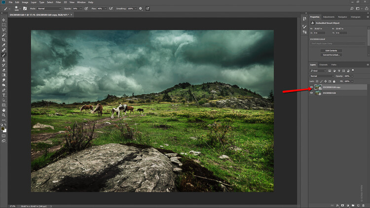
I like to start off in Lightroom and then pitch the image over to Photoshop as a Smart Object to apply the tilt-shift effect. I’ll show you why in just a bit.

How to Easily Simulate a Tilt-Shift Effect Using Photoshop

Now that you have the image opened in the loving hands of Photoshop the fun can begin! Yes, I think this is fun….

Duplicate the Layer

The first step in applying the tilt-shift effect is to duplicate the base image layer. Use the keyboard shortcut Ctrl/Cmd+J. It’s this duplicate layer to which you’ll apply the tilt-shift blur.

How to Easily Simulate a Tilt-Shift Effect Using Photoshop

Applying the Blur

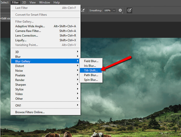
Tilt-shift is essentially a blurring effect, so it makes sense that it is located along with the other blur filters in Photoshop. Click on Filters > Blur Gallery >Tilt-Shift.

How to Easily Simulate a Tilt-Shift Effect Using Photoshop

This brings you into the tilt-shift blur module of Photoshop. You’ll notice that you can also add other forms of blur here, but ignore all that as we are just going to work with tilt-shift.

When the module opens you will see a masking tool already on top of your image. It resembles a dual graduated filter tool. In fact, it works very similarly to the graduated filter. The effect will feather out to the top and bottom from the central axis dot in the center of the filter. The solid lines control the border of the effect with the dotted lines determining the feathering. Here’s a breakdown.

How to Easily Simulate a Tilt-Shift Effect Using Photoshop

The tilt-shift filter overlay.

The intensity of the blur is controlled by the Blur slider or by adjusting the intensity dial. Keep in mind that the entire filter can be moved either simultaneously or the top and bottom portions can be moved and adjusted separately. This happens to be the final position of my tilt-shift filter.

How to Easily Simulate a Tilt-Shift Effect Using Photoshop

Click Ok and allow Photoshop to render the blur.

A few tips for you

While we’re waiting…this is a good time to go over a couple of things that will help make your tilt-shift more effective.

Always remember that, if you’re going for realism, an accurate tilt-shift simulation should adhere as closely as possible to the optical principles of photography. This means that since tilt-shift controls the depth of focus, your effect should also follow those rules. Be careful you don’t have significant irregularities at the borders of the blurred areas. Also, pay special attention to the elements within your photo and their spatial relationship to one another to avoid an overly artificial appearance.

Keep in mind that there are quite a few other sliders to be seen here in the tilt-shift module; namely those for distortion, bokeh, and light range. (Of course if you’re feeling adventurous then, by all means, try out those sliders but I generally leave them as is for virtually all of my work.) Distortion can be added to varying degrees to the blurred areas as well as bokeh enhancement/coloration. The light range slider allows control over blur based on specific luminance values. However, in most cases, the default settings for these sliders will be just perfect for your image.

After your tilt-shift effect is complete the image will automatically reopen in the main Photoshop window with your edits applied.

Tweaking the Effect

Just because you have to loosely adhere to some rules of optics doesn’t mean you are totally bound by them. I actually attempt to never use the word “rules” when it comes to photography. If you find you need to adjust the tilt-shift effect just remember that this is Photoshop after all and you, the intrepid post-processor, wield great power!

Remember how you imported your image as a Smart Object earlier? Well, this is where having your image available as a Smart object really comes in handy.

How to Easily Simulate a Tilt-Shift Effect Using Photoshop

You’ll notice the tilt-shift has already been scooped into its very own layer mask. So now, you are free to paint the blur effect in or out until it is just right. This allows you to go beyond the constraints of filters in the tilt-shift module. With this image, I used a little judicious painting on the Smart Filter layer mask to make the effect look a little more natural.

How to Easily Simulate a Tilt-Shift Effect Using Photoshop

Finish in Lightroom

After I’m completely finished with the tilt-shift I kick the image back over to Lightroom. I add in one last edit to help harmonize the tilt-shift and that is a graduated filter at the bottom of the frame to darken it ever so slightly.

How to Easily Simulate a Tilt-Shift Effect Using Photoshop

And that’s it! You should now have a genuine imitation tilt-shift image. Have a look at the before and after.

Before

After

Final Thoughts on the Tilt-Shift Filter…

Tilt-shift photography in Photoshop is easy and can add some amazing effects to your photos. As with most post-processing effects, it’s important to keep things within the realm of reality unless your goal is to deliberately skew things.

The effects achieved in Photoshop aren’t perfect, of course, but you can get very close to the look and feel of real tilt-shift photography. All this without needing to use a real tilt-shift lens or moving into large format photography. Experiment with the tilt-shift blur in Photoshop and keep these important tips in mind:

  • Remember tilt-shift is just a manipulation of depth of focus.
  • Try not to break the rules…I mean, the guidelines of optics.
  • Pick images that have larger areas of foreground and backgrounds with isolated subjects.
  • Don’t forget to tweak the tilt-shift effect or even add additional edits.

Try out the lessons in this article and stretch your creative legs with tilt-shift blur in Photoshop. And as always remember to have fun with your editing and please share your results and any questions you have in the comments area below.

The post How to Easily Simulate a Tilt-Shift Effect Using Photoshop by Adam Welch appeared first on Digital Photography School.


Digital Photography School

 
Comments Off on How to Easily Simulate a Tilt-Shift Effect Using Photoshop

Posted in Photography


How to Make a Little Planet Quickly and Easily in Photoshop

12 Oct

Do you find your panoramas a bit flat? Would you like to create a whole little planet out of a single street or square? Do you want to make fun, eye-catching images in just a few minutes without any new equipment or apps? Then this article is for you!

What is a Little Planet

Maybe you’ve heard about the “tiny planet” or “little planet” effect but don’t know exactly what that is. Maybe you have seen them but don’t know how to do them. Well, let’s start by explaining that a tiny planet is a spherical panorama and is technically called a stereographic projection.

The result of this effect is that your traditional landscape will now be circular and thus look like a planet floating in space, water, or sky depending on the background of the panorama you’re using.

PlanetReggio - How to Make a Little Planet Quick and Easy in Photoshop

Little planets are very trendy since it became possible to capture 360 x 180 degree panoramic shots. However, in this tutorial I’m going to show you how to do them from any straightforward bi-dimensional rectangular photo. I’m using Photoshop for this, but you can do it in most post-processing programs, even the free ones like GIMP.

Subjects for a Little Planet

A landscape or a panorama are the best choices, however you can get interesting results applying this effect to other kind of scenes. For example, I used it in this photo from the interior of a library, see how the spiral lines add depth to the space?

Library How to Make a Little Planet Quick and Easy in Photoshop

Also, if you apply it to a portrait the result is like looking through a peephole.

Clown How to Make a Little Planet Quick and Easy in Photoshop

How to Make a Little Planet

Okay, back to the instructions. First you need to open your image in Photoshop and alter the proportions of your photo so that it becomes a square. To do this go to Menu > Image > Image Size. Once the Image Size pop-up window opens, make sure you deactivate the “constrain proportions” option or else the entire image will resize proportionally. Once you do that, make sure the width and the height values are the same.

Size How to Make a Little Planet Quick and Easy in Photoshop

Now you will see your image distorted, like stretched out. Don’t worry about it, that’s what we were looking for here.

Rotate the Image

Distortion How to Make a Little Planet Quick and Easy in Photoshop

Now that you have your square you need to rotate it. To do it you go to Menu > Image > Image Rotation > 180 degrees.

Rotation

Now you will see the image upside down.

Upsidedown

*Note: if you want your planet to be inside out you skip this step! At the end, I’ll show you the results with and without this rotation.

Apply the Effect

The final stage is to apply the effect. Go to Menu > Filter > Distort > Polar Coordinates. In the pop-up window you will see a preview of your little planet; make sure that the Rectangular to Polar option is marked and click OK.

PolarCoordinates

Voila a Little Planet

There you go, your own little planet! You can rotate the image (like you did in step 2) until you find the orientation that works best for your image. You can also use the clone tool if you need to blend the merging of the borders or iron out any final details. And of course, you can fix contrast and exposure, as you would do with any photo.

Final How to Make a Little Planet Quick and Easy in Photoshop

And here is the one inside out if you skipped the second step and didn’t rotate the image:

Insideout How to Make a Little Planet Quick and Easy in Photoshop

So you see, it was only a matter of three steps. However, to get better results, especially if it’s your first few planets let me give you some tips and tricks:

Tips and Tricks

Use a photo with a wider ratio, like 2:1 and more. If you don’t have that, a landscape (horizontal) photo will still do better than portrait (vertical) one.

StartLandscape How to Make a Little Planet Quick and Easy in Photoshop

Compose your photo with the rule of thirds leaving the top and bottom sections with minimal information and the details in the middle area. In this example, I have the sky on the top, trees in the middle, and ground on the bottom.

Make sure the horizon line is completely straight. If it wasn’t like that in the original shot, it’s very easy to fix. First, pick the ruler tool from the toolbox (if you don’t see it just press and hold the eyedropper and you’ll find it). Then click and drag a straight line from one side to the other. Finally, click on the Straighten Layer button on top.

Ruler How to Make a Little Planet Quick and Easy in Photoshop

The edges will merge better in the planet if the left and right edges of your panorama are similar. When possible, like it would be in the case of a forest, for example, you can copy the left side, flip it and paste it on the right side. That way they will match perfectly.

Edges How to Make a Little Planet Quick and Easy in Photoshop

Your Turn

Now you can create a whole universe of little planets from nature to urban landscapes, the possibilities are endless.

UrbanPlanet

I invite you to share your planets here in the comments section below.

The post How to Make a Little Planet Quickly and Easily in Photoshop by Ana Mireles appeared first on Digital Photography School.


Digital Photography School

 
Comments Off on How to Make a Little Planet Quickly and Easily in Photoshop

Posted in Photography