The post Darktable: Is This Free Lightroom Alternative Right for You? appeared first on Digital Photography School. It was authored by Simon Ringsmuth.
When most people think about software for managing and editing their photographs, the most prominent program that comes to mind is Adobe Lightroom.
And while there are other options, such as Capture One and Apple Photos, there’s another program worth considering:
Darktable.
Darktable is an open-source alternative to the mainstream options, and while it might not have every single feature of its counterparts, it does have one enormous advantage: it’s free. That alone makes it worth checking out, but is it the right solution for you?
Read on to find out.

What is Darktable?
Darktable might be a new name for you, but it has been around since 2009 and has been steadily growing in popularity ever since. In an era where software costs are skyrocketing and more programs are moving to a subscription model, Darktable’s approach seems almost quaint.
Anyone can use Darktable for free – with no worries about contracts, upgrades, or missing features. This alone makes it a highly compelling editing solution, and certainly one worth considering for photographers without an unlimited budget.
There are some important tradeoffs with Darktable, especially if you are used to using Lightroom or another commercial program. Keep your expectations in check, and remember that the phrase “You get what you pay for” is popular for a reason.
That’s not to say you should ignore Darktable, but just be aware of what you are getting into.

Darktable overview
At its core, Darktable is similar to other programs you might already use. It’s a non-destructive image editor (it can handle RAW, JPEG, and many other formats) with a bevy of tools and options to edit your images.
Darktable has two central modes:
Lighttable and Darkroom.
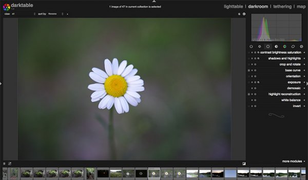
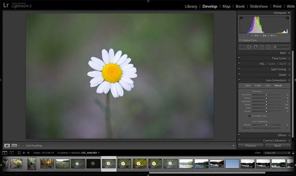
These function much like the Library and Develop modules in Lightroom. Darktable lets you import, categorize, sort, rate, flag, and tag images just like most other programs. Even the name Darktable is a play on the word Lightroom.
That said, there is a bit of a learning curve to Darktable because the features it offers are so overwhelming. Some new users are put off by this at first, but it doesn’t take much time to pick up the basics and start editing.
One additional thing worth noting:
I have found Darktable to be noticeably slower than Lightroom. Edits are shown in real time, but there is just a bit of lag as you drag sliders and change values. It’s not a dealbreaker, but something to be aware of.

In order to find out if Darktable is right for you, it’s helpful to understand precisely how its two main components, Lighttable and Darkroom, function.
Lighttable
In a broad sense, the Lighttable mode is similar to Lightroom’s Library module. You use Lighttable for importing images as well as tagging, rating, sorting, and general organizing.
The Import dialog lets you select files or a folder of images from your computer that is then loaded into the application. You can select multiple files and perform batch operations such as adding keywords, assigning color labels, and even applying GPX files for location data.

The sheer number of options is a bit overwhelming at first, but like any program, the more you use it the more it makes sense. Much of the Lighttable interface will be familiar to longtime Lightroom users, though the program does not strive for 1:1 feature parity. Instead, Darktable presents a logical series of actions and options designed to help photographers manage and import images.
Note also that the Export panel is in the Lighttable module, which is one way in which Darktable differentiates itself from Lightroom and other programs. In the screenshot below, you can see some of the many options available for exporting, which gives you a sense of the sheer depth offered by Darktable:

While things seem great up to this point, I do need to temper your expectations a bit. My biggest issue with Darktable is evident just from using the Lighttable module: overall responsiveness is not great. Scrolling through images, selecting pictures, editing metadata information, and other simple operations take far longer than other programs. Not that Lightroom and Capture One are speed demons – but comparing them to Darktable is like comparing a Ferrari to a Toyota Corolla. The latter will get the job done, but the former will do it way faster.
That’s not necessarily the only peg to hang your editing hat on, though. While speed is important, it’s not everything, and many quibbles with Darktable are mitigated by its price.
After all, despite my issues with Darktable’s user interface and lack of polish, it’s impossible to overlook the cost. I am still kind of amazed that all these features are in a free program that continues to be actively developed. For frugal photographers, it would be difficult not to recommend Darktable, and for everyone else, it just helps to have some patience.

One note for more technical users: Darktable doesn’t operate with a catalog like Lightroom.
Instead, the program stores all metadata in sidecar XMP files that reside next to your images on your computer. That means any information, such as keywords, star ratings, color tags, and edits, can be transferred along with your images just by copying the XMP files.
Some people find this more freeing than the catalog system in Lightroom, and while I have never had any issues with a catalog system, I do see the benefits of this approach.
Darkroom
While the Lighttable module is used for sorting and organizing your images, Darkroom is designed for the type of in-depth editing you would expect from a program that caters to the most demanding photo editors.
In fact, in terms of sheer editing prowess, Darktable blows Lightroom clear out of the water.

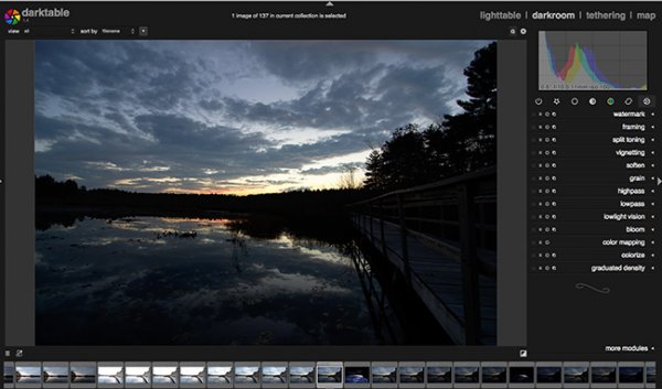
On the left side of the Darkroom interface, you will find elements that operate similarly to Lightroom and other editors. Darkroom contains a history panel, a system for managing duplicate images, a snapshot browser, and more. Across the bottom is a series of thumbnails for selecting images. The right side shows a histogram and a series of modules for editing things such as white balance, tone curves, sharpness, lens imperfections, and more.
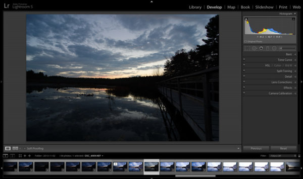
The final two words of the previous paragraph hide the true strength of Darkroom: the sheer quantity of editing options available is absolutely stunning. Whereas Lightroom has nine modules to choose from, Darktable has dozens. So many, in fact, that most of them aren’t even shown by default and are instead kept tucked away under a module called “More Modules.”

Beneath the histogram are icons that let you choose from a default set of modules most photographers find particularly useful: Basic, Tone, Color, Correction, and Effects. Click any of these to load modules that correspond to that type of edit.
For instance, click the Basic Group icon to access modules such as Base Curve, Tone Equalizer, Crop and Rotate, Exposure, and White Balance. You can also create your own custom set of editing modules and use the “Search Module” feature to locate a particular module just by typing its name.

Click any of the module titles to open its editing parameters, and you will see a familiar set of sliders and numerical values. The key difference with Darktable is the sheer quantity of sliders, values, and editing options at your disposal.
For instance, the Color Balance module contains sliders such as Input Saturation, Output Saturation, Contrast Fulcrum, and Contrast. In addition, there are three separate values (Factor, Hue, and Saturation) for Shadows, Midtones, and Highlights.

Compare this to the options in Lightroom, and you’ll quickly see that Darktable clearly pulls ahead in terms of editing efficacy. And Color Balance is just one of the editing modules available to you. Some of the modules are so technical that Darktable lets you adjust their parameters but actively discourages you from doing so:

Another powerful feature in Darktable is its implementation of custom masks. Most of the editing options can be combined with masks that can be accessed in the Mask Manager on the left side.
This lets you use common shapes, such as a brush or a circle, to create masks. However, Darktable goes one step further by letting you draw custom masks. This is helpful for anyone whose editing has been stymied by the comparatively limited options available in Lightroom.

Again, I need to temper expectations. Performing many of the editing maneuvers is an exercise in patience, even on a newer computer. Drawing a mask, moving a slider, or even cropping an image often involves precious seconds of wait time, which can really add up when going through hundreds of images.
There is also no mobile support, meaning photographers who rely on tablets or phones as essential components of their editing workflow will be left out in the cold.
Proceed with caution
At this point, you might be ready to cancel all your editing software subscriptions and jump on the Darktable bandwagon.
But before you take the leap, I need to offer a few words of caution. This article is not meant to be a review of Darktable, but rather a tool to help you decide if this program is right for you. And while there is no doubt that Darktable can handle any image editing tasks you throw at it, including more advanced options such as tethered shooting, slideshows, and printing, there are a host of drawbacks, as well.
As much as I want to like Darktable, I just can’t get around its overall sluggishness and lack of polish. Implementing edits is slow, and drawing custom masks can be a patience-draining exercise. Odd interface quirks abound, like truncated slider names and weird thumbnail resizing when switching in and out of the Lighttable mode.

The sheer level of complexity can also be a significant detriment. It takes a great deal of experimentation, trial and error, and online searching to figure out all the tools at your disposal. While this is true of any image editing program, the relatively small Darktable user base means that there just aren’t as many resources available to aspiring users compared to Lightroom and others.
Is Darktable right for you?
The best person to answer that question is you, and since Darktable is free for anyone to download, I recommend you give it a shot and see what you think.
However, if you want a bit more guidance, the following information might help.
I recommend Darktable for:
- Photographers on a budget who still want powerful editing software
- Highly technical editors who enjoy really digging into the editing process and don’t mind some software quirks
- Users who are unsatisfied with current offerings from Adobe, Capture One, and others, and want to try something different
I do not recommend Darktable for some people, including:
- Photographers who value speed and efficiency in their workflow
- Editors who want robust software that gets regular, substantive updates to fix bugs and add new features
- Casual users who value simplicity and user-friendliness over sheer editing power
- Mobile-centric photographers who prefer solutions that work on phones and tablets

Where you fall along this spectrum is up to you to decide. You can’t lose anything just by downloading Darktable and taking it for a test drive.
You might very well be surprised by what it can do for you!
You can download the latest version of Darktable here.
The post Darktable: Is This Free Lightroom Alternative Right for You? appeared first on Digital Photography School. It was authored by Simon Ringsmuth.


You must be logged in to post a comment.