RSS
 

Posts Tagged ‘Dark’

Lighting Up the Dark Side: Star Wars Shadow Art Portraits

24 Dec

[ By Steph in Drawing & Digital. ]

star wars shadow 1

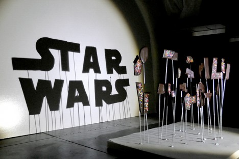
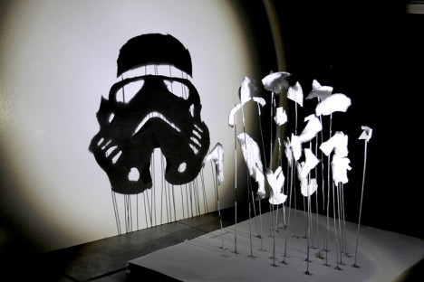
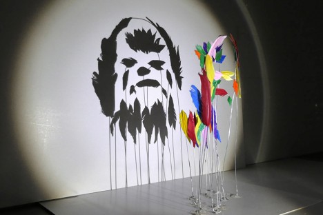
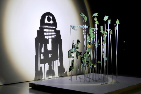
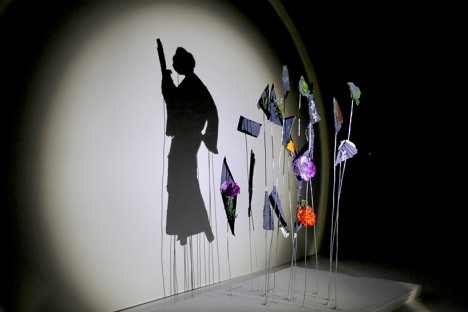
Balls of aluminum foil transform into Darth Vader and irregular chunks of chocolate cookies covered in rainbow sprinkles become the Star Wars logo when a single light source is shined upon them in just the right way. Artist ‘Red’ Hong Yi of Malaysia created an entire series of Star Wars shadow art with a range of materials, from feathers to discarded computer guts.

star wars shadow art 7

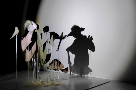
The artist turns on a lamp and begins attaching her bits of materials to pieces of wire embedded in a base, watching the shadows on a plain white wall until her seemingly random compositions start to make visual sense. Some of the portrait are more complex than others; a Stormtrooper made of cotton is simple and graphic while a Yoda silhouette crafted of nothing more than a handful of leaves  and weeds seems as if it could spring to life.

star wars shadow art 5

star wars shadow art 3

star wars shadow art 4

“It started with a spark of curiosity and then a lot of tweaks and experiments,” says the artist on her Instagram. “As an artist/designer, I’ve learned to not be afraid of experimenting and failing; you’ll get better at what you do with each step you take. Our responsibility as creators is to sit down and create again and again. May the force be with you!”

star wars shadow art 2

star wars shadow art 6

Get inspired with 24 more amazing works of shadow art, and follow Red Hong Yi on Instagram for more creations made from unexpected materials, like tea bag portraits and intricate arrangements of edible items.

Share on Facebook


[ By Steph in Drawing & Digital. ]

[ WebUrbanist | Archives | Galleries | Privacy | TOS ]


WebUrbanist

 
Comments Off on Lighting Up the Dark Side: Star Wars Shadow Art Portraits

Posted in Creativity


Dark Water: Take a Boat Ride Through a Flooded Museum

15 Sep

[ By Steph in Art & Installation & Sound. ]

boat ride art installation 1

In order to take in the new, dimly lit installation at Palais de Tokyo by artist Céleste Boursier-Mougenot, you’ll have to pilot a small boat through dark waters inside the flooded museum. Taking its name from the annual flooding event that sees the water levels in Venice rise so high that walkways disappear, the ACQUAALTA exhibition envisions the concrete interiors of the Palais as they would be if the forces of nature were similarly unleashed upon Paris.

boat ride art installation 4

boat ride art installation 6

Visitors sit or stand within their rowboats, using oars to paddle themselves around the nearly pitch-black space and disembarking to explore jagged foam landscapes.The hallucinatory voyage is reminiscent of souls crossing over to the underworld via the River Styx, with the ferryman Charon to guide them.

boat ride art installation 2

boat ride art installation 3

As they take in the subtle figurative silhouettes projected onto the black walls, the guests themselves become part of the exhibition, like actors in a play. As they navigate the waters, they are filmed, their movements projected onto one of the walls. The foam ‘island’ is a place of refuge, allowing deeper immersion into the work without fear of drifting.

boat ride art installation 5

boat ride art installation 7

Boursier-Mougenot believes that creating an atmosphere is integral to art, so that the work is not just disconnected imagery hanging on a wall, but rather an interactive experience that envelops onlookers and makes them active participants. The hope is that as a viewer, you temporarily forget who you are, falling headfirst into a dreamworld via an artificially constructed series of hypnotic images, movements and sounds.

Share on Facebook


[ By Steph in Art & Installation & Sound. ]

[ WebUrbanist | Archives | Galleries | Privacy | TOS ]


WebUrbanist

 
Comments Off on Dark Water: Take a Boat Ride Through a Flooded Museum

Posted in Creativity


24 Dark and Mysterious Shadow Images

17 Jul

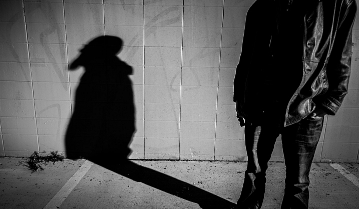
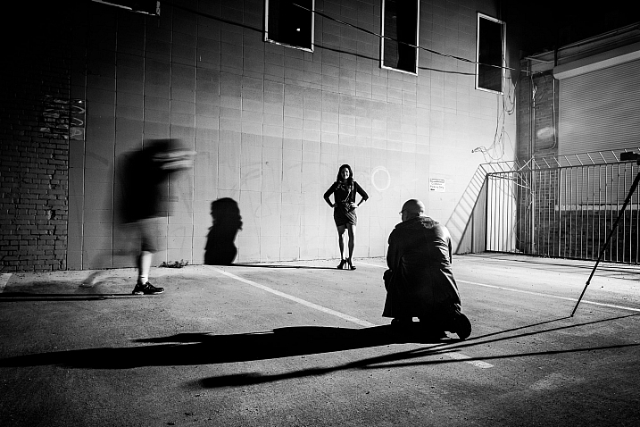
Light and shadow are key in photography. You cannot have one without the other, and how light is used in the image set the tone and mood of it. Images with high contrast, and strong shadows can be very dramatic.

Have a look and see if you agree that these shadow images have a certain mystique about them.

I’ll start off with a few of my own images taken on a “shadows” themed photo walk a couple years ago:

Darlene Hildebrandt

By Darlene Hildebrandt

Darlene Hildebrandt

By Darlene Hildebrandt

Darlene Hildebrandt

By Darlene Hildebrandt

Hapal

By hapal

Magdalena Roeseler

By Magdalena Roeseler

Bryon Lippincott

By Bryon Lippincott

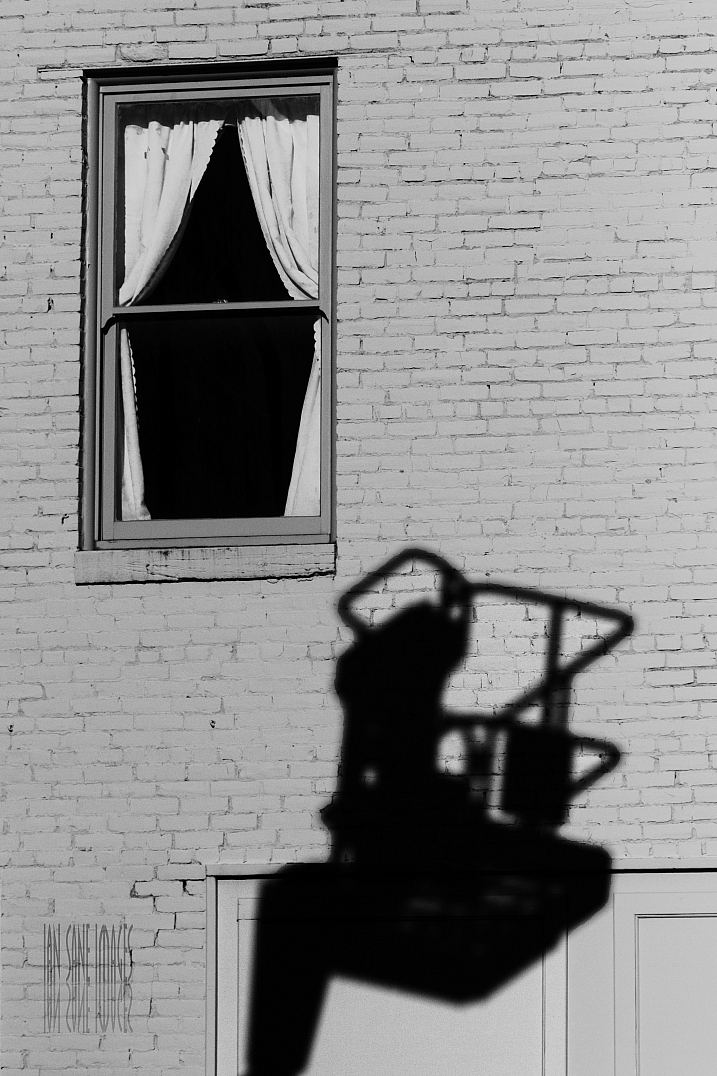
Ian Sane

By Ian Sane

Photograph O O by Jianwei Yang on 500px

O O by Jianwei Yang on 500px

Photograph Round shadows by Junichi Hakoyama on 500px
Round shadows by Junichi Hakoyama on 500px

Photograph Living Shadows by Jorge Pena on 500px

Living Shadows by Jorge Pena on 500px

Photograph Lead or Follow? by Krystian Olszanski on 500px
Lead or Follow? by Krystian Olszanski on 500px

Photograph Afternoon Shadow by Joe Josephs on 500px

Afternoon Shadow by Joe Josephs on 500px

Photograph Untitled by Spyros Catramis on 500px

Untitled by Spyros Catramis on 500px

Photograph shadows of people by Mister Mark  on 500px

shadows of people by Mister Mark on 500px

Photograph They also get along by Ignasi Jansà on 500px

They also get along by Ignasi Jansà on 500px

Photograph Love by Candle Light by Ticknor Photo on 500px

Love by Candle Light by Ticknor Photo on 500px

Photograph Salsa Shadows by Joan Herwig on 500px

Salsa Shadows by Joan Herwig on 500px

Photograph Shadow dancing by Didier Vanspranghe on 500px

Shadow dancing by Didier Vanspranghe on 500px

Photograph dancing with lights by nave aviani on 500px

dancing with lights by nave aviani on 500px

Photograph ????? by umedust ?? on 500px

????? by umedust ?? on 500px

Photograph Shadowdance by Alex Noriega on 500px

Shadowdance by Alex Noriega on 500px

Photograph Protector ! by Mardy Suong Photography on 500px

Protector ! by Mardy Suong Photography on 500px

Photograph 58/365  Bottle Neck by Monika Bigelow on 500px

58/365 Bottle Neck by Monika Bigelow on 500px

Photograph Fork Shadow by Michaël Luitaud on 500px

Fork Shadow by Michaël Luitaud on 500px

googletag.cmd.push(function() {
tablet_slots.push( googletag.defineSlot( “/1005424/_dPSv4_tab-all-article-bottom_(300×250)”, [300, 250], “pb-ad-78623” ).addService( googletag.pubads() ) ); } );

googletag.cmd.push(function() {
mobile_slots.push( googletag.defineSlot( “/1005424/_dPSv4_mob-all-article-bottom_(300×250)”, [300, 250], “pb-ad-78158” ).addService( googletag.pubads() ) ); } );

The post 24 Dark and Mysterious Shadow Images by Darlene Hildebrandt appeared first on Digital Photography School.


Digital Photography School

 
Comments Off on 24 Dark and Mysterious Shadow Images

Posted in Photography


Why You Should Make Dark Images

27 Apr

Street scene

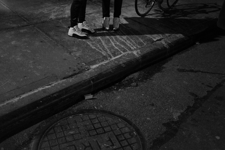
One of the most unexplored aspects in digital photography is the dark image.

With digital, we have built-in light meters, histograms, incredible ISO capabilities, and processing programs, which make it much easier to expose our images brightly in all different lighting situations. This can have the effect of making photographers feel that they need to expose all of their images with a neutral histogram, where you can see the image perfectly well, with some information in the highlights, mid-tones, and shadows.

This is often what you want to do, but not always.

When you are using Aperture Priority, Shutter Priority, or the Automatic modes, your camera’s light meter has the aim of making whatever it is focusing on a neutral grey. Thus, it has the tendency to overly darken scenes with a lot of bright highlights or to overly brighten scenes with lots of dark tones.

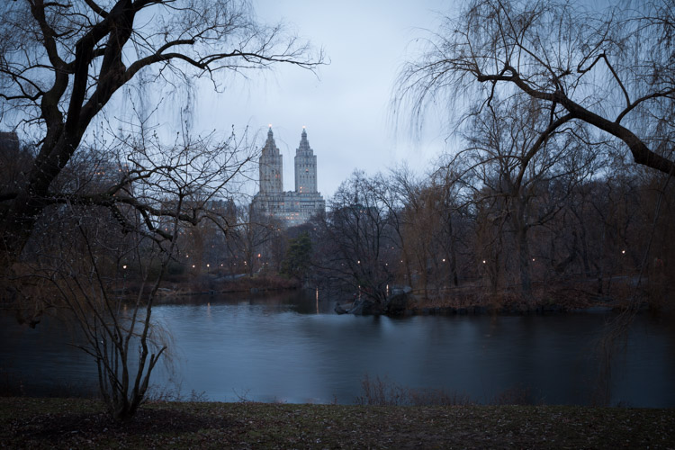
The Lake, Central Park – NYC

Because of this, when you photograph in dark situations your exposures can end up being bright as if they were taken during the day. It’s easy to think that this is okay, and often it is, but it also makes it easy to forget that sometimes a dark image is a good thing too. There is nothing wrong with making an image look like it was taken at night. There is nothing wrong with making the image tougher to see, like the scene was to your eye as you captured it.

For me, it was an experience when I started to look at older photography books and came across images that I couldn’t quite make out. ‘They should have been brighter”, I immediately thought, but then I realized that I liked them. I realized how natural and moody it made the images feel. I had to put in more effort to make out what was going on, and I liked that. It felt moody and real.

This image could have been made brighter and still worked.

Technically, to achieve this on Aperture or Shutter Priority, you need to lower your exposure compensation (+/-) setting when you are photographing subjects or areas with a lot of darker tones. I usually default to -2/3 or -1 stop, then tweak from there depending on the situation. You can even take it further by going into full Manual mode to override the camera’s light meter. Since the lighting is fairly consistent in many dark situations, this is often a great way to shoot.  I do this when shooting at night, in train stations, alleyways and many indoor situations. You can even shoot like this during the day by strongly underexposing your image.

If you notice, in the images in the article, the highlights are represented as middle grey tones. This is called exposing for the highlights and that is a key for making a dark image. Get used to seeing lots of deep blacks and mid greys. It can help to take a file into Lightroom and play around with the exposure to get a feel for how an image can look at different exposures. When shooting in dark situations, which means you will probably be using a very high ISO, you will want to make sure to get the image as close as possible to the prime exposure in the camera. But when you are learning it can only help to experiment in Lightroom to find the exposure that you like the best.

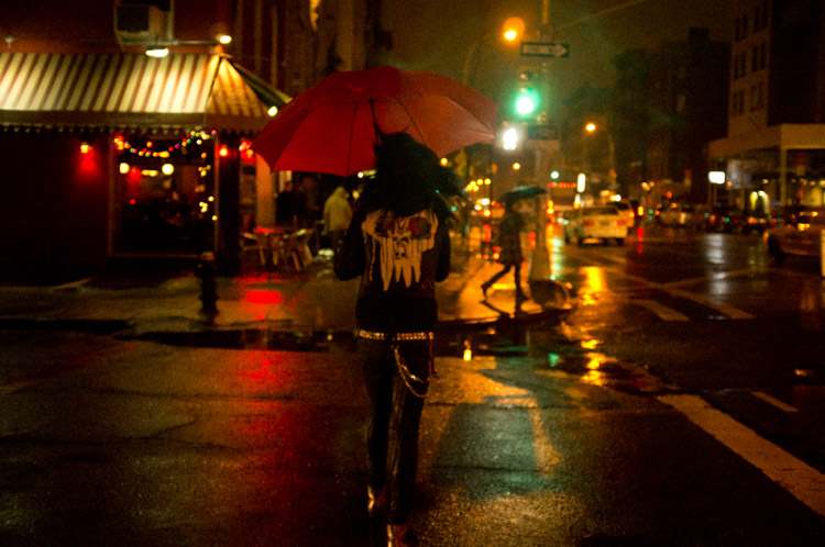
Nightlife Street Scene, East Village, NYC.

But what is the purpose of making an image dark? There are a few reasons. The first is that in many situations it can feel more realistic. Night images that look dark feel more like the viewer is actually there. They feel accurate and that can go along way for the viewer. Dark images can feel moody, eerie, dangerous, quiet, romantic, scary, weird, or contemplative. Many backgrounds look more beautiful with the dark shadows and moody lighting at night.

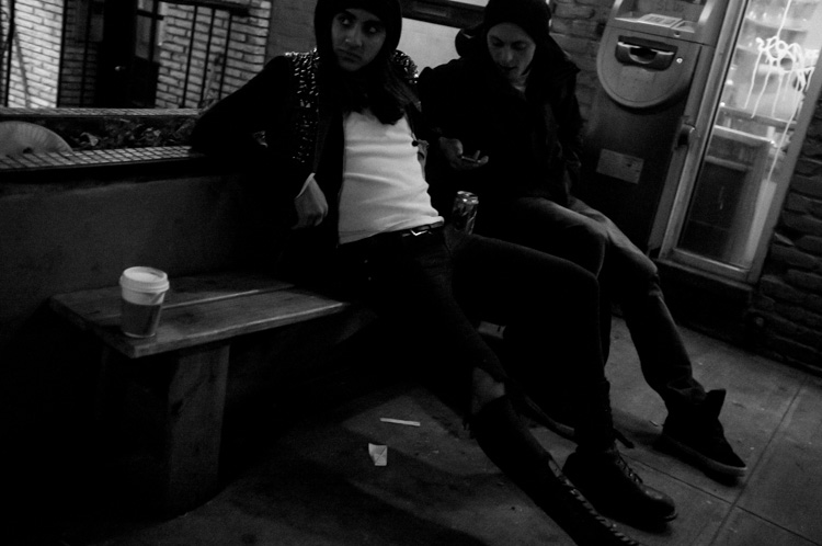
In addition, dark images draw the viewer in. Often with photography, the devil is in the details and sometimes it can be hard to draw viewers in to really look around an image. Dark images do that. As the viewer tries to make out the details, they inadvertently start exploring the image in more depth.

So next time you are shooting at night or in a dark area, think about making that image a bit darker.

Nightlife Street Scene, NYC.

googletag.cmd.push(function() {
tablet_slots.push( googletag.defineSlot( “/1005424/_dPSv4_tab-all-article-bottom_(300×250)”, [300, 250], “pb-ad-78623” ).addService( googletag.pubads() ) ); } );

googletag.cmd.push(function() {
mobile_slots.push( googletag.defineSlot( “/1005424/_dPSv4_mob-all-article-bottom_(300×250)”, [300, 250], “pb-ad-78158” ).addService( googletag.pubads() ) ); } );

The post Why You Should Make Dark Images by James Maher appeared first on Digital Photography School.


Digital Photography School

 
Comments Off on Why You Should Make Dark Images

Posted in Photography


Altopias: Speculative Art Explores Both Dark & Light Futures

17 Mar

[ By WebUrbanist in Art & Drawing & Digital. ]

iceberg on a beach

The world of future-focused artwork tends to examine extreme outcomes, but this artist’s visions represent a compelling range of possibilities from catastrophic to optimistic, Dystopian to Utopian with other shades of gray in between.

dust storm in barcelona

no snow in alps

First consider the range of negative outcomes and what they would do to villages, towns and cities around the world (as illustrated in this first round of images above and below) – built environments afflicted by surprising climatic changes like heat waves, ice storms and droughts.

venice run dry

desert meets water

On the one hand, Evgeny Kazantsev considers these disaster scenarios, from dust storms in Barcelona and villages in the Alps without snow to Venice gone dry and oceans overrunning desert cities. But this is only half of the story.

Next Page – Click Below to Read More:
Altopias Speculative Art Explores Both Dark Light Futures

Share on Facebook


[ By WebUrbanist in Art & Drawing & Digital. ]

[ WebUrbanist | Archives | Galleries | Privacy | TOS ]


WebUrbanist

 
Comments Off on Altopias: Speculative Art Explores Both Dark & Light Futures

Posted in Creativity


26 Images of Light and Dark that Speak to the Soul

13 Mar

In case you hadn’t noticed, this past week we had a theme to a lot of the articles – light!

In keeping with that topic here are some images that feature light and dark. You can’t have contrast without both of them, and you can’t have light without dark. It’s sort of a symbiotic relationship.

Photograph Cloisters by Michael Sinat on 500px

Cloisters by Michael Sinat on 500px

Photograph Sunlight shining through a green leaf by A_Kiggal on 500px

Sunlight shining through a green leaf by A_Kiggal on 500px

Photograph Deadly Beauty 2 by Rick Priest on 500px

Deadly Beauty 2 by Rick Priest on 500px

Photograph ~collar by chinh n on 500px

~collar by chinh n on 500px

Photograph ~abstract leaf (I) by chinh n on 500px

~abstract leaf (I) by chinh n on 500px

Photograph Fragility by Noelle Buske on 500px

Fragility by Noelle Buske on 500px

Photograph Old carriage interior with light intruding by Anna Váczi on 500px

Old carriage interior with light intruding by Anna Váczi on 500px

Photograph The lonely light by Karthik babu on 500px

The lonely light by Karthik babu on 500px

Photograph The Light of the Night by Joerg Bonner on 500px

The Light of the Night by Joerg Bonner on 500px

Photograph Ajar by Tony Antoniou on 500px

Ajar by Tony Antoniou on 500px

Photograph crazy lights by Adriano Saccio on 500px

crazy lights by Adriano Saccio on 500px

Photograph Beautiful city II. by Petr Kubát on 500px

Beautiful city II. by Petr Kubát on 500px

Photograph Light Path by Abdulmajeed  Aljuhani on 500px

Light Path by Abdulmajeed Aljuhani on 500px

Photograph Path of life II by Janek Sedlar on 500px

Path of life II by Janek Sedlar on 500px

Photograph Right Light by Daniel Bosma on 500px

Right Light by Daniel Bosma on 500px

Photograph Foggy path by Jose Ramon Santos Mosquera on 500px

Foggy path by Jose Ramon Santos Mosquera on 500px

Photograph Owl can smile by Drak ? Spirit  on 500px

Owl can smile by Drak ? Spirit on 500px

Photograph The essence of night by Liban Yusuf B&W on 500px

The essence of night by Liban Yusuf B&W on 500px

Photograph Walking in the dark by Carles Carreras on 500px

Walking in the dark by Carles Carreras on 500px

Photograph Black & White Flower by Alecia Groth on 500px

Black & White Flower by Alecia Groth on 500px

Photograph Oak and Winter Fog by Jeff Reindl on 500px

Oak and Winter Fog by Jeff Reindl on 500px

Photograph Geng by Bry Manaloto on 500px

Geng by Bry Manaloto on 500px

Photograph Silence by Ztd125 on 500px

Silence by Ztd125 on 500px

Photograph Stage Light on Queen Anne by Jocelyn Ball on 500px

Stage Light on Queen Anne by Jocelyn Ball on 500px

Photograph Abadoned by Luke Rooney on 500px

Abadoned by Luke Rooney on 500px

Photograph The Bird by Mark Horvath on 500px

The Bird by Mark Horvath on 500px

googletag.cmd.push(function() {
tablet_slots.push( googletag.defineSlot( “/1005424/_dPSv4_tab-all-article-bottom_(300×250)”, [300, 250], “pb-ad-78623” ).addService( googletag.pubads() ) ); googletag.pubads().enableSingleRequest();
googletag.pubads().disableInitialLoad();
googletag.pubads().collapseEmptyDivs( true );
googletag.enableServices();
} );

googletag.cmd.push( function() { googletag.display( ‘pb-ad-78623’ ); } );

googletag.cmd.push(function() {
mobile_slots.push( googletag.defineSlot( “/1005424/_dPSv4_mob-all-article-bottom_(300×250)”, [300, 250], “pb-ad-78158” ).addService( googletag.pubads() ) ); googletag.pubads().enableSingleRequest();
googletag.pubads().disableInitialLoad();
googletag.pubads().collapseEmptyDivs( true );
googletag.enableServices();
} );

googletag.cmd.push( function() { googletag.display( ‘pb-ad-78158’ ); } );

The post 26 Images of Light and Dark that Speak to the Soul by Darlene Hildebrandt appeared first on Digital Photography School.


Digital Photography School

 
Comments Off on 26 Images of Light and Dark that Speak to the Soul

Posted in Photography


How to Create Dark Moody Low-Key Portraits with Minimal Gear

14 Jan

To paraphrase Samuel L. Jackson in Jackie Brown, “Grids: when you absolutely, positively got to kill every lumen in the room, accept no substitutes.” Do you have a room or environment that you want to appear black? You don’t even need a black backdrop or the dark cover of night to create a dark, dramatic scene. All you need is a flash, a grid and enough space to allow your subject to be at least 5-10 feet away from any walls. As long as you can keep your strobe light from falling on the ground, background or other objects in the scene, only the subject will be illuminated.
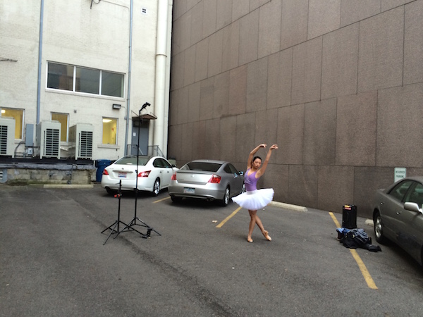
1

The scene: If you want to black out your environment to create dark moody low-key images, look for shaded areas with enough space to allow at least 5-10 feet between your subject and the background. The darker the background wall is, the better.
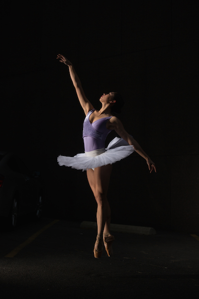
2

The raw file: If you look closely, you will see that there is a bit of background detail, which can be easily eliminated in Lightroom.

It was a particularly windy day that I photographed ballerina Kristie Latham. Since I didn’t have an assistant, and sandbags were too heavy to lug around by myself (I was already pulling my case and carrying two light stands), I would have to shoot without light modifiers. Note, if I had added an umbrella to the light stand without it being sandbagged or held by an assistant, it would have blown over onto a nearby car within five seconds. Though an un-modified flash on a light stand can still be blown over by the wind, it’s much less likely to happen. That said, I still made sure that it wasn’t too close to any nearby cars.

I wanted to highlight her form and the details of her outfit – specifically the tutu – so even though the light was going to be hard without modifiers, it would actually work out to my advantage. I began by setting up the main light. I placed it high – about 8 feet – in order to create dramatic, directional light. After taking a test shot, I saw that the light fell off below her tutu, since it came out about a foot from her body, causing her legs to go into shadow. To remedy this, I added a second light, placing it on the ground, aimed slightly up, to avoid lighting the ground. The second light worked at illuminating the lower half of her body (image above). By zooming the flashes in to a medium setting of 70mm, it allowed just enough light spread to cover her, while not spilling on too much of the environment around her. While a bit of background detail can be seen in the raw file, it can easily be removed in Lightroom in post-production.

3

The final shot: Kristie is now completely isolated in the void. Poetic.

In a slightly different environment, I was doing a shoot with model Dani Dikeman, in a basement. She was in black body paint, wearing all black above the waist. I wanted the whole scene to appear black, save for the highlights on Dani and the textures of her outfit. It was a conceptual portrait shoot, this portion being the Hell portion of a Heaven/Hell-themed shoot. (The as-yet-to-be-shot Heaven scenario will, fittingly, be all white.)
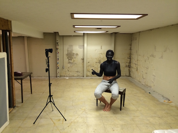
4
The setup: This scenario took place in a basement.

I met Dani at the makeup artist’s house, about an hour after they got started on the makeup, in order to give them a head start on the lengthy application. I knew that the basement was going to be an optimal shooting space because it was not only windowless, but wide open and barren. I quickly set up the sole flash, see above, and then waited while they put the finishing touches on the makeup and hair.
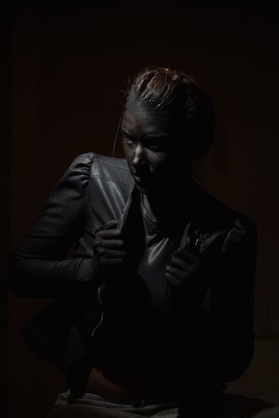
5
The raw file: Though a bit of Dani’s unpainted abdomen and sweatpants are visible in the shot, a quick Lightroom adjustment would have the image ready to go.

The shoot actually went rather quickly (15 minutes), which is ironic since the makeup application took two hours. Though the basement wasn’t especially large, by using a grid on my light to contain light from spilling on the nearby walls, the environment read pretty close to black in the raw files, as seen above. Although Dani’s unpainted abdomen and sweatpants visible in the shot, this wasn’t too big of an issue. Because the light falloff was so dramatic from her bust to her torso, a quick adjustment in Lightroom, lowering the exposure and it went easily to black.
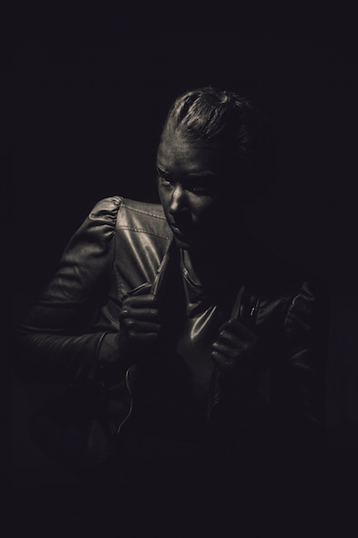
6
The final shot. All black everything.

Have you done all dark or low key images before? Have any other tips or comments to share?

googletag.cmd.push(function() {
tablet_slots.push( googletag.defineSlot( “/1005424/_dPSv4_tab-all-article-bottom_(300×250)”, [300, 250], “pb-ad-78623” ).addService( googletag.pubads() ) ); } );

googletag.cmd.push(function() {
mobile_slots.push( googletag.defineSlot( “/1005424/_dPSv4_mob-all-article-bottom_(300×250)”, [300, 250], “pb-ad-78158” ).addService( googletag.pubads() ) ); } );

The post How to Create Dark Moody Low-Key Portraits with Minimal Gear by Nick Fancher appeared first on Digital Photography School.


Digital Photography School
 
Comments Off on How to Create Dark Moody Low-Key Portraits with Minimal Gear

Posted in Photography


Photoluminescent Furniture: Filled Wooden Voids Glow in Dark

17 Dec

[ By WebUrbanist in Art & Sculpture & Craft. ]

glow dark wood table

A pair of crafty carpenters have separately arrived at the same conclusion: glow-in-the-dark resin is a really neat way to fill cracks, gaps, splits and other natural or accidental voids frequently found in wood shelves and surfaces.

glow in the dark shelf

Whether you have a small piece that needs infill or mending or a larger project in the works, one of these approaches may well be ideal for your own do-it-yourself project – some details are provided below but full instructions on each strategy can be found via links included as well.

glow shelf final product

glow knot seen from below

In the first instance, Mat Brown decided to try something other than the standard invisible-style repair to solve the problem of empty space around knots and front-facing unevenness in boards to be used as shelving.

glow dark resin mix

glow dark wood process

He provides further details on the process over at his blog, but in a nutshell: he used robust tape below and on the sides then heated up the resin, mixed in the powder and poured in the results. After a second similar round he cut, sanded and finished the pieces.

glowing infill table design

glowing cyprus power resin

Mike Warren has subsequently brought a similar idea to the table, creating a tutorial for filling in the naturally separation gaps found in a certain species of cyprus, livening up the surface with bright resin.

glow dark table detail

The full illustrated list of 25 steps for this latter version can be seen on Instructables, but in this case a similar process was used, just heavier-duty tools employed (like a drum sander) to keep the workload down. Hat tip to Chris of Colossal for finding both of these projects as well.

Share on Facebook


[ By WebUrbanist in Art & Sculpture & Craft. ]

[ WebUrbanist | Archives | Galleries | Privacy | TOS ]


WebUrbanist

 
Comments Off on Photoluminescent Furniture: Filled Wooden Voids Glow in Dark

Posted in Creativity


Gritty City: Dark Oils Capture Essence of Bustling Urbanity

19 Jun

[ By WebUrbanist in Art & Drawing & Digital. ]

gritty city aerial view

Buy shipyards, city streets, rain-streaked skyscrapers and other iconic staples of cities come alive in this portfolio of shadowy oil paintings.

gritty moving cars towers

gritty sidewalk intersection

gritty city shipyard

Valerio D’Ospina captures movement in the strokes of his brush, but the blurred results also take on that uncanny real-yet-indistinct character of a dream or memory, a little like the work of Alexandra Pacura.

gritty multi way roads

gritty city curve

Born in Italy, Valerio studied in Florence, painted in Paris and eventually moved to Pennsylvania – his range of industrial subjects reflects studies of historic Europe as well as the infrastructure of the United States.

gritty city skyscrapers

gritty city street

gritty narrow alley

He was trained to teach, but has since turned toward full-time creation. From his bio: “After this teaching experience he decided to focus exclusively on painting, receiving positive feedback from private collectors and galleries from around the world.”

Share on Facebook


[ By WebUrbanist in Art & Drawing & Digital. ]

[ WebUrbanist | Archives | Galleries | Privacy | TOS ]


WebUrbanist

 
Comments Off on Gritty City: Dark Oils Capture Essence of Bustling Urbanity

Posted in Creativity


Cutting Edges: Layered Back-Lit Paper Art Gets Deep & Dark

09 Apr

[ By WebUrbanist in Art & Sculpture & Craft. ]

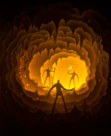
paper art cave people

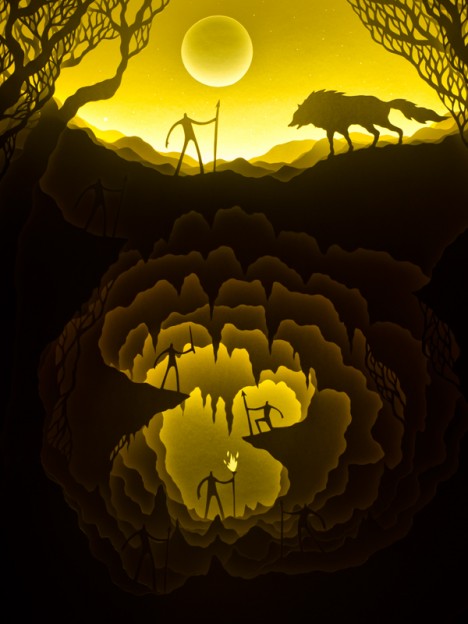
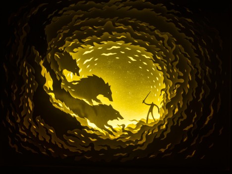
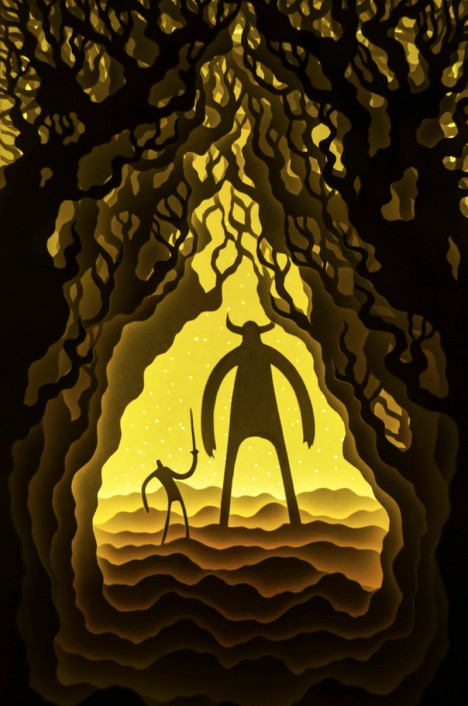
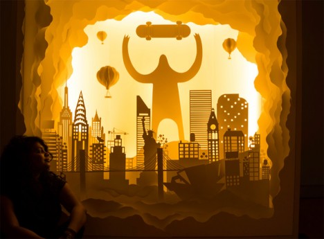
Together, Hari & Deepti (Deepti Nair and Harikrishnan Panicker) turn sets of two-dimensional cutouts into vivid and haunting three-dimensional dioramas, often set in shadowy fantasy spaces.

paper above and underground

paper sunken ship sea

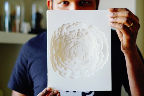
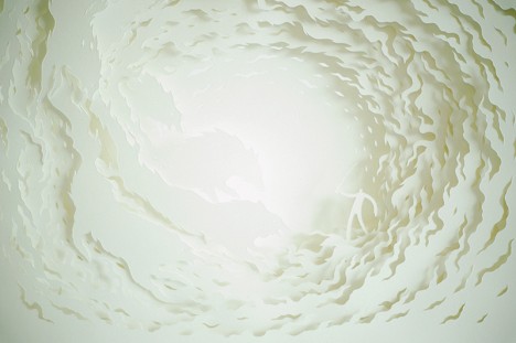
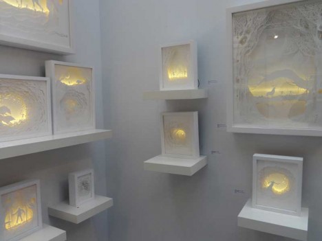
Despite the darkness of their subject matter, in ordinary lighting conditions there is almost nothing to be seen of these pieces. The work waits in the shadows, so to speak, popping out when you turn out the lights and turn on the LEDs inside each individual light box.

paper artist in context

paper art daylight

paper cut out art

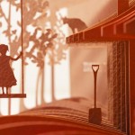
Loosely analogous to a book, perhaps, the story plays out in the space between the pages, each one individually flat but, together with illumination, adding up to something more than the sum of its parts.

paper art fantasy scene

paper art on display

While most of their works are relatively small, a recent project challenged them to build at a much bigger scale, creating an entirely monstrous (pun intended) New York cityscape (shown below).

paper artist giant sized

From the artists: “Paper is brutal in its simplicity as a medium. It demands the attention of the artist while it provides the softness they need to mold it in to something beautiful. It is playful, light, colorless and colorful. It is minimal and intricate. It reflects light, creates depth and illusions in a way that it takes the artist through a journey with limitless possibilities.”

Share on Facebook


[ By WebUrbanist in Art & Sculpture & Craft. ]

[ WebUrbanist | Archives | Galleries | Privacy | TOS ]


WebUrbanist

 
Comments Off on Cutting Edges: Layered Back-Lit Paper Art Gets Deep & Dark

Posted in Creativity