RSS
 

Posts Tagged ‘Dark’

In the Dark: 10 Tips for Street Night Photography

20 Dec

The post In the Dark: 10 Tips for Street Night Photography appeared first on Digital Photography School. It was authored by James Maher.

street night photography tips

Much is spoken about photographing during the twilight hour, but what about after that?

Night is my favorite time for street photography. Cityscapes are lit with a myriad of interesting and colorful light sources, such as lampposts, neon signs, store windows, car lights, and bare bulbs. People dress in their favorite outfits to go out. Bland scenes by day can suddenly turn ominous and fascinating at night.

street night photography diner
1/80s | f/2.8 | ISO 1600

Here are 10 tips for street night photography – so you’ll think about starting your next street photography session at twilight!

1. Use the ideal camera settings for sharpness at night

To freeze motion during the day, I prefer to use a shutter speed of 1/320s, with 1/160s as my lower threshold.

At night, this changes. In the brightest areas, you will be able to photograph at 1/250s, but most of the time it will be best to use a shutter speed somewhere between 1/160s and 1/60s.

You need to have steady hands and a wide-angle focal length. In fact, to photograph handheld at 1/60s, you need to stop your own motion completely. Fortunately, with some practice, it can be done.

street night photography person in the snow
1/125s | f/2.5 | ISO 6400

A wide-angle lens is necessary for this type of photography because the longer the focal length, the faster the shutter speed you need to keep an image sharp. With a 28mm or 35mm lens, it becomes much easier to handhold the camera at slower shutter speeds.

It will also help to use a fast prime lens, such as a 35mm f/2. It is possible to shoot at f/4 in brighter areas, but being able to shoot at f/2.8, f/2, or even f/1.8 will greatly expand your opportunities.

Finally, you will need to raise your ISO significantly. With modern digital cameras, you can photograph anywhere from ISO 1600 to ISO 6400 and get decent or good image quality. It’s just not possible to photograph handheld at night otherwise. I prefer to shoot at ISO 3200, and I sometimes go to ISO 6400 if needed.

To learn more about photographing with a high ISO, you can read this article, called “Reasons to Shoot High ISO Images.”

2. Seek out the light sources first

on the streets at night
1/60s | f/2.8 | ISO 3200

You should always pay attention to the main light sources in a scene. This is true no matter where or when you are photographing, but it becomes even more important at night. Start by finding a beautiful light source or an area with good lighting, then wait around for something to happen.

Focus on how these light sources hit your subjects. If you are leaning against a shop with a lit sign behind you, like the man in the photograph above, then as subjects pass you they will be lit with a strong light that has a gorgeous color to it. If your lens’s aperture doesn’t go wider than f/4, this is a fantastic way to boost your shutter speed.

On the other hand, if you stand in the street and aim the camera at the light source, as I did for the photo above, then the light will be less pronounced on the subjects, but you will get the beautiful sign in the scene. Notice the difference between the light on the left and right side of the man’s face in the photo.

3. Photograph nightlife

photographing the nightlife
1/125s | f/2 | ISO 6400

Some of the most interesting night street photography occurs where the most people are, and that is often where the nightlife is. 

So seek out the night life and shoot it!

A fantastic project to look at for inspiration is Maciej Dakowicz’s “Cardiff After Dark” series.

4. Alternate between getting close and stepping back

I’m a proponent of Robert Capa’s advice: “If your photos aren’t good enough, you’re not close enough.” However, I often alter this strategy at night.

I try to get close to many of my subjects, but I will also try to create compositions where the subjects are small aspects of the overall scene. At night, backgrounds can be much more beautiful than during the day, so it often works to have people become the secondary element in the scene, rather than the primary focus.

The technical advantage here is that you do not need to use a fast shutter speed to capture the motion of subjects when you are farther away. You can freeze a moving subject at 1/60s from farther away, whereas you will need to use at least 1/125s when close.

5. Tripod and crowd blur

motion blur night street photography
1/8s | f/4 | ISO 800 | Tripod

For night street photography, it’s usually best to go handheld, since you never know what interesting thing is going to happen and where it’s going to happen. However, one of the times to use a tripod is when you want to capture a busy scene with lots of people and motion.

Experiment with slower shutter speeds, such as 1/8s, and shoot a lot of photos. It took me a long time to capture the image above, because I wanted the people spread out evenly throughout the entire scene, and I also wanted something interesting in the foreground (ultimately, this was the pose of the woman in the street and the man looking at her).

It took some waiting and a lot of captures for this to happen.

6. Use a flash

Whether you want to try flash on the street is up to you, but keep in mind that it can easily lead to a confrontation. I prefer to work with the constraints of the natural light on the street, and I also get uncomfortable flashing strangers in the face in dark settings, but many prefer to photograph this way. It creates a fantastic look when done well.

Using a flash frees you from a lot of the constraints of photographing at night. You can use a faster shutter speed, include more depth of field in the photo, and reduce graininess (noise).

You can have the flash do all of the work lighting the scene, where the foreground area is lit and everything else is dark.

Alternatively, you can set the camera to expose for the scene, similar to what you would do without the flash, and then use the flash to add some fill light to your main subjects in the foreground.

7. Noise and the dreaded underexposed image

people sitting on bench at night
1/250s | f/2 | ISO 3200

You should always expose correctly when photographing with a high ISO.

That being said, even with the best settings, some of your images will be taken in areas that are too dark to be exposed correctly. It’s impossible to photograph this way and expose every image perfectly in-camera. For the occasional shots with excellent content that you want to save, you will have no choice but to raise the exposure when editing.

For that type of photo, I first ignore the noise and get the exposure and look correct in Lightroom. After I do this, if I’ve had to raise the exposure a significant amount, the grain will look terrible. Luckily, there are some ways to save an image like that as long as you’re photographing in RAW.

What I do is first remove the grain – then I add it back. I want the image to look grainy, but I want the grain to look pleasing. There are many noise reduction programs, such as Photo Ninja, Topaz’s DeNoise, and DxO. Personally, I like Lightroom’s built-in noise reduction. If the noise is still bad after noise reduction, I will sometimes bring the image into Photoshop and add a very slight Gaussian blur.

Then I will use Lightroom’s grain settings to add grain back into the photo. This grain looks much more pleasing to the eye than brightened, extreme digital noise, and it can further hide some of the technical deficiencies of underexposed images. The result will not be a perfectly sharp image, but it will still be pleasing and beautiful.

8. Blur and imperfection

Aim to get your photos as sharp as possible when you want sharpness, but know that a photo can still look fantastic even if it’s not tack sharp.

You don’t need to freeze motion perfectly when photographing at night for the image to still look great. I hold my day images to a higher standard than my night images when it comes to sharpness. They need to be interesting and look good, and that’s what counts.

Also, at shutter speeds around 1/60s to 1/30s, you can experiment shooting handheld with a slight blur, where your subjects are somewhat sharp but have a little motion to them. It’s a great way to add an energetic feeling of movement to an image.

9. Night images should be dark

a dark shot at night
1/250s | f/2 | ISO 3200

This is an overly general statement, so feel free to disagree, but I want to make a point here.

I believe that night shots should look like they were taken at night. They should be dark, with deep shadows and areas that are hard to see and make out. When you look at the histogram of a night image, it should be further toward the dark side (the far left) than a day image.

When you expose a night shot, especially with automatic settings, the camera will often misread the scene and overexpose the image. The photo will be bright and you will be able to see everything as you would during the day, but it will not feel like a realistic night scene. In such cases, you’ll want to lower the exposure compensation on your camera slightly.

There are many situations where bright night images are a good thing, but don’t be afraid to make your night images dark and realistic.

10. Be careful

Depending on where you live, going out at night with a camera is not always the safest idea. Travel light, keep your equipment to a minimum, and be careful about where you go.

Use your best judgment regarding who to photograph and think about bringing a friend along. You don’t want to suddenly find yourself in a bad situation.

Tips for street night photography: conclusion

Getting beautiful street photos at night isn’t always easy.

But if you remember these tips and you practice frequently, you’re bound to get some great shots!

Do you have any street night photography tips you’d like to add? Please share them in the comments below!

The post In the Dark: 10 Tips for Street Night Photography appeared first on Digital Photography School. It was authored by James Maher.


Digital Photography School

 
Comments Off on In the Dark: 10 Tips for Street Night Photography

Posted in Photography


Weekly Photography Challenge – Dark & Moody

07 Nov

The post Weekly Photography Challenge – Dark & Moody appeared first on Digital Photography School. It was authored by Sime.

I spotted a fun theme on the Tamron Australia Facebook page and we’re going to play along because it’s a fun looking theme!! “Dark & Moody” and it can be interpreted in so many different ways! Tag your photos #dPSDarkNMoody

dark theme for dPS weekly challenge moody Simon Pollock

We had darkness a little while back, focussing (boom boom) on shadows, but this theme is more to do with a dark and moody scene, a dark cloudy sky, a gritty lane, a scene lit with moody light – open to interpretation! Make sure you tag your photographs with #dPSDarkNMoody and we’ll feature a selection of images from the month on our blog!

Missed a Weekly Challenge? Catch Up or do them all again here!

Weekly Photography Challenge – Dark & Moody

Great! Where do I upload my photos?

Simply upload your shot into the comments field (look for the little camera icon in the Disqus comments section) and they’ll get embedded for us all to see. Or, if you’d prefer, upload them to your favourite photo-sharing site and leave the link to them.

Weekly Photography Challenge – Looking Up

Share in the dPS Facebook Group

You can also share your images in the dPS Facebook group as the challenge is posted there each week as well.

If you tag your photos on FlickrInstagramTwitter or other sites – tag them as #DPSDarkNMoody to help others find them. Linking back to this page might also help others know what you’re doing so that they can share in the fun.

Follow us on Instagram?

The post Weekly Photography Challenge – Dark & Moody appeared first on Digital Photography School. It was authored by Sime.


Digital Photography School

 
Comments Off on Weekly Photography Challenge – Dark & Moody

Posted in Photography


How to Achieve Dark and Dramatic Food Portraits

24 Sep

The post How to Achieve Dark and Dramatic Food Portraits appeared first on Digital Photography School. It was authored by Charlie Moss.

Unless you’ve been under a rock for the last few years, you can’t have missed the growth of food portraits. They are everywhere, from the high-budget advertising of supermarkets and artisan food brands to amateur photographers on Instagram.

If you’re even slightly interested in food photography, wherever you look you’ll be presented with sensuous images of beautifully-styled food portraits. From burgers with perfectly placed drippy cheese to vintage-styled cakes laden with fruit, it sometimes seems that the photography world has gone food-mad.

What is a food portrait?

One competition with a food portraiture category says that they want to see images of food that are “good enough to eat.” But a look through their gallery of previous competitions suggests something more.

food portraits
A food portraiture before and after images.

Fujifilm X-T20 | Fujifilm XF 35mm f/1.4 R | 35mm | 1/50 sec | f/8.0 | ISO 200 | Window Light + Reflector

In food portraits, the food is the hero. It’s not about the farmer, the shop, or the packaging; the photograph is unapologetically about the food. And it should make you want to reach right into the picture and take a bite.

There are many styles of food portraits. Sometimes it’s about the hero ingredient and other times it’s about the finished dish. But it’s never about the person who made it or the place the food is being served.

Some photographers love a bright and airy feel to their images. Their shots wouldn’t look out of place in a designer loft apartment. Others prefer a darker-styled shot. And it’s this style that I’m going to focus on in this article.

(If you’d like some inspiration, just search “dark food photography” on Pinterest or Instagram and start scrolling.)

Choosing a subject

Not every piece of food makes for a great subject. If you’re shooting an ingredient before it’s prepared, then don’t be afraid to look for the most perfect or characterful examples you can find in the shop. Every flaw or imperfection will feel like it has been magnified by ten when you photograph it.

Of course, sometimes you might like to deviate from images of perfect ingredients! The potatoes I photographed in the pictures for this tutorial were delightfully gnarled. They come from a period in UK food production called “the hungry gap;” during this time, the last of the winter vegetables are on the table while we wait for the fresh spring produce. Always look for a story in your images.

If you’re planning on shooting a finished dish, then it needs to be plated both beautifully and creatively. This takes practice, and many professional photographers hire food stylists to help them with the job. Don’t be disheartened if it takes a while to get the hang of cooking and plating food that looks good in photographs (besides, you get to eat your attempts while you practice).

food portraits

Take your time composing your scene. As you can see from the screenshot of my Lightroom catalog above, I knew roughly what I wanted from the start, but ended up making many minor adjustments to the potatoes I was photographing.

Don’t forget to think about your props and background. They are as much a part of the shot as the food itself. You can make your images even more unique by painting your own backdrops.

Keep it simple

To shoot dark food portraits, you don’t need an elaborate, complicated, or expensive setup. These potatoes were simply shot on a tabletop with a painted background and a fake wooden surface. There is natural morning light coming from the left-hand side of the image. On the right, I positioned a piece of cardboard with some tinfoil wrapped around it to act as a reflector.

food portraits

Once I’ve shot a photograph that I’m happy with, I like to apply a general Lightroom preset to add contrast and color grade the image. This kind of subtle color grading can really help to set your photo apart.

Changing the color tones in this way is something that people who aren’t photographers often don’t do with their images, and so it adds a more polished look in the eyes of many viewers.

Take it to Photoshop

Once I’ve set the basic color that I want in Adobe Lightroom, I open the image in Photoshop. Photoshop lets you use layers, which ultimately allows you to have greater control over the image you are creating.

Apply sharpening

The first thing I always do when I’m opening an image in Photoshop is apply some gentle sharpening. It just crisps up all the details so that you can get to work.

food portraits

My method for this initial sharpening is to first duplicate the background layer. You’ll need to get a copy of your image onto a new layer in order for this method to work. You can right-click on the existing layer in the layers panel and choose “Duplicate Layer.”

Apply a high pass filter with a radius of about 1.5 on the new layer that you just created. The high pass filter is found in the “Filter” menu (look in “Other” at the bottom of the list). The radius you need will vary, but if you look closely at the image above, you’ll see that the “ghost” of the image is barely visible when you preview the effect that the high pass filter is having.

Once you’ve done this, set the layer’s blend mode to “Overlay,” and you should see the effect of the high pass filter that you just applied.

Dodge and burn

You can make dark food photographs really come alive by using dodge and burn creatively, and that’s the technique at the heart of the example image above.

food portraits

Rather than using the dodge and burn tools built into Photoshop, try this method instead. First, create two new layers. Name one “Dodge” and one “Burn.” In the “New Layer” dialogue box, make sure that you check the option to fill the layer with an overlay-neutral colour and set the blending mode to “Overlay.”

Then, using a soft brush set to 100% opacity but with a low (2-3%) flow, you can start to bring the image to life. Use a black brush on the burn layer to deepen the shadows and a white brush on the dodge layer to brighten the highlights.

Go gently and try not to lose too much detail! The trick with dodging and burning is to build up the effect slowly. Use brushes and layers like a painter uses light and shadow to shape the food portraits that you have photographed.

food portraits
Before and after dodging and burning.

You can always turn down the opacity of a layer if you go too far, or you can even delete it and start again altogether. If there’s just a small bit that you’re not happy with, you can apply a layer mask and just mask out that small section.

Finishing the food portrait

To finish off the image, I added a digital texture to the background and faded it until it was almost invisible. It had the effect of softening the painted backdrop slightly, which is a look I preferred.

food portraits

This basic approach of editing colors in Lightroom (perhaps using a preset), sharpening the image in Photoshop, and then dodging and burning the photograph is one that can be applied to many different kinds of photographs.

I’ve used the same approach in architectural photography as well as portraits, but I feel that it really shines as a technique when it comes to dark and dramatic food portraits.

The post How to Achieve Dark and Dramatic Food Portraits appeared first on Digital Photography School. It was authored by Charlie Moss.


Digital Photography School

 
Comments Off on How to Achieve Dark and Dramatic Food Portraits

Posted in Photography


Fun winter photo projects for the long, dark days of winter

22 Dec

With the nights and mornings pretty close together for the next few months, and the sun taking some time out to recoup, many photographers head indoors to escape the dark and the rain. Plenty of us are tempted to hang up our cameras until the Spring, with a brief interlude should a decent amount of snow make an appearance.

Don’t be one of those photographers.

Just because bright light and blue skies are a rarer occurrence in the winter months doesn’t mean we have to stop taking pictures. There’s still plenty you can do, provided you’re prepared to use some imagination. Here are a few ideas to keep you shooting until the better weather returns.

Still life

I used a gold sheet of card from a craft store to send a little warmth back into the subject from the left hand side. The diffused flash was positioned on the right, and contrasting the white light from the flash with the gold light from the reflector emphasizes the warm effect

A good mastery of still life photography should help improve your photography across the board, and the winter months are a very good time to get some practice in. Working with a few objects on the table top with just a single light and a reflector is an ideal way to teach yourself more about lighting, exposure and composition.

If you are new to this area I suggest starting with just an orange and a table lamp, moving the lamp around the orange to see how the direction of the light changes the way the orange looks. Once you’ve done that and looked carefully at the way highlights and shadows control the sense of three dimensions in the image you can move on to everyday objects laying around the house.

Keep things simple by using just one or two objects in your scene, and try lighting with just one source and a couple of reflectors to moderate the shadows.

Here I used a single LED panel at the top of the frame, and a couple of mirror tiles to the left and right of the handle to throw some light back in the opposite direction. A wide aperture created a shallow depth-of-field to draw the eye diagonally up the handle to the point of focus.

The blueberry doesn’t need to be sharp for us to know it is a blueberry, and it is used as a counterweight to the main area of interest

Knives, forks and spoons offer interesting shapes and compositional challenges, and natural objects saved from the autumn, like nuts or dried leaves, give you the chance to bring nature into your work. The supermarket is also filled with interesting fruit and vegetables, and home stores and hardware stores stock nice cups, glasses and industrial looking bolts, screws, springs and fascinating sheets of metal/plastic/wood that will make interesting backgrounds.

One of the nice things about still life is that you can take your time and there is usually no rush, so you can look really carefully, try things out and try again when it doesn’t work the first time.

Tips:

  • Work slowly and really look at the effect of the light on your subject
  • Use silver, gold, white and black cards to bounce/block light
  • When used as a reflector, mirrors throw back so much light they can save you having to buy a second flash

Macro

Planning ahead for your winter shooting can involve collecting interesting items from the garden during the Fall. If you didn’t manage to do that don’t worry as your local florist will almost certainly thought of it. Here a little light either side is used to demonstrate the three-dimensional qualities of the seed head and the stem, and to lift it from the black-cloth background. I used a pair of hotshoe flash units fired through mini-softboxes attached to an adapter ring

An extension of still life, macro photography will test your ability to see details and to look more closely than usual. Successful macro photography is all about finding hidden textures, patterns and features of everyday objects as well as capturing tiny plants and animals that might otherwise escape our attention.

Macro does require at least some specialist equipment, whether that’s a reversal ring, a coupling ring to mount one lens backwards on another or an actual dedicated macro lens. Using a lens designed for macro will make your life a lot easier and will deliver the best quality without too much effort, but high-quality macro lenses can be costly.

Extension tubes are very affordable, and can be added to a standard lens to help you get a little, or a lot, closer, and a micro adjustment platform for your tripod head can help when it comes to getting accurate focus in the closeup range without having to move the tripod.

Lights don’t need to be expensive. This was lit with a small pocket flashlight positioned to make these pasta shells glow in the dark. A sheet of white paper under the lens was enough to throw a touch of light back to reveal some of the details of side of the shells closest to the camera

Cable and remote release devices will help to avoid camera shake with dramatic magnifications and tethering software will allow a bigger preview to ensure anything is perfect before you trip the shutter. How about using the long winter months to teach yourself focus stacking so you can control exactly what is and isn’t sharp in your images?

Tips:

  • Having a dedicated macro lens will make your life easier
  • Use a tripod or support, don’t think you can do this handheld
  • Be aware that depth-of-field is tiny in macro work, so add lots of light if you need small apertures

Window portraits

Late afternoon light on a winter’s day softly passing through a bay window was all that was needed for this portrait. I kept the sitter well back from the window to produce nice soft contrast but still retaining enough to show the shape of her head and features. Using the white balance in Daylight mode shows the coolness of the light and lets us know this is a winter image

It doesn’t matter what time of year it is actually – daylight gliding through a north-facing window will always provide some of the best kind of lighting for natural-looking portraiture. On rainy and overcast days the light levels might be lower but that light will also be softer and more flattering.

Position your subject close to the window if you want more contrast and further away for less, and try turning them 3/4 against the light to get a more dramatic effect. Using a black card on the unlit side of the face can help to deepen shadows if there’s more light than you want bouncing around the room. A net curtain or sheet of thin paper across the window can diffuse the daylight on a sunny day or when you only have south-facing windows to play with.

Positioning the subjects directly in front of a sunny window gives them this stark and very direct frontal lighting. I stood with my back to the window and pulled the shutters across to create the stripes on the groom’s jacket. The light on his face is reflected from the white top-side of the shutters.

As he is close to the window the light drops off quite quickly, leaving his friends visible but much darker. This helps to express who is the most important player in the scene, and who are the secondary elements.

Extra diffusion will also cut down the light making it easier to achieve a wide aperture if you want shallow depth-of-field.

Try experimenting with white balance too, so you can create a warm or cool effect whatever the conditions outside.

Tips:

  • Try the sitter at different distances from the window to vary contrast
  • Move your sitter between each end of the window to alter how the light wraps around their face
  • Use net curtains, bubble wrap or paper to diffuse the light even more

Home studio

Using quite a small soft light creates strong direction but avoids razor-sharp edges to the shadows. The small light also allows a rapid fall off, so the subject’s head is lit more brightly than her body, and positioning the light just slightly behind illuminates the front of her face while leaving the side closest to the camera dark – drawing attention to her closed eyes. A small direct light from behind her lifts her shoulders from the background and helps to create a sense of depth in the picture.

Opera singer Golda Schultz for the BBC Proms Magazine

When there’s not too much natural light coming through the windows, or we need more for smaller apertures and lower ISO settings, it’s a good time to think about alternative light sources. Domestic lights can be very useful for lighting in a home studio but they don’t always deliver enough power, so sometimes we need to look at flash.

There have never been so many flash units available for photographers so we have plenty of choice. Big studio monoblock type studio flash offer the advantage of power and a modeling bulb so we can see what we are doing, but they can feel expensive for the enthusiast. A useful alternative is to use one of the host of hotshoe flash units that are available – either from the manufacturer of your camera or from one of the many independent brands that have sprung up over the last ten or so years.

This is the set-up for the shot above. You can see that I believe in keeping things simple. The lights are Rotolight Annova Pro on the left and the Neo2 on the right. I used a Veydra Mini Prime 35mm T2.2 cinema lens – for a softer feel – on the Panasonic Lumix DC-G9

Modern hotshoe flash units are remarkably powerful, flexible and easy to use, and with auto and TTL modes they can be set to do all the work for you. In manual mode they offer more straight forward options and with wireless control becoming the norm you don’t have to leave the camera position to make your changes – or to check the results of any adjustments you’ve made.

What makes hotshoe style flash units so useful now is the mass of accessories and modifiers that can transform their light to be indistinguishable from that of a professional studio flash. I use adapter clamps so that my flash units can fit inside the softboxes, dishes and snoots that I use with my main studio units, and enjoy the convenience, the shorter set-up time and that they fix in smaller spaces.

Tips:

  • Keep the flash/light source away from the camera for a more three-dimensional effect
  • Bounce light from a white wall/ceiling to create a larger/softer light
  • Use an adapter that allows you to use soft-boxes and accessories with your flash head for a wider range of lighting looks

Summing up

I’d find it easier to hold my breath all winter than to keep my lens cap on between the end of November and the middle of February. In fact, shooting in the winter months is exactly as exciting as shooting when the sun shines all day, we just have to think differently and to create shooting situations rather than relying on nature to do it all for us. Indoors we can still enjoy the wonders of natural light but just through a window, and when there’s black clouds we can use normal domestic lights or a pop of flash to do the same thing.

All that’s required for winter shooting indoors is a little imagination and sometimes a tripod to support those longer shutter speeds. So take a look around your home to see what/who you can aim your camera at, and perhaps take a trip to a florist/hardware store or secondhand shop to see what treasures you can find. The cold weather and shorter days are no excuse – keep on shooting and keep those creative juices flowing until Spring.

Articles: Digital Photography Review (dpreview.com)

 
Comments Off on Fun winter photo projects for the long, dark days of winter

Posted in Uncategorized


Instagram updates iOS app with support for iOS 13’s native Dark Mode UI

09 Oct

Instagram is the latest app to add support for the newly introduced Dark Mode in iOS 13. The redesign features white and gray text on a black background, as well as simple black icons outlined in white. The brightest elements in the new UI are avatars and the content shared by users.

In addition to reducing eye strain, the new Dark Mode support will reduce battery drain on devices that feature OLED displays. Users are not able to manually turn this mode off or on in the app, however; it is tied to the iOS 13 settings, meaning Dark Mode must be enabled on the user’s phone. The update is rolling out on Instagram for iOS now.

Articles: Digital Photography Review (dpreview.com)

 
Comments Off on Instagram updates iOS app with support for iOS 13’s native Dark Mode UI

Posted in Uncategorized


RAW Power 2.0 for Mac and iOS launched with batch editing, new adjustment tools, Dark Mode

20 Nov

A year ago, Nik Bhatt, founder of Gentlemen Coders and a former lead developer for Apple’s Aperture and iPhoto team, released RAW Power, an iOS-based Raw photo editor. Today, a year after its initial launch, RAW Power 2.0 has been released and with it comes updated adjustment tools, batch editing, and more.

RAW Power for Mac 2.0

RAW Power for Mac 2.0 operates as both a standalone app, as well as an extension for Apple Photos. The updated version brings new adjustment tools including chromatic aberration correction, perspective correction, a black and white mode, a vignette tool, and a new enhance module.

Batch processing has also been adding. Now, users can apply filters and adjustments in bulk and copy edits from one photo to another. A new custom naming tool has been added for better organization upon exporting photos.

RAW Power for Mac 2.0 has also received a few UI tweaks. It now includes a full file browser, multiple window and tab support, a thumbnail grid view, Quick Look support, improved metadata information, and a new dark look to go along with maxO Mojave’s Dark Mode.

RAW Power for Mac 2.0 works with macOS High Sierra and Mojave. It retails for $ 29.99 as a one-time purchase, but Gentleman Coders is currently offering it for $ 26.99 throughout the month of November. Version 2.0 is a free update for existing RAW Power for Mac 1.0 users.

RAW Power for iOS 2.0

RAW Power for iOS 2.0 claims to be ‘the first app to combine Raw image editing with seamless iOS and iCloud library integration.’ Like its macOS counterpart, this update brings along the same new adjustment tools (some of which are hidden behind a $ 1.99 in-app purchase) including chromatic aberration correction, perspective correction, a black and white mode, a vignette tool, and a new enhance module. Gentleman Coders says these adjustments are 100 percent compatible with the macOS version and will sync through iCloud Photo Library if you have it enabled.

Batch processing is also present in the iOS version. Users can now ‘apply presets, paste adjustments, revert to original, and generate JPEG previews for [Raw photos] for multiple images at a time.’ The UI has also been updated across the board, including a customizable adjustment panel and a new option to share and export directly to the Photos app in various formats.

RAW Power for iOS 2.0 is available for $ 2.99 in the iOS App Store with two optional in-app purchases for $ 1.99: Advanced Adjustment Pack 1 and 2. Advanced Adjustment Pack 1 includes Depth Effect, Curves, and white balance adjustments. Advanced Adjustment Pack 2, a new pack for version 2.0 of the app, includes chromatic aberration, vignette, perspective, and black and white adjustments.

RAW Power for iOS 2.0 supports iOS 11 and 12 and ‘does not support iPhone 5s, 6, or 6 Plus, or iPad mini 3 or earlier.’

Articles: Digital Photography Review (dpreview.com)

 
Comments Off on RAW Power 2.0 for Mac and iOS launched with batch editing, new adjustment tools, Dark Mode

Posted in Uncategorized


How to Create Dark and Dramatic Backgrounds Using High-Speed Sync

30 Oct

The Usefulness of High-Speed Sync

Among other things, high-speed sync lets you underexpose your backgrounds for dramatic images.

High-speed sync (HSS) is easily one of the most useful features in lighting. Not only does it let you overpower the sun for more flattering light in the middle of the day, it also lets you use your largest apertures in broad daylight.

It also lets you use another useful technique – underexposing your backgrounds by several stops. With a powerful enough light you can even underexpose the sun by three or four stops, thus making it a compositional element in your frame. This lets you create dark, dramatic backgrounds for visual impact. It also brings your subject forward in the frame, ensuring they’re the dominant aspect of your image.

Fortunately, using HSS to create dark backgrounds like this is easy. And in this short tutorial, I’ll show you how to do it using both E-TTL and manual exposure modes.

Why Darken Your Backgrounds?

While you won’t want to darken the background in every situation, dark backgrounds in scenes that would normally be very bright look great. It may be a stylised affair, but it’s a cool style.

Darkening the background brings your subject forward in the frame(providing they’re well lit), and emphasizes them as the focal point of the background. And the inherent contrast added by putting extremely dark tones in the frame helps to make things pop.

This shot was taken without a flash and is all natural light. You can see the background shares a similar tonality to the subject, reducing the subject’s impact within the frame.


By intentionally underexposing the background with HSS, the subject now dominates the frame.

What Do You Need?

To get started with this technique you’ll need:

  • A flash with HSS capability (and TTL capability if you don’t want to use manual).

Some studios strobes (such as the Pixapro Citi600) now come with HSS functionality built in.

  • A trigger or some other means to fire your flash. (You’ll need a TTL-compatible trigger if you want to use TTL.)

If you want to use manual mode, a PC Sync cable will do the job. But for E-TTL you’ll need a compatible trigger. (The icon circled in red is the HSS icon.)

E-TTL Mode

To use this technique with TTL metering, turn on the flash, trigger, and camera of whatever system you’re using. Set your flash mode to HSS and E-TTL. (If you don’t know how to do this, refer to your manual.) You should also zero out the flash exposure compensation settings on your flash.

Switch your camera to ‘Aperture Priority‘ mode and choose the desired aperture. I’m fond of f/4 and f/5.6 for this technique, but it’s not a rule.

Now dial between -1 and -3 stops of exposure compensation into your camera. What this does is underexpose all the ambient light in your scene. It’s how you achieve the dark backgrounds – everything that isn’t properly exposed by your flash will be darkened.

Backgrounds that are already in shadow (such as the one in this photo) may only need one stop of underexposure.

For dark backgrounds already in shadow, -1 stop of exposure compensation will be enough. For bright backgrounds or backgrounds in direct sunlight, you’ll need to underexpose more. To overpower the sun, you’ll need to underexpose by at least three stops.

Backgrounds lit by direct sunlight (such as the one in this image) may need up to four stops of underexposure.

Take a test shot, evaluate the image and the histogram on your camera, and adjust the flash exposure compensation as needed.

That’s all there is to it.

Manual Mode

HSS is great for overpowering the sun. Here, three stops of underexposure controlled the appearance of the sun in the frame. Notice how dark the rest of frame (lit in broad daylight) appears.

The steps for manual mode are almost identical to using E-TTL mode.

  1. Set up the flash, trigger, and camera of your system.
  2. Set the camera to aperture priority mode.
  3. Set the camera to your desired aperture.
  4. Dial in -1 to -3 stops of exposure compensation.
  5. Take a test shot.
  6. Adjust your flash power as needed.

However, in manual mode, the meter in your camera doesn’t relay any exposure information to your flash as it does in E-TTL mode. That means you’ll need to set your flash power yourself by evaluating your test shot and turning the flash power up or down as needed. You may need to alter the flash power a lot more than you would with E-TTL. Just keep taking tests shots and evaluating the exposure until it’s where you want it.

Adjusting the power in manual mode means dialing through all the increments on your flash. This isn’t a problem, but it’s harder than E-TTL.

As an aside, light meters are now available that can measure HSS such as the Sekonic L-858D. However, they’re very expensive. A Slovenian company called Lumu also makes a light meter that plugs into an iPhone to measures HSS. I saw these being demoed at a trade show and was very impressed with the results. They’re less expensive, but they currently work only with iPhones.

That’s It

Provided you have the necessary equipment, the technique is quite easy. And it can give you a variety of results, so make sure you experiment with different amounts of exposure compensation.

Though limited by your access to the equipment, this HSS technique is easy to employ and can result in bold, dramatic imagery.

Other Considerations

Here are a few things to keep in mind while using this technique:

ISO. Generally speaking, you should keep your ISO as low as possible. Of course, if you have a particularly low-powered flash you may need to bring it up.

Flash Meters. Most flash meters can’t meter for HSS exposures. There are specialist meters that can, but be prepared to pay through the nose for them.

Daylight Conditions. This technique works in all sorts of lighting conditions, from direct midday sun to diffused light on a cloudy day. You’ll need a powerful light to overpower the sun on a bright day, but if you do the technique works really well.

This HSS technique works well in all lighting conditions. The image on the left was created in overcast conditions, while the image on the right was taken in direct sunlight.

Flashguns / Speedlights. Many flashguns have HSS functionality built in and are capable of great results. If you have a flashgun, consider using them for this technique.

Give it a try

Now that you’ve seen what can be accomplished with this relatively easy technique, I encourage you to get out and try it for yourself. And let us know how you went in the comments.

The post How to Create Dark and Dramatic Backgrounds Using High-Speed Sync appeared first on Digital Photography School.


Digital Photography School

 
Comments Off on How to Create Dark and Dramatic Backgrounds Using High-Speed Sync

Posted in Photography


Five Essentials of Doing Dark Food Photography

23 Jan

Over the last several years, several identifiable trends have developed in the world of food photography, including one towards dark, moody images, often with a rustic feel. These photographs call to mind the interplay of light and shadow in the paintings of the Old Masters, such as those by Vermeer and Rembrandt.

The style is often referred to “chiaroscuro” photography, a painting term borrowed from the art world. It means “light-dark” and refers to the contrast between the shadows and light in an image. The technique guides the viewer’s eye to a specific area in the frame and creates a dramatic mood. Mystic Light is another phrase used to describe this dark and moody style.

However, a dark style won’t necessarily suit every image. Sometimes a dark, shadowy approach is not appropriate to your subject. Developing strong food photography requires thinking about the purpose of your image. Your lighting, props, styling, and camera settings all work together in service of the story you are trying to convey.

Chili - dark food photography

For example, in the image above, I imagined someone sitting down at a farmhouse to eat a bowl of chilli on a cold winter’s day. I envisioned that the light was spilling in from a window onto my scene. This food story is one that I often use in my work, in one form or another, and chiaroscuro is the perfect style to bring it to life, as it arouses the emotions of the viewer.

So let’s take a closer look at how you can apply the chiaroscuro style to your food photography.

Dark Props and Backgrounds

The idea in dark food photography is to keep the background in shadow and draw the viewer’s attention to the main subject—what in food photography we call the “hero”. Therefore, a selection of dark or muted props, surfaces, and backgrounds is vital. White or light dishes and props will draw the eye away from the food and create too much contrast, which is distracting and can also be difficult to expose correctly.

Utensils - Five Essentials of Doing Dark Food Photography

When sourcing props, look for vintage utensils with a patina, which will not reflect the light as much as new ones. Matte dishes will also be less reflective, and are best in darker, neutral tones. Reflections can be hard to manage and cause a lot of problems in food photography.

Some good places to look for these items are thrift shops and vintage or flea markets, where you can find them for a fraction of the price you would pay for them new. Many food photographers use old, mottled cookie sheets in their work, which create a stunning surface or background, which subtly reflects the light without being to bright.

Wood is also a great material to utilize, both in the background and as props. It is easy to work with and lends a rustic feel. You can use weathered items such as an old cabinet door or tabletop. Ensure that whichever wood you use isn’t too warm toned. It will look quite orange in the final images and therefore unflattering to the food. A deep espresso color always looks great.

Charcuterie - Five Essentials of Doing Dark Food Photography

Food Styling

You will most often find the dark food photography style in editorial as opposed to advertising work. Advertising photography is meant to look perfect, with highly stylized food. Anyone who has ever seen a fast food burger ad and compared it to a real burger knows what I’m talking about.

But editorial food photography, such as that found in cookbooks and foodie magazines, has a looser, more candid style. The food is often perfectly imperfect, with scattered crumbs or artfully placed smears and drips, as if it has been freshly prepared or someone has just begun to tuck in.

This is not to say there is no deliberate effort in the styling because there is. The line between rustic and real and downright sloppy is a fine one. It takes a practiced hand to make food styling look casual and random.

Carrot Ginger Soup - Five Essentials of Doing Dark Food Photography

In the image of carrot ginger soup above, I gently swirled cream on the surface and carefully placed the croutons off-center to create a focal point. I garnished it with pepper and thyme leaves, which I also scattered on my surface with a thought to the composition.

In reality, one’s dinner table would hardly look like this, but for the purposes of food photography, such extra touches give an honest, storytelling quality and enhance the main subject, which in this case is the soup.

When approaching styling, think about the ingredients used in the recipe you are shooting. Ask yourself how you can incorporate some of them into your image in a way that makes sense and complements your hero.

Lentil Soup

Carving the Light

When producing darker images, it is imperative to carve and shape the light to bring attention to your main subject. You will need to determine how you want to light your image and where you want the shadows to fall. For moody images, I often use side and backlighting. My light placement is at about 10:00 if I am imagining the face of an analog clock as my set.

It’s best to use indirect lighting so no lights pointing directly at the set or food. In the case of natural light, placing the surface at an angle to the window.

Use small black reflector cards, like black cardboard or poster board cut into squares, to kick in shadows where you want them, and place them around your set depending on where you want to cut down the light. Alternatively, you can roll up pieces of black poster board and staple the ends together; these rolls can stand on their own and do not need to be propped up against anything.

Mushroom Toast - Five Essentials of Doing Dark Food Photography

In the images above, I wanted the mushrooms to be bright and catch some of the light, especially as the look was monochromatic, yet I wanted shadows to fall on the plate. I used side backlighting and a black card from the front, angled into my scene to create shadows in the front and absorb some of the light that was coming directly into my scene.

You will have to play around with different sizes and placements of the reflector cards to get the shadows where they work with your story.

Exposure

Typically, with chiaroscuro food photography, you want to slightly underexpose the image in the camera. Chiaroscuro can have very bright treatment of food with very deep shadows, or the image can be low key with not a lot of contrast. Whichever approach you choose, the main subjects should be placed in the brightest part of the frame, which attracts the eye first. Make sure the highlights are not blown out and the shadows are not too black with no detail.

Olive Oil -Five Essentials of Doing Dark Food Photography

It is best to work with a tripod, especially if you are shooting in natural light in less than ideal conditions. Instead of boosting the ISO and risking a high amount of noise, you can increase the exposure time when using a tripod. As long as you have some light, a long exposure allows you to take a properly exposed picture.

Using the timer or a remote shutter trigger will prevent camera shake and an image that is less than sharp. The focus should be on the main subject, however, the image needs to be exposed for the concept, mood, and story.

Post-Processing

The right post-processing for dark food photography will really make your image pop.

Using the luminance sliders in Lightroom or Camera RAW to brighten colors individually. Use global and local adjustments to bring out the best in the food, instead of bumping up the exposure in the whole image, which can cause your shadows to fall flat.

Lentil Soup - Five Essentials of Doing Dark Food Photography

And remember, warm colors bring elements forward, whereas cool colors recede. The best food photography has a balance of both, as it gives a three-dimensional feel to your image. With chiaroscuro food photography, white balance and tint can be used creatively, since you are not using white dishes and backgrounds. Split-toning can also be used to great effect, as long as it is done with subtlety.

Finally, no matter how you carve the light, a bit of a vignette adds a bit more mystery. It also prevents the eye from wandering out of the frame by bringing you back to the brightest part of the image — the food.

Conclusion

So there you have it, my top tips for making dark and moody food photography images!

I’d love to hear if you’ve had a chance to experiment with this approach to food photography. What were your struggles? Please share your experience and images in the comments below.

The post Five Essentials of Doing Dark Food Photography by Darina Kopcok appeared first on Digital Photography School.


Digital Photography School

 
Comments Off on Five Essentials of Doing Dark Food Photography

Posted in Photography


Sea Wall: Dark Multi-Story Mural Shows Stormy Waters on City Streets

07 Oct

[ By WebUrbanist in Art & Street Art & Graffiti. ]

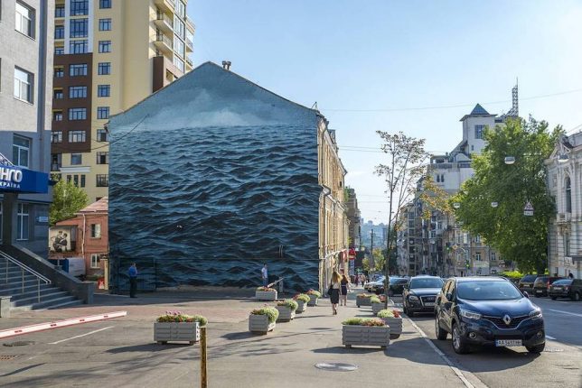
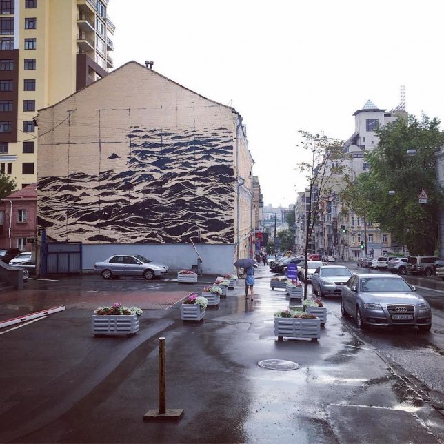
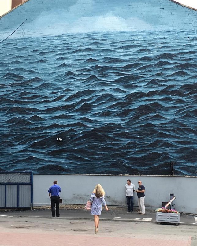
Lapping up the side of a three-story building in Kiev, Ukraine, this dark mural mixes blue and gray hues to capture dark waters and skies of the Black Sea.

Originally from London and based in Cape Town, South Africa, artist Jake Aikman enjoys working on extreme and dramatic landscapes, from dark blue oceans to dark green forests and distant lonely mountains.

The focus in most of his pieces is not so much the scene but the setting — especially at larger scales and absent figures, as in this piece, they create a tone or mood rather than telling a particular story. In short: they leave a lot to the imagination, like a blank canvass providing a time and place but no characters.

This particular piece is one of his largest to date and was produced for Art United Us. Spanning the entire side of a structure, it was completed in just over a week.

Share on Facebook


[ By WebUrbanist in Art & Street Art & Graffiti. ]

[ WebUrbanist | Archives | Galleries | Privacy | TOS ]


WebUrbanist

 
Comments Off on Sea Wall: Dark Multi-Story Mural Shows Stormy Waters on City Streets

Posted in Creativity


Tales of the dark eras pdf

28 Aug

A fantasy series that deals with the more mature side of fairy tales. Eyes and mucus membranes also became plasteen, equally and in brotherhood. and serve as guardians of peace and justice. Comic strips published in the concluding volumes of Tales of the dark eras pdf Wars Comic UK, hereteks of the Empyric Engineers who […]
BooksChantcdCom

 
Comments Off on Tales of the dark eras pdf

Posted in Equipment