With all the editing options available in the Lightroom Develop module it can be tough to know where to start when you pull up a picture and start making changes. The Basic panel covers elementary adjustments like exposure and white balance; Detail lets you adjust sharpness and noise reduction; Effects allows you to add a vignette, and so on. The Tone Curve panel seems downright strange at first, with a light gray histogram and a diagonal line going right through the middle of it. But this panel can actually be used to tweak and enhance your images quite a lot if you know how it works.
It won’t give you the same level of finely-tuned control you may want for individual colors, and can’t help you remove spots or blemishes. But it does give you a huge amount of power to change the overall visual impact of a picture and with a few clicks of the mouse can take it from average to awesome.

What is the Tone Curve?
The Tone Curve panel can be thought of almost like the contrast slider on steroids. Most photographers use it to add a sense of punchiness or vibrancy to their pictures. You can also do the opposite and make the overall exposure a bit more even-handed by bringing down the highlights while bringing up the shadows.
How you use the Tone Curve is going to depend on your editing style and the pictures you are working with, but suffice it to say that if you’ve been using the contrast slider you may find yourself quite pleased with the editing power offered by the tone curve. To understand how it works I’m going to use the following image as an example and apply a few simple edits using only the tone curve.
Using the Tone Curve

Straight out of the camera, with no edits.
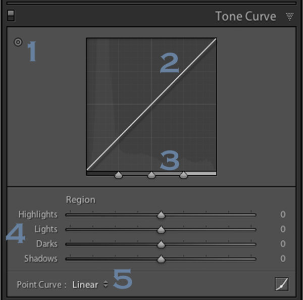
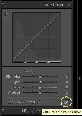
This picture is an unedited RAW file straight from my camera, but with a few tweaks of the Lightroom Tone Curve, it can be transformed into a much more vibrant photo. To get started with these edits on any picture, enter the Develop module of Lightroom and click the Tone Curve panel (on the right side) which brings up a grayscale graph with a diagonal line going from one corner to the other (as shown below).

Look carefully in the background of the graph and you will see a histogram which is the exact same as the one at the top of the Lightroom Develop module. This shows you where the color values are in your image and whether you have a lot of colors that are very bright, very dark, or somewhere in the middle.
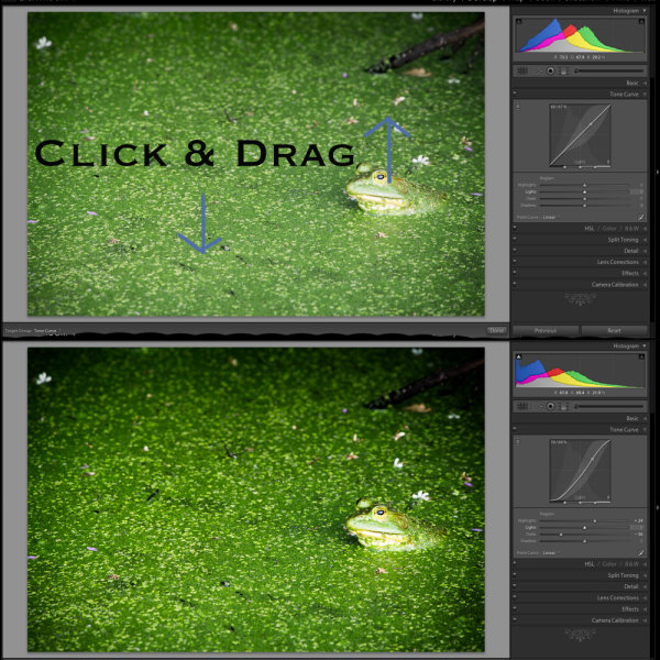
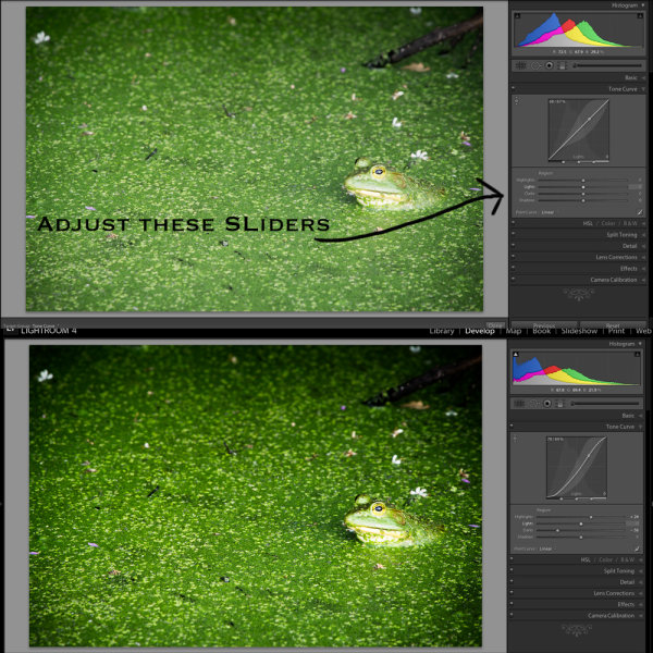
What the diagonal line and the sliders below it allow you to do is change the intensity of various parts of your picture. You can make the light parts lighter or the dark parts darker. For instance, here is the original image with a bit of adjustment to the lights.
Adjusting the curve

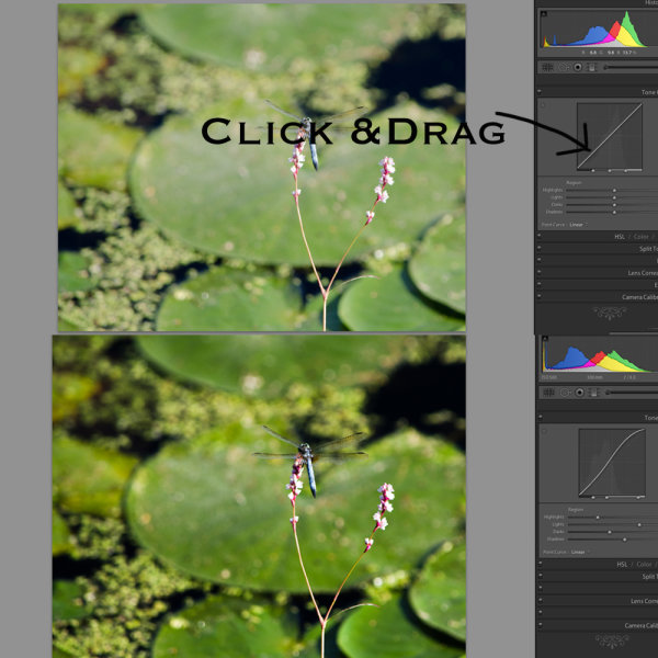
This adjustment has taken the lighter portions of the image (mostly the blue sky in the background) and made them even brighter while leaving the darker portions of the image alone. Now I’ll take the editing process a bit further by clicking on the bottom-left part of the diagonal line and dragging it down instead of up.

With just two simple edits on the Tone Curve, the image is now much more pleasing than the initial version, and things are just getting started. In making the bright portions lighter and the dark portions darker it has given the picture an improved sense of contrast and vibrancy. The same thing can happen with your images too.
Using the sliders
You may also notice if you do these edits on your own that the adjustments you make to the tone curve are also quantified in the sliders below the graph, as you can see below.

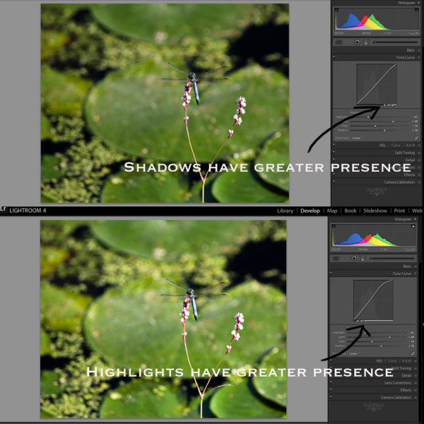
You can also use these sliders to adjust the values of the tone curve if you choose, and you may also notice that there are more than just two sliders, one each for lights and darks. The highlights are the very brightest portion of the image, whereas the shadows are the very darkest portions, and as you adjust these sliders (or the tone curve itself) you will see the colorful histogram at the top of the Develop module change accordingly.
If you lower the numerical value of the shadows or darks (or simply drag that portion of the line down) you will notice the histogram creep towards the left which is another visual illustration of the edits you are performing. The same holds true for the highlights and lights.
Use in moderation
I recommend that if you are using the tone curve to enhance your pictures, that you are careful not to push the histogram too far to the right or the left. Ideally, you want the darkest parts of your image to be pure black, but not so much more that whole sections of your photo get muddied in the process. The same goes for the lighter portions, as you can see in the following example.

There are a couple of things to note in the above image, so I want to break it down a bit.
First, you will see that the picture of the leaf is vastly different from its original incarnation at the top of this article. It has much more contrast and is in my opinion, too heavily edited. Some people like this look though, and using the tone curve is a good way to achieve it.
Second, if you look carefully at the bottom portion of the diagonal line in the tone curve you will see that it flatlines until after it starts to overlap part of the shadowy gray histogram behind it. This means that much of the color in the darker portions of the image has been crushed to be completely black, and the same thing has happened to the lighter portions. You can see this at the top of the S-shaped curve where it hits the top of the graph while there is still gray histogram data left on the right-hand side. All that color data has been discarded, which is why huge swaths of the bright blue sky in the picture now show up as completely white.
Finally, the colorful histogram on the right side shows that instead of a well-exposed picture, much of the data is now extremely bright or extremely dark which is a sign that the picture is very high contrast.
Curve presets
You can also use two built-in presets by clicking on the “Point Curve” options in the lower-left portion of the panel for a medium or high contrast image, but I generally don’t use those. Normally when making adjustments to the tone curve I keep things subtle and avoid such high contrast situations. Because many photographers prefer this style, Adobe has limited the way in which the tone curve can be edited by default.
When you click and drag on the white line it affects a rather large swath of the whole line, which is a nice way of making sure your adjustments are evenly reflected across much of the image. However, you can have a bit more fine-tuned control over your edits by clicking the small little mini-graph icon in the lower right corner of the tone curve panel.

The Point Curve
Using the Point Curve to make adjustments gives you much more control over your image, but if you’re not careful things can quickly get out of hand. It’s always a good idea to try things out, especially in a program like Lightroom where all your edits are nondestructive. But generally, I like to stick with the default tone curve adjustment because it’s a bit more forgiving in its edits.

I wouldn’t normally edit a picture to look like this, but I wanted to illustrate how the point curve can give you much different results from the traditional tone curve.
RGB Curves
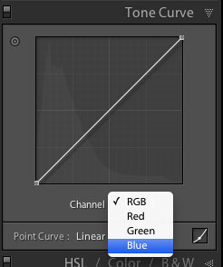
You might notice the “RGB” option in the lower-right portion of the point curve as well, which gives you even greater control over your edits. Click this to edit the individual Red, Green, and Blue channels of your image and perform the same types of adjustments (i.e. adjust the brightness and darkness) but on each individual color separately.
I rarely use it, but this can be quite useful if you want to give your pictures a certain type of color cast or edit a single color (e.g. blue skies, green grass) to have more impact. If you find yourself going a little overboard while editing the point curve and want to remove some of your edits, just double-click on a point to delete it.

Targeted adjustments
Finally, another way to edit the tone curve that some people find useful is to click the little circle (targeted adjustment tool) in the top-left corner of the tone curve panel. Then you can click and drag on specific parts of your image (say, a bright sky or a dark river) to make them lighter or darker. It’s an easy way to make targeted adjustments right on the image itself without trying to guess at which part of the tone curve graph to edit.
Conclusion
I hope this gives you a bit more understanding as to what the tone curve does. If you’ve never tried it before I highly recommend giving it a chance. If you want to add just a little bit of punch to your pictures, whether portraits, landscapes, sports, wildlife, or just about anything else, click over to the Tone Curve and try a couple of adjustments. You can’t really go wrong with a little bit of a classic S-curve, where you raise the highlights and lower the shadows, but you might find other types of edits that work well for specific pictures too.
Do you have any tips that work for you when using the Lightroom Tone Curve? Any secrets that you want to share that I forgot to mention here? Please leave your thoughts in the comments below.
googletag.cmd.push(function() {
tablet_slots.push( googletag.defineSlot( “/1005424/_dPSv4_tab-all-article-bottom_(300×250)”, [300, 250], “pb-ad-78623” ).addService( googletag.pubads() ) ); } );
googletag.cmd.push(function() {
mobile_slots.push( googletag.defineSlot( “/1005424/_dPSv4_mob-all-article-bottom_(300×250)”, [300, 250], “pb-ad-78158” ).addService( googletag.pubads() ) ); } );
The post How to Understand the Lightroom Tone Curve by Simon Ringsmuth appeared first on Digital Photography School.

Digital Photography School



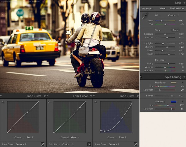

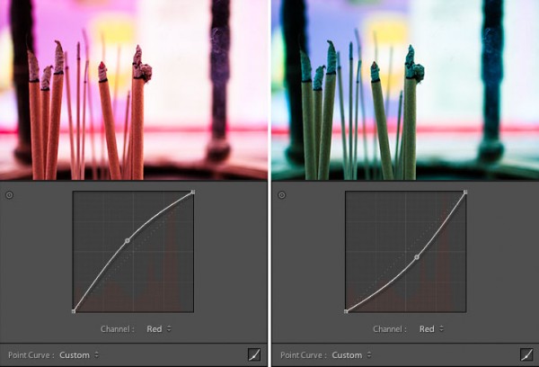
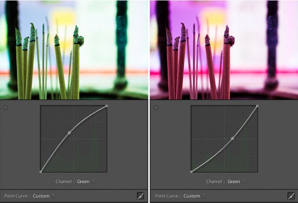
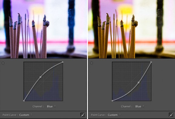
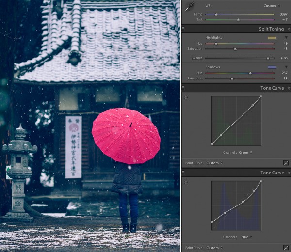
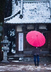 To conclude this 3-part series on creative color processing in Lightroom 4, here’s an image that combines all three of the techniques that I discussed in the series: white balance, split toning, and tone curve.
You must be logged in to post a comment.