RSS
 

Posts Tagged ‘Crazy’

Crazy 8: Panasonic Lumix DMC-GX8 sample gallery

24 Aug

The Panasonic Lumix DMC-GX8 is the follow-up to the company’s successful GX7 rangefinder-style mirrorless camera. The GX8 boasts a new 20MP Four Thirds sensor and ‘Dual IS’, which combines sensor and lens shift image stabilization for better results. The camera’s ISO range tops out at 25,600 and offers a max burst rate of 8 fps with single AF and 6 fps with continuous AF. We’ve been shooting with one for a little while – check out our gallery of samples!

Articles: Digital Photography Review (dpreview.com)

 
Comments Off on Crazy 8: Panasonic Lumix DMC-GX8 sample gallery

Posted in Uncategorized


7 Reasons Why You’d be Crazy Not to use Lightroom Presets

11 Aug

Today, in this digital age, your job isn’t done once you’ve taken the photos, you’re really only halfway there. You need to edit your photos. Luckily, using Adobe Lightroom, combined with some really high-quality presets, you can instantly start getting amazing results, rather than spin your wheels being frustrated trying to edit your photos.

But first – what is a Lightroom preset?

DPS Presets Article Cover Photo

A Lightroom preset is simply a collection of photo edit settings inside of Lightroom that are bundled into a single click allowing you to edit photos far more efficiently than you would otherwise by repeating those same settings and editing steps one by one.

Here are 7 reasons why you’d be crazy not to use Lightroom presets:

Save Time

When using Lightroom presets, with only one click you’ll be able to instantly get your photos to an 85-90% edited state, and sometimes you’ll even be completely done with one click! Rather than edit each photo from start to finish, you can spend your time on the fine-tuning part of the editing process.

Simple to Use

Learning any new software can be intimidating, and take time to master. While it’s certainly important to always take strides at truly learning the program, using presets will let you instantly get started in Lightroom, and edit your photos simpler than ever before.

LR Preset Screenshot what and why presets

Variety

Does the photo look best in black and white or a sepia edit? Or maybe a vibrant color edit or a subdued vintage look? Using Lightroom presets will give you a ton of creative variety right at your fingertips so you can effectively try different edits and see which style is most fitting for a particular photo, or even full photo session. Quick tip – when you hover over a different preset, Lightroom will show you a preview of how that photo will look with that preset applied (in the Navigator box, at the top of the left panel in the Develop Module, see screenshot above).
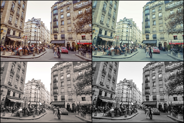
Digital Photography School Lightroom Presets 0001 Variety

Consistency

When you are editing an entire photo session, using the same presets across the whole photo shoot will give your images a more uniform and consistent look, as opposed to editing each and every photo one-by-one, which can yield varying settings and a disjointed look to your image set.

Completely Customizable

Have a preset you love, but you always have to slightly adjust the color or contrast? Or maybe your very own style has changed over time? No problem at all. Any develop preset you use inside Lightroom is completely customizable and it’s as easy as a couple mouse clicks.
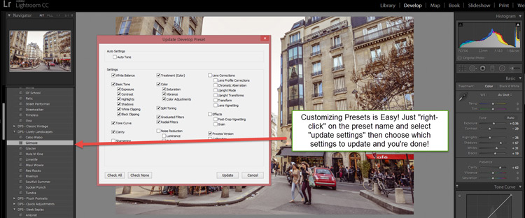
DPS Customize Presets 750

Lightroom versus Photoshop

Presets work inside Lightroom and actions work inside Photoshop. Both programs have their place in a professional photographer’s editing workflow. However, Lightroom is the primary editing software of choice for both professionals and hobbyists alike. Not only is it far easier to use and learn compared to Photoshop, but within Lightroom all of your edits are non-destructive. That means that your original unedited photo is always stored in Lightroom so you can experiment as much or as little as you want, without ever degrading the quality of your original image.

Presets + Batch Editing = The Winning Combo
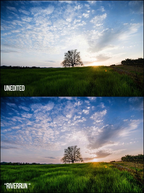
Final Landscape 750

Example from the dPS 101 Lightroom Presets Pack

One of the greatest benefits of using Lightroom is its ability to edit a lot of photos very quickly by batch editing, or syncing, your settings from one photo to many at once. When you combine high-quality presets with batch editing in Lightroom you will be able to drastically cut down your complete photo editing time per session.

Now that you have a better understanding of how using Lightroom presets can dramatically reduce the amount of time you spend editing your photos, while getting you better results and increasing your creativity – it’s time to grab some presets for you to use inside of Lightroom.

Introducing the dPS 101 Lightroom Presets Pack

You can scour the web to research and find different Lightroom presets, you can choose to create your own, or you can make your life really easy and purchase the official Digital Photography School – 101 Lightroom Presets Pack that I’ve created.
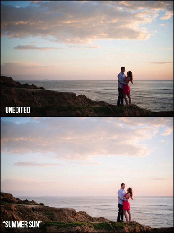
Final Portraits 750

Example using the Summer Sun preset from the dPS 101 Lightroom Presets Pack

This ultimate preset bundle includes seven different themes, so you can easily find and use a preset that is the most fitting for your specific photo, without having to waste any time. You’ll find presets dedicated for portraits, stunning black and white & sepia presets, presets for landscape photography, street photography, vintage presets and much more.

It doesn’t matter if you are a beginner or professional, you’ll love these presets and the amazing results you’ll get from them. Click here to learn more and save big by getting them during this limited time introductory special promotion price.
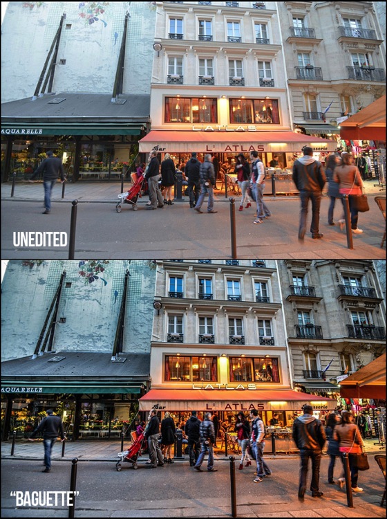
Final Street 750

Example from the dPS 101 Lightroom Presets Pack

presets_coverdPS 101 Lightroom Presets Pack

Cole’s handcrafted a brand new set of presets, exclusive to dPS.

  • Instant Digital Download
  • Guaranteed for 2 full months
  • Pay by PayPal or Credit Card

For a limited time only get them at the introductory price of $ 20.


googletag.cmd.push(function() {
tablet_slots.push( googletag.defineSlot( “/1005424/_dPSv4_tab-all-article-bottom_(300×250)”, [300, 250], “pb-ad-78623” ).addService( googletag.pubads() ) ); } );

googletag.cmd.push(function() {
mobile_slots.push( googletag.defineSlot( “/1005424/_dPSv4_mob-all-article-bottom_(300×250)”, [300, 250], “pb-ad-78158” ).addService( googletag.pubads() ) ); } );

The post 7 Reasons Why You’d be Crazy Not to use Lightroom Presets by Cole Joseph appeared first on Digital Photography School.


Digital Photography School

 
Comments Off on 7 Reasons Why You’d be Crazy Not to use Lightroom Presets

Posted in Photography


Flip for This: 12 Crazy and Creative Skate Ramps & Parks

18 May

[ By Steph in Architecture & Cities & Urbanism. ]

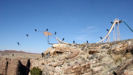
skate ramp grand canyon

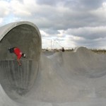
Glide you way through a multi-story dedicated skate park, a glow-in-the-dark bowl, an old subway tunnel under London, a floating ramp on Lake Tahoe or even a ramp that goes right off the edge of the Grand Canyon. These 12 skate parks and ramps, from California to Dubai, offer some of the world’s most amazing places to practice your tricks – places that are legal, anyway.

World’s First Multi-Story Skate Park
skate parks multistory 2

skate parks multistory 1

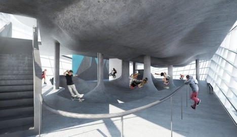
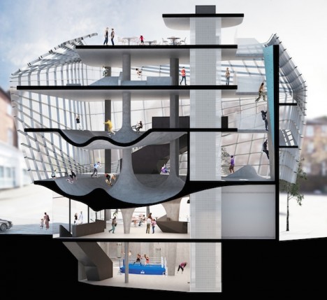
Many a skater has eyeballed the surfaces of a spiraling parking garage and wished they were curvier. Soon, a quiet seaside town in Britain will be home to the world’s first multi-story structure devoted to exactly this activity: the Folkestone Sports Park by architecture firm Guy Holloway. The world’s first facility of its kind, Folkestone will feature three entire floors for skaters as well as a climbing wall, underground boxing ring, cafe, training room, youth room and first aid center.

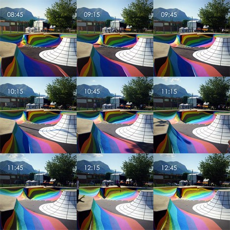
Skate Park Doubles as a Working Sundial
skate park sundial

skate park sundial 2

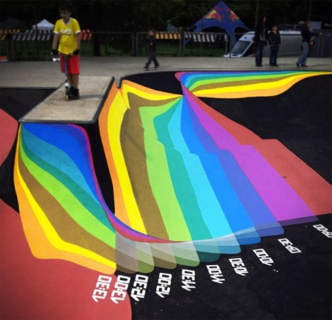
You don’t have to glance at a watch or phone to figure out what time it is when you’re skating at this park in Lugano, Switzerland. Brightly painted markings on the concrete of the bowl will tell you according to the sun and shadows. Designed by Moscow group Zuk Club, this park is one big rainbow-hued sun dial.

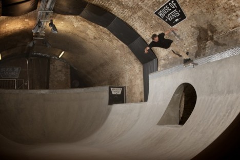
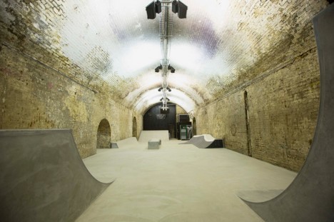
Abandoned Tunnel Turned Subterranean Skate Park
skate park tunnel london

skate park london 2

London’s famous Old Vic Tunnels under the Waterloo Station are home to the city’s first subterranean skate park, a cultural complex taking up 32,000 square feet. House of Vans offers a pool-style bowl, street section and mini ramp as well as a music venue, bar, theater, cafe, artist studios and gallery space.

Sink or Skate: Floating Ramp Design

skate parks floating ramp 2

skate parks floating ramp

This sculptural wooden ramp took up residence right on the surface of sparkling Lake Tahoe as a promo for the California tourism industry. Built by skateboarding pro Bob Burnquist with the assistance of art director Jerry Blohm, the structure features a half pipe, quarter pipe and 45-degree ramp and weighs an amazing 7,300 pounds. Bob had a wet-suited snorkeler waiting in the waters nearby to retrieve his board anytime it went over the edge.

Next Page – Click Below to Read More:
Flip For This 12 Crazy And Creative Skate Ramps Parks

Share on Facebook


[ By Steph in Architecture & Cities & Urbanism. ]

[ WebUrbanist | Archives | Galleries | Privacy | TOS ]


WebUrbanist

 
Comments Off on Flip for This: 12 Crazy and Creative Skate Ramps & Parks

Posted in Creativity


Seaside Stunners: 14 Cliff-Clinging Houses with Crazy Views

22 Jan

[ By Steph in Architecture & Houses & Residential. ]

cliff houses mirage 1

Dangling precariously from cliffs, tumbling down hillsides or jutting out over the water, these beautiful seaside homes feature mirage-like rooftop infinity pools, diving boards that lead nowhere, terrifying drop-offs and terraces that seem to float.

Mirage House with Rooftop Infinity Pool

cliff houses mirage 2

cliff houses mirage 3

The glimmer of water on the rooftop of this incredible home on Greece’s Tinos Island seems like a mirage at first, encompassing the entirety of a flat, rectangular surface. Come closer and you’ll see that it’s not a mirage at all – it’s an infinity pool on the cantilevered rooftop of a modern home by Kois Associated Architects. The home was designed to blend into the Aegean Sea so as to be virtually undetectable, with the visible parts of the front of the home mimicking the surrounding stone.

Dangling Modular Cliff House

cliff house extreme 2

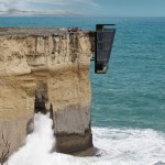
All that can be seen of this five-level modular home from ground level is the very top portion. The rest dangles in rather terrifying fashion over the roiling water, producing an effect that’s worthy of a Bond villain. Cliff House by Modscape Concept makes use of a challenging plot of land on a rocky portion of the southwest coast of Victoria in Australia. Each floor has glass walls for maximum views, and the whole thing is anchored to the cliff with engineered steel pins.

Actually Affordable Elevated Ocean Views

cliff houses mackay 1

cliff houses mackay 2

It’s rare that elevated homes with stunning views of the sea are actually affordable, but Canadian firm Mackay-Lyons Sweetapple Architects has created a modest timber box that juts out over a bedrock cliff to make it seem as if it’s floating. Clad in wood to blend into the environment, the 960-square-foot cabin has a galvanized steel frame skeleton and diagonal planks supported by joists to eliminate the need for interior cladding.

Retrofuturistic Mushroom House

cliff houses mushroom 1

cliff houses mushroom 2

Sam Bell’s retrofuturistic Mushroom House is tucked away next to the Pacific Ocean in the cliffs of San Diego, its round design offering panoramic views, a concrete sea wall and elevated living area keeping it from being inundated by the waves. And if you’re wondering just how the owners even access it, there’s an elevator stretching up the cliff face to a larger home above.

Dizzying Drop-Off House Design

cliff houses drop off 1drop off house

What looks like a diving board jutting out of the end of this concrete house in Japan by KA Architects leads nowhere but a cascading rocky cliff, so you probably don’t want to actually jump. The all-white home is all about sharp lines and stark contrast, with no transition between the street and the outdoor room that can be seen on the top level.

Next Page – Click Below to Read More:
Seaside Stunners 14 Cliff Clinging Houses With Crazy Views

Share on Facebook


[ By Steph in Architecture & Houses & Residential. ]

[ WebUrbanist | Archives | Galleries | Privacy | TOS ]


WebUrbanist

 
Comments Off on Seaside Stunners: 14 Cliff-Clinging Houses with Crazy Views

Posted in Creativity


Suntory Time: Crazy CNC-Milled Ice Cubes for Whisky Brand

01 May

[ By Steph in Art & Sculpture & Craft. ]

CNC Milled Ice Suntory 1

It’s Suntory time – on the incredibly intricate, CNC-milled, pagoda-shaped rocks.  The Japanese whisky brand famously touted by Bill Murray in the film ‘Lost in Translation’ has enlisted the services of a 5-axis CNC mill to craft miniature works of art in ice, including replicas of the Statue of Liberty and Michelangelo’s David.

CNC Milled Ice Suntory 4

The centerpiece of Suntory’s “3D Rocks” campaign is a teeny-tiny, amazingly detailed version of Kyoto’s Kinkaku-ji temple. Watch it in progress in the video above.

CNC Milled Ice Suntory 2

Suntory customers were asked to submit their own designs, and the winners were whisked to a secret location in Tokyo where they received a drink featuring their own creation in ice once it was complete.

CNC Milled Ice Suntory 3

The CNC router was kept chilled to a temperature of -7 degrees Celsius to keep the ice from melting while the machine was running.

CNC Milled Ice Suntory 5

It’s almost a shame to see the whisky splashing over these ephemeral works of art, knowing that they’re inevitably about to melt away.

Share on Facebook


[ By Steph in Art & Sculpture & Craft. ]

[ WebUrbanist | Archives | Galleries | Privacy | TOS ]


WebUrbanist

 
Comments Off on Suntory Time: Crazy CNC-Milled Ice Cubes for Whisky Brand

Posted in Creativity


Origami Microscope: Fifty-Cent Design is Crazy Durable

08 Apr

[ By Steph in Gadgets & Geekery & Technology. ]

Origami Microscope 1

Not only is this a microscope made of paper, costing a total of fifty cents to produce, it can stand up to being thrown, stomped on and dunked in water. And it comes in a flat-pack of yardstick that takes just a few minutes to assemble. Foldscope by Manu Prakash has the potential to transform the way disease is identified and diagnosed in developing parts of the world.

Origami Microscope 3

Demonstrated in a 2012 TED talk, the Foldscope is about the size of a bookmark and based on the principles of origami. It has no mechanical moving parts and it’s cheap enough to disseminate for free and incinerate after use to safely dispose of infectious biological samples.

Origami Microscope 2

It might not seem like a lens this tiny would be powerful enough to identify samples of microbes like Giardia or malaria, but the unique optical physics of a spherical lens held close to the eye can magnify samples up to 2,000 times. The lens is about the size of a poppy seed and costs about 17 cents. It can be press-fit into a small hole in the center of the slide-mounting platform on the paper microscope body.

Origami Microscope 4

More sophisticated version have multiple lenses or even combinations of colored LED lights powered by a watch battery. Other additions include the capability to project images on the wall of a dark room. Prakash plans to give away 10,000 of the DIY origami microscopes to citizen scientists with the most inspiring ideas for their use. Prospective users can apply for a Foldscope kit by emailing Signup@foldscope.com.


Share on Facebook


[ By Steph in Gadgets & Geekery & Technology. ]

[ WebUrbanist | Archives | Galleries | Privacy | TOS ]


WebUrbanist

 
Comments Off on Origami Microscope: Fifty-Cent Design is Crazy Durable

Posted in Creativity


Making Your Stock Photography Sell Like Crazy

24 Oct

Photographers get into stock photography in order to sell their pictures and make a respectable amount of extra money. Unfortunately, this is easier said than done since so many things can get in the way. For many photographers, their experimentations with stock photography simply amount to a waste of time and effort, which is unproductive. However, setting up and editing Continue Reading

The post Making Your Stock Photography Sell Like Crazy appeared first on Photodoto.


Photodoto

 
Comments Off on Making Your Stock Photography Sell Like Crazy

Posted in Photography


School’s Out Forever: 12 Crazy DIY Converted Bus Homes

21 Oct

[ By Steph in Architecture & Houses & Residential. ]

Converted Buses Main

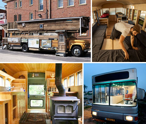
Flimsy, factory-made RVs have nothing on these totally customized, cozy buses converted into compact rolling homes. Dusty, run-down clunkers of school buses and city buses may not look like much at first, but creative DIYers transform them into comfortable living spaces complete with wood floors, transforming furniture, wood stoves and full bathrooms with hot showers.

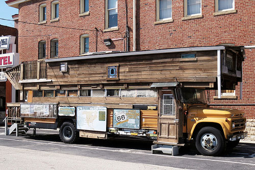
Waldmire Road Yacht

Converted Buses Road Yacht

This amazing half-wooden contraption is a converted school bus known as the ‘Waldmire Road Yacht,’ built by Rob Waldmire, who traveled in his handcrafted creation for decades along Route 66. It’s now part of the Route 66 Hall of Fame Museum in Pontiac, Illinois.

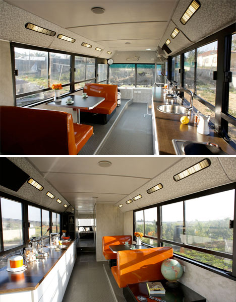
Run-Down City Bus Converted to DIY RV

Converted Buses City Israel 1

Converted Buses City Israel 2

This city bus seemed beyond saving when two Israeli women initially found it, but they saw the bones of their own highly customized DIY RV. The women tore out the interior and gave it a fresh, modern new look with pops of bright color.

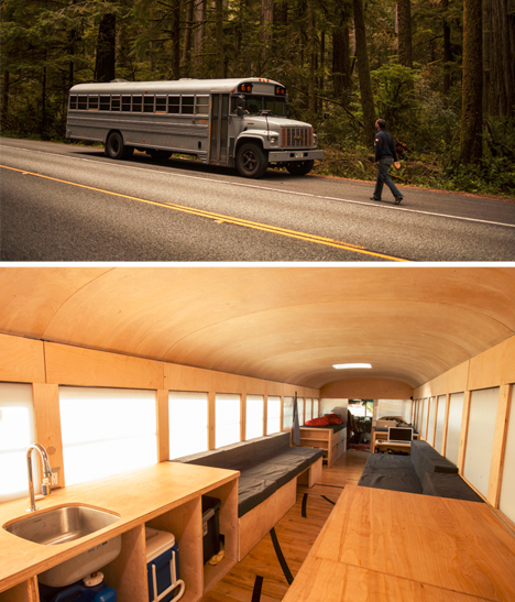
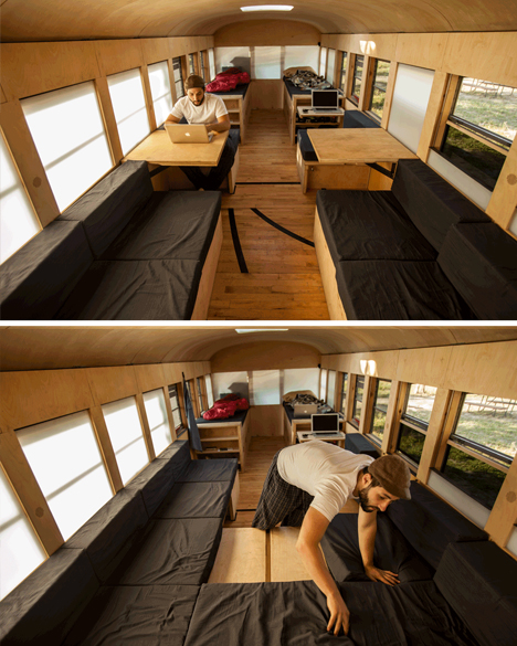
Bus to Minimal Mobile Home

Converted-Buses-Minimal-Mobile

Converted Buses Minimal Mobile 2

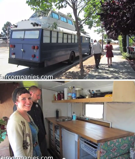
Tired of just drafting imaginary buildings in studio courses, architecture student Hank Butitta decided to get his hands dirty: he bought a bus for $ 3,000 and completely transformed the interior, spending $ 6,000 to improve it with an array of transforming modular features. Those include a bed system that unfolds in various ways for different sleeping configurations, lots of hidden storage, and seats withs egret flip-up and slide-out panels.

School Bus Turned Home That Sleeps Ten

Converted Buses Solar Power Ten

‘I think my mom’s reaction was, ‘this isn’t the sixties,’” says co-owner Rachel of the bus she converted with her partner Richard. It may not be conventional, but this living situation allows them to go wherever they please. Buying a school bus cheap gave them a blank canvas, and they designed every detail of their new home – which has transforming beds to sleep up to ten.

Next Page:
Schools Out Forever 12 Crazy Converted Diy Mobile Homes

Share on Facebook


[ By Steph in Architecture & Houses & Residential. ]

[ WebUrbanist | Archives | Galleries | Privacy | TOS ]


WebUrbanist

 
Comments Off on School’s Out Forever: 12 Crazy DIY Converted Bus Homes

Posted in Creativity


Wild Water Crossings: 14 Bold & Crazy Bridge Concepts

14 Oct

[ By Steph in Architecture & Public & Institutional. ]

Concept Bridge Designs Main

Even ordinary bridges are complex structures, but add in multiple levels,  undulating ribbons of steel, elements that dip into the water or roads that split into scissor-like blades and you’ve got quite a dynamic feat of engineering. Some of those potential feats are a little more achievable than others. These 14 (more!) bridge concepts include a few innovative designs that are actually going to be built, while others have been deemed ‘too crazy’ to ever be real.

Entwined Ribbon Bridge for China

Concept Bridge Designs Ribbon China

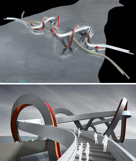
The competition this concept was shortlisted for has been canceled, so it may never be achieved in physical form. Denton Corker Marshall architects designed this bridge for Jinsha Lake in Hangzhou, with one ribbon offering a flat surface for cyclists, one rising into the air to offer various views, and a third decorative ribbon winding between the first two.

Tulip Bridge for Amsterdam

Bridge Concept Designs Tulip

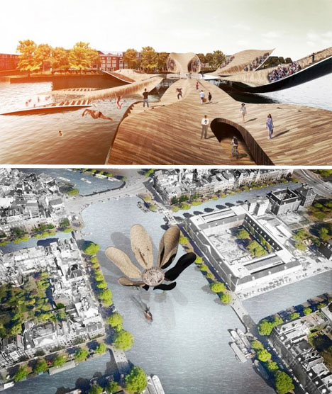
The ‘petals’ of this wooden bridge blossom and unfold in various configurations throughout the day, variously allowing pedestrians to cross the water or, if they so desire, jump in. Designed by MLBS Architects, the Tulip Bridge functions as a symbolic landmark for Amsterdam. When all of its petals are flat, it makes up a large plaza with plenty of room for the flow of pedestrians, but when all of the petals are raised (except for one that allows entry) it can turn into an exhibition space.

Bay Bridge Tourist Park

Concept Bridge Designs Bay 1

Concept Bridge Designs Bay 2

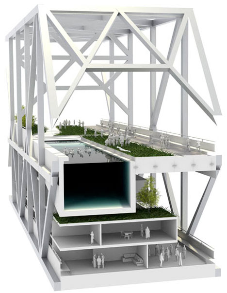
The September 2nd, 2013 opening of the new East Span of the San Francisco-Oakland Bay Bridge made the old one obsolete: so what to do with it? Some have called for it to be broken up and made into housing, others want to see it converted into a public park. Architects Rael San Fratello have a few tongue-in-cheek designs taking these ideas into consideration. How about bike paths, combing walls, outdoor cinemas, hotel rooms and a giant swimming pool? Together, these ideas may be a little over the top, but they present a few intriguing possibilities.

Habitable Bridge for Seville, Spain

Concept Bridge Designs Habitable Seville 1

Concept Bridge Designs Habitable Seville 2

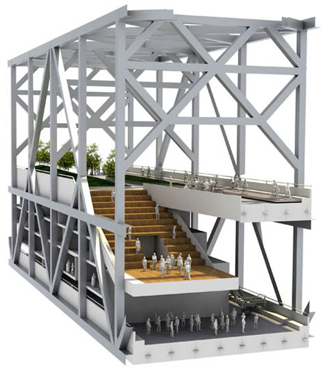
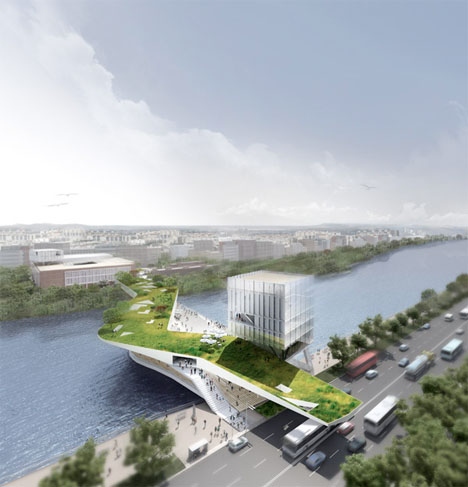
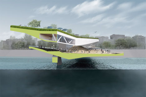
A sinuous bridge mimicking the waves of the river below it could act as a cultural center of Seville, Spain. This concept incorporates two layers – a sunny, grassy surface on top, and a shaded area with stepped seating closer to the water. The proposal also incorporates an existing tobacco factory, renovating it into an auditorium with a ground level piazza.

Parametric Cloud Bridge

Concept Bridge Design Parametric Cloud 1

This design doesn’t exactly conform to the general idea of what a bridge is, and should be. Unusual and unexpected, ‘Cloudbridge’ by Arturo Tedeschi architects creates a non-linear path between two points. The shape was determined by an algorithm that produces a cloud-shaped grid balancing the asymmetric loads of the footbridge.

Next Page:
Wild Water Crossings 14 Innovative Bridge Concepts

Share on Facebook


[ By Steph in Architecture & Public & Institutional. ]

[ WebUrbanist | Archives | Galleries | Privacy | TOS ]


WebUrbanist

 
Comments Off on Wild Water Crossings: 14 Bold & Crazy Bridge Concepts

Posted in Creativity


Crazy Cakes: 30-Foot Tentacle Leads to Edible Kraken

17 Sep

[ By Steph in Design & Guerilla Ads & Marketing. ]

Kraken Tentacle Cake 1
The thirty-foot tentacle that appeared to have washed up on the beach in Portmeirion, Wales was what drew the onlookers in, but it was the edible kraken that kept them. Beach goers who gathered around the dark purple-black appendage to stare at it in wonder were led to a tent where they found similar tentacles on a smaller scale – made of cake.

Kraken Tentacle Cake 2

A ‘Kraken Hunter’ in an intricate steampunkish costume performed an ‘edible autopsy’ on the questionable remains within the tent, serving up large chunks of what turned out to be spiced rum cake, including a football-sized eyeball.

Kraken Tentacle Cake 3

Kraken Tentacle Cake 5

The beach installation was part of a viral marketing campaign by Kraken Rum at Festival No. 6, an annual music event that draws thousands to an Italianate village on the Dwyryd Estuary.

Kraken Tentacle Cake 6

The cake calls to mind another incredibly realistic culinary creation: a snake cake that looks so much like a real viper, you’d hesitate to go near it with a knife.

Share on Facebook


[ By Steph in Design & Guerilla Ads & Marketing. ]

[ WebUrbanist | Archives | Galleries | Privacy | TOS ]


WebUrbanist

 
Comments Off on Crazy Cakes: 30-Foot Tentacle Leads to Edible Kraken

Posted in Creativity