In an earlier article (The Future of Photography Websites – Understanding and Adapting to Trends) on this topic, you can read about a couple of major trends in the web-design industry (as they relate to photo websites). Here’s a quick review:
- The huge number of new websites being built and ways to rise above the noise including: Choosing a photography niche (specializing); Differentiating yourself as a photographer; Using quality platforms and website templates; Simplifying and prioritizing elements on your site; Understanding and focusing on your target audience.
- New website performance standards and their effect on browsing habits: Why and how to make your website faster; Editing down your content and creating a smooth browsing experience; Having clear website navigation.
Now we’re going to continue exploring many other important aspects you should take into consideration when building your photography website (whether it’s an online portfolio, a stock website, or centred around a photo blog). All combined, these notes should give you a more clear picture of how to build your photography website and steer towards a more successful photo business.
3. Mobile devices are omnipresent and powerful
This is fairly obvious to see in the world around us, but what implications does it have on photography websites?
a. The old adage: stop using flash on your site
No need for me to dwell on this, but it’s hard to write an article on photography websites without mentioning Flash, and with good reason. I hope you’re in the position to skip this paragraph, but if you’re still using Flash, continue reading and consider making some changes soon.
Besides the well-known SEO limitations, Flash websites are slower, not compatible with Apple devices, harder to update, and can be almost entirely replaced today using modern HTML5, CSS3 and Javascript components (and surely surpassed in many aspects).
b. Make your website mobile-friendly (responsive)
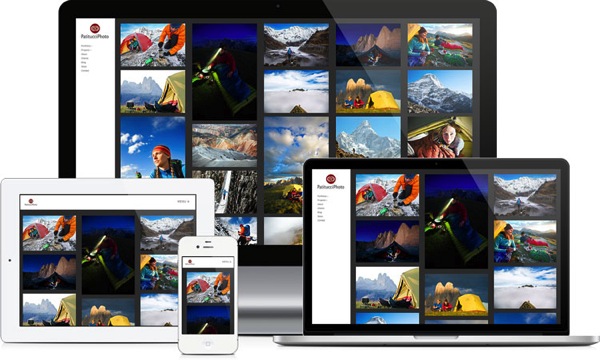
Many photographers are reporting that almost half of their website traffic comes from mobile users (smartphones and tablets), and we can expect this number to rise further.
So you can no longer afford not to have a mobile-friendly website. Google confirmed this by announcing they will now penalize non mobile-friendly sites. While this is just one of the many factors Google uses to rank websites, it’s a strong signal to take note of this issue.
This is especially important for photography websites where users interact with the site more (using slideshows, doing searches, buying images etc.) Slideshows and static images (along with the entire layout, of course) should automatically resize and adapt to any screen size.

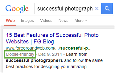
To emphasize the importance of a mobile-friendly browsing experience, Google provides a free testing tool for your site and rewards responsive websites in mobile search results:

c. Once again, make your website fast
You can read about website performance in the first article, however, it’s worth mentioning here again. The load times of a website are even more important to mobile users (with mobile networks being somewhat slower and less reliable than home broadband connections).
4. Content-consumption rates are increasing (a lot)
Not only are more users coming online (and using more devices than ever before), but they’re also consuming a lot more content. This should come as no surprise, and it’s worth considering for its web-design implications. Since users want more content, here are some ways to help them out:
a. Make your site easily shareable
That means leveraging social media buttons on your website (even when you don’t have your own profiles on those specific social media sites), making it easy for people to recommend your images and pages.

Don’t neglect tweaking your site to display pretty permalinks: a page URL like this www.johndoe.com/?p=789 is much uglier than something like www.johndoe.com/gallery/great-description-here/. Besides the SEO implications, pretty permalinks are also important for people sharing your content: if a URL is more inviting, it will naturally get more shares and visits.
b. Keep the content fresh

While everybody knows that blogs should frequently be updated, you need to refresh the rest of your website once in a while too.
- Make sure your contact information is up to date.
- Have some featured galleries on the homepage? Change or rotate them from time to time.
- Have a slideshow? Rearrange some of its images, or add new ones. Returning visitors will notice that.
- Recently worked on a project or received an award? Make sure it’s there on your site.
- Consider keeping a Recently Updated gallery or section on your site’s homepage, depending on your layout.
- Schedule and do such a site review regularly.
You’re not making a good impression if your site is becoming stale after months of inactivity, and let’s not even talk about Google (who values fresh content as much as users do).
c. Consider offering an email newsletter
Email marketing is becoming huge these days. While everybody hates inbox clutter, getting unique and valuable content via email is always good. This is especially important if you have a photography blog. Sure, people can come to your site to check for new content (or subscribe to an RSS feed), but sending them content directly via email can be very effective.

The people who subscribe to your mailing list are already targeted; they’re interested in your content to start with,
and want to see more of it. You can look into tools like MailChimp (free for up to 2000 subscribers) and follow their best practices for creating, and managing your mailing list.
5. People are searching more, not just exploring
Remember we mentioned impatience. With things happening so fast online, people expect to be able to search for content if they can’t find what they’re looking for in a few clicks. It comes down (again) to how you organize your site structure (and having clear site navigation), but it’s also about providing metadata and search options where appropriate:
a. Don’t ignore text content
Okay, you have a photography site, so it’s supposed to be image-heavy and visually impressive. The homepage is sometimes a good place to do that, but throughout the site, you need to also have quality text content to provide context.

We’re not even attacking this point from an SEO perspective. It’s important to your users that you describe every piece of content you have:
- What are these images about? (IPTC captions and keywords displayed on the page).
- What is this entire gallery about? (Gallery descriptions).
- What is this page about? (On-page intro paragraphs, SEO titles and meta descriptions to help users when seeing search results).
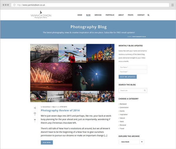
- What is this blog post about? (Text inside blog posts too, not just one image per post).
- What is this entire site about? (Titles and descriptions once again, text on the About page, text on other pages describing your work/services).
b. Allow (and track) image searches on your site
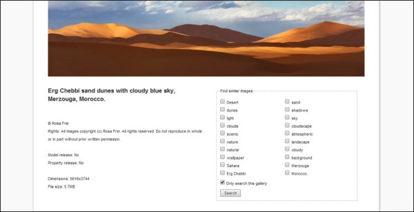
Once again, this comes down to properly captioning and keywording your images, along with having an easy-to-find search functionality. This entire process is time-consuming, for sure, but you’ll reap the benefits in the long run. How you add all this searchable image IPTC metadata is also important and shouldn’t be taken lightly. Nobody will do a search on your site for “DSC0023”, so you need to provide real value to users that need to search, by describing your images for:
- Abstract meanings.
- Scientific names where appropriate.
- Actual persons/locations/objects depicted in them< ./li>
- More creative captions describing your process, experience, gear, etc.

You can obviously write unlimited keywords for your images (sometimes overdoing it with all the possible synonyms), but it’s usually recommended to go for 10-20 keywords per image depending on the type of photography you do.
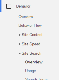
Once images are on your site and people are searching for them, be sure to also track those searches in Google Analytics to learn more about popular search queries (informing you about content demands). There are exceptions to this: simple portfolio websites (with just a small selection of best-of images) don’t really need a search functionality. For larger stock archives or anybody selling prints/licenses though, it’s a must.
If you have a popular blog on your site, a blog search option also comes in handy. Just make sure it doesn’t get into a fight for attention with the image search box – they need to be clearly separated. Choose whichever is most important to make prominent (like having an image search box in the header throughout the site, and a discreet blog search option in the blog sidebar only).
6. Search engines are looking at user satisfaction as a huge ranking factor
There’s obviously a huge buzz around SEO and how to rank higher for certain keywords. Google is always one step ahead, continually changing their algorithms to prevent any dishonest or spammy tactics. How do they do that? They constantly figure out how people make browsing choices, and turn those into ranking factors.
When writing SEO titles and meta descriptions, think about how they would look in search results, how to best encourage users to give you their clicks. Don’t just stuff them with keywords for Google’s sake.

For every main page on your website, ask yourself:
- What do people come to this page for?
- Can users quickly find the information they’re after?
- What would you want to see on this page if you came here for the first time?
- Where should visitors go to after viewing this page?
- What elements on the page are probably not useful to people?
This change in mindset is the one thing that can set you apart and differentiate your photo website. Sure, there are many SEO-specific actions you need to take care of, but you should always go above and beyond in providing value to people. Do that, and it will be impossible not to rank well in search engines.
7. Social media websites come and go
You probably can no longer build a successful business without some sort of social media presence. But you would be taking too many risks to only setup camp there, without building your own website. Social media companies can always get sold or shut down (acquisitions, natural life cycles, new competitors etc.), so you don’t really own your profiles there.
Whereas a website is an asset you can control, that you have copyright over. You’re interested in buying instead of just renting online real-estate. Social media sites are excellent marketing hubs, and they’ll always be there to drive business forward in one shape or another. But building your strong personal website should be the core of your focus.
With this in mind, it’s obviously important to leverage all the social media tools you have (by placing profile links and sharing buttons on your site). Use them as much as you want, just don’t rely solely on them, it’s more important to build your own online presence.
8. Web platforms and tools are maturing, and eCommerce is exploding
A lot of photographers these days are looking for hybrid solutions instead of having multiple separate sites. They want a place where they can blog, and showcase and sell their photos if they want. So it makes sense that some platforms are starting to offer that, and the days of having separate portfolio and blog sites are coming to an end.
Current established companies (like PhotoShelter or SmugMug) are getting strong competition from WordPress plugins like NextGen Gallery (with its Pro version) or WooCommerce (with its new Photography extension).

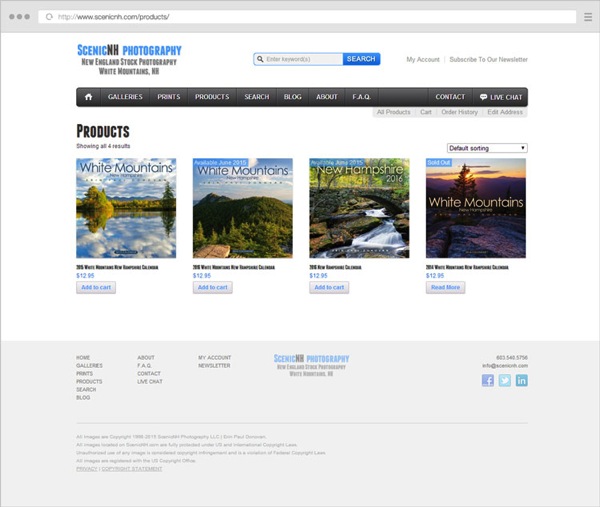
If you want to start selling prints/products, now is a good time. Since online sales keep growing, it’s natural to see many photographers shift (at least partially) from services to products, basically trying to build a passive income from their photography business. They do that through books, prints, courses, workshops, etc.
9. Design aesthetics are changing
Change is the only constant. I won’t recommend you use any particular flat design elements, any colors or layouts because those are just like fashion trends. They come and go.
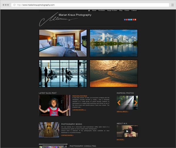
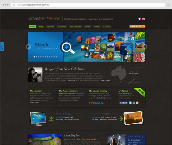
What is here to stay is simplicity. I can’t imagine a time when having a cluttered header area (with 10-12 menu items, six social media links, a search box and a subscribe box, all crowded together) will be in fashion. A clean website is not about using big fonts or a lot of white. It’s about prioritizing your business goals and the elements on your site.
Applying this mindset to the number of galleries you feature on your homepage or the products and services you offer is important. When visitors have fewer and more clear choices to make, they have a better browsing experience and are more likely to trust your website and keep coming back for more.

Conclusion
Along with part one of this article, this was an overview of the important web-design trends you should be aware of as a photographer.
Constant improvement is the only way to be successful with an online photography business. You know this to be true for your photo technique and composition skills (since you’re reading this on dPS, after all). The mindset can be applied to your online presence as well; it’s a continuous effort to get better and adapt to the industry.
Success does not depend on cool slideshows and flat designs. Sure, you have to make your photography website beautiful, and, therefore comply with the latest web design fashion trends sometimes, but not at the expense of helpfulness and clarity.
googletag.cmd.push(function() {
tablet_slots.push( googletag.defineSlot( “/1005424/_dPSv4_tab-all-article-bottom_(300×250)”, [300, 250], “pb-ad-78623” ).addService( googletag.pubads() ) ); } );
googletag.cmd.push(function() {
mobile_slots.push( googletag.defineSlot( “/1005424/_dPSv4_mob-all-article-bottom_(300×250)”, [300, 250], “pb-ad-78158” ).addService( googletag.pubads() ) ); } );
The post The Future of Photography Websites – Understanding and Adapting to Trends Continued by Alex Vita appeared first on Digital Photography School.

Digital Photography School


