I’m a big fan of the new Flickr. Despite a few bumps along the way, like last weekend’s uploading fiasco, it feels like a new fresher Flickr and I think the fact that people can download their photos now in bulk will be a wonderful way to attract new talent to the site.
There are two little things that bug me about Flickr right now though. They are unimportant in the big picture of things, but the compulsive side of me tends to focus on the little things sometimes.

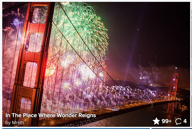
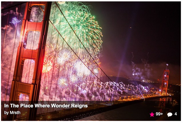
The first is the artifacting that takes place around icon that tells you if a photo is favorited or not or commented on not when you hover. Something just doesn’t seem right to me about this. It’s not a big deal for sure, but I wonder if Steve Jobs would let something like this fly? There appears to be two little dots around the star and the comment bubble seems cut off for me. I wonder if there is a way that this can be fixed?

On most of Flickr a full white star means a photo has been favorited.

On most of Flickr an empty white star means a photo has *not* been favorited.

On the “photos from your contacts” page a colored pink star means a photo has been favorited.

On the “photos from your contacts” page a full white star means your photo has *not* been favorited.
The second problem is a more serious one and something I’m sure will be addressed when Flickr rolls out their new page build to the “photos from your contacts” page — here the problem has to do with consistency in design.
On most places when you favorite a photo on Flickr it turns an empty star into a full white filled star — but on the photos from your contacts page, it’s confusing. On the photos from your contacts page a full white star actually means the opposite, that a photo is *not* favorited, here the signal for a favorited photo is a colored pink star.
As your eyes learn Flickr you become accustomed to seeing an empty or full white star to signal to you if it’s favorited or not, but when you go to this one page on Flickr and see a full white star it means the opposite.
As Flickr rolls out their new page design to other areas of this site I’m sure that this inconsistency will be fixed.
I’ve got a more serious problem with the “photos from your contacts page” that only affects some accounts at Flickr, and that is that the page is jumpy and unstable when I browse it. This is not a universal problem though and one that is only affecting some accounts (unfortunately mine is one) at the present time.
These are first world problems for sure. With each new build Flickr gets better and better, and the team should be commended for doing such a great job these days.
Thomas Hawk Digital Connection


