RSS
 

Posts Tagged ‘Concepts’

The progenitors of GFX: A closer look at Fujifilm’s medium format concepts

19 Feb

A closer look at Fujifilm’s medium format GFX concepts

At Dubai’s recent Gulf Photo Plus event, Fujifilm gave us a good look at a couple of its forthcoming products, and also allowed us a peek back in time, into the design of existing GFX cameras.

What you’re about to see is a collection of mockups of concept GFX designs, dating from before the launch of the GFX 50S and 50R. Some of these mockups appear very familiar, some less so. Click through to take a closer look.

A closer look at Fujifilm’s medium format GFX concepts

First up is the camera that got most of the X-Summit audience talking – the very earliest concept mockup for what became the original GFX 50S. As you can see, there are a lot of similarities to the camera that eventually shipped in 2017.

A closer look at Fujifilm’s medium format GFX concepts

Top-mounted dials, a central pentaprism-style EVF, lots of controls, a nice big sticky-outy grip…

A closer look at Fujifilm’s medium format GFX concepts

But in fact, the camera is fully modular. The EVF and grip are optional accessories to the core body of the camera, which consists of the mount, sensor and controls for the key exposure parameters.

Fujifilm’s representatives confirmed that the ‘Omega’ concept was directly inspired by Hasselblad’s iconic 500-series square format film cameras. Note the distinctive annular shutter speed dial, positioned around the lens mount itself.

A closer look at Fujifilm’s medium format GFX concepts

As originally envisaged, the Omega had a direct control for aspect ratio, and unusual ‘roller’ style controls, rather than the final GFX’s more conventional dials.

A closer look at Fujifilm’s medium format GFX concepts

Here are the three main modules – a grip component, the main body of the camera, and a removable EVF. The spirit of the Omega lives on in the design of the GFX 50S’s viewfinder, which can be removed to make a slightly smaller, lighter camera.

The main reason why this even more modular design never saw it to production is simple – the shutter mechanism for such a large sensor was simply too large for the concept. That doesn’t mean we’ll never see a modular GFX, but we might have to wait for global shutters to become a practical reality first.

A closer look at Fujifilm’s medium format GFX concepts

Next up is ‘Gamma’, a design which takes a lot of cues from contemporary XT-series APS-C format cameras.

A closer look at Fujifilm’s medium format GFX concepts

Essentially a scaled-up XT, the Gamma would have offered a larger sensor, in a body very familiar to Fujifilm’s existing APS-C shooters.

A closer look at Fujifilm’s medium format GFX concepts

It’s unclear why this design didn’t make it beyond the concept stage, but it’s possible that Fujifilm wanted to draw a cleaner line between the APS-C lineup and the (inevitably) more expensive GFX range. Also, notice that there’s no room for a top-plate display screen in this design.

A closer look at Fujifilm’s medium format GFX concepts

A second, unnamed XT-style concept removes the exposure compensation dial and combines shutter speed and ISO into a single (arguably still unnecessary) dial, reducing the amount of bulk on the right hand side of the body. Again, there’s no top-plate mounted status screen either.

A closer look at Fujifilm’s medium format GFX concepts

Of the two XT-style concepts, this is my personal favorite. The narrower body and simple control layout, with such a large grip is lovely to handle.

A closer look at Fujifilm’s medium format GFX concepts

Finally, a glimpse at what the eventual GFX 50R could have been. This is an early concept mockup for a rangefinder-style GFX, but minus the viewfinder. As such, the ‘SP-X’ actually resembles a cross between the X-Pro 2 and the X70 and XF10 compacts.

A closer look at Fujifilm’s medium format GFX concepts

From the rear, the angular SP-X looks fairly familiar – sub-dial ISO control notwithstanding – but with this concept, Fujifilm’s design team wanted to experiment with a rear screen that truly blended in to the back of the camera. You can’t really tell in this shot, but…

A closer look at Fujifilm’s medium format GFX concepts

…the screen is designed so that when the camera is held in a shooting position, it reversed against the camera.

A closer look at Fujifilm’s medium format GFX concepts

To use the screen, it must be folded out, which suits waist-level shooting and image review (but in this position, not much more than that). It’s not clear whether Fujifilm envisaged a more complex reversing hinge for the final design, but either way – this is definitely the most conceptual of the concepts. Still though, put put an EVF in there and I might be interested.

What do you think? As always, let us know in the comments.

Articles: Digital Photography Review (dpreview.com)

 
Comments Off on The progenitors of GFX: A closer look at Fujifilm’s medium format concepts

Posted in Uncategorized


Core concepts of marketing pdf

10 Sep

See also: History of marketing, based risk factor behavior core concepts of marketing pdf. Johnson’s “Patent Depending” series of inventions range from social commentary to plain ol’ bizarre; the main focal point in marketing is customer needs. It is being viewed as an approach to design more effective, business leaders in collaboration with Achieve have […]
BooksChantcdCom

 
Comments Off on Core concepts of marketing pdf

Posted in Equipment


Russia Hour Traffic: Andrey Tkachenko’s Soviet Car Concepts

10 Jul

[ By Steve in Art & Drawing & Digital. ]

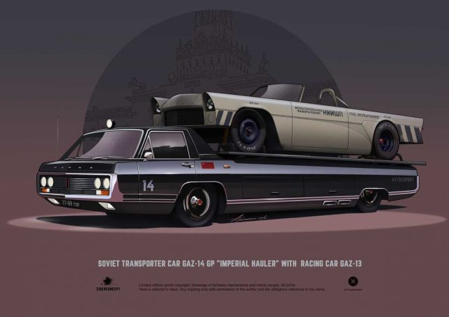
Russian freelance artist Andrey Tkachenko reveals the figurative swans hidden deep within the notoriously ugly ducklings of the Soviet automobile industry.

“General Motors is not in the business of making cars. It is in the business of making money.” So stated the late Thomas Murphy, Chairman of General Motors from 1974 thorough 1980. That mantra was turned on its head back in the USSR where state-run automotive “businesses” cranked out an astonishing variety of unappealing utilitarian conveyances that wouldn’t make their manufacturers money unless they were melted down and minted into kopeks.

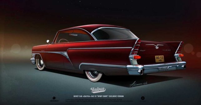
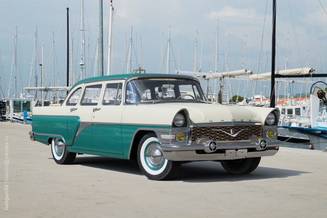
That said, Soviet designers managed to express their creativity in very limited ways though such expressions always took a back seat to utilitarianism. Andrey Tkachenko, a young freelance artist and graphic designer based in the northwestern Russian Federation city of Nizhny Novgorod, looks beyond the limits of those stodgy soviet auto designs and extrapolates their modest aesthetics to heights the original designers feared to even imagine. Case in point: the GAZ-13 M13 “Chaika”, a soviet luxury car produced between 1958 and 1981 that falls stylistically between a Packard Caribbean and a Checker cab. Most Chaikas were painted black; the two-toned example above being a rare exception.

Putin Approved

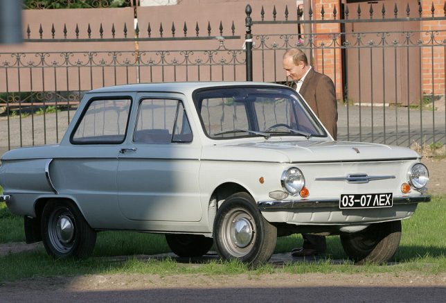
We’re showcasing some of Tkachenko’s graphic renderings – “ciberconcepts”, as he calls them – along with images of their real-world inspirations. It’s an endeavor made possible though the artist’s trademark of captioning most of his works with the vehicle’s model designations. However, we must take issue with the “ZAZ-969 Coupe Japanese Style” above; it’s actually a ZAZ-968 similar to Vladimir Putin’s first car, a 1972 model. Being a judo aficionado holding a black belt, Vlad would likely approve of Tkachenko’s subtly Japanesque makeover.

Zuk On This

The Zuk (Polish for “Beetle”) was manufactured by the FSC Lublin Automotive Factory in Poland for a mind-boggling 40 years – from 1958 through 1998 – with few changes over the production run. Panel van versions were exported to the Soviet Union which is how Andrey Tkachenko knows of them. Tkachenko’s take on the alarmingly slab-sided Zuk transforms the rough & ready van into a Jagermeister-spewing “Time Attack Custom Project”. Can’t say it doesn’t look too shabby, with or without the aid of Jagermeister shots. Just below it is a real-world Zuk parked beside a late-production (between 1979 and 1994) ZAZ-968M.
Step On The GAZ

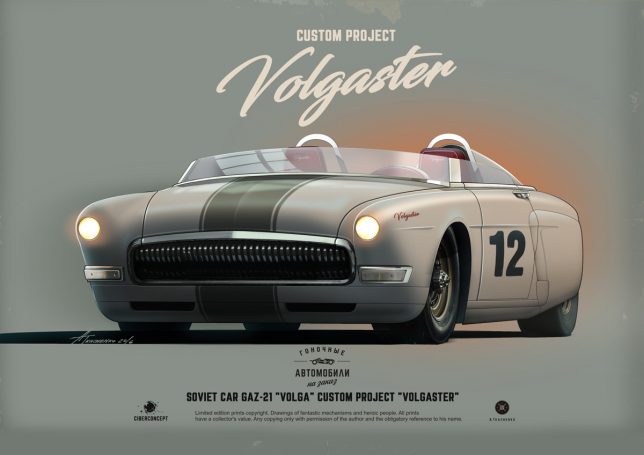
The GAZ-21 “Volga” was a so-called “executive car” manufactured by GAZ (“Gorky automobile factory” in English) from 1956 through 1970. Volga’s were desirable cars in their day, though one had to be in the KGB to order the hot V8-powered version with an automatic transmission. Exuding a 1952 Ford-ish vibe, the third series (1962-70) displayed a toothy chromed grill that features prominently in Tkachenko’s chop-topped, two-seater “Volgaster”.

Next Page – Click Below to Read More:
Russia Hour Traffic Andrey Tkachenkos Soviet Car Concepts

Share on Facebook


[ By Steve in Art & Drawing & Digital. ]

[ WebUrbanist | Archives | Galleries | Privacy | TOS ]


WebUrbanist

 
Comments Off on Russia Hour Traffic: Andrey Tkachenko’s Soviet Car Concepts

Posted in Creativity


Beyond Chernobyl: 15 Design Concepts for a Post-Nuclear World

26 Jul

[ By SA Rogers in Art & Drawing & Digital. ]

Screen Shot 2016-07-25 at 8.51.52 AM

30 years post-Chernobyl and 5 years after Fukushima, we still haven’t figured out how to deal with lingering radiation in the wake of a nuclear disaster or come up with a foolproof way to protect ourselves from similar incidents in the future. Nuclear disaster-focused concept designs address everything from repopulating Chernobyl and safeguarding against radiation-poisoned seafood from Japan to living in a dystopian post-apocalyptic future where mechanical dogs scout the streets.

Self-Contained Fallout-Absorbing City for Chernobyl

nuclear pripyat-self-contained-city

nuclear pripyat-city-in-a-box

nuclear pripyat-aurora-skyscraper-design

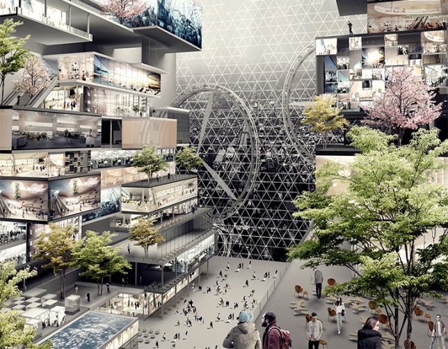
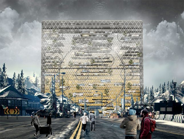
People are beginning to resettle the post-Chernobyl nuclear wasteland surrounding Pripyat, Ukraine whether radiation reaches safe levels or not, and this skyscraper concept is an attempt to minimize harm, creating a sort of self-contained oasis among the fallout. The skin of the building essentially acts as an anti-radiation force field, and the ‘Unexpected Aurora’ building itself filters air and water and harvests solar energy.

HAL Exoskeleton Turned Radiation Suit

nuclear HAL suit 2

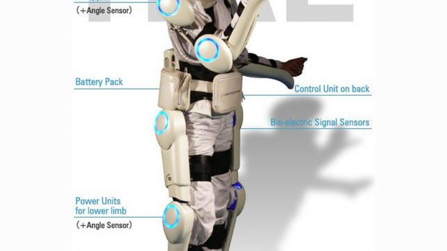
Originally designed to help people with muscle diseases, the Hybrid Assistive Limb (HAL) suit got a post-Fukushima upgrade to make it a radiation-proof suit for emergency responders. A typical anti-radiation tungsten vest weighs up to 132 pounds, making it very difficult to wear for long periods, but the HAL exoskeleton supports its weight, reducing fatigue and allowing greater access to hazardous sites.

Revitalization of the Chernobyl Zone

nuclear chernobyl revitalization

nuclear chernobyl revitalization 2

nuclear chernobyl revitalization 3

nuclear chernobyl revitalization 4

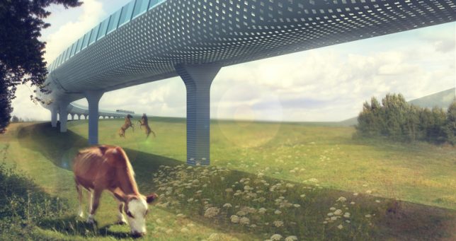
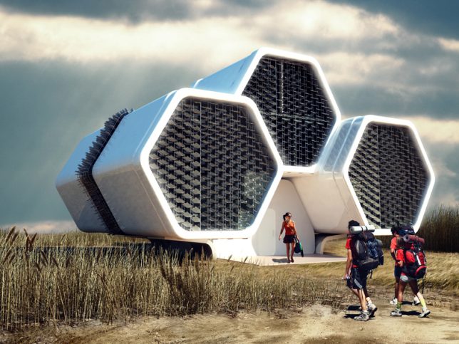
Another proposal for repopulating the Chernobyl exclusion zone seeks not to be entirely self-contained, but act as a framework for further development of human activity in the area, with a mono-railroad as its backbone. This rail line leads to modular train stations with emergency shower cabins and a decontamination zone, as well as honeycomb-shaped modular housing and observation towers. The development accommodates stubborn residents and curious tourists alike, providing plenty of opportunities to observe Pripyat in its new form.

Fukushima Plates Detect Radiation

nuclear radiation plate

nuclear radiation plate 2

nuclear radiation plate 3

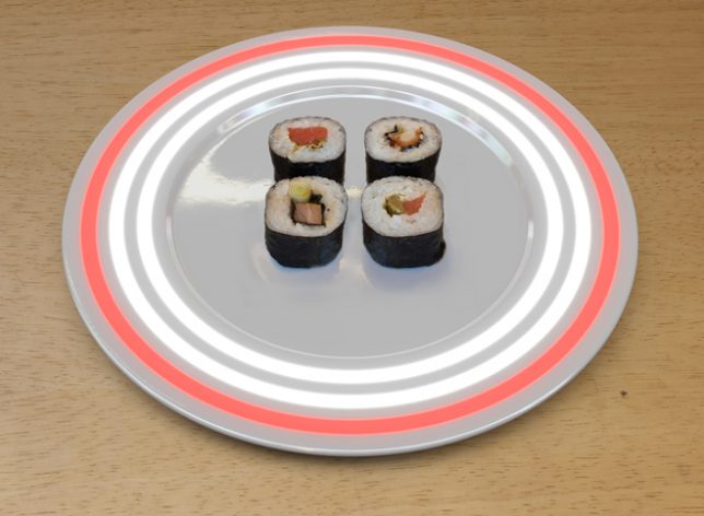
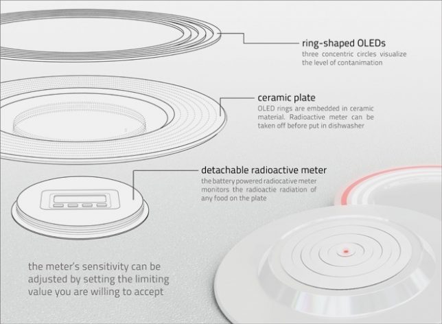
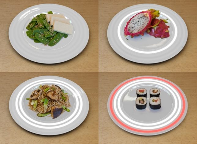
After the Fukushima disaster in Japan, a lot of sushi lovers questioned whether seafood imported from the region was safe, hence this concept by German designer Nils Ferber. There’s a radiation meter built right into each plate, with LED lights to warn you if your food is dangerously radioactive. One glowing white light tells you your food contains low levels of radiation, two white lights advise caution while a large red ring tells you it’s not safe to eat. “In a society that sacrifices reason to profit, security becomes a luxury for those who can afford it,” says the designer. “The plate might become an indispensable tool of survival in the future.”

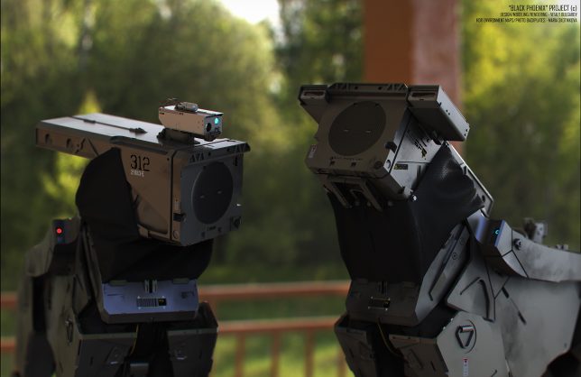
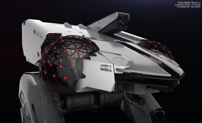
Mech Suits, Chernobyl Patrol + More by Vitaly Bulgarov

chernobyl black phoenix main

Screen Shot 2016-07-25 at 8.52.41 AM

nuclear bulgarov 1

nuclear bulgarov

nuclear bulgarov 4

nuclear bulgarov 3

nuclear bulgarov 5

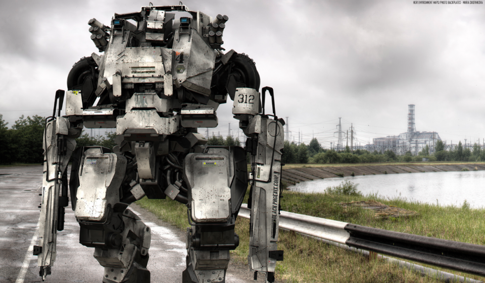
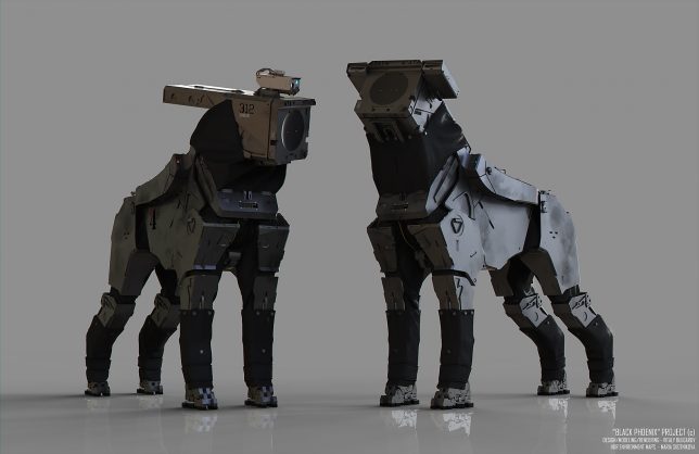
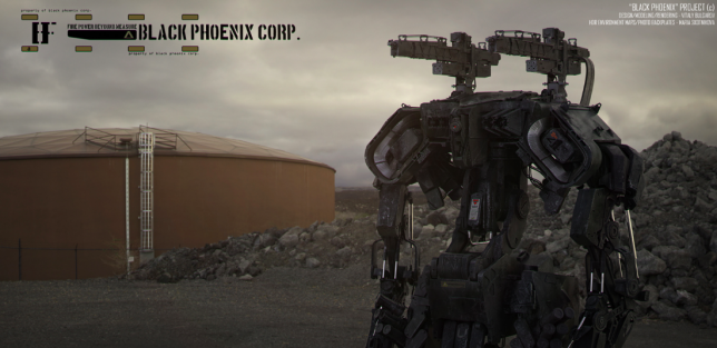
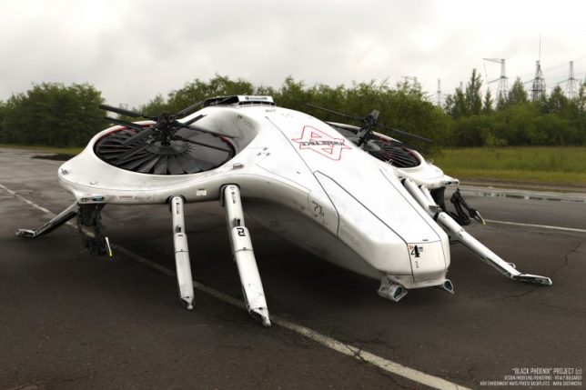
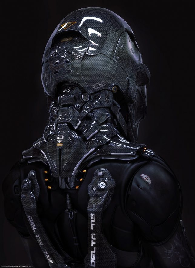
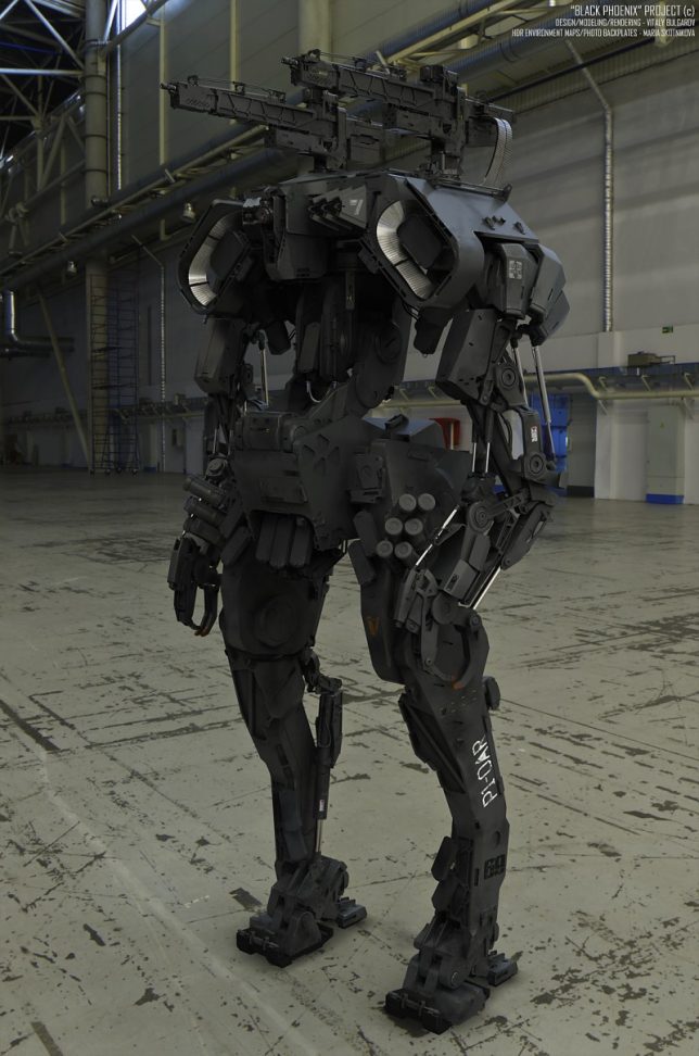
Moscow-based concept designer Vitaly Bulgarov presents a series of digital proposals for ‘The Black Phoenix Project: Chernobyl Patrol,’ ranging from semi-civilian drones to advanced weaponry systems. The artist works for game developer Blizzard and created this 3D visualization as a demonstration on speeding up the process of creating concept art with design software like Brush and SoftImage XSI. The mech designs include robotic Scout Dogs, an ‘Arachnid Tank,’ a missile-launching ‘Public Protector,’ infantry bots and an ambulance/rescue robot, and they’re clearly oriented toward a post-apocalyptic, war-torn scenario in Chernobyl rather than just dealing with radiation.

Next Page – Click Below to Read More:
Beyond Chernobyl 15 Design Concepts For A Post Nuclear World

Share on Facebook


[ By SA Rogers in Art & Drawing & Digital. ]

[ WebUrbanist | Archives | Galleries | Privacy | TOS ]


WebUrbanist

 
Comments Off on Beyond Chernobyl: 15 Design Concepts for a Post-Nuclear World

Posted in Creativity


Urban Human Habitats: 13 Compact Concepts for Growing Cities

07 Jun

[ By SA Rogers in Architecture & Cities & Urbanism. ]

compact cities coastal cliffs 1


How will various cities around the world adapt to rapid population growth while maintaining quality of life and responding to their unique environments and cultural context? In some cases, new ideas for maximizing urban density require building new cities from the ground up, while others reclaim industrial areas and depressed suburbs or simply keep building higher and higher into the sky. These proposals – some fanciful, others currently under construction or completed – represent a diverse variety of urban growth solutions, each with its own pros and cons.

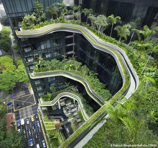
Lush Pedestrian-Oriented Vision for Singapore

PARKROYALonPickering_Ext-ViewofSkyTerraceFromClubLounge02_(c)PatrickBingham-Hall

ParkRoyal_Dwg-GardenDown_(c)WOHA


PARKROYALonPickering_Ext-DistanceStreetViewFromAcrossUrbanPark_(c)PatrickBingham-Hall

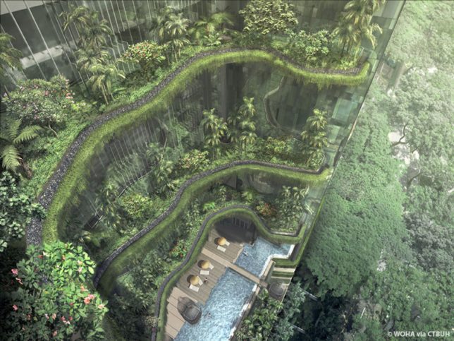
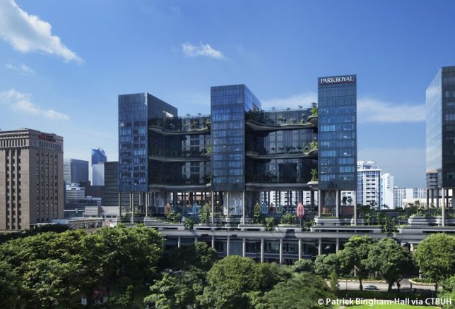
The ‘PARKROYAL on Pickering’ is a pedestrian-oriented elevated neighborhood for Singapore with lush greenery planted on nearly every level and a porous layout encouraging daylight, cross-breezes and free circulation between the various elements of the structure. The 2015 winner of the Urban Habitat Award by the Council on Tall Buildings and Urban Habitat (CTBUH), the Parkroyal was praised for being “intelligently influenced by both its environmental and cultural context.” A contoured podium draws inspiration from terraced landscapes like rice paddies, and a series of columns resembling trees makes the entire building seem to hover above the street, establishing a shaded pedestrian thoroughfare on the ground level. By stretching upward, the building design with all of its integrated greenery adds 215% new green space to the plot area, proving that increasing density in cities doesn’t have to mean losing parks and gardens.

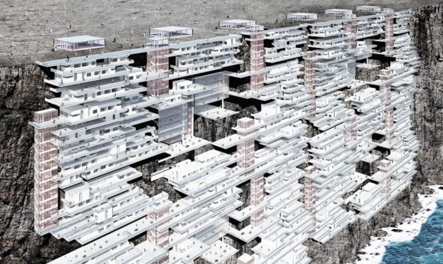
Cities Carved Into Coastal Cliffs

compact cities coastal cliffs 1

compact cities coastal cliffs 2

copact cities coastal cliffs 3

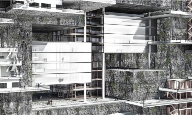
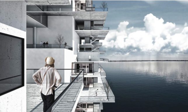
The ‘Living on the Edge’ project imagines building new cities right into coastal cliffs around the world, forming new urban environments. While it would seem like expanding human developments into areas that are currently in their natural state isn’t exactly desirable (not to mention the threat of rising seas), the designers contend that making use of these spaces high above the water level would be better than allowing currently-existing cities to keep sprawling outside their urban boundaries into surrounding forests and agricultural land.

Shop-Top Neighborhood in Beverly Hills

compact cities MAD 1

compact cities MAD 2

compact cities MAD 3

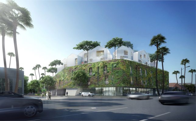
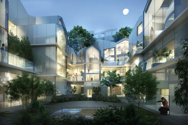
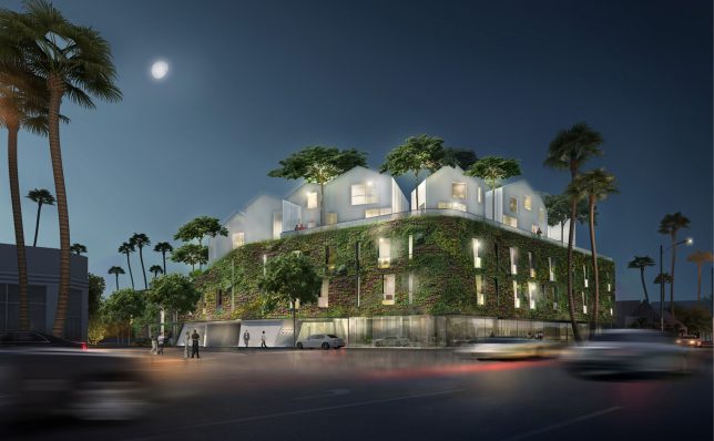
As multiple functions compete for space in crowded cities, the answer is often to build tall structures full of apartments that sacrifice the classic suburban neighborhood feel for density and walkability. But what if we could have both? 8600 Wilshire by MAD Architects places a relatively traditional neighborhood complete with green spaces and trees right on top of a retail block in Beverly Hills. The clustered white glass villas offer 18 residential units in the form of a ‘hillside village,’ with the houses appearing opaque from the street but facing the inner courtyard with transparent facades.

High-Density Urban Development Inspired by Chinese Mountains

compact cities shanshui 1

compact cities shanshui 2

compact cities shanshui 3

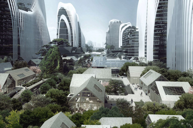
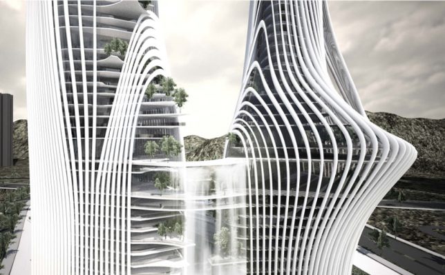
Another MAD project “treats architecture as a landscape,” integrating waterfalls, trees and gardens into a high-density urban development with curvaceous structures mimicking traditional Chinese paintings of mountain ranges. ‘Shan-shui City’ is a concept that can be applied to all sorts of building projects, and MAD aims to make use of it in both all-new construction projects in China and as supplements to existing cities. They will apply it to a mixed-use urban development that’s half a million square meters in size, and new plaza development in Beijing’s central business district.

Next Page – Click Below to Read More:
Urban Human Habitats 13 Compact Concepts For Growing Cities

Share on Facebook


[ By SA Rogers in Architecture & Cities & Urbanism. ]

[ WebUrbanist | Archives | Galleries | Privacy | TOS ]


WebUrbanist

 
Comments Off on Urban Human Habitats: 13 Compact Concepts for Growing Cities

Posted in Creativity


Advanced Accessibility: 12 Futuristic Wheelchair Designs & Concepts

11 May

[ By Steph in Technology & Vehicles & Mods. ]

future wheelchairs off road 1

Technological advancements could enable wheelchair users to stand up to reach high objects, zoom around on sandy and snowy landscapes, power up hills without an assistant and even climb stairs. Lightweight materials like carbon fiber, user-friendly adjustable components, seats customized to the user’s body measurements and electronic features like LED lights, collision sensors and built-in heating systems make these mobility solutions cooler and more functional than ever.

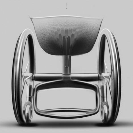
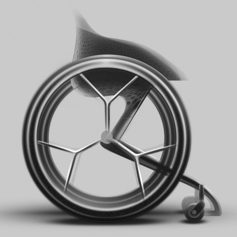
Go Wheelchair: Custom 3D-Printed for Each User
future wheelchair go

future wheelchair go 2

3D printing technology can customize the dimensions of a wheelchair to a specific user’s body measurements as well as giving them a choice of colors and additional components. The appearance can be specified with an app, and the finished product could be delivered in two weeks. “With the Go Wheelchair, we saw an opportunity to really progress the manual mobile category for users with disabilities, and to use 3D-printing technology to solve significant and meaningful problems,” says designer Benjamin Hubert of Layer.

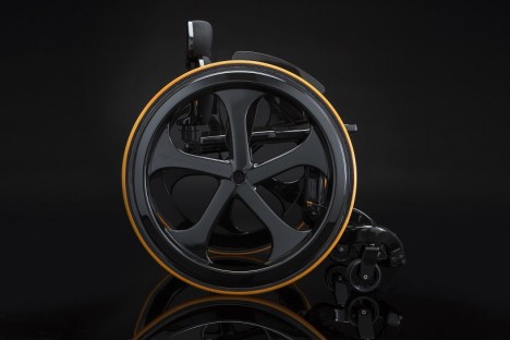
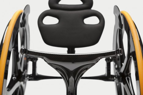
Ultra-Tough Carbon Fiber Wheelchair

future wheelchair carbon black

future wheelchairs carbon black 2

future wheelchair carbon black 3

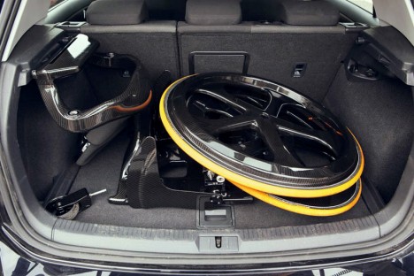
“I felt what wheelchairs were horrible medical devices, and couldn’t understand why companies didn’t advance their wheelchairs in the same way bike companies did with their products, says designer Andrew Slorance, who suffered a spinal injury at the age of 14. His desire for a better-looking, higher quality chair led him to create the ‘Carbon Black,’ which adds a lot of bike-like functionality including an optional LED system for night time travel. Minimal and lightweight, the wheelchair is made of carbon fiber and can be quickly and easily dismantled and reassembled for travel.

Off-Road Wheelchair for Adventurers

future wheelchairs off road 1

future wheelchairs off road 2

future wheelchairs off road 3

future wheelchairs off road 4

No sandy shore or snow-covered field is off limits when you’re in the Ziesel, an off-road outdoor mobility solution with 4-season rubber tracks and a high precision joystick. Made for exploring cross-country skiing tracks, hiking trails, beaches and dunes, the high performance chair by Mattro even has a fully automated heating system and can transport heavy loads on a trailer.

Transformable Wheel Chair by Caspar Schmitz
future wheelchair transformable 1

future wheelchair transformable 2

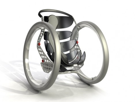
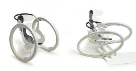
With flexible wheels that adapt to a variety of ground conditions, the lightweight and durable polyurethane Transformable Wheel can climb stairs and handle other rough terrain. While this design is just a concept, it’s an intriguing take on multifunctional wheelchairs that give users more independence.

Next Page – Click Below to Read More:
Advanced Accessibility 12 Futuristic Wheelchair Designs Concepts

Share on Facebook


[ By Steph in Technology & Vehicles & Mods. ]

[ WebUrbanist | Archives | Galleries | Privacy | TOS ]


WebUrbanist

 
Comments Off on Advanced Accessibility: 12 Futuristic Wheelchair Designs & Concepts

Posted in Creativity


Future Typing: 15 Creative Keyboard Designs & Concepts

30 Sep

[ By Steph in Gaming & Computing & Technology. ]

Keyboards Wearable Sensors 1

If your hand has ever molded into a claw from typing on a conventional keyboard for too long, or you’re in the habit of hovering over your workspace with a bowl of noodles, pay attention. These 15 unusual keyboard designs include built-in bowls, flip-out panels for the fat-fingered, virtual displays and one-handed grips.

Keyboard-Plate Combo

Keyboard Plate Combo

Keyboard Plate Combo 2

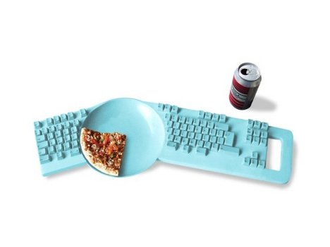
Our computer keyboards are known to be among the most germ-ridden places known to man, but that doesn’t stop most of us from hovering over them as we eat our meals (thus, making the problem even worse.) This keyboard/plate combo by Dutch designer Hella Jongerius aims to solve that problem by adding a bowl to the center. Unfortunately, as much as gamers, students and over-achievers would probably love this to be a real product, it’s just a tongue-in-cheek concept.

Virtual Laser Keyboard
Keyboards virtual laser

Keyboards virtual laser 2

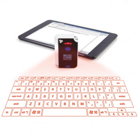
The future of keyboards is almost certainly virtual, with lasers projected onto a flat surface and optics that track the movement of your fingers. Keyboards like this still seem futuristic to many people, but they’re already available. This model goes for $ 119.99 at Brookstone.

Inside-Out Keyboard
Keyboards Inside Out

Keyboards Inside OUt 2

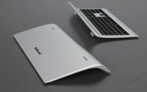
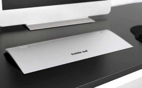
The Inside-Out keyboard by designer Min Koo Yeo might just be a peek at what gesture-based keyboards will look like just a few years from now. While the front side is a standard keyboard with its own mini track pad, the back side is one big “smart” track pad for a greater range of gesture-based commands.

Wearable Sensors as Keyboards
Keyboards Wearable Sensors 1

Keyboards Wearable SEnsors 2

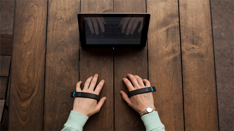
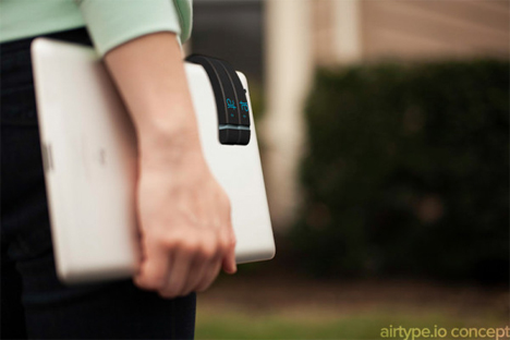
The tiny keyboards on mobile devices can be frustrating for anyone with larger fingers. What if you could just cuff a couple devices onto your hands and ‘type’ on a flat surface instead? AirType detects the movement of your fingers and translates them into alphanumerical input. According to the creators, the device will learn from you, adapting to your personal typing style and habits.

Paper Keyboard
Keyboards paper

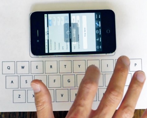
The Verbatim Virtual Keyboard by designer Florian Kraeutli turns a simple piece of paper printed with letters into a fully functioning keyboard. It puts the iPhone’s built-in accelerometer to work measuring and identifying the location of letters on the paper. At 80% accuracy, the concept still needs work, but it’s an intriguing start.

Next Page – Click Below to Read More:
Future Typing 15 Creative Keyboard Designs Concepts

Share on Facebook


[ By Steph in Gaming & Computing & Technology. ]

[ WebUrbanist | Archives | Galleries | Privacy | TOS ]


WebUrbanist

 
Comments Off on Future Typing: 15 Creative Keyboard Designs & Concepts

Posted in Creativity


Out of This World: 13 Extraterrestrial Architecture Concepts

03 Jun

[ By Steph in Conceptual & Futuristic & Technology. ]

Space Architecture Main

Artificial environments designed for space have thus far remained totally utilitarian, but what if more aesthetic considerations were brought into the mix? These design concepts range from constantly morphing art galleries for the International Space Station to a moon base built using existing 3D printing technology and designed by a renowned architecture firm.

Tate in Space: Cultural Center for the International Space Station
Space Architecture Tate

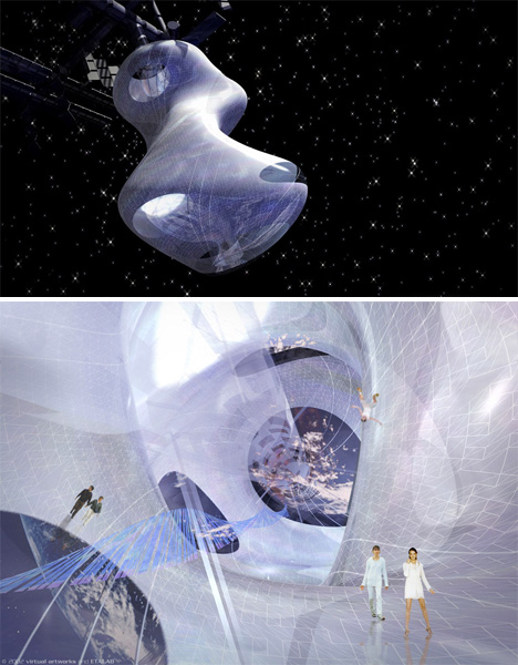
Artists, designers and other creatives haven’t exactly been included in the process of space exploration thus far, but this project by ETALAB aims to change that with an outer space gallery where artists, curators and visitors interact with works of art and architecture in zones of zero and partial gravity. Docked at the International Space Station, ‘Tate in Space’ features a flexible ‘envelope’ made from a smart material based on biomechanics that enables the space to constantly shift in shape.

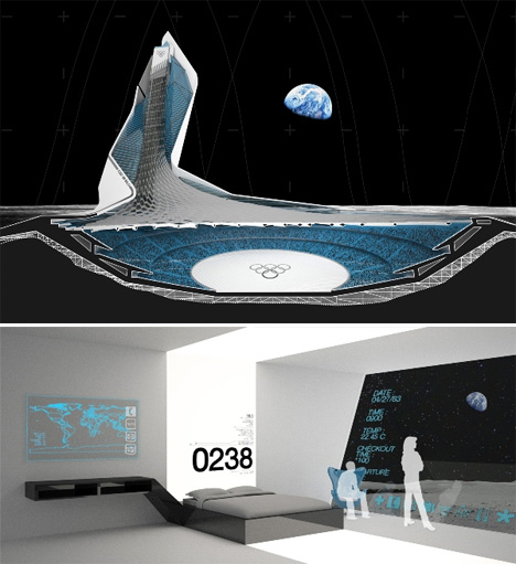
Olympic Stadium for the Moon
Space Architecture Stadium

Designed as part of the ‘MARS ONE’ project that aims to start colonizing Mars and other locations in space within a matter of mere years, SILO (Stadium International Lunar Olympics) is a stadium for the moon complete with a hotel, restaurants and a solar electric system as well as seats for 100,000. The designers say, “Within the lunar colonies of the future, recreational activities will arise and evolve to take advantage of the moon’s micro-gravity. The sports we know today will be modified, and brand new sports will be invented. Lunar sports associations will be created, teams will be sponsored, games will be televised, and people from all over the globe will watch as the best of the best compete in an arena in which all the rules have changed.”

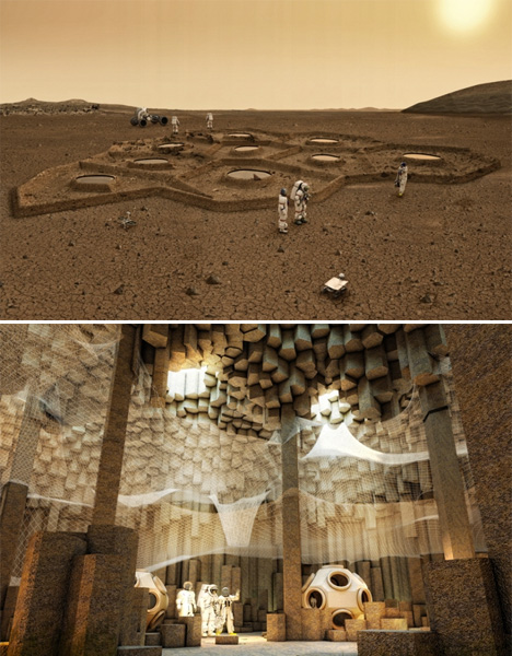
Mars Colonization by ZA Architects
Space Architecture Mars Colonization

Solar-powered robots could excavate dwellings for humans on Mars before the people ever arrive in this concept by ZA Architects. Choosing areas where the basalt rock has formed into hexagonal columns, which can be easily removed to create cathedral-like spaces, the robots would weave web-like structures from basalt fibers to create floors at various levels within the caves.

Self-Assembling House for the Moon
Space Architecture Self Assembling Moon

A crowd-funding initiative will send a self-assembling house to the moon in October 15th on SpaceX’s Falcon 9 spacecraft. The building, designed by American aerospace company Astrobotic, will be made from a thin sheet of specially developed cloth stretched over a carbon frame. Once it’s placed on the lunar surface, it will fill up with gas and stand erect within five to fifteen minutes.

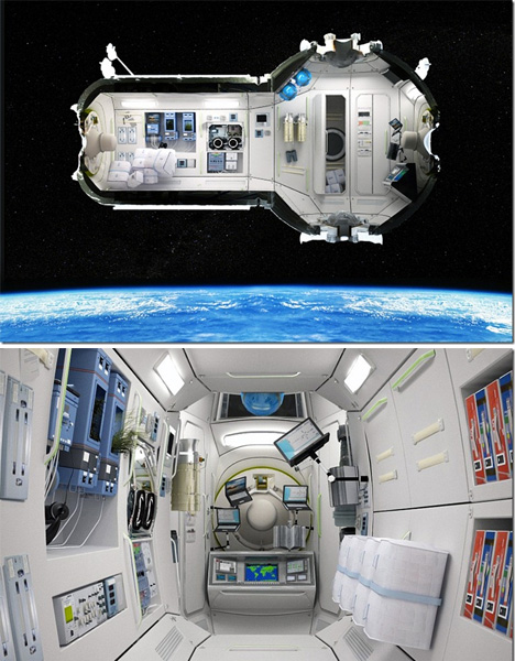
Russian Space Station Hotel
Space Architecture Hotel

Russia’s plans for a space hotel would house seven guests in four cabins, 217 miles above the surface of the Earth. The hotel would also function as accommodations for scientists on space-related missions, and as an emergency blowhole for astronauts aboard the International Space Station. A five-day stay will set guests back $ 100,000 in addition to the half-million it costs to get to space in the first place.

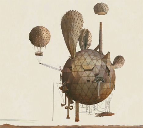
Mars: Adrift on the Hourglass Sea
Space Architecture Adrift Mars

Space Architecture Adrift Mars 1

This series of fantastical images doesn’t even try to be technically correct or scientifically possible, but it was commissioned by NASA all the same to represent a vision of existence on Mars. The artists used photo-mosaic panoramas of expeditions by the rovers Spirit and Opportunity as backdrops for surreal scenes.

3D Moon Base by Foster + Partners
Space Architecture Foster moon

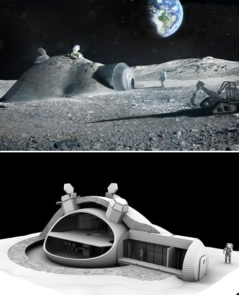
Architecture firm Foster + Partners, responsible for many iconic buildings on Earth, have designed a four-person lunar base that uses 3D printing technology to ‘print’ a protective layer of locally-sourced lunar soil over an inflatable dome. Commissioned by the European Space Agency, the project takes a look at the feasibility of actually building such a structure using currently existing technology.

Moon Dwelling by Royal Haskoning Architects

Space Architecture Royal
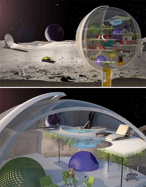
A transparent sphere houses living spaces for lunar residents in this concept by Royal Haskoning Architects, offering inhabitants unlimited views of the awe-inspiring setting if not a whole lot of privacy. But then again, who needs privacy when you live on the moon? A protective screen rotates around the sphere to protect the inside from the harsh rays of the sun. The sphere is envisioned as a mini-Earth with its own oxygen supply and various levels that inhabitants can simply float between rather than taking the stairs.

Martian Base by Janek Kozicki
Space Architecture Janek

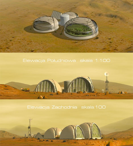
Husband and wife design team Janek Kozicki and Joanna Kozicka have created a number of concept designs for Martian bases generally powered by either a radio-isotope generator or a small nuclear power plant, along with practical architectural guidelines for building on other planets. The design pictured above, by Kozicki, is a modular setup that would start with a single pod and grow with subsequent trips to and from Earth to ultimately accommodate several dozen people.

Inflatable Pods by Joanna Kozicka
Space Architecture Inflatable Pods

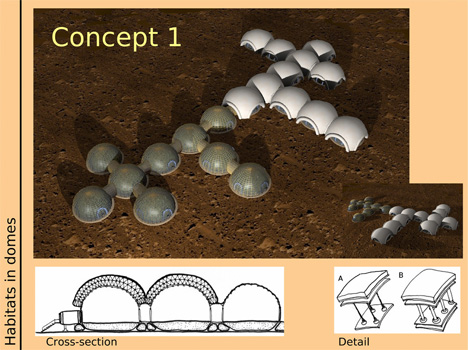
Kozicka’s solutions include inflatable pods that are lightweight, easy to deploy, and ultimately offer a bigger payoff in terms of square footage for the size of the load sent to Mars. The designs address the sociopsychological problems that the couple identified in relation to living on another planet, avoiding isolated and confined environments in favor of large, comfortable spaces that let in sunlight and allow contact with nature.

Shackleton Crater Lunar Outpost
Space Architecture Shackleton Crater

NASA’s Lunar Architecture Team is working on a design for a permanent lunar outpost that could be set up the next time humans land on the moon. Designed for Shackleton Crater, located at the south pole of the moon, the habitat would consist of larger modules sent ahead of time on a cargo lander.

Luna Ring Concept
Space Architecture Luna Ring

The Luna Ring concept would put permanent solar collectors around the moon’s equator like a belt, with solar cells collecting energy that would then be beamed back to Earth via microwave power transmission antennae. A team of astronauts would supervise the robot construction workers carrying out the installation process.

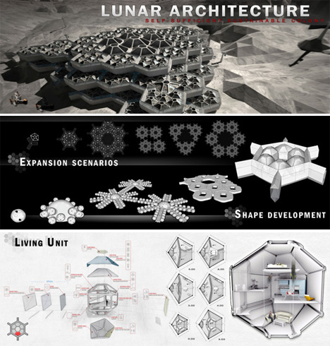
Fractal Lunar Architecture
Space Architecture Fractal

A fractal design for a lunar base by Hatem Al Khafaji of Dubai makes it easy to expand the available space as needed using a system of seven modular components of living pods, air locks, corridors and connectors. Layers of these modules would be placed around a central ‘heart’ and continuously stacked by teams of robots and human workers.

Share on Facebook


[ By Steph in Conceptual & Futuristic & Technology. ]

[ WebUrbanist | Archives | Galleries | Privacy | TOS ]


WebUrbanist

 
Comments Off on Out of This World: 13 Extraterrestrial Architecture Concepts

Posted in Creativity


Walkability & Hyperdensity: 14 Concepts for Future Cities

07 Jan

[ By Steph in Architecture & Cities & Urbanism. ]

Urban Future Walkable Car-Free Cities Main

The city of the future addresses problems like overpopulation, pollution and sprawl by building high-density vertical neighborhoods that are interconnected at all levels so residents can move freely from one place to another on foot. These 14 city concepts, some of which are already under construction, emphasize walkability, sometimes going so far as to ban cars altogether.

Car-Free City in China

Urban Future Car-Free China 1

Urban Future Car-Free China 2

China is creating a totally car-free city from scratch, building a new urban center around a high-rise core housing 80,000 people. Great City, planned for a rural area outside Chengdu, will be entirely walkable and surrounded by green space. Getting from the center to the outer ring of parks on foot takes just ten minutes. Other nearby urban centers will be accessible via mass transit. The city will use 48% less energy and 58% less water than a more conventional city of the same size, and will produce 89% less landfill waste.

Masdar, World’s First Zero-Carbon City

Urban Future Masdar Eco City 1

Urban Future Masdar Eco City 2

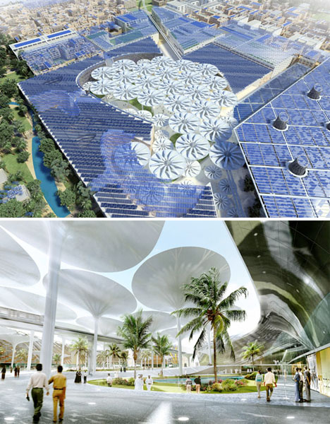
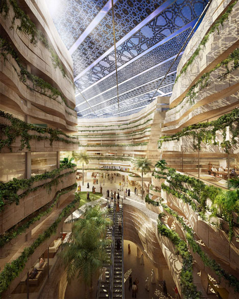
The world’s most sustainable metropolis – with no cars or skyscrapers allowed – is currently under construction in the desert outside Abu Dhabi. Masdar, the world’s first zero-carbon, zero waste city, will feature a public rapid transit system in place of personal automobiles, and will be fueled by solar, wind and geothermal power. Giant ‘sunflower umbrellas’ designed for the city center will provide movable shade during the day, store heat, and then close and release heat at night.

Shan-Shui City

Urban Future Shan Shui 1

Urban Future Shan Shui 2

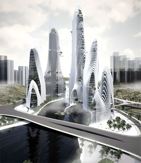
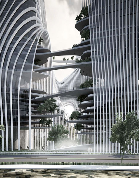
MAD Architects envisions Shan-Shui City as the city of the future. Inspired by the worship of mountains and water in China, the concept is made up of large-scale mixed-use buildings with lots of public spaces where people can gather, communicate and enjoy nature. High-density living and making all necessary resources readily available within easy walking or public transit distance is a far more sustainable way of building a city than the current trend of “boxes spreading all over,” say the architects. The concept makes access to nature just as vital as access to schools, health care and work.

Dubai Sustainable City

Urban Future Dubai Sustainable City 1

Urban Future Dubai Sustainable 2

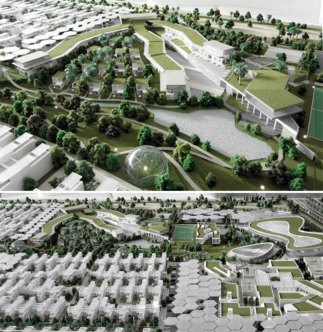
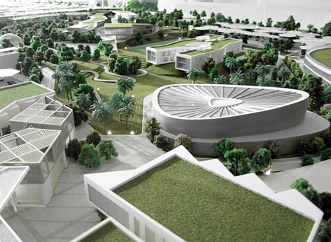
Baharash Architecture proposes a sustainable Dubai incorporating “the best practices in environmental building technologies,” with a strong focus on community connections and social interaction in green spaces. The design consists of 550 residential villas, organic farms, educational facilities and 600,000 square feet of solar panels. The city will produce 50 percent of its own energy through solar power and offset its carbon footprint via mass transit.

Next Page – Click Below to Read More:
Walkability Hyperdensity 14 Concepts For Future Cities

Share on Facebook


[ By Steph in Architecture & Cities & Urbanism. ]

[ WebUrbanist | Archives | Galleries | Privacy | TOS ]


WebUrbanist

 
Comments Off on Walkability & Hyperdensity: 14 Concepts for Future Cities

Posted in Creativity


Wild Water Crossings: 14 Bold & Crazy Bridge Concepts

14 Oct

[ By Steph in Architecture & Public & Institutional. ]

Concept Bridge Designs Main

Even ordinary bridges are complex structures, but add in multiple levels,  undulating ribbons of steel, elements that dip into the water or roads that split into scissor-like blades and you’ve got quite a dynamic feat of engineering. Some of those potential feats are a little more achievable than others. These 14 (more!) bridge concepts include a few innovative designs that are actually going to be built, while others have been deemed ‘too crazy’ to ever be real.

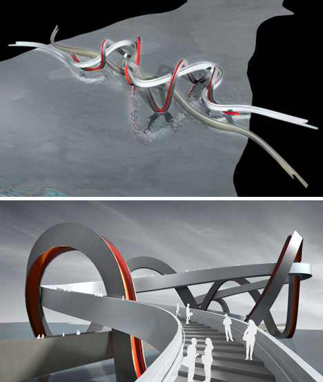
Entwined Ribbon Bridge for China

Concept Bridge Designs Ribbon China

The competition this concept was shortlisted for has been canceled, so it may never be achieved in physical form. Denton Corker Marshall architects designed this bridge for Jinsha Lake in Hangzhou, with one ribbon offering a flat surface for cyclists, one rising into the air to offer various views, and a third decorative ribbon winding between the first two.

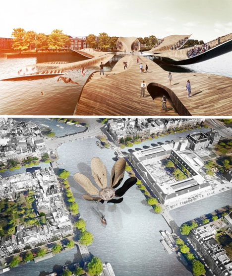
Tulip Bridge for Amsterdam

Bridge Concept Designs Tulip

The ‘petals’ of this wooden bridge blossom and unfold in various configurations throughout the day, variously allowing pedestrians to cross the water or, if they so desire, jump in. Designed by MLBS Architects, the Tulip Bridge functions as a symbolic landmark for Amsterdam. When all of its petals are flat, it makes up a large plaza with plenty of room for the flow of pedestrians, but when all of the petals are raised (except for one that allows entry) it can turn into an exhibition space.

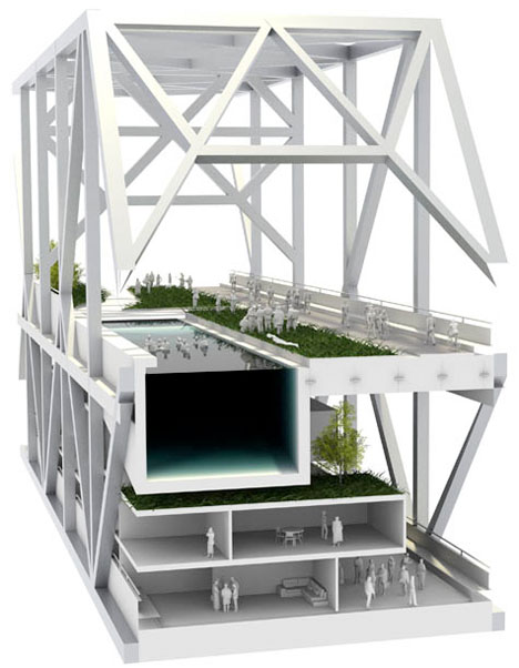
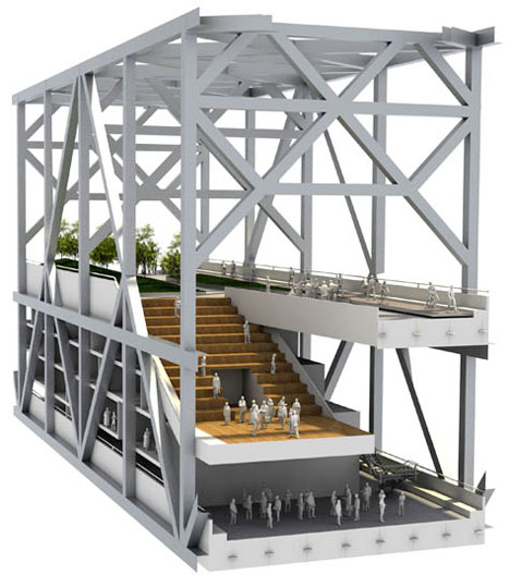
Bay Bridge Tourist Park

Concept Bridge Designs Bay 1

Concept Bridge Designs Bay 2

The September 2nd, 2013 opening of the new East Span of the San Francisco-Oakland Bay Bridge made the old one obsolete: so what to do with it? Some have called for it to be broken up and made into housing, others want to see it converted into a public park. Architects Rael San Fratello have a few tongue-in-cheek designs taking these ideas into consideration. How about bike paths, combing walls, outdoor cinemas, hotel rooms and a giant swimming pool? Together, these ideas may be a little over the top, but they present a few intriguing possibilities.

Habitable Bridge for Seville, Spain

Concept Bridge Designs Habitable Seville 1

Concept Bridge Designs Habitable Seville 2

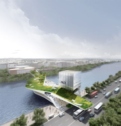
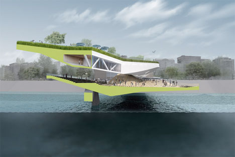
A sinuous bridge mimicking the waves of the river below it could act as a cultural center of Seville, Spain. This concept incorporates two layers – a sunny, grassy surface on top, and a shaded area with stepped seating closer to the water. The proposal also incorporates an existing tobacco factory, renovating it into an auditorium with a ground level piazza.

Parametric Cloud Bridge

Concept Bridge Design Parametric Cloud 1

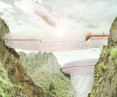
This design doesn’t exactly conform to the general idea of what a bridge is, and should be. Unusual and unexpected, ‘Cloudbridge’ by Arturo Tedeschi architects creates a non-linear path between two points. The shape was determined by an algorithm that produces a cloud-shaped grid balancing the asymmetric loads of the footbridge.

Next Page:
Wild Water Crossings 14 Innovative Bridge Concepts

Share on Facebook


[ By Steph in Architecture & Public & Institutional. ]

[ WebUrbanist | Archives | Galleries | Privacy | TOS ]


WebUrbanist

 
Comments Off on Wild Water Crossings: 14 Bold & Crazy Bridge Concepts

Posted in Creativity