The post Perspective in Photography: 4 Vantage Points for Unique Compositions appeared first on Digital Photography School. It was authored by Katie McEnaney.

As photographers, we often fall into the bad habit of shooting everything we see from eye level.
We walk around, something catches our attention, and we take a picture – right from where we are standing, without bending down, moving to the side, getting up high, etc.
(Sound familiar?)
But if you want to create stunning, eye-catching, original compositions, you need to get out of your eye-level (or tripod-level) rut. You need a change in perspective.
And that’s what this article is all about. I’m going to give you several easy tips for working with perspective in photography. By the time you’re done, you’ll be ready to bend, climb, move, and contort like a pro.
Let’s get started.
1. Get low
The easiest way to change your perspective for dramatic impact?
Get down low.
I use this all the time in my own photos, and it’s a favorite trick of many professional shooters. A low angle presents the world from a completely different point of view, one where the viewer feels small and the rest of the world looms large:

So get your camera down toward ground level, and see how it impacts your perspective. Don’t be afraid to lie flat in the grass, soil, or mud; you might get dirty, but it’ll be worth it!
Also, quick tip: Getting down low allows you to emphasize the foreground of your composition. You can use a wide-angle lens to feature foreground elements, which will then pull the viewer right into the image. Take another look at the shot above; do you see how the leaves act as a foreground anchor, guiding the viewer into the image and toward the background tree?
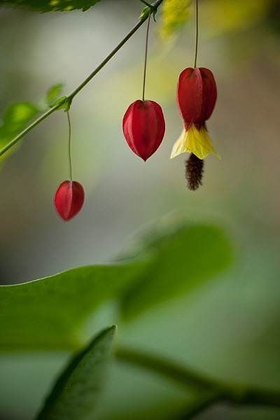
A low perspective can also change the way your viewer feels about or reacts to your subject. Getting low can make your subject appear taller or more imposing. Subjects viewed from below can look commanding and powerful. Even a simple sunflower can seem to tower above its surroundings:

Plus, a low angle can completely disorient your viewer. This near water-level shot (below) becomes a study in color and texture, as the water and the fallen autumn leaves interact with each other. From eye level, this would simply have been a photograph looking down into a storm gutter. But getting low simplified the composition, providing the viewer with a startlingly unique perspective.

2. Get up high (and shoot downward)
Shooting from up high does the opposite of getting down low. Instead of making the viewer feel small and the subject loom large, a high perspective makes the viewer feel huge and the subject look tiny:

Notice how the high vantage point gives the photo a sort of “giant looking down into a toy world” perspective? Photographers love to use this angle when shooting objects that are actually very large (e.g., mountains, icebergs, trees). It creates an interesting juxtaposition between what the viewer believes about the subject (i.e., that it’s huge) and what the viewer actually sees (i.e., it’s tiny).
Getting up high is also a great way to emphasize geometry – the lines, circles, squares, and dots that make up the scene. So if your subject is very graphic, with lots of obvious lines and curves, try a high vantage point; it’ll likely work well.
Unfortunately, a high perspective comes with a major issue:
Getting above a subject is not an easy task. It often requires a lot of creativity, and there are times when it just won’t work. Here are a few methods of getting up high (but be mindful of the appropriateness of each method given the situation):
- Climb stairs
- Climb on a roof
- Shoot from a window
- Shoot from atop a parking garage
- Use a drone
- Hold your camera as high as possible
Obviously, some high perspectives are easier to manage than others. If you want to shoot from above a building, you’ll probably need a parking garage or a drone – but if you want to shoot a flower from above, you simply need to stand tall and point your camera downward.
Make sense?
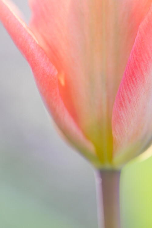
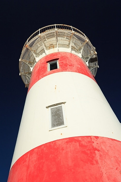
3. Shoot upward
This perspective is similar to getting low, as discussed above – except rather than shooting directly at your subject from the ground, you shoot up. It’ll emphasize the height of your subject and can often evoke a sense of wonder and awe:

The classic “up high” subject is trees, but you can shoot upward at plenty of subjects, including:
- Birds
- Planes
- Architecture
- Clouds
- Flowers
- Power lines
Note that some of these suggested subjects aren’t actually tall; instead, you just have to creatively work your angles by getting down on the ground and pointing your camera upward.
Pro tip: If you plan to shoot a lot of photos from below, bring a camera with a tilting screen. Constantly shooting upward can really hurt your neck – so a tilting LCD will prevent a lot of pain.
4. Go for the lateral
Low angles and high vantage points can be awestriking, but don’t forget to think laterally, too.
In other words: Before hitting the shutter button, walk a few steps to the right and left. It may not seem like a big deal, but a few feet can make a huge difference to the final photo. For one, you’ll get a different view of your subject. You’ll also get a different foreground and a different background, both of which can make or break a composition.
Personally, the first view and the first angle I try is often not the best available. It takes a bit of work – moving right and left, trying out different foregrounds and backgrounds – before I get the shot I want. Sometimes, it even pays to walk completely around the subject (and you can take a few test shots along the way). That’s what I did for this shot of the Chicago skyline:

I also positioned the spray from the fountain directly in front of a building to make it more visible. You see, in addition to changing the foreground and background, moving your feet can change the way different objects in your photograph interact with each other.
Take a look at the two shots below. While the top photograph looks nice, moving just a few feet to the right and squatting down allowed me to feature the foreground lights with the actual Capitol building in the background. This juxtaposition of elements improved the storytelling ability of the photograph:


Photography perspective: final words
Hopefully, you now feel equipped to revolutionize your compositions (just by moving your camera and your feet!).
Do not fall into the trap of shooting everything you see at eye level. Instead, take the time to explore your subject and consider changing your perspective. Get low and see what changes, get up high and explore a new view, or move laterally and watch different interactions occur and disappear between objects.
Now over to you:
What is your favorite photographic perspective? Do you have any tips for great results? Share your thoughts in the comments below!

The post Perspective in Photography: 4 Vantage Points for Unique Compositions appeared first on Digital Photography School. It was authored by Katie McEnaney.


 My ebook Mastering Composition will help you learn to see and compose photos better. It takes you on a journey beyond the rule of thirds, exploring the principles of composition you need to understand in order to make beautiful images. You’ll also learn how to use colour to create photos like the ones in this article. Click the link to learn more or buy.
You must be logged in to post a comment.