RSS
 

Posts Tagged ‘Composite’

Useful Ways You Can Use the Olympus Live Composite Feature for Long Exposures

16 Sep

The post Useful Ways You Can Use the Olympus Live Composite Feature for Long Exposures appeared first on Digital Photography School. It was authored by Mark C Hughes.

Olympus has a number of unusual features for longer exposure photography. Aside from the classic bulb style photography, there are two other specific long exposure features available with Olympus cameras: Live Time and Live Composite. These two functions, although related, treat longer exposures quite differently and can produce quite interesting results. Both are really fascinating tools for photographers looking to experiment. Both use computational features of your camera to allow you to get an image in a different way. Although we will briefly discuss Live Time, this article primarily focuses on the Olympus Live Composite feature.

olympus-live-composite-feature

The Live Composite feature on Olympus Cameras lets you mix light sources for long exposure

Live Time

Live Time is like the bulb function on old film cameras that held the shutter open as long as the bulb was depressed but with a twist. With modern cameras, you open the shutter by pressing once and then close it by pressing it a second time. As with any bulb function, you end up holding the shutter open for as long as you want but without a set time on the camera.

In the film days, you would just guess how long you wanted (or use a light meter and a stopwatch). With most digital cameras, there is a function to allow you to hold the shutter open for an extended time. However, for many makes of cameras, you won’t see the image until the camera has closed the shutter, taken a noise reduction image, and then processed the image.

Live Time in Olympus cameras is a little different. It allows you to see the image on your display developing during the process while the shutter remains open. As the exposure lengthens, you see the image form as more and more light gets added to the entire image. The image gets brighter on the back panel, and it is really cool to see the image created live.

This process allows you to decide when you have held the shutter open long enough. Like the old bulb settings, you decide how long the image progresses. You press to start the exposure and press to stop.

Image: Long Exposure images simply mean that light sources get brighter

Long Exposure images simply mean that light sources get brighter

Fundamentally, Live Time is just a manually extended exposure time that allows you to watch the image develop as you take it. It is still a pretty cool feature.

Problems with long exposure photography

The trouble with Live Time (and any long exposure image with any camera for that matter), is that bright things get brighter faster than the dark areas.

This means that dim, infrequent events in lower light environments with some point sources of light will be overwhelmed by the point sources. When you have enough light to expose the dark areas properly, this usually means that the lit areas have far too much accumulated light. Everything in the frame gets treated the same.

Image: A still Image of a fire provides lots of detail and freezes the action of the flames.

A still Image of a fire provides lots of detail and freezes the action of the flames.

olympus-live-composite-feature

Long Exposures tend to smear the light as the light sources persist.

Enter Live Composite

Live Composite is a particularly unique feature present in Olympus cameras that is not currently offered by other camera makers at this time.

Live Composite is similar to Live Time, in that you are taking a longer exposure image, but Live Composite is just light additive for new sources of light, not existing sources. What this means is that Live Composite takes a base image and then only adds new light to the image that was not present in the original base image. This means that light sources seen in the original reference image do not get brighter. Only new lighting or new light sources that move in the frame will appear in the final image.

olympus-live-composite-feature

Live Composite of a campfire shows that the entire image is not getting brighter

The mechanics of Live Composite

Using Live Composite is a two-step process; first, it requires you to take a base or reference image exposure. This image forms the base layer of the composite image. Then you take subsequent additional images at intervals with only new light in the field of view added.

This allows you to take a static image of a colorful background under low light conditions and add only new light sources.

Just like Live Time, you get to watch the image develop right before your eyes.

olympus-live-composite-feature

After the base image is taken, only new light sources (such as a lightning bolt) show up

How to use It

Turning on Live Composite on your Olympus camera is not the most prominent process. It is a bit hidden. Live Composite is a type of manual mode setting, so that is where you find it on the camera.

However, before you use Live Composite, you need to decide a few key parameters for your base composite image – specifically initial shutter duration, ISO and aperture.

You set the shutter time duration in the menu (out of the function itself) before setting the camera to shoot. However, you set the ISO and aperture as you go.

Useful Ways You Can Use the Olympus Live Composite Feature for Long Exposures

Turning on Live Composite varies a little between cameras (the EM1X does it slightly differently), but for most Olympus cameras, you simply set the mode selector dial to Manual (M) and adjust the time to beyond the 60-second shutter duration. At that point, you get a Bulb, LiveTime, and then LiveComp setting. LiveComp is the one you want for Live Composite. On the EM1X, you set the mode selector dial to B (bulb) and then turn to LiveComp. Everything else is the same.

At this point in time, you set your ISO and Aperture. This, combined with the shutter time duration you set in the menu system for cycling the images, will be used to set your base composite image. For instance, if you set the shutter timing to 4 seconds, plan on using an aperture of f/4 and ISO of 800. You will use those values for the base reference composite image.

To activate Live Composite, set up your composition, focus your lens, and then press the shutter for the reference image. The composite is now ready to start.

Next, when you press your shutter button again, the image creating process begins! The camera will open the shutter and add to the image as each time period compares to the base image. Any new light gets added to the composite at the end of each cycle. The image changes and grows on your display as Live Composite progresses.

It is very cool to watch as your image develops.

Does Live Composite mean you can take images that you couldn’t before?

Image: Lightning storms work incredibly well with Live Composite, especially if there is a lot of ne...

Lightning storms work incredibly well with Live Composite, especially if there is a lot of nearby light sources (such as streetlights)

Yes and no. You could take the images separately and combine them as a composite, but as a single image, you would not have been able to do it. Also, there are certain types of images that are way easier to take with the Live Composite function than would be possible to achieve in a single image.

Live Composite also forces you to change your approach to certain images. As part of that change, it may actually take longer to take some images (because you need to create a base/reference every time), but you get the benefit of seeing if it is doing what you want.

What kind of image works well with Live Composite?

Several specific types of images can get the full benefit of Live Composite. These include star trails, lightning flashes, fireworks, night photography with bright lights present, and light painting.

You can take all of these in other ways, but using live composite allows you to see if the image is turning out how you want.

Most of these images all require manual focus and manual settings for your exposures. All require some trial and error and pretty much all benefit from the use of a tripod. In theory, you might be able to take these images without one, but in reality, the requirement to be steady really limits those cases.

Star Trails

In astrophotography, taking an image of stars can be particularly daunting. This is because the earth is rotating and the stars are relatively dim. What this means is that you need a fast enough shutter speed to freeze the motion of the star but also need to leave the shutter open long enough for the start to appear on your image. If you leave the shutter open too long, you will see a streak or smear instead of a star. If you leave the shutter open even longer, the stars leave even longer trails that are circular. In the northern hemisphere, these star trails appear to rotate around the North Star.

Image: Star trails occur when you take astrophotography shots and leave the shutter open for an exte...

Star trails occur when you take astrophotography shots and leave the shutter open for an extended period of time. The stars create a trail. This image was taken with the shutter open for 27 minutes

With conventional digital cameras (or film cameras for that matter), working at night can be a challenge. The shutter duration required to create star trails are long, and you can’t see what your image is like until you’ve completed the entire exposure duration. In addition, if you have made an error in focus or composition, you won’t see it until the entire process is complete. There are ways to combine star trails together in post-processing, but the Live Composite allows you to do it in a single exposure.

With Live Composite, you can see the image develop. Particularly with star trails, this allows you to quickly figure out if you want to have your image in a different setup or use a different point of interest so that the star trails work with your composition.

You also have the ability to have star trails show up when there is an illuminated object in the foreground.

Lightning

Another significant challenge for photography is capturing images of lightning, particularly in areas where there are light sources. As anyone who has attempted to take lightning images knows all too well, this is a difficult type of photography.

olympus-live-composite-feature

Lightning strike captured using the Olympus Live Composite Feature.

The main difficulties of capturing lightning images are fourfold. Lightning is difficult to schedule, so you have to wait to find a storm to photograph. Depending upon your position relative to the storm, you need to find a vantage point to capture images that are reasonably clear (you need to be able to see the lightning from a distance) and have a perspective that forms a reasonable composition. More common vantage points are across a field, across a valley or from highrise building.

Next, you need to hope the lightning is not blocked or shrouded by rain (a common companion to lightning). This will interfere with your sightlines. Lighting is often at leading and trailing edges of storms, but if you are at the wrong end, the lightning will simply light up the sky.

Finally, taking images at night always presents a problem for trying to achieve focus. Focusing in the dark means that you can’t see what you are focusing on and the light from the lightning hasn’t lit up your subject yet.

If you have the right conditions, you can take the base image and wait for the lightning strike and the image to develop. You just wait until lightning strikes in the field of view.

For a detailed guide on photographing lightning, see this Ultimate Guide to Photographing Lightning.

Fireworks

Fireworks is an interesting subject for live composite. It actually isn’t faster to take images, but I think it takes better images. Fireworks requires you to manually focus where you think the images are, set the time, aperture, and ISO for a darker setting than your camera will want, then wait.

Image: Fireworks also work well, although it is a two-step process for every image.

Fireworks also work well, although it is a two-step process for every image.

Without Live Composite, you simply open the shutter and wait. The image gets brighter, and the duration is based upon a little trial and error.

With Live Composite, you take the reference image and then wait. When the fireworks start, you hold the shutter and watch the screen. You press the shutter when you have the image you want.

Unfortunately, you need to take a new reference image each time, so you end up with additional steps. However, the results are at least as good (and often better) as simply guessing an exposure time.

Night photography with bright lights and light painting

olympus-live-composite-feature

Capturing car tail lights and headlights will appear but the street lights don’t get overly bright

Night photography featuring bright lights, such as carnivals or street performers using fire at night, can turn out really well with Live Composite. So can images where lights are moving, but you don’t want the background to get brighter.

You can also use Live Composite for light painting. This is particularly useful if you have someone helping you when you are taking a light painting image.

Light painting is a technique for taking an image under low light conditions with a long exposure and lighting up the object with controlled use of flashes or light sources. The neat thing about using Live Composite for light painting is that you can have light in the image when you are taking the image with the light painting because only new light gets added. It also means that dark objects won’t show up, and the bright surfaces behind them will remain illuminated.

Image: Live composite allows you to do light painting with light sources present in the image (not t...

Live composite allows you to do light painting with light sources present in the image (not the greatest light painting image!)

Conclusion

Live Composite is a unique feature in Olympus cameras that allow you to make composite images in-camera that previously would only be able to be created with two separate images and a bunch of post-processing. It is another useful tool for your photography kit.

olympus-live-composite-feature

The Olympus Live Composite feature is a unique tool to allow you to be creative with low light images.

Have you used Olympus Live Composite Feature before? What are your thoughts? Share with us in the comments!


olympus-live-composite-feature

The post Useful Ways You Can Use the Olympus Live Composite Feature for Long Exposures appeared first on Digital Photography School. It was authored by Mark C Hughes.


Digital Photography School

 
Comments Off on Useful Ways You Can Use the Olympus Live Composite Feature for Long Exposures

Posted in Photography


How to Make a Composite Wine Bottle Image using Photoshop Layers

19 May

A wine bottle is always a tricky subject to photograph. The highly reflective nature of the glass makes it hard to use frontal lighting, while backlighting will not reach the label.

In short, the perfect light for the glass will usually not work for the label and vice-versa, often leading to the capture of various images that are later on composited in post-production, creating the final image in this manner.

Photograph wine bottle composite

In this article, I will show you step-by-step, how this image was photographed and composited using Photoshop.

Image capture

This image was photographed with a full frame DSLR, a 100mm macro lens, and two speedlights.

wine bottle photograph seen in the camera - How to Make a Composite Wine Bottle Image using Photoshop

One of the speedlights was fitted with a yellow filter, this provided the background light. The other speedlight was fitted on a stripbox and provided the light on the bottle in different positions for different shots.

Light areas

Planning ahead and deciding which areas to light are key factors for the success of the final image composite.
In this particular image, the areas that were lit for each image were as follows:

  • The label
  • Gold logo
  • The embossed letters
  • Light side light
  • The background

Photograph wine bottle composite 03

None of these images look good by themselves, but each adds its own contribution for the final result.

Raw image development

This is the stage where the Raw images are processed and the basic adjustments are applied. I start by adjusting the “background” image which will be the base for the composite.

Even though the yellow filter used on the speedlight created a nice warm tone on the image background, I decided to make that tone even warmer, adjusting the yellow and green hue to orange, giving it a vintage ambiance.

Photograph wine bottle composite 04

The compositing process

After developing the RAW images, it’s now time to start merging all of the different images.

I start by opening the “Background” image and giving it some basic corrections, like completing the right edge reflection with the clone stamp.

Photograph wine bottle composite 05

Next, I load the “Embossed Letters” image as a new layer that will stay on top of the “Background” layer and start the compositing process. For this process to work, it is imperative that all the images have the same framing and neither the camera or the object is displaced between shots.

Layers and masking

Even though there are many ways to create a composite in Adobe Photoshop, my favorite, and the one that allows more control, is the layer mask function.

This masking process hides parts of the image while revealing the information that exists on the underlying layer. Just click on the layer mask icon in the layer panel, and a mask will be added to the selected layer. It might look complicated but it is, in fact, a simple process.

White areas of the mask show what is on that layer, black areas show what is on the underlying layer (think of it as a hole you look through to see the layer below).

Photograph wine bottle composite 06

In this particular case, it is easier to invert the mask from white to black (Image>Adjustments>Invert) and paint in the areas you want to reveal from that layer by using a white brush.

The exact same process was applied to the “label” and “gold Logo” layers. The “Left Side Light” layer was used to create just a fine rim light on the left edge of the bottle and give it a better separation from the background.

Photograph wine bottle composite 07

Refinements

Now that it all starts to look much better, with all the bits and pieces that were used from each layer to form the composited image. So it is time to pay attention to the small details like small imperfections on the bottle, smudges or dust specs that may need to be fixed.

Photograph wine bottle composite 08

A higher zoom (100% or 1:1) will likely reveal problems that need to be solved.

The icing on the cake

Even though I could consider the image editing process finished by now, there is still a small but really important detail in my opinion – the table’s smooth wooden texture was not the right fit for the look I was trying to achieve.

So, the right thing to do was to photograph an old beat up piece of wood that would fit the look of the overall image and replace the existing tabletop.

Photograph wine bottle composite 09

Now I load it as a layer on the final image and use the perspective command (Edit>Transform>Perspective) to adjust the flat wood image to match the perspective of the tabletop.

Photograph wine bottle composite 10

And for the final touch, I changed the blending mode of the “Wood” layer to darken, in order to make it blend smoothly with rest of the scene.

Photograph wine bottle composite 11

Final thoughts

Even though I always try to get things as right as possible during the photography process, and leave as little as possible for the post-processing phase, the truth is that this compositing technique amazes me every time I try it. It is incredible the amount of detail control it offers.

Give it a try, I am sure you will be amazed too.

The post How to Make a Composite Wine Bottle Image using Photoshop Layers appeared first on Digital Photography School.


Digital Photography School

 
Comments Off on How to Make a Composite Wine Bottle Image using Photoshop Layers

Posted in Photography


Composite timelapse combines Death Valley’s night sky with New York City’s streets

14 Apr

In honor of International Dark Sky Week 2018—which will run from April 15th to the 21st—timelapse filmmakers Gavin Heffernan and Harun Mehmedinovic decided to create an interesting composite. Using their ample post-processing skills and footage they’d captured across the country, they replaced the light-polluted skies over New York City with long-exposure footage captured in pristine locations like Death Valley and Grand Canyon National Parks.

The whole thing is part of the duo’s project Skyglow: an ongoing quest to raise awareness about and examine the dangers of light pollution. The project features a 192-page hardcover book and blu ray video series made up of footage and photos captured all over the United States, but it was also the impetus behind an inspiring series of Skyglow timelapses. The project began three years ago with another composite timelapse—in which they ‘darkened’ the skies over LA—so Heffernan and Mehmedinovic decided they would cross the country and do it again, this time in NYC, for Dark Sky Week 2018.

You can learn more about the Skyglow Project at this link, watch the new New York City composite timelapse above, and scroll through some stills from the project below.

$ (document).ready(function() { SampleGalleryV2({“containerId”:”embeddedSampleGallery_9724141581″,”galleryId”:”9724141581″,”isEmbeddedWidget”:true,”selectedImageIndex”:0,”isMobile”:false}) });
Articles: Digital Photography Review (dpreview.com)

 
Comments Off on Composite timelapse combines Death Valley’s night sky with New York City’s streets

Posted in Uncategorized


Canon accidentally shared a composite photo shot with a Fuji all over social media

15 Jan

Well… this is awkward. Fstoppers has caught Canon Italy and Canon Spain sharing a photo to all of their social media accounts—Facebook, Twitter, and Instagram—the majority of which wasn’t even taken with a Canon camera. In fact, it was shot using a Fuji X-T1, by popular landscape and travel photographer Elia Locardi.

You can compare the two photos for yourself below, but there is little doubt that large parts of Elia’s photograph were used to create the one Canon shared:

The original photo, captured by Elia Locardi. Used with permission.
The image Canon Italy and Canon Spain have shared all over social media.

As you can see the entire sky, parts of the water, and some foreground elements as well were lifted directly from Elia’s original. In fact, as Fstoppers points out, there’s even a few-pixel-sized bird in Elia’s photo that was copied directly into the new shot.

We spoke to Elia this morning, and he told us that after a bit of sleuthing he was actually able to uncover the source of the image: a royalty free photograph on Unsplash that was allegedly taken in October of 2017 with a Canon 1D Mark IV. Elia has asked that we not “out” the photographer, but you can see the EXIF data in this screenshot:

From there, it doesn’t take an advanced degree to figure out what happened. A social media team at Canon Europe took to Unsplash to find a royalty free picture to share. They probably searched for “Canon 1D Mark IV” and “Italy,” and when they stumbled across this shot they had no idea that it was, in fact, not a single image but a composite of (at least) two photos… one of which was taken with a Fujifilm camera.

It’s embarrassing, sure, but probably an honest mistake. As of this writing, the post is still live on Canon Italia and Canon Estana’s Facebook and Instagram accounts, but we don’t expect that to last much longer as this story gains traction in the blogosphere.

The photo as seen on the Canon Italia Instagram account this morning.

We’ve reached out to Canon for comment, and will update this post if and when we hear back.

Articles: Digital Photography Review (dpreview.com)

 
Comments Off on Canon accidentally shared a composite photo shot with a Fuji all over social media

Posted in Uncategorized


How to do Digital Blending in Photoshop to Create a Composite Photo

14 Feb

Normally when talking about digital blending, people will first think of exposure blending. That is correct, but it can do more than that. There is several situations where digital blending can be very handy. Not only can it help create a better photo, it also eases you in your shooting experience. In this article, I will share how I use a digital blending in Photoshop to create a much more interesting composition.

digital blending

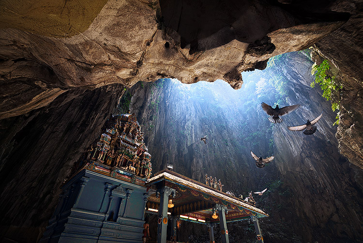
I took the photo above of Batu Cave in Malaysia. I chose to add a few pigeon photos from a series that I captured, and blended them all together into a single photo with the digital blending technique.

Select images

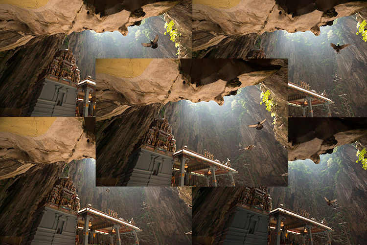
Here are the raw photos that I going to use. You can see that there are pigeons in different locations in each of the photos.

digital blending Photoshop

Open Photoshop

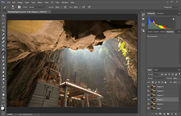
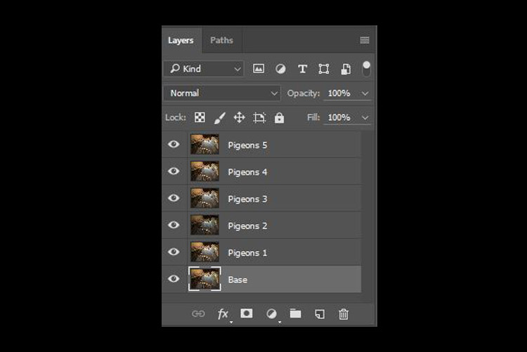
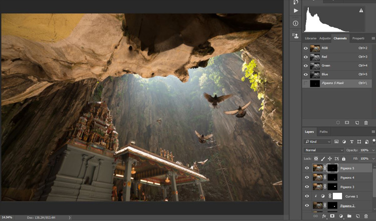
Next with Photoshop open, I load all the photos into one place as different layers. You can rename them if you want, as I did here.

digital blending in Photoshop

Back up for a second: How the shots were done

Notice there’s a “base” layer at the bottom. That image was captured with different camera settings compared to the pigeon shots. I do this because normally before capturing any additional photos such as the pigeon images, I will first take a few photos with the BEST camera settings for that situation. In this case, that was ISO 100, aperture of f/8, 1/30th of a second shutter speed.

However, the 1/30th shutter speed was too slow to capture any photos of pigeons. So I needed a faster shutter speed which ended up with camera settings of; ISO 800, f/5, and 1/640th of a second. This allowed me to freeze the movement of the pigeons, but at the same time, it also generated more noise in the photos (ISO 800 compare with ISO 100) and a slightly more shallow depth of field (f/5 compared with f/8) resulting in a softer background.

So the ideal scenario is to have them both together in one final image. Using the digital blending technique you can have the best image quality photo with lesser noise and better focus, and then blend in only the pigeons from later photos. The pigeons will appear to have more noise than other areas of the photo but only in very small areas and you can do a separate Noise Reduction just for the pigeons if needed.

Shooting sequence

Here is the shooting process in sequence, to give you a better picture:

  1. Decide on a composition.
  2. Take your photo with the best (optimal) camera settings for the scene.
  3. Without moving your composition, change the camera settings to capture anything that looks interesting to you. For example; animals, people that able to bring out the atmosphere of the place such as monk praying in a temple, or even any lifeless objects such as trains or boats, or anything else you can think of or notice in the scene.

Photoshop steps

Step #1 – Turn off some layers

Back in Photoshop, you will see there is an “Eye” icon beside each layer. This means that all these layers are visible. Temporary, let’s hide all the pigeon photos first by clicking on the “Eye” icon to uncheck each layer. Leave only two visible, the Base and Pigeons 1 layers.

digital blending

Step #2 – Add a layer mask

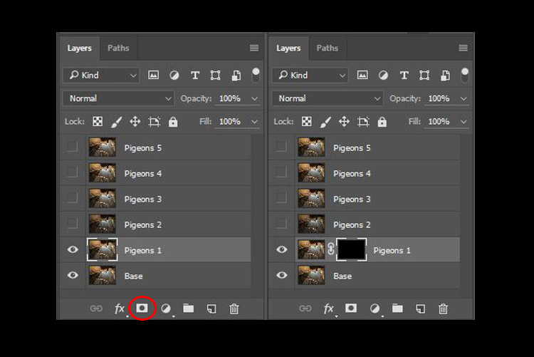
Next, select the Pigeons 1 layer and while holding down the Alt key, click on the “add layer mask” icon (circled in the red in the photo below left). You shall have a black rectangle appear at the right side of the layer, as seen in the photo below right. This is to add a reverse layer mask on your layer, the black mask means it is hiding what is currently in this layer. If you don’t hold the Alt key when you click on the icon, it will create a white mask which will reveal what is currently in the layer.

digital blending layer mask

Step #3 – Paint on the mask to reveal the bird

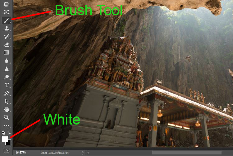
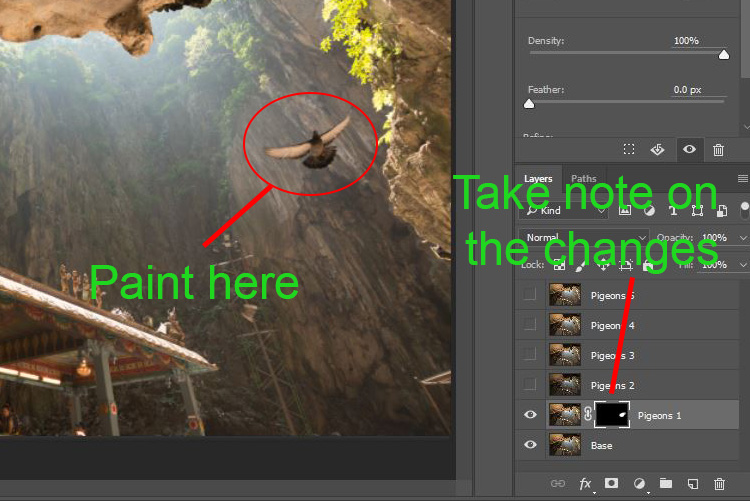
Now we have a black mask. To blend in only the pigeon from that layer, we will need to select the Brush Tool and paint on the mask in white over the pigeon’s area. Note: A black mask means hiding and white means revealing the layer.

digital blending Photoshop

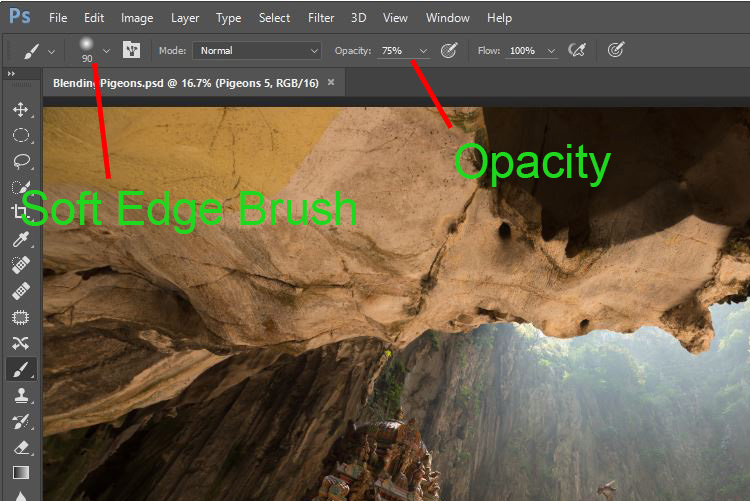
After selecting the Brush tool, make sure you are using a soft edged brush, and the opacity is set to about 75%. The opacity will affect how much of your painting result will be applied. Using opacity at 100%, you only need to paint once to fully reveal that particular area. However at 75 % or lesser opacity, you will need to repeat the painting few times in order to achieve the 100% effect. It is slower, but at the same time it create a smoother edges and the layer is better blended to the original image.

digital blending brush tool

Notice when you do the painting, the mask on the layer also reflects your painting result. Congratulations, now you have the first pigeon blended in! Let’s repeat the same process for the next layer.

digital blending Photoshop

Step #4 – Repeat on next layer

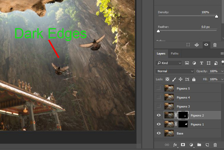
By performing the same steps on the “Pigeons 2” layer, you will now have the second pigeon added. But wait, something is not right. Do you notice that the second pigeon has dark edges surrounding it? Why?

digital blending Photoshop

This is because even at the same camera settings, the lighting conditions may have changed during the shooting process. This image was captured when there were clouds blocking the sun and it dimmed the light in the cave. Instead of solving this by doing some really precise masking (by zooming in and brushing carefully on the edge of the pigeons, which can be a tedious process), let’s try adding a Curves adjustment layer.

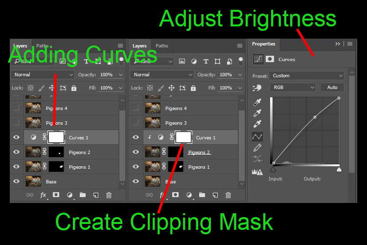
Before doing any adjustment with the curve layer, right-click on it and choose “create clipping mask”. This will make sure whatever adjustment is done here will only affect the layer below it. Now add some brightness by slightly pulling the curve up, as shown below right.

digital blending Photoshop

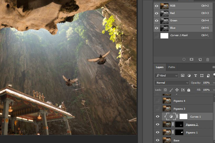
The surroundings of the second pigeon looks much better now. Other than using a Curve, you can do this on any other adjustment layers such as color balance adjustment layer to correct the tone of the particular layer, if the white balance is not equal with the background.

digital blending Photoshop

You can see the bird blends in much better now with the Curve applied.

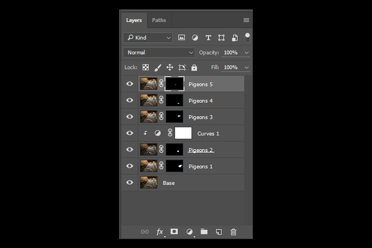
Step #5 – Complete masking on all layers

Let’s continue with the rest of the layers. The masking results will look like the photo below once you have done the blending process.

digital blending Photoshop

Finally

Here is the final output of the digital blending. Now you can perform any other post-processing adjustments from here by applying contrast, changing color balance, sharpening, or any other process that you think is necessary to enhance your photo.

digital blending Photoshop

I hope you have enjoyed this article, and it gives you some ideas or inspiration. If you have any questions or suggestions, feel free to leave a comment below.

googletag.cmd.push(function() {
tablet_slots.push( googletag.defineSlot( “/1005424/_dPSv4_tab-all-article-bottom_(300×250)”, [300, 250], “pb-ad-78623” ).addService( googletag.pubads() ) ); } );

googletag.cmd.push(function() {
mobile_slots.push( googletag.defineSlot( “/1005424/_dPSv4_mob-all-article-bottom_(300×250)”, [300, 250], “pb-ad-78158” ).addService( googletag.pubads() ) ); } );

The post How to do Digital Blending in Photoshop to Create a Composite Photo by Grey Chow appeared first on Digital Photography School.


Digital Photography School

 
Comments Off on How to do Digital Blending in Photoshop to Create a Composite Photo

Posted in Photography


Dreaming for a living: The conceptual composite photography of Colin Anderson

12 Oct

Australia-based conceptual artist Colin Anderson is re-defining what it means to be a modern photographer. An early adopter of Photoshop, Anderson creates complex allegorical images from a number of visual elements, including stills captured with a medium format camera and 3D elements created from scratch. Find out what he’s learned from a long career in editorial and commercial photography. Read more

Articles: Digital Photography Review (dpreview.com)

 
Comments Off on Dreaming for a living: The conceptual composite photography of Colin Anderson

Posted in Uncategorized


Microsoft Image Composite Editor 2.0 offers new panorama features and improved interface

09 Feb

Microsoft’s Research’s Interactive Visual Media Group has announced the release of Image Composite Editor 2.0. The software’s latest update, taking advantage of the company’s Photosynth technology, can seamlessly stitch together ‘gigapixel images’, create panoramas from video, and automatically fill in areas of missing photographs. Read more

Articles: Digital Photography Review (dpreview.com)

 
Comments Off on Microsoft Image Composite Editor 2.0 offers new panorama features and improved interface

Posted in Uncategorized


Composite Crime Scenes: NYC Past Patched onto Present

29 Apr

[ By Steph in Art & Photography & Video. ]

NYC Crime Scene Collage 1

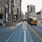
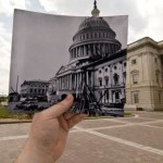
Murdered gangsters, car crashes and four-alarm fires are nearly forgotten in the peaceful present day, but this photo series reminds us that the past is not so far away. Photographer Marc A. Hermann, a historian with the New York Press Photographers Association, lays old New York City crime scene photos on top of their present-day locations for dramatic juxtapositions of time period and mood.

NYC Crime Scene Collage 2

Warning: these are real crime scene photos, and aren’t for the faint of heart. The very recently deceased are seen cradled in the arms of their loved ones, or sprawled out on the floor. The top photo depicts a distraught woman who climbed onto the ledge of her building; the second shows the Church of the Sacred Hearts of Jesus and Mary aflame.

NYC Crime Scenes 6

NYC Crime Scene Collage 4

The demise of gangsters Salvatore ‘Sammy’ Santoro and Frankie Yale can be seen after a shooting and a car crash, respectively. A woman hides her face in mourning of her sister in front of the ruins of a car. Firefighters battle a blaze at the Elkins Paper & Twine Co. that claimed the lives of six people.

NYC Crime Scene Collage 5

NYC Crime Scene Collage 3

In each photograph, the black-and-white historical image contrasts sharply with the modernized full-color setting. Tourists stroll past the scenes of some of the city’s most tragic disasters, completely unaware. The message seems to be that life goes on, but the ghostly imprints of those incidents remain. See the full series at New York Daily News.

Share on Facebook


[ By Steph in Art & Photography & Video. ]

[ WebUrbanist | Archives | Galleries | Privacy | TOS ]


WebUrbanist

 
Comments Off on Composite Crime Scenes: NYC Past Patched onto Present

Posted in Creativity


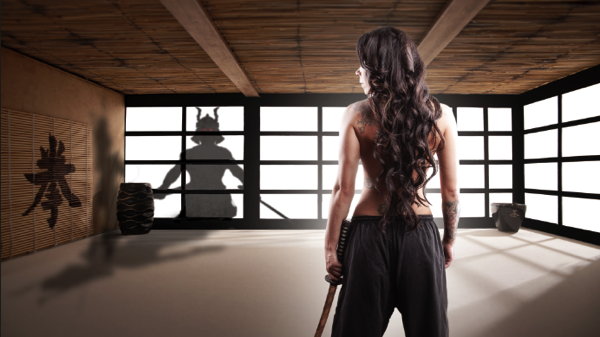
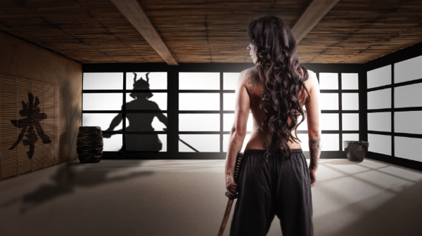
Samurai Girl Composite: Behind the Scenes Post Production Walk Through

29 Aug

by Tom Di Maggio

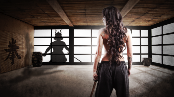
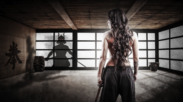
In this article I’ll show you how the “Samurai Girl” picture was done step by step. In addition there is a speed art video at the end of the article that shows the whole process from start to end in a 05:47 minutes Youtube video. It should make the whole process clearer.

Feel free to send me your questions via email at tom@purple-monkey.com

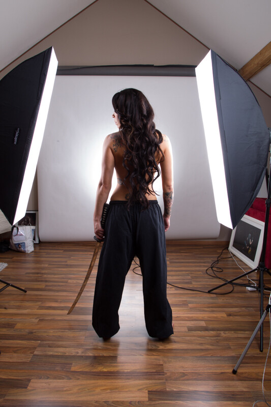
1 Base Image Jessica

Here is the image as it was shot. Before I start to extract the subject I use a technique to create that look on my models that consists of 6 Layers. I will write a separate tutorial on that topic, as it will deviate too much from the point of this tutorial.

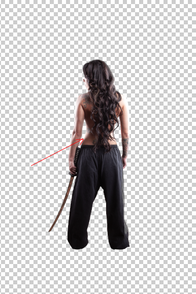
2 Model Liquify copy

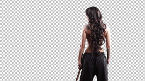
I started with cutting out Jessica from the background. When you know that you are going to extract the subject for a photo manipulation or composite, make sure you shoot them on a background that will create an nice contrast around the edges. It will make your life a lot easier for the extraction process. The method I use to extract my subjects varies a lot depending on the need and the situation. The tools I usually use are the Pen Tool, Brush, Refine Edge, Lasso, Quick Selection and the Blending Option effects. In this case I used a mixture of Pen Tool, Brush and Refine Edges.

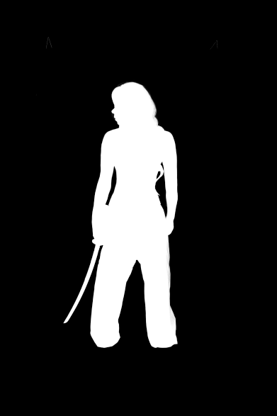
3 Mask

Here is a picture of the finished mask. I like to check the mask for imperfections by “Alt” clicking on the layer mask.. What I also do a lot is to check the mask against a white and a black background. I will usually show you all the imperfections on the mask especially fringing. If the extraction looks good against both backgrounds, then you can be sure that you won’t need many adjustments anymore against your final background.

4 Integrate into Image

I usually work on picture in the 16:9 format. Sometimes I quickly sketch my ideas on a piece of paper or on the iPad. I basically gives me an idea about the composition of the image. As soon as Jessica was extracted from the background I moved her over to the canvas using the move too. I scaled her down and positioned here approximately. I slightly corrected her position once the background was inserted.

5 Original BG

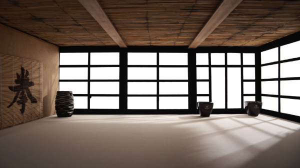
At this point I also imported my background in order to see what color corrections would be needed to integrate Jessica into it. When I opened the stock image for my background I saw some things that would need modification.

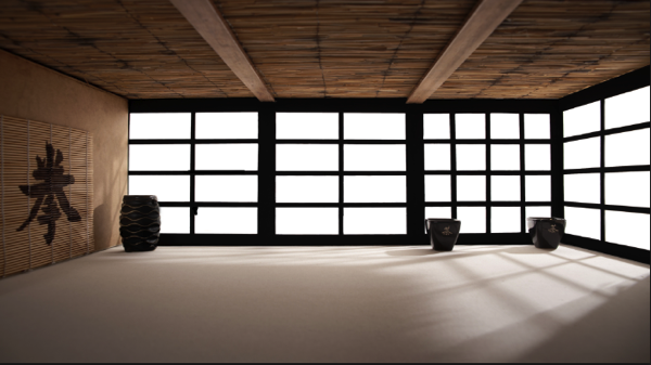
7 Corrected Bg

I didn’t like the doors on the right side as it would look weird when Jessica would be in position. So I just added some horizontal bars to solve that issue.

6 Gradient for Model

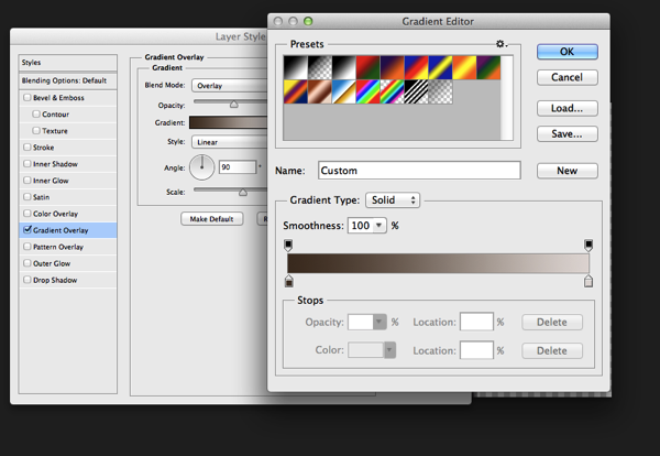
The first step I used to integrate Jessica was a Gradient map. The colors I used for the shadows was a sample of the wooden door frame (very dark brown) and for the highlights I used a sample of the Tatami. I lowered the opacity to about 45% to achieve an acceptable value. It’s important when you use this method that you use colors that are already present in the palette of the image.

8 Samurai

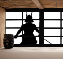
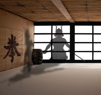
Next step was to integrate the Samurai. I’ve build the Samurai out of several stock photos and used an adjustment layer to darken it to complete black. I used a layer mask to hide the wooden frame of the window.

9 Samurai Eyes

In order to make it more realistic I’ve added a dirty texture on top of the Samurai with a blending mode Overly and I slightly blurred him, since what we actually see is a shadow on the fabric. I then added the eyes with the brush tool and some subtle outer glow effects.

Next step was to create the shadows on the floor and the wall. I duplicate the Samurai Layer and used distort and warp to adjust it’s shape. I also painted the shadows onto the barrel, in the original picture the barrel was brightly lit from the right side. Since the Samurai is standing in front of it, the light source would be blocked.

13 Overlay Color

To blend everything together I use a simple technique that is not well known out there. I merge all the Layers together onto a new Layer ( Shift+Ctrl+Alt+E (PC) or Shift+Command+Option+E (Mac) ) and then use the Blur Average Filter. Switch the blend mode to overlay and reduce the opacity until the color matches. I then used the Tilt-Shift filter to align the average depth of field of Jessica to the background.
14 tilt Shift and Light

Finally I created a new layer on top of it change it’s blending mode to overlay and painted with a soft black brush around the samurai and around Jessica in order to direct the viewers eye through the picture. A last step was to lay a grungy texture in overlay over the whole image and reduce it’s opacity quite a bit.

15 Final

I try to do a maximum in Photoshop in terms of light and shadows. But when I finish an image I always have some fun in Lightroom with some presets or simply play around with the sliders. Some times I end up not using any of it, but most of the time I find some settings that adds value to the overall image. Now there is no secret to this, I just play around with Clarity, Blacks, Temperature, and Contrast until I see it going somewhere. In this case I added some contrast, quite a bit of Clarity and slightly desaturated the image.

16 Final LR

Here’s the video of the whole process dialed up to about 1000%

Check out more of Tom Di Maggio’s work at his websites at TomDiMaggio.com, Purple-Monkey.com” and on Facebook.

Post originally from: Digital Photography Tips.

Check out our more Photography Tips at Photography Tips for Beginners, Portrait Photography Tips and Wedding Photography Tips.

Samurai Girl Composite: Behind the Scenes Post Production Walk Through


Digital Photography School

 
Comments Off on Samurai Girl Composite: Behind the Scenes Post Production Walk Through

Posted in Photography


How to Shoot and Create a Composite Image for a Product Advertisement

23 Nov

Background and Vision

The holiday season is upon us, and what better way to start the season than to share our behind-the-scenes video on how to shoot a composite image? I needed to shoot and create an advertising image for UNDFIND’s Fishbomb, which is a versatile accessory pouch that can carry lens filters, memory cards, and other small items. So I figured, why not create a behind the scenes video and tutorial on how I went about the shoot. Plus, it’s not a bad stocking stuffer for the photographer in your life, especially since you can get two for $ 13 (50% off) with this sale, wink! =)

Anyway, because the Fishbomb is shaped like a Christmas tree ornament, I decided to decorate a Christmas tree with the Fishbombs and shoot our model, Maria, placing a Fishbomb on the tree. Here is the final image we will be working towards.

Fishbomb UNDFIND SLR Lounge

The Behind-the-Scenes Video

If you are interested in watching the full behind the scenes video on the SLR Lounge YouTube Channel, here is the video below.

How We Shot It

GEAR USED:

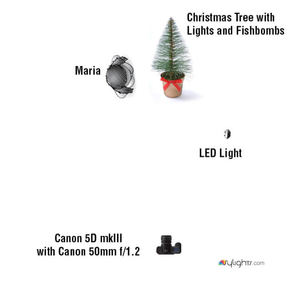
Camera: Canon 5D mkIII
Lens: Canon EF 50mm f/1.2 L USM Lens
Lighting: LED Light and Christmas lights on the Christmas tree

The biggest challenge that I encountered was how to light the Fishbombs in addition to lighting Maria, the Christmas tree, and the environment. The Christmas lights were used to light Maria and the environment.

However, when we hung the Fishbombs on the tree, we noticed that the front of the Fishbombs were not illuminated by the Christmas lights. This meant that we had to light the Fishbombs using another light source; I selected an LED light with an adjustable temperature so that I could color match with the tree’s natural Christmas lighting.

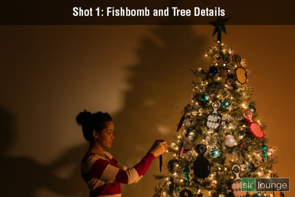
However, I ran into another problem. The LED light was casting a harsh shadow against the wall which destroyed much of the warm, ambient light from the Christmas tree as you can see in Shot 1 below.

The easiest way to solve this lighting issue was to light and shoot two separate images, one for the model and the environment, and the other for the actual detail on the Fishbombs and the tree. Afterwards, we can composite both images together in Photoshop via layers.

For each shot, I had the camera placed on a stationary tri-pod to make it simple to combine both layers into our final composite. So let’s look at how I shot each image.

Shot 1: The Fishbomb and Tree Details

Shot-1-Fishbomb-and-Tree-Detail

Shutter: 4.0 seconds
Aperture: f/16
ISO: 100

For the first photo, I lit the Fishbomb and the front of the Christmas tree with the LED light. I also dragged the shutter speed and used the smallest aperture possible in order to get a twinkling/starburst effect from the Christmas lights. I didn’t have to worry about any camera shake because the camera was on a tripod and was triggered with a shutter release. The tree and the ornaments were completely still as well since we were in a closed environment.

Shot 2: Maria and the Environment

Shot-2-Model-Environment

Shutter: 1/8 seconds
Aperture: f/2.8
ISO: 200

This image was lit strictly by the lights on the Christmas tree. Because I want to minimize any motion blur with the model, a quicker shutter speed was required. Therefore, I used a wider aperture and a higher ISO in order to attain a shutter speed of 1/8 seconds. Even then, I still had to ask Maria to hold completely still during the photo to prevent any motion blur.

How We Processed It

In Lightroom, I applied the Soft Portrait preset from the SLR Lounge Lightroom 4 Preset System to both images. Additionally, I shifted the Tint and the Temperature in order to add a warm, intimate glow reminiscent of a fireplace. Once I achieved the look that I wanted, I exported the two images into Photoshop via layers for compositing.
In Photoshop, I used layer masking to reveal the Fishbombs and the tree details from the first image over the second image of Maria and the environment.

Photoshop Layer Mask

After a little bit of clean up in the hair and the cloning of an extra branch to the top of the tree, this is how the image looks.
Fishbomb UNDFIND SLR Lounge

Finally, here is how the UNDFIND Fishbomb ad looks after I added the text:

UNDFIND Fishbomb Advertisement

Hope you all enjoyed this article! If you are interested in picking up some Fishbomb’s for stocking stuffers, the deal is available on UNDFIND’s Camera Bags website through the end of the year.

Post originally from: Digital Photography Tips.

Check out our more Photography Tips at Photography Tips for Beginners, Portrait Photography Tips and Wedding Photography Tips.

How to Shoot and Create a Composite Image for a Product Advertisement


Digital Photography School

 
Comments Off on How to Shoot and Create a Composite Image for a Product Advertisement

Posted in Photography