RSS
 

Posts Tagged ‘Complementary’

How to Use Complementary Colors for Color Correction of Your Images

25 Nov

Two days before my wedding, I got sunburnt on a fishing trip. It was also my bachelor party.

Al Shallal Ice Rink in Jeddah, Saudi Arabia – before color correction

Al Shallal Ice Rink in Jeddah, Saudi Arabia – after color correction

My wife’s cousin, the makeup artist for the big day, took one look at my bright red nose and dragged me into a changing room. She sat me down and pulled out a jar of green powder.

“Is that green powder?”

“Yep – green is the opposite of red on the color wheel, so this cancels out some of that shine.”

Those probably weren’t her exact words – but it was something like that. However, it stuck with me. She added a dash of green powder and my nose was slightly less red.

Using Complementary Colors for Color Correction

We are always striving to use color theory in new and captivating ways. Using complementary colors in your images, and creative adjustments to color balance and split toning can take your images to the next level. You most likely adjust white balance, including temperature and tint, somewhere at the start of the editing process. The ‘Temperature’ slider gives your images a cool or warm tone. The ‘Tint’ slider gives a green or magenta tint.

You use these sliders to add to the overall mood and tone of the image. Those values are fine-tuned throughout the editing process while making other adjustments. Recently, I made use of my knowledge of color theory (and that critical lesson on my wedding day), for an entirely different purpose.

Lightroom White Balance Slider at Default Settings

I currently live and work in Saudi Arabia. To the surprise of many people, I also play ice hockey out here for The Red Sea Sabres. We practice in Jeddah and play in international tournaments every year. On Saudi National Day, our team was invited to play in a friendly scrimmage against the re-emerging Saudi National Team. It was part of an effort to showcase ice hockey in The Kingdom (the details of the entire story are in the blog post linked in my bio).

When we arrived at Al Shallal Ice Rink, the ceiling lights had been tinted green in honor of the Saudi Flag. There was also a large mist looming over the entire ice surface. It was kind of like playing ice hockey on Venus. We were also part of a larger ice skating and Saudi National Day showcase, and there were heaps of photographic opportunities everywhere I looked.

Shooting backstage was fine, as you can see from the before and after images below that have only a few adjustments to the RAW cuts. However, backstage was under ‘normal’ fluorescent lighting and not the green tinted light hanging over the ice.

Original RAW file

And after minor corrections in LR

Tint Slider

My import screen filled with heavily tinted green photos.

You may already add small amounts of tint to your images for artistic purposes or to balance color after shooting under lighting conditions that cast an unwanted tint to your images. However, I had never seen anything like the RAW files I captured that night. As I watched my import screen fill with a tapestry of heavily tinted green photos, one word popped into my head…’magenta.’ I moved the tint slider toward the magenta side of the spectrum and the green cast faded.

Before the ice hockey scrimmage, an ice skating exhibition took to the ice – before color correction.

And after color correction.

Usually, I don’t go above +20 on the magenta slider, but the photo above required +130!

Split Toning

To help adjust skin tones and overall colors of jerseys and ice, I adjusted the split toning to add even more magenta to the image. However, I struggled to fully-correct the skin tones, but they looked better than the pale green faces staring back at me on import!

‘Split Toning’ helped remove more unwanted green from skin tones and even out the color of the ice.

Some of the images required a tradeoff. As with the image below; the foreground is backstage under fluorescent lights, and the background is on the ice under green colored lights. You can see that the player’s skin tone is off from the heavy magenta tint on his neck. However, it’s such a compelling image I allowed the tinted skin tone in exchange for the overall shot to be balanced.

This image could be further corrected in Photoshop using a localized correction on the player’s neck to correct his skin tone further.

Conclusion

Color, mood, and tone have a dynamic relationship in every image. If you are a self-taught photographer like me, you probably missed out on formal training in color theory. I have a picture of the color wheel on the wall in my editing office. That way, I am always reminded of the subtle but powerful difference using complementary or anchoring colors can add to an image. Alternatively, in this case, how adding a significant imbalance to one side of the spectrum can rescue images.

If you have been challenged by colored lighting conditions or have some images you’d like to share with us, please do so in the comments below.


The post How to Use Complementary Colors for Color Correction of Your Images appeared first on Digital Photography School.


Digital Photography School

 
Comments Off on How to Use Complementary Colors for Color Correction of Your Images

Posted in Photography


How to Stylize Your Images Using Complementary Colors in Lightroom

17 Nov

In this tutorial, I’m going to show you a process that uses complementary colors to stylize your images and create a consistent theme in your collections.

I recently embarked on an 1,800-mile road trip through the dusty outback of Western Australia. After two days on the road, I arrived at Karijini – a national park famous for its iron-rich earth, icy-cold gorges and sheer remoteness from absolutely anything.

Complementary colors Lightroom 01

The Middle of Nowhere – Karijini National Park, Western Australia

Karijini is awash with complementary characteristics; hot deserts, icy-cold gorges, warm days and freezing nights. Nothing quite compares, however, to the daily occurrence of Karijini’s natural complementary colors. Each night, my eyes were treated to a beautiful blend of golden earthy tones and cool shadows. And each night, they couldn’t get enough.

You may find yourself getting a little trigger happy when you’re on a holiday. Perhaps you are trying out a new lens, maybe practicing new techniques or just getting carried away with the shutter button – we’ve all been there! If so, you’re likely to return home with a mixed bag of great shots and perhaps some images that aren’t particularly strong enough in their own right to add to your portfolio, blog, or Instagram feed.

Here’s a collection of images from my trip to Karijini that don’t combine very well as a collection in their current form. They each have a different color palette, there are multiple different techniques going on, and they don’t really share the same style. There’s no cohesiveness, no harmony.

Complementary colors Lightroom 02

Individually, these images are not particularly strong. However, as a collection, they have potential to pull together to form a great storyboard.

To help this image set convey that story, I’m going to show you a coloring process to stylize this collection. By using complementary colors I will create a consistent look, feel, and style that will run through the entire collection. This process is something that you can adapt to your own collections, time and time again.

Complementary Colors

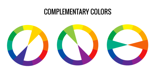
If you’re thinking, “What on earth is a complementary color?” don’t worry, it’s quite easy to understand. Put simply, they are colors that are opposite each other on the color wheel. Here’s a screenshot with some examples:

Complementary colors Lightroom 03

Complementary color examples.

Complementary colors appear everywhere, particularly in nature. Think of a beautiful sunset, the beach, or even Finding Nemo – each of them is jammed packed with complementary colors. They are called complementary because they do exactly what they say on the tin – complement each other.

You can use complementary colors in your photography to create a consistent look, feel, and style to a collection of images. This can be achieved while capturing your shots (i.e. by asking your subjects to wear a particular color) or by applying subtle adjustments to colors in post-processing. I am going to show you precisely how to achieve the latter using Adobe Lightroom.

Step #1: Create a Color Palette

Before you jump into Lightroom and begin to adjust your colors, you need to be clear about which colors you want your images to include.

A great way to do this is to create a simple color palette that you can refer to while editing your images. This color palette could be a collection of images you have cut out of magazines, perhaps some color swatches from a paint store or even a bunch of squares on your computer filled with your desired colors.

Here I opted for the bunch of squares, filling the color palette with complementary warm earthy tones and cool murky shadows that capture the landscape of Karijini.

Complementary colors Lightroom 04

Step #2: Align and Subtract using Hue, Saturation, and Luminance (HSL)

When you sit down to edit a photograph, you typically approach it with the mindset of adding something. For example, you tend to add contrast, sharpness, or perhaps you add a gradient.

When you are working with color, particularly when you have a color palette in mind, you need to alter your approach and instead think about subtracting. You need to subtract the colors from your images that don’t align with your color palette, because working with color is as much about the colors you can’t see as it is about the ones you can see.

Once you are happy with your colors, and they sit within the boundaries of your color palette, you can then go forth and add, enhance, and beautify.

In this step, I will show you how to use the HSL (Hue, Saturation and Luminance) panel in Lightroom to subtract and align the colors of an image to reflect those of your color palette.

Align with Hue

Start off inside the Hue section of the HSL tab. The Hue sliders allow you to replace your existing colors with neighboring colors on the color wheel.

For example, you are able to replace all red tones in your image with magenta by adjusting the Red Hue slider to -100. Moving this slider to +100 will replace all the Reds with Oranges. This is because magenta and orange sit on either side of red on the color wheel.

At this point, it’s worth taking a moment to study the color in your image and start to think about what colors you can push and pull to align your image with your color palette.

Let’s do this with an example image. At the moment, this image is a bit off from the desired color palette. It appears to have an aqua/green color cast, particularly in the sky.

Complementary colors Lightroom 05

Original image.

To remove the aqua/green color cast, you can push the aqua tones up to replace them with blue. In this example, a value of +81 works well. In addition, you can push the Blue slider up a little, to around +36. This will deepen the blue tones and remove what was left of the aqua/green color cast.

Finally, to align the orange/yellow tones to the color palette, you can pull the Orange and Yellow sliders to -26 and -15 respectively. This subtle adjustment pushes the orange tones towards red and the yellow tones towards orange – essentially warming up those earthy tones.

While editing, it’s always a good idea to view your image alongside your color palette, to ensure you are working along the same lines for each photo. This will help you pull the collection together at the end.

Complementary colors Lightroom 06

Hue adjustments in the HSL panel of Lightroom.

Here, you can already see that the Hue adjustments have aligned the color of the sky and earth to the desired color palette. However, there are still plenty of green tones roaming around in the shrubbery and navigation system that are wreaking havoc with the color palette. You can remove the green tones with the Saturation sliders.

Subtract with Saturation

The Saturation sliders within the HSL tab allow you to control the intensity of your colors. By increasing the saturation, your colors will become stronger and more vibrant. Decreasing the saturation sliders will make your colors less intense.

Have another look at your image and take note of any distracting colors that do not align with your color palette. Adjust the corresponding sliders to desaturate those colors. This will leave you with only the colors that align with your color palette. Once you have these base colors in place, you can then give them a little saturation boost to strengthen the image.

Let’s jump back to the example image to demonstrate.

While the example image is a lot closer to the desired palette, it still contains distracting colors that don’t align – notably, the green tones and strong yellows. You can subtract these colors from the image by desaturating the Green and Yellow sliders. In this case, values of -100 (Green) and -78 (Yellow) worked nicely.

To finish up with the Saturation sliders, you can increase the saturation of the colors that align to your complementary color scheme. In the example image, boosting the red, orange, aqua and blue colors worked a charm.

Time for another review of the example image against the color palette.

Complementary colors Lightroom 07

Saturation adjustments.

Lighten with Luminance

The Luminance sliders in the HSL tab allow you to control how bright or dark you want a particular color to look. Increasing the Luminance adds brightness to your colors, whereas decreasing the Luminance darkens your colors.

Compare your image to your color palette. How does it look? Are the colors a little too dark or too light? If so, adjust the corresponding Luminance slider to lighten or darken your colors.

In the example image, the oranges are appearing a little too dark and perhaps the blues could do with a little brightening as well. To achieve this, you can increase the luminance of the Orange, Yellow and Blue sliders until you are happy with the brightness. In this case, moving the Orange slider to +28, Yellow to +21 and Blue to +11 did the trick.

Complementary colors Lightroom 08

Luminance adjustments.

Try to get into the habit of regularly comparing your image to your color palette, particularly after you have made any adjustments to the HSL sliders. At this point, if you think that your colors need a little more work, run through each of the HSL sliders again and tweak them accordingly.

Step #3: Adding Character with Curves

Creating a consistent style and applying this to every image in your collection can be the difference between a good collection and a great one.

If you have a particular editing style, now is the perfect time to apply it to your images. If you’re at a stage where you’re perhaps trying to create or establish your own style and you’re not sure what to do, it’s a great idea to use your subject or environment as a style guide. Let’s take a look at doing precisely that with an example.

Karijini is awash with complementary colors, iron-rich earth, warm dusty air, and murky shadows. To help inject some of these characteristics into the image you can use the Tone Curve.

The Tone Curve is essentially a square graph that consists of a Histogram and a linear line running from the bottom left to the top right. Much like the Histogram, the left side of the Tone Curve represents the shadows, the middle represents mid-tones and the right side represents the image highlights.

Complementary colors Lightroom 09

Tone Curve – Basic

By clicking on the “Point Curve” Icon (in the lower-right corner of the Tone Curve window) you’re now able to click on the Tone Curve graph to create control points. You can then drag these control points up or down to alter the value of the corresponding tones.

Complementary colors Lightroom 10

Point Curve icon for adding adjustment points.

Your Tone Curve works in four distinct channels – RGB, Red, Green, and Blue. For now, ensure the channel of your Tone Curve is set to RGB. This allows you to control the overall tone of your image by manipulating the Red, Green and Blue tones simultaneously. You’ll get to know the other channels shortly.

Creating Atmospheric Shadows

Before incorporating atmospheric shadows into your image, you want to ensure that any adjustments you make only apply to the shadows. So, to safeguard your mid-tones, you can place a control point in the middle of your Tone Curve (as seen below).

Complementary colors Lightroom 11

Now you can add some control points on the left side of your Tone Curve. These will allow you to manipulate your shadows.

Complementary colors Lightroom 12

Dragging these control points downwards will darken your shadows. However, to create flat, murky looking shadows, you can drag these control points upwards – essentially lightening your shadows. While doing so, pay close attention to the darker areas of your image to ensure you don’t overdo it.

To complete this murky atmospheric look, you can darken the highlights by dragging the control point on the extreme right of your Tone Curve down a little.

In the example, you can see that this subtle adjustment has lightened the shadows, darkened the highlights, reduced the contrast, and introduced that murky atmospheric style to the image.

Complementary colors Lightroom 13

Tone Curve applied.

Color Stylizing

Every pixel in your photo is made up of a mix of Reds, Greens, and Blues. The Tone Curve isolates these individual color channels so you can adjust how much or how little of that color channel is present in your shadows, mid-tones, and highlights.

Studying the example image, the base colors of the image are looking good. It’s full of complementary colors, and it aligns nicely with the color palette. So then, why bother with these individual tone curve channels?

It goes back to infusing your photos with a style reminiscent of your subject or the environment. Perhaps there was a particular feeling or emotion during the shoot. Was it lively? Happy? Bright? Melancholic? Hot? Cold? Is there a color tone within your color palette that you feel best represents these?

Perhaps there was a lot of earthy red dust and cool shadows floating around? If so, you could add a subtle warm tone to your image and cool down those shadows to help enhance the look, feel and style of your images. Let’s take a look at how to achieve precisely that by using the Tone Curve with the example image.

Start off by selecting the Red Channel inside your Tone Curve. If you can’t see the “Channel” option, be sure to click on the “Points Curve” icon.

Complementary colors Lightroom 14

Working on the Red Channel of the Tone Curve.

Any adjustments you make to this Tone Curve will only affect the Reds in your image. If you create a control point in the shadows and drag this upwards, it will increase the Reds in your shadows. If you were to do the opposite and drag this control point downwards, it will remove the Reds from your shadows.

It’s worth noting here that when you remove a primary color using the Tone Curve, you will introduce its opposite color. Here’s a list of the primary colors and their corresponding opposite colors.

  • The opposite color to Red is Cyan.
  • The opposite color to Blue is Yellow.
  • The opposite color to Green is Magenta.

To add a subtle warm underlying tone to an image, simply click and drag the control point on the extreme left of the Red channel upwards slightly. You’ll notice that it doesn’t take a lot of adjusting to achieve the desired look.

Complementary colors Lightroom 15

Red Tone Curve adjustments.

To cool down your shadows, switch your Tone Curve channel over to Blue. This will enable you to increase the amount of Blue in the darker areas of your image. To do this, click and drag the control point on the extreme left of the Blue channel upwards. Pay attention to the darker areas of your image to ensure you don’t overdo it.

Complementary colors Lightroom 16

Working on the Blue Channel of the Tone Curve.

You may find that while this adjustment cools down the shadows, it also cools down the mid-tones and highlights. To counter this, you can click and drag the control point on the extreme right of the Blue Channel downwards. This will remove the blue tones from your highlights and introduce a little of Blue’s opposing color (Yellow) to warm your highlights back up.

Complementary colors Lightroom 17

Blue Tone Curve adjustments.

Step #4: Split toning (Optional)

The final step in the complementary color stylizing process is to apply a subtle split toning adjustment using Lightroom’s Split Toning tab.

By now, you may feel that your image is already perfectly aligned to your color palette and perhaps there is nothing more that needs to be adjusted. If so, congratulations! I encourage you to go forth, infuse your collections with your style and inspire others to do the same.

If you are looking at your images thinking “there’s something not quite right” or “they still need a little work”, head to the Split Toning tab. This is a very simple tool that can add a final layer of polish to your images.

Split Toning enables you to apply a specific color tone to your highlights and shadows. It’s a good idea to refer to your color palette and select the exact Hue that you want to be present in the highlights and likewise for the shadows. You can then dial back the intensity of this look using the saturation sliders until you are happy with the result.

For the example image, selecting complementary warm hues of 45 for the highlights and 240 for the shadows aligned perfectly with the color palette. Adjusting the Saturation of each to 10 and 6 respectively, applies just the right amount of toning and completes the stylizing process.

Complementary colors Lightroom 18

Split Toning adjustments added.

Recap

Let’s take a few seconds to do a recap of the coloring and stylizing process before taking a peek at the before and after.

  1. Start off by creating a complementary color palette.
  2. Using your complementary color palette as a guide, align the existing colors in your image and subtract those that don’t quite fit. Use the HSL panel for this step.
  3. Gently boost the saturation and luminance of your complementary colors, again using the HSL panel
  4. Use the Tone Curve to stylise your image and incorporate atmospheric shadows and subtle underlying tones.
  5. Pull all of your adjustments together with a subtle Split Toning adjustment, by adding complementary warm and cool tones to your highlights and shadows.

Before and After

Complementary colors Lightroom 05

Before

Complementary colors Lightroom 20

After

Below, you can see an example of what this process looks like when I applied it to the remaining images in my collection.

This collection now has a great level of consistency. It has a beautiful complementary color palette and a similar style running throughout the collection. As a result, there is a togetherness about the collection that wasn’t present before. It shares the same message and comes together to tell a lovely little story.

Complementary colors Lightroom 02

Collection – before.

Complementary colors Lightroom 19

Collection – after.

Conclusion

Working with color is a process, it’s not an exact science. While the exact values of the sliders and curve adjustments used for the example image will not necessarily work on every image, this overarching process will.

I hope this tutorial gets you thinking about how you apply color in your photography. It’s a great skill to develop, so try not to rely on presets and instead get thinking about defining a color palette of your own that you can use to stylize your collections. It’s much more fun that way!

PS. Do you have a color palette that you stylize your images with? If so please share in the comments below, I’d love to see your collections.

The post How to Stylize Your Images Using Complementary Colors in Lightroom by William Palfrey appeared first on Digital Photography School.


Digital Photography School

 
Comments Off on How to Stylize Your Images Using Complementary Colors in Lightroom

Posted in Photography


Add Contrast to Your Images by Using Complementary Colors

02 Oct

When looking at something as cognitive human beings, we naturally get a response. These responses could be emotional, physical, intellectual, etc. There is a whole range of how we respond. This range of reactions is essential for the photographer, no matter if you are shooting wedding photos professionally, landscapes for a hobby, or street photos as a traveler. Just as there is a range of photographic intentions there are ranges of how we interpret what we see. So, how do you see, and what makes you more likely to push the shutter button here and not there?

001 Red and green

From a market in Korea this green sea veggie and the red baskets they are placed in show how saturation can be achieved through color contrast

One reason is color! Colors can be striking, bold, subtle and muted, or they could be vibrant, luscious, and soft. The descriptions of colors goes on and on, as does the names of colors. Pick up an elementary school crayon box and what you’ll notice that what used to have eight colors when I was young, doubled to 16 and now there are even boxes with 152 different colours (I did look back into Crayola history and found they were sold in metal tins of 48 crayons). So again, we could make this as complicated as possible, but I can’t keep track of all those color names, can you? Nor do I want to. I just want better images.

To keep it straight forward and simple we will look at the traditional color wheel. Color wheels for printing and or mixing colors (e.g., oil painting), are not the same, so our focus is simply on what looks good to us, not the pigment mixing of paints, for painters and printers. If you look at the traditional color wheel, the complementary colors are the ones opposite of each other. When these colors are both present, called contrast, then it is pleasing to the eye.

Why, because the different colors excite different cones (or color receptors) in our eye which in turn sends signals to our brain giving us a feeling. As mentioned above colors are described in a variety of ways, as too are feelings. Sometimes complementary colors are more soothing, and sometimes they are more powerful. That often depends on the context and perspective that the colors are in (the surrounding colors), along with their tone (dark or light). Simply put, complementary colors vibrate themselves and give us feeling.

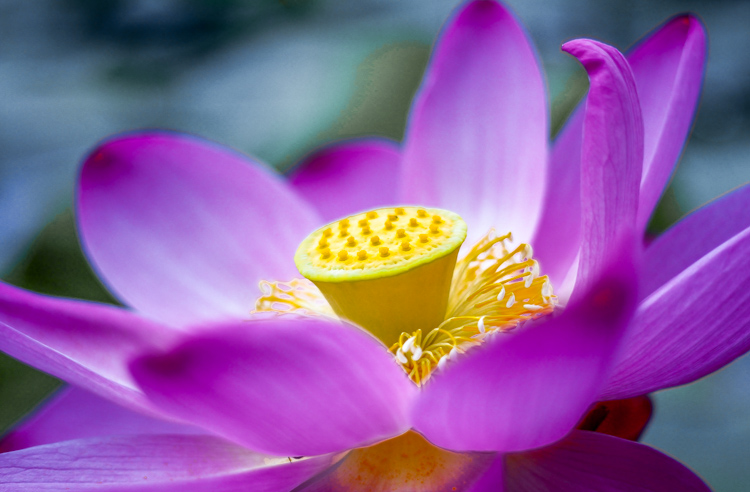
002 Yellow and purple

The contrast of the yellow to the purple direct the eye towards the center of the water lily along with selective focus. Combine color with other techniques to help guide the viewer. From Changchun China International statue park.

One reason that complementary colors tug our hearts in one direction or another is because the complementary color is actually a blend of the other two primary colors. Thus, each primary color has one complementary color which is a mix of the other two primary colors. The traditional complementary colors are red and green, yellow and purple, and blue and orange. Red is a primary color and its complement is green (i.e. a mix of yellow and blue—the other two primary colors). Thus when using complementary colors you are actually stimulating all of your color receptors but in a slightly deceiving way. If we look at the complement of yellow, it is purple. What are the two primary colors that create purple? You got it, red and blue.

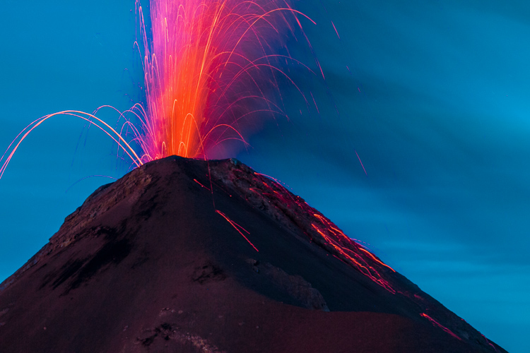
003 Blue and orange

The blue background of the volcano after sunset in Guatemala really highlights the orange lava bursting out. A much different feeling would be created if the picture had been taken at golden hour, rather than blue hour.

If we look at many Dutch master painters they were very skilled in the art of light and dark. Using lighter areas to attract your attention to certain areas of the photo, and using darker tones to push areas back into the shadows. If we move forward in the impressionist era, Monet definitely shows his use of complementary colors in his painting Impression, Sunrise (Impression, Soleil levant) in 1872, of the orange sun with the blue seascape. In the post-impressionist era, Van-Gogh’s Starry Night in 1889 of the yellow stars, and the purple night sky is maybe one of the most famous examples of the use of complementary colors.

So back to photography, what does this all mean? Well for one, print out a color wheel and put it in your camera bag. You can never look at color enough. Even back in ancient Greece, Aristotle pondered color and how it seemed to change based on the light around it. Moreover, if you look in the shadow of a primary color you will see hints of its complement. Color is one of the most subjective forms of visual art, and thus, it is very much open for interpretation and experimentation. Like most concepts in photography it is best to know the “rules” then to learn how to break them.

004 No blue

No blue: by subtracting one of the primary colors you can still achieve vibrant and dynamic results.

005 No Red

No Red: Because there is no red, the other colors seem to create more contrast.

006 No Yellow

No Yellow: In a very colorful scene, eliminating one primary color brings continuity to the photo.

Go out and see the world, armed with a little more understanding of what and how we perceive the world around us. Don’t be afraid of color in the natural world. But don’t expect to get it right by just ramping up the saturation slider in post-processing. Colors are vibrating wave forms all around us. Placing complementary colors next to each other gives your photo a little bit more energy.

Looking for the right colors might help you broaden your portfolio and prevent you from over-valuing leading lines or the rule of thirds. It might also help add punch to your textures, rather than sliding that saturation bar all the way up. Complementary colors naturally create contrast so you don’t need to try to create it in post-production. Let complementary colors complement your other strengths as a photographer.

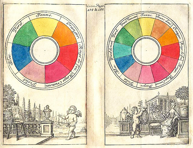
007 color circle from 1708

Traditional Color wheel from the early 1700’s.

Please help continue the tradition by sharing your thoughts and photos below.

googletag.cmd.push(function() {
tablet_slots.push( googletag.defineSlot( “/1005424/_dPSv4_tab-all-article-bottom_(300×250)”, [300, 250], “pb-ad-78623” ).addService( googletag.pubads() ) ); } );

googletag.cmd.push(function() {
mobile_slots.push( googletag.defineSlot( “/1005424/_dPSv4_mob-all-article-bottom_(300×250)”, [300, 250], “pb-ad-78158” ).addService( googletag.pubads() ) ); } );

The post Add Contrast to Your Images by Using Complementary Colors by Branson Quenzer appeared first on Digital Photography School.


Digital Photography School

 
Comments Off on Add Contrast to Your Images by Using Complementary Colors

Posted in Photography


24 Powerful Images With Complementary Colors

04 Apr

Complementary colors are ones which are opposite on the color wheel.

Lacie Lynnae

By Lacie Lynnae

They appear often in nature and are called complementary because they do just that, complement one another. They work well and make strong compositions.

Photograph Water and fire by wim denijs on 500px

Water and fire by wim denijs on 500px

Examples of common color combinations that work are:

  • Orange and blue
  • Yellow and purple
  • Red and green

Here are 24 examples of images that use complementary colors for a powerful composition:

Photograph Flower 03 by MaX Smiles on 500px

Flower 03 by MaX Smiles on 500px

Photograph The Concert Hall by Jürgen Lehmann on 500px

The Concert Hall by Jürgen Lehmann on 500px

Photograph The Red Dress by Ken Thai on 500px

The Red Dress by Ken Thai on 500px

Photograph Cloud Atlas by Meer Sadi on 500px

Cloud Atlas by Meer Sadi on 500px

Photograph Silent Witness by Moni  on 500px

Silent Witness by Moni on 500px

Photograph Cosmos by Julia Carvalho on 500px

Cosmos by Julia Carvalho on 500px

Photograph Fickle macro by Stolpulus II on 500px

Fickle macro by Stolpulus II on 500px

Photograph Dream sailing by Roberto D'Antoni on 500px

Dream sailing by Roberto D'Antoni on 500px

Photograph Calm Sunset in El Nido by Sunny Merindo on 500px

Calm Sunset in El Nido by Sunny Merindo on 500px

Photograph Heart of October by Mihai Dulu on 500px

Heart of October by Mihai Dulu on 500px

Photograph Norah by Suzy Mead on 500px

Norah by Suzy Mead on 500px

Photograph A colorful morning by Martijn Barendregt on 500px

A colorful morning by Martijn Barendregt on 500px

Photograph Perfect Cuteness by Gurdyal Singh on 500px

Perfect Cuteness by Gurdyal Singh on 500px

Photograph BayBridgeBlueFull by Bill Nichols on 500px

BayBridgeBlueFull by Bill Nichols on 500px

Photograph Star Chamber by Joseph Rossbach on 500px

Star Chamber by Joseph Rossbach on 500px

Photograph pondering by Alex Serres on 500px

pondering by Alex Serres on 500px

Photograph attractor by Pascal Faber on 500px

attractor by Pascal Faber on 500px

Photograph white eye by Woody L. Chu on 500px

white eye by Woody L. Chu on 500px

Photograph I am not a Lady Bug :P by Gideon James Draviam on 500px

I am not a Lady Bug :P by Gideon James Draviam on 500px

Photograph delicious pomegranate cocktail by Oxana Denezhkina on 500px

delicious pomegranate cocktail by Oxana Denezhkina on 500px

Photograph ...complementary colors... by Marko  Grubisic on 500px

…complementary colors… by Marko Grubisic on 500px

Photograph Complementary colors by Mauro Moroni on 500px

Complementary colors by Mauro Moroni on 500px

Photograph Red sea by Vitaliy Sokol on 500px

Red sea by Vitaliy Sokol on 500px

Photograph Yellow Butterfly by alaine  on 500px

Yellow Butterfly by alaine on 500px

googletag.cmd.push(function() {
tablet_slots.push( googletag.defineSlot( “/1005424/_dPSv4_tab-all-article-bottom_(300×250)”, [300, 250], “pb-ad-78623” ).addService( googletag.pubads() ) ); } );

googletag.cmd.push(function() {
mobile_slots.push( googletag.defineSlot( “/1005424/_dPSv4_mob-all-article-bottom_(300×250)”, [300, 250], “pb-ad-78158” ).addService( googletag.pubads() ) ); } );

The post 24 Powerful Images With Complementary Colors by Darlene Hildebrandt appeared first on Digital Photography School.


Digital Photography School

 
Comments Off on 24 Powerful Images With Complementary Colors

Posted in Photography


Weekly Photography Challenge – Complementary Colors

04 Apr

This week I thought we’d do another photography challenge based on color, but not just one color – complementary or opposite ones like the images shared earlier here.

Pichenettes

By pichenettes

Complementary color appear opposite on the color wheel. Find them in the example above. Use them in the challenge this week.

Weekly Photography Challenge – Complementary Colors

Your job is to find and photograph things with complementary or opposite colors. Many pairs of them occur in the natural world if you just look around. If you can’t find any, make your own. Here are a few more examples:

Shålaco

By Shålaco

Margaret Almon

By Margaret Almon

Andy Farnsworth

By Andy Farnsworth

Eileen McFall

By Eileen McFall

Distant Hill Gardens

By Distant Hill Gardens

Jeyp.

By jeyp.

Kate Ter Haar

By Kate Ter Haar

HIM LEE

By HIM LEE

Bogdan Suditu

By Bogdan Suditu

Michael Wallace

By Michael Wallace

Surajram Kumaravel

By Surajram Kumaravel

Share your complementary images here:

Simply upload your shot into the comment field (look for the little camera icon in the Disqus comments section) and they’ll get embedded for us all to see or if you’d prefer upload them to your favourite photo sharing site and leave the link to them. Show me your best images in this week’s challenge. Sometimes it takes a while for an image to appear so be patient and try not to post the same image twice.

googletag.cmd.push(function() {
tablet_slots.push( googletag.defineSlot( “/1005424/_dPSv4_tab-all-article-bottom_(300×250)”, [300, 250], “pb-ad-78623” ).addService( googletag.pubads() ) ); } );

googletag.cmd.push(function() {
mobile_slots.push( googletag.defineSlot( “/1005424/_dPSv4_mob-all-article-bottom_(300×250)”, [300, 250], “pb-ad-78158” ).addService( googletag.pubads() ) ); } );

The post Weekly Photography Challenge – Complementary Colors by Darlene Hildebrandt appeared first on Digital Photography School.


Digital Photography School

 
Comments Off on Weekly Photography Challenge – Complementary Colors

Posted in Photography