RSS
 

Posts Tagged ‘Compelling’

Tips for Creating Compelling Nature Photography

23 Oct

The post Tips for Creating Compelling Nature Photography appeared first on Digital Photography School. It was authored by Karthika Gupta.

tips-for-creating-compelling-nature-photography

Nature photography is one of the most common forms of photography out there today and in this article, I’m going to give you tips for creating more compelling nature photography.

Instagram alone has more than 80 million posts under the hashtag #naturephotography. Not to mention that variations like #naturephotos and #naturephotoshoot have their own massive following. No matter what genre of photography you practice, getting out in nature and capturing images of the natural world is always fascinating.

Perhaps some of the charm and pull of nature photography has to do with the fact that it is free, easily accessible (depending on where you are), and there is never a shortage of subject matter, light or even creative framing – all elements that contribute to a stellar photo.

Tips for Creating Compelling Nature Photography

Nature photography doesn’t have to be boring or mundane. Nor is nature photography only images of dramatic landscapes in exotic faraway locations. Even your house plant or tree in your backyard can become compelling nature photography if done correctly. There are a few things you can do to take your nature photography from boring to amazing.

Focus on the subject

Look at any photography course, cheat sheet, or guide. It will talk about the importance of your subject as it relates to the overall image. The subject is everything. A subject can make or break an image, and I don’t say that to just sound dramatic.

Some photos have so much going on that we are confused about the message. On the flip side, some images use a shallow depth of field to focus on one element, yet nothing else gives context to what is going on in the image. We are often left wondering what the intention of the image is.

Don’t let that happen to you. Focus on the subject based on what story you are looking to tell. Ask yourself if the subject helps or distracts from that story.

tips-for-creating-compelling-nature-photography

We were photographing wild horses in Utah when the sun set. My subject was still the horses but, for me, the element of the setting sun just added more drama to the scene.

If you want to photograph a tree in your backyard in the Fall, wait until all the leaves turn a bright red color to complement the story of fall colors. If you want to photograph a landscape at golden hour, figure out the direction of the sunset and watch the weather to see if conditions are right for a dramatic golden hour and sunset.

Understand what you are photographing and the story you want to tell. This will help you conduct the right kind of research needed for executing your shoot and the results you want.

Understand the light you are working with

If there is one thing I would shout from the rooftops as it relates to photography, it is about the importance of light in photography.

There is no such thing as bad lighting. Lighting is just different at different times of the day.

Not all lighting is the same in terms of quality of light. Light is just different at different times of the day. Sometimes the light is perfect – that warm, soft glow that translates beautifully in pictures. Other times, the lighting is harsh and strong. I wouldn’t say that type of lighting is always bad – it is just not the same every time.

tips-for-creating-compelling-nature-photography

Morning Light In The Tetons

tips-for-creating-compelling-nature-photography

Harsh mid-day sun in the Himalayas

Image: Setting sun along the Oregon coast

Setting sun along the Oregon coast

The sooner you train your eye to read the different types of light, and what it can do to your images, the sooner you will be able to analyze your imagery better. You’ll also get photos closer to the style you like without wasting too much time in post-processing. No amount of editing can really fix an image taken in poor lighting conditions.

As it is with nature photography, you cannot always control your light source, that is, the sun. There might be many instances that you are out in nature during the harsh midday sun. This light is strong and very warm. Learn to use that to compliment your photos.

If you can get outside during golden hour, use that light to add some drama to your nature photos. But make sure that you don’t photograph directly into the setting sun as it leads to a lot of sun flare entering your frame (unless that is the effect you are after). It can also make the shot appear muddy and blown out to the point of not being able to see the subjects clearly.

Focus on the details

Most of us focus on the bigger picture when we photo nature and landscapes: big skies, large mountains, or even vast open waters. But there is something to be said about slowing down and noticing the details around you. The feel and texture of sand, the colors of pebbles at the beach, the curling leaves under flowers or the colors of a butterfly’s wings. There are so many ways to include details in your images to create compelling nature photography.

Just because something is larger than life, doesn’t mean it is the only thing that matters. Details create depth, texture, and complement the narrative.

tips-for-creating-compelling-nature-photography

Explore colors in nature

I recently came across a YouTuber who prepares natural paints from colors found in nature and uses that for her art. I found it fascinating to watch her grid stones and use their powder for colors, harness indigo from blueberries and red from wild roses. There are countless colors that are found in nature if only we know where to look.

Use colors to convey emotions and meaning. We all know that some colors are associated with certain types of feelings in the eyes of the viewer. Yellow evokes happiness and enthusiasm. Red means strength and energy. Orange shows creativity and warmth. Green signifies harmony and growth.

Use colors in your photography to give that element of wow to your images. Nature has an abundance of color all around – just look for it.

Tips for Creating Compelling Nature Photography

Simple always triumphs complex

I alluded to this earlier in the article, where I talked about the chaos in an image. Clutter can be messy and sometimes put off a person in real life. Some busy photos where there is a lot happening can be complex and chaotic. Life is crazy enough. We don’t always need to take that into our art.

Nature Photography has the power to transform us to a magical and fantastical place, someplace calm and peaceful. By simplifying our photos, we can transport the user to a place of calm so that they can emotionally connect with our images.

Image: I used a simple black foam board to highlight the white and the fellow of these flowers.

I used a simple black foam board to highlight the white and the fellow of these flowers.

I hope these simple tips help you create more compelling nature photography. Nature has the power to heal in so many ways, and by using that effectively in our imagery, we can convey that narrative to our audience.

Do you have any other tips for creating compelling nature photography? Share with us in the comments!

The post Tips for Creating Compelling Nature Photography appeared first on Digital Photography School. It was authored by Karthika Gupta.


Digital Photography School

 
Comments Off on Tips for Creating Compelling Nature Photography

Posted in Photography


How to Use Multi-flash to Capture Compelling Action Photos

13 Aug

The post How to Use Multi-flash to Capture Compelling Action Photos appeared first on Digital Photography School. It was authored by Rick Ohnsman.

Have you ever been to a disco, performance, or another place where they used a strobe light? If so, you saw the interesting effect the rapid flashing creates. Smooth movement gets broken into a series of frozen-stepped motion, not unlike the frames of an old-time movie. Now, what if you could do that with your still camera? Create a series of images all within one frame? If you have a portable flash or studio strobe capable of generating the stroboscopic effect, there’s a good chance you can do this. You can create images that are a great way of analyzing and showing motion. This article will show you how.

How-to-Use-Multi-flash-to-Capture-Compelling-Action-Photos

How many times did the flash fire during this sequence? Count the number of steps.

Different flash manufacturers may use different names for this capability.

Canon, GoDox, and Yongnuo call it the Multi-Mode, while Nikon calls it the Repeating Flash Function. Whatever you call it, it’s the capability to have multiple, rapid-fire flashes during one camera exposure.

The best way to see if your flash is capable of this effect is to read your flash manual. If it has the capability, a photo illustration will often accompany it, showing the kind of images possible.

If your flash unit supports it, there will be three constants you can control regardless of the make or model of your flash unit. They are:

1. Power output

This controls the intensity of the light output.  Typically, output runs from 1/1 – (Full power), down in fractions of that, often like 1/2, 1/4, 1/8, 1/16, 1/32, 1/64, 1/128.  The smaller the fraction, the less intense the flash output.

There are two other things to remember about the flash output:

  1. The higher the output, the more battery power used and the longer it will take to recycle the flash before its ready for another burst.
  2. The duration of the flash is shorter as the output power gets lower.  As a result, lower power/shorter durations have more “stopping power” when it comes to freezing motion.

The chart below shows approximate flash durations for various power settings on a Canon 580EX Speedlight.

Flash Output Setting Flash Duration
1/1 1/250 of a second
1/2 1/919 of a second
1/4 1/2,066 of a second
1/8 1/3,759 of a second
1/16 1/6,024 of a second
1/32 1/9,470 of a second
1/64 1/14,000 of a second
1/128 1/20,000 of a second

2. Number of flashes

This one is easy and is exactly what it says – the number of times the flash will fire during the exposure.

Set it for however many times you want the flash to fire in your image. That’s how many “steps” of the moving object you will see.

3. Frequency

This one can sometimes throw the new user as it uses a term not always familiar to everyone – Hertz. In very simple terms, hertz refers to the number of cycles in one second. So, 1Hz = 1 flash per second, 10 Hz = 10 flashes per second, etc.

Image: The three settings you can control are – Power Output, Number of Flashes, Frequency (Fl...

The three settings you can control are – Power Output, Number of Flashes, Frequency (Flashes per second or Hertz). This is a Canon 550EX Flash.

The Formula

Here’s how you put it all together.

Figure out how much power output you need and set that. Your distance from the flash to the subject will help you determine that. So will how fast and how many flashes you expect to fire and how much “freezing action” you need.

Then think about the speed of the action you intend to capture and its duration. Finally, determine how many steps you want to see freezing the action.

The formula looks like this:

# Flashes/Hz = Shutter Speed

Let’s use an example. You want to take a strobed shot of a hammer swinging down and striking a nail. You can put the flash close to the action and so 1/32 power might be enough. If you use a slow swing, you can complete the action in one second. You’d like 6 steps of action in the shot.

Plug those numbers into the formula:

6 Flashes/6 Hz (6 flashes-per-second) = 1 Second

Now say you want to capture something faster like a club hitting a golf ball off a tee. You can still get the flash close enough to use 1/32 power. You want 15 steps in your sequence and guess the action will take just 1/30th of a second to complete.

Here’s how the formula looks for that:

15 Flashes/199Hz = ~1/15th Second

The formula is right, but perhaps the Speedlight you’re using, (in my case a Canon 550EX), is only capable of 199Hz maximum. Even at that, the shutter speed would have to be about 1/15th of a second, not the 1/30th you wanted. Could you live with just 8 steps in your shot?

8 Flashes/150Hz = ~1/20th Second.

Closer. If you slow down your swing, it just might work.

You will find that at the higher hertz rates the flash strobes so fast that it seems like just one burst. However, when you check your shot, a fast-moving subject done with a high flash-per-second (hertz) rate should show the individual steps.

Image: A bright object on a dark background will help a lot when using this technique.

A bright object on a dark background will help a lot when using this technique.

Adjusting Exposure

You’ve used the formula to determine what numbers you want to enter into the flash, and that’s determined your minimum shutter speed. Here, however, the flash is firing within the scope of the shutter duration, and shutter speed isn’t really a factor in setting exposure.

Here’s what is:

Ambient light

You want the flash doing the work here. Also, you will typically be shooting at longer shutter speeds to capture the duration of the action.

Ambient light is not your friend here as it will begin to force settings you may not want. You will also want to eliminate distractions in the shot as the steps of the object in motion will create a busy enough image already. Your best bet is to work in a darkened room and use a black or very dark background.

Do your setup with a work light on and then before making the shot, switch it off, so the flash is the only source of illumination.

That leaves a few things you can do to adjust exposure:

ISO

ISO adjustment can be helpful here as it allows you to have the aperture and shutter speed where you want them and adjust this third leg of the exposure triangle to get the exposure where you need it.  As always, to limit noise try to keep ISO as low as possible, but also remember modern cameras have become far less noisy in recent times.  Know what your camera can do and at what point you will get too much noise.

Aperture

You will want to adjust your aperture as much as anything by the depth of field you need for your particular shot. Also, keep in mind that most lens “sweet spots” where they perform best are between f/8 and f/16 so try to be in that range if you can. After that, adjust your aperture for exposure if you need to. However, use ISO first and this next setting next:

Flash Power

Remember, this is one of the settings you enter into the flash. The flash output will very much control your exposure. The best rule of thumb here is to only use as much as you need.

We spoke earlier about these, but to recap, these are the advantages of lower flash power settings:

  • Uses fewer battery resources  – (If you have an external power source for your flash, use it.  Stroboscopic flash work drains batteries fast.)
  • Flash will recycle faster
  • Lower power = shorter flash duration = more “motion-stopping capability”

Increase the flash output if you need to, but also consider an ISO increase.

You may also find the flash will limit what you can input, especially with higher power settings. To allow sufficient time to recycle between flashes, and also to prevent the flash from overheating, it may not allow many flashes or a higher hertz setting at higher power settings.

For example, my Canon 550EX can shoot 70 continuous flashes at 10Hz if the power is turned down to 1/128 power. However, it can only shoot 2 consecutive flashes at that same 10Hz rate if the flash power is turned up to 1/4 power.

The Multi-Mode on this Canon flash will not work at all if the flash power is set at anything higher than 1/4 power. Full or 1/2 power in Multi-Mode on the 500EX? No can do.

The flash manual has a chart showing how many sequential flashes are possible at various power and hertz settings. Also, the flash programming will not allow settings to be input that exceeds the flashes capabilities.

Canon also warns:

To prevent overheating and deterioration of the flash head, do not use stroboscopic flash for more than 10 frames in rapid succession. After 10 frames, allow the 550EX to cool for at least 10 minutes.

So, whether using a Canon Speedlight or another make/model, know that stroboscopic flash works your unit hard and be aware of its limitations.

One more thing

Here’s one more thing to think about when inputting the three parameters into the flash and calculating the shutter speed. When you click the shutter, the flash will immediately begin it’s strobed sequence.

If you input, say, 1/32 power, 6 flashes at 6hz, per the formula, it will take 1 second for the flash to complete the programmed cycle.  However, there’s no reason that the shutter speed couldn’t be longer, especially since in low ambient light conditions little if any additional light will add to the exposure once the flash cycle completes.

So to amend the formula just slightly:

# Flashes/Hz = Minimum Shutter Speed

With no additional flashes after the sequence completes, further action is not likely to be seen in the shot. So, overestimating the shutter speed is usually not a problem. Underestimating the shutter speed, however, won’t allow the flash sequence to complete before the shutter closes.

Image: These are the settings for the golf club shots below. Count the steps in the photo and you...

These are the settings for the golf club shots below. Count the steps in the photo and you’ll see it corresponds to the setting here – 12 flashes. At 80hz, the flash was firing 80-times-per second or another way to put it, every 1/80th of a second.

Determining the exposure

We’ve covered how to determine shutter speed, but how about aperture, ISO and flash output power?  There’s a couple of ways to approach this:

  • Use an external light meter.  Fire the flash and take a reading as you normally would with an external meter. Use that to determine your camera setting at the predetermined shutter speed.  Adjust ISO, aperture, and/or flash output power to get proper exposure.  If you are familiar with using an external flash meter, you will know how to do this.  But maybe you don’t have an external light meter.  If not you could try…
  • Looking up the Guide Number of your flash, determine the distance to your subject and, using the formulas in your flash manual, calculate your settings.  Uh, yeah, that can work. But if math is not your forte, you could always try Option Three…
  • The “Trial and Error Chimping Method.” Okay, that’s my name for it. But it simply involves starting at say an ISO of 100, an f/stop of about f/8, and flash output power of 1/32nd power. Set the number of flashes and Frequency (Hertz) where you think best. Shoot, “chimp” the shot, (that means take a look at the LCD playback), and if the image is too dark, increase the flash power or open the aperture. Test, chimp, and repeat as needed until you get it dialed in. Digital film is cheap, and once you figure out your settings, unless you change the flash-to-subject distance, you should be set for the session.

Other considerations

Colors/brightness of objects

You will very quickly find that because each step of the sequence in a shot only gets a portion of the total light during the entire exposure, darker objects in motion may not show up well during the exposure. Also, because static objects in the shot will get the full sum of the light, they will be brighter.

You can learn from your mistakes, but why not learn from mine instead?

Image: A patterned background too close to the subject and a golf club with a black shaft and head m...

A patterned background too close to the subject and a golf club with a black shaft and head made this less than it could have been.

In the shot above, I used a dark, patterned photographers popup background. I should have used a solid black background. Also, the background was too close to the subject. Finally, the golf club used had a dark head and shaft, and so while the white ball, golf tee, and reflective chrome parts of the club showed up reasonably well, other parts of the club disappeared. Finally, the patterned background got too much light such that the pattern interfered with the shot.

Here’s the lesson you can learn:

  • Use a black, plain background and place it as far from the subject as you can such that little if any light illuminates it.
  • Pick bright objects to use so that even while in motion, they reflect the light as much as possible so the steps in your sequence show up well.

Above, the bright orange color of the bell pepper and a dark black background worked much better.

A re-do of the golf shot incorporating those principals resulted in a much better shot.

How-to-Use-Multi-flash-to-Capture-Compelling-Action-Photos

Adding some reflective tape to the shaft of the golf club helped it show up better.

Remote trigger

Unless you have an assistant (or maybe three hands), trying to control the camera, perform whatever action you’re trying to capture, and then get the timing right is perhaps not impossible, but adds an additional degree of difficulty. A remote trigger allowing you to fire the camera as you start the action sequence can be a huge help. If you are mounting your flash off-camera, a means of triggering the flash will also be necessary. Use either a wired connection, wireless radio trigger, or infrared camera/flash system.

Another level of sophistication, if you want to add it, would be a flash trigger, perhaps activated by sound, breaking a laser beam or other activation method.

I have used the MIOPS Smart Trigger on other photo projects with success. A real advantage it adds is precision and repeatability of a shot – something that you will otherwise leave up to luck and timing.

In a dark environment, use bulb mode. Open the shutter, and when the action activates the flash trigger, (i.e., breaking the laser beam or creating a sound) the flash fires its strobe sequence.

Good flash triggers aren’t cheap. However, if you do a lot of this kind of work, they significantly speed up the work and the permit repeatability of a shot saving a lot of time and effort.

How-to-Use-Multi-flash-to-Capture-Compelling-Action-Photos

Practice makes perfect

Like any photography, practice will improve your results with stroboscopic flash work. You will better learn how the three flash settings; Flash Power, Number of Flashes, and Flashes-per-Second (Hertz) work together to craft a shot.

You will also learn what kinds of action sequences make good shots and how to tune your composition, camera settings, and finally edit your photo for the best results. You will also find that making lots of shots, checking your work, fine-tuning and repeating is key to getting that one really great keeper.

I hope you will take the time to try and learn this new flash trick and then share your results in the comments. If you have questions or other comments, please share those too.

I’m excited to hear how it went and see some of your images. Best wishes!


You may also find the following helpful:

  • Special Effect – How to Create Multiple Flash Exposures in a Single Frame
  • How to do Multiple Exposures In-Camera
  • How to do Creative Water Splash Photography with Off-Camera Flash
  • Making the Shot: Your Guide to Creating Stunning High-Speed Splash Photos Without Flash


How-to-Use-Multi-flash-to-Capture-Compelling-Action-Photos

The post How to Use Multi-flash to Capture Compelling Action Photos appeared first on Digital Photography School. It was authored by Rick Ohnsman.


Digital Photography School

 
Comments Off on How to Use Multi-flash to Capture Compelling Action Photos

Posted in Photography


Learning to See Like an Artist – 7 Powerful Techniques to Help You See More Compelling Images

31 May

The post Learning to See Like an Artist – 7 Powerful Techniques to Help You See More Compelling Images appeared first on Digital Photography School. It was authored by Anthony Epes.

Being an artist has nothing to do with your camera, your kit or your photo knowledge.

It has nothing to do with how long you’ve been taking photos or if you shoot on manual or automatic.

Being an artist is totally and completely about the mindset you inhabit when you are out shooting, and what you create from this state.

It’s about looking at the world in a way that is different from how we usually see it. It’s ridding ourselves of the habits to ‘get somewhere,’ to accomplish and tick things off our to-do lists.

It’s all about immersing ourselves, our senses, our beings in this beautiful, wild, chaotic and amazing world.

It’s diving deeper, seeing more and finding new and interesting ways to capture what we discover.

What you get from bringing this artistic approach into your photography are unique images.

Your photos become about expressing who you are, encompassing everything that you have seen and experienced in your life.

This to me is the joy of photography. So I have some simple, but immensely powerful tips that will help you connect to your inner artist.

“There is only you and your camera. The limitations in your photography are in yourself, for what we see is what we are.” – Ernst Haas

7 Powerful Techniques to Help You See More Compelling Images

First – ignore everyone

We spend so much of our lives in contact with other people. At work, our efforts are analyzed by our colleagues, boss or clients.

At home, our children, partner or family will comment on how we live, wash clothes, what we eat etc. We post something on Facebook and someone comments; everyone has an opinion.

As we are in constant contact with other humans, we find ourselves playing a role, fitting into expectations or rules or ways of living. We probably don’t even think about how the constant stream of people in and out of our lives makes us adjust and alter our behavior.

Creating art operates in a very different space – completely outside this interaction with other humans.

Being in the space of creativity is about forgetting what other people might think of our work, what other people are doing, literally everything that connects us to other human beings.

We need to release ourselves from our ‘normal lives’ and the way we live.

Because art can never be created by a committee. And what is completely unique and interesting about you is what will make the most compelling photos.

2. Know that we aren’t seeing the world as it really is

“Vision is the art of seeing what is invisible to others.” – Jonathan Swift

Did you know that your brain processes two billion pieces of visual data per second? And yet we only see about 50 bits of this information.

Of course, our brains are doing us a massive favor. If it didn’t block out most of what was happening around us, we couldn’t focus.

What’s interesting here is what 50 bits of information are you seeing, and what 50 bits am I seeing?

If we are seeing such a small selection of what’s available, then it’s highly unlikely we are all seeing similar things.

Which makes our personal world highly selective.

I find this so exciting because it shows how we are always able to create something new if we only open up our awareness.

This explains why we can all stand in front of the same scene and take different photos (this happens all the time on my workshops.)

Let’s celebrate that there is so much more to discover in the world around us.

3. Take your time to really observe the world around you

One thing I constantly see in my workshops is when people find a subject they love, they shoot it, then move on way too quickly.

I think it’s a natural response to how we live in this modern life. We are very driven by results. We shoot something, then we move on to the next thing. Almost like we are ticking a box.

But the way to be more creative in your photography is to forget about where you want to go next.

In fact, forget about everything that is not totally related to the present moment you are inhabiting, and the subject you are facing.

Take your time. Watch the light. Maybe wait for the light to change to see what would happen to your subject.

Look at the shadows. The people that are passing. What’s happening around your subject? Feel the atmosphere, and maybe how it is changing.

Observe.

As you see more and get to know your subject more, new angles will open up on how to shoot. Maybe the weather will change, making more dramatic images, or the light will soften creating a totally different feel to the mood of the shot.

The more you observe your subject the more it will reveal different qualities to you. You will notice more subtleties.

There is no rush. Allow yourself all the time you need to observe and shoot your subject.

4. It’s all about the light

“I am forever chasing light. Light turns the ordinary into the magical.” – Trent Parke

When people ask me what I photograph, I always say the same thing – light.

My biggest passion and main subject in photography is light. I love light in all of its forms.

The joyful, effervescent light of a spring morning; the deep, brooding, metallic grey light before a storm; the deep, deep blues of twilight in the city; the misty, melancholic light of a winter’s afternoon.

Light is always changing. Each day brings us something different and each part of the day has different qualities. And when you have interesting light it makes your subject so much more compelling.

Your job is to play with light and your subject, seeing what happens when the light changes.

What qualities are revealed in your subject in different light?

“Embrace light. Admire it. Love it. But above all, know light. Know it for all you are worth, and you will know the key to photography.” – George Eastman

5. Photography is all about feeling

When we see a photo we really love it’s rarely only because it’s nice to look at.

Beyond the composition, color, light and all of the things that we can organize, there is a more important element to a photograph that is more elusive and hard to capture.

This element is emotion.

“Photography’s a case of keeping all the pores of the skin open, as well as the eyes. A lot of photographers today think that by putting on the uniform, the fishing vest, and all the Nikons, that that makes them a photographer. But it doesn’t. It’s not just seeing. It’s feeling.” – Don McCullin

When a subject stirs emotion in us – joy, love, fear – it will transfer into our photo. And when the viewer sees that image, we want that emotion to be evoked in them too.

Capturing emotion is an art, and it’s not automatic. But it’s totally worth focusing on. Find subjects that stir your emotion, and try to capture that feeling in your images.

The most iconic photos that we remember for years, or the ones that really speak to us personally, will be communicating a powerful feeling.

6. Be in awe

“Instructions for living a life. Pay attention. Be astonished. Tell about it.” – Mary Oliver

If we think that photography is all about feeling then the most sensible option when deciding what to photograph is to find subjects that fill you with emotion.

I like to ask myself – what fills me with such deep excitement I am in total awe when I see it?

You can probably guess that light is what makes my heart burst with excitement and makes me want to get my camera out.

But there are other things too.

Exploring nature is always something that excites me. Spending days walking through the hills near where I live in Southern Spain, or through the pretty English countryside of my adopted homeland on a beautiful summer’s morning.

Cities too, especially at sunrise when they are empty and beautiful. I like to explore, wander and see what I come across.

It doesn’t matter though what your subject is, the most important part of your decision of what to photograph is that it has to be something that stirs your soul. It has to thrill you. It has to fill you with awe.

Otherwise, what’s the point of taking the photo?

7. Stop thinking

Now, the last step is often the hardest. We are trained from an early age to be in our heads. To be thinking and doing all the time.

However, if you want to hit that artistic mindset where you are present, connected to the world and in total creative flow, you will not be thinking or analyzing what’s happening around you.

“Don’t think. Thinking is the enemy of creativity. It’s self-conscious, and anything self-conscious is lousy. You can’t try to do things. You simply must do things” – Ray Bradbury

Once you have made the choices of when and what to shoot, then you can let yourself go.

Being an artist is losing yourself and becoming part of this magical and amazing world.

It’s daring to lose yourself to see what you can find. It’s being prepared to forget all the things that you have to do or worry about.

For this we have to be a little courageous, we have to experiment and try, we have to make mistakes and trust that we will take good photos (eventually). But –

“What would life be if we had no courage to attempt anything?” – Vincent Van Gogh

I hope you enjoyed these ideas.

I’d love to know if these sparked ideas or inspiration for you. Let me know in the comments below. Thanks!


The post Learning to See Like an Artist – 7 Powerful Techniques to Help You See More Compelling Images appeared first on Digital Photography School. It was authored by Anthony Epes.


Digital Photography School

 
Comments Off on Learning to See Like an Artist – 7 Powerful Techniques to Help You See More Compelling Images

Posted in Photography


How to Use Textures to Create Compelling Photographs

19 Mar

The post How to Use Textures to Create Compelling Photographs appeared first on Digital Photography School. It was authored by Glenn Harper.

Adding textures to photos is a fun way of creating new pictures. In some respects, it’s not very different to printing your photos onto textured paper or choosing frames for them (or both), except the images needn’t leave your computer. You can do this with photos you’ve already taken, though often it’s best to create them with this treatment in mind.

Adding textured backgrounds to photos

Cracked earth photo in the background.

Choosing your photos

You can add textures to almost any type of picture, but this method works well with simple photos where there isn’t a lot of fussy detail. Ideally, you need a sizeable single-tone area that allows the background to come through. Otherwise, you can use a simple texture with a complex photo – the important thing is that the two photos do not fight.

Adding textured backgrounds to photos

A harmless subject, despite appearances.

You can apply this treatment to portraits, landscapes, still lifes, or just about any genre. With still life, you’re at a particular advantage because you can take very simple pictures of subjects against plain backgrounds and then attempt to create something interesting later with a textured background.

Adding textured backgrounds to photos

Melding photos together is not a purist’s approach to photography, but you need only ask yourself one question: do you like the result? Adding a texture to a background is like putting two pieces of a jigsaw puzzle together. Do the two parts suit each other? A beneficial side effect of creating these pictures is that you’ll start noticing and shooting all kinds of textures to use with your photos.

Adding textured backgrounds to photos

Splodges of paint in the background.

Finding and photographing textures

You can create your own backgrounds quite easily by photographing textures around the home. For instance, try capturing textured paper, sandpaper, fences, walls, wood grain, baking trays, tiles, canvas, painted surfaces, rusting surfaces or concrete. Mid-tone textures with contrasting colors or details tend to work better than monotonous dark or bright surfaces.

Adding textured backgrounds to photos

Silhouetted trees against a blue painted background.

Try screwing up pieces of paper and then flattening them out for backgrounds. You can even use a scanner for paper backgrounds, which has the advantage of holding them flat while still recording the folds and creases.

Adding textured backgrounds to photos

The same silhouetted trees against brown paper. I wanted to avoid distracting contrast in the paper, so the processing holds off on highlights.

If you want to try this technique and don’t have any texture photographs in your library, you can always grab some to practice with from free photo websites (e.g. https://www.freeimages.com).

Adding textured backgrounds to photos

A French WW1 Croix de Guerre medal, originally shot against a white card background.

Another possibility is to use the in-built textures offered within image editing programs. Photoshop CC has this to a limited extent. There’s also a good textures section in ON1 Effects (standalone or filter plugin) that offers a lot of choice.

Adding textured backgrounds to photos

In Photoshop CC you can reveal the “Texture” filter under preferences. It only works on 8-bit images. This is the Canvas texture.

Photoshop Technique (or similar)

To blend textures into backgrounds, you need an editing program that has layers and blending modes. The second usually comes with the first. In brief, you just need to drag one photo on top of the other and adjust the blending mode between the layers to suit. Sometimes you might need to tweak opacity.

Here’s a more precise workflow:

  1. Open the two images you intend to merge (i.e. subject and textured background).
  2. Ensure that the texture image is the same size as the main photo or slightly larger. If it is much larger (e.g. a full-sized file layered onto a web image), it will appear less sharp.
  3. Using the move tool in Photoshop, drag the texture image onto the main photo. This automatically creates a second layer (“Layer 1”).
  4. Try the various layer blending modes in your layers palette until you find one that suits the image. “Overlay” is one that often works well.
  5. Adjust opacity to taste. If you want to strengthen the effect rather than fade it, you can duplicate Layer 1.
  6. Merge the layers (Ctrl + E) or Flatten Image.

You can do this the other way round and drag the main image onto the texture, but then the opacity slider becomes less useful. You ideally want to be able to fade the texture effect rather than the main photo. Also, if the texture file is larger, having that one on top avoids the need to crop the image afterwards.

Adding textured backgrounds to photos

Using the Brush Tool

Another thing you can do with your textures is to selectively paint parts of the effect out of or into the picture. You might do this if, for instance, you want to create the illusion that an object within the photo is resting on a textured background without being part of it.

Adding textured backgrounds to photos

Using a ON1 Effects texture I’ve created henna-type markings on the hand and used the brush tool to remove the same pattern from the watch.

To do this, you need to create a layer mask on “Layer 1” (your texture photo). Then, making sure the brush foreground color is black – visible in the tools palette – you use the brush tool at 100% opacity to selectively paint the texture out. Hitting “X” lets you paint detail back in again if you get clumsy.

Alternatively, you can do the opposite and create a black layer mask, painting texture into the picture with a white brush.

Harmony

I mentioned earlier choosing textures and photos that suit each other. So, what might that mean? Ultimately, you get to decide what goes well with what, but some textures intrinsically suit some subjects. For instance, old books generally go better with leather, paper or card textures than they do with a brick wall. Metallic objects might go well with rust or oxidation.

Adding textured backgrounds to photos

Another ON1 Effects texture (rice paper).

With human subjects, you might want to infer something else altogether, like cracks for old age or the passing of time. Be careful who you use that on! The bolder the texture is, generally the more limited it is in its potential. You can use paper and canvas textures on almost anything because of their photographic and artistic connection and their unobtrusiveness.

Express yourself

Any picture you produce on a computer rather than in camera will likely attract a degree of cynicism. That’s just the way photography is. But it’s not always healthy to be confined by your chosen craft and feel like you’re not doing anything new. Blending photos in Photoshop is creative, fun and even a little beneficial, since an eye for juxtaposition is a valid photographic skill.

Adding textured backgrounds to photos

Antique Vaseline pots against an old baking tray surface.

Get ready for the strange looks you’ll receive when you begin photographing plain walls and fences. Use a tripod for extra eccentricity ….

Feel free to share your creations in the comments section below.

The post How to Use Textures to Create Compelling Photographs appeared first on Digital Photography School. It was authored by Glenn Harper.


Digital Photography School

 
Comments Off on How to Use Textures to Create Compelling Photographs

Posted in Photography


How to Capture the Feeling of Color and Create More Compelling Images

14 Dec

How to Capture the Feeling of Color and Create More Compelling Images

I am an unashamed lover of color. I say this because when I first started out as a photographer, color photography was considered inferior to black and white. This attitude was especially prevalent in the photo-art world.

I found that confusing because to me, color can bring so much expression, feeling, excitement and vitality to an image. Don’t we want that? As my very favorite photographer, Ernst Haas said:

“Color is joy. One does not think joy. One is carried by it.”

I totally agree!

How to Capture the Feeling of Color and Create More Compelling Images

In this article, I’d like to talk to you about how to use color to create more feeling, more depth, and more energy in your images.

After all, if your images are not provoking an impact, a feeling for your viewer, then they will be easy to forget. And don’t we all wish to create memorable and unique images?

“Photography for me is not looking, it’s feeling. If you can’t feel what you’re looking at, then you’re never going to get others to feel anything when they look at your pictures.” – Don McCullin

How to Capture the Feeling of Color and Create More Compelling Images

Colour is a form of expression

“I found I could say things with color and shapes that I couldn’t say any other way – things I had no words for.”  – Georgia O’Keeffe

I agree with her! As a really visual person, I find it hard to express the feelings I have about the world with words. I’ve learned how, but it comes much more naturally to me to express my curiosity about the world through taking photographs.

Color evokes a spectrum of feeling, and it that is what we really want to capture in our photography.

How to Capture the Feeling of Color and Create More Compelling Images

Think about how you feel when you see the intense red of a flower, the soft azure blue of the sea, the warm yellows of morning sun in summer, the dark muddy browns of the earth in fall.

That is what I want you to think about today. Not only the photographing of color itself, as an element almost, but how you can use color to bring intense feeling into your photograph. Show the viewer more about how it felt to stand in the place where you were. To infuse your photographs with a feeling of atmosphere.

In this article, I will give you three techniques for using color in your images. They go from simple to pretty hard – but I hope you will try all three.

How to Capture the Feeling of Color and Create More Compelling Images - flowers

1. Using color as an element

The simplest way to start working with color in your photography is to use it as a key element within your image. Color can be used to provide contrast, shape, form, and texture.

The simple shape and form of color can be the subject of your photo. It can help you build elements within the photo.

I love to get inspiration for my photography from all kinds of sources. It’s important to me that I am not just stuck in the world of photography and image-making – because there is a stunning and unbelievable world out there for us to draw interesting and exciting ideas from. From philosophers to writers, musicians to scientists – I get ideas for photos from all kinds of places.

How to Capture the Feeling of Color and Create More Compelling Images

I love very simple, bold background for portraits. I’m always keeping my eye out for backgrounds like these.

I love how so many painters use color in big, bold ways to create powerful elements in their work. Painters such as Henri Matisse with his simple shapes and beautiful colors, Mark Rothko with his thick banks of color that seem to suck you into his paintings and Van Gogh with his heavy brush strokes of rich color.

Here is another quote from the painter Georgia O’Keeffe that explains a lot of what I am doing with my photography: drawing attention to things that most people miss

“When you take a flower in your hand and really look at it, it’s your world for the moment. I want to give that world to someone else. Most people in the city rush around so, they have no time to look at a flower. I want them to see it whether they want to or not.” – Georgia O’Keeffe

How to Capture the Feeling of Color and Create More Compelling Images

In this photo, I used the contrasting colors to make a simple and interesting composition with some abandoned chairs. For me turning simple things I find on the street, peeling off walls, at my feet, into something interesting is a favorite thing for me to do in my photography.

2. Using color to evoke a feeling

A more interesting way to use color – and one that takes more practice – is to use it purposely to create a feeling in your image. Color evokes all kinds of different feelings for people.

Painter Wassily Kandinsky developed many theories about art, one being that color created different feelings and states within the viewer.

How to Capture the Feeling of Color and Create More Compelling Images

“The deeper the blue becomes, the more strongly it calls man towards the infinite, awakening in him a desire for the pure and, finally, for the supernatural… The brighter it becomes, the more it loses its sound, until it turns into silent stillness and becomes white.” – Wassily Kandinsky

Kandinsky felt that colors evoked these feelings and states:

  • Yellow – warm, exciting, happy
  • Blue – deep, peaceful, supernatural
  • Green – peace, stillness, nature
  • White – harmony, silence, cleanliness
  • Black – grief, dark, unknown
  • Red – glowing, confidence, alive
  • Orange – radiant, healthy, serious

How to Capture the Feeling of Color and Create More Compelling Images

To use color to evoke feeling is a more sophisticated way to incorporate it into your images.

Now, where is a good place to start with this process?

Look at how the color you are seeing affects how you feel. Explore and examine color – almost in that state that toddlers do – with a sense of wonder and freshness. Then you can bring that into your images.

Of course, it doesn’t have to be big bold colors, it can be about the subtle, the evocative colors. I love playing with greys, browns, and blacks – and drawing out the subtlety in their range.

How to Capture the Feeling of Color and Create More Compelling Images

3. Capturing the inherent qualities of your subject using color

This has to be the hardest, most sophisticated technique of the three presented here – but it’s so worth trying it as you will create images with more complexity.

What I mean by capturing the inherent qualities of your subject using color, is to reveal the qualities of your subject using color. Pablo Picasso explained it even better than me when he is said:

“Some painters transform the sun into a yellow spot, others transform a yellow spot into the sun.”

How to Capture the Feeling of Color and Create More Compelling Images

So you are using the color to tell the viewer something of what that subject is. What it feels or looks like, what it is or how it is.

I love this photo below because to me it captures perfectly the browns, yellows, and oranges of autumn. I can feel autumn in this photo.

autumn image - How to Capture the Feeling of Color and Create More Compelling Images

The colors I am capturing here are not a compositional tool, but about revealing more about the subject itself.

I hope those were some interesting ideas to you. I love to know how you use color in your photography – and if you found some useful tips here that you can apply to your images.

Please let me know by commenting below.


The post How to Capture the Feeling of Color and Create More Compelling Images by Anthony Epes appeared first on Digital Photography School.


Digital Photography School

 
Comments Off on How to Capture the Feeling of Color and Create More Compelling Images

Posted in Photography


How To Shoot A Compelling Photo Essay

28 Jun

I frequently encourage people who attend my photography workshops to approach the day as though they have been assigned to shoot for a magazine editor and need to provide a strong series of images for a photo essay. One of the locations we visit is the local fresh market here in Chiang Mai, Thailand, so I’ll use images from this market to illustrate the point in this article.

How To Shoot A Compelling Photo Essay

The time it takes you to create a photo essay may be determined somewhat by your chosen subject. If you’re photographing your child’s birthday party, a social gathering at work, or a football match, you will have time constraints. With other subjects, you may have the luxury of being able to return many times over a period of days, weeks, or months to continue building your pictorial story. Whatever you choose as your subject you will be able to apply the points in this article to help you produce a strong series of photographs that a picture editor would welcome.

Approach to making photo essay

There are two main ways of approaching a photo essay – thematically or narratively.

How To Shoot A Compelling Photo Essay

I’ve chosen a series of images for my photo essay here with a thematic structure, showing the market as the overall theme. You may like to choose a narrative structure and tell a story with a beginning, middle, and end. To follow a narrative storyline at the markets I could choose to follow someone who arrives to do the buying for their restaurant, follow one of the porters who haul produce for shoppers or spend time with a vendor documenting their daily routine.

Whether you take a thematic or narrative approach, applying some basic guidelines to the way you shoot and how you make your final selection of photos will result in a strong series of images.

You want to look for three types of images; wide, medium, and close-up. By shooting these three image types you will build up a broader perspective on your subject.

Wide Shots

Photo essay tips 01

At a market, I’m always looking to capture a great wide shot showing the lively hustle and bustle and feel of the overall vibe of the market. This is difficult to capture because I have no control over what’s happening. It’s important in situations like this to take your time. Find a good location where the lighting and background are pleasing and you will not be obstructing anyone, and shoot a lot. Be observant.

Watch and see the flow of what’s happening and anticipate the best time to shoot. If your chosen subject is more static you might want to include a single prominent feature in some of your wide shots. For example, if you are making a photo essay of your local park, try including one of the park benches, a drinking fountain, or a flowerbed in your wide compositions rather than taking just a wide shot with no main focus.

Medium Shots

Medium shots are best composed with one main subject as the focus, and including relevant aspects of the location as well. These shots will show a more intimate view of your subject, draw the viewer deeper in, and help them connect with your story.

At the markets, I like to shoot environmental portraits, often of the people who work there. Including some of their surroundings supports the theme by developing the context of my story.

How To Shoot A Compelling Photo Essay

Showing the mango vendor with her cart, produce, scales, and umbrella helps build the essay more than if I was to crop in tight and to make a portrait of only her.

How To Shoot A Compelling Photo Essay

Including some action in these shots makes for interesting photos too, as with this photo (above) of the butcher sharpening his knife. Neither of these photos was posed, but sometimes it’s a good idea to take a little control of the situation and ask someone to pause so you can make a portrait.

How To Shoot A Compelling Photo Essay

I asked this fishmonger with the lovely smile tray of smoked mackerel to pose for me.

Close-Up Shots

Coming in close to capture the details will definitely add depth to your photo essay. Look for elements to include in your close-up compositions that others may overlook. Single colors, patterns, and textures all work well as close up shots.

How To Shoot A Compelling Photo Essay

How To Shoot A Compelling Photo Essay

How To Shoot A Compelling Photo Essay

How To Shoot A Compelling Photo Essay

The neatly stacked fish in the blue plastic tub, the basket of (live) frogs, the bundle of soup ingredients for 5 baht and the bunch of flowers made from pandan leaves all add variety and interest to my market photo essay.

If you’re photographing a birthday party your close-up shots may be of the detail on the cake, some of the wrapped or unwrapped gifts, or tightly cropped happy children’s faces. Look for detail shots which fit in with the overall feel of your photo essay.

Other Considerations

As you are shooting, consider how your images will fit in with your overall story. Think about the five “W” questions – who, what, where, when, and why. Answering them with your photos will build up a very good impression for someone viewing your photo essay or picture story.

How To Shoot A Compelling Photo Essay

How To Shoot A Compelling Photo Essay

Traditionally, this market is where the people of Chiang Mai have gotten food. The market is over 160 years old, so it has real character.

When you’re shooting your photo essay be aware of the overall tone and feeling of the situation you are photographing. Become a part of it, not an outsider with a camera, and you will produce more intimate, interesting photographs. If you have time on your side, even consider visiting the location where you’ll make your photo essay without a camera. Doing this will give you a different perspective and may help you connect with your subject more easily.

Choosing Your Photos

Once you’ve completed your shoot and have downloaded the photos to your computer, begin by discarding any that are technically inferior. You don’t want to include shots which are out of focus, poorly exposed, or your timing was off. Remember, you are aiming to please the photo editor of a magazine (just pretend this is the case, even if you are shooting just for yourself, it will help you to have this mindset) and they will reject any images not up to their technical standards.

Photo essay tips 13

Photo essay tips 14

Take your time to look over your photos. Grouping them into the three types, wide, medium and close-up will help your decision-making process. Compare your photos within these groups and look for the strongest pictures that support your overall story. Think about how they might be laid out on the pages of a magazine and what they will communicate to someone viewing them that is not familiar with the subject of your photo essay. Finally, you will want to choose one main shot to be the feature image. The one you are most happy with that best conveys your feeling for the story you are telling.

Conclusion

So even if you have no aspirations to shoot for a magazine, this is a good exercise to help you put together a better photo essay. Consider printing a book or your completed project for yourself or to share with friends or fellow travelers.

Please put your comments and questions in the space below, and share your photo essay images.


The post How To Shoot A Compelling Photo Essay by Kevin Landwer-Johan appeared first on Digital Photography School.


Digital Photography School

 
Comments Off on How To Shoot A Compelling Photo Essay

Posted in Photography


Using Juxtaposition for More Compelling Landscape Photography

30 Mar

Juxtaposition – it’s one of my favorite words, and also one of the most important aspects of successful photography. It’s used in portraiture, outdoor adventure, and frequently in travel photography. In images of the landscape, however, juxtaposition is often overlooked.

I say overlooked because many photographers integrate juxtaposed elements in their landscapes without even being aware of them. You see, juxtaposition, or the way different elements conflict and contrast, is a key feature in most good landscape photographs.

Though there are a dozen or more different ways juxtaposition can occur in an image, in this article I’m going to concentrate on three; color, texture, and subject matter.

Using Juxtaposition for More Compelling Landscapes

Juxtaposition – Color

You are probably familiar with the color wheel. Likely you were introduced to the concept in grade school when you learned the difference between primary and secondary colors. More recently, if you have selected a new font color on your word processing program you’ve likely seen some form of the color wheel.

Simply, a color wheel shows the three primary colors (red, blue, and yellow) occupying three slices of the circle with all the mixing iterations of color blending together between them. The result is a continuous blur of colors, encompassing just about everything on the visible spectrum.

Using Juxtaposition for More Compelling Landscapes

Many landscape images will have multiple juxtapositions. In this case, color is foremost with the warm tones on the salt mounds against the deeper blues of the water and sky. But the shape and texture also stand out. (Salar de Uyuni, Bolivia).

Colors that are opposite from one another (complementary) on the wheel like; blue and yellow, red and green, or orange and purple, for example, will juxtapose. That is, they will stand out from one another; some in a pleasing way, some in a conflicting way. Both can work in photography, depending on your goal, but you need to be aware of the way colors communicate in an image to assure your final result is what you intend.

Using Juxtaposition for More Compelling Landscapes

In this aerial image of the Baird Mountains in northwest Alaska, the turquoise tarn in the foreground stands out as the brightest patch of color in the frame, juxtaposed from the muted grays and browns of the mountains.

Reds and blues, for example, are very commonly blended in landscape photography; blue water with sunset sky, red flowers on a bluebird day, autumn colors against a dark backdrop, etc. Color plays an important role in landscape photography, and we recognize pleasing color combinations as soon as we see them. But recognizing WHY they are pleasing, is different from seeing that they are. Look for those relationships in your compositions, and concentrate on their placement. Some colors, red for example, are extremely effective at drawing the eye. But to be most effective, red needs to be counteracted by cooler tones, balancing the image. Mind how the colors are distributed in your image. It matters.

Juxtaposition – Texture

Using Juxtaposition for More Compelling Landscapes

A long exposure softened the water which creates a juxtaposition with the rough stones of the cliff. (Grand Canyon National Park, Arizona.)

Using Juxtaposition for More Compelling Landscapes

In this image, both the color and the rounded texture of the autumn Bearberry in the foreground creates a juxtaposition with the blue sky and the sharp, upright trees in the background.

Juxtaposed textures are abundant in any landscape; spiky bushes against a smooth landscape, water flowing over rough rock, or just a jagged boulder in the middle of an otherwise soft, grassy meadow, etc. Textures, as like color, are easy to observe in the field. Like bright colors, aggressive textures too need to be used in moderation. Like reds and oranges, sharp, rough, textures will dominate an image if used too liberally.

Using Juxtaposition for More Compelling Landscapes

The antlers of this caribou skull and the bright white against the dark tundra make the subject leap out from the image.

Overwhelming textures, just like overwhelming colors, might be exactly what you want. Just be aware of that decision when you make the image. Make the harsh textures the point of your image, because the wrong balance, or aggressive textures placed too dominantly by accident, can ruin the balance of an image. Consider how they relate, the story you want to tell with their use, and place them in the frame accordingly.

This is a tough one to put to use because there are no clear rules about texture. You may not always realize when you’ve gotten this balance right, but you’ll definitely know when it’s wrong.

Using Juxtaposition for More Compelling Landscapes

In this image of Denali, in Denali National Park, Alaska, the two rounded forms, one green and spiky, one blue-white and more smooth echo one another, while providing wildly different textures, colors, and implications for the image.

Juxtaposition – Subject

Using Juxtaposition for More Compelling Landscapes

Bright flowers on a gray day on a barren dune. Few things can create more juxtaposition in this image.

Using Juxtaposition for More Compelling Landscapes

Without context, this image would not have an obvious juxtaposition, it’s just an image of a lightning strike. But, when I tell you this photo was made on the arctic coastal plain of northern Alaska where thunderstorms are as rare as unicorns, then the juxtaposition of location and lightning are more clear.

The first two examples, color and texture, are more nebulous and tougher to apply in the field than the subject of the image. In landscapes, juxtapositions within the subject matter are easier to apply, and will almost always add interest to your images.

Using Juxtaposition for More Compelling Landscapes

A rare rain storm in the Altiplano of Bolivia catches the last rays of sunlight. Both color and subject juxtapose here.

As I sat down to write this article, the first thing that came to mind was the weather. Storm light, that rare sunlight that appears despite the dark clouds, is a perfect example of subject juxtaposition. Few things contrast as much as a stormy day, and sunlight.

Using Juxtaposition for More Compelling Landscapes

Rainbow in the dry desert, another clear example of the way juxtaposed subject matter can add interest to an image.

Tying weather to elements of the landscape is another way to create juxtapositions. A few years ago, I was hiking in the Chisos Mountains of Big Bend National Park, Texas when I was treated to a rare thunderstorm. As the very brief storm cleared the mountains, a rainbow appeared. The desert landscape, topped by a rainbow against a blue sky, leads to an undeniable juxtaposition.

Similarly, last summer I was leading a wilderness photo tour in the Brooks Range of northern Alaska. On the summer solstice, it snowed four inches overnight, and the following morning the blooming flowers were covered in snow. Summer flowers and fresh snow juxtapose nicely.

Using Juxtaposition for More Compelling Landscapes

Summer flowers the day after a snow storm.

Summary

Juxtaposition, the way elements compare and contrast each other, is as important in landscape photography as it is in any other discipline of the art, even if it is more difficult to use. Pay attention to the way color, texture, and your subject interrelate within your image and you’ll find greater success with your landscapes.

Have you explored juxtapositions in your landscape photographs? Tell me about it in the comments, and share some of your successes.

The post Using Juxtaposition for More Compelling Landscape Photography by David Shaw appeared first on Digital Photography School.


Digital Photography School

 
Comments Off on Using Juxtaposition for More Compelling Landscape Photography

Posted in Photography


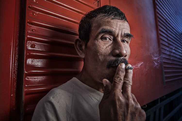
How to Create Compelling Wide-Angle Portraits Using One Off-Camera Flash

11 May

What are your most memorable moments as a photographer? As a travel photographer, my short list of stand-out moments include wandering alone in Namibia’s dead tree forest, photographing sunbeams from the top of a cliff in China, and capturing the Aurora Borealis on the coast of Iceland.

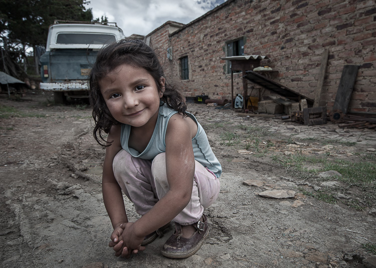
1 Colombian Girl

However, a year ago all of those amazing locations and moments were trumped by spending 30 minutes photographing a little girl outside her home near Villa de Leyva, Colombia (pictured above). This was the first time the girl had her portrait taken, let alone by a foreigner. With all the confidence of an experienced model, she literally stole the show that day. I believe the session is an important memory for her and instantly became my top moment photographing to date.

Ironically, two years ago I would not have even bothered taking this picture. I was focused on landscape and outdoor travel scenes. Also, if I’m honest with myself, I was somewhat intimidated by using artificial lighting and working with people as subjects. In April of 2014, I gave environmental portraiture a shot and have never looked back. It is now an important focus of my work.

This article will provide some guidance on how you can create images like the ones you see here, using a wide-angle lens and just one off-camera flash. But first, let me let you in on a little secret – it’s not that difficult.

Getting things right in camera is the important first step, which is the focus of this article. Processing your images is equally important, but I’ll cover that in a future article. So, let me start by providing you with the core techniques, then get into equipment and settings.

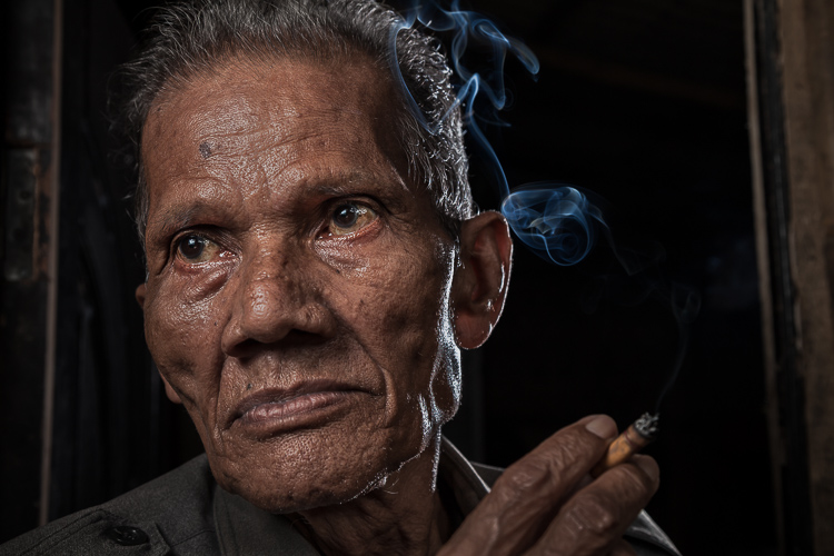
2 Smoking Guy

Use a (Relatively) Wide-Angle Lens

Lens choice is critically important in portraiture. Most portrait photographers reach for their 85mm or 105mm lens when heading out on a shoot. These focal lengths give a nice, realistic look to the subjects. However, I find myself drawn to portraits that have a surreal look to them, and include extra context that helps tell a story. Also, wide-angle lenses require you to shoot close to your subject, which also brings your viewer into the scene.

So, the first step is to leave your 85mm or 105mm in the bag, and grab a wide-angle lens. Most of the portraits you see here were created at 24mm using a full frame camera (use a 16mm for the same view if your camera has a cropped sensor). For me, this focal length is the perfect blend of reality and distortion. If you shoot much wider, elements closer to the lens, such as arms and hands, look too big or elongated. Also, wider focal lengths mean a much bigger background, which is usually not desirable.

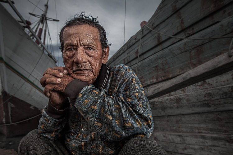
3 Dockworker Ships

Choose a Compelling Subject

Your subject is paramount. The Indonesian dockworker above is amazing. I spent 20 minutes photographing this guy and really had a difficult time choosing the best image. On the other hand, you could spend all day photographing me on the same dock, in front of the same ships, and have nothing but tossers at the end of the day.

I look for people that have experienced life. The ideal subject has a particular interesting quality about him or her, that makes them stand out from the rest. However, my subjects also have an everyday person quality about them. Finding subjects can be challenging, especially if you live in the suburbs of Chicago, like I do. I am a travel photographer and usually find my subjects in rural areas overseas. However, there are great subjects everywhere.

Clothing is critically important. If your 90-year old rural villager is wearing a hat that says, “I Love New York”, then you will want to politely ask him to take it off, or at least turn it around for the picture. The point is, don’t let out-of-context clothing ruin or weaken your shot.
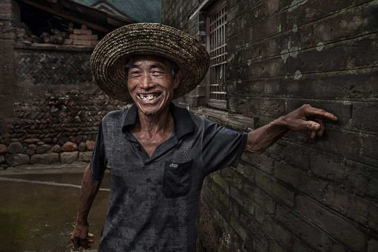
4 Smiley Guy

Choose a Complementary Background

Your image is only as strong as the weakest part of it, which is often the background. This is because, as photographer Jim Zuckerman puts it, “The world is a compositional mess”. There are two important qualities you want out of your background:

First, at the very least, your background must be non-distracting. Although you can easily isolate your subject with a longer focal length, the background becomes a major consideration with wide-angle portraits. Beginner, and even intermediate photographers, can overlook even some obvious distractions in the background. You have probably seen them before: trees that look like they are growing out of the subject’s head, patchy spots of bright light in the scene, colorful objects, straight lines and geometric shapes. You essentially don’t want anything that competes with your subject for attention.

The image of the Indonesian dockworker below is non-distracting, but not much more. He is essentially standing in front of a shipping container, so this image won’t win any awards for its background. Nevertheless, it is still a good picture because of the strength of the subject.

5 Dockworker Container

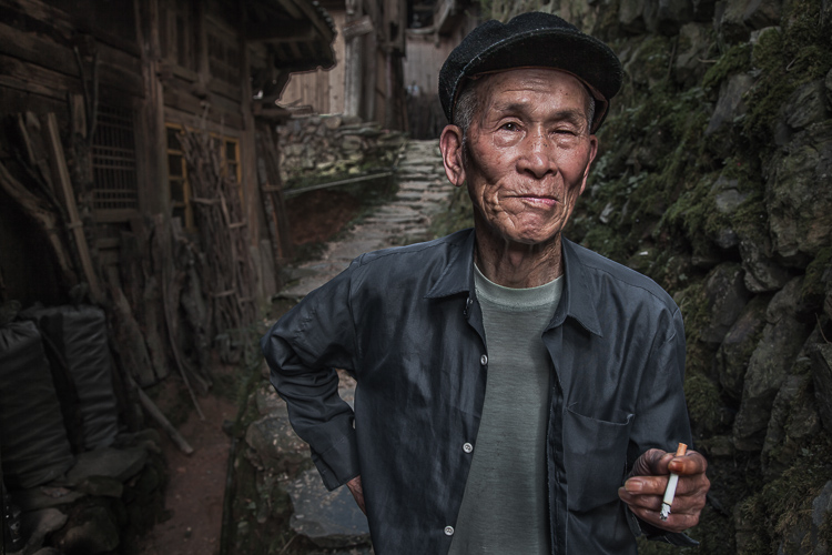
Second, whenever possible, include a background that complements your subject by providing a context. I’ve shot many images with simple non-distracting backgrounds. But, my favorite pictures are those with a background that tells a story about the subject. This is why I love shooting in places like rural China and Indonesia. These countries have many ancient villages that provide opportunities for amazing backgrounds, such as in the image below.

6 Chinese Guy Hat

I like to keep all evidence of modernity out of the background. I don’t like plastic stuff in my pictures. I don’t include modern looking buildings or cars. Instead, I prefer rural areas with weather-beaten buildings. Of course, this all depends on what you are after. The important thing is that the background complements the subject and does not distract from it.

Shoot in the Right Lighting Conditions

Because the majority of the background is not lit by the flash, many of the same outdoor photography lighting principles hold true, even if a flash is being used. Try shooting either early or late in the day (when the sun is low in the sky) or in overcast conditions. I actually prefer overcast conditions, but still shoot relatively early or late in the day.

Put Your Subjects at Ease

I don’t hire models, so some subjects work well and others not as well. What you want to avoid is a picture of your subject standing flat-footed, straight up and down, and holding a fake smile.

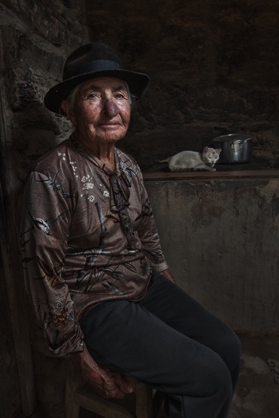
To help avoid this, it is a good idea to start your session by gaining their interest and confidence. If you have some images you’ve shot and processed, show them to give him or her an idea of what you are looking for, and hopefully peak their interest. This should communicate immediately that you are not looking for them to just stand there and smile. It should also show that the posing expectations will be basic.

7 Colombian Lady Cat

Posing and Composition

Because I am shooting wide, I get quite close to my subjects and warn them ahead of time about this. For me, the eyes are a critically important part of the picture and must be very sharp. I focus on the closest eye, and re-focus frequently as I move around the subject slightly.

I generally ask him or her to look directly at the camera and not to smile, although not always. I then start moving slightly left or right, asking them to keep their head still and just follow the camera with their eyes. I usually shoot from slightly below eye level. I have them stand or sit at an angle to the camera. If the subject is standing, I have them put their weight on the back foot.

I like to include the subject’s hands in the composition. With a wide-angle lens, their hands in the foreground will look large, so try to strike a balance with the hands being prominent, but not too large. You can do this by simply positioning the hands closer to or farther away from the lens relative to their body.

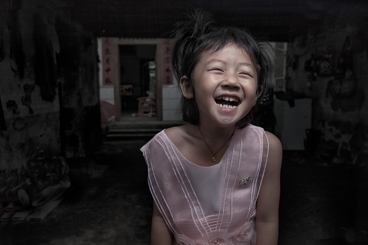
8 Chinese Girl Laughing

Equipment and Settings

The Camera

Your camera should be equipped with an internal or external flash trigger to control your off-camera flash. Here is how I set things up:

  • Start by leaving your flash or trigger initially turned off.
  • Set your camera to manual mode.
  • If the session is outdoors, I try for settings of ISO 100, f/7.1 and a shutter speed of around 1/160. You can adjust your f-stop and shutter speed to your preference, but keep in mind that you cannot go faster than your camera’s maximum flash sync speed.
  • Make the necessary adjustments to slightly underexpose the background by 1/3 to 2/3 stop. I usually start by adjusting shutter speed, but go no slower than 1/60 and no faster than 1/160. If necessary, I will then adjust my f-stop to f/5.6 at the widest. Then, and only then, will I start bumping up the ISO.
  • If you are indoors, you need to start with a higher ISO as a first step, and then make your adjustments to shutter speed and f-stop in the same manner.

9 Chinese Woman

Lighting

For 90% of my portraits, I use a single off-camera flash, diffused with an umbrella or softbox. The most important rule with flash is “don’t ruin your shot,” which is usually done by putting too much flash on your subject. Instead, you want to get a decent balance of natural and artificial light, so that the flash is undetectable to the untrained eye, but lights your subject brighter than the underexposed background.

Now, turn your flash and trigger on:

  • Set your off-camera flash to manual mode.
  • I typically position the flash at a 45-degree angle to the subject, about 2-3 feet (slightly less than a meter) away, higher than their head, angled downward.
  • I usually start with 1/16 flash power when outdoors, and adjust from there until the subject stands out from the background, but does not look like they have been blasted with flash.

Post-Processing

You need to get things right in camera first. But, you will need to use a variety of post-processing techniques to get the effect you see in these images. I’ll coverthe techniques I use to process environmental portraits in a future article.

Thank you for reading, please share your wide-angle portraits and questions in the comments below.

googletag.cmd.push(function() {
tablet_slots.push( googletag.defineSlot( “/1005424/_dPSv4_tab-all-article-bottom_(300×250)”, [300, 250], “pb-ad-78623” ).addService( googletag.pubads() ) ); } );

googletag.cmd.push(function() {
mobile_slots.push( googletag.defineSlot( “/1005424/_dPSv4_mob-all-article-bottom_(300×250)”, [300, 250], “pb-ad-78158” ).addService( googletag.pubads() ) ); } );

The post How to Create Compelling Wide-Angle Portraits Using One Off-Camera Flash by Ken Koskela appeared first on Digital Photography School.


Digital Photography School

 
Comments Off on How to Create Compelling Wide-Angle Portraits Using One Off-Camera Flash

Posted in Photography


A Turn of the Head – Creating More Compelling Bird Portraits

09 Dec

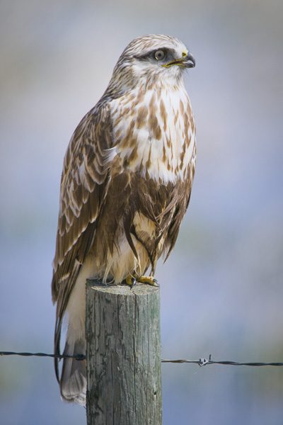
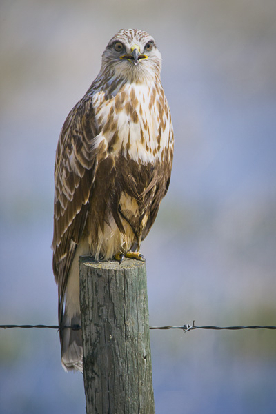
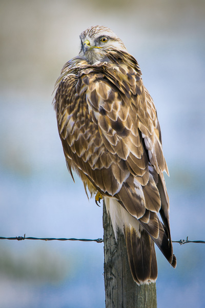
The last time I counted, there were about seventy two quadrillion photos of birds on the internet. Therefore, if you’re dedicating your time to try to stand out as a bird photographer, there is a ton of competition out there. However, there is one thing that you can try to incorporate in your photos that will at least have them stand out a little bit.

Creating More Compelling Bird Portraits

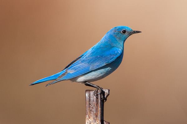
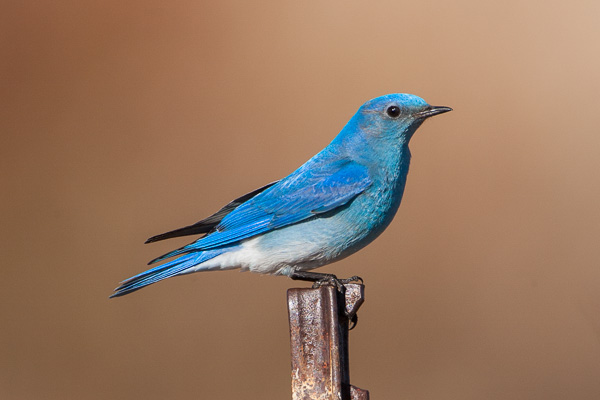
Wait for the turn of the head. Sounds pretty simple doesn’t it? It sounds simple, but achieving it is often a bit trickier. Many bird species have their eyes placed on opposite sides of their heads. When photographing birds without their heads slightly angled towards the viewer, the images tend to lack a bit of intimacy. Consider the following two images of a Mountain Bluebird. In the first image, the bird’s head is angled away from the viewer, while the second image features the bird’s head angled just slightly towards the viewer.

Mountain Bluebird looking away from the viewer

Mountain Bluebird looking away from the viewer

Mountain Bluebird looking toward the viewer

Mountain Bluebird looking toward the viewer

I’ll bet that for most of you, the second image is more compelling just because of that eye contact. Sure the perch is somewhat ugly (it’s the post used to mount the bird box above the ground), but even with an ugly perch, the second image is more compelling. Then if you’re patient, even with an ugly perch, you can still get a compelling image out of it, slight head turn included.

Mountain Bluebird posing pretty

Mountain Bluebird posing pretty

What to look for – subtle differences are huge

Consider the following three photos of a Rough-legged Hawk.

Rough-legged Hawk looking away from the viewer

Rough-legged Hawk looking away from the viewer

© Paul Burwell Photography - Rough-legged Hawk looking directly at the viewer

Rough-legged Hawk looking directly at the viewer

© Paul Burwell Photography - Rough-legged Hawk with the sexy over the shoulder look towards the viewer

Rough-legged Hawk with the sexy over the shoulder look towards the viewer

In the first image, the bird is looking away from the viewer. In the second, he is looking straight on to the viewer, while the third image has my preferred head-turn. In my opinion, in terms of a compelling image, it isn’t even a close comparison. The perch still isn’t ideal (although this is the typical place we find these birds where I live), but the third pose with the head-turn makes that image into a keeper for me.

Patience or initiative gets the head turn

So, is it just a matter of patience and waiting for the preferred head-turn? Sometimes that is true. Other times I try to “encourage” my subject to look my way. How do I accomplish this? I imitate the squeak of a mouse. I purse my lips together and suck in air through my teeth to produce an irritating squeaking sound. Sometimes, not always, but some times, the bird is curious enough to look my direction.

I know of some photographers who prefer to use the “machine gun” approach where they just hammer-down on the shutter button, essentially shooting a slow frame-rate movie.  Occasionally they’ll catch the bird with its head in the preferred position.  I personally don’t favour that approach, but would rather just wait for the appropriate moment and cut down on my post-processing work once I get home.

In terms of the bird looking head-on into the camera, that can occasionally work, but for most birds it just isn’t their best angle. There are definitely exceptions to that and owls are the first bird that springs to mind. Consider this image of the tiny Northern Pygmy Owl for example.

© Paul Burwell Photography - Northern-Pygmy Owl looking frosty

Northern-Pygmy Owl looking frosty

Here are a couple more images to consider:

© Paul Burwell Photography - www.bsop.ca

Ruddy Duck Drake looking towards the viewer

© Paul Burwell Photography - www.bsop.ca

Ruddy Duck Drake looking away from the viewer

I made these two images of the Ruddy Duck just seconds apart. In the first image, the bird looked my way due to my incredible squeaking ability, while in the second, his patience expired and he was off to find his girl friend.

The following two images of a White Breasted Nuthatch also illustrate the point. In both images, the birds are in their traditional upside-down pose on the side of a tree. The difference between the images is that in the first the bird is looking slightly away from the viewer while in the second exhibits that classic slight head-turn towards the viewer that I strongly favour.

© Paul Burwell Photography - www.bsop.ca

White-breasted Nuthatch looking away from the viewer

© Paul Burwell Photography - www.bsop.ca

White-breasted Nuthatch looking towards the viewer

The last two images I present for your consideration are these two images of a Common Loon carrying a chick on its back.

© Paul Burwell Photography - www.bsop.ca

Common Loon carrying a chick on its back with both birds looking away from the viewer

© Paul Burwell Photography - www.bsop.ca

Common Loon carrying a chick on its back with both birds looking towards the viewer

In the first image, both adult and baby are looking away from the viewer. It’s a nice image but lacks a bit of intimacy.  Whereas the second image features both birds looking towards the viewer. The second image is a result of the large goofy photographer, with his lens perilously positioned inches above the water, from an unstable boat squeaking his heart out. For me, there is no comparison between the two images; the second wins easily.

Therefore, the next time you’re out in pursuit of some bird images that might rank in the top thirty-six quadrillion instead of the bottom, look for the opportunity to capture those birds with their heads slightly turned towards you. Whether you achieve it through patience or “the squeak”, I’ll bet you’ll find your images a bit more compelling.

Post originally from: Digital Photography Tips.

Check out our more Photography Tips at Photography Tips for Beginners, Portrait Photography Tips and Wedding Photography Tips.

A Turn of the Head – Creating More Compelling Bird Portraits

The post A Turn of the Head – Creating More Compelling Bird Portraits by Paul Burwell appeared first on Digital Photography School.


Digital Photography School

 
Comments Off on A Turn of the Head – Creating More Compelling Bird Portraits

Posted in Photography


6 Easy Ways to Give your Photographs a Compelling Narrative

10 Apr

Everybody loves a good story. Knowing this fact is what separates a good photographer, from an exceptional one. With this knowledge, a photographer has a whole breath of tools at their command to trap the viewer, and cause them to be spellbound! Below I have listed 6 of the best ways to give your photographic approach the artistic edge of Continue Reading

The post 6 Easy Ways to Give your Photographs a Compelling Narrative appeared first on Photodoto.


Photodoto

 
Comments Off on 6 Easy Ways to Give your Photographs a Compelling Narrative

Posted in Photography