RSS
 

Posts Tagged ‘Feed’

How to Use a Split Tone Style in Lightroom Mobile for a Consistent Instagram Feed

09 Sep

The post How to Use a Split Tone Style in Lightroom Mobile for a Consistent Instagram Feed appeared first on Digital Photography School. It was authored by Ana Mireles.

Have you ever seen an image and immediately known who took it? That’s because the photographer has a unique style.

If you want to make your own images recognizable for your clients and followers, you might want to try a split tone style.

Keep reading to learn how this works.

Create a split tone style
Snapshot taken with the default camera app on a Redmi Note 8.

Style

You can create your own style through many different elements, from lighting and composition to a particular way of post-processing.

This last one is where a split tone style fits.

Introduction to split toning style
Canon 50D | Sigma 28-300mm | 28mm | 1/800 sec | f/3.5 | ISO 100

Using this technique, you can keep your images consistent. That way, the viewer feels like all your images belong together and associates the images with you and your brand. This works for your portfolio, your website, and your Instagram feed.

Split tone

When you assign a certain tone to the shadows and a different tone to the highlights, it’s known as a split tone. The full white and full black will always remain untouched. But the highlights will be cool while the shadows will be warm.

Let me show you what I mean with this gradient:

Split tone gradient

You can also change the ratio between highlights and shadows. On these next gradients, see how the same split tone colors give a different effect when you adjust the split tone balance:

Split tone changing balance

This is just an example, but you can use any combination of colors that suits your style and brand. For that, you can create a color palette.

Choose a color palette

A color palette is a range of colors used in a particular context. These colors need to work well together and reinforce your style.

There are different theories you can use to create your color palette. You can go for a monochromatic scheme or a complementary one. If you’re not sure, there are some great tools to help you. You can check out Adobe Color or Color Hexa.

Adobe Color Website

Just like a filter, different split tones may look better on some images than others. Having a color scheme gives you the flexibility to apply different split tone combinations while maintaining your style.

Split tone style

Almost every program has a feature or a way to do split toning: ACR, Capture One, Photoshop, Luminar, Lightroom, etc. Also, many apps allow you to do split toning on your phone: Photoshop Express, Lightroom Mobile, and VSCO Cam. Choose whichever fits best into your workflow.

In most cases, the split toning interface is similar from program to program. You’ll have two gradients: one for the highlights and one for the shadows. You’ll also have a balance slider.

I’m going to show you how to split tone in Lightroom Mobile, because it’s the program I find most comfortable. Also, because Lightroom Mobile allows you to save your split tone effect as a preset.

Both split toning and preset functionality are included in the free version of Lightroom Mobile, so you can follow along without getting a subscription.

Split toning in Lightroom Mobile

When you have your image open in Lightroom Mobile, you can see the menu at the bottom. Scroll to the right until you find Effects.

Once you open the Effects tab, on the top right you can find Split Tone. This will open the gradients for the highlights and shadows. Below these gradients, you’ll find a slider to control the split tone balance.

Move the highlights, shadows, and balance values until you’re satisfied.

Split tone style in Lightroom Mobile

In the color palette section of this article, I was telling you that there are different ways to split tone. Here you can see an example of split toning using a monochromatic scheme (the center photo), and another that uses complementary colors (the right photo).

Make it a preset

To keep your split tone style consistent without having to remember the specific values every time, you can create a split tone preset. That way it becomes a one-touch edit you can apply to every photo.

To do this, click on the three dots in the top right. This will open a menu; from there choose Create Preset. Make sure that only the Split Toning option that you find inside Effects is checked. Otherwise, the preset will save additional edits that you might not want to replicate in other photos.

Then name the preset and tap on the check icon (in the top right) to save.

Lightroom Mobile Presets

Next time you want to apply the split tone effect to a photo, just open it in Lightroom Mobile, go to Presets, then User Presets, and find the split tone preset you want.

You can also create different split tone presets that use variations from your color palette. That way, you can use the preset that fits each image best while maintaining the overall aesthetic.

Conclusion

Using a split tone style will help you maintain a consistent look in your images. This will make your account recognizable to your followers and let your clients know what they can expect from your brand.

It doesn’t matter which app or program you use; the important thing is that it’s easy to incorporate into your workflow.

Share your recommendations and experiences in the comments section.

The post How to Use a Split Tone Style in Lightroom Mobile for a Consistent Instagram Feed appeared first on Digital Photography School. It was authored by Ana Mireles.


Digital Photography School

 
Comments Off on How to Use a Split Tone Style in Lightroom Mobile for a Consistent Instagram Feed

Posted in Photography


How to Make a Unified Instagram Feed as a Photographer to Help Support Your Brand

15 Jan

The post How to Make a Unified Instagram Feed as a Photographer to Help Support Your Brand appeared first on Digital Photography School. It was authored by Anabel DFlux.

unified-instagram-feed-for-photographers

Social media has such a strong presence in our world, both in a personal and professional sense. Gone are the days of searching for a photographer via Google. Many are turning to the social media platform, Instagram. Instagram has become a powerful tool for photographers and content creators alike. It is an engagement-oriented online portfolio so-to-speak.

But with thousands of accounts active on Instagram in any given second, how do you stand out from the rest and still attract photography clients? By having a feed that is more aesthetically pleasing than the rest!

Here is our guide on how to make a unified Instagram feed as a photographer.

What does a unified Instagram feed even mean?

Image: This feed by singer Jessica Abari, shows unification by color tonality. She uses blues and pi...

This feed by singer Jessica Abari, shows unification by color tonality. She uses blues and pinks to unify her Instagram feed.

Humans naturally gravitate to cohesiveness, especially those with a certain sensitivity to aesthetic.

A unified Instagram is one in which each image, viewed in totality with one another, look like a piece of a great puzzle. Each one appears to belong and in some way, shape, or form unites with another surrounding it.

It’s the difference between a feed that looks cluttered and disconnected and one that looks like it is a part of a strategically and effortlessly tailored brand.

Having unity in your work not only pushes your brand further, but can attract a slew of eyes on your product (the beautiful images!). Not only is it a trend to have something a bit more cohesive, it has been shown to really aid in acquiring new clients who are attracted to the style your showcasing.

Image: An example of my varied feed – when you have many areas of specialization, it can be difficul...

An example of my varied feed – when you have many areas of specialization, it can be difficult to maintain complete cohesiveness.

This isn’t a tried and true method for all photography businesses. For example, I am a multi-faceted photographer and to have an overly-cohesive feed is just not possible for me. However, my fellow industry mates have very beautifully tailored and structured feeds that work brilliantly for them! Their clients know exactly what to expect and hire them based on their look.

The real secret?

Image: This is an example of my thematic feed of female portraits with animals.

This is an example of my thematic feed of female portraits with animals.

So, what’s the real secret? For the most part, it’s utilizing the same editing mechanism over and over again. Create a preset or a general direction for your editing, and replicate this across your full board. This already creates a look of cohesiveness with minimal effort.

I suggest not using Instagram’s preset filters as these tend to lower the quality of your images. Instead, create your own Presets or Actions in Lightroom or Photoshop. You can even automate these to play on the batch of images you select for posting.

If you find that preset editing really isn’t you, unite your feed by topic or theme. This also allows you an opportunity to really solidify your niche as a photographer and attract the right demographic to your work. Figure out what kind of photographer you are and who or what your most common subjects tend to be, and post images that fit within that scope.

Image: In this feed from Goldilocks and the Wolf, there is unification by the fairytale theme and th...

In this feed from Goldilocks and the Wolf, there is unification by the fairytale theme and the winter landscapes.

Creating a unified feed based on a color palette is also an excellent idea.

Colors are a major way to keep everything looking tailored and express who you are as a creator.

Color theory is a complex topic that can be taught for hours, but the general idea is that certain hues and color combinations attract a specific reaction. Tying marketing into Instagram, find a color palette that tends to attract your customers (and potential customers).

Look at what your followers gravitate towards, and feed into that wanting. It’s okay to break up your feed with text that engages your audience base, and keep everything still looking together.

Bonus tip: create a posting calendar for the month. Preview these images in a mockup of your Instagram feed and see how it all looks together. This provides a lot of insight on the final outcome!

If you make a unified feed and then want to change the theme, what then?

Image: This feed by singer Jessica Abari, shows unification in sets of 3 (with editing style and ima...

This feed by singer Jessica Abari, shows unification in sets of 3 (with editing style and images from the same photo shoot), but also overall because Jessica herself is the theme.

I think a daunting aspect of this is all is permanence.

If you spend the time making your images cohesive with one another and then change your mind, has all of your effort been wasted?

Not at all! It’s quite simple to change your theme. You can choose to gradually shift to your new aesthetic or go bold and post three images in the new style right off the bat and go with that.

Final thoughts

Image: Rachel Lauren’s Instagram Feed. Her feed is unified in both her editing style and theme...

Rachel Lauren’s Instagram Feed. Her feed is unified in both her editing style and theme with the portraits with animals.

Remember that while in the pursuit of unity, don’t lose yourself or who you are as a photographer.

There is a fine line to walk between solely appeasing the masses and ensuring that your individual photography voice is heard. Where that balance is, rests entirely on your own opinion.

As well as this, be wary about appearing too repetitive and monotonous – try to post images that have different compositions or express something new. Being cohesive doesn’t mean being boring.

When you make a unified Instagram feed as a photographer, put your best imaging foot forward first!

The post How to Make a Unified Instagram Feed as a Photographer to Help Support Your Brand appeared first on Digital Photography School. It was authored by Anabel DFlux.


Digital Photography School

 
Comments Off on How to Make a Unified Instagram Feed as a Photographer to Help Support Your Brand

Posted in Photography


Instagram clarifies its algorithmic feed doesn’t limit post reach, despite viral claims

24 Jan

Instagram has released a statement clarifying a viral image that claims only 7% of a user’s followers can see content they share on the platform. Images of the clickbait claim have been making their rounds on the platform for months, usually with the header, ‘This is a test.’

A collection of posts with the hashtag #thisisatest that can be found when searching Instagram

According to a series of tweets from the company, Instagram hasn’t made any recent changes to its feed algorithm and doesn’t hide any posts from users.

Instagram addressed the claim in multiple tweets yesterday, stating that its users will see all posts from all accounts they follow, assuming they “keep scrolling” long enough.

Instagram replaced its chronological feed with one sorted by an algorithm in 2016. Since that time, Instagram users see content presented based on a number of factors, including how often they engage with a particular account and how often they check their feed. Some users have been confused by this change, which can make it appear that posts by some accounts are missing from the feed.

In March 2018, the company announced that it would tweak its algorithm based on this feedback so that newer posts were more likely to show up near the top of the feed.

Articles: Digital Photography Review (dpreview.com)

 
Comments Off on Instagram clarifies its algorithmic feed doesn’t limit post reach, despite viral claims

Posted in Uncategorized


500px Home Feed redesigned to increase photographers’ exposure

16 Nov

500px has launched a redesigned Home Feed that was inspired by photobooks, according to the company. The new 500px Home Feed is designed to increase photographers’ exposure and enable them to browse more images without navigating away from the feed. 500px says machine learning powers a new recommendation system to help surface content.

500px explained in a blog post that its new recommendation system will help increase photographers’ visibility on the platform by more evenly distributing exposure. Users will see a greater variety of content on the new Home Feed, as well.

Photo pages have been redesigned to make details, Pulse, views and other info readily accessible without being distracting. Photos are prominently displayed at the top of the page on a dark background for minimized distractions.

The changes apply to both desktop and mobile, the latter of which now supports the ability to view and publish Galleries. The redesign also enables users to add images to existing Galleries and then share them with followers.

Other changes revolve around the recommendation system and include suggested images in a grid format for desktop and carousel for mobile, as well as recommendations based on user activity. Recommendations will also draw from recently uploaded images to improve the discovery of new content.

According to 500px, it will not provide NSFW content on its new mobile Home Feed in order to comply with Google’s and Apple’s respective app store restrictions. The NSFW images will still be accessible on desktop, however, assuming the user opts-in to the content in their account settings. The changes are rolling out now.

Articles: Digital Photography Review (dpreview.com)

 
Comments Off on 500px Home Feed redesigned to increase photographers’ exposure

Posted in Uncategorized


Instagram updates news feed, makes it a bit more chronological

24 Mar

Yesterday, Instagram announced some changes to the News Feed that might quiet some of the grumbling that’s been going on ever since the app switched from a Chronological to an Algorithmic feed. No, the rumors were not true and the company is not going back to the chronological feed in full, but your Instagram feed will begin surfacing newer posts closer to the top of your feed from now on.

The announcement comes less than a week after Instagram was forced to debunk a viral rumor that it was testing a return to the Chronological feed. But it seems that rumor might have contained a grain of truth.

Yesterday’s update is actually two-fold. First, newer posts are now “more likely to appear first in feed” so you don’t have to scroll through a bunch of posts from several days ago in order to see images that were posted this morning. And Second, the feed will no longer update automatically; instead, Instagram is testing a “New Posts” button that allows you to manually refresh the feed only when you’re ready.

The latter change is a response to feedback that “it can feel unexpected when your feed refreshes and automatically bumps you to the top.” I can personally relate to this annoyance, and I’m sure some of our readers can, too.

Profile names and hashtags are now clickable in your Instagram bio.

Finally, right before this announcement went live, Instagram also revealed that it would now allow users to link hashtags and profile links in their bio. So if you add your professional photo profile to your personal bio or visa-versa, that @-name will now be clickable. Same goes for hashtags.

Adding a level of security to this, whenever you link someone’s profile in your bio, their account will receive a notification, and they can choose to remove the link.

All of these changes are rolling out now, although the News Feed changes still in the ‘testing’ phase. To take advantage of the updates yourself, just make sure you’re using the latest version of Instagram on either iOS or Android.

Press Release

Changes to Improve Your Instagram Feed

Today we’re introducing changes to give you more control over your feed and ensure the posts you see are timely.

We’ve heard it can feel unexpected when your feed refreshes and automatically bumps you to the top. So today we’re testing a “New Posts” button that lets you choose when you want to refresh, rather than it happening automatically. Tap the button and you’ll be taken to new posts at the top of feed — don’t tap, and you’ll stay where you are. We hope this makes browsing Instagram much more enjoyable.

Based on your feedback, we’re also making changes to ensure that newer posts are more likely to appear first in feed. With these changes, your feed will feel more fresh, and you won’t miss the moments you care about. So if your best friend shares a selfie from her vacation in Australia, it will be waiting for you when you wake up.

Over the next few months, we’ll be sharing more about improvements we’re making to feed. Our goal is to be the best place to share and connect with the people and interests that matter most to you.


Introducing Hashtag and Profile Links in Bio

Today, we’re introducing hashtag and profile links in bio, a new way to express yourself and the things you care about. Now when you include a # or @ in your bio, they become live links that lead to a hashtag page or another profile.

In December, we introduced the ability to follow hashtags, giving you new ways to stay connected with the interests, hobbies, passions and communities you care about. With hashtag and profile links in your bio, you can express yourself and your interests right in your profile. Whether you’re a #guitarlover, into #pencilsketching or have a #makeuptutorial account, now you can link to any hashtag or profile you want.

To add a hashtag or profile link in your bio, just tap on Edit Profile and go to the bio section. When you type a # or @, you will see a list of recommended hashtags and accounts in the typeahead. Once you select the hashtags and accounts you want, they will automatically be linked in your bio.

When you mention someone else’s profile in your bio, they will receive a notification and can choose to remove the link to their profile. Their profile will remain in your bio but without a link.

Instagram has always been a place for self-expression, and now there are even more ways to express yourself and your interests. To learn more, check out the Help Center.

Articles: Digital Photography Review (dpreview.com)

 
Comments Off on Instagram updates news feed, makes it a bit more chronological

Posted in Uncategorized


Instagram might bring back the chronological feed

13 Mar

In 2016, Instagram changed the way the images of the users you are following are displayed in the app from a chronological feed, to a much-debated ‘”algorithm feed”, causing a fairly heavy backlash among its user base.

The chronological feed wasn’t even kept alive as an option, meaning that since this change users have had to rely on the intelligence of Instagram’s algorithm instead of simply seeing posts appear in real-time. Then, adding insult to injury, Instagram recently started inserting “recommended” posts of users you’re not even following into your (still algorithmic) feed.

Almost two years after the change, users are still complaining about the algorithm feed, but there are now signs Instagram might bring the chronological feed back as an option.

Resource Magazine reports that Instagram user @jackharding posted a video of his Instagram stories, showing his feed was in chronological order and including the following comment:

“Instagram back to chronological order. I wonder if this is good or bad news.”

This could simply have been coincidence, but In a follow-up story the same user revealed he is an Instagram employee, and part of a beta test of the new chronological feed. And while my own Instagram feed is still in algorithm mode, more reports about users seeing a chronological feed have since appeared on the web.

So, if you’re one of the many (many, many) users who have been missing Instagram’s chronological feed over the past two years, it seems there is now hope. For already-popular accounts with massive engaged followings, a move back to chronological could actually hurt their reach; however, for anyone looking to build a following on Instagram, it would level the playing field and put everyone on equal footing once again.

No word on when or even if Instagram will ultimately make this change—a beta test does not a promise make—but let us know in the comments if your Instagram feed has shifted back to chronological order, and what you think of the change.

Articles: Digital Photography Review (dpreview.com)

 
Comments Off on Instagram might bring back the chronological feed

Posted in Uncategorized


Instagram is changing its feed to use algorithm

18 Mar

Instagram has confirmed in a blog post that it will change the way the photos and videos of your friends are displayed in its stream. Chronological sorting will be scrapped in favor of a new algorithm that sorts images based on ‘the likelihood that you’ll be interested in the content, your relationship with the person posting and the timeliness of the post.’ Read more

Articles: Digital Photography Review (dpreview.com)

 
Comments Off on Instagram is changing its feed to use algorithm

Posted in Uncategorized


Soylent 3.0: 100K Sq Ft Warehouse Could Feed 4 Million People

09 Aug

[ By WebUrbanist in Conceptual & Futuristic & Technology. ]

Photobioreactor PBR 4000 G IGV Biotech

The first generation of Soylent is a powdered food substitute for all your nutritional needs, the second will be a premixed beverage boasting the addition of algae, but the ultimate target is fully-grown, ultra-efficient food equivalent. An eco-friendly paradigm shift, this would allow vast amounts of healthy calories to be created in very small spaces, a single small factory space supplying enough for to sustain the entire city of Los Angeles.

soylent in a bottle

In just a few years, Soylent went from an experimental substance to the household name in food replacement, but its creator’s endgame is far more ambitious than the current niche product might suggest. Soylent 1.0 remains relatively cost-intensive to produce and expensive to consume – it provides simplicity, but only for those who can afford it. Soylent 2.0 will begin targeting broader markets and introduce algae-grown components, but a future version (3.0, perhaps) could truly revolutionize food production and distribution.

soylent powder

Imagine using just water, sunlight, air and a single algae superorganism to generate the complex nutrients (including carbohydrates, proteins and lipids) needed to sustain life, with applications in rich and poor countries (or in space). Then consider having this substance available on tap, piped right into your home like water or power. Alternatively, you might buy your own household bioreactor, churning out Soylent 3.0 directly in your kitchen on demand. Rob Rhinehart’s vision takes various forms, but it comes down to the same thing: an alternative to conventional food and potential solution to unsustainable agricultural practices, available to all those who wish to take part.

Not everyone will want to subsist partially (let alone entirely) on Soylent, now or ever, but that is also not the point – it can always be used in conjunction with other meals by those so inclined or deployed to places otherwise without sufficient food for subsistence. Meanwhile, for the next round (from Motherboard), “The algae [called AlgaWise] in Soylent 2.0 is grown by the biotech company Solazyme, in a facility owned by the Archer Daniels Midland, the food processing giant. The oil is then pressed out much like olive oil. It’s amazingly efficient. Entire tanks can be filled in days.” Solazyme calls the stuff AlgaWise.”

soylent boxes

More from Rhinehart on current and next steps: “In the interest of building a sustainable business to fund our research we’ve been focused primarily on product improvements and new products, like the launch today, but I’ve also worked on setting up infrastructure including lab building and recruiting and drawn up a roadmap for reaching the goal of cell synthesis, starting with protein. This process has two modules: one strain engineering to develop and optimize the organism that produces, the other bioreactor engineering to make an ideal growth environment for the strain(s).”

Share on Facebook


[ By WebUrbanist in Conceptual & Futuristic & Technology. ]

[ WebUrbanist | Archives | Galleries | Privacy | TOS ]


WebUrbanist

 
Comments Off on Soylent 3.0: 100K Sq Ft Warehouse Could Feed 4 Million People

Posted in Creativity


Ecological Life Support: Recycle a Bottle, Feed a Stray Dog

02 Aug

[ By Steph in Gadgets & Geekery & Technology. ]

Stray Animal Vending Machine 1

Dispose of your empty plastic bottle in this little sidewalk kiosk, and it’ll dispense enough food to feed a stray cat or dog. Aiming to help both the environment and homeless animals, the vending machine by Turkish company Pugedon operates at no cost to the city since the value of the plastic pays for the food.

Stray Animal Vending Machine 2

Referred to by the company as ‘ecological life support,’ the vending machine is an answer to a pressing problem in Istanbul: around 150,000 stray cats and dogs. Anyone passing by with a little bottled water can also choose to empty the rest of their water into the machine for the animals.

Stray Animal Vending Machine 4

Stray Animal Vending Machine 5

These animals generally rely on the kindness of local residents to survive, and while some love having them around, others believe they’re dangerous and a source of disease. The locals who host Facebook campaigns to gather supplies to care for the animals are countered by attempts to poison them.

Stray Animal Vending Machine 3

While this vending machine isn’t an answer to the problem of homeless animals, it does offer an interesting compromise to care for them without putting a burden on Istanbul residents or the city.

Share on Facebook


[ By Steph in Gadgets & Geekery & Technology. ]

[ WebUrbanist | Archives | Galleries | Privacy | TOS ]


WebUrbanist

 
Comments Off on Ecological Life Support: Recycle a Bottle, Feed a Stray Dog

Posted in Creativity


Unboxing the New Facebook News Feed

10 Mar

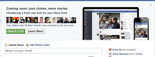
The New Facebook Newsfeed

I got the new Facebook news feed last night. The screenshot above is what it looks like. It’s super awesome. A very small minority of people will hate it — because a very small minority of people will hate EVERYTHING. I’m not kidding. The way some people love to bitch blows my mind sometimes. Haters gonna hate.
Most of you will love it though. I think it’s the most significant improvement made to Facebook since Facebook started. If you’re a photographer, you especially will love it. Photos are bigger. Bigger photos have more impact. Bigger photos look better.

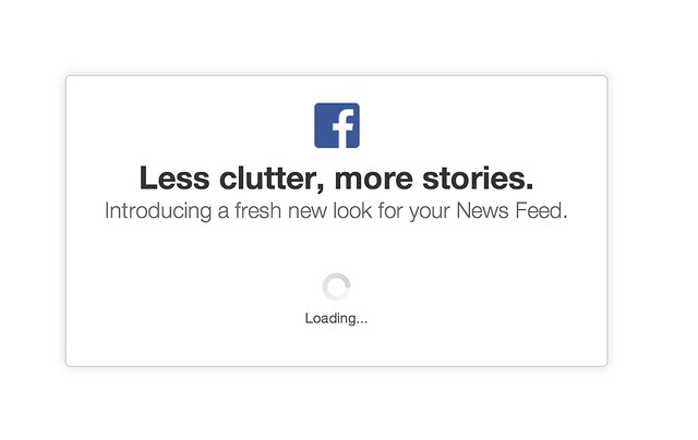
When you’re eligible for it you’ll notice a little “coming soon, less clutter, more stories” box on your news feed. There is a green button to press to give it a try. If you press that green button you get the loading message. I think there was one other notice window that popped up telling me that I couldn’t go back if I went forward with it, but I can’t remember 100% on this. After this loading box the new news feed pops up.
The Invite to Try the New Facebook Newsfeed
Woah! What’s this?

Loading the New Facebook Newsfeed
Almost there!

I’ve only played with the new news feed for a few hours, but here are just a few early observations.

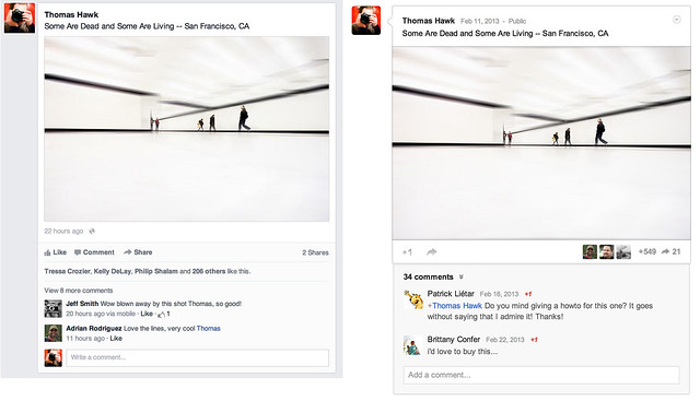
1. Content in the new news feed feels ALOT like Google+. I’m not saying Facebook copied Google+ here, and imitation is, of course, the sincerest form of flattery and all that, but check out the two content envelopes side by side in the photo below. They are pretty darn close.

The New Facebook Newsfeed Feels ALOT Like Google+
Separated at Birth. Facebook new news feed on the left, Google+ on the right. Or wait, is it the other way around?

Personally speaking I have no problem with this by the way. I love competition on the web. With competition users win. Everybody should rip everybody off and make everything look as awesome as it possibly can.

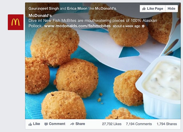
2. Pictures are bigger and stand out more, but unfortunately so do all of those crappy memes and worse, sponsored posts (ugh! advertising — the new advertisement for McDonald’s new fish McNuggets feels even more intrusive). Please Facebook, let us pay you for a Pro account and let us opt out of all the horrible ads.

Photos Look Bigger and Better, but Unfortunately so do the Ads
That’s an awfully big advertisement for those new Fish McNuggets that McDonalds is selling.

The meme’s are really my own fault though. When I started Facebook years ago, I simply accepted every single friend request, whether I knew somebody or not. Hey, I’m a friendly guy. I now realize that was a mistake. I think as I unfriend the most egregious of the meme sharers this should improve a bit for me.

Sometimes though there is just that one person that for whatever reason you CAN’T unfriend. You know who I’m talking about. They’d take it really hard. Yet it’s that one person who keeps sharing the crappiest meme things on Facebook 50 times a day. If you’re that guy, knock it off. Sometimes I wish there was an easy way to permanently hide someone’s content without actually unfriending them.

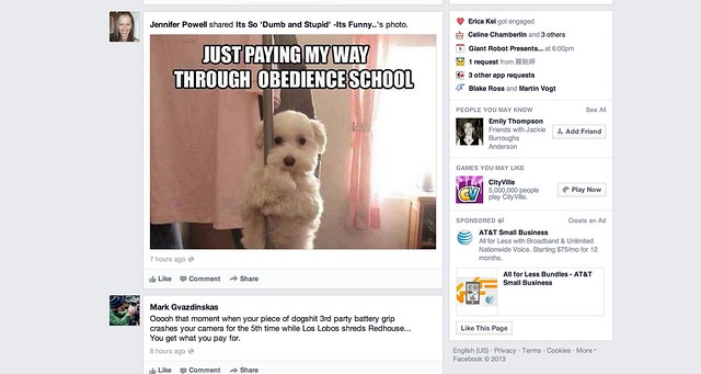
Attack of the Facebook Killer Meme's, Now Bigger Than Ever in Your Timeline
Attack of the killer Facebook meme’s, now even bigger than ever!

Hey it’s a dog, hey it’s stripping. AWESOME!!!! I think I’ll reshare this on Facebook!

3. The hide button is broken. One of the things that I like about Facebook is their move fast and break things moto. Sometimes though this means that everything doesn’t work so well. I haven’t been able to reposition photos on my timeline for weeks now. My wife can’t upload photos directly to Facebook at all. She has to upload to an album and share from the album.

What I’ve found on the new news feed is that when I hide content, it doesn’t stay hidden. It stays hidden for that session, but if I refresh the page it comes back. I don’t know if this is just a bug for me or for everyone, but if I actually HATE something enough to hide it, I really, really don’t like it — and after I went through the pain of a two click effort, I’d really like it to stay permanently hidden from my news feed.

4. I still haven’t figured out exactly how Facebook is repositioning photos that are less ideal for their new envelope. It seems like some portrait aspect and square aspect photos are being stuffed into a landscape frame. It also seems like some are not though — it’s weird why some are and some aren’t. I wonder if there is some sort of algorithm at play here as well, because when photos are repositioned, a lot of the time it’s a pretty smart natural reposition. Like Facebook is focusing on the eyes in photos of people.

The apple screensheet below is from my friend Kelli Seeger Kim. It’s actually a portrait oriented photograph of two apples in a basket. If you click through the image you’ll see it correctly, but in the news feed the crop is less than ideal. So sometimes this feels a little awkward.

Sometimes Facebook Does Not Get the Repositioning for Portrait or Square Oriented Photos Just Right

Overall the new design is clean and light and lovely. It feels very smooth and really nice. Photos really pop now that they are bigger. I’d give this redesign two thumbs up!

Congrats to the Facebook team on the great work! You can find me on Facebook here. Come find me and let’s be friendly.


Thomas Hawk Digital Connection

 
Comments Off on Unboxing the New Facebook News Feed

Posted in Photography