Have you ever been so close to a subject that you just couldn’t get it all into the frame? You could use a fisheye lens but they creates so much distortion that it doesn’t always work the way you want it to. You can actually get the photo that you want with the lens that you already have! You can accomplish this by taking multiple images over several columns and several rows, and combining them into one very large, extremely detailed image. With a little practice and some information any photo is possible with the gear that you have in your camera bag.
Combining Images for Large Subjects using Photoshop Photomerge
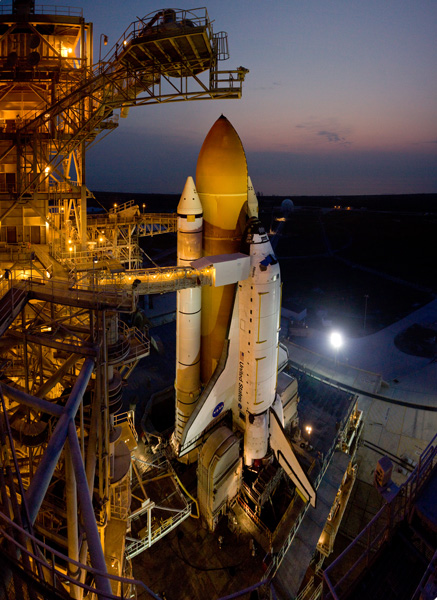
WIDE LENS VERSUS IMAGE COMBINING
Let’s take a look at how to create one of these images. This photo of space shuttle Atlantis was taken just before sunrise as this incredible (and incredibly large) engineering marvel was being prepared for launch. Here are two photos
for comparison (Image #1 below) and (Image #2 above)

The image directly above was taken with a fisheye lens. More specifically a full-frame fisheye lens; one that covers a 180 degree angle of view, but the image still covers the entire frame with no black borders. As compared to a circular fisheye lens which covers a 180 degree angle of view, but the final image is a circle with a black border filling the rest of the frame. This image may be OK for some, but the cartoon like distortion may not be work for others.

You could buy a superwide lens that is corrected to eliminate distortion but those lenses could cost two or three times as much as a fisheye lens. Or maybe you have one but just don’t happen to have it with you on that particular day.
Image #2 (top and right) was created using a 17-40mm wide angle lens. This was accomplished by taking a series of images in a sequence from top to bottom in one column, followed by a second sequence from top to bottom in a second column. You want to make sure that you overlap your images approximately 20-25 percent so that they can be spliced together later using your editing software. The resulting image in this case was a combination of 12 images merged into one very large, very detailed image!
One major benefit of using this method is that you can focus each image separately as you take them allowing you to capture a greater depth of field. And when the images are combined you will have one large digital file that has many more pixels than the single images that you normally take. In this example the individual files were 3168 x 4752 pixels each. The total file size of the combined images is 9179 x 12,009 pixels. This composite image was then cropped to show just the desired image, cropping out this outer portion is something that we will take a look at in a minute. Using this method you can make some really large prints if you wanted to.
USING PHOTO MERGE TO COMBINE THE IMAGES
So now you know that it’s easy enough to take the images as long as you have sufficient overlap, so let’s learn how to combine them. I use Adobe Photoshop and I have successfully created these on every version that has the ‘Photomerge’ capability. You may have other photo stitching software that you want to try and that’s part of the fun of photography. Experiment with different software and experiment with how you take photos. It’s all part of adding knowledge to your photography tool belt. I’ll show you how we can combine these images using Photoshop CC since that’s what I’m currently using (the results are the same with all versions).
STEP ONE – SELECT IMAGES
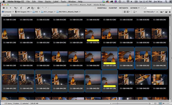
Step 1. Using Adobe Bridge select the images that you want to combine
STEP TWO – PHOTOMERGE
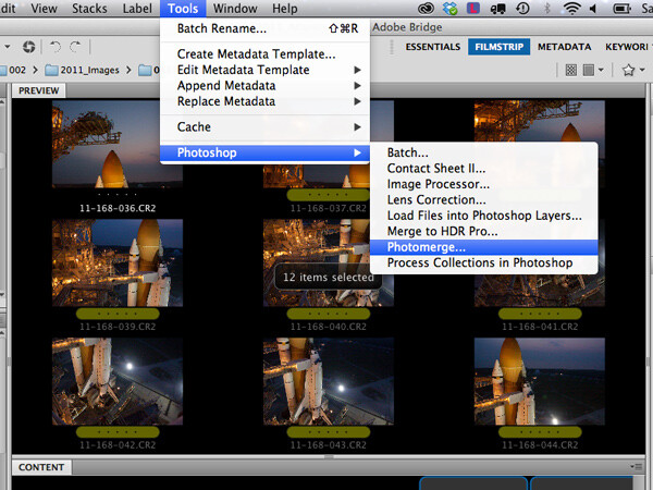
Step 2. In Adobe Bridge go to Tools > Photoshop > Photomerge
STEP THREE – COMBINING SETTINGS
A new window will appear that shows you which files have been chosen to be combined, this allows you to verify that you have all of the correct files. You will see that you also have some options on how you want to combine the images. I have found that letting Photoshop automatically combine them works perfectly well for most things, so select Layout “Auto”, the top option. Check the ‘Blend Images Together’ option box, and leave the others unchecked. The ‘Blend Images Together’ option will automatically create layer masks in each of the layers of your image and it will greatly aid in seamlessly combining all of these images into one. See screen shot below.
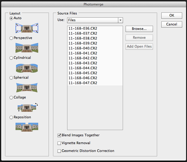
Click OK
Note: At this point you may want to go make a sandwich. This part of the process can be time consuming and there are a lot of variables that will determine just how quickly or slowly your computer can crunch all of these pixels into one remarkable image.
- Q. How many photos are you trying to combine? A. I recommend trying just 3 or 4 the first time.
- Q. Are you combining RAW files or jpegs? A. For maximum punch you definitely want to use your RAW files, but for trying this out I would recommend using jpegs initially.
- Q. How much RAM does your computer have? A. More is always better and will significantly decrease the time that your computer takes to process images like these. Combining these 12 images with 4GB RAM on my 2.4GHz Macbook Pro took almost 60 minutes.
How fast your processor is, what type of processor you have, which operating system, etc., are all factors that will determine how quickly this process works. Always use your computer’s hard drive (aka local drive) as opposed to an external hard drive that doesn’t respond as quickly as your local drive.
If you don’t have that super computer that you really would like to have yet, then you could stick to combining jpeg versions of your files instead of RAW files, but if you do that just make sure that your original files are untouched. And by untouched I mean do all of your color correcting AFTER your images are combined into one. That is true for those of you wanting to combine RAW files on your higher end computers also.
STEP FOUR – CROP AND FINAL TWEAKS
When photomerge has completed combining and blending your images you will see something like this below.
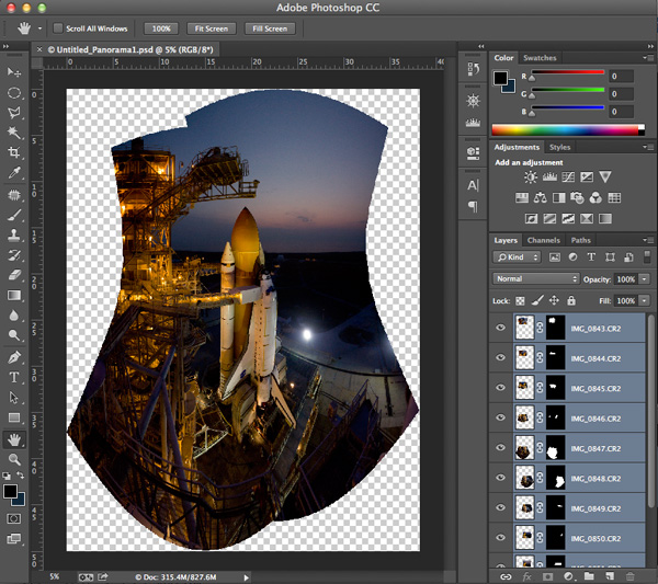
Photomerge has created a PSD file, complete with layer masks for showing just the parts of the image that you need to see from each layer. The blending may not look perfect at this point- you can usually see light edges where the masking is and that’s okay. You can see how Photoshop has automatically corrected for distortion and there will be some parts of the image that need to be cropped away. Let’s save the file ‘as is’ so that you will always have this ‘original’ to go back to.
The next step is to crop the image and save another copy that you can go ahead and flatten. It’s at this point (when the image is flattened) that you will see how well the blending did. Or rather you won’t be able to see it because the blending is seamless. You now have one really large composite image file with lots of detail.
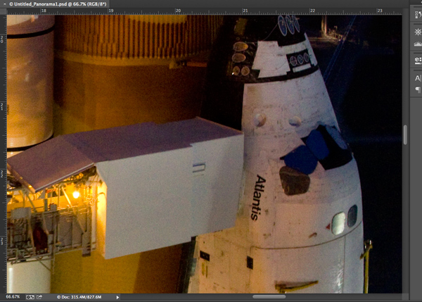
You can save this flattened image as a TIF or JPG and make color corrections in Adobe’s Camera RAW, or any photo editing program. You can size it however you would like at this point.
SUMMARY AND CHALLENGE
So the next time you’re face to face with a larger than life subject, you can go ahead and take that fisheye capture. But while you’re there take a series of images with one of your other lenses as well. Capture them in columns or rows, leaving about 20-25% overlap, and see what you can create by combining those images. It might be a once in a lifetime opportunity so why not maximize your chances to get that great photo that you were hoping for!
Here are a few more photo stitching articles for further reading:
- How to create a panorama with Photoshop and Photomerge
- Stitching images for larger prints
- How to shoot really big panoramas
- Sending panorama sequences from Lightroom to Photoshop
The post Combining Images for Large Subjects using Photoshop Photomerge by Jim Wise appeared first on Digital Photography School.

Digital Photography School


You must be logged in to post a comment.