RSS
 

Posts Tagged ‘Colour’

Beware of Colour: Activists Highlight Decay with Pink Paint

11 Jan

[ By WebUrbanist in Art & Street Art & Graffiti. ]

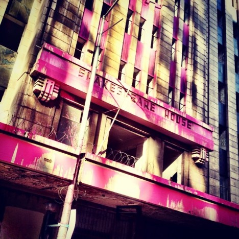
pink abandoned building photo

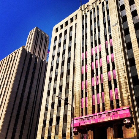
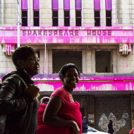
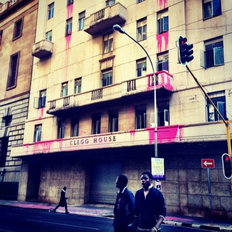
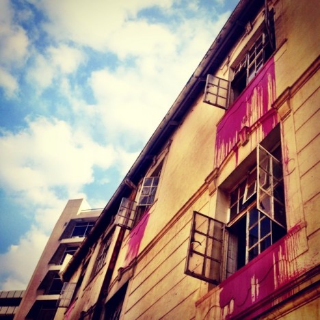
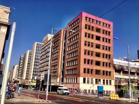
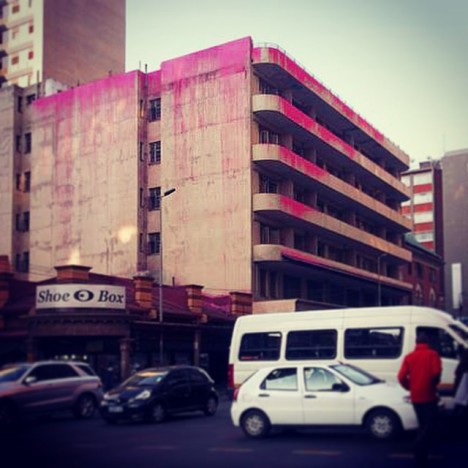
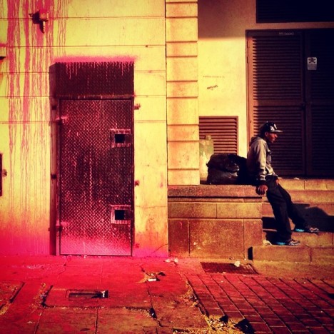
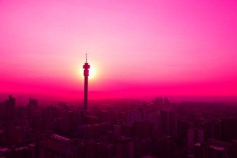
Splashed with bright buckets of paint from roofs and windows, the colorfully defaced buildings of downtown Johannesburg have evoked different reactions from supports and detractors who variously see this work as an act of protest or crime of vandalism. Before we delve too deep into the sides represented, keep in mind that Beware of Colour employed water-soluble paint in these interventions.

pink painted historic building

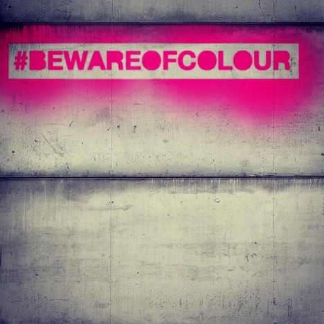
beware of color logo

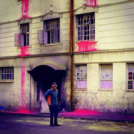
pink buildings people foreground

pinked architecture

Colombian-American Yazmany Arboleda and the other artists behind the work note that all of the buildings targeted have been abandoned for decades despite a housing crisis – a fifth of the region’s population needs a place to live, currently dwelling in shanties or on the streets. Historic preservationists, meanwhile, decry the defacement and suggest that other methods could be used to raise public awareness of civic problems.

pink window splashes

pinked out building protest

pink abandoned structure balconies

pink beware of color

The case is more complicated, though, than either single viewpoint might suggest and the case for preservation is nuanced. As CityLab’s Ryan Lenora Brown points out, “appealing to history in contemporary South Africa is hardly a straightforward matter. Buildings like Shakespeare House were originally built for the exclusive use of whites, back when Johannesburg’s inner city was the center of one of the modern world’s most infamous projects of racial segregation …. The slumped and broken building has become a symbol for a different Johannesburg, one blighted by decades of white flight and municipal neglect.”

pink city artist statement

pink hashtag logo

pink derelict structure splashed

pink architectural urban intervention

Arborleda was eventually caught with a crew of people and arrested for “malicious destruction of property” after being spotted entering one of the buildings on their list. This has, for now, put an end to this particular vintage of urban activism in South Africa.

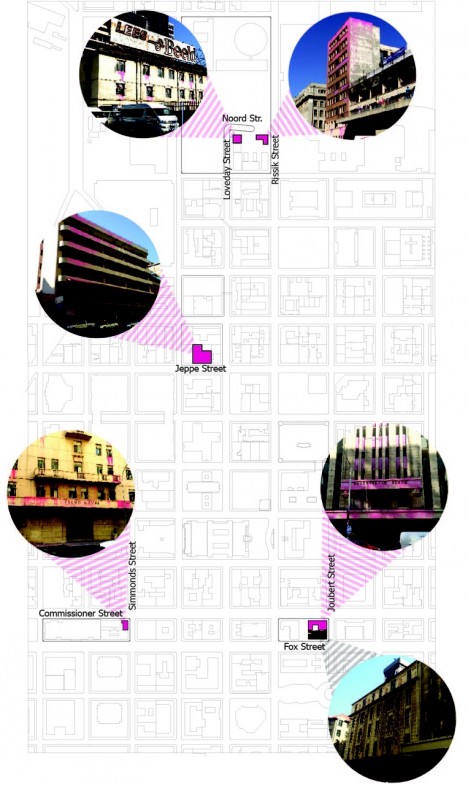
pink architecture site plan

pink south africa press

Most of the structures the 30-some artists threw paint upon are either owned by the city or by Urban Ocean, a development group with a significant number of centrally-located and historical holdings. It remains to be seen whether this project will make a difference in the course of the city’s development, or become just another piece in the area’s persistently puzzling blight.

Share on Facebook


[ By WebUrbanist in Art & Street Art & Graffiti. ]

[ WebUrbanist | Archives | Galleries | Privacy | TOS ]


WebUrbanist

 
Comments Off on Beware of Colour: Activists Highlight Decay with Pink Paint

Posted in Creativity


Everything You Need to Know About Lightroom and Colour Space

03 Sep
Lightroom and colour space

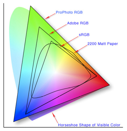
This diagram shows the three colour spaces that Lightroom works with. Photo from Wikipedia

One of the key differences between Lightroom and Photoshop is their approach to colour management. In Photoshop, once out of Adobe Camera Raw, you can go to the Colour Settings menu option and tell Photoshop in which colour space you want it to work.

How Lightroom works

Lightroom works differently. When processing Raw files, Lightroom uses the ProPhotoRGB colour space the whole time, and there’s nothing you can do to change it. The benefits of this method are:

  • Less colour information is lost during the processing stage. ProPhotoRGB is the largest colour space, so it is the optimum one to work in.
  • You can export multiple versions of the same photo, each with a different colour space, if you have need to do so.
  • If future output devices (monitors, printers etc.) support ProPhotoRGB (they don’t at the moment) then your photos will be ready for them.
  • Colour management is greatly simplified. You don’t have to make any decisions about what colour space to work in until you export your photos. This is the biggest advantage of all.

How Lightroom manages colour

When processing Raw files, Lightroom (and Adobe Camera Raw in Photoshop) uses its own colour space based on ProPhoto RGB. It provides a large colour gamut to work with the wide range of colours that digital sensors are capable of recording.

Note: Gamut is the term used to describe the range of colour values that fit in a colour space.

Exporting photos in Lightroom

When you export a photo in Lightroom it gives you the choice of three colour spaces.

ProPhotoRGB: ProPhoto RGB is the largest of the three. It roughly matches the range of colours that a digital camera sensor can capture.

Adobe RGB (1998): Adobe RGB (1998) is smaller than ProPhoto RGB, but larger than the next choice, sRGB. It roughly matches the colour gamut of CMYK printers used to print books and magazines.

sRGB: sRGB is the smallest colour space of the three. It represents the colour space that most monitors are able to display.

Comparing colour spaces

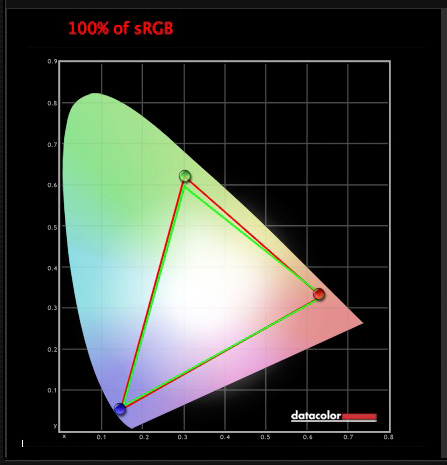
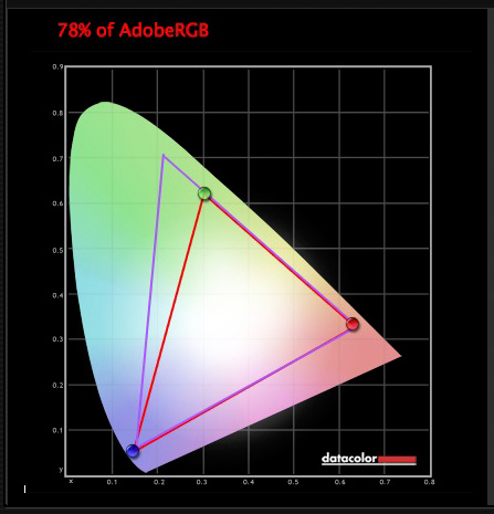
These two graphs show how the colours my monitor is capable of displaying, compared to the sRGB and Adobe RGB colour spaces.

Lightroom and colour space

The green triangle shows the sRGB colour space, the red one shows my monitor’s colour gamut. The two are nearly identical.

Lightroom and colour space

The purple triangle shows the Adobe RGB (1998) colour space, the red one shows my monitor’s colour gamut. My monitor can’t display all the colours within this colour space. Only a select few high end monitors can display all the colours within the Adobe RGB (1998) colour space.

This diagram compares the ProPhoto RGB, Adobe RGB (1998) and sRGB colour spaces. You can see that ProPhoto RGB is the largest.

Lightroom and colour space

Photo from Wikipedia 

Keeping it simple

Armed with this knowledge, here’s a guide to which colour space you should select when exporting your photos:

sRGB: Use when exporting photos to be displayed online, printed at most commercial labs, or printed with most inkjet printers. In short, if in doubt, use sRGB.

Note: Lightroom’s Web module automatically sets the colour space of exported files to sRGB.

Adobe RGB (1998): Use only if requested. If you’re not sure, ask. If you’ve been asked to submit photos to a magazine, for example, then ask them which colour space is required. It will probably be Adobe RGB (1998). Submitting photos to a stock library? Again, it will probably be Adobe RGB (1998). It’s the colour space most likely to be used for commercial purposes.

You would also use this colour space if you have an inkjet printer that utilizes the Adobe RGB (1998) colour space, or you are using a lab that accepts and prints photos with that profile.

ProPhoto RGB: Use when exporting a photo file to be edited in another program such as Photoshop or a plug-in. The file should be exported as a 16-bit TIFF or PSD file. There is little point in using the ProPhoto RGB colour space with 8 bit files, as they don’t contain enough bit depth to utilize the full colour range.

Note: If you import a JPEG or TIFF file into Lightroom, it uses the file’s embedded colour profile. If there is no colour profile attached, it assumes that it’s an sRGB file. If you choose an alternate colour space when you export the file, Lightroom converts it.

Colour spaces and compression

The reason that Lightroom uses a version of the ProPhoto RGB colour space, is that it is doesn’t compress the colours captured by your camera’s sensor.

When you export a photo, if you select either the Adobe RGB (1998) or sRGB colour space, Lightroom compresses the photo’s colours to match the chosen profile. That’s why selecting colour space is best left for as close to the end of the post-processing workflow as possible.

While Lightroom does its work within its version of the ProPhoto RGB colour space, your monitor isn’t capable of displaying all those colours. Instead, your computer’s operating system uses the monitor profile to convert the colours to ones that your monitor is capable of displaying.

Note: All monitors have a colour profile, regardless of whether they have been calibrated. But your monitor will only display colour accurately if it has been properly calibrated. You can learn more about the calibration process in my article How to Calibrate Your Monitor With the Spyder 4 Express.

Exporting photos with Lightroom

To export a photo in Lightroom, select the photo (or photos) you want to export, then go to File > Export. You can do this from any module (use the Film Strip to select multiple photos if you are not in the Library module’s Grid View).

Go to the File Settings section of the Export window and set the required colour space. If you select the ProPhoto RGB colour space set Bit Depth to 16 bits/component.

Lightroom and colour space

Transferring photos to Photoshop

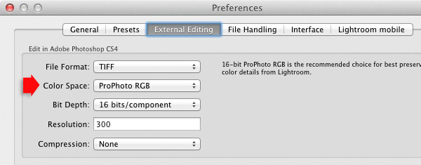
To open a photo in Photoshop, right-click on the photo and select Edit In > Edit In Adobe Photoshop. Photoshop opens the photo using the colour space indicated in Lightroom’s preferences.

To adjust this setting, go to the External Editing tab in preferences, and set Color Space to ProPhoto RGB. You can choose another colour space if you wish, but ProPhoto RGB is definitely the best one to use.

Lightroom and colour space

Opening photos in plug-ins

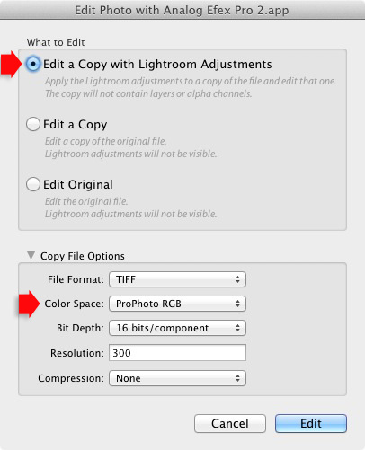
To export a photo to a plug-in, right-click on the photo, go to Edit In and select the plug-in you want to use to open the photo.

In the Edit Photo window, if you select Edit a Copy with Lightroom Adjustments (the only option available if you are exporting a Raw file) you will be able to select which colour space you want to use. Again, go with ProPhoto RGB for the best results.

Lightroom and colour space

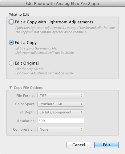
If you are exporting a JPEG or TIFF file, Lightroom gives you the option of selecting Edit a Copy or Edit Original in the Edit Photo window. If you do so, the option to select a colour space is greyed out and Lightroom opens the photo in the plug-in using the embedded colour profile.

Lightroom and colour space

But if you select Edit a Copy with Lightroom Adjustments, you can select any colour space and Lightroom will convert the photo to that colour space when it opens the photo in the plug-in.

Conclusion

Confused? I hope not, because colour management in Lightroom is really very simple. It’s essential to calibrate your monitor, but after you’ve done that Lightroom takes care of all colour related issues for you until you export your photos. Then, it’s just a matter of selecting the appropriate colour space.

If you have anything to add to the article, or any questions, please post it in the comments.


Mastering Lightroom: Book Four – The Photos ebookMastering Lightroom: Book Four – The Photos

My new ebook Mastering Lightroom: Book Four – The Photos takes you through ten beautiful examples of photography and shows you how I processed them step-by-step in Lightroom. It explores some of my favourite Develop Presets and plug-ins as well as the techniques I use in Lightroom itself. Click the link to learn more.

The post Everything You Need to Know About Lightroom and Colour Space by Andrew S. Gibson appeared first on Digital Photography School.


Digital Photography School

 
Comments Off on Everything You Need to Know About Lightroom and Colour Space

Posted in Photography


Getting Creative with Aperture and Colour

19 Sep

Creative use of aperture and colour


Andrew S. Gibson is the author of Mastering Photography: A Beginner’s Guide to Using Digital Cameras, on offer now at Snapndeals for a limited time.

You are probably already familiar with the effect of aperture on your images. If not, here’s a quick recap: for any given focal length and camera-to-subject distance, use a wider aperture to get less of the image in focus. There’s a fair amount of science behind that statement (some of it subjective, such as the definitions of depth-of-field and sharpness) but the end result is that you can use wide apertures to limit depth-of-field and add a real creative edge to your images. Note that you’ll get the best results with a prime lens as they have wider maximum apertures.

I’m writing about using wide apertures in this article because they are exciting. You can use them to do wonderful things with composition, focus and colour. Today I’m going to concentrate on the relationship between aperture and colour, something that I hadn’t really thought about before until someone pointed it out in a comment on a previous article. It made me realise that a wide aperture alone isn’t enough to make a good image. Light (as always in photography) is important, and (unless you’re working in black and white) so is colour.

Creative use of aperture and colour

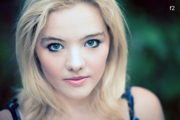
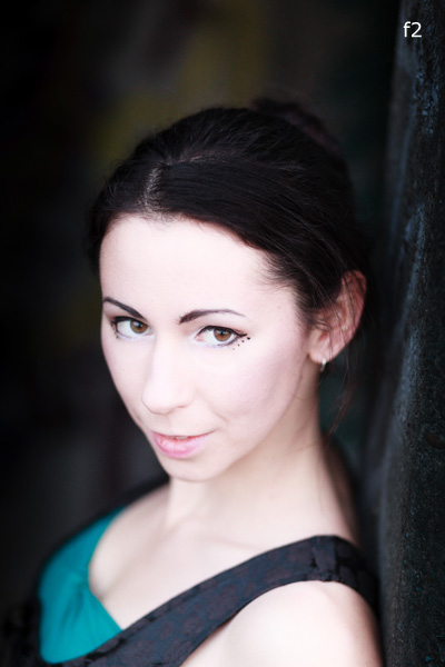
Here’s an example. I used an 85mm lens and an aperture of f2.0 to create a portrait with very little depth-of-field. Now, look at the model. She has fair skin and dark hair. She’s wearing a black top over another green top. There is very little colour. I emphasised that by placing her against a grey coloured background. I darkened the background in Lightroom and reduced the saturation. The end result is a portrait with a lot of neutral light and dark tones and very little colour. The colour has become a subtle and understated part of the composition.

Creative use of aperture and colour

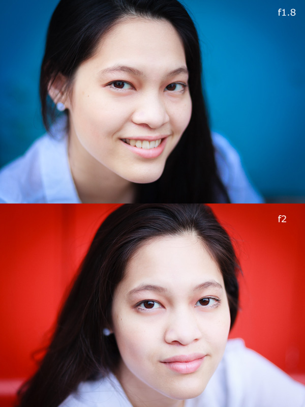
Here are two more portraits. They were taken during the same shoot, just with different backgrounds. In both cases I moved the model away from the background so that it would go out of focus. The idea here was to have fun and play around with the colours. Unlike the previous example the colours are strong, rather than subtle.

The background in both portraits was a painted door. Perhaps it’s also another example of seeing – where many photographers would see a door I saw colour, because I understood that I could throw the doors out-of-focus by choosing the right lens and aperture.

Creative use of aperture and colour

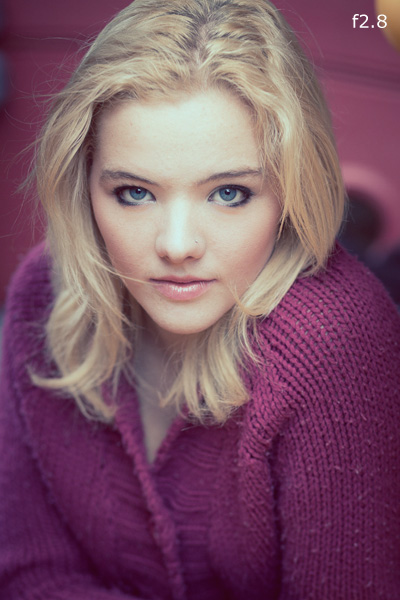
This portrait has a different approach. We took the photos in a children’s playground, and I noticed that the model’s jumper was nearly exactly a match with the colour of one of the plastic climbing frames. I was able to position her so that the colour of the background (out of focus again) matched her jumper.

The key in all these photos is first in observing the colours (seeing what is actually happening in the scene) and then finding interesting ways to work with the colour palettes presented by the combination of clothes worn by the models and the environment we were in. None of these were pre-conceived concepts. I was simply reacting to the circumstances given to me.

It’s also part of learning about how lenses and aperture work. Once you understand that you can make the background go out of focus by moving your model away from it and using a short telephoto lens with a wide aperture, you can start seeing what the camera sees, rather than what you see when you use your own eyes.

Mastering Photography

Creative use of aperture and colour

Would you like to learn more about aperture and the other important settings on your digital camera? My latest ebook, Mastering Photography: A Beginner’s Guide to Using Digital Cameras introduces you to digital photography and helps you get the most out of your camera. It covers concepts such as lighting and composition as well as the camera settings you need to master to take photos like the ones in this article. It’s available now at Snapndeals for a special price for a limited period.

Post originally from: Digital Photography Tips.

Check out our more Photography Tips at Photography Tips for Beginners, Portrait Photography Tips and Wedding Photography Tips.

Getting Creative with Aperture and Colour


Digital Photography School

 
Comments Off on Getting Creative with Aperture and Colour

Posted in Photography


Colour Composition: Using Subtle Colour

11 Jul

A photo with subtle colour

In my last article I wrote about using colour boldly. Today I’m going to look at ways you can use colour in a much subtler, gentler fashion.

Bold colours are most often found in man-made objects. If someone paints a wall bright red, for example, and you take a photo of it against a deep blue sky, then you are using colours that are just about as strong and deep as it is possible to get.

In nature though, colours are often much more subtle. And there are ways that you can use the subtlety of colour found in nature to create photos that capture the mood of the scene.

Let’s look at some examples to explain what I mean:

A photo with subtle colour

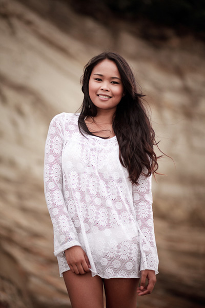
For this portrait I photographed my model against a cliff and use the cloudy white balance setting to warm it up. The background and the model’s skin and hair are all shades of brown. Apart from white, I don’t think there’s another colour in the image.

A photo with subtle colour

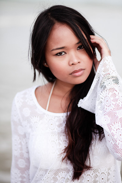
Here’s another portrait taken the same afternoon. The background in this photo is the sea, although it’s difficult to recognise as it’s out of focus. It was overcast, so the sea has come out grey rather than blue. But it suits the image. Just like the previous portrait, the colour palette is limited.

A photo with subtle colour

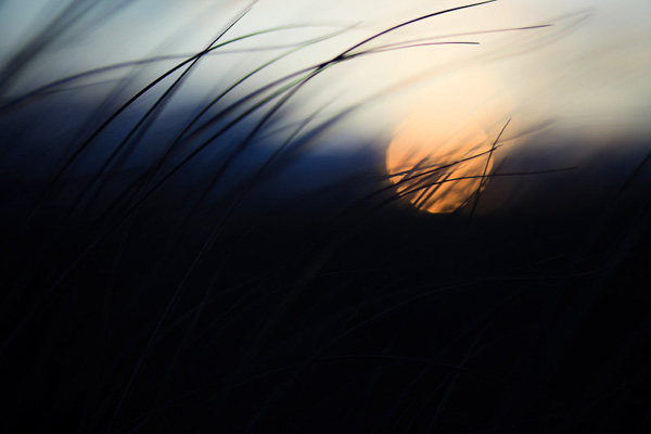
I created this photo by focusing on the grass in the foreground and using a wide aperture to defocus the setting the sun. I applied a low colour temperature in post-processing to give the scene a cool feel. Even though it is sunset, the colours are subtle.

A photo with subtle colour

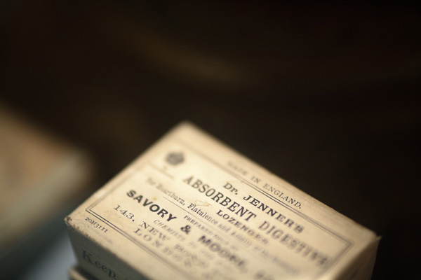
Here is a close-up photo I took in a local museum. The colour palette is very subtle. The box is cream, and the background is green. There is some nice tonal contrast going on in this image.

So far, the examples I’ve given have all used soft or pastel colours. But you can still use bright colours such as red in a subtle way. Here’s an example:

A photo with subtle colour

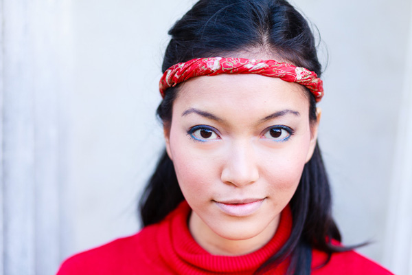
My model was wearing a bright red jumper and headband, so I positioned her against a white coloured building to provide a neutral background. The neutrality of the background colours emphasise the strength of the red.

I hope the photos in this article and the last have given you some ideas about using colour in your photos. It’s a little more difficult to use colour with subtlety that it is to fill the frame with bright colours. But it does give you an extra tool for expressing yourself with. And don’t forget, you don’t have to settle for the colour palette that nature provides. Feel free to make the colours in your images more subtle by desaturating them in post-processing.

Mastering Photography

A photo with subtle colour

My latest ebook, Mastering Photography: A Beginner’s Guide to Using Digital Cameras introduces you to digital photography and helps you make the most out of your digital camera. It covers concepts such as lighting and composition as well as the camera settings you need to master to take creative photos like the ones in this article.

Post originally from: Digital Photography Tips.

Check out our more Photography Tips at Photography Tips for Beginners, Portrait Photography Tips and Wedding Photography Tips.

Colour Composition: Using Subtle Colour


Digital Photography School

 
Comments Off on Colour Composition: Using Subtle Colour

Posted in Photography


Using Colour Boldly

04 Jul

Bold colours

In my previous article I explored some of the ways that you can use two contrasting colours, orange and blue, that appear in nature to create atmospheric images full of emotion.

Today I’m going to look at ways you can use other bright colours effectively.

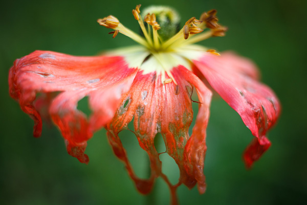
Let’s start with a simple example. Flowers are a common, brightly coloured subject. If it is summer where you live right now you there may be public gardens close to you where you can practise taking photos like the one below. One of my favourite techniques is to photograph red flowers against a green background:

Bold colours

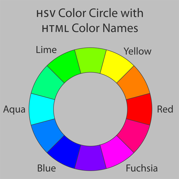
Bold colour is part of the composition of this photo. To see why, let’s take a look at the colour wheel again:

Bold colours

The colour wheel tells us that certain colours have a dynamic relationship. Colours that are on opposite sides of the wheel, such as red and green, are said to be contrasting colours. That’s just a way of saying that the human eye can easily distinguish between these colours. So, in the above photo, it’s easy to tell the red flower from the green background, and that makes the photo more interesting to look at.

Man-made colours

Now, the most likely place to find bold colours is with man-made objects. Humans have a tendency to make brightly coloured objects, and we can take advantage of that. Here are a few examples to show you what I mean:

Bold colours

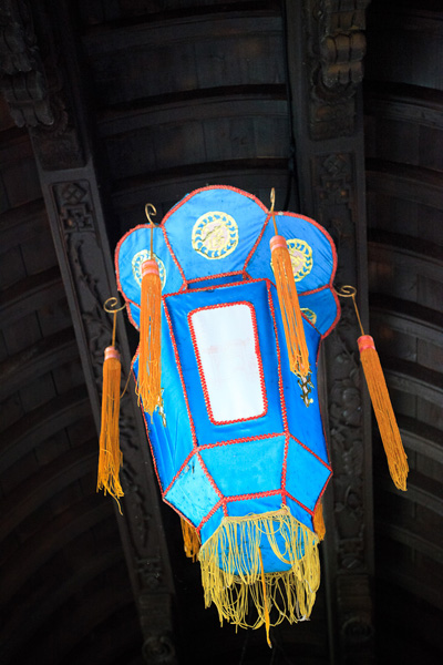
The blue colour in this Chinese lantern is very intense. It helps that the tassels and trim are yellow, a colour that contrasts with blue (see the colour wheel). It also helps that the background is a neutral shade. It doesn’t compete with or distract attention from the lantern.

Bold colours

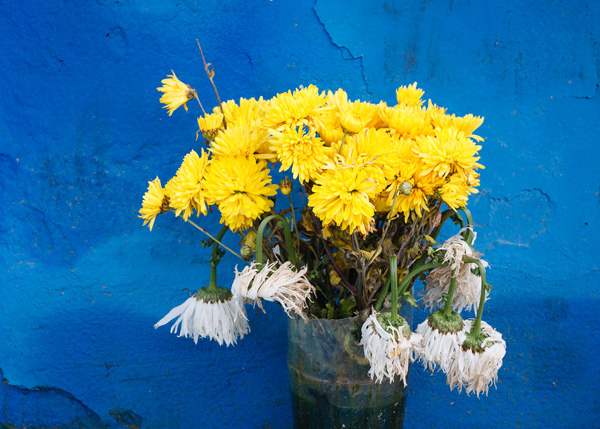
Here’s another example of the blue/yellow dynamic in action. The flowers are natural, of course, but the background is man-made. Intense colours like this shade of blue occur rarely in nature.

Bold colours

Blue and red is another powerful colour dynamic.

Bold colours

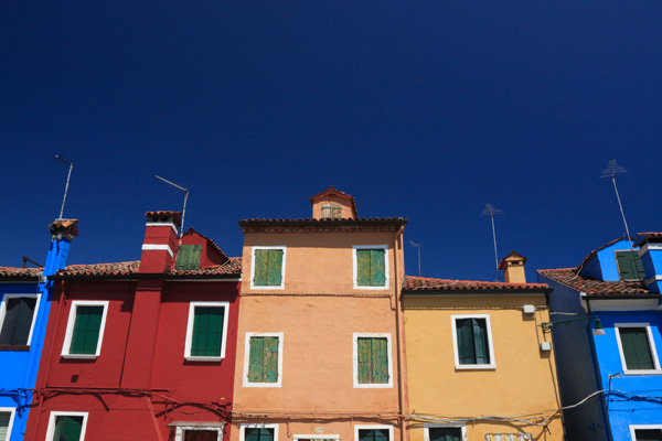
This is a photo I took in Burano, an island near Venice known for its colourful buildings. I made the most of the colours by using a polarising filter on my lens.

Polarising filters work by eliminating glare from reflective non-metallic surfaces. This results in deep blue skies and more saturated colours. It’s an effect that can’t be replicated in post-processing, making a polarising filter an essential piece of gear for taking photos like this.

Using colour boldly

The way I see it, there are are two ways to utilise strong colours. The first is the one that we’ve seen so far – using bold colours to create strong images where the use of colour is an important part of the composition.

The second is use colour boldly. The idea is to create near abstract images that are very much about the colours and little else. They probably wouldn’t work in black and white, or if the colours were subtle rather than strong. Here are some examples:

Bold colours

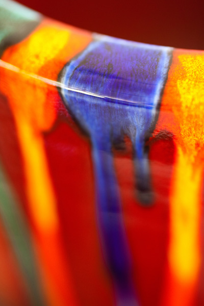
This is a close-up I took of a vase in a pottery store. I closed in and created a composition that is really about the streaks of colour and little else.

Bold colours

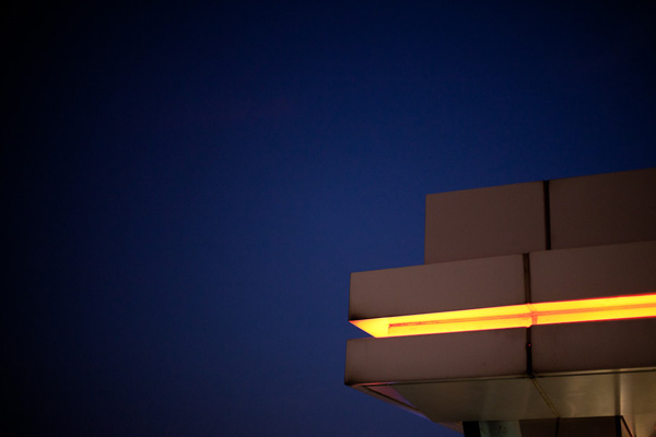
A photo taken in Hong Kong. There are no clues to the location in the photo – it is simply a photo of an orange light against the night sky. Very abstract, and almost entirely about colour.

Bold colours

I took this photo close to my home. It was dark and the glow from the neon light caught my eye.

Simplicity

On a final note I’d like to mention that throughout this article the photos have benefitted from keeping the composition simple. There is little to distract from the main subject and the use of colour.

Mastering Photography

Bold colours

My latest ebook, Mastering Photography: A Beginner’s Guide to Using Digital Cameras introduces you to digital photography and helps you make the most out of your digital cameras. It covers concepts such as lighting and composition as well as the camera settings you need to master to take photos like the ones in this article.

Post originally from: Digital Photography Tips.

Check out our more Photography Tips at Photography Tips for Beginners, Portrait Photography Tips and Wedding Photography Tips.

Using Colour Boldly


Digital Photography School

 
Comments Off on Using Colour Boldly

Posted in Photography


Colour Contrast: Making the Most of Orange and Blue

29 Jun

Colour contrast: using orange and blue

One of the principles behind using colour in photography is that of using contrasting colours. To understand the concept we need to look at a colour wheel – a type of diagram used by designers to show the relationships between colours:

Colour contrast: using orange and blue

Diagram by Wikipedia contributor Jacobolus

Contrasting colours are those that appear on opposite sides of the colour wheel. Today I’m going to look at two specific colours, orange and blue.

Why these two? They happen to be very useful colours to work with because they appear a lot in nature (even though you might not be aware of it). It’s all to do with the colour of the ambient light, which ranges from cool blue to warm orange, depending on the light source.

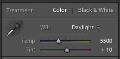
Incidentally, this is reflected by the colour temperature slider in Lightroom. One end is blue, and the other is orange:

Colour contrast: using orange and blue

Blue light

In low light, in fog or rain, or at twilight the natural colour of the light is blue. In these conditions, any photo you take has a blue colour cast.

The easiest way to see a colour cast in your photo is to set white balance to daylight. If the colour of the light is blue, then it will come out blue in your photo.

If you use auto white balance the camera will warm the photo up to compensate for the blue colour cast of the light. That’s useful sometimes, but it’s not desirable if you want to create a moody image.

Blue light is atmospheric. That’s because some colours evoke an emotional response, and blue is one of them. It is a cold colour – it connotes cold, misery, bad weather, even depression.

Colour contrast: using orange and blue

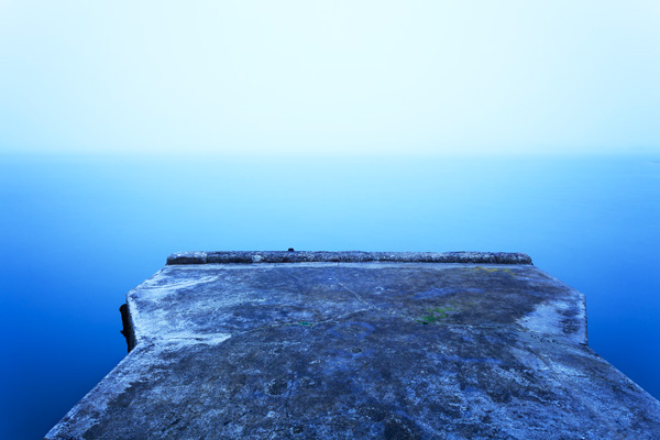
I took this photo in thick fog.The natural colour of the light is blue. The blue colour cast in this photo creates mood.

Orange light

Orange coloured light also occurs naturally. Light originating from the sun in the late afternoon, early evening or at sunset has an orange colour cast. So does light emitted by tungsten bulbs and burning flames.

Anything lit by these light sources will have a warm orange colour cast. Again, you will see it clearly if you set white balance to daylight.

Orange is another colour that evokes emotion. It is the colour of warmth and energy. It reminds us of things like the heat of summer or emotional warmth. Like blue, the psychological effect can be quite powerful.

Colour contrast: using orange and blue

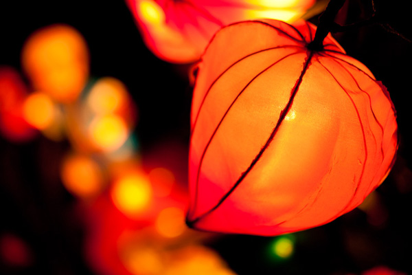
The light source in this photo is the tungsten bulbs inside the lanterns. The natural colour of this light is orange.

You can see that blue and orange are opposites in many respects. They are opposites on the colour wheel, and also in the emotions and feelings that they represent.

Combining blue and orange

One way to show contrast between two things is to place them together. There is a famous photo by Annie Leibovitz of a jockey and a basketball player, side by side (you can see it here). Placing both sportsmen side by side emphasises their respective height, and the difference in stature between them.

It’s the same with blue and orange. Include both in the same image to add to the power of this colour combination. The coldness of the blue tones emphasises the warmth of the orange ones, and vice versa. Here are a few examples:

Colour contrast: using orange and blue

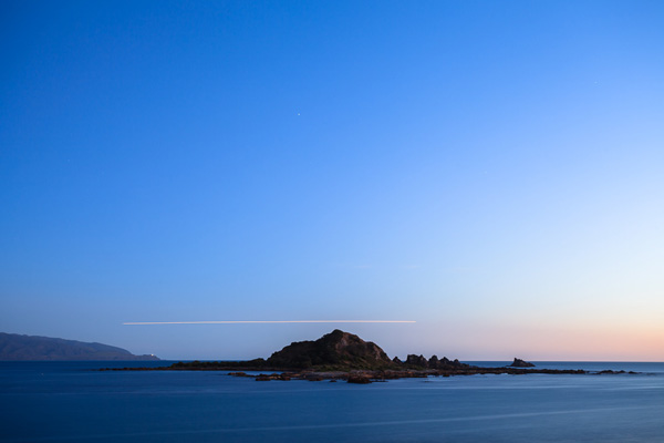
Most of the scene is lit by fading daylight, which has a natural blue colour. There is some warm light coming from the right, where the sun has set. The orange streak of light over the horizon comes from a plane flying by during the exposure.

Colour contrast: using orange and blue

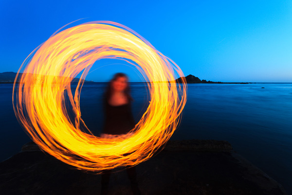
This photo was taken when it was nearly dark. The landscape is lit by the fading light, which has a natural blue colour. My model is whirling a burning object around. The light from the fire is orange.

Colour contrast: using orange and blue

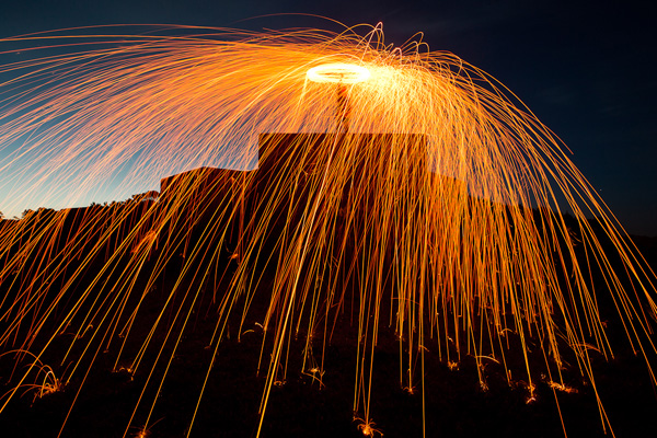
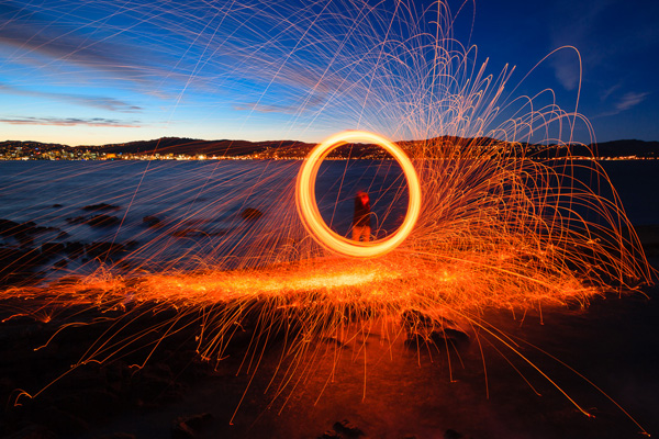
Finally, here is a photo created using the steel wool spinning technique. It’s taken at dusk, and the landscape is lit by the blue coloured light of the fading daylight. The light from the burning steel wool is orange, and so are the lights from the distant city buildings over the water.

If you want to try steel wool spinning yourself, click the link to read an article I wrote about it on my website. Please pay attention to the safety instructions in the article – steel wool spinning is potentially dangerous.

Mastering Photography

Colour contrast: using orange and blue

My latest ebook, Mastering Photography: A Beginner’s Guide to Using Digital Cameras introduces you to digital photography and helps you make the most out of your digital cameras. It covers concepts such as lighting and composition as well as the camera settings you need to master to take photos like the ones in this article.

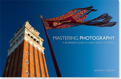
By the way, the cover photo is another great example of using the orange and blue colour contrast. The building and flag are lit by the setting sun, so they have an orange colour cast. The summer sky is deep blue. You can take this sort of photo just about anywhere during the golden hour at the end of the day.

Post originally from: Digital Photography Tips.

Check out our more Photography Tips at Photography Tips for Beginners, Portrait Photography Tips and Wedding Photography Tips.

Colour Contrast: Making the Most of Orange and Blue


Digital Photography School

 
Comments Off on Colour Contrast: Making the Most of Orange and Blue

Posted in Photography


The Pro Photographers Guide to Black & White Vs Colour

21 Mar

Setting the tone of an image is arguable, the most important part of any photograph. As the photographer, this choice can help to define your overall style; making your work instantly recognisable purely by the tone of your chosen medium. You have to consider the composition, exposure and all those other technicalities. But it is how the subject is portrayed Continue Reading

The post The Pro Photographers Guide to Black & White Vs Colour appeared first on Photodoto.


Photodoto

 
Comments Off on The Pro Photographers Guide to Black & White Vs Colour

Posted in Photography


Understanding Colour on Your Digital Camera

05 Mar

This is the third in a series of articles by Andrew S Gibson, the author of Understanding EOS: A Beginner’s Guide to Canon EOS cameras.
01

Joel Meyerowitz once asked ‘If the world is in colour, why shoot it in black and white?

Okay, I can think of plenty of good reasons for working in black and white, but it seems that most photographers work in colour a great deal of the time. And when you work in colour, you naturally want to configure your camera to give the best possible results. To do so, it’s important to understand how your digital camera records colour.

You may be wondering why this matters. Surely, digital cameras just accurately record the colours of the subject? Well, the truth is it doesn’t work like that. To understand why, we need to look at the nature of digital capture.
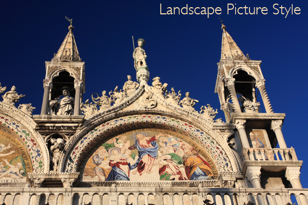
02

Digital capture

The creation of a digital photo occurs in two stages.

The first step happens when you take a photo. The shutter opens, light reaches the sensor, and then the shutter closes again. The sensor’s photodiodes react to the light that hits them and this information is converted to electronic form in a series of millions of bits and bytes.

The second step depends on the file format setting you have selected on your camera.

When you select Raw, the data captured by the camera’s sensor is compressed and recorded onto the memory card as a Raw file. The camera also generates a small JPEG file that is embedded in the Raw file so that you can preview it on your camera’s LCD screen.

When you select JPEG, the camera converts the information captured by the sensor into a JPEG file and then ditches the information captured by the sensor. The main aim of the JPEG format is to save memory card space (the file sizes are smaller) and to give you a file that doesn’t need any post-processing.

When the camera creates a JPEG file, it does so using the colour settings that you have dialled into the camera. Changing those settings alters the way the camera records colour.
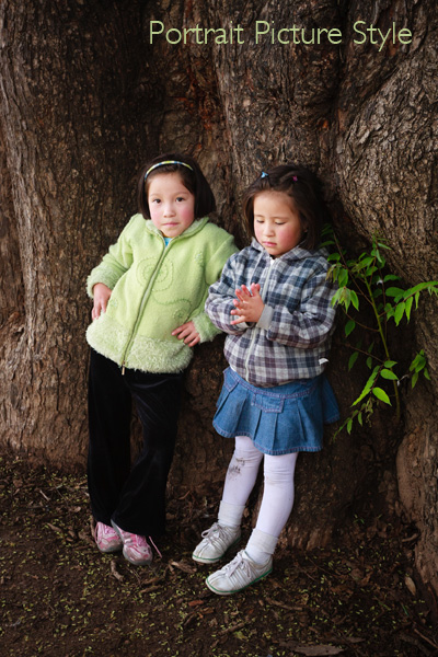
03

Colour settings

There are two colour related settings you need to know how to use. One is white balance (I’ll tackle that in the next article in this series).

The second setting has a different name depending on the camera you have. It is called Picture Style on my Canon EOS cameras. It’s the term I’m accustomed to so it’s the one I’m going to use in the article.

Nikon calls it Picture Control.

Sony calls it Creative Style.

Pentax calls it Custom Image.

Olympus calls it Picture Mode.

Fuji calls it Film Simulation Mode. I like this name as it describes exactly what the settings do – emulate the look of various Fuji film types.
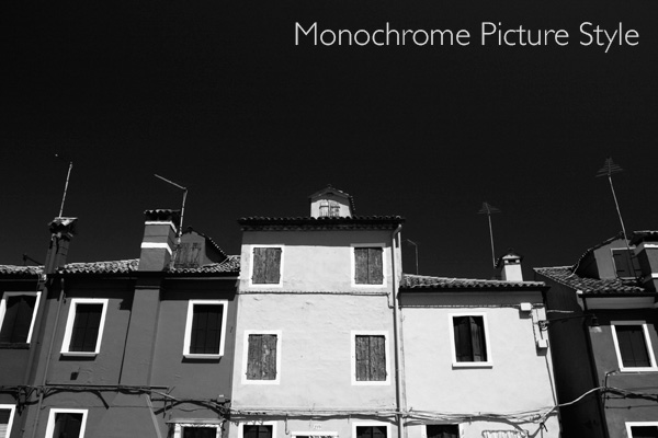
04

What’s the purpose of Picture Styles?

The purpose of Picture Styles, believe it or not, are to imitate the effects of using different films in the camera. Let me elaborate (I realise that this will seem a little abstract to anybody who hasn’t used a film camera).

If you use film, then you would select a film type that records the subject in a way that suits the subject.

For example, the film of choice for many years for most landscape photographers was Fuji Velvia. This was a high quality slide film that recorded deeply saturated colours. It emphasised hues like green and blue, making it ideal for creating punchy landscape photos.

On the other hand, if you are taking photos of people, Fuji Velvia is a poor choice of film. You would be better off using something like Kodak Portra. This is a colour negative film designed to give a softer, less saturated image with good skin tones.

In digital cameras, the idea that photographers should be able to change the colour settings to suit the subject they are photographing led to the development of Picture Styles. The same principle applies – you set the Picture Style that is most appropriate to the subject that you’re shooting.

Let’s take a look at the default options on EOS cameras (check your camera’s manual for details if you own a different brand):
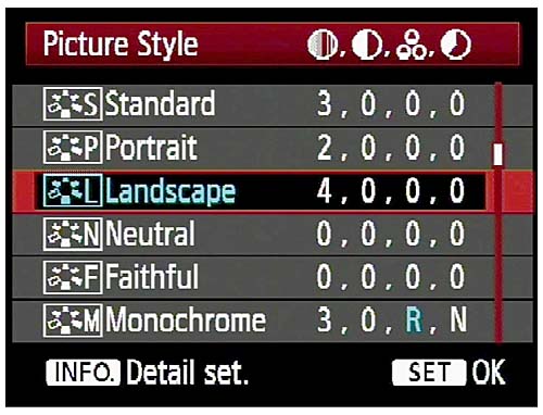
05

Out of the six, the three you would use most often are:

Portrait: For when you’re taking portraits. Obvious enough really. This Picture Style is designed to give warm, flattering skin tones.

Landscape: Also straightforward. This Picture Style gives slightly sharper images than the portrait Picture Style and deeply saturated blue and green tones. It’s intended for landscape photos.

Standard: This is what you would use for just about every situation that isn’t a portrait or a landscape. It gives deeply saturated reds.

Neutral and faithful: These two Picture Styles are nearly identical and are designed to give soft, neutrally coloured JPEG files that are intended to be processed further in Photoshop. Given that most photographers who want to post-process now shoot Raw, these have virtually become redundant.

Monochrome: For black and white images. If you’re serious about black and white photography you’ll get much better results by shooting in Raw and converting the colour image to monochrome in post-processing. But, this Picture Style may come in useful if you want to dabble or simply don’t like to process images on a computer (not everybody does).
06

What is a Picture Style?

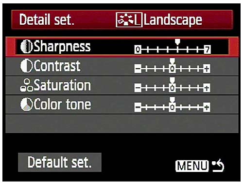
On Canon cameras, a Picture Style is made from four different settings. They are sharpness, contrast, colour saturation and colour tone. You can change any of these in the camera’s menu to alter the way a Picture Style works. This gives you a lot of control over the way your photos turn out.

Moving beyond Picture Styles

The Picture Style control is very useful if you use the JPEG format. But, as I touched on before, a lot of photographers now use the Raw format. Raw processing software has improved over the years to the point where the benefits in terms of image quality are too great to be ignored.
07

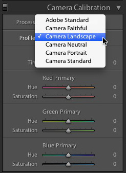
If you shoot Raw you don’t have to select the Picture Style at the time you take a photo. The Raw processing software lets you select the Picture Style at the time you process the file (the screenshot above is from Lightroom 4). That means you can select the Picture Style that most suits the image, and switch between the different options to see which you prefer.

Advanced workflow

If you use a program like Lightroom to process your Raw files, it has so many options for controlling and altering colour that the initial Picture Style you select may become irrelevant if you make lots of changes. If you use Lightroom presets to process your files the Picture Style hardly matters at all.

The same goes for Photoshop if you use Photoshop actions to change the look of your photos. Picture Style is just a starting point, and the result of the actions you use will have a much greater effect on the final result than the Picture Style you started with.

Conclusion

In short, the usefulness of the Picture Style setting depends very much on your shooting style and workflow.

If you use the JPEG format, then Picture Style is very useful as (along with the white balance setting) it determines the way in which your digital camera records colour.

If you use the Raw format, the Picture Style may not be very relevant at all. It provides a starting point and you may choose to use your Raw processing software to create a completely different look.

Did you know that the white balance setting is just as important as Picture Style when it comes to colour photography? I’ll explain why in my next article.

Previous articles

These are the earlier articles in the series:

Introducing the Creative Triangle

Finding Your Way Around the Mode Dial
08

Understanding EOS

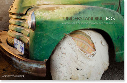
Andrew S Gibson is the author of Understanding EOS: A Beginner’s Guide to Canon EOS cameras. The use of Picture Style is one of many topics explored within the ebook.

Post originally from: Digital Photography Tips.

Check out our more Photography Tips at Photography Tips for Beginners, Portrait Photography Tips and Wedding Photography Tips.

Understanding Colour on Your Digital Camera


Digital Photography School
 
Comments Off on Understanding Colour on Your Digital Camera

Posted in Photography


3 January, 2013 – Colour Harmonies in Photography

03 Jan

Our first article for 2013 is the final installment in Alain Briot’s series on Color Harmonies in Photography.


"Yes I downloaded the videos. THEY ARE AWESOME!!! I learned so much I think my brain is going to explode.


Now I need to get the LR4 video to see how much of Lightroom 4 I don’t know".


The Luminous Landscape – What’s New

 
Comments Off on 3 January, 2013 – Colour Harmonies in Photography

Posted in News


Selective Colour Time Lapse 2

18 Nov

www.libanyusuf.com Buy photo prints! http Cities Photographed: Havana Prague Rome Niagara Falls (Canada) Frankfurt Toronto International Airport Music: Valentina Igoshina playing Chopin’s Nocturne in C Minor, Op. 48, No. 1. Equipment: Nikon D300, Photoshop & Final Cut Pro. Thanks for watching, please rate, fav and subscribe!
Video Rating: 4 / 5

 
Comments Off on Selective Colour Time Lapse 2

Posted in Nikon Videos