The post 7 Tips for Colorful Landscape Photography appeared first on Digital Photography School. It was authored by Rick Ohnsman.

Color evokes emotion – so if you can become a master of color, then your colorful landscape photography will affect viewers on a deep level.
You may understand exposure, control your camera like a wizard, have the best equipment, get to the most exotic locations, and excel with editing. But if you don’t purposely imbue your images with intentional emotion, they will never “speak” to your viewer (or if your photos do speak, they might say the wrong thing).
That’s where color comes in handy. Let’s learn the language of color and how to use it – through seven colorful landscape photography tips (that’ll take your images to the next level!).

1. Learn the psychology of color
The human brain is hardwired to respond to different colors. Psychologists have studied this, advertisers use it masterfully, and to be a good photographer, you need to understand how different colors will make your viewer feel.

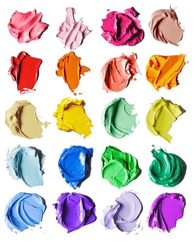
Here are the feelings that colors produce:
- Red: Exciting, important, passionate, angry, call to action
- Purple: Beauty, exotic, royal, luxurious, sensual
- Blue: Calming, serene, trustworthy, cold
- Green: Peaceful, tranquil, natural, alive, growth
- Orange – Fun, warm, energizing
- Yellow – Happy, sunny, bright
- Brown – Earthy, grounding, strength, dependability
- Black – Mysterious, elegant, bold, powerful, edgy
- White – Clean, healthy, pure, sterile, cold
2. Color relationships and the color wheel
In colorful landscape photography, we usually can’t choose our subject’s color. That said, if we understand the different color relationships, we can produce better photos.
You’re likely familiar with the color wheel (displayed below). Take a look at it as we discuss key color relationships:

- Complementary colors – These colors sit opposite each other on the color wheel. They can work nicely in a photo; for example, blue (often a sky color) and orange/brown (often an earth color). Thus, a sky/land photo can be pleasing because the colors are complementary. Look at some of the examples below!


- Analogous colors – These are what we might call “color families.” For example, blue, blue-green, green, and yellow-green are adjacent to each other on the color wheel and therefore analogous. We can often make pleasing, colorful landscape photos with scenes comprised of analogous colors.

- Color triads – These are three colors equally spaced out on the color wheel. For example, green, violet, and orange. If you look carefully, you will find color triads in nature, and they can help create impactful photos.


3. Pay careful attention to the time of day
You won’t be involved in landscape photography for long before you’ll hear the terms “golden hour” and “blue hour.” Golden hour is the time of the day when the sun is rising or setting. The color of the light is very warm and golden.


Well before sunrise or later in the evening after sunset we have the blue hour. The sky is not dark and black. Instead, it’s very cool and blue in tone. Blue hour can produce interesting light and color with a whole different mood.

I’ve seen new and inexperienced landscape photographers come to shoot a sunset and make shots right up until the sun dipped below the horizon. Then they’d pack up and leave. That’s a mistake! The best sky color often comes well after the sun is already down. And if you wait even longer, the blue hour comes and continues until it gets truly dark.
Do enough colorful landscape photography during the sunrise/sunset/blue hour times and you run the risk of becoming a “light snob,” only wanting to make photos when the light and colors are “pretty.” (Shooting during midday? You must be joking!)
However, you won’t always have the luxury of getting to places during great light. Plus, even if you do, conditions won’t always cooperate. Many photographers can make nice photos of a spectacular sunset, but it’s the great photographers who can create impactful images at any time of day in any kind of light (and in any kind of weather).
4. Think about the season
Colorful landscape photography knows no season. There are great images to be made year round. But when planning a photo outing, you may want to consider how to take advantage of the colors of the season.
In the spring, colorful flowers and fresh green fields make for great subjects. Summer brings bright golden days, the sun and sand colors of the beach, bright colors and sunny scenes. Autumn is often a photographer’s dream with fall colors that delight the eye. Winter might be the least colorful season, but brilliant whites and deep cold blues are still impactful.

In any season, you can use color to communicate with your viewer. How do you want the photo to make them feel? Use color to carry that message: the cool blue tones of a winter’s day, the bright and happy yellow color of a field of flowers, the peaceful greens of a forest, or the fiery reds and oranges of a summer sunset.
When composing, shooting, and editing, give conscious thought to the colors you’re trying to bring out and what they say to your viewer.


For the best colorful landscape photography, make sure to consider what’s in season. When do the camas flowers bloom? When are the aspens at peak yellow color? When are the fields in the Palouse Country deep green or golden? What is the best time to get a moonless dark night and have the Milky Way high in the sky?

Knowing when to be at a location for the best colorful landscape photography takes good research and a large measure of luck. It all came together this evening several years ago. It’s never been quite as good since, but each year I still go back.

If you hope to get the very best colorful landscape photos, you need to do your homework, develop good information sources, and be ready to go when things are just right.
The old saying holds true: “Luck happens when preparation meets opportunity.”
5. Shoot when the weather is bad
If you’re a “fair-weather photographer,” someone who only gets out when the skies are clear and the weather is comfortable, then you’re missing some of the best colorful landscape photography.
Here’s another saying for you: “When the weather gets bad, the photos get good.” It may not be pleasant, but I’ll take a cold, stormy day with dramatic clouds, interesting light, and striking color over a clear, cloudless, warm bluebird day (if my goal is impactful landscape photography).

The same goes for rainy, foggy, or snowy days. Don’t think that good color always means contrasty, heavily saturated scenes. Watch for the more muted color and low contrast provided by inclement weather conditions.
Bright, saturated colors might be more impactful, but soft pastels and muted colors create mood and carry a completely different feel and message.

Once again, ask yourself, “How do I want to make the viewer feel?” Capture photos that speak your message and use color as your “words.”
6. Carefully edit colors for the best results
There are many good articles about how to edit color. That is not my intent here. Instead, I’ll offer some general things to keep in mind when editing colors in your photos.

- Shoot in RAW. You greatly limit your options if you only shoot and save JPEG images. The most obvious reason to shoot RAW is the flexibility to adjust the white balance later in editing rather than trying to get it right when shooting. Warming or cooling an image by adjusting the color temperature slider becomes much more difficult if you’re trying to overcome the wrong white balance baked into a JPEG.

- Understand the difference between global and local adjustment tools. Sometimes, you might want to adjust the color of the entire image – so global adjustment sliders and controls work fine. Other times, you might want to make the sky bluer without affecting the land below or bring up the saturation of just the red flowers in a landscape; such edits will require the use of local adjustment tools. If your objective is to communicate with color, knowing how to carefully and precisely control specific colors in your image is an important skill to master.
- Don’t overprocess. How much is too much? That’s a judgment call, but let me express a personal bias. Just as you can over-salt a meal, you can also oversaturate a color photo. Glowing “postcard color” is not a good look if you want to be taken seriously as a landscape photographer. Neither is a grungy HDR. I believe in using color to creatively speak a message, but I don’t want it to shout.

7. Make it monochrome
Sometimes, color is not the best way to give your image the most impact or communicate your message. Here are some reasons you might want to go monochrome instead:
- The image is more about the “bones” of a good image: shape, form, tone, and texture. The color is an unnecessary distraction.
- The image is almost monochrome anyway and the color isn’t adding anything.
- Black and white might better capture the old, nostalgic, or period feel of the image.
- In some genres of photography such as photojournalism or street photography, black and white offers a gritty reality.

- You want to create a lot of drama. You can often push a monochrome edit far, whereas the same amount of processing on a color image might look garish or just plain bad.
- You are unable to get good colors, so you save your image with a black and white conversion. It’s the last reason to favor monochrome, but it happens. That said, the choice to go color or black and white should be intentional rather than a rescue mission. Good photographers know their intent for a shot before they make it. But realistically, the fix for a bad color image might be a conversion to monochrome. While editing, you might think, “I wonder how this will look in black and white?” Also, this circles back to something I said earlier: Always shoot in RAW. Your images will be in color – but should you later decide black and white is preferable, it’s an easy conversion.

Help your images speak: conclusion
Imagine your photograph is printed and hanging on the wall of a gallery. You are not there, only the image and the viewer.
Now, what do you want the viewer to see, think, feel, hear, smell, and experience when looking at your photo? You are not there to interpret, explain, justify, or defend. Your photo must speak for itself.
Once you determine what you want the image to say, apply all the “visual words” at your disposal, many of which use the language of color. Do it well, and you’ll be a master of colorful landscape photography.

Understand the relationships between colors, such as complementary colors, analogous colors, and color triads. That way, you can create pleasing color photos.
When you make a color landscape photo, consider what you want it to communicate to your viewer. Then work with the colors in that image when composing, capturing, and editing – so that the colors of the image “speak” to your viewer. Understand how different colors carry different feelings. Use the feelings to create more impactful images.
The answer is that it depends. If the idea is to concentrate on the basics, such as the shapes, forms, tones, and textures of an image, sometimes color becomes a distraction. Other times, a color photograph can communicate things a black and white image cannot. Photographers and artists have long debated the merits of each approach. Here is a quote worth considering: “To see in color is a delight for the eye but to see in black and white is a delight for the soul.” – Andri Cauldwell
The post 7 Tips for Colorful Landscape Photography appeared first on Digital Photography School. It was authored by Rick Ohnsman.









You must be logged in to post a comment.