The post Texture and Clarity Sliders in Lightroom Classic CC: What’s the difference? appeared first on Digital Photography School. It was authored by Adam Welch.
Throughout the last couple of years, Adobe has released an absolute tsunami of updates for their photo editing platforms. Adobe Lightroom Classic went through a plethora of upgrades and changes, with new (and sometimes major) add-on’s seemingly incorporated with each new build. One of these sizable fresh additions to the Lightroom Classic toolkit came in May of 2019 with the release of v8.3. It’s called the Texture slider.

Yep, that little guy right there.
You’ll find the texture slider nestled comfortably in the Presence section of the basic panel alongside the now veteran Clarity and Dehaze adjustments. These Presence sliders are extremely interesting in their effects and how they each accomplish their separate actions. Clarity, Dehaze, and now Texture, all perform similar adjustments. They each tweak contrast within our photos to varying degrees with wholly different results.
Texture and Clarity are particularly interesting. Both perform quite similarly, while at the same, remaining their own animals…if that makes any sense? In this article, we’re going to have a closer look at the Clarity and Texture sliders.
I’ll explain how they work and show the different effects each of these powerful sliders can have on your photos.
Texture vs Clarity
All right, so what’s the difference between Clarity and Texture?
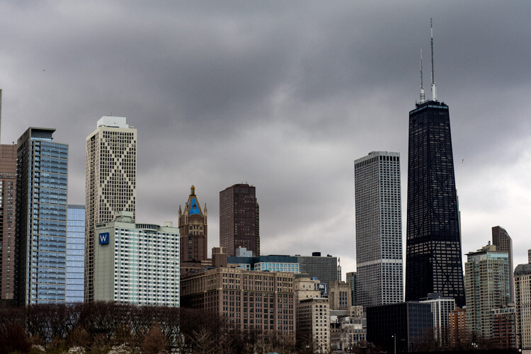
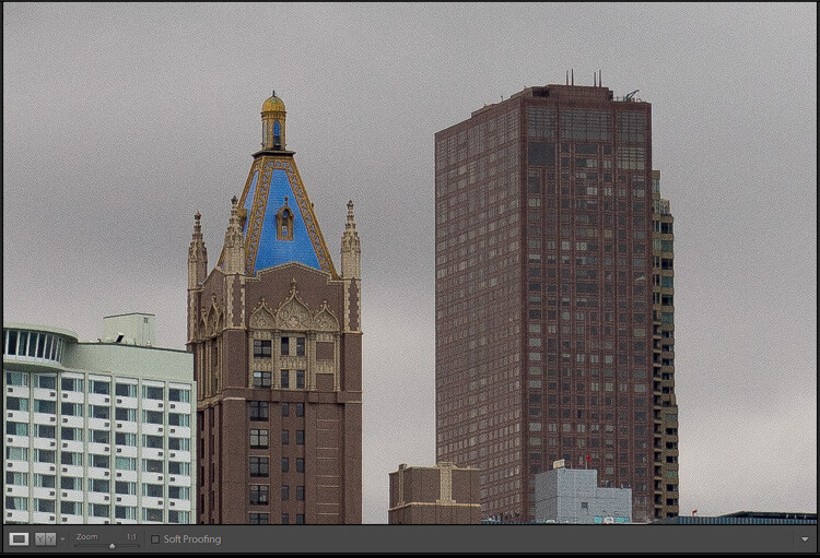
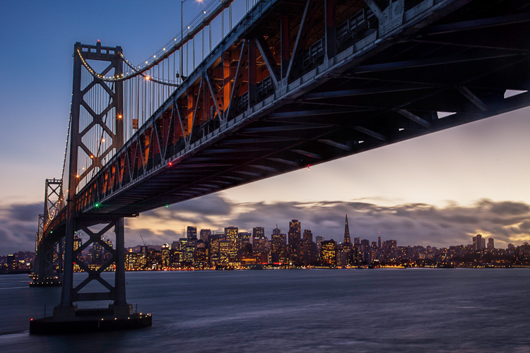
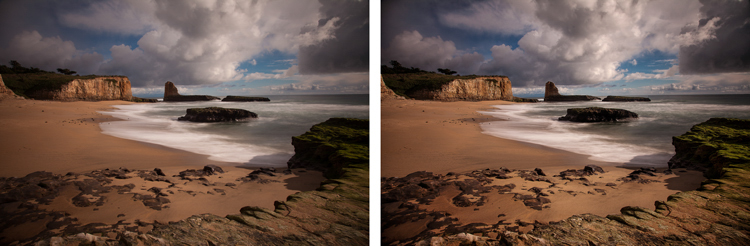
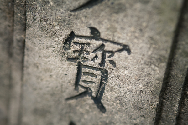
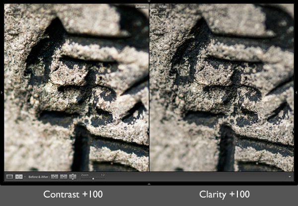
We’ve already surmised they are similar in that they function to bring out detail within a photo. However, you’ll notice some very obvious differences as soon as you view the effects of each slider side by side. Have a look at this. Here’s the original photo:

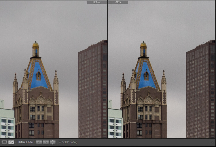
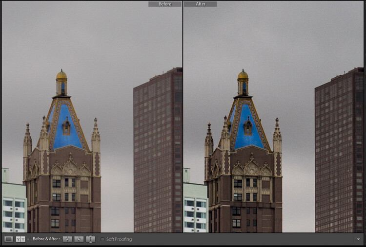
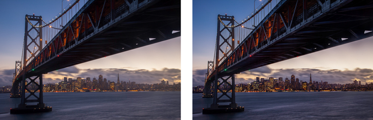
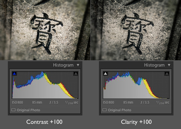
And now a side-by-side comparison of some Clarity and Texture Slider adjustments.

In the photo on the left, I’ve increased the Clarity slider to +100. I’ve applied +100 Texture to the photo on the right. The difference is apparent, but what exactly is happening here? First, let me remind you what our beloved Clarity slider actually does.
A refresher on Clarity
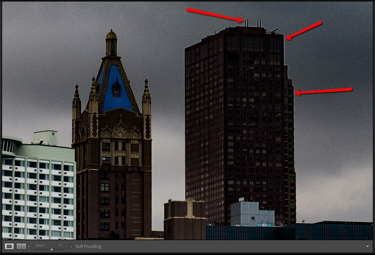
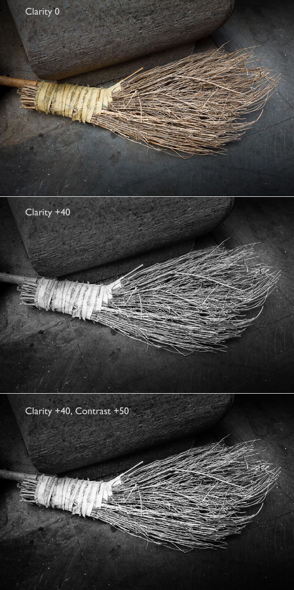
In short, Clarity interacts with our photos by increasing or decreasing the contrast between midtone luminance values. This essentially gives the illusion of our image becoming clearer. However, in reality, all that is happening is the application of more or less contrast to the light and dark areas which fall as midtones (between highlights and shadow).
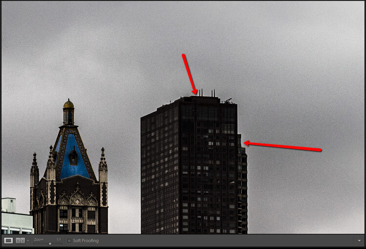
You’ll also notice that the photo is perceptively brighter and that the color saturation diminishes slightly when increasing Clarity. On the other end of the spectrum, decreasing clarity adds in a soft-focus effect. This can sometimes work extremely well, depending on your subject. For a little more of a breakdown on Clarity check out my other article, How to Make Your Photos Shine Using Clarity, Sharpening, and Dehaze in Lightroom. You’ll also learn some great tips on using Clarity along with the Sharpening and Dehaze sliders.
What is Texture?
Now let’s talk about the new kid on the block, the Texture slider.
Ironically enough, the idea for the Texture slider was born not from the goal of increasing the textures (positive) within an image but rather decreasing them (negative) thereby essentially smoothing out a photo. The Texture slider was initially named the “Smoothing slider” in the early stages of its development.
The team at Adobe were aiming to migrate into Lightroom (at least to some extent) the skin retouching capabilities of Photoshop. Their goal was to offer a feature that packed a less drastic punch than the Clarity slider. All while still being able to increase (or decrease) the apparent contrasts in the photo to give the illusion of enhanced textures within the images.*

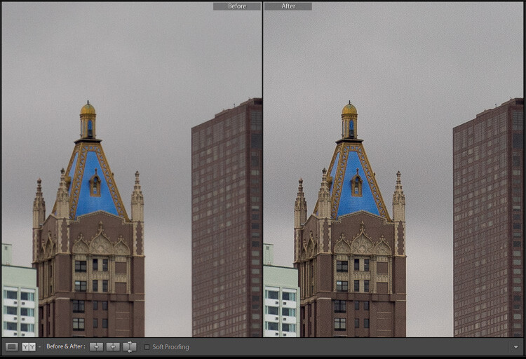
+69 texture added globally
The Texture slider lands somewhere between Clarity and Sharpening in Lightroom. A good way to think about Texture is that it is much less harsh than Clarity and offers more subtle results without affecting absolute brightness or color saturation.
Texture focuses it’s smoothing or clearing effects on areas of a photo which possess “mid-frequency” features. You can think of these as medium detail areas. For reference, a cloudless sky would be considered a low-frequency feature while a cluster of trees would be considered a high-frequency feature.
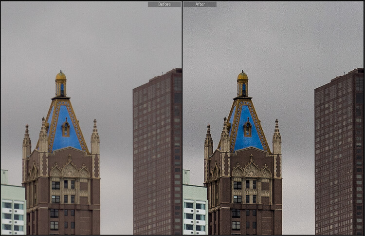
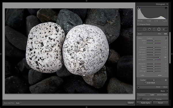
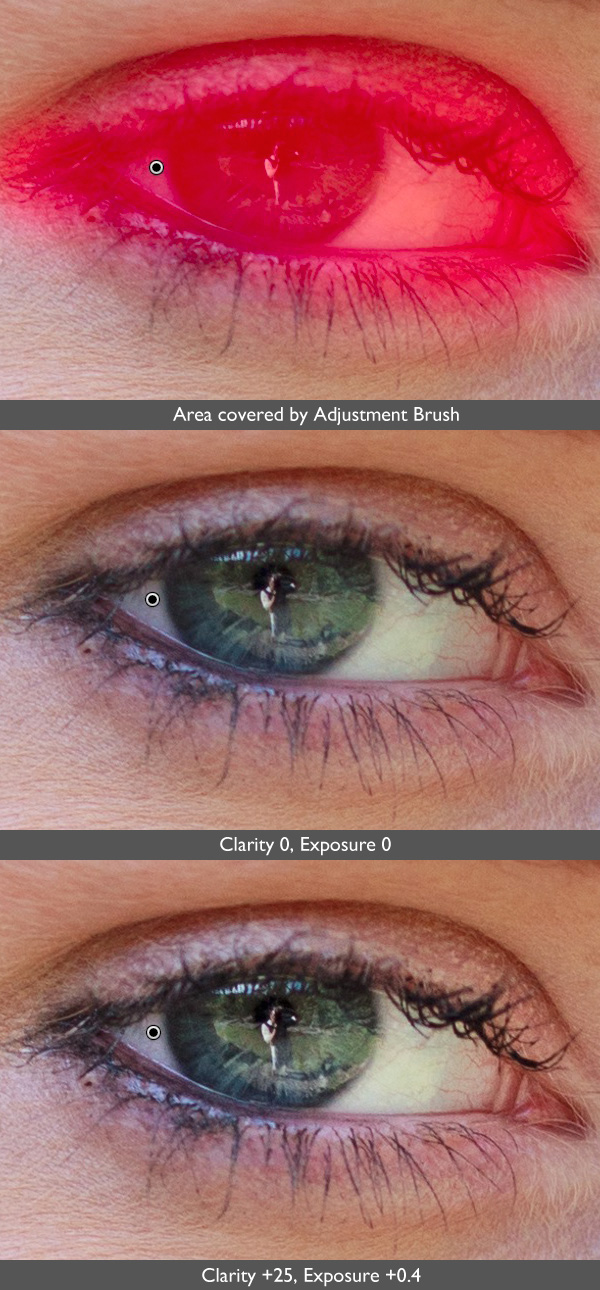
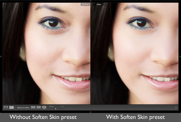
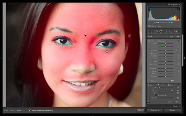
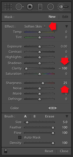
It is also worth mentioning that like many of the tools found in Lightroom Classic, you can apply the texture effect both globally (the entire photo) and locally to specific areas. Local negative texture adjustments work wonders for smoothing out skin wrinkles and blemishes in your portraits.

Before localized skin smoothing

After some retouching using a negative texture with Lightroom’s adjustment brush. Now I only look nominally haggard…
*Note: This is an extremely basic explanation of the Texture slider. If you’re feeling truly adventurous and want to learn more about the technical makeup of the Texture slider, I highly recommend this post over on the Adobe Blog.
Should I use Clarity or Texture Slider?
The looming question is, “When should I use Texture, and when should I use Clarity?” Unlike most commentary I offer on the absolutes of post-processing, which often borders on a Zen-like existentialist approach of “it all depends on the image,” there are some relatively straightforward things to look for when deciding which adjustment will work best for your particular photo.
Try the Clarity slider if:
- Your image consists of high-frequency features
- The effect is needed on a more global scale
- Your image is a landscape
- The image is black and white
Try the Texture slider if:
- Your image has large areas of mid to low-frequency features
- A more subtle enhancement is needed
- The image is a portrait
- Your image has extreme color contrasts/saturation
Of course, these are just guidelines, and I hope you experiment with both the Clarity and Texture sliders.
Also, nothing is stopping you from using a combination of the two – especially when you are applying them using local adjustment tools.
Closing thoughts on Texture and Clarity Sliders
You’ve heard me say time and time again that less is generally more when it comes to applying adjustments in post-processing. Just because a tool is available doesn’t always mean you have to use it to its full strength.
Perhaps this is no truer than when it comes to using the tools found in the Presence section of Lightroom, in this case, the Texture and Clarity sliders. These nifty little adjustments can yield amazing results for your photos.
In fact, I use both local and global Clarity and Texture slider adjustments in virtually all of my photos to one extent or another.
With that said, it’s a good practice not to over-process your images. Some judicious use of negative Texture can shave years off your clients face. However, go too far, and they might end up looking like a wax doll.
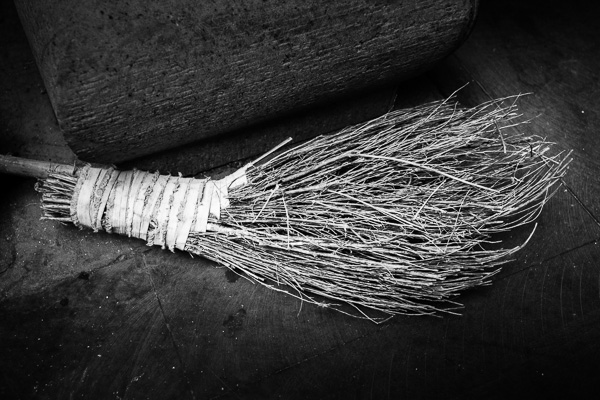
Adding positive Texture can bring out the subtle beauty of tree bark, however, use too much, and you’ll end up with…well, you get the idea.
What are your thoughts on the new Texture slider in Lightroom Classic CC? Is it a feature you will use regularly? Sound off in the comments below!

The post Texture and Clarity Sliders in Lightroom Classic CC: What’s the difference? appeared first on Digital Photography School. It was authored by Adam Welch.


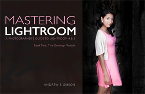 My new ebook Mastering Lightroom: Book Two – The Develop Module teaches you how to process your Raw files in Lightroom for spectacular results. Written for Lightroom 4 & 5 it takes you through every panel in the Develop module and shows you how to creatively edit your photos. It’s now 40% off at Snapndeals for a limited time only.
You must be logged in to post a comment.