RSS
 

Posts Tagged ‘changed’

The gear that changed my (photographic) life: Nikon’s 35mm F2 AF-D

29 Mar
My workhorse combo for many years (with a cleaner UV filter, I promise).

I finished my undergraduate degree in visual journalism using a Nikon D80 while many of my peers were using Nikon’s D90, D300 and D700 cameras. I was, shall we say, a bit jealous. The change in overall image quality from the switchover of 10MP CCD sensors to 12MP CMOS sensors in all of Nikon’s camera bodies (both APS-C and full-frame) wasn’t lost on me, and I couldn’t help but think one of those cameras was really the key to making me a better photographer.

They weren’t. I got a fancy, brand-new D7000 when I graduated and got my first real job, and a very well-used full-frame D700 after that. They were great cameras (I still have that D700), but it wasn’t so much the cameras that helped me grow. It was my embracing of prime lenses that pushed me photographically, and chief among them, the Nikkor 35mm F2 AF-D lens which was all but glued to my D700 for years.

ISO 200 | 1/160 sec | F2.8

Up until this point, I thought I needed a decent wide-aperture zoom to cover everything. I felt I needed the versatility of varied focal lengths, and the idea of having a zoom became a crutch I leaned on. The F2.8 constant aperture on the Promaster 17-50mm lens (I swear, all the reviews said it was just a rebadged Tamron) mounted to my D80 helped during Bellingham, WA’s interminably short and dark winter days, but ultimately, it was $ 250 USD down the drain for my photographic journey.

Why? Because I spent so much time shooting at the wide end of the zoom range, trying to fit everything in and capture every essence of the scene in each photograph. By looking at the broader picture, I was missing some of the details.

Once I got that D700 and figured I needed some lenses made for it, I picked up a secondhand 35mm F2 on a whim and discovered that – for myself – I had been shooting photographs wrong a lot of the time.


Nikon 35mm F2 AF-D sample gallery

$ (document).ready(function() { SampleGalleryV2({“containerId”:”embeddedSampleGallery_6642767826″,”galleryId”:”6642767826″,”isEmbeddedWidget”:true,”selectedImageIndex”:0,”isMobile”:false}) });


Framing is everything. We ‘crop’ just about everything in our lives, whether we want to admit it or not. This is a philosophical debate in and of itself, but pretending we’ve come out on the other side of that debate, I quickly found that 35mm lenses provide my eyes with a sense of ‘here’s the most important thing in the scene, but with just the right amount of context’. The photos coming out of this lens and camera combo just felt right.

When I twisted my 35mm F2 D lens onto my D700 and peered through the viewfinder, I found that instead of trying to fit everything in a 26-28mm equivalent frame, I needed to pick-and-choose-and-layer things into my 35mm equivalent view. My photographs improved because of that. I thought to myself, this is a great way to document the world in front of me. I can get used to figuring out how to cut out the ‘fat’ in the image, and focus on the most important bits.

ISO 200 | 1/1000 sec | F8

Fast forward many years, and I still tend to judge a new camera system by whether or not it has a decent and affordable 35mm equivalent prime-lens option. I know that it’s not to everyone’s taste (sorry, Chris, I know you hate 35mm), but with the 35mm F2, my D700 was my carry-everywhere camera for years, and I can honestly look back on my time with it and realize how it helped make me the photographer I am today.


If you have a piece of gear that you’d like to write about, we’d love to hear from you – and you might even get featured on the DPReview homepage. Leave us a short note in the comments and if you have a longer story to tell, send it to us, and we’ll take it from there.

Articles: Digital Photography Review (dpreview.com)

 
Comments Off on The gear that changed my (photographic) life: Nikon’s 35mm F2 AF-D

Posted in Uncategorized


Why we haven’t taken a stance on in-body stabilization vs OIS – and why that has changed

20 Dec

DPReview has never taken sides in the row over whether image stabilization should be provided in-body or in the lens. But we’ll now list the absence of in-body stabilization as a Con in our camera reviews. We’ll explain what’s happened to change our stance.

For at least the last decade, our internal policy has been to have no preference between in-body and in-lens stabilization. It’s an approach that was sometimes seen as fence-sitting but was driven by two logical precepts:

Our primary reasoning was based on our guiding principal that it makes more sense to concentrate on the photographic impact, rather than which technology was used. For many years, a majority of users bought DSLRs that came with a stabilized lens and had essentially the same experience as those users who bought a camera body with stabilization. The in-body advocates talked a good game about ‘every lens being stabilized’ but we didn’t hear reports from thousands of distraught DSLR buyers wondering why their shots were blurry.

There are genuine advantages and disadvantages to both approaches

Secondly, there are genuine advantages and disadvantages to both approaches. As a broad generalization, in-body stabilization does a better job of correcting the translational movements that affect close-up and wide-angle photography, while in-lens designs cope better with the large pitch and yaw corrections needed with long focal lengths. So why would we give credit for one and ignore the benefits of the other?

The result was close enough to a wash that we felt it was inappropriate to have a preference.

So what’s changed?

That’s now changed, again for two main reasons. The first is prevalence: for our review Pros and Cons, we tend to recognize a new feature as a Pro if it’s rare or exceptional but then acknowledge its absence as a shortcoming, once it’s become a common (and hence expected) feature. So, for example, we started off seeing USB charging as a ‘Pro’ (with an associated ‘Con’ if it was used as an excuse to leave an external charger out of the box), when it first appeared. But, now that it’s become commonplace, it’s the absence of USB charging that would be seen as a negative.

Now that Ricoh, Olympus, Panasonic, Sony, Fujifilm and Nikon all offer in-body IS on at least some of their interchangeable lens cameras, its omission starts to look like a factor we should highlight to would-be buyers.

The second factor is the growth in importance of video. There may have been little difference in performance between in-lens and in-body stabilization when it came to stills, but the same can’t be said for video. Watch TV or movies and you’ll see all sorts of camera movements, but what you won’t tend to see is roll: left-and-right rotations that cause the horizon to tilt. In-lens stabilization can correct for pitch and yaw but it can’t correct for roll: which gives in-body stabilization an immediate advantage.

There may have been little difference in performance between in-lens and in-body stabilization when it came to stills, but the same can’t be said for video

We’ll still test each camera to see how well its IS works: our approach of assessing effect, rather than technology means we’ll check whether digital stabilization in concert with in-lens stabilization provides a good degree of correction. But don’t be surprised if you see Cons highlighting the lack of in-body stabilization in our future reviews.

Articles: Digital Photography Review (dpreview.com)

 
Comments Off on Why we haven’t taken a stance on in-body stabilization vs OIS – and why that has changed

Posted in Uncategorized


How Using the SpiderPro Camera System V2 Changed My Life

27 Nov

As a professional wildlife and adventure photographer, I am accustomed to carting heavy camera equipment from location to location. You’ll know what I mean if you’ve ever used 500mm+ lenses and pro-bodies. Nevertheless, in most situations, these larger-than-normal set-ups are used in conjunction with super-sturdy tripods with gimbal heads and or other supports such as bean bags, which comfortably take the weight and more importantly, the strain.

1 How Using the SpiderPro Camera System V2 Changed My Life

When I set up my UK-based dog photography business a few years ago, I rocked up to my outdoor on-location dog photo sessions with a lot less equipment than I was used to – which was awesome!

So I thought!

Holding Heavy Equipment

On most dog photography shoots there are periods where I’m holding a pro-body, with a 70-200mm f/2.8 or 24-70mm f/2.8 lens attached. I hold this in my right hand while using my left to attract my subject’s attention with squeakers, toys, balls, treats and more. I use my thumb to control the back-button focusing while using my index and middle fingers to control a multitude of features. I am crouched, lying down while looking up, standing while looking down, in water, or snow. You name it; I do it!

Now, I’ve always been a reasonably fit individual and look after myself, so when I started to suffer from a few unusual aches and pains, alarm bells rang.

First off, I experienced chronic muscle twinges and aches in my right shoulder. Then, depending on the demands of the shoot, I frequently suffered from lower back pain. These two issues were bad enough. However, the most painful affliction was in the index and middle fingers on my right hand. I only had to knock these two digits against something and the pain, although momentary, was excruciating.

So, after a couple of x-rays the verdict was in – Repetitive Strain Injury (RSI). After I discussed my experiences with three fellow pet photographers with comparable stories, RSI was confirmation of what I suspected.

However, they are no longer sufferers, and each put their freedom of pain and increased productivity down to a couple of products from the SpiderPro range: the SpiderPro Camera Holster and the SpiderPro Hand Strap.

2 How Using the SpiderPro Camera System V2 Changed My Life

Their shared experiences were endorsement and encouragement enough to test-drive the SpiderPro Camera System V2 system and discover the potential benefits for myself.

SpiderPro Single Camera System v2

The Belt and Holster

The SpiderPro Pro 2 Belt features an improved design, over the original that is more optimized for comfort and flexibility and now features a heavy-duty triple-lock buckle. The whole belt and holster system is super-tough and expertly constructed with durable and wear-resistant materials.

My immediate impression, when first wearing the holster, is just how comfortable and secure everything feels. The build quality is excellent with stainless steel and hardened aluminum. The plate and pin system, that screws on to my camera’s base and engages with the Holster feels bulletproof and is not going anywhere.

3 How Using the SpiderPro Camera System V2 Changed My Life

The SpiderPro Camera Holster takes the weight of my pro gear away from my upper body relieving the strain on my upper back. The holster relieves strain in my shoulder areas, and distributes it at my waist, which according to Spider is “the most ergonomic place to carry heavy gear – just ask a carpenter with a full tool belt!” Moreover, I have to agree.

The SpiderPro Camera Holster features a two-position lock designed for flexibility – unlocked for quick draw action shots or auto-locking for security in any shooting situation.

4 How Using the SpiderPro Camera System V2 Changed My Life

5 How Using the SpiderPro Camera System V2 Changed My Life

The Plate

The improved Pro2 Plate attaches to any professional DSLR and has is redesigned for a more balanced and comfortable carry. The new plate also features an improved and more secure pin and anti-slip rubber grips to keep the plate in place. It can be swapped easily for carrying on the left or right and is compatible with any tripod.

6 How Using the SpiderPro Camera System V2 Changed My Life

If you want a camera on each hip, you can now upgrade the single system instead of purchasing the dual system. The Dual Camera Upgrade v2 requires no tools, which makes adding a second holster extremely easy.

7 How Using the SpiderPro Camera System V2 Changed My Life


The SpiderPro Hand Strap

Over the years I’ve experimented with various hand straps and none, and I mean none, have worked for me. They’ve all lacked one or two crucial features such as comfort, performance and or ergonomic functionality.

The SpiderPro Hand Strap, however, is different. It has all of the features that make a good hand strap and has been an absolute game changer for me.

8 How Using the SpiderPro Camera System V2 Changed My Life

My hand slides in effortlessly.

The ‘S’ curved leather strap is particularly snug and follows the contour of the back of my hand, ensuring the weight of the camera is evenly distributed and secure. However, more importantly, the straps’ clever design ensures the correct position for shooting while allowing my thumb, index and middle fingers to operate the camera unrestricted.

Trust me – that’s a major coup.

9 How Using the SpiderPro Camera System V2 Changed My Life

The Strap is compatible with extended battery packs, vertical grips, and any tripod or Spider plate. There’s also clear access to the memory card slots. It’s available in a variety of colors, which is an extra touch.

10 How Using the SpiderPro Camera System V2 Changed My Life

In Conclusion

I’ve been using the SpiderPro Camera Holster System, v1 and v2, in conjunction with the Hand Strap now for over a year and my strain-related pains have all but gone.

Photography, like many professions, can be physically demanding and you need to look after yourself. So, when a brand, like SpiderPro, takes on the challenge of designing and producing a product that not only enhances our lives but also increases our productivity, then I have to take my hat off to them.

Nowadays, manufacturers can tap into social media and online forums for real-time user feedback on their products. Armed with valuable, in-the-field insight, they’re able to improve each product based on what we, the consumer, would like to have.

The adage of ‘if it ain’t broke, don’t fix it’ very rarely applies to camera systems and camera accessories. SpiderPro’s products are indeed a testament to this.

All images courtesy of Spider Holster.

The post How Using the SpiderPro Camera System V2 Changed My Life appeared first on Digital Photography School.


Digital Photography School

 
Comments Off on How Using the SpiderPro Camera System V2 Changed My Life

Posted in Photography


Macphun has changed its name to ‘Skylum’ now that it’s not Mac-only

02 Nov

Macphun—the Mac-based software company that launched about seven years ago—branched out onto the Windows platform this year with the debut of its HDR and Luminar products for PC. In light of that, Macphun has decided to change its name to the platform-agnostic moniker Skylum, explaining in a blog post that, “we think that this name is a better fit, since we’re no longer a Mac-only developer.”

The company will fully transition to the Skylum name in early 2018.

Articles: Digital Photography Review (dpreview.com)

 
Comments Off on Macphun has changed its name to ‘Skylum’ now that it’s not Mac-only

Posted in Uncategorized


Inspiration: How the Lofoten Islands changed Chris Burkard’s life

29 Sep

Chris Burkard is one of the most prolific, successful, and recognizable adventure travel photographers in the world. But before the TED talk and the crazy adventures to remote parts of the world, Burkard was a working surf photographer who was bored and unfulfilled despite having achieved success with his art.

In the short film above by Vincent Urban Film, Burkard tells his story of self-discovery; he tells the story of visiting the Lofoten Islands and finding, not just a beautiful landscape, but his calling and passion in life.

Our friend and Resource Travel editor Michael Bonocore actually got to visit the Lofoten Islands with Chris three years ago, when he was working for SmugMug on an inspirational film about Burkard’s work. Michael got to see Chris in his element, and meet the man he now describes as a “humble bad ass”—at once one of the most talented and successful photographers in the world, and the guy who rarely if ever talks about himself or his own work.

Check out a selection of photos Bonocore took on that trip below, and if you like what you see, check out this article on Resource Travel to learn more about this experience and see even more candid photos of Chris in action.

$ (document).ready(function() { SampleGalleryV2({“containerId”:”embeddedSampleGallery_8685759131″,”galleryId”:”8685759131″,”isEmbeddedWidget”:true,”standalone”:false,”selectedImageIndex”:0,”startInCommentsView”:false,”isMobile”:false}) });
Articles: Digital Photography Review (dpreview.com)

 
Comments Off on Inspiration: How the Lofoten Islands changed Chris Burkard’s life

Posted in Uncategorized


Nikon D3: The camera that changed everything

28 May

In 2007, after several years of lagging behind Canon in the enthusiast and professional DSLR market, Nikon was doing alright. Not spectacularly, but they were hanging in there. The D200 was a popular and capable enthusiast model, and the professional D2x was a significant advance on the muddled ‘h’ and ‘s’ releases of the past. But it was their biggest competitor that seemed to have all the momentum. While Canon had been using APS-H and full-frame sensors for years, none of Nikon’s DSLRs offered sensors bigger than APS-C, and Canon still ruled the roost in terms of autofocus1 and high ISO imaging capability.

But around that time, we had an inkling that Nikon had something big on the way. Not a company prone to grand gestures, Nikon invited the world’s press (and I do mean the world’s press) to Tokyo, in the sapping humidity of a Japanese heatwave for a top secret announcement…

The magnesium alloy-bodied D3 was as tough as anything that Canon ever brought to market, but offered a combination of speed, sensitivity and autofocus performance that the industry had never seen before. 

Ten years ago, camera technology was advancing continuously, and quickly. For quite a long time, it seemed like every new generation of digital cameras was better than the last in ways that camera buyers (and reviewers) actually cared about. Obviously, each new cycle brought more megapixels, but equally as important were the ergonomic and performance improvements that made each new generation of cameras easier to use, and more effective than the last.

Buzz Aldrin, in London to mark the 40th anniversary of the Apollo 11 landing.

Nowhere were these advances more obvious than in the professional DSLR segment. Compare the original EOS-1D of 2001 to the EOS-1D Mark IV of 2010. They look similar, but in terms of usability and image quality they’re worlds apart.

Let’s take usability, to start with. If we look at just the screen interfaces alone, in less than a decade, LCDs got bigger, and much sharper. Live view became standard, and, camera menu systems evolved from messy lists that looked like Windows ME error messages to friendly tabs and mobile-inspired icons.

My personal D3S, nestled alongside a D810 and several lenses in a Pelican case. It’s still great, and I still use it.

The 4MP Canon EOS-1D is still capable of turning out decent-looking images for web and limited print use, and it can do so impressive quickly (8 fps ain’t bad for a sixteen year-old DSLR). But the EOS-1D Mark IV offered four times the pixel count, better image quality across the board, including a far superior high ISO imaging capability, a faster continuous shooting rate, and a much more sophisticated autofocus system – plus live view and movie mode.

High Barn, not far from where I grew up, in North Yorkshire. 12MP might not be much by 2017 standards, but it’s enough for a high quality 13-inch print.

All of this is by way of preamble. The point (finally! He gets to the point!) is that even by the fast-paced standards of the professional DSLR market in the mid 2000s, the Nikon D3 was a major technological achievement. Arguably, (and I admit it’s a big ‘arguably’) the EOS-1D Mark IV and its successors might not have been quite such advanced cameras without the technological game-upping that Canon had to do in the years following the launch of the D3.

Nikon D3 Sample Images (2008)

$ (document).ready(function() { SampleGalleryV2({“containerId”:”embeddedSampleGallery_0514703700″,”galleryId”:”0514703700″,”isEmbeddedWidget”:true,”standalone”:false,”selectedImageIndex”:0,”startInCommentsView”:false,”isMobile”:false}) });

As a working photographer and photography writer at the time, the D3 was (and remains, actually) the single most impactful product to be released during my career. Before Nikon’s presentation in Tokyo had even drawn to a close,2 our industry’s expectations of what a DSLR could do had been shifted.

Until the D3, you could either have a fast cropped sensor DSLR, or a slow full-frame one – not both. Until the D3, the maximum ISO sensitivity setting that you might be able to shoot at was either 1600 or 3200 (depending on the model), and even then, not particularly confidently. Until the D3 (and its sister model the D300) came along, if you wanted the best autofocus performance, there was no question – you bought Canon.

Melody Gardot, performing in London. The D3’s shutter sounds like someone just dropped a cribbage board onto a marble floor, but the D3S introduced a fairly discreet ‘Q’ mode.

I was happily shooting with a Canon EOS-1D Mark II when the D3 was released. For the kind of photography I was doing at the time, the Mark II was one of the best cameras on the market, and did the job perfectly well – or so I thought. I felt the same way about the 1D Mark II in 2007 as I did about my Nokia 3210. Solid, reliable, and elegant in its own way. A useful and streamlined tool.

At risk of overstating the point, the D3 was to my EOS-1D Mark II what the iPhone was to the Nokia 3210: a paradigm shift.3 

Florence Welch, shot with the D3’s successor, the D3S. The D3S added some welcome tweaks over the D3, including in-camera sensor cleaning, and slightly improved high ISO image quality.

Using the D3, I could shoot quickly and without a crop factor for the first time. I could capture full-color images in light so low that my own eyes couldn’t fully discern what I was looking at (and the AF could usually keep up). I could shoot at ISO 6400, and marvel at the moderate film-like grain – a grain pattern that wasn’t distracting at all, and showed no banding. The D3’s autofocus system was at least a generation ahead of what I was used to in terms of tracking too, allowing me to reliably use AF-C, even with off-center AF points in poor light. 

Nikon D3S Sample Images (2010)

$ (document).ready(function() { SampleGalleryV2({“containerId”:”embeddedSampleGallery_3187037466″,”galleryId”:”3187037466″,”isEmbeddedWidget”:true,”standalone”:false,”selectedImageIndex”:0,”startInCommentsView”:false,”isMobile”:false}) });

In practical terms, this meant that I could capture images of performers in light so marginal that none of the other photographers working alongside me were able to get a sharp exposure.

A couple of times during my first few months of shooting with the D3 (when I had the camera for review, but before it was shipping in significant numbers) I found myself alone in the photo pit at a small venue, still shooting in punishingly low light after the other photographers had given up and left.4

But it wasn’t just performance photographers that were amazed by the D3. Wildlife photographers, too, were raving about this amazing new camera that let them shoot in full color, in situations where previously they would have been limited to infrared. Like I said, it was a paradigm shift.

The D3S has accompanied me on a few shooting trips in 2017, including a protest against the Trump administration’s attempted travel ban, back in January. 

So of course I bought one. I sold all my Canon gear, took a hit on the exchange, ate tinned food for a few months and picked up a D3 with a 24-70mm F2.8. I added more lenses over the following couple of years when I could afford to, and ultimately traded the D3 for a D3S. The D3S added in-camera sensor-cleaning (one of the D3’s few deficiencies), even better high ISO image quality and a basic HD video function. That was around the same time I started to write for DPReview, and about a year after that we moved to America and I mostly stopped shooting live music.

My life has changed a lot since then, but I still have my D3S and I still use it – mostly now as a second camera for event photography. And no, Dan Bracaglia – I’m not selling, so stop asking.

A still from a commercial shoot for a young singer-songwriter, Anna Sinfield, in 2008. She’s a producer, these days, for UK radio.

One last anecdote…

Not long after the D3’s launch, back in London, I spoke to a young Nikon engineer who had been heavily involved in the design of the new camera. He was visiting from Tokyo. He brought with him two sets of prints – one set from the then-current Canon EOS-1D Mark III, and an equivalent set from the D3. Pointing to the shots from the Canon, he said “in my opinion, these look like digital images”. Turning to the images from the D3 he said “but these look like photographs”.

That might sound like hyperbole, but the thing is – he was right.


1. Setting aside the much-reported and in my opinion overblown autofocus woes of the EOS-1D Mark III.

2. In addition to the cameras, the presentation was also memorable for a closing appeal from a very senior Nikon executive to the assembled US press. Please – he requested – please pronounce ‘Nikon’ correctly as ‘Nick-on’ not ‘Nye-con’ – a plea that was of course completely ignored by all concerned. That trip was also the first time I encountered a Geisha (it would not be the last).

3. If the D3 had come loaded with ‘Snake II’ it would have been perfect. Actually, given the amount of time professional photographers spend just waiting around, I’ve always wondered why simple arcade games weren’t pre-loaded on professional DSLRs. 

4. The Pogues – I’m looking at you. Or rather, I was trying to…

Articles: Digital Photography Review (dpreview.com)

 
Comments Off on Nikon D3: The camera that changed everything

Posted in Uncategorized


Fujifilm X100F vs X100T, what’s new, what’s changed and is it enough?

30 Jan

Apparent similarities

Glance too fleetingly at the X100F and you might think nothing had changed, compared with the X100T. Or the X100S, the original X100 or the film rangefinders their styling harks back to. But, in keeping with continuous improvement approach (‘Kaizen’ if you must) Fujifilm appears to be adhering to, just about every aspect of the camera has been updated in some small way.

But is the sum of those changes enough to make it worth upgrading or to attract new customers?

New Sensor

The single biggest change to the X100F is the use of the latest 24MP sensor. As we’ve seen the the X-Pro2 and X-T2, it’s capable of some excellent results and is a bigger step forward from its 16MP cousins than the 22% increase in linear resolution would suggest.

Arguments still rage about the merits of X-Trans, especially now that Bayer sensors are reaching high enough pixel counts that manufacturers can cut out the costly AA filter without too many downsides/complaints. Clearly X-Trans strikes a different balance of luminance/chroma resolution than the Bayer design and isn’t as universally well supported, when it comes to Raw processing, however, we’ve seen the 24MP version and Fujifilm’s latest processing give some great results, so we find it hard to get that worked-up about it.

What hasn’t changed?

The X100 series’ core features are, broadly speaking, unchanged. The OLED panel in the hybrid optical/electronic viewfinder is being run at a faster refresh rate, but it’s still essentially the same spec as on the previous model.

Likewise, the lens is unchanged from the X100F’s predecessors. This means that it’s still a increasingly soft when shot close-up and wide-open but also that it’s not exactly fast to focus (though this is the snappiest X100 yet). The good news, though, is that the the lens seems to me more than sharp enough to resolve the higher-res sensor at all but the closest working distances, and remains as impressively small as ever.

Handling differences: Joystick

Many of the differences between the X100T and F come down to small changes in the cameras’ handling. The first thing to note is the addition of the AF joystick that first cropped up on the X-Pro2.

In its own way, it’s as big an upgrade as the 24MP sensor. It speeds up AF point selection immensely (which is needed, since the X100F can offer up to 325 individually selectable points). Or, at least, it does once you’ve got out of the habit of trying to use the four-way controller to do so.

The other thing the joystick does is resolve the tension between using the four-way controller as Fn buttons or to directly access AF points. This means that, while the X100F still offers the same number of customizable buttons as its predecessor, it’s more likely that you’ll be able to use them all.

Handling differences: Buttons

There’s been a considerable re-shuffling of buttons between the X100T and the F though, as already mentioned, the net result is still that there are still seven customizable control points.

The buttons to the left of the rear screen, which date back to the original X100, have been eliminated, with most of them being pushed across to the right. There’s also an extra function button at the center of the viewfinder mode switch on the front panel, to make up from the one lost on the rear plate. The ‘Drive’ mode function is now irrevocably assigned to the four-way controller, while the function of the rear dial’s push-in button can now be re-configured.

For most users we think it’s likely to be a case of swings and roundabouts, unless there’s some very specific but vital combination of buttons that we’ve not been able to envisage. Generally it seems likely that the certainty of being able to use the four-way controller (or, at least, three of its buttons) as Fn keys will be enough to keep most users happy.

Handling differences: Extra dial

The bigger change to the camera’s handling is the addition of a clickable dial set into the camera’s front plate. By default, this does nothing while shooting, and is primarily used for jumping between images in playback mode. However, there is a menu option that allows its use to control ISO if the top plate ISO dial is set to ‘A.’

While this makes it possible to use the rear dial to set shutter speed (by setting the shutter speed dial to ‘T’), and the front dial for ISO, there’s no way to use anything other than the aperture ring to control aperture value. We’re not sure why you’d want to, but if that’s something you were hoping for, you’re out of luck.

The final big change is the use of the focus ring as a control ring. There are four settings for this: Standard, White Balance, Film Simulation and (if you’re shooting JPEG-only), Digital Teleconverter, all of which are overridden if you switch to manual focus mode. Personally I found that assigning anything to the focus ring just meant that I’d inadvertently make a change, every time I changed the aperture, so I just left it on ‘Standard’, which leaves the ring inactive in most drive modes.

Handling differences: ISO Dial

The final two changes in the X100F’s dial behavior are modifications that were introduced with the X-Pro2. Note that I say ‘modifications,’ rather than ‘improvements.’

The first, which I’m all for, is the addition of a ‘C’ position on the Exposure Comp dial. Set to this position, the newly added front command dial takes charge of Exposure Comp and extends the controllable range from ±3EV to ±5EV.

The other modification is the arrival of the pretty-but-pretty-impractical ISO control set within the shutter speed dial. I don’t hate it, but, given that I change ISO more frequently than once every 36 frames, I just don’t think that lifting, turning and dropping a dial is the most sensible way of controlling sensitivity. Thankfully there are two effective workarounds: pushing ISO control to the camera’s front dial or, better still, setting a couple of Auto ISO presets and switching between them.

Finer control

The X100F has the latest ‘X Processor Pro,’ which not only sees the addition of the more-detailed black-and-white ‘Acros’ film simulation, but also the option to control the JPEG output with a higher degree of precision.

Whether it’s for straight-out-of-camera JPEGs or for subsequent in-camera Raw conversions, the highlight and shadow portions of the tone curve can now be adjusted between +4 and -2, while most other parameters, including sharpening, noise reduction and color (saturation) can be adjusted on a ±4 scale.

Latest UI

As you might expect (assuming you’ve been reading our recent X-series reviews, start-to-finish), the X100F gets Fujifilm’s improved menus.

The latest version of the menu system breaks the options down into sensible categories with icons to distinguish between them, as opposed to the numbered tabs in the older scheme.

On top of this, there’s a ‘My Menu’ tab that can be populated with your most-accessed menu options. Add to this a wider range of flash control options, for use with external flashguns and the X100F manages that rare trick of being both more powerful and easier to operate.

In the moment:

The thing that’s most noticeable when you pick up the X100F is that it’s quicker than the T or any of the previous models. It’s the little things: start-up time, especially from sleep mode, or a focus re-acquisition if there’s been very little change of depth, they all add up.

Continuous focus still isn’t going to help you win any sports photo competitions but it too is noticeably improved. Overall, then, the camera just feels responsive to an extent that the series hasn’t really done, previously. Hell, even the Wi-Fi connects faster, making it that bit more likely that you’ll use it.

This newfound responsiveness is something that will be almost immediately apparent to existing X100 series owners and, perhaps just as importantly: unnoticed by new users whose expectations have been set by contemporary cameras.

Overall

Fujifilm’s approach to the its X-series cameras has been one of constant improvement, which has meant that each generation of camera is better than the last (bickering about X-Trans notwithstanding). However, while this has made it easy to recommend which model a new customer should buy, it’s meant it’s not always been clear-cut whether the sum of the differences is sufficient to prompt existing owners to upgrade.

Obviously the specific decision will depend on the needs, expectations and level of satisfaction of individual users but, even in pre-production form, this feels like more of a step forwards than the bare specs led me to expect. We’ll revisit this question as part of the full review, once we’ve spent more time with the camera, but our initial impressions are pretty positive. Well, except for my bank account.

Articles: Digital Photography Review (dpreview.com)
 
Comments Off on Fujifilm X100F vs X100T, what’s new, what’s changed and is it enough?

Posted in Uncategorized


What’s changed? Comparing the Olympus OM-D E-M1 and E-M1 II

21 Nov

Olympus OM-D E-M1 versus E-M1 II

The new Olympus OM-D E-M1 II is quite a camera. Capable of shooting at up to 60 fps at full resolution and packing high-bitrate 4K video and in-body stabilization, the E-M1 II is a powerhouse. But if you already have an E-M1, is it worth the upgrade?

In this article, I’ll compare several of the key areas of differentiation between the E-M1 II and its predecessor, to help you answer that question. 

Sensor

The E-M1 II’s maximum output resolution of 20MP might not match the 24MP+ sensors of larger-format competitors, but 20MP is quite enough for most purposes, and a nice step up from the 16MP of its predecessor. 

If 20MP isn’t enough, the E-M1 II incorporates Olympus’s high-resolution multi-shot mode, first seen in the OM-D E-M5 II. This allows the camera to produce 50MP JPEG and Raw files by combining several exposures taken with the sensor shifted by single-pixel increments. This mode is best suited to still life subjects (to avoid issues created by movement in the scene) but from our initial testing it seems like the E-M1 II does a good job of correcting some of the nasty artifacts that limited this mode’s usefulness in the E-M5 II. 

Speed

Resolution isn’t everything, of course. As well as more pixels, the sensor in the E-M1 II can also output data 3 times faster, allowing for full-resolution capture at up to 60 fps in electronic shutter mode. A maximum shooting rate of 18 fps with continuous autofocus makes the E-M1 II a significantly more interesting camera for shooting fast action than the original E-M1.

The E-M1 II’s high-speed USB 3.0 interface (C-type) is handy for quickly transferring files to a laptop if you’ve forgotten a card reader. Finally – a good reason to buy a new MacBook Pro…

Autofocus

The original E-M1 wasn’t exactly a slouch in the AF department, but the E-M1 II takes things to a whole new level. This new, faster sensor features 121 on-sensor phase-detection AF points, which cover 75% of the imaging area vertically, and 80% horizontally. All of these AF points are cross-type. The original E-M1 offered 37 phase-detection AF points, in a smaller central area of the frame.

The extra phase-detection AF points and the broader coverage mean that the E-M1 II is even more versatile when used with one Olympus’s range of older Four Thirds (non-Micro) lenses.

AF Tracking

These improvements, coupled with a dedicated processor for AF, means that the E-M1 II is capable of full-resolution shooting at up to 18fps with AF tracking. Compare this to a maximum frame-rate of 9 fps with AF from the E-M1 (running firmware 4.0). 

With the new E-M1 II, it’s also possible to use the rear LCD screen as a touch-pad to manually position the active AF point by touch, with your eye to the viewfinder. In addition, adjustable AF-C tracking sensitivity, and four ‘AF Target Modes’ allow the E-M1 II’s autofocus system to be quickly tweaked to suit different kinds of subjects. 

Ergonomics

The E-M1 II is ergonomically very similar to the E-M1. A slightly deeper hand grip makes the new camera feel a little more secure in the hand (depending, I suppose, on your hand size) and the tripod socket has been centered in the E-M1 II, in line with the lens axis. This is generally a good thing (and can be very handy for things like nodal panoramas) but it does mean the tripod socket is now closer to the battery door. The door has increased in size thanks to the bigger battery, which combines to incresae the risk of the door being occluded when the camera is mounted to a tripod.

The only thing that some users might argue has gone backwards in the E-M1 II compared to the original E-M1 is the rear screen’s articulation. If the E-M1 II is incorporated into a video rig, with microphone or headphones plugged in and video output to an external recorder over HDMI, the folding screen can foul these cables when extended. The tilting screen of the original E-M1 is arguably less versatile, but can be used without snagging the I/O ports.

In-body Image Stabilization (I.B.I.S)

Both the E-M1 II and its predecessor feature 5-axis in-body image stabilization, but the Mark II improves the feature to offer a maximum benefit of 5.5EV, compared to 4EV in the older model. For anyone used to shooting according to the ‘one over equivalent focal length’ rule this means that at 50mm (equivalent) the E-M1 II should be hand-holdable down to as low as half a second, in favorable conditions, whereas the E-M1 would be safe down to ‘only’ around a quarter of a second. With the new stabilized 12-100mm zoom, the E-M1 II offers up to 6.5EV of shake compensation.

As well as stills, the E-M1 II’s I.B.I.S is also useful when shooting video footage. The E-M1 was capable of capturing extremely smooth and shake-free video, and the E-M1 II is even better.

Video

One of the most significant improvements offered by the E-M1 II compared to its predecessor is a totally revamped video mode. Capable of 4K video at up to 30p, the E-M1 II boasts a maximum bitrate of 237 Mbps during DCI 4K/24p capture. A ‘flat’ picture profile in movie mode is a nice addition to the E-M1 II’s video feature set, too.

The E-M1 produces very nice-looking video (and as previously noted, it’s tilting screen doesn’t foul the camera’s I/O ports) but it’s limited to 1080/30p in normal use, and isn’t capable of clean output over HDMI to an external recorder. The E-M1 can capture 4K footage, but only in time-lapse movie mode.

One final note – it’s not really fair to call it a ‘downside’, but if you plan on shooting 4K with the E-M1 II, do make sure to budget for a high-capacity UHS-II or UHS-I Speed Class 3 card. 

Durability

The E-M1 and E-M1 II are both tough cameras, built to a high degree of quality and intended to withstand use in unfavorable conditions. As such, both are weather-sealed and both can operate in freezing conditions. The E-M1 and E-M1 II have the same rated operating range of -10 to +40 degrees C, and both can handle being left out in the rain, but the E-M1 II’s shutter is rated to a higher count of 200,000 exposures (the E-M1 is rated to 150,000). Whether this translates to substantially better durability in normal use is hard to say, but more pictures = more better.

Battery life

A less abstract measure of durability is battery life, and in this respect the E-M1 II also outperforms its predecessor, offering a maximum endurance of 440 shots (CIPA) in normal use from its larger, beefed-up battery and up to 950 when ‘quick sleep’ mode is used. These figures actually seem conservative judging from our shooting so far, during which we’ve routinely experienced 1000+ shot endurance in normal (stills) shooting.

The original E-M1 can shoot for a rated maximum number of 350 shots but the same applies – you can expect better endurance if you’re not shooting video or constantly reviewing images. 

Twin card slots

Speaking of shots, the E-M1 II offers two SD card slots, as opposed to the E-M1’s single slot. The additional card can be used as overflow or backup storage, or as a dedicated card for storing video clips. Note that only the upper slot is UHS-II compatible, so that’s where you’ll want to save those 4K video clips.

Verdict

There’s absolutely no doubt that the new OM-D E-M1 II is a better camera than its predecessor in virtually every way. It’s rare these days that we see successor models which so roundly outperform the models that they replace. We might have expected the viewfinder and / or rear LCD screens to get a bump in resolution, but arguably, neither really needed improvement.

All told, the E-M1 II is a very impressive update to the original E-M1. But it’s also heavier, and more costly. We’d strongly suggest spending the extra cash if you can afford it (we can’t see the E-M1 II being outmoded any time soon) but if you’re mostly a slow-speed stills photographer, the original E-M1 won’t disappoint. 

Articles: Digital Photography Review (dpreview.com)

 
Comments Off on What’s changed? Comparing the Olympus OM-D E-M1 and E-M1 II

Posted in Uncategorized


Sony a6300 versus a6500: what’s changed, and what still needs to change

18 Oct

Sony a6300 versus a6500

That was quick.

Just eight months after Sony introduced the a6300, a higher-end sister model to the a6000, we now have another higher-end sister model in the a6500. The sheer speed of Sony’s product releases lately is somewhat appropriate, given the outright shooting speed these cameras are capable of.

Both cameras feature the same 24MP APS-C CMOS sensor, the same 425-point on-sensor PDAF system, the same viewfinder, the same video specification, and the same 11 fps burst shooting rate (8 fps with Sony’s implementation of ‘live view’). Wait a second – what exactly is new to the a6500?

Turns out, there’s a handful of changes that can have big implications for how photographers will interact with and use these cameras, but are they worth the $ 400 premium on the new model? Let’s take a look.

Continuous shooting

Patrick Murphy-Racey discusses using the a6500 for peak action (like drag races) due to its burst speed and autofocus system.

A deeper buffer combined with a newly developed front-end LSI (which stands for Large Scale Integration – it’s basically an additional chip providing more processing power) promise more responsive performance when shooting bursts – 300 JPEG or 107 Raw images can be captured at 11 fps with full autofocus and autoexposure. Users can also instantly review or check focus on the last image that the camera has written to the card (though that might not necessarily be the last image in that burst), with the added plus of an indicator showing just how many images remain to be written to the card.

Comparatively, the a6300 can still shoot at 11 fps with full autofocus and autoexposure, but only for 44 JPEG or 21 Raws. And while the camera is writing to the card, you can’t enter playback, or magnify the displayed image (if you have image review on). We’re particularly happy to see that last limitation go, as it makes the camera eminently more usable.

In-body 5-axis stabilization

Sony consolidated the shutter charge and shutter mechanisms to one side to make room for the IBIS unit in the a6500.

Without increasing the depth of the camera body, Sony has redesigned the a6500’s shutter mechanism to not only be more durable (tested – though not guaranteed – to 200,000 cycles), but also to incorporate 5-axis stabilization with non-stabilized lenses. What’s more, when you pair an optically stabilized lens with the a6500, the camera knows to pass of pitch and yaw correction to the lens’ stabilization system. This doesn’t increase the effectiveness more than the rated 5 stops, but is likely to help maintain effectiveness when shooting at longer focal lengths.

There’s also the intriguing possibility of shooting full 4K stabilized video with any lens – but we’re withholding our verdict on the resulting image quality until we can test it for ourselves. After all, core video specification and performance hasn’t changed from the a6300 to the a6500, and we’re curious to see if the stabilization system has any effect on the rather lackluster rolling shutter performance of the a6300.

And, of course, the a6300 offers no in-body stabilization.

Touch and see

The a6500’s screen is touch-enabled, whereas the a6300’s isn’t. They share the same resolution (and the touch-panel doesn’t seem to have affected glare or fingerprint-resistance), but on the a6500, you can now use the screen to quickly place an AF point, move your AF point around by acting as a ‘touchpad’ with your eye to the finder, and also double-tap to zoom and swipe around an image in playback.

So while AF performance will likely remain the same on the a6500, you may now find you’re more quickly able to adapt to a scene in front of you by using the touchscreen as opposed to the cumbersome sequence of button presses most Sony cameras require for focus point movement.

That said, in touchpad mode, the control of the AF point is unfortunately always relative, rather than (at least an option for) absolute, so you swipe to move the AF point from its current position, rather than touching exactly where you want it to be. This meant we found ourselves often swiping repeatedly to get the AF point from one side to the other. This could be obviated with absolute positioning in combination with limiting the touchpad area to the upper right quadrant, something we suggested to Sony in-person. Lastly, we found the touchpad performance to be decidedly laggy, especially when compared to competitors’ offerings.

When it comes to video, the a6500’s touchscreen is particularly useful for focus pulls, since you can just tap to change the focus point and initiate a rack focus (and as always, you can control how quickly the camera will rack focus). Less easy is getting the camera – in video – to continue to track your subject around the frame after you’ve tapped on it, since Lock-on AF is unavailable in video (something we continue to request Sony to address).

There appears to be a workaround, though: if you turn the old, vesitigial ‘Center Lock-on AF’ on, then tapping appears to initiate subject tracking. Unfortunately, ‘Center Lock-on AF’ isn’t always the most reliable, and it’s still somewhat cumbersome to work this way as you have to first turn this feature on, which requires either a (Fn/main) menu dive or a dedicated button assigned to it, plus a couple more button presses before you tap.

Controls and usability

Autofocus and video options are among the new ‘groupings’ within the updated Sony menu system.

Besides the touchscreen, the other major control change on the a6500 compared to the a6300 is the addition of C2 | C1 custom buttons on the top plate, a7-style. They’re nicer buttons than the soft-press C1 button of the a6300, providing more haptic feedback. The a6500’s grip has also been redesigned to be ‘chunkier’ and deeper than that on the a6300, again much like the a7 Mark II cameras, which should help when using heavier or longer lenses.

The a6500 also inherits the redesigned menu interface that debuted in the a99 II which is, in our opinion, much more user-friendly than the interface on the a6300 (and a6000, for that matter). The tabs are now color-coded, but more importantly, similar functions like autofocus, image parameters and movie settings are grouped. This makes it much less likely that you’ll miss a moment while rocketing through the menu to find a setting you swear you saw somewhere in there last week. It’s one of our favorite additions to the a6500, and it’s about time.

Unfortunately, you still can’t make a custom ‘My Menu’-like page in this menu system. A shame, as it’s an easy way to group most-used menu items into one section for quicker access, particularly ones – like movie options – that can’t be assigned to the custom Fn menu.

What hasn’t changed (and should have been)

There’s no question that the a6500 is incredibly well-specified camera in an impressively small package. In terms of usability, Sony has made great strides on this new model with the addition of a touchscreen and a revamped menu system. Unfortunately, there’s still a few aspects of the a6500 that we can’t help but wish Sony would have addressed.

Unfortunately, like the a6300, the a6500 lacks a control dial on the front of the camera – an omission that is all the more glaring at its higher position in the market. Unlike the a6300, all of the a6500’s direct peers offer twin control dials, and a front control dial would further aid usability in our opinion (though we’d also happily take the ‘Tri-Navi’ system of the old NEX-7 flagship as a compromise).

The core stills and video specification hasn’t changed at all since the a6300 (although the new front-end LSI is supposed to help with JPEG performance at higher ISO values). Now, the a6300 already produced great results under almost any circumstances with one big exception – rolling shutter in 4K. While the detail level is impressive and the capture aids are extensive (S-Log, zebra patterning, focus peaking, etc.), we would really have liked to see Sony address the rolling shutter issue in this new model. And a headphone monitoring port wouldn’t hurt, either.

Limited battery life is a problem endemic to mirrorless cameras as a whole, and the a6000-series is no exception. Still, probably thanks to the additional processing and touch-screen, the a6500’s battery life rating has actually decreased compared to the a6300 by over 10%. It goes without saying that’s a change in the opposite direction than we would like.

Adding it all up

The a6500’s additions over the a6300 are small in number, but potentially huge for what they offer users. Sure, the new model comes at a $ 400 premium over its mid-range sibling, but the upgrades in the new flagship model have the potential to be significant.

Of course, whether they’re significant to you depends on whether they line up with what you like to shoot. If you don’t shoot long bursts, or don’t find yourself checking focus all that often, the additional buffer performance isn’t likely to matter. If you shoot a lot of video and want more flexibility with lens choice, the in-body stabilization is likely to be very helpful. One thing that we feel will positively impact all users – even those who primarily use the viewfinder – is the touchscreen. That said, its laggy behavior is disappointing considering just how much processing power this camera has.

We generally feel that, given the sheer capability of this camera, the price premium over the a6300 is warranted. The Sony a6500 represents a lot of camera in a very lightweight package, and it’s encouraging to see that Sony is continuing to refine its APS-C offerings.

Articles: Digital Photography Review (dpreview.com)

 
Comments Off on Sony a6300 versus a6500: what’s changed, and what still needs to change

Posted in Uncategorized


How the Switch from DSLR to Mirrorless Changed How I Edit Photos

22 Jul

When I started in photography more than 10 years ago, the only viable option for editing images was Adobe Photoshop. At that time, 100% of my photo editing was done there.

A few years later, Adobe introduced Lightroom and I embraced it right away for its speed and organizational features. I immediately adopted it into my photo processing workflow and it was the first big transition that drastically changed my processing.

The next big change in my processing happened when I discovered HDR photography. As a photographer with a background in graphic design, I quickly saw the potential in the new processing technology and, again, I incorporated it into my workflow.

Images How Switch to Mirrorless Change Photo Edit 1

Canon 60D, HDR processed

By the end of 2014, after 10 years of shooting with a Canon DSLR, I had established my own photo editing workflow – one that I was comfortable with, that reflected my style of photography, and covered different scenarios of travel and landscape photography. Below is a list of four main processing techniques in my editing workflow, with the percentage of the total use for each.

HDR Processing in Photoshop HDR Pro and Lightroom – 50%

The foundation of my natural looking HDR photography style, this technique is based on merging bracketed photos in Photoshop HDR Pro and later editing the new HDR image in Lightroom. The beauty of this method is that Photoshop HDR Pro does not change the pixels (luminosity, contrast, saturation) of the original images. Instead, it combines data from the bracketed photos into one enormous 32-bit TIFF image.

I outlined this technique in detail in one of my previous articles: Natural Looking HDR in Photoshop and Lightroom in 5 Easy Steps.

Images How Switch to Mirrorless Change Photo Edit 2

Canon 60D, HDR processed with Photoshop HDR Pro

HDR Processing in Photomatix – 30%

Photomatix is the most popular, and matured standalone HDR program. It has a completely different approach compared to Photoshop HDR Pro. Besides standard HDR features like image alignment, de-ghosting and merging for HDR, it has unique image editing tools that allow me to create distinctive looks in my photographs.

Images How Switch to Mirrorless Change Photo Edit 3

Canon 60D, HDR processed with Photomatix

Luminosity Blending in Photoshop – 10%

This technique is based on blending multiple images together in Photoshop using transparency masks. It gives me the most flexibility and control over image processing but, at the same time, it is the most involved and time consuming. I use it in the most complex cases when everything else has failed.

Images How Switch to Mirrorless Change Photo Edit 4

Canon 60D, digital blending with Luminosity Masks

Single RAW processing in Lightroom – 10%

When the light is not very dynamic, I use a single image and process it in Lightroom.

Images How Switch to Mirrorless Change Photo Edit 5

Canon Digital Rebel, single RAW image processed in Lightroom

The Switch

The biggest change in my photography happened at the end of 2014 when, after shooting with a Canon DSLR for 10 years, I switched to Sony mirrorless. It was quite an adjustment. After shooting for so long with one brand, I had become extremely comfortable with it. During the switch, I had to learn how to work with something very different (more details on that topic here: 5 Lessons Learned Switching from DSLR to Mirrorless for Travel Photography).

But, I did not expect that the brand switch would dramatically change my editing. I was wrong.

After I returned from my first photography trip to Hawaii and California, where I put my new equipment through the test of real life scenarios of travel photography, I had 3000 brand new photos shot with the Sony a6000.

When I started to edit the new photos, I could see some differences. In general, the images were much cleaner and sharper with a higher amount of detail. These changes did not surprise me because the a6000 has a new generation sensor with a higher pixel count, and in combination with quality lenses from Sony and Zeiss, it could easily resolve a staggering amount of detail.

What surprised me was how the images behaved when I started to edit them. I could immediately see that the images were more responsive, meaning that I could push them much further, with more aggressive editing, and that I could recover more shadows and highlights from a single RAW image. I realized that I could process some images without using HDR techniques, which was not possible before.

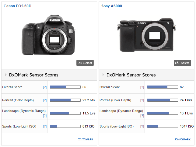
This is when I started to look around trying to find the reason for the different behaviour. I found my answers on the DoX Mark website when I compared camera sensors. The dynamic range of the Sony a6000 sensor is wider by almost 2 stops (11.5EV vs 13.2EV) or 14%.

Images How Switch to Mirrorless Change Photo Edit 6

The difference is probably not a big deal if you are a wedding or street photographer but, for someone like me who specializes in travel and landscape HDR photography, this was a game changer. I saw the opportunity to streamline and optimize my digital techniques once again.

Now, six months later, below is my new modified digital photography workflow.

Single RAW Preset Based Lightroom Processing – 50%

A major shift toward the single RAW Lightroom editing made me realize that it could be the perfect opportunity to optimize my workflow in order to save time on processing. I organized my Lightroom presets into four collections: Landscapes and HDR, Cross Processing, People and B&W. Now, I start the process of editing by applying different presets to the image trying to find the right look. When I find the one I like the best, I tweak it with standard Lightroom and Photoshop editing tools.

Images How Switch to Mirrorless Change Photo Edit 7

Sony A6000, Sony 10-18mm lens, Lightroom Preset Based Processing

HDR Processing in Photoshop HDR Pro and Lightroom – 20%

With Adobe introducing Merge to HDR in Lightroom 6, I find myself using it more and more but I still use Photoshop HDR Pro.

Images How Switch to Mirrorless Change Photo Edit 8

Sony A6000, Zeiss 16-70mm lens, Lightroom 6 HDR Processed

HDR Processing in Photomatix – 20%

Cleaner digital files allow me to push the images even further in Photomatix.

Luminosity Blending in Photoshop – 10%

Nothing has changed here.

Conclusion

The switch from Canon DSLR to Sony mirrorless had unexpected consequences that drastically changed the way I edit my photos. In the end, the change was very positive, it allowed me to save time on processing and editing photos. Also, the extended dynamic range of the new sensor resulted in me taking fewer photos. I do not have to take five or seven bracketed shots anymore; in most cases, three brackets are all that is needed.

Have you made the switch? Have you noticed any changes in your processing workflow? Share with us your thoughts in the comments below.

googletag.cmd.push(function() {
tablet_slots.push( googletag.defineSlot( “/1005424/_dPSv4_tab-all-article-bottom_(300×250)”, [300, 250], “pb-ad-78623” ).addService( googletag.pubads() ) ); } );

googletag.cmd.push(function() {
mobile_slots.push( googletag.defineSlot( “/1005424/_dPSv4_mob-all-article-bottom_(300×250)”, [300, 250], “pb-ad-78158” ).addService( googletag.pubads() ) ); } );

The post How the Switch from DSLR to Mirrorless Changed How I Edit Photos by Viktor Elizarov appeared first on Digital Photography School.


Digital Photography School

 
Comments Off on How the Switch from DSLR to Mirrorless Changed How I Edit Photos

Posted in Photography