RSS
 

Posts Tagged ‘cast’

MIT project uses camera and AI to ‘record’ hidden objects using the shadows they cast

10 Dec

Researchers with MIT’s Computer Science & Artificial Intelligence Laboratory (CSAIL) have published a study detailing the use of cameras and artificial intelligence to recreate hidden actions based only on the shadows they cast. The method produces fairly low-quality results at this time but may be refined for future computational photography purposes that include helping self-driving cars ‘see’ hidden objects in their environment.

Shadows can reveal the presence of things a person may not be able to directly see; in the most obvious example, someone could, for example, perceive that a person is standing around a nearby corner because of the shadow they cast on the sidewalk. Though humans can perceive the movement of objects using their shadows, we cannot determine their colors and may not be able to determine their shape.

The newly detailed MIT AI can, however, recreate videos that include hints about an object’s color and shape based on the shadows it produces. As demonstrated in the video above, the AI was surprisingly capable of recreating the movement and general shape of hands and forearms in motion out of view of the camera. As well, the algorithm generated a video of hands moving large blocks and a small ball, recreating part of each object’s color.

This is the latest example of researchers combining cameras and artificial intelligence to produce seemingly magical results. This past summer, for example, experts with Facebook Research and the University of Washington unveiled an algorithm that can generate ‘living’ animations from individual still images.

Articles: Digital Photography Review (dpreview.com)

 
Comments Off on MIT project uses camera and AI to ‘record’ hidden objects using the shadows they cast

Posted in Uncategorized


Nikon D850 firmware 1.01 fixes long exposure green cast and other minor bugs

18 Jan

Nikon has released the first firmware update for its 45.7 MP full-frame D850 DSLR. Firmware version 1.01 comes with fixes for the following issues:

  • Users exiting the Clean image sensor menu entry after adding it to and entering it via My Menu would be returned not to My Menu but to Setup Menu.
  • Photos taken with On selected for Long exposure noise reduction would sometimes have increased noise or shadows with a greenish cast.
  • Slight aperture reset lag would sometimes occur after shooting at shutter speeds under 1/10 s (type E and PC-E lenses excluded).

These all sound like minor issues, but it is reassuring to know Nikon is taking the continuous improvement of its products seriously. If you own a D850 and want to update to the new firmware, you can find all information and download links on the Nikon website. If you are considering the D850 as your next camera, check out our full review bellow:

Nikon D850 Full Review

Articles: Digital Photography Review (dpreview.com)

 
Comments Off on Nikon D850 firmware 1.01 fixes long exposure green cast and other minor bugs

Posted in Uncategorized


The Architect: New Film with All-Star Cast Features Egotistical Starchitect

19 Dec

[ By WebUrbanist in Architecture & Houses & Residential. ]

the-architect-interior

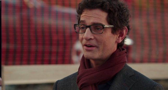
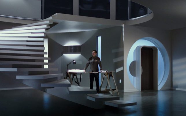
All of the stereotypes associated with the architectural profession and its stars, real and exaggerated, are about to be revealed in an hour-and-a-half movie starring Parker Posey (wife), Eric McCormack (husband), John Carroll Lynch (builder) and James Frain (architect).

Directed by Jonathan Parker, the The Architect‘s trailer gives you a taste of what is to come: “Often the opinion of the client must be disregarded for his own good,” says starchitect Miles Moss (James Frain). “Less is only more when more is no good” (a satirical nod to Mies van der Rohe).

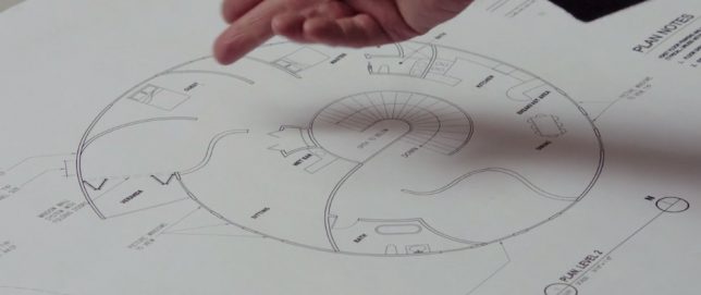
house-plan

The story revolves around a couple that buy a tear-down house and decide to build from scratch. They spot a house they like and hunt down the architect to design their dream home. It quickly becomes clear, however, that their dreams will be replaced by those of the architect, or at best: rendered in concrete, glass and steel. The wife (Parker Posey) may also be having second thoughts about her choice of partner. Architects and architecture often take a back seat to the main story (Sleepless in Seattle), but in this picture, for better or worse, they are the center of attention.

the-architects

His masterful creation meets resistance, probably in part because its semi-circular spaces are somewhat difficult to furnish. “I don’t know why people hire architects, and then tell them what to do,” Moss wonders aloud, frustrated with his clients. Like this one, many of his lines clearly refer to quotes from famous architects both contemporary (Frank Gehry) and historical (Le Corbusier).

the-architect

“These are the sleeping spaces” says the architect, pointing at the plan (“You mean bedrooms?” the husband replies) — “You could call them that” he admits, his voice dripping with superiority (architects are notorious for giving things fancy names). The movie hits on movements from Modernism through Deconstructivism, wrapping them in the comedic story of a troubled couple. Love it or hate it, this is a must-watch movie for fans as well as critics of the profession.

Share on Facebook


[ By WebUrbanist in Architecture & Houses & Residential. ]

[ WebUrbanist | Archives | Galleries | Privacy | TOS ]


WebUrbanist

 
Comments Off on The Architect: New Film with All-Star Cast Features Egotistical Starchitect

Posted in Creativity


Art in the Shadows: Everyday Objects Cast Unexpected Shapes Onto Paper

10 Dec

[ By SA Rogers in Art & Drawing & Digital. ]

art-in-the-shadows-3

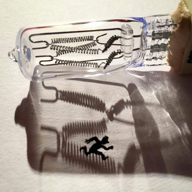
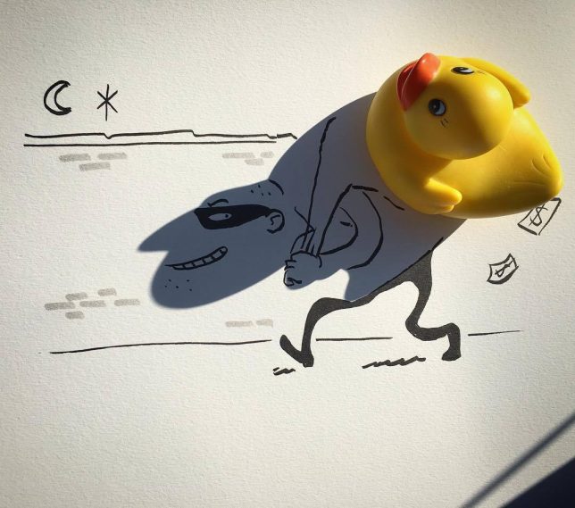
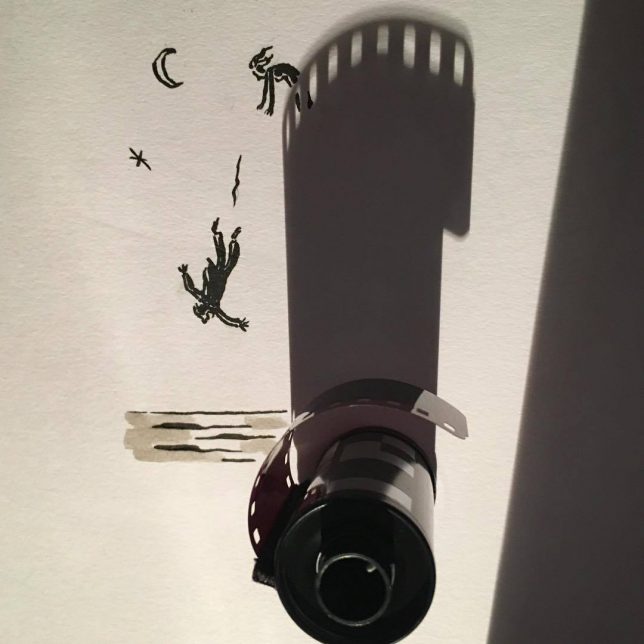
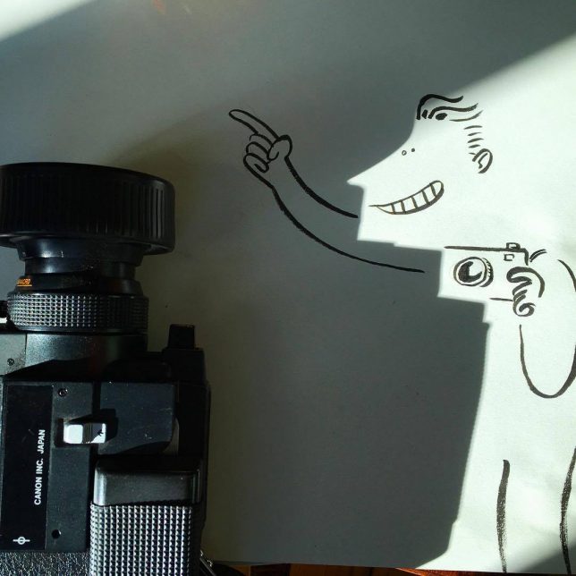
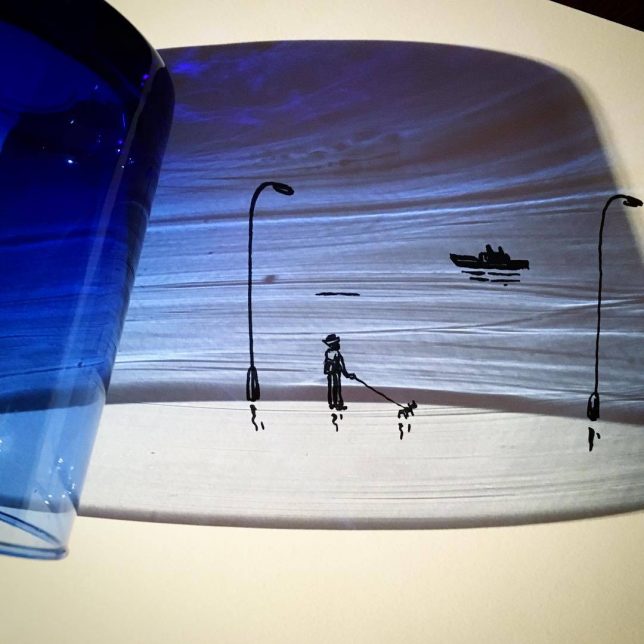
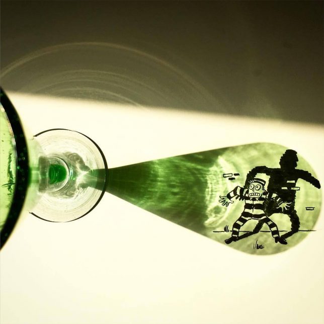
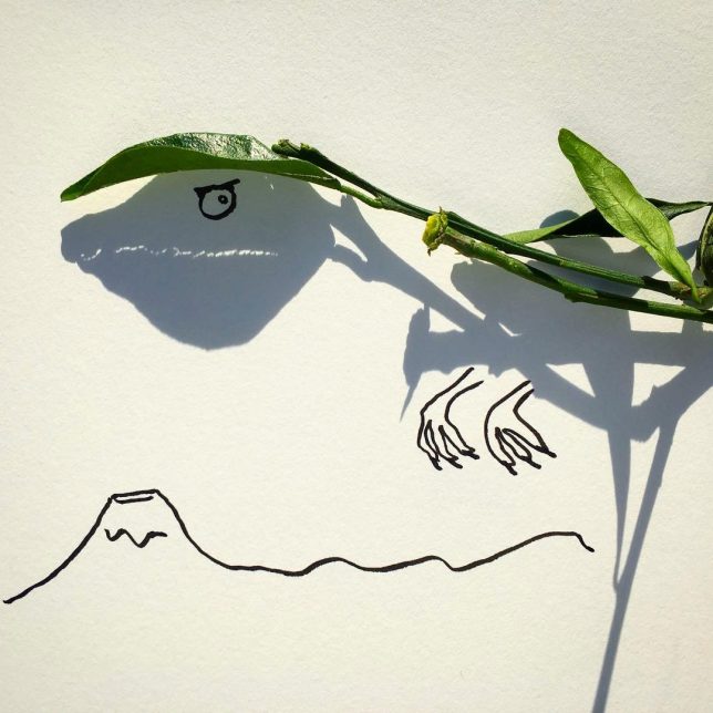
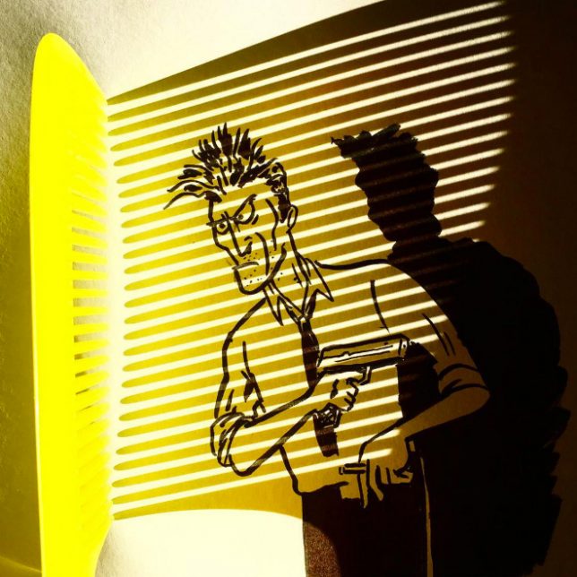
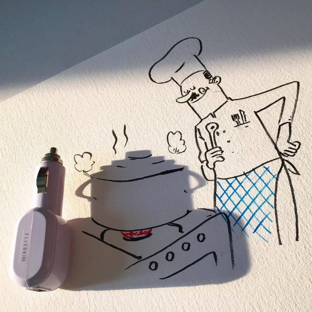
Has doodling ever been more creative than this? While most people wouldn’t give a second’s thought to the shape an everyday object’s shadow casts upon adjacent surfaces, artist Vincent Bal looks at them and sees the beginnings of a character or scene. It might be a phone charger, a fallen leaf, a drinking glass or a Christmas ornament, but in its shadow, Bal sees far more than the object itself.

art-in-the-shadows

art-in-the-shadows-2

art-in-the-shadows-5

art-in-the-shadows-6

art-in-the-shadows-7

Each of Bal’s quick and clever illustrations is a testament to the creativity of an artist’s brain. Calling his work ‘shadowology,’ Bal plays around with silhouettes and light sources to find inspiration for sketches most people would never dream up. It takes the game of finding shapes in the clouds and applies an artist’s hand to the process, embellishing the shapes into something more.

art-in-the-shadows-8

art-in-the-shadows-9

vincent-bal-2

vincent-bal-1

Calling himself a ‘filmmaker and doodler and procrastinator from Belgium’, Bal shares his work on his popular Instagram account and sells prints on Etsy.

Share on Facebook


[ By SA Rogers in Art & Drawing & Digital. ]

[ WebUrbanist | Archives | Galleries | Privacy | TOS ]


WebUrbanist

 
Comments Off on Art in the Shadows: Everyday Objects Cast Unexpected Shapes Onto Paper

Posted in Creativity


Cast your vote: DPReview Readers’ Choice Awards 2015

17 Dec

It was a quiet year for some manufacturers, and a year of milestones for others. We’ve tested loads of equipment, both in our studio and out, and have voiced our opinions on many of the year’s notable cameras and lenses. Now it’s your turn! Vote for your favorite gear of the past year in four categories, and stay tuned for the final showdown between the winners in each category.

Articles: Digital Photography Review (dpreview.com)

 
Comments Off on Cast your vote: DPReview Readers’ Choice Awards 2015

Posted in Uncategorized


How to Use LAB Color in Photoshop to Remove an Unwanted Color Cast

15 Dec

Marin County Headlands with LAB adjustments

In a recent article about the LAB colorspace, I covered the basic LAB move to enhance colors. Hopefully that gave you an idea of the power of the LAB colorspace to manipulate color in Photoshop. In this article we are going to build on that a little bit. Whereas in the last article we simply used the basic LAB color move to enhance color, now we will get into color manipulation. Specifically, I will show you how to remove an unwanted color cast from your photos using LAB. In many ways doing this in LAB is simpler and more powerful than doing it in your normal color space (RGB).

Setting the stage

Removing color casts and manipulating color will be simple for you once you know a little bit about how LAB color works, so first let’s make sure you understand what is going on in the LAB colorspace. Once you understand how LAB works, everything else will be easy.

LAB stands for Lightness, A channel, and B channel. The L channel strictly controls lightness and we won’t be working with it for purposes of this article. All color in the LAB colorspace is within the A and B channel. The A channel consists of greens and magentas. The B channel consists of blues and yellows. The histogram in both of these channels almost always looks like a spike in the middle of the histogram. Because LAB is such a ridiculously broad color space, there will be a lot of empty space on either side of the histogram. As you saw in the last article, this empty space is what gives us the opportunity to enhance color so effectively in the LAB colorspace.
LAB color graphic

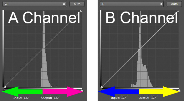
Now let’s look at the histogram of the A channel more closely so that you can see how this works. The A channel is a combination of green and magenta. The further to the left you are in the histogram, the more green is present. Conversely, the further to the right you are in the histogram, the more magenta is present (see diagram above).

The middle of the histogram is a gray tone without any real color. It is designated as zero. As you move away from the zero (gray) point in the middle, more color is added. To the left, the numbers go into negatives (all the way down to -128) and things get more green. To the right, you move into positive numbers (toward a max of +127) and things get more magenta (pinkish).

It works exactly the same way in the B channel, only the colors are different. In the B channel you still have a starting middle point of zero, which is also gray. But, as you move to the left on the histogram towards -128, the colors get bluer. As you move to the right towards +127, the colors get more yellow.

Also note that the center line of the histogram runs right through the zero in the center of both the A and B channels. This will be important for identifying and correcting color casts.

If you are still with me thus far, everything will be easy from here. Now you can take what you just learned and see how to identify and fix color casts easily in LAB.

Identifying color casts easily

It is easy to identify a color cast in LAB mode. Just look at the A or B channel. If the colors are more or less evenly distributed on either side of the midpoint of the histogram, your picture will probably not have a color cast. But if the histogram values are skewed to the left or to the right of the histogram, you are probably have a color cast. Here is how it works in the A and B channels:

  • In the A channel, if the colors are more on the left side, you will have a greenish color cast in your image. If they are to the right, you will have a magenta color cast.
  • Similarly, in the B channel you know if the histogram appears shifted to the left, you will have a bluish cast to your picture. If the values are to the right of the histogram, your picture will appear more yellow.

LAB color cast chart

In this way, the LAB colorspace makes it super simple to determine if you have a color cast. Just look at the middle of your histogram, and if the colors are skewed to one side or the other, you know you have a color cast or shift. This is important because a slight color cast is not always apparent to the naked eye. Your eye gets acclimatized to seeing the picture in a certain way, and accepts that as normal. Now this we’ve identified a color cast, let’s set about fixing it.

Fixing  color casts in LAB

Much of the power of the LAB colorspace comes from scooting in the endpoints on either side of the histogram. In the last article, we did that to separate the colors, which enhances them. We moved the endpoints in toward the center the exact same amount on each side of the histogram. That enhanced colors without affecting the overall color cast of the picture. This time, however, we are going to move the endpoints in different amounts to fix color casts.

For example, let’s say your picture has a blue color cast. When you open up the B channel, the spike showing color is skewed to the left of center on your histogram. To fix it, you simply scoot in the right endpoint of your histogram more then the left endpoint. It’s as simple as that.

Let’s try another example, let’s say you open the A channel of one of your pictures, and noticed that the values are skewed to the left of center on the histogram. That means that you likely have a green color cast. To fix it, simply scoot in the right endpoint a little bit. Don’t do it too much, usually three to five points will make a major shift in color.

Identifying and fixing a slight color cast

This might make more sense to you if we walk through an actual example. So here’s a good example of everything we have been talking about in this article so far. We will start with a photo that I was in the process of editing:
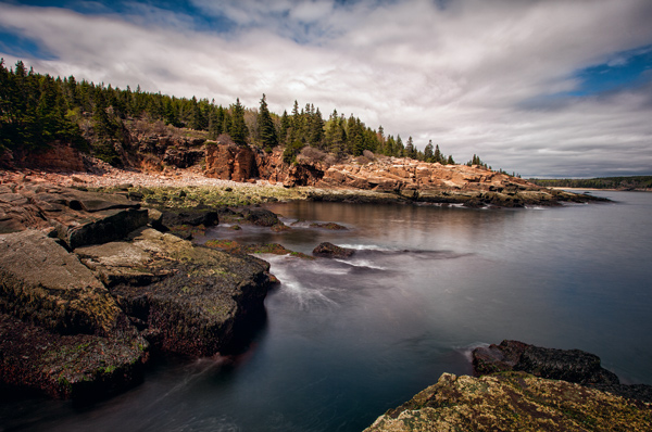
Original photo with color cast

I frankly did not see a color cast, however, I decided to check it out. I converted to LAB, opened a Curves Adjustment Layer, and looked at the histogram of the A channel and the B channel. Here is what I saw:
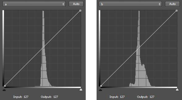
Histogram showing A & B channels

Two histograms in LAB. The left histogram is the A channel. The right histogram is the B channel. Notice that both are skewed to the right of the centerline – a sure sign of a color cast in the picture.

Notice that in the A channel most of the pixels are stacked up to the right of the center line on the histogram. That is a sure sign that there are more magenta pixels than green in the picture. Notice also that in the B channel most of the pixels are also stacked up to the right of center, which means there are more yellows than blues in the picture. Neither necessarily means there is anything wrong with the image, but that might mean a color cast. So let’s make an adjustment as described above and scoot in the left endpoints a little bit in each channel. Here are the two minor moves I made:
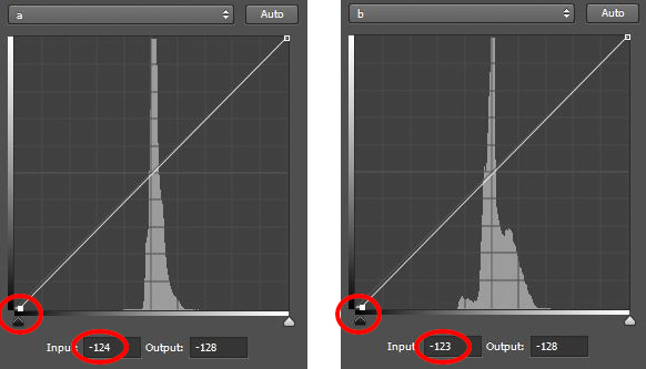
Histograms of A & B channels - after adjustment

Here are the histograms after the adjustments. Notice that I pulled in the left endpoints of each to the center.

All I did was pull the left endpoint of each histogram to the center a little bit to offset the fact that the colors are skewed to the right of the histogram in each channel. As mentioned above, a change of three to five points will create a large adjustment, so that is all I did. As the numbers below the histograms reflect, I made the following adjustments:

  • A Channel:  I pulled the left endpoint to the center by four points (from -128 to -124).
  • B Channel:  I pulled the left endpoint to the center by five points (from -128 to -123)

After the adjustment, here is the resulting picture:
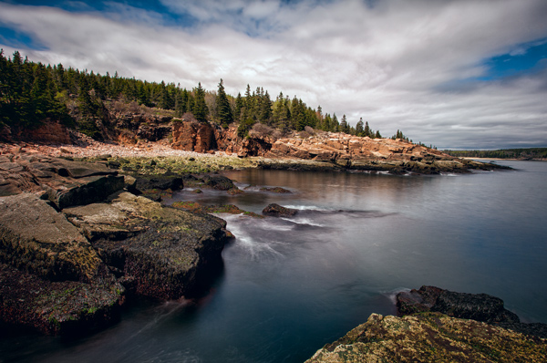
Acadia After LAB adjustment

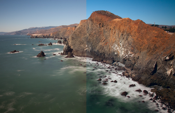
I think it looks better now. To me, it had a color cast that I just wasn’t seeing. The difference is subtle, but significant. In particular, look at the clouds. Here are the before and after pictures side-by-side:

Comparison

The original picture is on the left. The picture on the right had is after a minor LAB adjustment. I did not even see the original color cast, but I think it looks better after the adjustment.

Incorporating this into the LAB color move

Sometimes, you will notice that the spike in the A or B channel is to one side of the center of the histogram, but you do not really want to change the overall color of the picture. It is still important to understand what is going on when you are making your normal LAB color move.

If you ignore the shift to one side or the other, then when you scoot in your endpoints by equal amounts, you may be exacerbating the color shift. Therefore, keep an eye on your histogram and try to make your shift pivot around the spike rather than on the center of the histogram. In other words, if the pixels are to the right of the histogram, scoot in your left endpoint a little bit more (and vice versa). In this way, you can make your normal LAB color move, but at least not add any color cast to your picture.

Why not just do this in RGB?

You may be asking, can’t I just remove color casts in RGB? The answer, of course, is yes. But the LAB colorspace has advantages that I want to make sure are clear to you.

First, because LAB separates Lightness from all color adjustments, LAB allows you to fix these casts without any impact on lightness or contrast. This is not possible in RGB. When you affect the red channel, green channel, or blue channel in RGB, you are necessarily affecting lightness. It is all tied together in RGB.

Second, LAB makes it easier to identify color casts. As you saw above, you just open up the A or B channel and see if the spike is shifted to one side of the histogram. If it is, you likely have a color cast. If it isn’t, you do not. In RGB, you have to compare channels and see how one channel appears compared to the other two channels.

Isn’t this like setting your white balance?

You may have noticed that the LAB colors correspond with the sliders in Lightroom or Adobe Camera Raw (ACR) that are used to set the white balance in your picture. You can think about LAB in those terms and it might help you to understand how the colors work together. But using LAB to manipulate color offers certain advantages over just setting your white balance. For one thing, you can change the colors later in your workflow, and are not compelled to do it right up front. For another thing, you can take advantage of Photoshop’s layers and selections in manipulating color. Although Lightroom and ACR have very helpful aids in setting the while balance, like the White Balance Selector (the little dropper) or the presets, there is no histogram to allow you to really see and fine-tune your changes.

Applying this to your worklflow

What the technique shown in this article will allow you to do, is make your normal LAB color move in a more nuanced fashion. In the last article, I showed you how to make the LAB color move in a basic, unthinking way. You simply moved the endpoints of your A channel and B channel by equal amounts. It is sort of a one-size-fits-all approach, which doesn’t always work in photography. Now, you can use this to manipulate color a little bit or at least keep it from getting worse as you edit.

I have talked about correcting color casts as if there was a special correct way. But of course that isn’t really true and what looks correct to me might not look exactly right to you. Use your own judgment and do what seems right to you. As you make these moves, however, you might want to bias them in one direction or another. Remember that sometimes a color cast can add effect or mood to your picture. Sometimes a slight color cast just looks good. For example, a warmer tone created by a yellow or magenta cast can actually enhance your picture. Sometimes, but less often, a bluish cast can be appropriate. Also remember that a greenish cast never looks good and should be avoided.

I know it can sometimes be confusing knowing where colors reside, and how to fix them within the LAB color space. To try to make it easier for you, here is a chart:

LAB Color Casts Chart

Conclusion

The LAB colorspace is a powerful beast. You previously learned how to unleash that power by using the basic LAB color move. Using the technique in this article will allow you to tame that beast a little bit. It will allow you to use the power of LAB without getting garish effects or color casts in your pictures. It will also allow you to fix these color casts simpler and easier than anything that RGB allows. Give it a try and see if it corrects your colors.

googletag.cmd.push(function() {
tablet_slots.push( googletag.defineSlot( “/1005424/_dPSv4_tab-all-article-bottom_(300×250)”, [300, 250], “pb-ad-78623” ).addService( googletag.pubads() ) ); } );

googletag.cmd.push(function() {
mobile_slots.push( googletag.defineSlot( “/1005424/_dPSv4_mob-all-article-bottom_(300×250)”, [300, 250], “pb-ad-78158” ).addService( googletag.pubads() ) ); } );

The post How to Use LAB Color in Photoshop to Remove an Unwanted Color Cast by Jim Hamel appeared first on Digital Photography School.


Digital Photography School

 
Comments Off on How to Use LAB Color in Photoshop to Remove an Unwanted Color Cast

Posted in Photography


Book of Shadows: 2D Shape Cutouts Cast Silhouettes on Pages

24 Jul

[ By WebUrbanist in Design & Products & Packaging. ]

motion train animated example

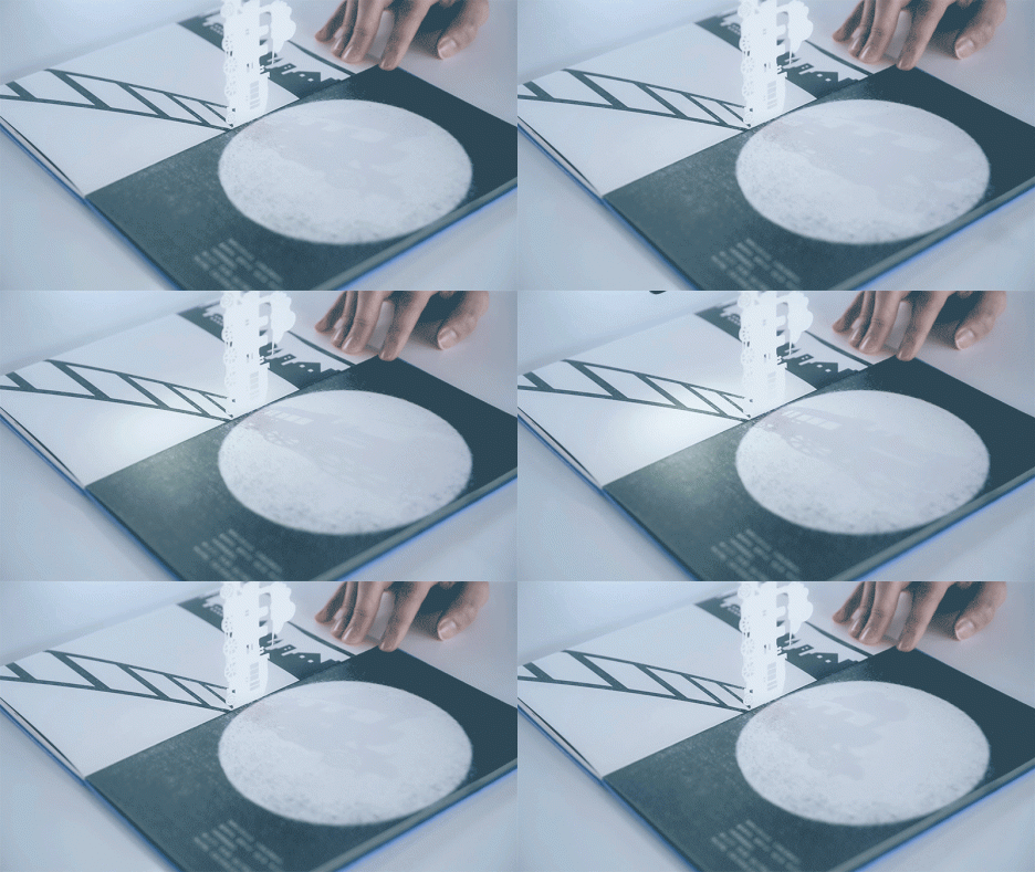
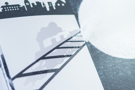
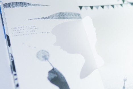
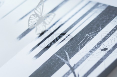
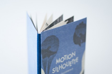
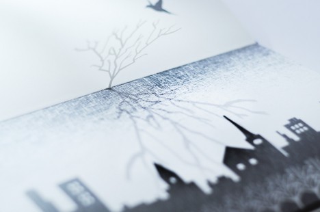
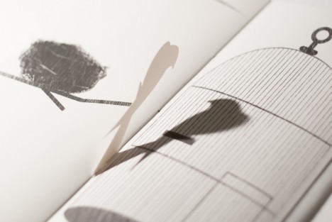
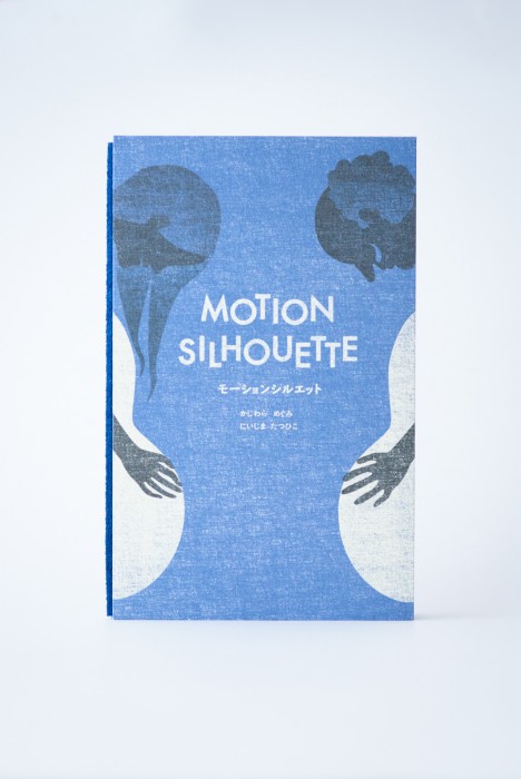
A children’s book with an interactive twist, Motion Silhouette engages readers through pop-up pieces that require lighting to animate shadow pictures on each page.

motion train moving page

motion train other page

motion womans face page

motion butterfly shape page

The idea is to add elements of manual animation that are necessarily subjective – each person will hold, turn and highlight the cutouts in different ways.

motion animated book shadow

motion silhouete tree city

motion silhouette

Secondary readers or viewers (young kids watching over parents’ shoulders) will also have their own unique experience each time.

silhoutte book one

silhouette spider web

silhouette plant shapes

silhouette cross page

silhouette bird page

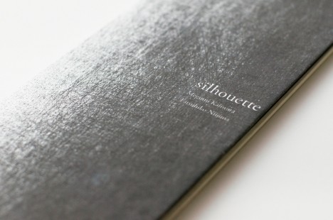
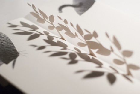
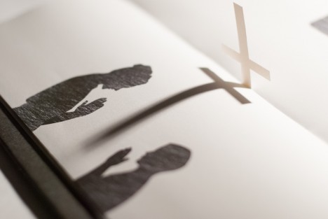
Motion Silhouette is actually a sequel to another book, simply titled Silhouette (excerpts shown above), a work which similarly uses slightly less-developed pop-up pages to create a more basic multi-dimensional experience.

motion silhouette book

From its Japanese creators, Megumi Kajiwara and Tathuhiko Nijima: “I will begin to talk about the story and illustrations shadow falls on top of the page overlap. In this work, you can enjoy the animation of shadow phantasmagoric by you move the light. Trees and become bigger and bigger, which aims to train a distant star. Story that changes depending on the page falling shadows, shadows move around the top of the page.”

Share on Facebook


[ By WebUrbanist in Design & Products & Packaging. ]

[ WebUrbanist | Archives | Galleries | Privacy | TOS ]


WebUrbanist

 
Comments Off on Book of Shadows: 2D Shape Cutouts Cast Silhouettes on Pages

Posted in Creativity


Create a Cast of Light in Your Image using Photoshop or Elements

06 Feb

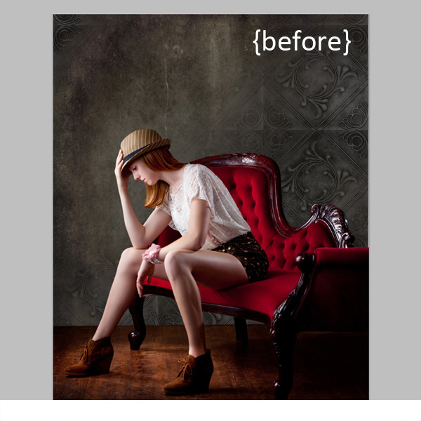
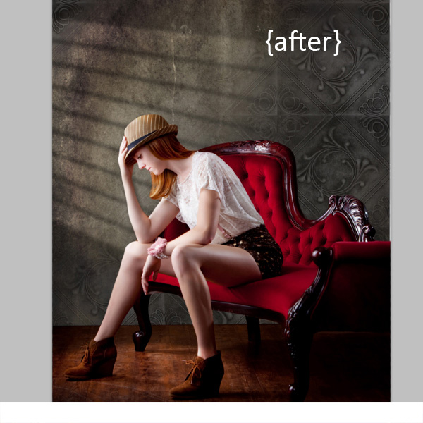
Light sources add depth and interest to your images immediately. By simply adding some window light to this image we added depth and warmth. If you have an image that you love, but it’s falling a little flat, consider adding some light! With just a few simple steps you can add beautiful light to your images.

Follow these steps to create a cast of light – works in Photoshop and Elements

Window Light Cast Before

Window Light Cast After

One thing you’ll want to pay special attention to is pre-existing lighting in your image. Make sure the light source you add works with and compliments your image. You can adjust the angles and direction of your added lights to make them work together so your image is both believable and beautiful.

Let’s get started. Follow these simple steps to make your compositions shine!

Step 1: Start with a light source

This can be an image you’ve taken, something you’ve designed or something you’ve purchased. We are using a light element from our Window Cast Light Set. Choose a light source and shape that you want to bring into your composition.

NOTE: if you want to follow along and try this on one of your images we’re happy to provide our set of Light Casts to you for free. Go here to download them – use the code: FREEBIE when you checkout to get them at no charge.

Step 2: Add the light source to your image

If you have your image and the light source both open in Photoshop, you can use your selection tool to drag the light source to your image. Alternatively, you can also copy (Control + C) the window shape layer in Photoshop (or PSE). Open your image and paste (Control + V) the window shape layer into your image.

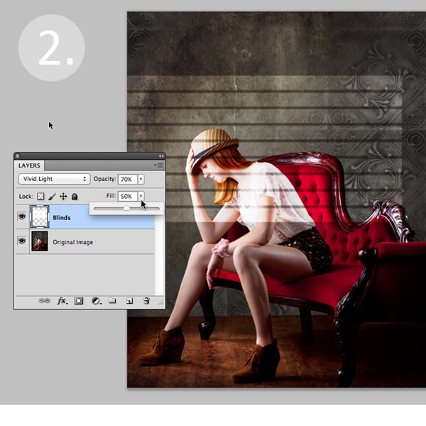
In this case, we placed the light source over our image. Next we adjusted our Layer Blending Mode by setting it to “vivid light” and then adjusted our opacity and fill on the light source until we achieved the desired look. You’ll want to play around with these settings to get the right look for your image.

Window Light Cast La ED2363

Step 3: Adjust the shape of your light

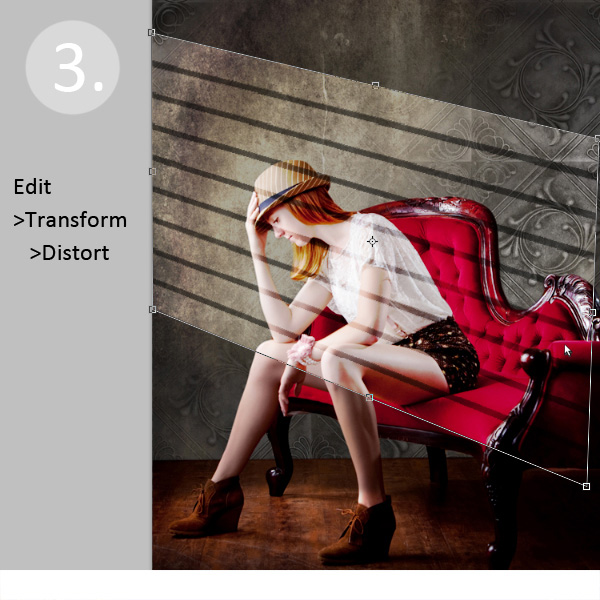
Next, you’ll transform the window shape to your liking. Go to Edit>Transform>Distort and then move the corners to create the
shape that works best with your image.

Window Light Cast Transform

Step 4: Soften your light

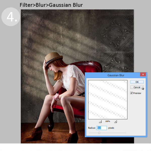
Now you want to soften the edges of your light so that it is not so harsh. Use the Gaussian Blur filter (Edit>Blur>Gaussian Blur) to soften the edges to your taste. In this case, we set the blur amount to 5. Adjust the amount of blur up and down to see how it softens the light in your image.

Window Light Cast Blur

Step 5: Fade your light source for a more natural look

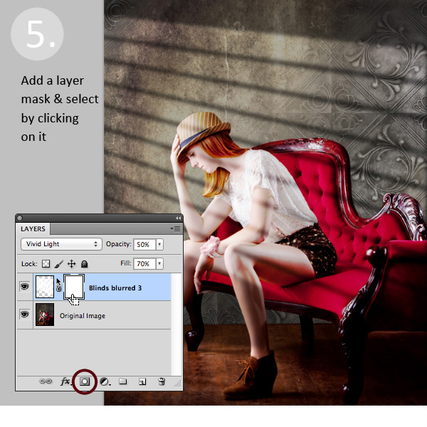
Now you’ll add a Layer Mask to your window shape layer. First, select your layer, and then click the Add Layer Mask Button at the bottom of your Layers Palette. Click on the new Layer Mask in the layer to make sure it’s selected. (VERY IMPORTANT STEP!)

Window Light Cast La ED283A

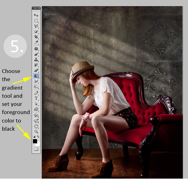
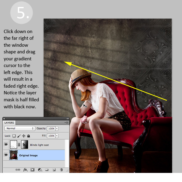
After adding a layer mask to the light cast layer, set your color palette to black and white, with black in the foreground color. Then use the gradient tool set to “foreground to transparent” to fade the light off.

Window Light Cast Gradient

Simply click into your layer mask and drag your cursor from one end (this will be 0% opacity) to where you’d like to see the light at 100% opacity. If you don’t like your results, fill the mask with white and start over.

Window Light Cast Gr ED2331

Step 6: Position the window shape to your liking.

Use your Selection Tool to adjust the position of your light layer to the desired location in your image. You can also use a soft black brush set to 30% opacity to subtly brush away the window light in the layer mask. We did this to remove extra light from her face.

Congratulations! You’ve successfully added a beautiful, warm light effect to your image to create more depth and interest in your image.

Window Light Cast Before

Window Light Cast After

Your turn!

If you’ve tried out this technique please share your images in the comments below, and please ask if you have questions!

The post Create a Cast of Light in Your Image using Photoshop or Elements by Christina Roth appeared first on Digital Photography School.


Digital Photography School
 
Comments Off on Create a Cast of Light in Your Image using Photoshop or Elements

Posted in Photography


Starry Light: Hand-Crafted Shell Lamps Cast Stellar Patterns

11 Sep

[ By WebUrbanist in Design & Furniture & Decor. ]

lamp ball of light

Innocuous spheres by day, the carefully handmade holes dotting these coconut shells are hard to even see until they light up at night, morphing from muted balls to bright orbs.

lamp 2

lamp 6

lamp 4

lamp 3

lamp 5

lamp 7

Once illuminated, these subtle spheres are themselves beautifully lit up from within, but also project amazing patterns on surrounding walls, furniture and furnishings, whether set on the floor or placed on a bookcase or nightstand.

lamp 14

lamp 15

lamp 18

lamp 19

Creator Vainius Kubilius explains their constituent parts in anatomical terms – bones (of metal wire) to create a strong and flexible stand, wrapped with skin (of various ropes) to create a tactile exterior, with a head and brain (custom drilled coconut) unique in each case and giving personality to the whole.

Next Page:
Starry Light Hand Crafted Shell Lamps Cast Stellar Patterns

Share on Facebook


[ By WebUrbanist in Design & Furniture & Decor. ]

[ WebUrbanist | Archives | Galleries | Privacy | TOS ]


WebUrbanist

 
Comments Off on Starry Light: Hand-Crafted Shell Lamps Cast Stellar Patterns

Posted in Creativity


4 Quick Tips to Notice the Supporting Cast of Your Landscape Scene

22 Aug

Recently I took a stroll through my photo archives as a way of bench-marking my progress as a photographer and something dawned on me – I’ve begun to overcome a very troublesome disorder for photographers known as Single Subject Blindness.

Single Subject Blindness

Have You Ever…

Come home from photographing something spectacular only to have ever photograph you upload be of that one spectacular subject? I mean there’s nothing wrong with this problem – after all you are still getting a photograph of one spectacular subject, but could you have gotten more? Done something else? Seen the scene differently?

So when you think back to some of your recent photo adventures – Have you ever photographed a dramatic sunset and walked away with photographs of only the sunset? Have you ever hiked deep into a forest to photograph a waterfall to walk away with only photographs of the waterfall itself? This is what I’m calling single subject blindness and it is something I’d like to mention today and talk about how I avoid it.

Thin Ice

There’s Nothing Wrong With Main Characters – But They Aren’t The Full Story

I do want to mention that there’s nothing wrong with capturing the main characters of your scene, the sunset, the waterfall, the expansive mountain range etc, but I do think that if that’s all you’re photographing when you go out on a shoot you’re missing a big part of the scene around you – the supporting cast!

I’ve done this myself for many years – I’ll get caught up in a scene and return to my computer to see what I’ve captured only to find every photo looks the same. Lately I’ve begun to catch myself doing it in the field and I’ve found a couple of ways to break the habit.

It’s not easy though – The thing is just like in the movies, a great book, or a dramatic play the main characters draw your attention, and keep it. The supporting cast is there to move the story along, but not necessarily be the story – however, they can make for very compelling and interesting subjects when isolated and taken separately. So while we can still photograph our main subjects I think it’s also important to find ways to steer our focus from the obvious subjects to those which are more subtle.

So How Do You Steer Your Focus?

There’s no denying that it’s hard to ignore the main character of your photo shoot – after all many times it’s the reason where there in the first place. If you want to have a chance to photograph the supporting cast of your scene you have to find the strength to divert your focus, even if only for a moment, from that main event. Here are four quick tips that I use to get myself noticing the smaller details of a scene – if you can think of more tricks leave them in the comments below!

Supporting Cast

4 Quick Tips to Notice the Supporting Cast of Your Scene

  1. Step back – It’s no secret that stepping back from you camera from time to time can be a huge benefit in improving your photography. It can help you see the entire scene as a whole, it can help you see different compositions of the subject you’re photograph, and yes it can even allow you to find and isolate the supporting cast of your scene which you might have otherwise missed with your eye glued to the viewfinder. 
  2. Close Your Eyes – Take a minute or two and close your eyes. I love doing this when I’m in the middle of no where, sometimes I’ll even spin myself in a couple circles and really try to disorientate myself (make sure you can find your way home before you try this though). The reason this works is because it causes you to really focus in on your location when you open your eyes to find your bearings. You’ll have a new view of your surroundings and this will help you see something that you didn’t notice before.
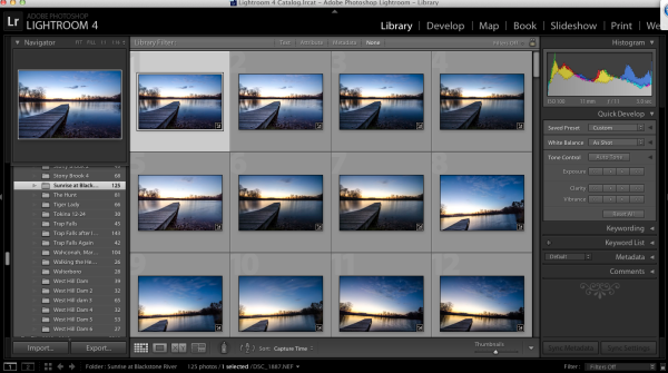
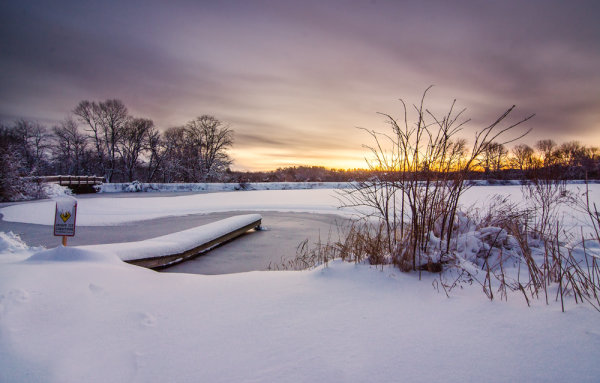
  3. Don’t Get Caught Up – I once woke up an hour before dawn in the middle of winter after a snow storm and drove to a frozen lake to photograph sunrise. I took nearly 150 shots during the 45 minutes I was there and ended up with one photograph – the one of the dock above. Of the photographs I took 95% of them looked exactly like the one above. I was cold, tired and very disappointed I didn’t make an effort to photograph other subjects during that shoot, but realized it wasn’t that I didn’t make an effort it was simply that I was caught up in photographing one subject instead of diverting my attention to other smaller details in the scene before me.
  4. Set an Alarm – If you know you’ll have a problem with number three try setting a timer. Allow yourself only a predetermined amount of time to get the shot you want from your main subject, and then once that time is up, spend the rest of your shoot looking for interesting supporting characters. This tip works wonders and it has a two fold effect – one due to the time crunch to capture the shot of your main subject you’ll find yourself working harder to get the shot you want in as short amount of time as possible, two it gets you looking for other interesting details in the scene you’re photographing.

Have You Ever Been Afflicted With Single Subject Blindness? What have You Done to Fix It?

I’d love to hear your own take on this and what you’ve done to avoid the problem in the comments below!

Post originally from: Digital Photography Tips.

Check out our more Photography Tips at Photography Tips for Beginners, Portrait Photography Tips and Wedding Photography Tips.

4 Quick Tips to Notice the Supporting Cast of Your Landscape Scene


Digital Photography School
 
Comments Off on 4 Quick Tips to Notice the Supporting Cast of Your Landscape Scene

Posted in Photography