RSS
 

Posts Tagged ‘Burning’

Dodging and Burning in Lightroom: A Comprehensive Guide

20 Jan

The post Dodging and Burning in Lightroom: A Comprehensive Guide appeared first on Digital Photography School. It was authored by Rick Ohnsman.

dodging and burning in Lightroom a comprehensive guide

Digital photographers who have never worked with film or never even set foot in a darkroom still encounter terms from the early days of photography. The phrase “dodging and burning” is a throwback to those times.

Now, the reasons for using this technique still apply, but the tools and methods for dodging and burning are much easier today. In fact, you can do effective dodging and burning in most post-processing programs, including Lightroom.

So let’s dig into the what, why, and how of dodging and burning in Lightroom – and show you how this technique can improve your photos.

darkroom setup
Working with an enlarger in the orange glow of a safelight. This is how photos used to be printed.

A history lesson

Adobe’s “Lightroom” is a tip of the hat to the place photos were made in days gone by, the darkroom. I had a makeshift darkroom in a corner of my garage and remember the tanks and trays of smelly chemicals, working in the orange glow of a safelight, developing negatives, and making prints. It was a laborious process, and one for which there was no “undo” when a mistake was made.

The standard darkroom workflow went something like this:

  1. Load the film (sheet film for larger “view cameras,” roll film for smaller cameras)
  2. Make shots in the field
  3. Return to the darkroom, and in total darkness or using a film bag, put the film in a developing tank
  4. Develop the film in a multi-step series of chemical baths (develop, rinse, stop bath, rinse, fix, rinse, Photo-Flo, rinse, dry)

At this point, you’d have your negatives, which were film with reversed lights and darks (and colors if you were using a color film.) Next, you’d need to print. Photos were prints; you couldn’t view images on a computer screen.

(Later came reversal film, “slides” that still were physical renditions of your photo but able to be shown with a projector.)

Old school photo enlarger
If you were a DIY photographer and made your own prints in a darkroom, you had to have a lot of tools – including a device like this, called an enlarger. People who think photo printing is challenging today have no idea how it used to be!

At this point in the darkroom workflow, you’d be getting to the dodging and burning part.

You’d put your negatives in an enlarger – a projector of sorts which would shine the negative image down onto a piece of photo paper.

(This was all done in the darkroom under a “safelight,” which allowed you to see your work because the orange color wouldn’t expose the photo paper.)

Now, you had to decide how much time was needed to expose the photo paper to the light in order to make a proper exposure. Often, you’d create a “test strip,” a print where you’d create a succession of incremental exposures (shown below). Of course, that would have to be developed in a series of chemical baths, too.

Test strips were made to determine proper photo printing time.
How long should you expose the photo paper to the negative image projected by the enlarger? Better print a test strip.

Finally, you’d be ready to make your print. You’d put a piece of photo paper under the enlarger, set your timer for the exposure duration you established, hit Start, and expose the paper to the light of the projected negative image.

But wait! What if you wanted some parts of the image to be darker and others lighter?

Well, the amount of time the paper was exposed to the light determined how dark the image was.

So if you used an instrument to block light from portions of the image during the projected exposure or, in a second exposure, exposed select portions of the paper to more light, you’d selectively brighten or darken parts of the final print.

The term for selectively blocking the light from the photo paper is “dodging,” and the term for exposing areas of the photo paper to more light is “burning.”

These used to be the tools of the trade before we had dodging and burning in Lightroom
You could buy a dodging kit – or you could just get some wire and make some cardboard cutouts.

Granted, that was a long story just to explain these key terms, but you need to feel the pain just a bit. Imagine doing all those things, then developing the photo paper, spending time and money, only to find that your print didn’t turn out as you hoped. Frustrating, right?

(Guess you weren’t the…wait for it…”artful dodger” you thought you were.)

Dodging and burning in Lightroom sure is easier than the old-school methods!
These are the origins of the terms: “Dodging” meant using various tools to block the light from reaching the photo paper, thus lightening that part of the print. Burning used tools to allow extra light to reach portions of the paper, thus darkening those areas of the print.

Lighten and darken

We have it so much easier, cheaper, and safer with digital photography. No chemicals, no working in the dark, and maybe best of all, the ability to experiment, undo, and replicate the finished results with ease.

So while you will still hear about dodging and burning in Lightroom (as well as in Photoshop and most other digital editing programs), and the tools are still labeled as such, let’s substitute something easier to understand:

Dodging = Lightening.

Burning = Darkening.

Why dodge and burn?

When we use the sliders in Lightroom to adjust our image, we are working with “global” controls. These uniformly apply the effect to the entire image.

For instance, increase or decrease the Exposure slider, and the entire image will get lighter or darker.

What we may want to do is selectively control portions of the image, making some areas darker and some areas lighter. A major reason for doing this is because viewers tend to look at brighter portions of an image first, concentrating less on darker areas.

So to emphasize and deemphasize portions of our image, we may wish to selectively lighten or darken them.

(Remember, lighten=dodge and darken=burn).

The “quick and dirty” method

Dodging and burning in Lightroom can be complicated – but it can also be very simple, and that’s what I’m going to discuss in this section.

Here’s how it works:

  1. Bring up the image you wish to edit in the Develop module of Lightroom. Perform whatever global adjustments you like using the sliders.
  2. Select the Adjustment Brush tool. Double-click the word “Effect” to zero all the sliders. First, we’ll work on areas we wish to lighten (dodge) in the image.
  3. Now let’s “load” the brush. In the Basic panel, drag the Exposure slider up to about +1.0. Set your Feather, Flow, and Density all to 100. This will likely create too much of an effect, but will make it easier to see what you’re doing. You can always back off the brightness later by bringing down the Exposure slider.
  4. Pick an area of the image you wish to lighten and start painting on it with the brush. You will see the area get lighter. Only work on one area. When you’ve painted over all the desired sections, go back to the Exposure slider and drag it up or down to get the final amount of lightness you desire. Click Done when finished with this area.
  5. To work on another area of the image, click the Adjustment Brush again (which will add a new “pin”) and repeat the steps explained above. Because adjustments with the sliders will affect everything done via that “pin” adjustment, you will have more control if you work on multiple smaller areas, rather than lightening multiple areas all at once so you’re forced to apply the same degree of lightening (dodging) to each one.
  6. To darken areas of the image, you can use the same procedure, though you’ll need to drag the Exposure slider in the negative ( -) direction.
Combine global adjustments with simple dodging and burning in Lightroom and you can get a nice result.
Combine global adjustments with simple dodging and burning in Lightroom and you can get a nice result. Before (left) and after (right).

With the Adjustment Brush and the Exposure slider, you can selectively lighten (dodge) and darken (burn) areas of your image.

It works, but maybe you’d like to refine your skills a bit, which is what the next sections are all about:

Tools of the trade

When we talk about dodging and burning in Lightroom, we have three tools we can use:

  • Adjustment Brush
  • Radial Filter
  • Graduated Filter

These tools allow you to select areas of your image where you can apply lightening and darkening.

Let’s discuss how each of these tools might be used and look at some examples that illustrate these concepts.

Tools for dodging and burning in Lightroom

The Adjustment Brush

The Adjustment Brush in Lightroom allows you to selectively “paint” the area of the photo you wish to affect. It might help to think of how you’d control an airbrush rather than a regular paintbrush.

You can make several changes to the Adjustment Brush, including:

  • Size: Changes the size of the brush. Roll the mouse wheel, use the left and right bracket keys, or use the slider.
  • Feather: Changes how hard the edge of the brush is and how rapidly the effect falls off. Use Shift while rolling the mouse wheel, Shift and the bracket keys together, or the Feather slider.
  • Flow: Controls how quickly the effect is applied with each stroke of the brush. Use the slider to adjust the flow, or with the Adjustment Brush selected, change the flow with the number keys on the keyboard. Using multiple strokes will build up the effect.
  • Density: Controls the maximum opacity of the brush effect. For example, if the Flow was at 100 but the Density was at 50, one stroke of the brush would apply the effect at 50% opacity.

The Radial Filter

The Radial Filter works somewhat like the Adjustment Brush – but rather than allow you to paint randomly, your adjustments are restricted to a circle or oval shape.

You can control the size and shape of the Radial Filter, and you can also feather the edges. Plus, you can control whether the effect takes place inside the circle or outside the circle.

I often use the Radial Filter with the Invert box checked (so only the inside of the circle is affected), and then adjust the filter strength with the Exposure and Feather sliders. You can create what appears to be a spotlight and use it to selectively lighten (dodge) areas of your image.

Some other tips for working with the Radial Filter:

  1. Hold down the Shift key when you drag out the Radial Filter to constrain it to a circle
  2. Use the “handles” on the top, bottom, and sides to drag the Radial Filter into other oval shapes
  3. Once the Radial Filter is created, move the cursor just outside the shape until you see the double-headed arrow and then drag to rotate the shape
  4. Get another “spotlight” to use on a different area by right-clicking a previously-created Radial Filter pin, choosing Duplicate, and then dragging the new Radial Filter off to the next place you want to work.
Creative use of the Radial Filter, one of the tools for dodging and burning in Lightroom
The Coquille River Lighthouse near Bandon, Oregon doesn’t use the light any longer. But with some creative use of the Radial Filter…
radial filter for dodging
…we can turn the light on! A Radial Filter was used to dodge the lighthouse itself, to put a light in the tower, and (as highlighted by the green overlay) to create a light beam.
lighthouse with beam
The finished result.
the radial filter dodging and burning
A Radial Filter was applied to the first window to dodge it, then the Filter was duplicated and moved to each of the other windows. The window at the bottom-right shows how the round shape of the filter can be modified using the Erase brush – which you can switch to by holding down the Alt (Option on Mac) key. The window is showing red because the mask overlay is turned on.

The Graduated Filter

The Graduated Filter can also help you lighten and darken selective areas of your image, but in a more gradual way.

While you might not immediately think of the Graduated Filter as a dodging/burning tool, the concept is the same – you can use it to choose which areas of your image are affected. While it’s a separate subject, combining the Graduated Filter with range masking in Lightroom can provide a very powerful method of selective dodging and burning, which is why I suggest you also read up on range masking.

the graduated filter is one of the tools to dodge and burn in Lightroom
You might want to burn (darken) a sky in Lightroom. The Graduated Filter is a great tool to use – and combined with the Range Mask, it can help you keep the effect where you want it and away from where you don’t, such as the trees in this shot. The red overlay shows where the effect will be placed.

The vignette

A vignette is used for darkening or lightening the edges of your photo.

When used to darken the frame edges, a vignette puts more attention on the center, brighter areas of the image, and helps direct the viewer to the center of the photo.

The Post-Crop Vignetting option is found under the Effects tab in the Lightroom Develop module.

Behind the mask

Any of the tools you use for selective dodging and burning – the Adjustment Brush, the Radial Filter, or the Graduated Filter – are all applying “masks” to your work, controlling how and where the effect is applied.

Often, it can help to see exactly where the masks are applied.

When we first choose one of our dodging and burning tools and begin to work with it, Lightroom will create a “pin,” a marker showing that an effect has been applied.

There is a control to choose when a pin will be displayed, which pins are active, and where the mask has been applied. You can even choose the color of the mask to help you best see it while editing. Hold down Shift, and each time you tap the “O” key, the mask will cycle through its available colors: red, green, white, and black. Use whichever color helps you best see where you’re working.

the mask overlay in Lightroom
Turning on the mask overlay can help you see where your effect is being applied.

Paint on, paint off

Even once you’ve created a dodge or burn effect, there are ways to further refine your selected areas.

Let’s take a quick look at a few of them.

  • Adjustment Brush: If you need to erase portions of your mask, turn on the overlay so you can see what you’re doing (hit the “O” key). Hold down the Alt (Option on Mac) key, and the “+” sign in the middle of the brush pin will change to a “-” sign. Keep holding down the Alt key, and erase the portions of the mask you don’t want.
  • Radial and Graduated Filters: After applying a radial or gradient mask, click the word Brush (at the top of the adjustment panel). Then hold down the Alt/Option key so the symbol turns to a “-” sign. Finally, brush out portions of the radial mask you don’t want.
  • Auto Mask: Checking this box will help the Adjustment Brush find edges and may assist you in selectively masking areas. I suggest you do some further reading to understand how this tool works.

Using the histogram

One feature of the histogram is the ability to show any shadow or highlight clipping. Tap the “J” key, and if any shadows are clipped they will show in blue, while clipped highlights will show in red.

By using the tools we’ve already discussed, you may be able to “rescue” such areas by selectively lightening or darkening them.

There could also be images where you purposely want to black out or white out areas. The “J” key will show you any clipping, then you can dodge or burn areas you wish to black out or white out.

Have a look at the images below, where I used this technique:

Extreme dodging and burning in Lightroom
You don’t want to completely clip your highlights or shadows in a photo…except when you do. This was the straight-out-of-camera (SOOC) photo. It needed some cleanup.
extreme burning in Lightroom
Here, I’m using the Adjustment Brush for some “extreme burning,” a way to black out the background and remove distractions in this shot.
pepper splashing in water
Here is the final edited shot.
Dodging and burning in Lightroom to clean up the background
I used the same technique for this photo. The rose shot against the black background was cleaned up by burning the background until the shadows were totally clipped. The rose on the white background was cleaned up by dodging the background until the highlights were totally clipped. Turn on the clipping indicator (hit the “J” key), set up your Adjustment Brush, check the Auto Mask box, and go to work.

Complexifying the light

When I was first learning to use Lightroom, I spent quite a few hours watching French photographer Serge Ramelli’s Youtube videos. He would often use the term “complexifying the light” when speaking about dodging and burning, and when talking about how you could use dodging and burning to make images more interesting.

I suggest you take a look at some of his tutorials; below is an image I edited with similar techniques.

Complexifying the light in Lightroom

Less is more

A good chef knows that a little salt can enhance the flavor of a dish, but too much can ruin it. A good photo editor learns that any manipulation of an image needs to be subtle, enhancing the image while not drawing attention to itself.

After a session of dodging and burning, it’s a good idea to get away from the screen for a while, then come back and view the image again. If you didn’t know, would you suspect that areas had been lightened or darkened with dodging and burning techniques?

I think you’ll often find that – especially when learning – you’ll need to dial back the sliders a touch to make the effects more subtle.

The technical and the aesthetic

As with all of photography, there are two sides to dodging and burning.

First, there’s the technical side, which requires learning the tools and techniques for dodging and burning in Lightroom.

The other component is aesthetic; you need to understand how to artistically view your image and decide where to dodge and burn to better direct the eye of your viewer to and through the image.

The technical side requires study to learn the tools. The aesthetic side requires artful contemplation and practice.

Union Pacific 844 train
The Union Pacific 844 is a “thundering beast,” the only steam locomotive owned by a North American Class I railroad that has never been retired. I wanted to capture its might. This unedited shot didn’t quite do it.
train with dodging and burning
But bring to bear the diversity of editing tools in Lightroom, including some dodging and burning, and you get an edited version that does a much better job of capturing my vision.

Dodging and burning in Lightroom: Conclusion

There are many photo-editing programs, tools, and techniques for dodging and burning your photos.

Some photographers may favor Photoshop, Luminar, ON1, Corel PaintShop Pro, or any of the dozens of other choices.

So feel free to choose your weapon.

But realize that no one will ask you what tool you used to improve your image. Master the tool you choose and wield it well. For me, dodging and burning in Lightroom is one tool for adding flair to my photos.

Now over to you:

Do you do dodging and burning in Lightroom? Do you want to? Share your thoughts, tips, and tricks in the comments below!

The post Dodging and Burning in Lightroom: A Comprehensive Guide appeared first on Digital Photography School. It was authored by Rick Ohnsman.
Digital Photography School

 
Comments Off on Dodging and Burning in Lightroom: A Comprehensive Guide

Posted in Photography


Tips for Dodging and Burning with Lightroom

21 Sep

In this video from Johny Spencer, learn how to use the local adjustment tools inside Lightroom to do dodging and burning. The idea behind this technique is about highlighting certain areas of your image and really make them pop.

You don’t have to be a Lightroom or processing master to d so this. Just follow along and watch the video below:

?

Did you learn some good tips? Did the video make you want to go to the beach? I did for me! Well now is the time to put your new skills to use and try it out on some of your images.

Need more Lightroom help? Try these dPS articles:

  • 10 Lightroom Tricks That Will Make Your Life Easier
  • Lightroom Local Adjustments – Radial Filter Versus the Adjustment Brush
  • Unlocking the Power of the Basic Panel in Lightroom
  • The dPS Ultimate Guide to Getting Started in Lightroom for Beginners
  • 5 Lightroom Tips and Tricks for Beginners
  • How to Make Custom Camera Raw Profiles for Lightroom & Photoshop


The post Tips for Dodging and Burning with Lightroom appeared first on Digital Photography School.


Digital Photography School

 
Comments Off on Tips for Dodging and Burning with Lightroom

Posted in Photography


Black Rock City’s Biggest Art Car: Converted 747 Lands at Burning Man

04 Sep

[ By WebUrbanist in Art & Installation & Sound. ]


black rocket

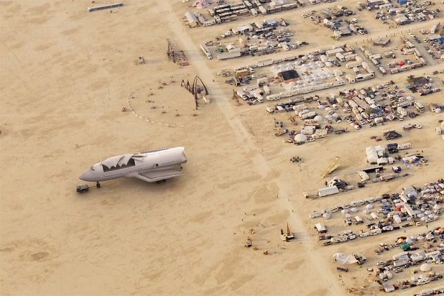
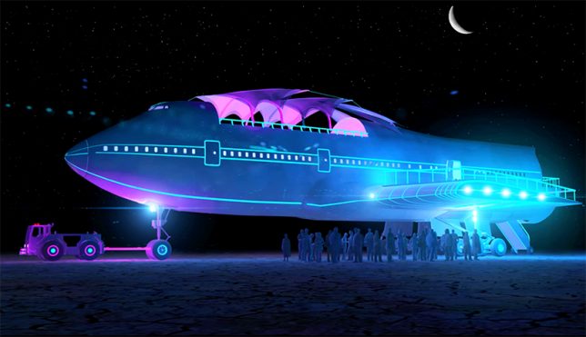
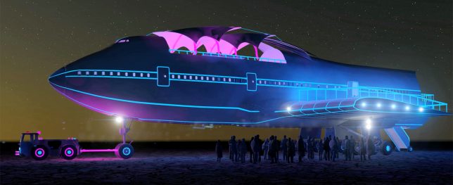
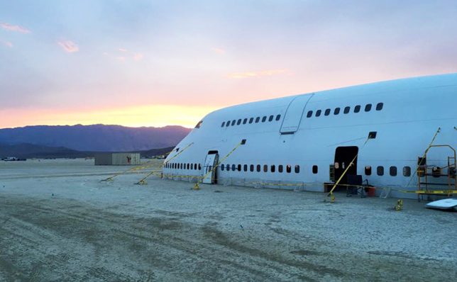
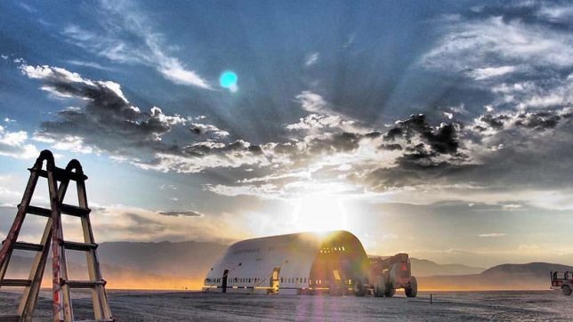
A temporary metropolis for tens of thousands built annually in Nevada’s remote Black Rock Desert, the Burning Man festival is famous for its extreme architecture and creative art cars, the latter now including a transformed Boeing 747.

black rock 747

747 arts venue

747 in city

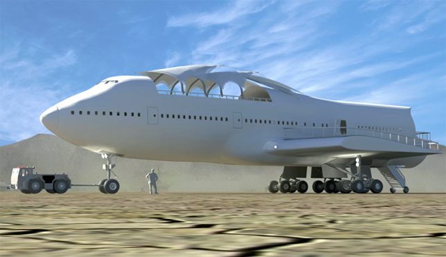
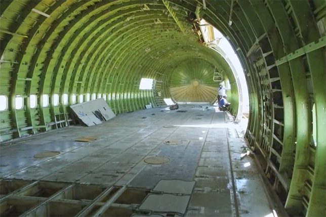
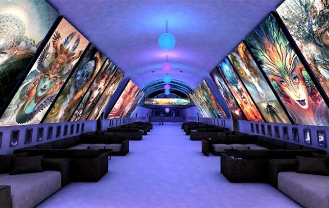
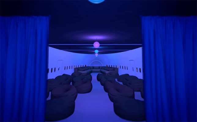
Fitting this year’s theme of Da Vinci’s Workshop (art and technological innovation), the huge gutted hull has been in the works for seven years thanks to Big Imagination Foundation and their supporters.

747 shell

converted 747

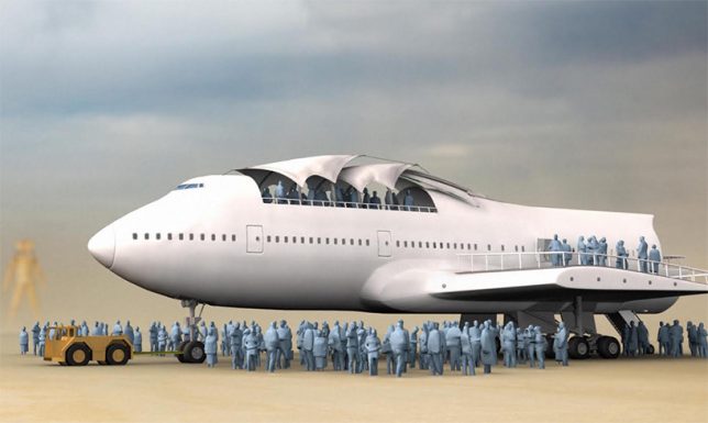
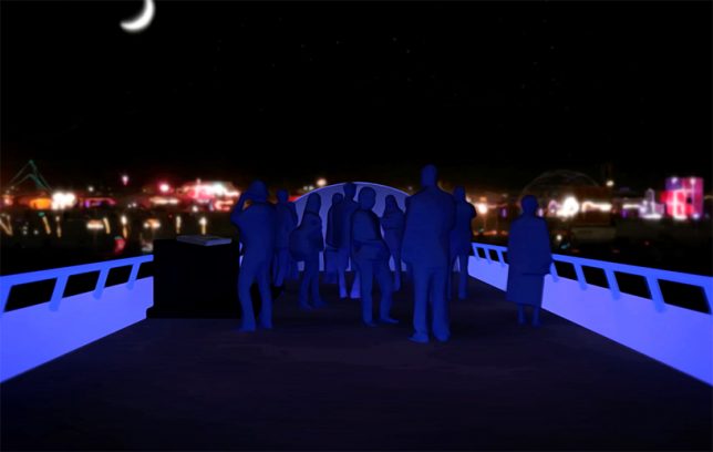
The carved-out jumbo jet invites people to hop on board for speakers, parties and other events. It is being towed around the dusty playa by a surprisingly small service vehicle, a bit like one might see on the tarmac at an airport.

747 work

747 gutted

747 interior

A team of over 100 artists, engineers and other creatives helped strip and reconstruct the original plane, reinforcing its removed structure with custom interior supports and adding a series of staircases.

747 art car huge

747 screens

747 lounge

747 roof

747 in person

Anyone who has attended the festival will know that one of the most fascinating experiences is the serendipity of boarding a big art vehicle and seeing where it leads, either spatially or experientially (or both). This may be the best such adventure yet, featuring interactive art, music and other live performances and inspirational talks.

Share on Facebook


[ By WebUrbanist in Art & Installation & Sound. ]

[ WebUrbanist | Archives | Galleries | Privacy | TOS ]


WebUrbanist

 
Comments Off on Black Rock City’s Biggest Art Car: Converted 747 Lands at Burning Man

Posted in Creativity


Dodging, burning… microwaving? A look inside Ansel Adams’ darkroom

09 Jul

In a recent interview with Marc Silber of Advancing Your Photography, Ansel Adams’ son Michael gives a tour of his father’s darkroom.

The basics are all there, but by and large, they were designed by Adams for the space he was in. Sure, the dodge-and-burn stick is literally a stick with some cardboard taped to it, but the enlarger and wall mount are both on a custom-built track, and can be moved independently toward or away from each other depending on Adams’ needs. The light source in the enlarger is actually 30 individual light sources, each with its own switch for the utmost control over a negative’s illumination.

My favorite part? When Michael details how his father tested exposures with a new image. It’s pretty standard up until the end, when he says that Adams would routinely microwave the test print – it would dry faster that way, and the best way to ascertain the correct exposure is with a dry print. The more you know!

It’s a fascinating look back into the world of film and physical prints, and a reminder that creativity and control don’t necessarily require the fanciest equipment money can buy. 

Articles: Digital Photography Review (dpreview.com)

 
Comments Off on Dodging, burning… microwaving? A look inside Ansel Adams’ darkroom

Posted in Uncategorized


Your Hunk-a, Hunk-a Burning Questions Answered Here

26 May

Meet our stellar customer service team. They’re chock-full of information about all of our shop goodies (also great at telling jokes!)

We picked their brains about some of our most popular products in order to answer your most FAQs.

Don’t see your question? Shoot them an E-mail, they love chatting!

CS FAQ ASAP

(…)
Read the rest of Your Hunk-a, Hunk-a Burning Questions
Answered Here (988 words)


© Erin for Photojojo, 2015. |
Permalink |
No comment |
Add to
Answered Here”>del.icio.us

Post tags:


Photojojo

 
Comments Off on Your Hunk-a, Hunk-a Burning Questions Answered Here

Posted in Equipment


Dodging and Burning to Create More Effective Black and White Images

16 Oct

With the huge assortment of software and plugins you have at your disposal these days, the photo processing technique of burning and dodging is practically ancient. It was (and still is) one of the most common ways of enhancing film images in the darkroom, and everyone from Ansel Adams to Imogen Cunningham used it.

myra2

They used it because it is powerful and simple and still is to this day. With all the complicated plugins and post-processing procedures you have at your disposal, you won’t get any better bang for the buck than creative dodging and burning.

This tutorial with show you  how I do dodging and burning in Photoshop, for black and white images. I’ll save another article for you about using the technique for your color images. First, though, let’s make sure we all know what dodging and burning is.

WHAT IS DODGING AND BURNING?

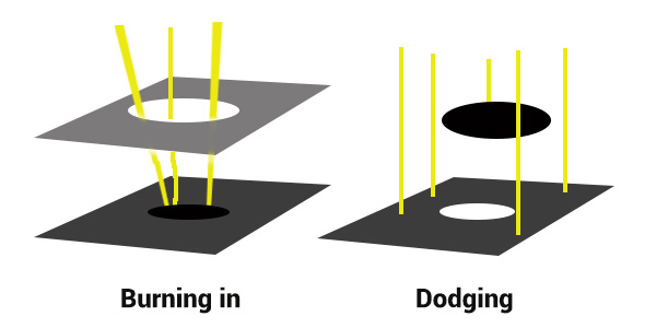
Originally, dodging and burning was used in the traditional darkroom, to retouch film to enhance highlights, and deepen shadows on photographic prints. Photographers used simple darkroom tools to either allow more light from the developer machine to reach certain parts of the light sensitive photographic paper. This was known as “burning in” which made these parts of the photo darker. The photographer could also dodge the light – hold it back from the paper – allowing that part of the photo to remain less developed or lighter than the non-dodged area.

Using this method, photographers or retouch artists could control with great accuracy the developing process to ensure that their prints displayed the full range of tonal values needed to make the photograph pop.

Darkroom Burning and Dodging digram

Darkroom burning and dodging: allowing more light to pass, or holding light back.

WHY YOU SHOULD DODGE AND BURN YOUR DIGITAL PHOTOS

So what has an ancient darkroom technique got to do with your photography? Plenty! Dodging and burning can add a whole new level of depth to your images. With Photoshop it’s simple.

Here are some compelling reasons to incorporate dodging and burning into your digital photography post-processing workflow:

  • To create more dimensionality, make things pop out at your viewers, and make others recede into the shadows.
  • To draw your viewer into your image. Our eyes are programmed to follow the light, and the lightest, brightest parts of your photo are where you want to direct viewers. Some creative dodging and burning will help get their eyes where you want them to go.
  • To isolate the subject.
  • To minimize distracting backgrounds.
  • To turn the lights on, in a photo – if you need some creative lighting after your shot, dodging and burning can help.
  • To make things more dramatic and moody – enhance the shadows to darken things down.
  • Add a vignette to keep the viewer’s eye in the image.
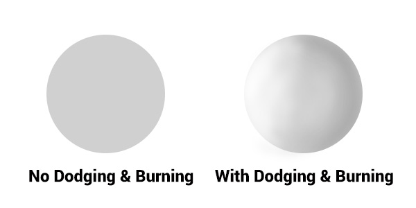
Dodging & Burning adds dimension.

Dodging and burning add dimension.

The three dimensionality of the circle on the right was created purely by dodging and burning a copy of the one on the left. As well, it is super easy with the technique you’re about to learn. As with most things in Photoshop there are many ways to accomplish the same goal, and each have their advantages and drawbacks. I prefer this way because it gives you a huge amount of control and flexibility. It’s drop dead simple, and non-destructive.

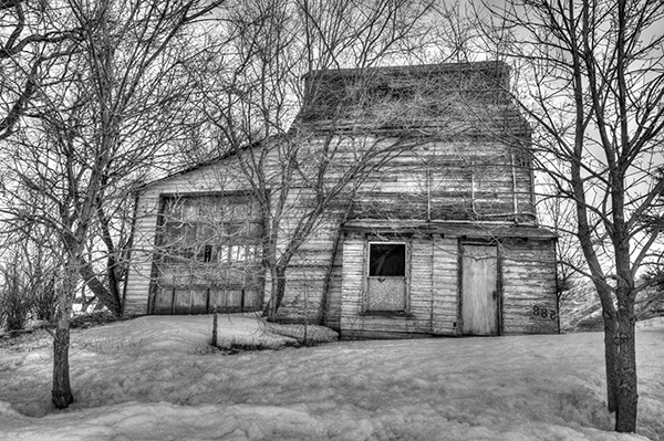
Let’s look at  before and after shots so you can see  the difference between nothing, and selective dodging and burning.

Before Dodging and Burning

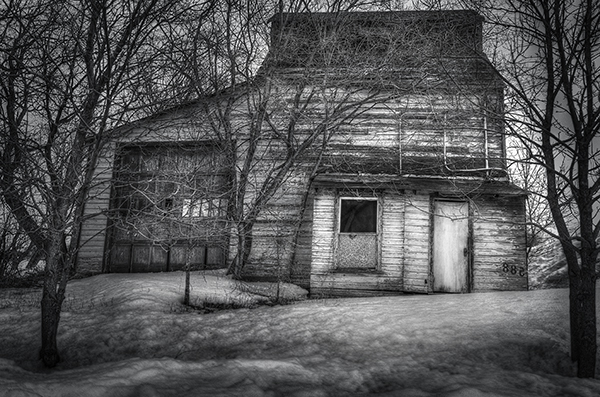
Before dodging and burning, the image is flat and has no center of interest.

Final Image, with Burning and Dodging applied - exaggerated for effect.

Final image, with dodging and burning applied – we are drawn by light to the door.

The second image has more drama, more of a moody feel. The snow has texture and dimension, and the small door and window are the clear center of interest. Nothing was changed in this photo other than adding tonality by dodging and burning. The look has been exaggerated so you can see the changes, normally dodging and burning is more subtle than this example. Although you can get quite dramatic results if that’s the mood you’re going for.

USE THE BEST TOOLS FOR THE JOB

toolsYou may have noticed in Photoshop’s Toolbar, a couple of tools called Dodge and Burn. Forget about them. I don’t use  these for my dodging and burning. I like to have more control when I work on my images. So instead of the pre-made tools I create my own using layers and the brush tool. It becomes artistic like creating a painting, and you have more freedom to be flexible.

Using layers give you the flexibility to change opacity, and to group your different layers into folders. You can then selectively turn on layers to see how your work is progressing.

HOW TO DO DODGING AND BURNING

Dodging – adding more light:

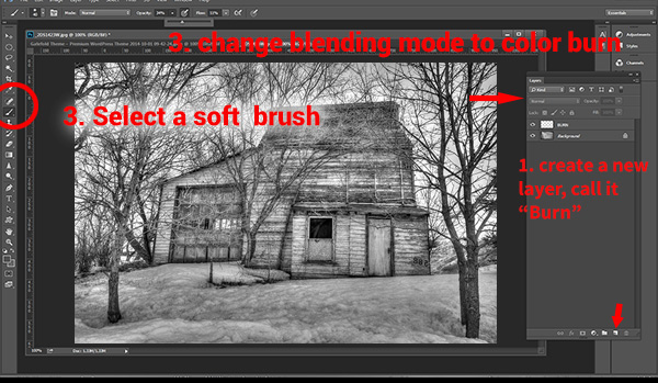
  • Create a new layer. Switch the blending mode to Color Dodge, and rename this layer Dodge. You may end up having many dodge layers, so name it something more descriptive, door dodge or tree dodge.
  • Select a pale gray color from the toolbox palette, initially this color will be light, for example #bcbcbc, or 188,188,188 on the RGB scale. This color determines the main intensity of the dodge, or how bright it will be.
  • Select a soft brush at a size suitable for the area you want to bring out or emphasize.
  • Initially set the Opacity and Flow of the brush to about 20% each.
  • Brush on the new layer and instantly see the light colors start to POP. If there’s too much, you can either reduce the opacity of the layer, or reduce the opacity and flow of the brush itself.

step1

Once you have an intensity you like, brush dodge segments of the image – the door for example. If you move to another part of the image use a new layer for that area or element. You do this because you may want to adjust the intensity by changing the opacity of the layer, or the brush, or even change the color to a lighter or darker shade of gray.

Finally create a Layer Group – click the little folder icon in your layers palette. Move all your Dodge layers into one Group. Name the group Dodge. This allows you to instantly turn off all the “lights” to see before and after. Did you go overboard too much, should you do more, or is it just right? Being able to turn all the dodging off with one click will help you decide.

Where and what to dodge:

You want the lightest parts of your image to lead the viewer’s eye to your subject. Can you create a pathway of sorts with a dodged or brighter leading line, a bright path that the eye can easily follow? Alternately you can also make leading lines darker by burning. Leading lines don’t always have to be bright.

Dodge (and burn) places with texture, to add that three dimensionality, to make the texture really stand out. Try dodging the subject a bit, just a subtle brushing with a gentle opacity to add some brighter tones relative to the rest of the image. Does it pop out a little more now?

You’ve finished dodging for now, next let’s go over to the dark side!

Burning – creating darkness:

Next you’ll do the exact same process for burning. I suggest starting with the exact same color and opacity settings too. Simply create a new layer and set the blending mode of Color Burn, and name the layer Burn.

Once again, if you need more drama, you can change the color of the brush, or change the opacity and flow of the brush or the layer. You can add more layers if needed, duplicate a layer to instantly double the amount of darkness.

This method is quick and intuitive, and if I feel that you’ve gone too far, you can turn off a few layers to hide their visibility in the image. I suggest you make a Layer group for the Burn layers as well.

You can even create another Layer group called D&B (for dodge and burn) and put the the other groups inside. Just ctrl+click to select them and drag them over top of the D&B layer. Now you’ll be able to see the total before and after view with one click. Off and on – good or not? More work needed or done?

SEEING THE BIG PICTURE

Once you’ve brushed in the areas that you want and think you have all the burning and dodging done, you can burn a vignette around the edges of your image to keep the viewer’s eye from leaving. It’s like framing your photo with a bit of darkness, so the eye stays on the brightness.

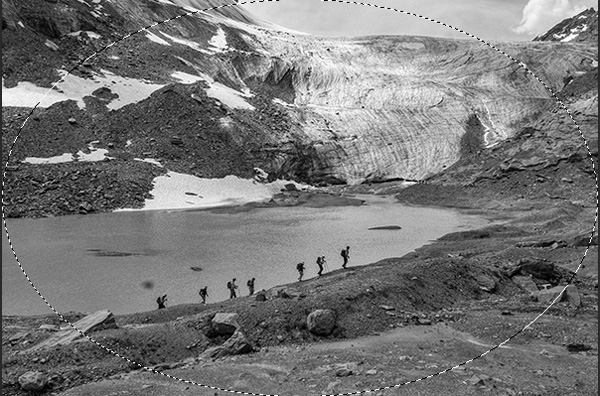
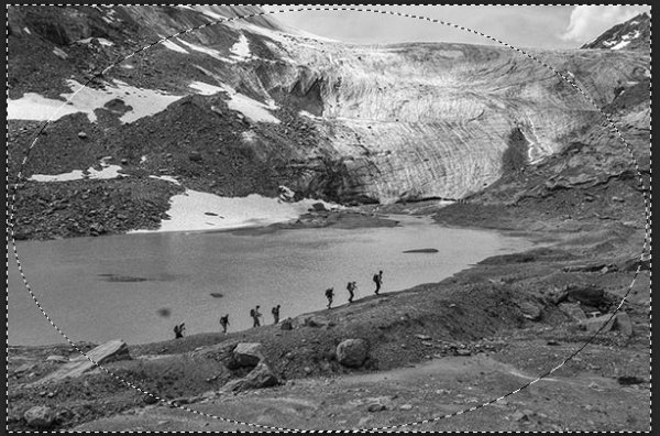
All  you need to do here is create (yes) another layer and use the elliptical marquee tool, with a feathering setting of at least 50 pixels. On the new layer drag out the circle so it touches the edge of your frame. To add darkening to just the edge of the image to create the vignette, go to the top menu in Photoshop and click on Select>Inverse. This will now let you fill the area OUTSIDE the selection.

In the Tools Box, select the same grey color you used for the initial burning of your image as your foreground color, then hit Alt>Backspace on your keyboard to fill that selection with color.  Set the layer blending mode to Color Burn. You may have to decrease the opacity of this layer a bit depending on the tones in your image.  This vignette should be pretty subtle, it’s not meant to be a frame, just a very slight darkening to keep your centre of interest a few tones brighter, to keep the viewers’ eye in your frame.

marquee

Initial selection

Selection inverted

Selection inverted

Vignette added

Vignette added

_2DS2932VV

FInal image

I’ve made a short screen capture video showing my technique for dodging and burning you can watch below if you prefer to follow along:

Once you give this method a try, you’ll see how easy it it and how you can achieve dramatic effects with a few quick steps. You have full control of the look and style of your image, and you can revert your steps at anytime to adjust if needed.

If you have alternate methods for dodging and burning let me know why you like them, and also what challenges they create for you. If you’d have any dodged and burned images you’d like to share, please do post them here. Inspire us!

The post Dodging and Burning to Create More Effective Black and White Images by Alex Morrison appeared first on Digital Photography School.


Digital Photography School

 
Comments Off on Dodging and Burning to Create More Effective Black and White Images

Posted in Photography


Burning Man: Willkommen zuhause

09 Oct

Ein Beitrag von: Victor Habchy

Diesen Sommer brannte ich. Ich war einer der glücklichen Menschen, die ein Ticket für das Burning Man bekommen konnten, ein Festival in der Mitte der Wüste von Nevada in den USA. Ich habe zuvor viel darüber gelesen und versucht herauszufinden, wie es sein könnte. Wie ich mich darauf vorbereiten kann, eine Woche ohne Strom zu verbringen, in einem kleinen Zelt bei 40 °C zu schlafen, mit einer stark reduzierten Menge an Wasser und Nahrung auszukommen.

Aber sobald ich ankam, verstand ich, dass man sich darauf nicht wirklich vorbereiten kann, weil man es einfach nicht kennt. Wie kann man auf Krieg vorbereitet sein, wenn man nie erfahren hat, wie man kämpft? Jedoch war, trotz dieses Vergleichs, mein einziger Kampf der, loszulassen, mein Selbstbewusstsein zu vergessen. Von da an war es plötzlich allumfassend.

Denn noch nie in meinem Leben habe ich mehr Liebe, mehr Freiheit und mehr Selbstverwirklichung erfahren. Denn es ist der einzige Platz auf der Welt, an dem Du sein kannst wie Du möchtest, solange Du damit nicht die Freiheit eines anderen beeinträchtigst. Hier merkt man, dass man sich von vielen Regeln der Gesellschaft losmachen kann, ja, sie nicht einmal braucht.

Wisst Ihr, was die erste Nachricht ist, die Ihr hört, wenn Ihr das erste Mal das Burning Man besucht? – „Willkommen zuhause.“

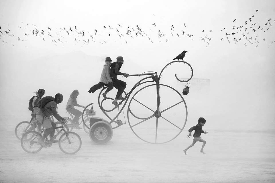
Ein seltsamen Gefährt gefolgt von drei Fahrrädern und einem kleinen Jungen in der Wüste.

Ein Boot auf Stelzen in der Wüste. Zwei Fahrräder davor.

Ein Mann in Kostüm mit ausgebreiteten Armen.

Ein Schiff in der Wüste mit Fahrrad.

Artisten turnen an Stangen.

Artisten zu einem Turm aufgebaut.

Zwei nackte Menschen vor einer Wüstenkulisse.

Zwei Menschen küssen sich im Wüstensand sitzend.

Installation mit zwei Personen, die mit einem Herzluftballon spielen.

Zwei Personen umarmen sich, neben ihnen ein Fahhrad, dahinter ein Auto.

Ein Zug in der Wüste.

Ein Schiff in der Wüste.

Ein Wegweiser. Links davon ein Mann mit Fahrrad, rechts ein nackter Mann mit zwei blauen Regenschirmen.

Große Buchstaben, die das Wort LOVE bilden.

Auf den Kopf gedrehtes Bild von zwei Turnern.

Zwei Menschen umarmen sich, darüber turnen Artisten.

Eine Frau mit Tuch im Wind auf einem seltsamen Holzgerüst.

Oktopusauto, welches Feuer aus den Armen sprüht.

Ein VW in der Wüste.

Eine Reihe Menschen tragen Laternen auf einem Holzgerüst.

Frau auf einem Fahrrad?

Menschen turnen an einem Gerüst. Davor ein Fotograf.

Und dann wiederum: Es war hunderttausend Kilometer von meiner Heimatstadt entfernt und trotzdem fühlte ich sicher aus den Tiefen meines Herzes, dass dieser Platz Heimat für mich ist.

Dieser Artikel wurde von Katja Kemnitz für Euch aus dem Englischen ins Deutsche übersetzt.


kwerfeldein – Fotografie Magazin | Fotocommunity

 
Comments Off on Burning Man: Willkommen zuhause

Posted in Equipment


Floating on Ephemerisle: Seasteading Event ala Burning Man

17 Jun

[ By WebUrbanist in Global & Travel & Places. ]

floating city event ephemerisle

For all its art and controversy, the desert is perhaps the most unique defining characteristic of Black Rock City, home of the Burning Man Festival in rural Nevada. Potentially even more challenging than harsh heat and dust storms: Emphermisle, a temporary autonomous zone on the water, coming to California again this year in the middle of July.

floating burning man event

From its creators: “We construct a floating city on the Sacramento River Delta and live on it for five days. Ephemerisle has elements of Burning Man in the early 1990s: a new adventure into an alien environment, with discoveries, adventures, and mishaps along the way.” Unlike the current form of Black Rock City, though: “There are no tickets, no central organizers, and no rangers to keep you safe.”

Its creation, though, is about more than just at temporary experience: “Seasteading seeks to move human communities out into the vast expanse of our planet covered in water. Ephemerisle gives an introduction into the physical challenges of being water and learning ways to deal with them. It also provides for small scale experimentation in differing forms of governance.”

floating seasteading project experience

Atossa Abrahamian describes the experience of arriving this year at the event, with its patchwork neighborhoods,  impromptu parties and unpredictable ad hoc public transit system: “It looked, at first, like a shapeless pile of floating junk, but as the boat drew closer, a sense of order emerged. The island was made up of two rows of houseboats, anchored about a hundred feet apart, with a smaller cluster of boats and yachts set off to the west. The boats had been bound together with planks, barrels, cleats, and ropes, assembled ad-hoc by someone with at least a rudimentary understanding of knots and anchors. Residents decorated their decks with banners and flags and tied kayaks and inflatable toys off the sides”

Share on Facebook


[ By WebUrbanist in Global & Travel & Places. ]

[ WebUrbanist | Archives | Galleries | Privacy | TOS ]


WebUrbanist

 
Comments Off on Floating on Ephemerisle: Seasteading Event ala Burning Man

Posted in Creativity


Beyond Domes: 36 Photos of Burning Man Building Types

11 Dec

[ By WebUrbanist in Architecture & Cities & Urbanism. ]

It would be a mistake to characterize Burning Man as merely a festival in the desert. For one week a year, an entire built environment (dubbed Black Rock City) for tens of thousands of residents emerges out of the flat cracked-sand landscape, only to disappear again at the end.

Photographer and author Philippe Glade has catalogued this temporary architecture in rural Nevada extensively on his blog and in a book covering fifteen years of structural ingenuity in one of the most challenging environments on the planet.

By now you have no doubt seen images of outrageous costumes and crazy art cars, but again: there is more to Black Rock City than those sensational elements – there are equally eye-catching and physically-compelling structures made to house and entertain small groups and massive camps.

Consider this deceptively-simple tension structure, for instance, which provides shade but also allows for breezes to pass through, and culminates in a viewing tower at the top – all lightweight, easy to transport and assemble, but robust enough to withstand high-speed desert winds.


Want More? Click for Great Related Content on WebUrbanist:

Burning Man 2007: Can the World’s Largest Temporary City Go Green?

Burning Man is an amazing annual event that takes places for one week a year in the remote Black Rock Desert.
18 Comments – Click Here to Read More »»


Burning Man 2007 Year in Images: Tragedy, Controversy and Sustainability

The dust has finally settled in the Black Rock Desert, both literally and otherwise.
10 Comments – Click Here to Read More »»


Share on Facebook


[ By WebUrbanist in Architecture & Cities & Urbanism. ]

[ WebUrbanist | Archives | Galleries | Privacy | TOS ]


WebUrbanist

 
Comments Off on Beyond Domes: 36 Photos of Burning Man Building Types

Posted in Creativity


WARNING: How To Do Burning Man Video

03 Nov

Check out the full article here: www.adventuresauce.com Benjamin Jenks makes a Burning Man Video with tips and advice for new “burners” to get the most from their experience. Music: Que Beats, “Stutter Step” www.soundclick.com Shot: GoPro Hero & Nikon d5100 Edited: Final Cut Pro X
Video Rating: 4 / 5

 
Comments Off on WARNING: How To Do Burning Man Video

Posted in Nikon Videos