The post Weekly Photography Challenge – Historic Buildings appeared first on Digital Photography School. It was authored by Caz Nowaczyk.
This week’s weekly photography challenge – HISTORIC BUILDINGS!

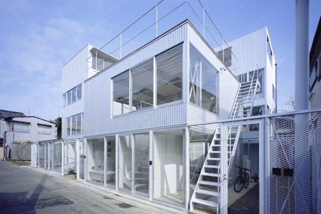
Mayday Hills Lunatic Asylum, Beechworth, Victoria by © Caz Nowaczyk
Go out and take some photos of historic buildings. Do exterior shots, interior shots, and close-ups of details. Get down low and shoot high for extreme angles.

So, if you are lucky enough to be somewhere you can photograph some historic buildings, capture them in any way you like. Alternatively, go through your catalog and find your best historic building photos!
Play with post-processing too – try split-toning, black and white or sepia.
Slot photos together, like I do to see how images work together as a series too.
Take them with your camera or smartphone.
The choice is yours! I look forward to seeing what you share 

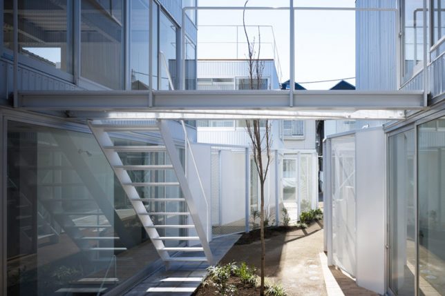
Mayday Hills Lunatic Asylum, Beechworth, Victoria by © Caz Nowaczyk

Mt Buffalo Chalet in Mount Buffalo National Park, Victoria by © Caz Nowaczyk
Check out some of the articles below that give you tips on this week’s challenge.
Tips for photographing HISTORIC BUILDINGS
Simply upload your shot into the comment field (look for the little camera icon in the Disqus comments section) and they’ll get embedded for us all to see. Or, if you’d prefer, upload them to your favorite photo-sharing site and leave the link to them. Show me your best images in this week’s challenge.
Share in the dPS Facebook Group
You can also share your images in the dPS Facebook group as the challenge is posted there each week as well.
If you tag your photos on Flickr, Instagram, Twitter or other sites – tag them as #DPShistoricBuildings to help others find them. Linking back to this page might also help others know what you’re doing so that they can share in the fun.
The post Weekly Photography Challenge – Historic Buildings appeared first on Digital Photography School. It was authored by Caz Nowaczyk.


You must be logged in to post a comment.