RSS
 

Posts Tagged ‘Brilliant’

How to Make Brilliant Black and White Photos with Dramatic Composition

27 Feb

It’s hard to beat the power and drama of good black and white photography. There’s a reason that monochrome has survived and prospered as an artistic medium despite the arrival of color photos. But how do you harness the power of black and white for yourself? The key is in your composition.

The problem with composition is that it’s such a vast topic it’s easy to lose track of the various principles and the ways you can put them into the practice. So let’s keep it simple – I’m going to give you three things you can concentrate on. Put these into practice and you’ll see a dramatic improvement in the composition of your black and white photos!

#1 – Simplicity

Simplified composition helps give your black and white photos more power by focusing attention on the main subject.

How to Make Brilliant Black and White Photos with Dramatic Composition

The above landscape photo is a great example. The composition is about as simple as you can get. It works because I used a neutral density filter and a long shutter speed of 90 seconds to blur the water and clouds. The result is a black and white landscape photo with a minimalist style composition.

This principle also applies to portraiture. Keep the composition simple to focus attention on your model. An easy way to do this is to use a short telephoto lens with an aperture of around f/2.8. Get in close and make sure there are no distractions in the background to pull attention away from the person you’re photographing.

How to Make Brilliant Black and White Photos with Dramatic Composition

#2 – Texture

One of the interesting things about black and white is that it brings out the interesting textures in your subject. You can use this characteristic to make your black and white photos more interesting.

This photo of some old wooden boxes is a good example.

How to Make Brilliant Black and White Photos with Dramatic Composition

There are two interesting things about the composition of this image. First is the pattern created by the repeating shapes of the boxes. Second is the texture of the wood.

The absence of color in black and white helps emphasize texture. You can take it further in post-processing by applying Clarity or other tools designed to bring out texture (such as the Structure sliders in Silver Efex Pro 2).

Texture and contrast

You can take this idea further by using the contrast between smooth and rough surfaces. Some objects are more tactile than others and have lots of texture. Others have very little.

You’ll see this technique used a lot in long exposure photography, where you can take advantage of the juxtaposition between a subject with lots of texture, such as a concrete jetty, and one that has very little, like water blurred by using a neutral density filter and a long exposure. The earlier photo of two rocks is a good example.

Here’s another. I used a shutter speed of 3-minutes to blur the clouds and the water. As a result, there’s a strong contrast between the concrete in the foreground, the jetty in the distance, and the surrounding water and clouds.

How to Make Brilliant Black and White Photos with Dramatic Composition

#3 – Tonal Contrast

Tonal contrast is where you have light tones and dark tones next to each other. Now we’re getting to the heart of black and white photography! This technique is not nearly as effective in color because of the way that colors that are similar in tone, such as red and green, still create a powerful contrast. Tonal contrast is the main factor that separates black and white photography from color.

The easiest way to explain how tonal contrast works is with some examples.

In the first (below) there’s a strong tonal contrast between the white and black stones. Your eyes go to the white stones because they are in the center of the frame and because they provide a strong contrast against the black stones underneath them.

How to Make Brilliant Black and White Photos with Dramatic Composition

Another subject where tonal contrast is used to good effect is portraiture. In the portrait below the model’s light-toned skin contrasts with the dark background. The key to making this technique work is to make sure the background is in shade and that it contains no distracting highlights.

How to Make Brilliant Black and White Photos with Dramatic Composition

So far both examples have shown a light toned subject against a dark background. But you can turn it around by placing a dark subject against a white background.

That’s the technique I used in the following portrait. I photographed the man during carnival in Spain. He was dressed for the occasion and had even painted his face. I placed him against a bright, sunlit building to take advantage of the tonal contrast between his dark skin and the white wall.

How to Make Brilliant Black and White Photos with Dramatic Composition

Conclusion

There are many factors that make up a good black and white photo, but the composition is one of the most important. If you want to make a strong black and white photo, then focusing on these three key factors – simplicity, texture, and tonal contrast – is a great place to start.


Mastering Composition Book Two

Want to learn more about composition? Then check out my wildly popular ebook Mastering Composition Book Two. It contains 20 lessons that will help you get better at composition, no matter what your skill level!

The post How to Make Brilliant Black and White Photos with Dramatic Composition by Andrew S. Gibson appeared first on Digital Photography School.

Digital Photography School

 
Comments Off on How to Make Brilliant Black and White Photos with Dramatic Composition

Posted in Photography


The ‘Chairpod’ is a chair-tripod hybrid that’s either ridiculous or brilliant

22 Jan
Photos via DC Watch

Sometimes an idea is so crazy, it might just be brilliant—what might be described as “wonderfully weird.” The upcoming Chairpod by Japanese tripod manufacturer Velbon might be one of those inventions… or it might just be weird. We haven’t decided yet, so we’ll leave that judgement up to you.

Originally reported on by Japanese site DC Watch (translated version here), the Chairpod HY 127 is a hybrid between a tripod and a three-legged folding chair that was originally exhibited at CP+ 2017 (how did we miss that!?). One of the legs, in this case, has a standard tripod camera mount on the top that can be extended out to bring the camera level with your face. At max length, it’s reportedly 117 centimeters tall, or about 3.8 feet, without the optional extension rod. And if you won’t want to use it sitting down, it turns into an odd sort of monopod.

According to DC Watch, the Chairpod will be released through major retail chains in Japan “in late January”, and the publication expects it to cost about 19,850 Yen (~$ 179 USD). No word yet on whether or not this quirky masterpiece will make it to the US or European markets.

Articles: Digital Photography Review (dpreview.com)

 
Comments Off on The ‘Chairpod’ is a chair-tripod hybrid that’s either ridiculous or brilliant

Posted in Uncategorized


Forest of Resonating Lamps: Brilliant Interactive Illuminated Installation

06 Sep

[ By SA Rogers in Art & Installation & Sound. ]

teamlab maison 4

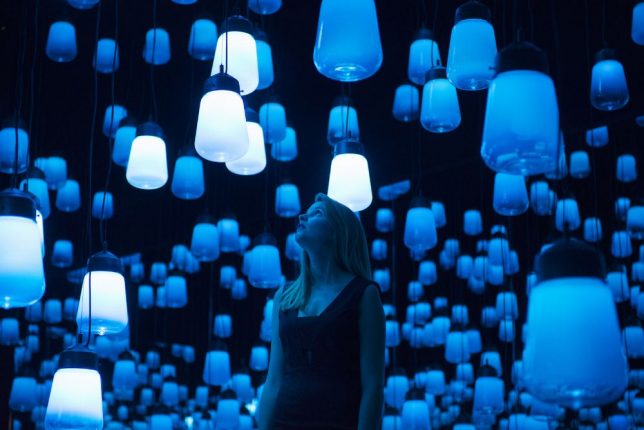
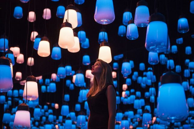
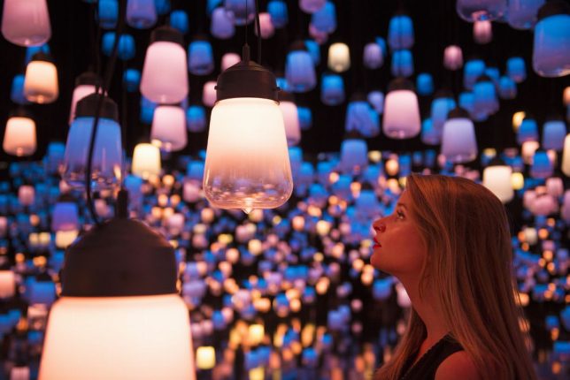
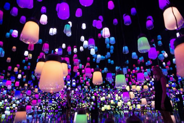
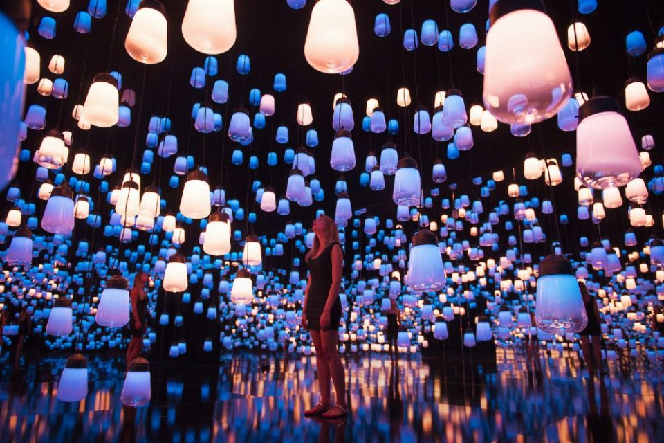
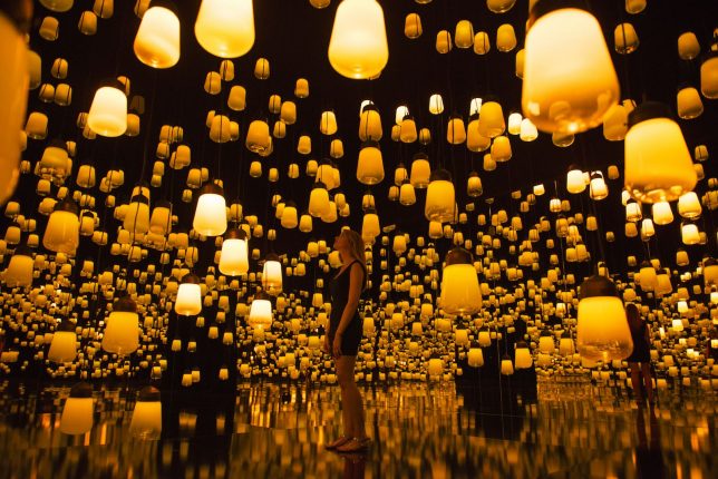
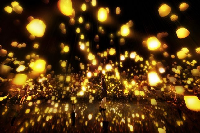
Dangling from a darkened ceiling like strange bioluminescent blooms, hundreds of high-tech lamps respond to the movements of people in the room, glowing in a particular color that resonates outward, spreading to more and more lamps. This chain reaction shifts as observers navigate the space, contrasting with the patterns created by others. ‘Forest of Resonating Lamps’ is an immersive installation by Japanese collective Teamlab, created for Maison et Objet 2016.

teamlab maison

teamlab maison 12

Occupying the junction of art and technology, the installation is not just about a single decorative object, beautiful as it may be. The lamps themselves are made of Murano glass and equipped with LED bulbs, hung from the gallery ceiling in a space with mirrored walls that multiply them so they seem to go on forever, a la Yayoi Kusama’s Infinity Room installations.

teamlab maison 2

teamlab maison 3

teamlab maison 5

As an observer approaches a lamp, it shines brightly, emitting a color tone that is transmitted to lamps nearby. If you’re the only person in the room, the light is entirely centered upon you, but as soon as someone else enters, you become aware of the ripple effect created by their own movements. While the lamps seem to be scattered randomly throughout the space, they’re actually placed to form a continuous line from select lamps that act as starting points.

teamlab maison 6

“The planar arrangement of the lamps is staggered in zigzag to fill a space, staying in a perfectly ordered grid,” says Teamlab. “This is the first constraint. The second constraint is the height and width of the room and the pathway that people walk through, thus creating a ‘boundary condition.’ The third constraint is that all the lamps, when connected to its two closest lamps three-dimensionally, form a unicursal pattern with the same start and end points.”

teamlab maison 7

teamlab maison 8

“The arrangement of the lamps thus created is beautiful not only in an immobilized, static kind of way, but more so in a dynamic way caused by people approaching these lamps. It demonstrates the space of new era: the space freely designed through digital technology, and adapting the change and movement made by people’s existence in it.”

Share on Facebook


[ By SA Rogers in Art & Installation & Sound. ]

[ WebUrbanist | Archives | Galleries | Privacy | TOS ]


WebUrbanist

 
Comments Off on Forest of Resonating Lamps: Brilliant Interactive Illuminated Installation

Posted in Creativity


Amazing Apartment Makeovers: 15 Brilliant & Beautiful Remodels

07 Mar

[ By Steph in Architecture & Houses & Residential. ]

apartment remodel fashion 2
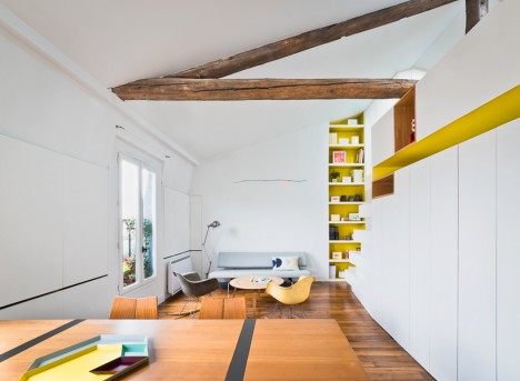
Sometimes it’s hard to see the potential hidden behind a mess of drop ceilings, darkening partition walls and hideously dated kitchens, but the bones of a residential space can be more beautiful than you would have imagined. These 15 bright, spacious, modern apartment renovations open up cramped interiors, make use of vertical space and reveal long-forgotten historic features that add lots of character.

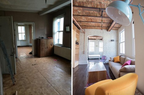
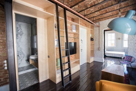
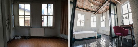
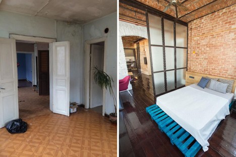
Amazing Transformation in Istanbul
apartment remodel istanbul 1

apartment remodel instanbul 2

apartment remodel istanbul 3

apartment remodel istanbul 4

apartment remodel istanbul 6

apartment remodel istanbul 7

apartment remodel istanbul 8

apartment remodel istanbul 9

apartment remodel istanbul 10

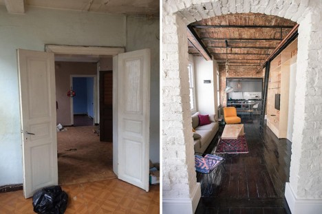
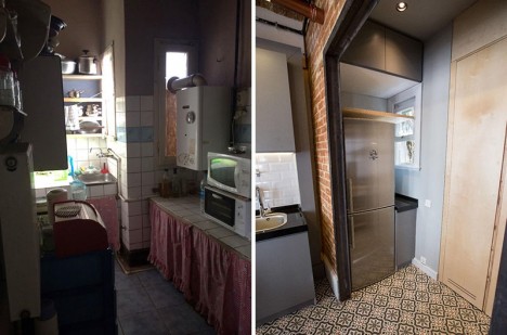
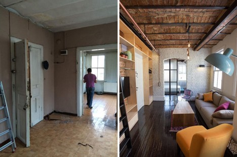
Looking at the dim, depressing, highly ordinary ‘before’ photos of this apartment in Istanbul, would you ever have guessed at the potential it contained behind all of that plaster? SEA Architects saw the beautiful historical bones in brick and timber, tearing out most of the walls and ceilings to reveal what has been hidden for decades. The results are fresh, creative and highly unexpected.

Formerly Frightening Basement in Barcelona

apartment remodel barcelona basement 1

apartment remodel barcelona basement 2

apartment remodel barcelona basement 4

apartment remodel barcelona basement 5

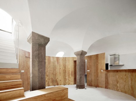
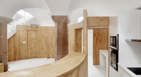
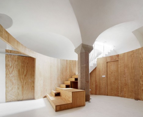
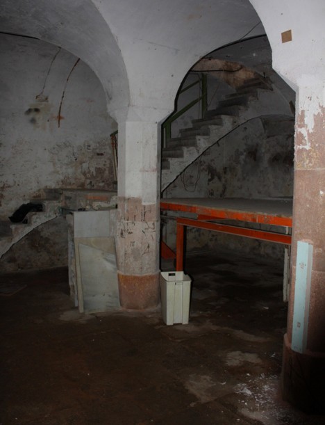
Dark and dirty with stained walls and floors, this basement in Barcelona was legitimately scary before RAS architecture got their hands on it. ‘Apartment Tibbaut’ has a single entrance from above, one of three sources of natural light to the space, but octagonal stone pillars and a domed ceiling made it seem promising. These original elements were restored while new partition walls of laminated pine help define the new private areas.

Maximizing a Tiny Parisian Apartment
apartment remodel tiny paris 1

apartment remodel tiny paris 3

apartment remodel tiny paris 4

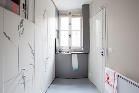
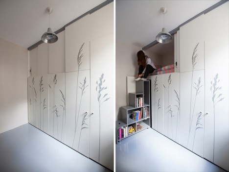
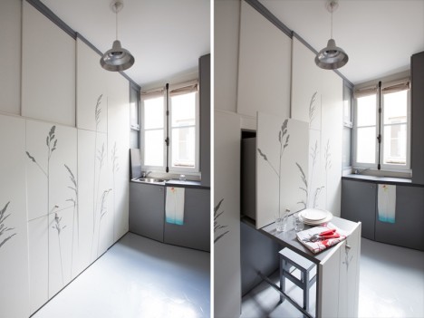
How can you live in an ‘apartment’ that’s the size of a closet? Make the best possible use of every inch of space, like Kitoko Studio has done here with a maid room in Paris. A built-in inspired by swiss army knives takes up an entire wall, with the various components pulling out or folding down to reveal a bed, storage, a table, a wardrobe, a staircase, a kitchenette and more.

Multifunctional Addition to Fashion Designer’s Apartment
apartment remodel fashion 1

apartment remodel fashion 2

apartment remodel fashion 3

apartment remodel fashion 4

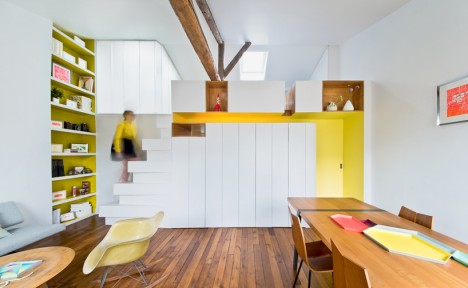
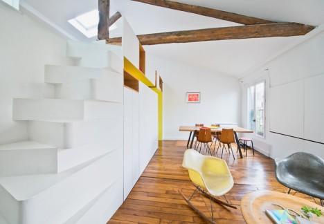
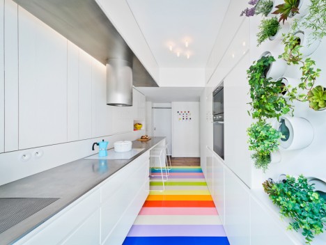
A young fashion designer gets a bold and fun new apartment in a historic space within Paris’ Montmartre district courtesy of SABO project. A white built-in storage partition with alternating tread stairs leads to a sleeping loft and separates the living room and kitchen. The latter features a small green wall and vibrant flooring comprised of 25 natural rubber strips in 14 colors.

Two-Level Play Frame in a Moscow Apartment
apartment remodel moscow 1

apartment remodel moscow 2

apartment remodel moscow 3

apartment remodel moscow 4

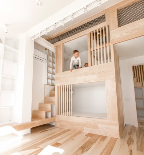
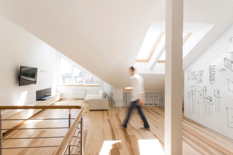
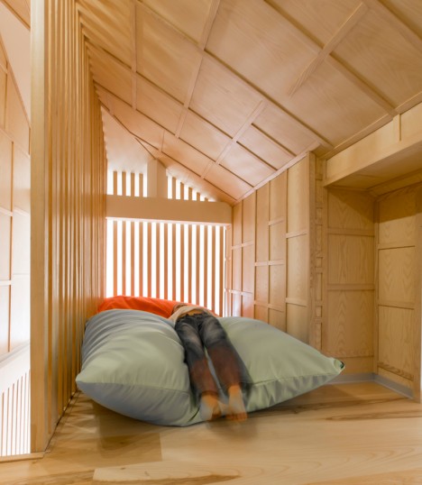
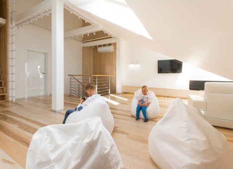
The formerly uninhabitable attic of a Moscow apartment has become a fun two-story play space for the client’s children. Ruetemple added the timber structure with a nook for the kids, connecting the lower level to a playroom.

Next Page – Click Below to Read More:
Amazing Apartment Makeovers 15 Brilliant Beautiful Remodels

Share on Facebook


[ By Steph in Architecture & Houses & Residential. ]

[ WebUrbanist | Archives | Galleries | Privacy | TOS ]


WebUrbanist

 
Comments Off on Amazing Apartment Makeovers: 15 Brilliant & Beautiful Remodels

Posted in Creativity


World’s Brightest Flashlight: Brilliant 1000-Watt DIY Lantern

16 Dec

[ By WebUrbanist in Gadgets & Geekery & Technology. ]

highyieldledlight

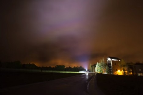
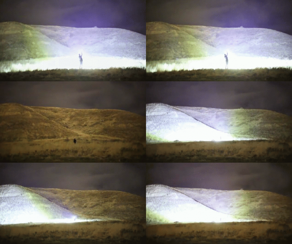
Lighting up the night sky like artificial lightning, this incredible homemade lamp boasts a 90,000-lumen output (over 100 times that of a typical Maglite) that would put the flashiest high-beams on dark roads to shame, making nighttime scenes look uncannily daylit.

Constructed by RCTestFlight and published on YouTube, the project consists of ten 100-watt LEDs mounted on a heatsink and powered by twin 8 amp-hour, lithium-polymer batteries (about the equivalent energy of 10 mobile phones).

night bright light

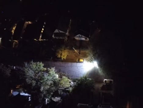
In the embedded video, you can see comparisons between car lights, streetlights, other handheld lamps and this flashlight, as well as demonstrations of lighting up clouds and mountains at a distance. Even the short-exposure shots reveal an incredible degree of brightness.

night handheld led flashlight

The rig uses ten 100-watt LED chips in a row, each connected to a large heatsink with bolts and thermal grease to help the heat transfer, each component tied to its own driver. Each LED has its own lens focusing light projection at around 60 degrees.

night flashlight worlds brightest

Made to burn fast and bright, the projection lifespan is accordingly limited: it can only run for about ten minutes and gets hot even faster than that. Cooling fans would be useful if longer blasts were needed, but for short bursts the system holds up just fine.

blindinglight

It shines bright in part due to LEDs trumping halogens, but also the various engineering details that help optimize for power and heat. The device can turn well-lit rooms into sun-bright spaces and even outdoors, at closer than 100 feet, it is basically blinding.

Share on Facebook


[ By WebUrbanist in Gadgets & Geekery & Technology. ]

[ WebUrbanist | Archives | Galleries | Privacy | TOS ]


WebUrbanist

 
Comments Off on World’s Brightest Flashlight: Brilliant 1000-Watt DIY Lantern

Posted in Creativity


How to Compose Brilliant Black and White Photos

30 Aug

Composition in black and white photography

Brilliant black and white photos are created in two steps. The second of these is post-processing, and is very important. But before you get to that stage, you have to learn how to see and compose photos in black and white. This is just as important as processing – it doesn’t matter how creative or clever you are in Lightroom or Photoshop, if the image is badly composed, or the subject just isn’t suitable for black and white, then you are going to struggle to make a half-way decent monochrome conversion, let alone a great one.

I thought it would be interesting for you to look at some of my favourite black and white photos and learn why they work in terms of composition.

Wooden boats – Puerto Aysen, Chile

Composition in black and white photography

Puerto Aysen is a small port town in south-west Chile. The weather is often cold and miserable, even in summer. It rains a lot. I was wandering around the outskirts of the town when I came across these old wooden boats. Initially I was attracted to the atmosphere of the scene – there was a soft rain, and in the original uncropped photo you can see the hills on the horizon fading through the drizzle. The scene worked in colour (see below), but in the post-processing stage I also realized that it would come out beautifully in monochrome.

Composition in black and white photography

The reasons the image works well in black and white are:

  • Tonal contrast: The boats are painted light tones and the background is mainly comprised of dark tones. The eye is naturally pulled to the largest boat in the scene which becomes the focal point of the photo.
  • Texture: The weathered surfaces of the boats and the grass are beautiful textures which tend to be more effective in black and white than colour. This image wouldn’t have worked nearly as well if the boats were brand new.
  • Lines: The position of the boats in the scene creates two diagonal lines. The first moves from the bottom left through to the top right, and the second line, formed by the rowboat, creates a second diagonal line that meets the first. Diagonal lines pull the viewer’s eye through the photo and help add a sense of movement to the composition.
  • Panoramic crop: I decided the hills in the distance were a distraction and cropped the photo to concentrate attention on the boats. This took place in post-processing and strengthened the composition by focusing attention on the boats.

Chairman Mao watch – Shanghai, China

Composition in black and white photography

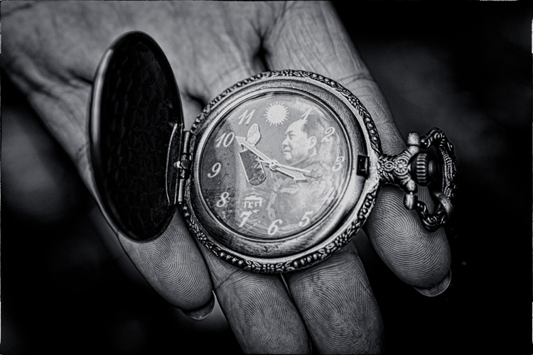
I went to Dongtai Road antiques market in Shanghai, an open-air street market comprised of stalls and shops where you can buy a variety of genuine and fake antiques, plus kitsch ornaments and souvenirs. I found the watch that this vendor was offering quite amusing. I didn’t want to buy the watch, but I asked if I could take a photo. The answer was yes.

Why the image works in black and white:

  • Strong use of shape: The watch face is a circle. It is placed in the centre of the composition and dominates it.
  • Lots of texture. The textures of the watch and the vendor’s hand are very strong.
  • Strong diagonal lines. The vendor’s fingers create lines that pull the viewer’s eye up from the bottom of the frame. I deliberately framed the photo so the fingers ran at an angle across the frame rather than parallel with the edges. This creates a more dynamic composition.
  • Simple composition. I moved in close to create a simple composition that emphasized shape, line and texture, the dominant elements of the photo. Another benefit of moving in close and using a wide aperture was that the background went out of focus, eliminating potential distractions.

John – Wellington, New Zealand

Composition in black and white photography

I got in contact with John via Model Mayhem and we arranged a portrait shoot. The setup was simple – I used an 85mm lens (with a full-frame camera) and a wide aperture of f/2.8 to blur the background. The portrait is lit by natural light – John stood underneath an archway so the light fell from his left (camera right).

Men can be great subjects for black and white portraits because there is no pressure to retouch skin. Black and white emphasizes texture – the texture of skin can be a beautiful thing that doesn’t (or perhaps shouldn’t) need retouching as often as some people think it does.

Why this photo works in black and white:

  • Strong eye contact. The strength of this portrait is in the eye contact. John is gazing directly at the camera which creates a powerful connection with the viewer. His face is level with the camera so I could use a wide aperture to defocus the background, while keeping both eyes in sharp focus.
  • Texture. The texture of John’s skin, especially in the sharpest areas around his eyes, renders beautifully in black and white. The background is out of focus and lacks texture, and this sets up a contrast between the sharp areas of the model’s face and the heavily blurred background.
  • Tonal contrast. The model’s face is a lighter tone than the background. Light tones pull the eye, and the tonal contrast here (combined with the strong eye contact) establishes the model’s face as the focal point of the composition. The side lighting effect, created by asking the model to stand in an archway, means that one side of his face is lighter than the other. This creates depth, by revealing the shape of this face.

Common themes

Analyzing these photos is a simple exercise but it brings up several elements that work well in most black and white photos – texture, line, shape, tonal contrast, and simple composition. When you find a subject where these elements come together, you know you have the potential for a great black and white photo.

What do you think is important for a brilliant black and white photo? Please let us know in the comments. I’m looking forward to hearing what you think.

Editor’s Note: We recently ran a series of articles this week featuring black and white photography tips. Look for more on this topic below.

  • 5 Simple Ways to Create Expressive Photos in Black and White
  • Tips for Black and White Wildlife Photography
  • 7 Tips for Black and White Portrait Photography
  • 28 Images with Strong Black and White Compositions
  • Weekly Photography Challenge – Black and White Techniques
  • Tips for Black and White Wildlife Photography
  • How to Convert Images to Black and White and Add a Color Tint in Photoshop
  • Shooting all Black and White for a Day to Improve Your Photographic Eye
  • Split Toning Black and White Images in Lightroom
  • Processing Black and White Photos with OnOne Perfect B&W
  • Color or Black and White for Street Photography?

Mastering Composition ebookMastering Composition

My new ebook Mastering Composition will help you learn to see and compose photos better. It takes you on a journey beyond the rule of thirds, exploring the principles of composition you need to understand in order to make beautiful images.

googletag.cmd.push(function() {
tablet_slots.push( googletag.defineSlot( “/1005424/_dPSv4_tab-all-article-bottom_(300×250)”, [300, 250], “pb-ad-78623” ).addService( googletag.pubads() ) ); } );

googletag.cmd.push(function() {
mobile_slots.push( googletag.defineSlot( “/1005424/_dPSv4_mob-all-article-bottom_(300×250)”, [300, 250], “pb-ad-78158” ).addService( googletag.pubads() ) ); } );

The post How to Compose Brilliant Black and White Photos by Andrew S. Gibson appeared first on Digital Photography School.

Digital Photography School

 
Comments Off on How to Compose Brilliant Black and White Photos

Posted in Photography


Brilliant Brick Creations: 13 Amazing LEGO Gadgets & Art

15 Dec

[ By Steph in Gadgets & Geekery & Technology. ]
superawesomemicroproject-designboom00

LEGOs can form the basis of all sorts of amazing things, but would you ever have imagined they could create working prosthetics, mechanical looms, drivable hot-rods and even full-sized houses? These 13 incredible creations test the limits of the little plastic bricks, proving that there’s no reason to put them aside as ‘toys’ when we reach adulthood.

Wheelchair for a Disabled Tortoise
strange LEGO tortoise wheelchair

Poor little ‘Blade’ wasn’t managing to get around very well on his own, so his human companion brought him in to local veterinarian Carsten Plischke. Realizing the turtle had a disability that made it hard for him to carry his own weight, Plischke fashioned an adorable little wheelchair out of parts from his son’s Lego collection.

LEGO x IKEA: Furniture Animals
strange LEGO IKEA 1

strange LEGO IKEA 2

strange LEGO IKEA 3

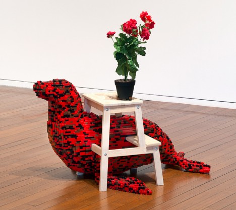
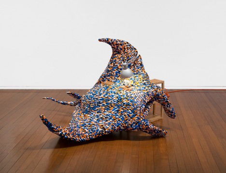
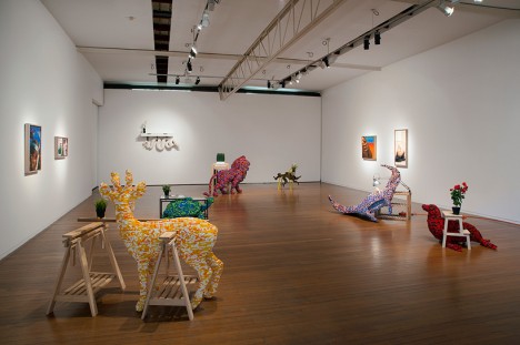
Here’s the LEGO and Ikea mashup you never knew you needed: building block animals interwoven with inexpensive Swedish furniture. ‘Venereal Architecture’ by Claire Healy and Sean Cordeiro includes a lion, deer, stingray, snake, tortoise, octopus and other creatures built around various Ikea items. “As humans we are ever adapting and manipulating our environment to cope with the elements and creatures that share our spaces. We build structures that enclose and protect us from nature. Air conditioning controls the temperature and we domesticate animals so they can live with us.”

“Our control over nature (or lack there of) is central to this body of work. Lego and Ikea furniture are very similar in a sense: they are both objects of aspiration that require assembly… both products represent destruction and re-construction, which are concerns we revisit continually within our practice.”

Working LEGO Gadgets
strange LEGO gadgets 1

working LEGO gadgets 2

Officially released by LEGO themselves after a collaboration with a company that specializes in children’s tech products, this fun range of gadgets includes working electronic items like walkie talkies, boom boxes, alarm clocks, cameras and even an MP3 player.

Digitally Synced LEGO Calendar
strange LEGO calendar

strange LEGO calendar 2

This wall-mounted calendar made entirely of LEGO bricks by UK design studio Vitamins lynches with Google Calendar or iCal to synchronize schedules when users take a picture of the calendar with a smart phone. Software scans the image, notes the location of the various colored squares, and interprets the information.

LEGO Prosthetic Arm
strange LEGO prosthetic arm 1

strange LEGO prosthetic arm 2

This fully-functional prosthetic limb by student Max Shepherd is made entirely from LEGO and can replicate a full range of human movements including an extending elbow, flexing movements in the wrist, rotation of the thumb and opening and closing of the fingers. The prosthetic is mounted to a ‘skeletal’ base containing all of the wires needed to power it, so we don’t get to actually see it in action on a real live person, but it’s a pretty interesting concept.

Next Page – Click Below to Read More:
Amazing Lego Gadgets Art

Share on Facebook


[ By Steph in Gadgets & Geekery & Technology. ]

[ WebUrbanist | Archives | Galleries | Privacy | TOS ]


WebUrbanist

 
Comments Off on Brilliant Brick Creations: 13 Amazing LEGO Gadgets & Art

Posted in Creativity


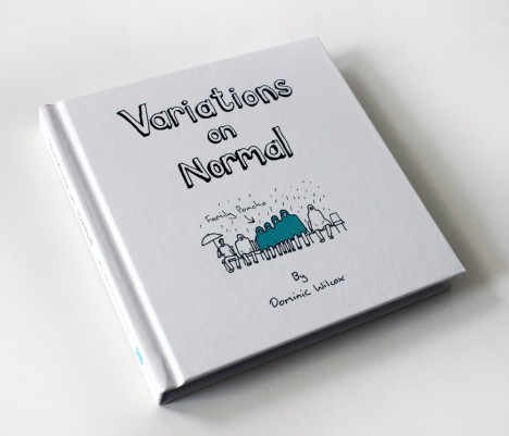
Variations on Normal: Book of Absurdly Brilliant Inventions

29 Oct

[ By WebUrbanist in Design & Products & Packaging. ]

dominic wilcox sleeping bed

The work of Dominic Wilcox is a wonderful blend of out-of-the-box design inspiration that, finally, you can get shipped to your door (in a box, no less!).

cost saving fence designs

duel use coffin workstation

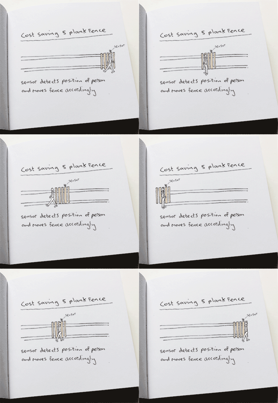
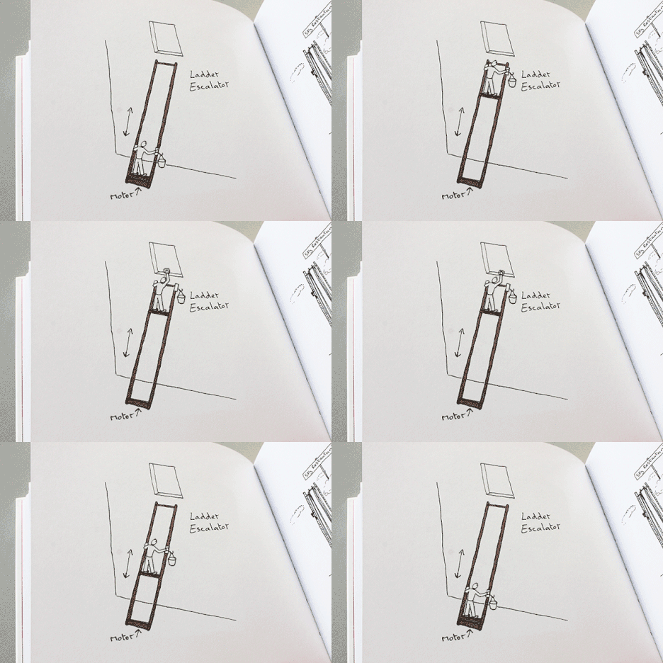
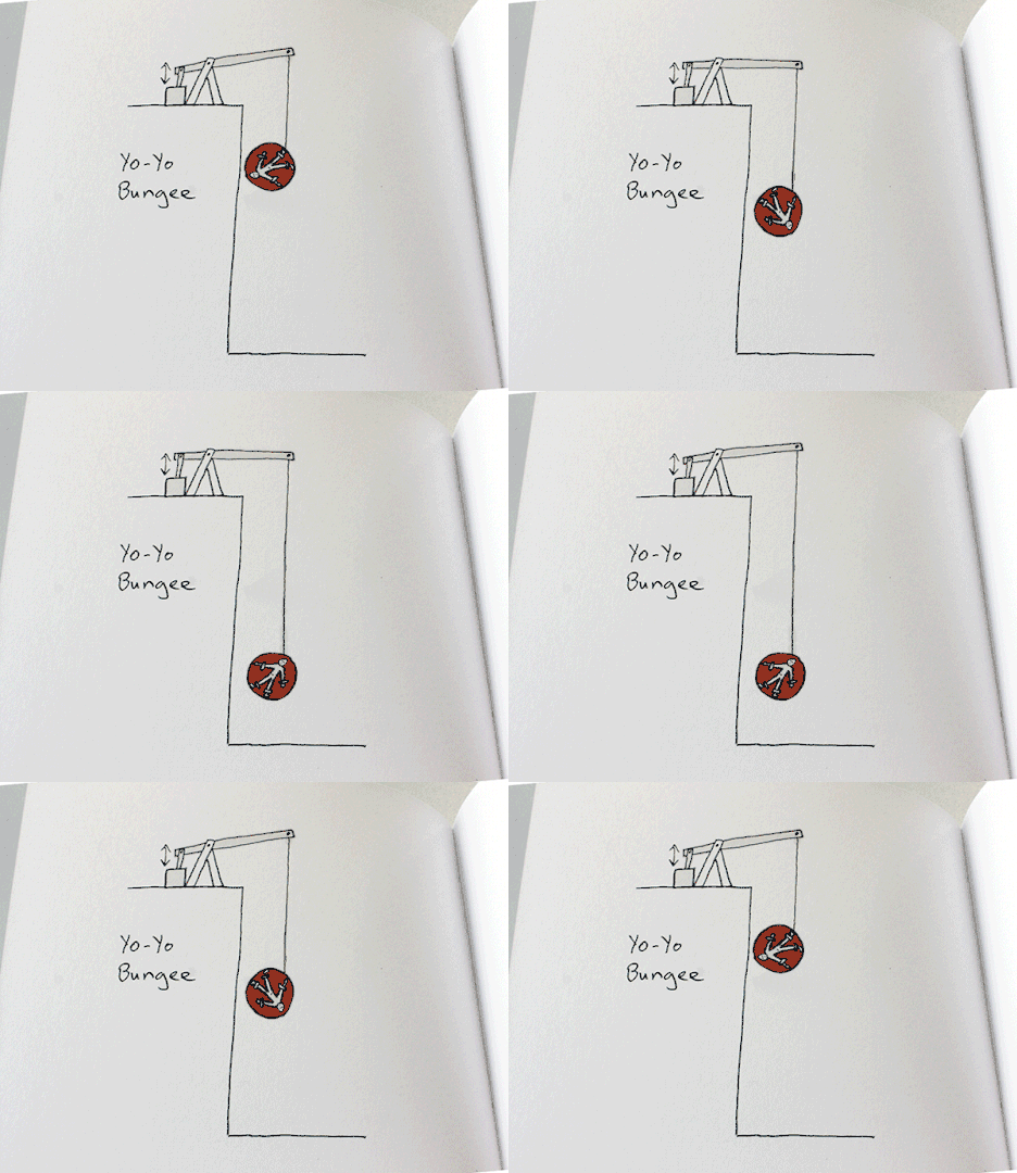
Often intentionally impractical and definitively theoretical, the ideas found inside this 128-page book (as on his blog) are nonetheless extremely compelling. Presented as something between sketches and comics, they will challenge you to look at the world from fresh new angles, not to mention their pure entertainment value.

variations on normals

ladder escalator playful design

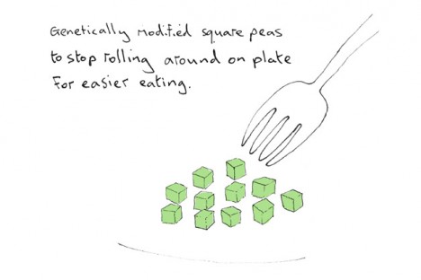
From mobile fences and motorized ladders to square peas and coffin workstations, there is always an element of functionality (hence design, not art) but also a playfulness to each piece.

square peas genetically modified

yoyo bungie system design

About his inspiration: “I’ve convinced myself that within everything that surrounds us, there are hundreds of ideas and connections waiting to be found. We just need to look hard enough. Some of my ideas develop from observations on human behaviour and I express them through the objects I create. I also experiment with materials to try to find surprises that can’t be found simply by thinking with a pen or a computer.”

scarf with integral propeller

variations on normal static

Wilcox lives in London but was educated at the Royal College of Art (Design Products MA) and the Edinburgh College of Art (Visual Communication BA).  More about his book and other recent works can be found on his website.

Share on Facebook


[ By WebUrbanist in Design & Products & Packaging. ]

[ WebUrbanist | Archives | Galleries | Privacy | TOS ]


WebUrbanist

 
Comments Off on Variations on Normal: Book of Absurdly Brilliant Inventions

Posted in Creativity


50 Brilliant Photo Manipulation Tutorials to Understand Photoshop Like a Pro

18 Nov

When it comes to photo editing, the first thing that comes to my mind is Photoshop. Photoshop is the second name of creativity. Photo manipulation may be one of the funniest things you can do with Photoshop. Of course, a person should have lots of patience and time to create some truly stunning artwork, but it’s worth a try. Today, Continue Reading

The post 50 Brilliant Photo Manipulation Tutorials to Understand Photoshop Like a Pro appeared first on Photodoto.


Photodoto

 
Comments Off on 50 Brilliant Photo Manipulation Tutorials to Understand Photoshop Like a Pro

Posted in Photography


50 Brilliant Photo Sites of Professional Photographers & 1 Quick Way To Launch Your Own

24 Apr

Are you a successful photographer? Or are you a beginner who just started the way to fame? Modern world requires new rules and these days you just can not be a famous photographer without personal online portfolio. But why is it so important? The point is that most clients believe only what they see. And your photo portfolio is the Continue Reading

The post 50 Brilliant Photo Sites of Professional Photographers & 1 Quick Way To Launch Your Own appeared first on Photodoto.


Photodoto

 
Comments Off on 50 Brilliant Photo Sites of Professional Photographers & 1 Quick Way To Launch Your Own

Posted in Photography