The post Mastering Color Series – The Psychology and Evolution of the Color BLUE and its use in Photography appeared first on Digital Photography School. It was authored by Megan Kennedy.
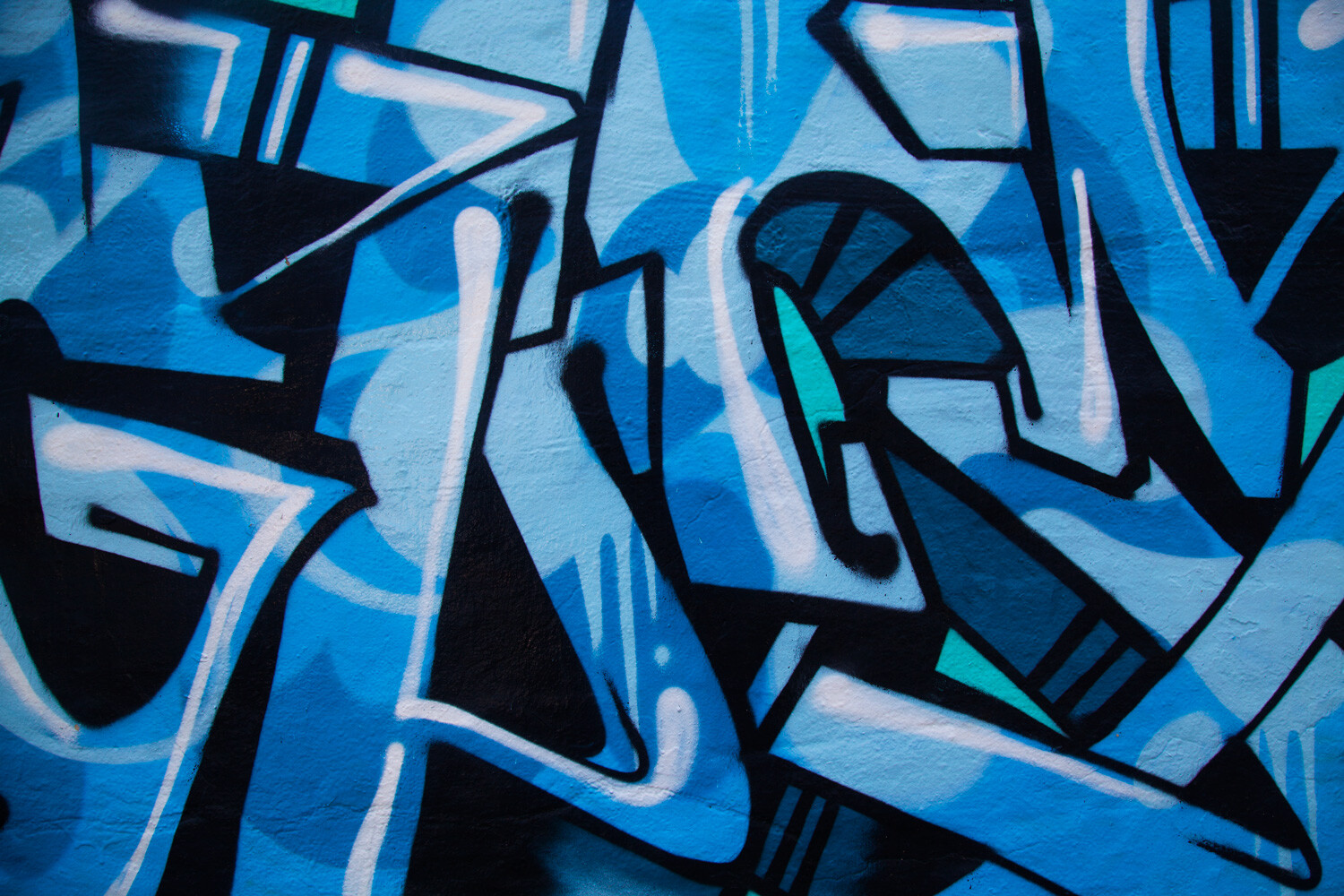
As one of the three primary colors in traditional colour theory and the RGB colour model, blue’s greatest impact is in its capacity to convey strong emotion. Painter Vincent van Gogh once said “I never get tired of the blue sky”, his fascination proving integral to many of his most famous paintings. In this article, we’ll have a detailed look at the history of blue in visual arts and what it means for your photography.

The psychology of blue
Color has a profound effect on our psychology. Rayleigh scattering, an optical phenomenon that causes the sea and sky to appear blue, forges a psychological association between the color blue and the perceived qualities of blue in nature. For example, the ancient duality of the sea and the sky generates a visual relationship between blue and impressions of consistency and trust. Blue’s associations with water tie it to cleanliness and refreshment but also tears. Consequently, a person experiencing sadness is said to be feeling blue.
The cool light of winter and the blue tint of ice draws connections between blue and the cold. Clear blue skies have become synonymous with happiness, relaxation and tranquility. The blue tint of daylight helps regulate our circadian rhythms. Blue also lowers stress levels, stimulating calm. This has practical applications; hospitals are often painted in shades of blue to help ease patient anxiety. Additionally, many medications are dispensed in blue pill form.

Blue is believed to symbolize the male gender in the Western cultures – though this hasn’t always been the case. In China, blue manifests itself as a color of healing, relaxation and immortality. In countries like Turkey, Greece and Albania, blue is said to repel evil. Hindu tradition associates blue with Krishna, a deity that embodies love, virtue and divinity. Furthermore, in German, Swedish and Norwegian languages, a naive person is said to look upon the world with a blue eye.

Jodhpur – the blue city of India.
The evolution of the color blue
Egyptian blue
Egyptian blue is considered to be the first synthetic pigment. Produced by the ancient Egyptians from around 2,200 BC, Egyptian blue was made from a mixture of ground limestone, sand and a copper-containing mineral (like azurite or malachite). The mixture was heated up to 1650°F, producing an opaque blue glass. The glass was then crushed and combined with thickening agents for application.
Associated with the River Nile and the sky, ancient Egyptians used Egyptian blue to paint murals, statues and ceramics. Eventually, Egyptian blue spread to the Near East, the Eastern Mediterranean and the Roman Empire. Egyptian blue’s usage continued throughout the Late and Greco-Roman periods. However, the pigment died out in the 4th century AD, when the recipe for its manufacture was lost.

Ultramarine
Lapis lazuli first appeared as a pigment in 6th to 7th century AD paintings in Afghanistani Zoroastrian and Buddhist temples. During the 14th and 15th centuries, Italian traders shipped the pigment to Europe. There, it was called ultramarine or ultramarinus (meaning beyond the sea in Latin).
For centuries, the cost of ultramarine pigment rivaled the price of gold. Subsequently, artists used ultramarine in only the most imperative aspects of a painting. This judicious application culminated in associations between the color blue and status.
Ultramarine remained almost prohibitively expensive until an artificial process was discovered in 1828 by Jean Baptiste Guimet. Commercial production of the synthetic ultramarine had commenced by 1830, and became known as French ultramarine.
Cobalt blue
In the 8th and 9th centuries, cobalt blue was used to color porcelain and jewelry in China. An alumina-based version of cobalt blue was later discovered by the French chemist, Louis Jacques Thénard in 1802. Commercial production of the pigment began in France in 1807.
Lightfast, stable and compatible with other pigments, Impressionists such as Pierre-Auguste Renoir and Claude Monet readily adopted cobalt blue as an alternative to pricey ultramarine. Post-Impressionists such as Vincent van Gogh and Paul Cezanne also made use of cobalt blue. According to the Musee d’Orsay, van Gogh used a combination of Prussian blue, cobalt and ultramarine to create the nighttime hues of Starry Night Over the Rhone. Van Gogh himself stated that “cobalt is a divine color and there is nothing so beautiful for creating atmosphere…”

Cerulean
Cerulean is a Latin word which translates as sky blue. Originally composed of cobalt magnesium stannate, cerulean was refined by a process developed in 1805 by Andreas Höpfner in Germany. Cerulean wasn’t sold as an artist’s pigment until 1860 by Rowney and Company. When it did become available, however, the color, ranging between azure and dark sky blue, proved popular among artists.
In 1999, Pantone released a statement declaring Cerulean Blue as the color for the millennium. Leatrice Eiseman, executive director of the Pantone Color Institute, stated that “…cerulean blue could bring on a certain peace because it reminds you of time spent outdoors, on a beach, near the water…in addition, it makes the unknown a little less frightening because the sky…is a constant…that’s the dependability factor of blue.”
Lisa Herbert, vice president, corporate communications worldwide, Pantone Inc., went on to say “our studies show that blue is the leading favorite color…regardless of culture, gender or geographic origin….[in the] U.S. [and] Europe and Asia as well. We’ve chosen cerulean blue as the official color for the millennium because of its mass appeal.”

Cerulean is the Latin word for sky blue
Prussian blue
Prussian blue was apparently discovered by accident. Around 1706, pigment and dye producer Johann Jacob Diesbach was mixing crushed cochineal insects, iron sulfate and potash to create cochineal red lake. Unbeknownst to him, the potash he used was contaminated with animal blood. The resulting concoction turned out to be the first modern synthetic pigment, a rich, dark blue that was quickly recognized for its artistic applications.
Inexpensive, easily produced, non-toxic, and intensely colored, Prussian blue spread throughout the art world. Pieter van der Werff’s The Entombment of Christ is the oldest known example of Prussian blue in an artwork. Other early examples include Antoine Watteau’s Pilgrimage to Cythera and paintings produced in Berlin in 1710 by Antoine Pesne.
Japanese woodblock artist Katsushika Hokusai used Prussian blue (as well as indigo dye) to create the Great Wave off Kanagawa. In 1842, English scientist and astronomer Sir John Herschel’s experimentations with Prussian blue led to the invention of the cyanotype.
International Klein blue
International Klein Blue (IKB) is a deep blue hue developed by French artist Yves Klein and Edouard Adam, a Parisian art paint supplier. Klein suspended his favorite ultramarine pigment in a matte, synthetic resin binder made of petroleum extracts. This allowed the rich blue hue to be applied without the loss of vibrancy. Single-colored canvases as well as elaborate performative undertakings were underpinned by Klein’s extensive use of the brilliant IKB.
YInMn blue
Much like Prussian blue, YlnMn (pronounced Yin Min) blue was discovered by accident. In 2009 at Oregon State University, Professor Mas Subramanian and his then-graduate student Andrew E. Smith were investigating new materials for making electronics. The pair were experimenting with the properties of manganese oxide by heating it to approximately 2000 °F. What emerged from the furnace however, was a striking blue compound. Named after its chemical makeup of yttrium, indium, and manganese, YlnMn blue pigment was released for commercial use in June 2016. According to paint company Derivan YlnMn blue is “non-toxic with excellent archival attributes”.

Blue in visual arts
Ancient art to the Renaissance
Blue is an enduring presence throughout art history. Ancient Egyptians decorated murals and tombs with shades of blue. The walls of Roman villas in Pompeii had frescoes of blue skies. Greek artists used blue as a background colour behind the friezes on Greek temples and to colour the beards of statues.
Dark blue was widely used in the decoration of churches in the Byzantine Empire. Byzantine art depicted Christ and the Virgin Mary dressed in dark blue or purple. Elaborate dark blue and turquoise tiles were used to decorate mosques and palaces from Spain to Central Asia.
At the beginning of the Middle Ages in Europe, blue played a less significant role to that of other colors. However, in the 12th century, painters in Italy and greater Europe were instructed by the Roman Catholic Church to paint the robes of the Virgin Mary with ultramarine, the newest and most expensive pigment at the time. The Virgin Mother’s updated wardrobe resulted in blue being associated with holiness, humility and virtue.
During the Renaissance, artists began to paint the world as it was seen in real life, mixing blue hues with lead white paint to articulate shadows and highlights. In Titian’s Noli me Tangere and Bacchus and Ariadne, different shades of blue are layered to cultivate depth and tension. In another example, Raphael’s Madonna of the Meadow depicts Mary wearing a deep blue mantle set against a red dress, a striking contrast against a background populated with brown and light blue hues.
Rococo to contemporary art
The Rococo art movement depicted mythology and light-hearted portrayals of upper-class domestic life with pastel blue skies and rich blue furnishings. Romanticism used blue predominantly to convey drama in the heavens, and Impressionists like Claude Monet used blue to investigate light and movement in both natural and artificial landscapes.
Emphasizing strong colour over the representational, Fauvist Henri Matisse’s figures in Dance circle naked under an open blue sky. Expressionist van Gogh’s seminal Starry Night, conveys the night sky in active blues and yellows. Cubist Pablo Picasso’s extensive use of Prussian blue defined his Blue Period while Surrealists adopted blue to simultaneously orientate and disorientate the viewer.
From the 20th century artists began to free themselves from the confines of the literal. As a result, artists looked to color as a tool to channel emotion. Exemplified in abstract expressionism, Jackson Pollock‘s Blue Poles, is made up of chaotic strands of blacks, greens, oranges, whites, yellows and grays tempered by nine vertical blue lines. Mark Rothko experimented extensively with blue, as did Barnett Newman, both artists using color as a device to transcend the confines of the canvas. And Helen Frankenthaler‘s stained blues emphasize both the flattening and dimensionality of space.
With the arrival of modern technologies and materials, contemporary examples of blue in art are rich and varied. Roger Hiorns’ crystalline Seizure, transformed space with color, light and chemistry. Katharina Fritsch’s Hahn/Cock plays with our sense of scale and relationship to animals. And Anish Kapoor’s Sky Mirror, Blue challenges our perceptions of an urban environment, re-imagining the landscape through the lens of a large, blue concave mirror.
Blue in photography
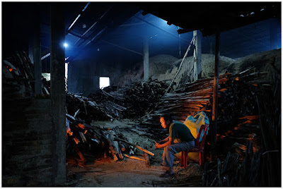
Birthed from nature and art, blue’s associations play a critical role in conveying the nature of the photographic image. Luigi Ghirri explored the relationship between shape and space by incorporating large fields of blue sky into his imagery. Color pioneer Martin Parr makes use of rich blues to create a surreal juxtaposition between subject, object and nature. Bill Henson uses blue hues to cultivate experiential photographic dramas. David Burdeny photographs precision landscapes, using blue to illustrate the materiality of his abstract vistas. While Gregory Crewdson and Didier Massard both use blue to signal time, place and atmosphere throughout their imagery.
The color blue has other applications in photography too. Occurring just after sunset and just before sunrise, the blue hour is a period when the sun drops below the horizon and residual sunlight takes on a blue hue. Valued for its soft quality of light, blue hour is popular with portrait and landscape photographers. In addition, blue filters (applied on-camera or in post production) are used in black and white photography to increase the appearance of mist and haze.

Conclusion
Yves Klein once said “blue has no dimensions, it is beyond dimensions”. Over history, blue has communicated the ineffable, transcending colour and touching on our spirituality and sense of self. Associated with nature, calm, reverence, purity, trust and sorrow, blue embodies the visual weight of emotion and human experience.
Have you used blue in your photography? Feel free to share them with us in the comments below.
You may also like:
Mastering Color Series – The Psychology and Evolution of the Color RED and it’s use in Photography
Mastering Color Series – The Psychology and Evolution of the Color YELLOW and its use in Photography

The post Mastering Color Series – The Psychology and Evolution of the Color BLUE and its use in Photography appeared first on Digital Photography School. It was authored by Megan Kennedy.

Digital Photography School


You must be logged in to post a comment.