RSS
 

Posts Tagged ‘Beijing’

Preserving Architectural Gems: 8 Beijing Hutong Plug-Ins Update Historic Shells

19 Oct

[ By SA Rogers in Architecture & Houses & Residential. ]
Passing through historic Beijing neighborhoods, seeing only the preserved street-facing facade, you’d never know that surprisingly modern structures contrast with aging surfaces within the courtyards just out of sight. Instead of just demolishing the ‘hutong’ courtyard houses found only in this Chinese city, architects are adapting them to modern life, slotting houses, hostels, museums, tea houses, cinemas and more under the existing roofs.

Tea House by Archstudio
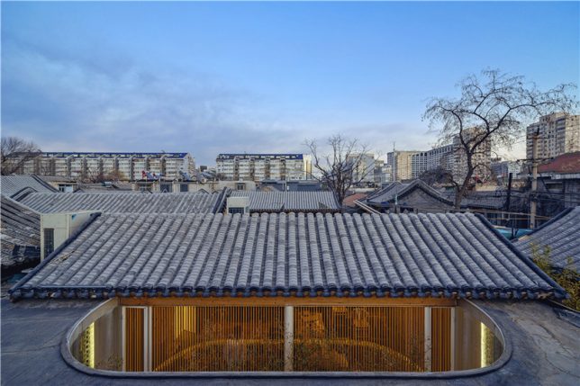
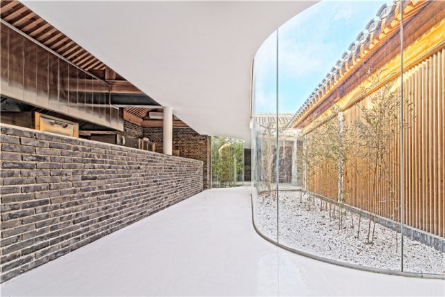
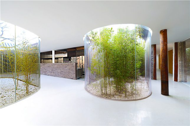
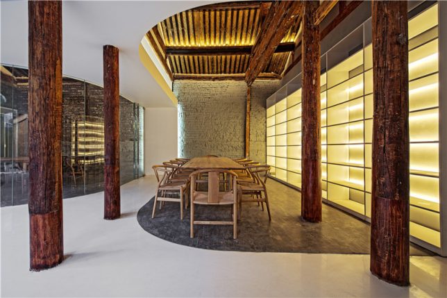
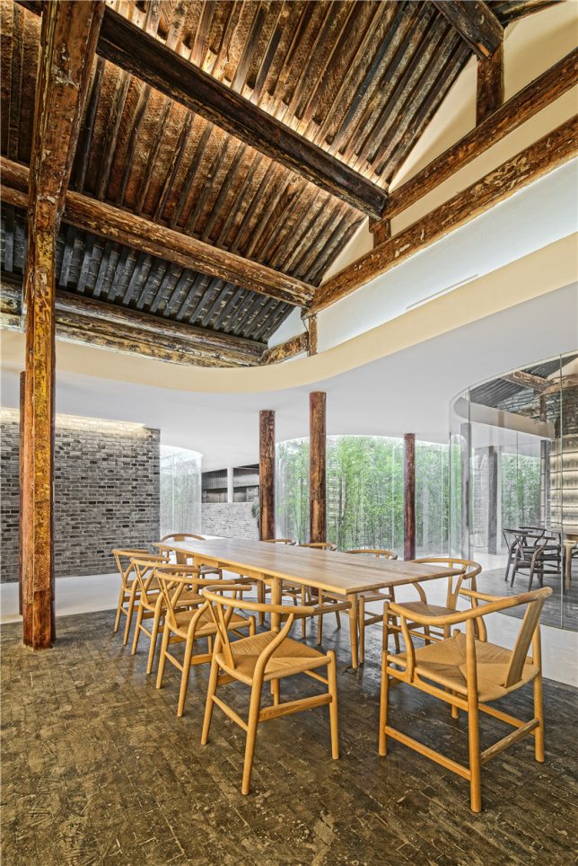
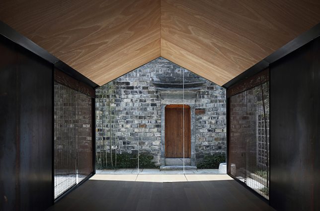
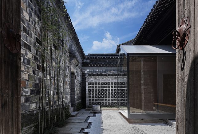
In a truly stunning adaptation, Archstudio has completed a tea house and cafe within an existing hutong house, enclosing it from above with new roofs while leaving atriums open for bamboo and other greenery. The intervention connects the site’s five existing structures with a glazed corridor following the path of the original courtyard, forming three tea houses with their own unique views.

Twisting Courtyard by Archstudio
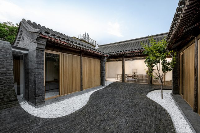
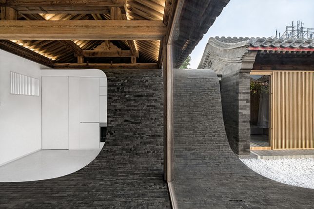
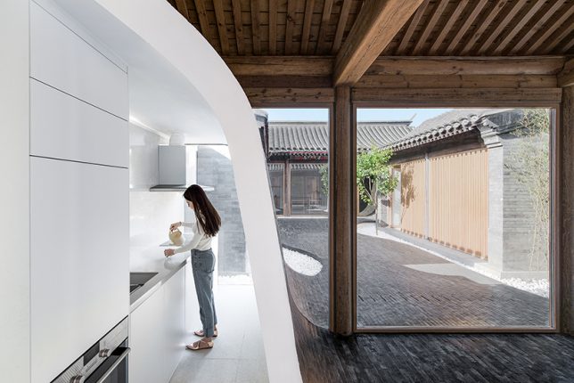
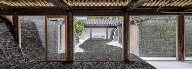
A river of glossy grey bricks streams through the courtyard of a Siheyuan house in the Paizihutong area of Beijing, upgrading the historic architecture with spaces that meet modern requirements of living. Archstudio‘s stunning pathway arches over the new volumes and even continues right into the dining room as part of the floor.

Mini Hostel Inside Hutong by ZAO / standardarchitecture
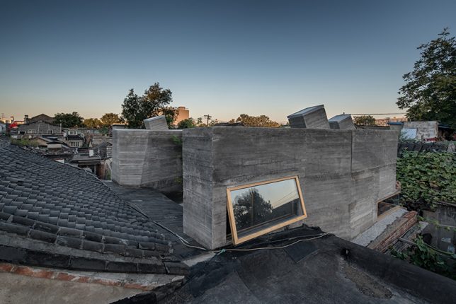
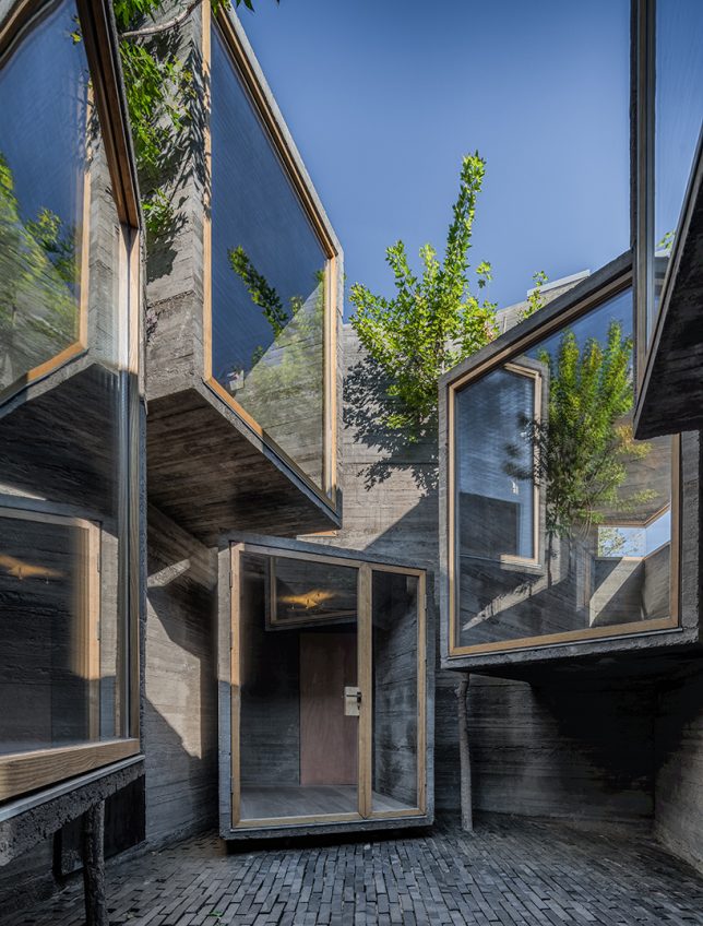
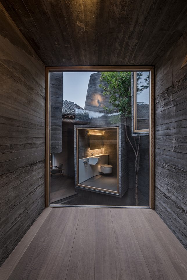
The firm ZAO / standard architecture inserted a small hostel inside a renovated Beijing hutong, exploring the potential of small-scale accommodations that slot right into the city’s existing architecture instead of displacing it. The glazed facades of volumes made of board-formed concrete project into the courtyard, facing each other (in some cases, with views of toilets, much to the horror of many Westerners looking at these images.) “The result is an architectural operation that brings back the courtyard as generator of the program, as it activates the building by creating a direct relationship with its urban context.”

Lai Yard House by Minggu Design
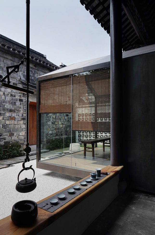
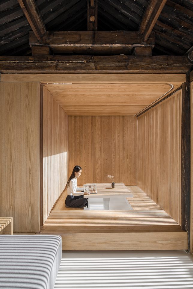
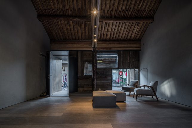
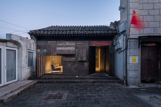
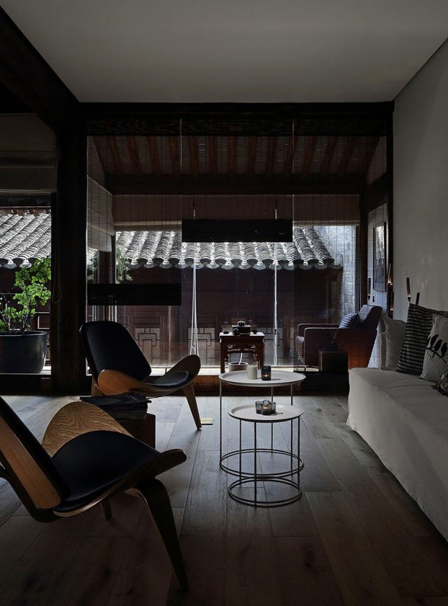
Tucked away behind weathered brick facades near the ancient city wall of Beijing, this courtyard home was crumbling. Minggu Design protects and preserves the original Chinese architecture while enhancing and adapting it for the 21st century, inserting volumes made of wood and glass to complement the surroundings without overpowering them. They used the new volumes to intentionally block and filter light to the original interior, creating a tranquil cave-like feel.

Next Page – Click Below to Read More:
Preserving Architectural Gems 8 Beijing Hutong Plug Ins Update Historic Shells

Share on Facebook


[ By SA Rogers in Architecture & Houses & Residential. ]

[ WebUrbanist | Archives | Galleries | Privacy | TOS ]


WebUrbanist

 
Comments Off on Preserving Architectural Gems: 8 Beijing Hutong Plug-Ins Update Historic Shells

Posted in Creativity


Transformers: 2 Beijing Houses Packed Full of Space-Maximizing Tricks

08 Dec

[ By SA Rogers in Architecture & Houses & Residential. ]

blue-architecture-studio-narrow-5

Think you’ve seen it all when it comes to ideas for saving space in small houses and apartments? Beijing’s B.L.U.E. Architecture Studio is here to prove you wrong in the most delightful way, with a series of transforming elements and incredibly clever layouts in two tiny ‘hutong’ alley houses. Working with lots as small as 258 square feet that are squashed between existing buildings, the architects managed to produce functional, comfortable, private residences full of natural daylight and enough space for multi-generational families.

blue-architecture-studio-narrow-1

Both homes butt up against other structures, making it impossible to incorporate windows into the design. B.L.U.E. added skylights to both, utilizing open-plan lofted layouts inside to encourage a bright and cheerful atmosphere. The first home is on a narrow L-shaped lot and features a cool glass-filled rear wall that opens all the way up to the courtyard.

blue-architecture-studio-narrow-2

blue-architecture-studio-narrow-4

blue-architecture-studio-narrow-6

Inside, beds and children’s play areas are lofted above a pale wooden built-in full of sliding elements, fold-down tables, transforming stairs, beds that instantly double in size, retractible walls and a modest-sized table that expands to seat six diners.

blue-architecture-studio-narrow-7

blue-architecture-studio-narrow-3

The second house is even smaller, with a nearly-identical arrangement of skylights and cabinet-packed walls revealing an array of unexpected features when opened. Extra countertops and work surfaces pop out of the wall facing the galley kitchen, and storage space stretches from the floor to the ceiling.

blue-architecture-studio-hutong-2

blue-architecture-studio-hutong-3

Beneath the lofted bedrooms for the owners and their kids, a third bedroom area doubles as an extra dining space. Remove the mattress to reveal a pop-up table and cushioned bench seating that you climb into like a retro conversation pit, or lay it back down and pull down the blinds for privacy. A second table folds down from the adjacent wall in seconds, with storage cubes doubling as stools.

blue-architecture-studio-hutong-1

blue-architecture-studio-hutong-4

From the pictures, it looks like there are even more built-in elements that aren’t demonstrated in GIF form, like a mysterious hatch in the dining room floor. The whole setup is clean, modern and uncluttered enough for a minimalist’s sensibilities despite so many people living in such a small space – an inspiration for all the tricks and hacks we’re going to have to come up with to boost housing density in cities with burgeoning populations.

Share on Facebook


[ By SA Rogers in Architecture & Houses & Residential. ]

[ WebUrbanist | Archives | Galleries | Privacy | TOS ]


WebUrbanist

 
Comments Off on Transformers: 2 Beijing Houses Packed Full of Space-Maximizing Tricks

Posted in Creativity


Double-Helix Bridge Design for Beijing Based on Abstracted Olympic Symbol

23 Jul

[ By SA Rogers in Architecture & Public & Institutional. ]

double helix bridge 1

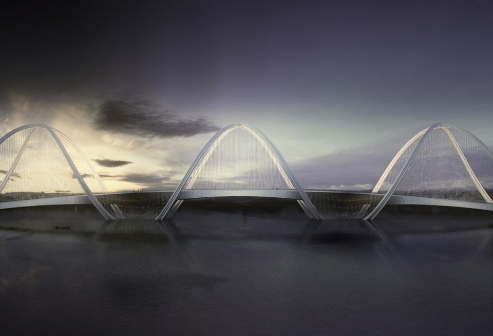
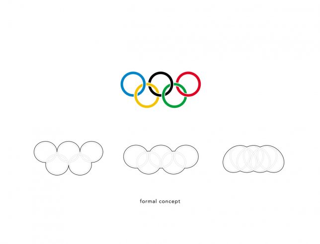
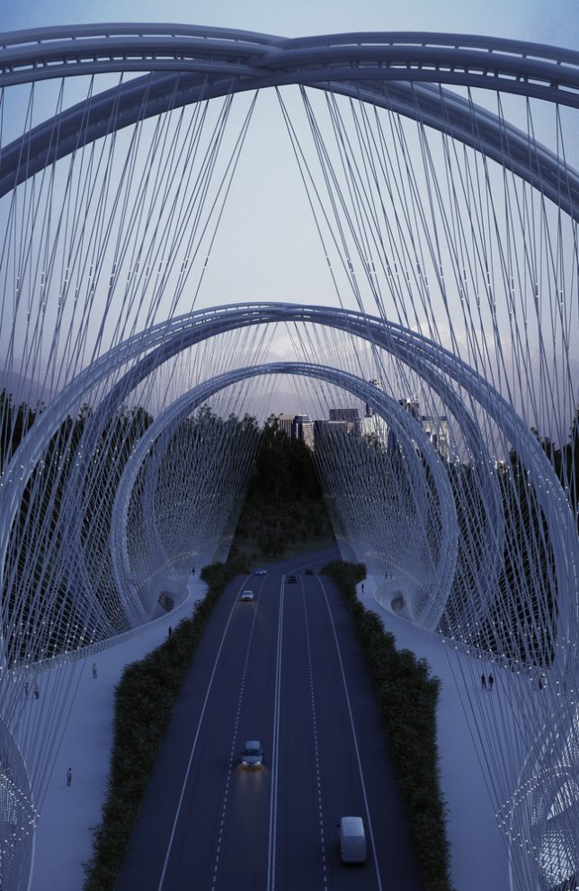
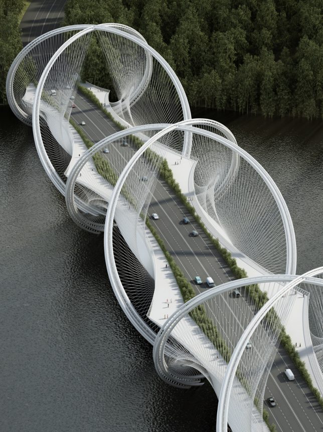
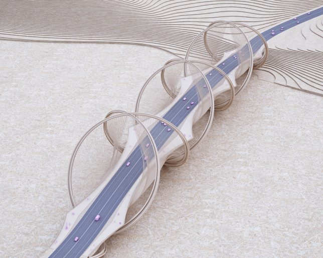
The Olympic symbol consisting of five interlinked circles is stretched out and rotated until the links create a three-dimensional double helix formation in this bridge design, which is scheduled to become reality in Beijing in time for the Olympic Winter Games in 2022. China has already made it clear that it’s willing to go big when it comes to Olympic architecture, filling Beijing with a series of massive structures for the 2008 Summer Olympics, and it aims to make its next turn hosting just as memorable. The San Shan Bridge (3 Mountains Bridge) by architecture firm Penda will connect Beijing with the city of Zhangjiakou, where most of the outdoor events for the Games will take place.

double helix bridge 8

160612_SanShanBridge_structure diagram


double helix bridge 5

bridge 2

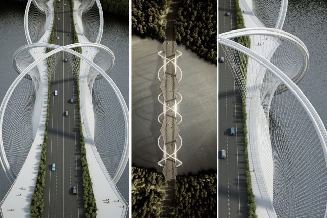
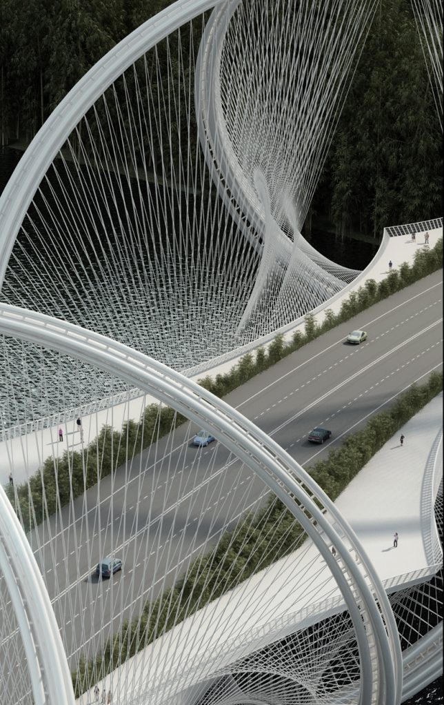
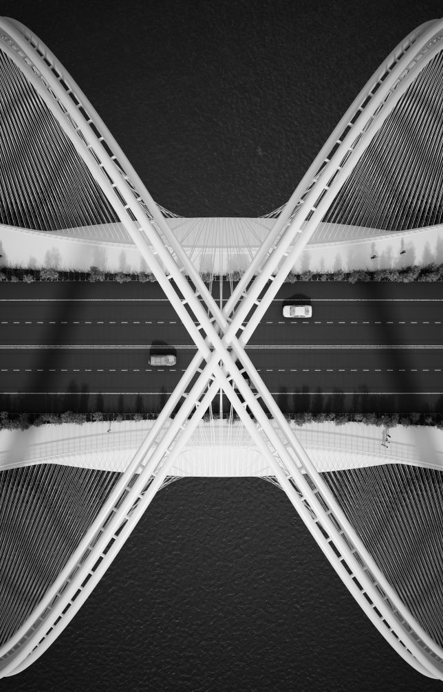
Spanning China’s Gui River, the San Shan Bridge is supported by the double-helix structure made up of three sets of undulating steel arches that cross above and below the road surface, dipping into the water. The deck is suspended from the higher arches using high-strength steel cables in a woven pattern. Four vehicular lanes are edged with greenery, which separates the cars from pedestrian paths on either side. Using up to 5 times less steel than a conventional box girder bridge, the design is slim and lightweight in appearance despite its big visual impact.

bridge 1

double helix bridge 7

double helix bridge 2

The region surrounding the bridge is a popular recreation spot for locals and tourists alike, with booming growth leading to a need for more infrastructure. The bridge will not only provide a crucial (and highly memorable) artery from the city to the Olympic events, it’ll be a central component of the Beijing Expansion Masterplan. Nearly 1500 feet long, the bridge will take a few years to construct, but should be done by the time the Beijing Horticultural Expo 2019 rolls around.

Share on Facebook


[ By SA Rogers in Architecture & Public & Institutional. ]

[ WebUrbanist | Archives | Galleries | Privacy | TOS ]


WebUrbanist

 
Comments Off on Double-Helix Bridge Design for Beijing Based on Abstracted Olympic Symbol

Posted in Creativity


Reflections: China’s Lost Lakes Resurface in Urban Beijing

26 Jul

[ By Steph in Art & Installation & Sound. ]

China Lost Lakes Installation 1

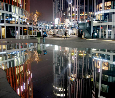
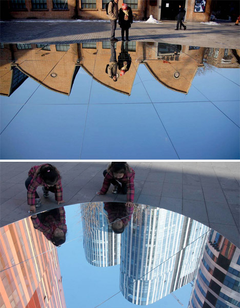
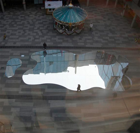
As China has transformed from a largely agricultural society to an industrial superpower, vastly changing its landscape with both construction equipment and the unintended effects of climate change, over 240 of its lakes have disappeared. In less than half a century, so much of the nation’s natural beauty and tranquility has been lost. A project called The Lost Lakes brings it back temporarily in the illusory form of lake-shaped mirrors installed in the middle of urban Beijing.

China Lost Lakes Installation 2

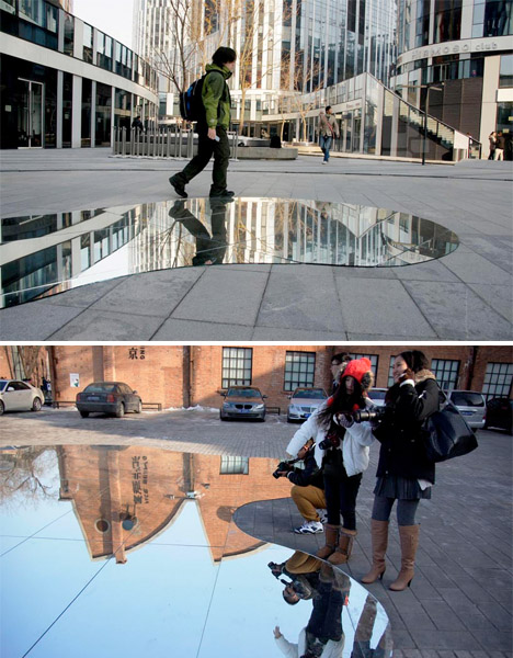
The lost lakes haven’t just impacted China’s ecology; rapid urbanization has caused severe droughts and water shortages across the country. The problem affects every Chinese citizen. The Lost Lakes installation brings this problem home to city dwellers in the form of customized mirrors mimicking the reflection of water in unexpected places.

China Lost Lakes Installation 3

Fifteen craftsman spent six weeks creating mirrors with curved edges that fit together like puzzle pieces. They’re designed to stand up to weather and curious onlookers, and can be transported and reassembled in a new location.

China Lost Lakes Installation 4

Over 350,000 people have visited the installation to ‘reflect’ upon what the loss of natural bodies of water means to them (or maybe just to gaze at themselves and the skyscrapers around them.)

Share on Facebook


[ By Steph in Art & Installation & Sound. ]

[ WebUrbanist | Archives | Galleries | Privacy | TOS ]


WebUrbanist

 
Comments Off on Reflections: China’s Lost Lakes Resurface in Urban Beijing

Posted in Creativity