RSS
 

Posts Tagged ‘Beauty’

CVS bans photo manipulation on its beauty images, will hold other brands to same standard

16 Jan
Photo: CVS Health

Earlier today, CVS announced that it would ban ‘materially altered’ imagery on its store-brand beauty products, and begin marking imagery on all of the beauty products the store carries as ‘Digitally Altered’ if it doesn’t match the new policy by 2020. Given the influence CVS wields—it is the US’s largest drug store chain—major beauty brands such as L’Oreal, Maybelline, and others are expected to follow suit.

The announcement is branded as a “commitment to create new standards for post-production alterations of beauty imagery,” and includes the introduction of the so-called CVS Beauty Mark: a watermark that will appear on all beauty imagery in the store that has not been materially altered. And, just in case you’re not sure what CVS means by ‘materially altered,’ the company explains:

For this initiative, materially altered is defined as changing or enhancing a person’s shape, size, proportion, skin or eye color, wrinkles or any other individual characteristics.

The move, says Helena Foulkes, President of CVS Pharmacy and Executive VP of CVS Health, is a recognition of the company’s responsibility as one of the largest beauty retailers in the United States:

The connection between the propagation of unrealistic body images and negative health effects, especially in girls and young women, has been established. As a purpose-led company, we strive to do our best to assure all of the messages we are sending to our customers reflect our purpose of helping people on their path to better health.

The CVS Beauty Mark will begin appearing on CVS-produced beauty imagery in 2018, but the goal is to have all of the photographs in the beauty sections of CVS stores up to transparency standards by the end of 2020. At that point, any altered beauty image that appears in CVS “stores, marketing materials, websites, apps or social media” will be clearly labeled as such.

To learn more about this initiative, head over to the CVS Beauty Mark website. And if you plan to shoot campaign images for … well … almost any beauty brand from this point forward, you might want to keep these standards in mind. Chances are good that product is carried in a CVS store.

Press Release

CVS Pharmacy Makes Commitment to Create New Standards for Post-Production Alterations of Beauty Imagery

WOONSOCKET, R.I. | January 15, 2018 – CVS Pharmacy, the retail division of CVS Health (NYSE: CVS), today announced a commitment to create new standards for post-production alterations of beauty imagery it creates for stores, websites, social media and any marketing materials. As part of this initiative, transparency for beauty imagery that has been materially altered will be required by the end of 2020.

The company also announced that it will introduce the “CVS Beauty Mark,” a watermark that will be used to highlight imagery that has not been materially altered. For this initiative, materially altered is defined as changing or enhancing a person’s shape, size, proportion, skin or eye color, wrinkles or any other individual characteristics. CVS Pharmacy will be working together with key brand partners and industry experts to develop specific guidelines in an effort to ensure consistency and transparency.

“As a woman, mother and president of a retail business whose customers predominantly are women, I realize we have a responsibility to think about the messages we send to the customers we reach each day,” said Helena Foulkes, President of CVS Pharmacy and Executive Vice President, CVS Health. “The connection between the propagation of unrealistic body images and negative health effects, especially in girls and young women, has been established. As a purpose-led company, we strive to do our best to assure all of the messages we are sending to our customers reflect our purpose of helping people on their path to better health.”

This new initiative is being introduced in an effort to lead positive change around transparency in beauty as well as to allow customers to differentiate between authentic and materially altered imagery. The CVS Beauty Mark will start to appear on CVS Pharmacy-produced beauty imagery in 2018 with the goal of all images in the beauty sections of CVS Pharmacy stores reflecting transparency by the end of 2020.

“We’ve reached out to many of our beauty brand partners, many of whom are already thinking about this important issue, to work together to ensure that the beauty aisle is a place that represents and celebrates the authenticity and diversity of the communities we serve,” Foulkes added. “We’ve been inspired by their willingness to partner with us to redefine industry standards around this important issue for the well-being of all of our customers.”

“Girls Inc. applauds CVS Pharmacy’s leadership commitment to showcase and celebrate beauty in all of its forms. As the national nonprofit dedicated to inspiring all girls to be strong, smart, and bold, Girls Inc. is honored to be a partner in CVS Pharmacy’s movement to counter limiting stereotypes too often faced by girls and women. Allowing diversity and natural beauty to shine will have an immensely positive impact on girls and women everywhere.” said Judy Vredenburgh, Girls Inc. President & CEO.

CVS Health has previously made significant changes in its retail stores with the health of its customers in mind, such as ending the sale of tobacco products, delivering healthier food options throughout CVS Pharmacy stores and committing to remove certain chemicals of concern from all store brand beauty and personal care items by 2019.

To learn more about CVS Pharmacy’s new beauty imagery initiative, visit www.cvshealth.com/BeautyMark.

Articles: Digital Photography Review (dpreview.com)

 
Comments Off on CVS bans photo manipulation on its beauty images, will hold other brands to same standard

Posted in Uncategorized


How to Photograph the Sheer Beauty of Soap Bubbles

16 Jan

Most of us are fascinated by soap bubbles and love playing with them since childhood. Watching bubbles float in the air and burst is a pleasure every child and even adults enjoy. Soap bubbles have an exciting range of color and textures. When light shines onto a bubble it displays vivid color that changes swiftly. Even though we see them on regular basis, we never actually observe them so closely to enjoy the thrilling beauty they hold within.

They are stunning, amusing and mesmerizing but extremely short-lived. Soap bubbles usually last only for a few seconds and then burst either on their own or upon contact with another object. So how can you capture these beautiful soap bubbles and keep it forever? Let’s find out.

Soap Bubbles 01

What gear do you need?

First, we’ll talk about the camera gear you need for photographing soap bubbles. These photos can be taken with any DSLR or even compact camera if it is capable of firing an external flash. And for the lens, it’s better to use a macro lens but if you don’t have one, any lens will work fine.

Get or make a large light source

The most important aspect of soap bubble photography is the light source rather than a camera. It requires a large light source. If you have a studio light with a large softbox or beauty dish that will work great. But if you don’t have one, it doesn’t mean that you can’t take this type of photo. It can be done by using off-camera flash with a DIY softbox too.

For a DIY softbox, make a frame of two by two feet by using wood or iron wire and wrap it in white cotton cloth or butter paper. This frame, combined with an off-camera flash, will give the same impact as studio flash with a softbox.

And if you don’t have an external flash, you may place this frame near the window (or hang a white bed sheet over a window) and use sunlight as your light source. The possibilities are endless, you just need to use your imagination.

Steady the camera

You will also need a tripod so you can fix your camera on it and free your hands to blow bubbles. If you have a shutter release cable (remote trigger) it would be great to use that as well.

Other supplies

Other than this, get a piece of black cloth or black paper to use as a backdrop. You’ll also need soap solution to blow bubbles. You can buy it from local stores or make it at home by adding two tablespoons of liquid soap and one tablespoon of glycerine in half cup of water and leave it overnight.

Workflow

Okay, now we have everything, let’s start shooting. First, switch-on your music system and start playing your favorite album. It’s not necessary but it’s always good to listen to music while you shoot.

Now pour soap solution into a small bowl and place it on a table. Put a black cloth or black paper behind the bowl and set up your light source. Your light should be very near to the bubble (just 2-3 inches). If you want your bubbles to look like a floating planet, place the light source right above the bubble otherwise place it at 45 degrees downward.

Soap Bubbles 19

Soap Bubbles 12

Set your camera on the tripod and attach the shutter release cable. Set a narrow aperture between f/11-f/16, so you can get deep depth of field and get the entire bubble in focus. Focus manually and change other settings like shutter speed and ISO according to the light. Now use a straw to blow bubbles and start clicking.

Problems and Solutions

Once you blow the bubble, you’ll notice that it doesn’t have the swirls of colors which you were expecting. Wait a few seconds, and the colors will begin emerging, which is your cue to start clicking pictures.

Soap Bubbles 14

Soap Bubbles 15

Also, keep a close watch on the surface of the bubble. If it starts looking transparent, it means that the bubble is about to burst. To increase its lifespan, use a straw and blow on the bubble slightly. This will also add some unique texture to it.

If you are using homemade soap solution which you made using the formula I talked about earlier, soap bubbles will have a longer life but if you are using other soap solution, bubbles will burst in very short time. If that’s happening, adding a few drop of glycerine will increase its lifespan.

I also discovered that the temperature and the humidity of room play an important role in increasing the life of a soap bubble. If the temperature of the room is hot or atmosphere too dry, the bubbles would burst very quickly. This happens because soap bubbles have a layer of water between two thin layers of soap and when the water evaporates, it bursts. This is why it has a shorter lifespan in hot and dry environments.

So, by adding glycerine and lowering the temperature of the room, you can increase the lifespan of the bubble up to five minutes. Soap bubbles show a whole range of colors and textures from their formation until they burst. Every second you’ll find different colors and patterns and you can get lots of different shots with just one bubble.

Soap Bubbles 09

Post-processing

If everything has been set up properly, there is no need for heavy post-processing. Just level adjustments, some cleaning, cropping and sharpening would be enough and your image end up looking like scenes from the movie Interstellar.

At last, keep trying until you get the desired results and share your photos in the comments below.

The post How to Photograph the Sheer Beauty of Soap Bubbles by Ramakant Sharda appeared first on Digital Photography School.


Digital Photography School

 
Comments Off on How to Photograph the Sheer Beauty of Soap Bubbles

Posted in Photography


Pencil Art: 50+ Sculptures Explore the Hidden Beauty of This Utilitarian Object

04 Sep

[ By SA Rogers in Art & Sculpture & Craft. ]

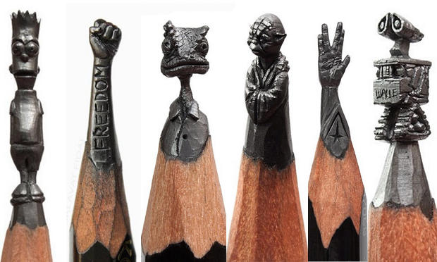
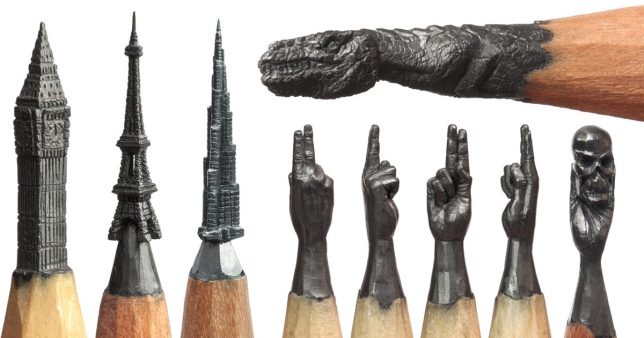
A pencil is usually a tool, but what happens when artists subvert its common usage, transforming it into a medium for sculpting instead? Extraordinary sculpting skills paired with a steady hand and a magnifying glass make it possible to carve amazingly tiny figures out of the pencil’s lead. Some artists see flowers or portraits in cast-off pencil shavings, or glue masses of the writing instruments together to sculpt and sand them into new forms punctuated by the graphite or colored pigments inside each pencil’s core.

Pencil Lead Carvings by Salavat Fidai

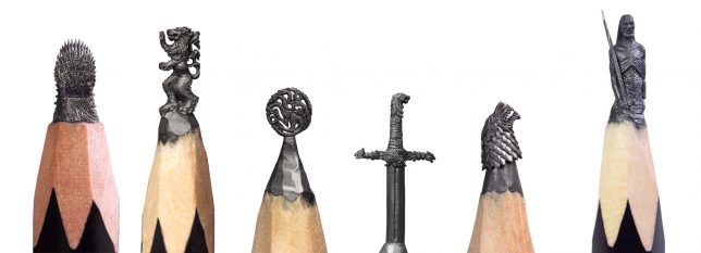
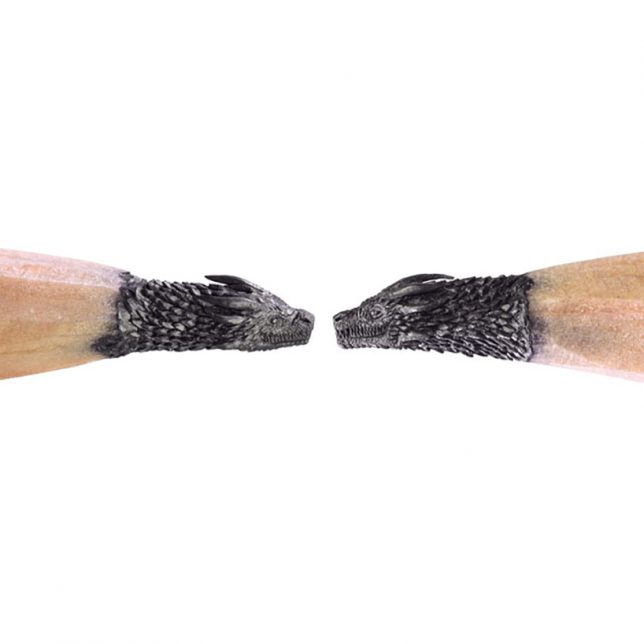
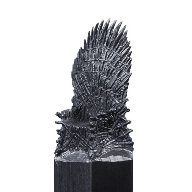
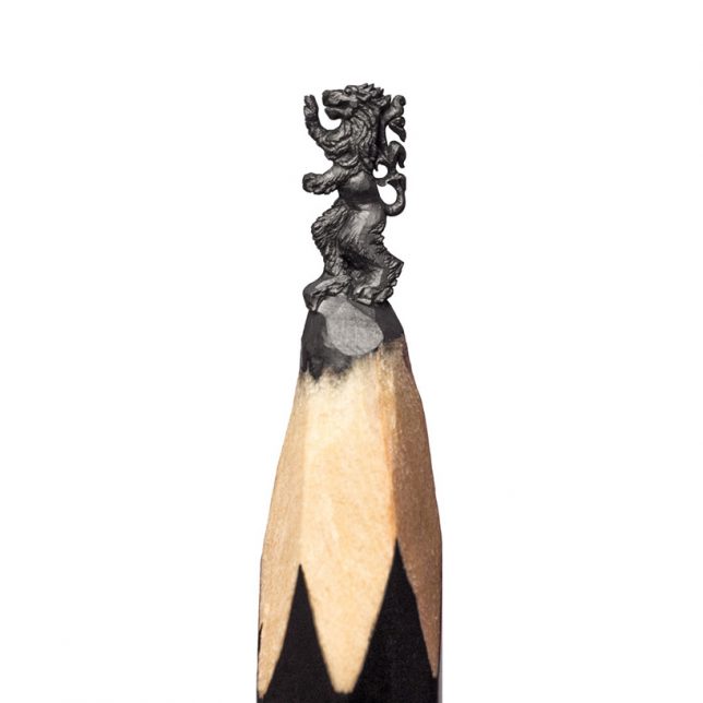
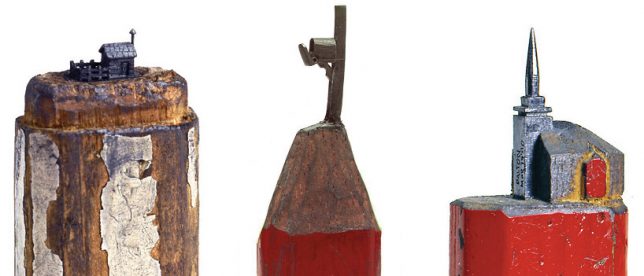
HBO Asia recently commissioned an incredible set of Game of Thrones-themed pencil lead carvings from Russian artist Salavat Fidai, including the sigils of each House, a White Walker, the dragons and the Iron Throne. It takes Fidai about 6 to 12 hours to sculpt each one using a craft knife, a magnifying glass and a microscope. The artist says the most challenging piece in the collection was the throne, which took over three weeks to perfect. Of course, the Game of Thrones pieces are just the latest works from Fidai, who has also carved tiny architecture, superheroes and other fictional characters, and much more.

Vases Made of Pencils by Studio Markunpoika

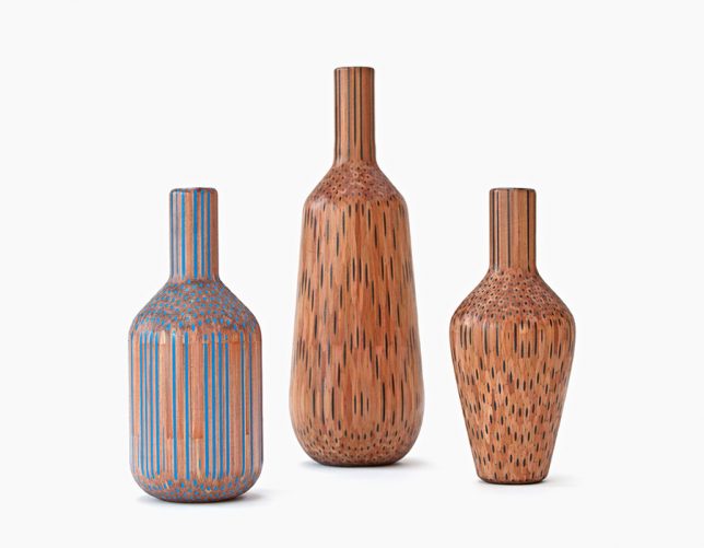
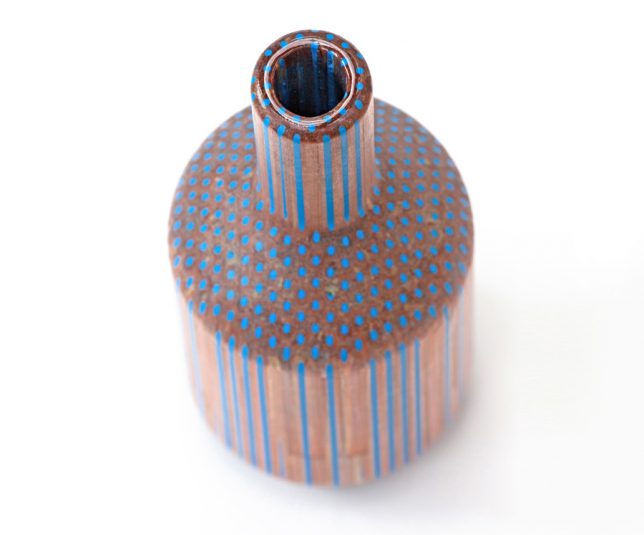
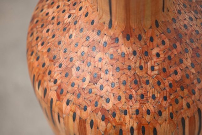
Hundreds of pencils are glued together into a solid mass and then carved on a machine lathe to create vases and other decorative objects, revealing the insides of the pencils. Studio Markunpoika describes their process: “‘Amalgamated’ is a collection which explores the relationship of a mass produced ‘tool’ and its individual purpose. The beauty of the pencil as an object seems to go unnoticed if utilized only for their primary purpose. ‘Amalgamated’ is a visual and tactile investigation using pencils as a raw material. This holistic principle has been the fundament for creating this set of vases; let the pencils become a thing themselves.”

Pencil Lead Carvings by Dalton Ghetti

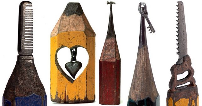
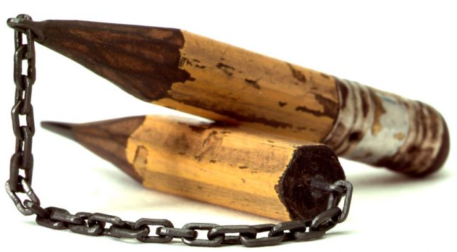
The most impressive works by Dalton Ghetti are undoubtedly those which turn single pencil leads into chains. You can’t help but stare at each one for a while, wondering how he managed to pull them off. The fact that the artist has been refining his process since childhood might tell you a thing or two about how he’s able to pull pieces like these off – or that some of his pieces can take months or even years to complete. He also carves his tiny sculptures without the aid of a microscope or magnifying glass, using sewing needles and razor blades.

Pencil Sculptures by Jennifer Maestre

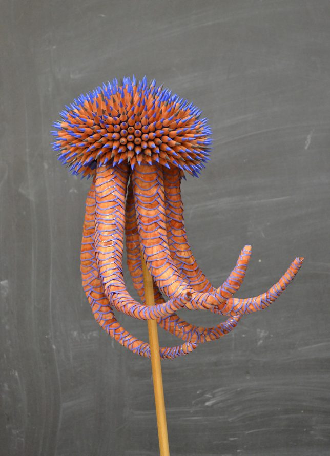
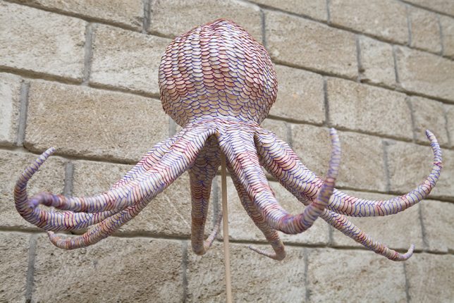
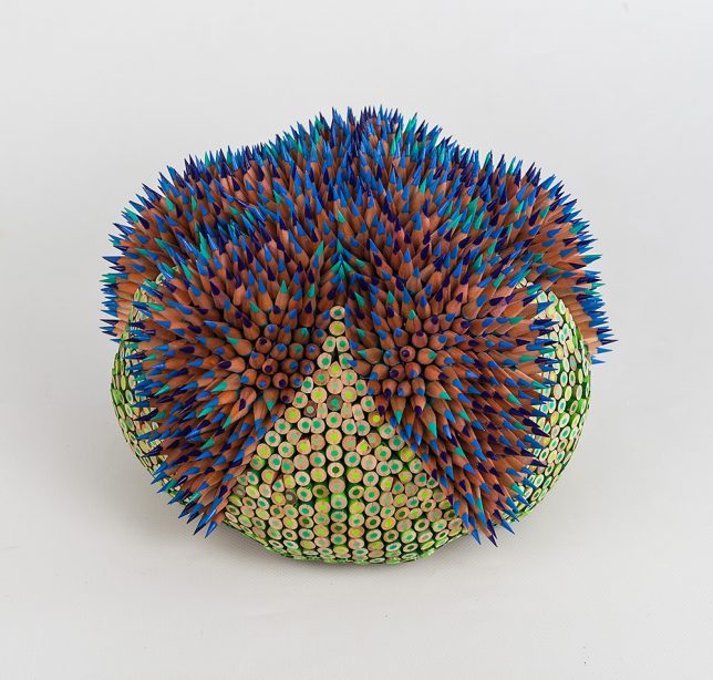
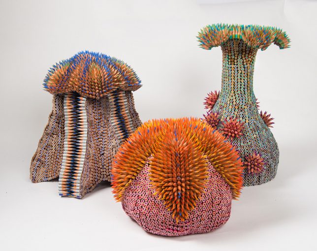
The colorful bristling creatures of Jennifer Maestre seem to have come from the depths of the sea, their appendages recalling the natural shapes of urchins, anemones, coral, octopi and jellyfish. The artist uses colored pencils as a medium for her unusual sculptures. “The spines of the urchin, so dangerous yet beautiful, serve as an explicit warning against contact. The alluring texture of the spines draws the touch in spite of the possible consequences. The tension unveiled, we feel push and pull, desire and repulsion. The sections of pencils present aspects of sharp and smooth for two very different textural and aesthetic experiences. Paradox and surprise are integral in my choice of materials.”

Pencil Lead Carvings by Cindy Chinn

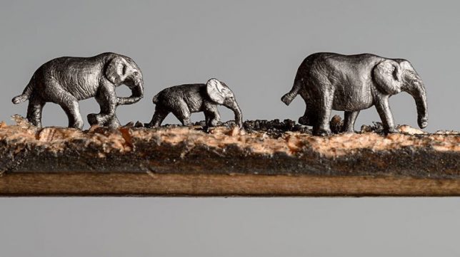
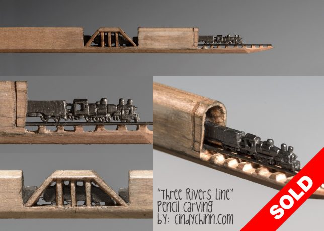
Cindy Chinn takes advantage of the length of graphite contained within a pencil, tunnel-like inside the wood, and translates it into lines of marching elephants or trains. Her ‘Elephant Walk’ series was commissioned by the California-based Epiphany Elephant Museum. Of the train piece, Chinn says “This piece was designed using straight lead pieces for the rails, with the tiny carved train placed and securely glued on top of the rails. The train engine is only 3/16” of an inch tall. The pencil is 5-5/8” long and mounted in a wood shadowbox frame as shown in the photos.”

Next Page – Click Below to Read More:
Pencil Art 50 Sculptures Explore The Hidden Beauty Of This Utilitarian Object

Share on Facebook


[ By SA Rogers in Art & Sculpture & Craft. ]

[ WebUrbanist | Archives | Galleries | Privacy | TOS ]


WebUrbanist

 
Comments Off on Pencil Art: 50+ Sculptures Explore the Hidden Beauty of This Utilitarian Object

Posted in Creativity


How to shoot classic beauty product photography on a budget

16 Aug

Dustin Dolby of Workphlo is back with another simple step-by-step tutorial that shows you how to create professional-looking magazine-quality product photography using affordable gear—in this case, he uses two speedlights inside strip boxes, and could have used just one.

For this shoot, Dolby is tackling beauty care products, which he decided to place on white plexiglass because of the subtle reflection this creates. From there, he brings out his trusty strip lights (two of them) and some diffusion material, and begins to “build” his composition. Over the course of five minutes he captures seven different lighting variants and a silhouette (which he uses as a mask):

$ (document).ready(function() { SampleGalleryV2({“containerId”:”embeddedSampleGallery_2912898008″,”galleryId”:”2912898008″,”isEmbeddedWidget”:true,”standalone”:false,”selectedImageIndex”:0,”startInCommentsView”:false,”isMobile”:false}) });

He then combines these images to taste in Photoshop, using the mask to cut out his products and picking a color from within the product itself to use as a solid background. The final image looks just like any other classic beauty care shot you might see in a popular magazine:

Check out the video at the top to walk through the tutorial step-by-step. And if you like Dolby’s style you can find more of his tutorials on his YouTube channel.

Articles: Digital Photography Review (dpreview.com)

 
Comments Off on How to shoot classic beauty product photography on a budget

Posted in Uncategorized


Video: How to make a DIY ‘beauty dish’ for $12

12 Jul

Photographer and YouTuber Joe Edelman is a bit DIY obsessed when it comes to portrait gear—from DIY gobos, to a reflector holder, to a portable background stand, he’s created some pretty interesting things. But this poor man’s DIY ‘beauty dish’ might be his most useful creation yet.

A beauty dish, as Edelman explains in the video, is a light modifier that turns a bare bulb flash into a large direct light source with rapid fall off and no hot spot in the center. It creates a fairly harsh light that is unforgiving, but desirable in portrait lighting situations where you really want to carve out your subject’s features.

If you’re a novice you might occasionally want this create this look, but not so much that you’re willing to spend $ 60, $ 70 or $ 80 on a bona fide beauty dish. What’s a poor (literally) photographer to do?

Left: Edelman’s DIY ‘beauty dish’ made from an umbrella and a piece of foam core. Right: sample photo shot with this modifier.

Edelman’s solution is to use a 30-inch photography umbrella, place it strategically close to your subject for faster fall-off, zoom your speedlight as far in as you can, and cut out a 12-inch circle of black foam core to place in the middle.

All together, this hacked-together modifier can cost as little as $ 12 ($ 11 for a 33-inch umbrella, $ 1 for some foam core at your local WalMart).

Sure, it’s not a ‘real’ beauty dish, and maybe you can hack together a more accurate facsimile in your spare time, but it’s portable, takes about 5 minutes to ‘make’ and the results are remarkably similar to a real beauty dish.

Check out the full video up top and then head over to Edelman’s YouTube channel if you want to see more tutorials like this one.

Articles: Digital Photography Review (dpreview.com)

 
Comments Off on Video: How to make a DIY ‘beauty dish’ for $12

Posted in Uncategorized


Filmmaker and photographer collaborate to show natural beauty of ocean waves

10 May
 

How do you capture the beauty of an ocean wave with a single still image? You turn it into a cinemagraph, of course.

After discovering the potential of the Puppet Warp tool in Adobe effects, Dutch cinematographer Armand Dijcks started to experiment with creating ‘cinemagraphs’ of images of moving water, using Flixel Cinemagraph Pro to create the infinitely looping animations.

After perfecting the technique, Dijcks reached out to Australian ocean photographer Ray Collins for source images. Their collaboration, titled ‘The Infinite Now’ can be viewed above.

Read more about the process of creating ‘The Infinite Now’

Articles: Digital Photography Review (dpreview.com)

 
Comments Off on Filmmaker and photographer collaborate to show natural beauty of ocean waves

Posted in Uncategorized


NYC Dance Project: How two photographers capture the beauty in movement

06 Nov

NYC Dance Project: The Art of Movement

Charlotte Landreau, Soloist, Martha Graham Dance Company. © Ken Browar and Deborah Ory

New York City-based photographers Deborah Ory and Ken Browar have spent the past two and a half years creating images of today’s most influential dancers in their home studio. A project that began in a quest to make photographs to decorate their daughter’s bedroom quickly became a long-term endeavor to capture the beauty of movement. This self-funded project, fueled by their passion for photography and dance, resulted in the team’s first book: The Art of Movement—a beautiful, award-winning 300 page compilation featuring photographs of more than 70 dancers from the world’s leading companies including American Ballet Theatre, New York City Ballet, Alvin Ailey American Dance Theatre, Royal Danish Ballet, among many others.

Ory, who started dancing when she was 7, began her photography career photographing rehearsals when a dance injury prevented her from performing. She has shot editorial for magazines including Self, Martha Steward Living and Real Simple and served as photo editor for House and Garden and Mirabella.

Fashion and beauty photographer Browar began his career in Paris, with work published in some of the leading fashion magazines in Europe and the U.S. including Vogue, Elle and Marie Claire. Browar’s interest in dance began when he photographed dancers for the Paris Opera Ballet.

Together their NYC Dance Project has been featured in numerous magazines ranging from Harper’s Bazaar to Vogue Italia.

For behind the scenes insight into the project, you can read our Q&A with this talented team. Be sure to scroll through the gallery to see some of the images from the project.

The book can be purchased here. Follow NYC Dance Project on Facebook and Instagram And if you’re in New York City, check out these events celebrating the book:

November 7 – ABT Jr Council Book Launch – A cocktail party and book signing; many of the ABT dancers will be there. More info and tickets

November 10 – Barnes and Noble Book Signing – 7pm – 150 East 86th Street, New York City. A book signing and Q&A. Ory and Bowar will be joined by Martha Graham Principal dancers, Lloyd Knight and Masha Dashkina Maddux (the dancer on the cover). More info here

?November 30, 2016 – Martha Graham Dance Company Studio Series – 7pm. Ory and Browar will be having a discussion with Artistic Director, Janet Eilber. Members of the Martha Graham Company will be performing and there will be a chance to take photographs of the dancers. Reserve your tickets here

December 8, 2016 – Rizzoli Bookstore – 6-8pm. 1133 Broadway, New York City. There will be drinks and a launch party to celebrate the book as well as a panel discussion with Ory, Browar and the dancers.??? rizzolibookstore.com

NYC Dance Project: The Art of Movement

Xin Ying, Principal, Martha Graham Dance Company. © Ken Browar and Deborah Ory

How did the NYC Dance Project get started? What was your inspiration?

The inspiration for the project came when our daughter Sarah, an aspiring ballerina, wanted to decorate her room with dance photographs. To our disappointment, we were not able to find images of the current dancers that Sarah admired in any contemporary books or photographs. There were beautiful images of famous dancers from past generations – such as Baryshnikov or Markova, taken more than 40 years ago – but nothing of the current stars.

Ken decided we needed to photograph these dancers ourselves. We were great fans of Daniil Simkin, the American Ballet Theatre Principal Dancer, and sent him an email asking him to be our first subject. Daniil loves photography and agreed to be photographed and this was the beginning of NYC Dance Project. Daniil helped us in getting a lot of other dancers involved in the project. It was a time when dancers were starting to use social media to promote themselves and they were interested in having images taken.

We originally thought it was going to be a blog, but after we had 4-5 shoots, we realized this had a longer life than we thought it would.

NYC Dance Project: The Art of Movement

Gillian Murphy, Principal, American Ballet Theatre. © Ken Browar and Deborah Ory

You’re very active in social media. How has that benefited you and the project?

Social media is a really important part of our project and we started with it right away. Daniil Simkin was very involved in social media and helped us learn how to promote our project through Facebook and Instagram. Our audience has been really active and it’s been a great way for us to reach even more people. Through social media, we have been able to reach an international market – we have dancers from around the world contacting us and asking about doing shoots with us when they are touring to NYC. It’s been a great way for us to connect worldwide with the dancers.

Having a large social media following was also important to our publisher, as it’s a great way to promote the book.

NYC Dance Project: The Art of Movement

Michael Jackson Jr, Alvin Ailey American Dance Theater © Ken Browar and Deborah Ory

Your studio is set up in your living room. How do you manage that arrangement?

Ken and I mostly worked in rental studios or outdoors previous to this and the fact that we work from our home changes the mood for the shoot. There are usually no more than the two of us, the dancer and sometimes a hair and makeup artist. Because it’s a small crew, in our home, it’s a very warm and friendly environment. There is something about the casualness of being in our home that we really love. We also can do a shoot at the last minute. Often we leave our studio set up for a few days and shoot several dancers. We go in spurts where shoot a lot, then we put our home back together and spend a few days editing.

The space we have is very large. We were able to do a shoot with 9 dancers here, although it was very tight. Ideally we would have an even larger studio, but as this is a self-funded project, we never would have been able to do it if we rented a studio.

NYC Dance Project: The Art of Movement

Michael Jackson Jr, Daniel Harder, Sean Aaron Carmon, Alvin Ailey American Dance Theater. © Ken Browar and Deborah Ory

Tell us about how your studio space is set up, what gear you use and how you work together.

Our home is a loft space with 16 foot high ceilings. Usually our background is about 15 feet high. We work with a Hasselblad on a tripod, using a standard 80mm lens. We now have the H6D. We like working with medium format, because we love the way it looks. Also, we like printing the images very large and the medium format lends itself well to this. We work very slowly, as we are using strobes and never have used a motor drive. When a dancer does a jump, we have to get the timing right, there is no room for mistakes!

We tend to keep our lighting very simple, with just one or two lights – from the top and/or side, depending on where the subject is and how they are moving. We’ve been using Profoto’s D4’s. These are not as fast as other lights that would stop the action 100%, but we are not bothered by not having technically perfect images. It’s the emotion and movement that we are trying to capture.

Our light is just to enhance the movement. We’ll start with the movement and think about how the light can work the best to complement it. Since the dancer is always moving throughout these shoots, we are constantly adjusting the light, bringing reflectors in and out and refining things. It’s all very fluid.

NYC Dance Project: The Art of Movement

Artem Ovcharenko, Principal, Bolshoi Ballet. © Ken Browar and Deborah Ory

…(cont.) People write us all the time asking if we can send them a lighting diagram. We can’t do this as we are constantly adjusting the lights. It’s so helpful having two people making the images – one of us is watching the dancer and the other is moving a light or adjusting it.

We use hand painted backgrounds that we’ve had an artist make. She is constantly refining it over and over for us. At one point she told us that she can’t add any more paint to it, it was getting too thick to roll up!

We have wood floors but we put a Marley dance floor, which comes in rolls, on top of the floor and underneath the canvas. That helps dancers from slipping and helps keep the canvas in place as well.

In the beginning we each worked with our own camera and had our own idea of what the image should be. The dancer would have to repeat the movement for each of us and we would compare who captured it better. Now we have become a team and work with one camera.

NYC Dance Project: The Art of Movement

James Whiteside, Principal, American Ballet Theatre. © Ken Browar and Deborah Ory

When a dancer comes into the studio for a shoot, how much do you direct them? Where do you begin?

Most of these dancers are well known dancers that we have seen perform before. If we haven’t seen them live—such as dancers from another country—then we’ll watch videos of them so we kind of know their strengths. Ken and I have an idea about what we would like to capture about each dancer, but once the dancer comes in, it’s a collaboration with them as well. We have them start moving with very little direction from us. We’ll look at a few images together and start to refine them. Usually we pick one or two ideas to work on and fine tune those until we get an image we all feel works well.

NYC Dance Project: The Art of Movement

Miriam Miller, New York City Ballet. © Ken Browar and Deborah Ory

Who styles the dancers and where do you get the outfits for the shoots?

I [Ory] do most of the styling for our shoots. Once we worked with a stylist and we felt it was too much about fashion and often the clothes did not move well. The clothing needs to be simple and beautiful, but most importantly, it needs to move well.

Clothing is a really important element for us. We’ve gotten outfits from different designers, including Leanne Marshall, who has been a big contributor for us. Companies like ABT will sometimes give us old costumes. They’re tattered and hand stitched and I love that you can see little rips and tears.

We also sometimes paint their pointe shoes so they match the clothing. In fashion you would never wear the same colored shoes with every outfit, so why would you wear pink pointe shoes with every dress?

NYC Dance Project: The Art of Movement

Fana Tesfagiorgis, Alvin Ailey American Dance Theater. © Ken Browar and Deborah Ory

What software do you use and how much post-processing is involved?

On set we shoot tethered with Hasselblad’s Phocus software. The images are brought into Lightroom to edit and the post-processing is done in Photoshop, after we have made our selects. Post-processing is pretty minimal in terms of what we do to the pictures. Most of our time is spent cleaning up spots and dust in the background. There is very little manipulation of the images themselves.

Often we have to remove cats from the photos! Our cats are literally walking through the set and often they are in the photo or there is a tail in the picture. They will go lay down underneath the dancer, no matter what the dancer is doing!

NYC Dance Project: The Art of Movement

Misty Copeland, Principal, American Ballet Theatre, from our shoot for Harper’s Bazaar, Degas story. © Ken Browar and Deborah Ory

You were commissioned by Harper’s Bazaar to do an editorial with American Ballet Theatre’s Principal dancer, Misty Copeland in conjunction with the Degas exhibit at MOMA. How did that come about?

Harper’s Bazaar found us on Instagram and also through another principal dancer who recommended us for this job. Glenda Bailey, their Editor-in-Chief, wanted someone who was used to shooting dancers, rather than a fashion photographer. Also, we had worked with Misty before, so they had seen our images of her. While we were very fortunate that they picked us, we were not really looking for commercial assignments at that time. They asked us if we had a porfolio and we just suggested they look through our Instagram feed. It was interesting to us as we knew how difficult it can be to send your portfolio and try to get jobs with magazines like Harper’s Bazaar.

It was a really difficult shoot. Bazaar wanted to make the pictures look exactly like Degas’ painting of dancers. We were stressing about how to make these images keep the perspective and painterly look of the Degas paintings. Degas sometimes just painted things in the background and we could not figure out what these things were. What are those blue streaks? Is he painting a set or was that just for effect? It was really a challenge re-creating these paintings!

There were about 50 people on set, and it was the first time we had worked with a crew that large for a dance shoot. The space we used at Pier 59 photo studios in NYC was really large, but we had to create 5-6 sets and there was only room to put up 2 at a time. Luckily, there were a lot of people to help us create these sets and it all came together beautifully. There was a lot of press surrounding the story, so it really helped us to get better known.

NYC Dance Project: The Art of Movement

© Ken Browar and Deborah Ory

Your first book, The Art of Movement, was released this October. What was it like to publish your first book?

As photographers, both of us had always dreamed of making a book. We certainly did not just create the images for instagram! Meeting with publishers was a bit depressing, however; most said they only do a dance book every ten years or so. It took a lot of persistence, and also a great literary agent, to help us find the right publisher. Although it worked out in the end, we got our contract at the last minute. Our publisher, Black Dog & Leventhal, wanted to get the book out this year, so we had to work incredibly quickly to meet the deadline. We barely slept for a few months. Putting together a 300 page book in such a short amount of time was very ambitious and stressful, but looking back now, it definitley feels worth the struggle!

NYC Dance Project: The Art of Movement

Michael Jackson Jr and Sean Aaron Carmon, Alvin Ailey American Dance Theater. © Ken Browar and Deborah Ory

What’s next for you?

It’s likely that we will make another book. The next step is also working with galleries. We just started working with the Holden Luntz Gallery in Palm Beach and will be looking for a gallery in NYC as well.

Articles: Digital Photography Review (dpreview.com)

 
Comments Off on NYC Dance Project: How two photographers capture the beauty in movement

Posted in Uncategorized


Mount a Canon 5D Mark III to a custom drone and capture the beauty of nature

04 Nov

Polish photographer Miron Bogacki mounted a Canon EOS 5D Mark III to a custom-built octocopter and flew the drone over Northern Poland in the Valley of Drw?ca. We hope that you enjoy the gorgeous video footage he captured as much as we did! To see more of Miron’s work check out his website.

Articles: Digital Photography Review (dpreview.com)

 
Comments Off on Mount a Canon 5D Mark III to a custom drone and capture the beauty of nature

Posted in Uncategorized


Earth from a New Perspective: ‘Overview’ Aerial Shots Reveal Hidden Beauty

01 Nov

[ By SA Rogers in Art & Photography & Video. ]

Planned community of Sun Lakes, Arizona

Other than a few brief glimpses near airports, few of us ever get to see the Earth from high up in the sky, taking in all of the complex textures and patterns created by nature and human activity. If we could, we might feel more inclined to do all that we could to protect it. This phenomenon, as experienced by astronauts when viewing our small, fragile planet from space, is called the ‘overview effect,’ and it serves as the inspiration behind a series of stunning aerial photographs by Benjamin Grant.

Tulip fields, Lisse, Netherlands
A highway interchange in Jacksonville, FL
World's largest aircraft storage facility, Tucson, Arizona
World’s largest aircraft storage facility, Tucson, Arizona
Residential communities in Boca Raton, FL

‘Overview: A New Perspective of Earth’ is a new hardcover book full of over 200 aerial images taken of sites all over the world, from industrial areas of South Korea and fields in Ethiopia to planned communities in South Florida. Grant initially started the project as an Instagram series in December 2013, selecting high-resolution satellite photographs that reveal the extent to which we have altered the surface of the planet upon which we live and curating them into a thoughtful, emotional collection.

Port of Singapore
Port of Singapore
Industrial district, Ansan, South Korea
Agricultural development, Addis Ababa, Ethiopia
Residential neighborhood in Delray Beach, FL

“What I’m really trying to get across here is that we’ve entered an important time in human history where our home has been significantly altered,” Grant told Wired in a 2015 interview.

The Gemasolar Thermosolar Plant, Seville, Spain
Olive tree groves in Cordoba, Spain
Mexico City
Mexico City
Burning Man, Black Rock, Nevada

Grant searches aerial shots relating to a specific current event or environmental issue to find the ones that have the biggest impact, striking us as visually beautiful even when the imagery depicts tragedy. Some examples include shots of a refugee camp in Kenya, shrinking ice sheets and the choked streets of the world’s most populated cities. Take a look through the feed on DailyOverview.com, or order the book on Amazon.

Share on Facebook


[ By SA Rogers in Art & Photography & Video. ]

[ WebUrbanist | Archives | Galleries | Privacy | TOS ]


WebUrbanist

 
Comments Off on Earth from a New Perspective: ‘Overview’ Aerial Shots Reveal Hidden Beauty

Posted in Creativity


Beauty in Decay: Moody Murals Bring Human Faces Back to Abandoned Places

25 Oct

[ By SA Rogers in Art & Installation & Sound. ]

rone-murals-abandoned-places-1

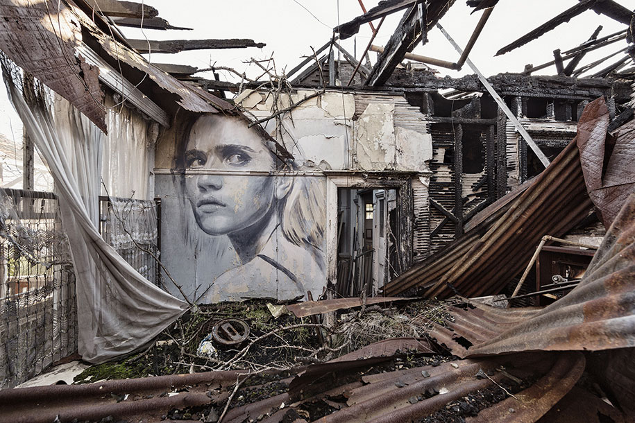
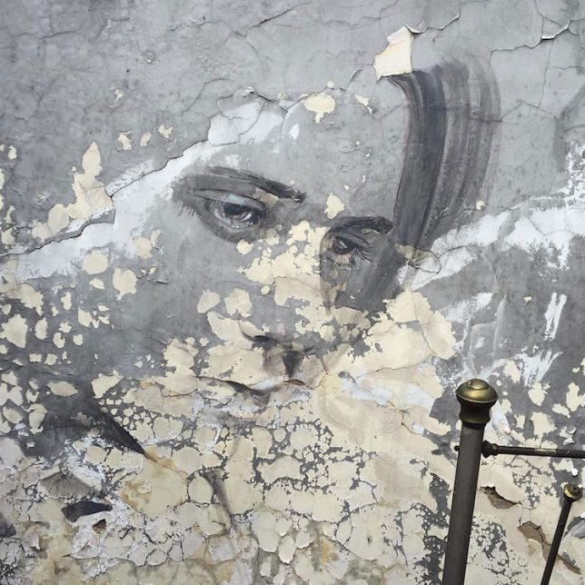
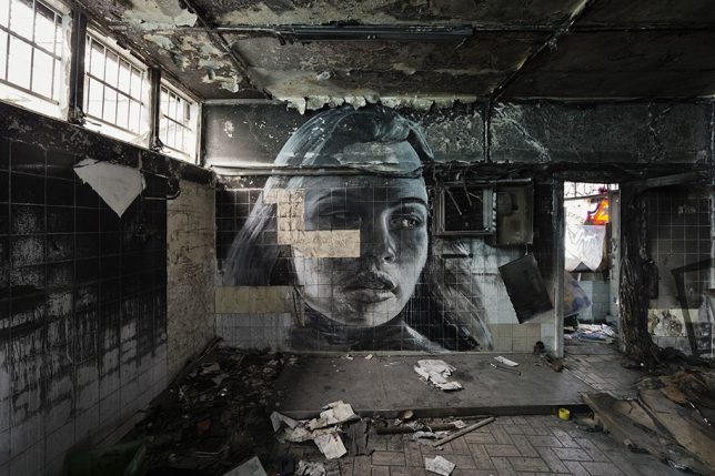
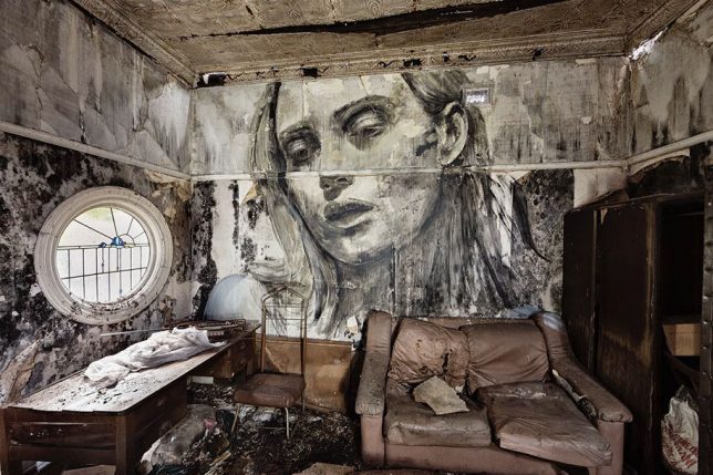
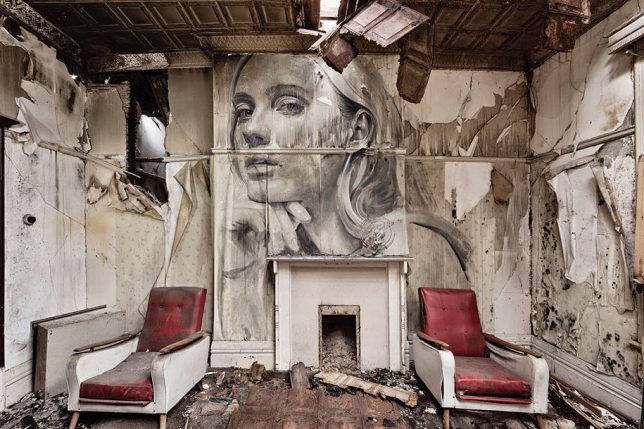
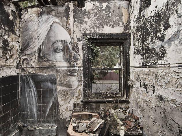
Abandoned places are often steeped in a mixture of emotional impressions, commingling a sense of loss and a confrontation of our own mortality with slivers of hopefulness for a new future, as nature begins to take over what we’ve left behind. As we move through these deteriorating spaces, strewn with the belongings of former inhabitants who seem to have simply disappeared, we wonder who they were and why the spaces that once sheltered them as they went about their lives have come to this. It’s these emotional qualities that make a new series of murals by Australian street artist Rone all the more poignant and powerful.

rone-murals-abandoned-places-2

rone

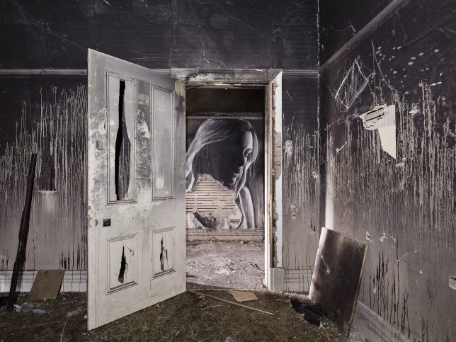
Entitled ‘Empty,’ the series places the artist’s signature portraits of women on the walls of abandoned interiors, deepening their emotional weight. Much of the subjects’ glamour is stripped away as their skin takes on the texture of peeling paint, the lines of their faces are interrupted by fallen tiles and their gazes are pointed down at the destruction of their environments.

rone-murals-abandoned-places-3

rone-murals-abandoned-places-4

For the Melbourne-based artist, this series represents a shift from the smooth, clean surfaces of his canvases and even the more clear-cut exterior walls upon which his murals are typically painted. But Rone has always found meaning in the temporary nature of these installations, as the artworks are gradually worn away by the elements or painted over by vandals and other artists.

rone-murals-abandoned-places-5

rone-murals-abandoned-places-6

rone-murals-abandoned-places-7

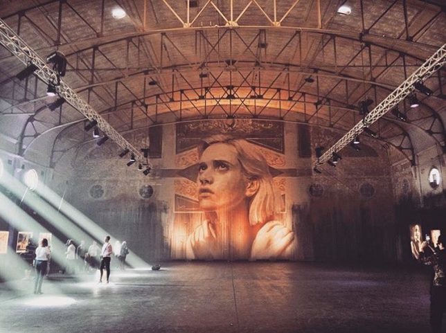
Rone exhibited ‘Empty’ at the soon-to-be-demolished Star Lyric Theatre building in Melbourne, presenting photographs of the murals in situ along with works on canvas and paper. The artist also painted a new mural directly onto the back wall of the theater, stretching nearly 33 feet from floor to ceiling. It’s a fitting way for the decaying Art Nouveau building to go out, with Rone’s canvases lining its blackened and stained surfaces. See more photos of the installation at Street Art News.

Share on Facebook


[ By SA Rogers in Art & Installation & Sound. ]

[ WebUrbanist | Archives | Galleries | Privacy | TOS ]


WebUrbanist

 
Comments Off on Beauty in Decay: Moody Murals Bring Human Faces Back to Abandoned Places

Posted in Creativity