RSS
 

Posts Tagged ‘Artwork’

Lenovo unveils 21.5″ Smart Frame wall screen for displaying digital images and artwork

08 Jan

Lenovo has introduced a new product for displaying albums of digital images as art in one’s home or office. Called the Smart Frame, this new connected 21.5-inch display is designed to look like a large picture frame, blending in with one’s existing decor to showcase the user’s own images or a selection of licensed artwork stored in the cloud.

The Lenovo Smart Frame is designed for use with the company’s snap-on mounting system, which enables the user to rotate the image from portrait to landscape modes for displaying different types of images and artwork. Buyers are given the option of choosing different frame materials and colors to match their existing decor.

A built-in color tone sensor monitors the ambient lighting in the room where the Smart Frame is mounted and automatically adjusts the screen’s brightness for what Lenovo claims is ‘a more natural and aesthetic viewing experience.’ The display has an anti-glare matte finish for a realistic, viewable experience during daylight hours.

According to Lenovo, the Smart Frame uses an AI to curate the user’s own photo album, selecting the highest quality images to create digital collages that show multiple photos at once. As well, the device comes with a companion app that offers access to hundreds of pieces of artwork.

Lenovo plans to launch the Smart Frame in North America in August with a starting price of $ 400.

Articles: Digital Photography Review (dpreview.com)

 
Comments Off on Lenovo unveils 21.5″ Smart Frame wall screen for displaying digital images and artwork

Posted in Uncategorized


Photographing Artwork? These Tips Will Make the Process Much Easier!

20 Dec

The post Photographing Artwork? These Tips Will Make the Process Much Easier! appeared first on Digital Photography School. It was authored by Glenn Harper.

photographing-artwork

Photographing artwork may seem like a simple task, but it’s often hard to do well. There are technical hurdles to overcome, like achieving an even exposure, avoiding reflections, focusing accurately, choosing the right aperture, and so on. In this article, I’ll give you some tips on photographing artwork that make the process much easier!

Photographing artwork

Detail from ‘The Ninth Wave’ (1850) by Ivan Aivazovsky. Russian Museum, St Petersburg.

Tips on photographing artwork

The tips I’m about to give mostly relate to 2D art, meaning paintings, drawings or prints in whatever form they come. I’ve photographed most of them, ranging from grand oil paintings in national museums to antique newspaper illustrations at home.

I will give a few tips on photographing sculpture, as well. Creating successful pictures of 3D art is not always straightforward.

White balance

When photographing artwork, white balance is not objective – there’s a creative decision to make. Do you want to preserve the color of the art as you see it or should you neutralize it and make the whites white? Will you be a historian or a restorer?

Taking archival photos of old newspapers

I could restore whiteness and original color in this Victorian newspaper with a single click, but using a gray card, I’ve reproduced its 125-year-old state. Lighting is overhead daylight.

Paper and paint tend to discolor with age, typically with yellowing. So, you have to decide if you want to copy what you see or turn back the clock. That’s assuming you’re correct in your assumptions about the original color.

To “correct” white balance, there are two main approaches:

  1. To make whites appear white: choose an area within the artwork that should be neutral in tone – preferably a mid-gray if one exists. By clicking on this area with a white balance tool, you’ll equalize the RGB values and, with any luck, correct color in the rest of the image. Problems arise when the artwork has aged more in some places than others, which tends to create ugly yellow blotches when you perform a WB adjustment.
  2. To preserve signs of aging: use a gray card to correct for the light illuminating the art, which keeps the existing color of the artwork including signs of aging. There will still be some slight shift in color since the appearance of all objects is affected by the light they fall under. But you’ll retain the overall appearance of age. You can always warm the photo up a bit if you want to emphasize the antique look.

A third option, if you have no neutral tones in the image nor any gray card, is to fiddle with color temp and tint sliders until you think the white balance is correct. Correcting color by eyesight is hit and miss, however, and never as accurate as using numbers.

Correcting white balance in artworks

One thing we know about snow is that it looks better white. Artificial lighting and/or aging make this painting come out yellow in a photo. A white-balance tool quickly restores it, though it’s hard to always know how a painting looked when fresh. Artist: Ferdinand Schmidt (c1900), La Piscine Museum, Roubaix.

The light source makes a huge difference to white balance. Avoid mixed lighting if you can. In museums, you won’t often find paintings under mixed light sources, but the same is not true of sculpture. A mixture of warm artificial light and window light causes strong orange or blue color casts in local areas of the picture. This can be hard to deal with in post-processing.

white balance adjustments for artwork

Art museums don’t tend to display paintings under mixed lighting, but you might find sculptures near a window. That will often result in blue highlights and orange shadows. Sculpture: Epicurus and Metrodorus, Louvre Museum.

Color correction, DNG profiles, light sources

We’ve talked about correcting white balance when photographing artwork, but you can take color correction further than that. You can also correct for the characteristics of the light source.

Fluorescent and LED light sources are more energy-efficient than old filament lights and don’t outwardly transmit heat. LED lighting is now very common in art museums. And yet its light is lower quality from a photographic viewpoint than that of halogen.

Modern light sources emit either a discontinuous or narrow-band spectrum, meaning they reproduce colors inconsistently and sometimes not at all across the visible spectrum.

Image: Art museums and galleries use one light source to illuminate paintings. It might be overhead...

Art museums and galleries use one light source to illuminate paintings. It might be overhead diffused light or spotlights on a track lighting system. Photo by Riccardo Bresciani from Pexels

To some degree, you can judge the quality of LED/fluorescent lights by their CRI rating. You need 90+ if you’re shopping for them, but a high rating does not make them equal to traditional light sources. The CRI test is a lenient, non-standardized test using a few color patches, so the difference between 95% and 100% is greater than the numbers suggest. Incandescent and halogen lamps score 100% by default.

One way you can improve color in your photos when shooting art under modern light sources is to create a DNG profile. For this, you use a product like the X-Rite Color Checker and either X-Rite or Adobe software. You then apply this profile at the raw-conversion stage if the software supports it.

photographing artwork tips - X-Rite Color Checker - white balance correction

This page from an antique WW1 history book is clearly being lit from the right. Note the X-Rite Color Checker includes neutral patches for correcting white balance as well as color patches for DNG profiles.

If you try to correct for LED or fluorescent lighting by eye, you are likely to need the “tint” slider in raw converters. These light sources vary greatly in their output along a green to magenta axis. Old filament lamps don’t behave the same way – their output always sits along the orange-blue Kelvin scale.

Window light – Pros and Cons

Photographing artwork

This old advertisement was on display outside. Though the color temperature of daylight varies, no other light source displays color so fully across the visible spectrum. KattenKabinet Museum, Amsterdam.

You’ll never beat daylight for its ability to display all colors of the visible spectrum with little bias. It’s an ideal light source for art. The only problem is you can’t control it very well. If you use window light to photograph a piece of art, the exposure will likely be uneven from side to side. There may be a stop or more difference. You can get this down to about half a stop or less if you use a reflector.

Of course, you can even up the exposure in post-processing. One thing you can do is photograph a blank card or piece of white paper under the same light, which makes uneven exposure obvious when you see it on the computer. Use what you see there to correct other photos in the shoot.

Photographing art using window light

If you photograph a postcard by window light, flipping it over makes uneven exposure more obvious. The right of this photo is 25% brighter than the left.

Use adjustment brushes, layers, and layer masks or a graduated neutral density filter to correct uneven exposure across an image. On-image local adjustments like those found in DxO PhotoLab are good. A graduated filter is a smooth way of dealing with it, but you can just as easily use brushes with lots of feathering.

Perspective: positioning art for a photo

When photographing a 2D piece of art, position it flat against a wall or table and try to get the camera sensor perfectly aligned with it. Otherwise, you’ll see the same “keystoning” effect you get with architecture, where vertical lines diverge. The subject of the art will be slightly distorted if you take it at an angle, though not always to a degree anyone will notice.

One way you can align a camera with art is to use a spirit level on both. Test the surface that the art lies against to see if it is even, making adjustments with props if necessary (much like you would with a table leg on an uneven floor). Do the same thing with the camera, using a spirit level on the hotshoe or resting on a flat part of the camera in a tripod. It needn’t look professional if it does the job.

photographing artwork tips - positioning

Ideally, you want the camera to be level with the center of the picture when photographing art. I haven’t done badly with this handheld shot, though it’s slightly wonky to the right (wall-mounted paintings might tilt slightly at the top). The correction will be moderate. Artist: Lucien Jonas (1880-1947), La Piscine Museum, Roubaix.

Spirit levels vary in their accuracy, but you’ll soon see if your method works or not with rectangular artwork. If it does, the horizontal and vertical edges will align with the 90-degree angles of your photo. If you’re off-kilter, you’ll see the slight keystoning effect.

Does this matter? You can correct perspective in editing software, but only with a loss in edge-to-edge sharpness.

The less you have to correct, the better.

Using spirit levels in photography

Use spirit levels along with any perpendicular lines in the artwork to achieve the best possible perspective. Heavy corrections for keystoning after the fact have an adverse effect on image quality, which may or may not be noticeable depending upon intended use.

If all you’re doing is sharing a photo of a painting on Facebook, you don’t need to be fussy about aligning artwork and camera. Using sufficient depth of field will compensate for minor focusing errors and nobody’s going to pick you up on imperfect verticals! On the other hand, if you’re selling art online, you want to do the best job you can with the photos.

Lens choice and depth of field

A good choice of lens for photographing art is a 50mm or 100mm prime lens with decent close-focusing capability. Many people use macro lenses, not least because they create very little distortion at close range. A high-quality zoom will suffice at around portrait-length.

You needn’t choose a small aperture when photographing 2D art, since you don’t need much depth of field. Closing the lens down two or three stops to f/8 often produces optimum sharpness, whereas much more than that reduces sharpness by diffraction.

Focusing Accuracy & Live View

Without question, the most accurate way to focus on almost anything is to set your camera up on a tripod and use live-view mode with manual focusing. Needless to say, it doesn’t work so well for moving subjects, but it’s the perfect technique for artworks.

Using live view works well for 2D subjects but isn’t crucial unless you want perfect sharpness. You can focus adequately through an optical viewfinder and let depth of field take care of any minor errors.

For 3D subjects like statues, live view is invaluable. It overcomes problems like field curvature, inaccurate focusing screens or focusing points and misaligned mirrors & sensors.

Image: I’m far from ready to take a picture here, but I’m lining up an antique postcard...

I’m far from ready to take a picture here, but I’m lining up an antique postcard in live view mode on the tripod. One problem with flat artworks is keeping them flat for the picture. You can use pieces of high-quality masking tape and clone them out afterwards, but be very careful not to rip off the paper surface upon removal.

Technical issues often make it hard to achieve critical sharpness where you need it in statues – usually the face and eyes. You may not notice this unless you zoom into your photos 100%, but it’s easy for focusing to be slightly off, especially on large statues where you are shooting upwards.

You can’t rely on focusing points or focus/refocus techniques, as they don’t always work. Live view and manual focusing overcome that.

Avoiding reflections

When you’re taking a photo of 2D art behind glass, one of the biggest hurdles to overcome is reflections.

Sometimes it’s easier to move on to another subject, but there are ways of avoiding reflections in your artwork photos. Here are some of them:

  • Do not use direct on-camera flash. It’ll create a hideous hotspot in the glass that is impossible to remove after the fact.
  • Use directional light sources from the side – preferably two at equal distance (one at either side of the art). Non-directional light is softer but will create reflections from other items in the room.
  • At a museum, wearing black clothes can help in photographing small art pieces as it shows up less in reflections and absorbs light from other light sources.
  • Get friends or relatives in dark clothing to stand near the art and block reflections.
  • Use a large black scrim/screen and push your lens through it to photograph the object – same reasons as black clothing but more effective.
  • Use a polarizing filter to cut out much of the glare (increases exposure time or ISO, so not ideal for handheld shots in dim museums).
  • Shoot at a slight angle to cut out reflections and adjust perspective in post-processing. Overdoing this will noticeably decrease edge-to-edge sharpness.
  • Examine the artwork carefully for reflections that may not be immediately obvious – they have a habit of being more noticeable on a PC.

Capturing texture

If you want to capture texture in a piece of art (e.g. oil painting), the last thing you want is a diffuse light source like a fluorescent bulb. What you need is a directional light source from one side.

In oil paintings, revealing texture usually means some light will reflect into the lens, which can be distracting. It’s a question of controlling the effect so that spectral highlights don’t ruin the picture. A polarizing filter will help as long as it doesn’t make other shooting parameters unusable.

photographing artwork tips - texture in artworks

The reflections in this oil-painted portrait emphasize texture but they’re distracting. Like all spectral highlights, reflections in art need to be subtle and kept away from focal points.

Note that LED lighting is directional by nature. You can improvise at home by setting up LED narrow-beam G50 spotlights or similar. Otherwise, you can control diffuse artificial lighting or flash lighting with modifiers such as a snoot.

photographing artwork

Few artists laid down paint more thickly or wildly than Vincent van Gogh. You can see light reflected in this detail from one of his paintings, but it’s subtle enough not to detract from the bigger picture. Photo from rawpixel.com / Yale University Art Gallery (Source)

Copy stands, light tables, and light tents

If you’re photographing fairly small artworks, you can be ultra-professional by using equipment meant for the job. Personally, I like to save money by using Heath Robinson methods, but not all the gear I’m going to mention is expensive. I might even talk myself into buying some of it…

Copy stands

Copy stands include a base, two lights, a column, and an arm to hold the camera. They’re ideal for photographing large volumes of flat art because they’re ready to go, whereas setting up a tripod, camera and lights takes time. Copy stands usually cost from around $ 200, but you can pick them up secondhand for less than half of that.

Light tables

Light tables are often used to create product photos with a clear, smooth white background. You could just as easily use one for small artworks and ornaments. A copy stand is a better bet if you want to record flat artworks without a background.

Light tent or cube

Light tents tend to be five-sided cubes held together by wire or plastic frames. The sides are made from a translucent material that allows diffused light through. Also supplied are various backgrounds. Some tents have an aperture in the top that lets you point the lens downwards. This is ideal for photographing small, flat artworks.

You need an even exposure for flat art, so lights of equal strength and distance either side of the tent are good. With sculpture, uneven lighting creates modeling and emphasizes form, so the set-up is different.

Image: Light tents can easily be made at home by constructing a simple frame and covering it with tr...

Light tents can easily be made at home by constructing a simple frame and covering it with translucent material. Photo: Alison Christine from North Yorkshire, UK [CC BY 2.0] via Wikimedia Commons

Light tents are often cheap to buy, unlike light tables and copy stands. They’re often flimsy, too, but they’re worth trying for a few bucks. No viewer is ever going to question technique or how much you spent on gear if the picture works.

Why photograph artwork instead of making it?

Photographing other people’s art may seem pointless, but it’s a useful exercise in developing your creative eye. That’s especially the case if you isolate areas of a painting or sculpture, which forces you to study art closely. There are often several pictures within a picture.

Image: Within larger paintings, you’ll see delightful details. Here, a young girl distracts he...

Within larger paintings, you’ll see delightful details. Here, a young girl distracts herself with flowers whilst possibly slightly bored at a wedding table. Artist: Albert Fourié (1854-1937), Musée des beaux-arts de Rouen.

The only activity I’d strongly advise against is making straight copies of work from living or recently-living artists (unless they are your client and they have commissioned you to do so) and trying to make money from them. Then, you’re on very thin moral and legal ice (in fact, you’ve fallen through it). Copyright durations vary from country to country.

Of course, you might be photographing your own art to share online or sell on eBay. There is no photographic motive purer than sharing. The desire to share is, after all, in the heart of most artists, no matter the size of the audience.

Do you have any other tips for photographing artwork that you would like to share? Please do so in the comments.

The post Photographing Artwork? These Tips Will Make the Process Much Easier! appeared first on Digital Photography School. It was authored by Glenn Harper.


Digital Photography School

 
Comments Off on Photographing Artwork? These Tips Will Make the Process Much Easier!

Posted in Photography


Shutterstock AR feature lets customers preview stock images as wall artwork

18 Apr

Shutterstock has announced the launch of its first augmented reality feature. The new tool ‘View in Room’ has been added to the company’s iOS app; customers can use it to preview stock images as virtual artwork on their office or home walls before deciding whether to make the purchase.

The ‘View in Room’ feature can be used with any of the millions of images available on Shutterstock, according to the company, which powers the tool with its own computer vision technology and the iOS ARKit framework. The feature first arrived as a hack to the future employee hackathon project.

According to Shutterstock, a growing number of its customers are purchasing images to use as artwork or decor. The augmented reality feature enables them to preview exactly what the final product would look like on their wall, eliminating the need to visualize it using less precise methods.

The Shutterstock iOS app can be downloaded from the App Store here.

Articles: Digital Photography Review (dpreview.com)

 
Comments Off on Shutterstock AR feature lets customers preview stock images as wall artwork

Posted in Uncategorized


Tips for Photographing Artwork for Marketing Purposes

29 Jul

You have come a long way as a photographer and people are constantly telling you, “Your photos look great! You should start to sell some!”. As you are excited at the prospect, take their advice, and begin to post photos of printed products on your social media or perhaps you even develop a website.

However, you notice something. When you take an image of your images the color is off, there is a reflection of the lights in the room, and you are generally unhappy with how it looks. Not only that, but you realize your print products do not look that desirable to purchase based on the photo you took.

The reality is taking photos of your print products or artwork (paintings for example) for marketing can be difficult. But for a few dollars and a little bit of work you can increase the marketability (and hopefully sales) of your hard-earned images (and photograph other artist’s work for them too).

Tips for Photographing Artwork for Marketing Purposes - photo of an owl in a rustic wood frame

I create a lot of my own artwork from my images and depend on quality images of my artwork to help market them.

I hope you will learn a few key things while reviewing this article.

You will learn how to make an inexpensive lightbox, how to change lighting direction and source, and how to set up a camera for shooting photos of your photos. With those skills in your arsenal, I hope you will begin to market your own work!

Tips for Photographing Artwork for Marketing Purposes - photo in a frame on a small stand

Pre-matted prints are a common way to sell your work. But in my opinion are difficult to photograph because of the gloss from the cover and reflections is causes. A properly lit lightbox can help you create marketable images of your artwork.

Make a Lightbox for Less Than $ 20

The first thing you will need to do is create (or buy) a lightbox. A lightbox is a simply a structure that provides a neutral background for making images.

This is beneficial because it helps your camera control the color of your image and as well as removing distracting background elements. The construction of the lightbox will allow you to creatively light your artwork and ensure it is evenly lit as well.

Let’s look at how you can build a lightbox for under $ 20. I like this design because it comes apart for easy storage or transportation.

DIY Do It Yourself lightbox - Tips for Photographing Artwork for Marketing Purposes

In the steps below I will show you how to build this simple lightbox.

What you will need:

  • 5 sheets of 3/32” foam core board. These can be any dimension and should be large enough to fit your artwork into once the box is completed.
  • A utility blade
  • And a yard (meter) stick.

Steps to make the lightbox

Use the meter stick to measure in 2 inches from the edge of the foam-core board and then draw a line from the top that is half the length of the board.

Now measure in from the same edge 2 3/32” inches and draw another line paralleling the first. You should now have two lines that are 3/32” apart that span half the board

Using the utility blade, cut out the 3/32” space down half the board.

Tips for Photographing Artwork for Marketing Purposes - diy lightbox cutout

Repeat on the other side of the board so that you have parallel cuts in the board (see below).

Tips for Photographing Artwork for Marketing Purposes

Put that board aside and repeat on two more of the boards. Once you are done should have 3 boards with 3/32” grooves cut into them.

Assemble the walls of the lightbox by sliding the grooves of the boards into each other.

Tips for Photographing Artwork for Marketing Purposes

Place one, uncut board underneath the walls for a bottom and place the other on top. You now have a lightbox!

Display in the Lightbox

You will now use your newly built lightbox for displaying, lighting, and photographing artwork. You will want an easel-style stand that fits the feel of your artwork. If you have any extra foam-core board laying around, consider using that to build a neutral easel that will not detract from your artwork.

Tips for Photographing Artwork for Marketing Purposes - DIY lightbox in use

Once completed with an easel, your lightbox will help you create beautiful images of your artwork such as this metal print of the Aurora Borealis.

Lighting

Getting the lighting in the box set correctly is the most important thing you can do. Correctly lighting your image will remove reflections from the artwork, evenly light it, and ensure the color of the light allows your camera to capture the white-balance of the image correctly.

You may consider backlighting, lighting angle, and lighting intensity to help address these things. For each of these things, you should adjust and modify accordingly until you are happy with the shot.

Tips for Photographing Artwork for Marketing Purposes

I use this light panel to light my products, but a cell phone or other light source will suffice, too!

Lighting Angle

Lighting angle is the most important thing you can do to create a quality shot. Try lighting your artwork from the top and the side and see what you like better.

If your artwork is tilted backward in an easel, lighting it from the top and then shooting the image straight on with your camera will remove the reflection of the light in your final image. Lighting from the top and the sides simultaneously will evenly distribute the light over your print to accurately portray your product.

Tips for Photographing Artwork for Marketing Purposes - canvas print on a stand

This image of a canvas print is lit from the top.

Tips for Photographing Artwork for Marketing Purposes

In this image, it was lit from the bottom.

Tips for Photographing Artwork for Marketing Purposes

This image of a canvas print was lit from the side and creates the best finished product to my eye.

Back Lighting

Backlighting the image is another way to evenly distribute light. To backlight, place a lighting source behind your artwork so that it cannot be seen by the camera. Reflect the light off the roof of the lightbox or the side of it to light your image. A properly used backlight will give your image the appearance of floating in mid-air.

Tips for Photographing Artwork for Marketing Purposes

This image of a metal print was lit from behind with a cell phone and from the top with a light panel.

Lighting Intensity

You will need to control the lighting intensity inside the lightbox. There are several ways to do this.

First, be sure to take advantage of those white walls by bouncing light off them. Second, you may want to cover your light source with something to soften the light. This could be a tissue over the light of a cell phone, or a professional cover on a light panel.

As you progress with your skills you may consider purchasing a professional lighting source that allows you to adjust the intensity of the light.

Tips for Photographing Artwork for Marketing Purposes

I needed to reduce the intensity of the light and adjust my camera’s exposure compensation settings to keep this image from blowing out.

Tips for Photographing Artwork for Marketing Purposes

I changed my lighting intensity to get the proper exposure on this metal print.

Camera Settings and Setup

The next thing you need to do is get your camera set up. I like to use a 50mm lens because it is sharp to the corners and will not distort the final image. If you have a tripod, it is best to use it and set it up in front of your artwork.

Try starting your camera in aperture priority mode, your aperture at a couple of stops past wide open (e.g, if you have a f/2.8 lens stop it down to f/5.6), the white balance on auto and your ISO at 200.

You can alter these settings, but use I like to use a shallow depth of field to emphasize the surface of your artwork. Since a picture is two dimensional you will not have to worry about it being out of focus!

With your camera on a tripod, step down the aperture and shoot at a low ISO to reduce noise in the final image. A slow shutter speed should not be an issue with the camera on a tripod.

Practice Makes Perfect

Each of the things discussed in this article is just a starting point. Be sure to experiment with lighting angles, light sources, intensity, and camera settings to get the most stunning image of your product possible.

Remember, “pixels are cheap”, so make lots of them as you go out marketing your art!

The post Tips for Photographing Artwork for Marketing Purposes appeared first on Digital Photography School.


Digital Photography School

 
Comments Off on Tips for Photographing Artwork for Marketing Purposes

Posted in Photography


Metropolitan Museum adds 375,000 scans of artwork to public domain

18 Feb
“[Advertisement for Sarony’s Photographic Studies]” by Napoleon Sarony (American (born Canada), Quebec 1821–1896 New York) via The Metropolitan Museum of Art is licensed under CC0 1.0

The Metropolitan Museum of Art in New York City has added 375,000 images to the public domain, each showing a scan of copyright-free artwork in the museum’s collection. Every image has a Creative Commons ‘CC0’ license, meaning they can be used for both personal and commercial purposes, and can be edited or used as parts of other projects.

This photo release follows the Museum’s Open Access of Scholarly Content initiative launched back in 2014, which made 400,000 photos available for non-commercial use. This latest photo release represents a slight change in the Museum’s policy: that all of its photos of public domain works are now accompanied by a CC0 public domain license.

Talking about this move, Creative Commons CEO Ryan Merkley said:

Today, The Met has given the world a profound gift in service of its mission: the largest encyclopedic art museum in North America has eliminated the barriers that would otherwise prohibit access to its content, and invited the world to use, remix, and share their public-domain collections widely and without restriction. This is an enormous gift to the world, and it is an act of significant leadership on the part of the institution.

The newly released public domain photos can be located using the search tool on the Creative Commons website.

Via: Metropolitan Museum of Art

Articles: Digital Photography Review (dpreview.com)

 
Comments Off on Metropolitan Museum adds 375,000 scans of artwork to public domain

Posted in Uncategorized


Unnatural Wonders: Magical Surrealist Artwork Worthy of Dalí & Escher

25 Sep

[ By WebUrbanist in Art & Drawing & Digital. ]

roof-bricks

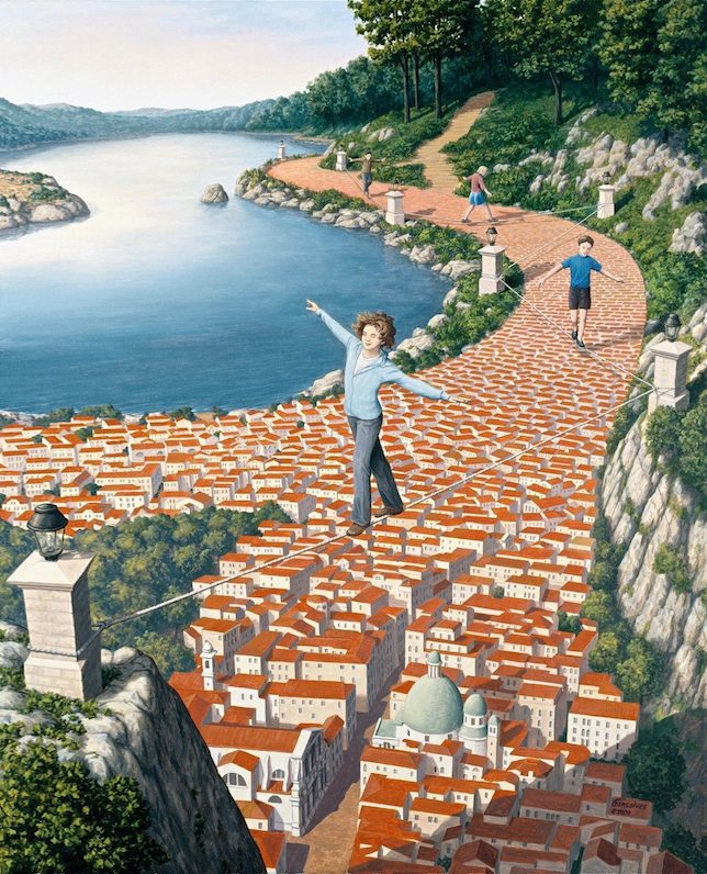
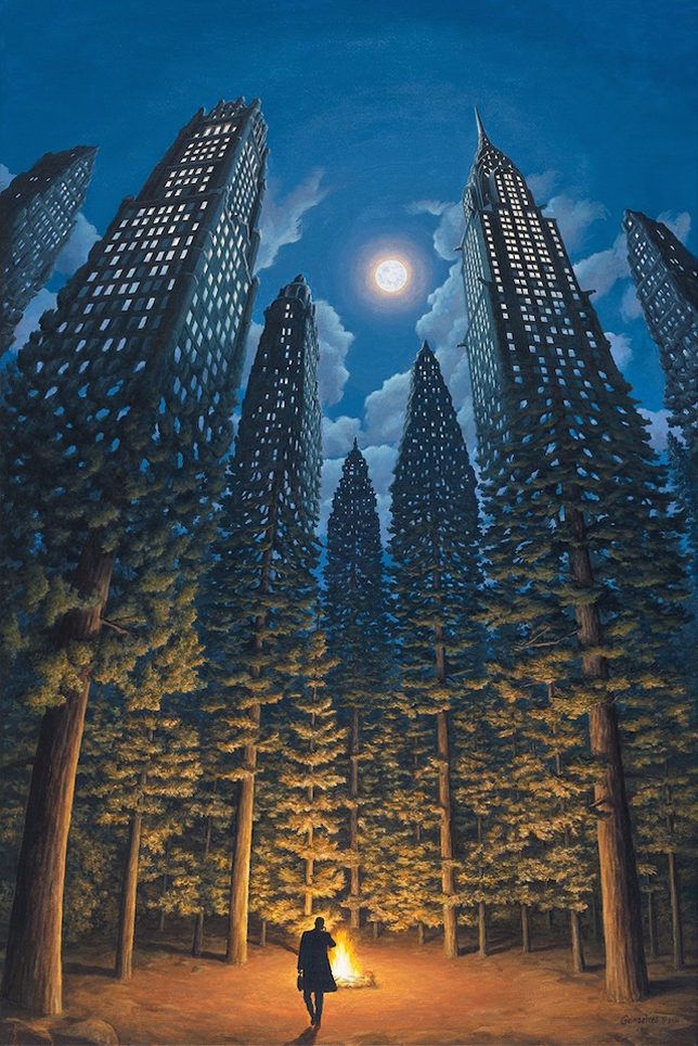
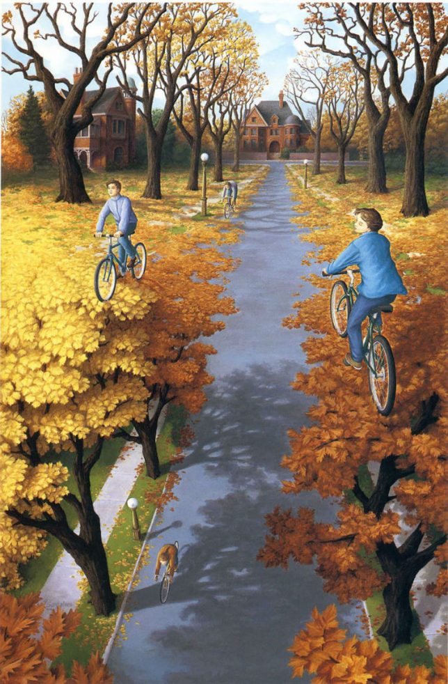
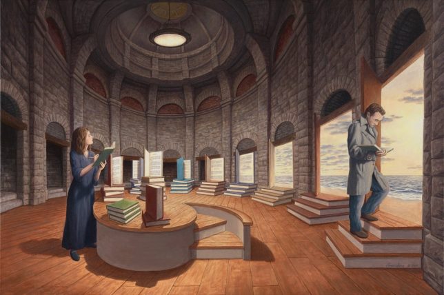
In the same magic-realist vein as artistic giants like Salvador Dalí, M.C. Escher and Renê Margritte, Rob Gonsalves crafts elaborate and interconnected scenes that shift subtly to form remarkable illusions of dizzying depth and scale.

magical-realism

The 55-year-old Canadian of Portuguese descent takes settings that look ordinary at first glance, then layers and intersects them to form fantastic fictional realities. Many of his pieces tackle overlap, blurring the boundaries of natural and built environments, man-made and organic phenomena.

night-skyscraper-trees

Trees falling from the tree on a street form a canopy for a second, semi-secret world below. Books slowly turn into steps as they make their way around a domed library. Bricks become rooftops as children walk along a path. Skyscrapers morph into trees, blending nature and cities.

trees-biking

After college, Gonsalves worked as an architect and painted trompe-l’œil murals and theater sets on the side. As the popularity of his artistic works grew, he turned to painting as a profession.

library-morph

ocean-sky

“Although Gonsalves’ work is often categorized as surrealistic, it differs because the images are deliberately planned and result from conscious thought. Ideas are largely generated by the external world and involve recognizable human activities, using carefully planned illusionist devices. Gonsalves injects a sense of magic into realistic scenes. As a result, the term “Magic Realism” describes his work accurately. His work is an attempt to represent human beings’ desire to believe the impossible, to be open to possibility.”

Share on Facebook


[ By WebUrbanist in Art & Drawing & Digital. ]

[ WebUrbanist | Archives | Galleries | Privacy | TOS ]


WebUrbanist

 
Comments Off on Unnatural Wonders: Magical Surrealist Artwork Worthy of Dalí & Escher

Posted in Creativity


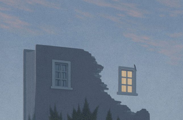
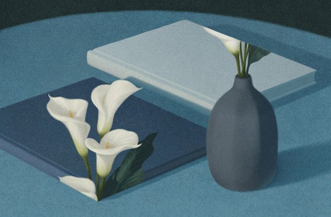
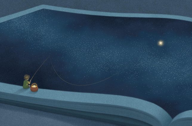
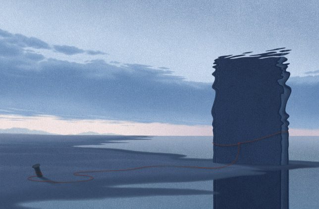
Spellbinding Visuals: Magical Book Artwork Tells Surrealist Stories

05 Sep

[ By WebUrbanist in Art & Drawing & Digital. ]

book cover art

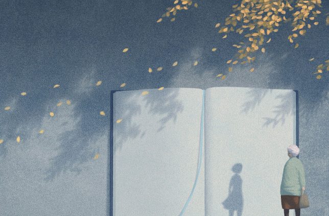
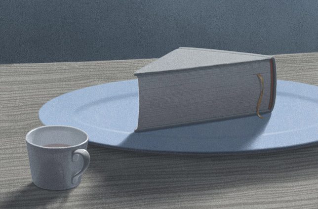
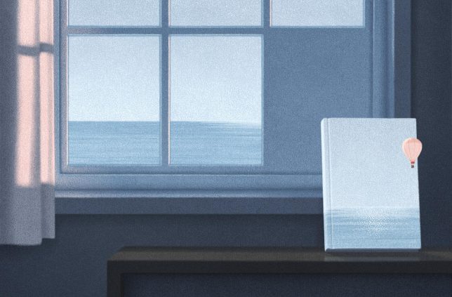
A series of book-centric illustrations (now collected into one big ‘book of books’) by Seoul artist Jungho Lee explores realms of impossibility through the deconstruction and re-imagining of bound volumes. Each surrealistic piece pushes the limits of plausibility in different ways, challenging the viewer to read complex stories into deceptively simple-looking drawings.

book architecture

book bending warped

book fishing

Winner of the World Illustration Awards for 2016, Lee is a Korean artist whose dreamlike work is often featured both on the covers of and within books for children or adults. The illustrations shown here are some of the 21 submitted for the competition and also included in the book Promenade, a collection published by Sang Publishing early this year.

book door

book image

book memory

Lee’s mixed-media approach includes “charcoal, water colour, gouache, hot-pressed papers and computer” graphics. He cites surrealist René Magritte and German artist Quint Buchholz as sources of inspiration for composition, messaging, lighting and angle of observation choices.

book plane wing

book pie

book surrealism

Lee starts with a basic image or rough sketch on large-format paper, usually using graphite or charcoal. Then he scans in the work and begins digital manipulations. Sometimes he goes back and forth, printing to paper to add more layers manually.

book lighthouse

book hike

book deconstructed

While his pictures span a variety of types, styles and subjects, much of his recent work specifically revolves around the manipulation of book-related imagery, expressing the contents of volumes without any use of text. If the series continues, he may create a followup volume to Promenade featuring further works of bookish art.

Share on Facebook


[ By WebUrbanist in Art & Drawing & Digital. ]

[ WebUrbanist | Archives | Galleries | Privacy | TOS ]


WebUrbanist

 
Comments Off on Spellbinding Visuals: Magical Book Artwork Tells Surrealist Stories

Posted in Creativity


Anti-Gravity Boots: London Shoe Artwork Defies Laws & Physics

09 Jul

[ By WebUrbanist in Art & Street Art & Graffiti. ]

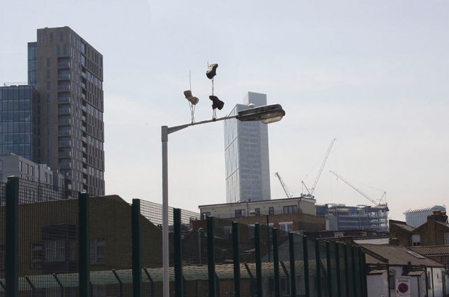
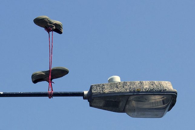
anti gravity shoes street

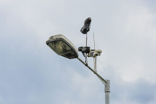
There are many theories, but no one is quite sure where the practice of throwing shoes over raised urban infrastructure started. Some suggest bullies take shoes from other kids and toss them over power and telephone lines; other think it could be a way of marking gang or drug-dealing territories. Or perhaps people just make and lose bad bets, paying the price with sore feet.

shoe on wire art

laced shoe downside up

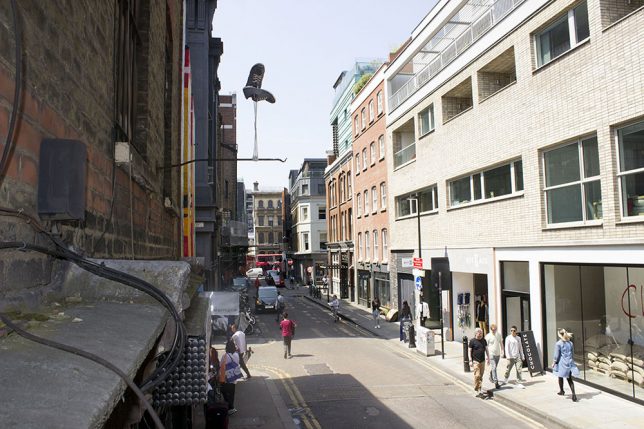
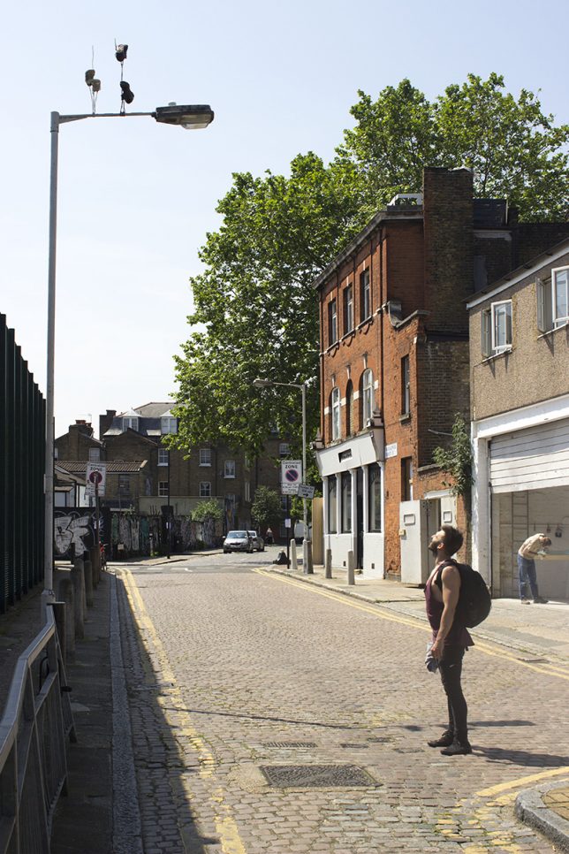
Whatever the reason, London street artist Pejac (images by Gary Van Handley) has taken the shoe-on-a-wire concept to the next level, with individual and paired shoes seeming to hang upside-down, pulled inexplicably toward the sky. Presumably to minimize annoyance to the city (and possible damage to critical lines), the artist in this case opted to use poles rather than wires for support.

gravity shoe art installation

gravity suspended shoes

Titled Downside Up, this series of shoe art installations across East London are in part a series of street artworks but also a viral marketing campaign for an upcoming solo exhibit. Pejac is well known for both silly and thought-provoking interventions, often manipulating built environments in subtle ways by pealing paint or through small installations easily missed by less observant passersby.

Share on Facebook


[ By WebUrbanist in Art & Street Art & Graffiti. ]

[ WebUrbanist | Archives | Galleries | Privacy | TOS ]


WebUrbanist

 
Comments Off on Anti-Gravity Boots: London Shoe Artwork Defies Laws & Physics

Posted in Creativity


Shazam for Art: Phone App Identifies, Prices & Compares Artwork

27 Apr

[ By WebUrbanist in Art & Drawing & Digital. ]

art identification app

Whether at a gallery without wall plaques, visiting a business establishment or hanging out at a friend’s home, having Magnus on your smartphone will let you see what the wall art around you is all about.

art comparison app

Pointing your device and clicking a picture brings up all kinds of details about a given work, including the name of the artist, medium of the work and its dimensions … as well as its price (either current, if available, or most recent if sold and off the market).

art gallery app

One of its more fascinating features, however, is  its comparative software that brings up what the app considers to be related works of art, by type, style and price. It does this by tapping into a crowd-sourced database of 8,000,000 works of art (and growing).

One risk here, of course, it that it reinforces the commodification of art. It is also sort of a strange function in that it boils art down to tastes and preferences … just because another piece looks similar or is priced in the same range does not mean a user should go out and buy it.

artist coder

Magnus was 31-year-old German art entrepreneur Magnus Resch, known for his work on best Larry’s List, an active database of contemporary art collectors. His response to this kind of criticism: “Why is it ethically wrong to show users prices of an artwork they are interested in?

“If you are willing to spend $ 10,000 on an artwork,” he continues, “you should know that another gallery put the work on auction a year ago for $ 7,000 and it didn’t sell. Knowing this will allow the collector to make a more conscious decision.” Of course, for most of us, spending $ 10,000 on a piece of art is a bit unrealistic, so perhaps the general public is not really the target audience for the app.

Share on Facebook


[ By WebUrbanist in Art & Drawing & Digital. ]

[ WebUrbanist | Archives | Galleries | Privacy | TOS ]


WebUrbanist

 
Comments Off on Shazam for Art: Phone App Identifies, Prices & Compares Artwork

Posted in Creativity


Potential Greenery: Topsoil & Time Shape ‘Empty Lot’ Artwork

04 Apr

[ By WebUrbanist in Art & Installation & Sound. ]

emptylotdec2015

A recently-completed, six-month art installation in the Tate Modern imported soil from parks all around London, arraying them in the museum’s Turbine hall to show what weeds, grasses and ferns would grow from seeds and spores already present in the dirt.

Abraham Cruzvillegas_ Empty Lot.-25004509915 (1)

Empty Lot by artist Abraham Cruzvillegas involved equalizing conditions for the various samples of topsoil, which were evenly lit by lamps and consistently watered for half a year.

Empty Lot-24111522275

The installation was set up as a large geometric sculpture placed on scaffolding, supporting an array of triangular planters.  The samples were brought together from six parks, and kept separate between beds, growing in parallel.

Hyundai Commission 2015_ Abraham Cruzvillegas_ Empty Lot-24171950432

The outcome was unknown in advance, just like growth in nature or the evolution of a city, with elements of chance revealing the hidden potential in different park spaces (images by Sara~, Jennifer Morrow and Alexander Baxevanis)

Share on Facebook


[ By WebUrbanist in Art & Installation & Sound. ]

[ WebUrbanist | Archives | Galleries | Privacy | TOS ]


WebUrbanist

 
Comments Off on Potential Greenery: Topsoil & Time Shape ‘Empty Lot’ Artwork

Posted in Creativity