RSS
 

Posts Tagged ‘Artist’

XP-Pen Artist 24 Pro Review: A Gorgeous Graphics Tablet for Photographers

08 Jan

The post XP-Pen Artist 24 Pro Review: A Gorgeous Graphics Tablet for Photographers appeared first on Digital Photography School. It was authored by Sime.
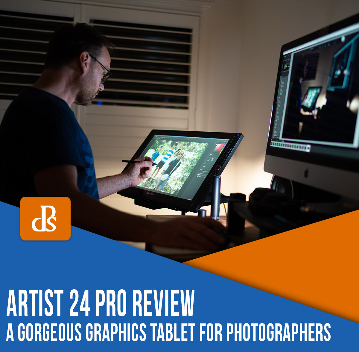
XP-Pen Artist 24 Pro graphics tablet review

I’ve been using Photoshop for many years – primarily as a photographer that works in Lightroom and sometimes exports images into Photoshop for editing. But using Photoshop with a mouse is something that takes a lot of practice; it’s not really a natural way to post-process, which is why many serious editors turn to graphics tablets.

Now, when the team from XP-Pen reached out and offered us a review unit of the XP-Pen Artist 24 Pro, a 2K, 23.8-inch QHD graphics tablet, I’ll admit I was a little dubious. I’d only ever owned one graphics tablet – a tiny little Wacom that didn’t get a lot of use. I was certainly keen to try a new tablet, but I’ll admit that I was a little worried about not liking it.

Fortunately, as you’ll soon see, I needn’t have worried. As I share in this review, the XP-Pen Artist 24 Pro is a powerful graphics tablet, one that both looks and works great.

So to discover all the nitty-gritty details, including both the benefits and the drawbacks of working with the Artist 24 Pro, read on.

First impressions

The package that arrived was much larger than I expected. I knew the Artist 24 Pro featured a 24-inch display, but I had clearly not managed to comprehend just how large the tablet would be.

I have a desk with two 27-inch displays, which meant that the XP-Pen Artist 24 Pro would need an extra bit of real estate. So after I MacGuyvered something together with a Kupo light stand and my Tether Tools Aero, it was time to get the new tablet set up!

XP-Pen Artist 24 Pro graphics tablet review
The XP-Pen Artist 24 Pro standing on the makeshift work table.

I tried using the tablet in two different configurations:

First, on a stand with my Macbook sitting behind it. This is a great setup for shooting tethered, as you can perform quick edits there and then with the tablet while using it as your main display.

The second configuration, as shown in the photograph above, was with the tablet adjusted to the height of my standing desk, ready to go!

Design

The XP-Pen Artist 24 Pro offers one HDMI and two USB host ports (so you can charge things like phones, etc.), as well as the power input on the back of the unit.

There’s also a USB-C port, which allows me to connect my iMac to the display. This was very quick and convenient; it worked straight out of the box with very little configuration required.

XP-Pen Artist 24 Pro graphics tablet

The rear of the tablet sports a flappy-paddle stand that, when depressed, moves a foot into the desired position. This lets you adjust the unit to stand up or lay almost flat, as though you’re writing in a nice big notepad.

XP-Pen Artist 24 Pro graphics tablet tilting

I love how I can stand up the tablet to use as a regular second monitor for my 13-inch Macbook Pro, before laying it flat and working on photographs.

XP-Pen Artist 24 pro setup
The XP-Pen Artist 24 Pro lying almost flat.

Ease of use

The XP-Pen Artist 24 Pro comes with a piece of software (a download) that adjusts the settings of the tablet, pen controls and functions, monitor configuration, express key setup (more on that in a bit), calibration, and other general features. I’ve found it very easy to use with no what-the-heck-am-I-doing moments to speak of!

XP-Pen Artist 24 Pro settings

However, when you first set up your tablet and open Photoshop, make sure you have the correct monitor mapped. Otherwise, you’ll find yourself deeply frustrated; I speak from personal experience.

XP-Pen Artist 24 pro settings tab

Performance

There are many technical reviews of the XP-Pen Artist 24 Pro on the web, and most of them will tell you, in superbly technical terms, that the tablet is a very capable tool.

In fact, my conclusion is similar – the large screen, the 2560×1440 resolution, the 90% AdobeRGB color gamut, and the tilting stand makes for a very usable tablet.

When you get the XP-Pen Artist 24 Pro custom buttons all configured using the two easy-to-control red dial wheels and the 20 customizable shortcut keys, it’s very easy to open and control many different graphics packages, as well as a lot of other options (depending on which software you like to use on your computer).

In truth, I hadn’t previously used a tablet much. I thought that I’d always just edit with my mouse. I guess that comes from having a less-than-pleasant time with the first tablet I tried (and I hadn’t used another tablet until the Artist 24 Pro).

I’ve now had the XP-Pen Artist 24 Pro for quite a while. And when working in Photoshop, while I would have once happily used my mouse, I now whip out the tablet and do my editing on the screen – a testament to the great performance and ease of use of the tablet.

Granted, the 24-inch tablet isn’t the smallest device, and you do need to have space for it. But the tablet only requires one USB-C (or HDMI) and one power cable, so you can have your laptop tucked behind the tablet, using the tablet as your main display with a wireless keyboard and mouse to give your laptop that “big screen” feeling.

I’ve used the tablet as the main display for my 13-inch MacBook Pro for almost everything from movies to editing since I received it.

The XP-Pen Artist 24 Pro review: Conclusion

The XP-Pen Artist 24 Pro offers solid build quality combined with a simple-to-navigate interface, great on-screen performance, visual clarity, and ergonomics.

There was only one thing I thought could be improved, and that was the rear foot of the big screen. It has a couple of rubber stoppers that hold the device nicely in place, but it’s easy to scratch your desk if you’re not careful.

Overall, I like almost everything about the Artist 24 Pro; it’s packed full of features that make it one great tablet!

You can purchase the XP-Pen Artist 24 Pro right here.

The post XP-Pen Artist 24 Pro Review: A Gorgeous Graphics Tablet for Photographers appeared first on Digital Photography School. It was authored by Sime.


Digital Photography School

 
Comments Off on XP-Pen Artist 24 Pro Review: A Gorgeous Graphics Tablet for Photographers

Posted in Photography


500px tells photo artist it once praised that his work is no longer welcome on platform

25 Jun

Online photography community 500px has alerted one of its most prominent users, Polish photo artist Michal Karcz, that his work is no longer welcome on the platform. According to a post Karcz published on Facebook, 500px warned the artist that ‘non-photographic content’ on his account is now in violation of the company’s Terms of Service.

The decision to ban Karcz’s digital artwork highlights a major change in policy for 500px, which historically not only welcomed Karcz’s work, but also repeatedly praised it with multiple ‘Editor’s Choice’ and ‘Year’s Best’ designations. According to Karcz’s Facebook post, his work on 500px has received more than 7 million views, 168k ‘Affections,’ and his account has nearly 35,000 followers.

One of the photo illustrations Karcz shared on his 500px account. Used with permission

Karcz’s was declared a ‘Photoshop master’ in an article 500px published on its blog to showcase his work. The content blends photography and digital art to present viewers with unique, in some cases other-worldly, images of reality. These same images are now in violation of the 500px guidelines, a representative clarified to Karcz in a second message:

Hi there, Unfortunately photomanipulations based on photography is not photography and our website in the current iteration is evolving into a purely photography website. Not only that, our terms of service require you to be the copyright owner of the images you upload so if you’re editing bits and pieces of other peoples imagery then you’re in violation of that. I personally am a fan of your artwork but unfortunately it doesn’t fit within the conditions of our site at the moment.

Another photo illustration Karcz shared on his 500px account. Used with permission.

Karcz’s 500px account is still live on the service at this time and still features the same ‘non-photographic content.’ It’s unclear whether the account will be deleted, but Karcz’s work remains live on Facebook and his personal website.

Articles: Digital Photography Review (dpreview.com)

 
Comments Off on 500px tells photo artist it once praised that his work is no longer welcome on platform

Posted in Uncategorized


Learning to See Like an Artist – 7 Powerful Techniques to Help You See More Compelling Images

31 May

The post Learning to See Like an Artist – 7 Powerful Techniques to Help You See More Compelling Images appeared first on Digital Photography School. It was authored by Anthony Epes.

Being an artist has nothing to do with your camera, your kit or your photo knowledge.

It has nothing to do with how long you’ve been taking photos or if you shoot on manual or automatic.

Being an artist is totally and completely about the mindset you inhabit when you are out shooting, and what you create from this state.

It’s about looking at the world in a way that is different from how we usually see it. It’s ridding ourselves of the habits to ‘get somewhere,’ to accomplish and tick things off our to-do lists.

It’s all about immersing ourselves, our senses, our beings in this beautiful, wild, chaotic and amazing world.

It’s diving deeper, seeing more and finding new and interesting ways to capture what we discover.

What you get from bringing this artistic approach into your photography are unique images.

Your photos become about expressing who you are, encompassing everything that you have seen and experienced in your life.

This to me is the joy of photography. So I have some simple, but immensely powerful tips that will help you connect to your inner artist.

“There is only you and your camera. The limitations in your photography are in yourself, for what we see is what we are.” – Ernst Haas

7 Powerful Techniques to Help You See More Compelling Images

First – ignore everyone

We spend so much of our lives in contact with other people. At work, our efforts are analyzed by our colleagues, boss or clients.

At home, our children, partner or family will comment on how we live, wash clothes, what we eat etc. We post something on Facebook and someone comments; everyone has an opinion.

As we are in constant contact with other humans, we find ourselves playing a role, fitting into expectations or rules or ways of living. We probably don’t even think about how the constant stream of people in and out of our lives makes us adjust and alter our behavior.

Creating art operates in a very different space – completely outside this interaction with other humans.

Being in the space of creativity is about forgetting what other people might think of our work, what other people are doing, literally everything that connects us to other human beings.

We need to release ourselves from our ‘normal lives’ and the way we live.

Because art can never be created by a committee. And what is completely unique and interesting about you is what will make the most compelling photos.

2. Know that we aren’t seeing the world as it really is

“Vision is the art of seeing what is invisible to others.” – Jonathan Swift

Did you know that your brain processes two billion pieces of visual data per second? And yet we only see about 50 bits of this information.

Of course, our brains are doing us a massive favor. If it didn’t block out most of what was happening around us, we couldn’t focus.

What’s interesting here is what 50 bits of information are you seeing, and what 50 bits am I seeing?

If we are seeing such a small selection of what’s available, then it’s highly unlikely we are all seeing similar things.

Which makes our personal world highly selective.

I find this so exciting because it shows how we are always able to create something new if we only open up our awareness.

This explains why we can all stand in front of the same scene and take different photos (this happens all the time on my workshops.)

Let’s celebrate that there is so much more to discover in the world around us.

3. Take your time to really observe the world around you

One thing I constantly see in my workshops is when people find a subject they love, they shoot it, then move on way too quickly.

I think it’s a natural response to how we live in this modern life. We are very driven by results. We shoot something, then we move on to the next thing. Almost like we are ticking a box.

But the way to be more creative in your photography is to forget about where you want to go next.

In fact, forget about everything that is not totally related to the present moment you are inhabiting, and the subject you are facing.

Take your time. Watch the light. Maybe wait for the light to change to see what would happen to your subject.
Look at the shadows. The people that are passing. What’s happening around your subject? Feel the atmosphere, and maybe how it is changing.

Observe.

As you see more and get to know your subject more, new angles will open up on how to shoot. Maybe the weather will change, making more dramatic images, or the light will soften creating a totally different feel to the mood of the shot.

The more you observe your subject the more it will reveal different qualities to you. You will notice more subtleties.

There is no rush. Allow yourself all the time you need to observe and shoot your subject.

4. It’s all about the light

“I am forever chasing light. Light turns the ordinary into the magical.” – Trent Parke

When people ask me what I photograph, I always say the same thing – light.

My biggest passion and main subject in photography is light. I love light in all of its forms.

The joyful, effervescent light of a spring morning; the deep, brooding, metallic grey light before a storm; the deep, deep blues of twilight in the city; the misty, melancholic light of a winter’s afternoon.

Light is always changing. Each day brings us something different and each part of the day has different qualities. And when you have interesting light it makes your subject so much more compelling.

Your job is to play with light and your subject, seeing what happens when the light changes.

What qualities are revealed in your subject in different light?

“Embrace light. Admire it. Love it. But above all, know light. Know it for all you are worth, and you will know the key to photography.” – George Eastman

5. Photography is all about feeling

When we see a photo we really love it’s rarely only because it’s nice to look at.

Beyond the composition, color, light and all of the things that we can organize, there is a more important element to a photograph that is more elusive and hard to capture.

This element is emotion.

“Photography’s a case of keeping all the pores of the skin open, as well as the eyes. A lot of photographers today think that by putting on the uniform, the fishing vest, and all the Nikons, that that makes them a photographer. But it doesn’t. It’s not just seeing. It’s feeling.” – Don McCullin

When a subject stirs emotion in us – joy, love, fear – it will transfer into our photo. And when the viewer sees that image, we want that emotion to be evoked in them too.

Capturing emotion is an art, and it’s not automatic. But it’s totally worth focusing on. Find subjects that stir your emotion, and try to capture that feeling in your images.

The most iconic photos that we remember for years, or the ones that really speak to us personally, will be communicating a powerful feeling.

6. Be in awe

“Instructions for living a life. Pay attention. Be astonished. Tell about it.” – Mary Oliver

If we think that photography is all about feeling then the most sensible option when deciding what to photograph is to find subjects that fill you with emotion.

I like to ask myself – what fills me with such deep excitement I am in total awe when I see it?

You can probably guess that light is what makes my heart burst with excitement and makes me want to get my camera out.

But there are other things too.

Exploring nature is always something that excites me. Spending days walking through the hills near where I live in Southern Spain, or through the pretty English countryside of my adopted homeland on a beautiful summer’s morning.
Cities too, especially at sunrise when they are empty and beautiful. I like to explore, wander and see what I come across.

It doesn’t matter though what your subject is, the most important part of your decision of what to photograph is that it has to be something that stirs your soul. It has to thrill you. It has to fill you with awe.
Otherwise, what’s the point of taking the photo?

7. Stop thinking
Now, the last step is often the hardest. We are trained from an early age to be in our heads. To be thinking and doing all the time.

However, if you want to hit that artistic mindset where you are present, connected to the world and in total creative flow, you will not be thinking or analyzing what’s happening around you.

“Don’t think. Thinking is the enemy of creativity. It’s self-conscious, and anything self-conscious is lousy. You can’t try to do things. You simply must do things” – Ray Bradbury

Once you have made the choices of when and what to shoot, then you can let yourself go.

Being an artist is losing yourself and becoming part of this magical and amazing world.

It’s daring to lose yourself to see what you can find. It’s being prepared to forget all the things that you have to do or worry about.

For this we have to be a little courageous, we have to experiment and try, we have to make mistakes and trust that we will take good photos (eventually). But –

“What would life be if we had no courage to attempt anything?” – Vincent Van Gogh

I hope you enjoyed these ideas.

I’d love to know if these sparked ideas or inspiration for you. Let me know in the comments below. Thanks!


The post Learning to See Like an Artist – 7 Powerful Techniques to Help You See More Compelling Images appeared first on Digital Photography School. It was authored by Anthony Epes.


Digital Photography School

 
Comments Off on Learning to See Like an Artist – 7 Powerful Techniques to Help You See More Compelling Images

Posted in Photography


Artist caught using stolen photos for $20,000 Calgary art installation

09 Dec
Image by Derek Besant via Avenue Calgary

A public art installation in Calgary has been removed after it came to light that the artist behind it, Derek Michael Besant, used copyrighted photos as part of the project without permission.

Besant was commissioned by the city of Calgary a couple years ago to create the $ 20,000 CAD / $ 15,500 USD art exhibit as part of the city’s 4th Street S.W. Underpass Enhancement Project. The resulting exhibit, which was located in the 4th St. S.W. underpass, featured large Polaroid-esque images showing blurred individuals with brief quotes overlaid onto them.

The individuals in the images were allegedly travelers with whom Besant had interacted in the underpass. Local publication Avenue Calgary reported in 2015 that Besant had spent a couple days in the underpass with “a camera, notepad and recorder” to get images and quotes from people who passed through. However, that lie fell apart after a Calgary traveler noticed that one of the project’s images resembled UK comedian Bisha Ali.

He sent Ali a note about it, at which point she began deconstructing the lie publicly online, pointing out that at least a few of the other images were also portraits of comedians. Ali detailed the entire saga in a long Twitter thread accessible here.

Late last month, Canadian publication MacLean’s unraveled the rest of the story, reporting that the images were swiped from the 2015 Edinburgh Fringe Festival, and that the artist had recommended to Calgary Head of Community Services Kurt Hanson that the city take down the exhibition.

In a tweet on the matter dated November 29th, Ali reported that Calgary was taking down the art installation:

Articles: Digital Photography Review (dpreview.com)

 
Comments Off on Artist caught using stolen photos for $20,000 Calgary art installation

Posted in Uncategorized


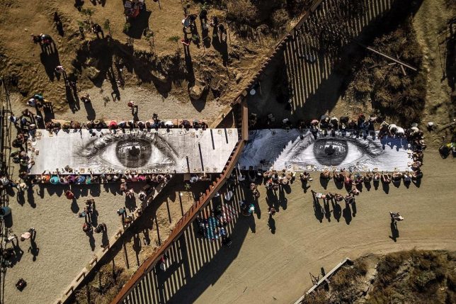
Picnic at the Border: Artist JR Hosts Bi-National Meal at a Giant Table

12 Oct

[ By SA Rogers in Art & Street Art & Graffiti. ]


At one small point on the United States-Mexico border, where two towns named Tecate are separated by a fence, residents of both countries sat down to the same picnic at a gigantic table printed with ‘The Eyes of the Dreamer.’ This new event, held on October 8th, comes just weeks after the artist rolled out a massive 65-foot-tall photographic installation of a toddler peering over the fence from the Mexico side.

“GIANT PICNIC at the border today in Tecate … people eating the same food, sharing the same water, enjoying the same music (half of the band on each side) around the eye of a dreamer … we forgot the wall for a minute …” says JR in a Facebook post.

Picnic-goers sat down to the same meal at one big table for the single-day installation, which was apparently pulled off with the help of a sympathetic border guard. A band played, with some of its members sitting on the U.S. side and others on the Mexico side.

JR is well known for these black-and-white photographic installations, which are put up all over the world, often without official permission. The subjects of his portraits are usually everyday people who live in the area. The TED Prize winner says he aims to use art to “turn the world inside out.”

Share on Facebook


[ By SA Rogers in Art & Street Art & Graffiti. ]

[ WebUrbanist | Archives | Galleries | Privacy | TOS ]


WebUrbanist

 
Comments Off on Picnic at the Border: Artist JR Hosts Bi-National Meal at a Giant Table

Posted in Creativity


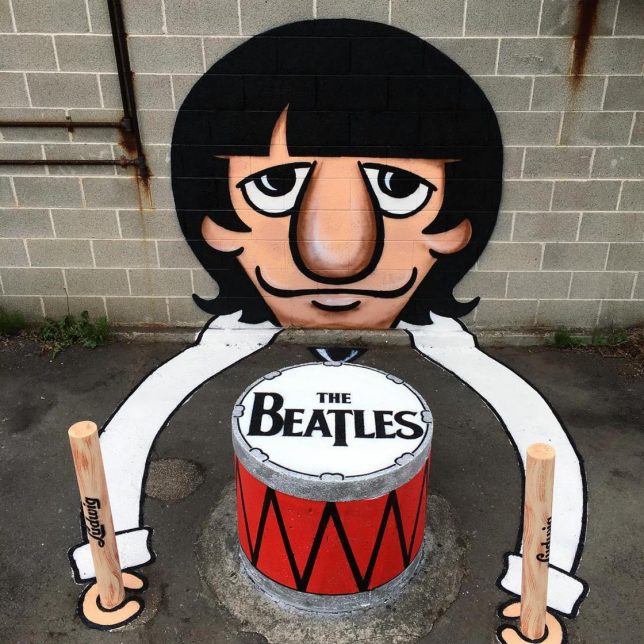
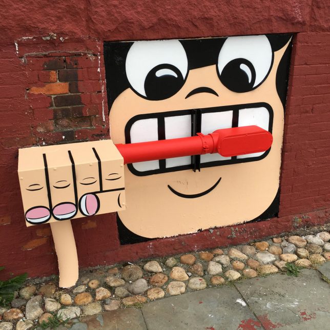
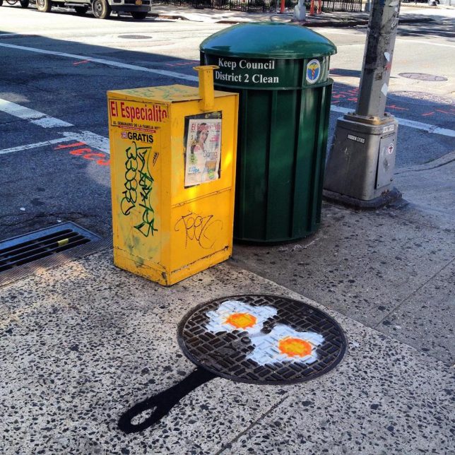
NYC Transformed: Graffiti Artist Turns Urban Objects into 3D Cartoons

29 Jul

[ By SA Rogers in Art & Street Art & Graffiti. ]

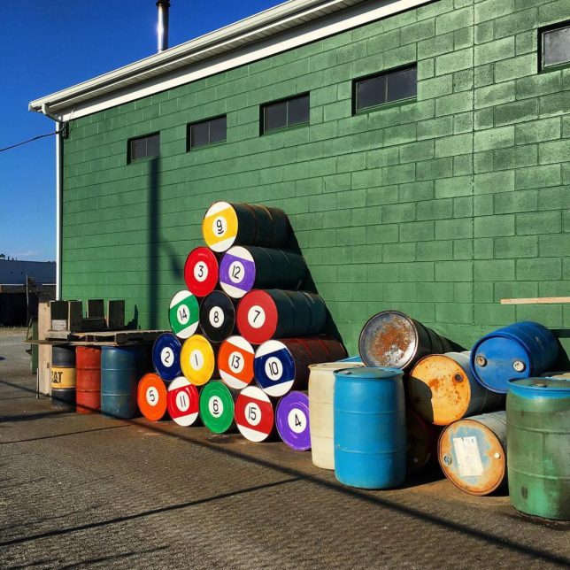
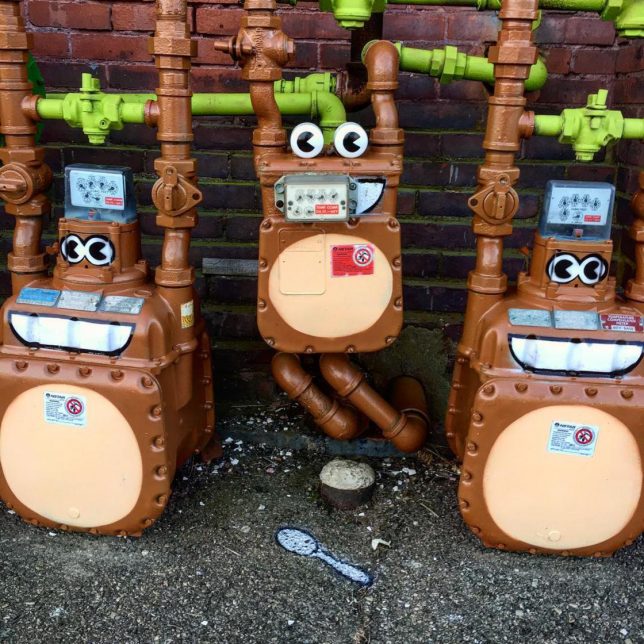
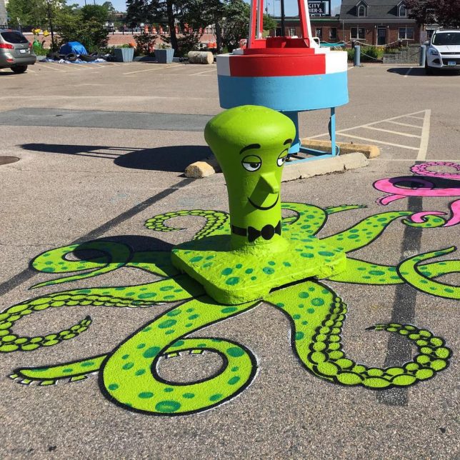
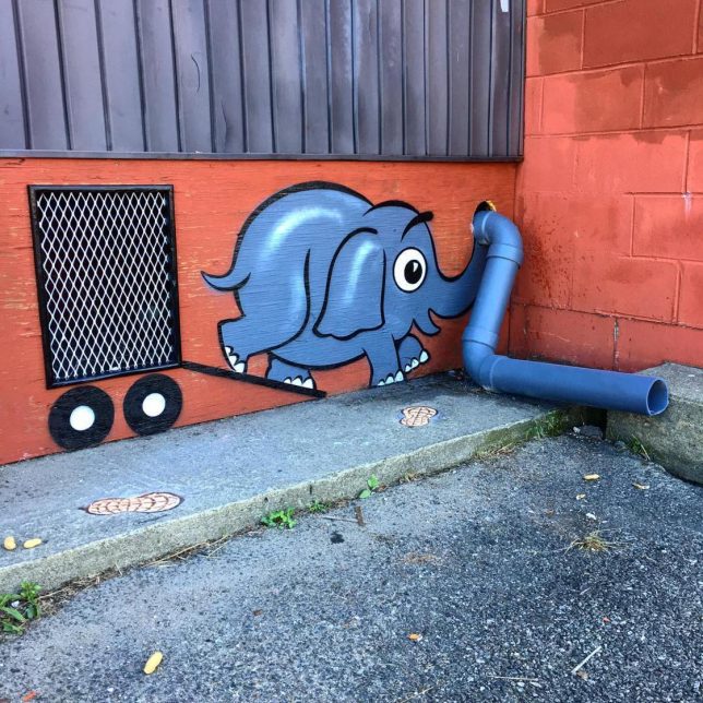
No street grate, pipe, manhole cover, stack of barrels or concrete blob on the beach is too random and irregular to be transformed into a lighthearted cartoon. Street artist Tom Bob looks for the potential in every alleyway, every sidewalk – seeing all sorts of creatures and scenes and bringing them to life in his signature vivid, playful style. You’ll never see street debris the same way.

BEFORE & AFTER ? Found this street sign end post as is. #bartsimpson #after #streetart #cartoonface #bart #simpson #tombobnyc #stencilart #thesimpsons #? #beforeandafter #tombob

A post shared by Tom Bob (@tombobnyc) on

JUMP ROPE GIRL #??#bikerack #jumpropegirl #sillouette #streetart #newbedford #massachusetts #brockavenue #nbma #southend #tombobnyc #publicart #tombob #jumprope

A post shared by Tom Bob (@tombobnyc) on

FLOAT LIKE A BUTTERFLY, STING LIKE A BEE!! ? RIP #muhammadali #thegreatest #boxer #champion #ali #cassiusclay ? #floatlikeabutterfly ? #stinglikeabee ? #streetart #saltspreader #tombobnyc #bumblebee #bee #?

A post shared by Tom Bob (@tombobnyc) on

The artist posts many of his creations on Instagram, sometimes showing before-and-after shots that give us an idea of just how mundane the scenes looked before he arrived with his cans of paint. Abandoned construction equipment becomes giant insects, a squashed traffic cone is roadkill, utility boxes turn into monkeys or crabs. The pieces seem to send a message that fun is wherever you want to find it.

ROAD KILL!! #splat #trafficcone #streetart #tombobnyc #stencil #tombob #stencilart #roadkill

A post shared by Tom Bob (@tombobnyc) on

Quiney #enjoying her @oreo #cookie @buttonwoodpark #nbma #? #oreocookie #manholecover #oreo #manholecover #streeart #stencil #manholecoverart #tombob @hmimoso4 @dlupe #oreocookies

A post shared by Tom Bob (@tombobnyc) on

? If you are in #newyorkcity tonight, come check out this piece I have in a group show @theskinnybar 174 #orchardstreet #les 7-4am curated by @djpumpkin #menatwork #warning #streetsign #roadsign #catching #gator #? #alligator #croc #sewer #sewergator #streetart #tombobnyc

A post shared by Tom Bob (@tombobnyc) on

With everything going on in the world, it’s good to have some levity to balance out the bad. The artist – whose real name is Thomas Bobrowiecki – was born in Massachusetts and earned a Bachelor of Arts degree in Design at Southeastern Massachusetts University.

Share on Facebook


[ By SA Rogers in Art & Street Art & Graffiti. ]

[ WebUrbanist | Archives | Galleries | Privacy | TOS ]


WebUrbanist

 
Comments Off on NYC Transformed: Graffiti Artist Turns Urban Objects into 3D Cartoons

Posted in Creativity


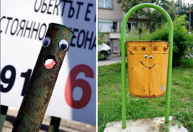
Eyebombing Bulgaria: Artist Adds Googly Eyes to Bollards, Bins & Pipes

09 Jun

[ By WebUrbanist in Art & Street Art & Graffiti. ]

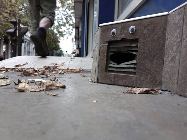
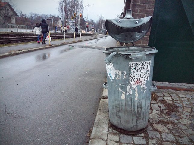
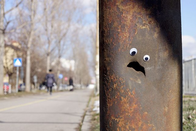
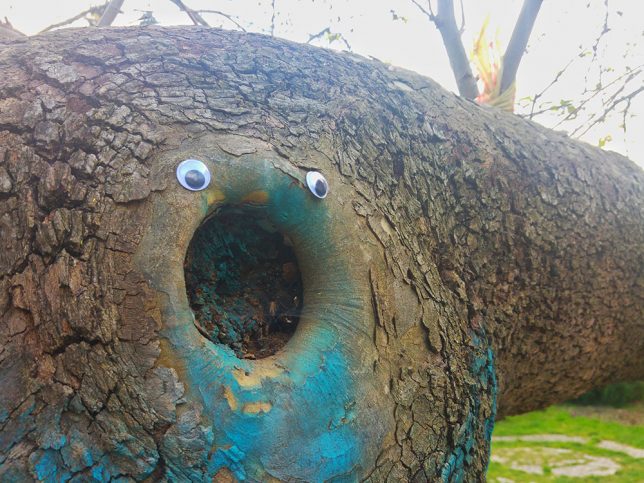
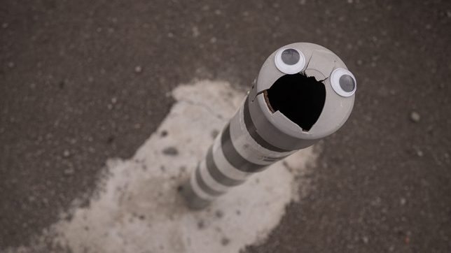
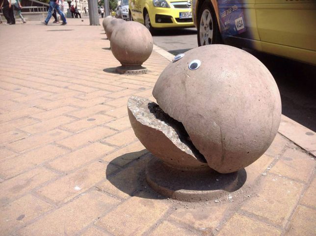
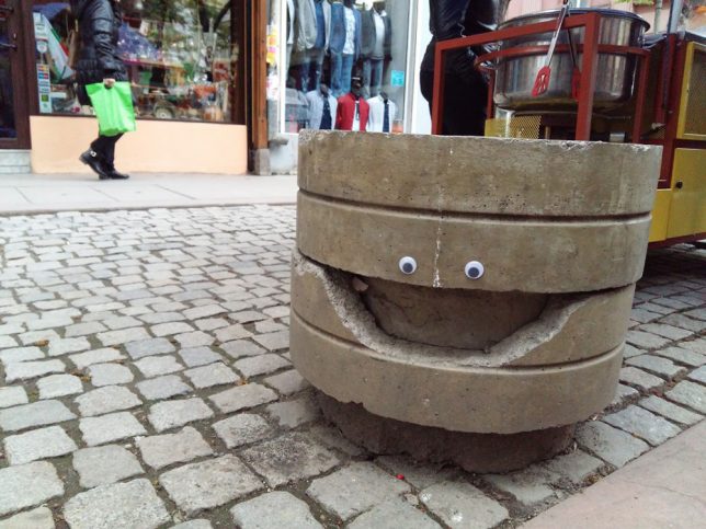
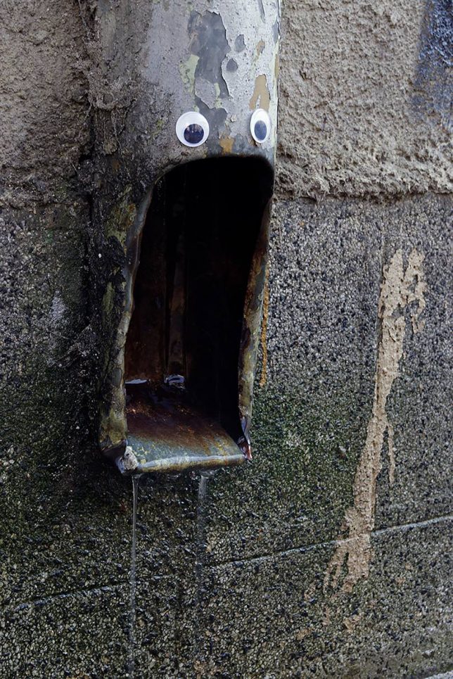
As public art interventions go, googly-eye additions to urban objects and surfaces are pretty simple to implement, effectively animating their surroundings without too much work (or risk of being caught).

Humans are naturally wired to read faces into ordinary things, but an extra cue or too by someone like Vanyu Krastev solidifies the effect, often with hilarious results.

Cracked bollards become crooked Pac Man-esque creatures and gaping water pipes seem to scream while doors and garbage cans gain strange sentience. The emotive range of these inanimate objects is quite impressive, considering it’s entirely in the eye of the viewer (and the two eyes placed on a given thing).

Eyebombing is nothing new (at least as old as the internet and probably as old as ‘googly eyes’ themselves), but always a fun way to lighten someone’s day as they pass by on the street. It’s also a form of expression anyone can engage in — very little skill or cash required.

It is “different from traditional types of street art like tagging, sticking, stencils” according to Eyebombing.com because “the above forms are largely driven by egocentric behaviour, like getting seen, respect and maybe a hope to get famous, often using vandalism as modus operandi.”

Share on Facebook


[ By WebUrbanist in Art & Street Art & Graffiti. ]

[ WebUrbanist | Archives | Galleries | Privacy | TOS ]


WebUrbanist

 
Comments Off on Eyebombing Bulgaria: Artist Adds Googly Eyes to Bollards, Bins & Pipes

Posted in Creativity


Film artist explains what’s wrong with new ‘Spiderman: Homecoming’ poster

27 May

There’s a new Spiderman movie coming out (yes, really – another one) and the most recent poster been generating a lot of comments. Mostly they’re comments about how it looks like the creation of a fevered teenager that just discovered Photoshop.

While the film itself looks like it might not be terrible, the poster is a technicolor mishmash of disparate elements from the movie, thrown together with gleeful disregard for scaling or uniform lighting:

In an interview with The Verge, veteran illustrator Tommy Lee Edwards explains what probably went through the designer’s mind: “Here’s a bunch of references I got from the movie. Let’s put it all together and see how it looks.’ From there, you might be inspired to do a real poster. Instead, they just stopped at that point”.

Well, to be fair, nobody ever said graphic design was easy.

Read more at The Verge

Articles: Digital Photography Review (dpreview.com)

 
Comments Off on Film artist explains what’s wrong with new ‘Spiderman: Homecoming’ poster

Posted in Uncategorized


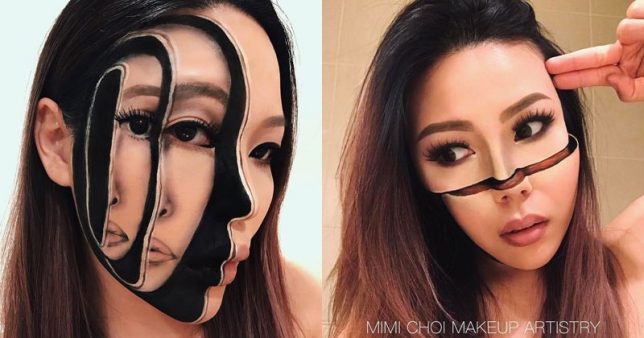
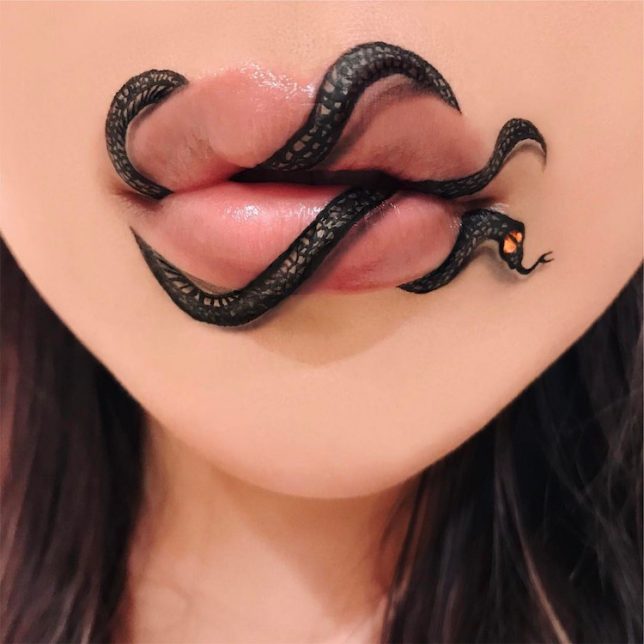
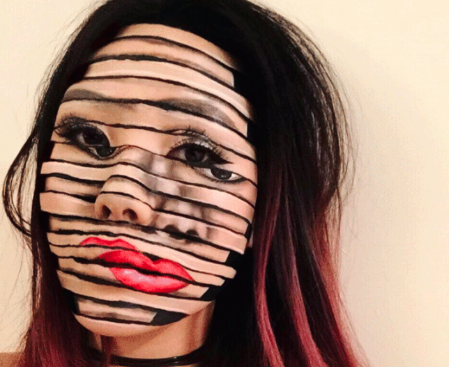
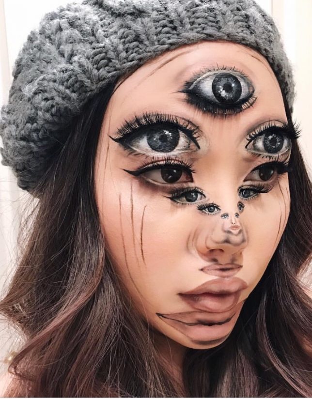
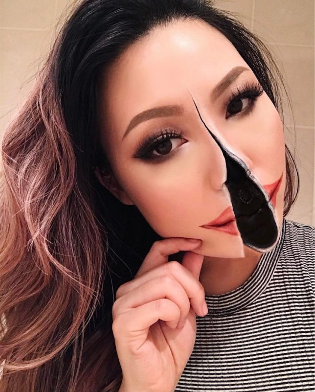
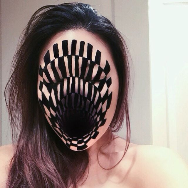
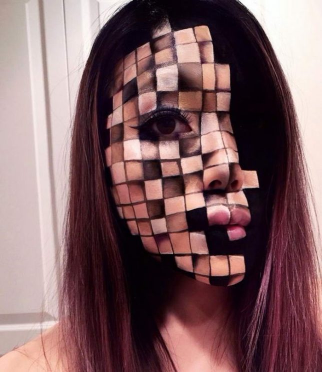
Trippy Transformations: Makeup Artist Creates Unreal 3D Illusions

26 May

[ By SA Rogers in Art & Drawing & Digital. ]

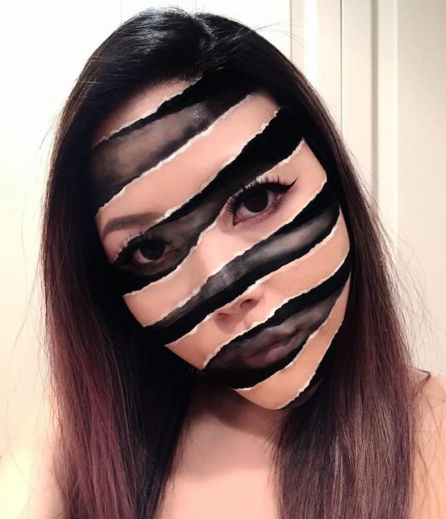
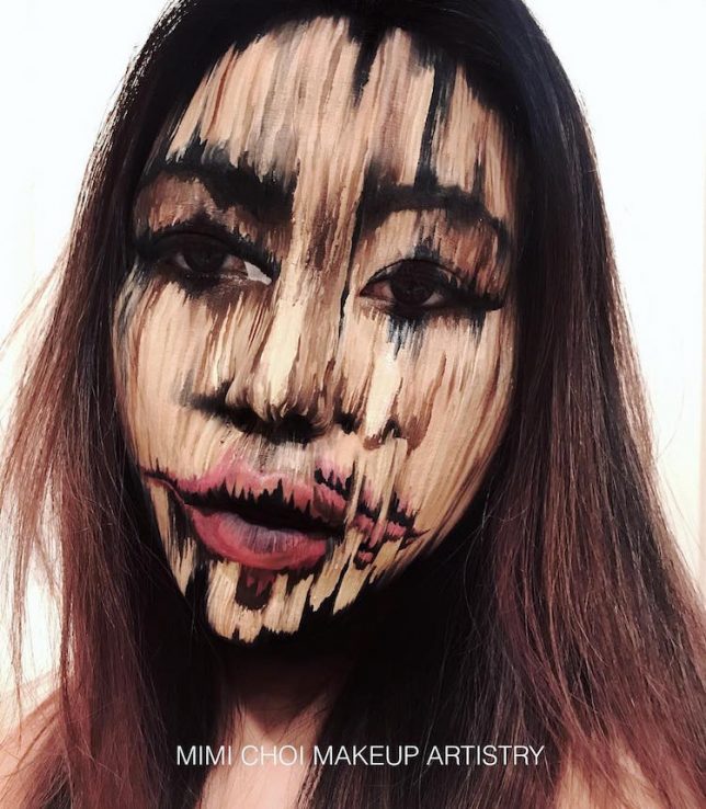
Makeup artist Mimi Choy slices, disjoints, stretches, blurs and otherwise radically transforms her own face in stunningly realistic optical illusions using nothing but makeup. No templates, prosthetics or Photoshop go into the creation of her surreal photos – she freehand them all, often using standard cosmetics from brands like MakeupForever and Kryolan theater makeup. The Vancouver, Canada-based artist shows off her trippy looks on Instagram alongside her more standard everyday makeup looks.

Mostly using herself as a canvas for her optical illusions, Mimi says, “To be honest, I never thought anybody would be interested in following my bizarre late-night creations a few years ago because it wasn’t ‘on trend.’ But I continued because illusion art is challenging and I like having to push limits each time. Later on, I realized it’s not about creating looks that are ‘popular’ or would guarantee likes/follows, it’s about creating our own trend and breaking barriers.”

Mimi says she rarely even has a specific plan in mind when she starts painting – she just goes for it, and allows the result to come about spontaneously. Check out her Instagram @mimles for lots more wild and intricate makeup creations.

Share on Facebook


[ By SA Rogers in Art & Drawing & Digital. ]

[ WebUrbanist | Archives | Galleries | Privacy | TOS ]


WebUrbanist

 
Comments Off on Trippy Transformations: Makeup Artist Creates Unreal 3D Illusions

Posted in Creativity


Dirty Car & Truck Art: Moscow Street Artist Adds Critters to Filthy Vehicles

14 May

[ By WebUrbanist in Art & Street Art & Graffiti. ]

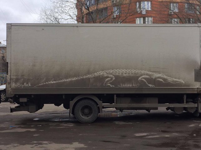
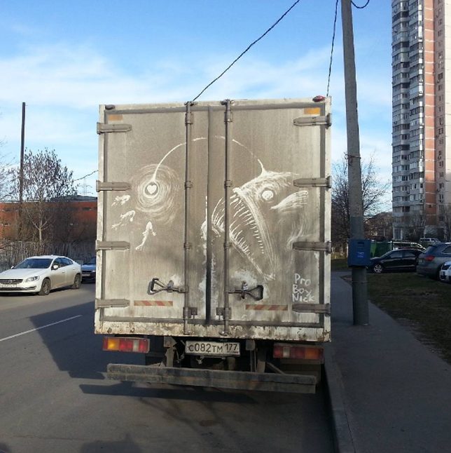
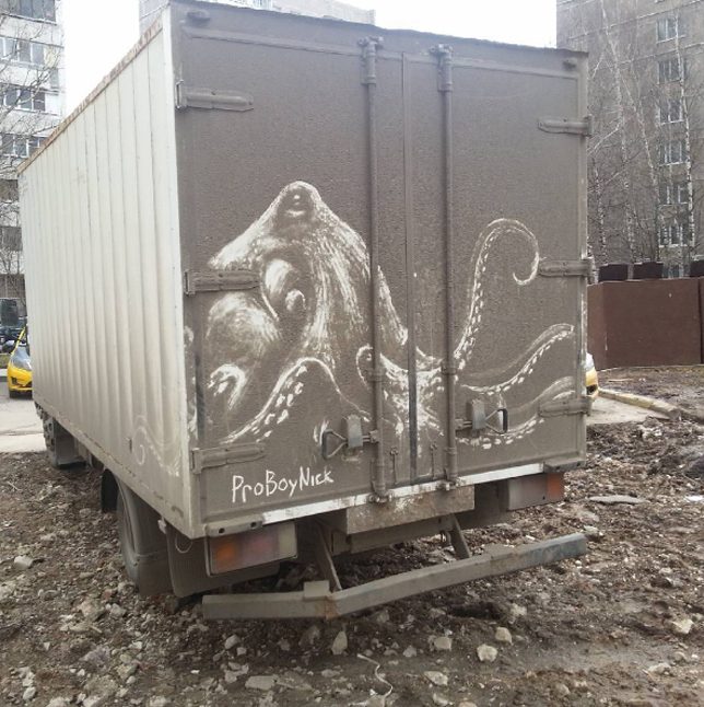
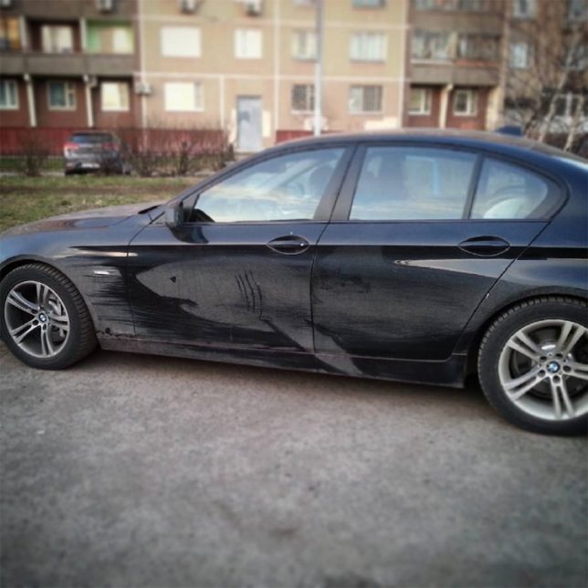
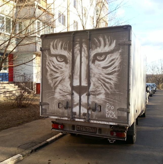
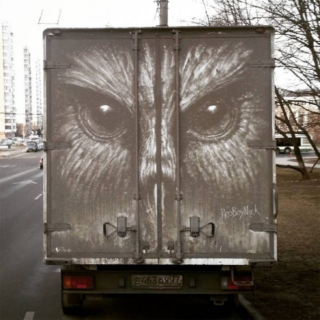
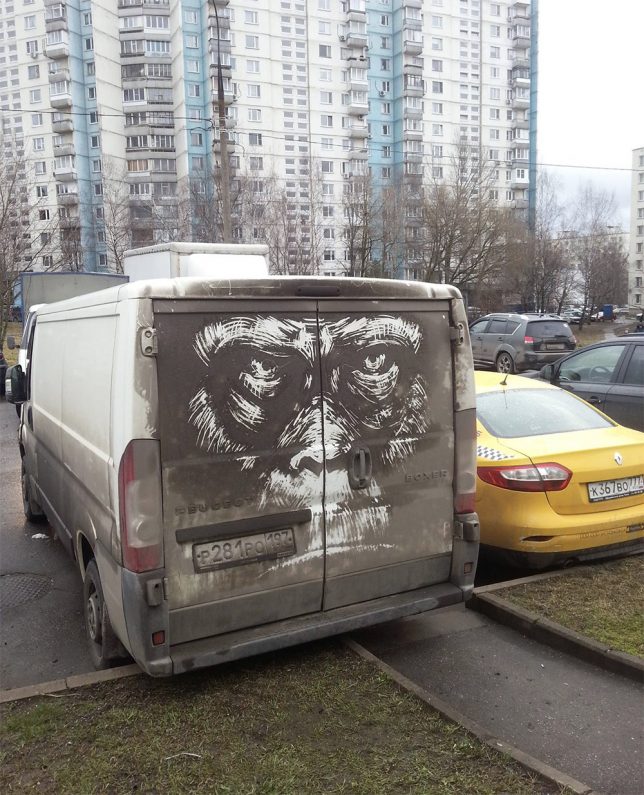
Massive deep sea monsters, jungle predators and swamp creatures lurk in the grimey shadows on the backs of trucks, thanks to interventions by illustrator Nikita Golubev. Most of the featured critters are of the potentially creepy variety, including a deep-sea angler fish, octopus, shark, alligator, lion, owl and orangutan.

Based in Russia, the artist works on cars sometimes as well, but finds the broad doors and long sides on larger vehicles particularly inviting as blank canvasses for light-on-dark works of art.

As a subtractive strategy, there is less risk associated with these impermanent pieces as well — at worst, some truck driver may be less than amused to find their dirty vehicle highlighted in such a way.

Reverse graffiti is nothing new, but most artists who work in that vein operate at smaller scales, cleaning up sections of door and rear windows rather than tall trucks. Naturally, these pieces are all temporary, destined to come off in the wash or rinse out in the rain (but live on in photographs).

Share on Facebook


[ By WebUrbanist in Art & Street Art & Graffiti. ]

[ WebUrbanist | Archives | Galleries | Privacy | TOS ]


WebUrbanist

 
Comments Off on Dirty Car & Truck Art: Moscow Street Artist Adds Critters to Filthy Vehicles

Posted in Creativity