RSS
 

Posts Tagged ‘Architectural’

Learn These 5 Elements to Capture Interesting Architectural Photography

04 Aug

The post Learn These 5 Elements to Capture Interesting Architectural Photography appeared first on Digital Photography School. It was authored by Jeremy Flint.

Architectural photography is an enjoyable genre of photography to shoot. It encourages you to visit and capture urban structures and environments, whether it be towns or cities, or whilst taking in views of majestic buildings, bridges, or interiors. Architecture can be present in many different forms from ancient to modern and both internal and external. If you have you ever wondered what steps to consider when shooting interesting architectural photography, this article will help you to identify some key elements to contemplate during the process.

Architecture Photography 01

Brasov, Romania

1. Choose a subject

The first fundamental aspect to consider when capturing interesting architectural photography is the subject. Your choice of subject can be anything from a streetscape to a city scene or famous landmark. Once you’ve found an object or theme to visit and photograph, think about what appeals to you about it. Think about what you want to photograph, such as the entire structure or just part of it.

Whatever you decide to photograph, be happy with your decision and take some pictures.

You can choose to focus on capturing wide shots and detail shots. A scenario where you may choose to shoot wide may include a prominent sky that adds beauty to the composition or a street scene that portrays many interesting buildings together. On the other hand, you may choose detail shots when there is a particularly striking facade or object on a building. For example, a statue makes a great feature on its own.

Architecture Photography 02

Bran Castle, Romania

2. Select your camera settings

The next thing you will want to do is set up your camera and choose your settings. In terms of architecture photography, you will need to select an appropriate aperture, ISO, and shutter speed. The aperture you choose depends on what you are trying to achieve with your photos.

If you are trying to achieve a narrower focus and render the front or back elements of the image out of focus, you will want to select a wider aperture (smaller f/number) from anything between f/2.8 to f/5.6. A scenario where you may choose to use a narrow depth of field is when you want to isolate an object from the background such as a doorframe. Alternatively, another scenario may be when shooting a single point of interest such as a statue.   

However, if you aim to make everything in your image sharper, I recommend selecting an aperture between f/8 to f/22. A scenario where you may want a wide depth of field may include stunning cityscape scenes. Here, you may want everything in focus within the frame. A cityscape can include some monumental buildings and the night sky or people walking within a street scene.

Architecture Photography 03

Cluj-Napoca, Romania

A lower ISO is important to reduce noise in the final image, so I suggest an ISO of 100-400.

The shutter speed you choose depends on the overall look and feel you want to achieve in your image. A faster shutter speed of 100th of a second or more will help to keep moving objects sharp such as cars or people. In contrast, a slower shutter speed of one second or more will let more light into your frame and start to blur moving subjects.

3. Decide on a composition

Architecture Photography 04

Sibiu, Romania

One important step in capturing architecture is the composition.

Composition simply refers to how you arrange the elements in a frame.

When looking at pictures of famous icons such as the Taj Mahal, Houses of Parliament or Big Ben, you’ll notice these structures often photographed in similar ways. One thing I would encourage is to find new angles of familiar landmarks when doing architectural photography – something that stands out from the others. You can achieve this by changing your viewpoint or angle.

4. Shooting interior architecture

Architecture Photography 05

Sibiu, Romania

When shooting interior architecture photography and exteriors, there are a few fundamental differences to consider, notably the light and composition. You will need to take into account the fact there is usually less light when shooting indoors, so change your settings to accommodate. Due to low light, use a tripod and slower shutter speeds to allow more light into your image. This helps you to manage different types of light, including candles, lamps, and outside light projecting internally. You will also need to balance mixed artificial and natural lighting.

The other major difference is the composition.

You may find more restriction photographing indoors than outdoors. Restrictions such as limited space, internal structures or part of the building’s architecture that may restrict or limit your view and composition. As a solution, use a wide-angle lens or try to take a step back (if you can) to get more of your chosen subject into your frame.

Alternatively, zoom your lens in further to eliminate distracting elements.

Structures often provide interesting internal features which can vary depending on the type of architecture and the country you are in. Church interiors, cathedrals, and even modern and historic buildings can all house hidden gems from altars to pillars, delightful structures, and stained glass windows.

The best lenses for shooting small or large spaces are usually a 24-70mm lens or a wide-angle lens such as a 16-35mm.

5. Shooting exterior architecture

Shooting exteriors is one of the most popular and fun subjects in architectural photography. You will often see pictures of the exteriors of the most famous buildings around the world and in your local area in publications. If you choose to shoot exteriors, you may decide to focus on the whole structure, the roof or a particular aspect of the external building that is interesting.

Architecture Photography 05

Peles Castle, Romania

Photographing exteriors can be challenging especially in changing light and high contrast conditions but can result in some great images.

Conclusion

In conclusion, remember these important steps when shooting architecture including choosing a subject, selecting your camera settings, deciding on composition and choosing whether to photograph interior or exterior architecture.

Share any additional steps you have for interesting architectural photography and your images with us below.


Capture-Interesting-Architectural-Photography

The post Learn These 5 Elements to Capture Interesting Architectural Photography appeared first on Digital Photography School. It was authored by Jeremy Flint.


Digital Photography School

 
Comments Off on Learn These 5 Elements to Capture Interesting Architectural Photography

Posted in Photography


How to Process Real Estate or Architectural Photos with Aurora HDR 2018

21 Nov

If you’ve ever tried your hand at real estate or architecture photography, you know that these are two of the most complicated forms of photography out there. The challenge is due mostly to having to balance out shadows created by harsh or uneven lighting. Thus, it’s no wonder that High Dynamic Range (HDR) photography is one of the most-used techniques for capturing real estate and architecture photos.

Before I go any further, let’s make it clear that this article is not about defining what HDR photography is or debating its merits. There is a myriad of arguments for and against HDR, but let’s save those are for another article. For now, let’s talk about Aurora HDR 2018 and how it might help you capture and process better HDR images.

How to Process Real Estate or Architectural Photos with Aurora HDR 2018

Simple, intuitive interface

If you’ve made HDR images using other photo editing programs such as Adobe Photoshop, you’ve probably had trouble figuring out how to use the software. One of the best features of Aurora HDR is that it is very stripped down, presenting you with only a few essential options that you can select to create your image. This greatly reduces your learning curve and makes it easy to get started immediately.

Use as standalone or with other programs

Speaking of other photo editing programs, you can use them in conjunction with Aurora HDR. It’s very easy to do. When you install Aurora HDR 2018 you can set it up to work both as a standalone program, or as a plugin for Lightroom, Photoshop, and others.

You don’t need a tripod

Historically, you’ve always needed to shoot bracketed images with a tripod to make sure they’re all aligned before merging them into a single HDR image. Not so with Aurora HDR. Thanks to their handy Alignment feature, Aurora HDR can automatically align your bracketed images (more on this in #2 below). This means that you don’t necessarily need to capture brackets with a tripod.

Of course, your images should be relatively aligned beforehand, but you don’t need the pinpoint accuracy that you used to need with other HDR photo editing programs.

Macphun Aurora HDR Photo Editing

Getting started with Aurora HDR

1. Open Aurora HDR and load images

When you first open Aurora HDR, you’re presented with a straightforward dialogue box that offers you three options (as seen in the screenshot above).

a) Open Image – In the very center is a button labeled “Open Image.” You can click on the button to select your images, or drag and drop them.

b) Batch Processing – If you have multiple sets of bracketed shots that you want to process all at once, drag and drop them into the Batch Processing dialogue box! Aurora HDR is intuitive enough to sort through the batch of files for you and automatically detect and match up your bracketed images.

Aurora HDR Batch Processing

c) Open Sample Image – This is a blue hyperlink below the “Open Image” button that you’ll probably only use the very first time you’re getting your feet wet with Aurora HDR. It exists mainly for demonstration purposes.

2. Set additional settings

For now, let’s assume you chose to Open Images (or, in the demo screenshots below, Load Sample Images). After doing so, another dialogue box appears with just a few options. The Alignment option is visible, and the others pop up when you click on the “Additional Settings” button.

Aurora HDR Brackets

Alignment

As mentioned above, checking the Alignment box will make sure all of your bracketed images line up properly. This means that you could possibly hand hold your camera while taking bracketed shots. But if you’re shooting a paid job, I’d still recommend shooting on a tripod to make sure you get the right shots, in perfect registration.

Ghost Reduction

If you happen to have a moving subject in your HDR brackets, enable the Ghosts Reduction setting. This can minimize the effect of ghosting in which moving objects may appear translucent or ghost-like in your final image. For real estate and architecture photography, you’re unlikely to have moving subjects unless you’re incorporating people in your photo or you can see moving tree branches through a window.

Aurora HDR Options

Get to Ghosts Reduction, Color Denoise, and Chromatic Aberration Removal by clicking on the gear icon (seen here in orange).

Color Denoise

Reduces the low-light noise in color pixels that can sometimes occur when merging photos together. This option is automatically enabled (as seen above), but you can shut it off if you wish.

Chromatic Aberration Reduction

It’s not unusual for real estate or architecture photos to have chromatic aberrations. Luckily, Aurora HDR has an option for minimizing the appearance of the purple and green glow along your image edges that is a clear indication of chromatic aberration.

3. Merge your photos

After checking the settings, click on the blue Create HDR button, and wait for your images to merge. This is perhaps the only downside to Aurora HDR (or, the whole HDR process in general). It takes a minute or two for the images to be merged together, so sit tight!

4. Select a preset or edit with the tools

Once Aurora HDR is done merging your photos, you’ll be presented with a more robust workspace where you can edit your HDR image further.

At the very bottom of the screen are a bunch of presets that you can choose to automatically adjust your image to a certain style. The Basic presets are selected by default, but if you click on the yellow “Categories” hyperlink, a bunch more will appear. For real estate, the Architecture presets are particularly helpful. Once you select a preset, you can adjust the amount to lessen or magnify the effect to your taste.

If you prefer to manually edit the photo with or without presets, use the far right panel where you’ll find basic photo editing tools. Scroll down to find even more editing tools such as Adjustment Layers and Dodge and Burn (more on these below).

aurora HDR

Preset categories here.

Aurora hdr

Lessen the effect of a preset by lowering the slider.

5. Add Adjustment Layers

Another fantastic feature of Aurora HDR is the ability to easily add Adjustment Layers in order to make targeted, non-destructive edits to your image. This is extremely useful in real estate and architecture photography, as you often need to make color and tonal adjustments to your image without inflicting permanent changes on the pixels.

For example, the image below illustrates the addition of an Adjustment Layer that targets the blue tinge in the staircase and chairs in the middle of the image, with the goal of color correction. Adjustment Layers also exist in Photoshop, and they function very similarly in Aurora HDR. The best part is that it is much more intuitive and easier to find in Aurora HDR than they are in Photoshop.

Aurora HDR Adjustment Layers

Adding an Adjustment Layer for local color control in selected areas.

6. Dodge and Burn

If you’ve upgraded to the brand new Aurora HDR 2018 version, you’ll find a couple of essential real estate photo editing tools that are much handier to access: Dodge and Burn Tools! If you’re unfamiliar with dodging and burning, you can read up on these photo editing processes in this dPS article.

In short, dodging helps you brighten targeted areas of an image while burning lets you darken them. Both techniques are essential for real estate photography retouching. In the new version of Aurora HDR, these tools are easily accessible in the right-hand panel. Simply scroll down to the “Dodge and Burn” panel and click on “Start Painting.” This will activate a few settings right above your image.

Aurora HDR Dodge and Burn

Use the Dodge and Burn tools to do special localized tone control in your image.

In Conclusion

If HDR photography sounds interesting to you and you’re looking for an easier way to post-process your images, give Aurora HDR 2018 a shot! Its intuitive, clutter-free interface is relatively easy to learn and you can begin enhancing your real estate photos in no time.

Disclaimer: Macphun is a dPS advertising partner.

Aurora HDR Final

Final image edited with Aurora HDR 2018.

Aurora HDR Sample Images

Before – a single image of a series of brackets.

Before

01 Macphun Aurora HDR Photo Editing

Before

Before

01 Macphun Aurora HDR Photo Editing

01 Macphun Aurora HDR Photo Editing

The post How to Process Real Estate or Architectural Photos with Aurora HDR 2018 by Suzi Pratt appeared first on Digital Photography School.


Digital Photography School

 
Comments Off on How to Process Real Estate or Architectural Photos with Aurora HDR 2018

Posted in Photography


Preserving Architectural Gems: 8 Beijing Hutong Plug-Ins Update Historic Shells

19 Oct

[ By SA Rogers in Architecture & Houses & Residential. ]

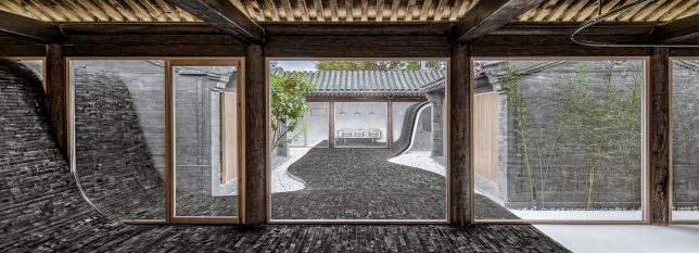
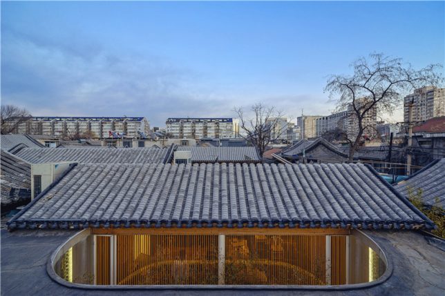
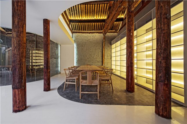
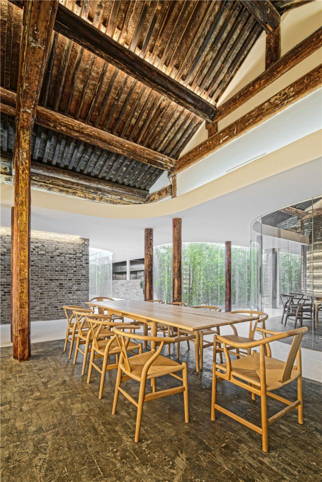
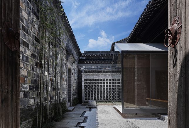
Passing through historic Beijing neighborhoods, seeing only the preserved street-facing facade, you’d never know that surprisingly modern structures contrast with aging surfaces within the courtyards just out of sight. Instead of just demolishing the ‘hutong’ courtyard houses found only in this Chinese city, architects are adapting them to modern life, slotting houses, hostels, museums, tea houses, cinemas and more under the existing roofs.

Tea House by Archstudio

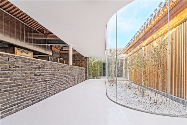
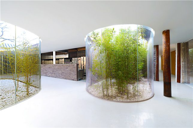
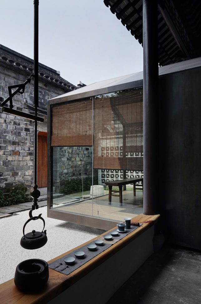
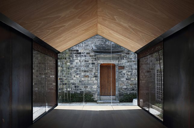
In a truly stunning adaptation, Archstudio has completed a tea house and cafe within an existing hutong house, enclosing it from above with new roofs while leaving atriums open for bamboo and other greenery. The intervention connects the site’s five existing structures with a glazed corridor following the path of the original courtyard, forming three tea houses with their own unique views.

Twisting Courtyard by Archstudio

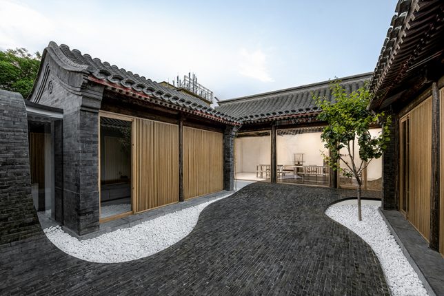
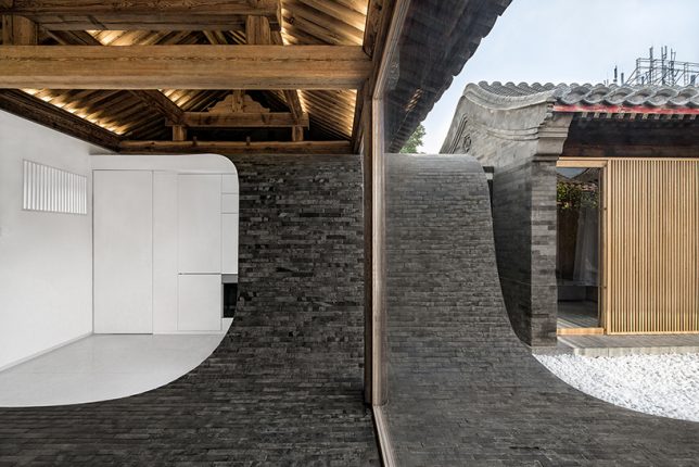
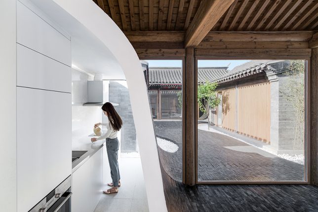
A river of glossy grey bricks streams through the courtyard of a Siheyuan house in the Paizihutong area of Beijing, upgrading the historic architecture with spaces that meet modern requirements of living. Archstudio‘s stunning pathway arches over the new volumes and even continues right into the dining room as part of the floor.

Mini Hostel Inside Hutong by ZAO / standardarchitecture

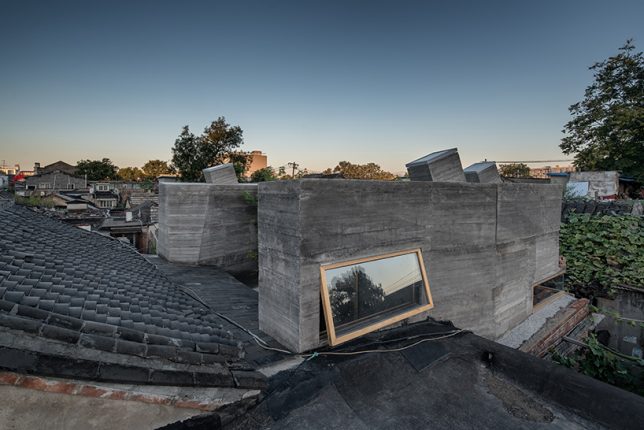
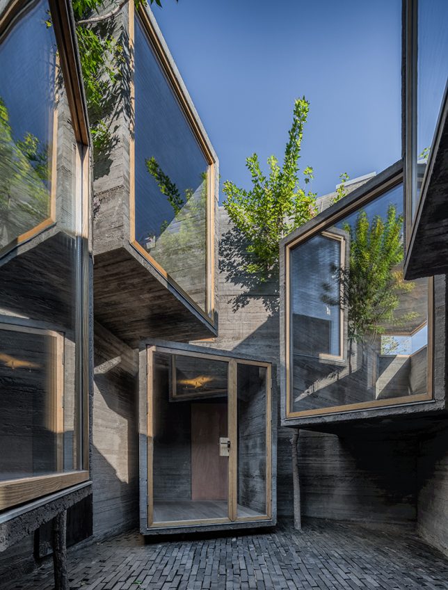
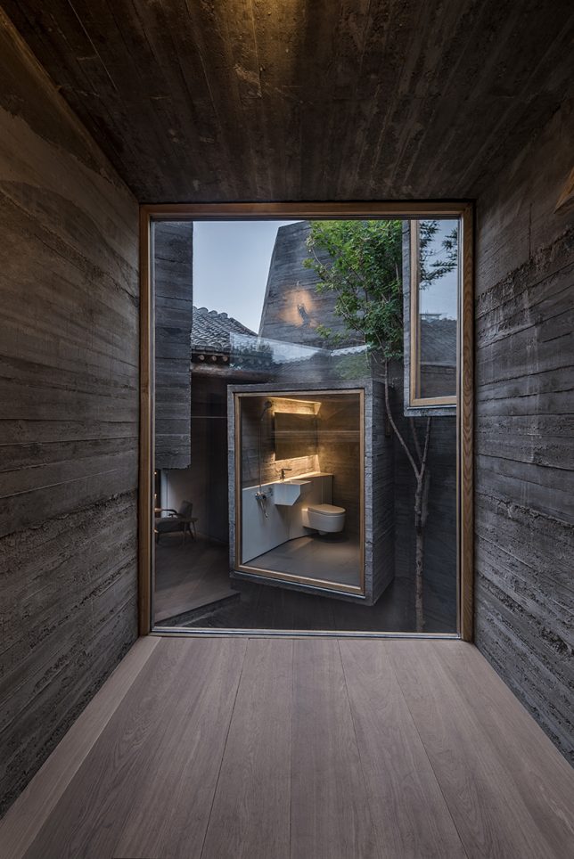
The firm ZAO / standard architecture inserted a small hostel inside a renovated Beijing hutong, exploring the potential of small-scale accommodations that slot right into the city’s existing architecture instead of displacing it. The glazed facades of volumes made of board-formed concrete project into the courtyard, facing each other (in some cases, with views of toilets, much to the horror of many Westerners looking at these images.) “The result is an architectural operation that brings back the courtyard as generator of the program, as it activates the building by creating a direct relationship with its urban context.”

Lai Yard House by Minggu Design

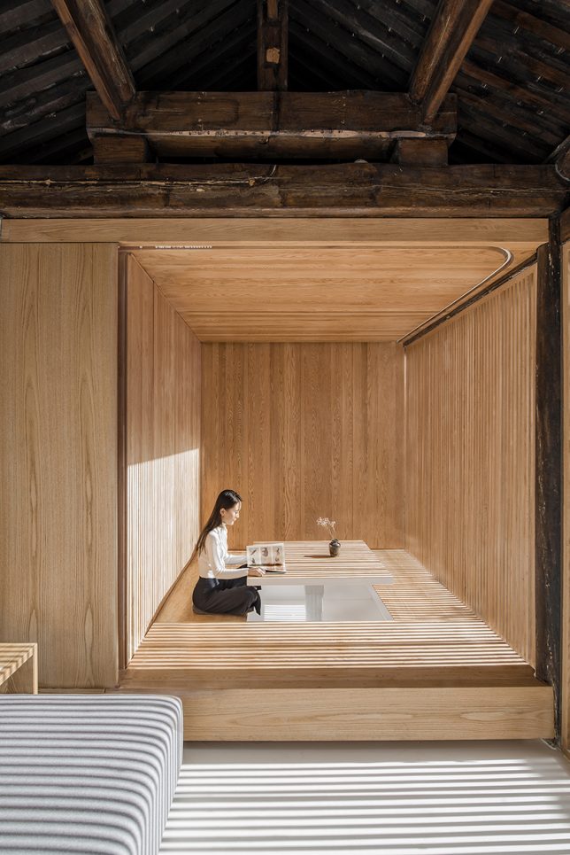
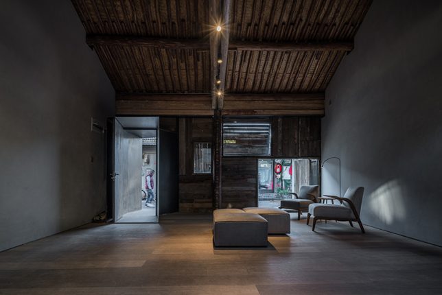
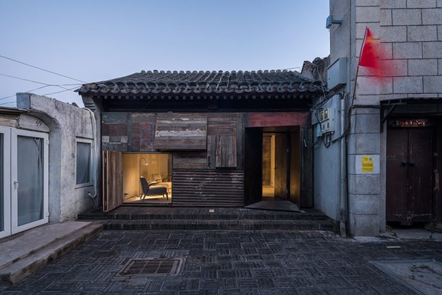
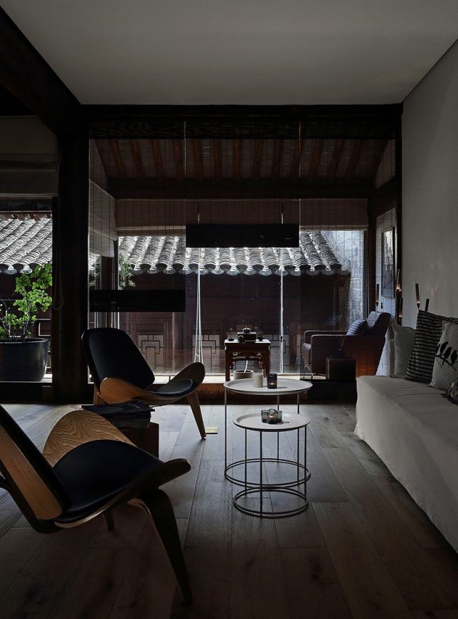
Tucked away behind weathered brick facades near the ancient city wall of Beijing, this courtyard home was crumbling. Minggu Design protects and preserves the original Chinese architecture while enhancing and adapting it for the 21st century, inserting volumes made of wood and glass to complement the surroundings without overpowering them. They used the new volumes to intentionally block and filter light to the original interior, creating a tranquil cave-like feel.

Next Page – Click Below to Read More:
Preserving Architectural Gems 8 Beijing Hutong Plug Ins Update Historic Shells

Share on Facebook


[ By SA Rogers in Architecture & Houses & Residential. ]

[ WebUrbanist | Archives | Galleries | Privacy | TOS ]


WebUrbanist

 
Comments Off on Preserving Architectural Gems: 8 Beijing Hutong Plug-Ins Update Historic Shells

Posted in Creativity


Somewhere Outside of Time: 13 Classic Retro-Futuristic Architectural Visions

07 Sep

[ By SA Rogers in Architecture & Houses & Residential. ]

Retro-futuristic architecture seems to exist outside of time, perhaps in parallel universes where the versions of the future envisioned by their creators actually became reality. They combine design elements from the decades in which they were built with futuristic elements as the architects imagined them, recalling the science fiction of their respective eras, often seeming like remnants from movie sets. Many still stand in a rapidly changing world, feeling like portals to somewhere very far away.

Walden 7 by Ricardo Bofill

Built in 1975, this housing structure by Ricardo Bofill located outside Barcelona, Spain takes inspiration from the science fiction novel Walden Two by B.F. Skinner. It originally included 446 residences in 18 towers, resulting in a labyrinth organized around seven interconnecting interior courtyards. Bofill imagined that this structure would be a utopian urban residence addressing many of the problems of urban life, with space for gardens and social interaction as well as two swimming pools. The high rise still stands and functions as an apartment building, with some units combined to create larger spaces.

Palais Bulles by Antti Lovag

The strange and bulbous Palais Bulles, or Palace of Bubbles, was built in 1989 on a cliff overlooking the Mediterranean Sea. Though it’s often used as a setting for fashion shoots and film festival parties, architect Antti Lovag emphasizes that how the structure is inhabited is its most important aspect. “Whether for economic reasons or lack of technical solutions, human beings have confined themselves to cubes full of dead ends and angles that impede our movement and break our harmony.”

Monsanto House of the Future by Monsanto

Did you know that infamous agrochemical giant Monsanto (known for creating Agent Orange during the Vietnam War) built a ‘house of the future’ at Disneyland in 1957? Located at the entrance to Tomorrowland, the house was designed by Monsanto in collaboration with MIT and Disney Imagineers, showcasing their vision of what life would be like in 1987. Made of fiberglass, the house was elevated on a pedestal with the intention of allowing it to rotate. Everything was modular and made of synthetic materials. Monsanto’s House of the Future closed in 1967, and though it was scheduled to be demolished in one night, the wrecking ball bounced off its tough facade, and a 2-week demolition job was ultimately required to take it down.

Habitat 67 by Moshe Safdie

First built as a pavilion for the World’s Fair in 1967 after architect Moshe Safdie conceived it as his master’s thesis, Habitat 67 remains one of the most unusual buildings of its kind, featuring 146 residences and a network of interlocking forms and walkways. The architect wanted to maximize the amount of private space and natural environments within a small urban footprint, enhancing the quality of life with gardens, fresh air and views. It was intended to be the first phase of a much larger complex, but Safdie’s vision for futuristic affordable housing failed to proliferate due to the high per-unit cost of his design.

Next Page – Click Below to Read More:
Somewhere Outside Of Time 13 Classic Retro Futuristic Architectural Visions

Share on Facebook


[ By SA Rogers in Architecture & Houses & Residential. ]

[ WebUrbanist | Archives | Galleries | Privacy | TOS ]


WebUrbanist

 
Comments Off on Somewhere Outside of Time: 13 Classic Retro-Futuristic Architectural Visions

Posted in Creativity


Starchitect Spotlight: 10 Iconic Architectural Projects by Herzog & de Meuron

29 Aug

[ By SA Rogers in Architecture & Offices & Commercial. ]

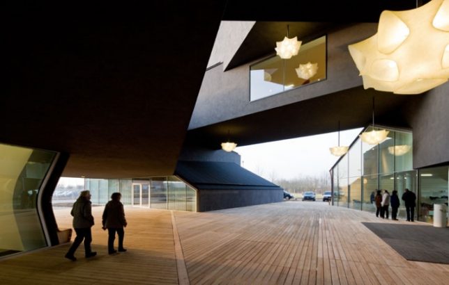
Based in Basel, Switzerland, the architecture firm Herzog & de Meuron is known for dramatic, monumental Modernist structures free of frivolity, expanding over the years from simple geometric silhouettes to more complex and dynamic shapes. Each of their buildings is almost like an oversized sculpture, some rising high above street level or cantilevering at striking angles while others, like their recent Berggruen campus, lie low and flat. These 10 projects represent some of the firm’s most iconic and memorable works.

Berggruen Institute, Los Angeles, California

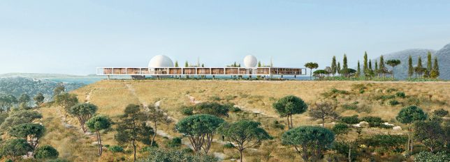
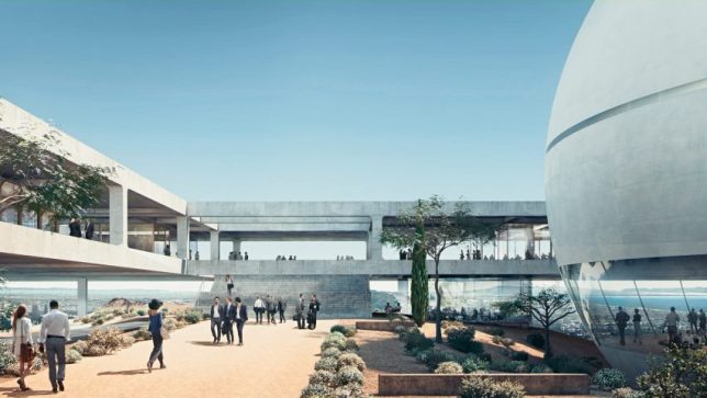
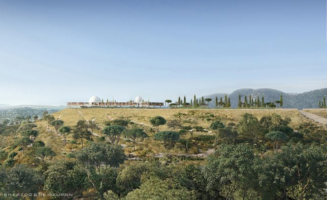
The firm conceived this new campus for the Berggruen Institute overlooking Los Angeles as a “landscape vision,” building on only a small area of the 447-acre site to keep 90% of it open and natural. Built along a mountain ridge in the Santa Monica mountains, the campus includes an elevated ‘frame’ surrounding a large courtyard garden and spherical lecture hall. It will act as a private educational forum for scholars and leaders in various fields working to “provide critical analysis and new ideas that will shape political, economic and social institutions.”

56 Leonard Street Skyscraper, New York City

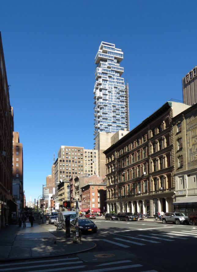
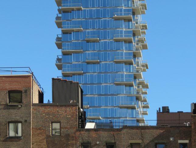
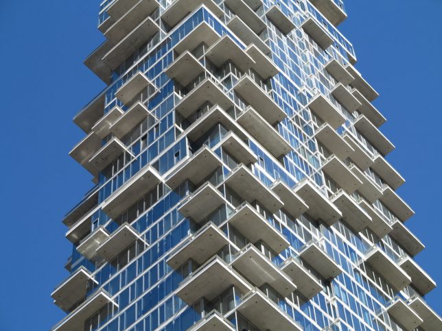
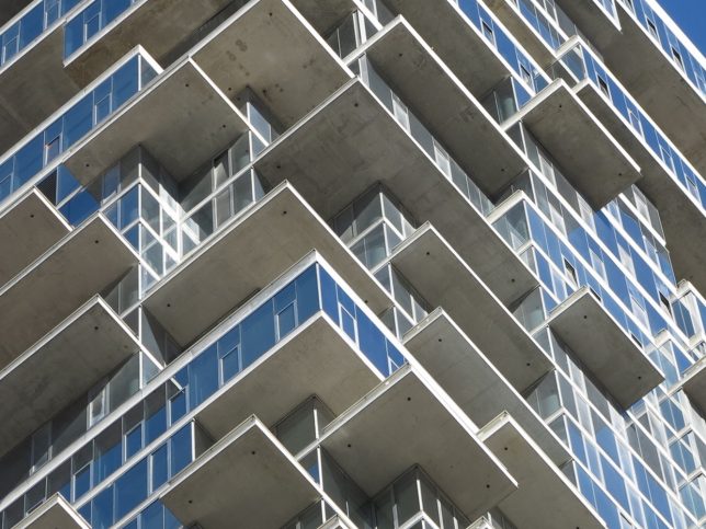
Construction of Herzog & de Meuron’s latest New York City skyscraper is complete, and the firm has released a stunning time lapse of the building process. This structure is envisioned as a stack of individual houses arranged in a Jenga-like formation, giving it a pixelated appearance. This arrangement also creates a series of terraces and projecting balconies on every level.

Elbphilharmonie, Hamburg, Germany

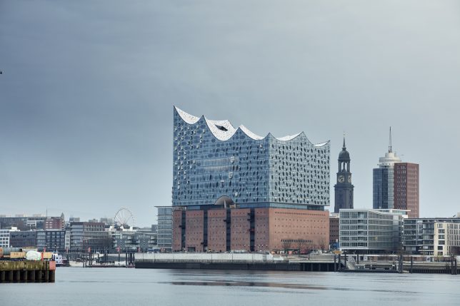
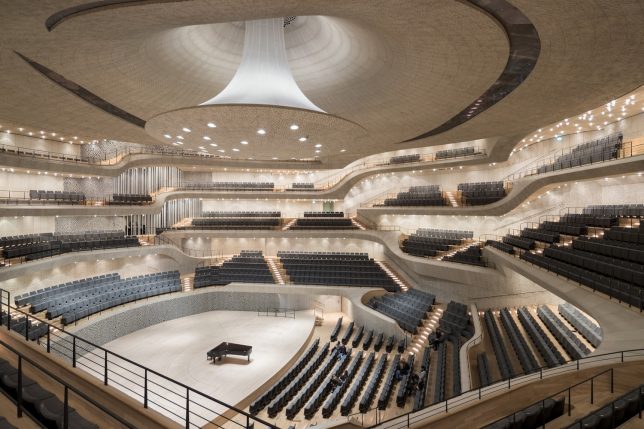
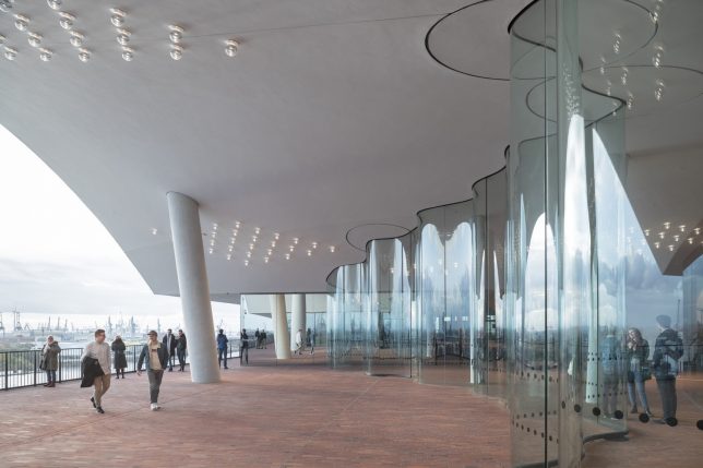
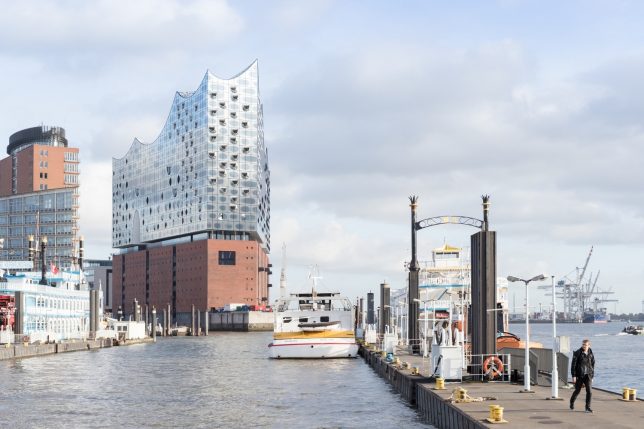
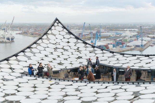
At $ 900 million, the price tag for Herzog & de Meuron’s Elbphilharmonie building in Hamburg is undeniably astronomical, but many in the city – and the international architecture community – say it’s worthwhile. Positioned on top of a 19th-century warehouse, the new structure glitters in a series of buoyant waves, echoing the water of the adjacent Elbe River. The 26-floor, 700,000-square-foot complex features a sweeping 269-foot escalator, performance halls, a main auditorium and a rooftop terrace.

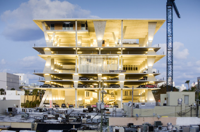
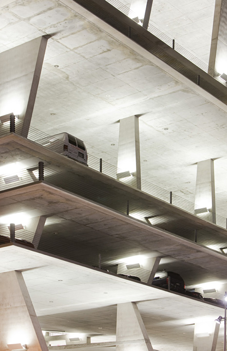
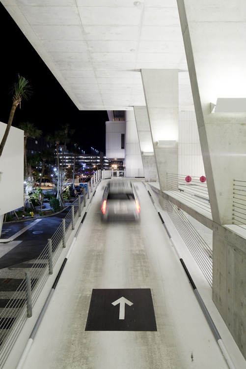
1111 Lincoln Road, Miami, Florida

Helping to popularize a trend of high-design parking garages, 1111 Lincoln Road is a stunning, angular concrete structure positioned in one of Miami’s most active pedestrian areas, overlooking the city’s iconic Art Deco architecture. “Jacques Herzog stated that this building will reinterpret the essence of Tropical Modernism, and it somehow reminds me of the modern movement in Brazil, with raw structures providing shade, while containing smaller enclosing sub-elements,” the architects explain. “The slabs stand over a set of irregular columns, giving a sense of a precarious equilibrium. These columns also cast different shadows, giving more character to the facade.”

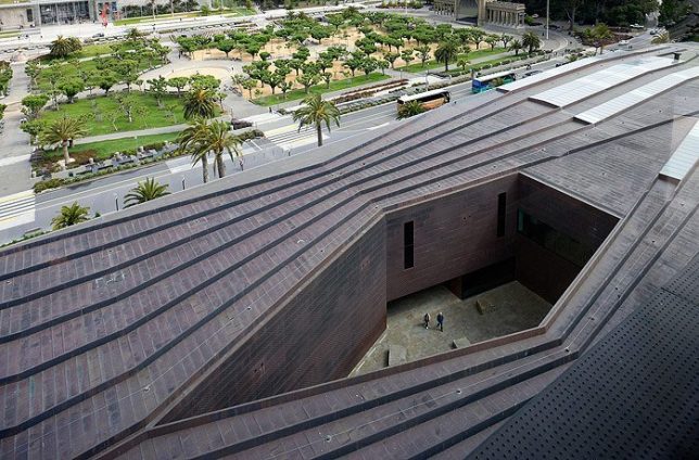
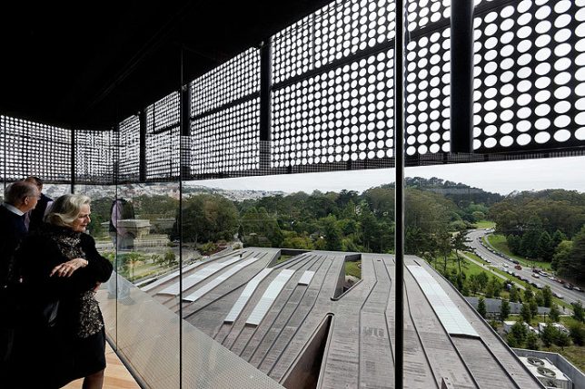
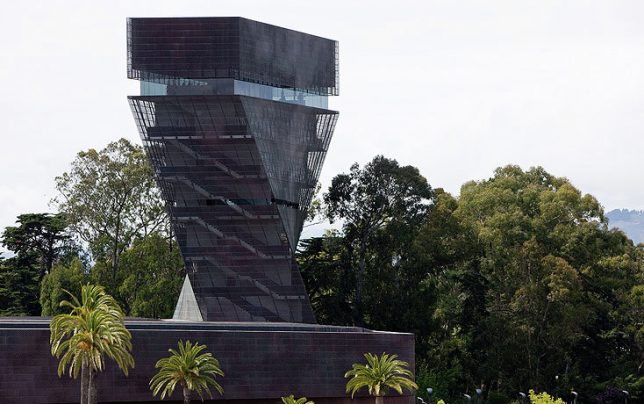
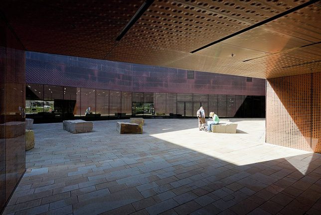
M.H. De Young Museum, San Francisco, California

Reviving an 1895 museum that was destroyed by the 1989 Loma Prieta earthquake, the M.H. De Young Museum in San Francisco dramatically departs from the visuals of its predecessor, keeping only historic elements like sphinxes and original palm trees and taking on a monumental silhouette. Its inverted pyramid-shaped tower twists atop its ground-level roof, making it a landmark from a distance. Materials like stone, copper and wood help merge it with its park-like environment.
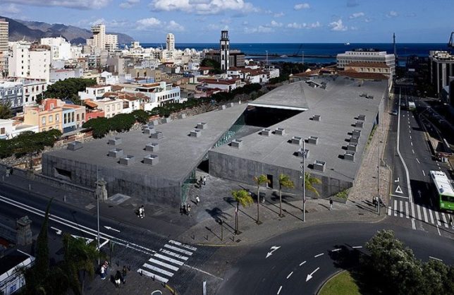
Tenerife Espacio de las Artes, Spain

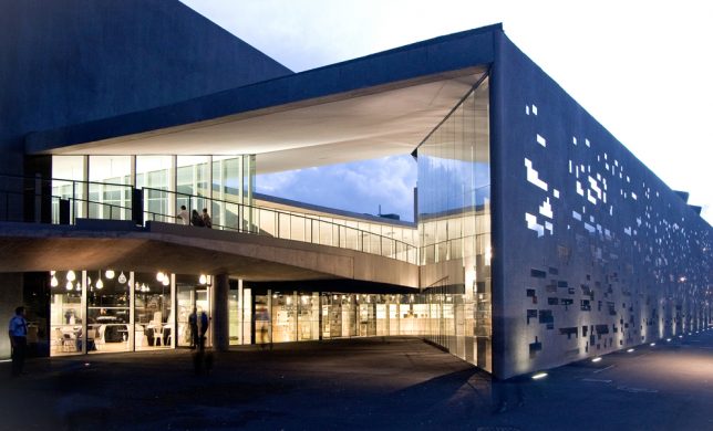
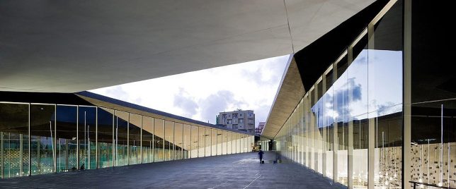
For the TEA cultural center in Spain, Herzog and de Meuron wanted to interfuse and interflow various activities and spaces within the center, cutting a new public path diagonally through the complex connected to the top of the General Serrador Bridge. The triangular space at the center is a new public plaza open and accessible to everyone in the city, featuring a cafe and restaurant along with the capability to become an open-air cinema. “The spatial interplay between inside and outside integrates rather than separates the very diverse urban landscapes which are so fascinating in Santa Cruz. The new cultural centre is therefore not only a place of encounter for people but also a place of intersection for the landscape of the contemporary city, the old city with its skyline along the Barranco and the archaic topography of the Barranco itself.”

Beijing ‘Bird’s Nest’ Olympic Stadium, China

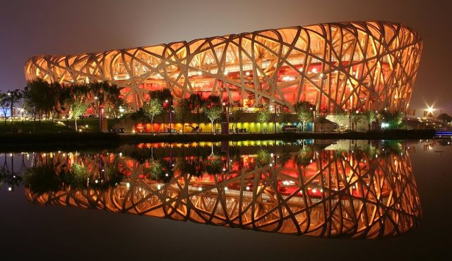
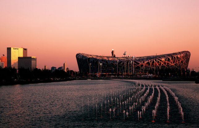
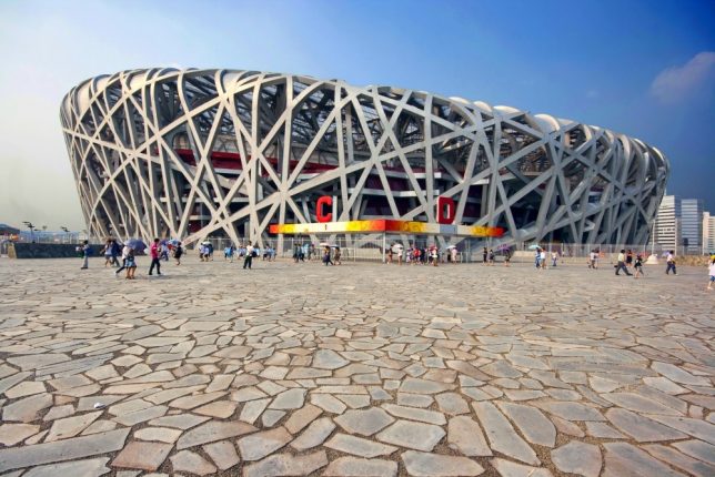
Completed in 2008, the national stadium in Beijing sits in the center of the Olympic complex, and like many Olympic structures once the Games are over, it has reportedly fallen into disuse and disrepair. In its prime, it was one of the most complex stadiums ever built, and it was especially impressive at night, when illuminated from within. Taking inspiration from Chinese ceramics, it integrates criss-crossing steel beams to hide the supports for the retractible roof, which was later removed from the design. Still, those beams remain its most striking and notable feature.

Feltrinelli Porta Volta

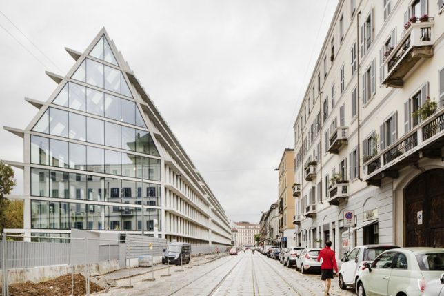
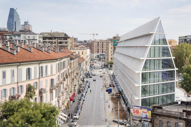
A long, gabled volume with a gridded exterior stretches down a Milan street, hosting a research center and offices for Fondazione Giangiacamo Feltrinelli. Situated within the city’s Ports Volta district, the elongated building is all white and glass, with glazing continuing right up its 5-story facade onto its roof. A strip of greenery stretches from the boulevard to its rear entrance. “The new buildings are inspired by the simplicity and generous scale of historic Milanese architecture such as the Ospedale Maggiore, the Rotunda della Besana the Lazzaretto and Sfrozesco Castle,” says Herzog & de Meuron.

VitraHaus

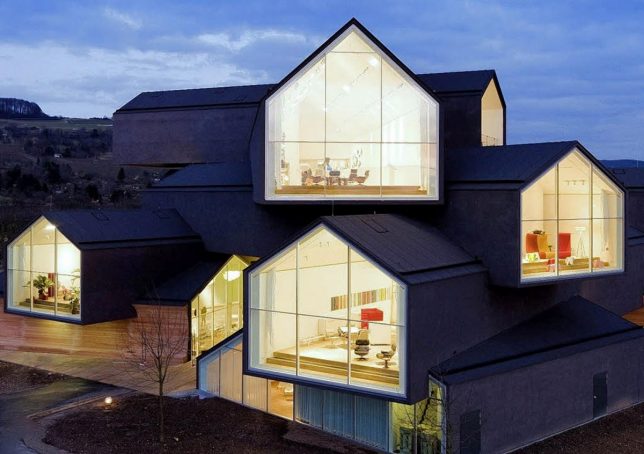
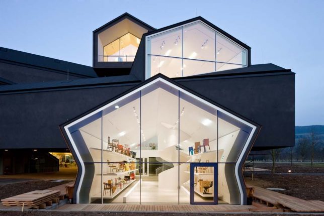
Another instant Herzog & de Meuron classic utilizing gabled typologies is VitraHaus, commissioned by home design company Vitra to present their home collection on their campus in Weil am Rhein, between the border of Switzerland and Germany. 12 ‘houses’ are stacked together into a five-story structure, with five houses at the base and seven more stacked on top of them. Some are cantilevered up to 49 feet, and all of them feature glazed ends to show off Vitra’s interiors.

The Tanks at the Tate Modern, London

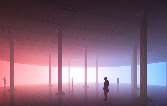
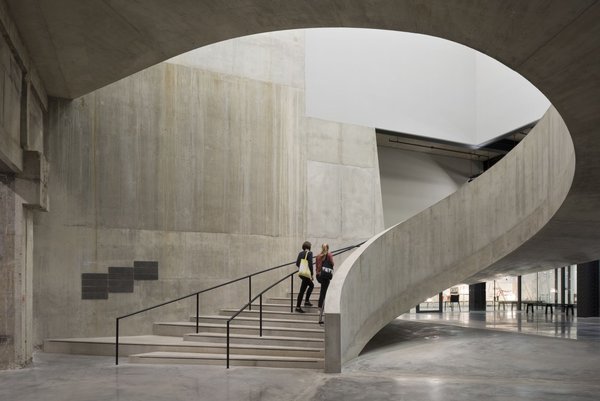
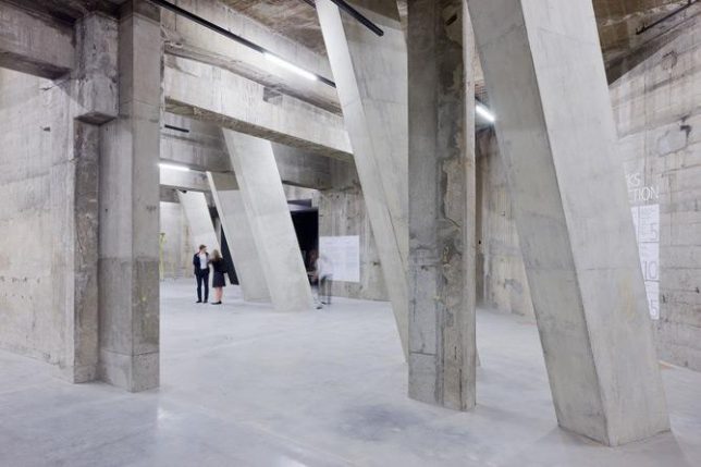
‘The Tanks’ are a series of underground gallery and performance spaces beneath the Tate Modern Museum in London, converted from former oil storage spaces by Herzog and de Meuron. In a previous life, the space the gallery occupies was a power station. The architecture firm transformed the raw industrial spaces without disguising their origins, giving them a vague dystopian feel.

Share on Facebook


[ By SA Rogers in Architecture & Offices & Commercial. ]

[ WebUrbanist | Archives | Galleries | Privacy | TOS ]


WebUrbanist

 
Comments Off on Starchitect Spotlight: 10 Iconic Architectural Projects by Herzog & de Meuron

Posted in Creativity


Splitting Bricks: Architectural Art Installation Tears a London Building Apart

10 Aug

[ By SA Rogers in Art & Sculpture & Craft. ]
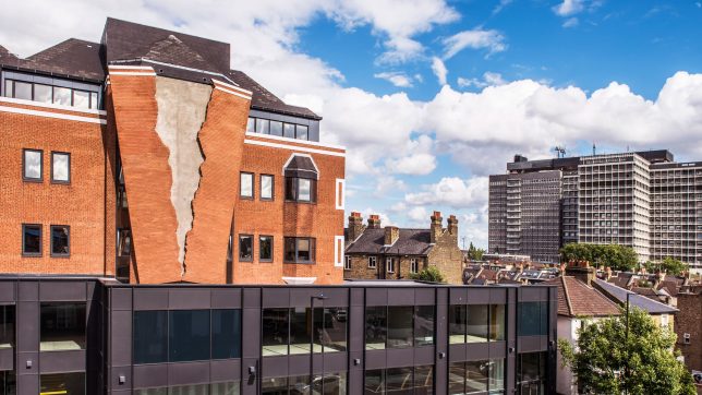
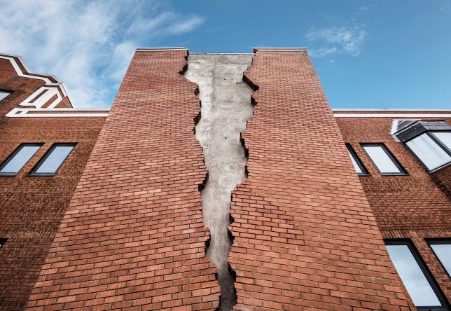
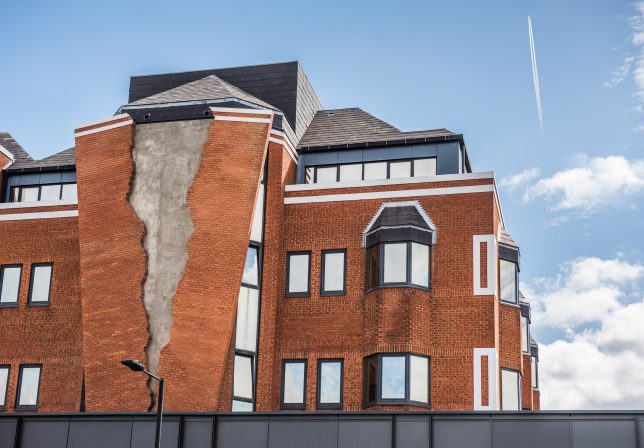
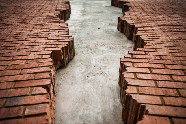
A London building appears to have fallen victim to an earthquake tremor or foundation collapse, with a jagged section of its brick facade split in half and threatening to collapse altogether. But the deteriorating appearance of this otherwise pristine structure isn’t quite what it seems. Artist Alex Chinneck used 4,000 bricks to create the effect of a ripped piece of paper to create ’Six Pins and a Half Dozen Needles,’ a nearly 66-foot tall sculpture outside a mixed-use complex known as Assembly London.
With the paper reference, the artist pays tribute to the site’s former life as home to the publishing company Hammersmith. Chinneck says he spent months scanning torn sheets of paper to find just the right pleasing edge for the split. The sculpture blends into the main building behind it, partially obscuring a few windows, and its elevated position makes it a real eye-catcher. It’s two bricks deep, and took 14 months to complete, with the help of structural engineers, steelworkers and brick makers. Its stainless steel framework is bolted and welded to the building behind it.

Chinneck previously dropped jaws and raised eyebrows in London with two particularly dramatic installations: an upside-down car clinging to a curling piece of pavement outside the Southbank Centre, and a brick facade sliding off the front of a building in Kent. Unlike these previous works, however, ‘Six Pins’ is permanent.
“The work was onceived to engage people in a fun and uplifting way,” says Chinneck. “Although we use real brick, it was designed with a cartoon-like quality to give the sculpture an endearing artifice and playful personality. I set out to create accessible artworks and I sincerely hope this becomes a popular landmark for London and positive experience for Londoners.”
Share on Facebook


[ By SA Rogers in Art & Sculpture & Craft. ]

[ WebUrbanist | Archives | Galleries | Privacy | TOS ]


WebUrbanist

 
Comments Off on Splitting Bricks: Architectural Art Installation Tears a London Building Apart

Posted in Creativity


Rethinking the Refugee Camp: 8 Architectural Proposals for Asylum Seekers

01 Aug

[ By SA Rogers in Architecture & Cities & Urbanism. ]

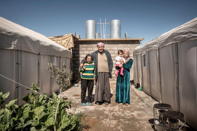
Refugees fleeing the worst humanitarian crises of our time don’t just need tents – they need safe and stable long-term housing, a sense of community, access to transitional resources and plans for permanent integration into existing cities. Smart and sensitive design solutions may play just one small role in addressing the crisis, but they can help provide the architecture and infrastructure needed to start a new life.

Mannheim Refugee Pavilion, Germany

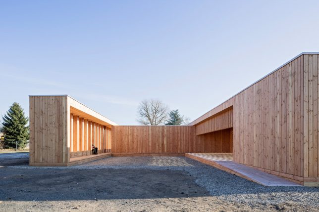
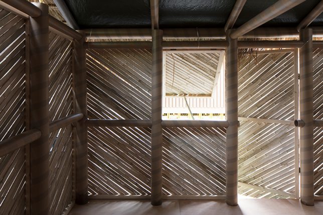
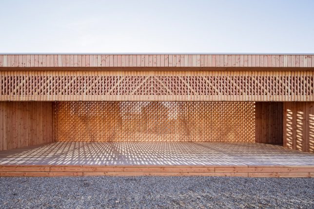
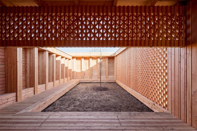
Architecture students at the University of Kaiserslautern in Mannheim created an airy community center made of latticed wood to offer a sheltered communal area for refugees arriving to an adjacent camp. The team worked with 25 refugees and building companies to create the shelter. “Due to bureaucratic procedures, refugees arriving in Germany are condemned to sustain a long period of passiveness. They are well provided with the bare essentials but the immediate area is quite desolate and lacking of quality common spaces. The residents at the preliminary reception center has the opportunity to actively shape their environment and create a quality place for common or individual use.”

20,000 New Homes for Refugees in Kenya by Shigeru Ban

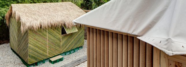
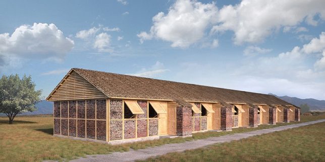
Japanese architect Shigeru Ban will design 20,000 new homes for refugees at the Kalobeyei refugee settlement in Kenya based on discusses he held with refugees in the area. “The key thing will be to construct shelter where no or little technical supervision is required, and use materials that are locally available and eco-friendly,” he says. “It’s important that the houses can be easily maintained by inhabitants.”

Ikea’s Flat-Pack Refugee Shelter Named 2016 Design of the Year

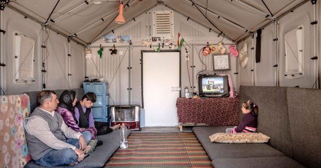
The ‘Better Shelter’ by Ikea is a flat-pack structure large enough to house a family of five that can be assembled in just a few hours. Made from recyclable plastic, it consists of just 68 components and includes a solar panel to power lights and charge smartphones and other devices. It went into production in 2015, and since then, tens of thousands of units have been delivered to countries all over the world. Though it’s more practical than glamorous, the Better Shelter won the Beazley Design of the Year Award presented by the Design Museum in London in 2016.

‘Weaving a Home’ by Abeer Seikaly

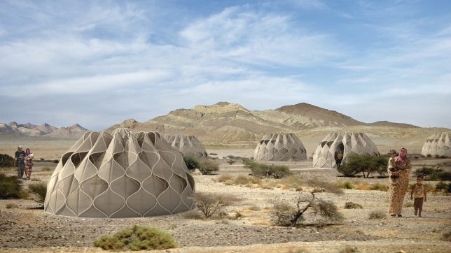
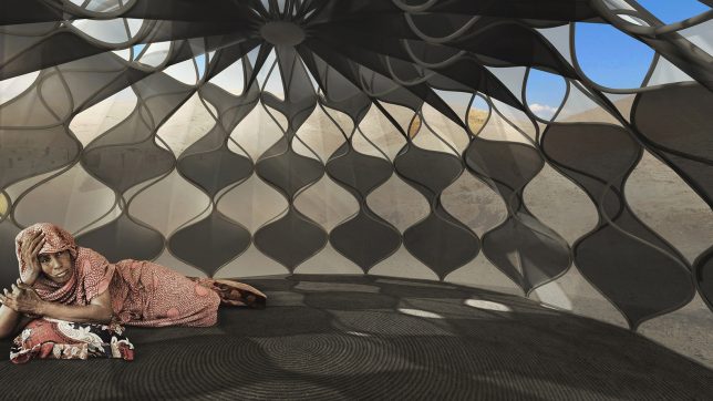
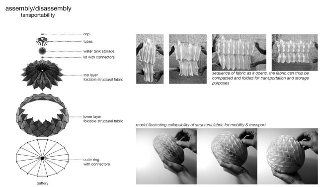
Winner of a Lexus Design Award in 2013, ‘Weaving a Home’ by Abeer Seikaly is a collapsible structural fabric shelter capable of adapting to various climates. The design is cellular, made of high-strength plastic tubing woven into a fabric membrane, and segments can be left open to create doorways or windows or closed to retain heat. At the top of the unit is a water storage tank supplied by rainwater or an onsite source to provides running water inside. “Refugees carry from their homes what they can and resettle in unknown lands, often starting with nothing but a tent to call home…” says Seikaly. “In this space, the refugees find a place to pause from their turbulent worlds, a place to weave the tapestry of their new lives.”

Next Page – Click Below to Read More:
Rethinking The Refugee Camp 8 Architectural Proposals For Asylum Seekers

Share on Facebook


[ By SA Rogers in Architecture & Cities & Urbanism. ]

[ WebUrbanist | Archives | Galleries | Privacy | TOS ]


WebUrbanist

 
Comments Off on Rethinking the Refugee Camp: 8 Architectural Proposals for Asylum Seekers

Posted in Creativity


Grime in 1:20 Scale: Gritty Dollhouse-Sized Urban Architectural Models

14 Mar

[ By SA Rogers in Art & Sculpture & Craft. ]

urban architectural models

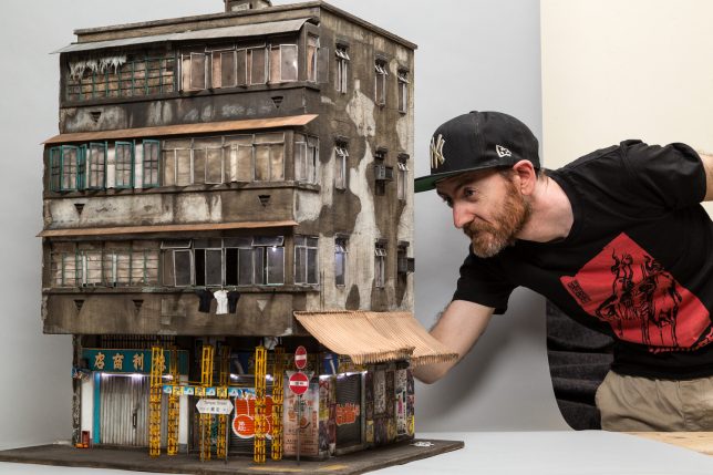
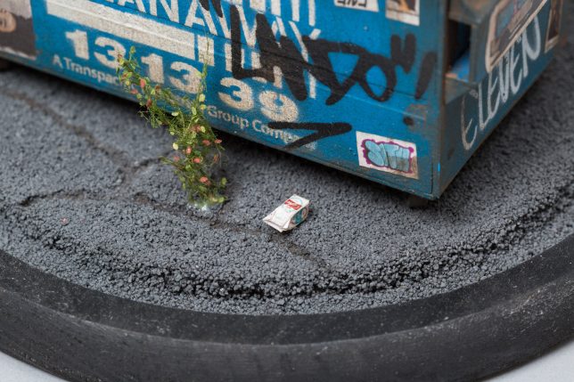
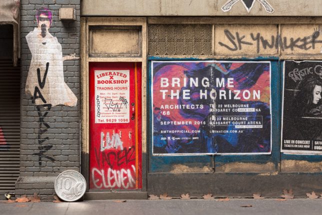
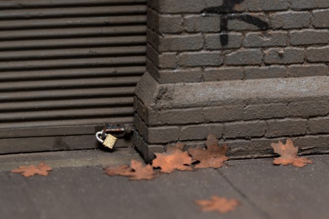
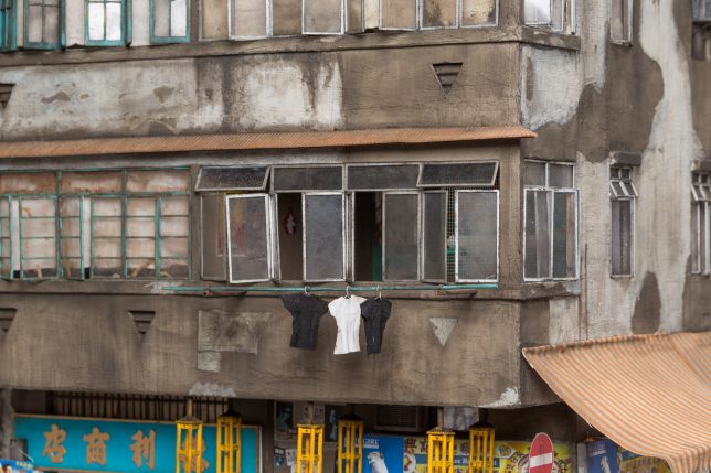
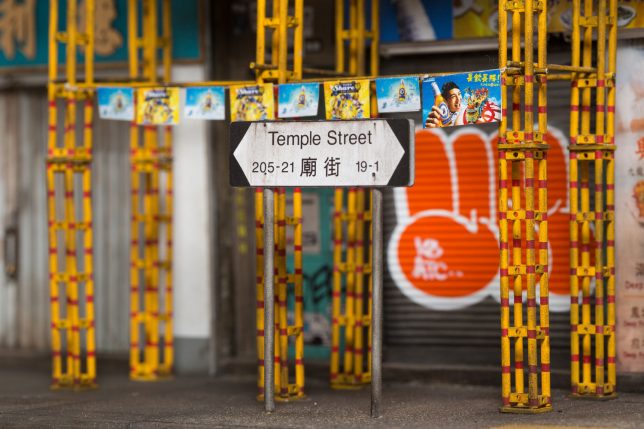
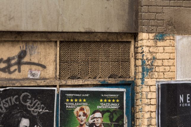
The kind of graffiti-covered, poster-plastered, weathered and visibly aging architecture that once characterized many big cities and has now largely been demolished is recreated in miniature by artist Joshua Smith. Every aspect of Smith’s tiny urban environments is crafted in loving detail, with absolutely nothing overlooked. Photographs of each miniature will make you wish you could examine them in person with a magnifying glass, appreciating the realism in every sidewalk crack, weed, pebble and fallen leaf.

urban architectural models 2

urban architectural models 9

urban architectural odels 5

A dumpster at the Oakland Docks is packed full of tiny trash, some strewn around its base, a plastic bag fluttering on the barbed wire fence behind it. Melbourne’s Liberated X Bookshop and Shoe repairs features some fantastic Bladerunner-inspired wheat pasting, peeling plywood and the world’s tiniest padlocks. Big Bang Fireworks Company, based on 15 Pell Street in New York City’s Chinatown looks like you could slide those windows open and find a tiny family dining inside.

chinatown

dumpster

urban architectural models 9

urban architectural models 10

Based in South Australia, Smith previously worked for sixteen years as a stencil artist, and has now shifted his focus to model-making. The artist recently granted an interview to ArchDaily about his modeling process.

urban architectural models 3

urban architectural models 4

urban architectural models 7

“The longest build, which was my Kowloon Miniature, took three solid months working on average six to seven days a week and eight to sixteen hour-long days,” says Smith. “I strive to create a reality. I take as many reference photos as possible to mimic every single streak of rust, grime and chipping of stonework. I want viewers to be fooled, if I are a photo of the completed work in sunlight, to think it is the real thing.”

Take a closer look at some high-resolution images at Joshua Smith’s website.

Share on Facebook


[ By SA Rogers in Art & Sculpture & Craft. ]

[ WebUrbanist | Archives | Galleries | Privacy | TOS ]


WebUrbanist

 
Comments Off on Grime in 1:20 Scale: Gritty Dollhouse-Sized Urban Architectural Models

Posted in Creativity


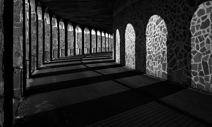
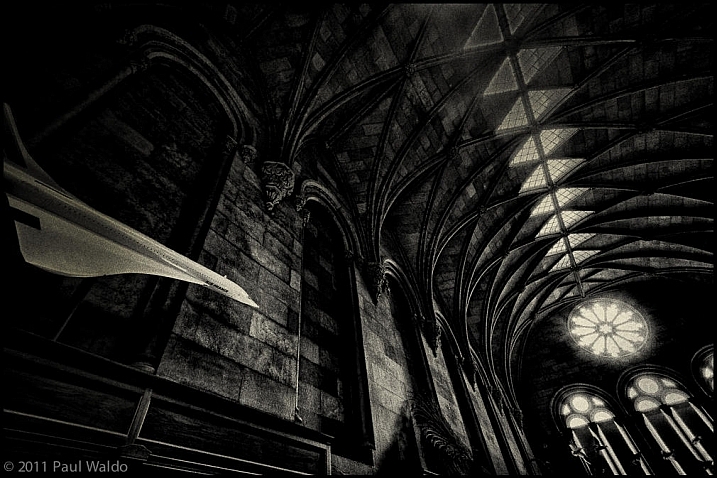
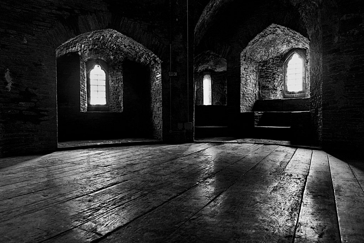
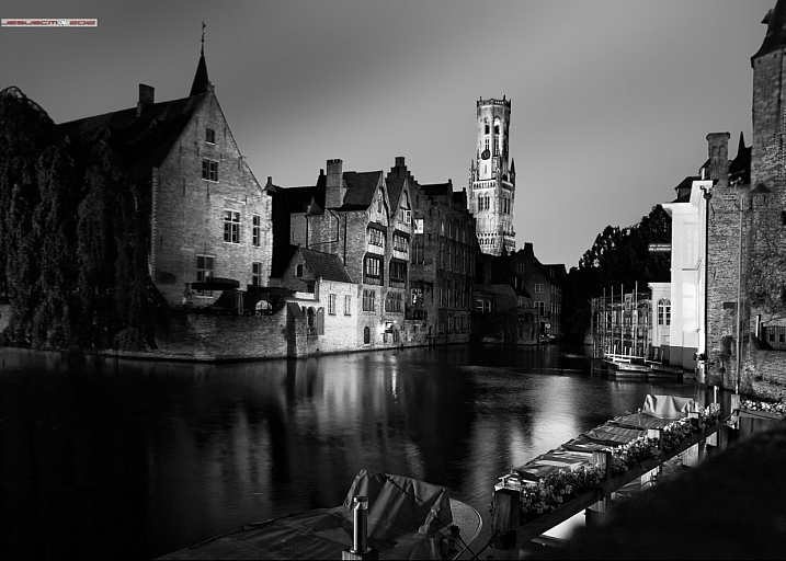
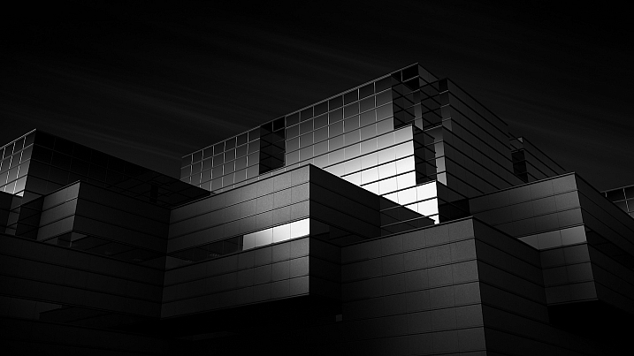
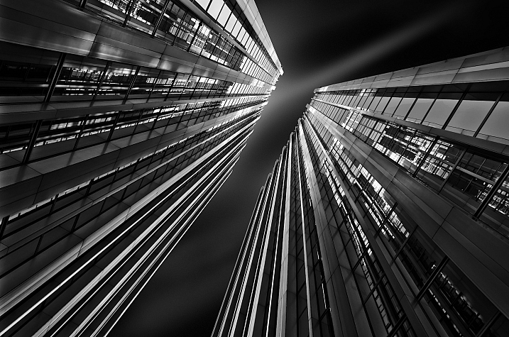
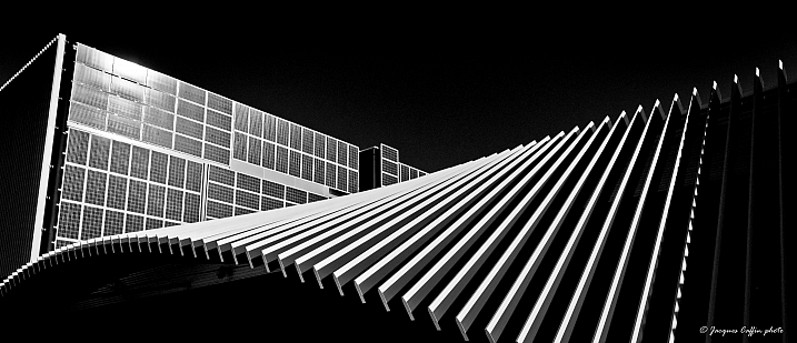
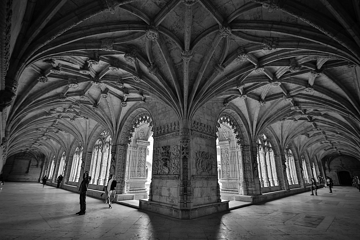
23 Moody Black and White Architectural Images

18 Feb

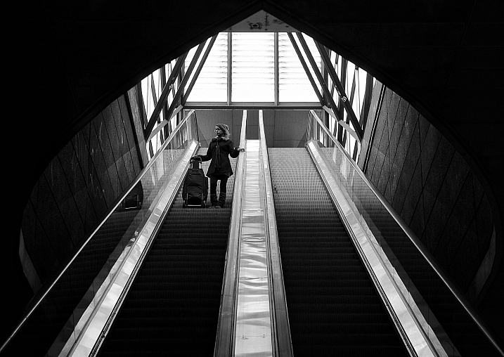
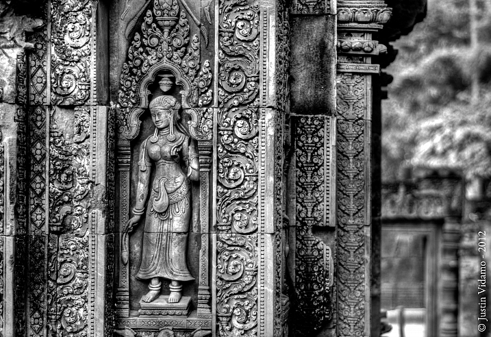
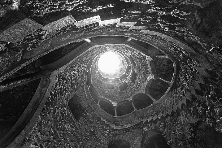
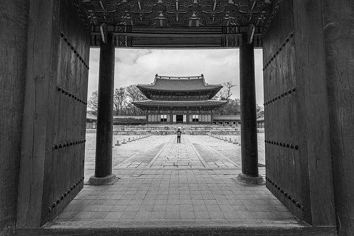
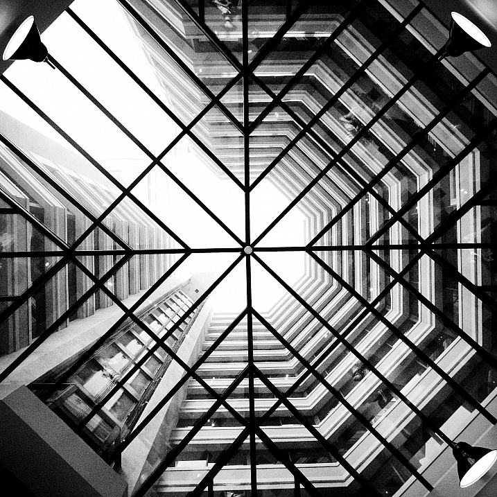
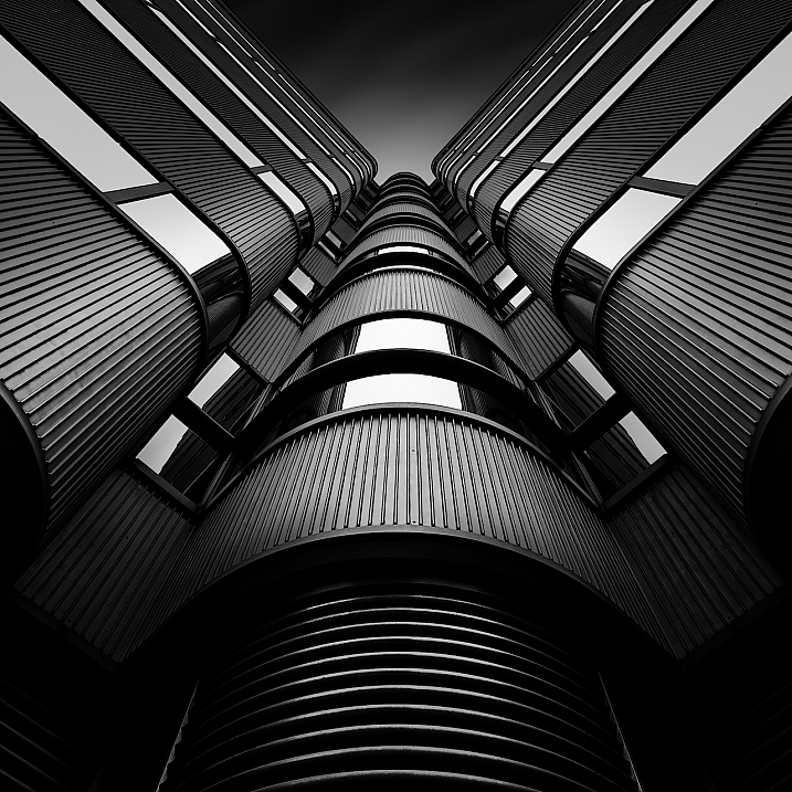
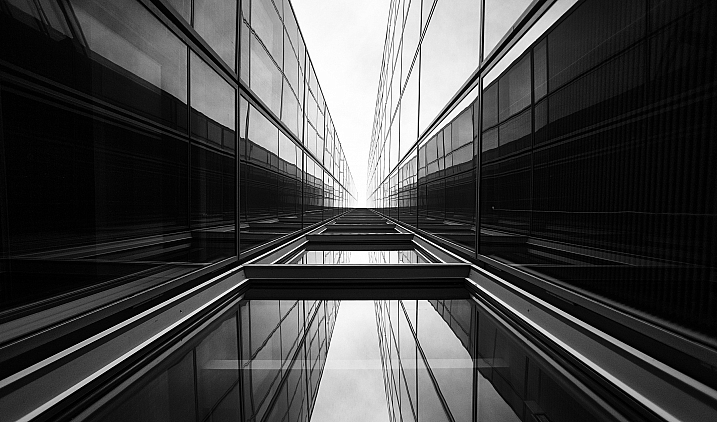
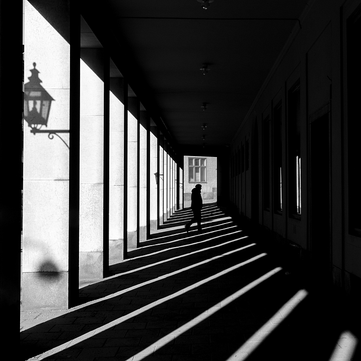
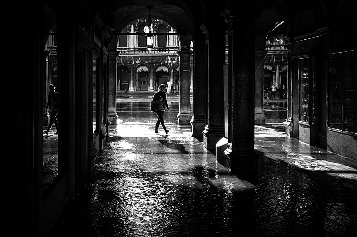
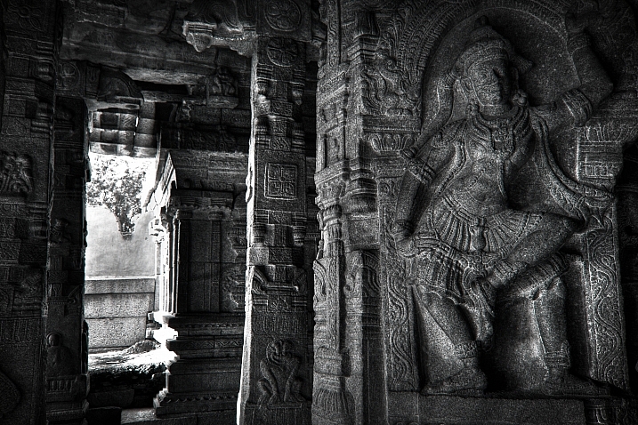
Architecture provides a few things that photographers love; texture, shape, contours, dramatic lighting.

Let’s see how these 23 photographers found and photographed different buildings and kinds of architecture in black and white.

By Marco Crupi

By Paul Waldo

By Andrew Howson

By jesuscm

By Thomas8047

By Justin Vidamo

By Brad Hammonds

By Brad Hammonds

By Thomas Hawk

By ?Jin Mikami?

By perceptions (creative pause)

By Peter Tandlund

By ?Jin Mikami?

By ?Jin Mikami?

By Jacques Caffin

By Paulo Valdivieso

By Franck Vervial

By Chris Chabot

By Wasif Malik

By Davidlohr Bueso

By gato-gato-gato

By Brad Hammonds

By Premnath Thirumalaisamy

googletag.cmd.push(function() {
tablet_slots.push( googletag.defineSlot( “/1005424/_dPSv4_tab-all-article-bottom_(300×250)”, [300, 250], “pb-ad-78623” ).addService( googletag.pubads() ) ); } );

googletag.cmd.push(function() {
mobile_slots.push( googletag.defineSlot( “/1005424/_dPSv4_mob-all-article-bottom_(300×250)”, [300, 250], “pb-ad-78158” ).addService( googletag.pubads() ) ); } );

The post 23 Moody Black and White Architectural Images by Darlene Hildebrandt appeared first on Digital Photography School.


Digital Photography School

 
Comments Off on 23 Moody Black and White Architectural Images

Posted in Photography


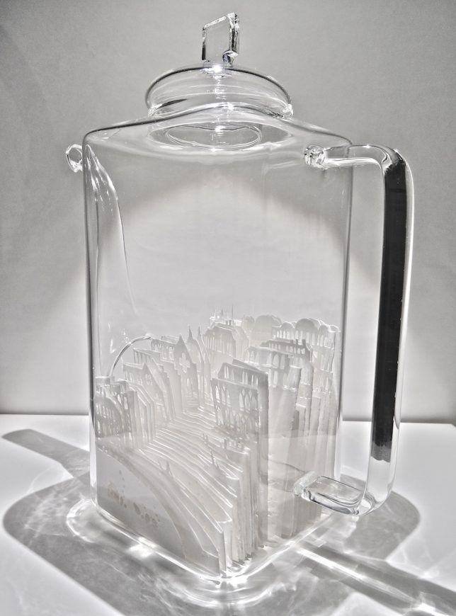
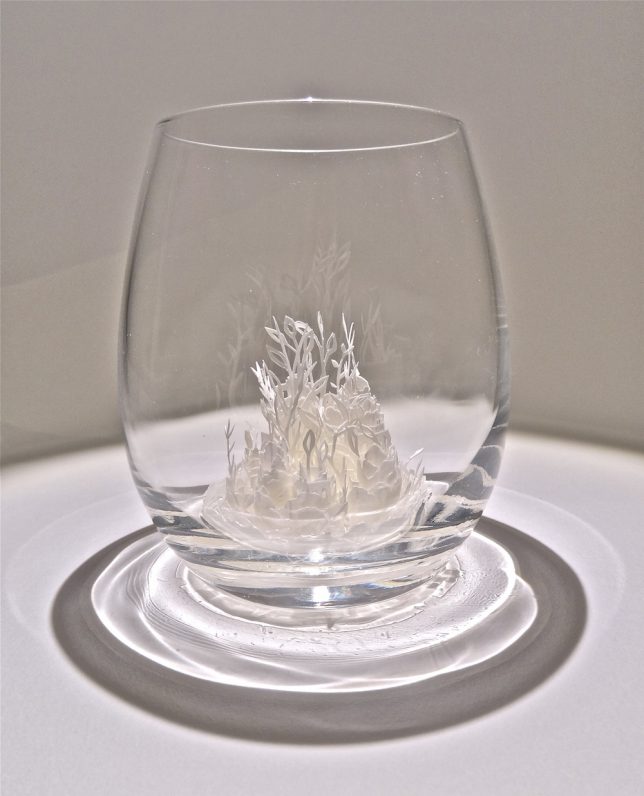
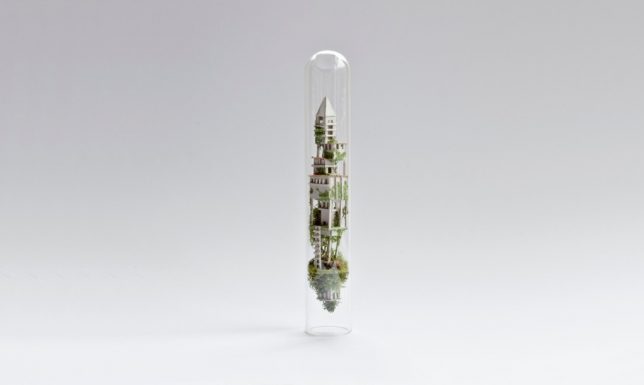
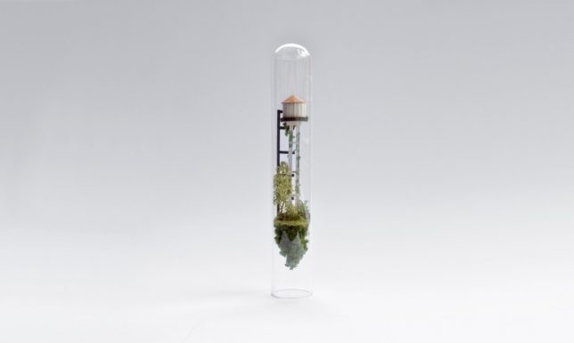
Worlds Under Glass: 33 Miniature Cities & Architectural Sculptures

16 Feb

[ By SA Rogers in Art & Sculpture & Craft. ]

thomas doyle 7

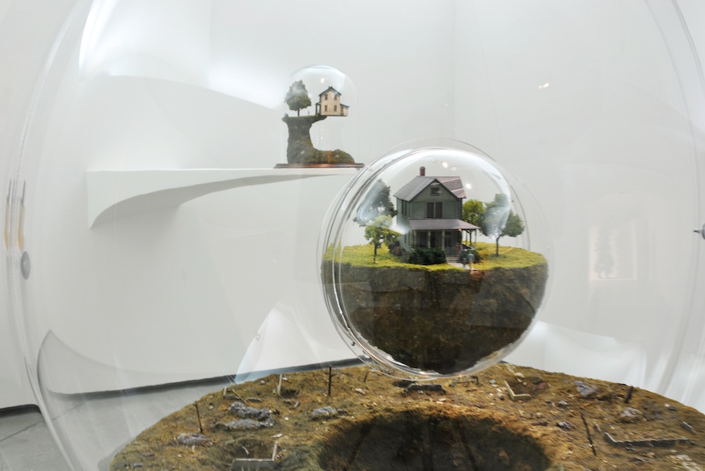
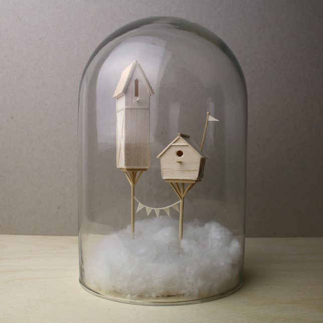
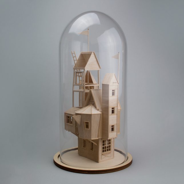
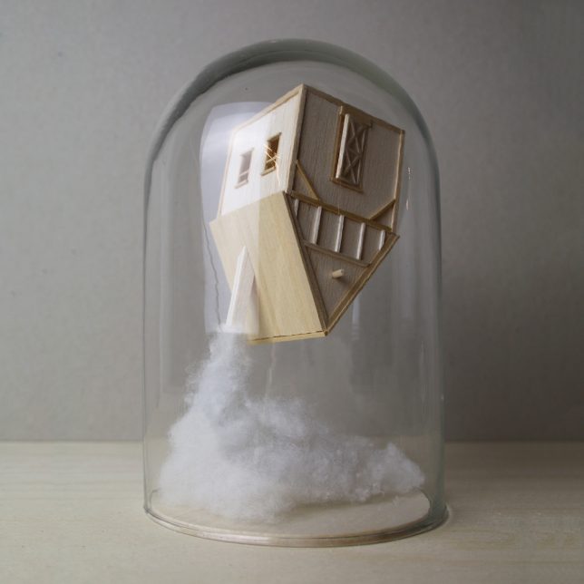
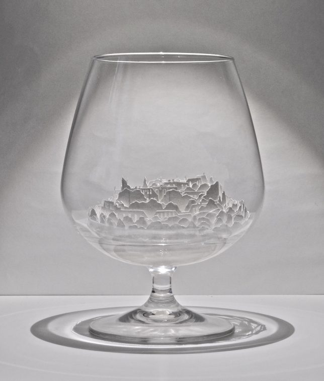
Sheltered by glass vessels like tiny self-contained biomes, these miniature buildings and cities seem to have their own atmospheres and variable gravity, with houses teetering on the edges of cliffs or springing out of clouds in the sky. Artists craft small-scale structures from balsa wood, paper, cardboard and other materials and house them under domes, bottles, teapots and Victorian terrariums.

Balsa Wood Architecture by Vera van Wolferen

wolferen 1

wolferen 2

wolferen 3

wolferen 4

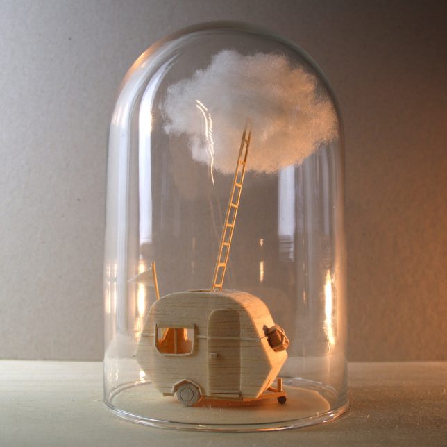
Often incorporated into animations, Vera van Wolferen’s tiny balsa wood structures can also be structures telling their own stories. A recent series of structures perches tiny dwellings on stilts or stretches them several stories into the ‘sky’ beneath a glass dome, often emerging from cotton ‘clouds.’

Paper Cities by Ayumi Shibata

ayumi shibata 1

ayumi shibata 2

ayumi shibata 3

ayumi shibata 4

Slivers of two-dimensional cities and landscapes curl around each other within glass vessels in rosebud-like arrangements or stack up into faux hillsides to create a three-dimensional whole in these works by Ayumi Shibata. The artist uses traditional Japanese paper cutting techniques, noting that the Japanese word for ‘paper’ is ‘Kami,’ which can also mean ‘god,’ ‘spirit’ or ‘divinity.’

“Kami move freely beyond time, universe and places, appearing during events, as well as in our houses and our bodies,” she says. “These spirits also dwell in paper. In the religion of Shinto, white paper is considered a sacred material.”

Micro Matter by Rosa de Jong

rosa de jong 1

rosa de jong 2

rosa de jong 3

rosa de jong 4

rosa de jong 5

rosa de jong 6

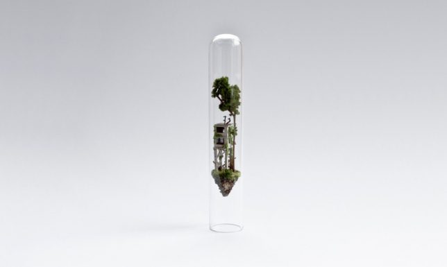
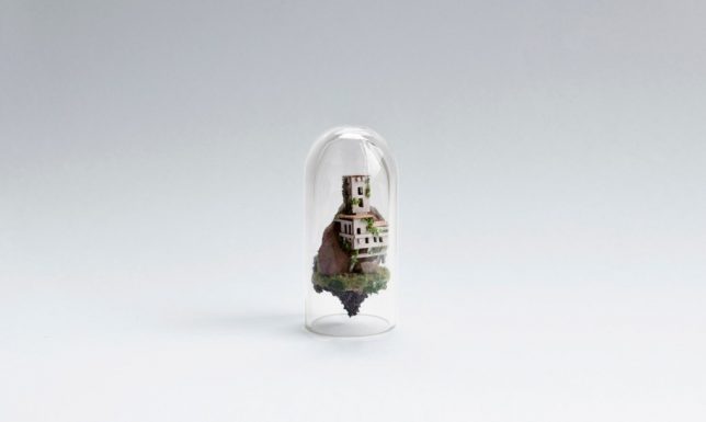
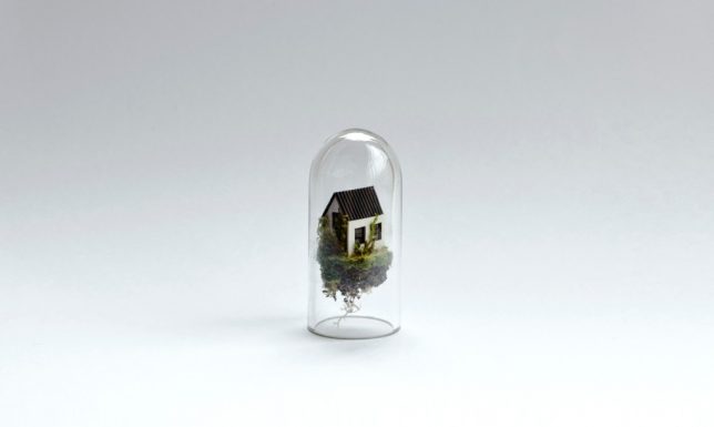
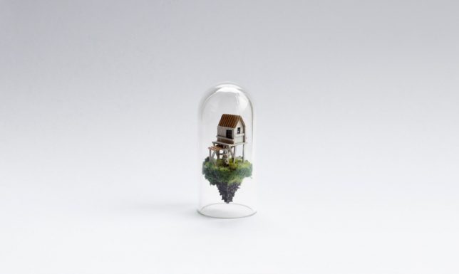
Enclosed within glass domes or test tubes, Rosa de Jong’s ‘Micro Matter’ sculptures bring unfathomably small worlds to life, each one seemingly floating in its own low-gravity atmosphere. The works often feature dilapidated homes, farm buildings, mines and construction sites, exploring the ways in which built environments interact with nature. The sculptures are created in a way that’s similar to building a ship in a bottle, snugly inserting the pieces to fit their vessels just right.

Next Page – Click Below to Read More:
Worlds Under Glass 33 Miniature Cities Architectural Sculptures

Share on Facebook


[ By SA Rogers in Art & Sculpture & Craft. ]

[ WebUrbanist | Archives | Galleries | Privacy | TOS ]


WebUrbanist

 
Comments Off on Worlds Under Glass: 33 Miniature Cities & Architectural Sculptures

Posted in Creativity