RSS
 

Posts Tagged ‘Architects’

Zaha Hadid Architects Make Flood Protection Look Elegant in Hamburg

28 Aug

As urban planners grapple with the need for creative flood management systems in cities around the world, Zaha Hadid Architects provides an interesting example in Hamburg.

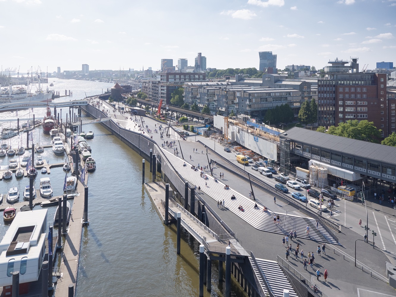
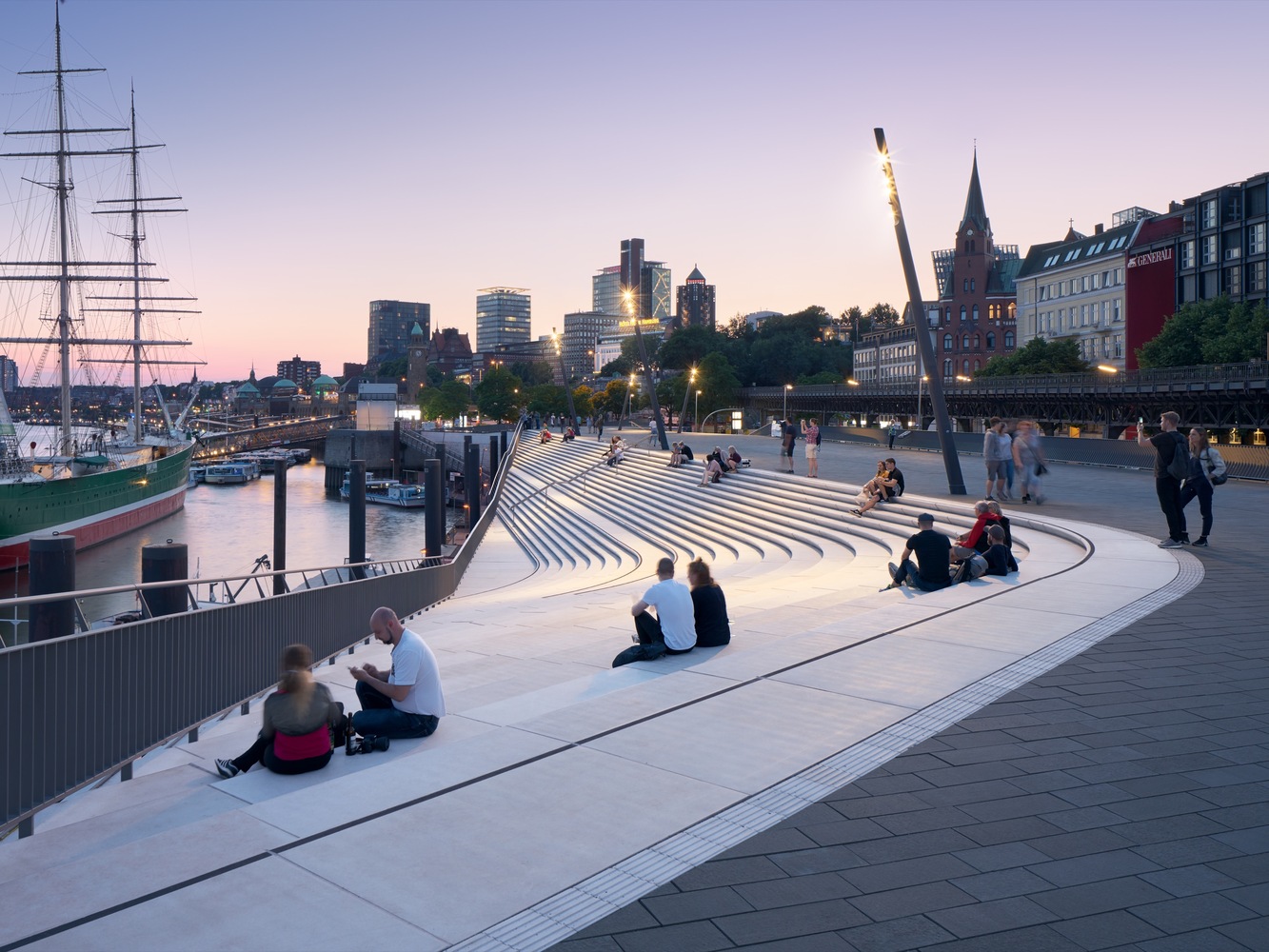
Located along the Elbe River, the new Niederhafen River Promenade offers two functions in one: a flood wall and a riverfront promenade. Set in a popular tourist area alongside one of the city’s most important public spaces, the new promenade offers views of the Elbe, links to adjacent neighborhoods and lots of room for pedestrians, food stalls, cafes and street performers, with shops and public utilities set into the structure at street level on the side that faces the city.

The barrier at Niederhafen was first built in the 1960s in the aftermath of severe storm surge floods that caused 315 fatalities and destroyed the homes of 60,000 residents, but according to modern calculations, it was no longer high enough to be effective. In addition to raising the total height of the barrier by .8 meters, the overburdened supporting elements of the structure needed to be replaced. The city announced a competition to design a redevelopment, awarding the project to Zaha Hadid Architects.
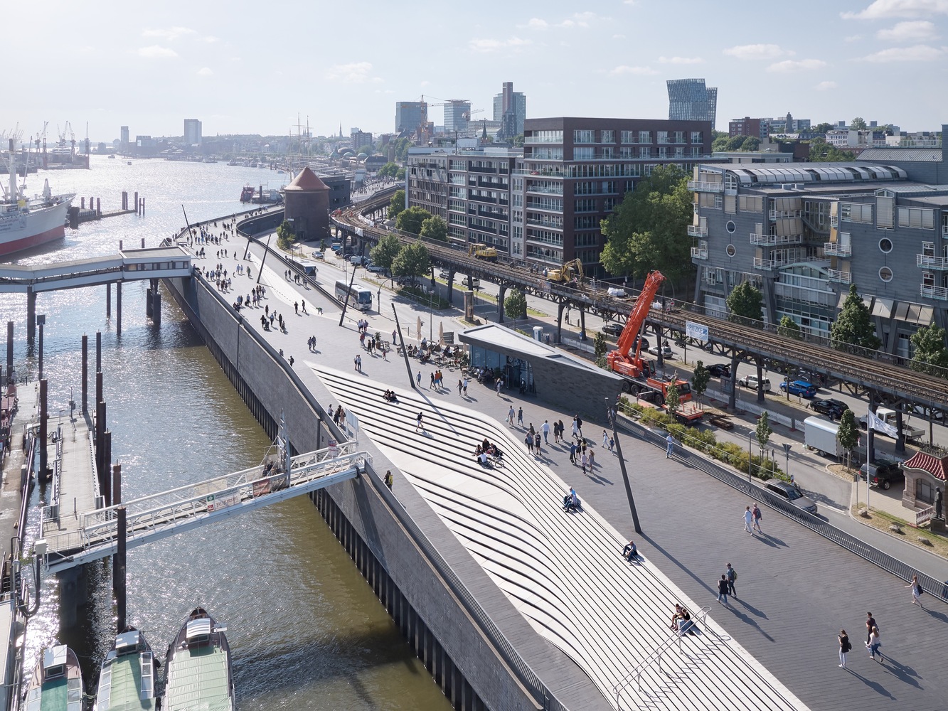
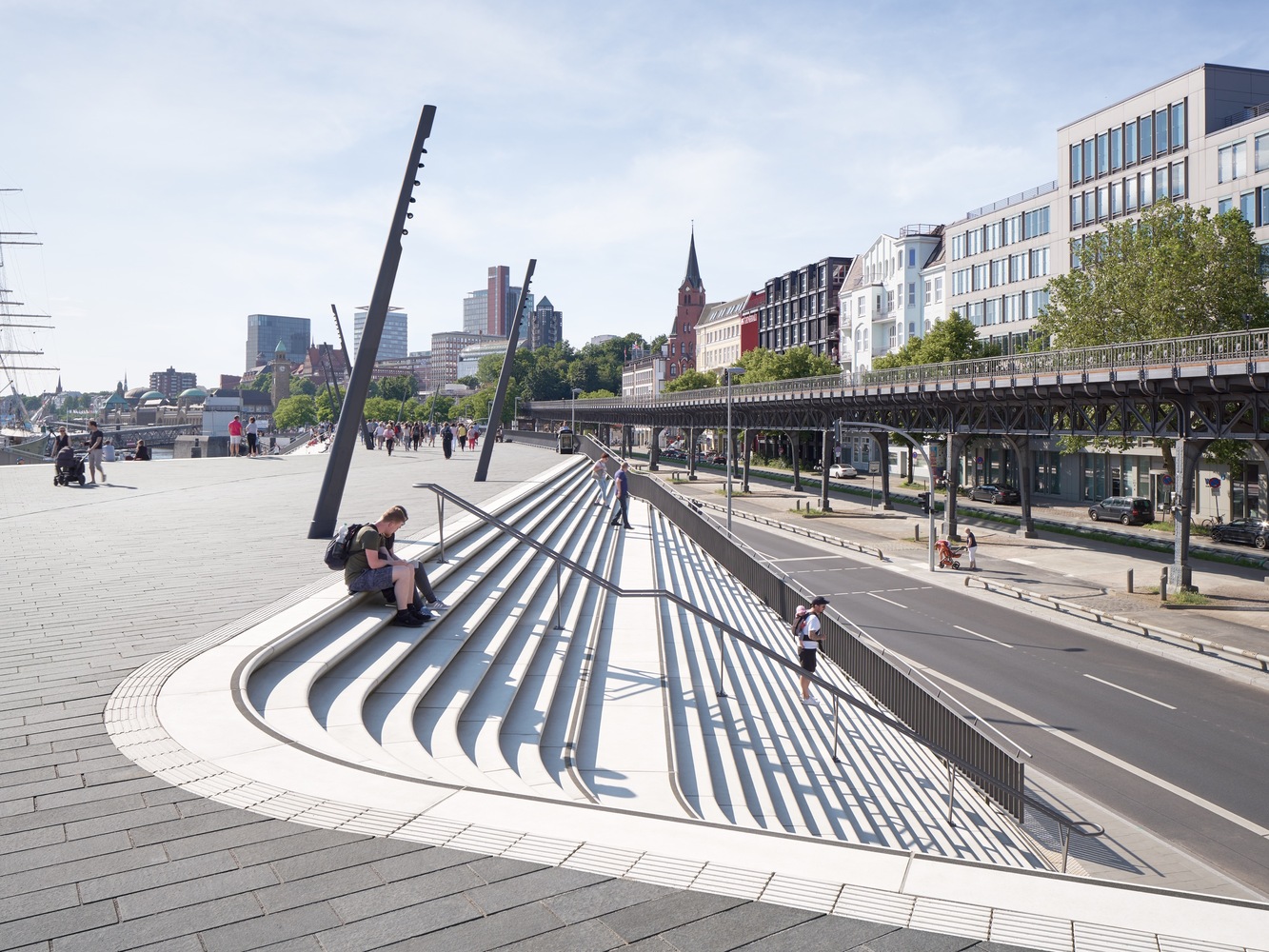
Standing 8.6 meters (28 feet) high on the eastern side and 8.9 meters (29 feet) high on the western side, the barrier is now tall enough to protect the city from maximum winter storm surges and extreme high tides. The architects carved sculptural staircases into the sides at various points, creating angular amphitheaters that encourage people to linger and enjoy the views and “generating an oscillating sequence in the river promenade as it repeatedly widens and narrows.”

“Dedicated cycle lanes at street level run the length of the flood protection barrier. Wide ramps at Baumwell and Langdungsbrücken connect the river promenade with street level and provide accessibility for all. A third central ramp enables service vehicles to access the promenade and Überseebrücke.”
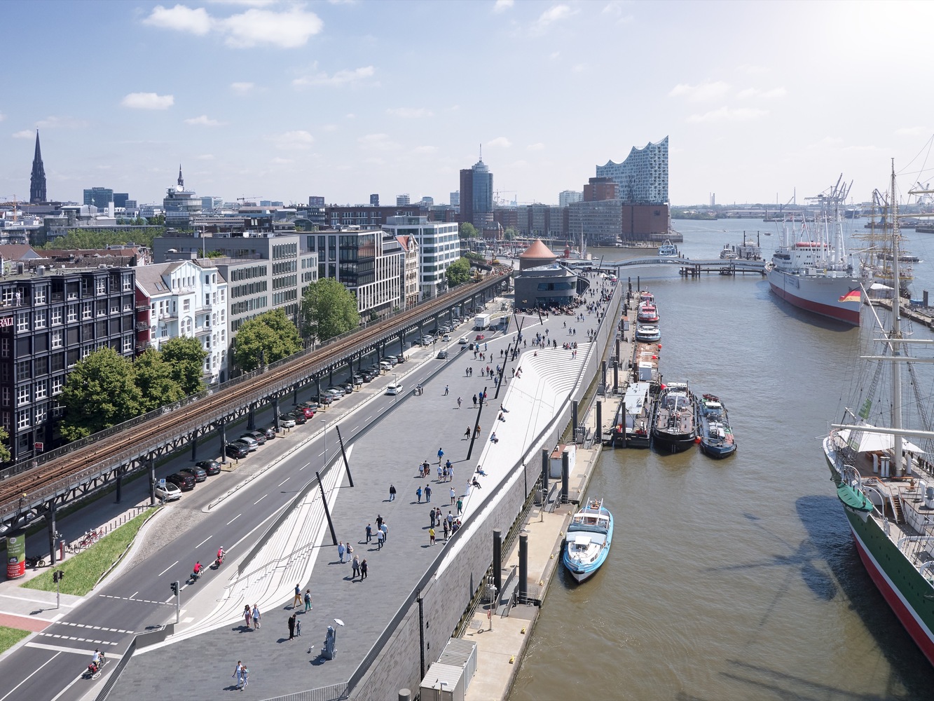
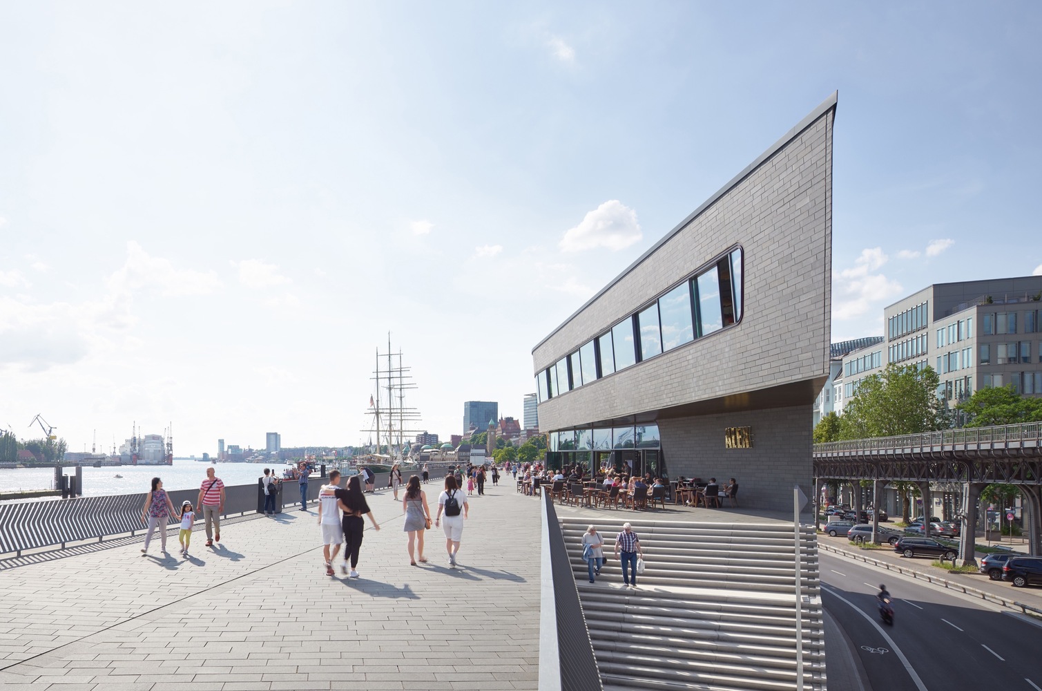
“The river promenade is divided into two sections with different spatial qualities. The zone to the west is at a larger scale, offering wide views downstream of all shipping activity on the river. To the east, the port’s marina creates amore intimate atmosphere with a long ramp alongside the amphitheater leading visitors down to the water’s edge.”

Of course, concrete flood walls aren’t right for every city, especially those where aquatic wildlife habitats have been destroyed and need to be restored. Some cities are working on plans to do just that, like Chicago’s “Wild Mile.” Read more about how “urban rewinding” can help make cities more flood resistant.

Photos by Piet Niemann via Zaha Hadid Architects

WebUrbanist

 
Comments Off on Zaha Hadid Architects Make Flood Protection Look Elegant in Hamburg
Posted in Creativity


MAD Architects Redesign Turns Ugly Paris Tower into Giant City-Scale Mirror

03 Oct

[ By WebUrbanist in Architecture & Offices & Commercial. ]

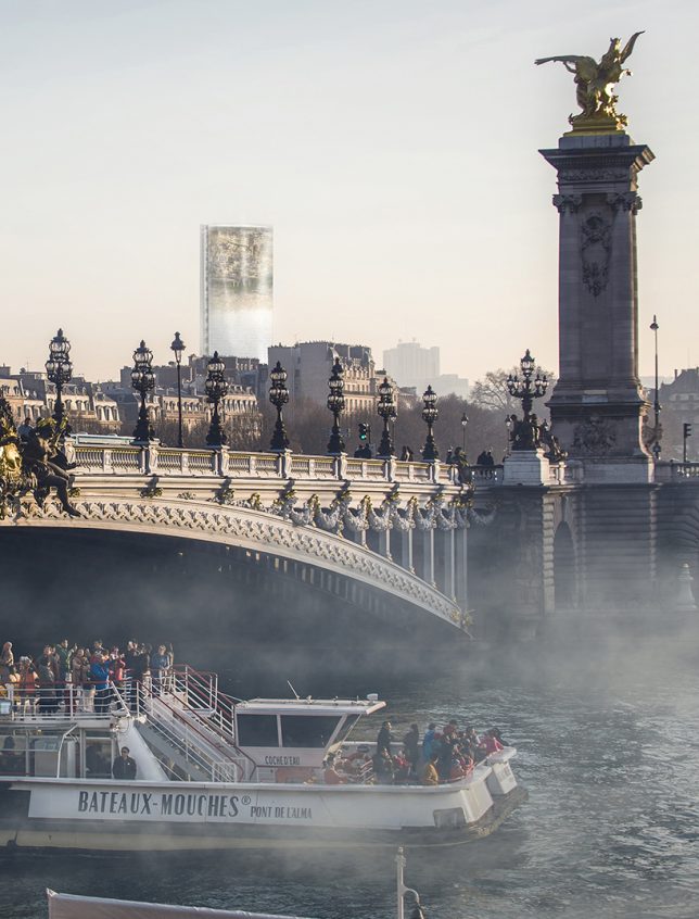
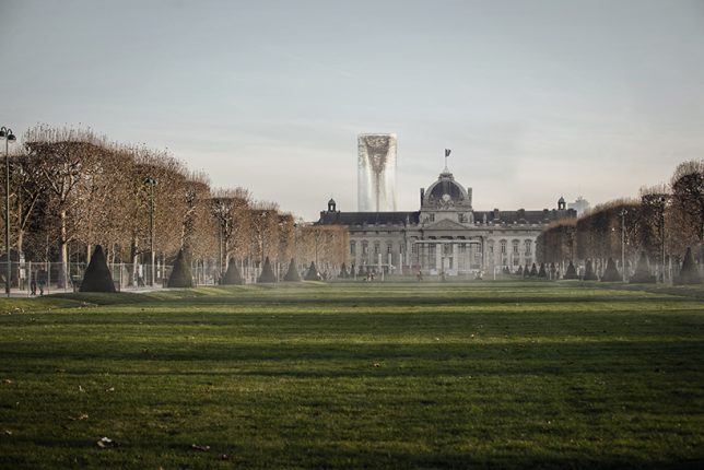
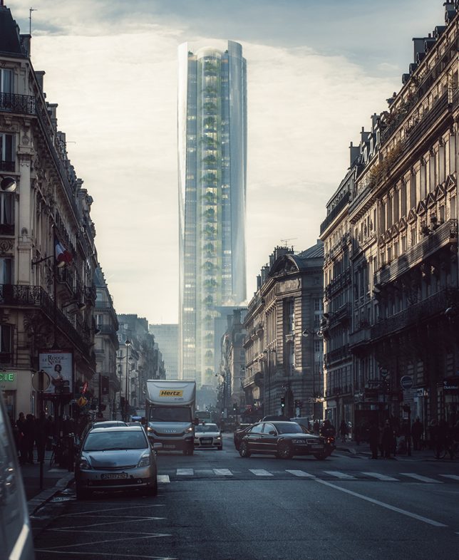
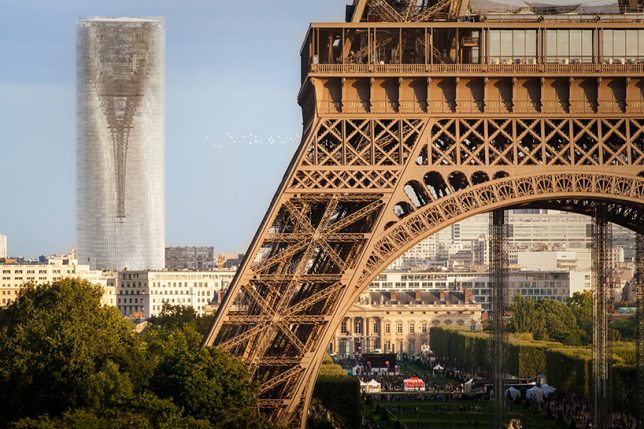
Tall, dark and brooding, the infamous Maine-Montparnasse Tower is an unexciting skyscraper, especially by Parisian standards, but that could all change if MAD Architects converts it into a city-scale mirror. Their renovation proposal employs clever optical tricks to reflect and invert the surrounding cityscape.

When it was built, Montparnasse was the tallest building in France and heralded as a technological achievement. But unlike the Eiffel Tower, which was controversial at first but became a symbol of the city, this skyscraper never gained iconic status — in fact, it led urban building heights to be capped at seven stories. Some quip it has the most beautiful views in the city, in part because those views don’t include the building.

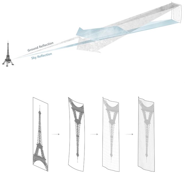
MAD Architects aims to change perceptions of the tower and its role in the city using concave glass panels tilted at an angle to create reflections of the surrounding built environment.

Viewers would be able to see surrounding streets, roofs and buildings in its mirrored facade. In a way, the resulting design both blends into the environment while also highlighting the beauty of the French capital and showing it from generally unseen angles.

“Today, we cannot really demolish this building and the historical regrets it stands for,” explains one of the architects behind the proposal, “but we can establish a new perspective to re-examine and think about how humanity can co-exist and interact with the tower and its environment, to bring meaning to our hearts.”

Perhaps unfortunately, while the firm was shortlisted in a redesign competition, another team was chosen to renovate the structure before the upcoming Olympic Games. Still, the design idea is out there, and another city might have its own ugly tower in need of transformation.

Share on Facebook


[ By WebUrbanist in Architecture & Offices & Commercial. ]

[ WebUrbanist | Archives | Galleries | Privacy | TOS ]


WebUrbanist

 
Comments Off on MAD Architects Redesign Turns Ugly Paris Tower into Giant City-Scale Mirror

Posted in Creativity


Bold Bamboo: 8 Dramatic Organic Structures by Chiangmai Life Architects

14 Aug

[ By SA Rogers in Architecture & Public & Institutional. ]

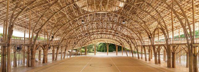
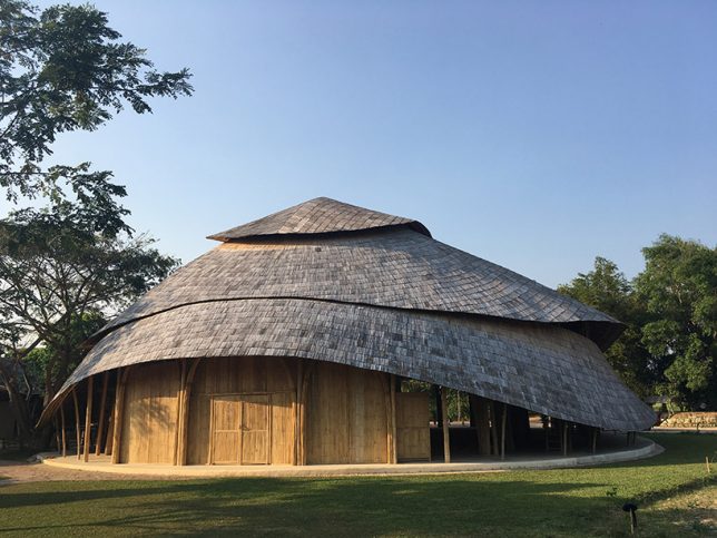
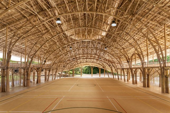
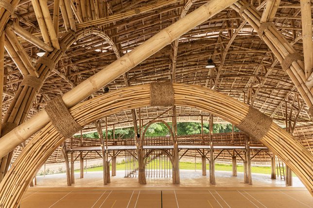
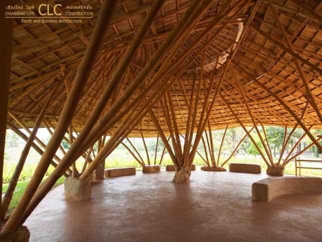
With the completion of their latest project, a spectacular sports hall made of prefabricated bamboo trusses, Thai firm Chiangmai Life Construction (CLC) shows off the stunning architectural possibilities of this natural, inexpensive and sustainable material. But it’s far from the only incredible bamboo structure they’ve designed and built, and they’re here to prove that bamboo blends beautifully with modern technology and lifestyles. Each of their projects centers on the concept of ‘life construction,’ in which the design of a building is carefully customized to its environment, including weather, to control how bamboo interacts with the elements.

Bamboo Sports Hall for Panyaden International School

Each of the prefabricated bamboo trusses used to build this sports hall for a school in Thailand spans more than 55 feet without steel reinforcements or connectors, lifted into position on-site with help from a crane. The structure is designed to withstand earthquakes, torrential rain and high velocity winds, and to host basketball, futsal (a variation of football played on a small hard court), volleyball and badminton. The building shape is based on that of a lotus flower, and like all of CLC’s projects, this one is open to the air to encourage ventilation for cooling in Thailand’s temperate climate, where cold weather is not a problem. The space can host 300 students at a time and includes a storage area behind the stage.

Erber Research Center

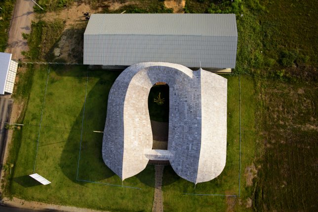
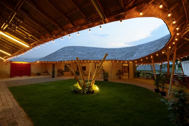
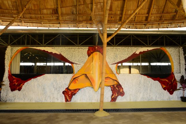
At Kasetsart University, Thailand’s largest agricultural learning institution, CLC created a facility that allows students and visitors to study chicken rearing through the windows of an adjacent pre-existing broiler hall (where the chickens are raised) as well as offering space for lectures. Based on the layout of a traditional farmhouse with a square courtyard, the facility includes a covered observation platform with windows spray-painted to look like the eyes of a chicken, with a meeting room, office, lecture hall, kitchen and bathrooms nearby. Says CLC, “This design brings traditional architecture to today’s students who grow up in concrete bunkers.”

Trika Villa

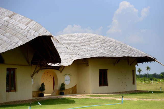
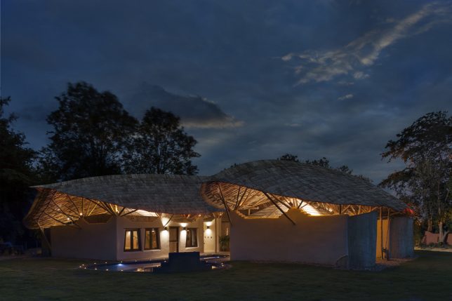
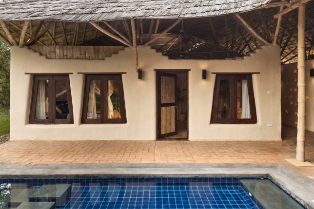
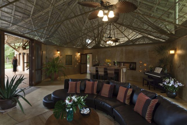
Trika Villa is a residence aiming to illustrate CLC’s core goal of bringing natural materials into the 21st century, maintaining a balance of beauty, affordability and quality. The luxury residence includes 5 bedrooms, 5 bathrooms and a spacious living and dining room arranged around a swimming pool in the courtyard. The adobe walls don’t quite meet the curving, overhanging roof, allowing heat to escape and breezes to penetrate the structure.

Bamboo Reception Hall

Welcoming parents and visitors at the entrance of Panyaprateep School in Thailand is this bamboo reception hall with a rolling bamboo roof inspired by snakeskin. Half open and half closed, the structure offers earthen and stone benches for sitting together in small groups as well as an area full of shelves for the display of items made by the students.

Next Page – Click Below to Read More:
Bold Bamboo 8 Dramatic Organic Structures By Chiangmai Life Architects

Share on Facebook


[ By SA Rogers in Architecture & Public & Institutional. ]

[ WebUrbanist | Archives | Galleries | Privacy | TOS ]


WebUrbanist

 
Comments Off on Bold Bamboo: 8 Dramatic Organic Structures by Chiangmai Life Architects

Posted in Creativity


Revitalizing the L.A. River: 7 Architects Envision Fresh Uses for Old Waterway

26 Jul

[ By WebUrbanist in Architecture & Cities & Urbanism. ]

The Los Angeles river changes dramatically as it snakes into and through the city, and these different design proposals carry that legacy forward while envisioning new, user-friendly, flexible and sustainable nodes of activity. The L.A. River Downtown Design Dialogue celebrates ten years of working to revitalized areas and create connections along the river’s route.

Currently, this often-dry river, encased in concrete, feels about as much like a river as Silver Lake feels like a lake, or anything can feel natural when so artificially contained. Seven architecture firms were given one-mile strips to work with and created a wonderful array of designs featuring lush green parks, bike paths, kayaking zones, climbing walls and more.

Gruen Associates tackled a section near Chinatown, created a series of elevated paths and natural meadows all tied into an existing railroad yard.

WSP placed walkways and terraces along the sides of the river while also offering stepping stones for people wanting to walk across.

CH2M took its zone near the Arts District and added bicycle paths and other amenities around a winding and widened section of river made to look and feel more like a local creek.
AChee Salette took over old railway tracks to create a series of gardens spilling down from the road grade above to the level of the river below.

Curving and wrapping paths and walls create an organic wrapper for the section designed by Mia Lehrer + Associates, creating a space to canoe and kayak.

AECOM’s  playfully integrated climbing walls, basketball courts and other sporting amenities, while adding light and color through mosaics and murals spanning their area.

Tetra Tech designed a new bridge to cross the river as well as a river walk, all taking advantage of the existing sloped sides, reflecting the river’s historic form.

Together, these schemes reflect a rich diversity of design strategies as well as usage possibilities — given how prominent and central the path of the river is, it makes a lot of sense to make it a more accessible and vibrant resource for the city and its citizens.

Share on Facebook


[ By WebUrbanist in Architecture & Cities & Urbanism. ]

[ WebUrbanist | Archives | Galleries | Privacy | TOS ]


WebUrbanist

 
Comments Off on Revitalizing the L.A. River: 7 Architects Envision Fresh Uses for Old Waterway

Posted in Creativity


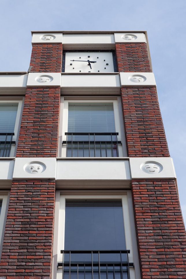
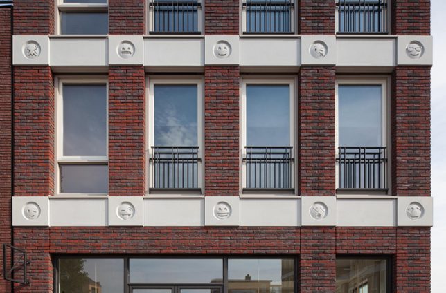
Emoji Facade: Dutch Architects Decorate Brick Building with 22 Smiley Faces
05 May

[ By WebUrbanist in Architecture & Offices & Commercial. ]

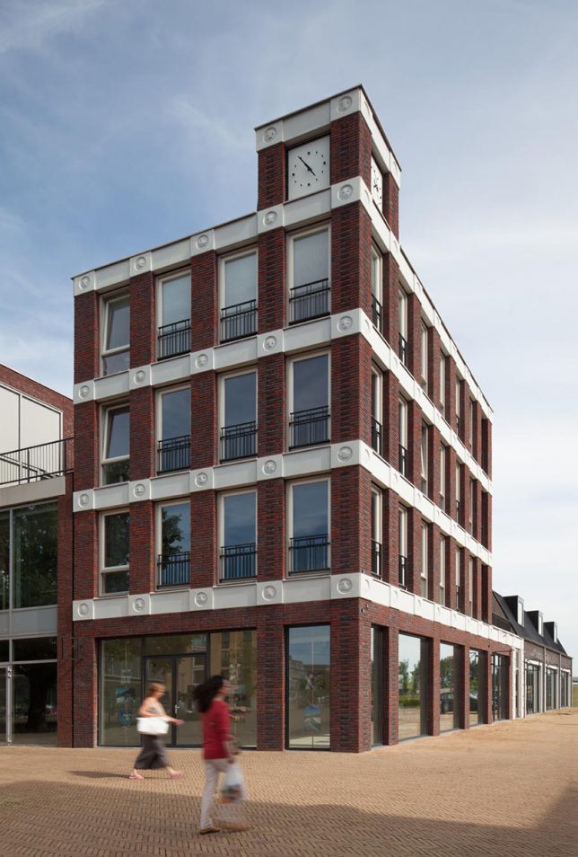
Instead of gargoyles, grotesques or ornate decorative details, this somewhat silly facade expresses an array of emotions through circular icons familiar to anyone with a smartphone or social media account.

Located in suburban Vathorst near Amersfoort, this design by Attika Architekten (images by Bart van Hoek) looks quite conventional at a glance. At each level, horizontal rows of light concrete break up stacks of dark brick and divide the tops and bottoms of windows.

Upon closer inspection, however, the mixed-use project has a detail that varies from one location to the next — round faces featuring a broad range of emotional states and attitudes.

“In classical architecture they used heads of the king or whatever, and they put that on the façade,” explains the architect. “So we were thinking, what can we use as an ornament so when you look at this building in 10 or 20 years you can say ‘hey this is from that year!’.” If nothing else, they seem to have hit that target.

“The cast concrete characters express a range of familiar emoji emotions, including the classic sad and happy styles, the instantly-recognizable kissing face, and the much-loved heart eyes personality.”

Formally speaking, this decor adds a layer of interstitial detail often found in early Modern architecture urban architecture (derived historically from Gothic influences). It adds an element that spans the fine grain of the brick columns and otherwise featureless and monolithic concrete rows.

Whether or not these emoticons will look funny, cool, creative, unique, dated or all of the above in a few decades remains to be seen. Still, it is certainly is a fun way to think about decor in the post-Postmodern world where rote historicism has become a thing of the past.

Share on Facebook


[ By WebUrbanist in Architecture & Offices & Commercial. ]

[ WebUrbanist | Archives | Galleries | Privacy | TOS ]


WebUrbanist

 
Comments Off on Emoji Facade: Dutch Architects Decorate Brick Building with 22 Smiley Faces

Posted in Creativity


Pretty in Pink: Trump’s Border Wall as Envisioned by Mexican Architects

22 Oct

[ By SA Rogers in Architecture & Cities & Urbanism. ]

trump-border-wall-6

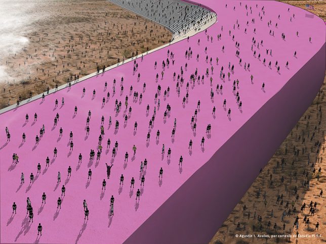
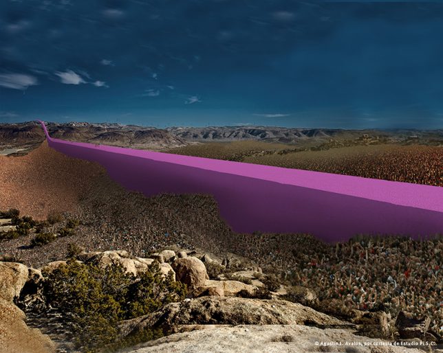
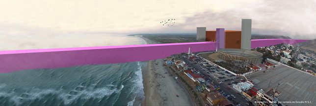
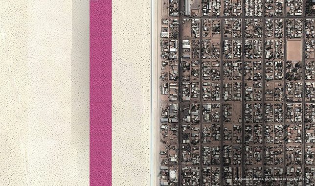
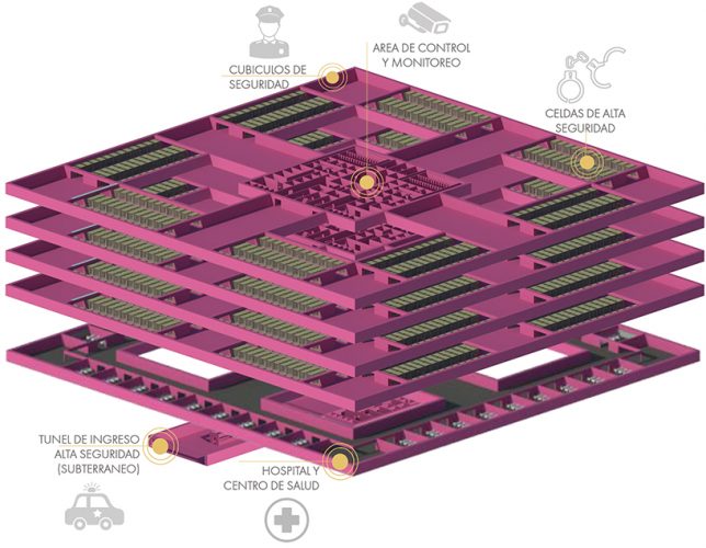
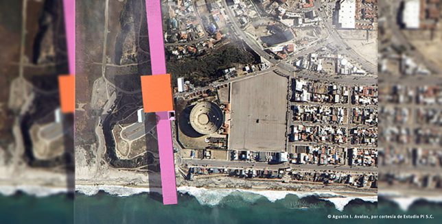
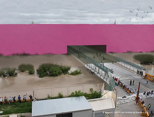
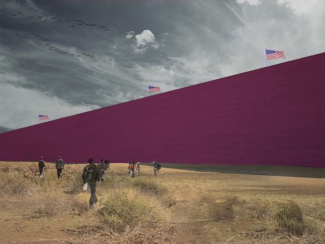
Donald Trump has promised that if he becomes President of the United States, he’ll build a “beautiful and impenetrable” wall and force Mexico to pay for it – so a group of Mexican architects have taken on the task of designing it for him, too. The firm Estudio 3.14 has envisioned the “gorgeous perversity” of the proposal in a vibrant shade of neon pink, a solid architectural ribbon running from the Pacific Ocean to the Gulf of Mexico and packed full of prisons.

trump-border-wall-1

trump-border-wall-2

“I will build a great wall – and nobody builds walls better than me, believe me – and I’ll build them very inexpensively,” Trump said during his candidacy announcement speech in June 2015. “I will build a great, great wall on our southern border, and I will make Mexico pay for that wall. Mark my words.”

trump-border-wall-7

trump-border-wall-8

Estudio 3.14 presents a series of renderings of the structure in the various types of border landscapes one finds along that 1,954-mile stretch. The wall is painted pink in honor of Pritzker Prize-winning Mexican architect Luis Barragán. To understand exactly what the architects are getting at with this project, it’s best to hear it described in their own words.

trump-border-wall4

trump-border-wall-5

“Based on Trump’s statements, the economic, ecological and financial aspects have been called into question. However, he continues with his verbal plan. As architects and designers, we have the capacity to imagine and interpret what Trump is saying, and we are convinced that if we can make people see it, they can assess his words and the perversity in his proposal.”

“Because the wall has to be beautiful, it has been inspired in by Luis Barragán’s pink walls that are emblematic of Mexico. It also takes advantage of the tradition in architecture of megalomaniac wall building. Moreover, the wall is not only a wall – as you can see in the hill landscape cross-section it is a prison where 11 million undocumented people will be processed, classified, indoctrinated, and/or deported.”

trump-border-wall-9

“The relation between the discipline of architecture and political perversity and/or megalomania has already been seen through previous characters such as Adolf Hitler and Benito Mussolini, who relied on the imaginative architects of their words and the creators, who materialized their macabre ideas. The proposal is made from the disciplinary field that has worked, since the existence of humanity, for the status quo and benefits from this tradition.”

Share on Facebook


[ By SA Rogers in Architecture & Cities & Urbanism. ]

[ WebUrbanist | Archives | Galleries | Privacy | TOS ]


WebUrbanist

 
Comments Off on Pretty in Pink: Trump’s Border Wall as Envisioned by Mexican Architects
Posted in Creativity


Zaha Hadid’s Legacy: Proposal for London by the Architect’s Final Students

11 Oct

[ By SA Rogers in Architecture & Cities & Urbanism. ]

bishopsgate-proposal-2

The legacy of famed architect Zaha Hadid continues to unfold months after her death at age 65 as a long list of her final projects continue in various stages of development, from those currently under construction to concepts that may forever remain unbuilt. But even putting aside the many outstanding and unrealized designs remaining on her firm’s docket, Hadid’s influence on modern architecture lives on through the work of her students at the Yale School of Architecture.

bishopsgate-proposal-8

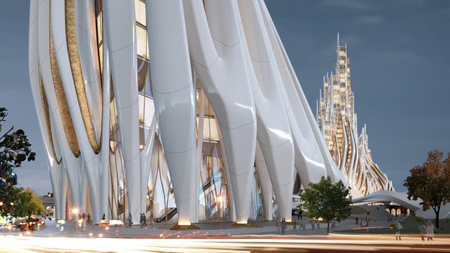
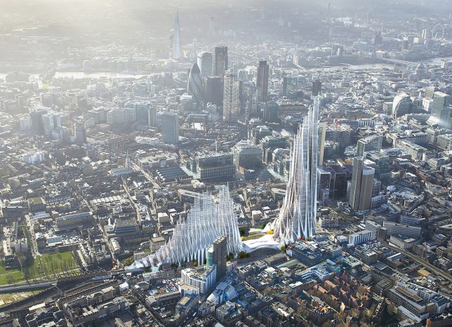
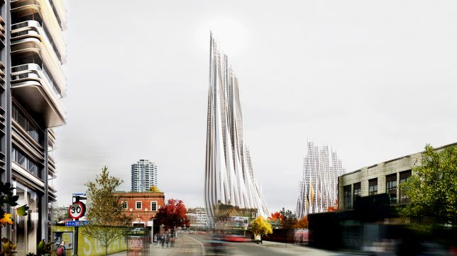
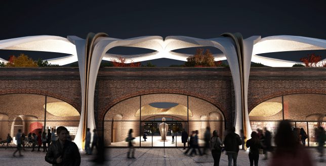
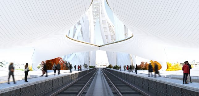
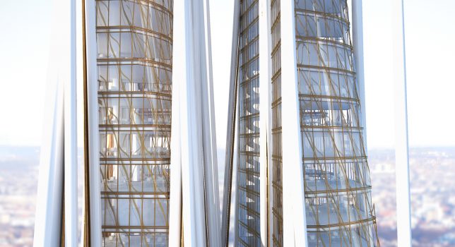
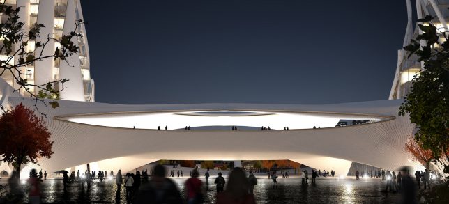
During their semester-long project at Zaha Hadid’s final studio course, a group of students envisioned a striking new development for London’s Bishopsgate Goodsyard, a flowing white complex in the architect’s signature biomimetic style. Consisting of a high-density residential tower, a mid-rise block and a train station acting as a bridge between the two, the proposal adds some height and visual interest to the largest undeveloped piece of land remaining in central London.

bishopsgate-proposal-1

bishopsgate-proposal-5

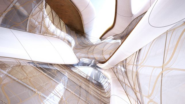
Lisa Albaugh, Benjamin Bourgoin, Jamie Edindjiklian, Roberto Jenkins and Justin Oh present a futuristic network of  gleaming white structures with a skeletal appearance, as if someone took the carcass of some extinct megabeast and reassembled it into a deconstructed approximation of a Gothic cathedral. The spaces between the rib-like columns are filled in with wavy walls of glass decorated with veinous ribbons of gold.

bishopsgate-proposal-3

bishopsgate-proposal-4

Viaducts at the base act as access points to a series of public spaces, including a park landscape, connecting the various functions within the complex. All of the different elements that would normally be contained within a traditional tower core are instead spread into individual ‘strands,’ like the elevators, stairs and mechanical systems, freeing up the tower’s center for unusual cross-views out of all that glass.

bishopsgate-proposal-6

bshopsgate-proposal-7

It would seem that the proposal is pure fantasy, given that the developers of the site, Hammerson and Ballymore, have already produced their own proposal. But Londoners have made it clear that they aren’t too keen on that design, with over 11,000 residents signing a petition against it. Critics argue that the developers’ proposal “would result in unacceptable and avoidable significant negative impacts” to the neighborhood.

Share on Facebook


[ By SA Rogers in Architecture & Cities & Urbanism. ]

[ WebUrbanist | Archives | Galleries | Privacy | TOS ]


WebUrbanist

 
Comments Off on Zaha Hadid’s Legacy: Proposal for London by the Architect’s Final Students

Posted in Creativity


Famous Figures: How 21 Different Architects Draw Scale Humans

30 Mar

[ By WebUrbanist in Art & Drawing & Digital. ]

norman foster figure

Many contemporary architects cut and paste scale figures into their renderings to show depth and dimension, but in cases where they draw their own, aspects of their style and personality become apparent in the radical differences between their approaches.

frank gehry figure

walter gropius figure

steven holl figure

Frank Gehry’s figure, perhaps predictably, is a mess of forms and shapes. Walter Gropius’ betrays a Bauhaus bent, all angles and boxes. Steven Holl, of course, is a lovely little watercolor, expressive and reflective of his well-known habit for creating daily water-colored sketches.

renzo piano figure

alvaro siza figure

New York architectural designer Noor Makkiya has collected twenty-one such examples for a series dubbed simply Figures, isolating them on neutral backgrounds to allow for easy side-by-side comparisons.

sanaa figure

mies van der rohe figure

The variations are dramatic, between highly-stylized forms to simplified human figures or completely abstract sets of shapes forming nearly-illegible avatars, all showing something about the architect behind them and how they choose to represent their work.

santiago calatrava figure

lenoardo de vinci figur

From the collector: “Human figures are typically used in an architecture rendering to provide a clear scale for the common eye. Thanks to new technologies like Photoshop we have lost our “ontological dimension”, and the copy paste method we use makes it easier for us to fill architecture renderings with a desultory crowd of figures.”

peter cook figure

oscar neymeier figure

le corbusier figure

“True architects since the early centuries used human figures not only to describe the quantity and the quality of the environment but also for deeper purposes of study and expression. Some used it as means of architecture inspiration, demonstrating the divine power of the human order. Other architects use human figures to emphasize on the activity within the space, sometimes it is important to depict the spatial properties of a design. Architects project themselves into the human figure. So if we compare drawings from different architects, we frequently find differences in body shape and body activity, for practicing architects often represent their own ideologies as a reference for understanding the human physical condition.”

Share on Facebook


[ By WebUrbanist in Art & Drawing & Digital. ]

[ WebUrbanist | Archives | Galleries | Privacy | TOS ]


WebUrbanist

 
Comments Off on Famous Figures: How 21 Different Architects Draw Scale Humans

Posted in Creativity


2 Tons of LEGO: 10 Architects Construct Interactive Micro-City

17 Jun

[ By WebUrbanist in Art & Installation & Sound. ]

interactive lego work

Using a staggering volume of LEGO bricks, a series of ten famous architecture firms has constructed a series of miniature built environments, deploying them on the High Line in New York City and encouraging the public to play with and reconfigure their work.

interactive lego architecture city

interactive lego block design

Organized by installation artist Olafur Eliasson (images by Timothy Schenck), The Collectivity Project features contributions from an all-star cast of local and international designers from: James Corner Field Operations, BIG, David M Schwarz Architects, Diller Scofidio + Renfro, OMA New York, Renzo Piano Building Workshop, Robert A.M. Stern Architects, Selldorf Architects, SHoP and Steven Holl Architects.

interactive architect building

interactive built environment

The results range from pointy towers and crooked skyscrapers to giant trees and complex landscapes, all created from versatile white bricks that can be added, removed and used interchangeably.

interactive building design

interactive people visitor architects

These are also not meant to be finished or stand-alone works – visitors and passers by are encouraged to remake this scaled-down urban landscape according to their own whims, transforming the architecture piece by piece over the coming months.

interactive miniature architecture nyc

interactive bridge building

Already, people have begun the conversion process, creating additions to bridges between the disparate LEGO buildings.

interactive cityscape

interactive high line architecture

Sitting the shadow of Hudson Yards, a floating megablock toward one terminus of the elevated park, those interacting with the work are encouraged to draw inspiration from their under-construction surroundings as well the historical hybrid of raised rail and modern pathway that is the High Line itself.

Share on Facebook


[ By WebUrbanist in Art & Installation & Sound. ]

[ WebUrbanist | Archives | Galleries | Privacy | TOS ]


WebUrbanist

 
Comments Off on 2 Tons of LEGO: 10 Architects Construct Interactive Micro-City

Posted in Creativity


ARCKIT: Reusable Model-Making Blocks Built By & For Architects

27 May

[ By WebUrbanist in Design & Products & Packaging. ]

architectural model blocks design

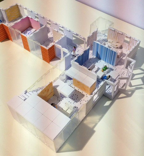
Positioned between robust LEGO-style systems made for easy reuse and refined architectural models that are fragile but permanent, this modeling kit is both a design tool for professionals and rendering mechanism to convey space and materiality to clients.

architecture bricks lego like

arckit imagine built it

Using 1:48 scale, the modular pieces that come with ARCKIT are compatible with conventional imperial measurements (easy inch-to-foot conversions) but also close to 1:50 for metric purposes and compatible with scale trees, furniture and figures already sold to architectural professionals. Different textures can be overlaid on surfaces to create realistic material effects, simulating wood panels, tile floors, stone walls and more.

modular house block system

architecture arckit box design


Easy to attach then disassemble, the pieces strike a balance between process and product, letting users reshape them as a design evolves. The physical blocks also have SketchUp-compatible digital analogs, allowing designers to shift back and forth between 3D modeling software and physical construction.

architect simulated space design

architecture material craft model

Anyone who has spent time on an architectural model knows that so much effort goes into measuring, cutting, gluing and waiting – the idea here is to reduce that frustration but also free up designers from feeling too committed to a lovingly-crafted physical model, reducing incentive to iterate. At the same time, this system is also accessible to non-professionals, both kids and adults, already being compared by many to physical toys (like LEGO) and digital games (like Minecraft).

arckit modes

arckit model

“ARCKIT is a freeform model making system that allows you to physically explore designs and bring your architectural projects to life. The system uses interconnecting components that are completely modular and based on modern panelled building techniques, making it possible to create a diverse range of scaled structures that can be quickly assembled and endlessly modified.”

Share on Facebook


[ By WebUrbanist in Design & Products & Packaging. ]

[ WebUrbanist | Archives | Galleries | Privacy | TOS ]


WebUrbanist

 
Comments Off on ARCKIT: Reusable Model-Making Blocks Built By & For Architects

Posted in Creativity