RSS
 

Posts Tagged ‘Applying’

Applying color theory to landscape photography

27 Jan
This is Albert Biestadt’s painting entitled ‘Among the Sierra Nevada’ from 1868. As you can see he employed the use of what we now call color theory to create a color harmony in his painting.

Color Theory can be an extremely complex subject, especially if you start looking at the mathematics and physics behind the theory itself. On a more aesthetic level it’s an integral part of what can make an image of a landscape pleasing to the eye. Composition, subject and light all play a considerable roll in landscape photography, but color, and more importantly the idea of color theory, helps to weave all of those elements together to form a successful image. 

The most commonly utilized types of color harmonies are analogous, monochromatic, complementary, split complementary, triadic and quadratic. These color harmonies are essentially different combinations of groups of colors that work well with with one another, or for lack of a better word, are harmonious in their visual representation. 

Painters such as Albert Beirstadt, who is best known for his renditions of the American West during the mid to late 1800s, utilized what we now call color theory extensively in his paintings of breathtaking landscapes. In the above painting entitled ‘Among the Sierra Nevada’ Beirstadt utilized a triadic color harmony to add balance to the scene.

In the modern era of landscape photography, the same principles that Beirstadt utilized in the 1800s, can be applied to the way we compose images today. Consider the example below taken from Ted Gore’s blog post on the subject. As you can see, the color balance that he strikes in this image helps to solidify an already strong composition with excellent leading lines by guiding your eye through the scene through the use of the colors present in the image.

In this graphic, Ted has outlined the use of the Triadic Color Harmony present in this image taken along the Napali coastline on the island of Kauai, HI.

The Triadic Color Harmony present in the above image combines three groups of colors that are equally spaced from each other on the color wheel. The greens, yellows/oranges and blues all work to add balance to the overall scene and to create a very well composed final product that is pleasing to the eye. This is just one example of the several provided by Ted in his blog post. 

To find out more on the subject please give his blog post a read as we think that it does an excellent job explaining how color harmonies work and how they can be utilized effectively in modern landscape photography.

If you want to dive even further into the science behind color theory, give Dave Morrow’s blog post a read as well.

Articles: Digital Photography Review (dpreview.com)

 
Comments Off on Applying color theory to landscape photography

Posted in Uncategorized


Beginners Guide to Creating and Applying Texture Overlays Using Photoshop

03 Aug

Creating and applying textures is surprisingly simple and fun to do.

Adding texture to photographs was happening long before the invention of Photoshop and other editing programs. In the days of the darkroom, we would scratch negatives with pins, sand paper them, stain the photographic paper with fixer before exposing, layer two negatives on top of each other in the enlarger, or push our film ISO to increase grain. These days, with editing programs being our digital darkroom, we simply have yet another way of adding texture to photographs.

What is a texture?

In digital photography terms it’s simply another layer added to your photograph in an editing program, usually an image of some sort of textural surface, such as paper, wood, concrete, etc., but anything at all can be a texture. They can be photographed, scanned or even made in Photoshop.

Almost anything can be used as a texture.

Some examples of textures. A friend’s work bench, a close-up of my lamp shade, a mossy rock, fog from a smoke machine, and some very ugly carpet.

Why use textures?

With the right texture overlay, and application of it,  you can add an extra level of depth and feeling to your photograph. You can use them for anything – from adding a vintage or grunge look to your photographs, to creating fine art pieces.

One of the best uses is to rescue a photograph that just isn’t quite working. I’ve been told no texture overlay will save a terrible photograph. While this is true for the most part, sometimes it can transform an otherwise unusable image to something more promising.

A texture can transform an otherwise unusable image into something more promising

A texture can transform an otherwise unusable image into something more promising.

Textures can be added to almost any kind of image. If you’ve ever downloaded a photography app for your Smartphone, you have most likely had them add a texture with the app’s built-in filters.

Some mobile phone apps add texture for you

If you’ve ever used a filter on a mobile phone app, you have probably already had textures added for you.

Getting started

You don’t need to create your own texture to get started. There are many pre-made, free textures available on the internet. A quick Google search will bring up a bunch of free texture sites. But not all textures are created equally, or usable legally. You need to look for textures that are a decent size and resolution, a 200px/72dpi texture over a 3200 px/300dpi image probably isn’t going to work so well.

You’ll also want to make sure the texture has the right copyright permissions. Sites like deviantart.com have many stock textures offered free by their artists for personal use. These artists ask that you simply return the favor by sending them a link to the image you created using their work. Other sites like freetstocktextures.com offer their images copyright free for personal and commercial use, as long as you aren’t reselling the texture images themselves.

Creating your own textures

Creating your own textures is as simple as taking a photograph. Why do that, when you can download free ones? Because it’s fun, your work is then completely all yours, and you can tailor your textures to suit your images. For example; if you’re photographing skateboarders at a skate park, you could also gather some shots of the concrete they skate on, or graffiti around the place to create original textures that work with, and possibly add to, the story of your subject matter.

create your own textures to add more story to your image

Textures can add a bit more of a story to your images.

The image above is of my daughter asleep after a day at the beach (many years ago) combined with texture of the water I took that day, to add to the story and memory of the day, and give the photo an extra dream like feel.

Create a texture with your scanner

Below is the first texture I created, one that I still use years later. It was created by scanning the bottom of an old baking tray. Scanning works well for textures of papers and other small flat surfaces.

You can also use a scanner to create textures. Thiis is a scan of the bottom of an old baking tray

Scanned texture from an old baking tray.

The baking tray texture was used in the image of the cello player at the beginning of this article, in combination with a manuscript image of the music she played on the day. I also used it in the image below; one of a series of images created in collaboration on album artwork with Canadian singer songwriter Sora. The texture was used to tie all the photographs in the album together even though some were taken by other photographers. Yet another use for textures!

Baking tray texture in combination with a few other textures.

Textures can be used to tie a series of images together.

Create a texture in Photoshop

You don’t need to understand complex Photoshop processes to create a texture quickly and easily. Here are a few simple steps to create a basic texture in a few minutes:

  1. Open a new file the size and resolution you require
  2. Brush around a couple of colors
  3. Add a Render Clouds filter
  4. Adjust levels for a bit of contrast
  5. Add a vignette and a color filter
Creating a texture in photoshop takes only minutes.

Paint in some colors, add Render Clouds Filter, some contrast, then some colour and vignette. Easy!

Instead of a Render Clouds you could use the Blur Tool to swirl your colors around, or try some of the other filters in Photoshop to get different effects. I tested it out on what was originally a rather terrible photograph of this orchid.

creating-and-applying-textures13

The texture, plus a few color adjustments and a warming photo filter, and it’s a whole different image.

create-and-add-textures09

While it does look a little like something you might see on your Facebook stream with a positive affirmation written across it in an awful font, it took me less than five minutes to do for this demonstration to show you how simple it can be to create a texture from scratch.

create-and-add-textures10

Applying your texture

It is really very easy to apply your texture. There are some more technical articles on adding textures here on dPS, but here is a quick guide to get you started.

Click and drag your texture thumbnail in the Layers palette over onto your original image. Your texture becomes layer 1 in your original image’s Layer palette. Choose your level of transparency with the Opacity Slider and use Free Transform Tool to move the texture about. Turn it around, enlarge or stretch. See where it sits best.

create-and-add-textures11

Then it’s simply fine tuning the Opacity, maybe putting Eraser Tool on a low opacity and painting out unneeded parts of the texture. Alternatively use a layer mask to paint out some areas, as well as back in, if you accidentally paint out too much.

create-and-add-textures12

Have fun with it and experiment. Try a few different layer blend modes, add multiple textures, or add the same texture image a few times, perhaps with each layer having a slightly different hue. There are no rules.

Have you created a texture that you love? Share it and its use (your images) in the comments below.

googletag.cmd.push(function() {
tablet_slots.push( googletag.defineSlot( “/1005424/_dPSv4_tab-all-article-bottom_(300×250)”, [300, 250], “pb-ad-78623” ).addService( googletag.pubads() ) ); } );

googletag.cmd.push(function() {
mobile_slots.push( googletag.defineSlot( “/1005424/_dPSv4_mob-all-article-bottom_(300×250)”, [300, 250], “pb-ad-78158” ).addService( googletag.pubads() ) ); } );

The post Beginners Guide to Creating and Applying Texture Overlays Using Photoshop by Lea Hawkins appeared first on Digital Photography School.


Digital Photography School

 
Comments Off on Beginners Guide to Creating and Applying Texture Overlays Using Photoshop

Posted in Photography


Applying a Texture Overlay to Your Images to Create an Antique Look

19 Apr

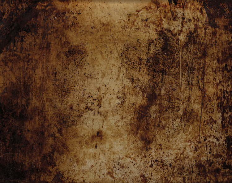
If you were to look at my computer you would find a folder called textures, and in that folder you would find hundreds of files. I take photos of things everywhere that I think will be good textures. I also make them, and try different things. You can do the same. Any time you see interesting textures in concrete, marble, or maybe cracked paint, take photos of them, add them to your folder for textures.

There are numerous reasons for adding textures to your photos, and one of the best is to give your work an old or antique look. Lots of old photos have marks on them or the emulsion has stained. Photos were often not treated with preservation in mind and they have started to look textured.

In this article we are going to look at how you can apply a texture overlay to your images to give them an aged look.

1-lily-texture-original

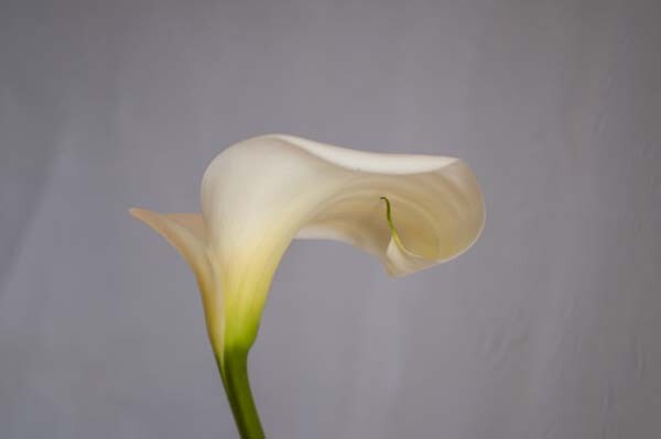
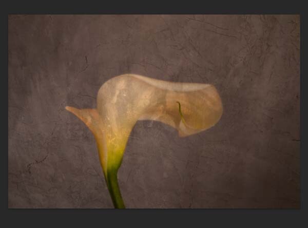
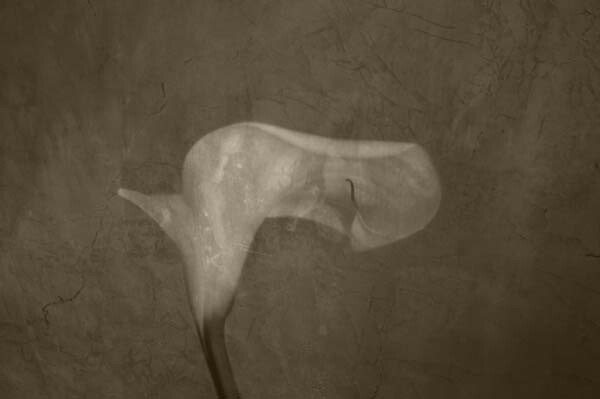
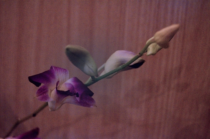
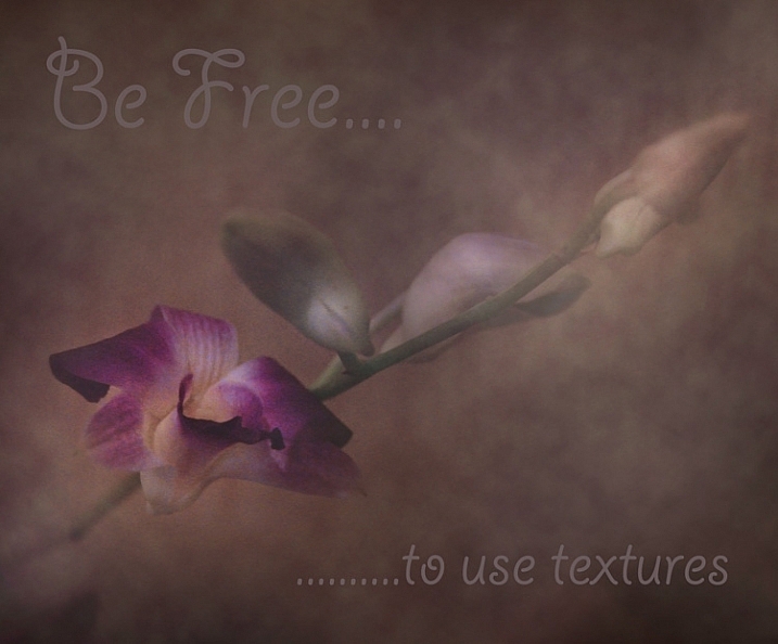
We are going to work on the above image of the lily. It has had basic processing done to it in Adobe Camera Raw before being opened in Photoshop CC (2014).

Cameras and lenses back in the day often didn’t produce super sharp images, so to start off we are going to make a duplicate layer of our image. I do this with the Ctrl+J, keyboard shortcut (Cmd+J on a Mac). There are other ways of doing this, such as; going to the menu at the top and choosing Layer, then clicking on Duplicate Layer, but I find the keyboard shortcut to be the easiest and quickest way.

11-lily-texture-original

10-lily-texture-original

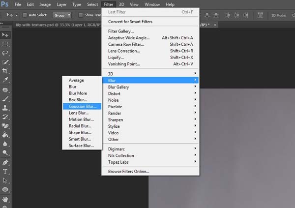
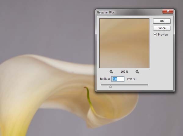
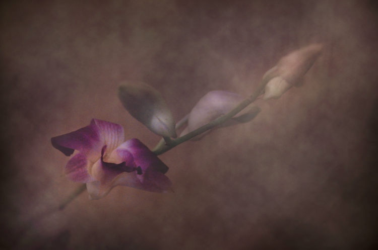
Once you have that duplicate layer then go over to Filters and choose Blur, then Gaussian Blur as in the image above. You don’t want too much blur, or it will look like it is out of focus, and you don’t want too little or it will not be visible or obvious enough. I used 3.8 for the purpose of this image.

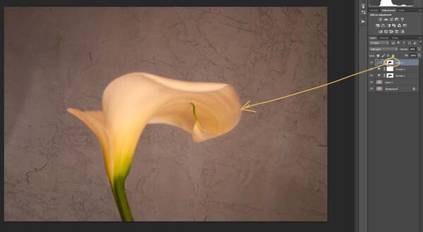
Next, you want to try and separate the flower from the background, you can do this with curves. Open a curves adjustment layer and use it to darken the image overall. Then using the Brush tool (which is located on your tool bar in Photoshop) on the layer mask, remove the adjustment from the flower as follows.

12-lily-texture-original

3-lily-texture-original

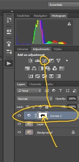
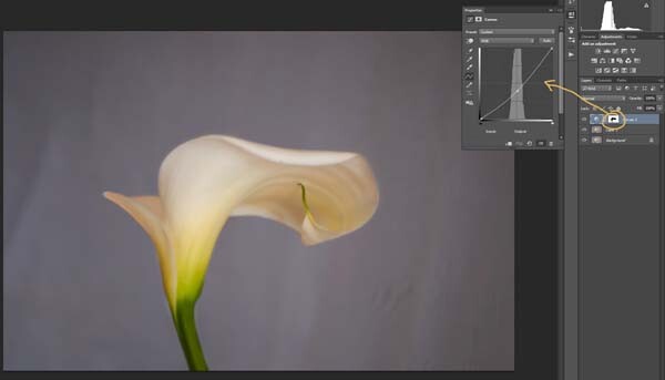
Click on the Brush tool, then set your foreground colour to black. It is the one with the two little squares at the bottom of the tool bar – the colour on top is the foreground color, the one on the bottom is the background color. Go to the curves layer you created in your layers panel and click on the white square in that layer (that is the mask), then go to your image and start brushing on the flower. You should see the flower getting lighter.

Add a warmer color to your image

Screen Shot 2015-04-13 at 11.52.55 AMNext you are going to change the colour of the highlights. You don’t have to do this, but it is a nice touch and it helps create a warmer feel to the image.

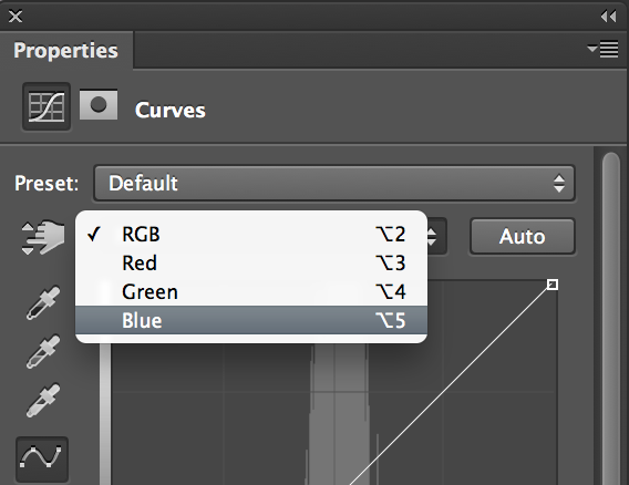
Open another curves adjustment layer. At the top you should see a pull down menu that says RGB, click on that and choose Blue. Go to the curves line and up in the top right corner (the highlights) click on the dot in the corner and pull it down along the side line. Don’t go too far, but you should see the image turning yellow. Remember yellow is the opposite of blue.

4-lily-texture-original

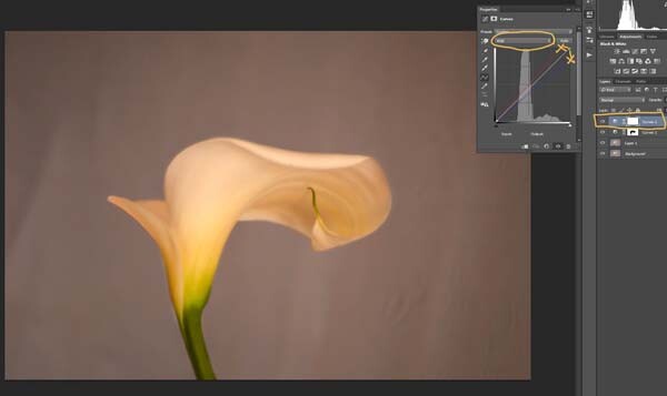
Go back up to the curves window and click on red. You are going to do the same thing, except this time take the dot to the left and across the top. You don’t need to go very far.

Adding the texture overlay

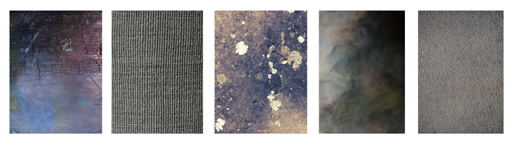
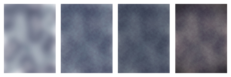
Now it is time to find a texture overlay to put on top of your image. It is always going to be an individual thing and something that you need to work out. Here, I used a texture that I saw on the floor of a building in the city. I liked the cracked look of the floor so I took quite a few photos.

5-lily-texture-original

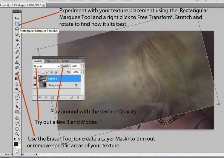
Open the texture file in Photoshop, then using the move tool (the first one at the top of the tool bar) click on the image and drag it over to the image you want to apply it to. You can copy and paste it as well, or use Place (which will add it as a SmartObject).

If you buy textures, or get free ones off the internet, you will often find they are too small for your image. But don’t worry about it because you are going to be blending it into your image, so it doesn’t really matter.

If you need to change the size of the texture overlay you can do this with the transform tool. You can find the Free Transform tool under the Edit button on the main menu across the top, where you found Layer and Filters. You can also the keyboard shortcut, Ctrl+T (Cmd+T on a Mac).  You will see a little grid go up around the texture so you can drag one of the corners to make it bigger, or smaller, depending on the size you require.  Press enter to apply the transform, or you can double click on it, or click on the move tool and press apply.

Blending the texture into your image

You will need to blend the texture so you can see your image underneath. The layer blend mode options are at the top of the layers panel, it is another drop down menu. The default option is set to Normal, so look for that. There are many options, for this tutorial however, we are going to use Soft Light. Once you change it to that blend mode you should be able to see the texture and the image underneath.

You can also change the opacity of the layer if you like as well. I usually change it slightly so the texture isn’t too strong. You can change the opacity in the window next to the options panel. Just make sure your texture layer is highlighted.

6-lily-texture-original

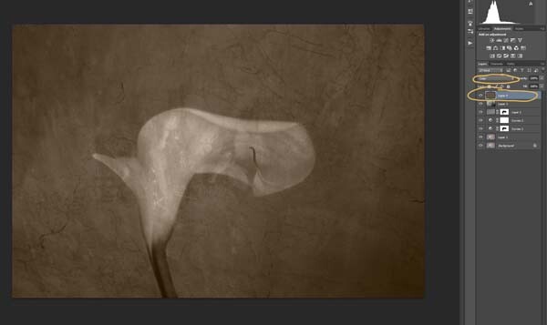
If you go to the bottom of the layers panel you will see a few things across the bottom.  If you click the rectangle one with the round hole in it you will give your layer a mask.  The mask means you can hide some of that layer from your image, like you did with the first curves layer.

Again, get your brush tool, make sure the foreground colour is black and paint over the flower.  You are now making the texture look like it is just on the background.

7-lily-texture-original

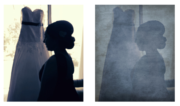
Next we are going to apply a texture to the whole image. This time it is one that will make the image look grungy, and dirty. You can find textures that have marks on them that look like smudges and grease. The one in this tutorial was a polished cement wall outside.

Add the texture to the image the same way you did the previous one. Blend it with the Soft Light Blend mode again. See how you feel about how the image looks, and if you decide it is too strong remember that the opacity can help make it less intense.

Adding a tint to your image

8-lily-texture-original

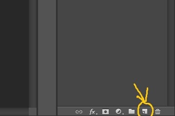
You will need to add a new layer, one that is transparent. At the bottom of the layers panel where you found the layer mask, you should see next to the trash bin a white square with a corner folded over, that is the new layer icon (see below). Click on it.

9-lily-texture-original

Next go to the tool bar and find the Paint Bucket Tool. Then go to the foreground colour and click on it. A popup window should come up and you can choose a colour to give your image a new tone. I would recommend you choose a grey, for this demonstration a mid tone grey with a hint of orange was chosen.

13-lily-texture-original

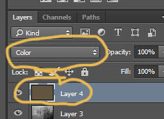
Now go to your image and click on it. The new empty layer should be filled with the colour you chose, and your whole image should look like a solid colour. Go to the blending mode for the new layer and change it to Colour. Your image should be transformed to monochrome. If you change the opacity of that layer then some of the original colour will come through, but that is up to you.

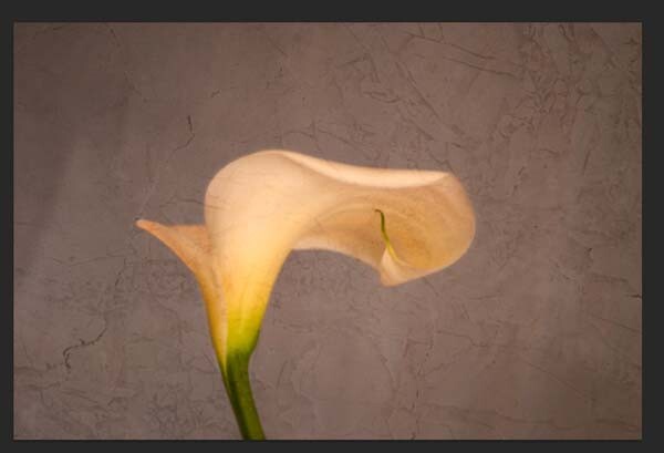
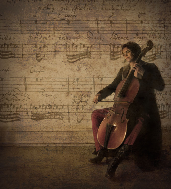
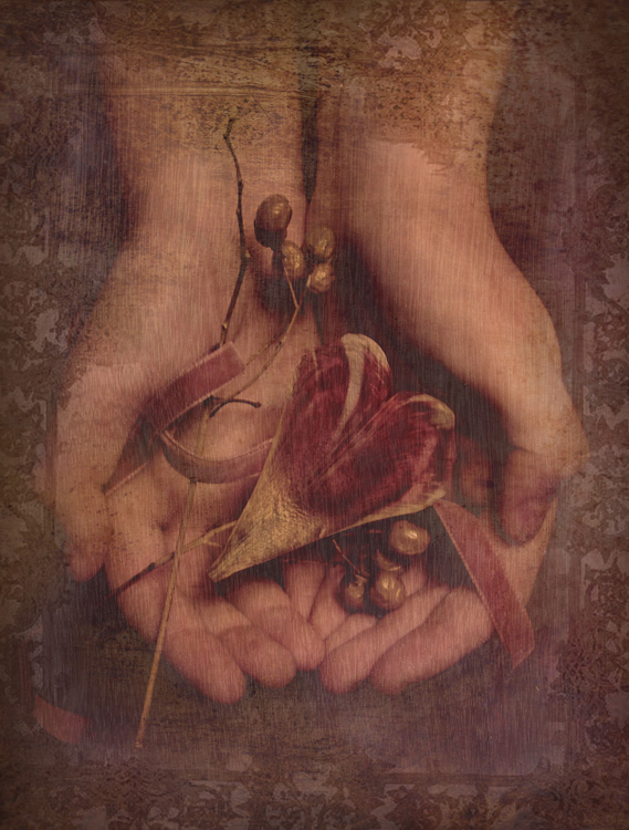
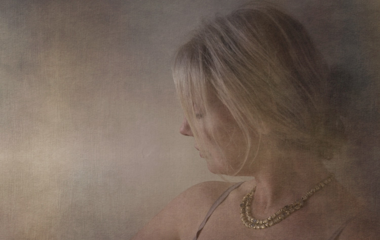
Here is the final image.

lily-with-textures

There are lots of other things you can do, but that might be best left for another tutorial.

If you prefer to watch this demonstrated you can check out the video below as I walk you through the same steps:

Have you tried using textures before? Do you have any favorite textures or sites for finding them? Please share in the comments below.

googletag.cmd.push(function() {
tablet_slots.push( googletag.defineSlot( “/1005424/_dPSv4_tab-all-article-bottom_(300×250)”, [300, 250], “pb-ad-78623” ).addService( googletag.pubads() ) ); } );

googletag.cmd.push(function() {
mobile_slots.push( googletag.defineSlot( “/1005424/_dPSv4_mob-all-article-bottom_(300×250)”, [300, 250], “pb-ad-78158” ).addService( googletag.pubads() ) ); } );

The post Applying a Texture Overlay to Your Images to Create an Antique Look by Leanne Cole appeared first on Digital Photography School.


Digital Photography School

 
Comments Off on Applying a Texture Overlay to Your Images to Create an Antique Look

Posted in Photography


Butterfly Girl Photoshop Tutorial: Applying Digital Makeup and Photo Editing with VIPtutorials.com

01 Aug

Working with a photograph and being able to apply digital makeup without altering the original image is very important. In this tutorial you will learn Photoshop techniques of photo retouching by using layers, coloring modes, adjusting hues and saturation. Adding digital props into portrait photography and changing color of your background will finalize the look you want to achieve. Have fun!?
Video Rating: 4 / 5


Photoshop: Applying Makeup

30 Oct

Apply makeup to your models in Photoshop! Watch it on TutCast: www.tutcast.com Visit www.PhotoshopTalent.com for more tutorials, contests and more! Music Kevin MacLeod