RSS
 

Posts Tagged ‘Amazing’

Sony Announces New Compact Camera With Amazing Features

01 Aug

The post Sony Announces New Compact Camera With Amazing Features appeared first on Digital Photography School. It was authored by Jaymes Dempsey.

Are you searching for a pocket-sized camera that packs a big punch?

Look no further than the just-announced Sony Cybershot RX100 VII, which is an all-around amazing camera, from its small size to its impressive zoom to its powerful optics.

First, take a look at its lengthy zoom lens, which goes from 24mm to 200mm in moments. This is perfect for capturing wider landscapes, then zooming in to emphasize a few compelling details.

The Sony RX100 VII also promises stellar image quality, with a ZEISS lens and a 20.1-megapixel sensor.

But where the Sony RX100 VII really shines is in the thick of the action. The RX100 VII shoots at 20 frames-per-second, which is far faster than most competitors on the market. And the autofocus is especially notable, with 357 AF points.

Sony-RX100-VII

If you’ve worked with mirrorless or DSLR cameras before, then you’ll appreciate the electronic viewfinder on the RX100 VII. This is useful for shooting in bright conditions, or when you’re struggling to see the (touchscreen!) LCD.

Oh, and did I mention the 4K video capabilities? If you want a camera that will get you good images and beautiful videos while remaining nicely compact, the RX100 VII may be the way to go.

Who is the Sony RX100 VII for?

The RX100 VII should appeal to a few groups of people.

First, the RX100 VII is a good camera for beginner photographers looking to buy something a bit more long-term, but who doesn’t want to deal with the complexities or price of a DSLR or mirrorless camera.

And for those of you who have been using your smartphones as a primary camera, the RX100 VII will take your photos up a notch – without requiring much in the way of advanced settings or know-how.

Finally, the Sony RX100 VII is ideal for more serious photographers who want a second, more portable camera body. If you often get frustrated carrying around a DSLR or mirrorless camera/lens combo while traveling, then the Sony RX100 VII may be exactly what you need.

Are you excited about the release of the Sony RX100 VII? What is your favorite new feature? Let me know in the comments!

You may also find the following helpful:

  • Which Crop Sensor Sony a6000 Series Camera Should You Buy?
  • Hands-On with the new Sony RX100 VI Compact Camera
  • Why This Pro is (sort of) Switching from Canon to Sony
  • Sony a6300 Mirrorless Camera – Thoughts and Field Test

The post Sony Announces New Compact Camera With Amazing Features appeared first on Digital Photography School. It was authored by Jaymes Dempsey.


Digital Photography School

 
Comments Off on Sony Announces New Compact Camera With Amazing Features

Posted in Photography


Tiniest Interchangable Lens Micro Four Thirds Cameras for Travel with Amazing Quality

21 Jun

The post Tiniest Interchangable Lens Micro Four Thirds Cameras for Travel with Amazing Quality appeared first on Digital Photography School. It was authored by Caz Nowaczyk.

In this video by MarkusPix, he looks at some of the tiniest ILC micro-four-thirds cameras and shows how well they hold up on his travels when taking some portraits.

In the video, he specifically looks at the Panasonic Lumix GX1 (2012), GX850 (2017), GM1 (2013), GM5 (2014) and uses the M Zuiko 45mm f/1.8 lens (which he describes as a great portrait lens).

He also uses the Godox Ad200 with the world’s smallest flash trigger – the FlashQ.

?

Panasonic Lumix GM1 (2013)

He states that the GM1 is one of the smallest and lightest ILC M4/3 cameras in the world. It has no viewfinder, hot shoe or image stabilization. However, the GM1 has a 16mp CMOS sensor, with a shutter speed of up to 1/16,000th, face detection, built-in wireless, built-in flash, video, and time-lapse recording.

Panasonic Lumix GM5 (2014)

Mark also states that the GM5 is one of the smallest and lightest ILC M4/3 cameras in the world. It has similar features to the GM1 but the GM5 has an electronic viewfinder and a flash shoe.

Panasonic Lumix GX1 Black (2012)

The GX! has a hotshot and can take an optional EVF (you can’t use a flash while using the optional EVF as it connects to the flash hotshoe). It has some similar features as the above cameras, but it also has optical image stabilization and built-in flash. The battery door opens all the time and the menu is confusing.

Panasonic Lumix GX850 (2017)

The GX850 (also known as the GX800 and GF9) has no EVF or hotshoe, but has a tilting screen, better LCD resolution, focus stacking and face detection. The images are very sharp. It also has a built-in flash.

So check out his experiments and see if you think these cameras would make a great (lightweight) travel companion.

Have you used these cameras? Do you agree? What are your thoughts?

Or do you have any cameras you’d add to the list?

Share with us in the comments below.

You may also find the following helpful:

  • Full Frame VS Crop Sensor VS Micro Four Thirds: Camera Sensors Explained
  • Some of the Pros of Using Micro Four-Thirds Cameras for Wildlife Photography
  • My experience with a micro-4/3rds camera – (Panasonic GF1 Review)
  • Panasonic Lumix DMC-GX7 Review
  • Panasonic Lumix DMC-G6 Review
  • Panasonic Lumix DMC-GF6 Review


The post Tiniest Interchangable Lens Micro Four Thirds Cameras for Travel with Amazing Quality appeared first on Digital Photography School. It was authored by Caz Nowaczyk.


Digital Photography School

 
Comments Off on Tiniest Interchangable Lens Micro Four Thirds Cameras for Travel with Amazing Quality

Posted in Photography


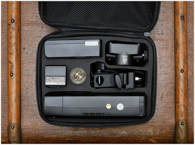
Godox AD200: An Amazing Flash— If You Tweak it a Little

01 May

The Godox AD200 has been much written about (and fawned over) for good reason: it's a legit 200ws flash in a near-speedlight form factor that has a lot going for it.

At $ 299, as packaged, it's a near-miss. But at $ 366 (including two specific accessories) it's a home run.Read more »


Strobist

 
Comments Off on Godox AD200: An Amazing Flash— If You Tweak it a Little

Posted in Photography


9 Creative Architecture Photography Techniques for Amazing Photos!

19 Mar

The post 9 Creative Architecture Photography Techniques for Amazing Photos! appeared first on Digital Photography School. It was authored by Simon Bond.

It’s great to get a technically sound photo, and architecture photos demand this. Getting the technical side of your photo correct should be your first priority, but beyond that, it’s worth experimenting. In this article, you’ll learn about some creative photography techniques, and how you can apply these to your architecture photography. Whether you adopt any of these for your work will be at your discretion, but having extra options for your photography is never a bad idea. So read on to find out which creative architecture photography techniques you could apply.

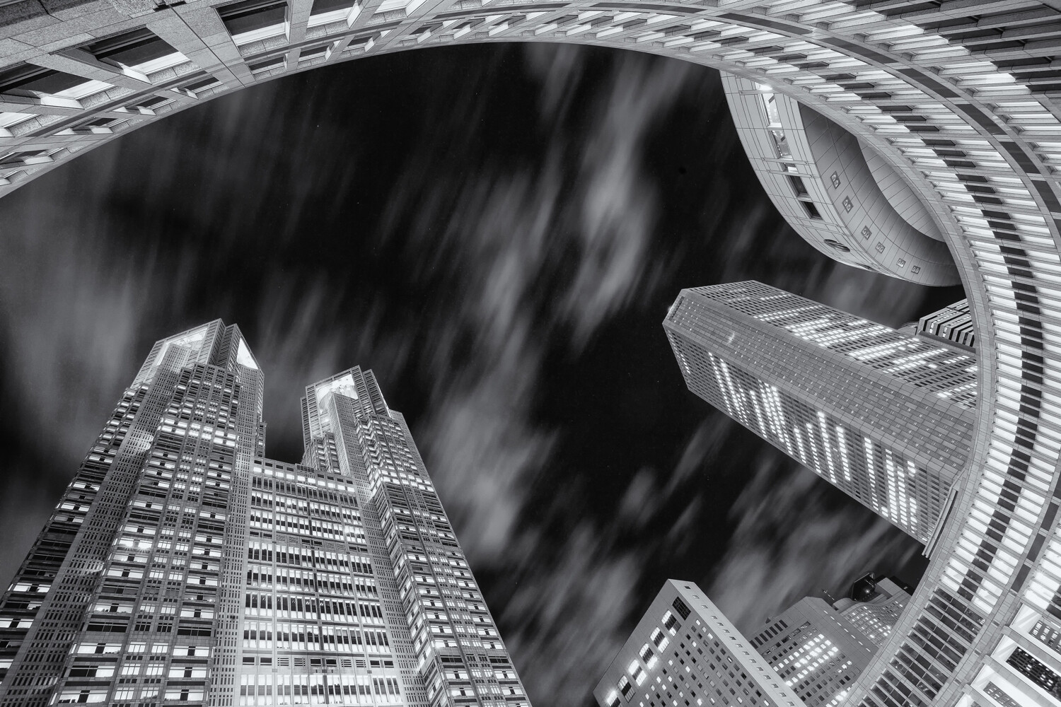
This photo of the Tokyo metropolitan government building has used a worm’s eye view, and a wide-angle lens.

1. A different perspective

Many architecture photos are taken at eye level. In other words, a standing composition from street level or an elevation that brings you level with the building if that’s available. This is far from the only way to photograph architecture though. Using extreme perspectives like worms eye or birds eye views can give dramatic results.

  • Worms eye view – This is likely to be the easiest perspective to achieve and works best when photographing taller structures. You can use this to emphasize interesting ceiling features or to take photos of skyscrapers from the base of the building. If you happen to be surrounded by tall buildings that are close to each other, you can use this perspective to fill the sky.
  • Birds eye view – To get this type of angle, you’ll first need to find a way of getting above the structure you’re photographing. With the advent of drone photography, this has now become a lot easier to achieve. No drone? No problem. You can always find a tall building to photograph from or, if you’re lucky, a hot air balloon ride!

2. Infrared photography

You can change the nature of your creative architecture photography, without needing to use extreme perspectives. One of the best ways to do this is by using infrared photography. This will change your image into more of a dreamscape. This style of photography works much better outdoors, and in places where there is some vegetation. Through some post-processing, you’ll create an image where photosynthesizing plants are white, and the sky is dark. Architecture then forms a powerful focal point within your infrared photo. There are some excellent guides on this style of photography. You have three main choices when it comes to carrying out this style. You can convert your camera for infrared, use an infrared filter, or you can produce this effect through post-processing.

Infrared photography is a great technique to experiment with.

3. Light painting

One of the most creative photography techniques out there is light painting. Through the use of light painting techniques and styles, you can customize the way you photograph architecture. The trick is knowing where and how to apply this to your photograph because not all architecture lends itself to every technique. Perhaps it’s impossible to gain access to the area of the structure in which you’d like to light paint? Perhaps light painting will be too big a distraction and detract from the architecture itself. When you can use light painting to form a leading line to the architecture, or perhaps to frame the architecture, you’ll be on the right lines. There are various tools you can use. Below is a selection.

  • A torch – The simplest of light painting tools. This can be used to create patterns in front of the camera, or perhaps to light up a section of the architecture you wish to photograph.
  • A light source on a string – Repeating patterns work well in photography, and spinning a light source on a string will provide this repetition. You could also use this to create a light orb, and strategically place the orb in front of your architecture.
  • LED light sticks – In recent years products like the pixelstick and the magilight have really revolutionized light painting. These excellent tools can be used to create bespoke light paintings in front of the architecture you’re photographing.

In this photo a pixelstick has been used to light paint around the pagoda.

4. Kinetic light painting

Light paintings’ cousin is kinetic light painting. The technique also requires a tripod, but this time you move the camera rather than the light source. Once again, this can be quite experimental, and not all locations are well served by this photography style. The two main types of kinetic light painting are the zoom burst and camera rotation.

  • Zoom burst – This technique works well with tall buildings, from a distance, and where they’re lit up with lots of interior building lights. You’ll need to set the camera on a tripod, with a lens that can zoom. A kit lens works very well for this, or perhaps a 24-70mm lens. You begin the photograph at the longer focal length, and then zoom out. You can read more about this technique here.
  • Camera rotation – This time you rotate your camera around a tripod head. It works well with tall buildings, where you have a worms eye view. Once again, you can read more about how to do this by reading this guide.

This is a single photo of the Tokyo Skytree. It’s straight out of the camera, and has used kinetic light painting.

5. Refraction photography

You can also use refraction photography with a crystal ball for creative architecture photography. That’s because the fisheye-like properties of the glass ball will capture the entire piece of architecture you intend to photograph. There are tricky aspects you need to handle including the upside-down image within the ball, and centering the architecture within the ball. Providing you can find a good place to position the ball, you’ll be able to use this technique to produce a unique photo of a building or sculpture.

This location is a popular place to photograph St Paul’s cathedral in London. The addition of a crystal ball gives this image another perspective.

6. Detail photos

The main focus of architectural photography is to capture the whole scene. That’s not always needed though, and you can find great detail photos by using lenses of longer focal length. These photos might not work on their own but would certainly add to a selection of photos of one particular piece of architecture. You’ll need to look out for details in the roofing, lines of repeating architecture like arches in a church, or ornate decorations on a wall. Then look to focus in on this particular area. Look to light the detail photo well by either choosing the correct time of day for the sun or using an external flash.

Detail photos of architecture are always worth taking.

7. Digital blending

A process known as digital blending allows you to get perfect pictures. The technique is great for getting technically perfect photos, but you can push beyond that and get more creative. One of the main advantages of this is the ability to photograph towards a sunset sky, and then to balance light across the scene so your architecture doesn’t become too silhouetted. The technique requires you to use a tripod for best results and to take a set of bracketed images. You’ll then need to use luminosity masks to blend the bracketed images in post-processing.

In this photo digital blending is used to ensure the roof windows aren’t blown out.

8. Contrast

Contrast is a broad term, and can be interpreted in several ways. You can use any of these interpretations for more creative architecture photography. Let’s look at some of the ways contrast can be applied.

  • Light and shadows – The most obvious when it comes to photography is to use the light in your photo. You can use this to accentuate areas of interest on the architecture, by using shadows to show detail points.
  • Colors – In some cases, you can play colors off against each other. Obviously, you can’t move architecture, so you’ll need to be creative about how you add opposite colors that contrast with it.
  • Old and new – Old architecture surrounded by new can make an effective photo. Think of a church or temple surrounded by modern skyscrapers.

Framing is a potent photographic technique, which draws the eye to the main subject.

9. Framing

Look to frame the architecture you’re photographing. An arched doorway is a great way to frame your main subject. You could introduce the framing yourself, by holding something in front of the camera. You can use gaps in a fence as a way of framing your photo.

Which creative architecture photography technique will you use?

There are many ways to add creativity to your photography. You’ve now learned about some of the best creative architecture photography techniques. Are any of these techniques you’ve tried before? Which of these ideas will you try? We’d love to see the results of your photography from the past, and anything you might take in the future. As always please share your thoughts and photos in the comments section of this article.

The post 9 Creative Architecture Photography Techniques for Amazing Photos! appeared first on Digital Photography School. It was authored by Simon Bond.


Digital Photography School

 
Comments Off on 9 Creative Architecture Photography Techniques for Amazing Photos!

Posted in Photography


How To Make Amazing Photomontages. Part 3: Printing and Constructing Photomontages

11 Feb

The post How To Make Amazing Photomontages. Part 3: Printing and Constructing Photomontages appeared first on Digital Photography School. It was authored by Kevin Landwer-Johan.

This is the third article in a series of three (part one, part two) with guidelines on how to make amazing photomontages in which you’ll learn about printing and constructing photomontages.

You may be quite content with your photomontage you see on your monitor. But there’s something special about getting all the images printed out and pasting them onto a board. Finishing a montage like this is even more fulfilling.

You can, of course, have your montage printed out as a regular photo, on a single piece of paper. However, I prefer getting individual prints made of each layer, positioning them and sticking them down.

Ducati How To Make Amazing Photomontages

© Kevin Landwer-Johan

Part 3: Printing and Constructing Photomontages

1. Have your photos printed

Importing the photos using the method I outlined in Part two of this series will mean each of your layers has retained the original file name. Now it’s time to go back to the folders with the photos you resized and collect up all of them that made it into your final composition.

Copy them into a new folder and have them printed.

2. Buy a board

You’ll need a sturdy piece of board to mount your photos on. I prefer to use foam core board as it’s strong but lightweight. It also does not warp. If you use cardboard it can buckle easily once you get many layers of photos stuck down.

Whatever you choose to use, make sure that it will be big enough to compile all your photos on.

Beauty Mirror How To Make Amazing Photomontages

© Kevin Landwer-Johan

3. Prepare to adhere your photos

For many years I have used double-sided adhesive paper. It’s like a huge roll of double-sided tape. This method is the cleanest and easiest that I know of.

Pasting the photos up with glue is possible, but you need to be extremely careful you don’t get glue places you don’t want it.

Before I begin sticking the prints down, I use a black marker pen to blacken the edges of each print. White edges don’t look great when the photos are stuck down.

Stick it How To Make Amazing Photomontages

Photo by: Pansa Landwer-Johan

4. Lay out your prints

Open your montage file on your computer and turn off all the layers except the bottom one. Find the print of this image and position it on your board. Turn on the next layer and repeat the process of laying out your photos.

Prints will get knocked and move around during this process. Don’t be concerned, because as the montage takes shape the positions of prints will change. You may begin to see different relationships between the prints you may not have noticed on your computer monitor.

You can use masking tape to help keep the prints in position. Take care when you remove the tape that it does not damage your print.

I will often use post-it notes stuck alongside the photos. This helps me reposition them when they do get bumped.

Remain relaxed and fluid during this part of the process. Don’t stress if you cannot manage to line all the photos up as precisely as you lined up the layers in Photoshop.

Take a few steps back, or get up above the table you are working on. This will help you see the overall look of your composition. Do this a few times during your layout stage.

Layout How To Make Amazing Photomontages

Photo by: Pansa Landwer-Johan

5. Stick it all down

You can spend forever tweaking the positioning of the prints, but eventually, you will want to stick them all down.

Start with a corner there’s a print with no others overlapping it. Position it carefully in relation to the edge of the board and stick it down.

Begin to work your way from this point, sticking down only prints that do not overlap above any other print. Whenever a print has another layer underneath, the bottom one must be stuck down first.

If you make a mistake, just consider alternatives to remedy the situation. You might have to get another print or two made so you can cover up the problem area. Other times you will be able to rearrange the way you stick the prints down and still make it look good.

Work slowly and carefully, trying as much as possible not to let the prints move around. Any fast movement or clumsiness at this stage can mean you have to start over and lay it all out again.

Fixed How To Make Amazing Photomontages

Photo by: Pansa Landwer-Johan

Conclusion

Once your photomontage is all adhered, you will notice a big difference. It’s much more dimensional than it appears on your computer monitor or as it would be printed on a single sheet of paper.

Taking your time and working carefully, yet remaining flexible, as you stick your prints down, will make it a more enjoyable process.

The overlapping layers and any unconformities that happen during paste-up give a montage some depth and texture. These used to bother me until I realized they actually add to the look and feel of these artworks.

Here’s another short video of me working on a montage for my ‘Fractured Dimensions’ exhibition in 2014.

I hope you’ve enjoyed this short series on photomontages and I encourage you to experiment with the process yourself. Let us know how you get on in the comments below, and don’t forget to share your montages with us too.

Other articles in this series:

How to Make Amazing Photomontages. Part 1: Taking Your Photos

How To Make Amazing Photomontages. Part 2: Compiling Photomontage Photos


The post How To Make Amazing Photomontages. Part 3: Printing and Constructing Photomontages appeared first on Digital Photography School. It was authored by Kevin Landwer-Johan.


Digital Photography School

 
Comments Off on How To Make Amazing Photomontages. Part 3: Printing and Constructing Photomontages

Posted in Photography


How To Make Amazing Photomontages. Part 2: Compiling Photomontage Photos

10 Feb

The post How To Make Amazing Photomontages. Part 2: Compiling Photomontage Photos appeared first on Digital Photography School. It was authored by Kevin Landwer-Johan.

In Part One of this three-part series on How to Make Amazing Photomontages, you learned how to approach and take your photos for your montage. Here in Part Two, you’ll learn about compiling photomontage photos. To compile your Photomontage images using the following steps, you require Photoshop or other imaging software that has the ability to create layers.

Lanna Chic 1 How To Make Amazing Photomontages

© Kevin Landwer-Johan

Part 2: Compiling your photos

1. Get organized

Managing your photos well can save you getting in a mess further along in this process.

Import all your images into one folder. Go through and pick out your strongest images – ones that stand out to you.

Naturally, you’ll have lots of photos that won’t be worth looking at on their own, but among them should be some key images. Put these into a separate folder and label it ‘Group 1’ or something useful to you.

Next, you need to choose the bulk of the photos you want to use. Think about the images you want to go around the edges. Which ones are for the main body of your photomontage? These are likely the first photos you took. Place these into another folder and label it ‘Group 2’ or something useful to you.

Drop the remaining images into a third folder and label it.

Ceramic Artist How To Make Amazing Photomontages

© Kevin Landwer-Johan

2. Save as and resize all your images

Save all your photos as jpeg files with a resolution of 300ppi. At this resolution, they are a little large but will be the same size when you get them printed later.

What dimensions do you want your finished photomontage to be? Think about how many photos you made along the horizontal axis. Calculate how wide each one should be, so they fit within the finished size you want your montage.

If you want a montage one meter wide (3.3 feet) and have taken seven photos across the horizontal, make each photo 14 centimeters wide (5.5 inches.) This gives you a starting point. As you start laying the photos out, this can change entirely so you may have to resize the images again later.

Run a batch command to resize them all. Save them to new folders because it is helpful if you need to resize the originals again later.

Chedi Luang How To Make Amazing Photomontages

© Kevin Landwer-Johan

3. Prepare a clear canvas

In Photoshop or your preferred software, make a new canvas. Make the ppi resolution 300 to match your image files. Make the size a little larger than you want your finished Photomontage to be.

4. Import your photos

Photoshop allows you to import a series of images to a single working file, so they retain their original file names. To do this, go to the top menu and choose File->Scripts->Load Files To Stack. These open into a new canvas. Select them all and drag and drop them onto your montage canvas.

Do this with the three folders of resized images you’ve made. Arrange them in the layers panel so they are in three groups to make your workflow easier.

Lanna Chic 2 How To Make Amazing Photomontages

© Kevin Landwer-Johan

5. Lay out your photos

Right now you probably have all the layers stacked so you can only see the top photo. Turn off the visibility of the Group 1 and Group 3 folders.

Select all the layers in the Group 2 folder and drag all the photos to one corner of your canvas.

Now select only the top layer and drag and drop it roughly in the position you want it. Do the same with each layer. Don’t worry at all about positioning anything precisely at this stage. Everything from here is likely to be shuffled around a number of times.

Once you’ve added all the photos in Group 2 and have them laid out, repeat this process with images in Group 1. Then from Group 3, but only if you really need them.

Drag photos up and down in the layers panel hierarchy to place them above or below other photos on the canvas.

As you add more photos, you should start noticing the relationship between the images. Keep nudging and tweaking all the layers until you are satisfied they’re all in the best position.

When I am working with large numbers of layers, I color code them to help me keep track of them. You might like to make the layers with the images on the left, middle and right of your montage all separate colors.

Colored Layers How To Make Amazing Photomontages

© Kevin Landwer-Johan

6. Turn unused layers off

You may now have many layers visible with lots of overlapping. Begin to turn layers off for images you may not want to include in your finished montage. Don’t delete them at this stage, just turn their visibility off.

Now you’ll see fewer photos on your canvas, and it’ll be easier to arrange the images you have visible.

At this stage, you may be seeing some gaps in your montage. This is where the images in Group 3 may be useful if you haven’t added them already. You can always duplicate similar layers and drag the copied layer to fill the space. If this does not work, you may need to go back and take some more photos.

Once you are happy with the way your montage looks, go ahead and delete all the layers you have turned off.

Harleys How To Make Amazing Photomontages

© Kevin Landwer-Johan

7. Go back and take more photos (optional)

Having big gaps in your photomontage may look okay. Alternatively, you may have completely covered the whole area and edges, and have ample images. If not, you’ll need to have another session and make some more images.

Use the same camera and lens, at the same focal length. Make your new photos at about the same time of day and ensure you have similar lighting. If the light’s not right, you’ll have a hard time making the new set of photos match.

A few additional layout tips

There’s no right or wrong way of laying out your Photomontages, but you’ll be more pleased with some layouts than others.

If you get stuck and can’t get the photos arranged so they look good, start again. Duplicate the whole file. Keep the original one and re-work the new file. Move the images around differently and change their positions in the layers hierarchy. Experiment until you are content.

Aim to build cohesion in your composition. Too much fragmentation can make your montage difficult for people to view. Follow strong lines in your montage to help keep the flow. In my montage of the taxi trucks in Chiang Mai, following the lines of the vehicles was vital.

Songtao How To Make Amazing Photomontages

© Kevin Landwer-Johan

Don’t worry about ragged edges. I don’t often make montages that fit a regular shape. However the edges of your montage are formed, make sure they enhance the overall image.

Tweaking individual photos may sometimes improve the overall look of your montage. When you have the images laid out, take a step back and consider your composition. Are there individual images which are too dark or too bright? Do some contain colors that don’t fit well? How would the whole montage look in black and white?

Be prepared to go with the flow of new ideas you’ll have during the process. As I said, there’s no right or wrong way to make these. It’s up to your creative process. Starting with some idea of how you want it to look is important. However, you don’t need to stick to it strictly when you feel fresh ideas emerging.

Conclusion

Take your time. The process of compiling a montage until you are satisfied can take a long time.

Tuktuk How To Make Amazing Photomontages

© Kevin Landwer-Johan

Often I have been on the verge of giving up because I just can’t get a montage looking right. I had started my Tuk Tuk montage then it sat on my hard drive for months without being touched. Finally, I got back to it with some fresh inspiration, and it came together well.

Experiment with the placement of your photos on the canvas. Look at how each one relates to the images around it. Zoom out and sit back often to keep an eye on how the overall montage is taking shape.

Let’s see what you are working on and your thought process in the comments below.

In the next article in this series, I outline how to compile a print version of your Photomontage.


https://digital-photography-school.com/

The post How To Make Amazing Photomontages. Part 2: Compiling Photomontage Photos appeared first on Digital Photography School. It was authored by Kevin Landwer-Johan.


Digital Photography School

 
Comments Off on How To Make Amazing Photomontages. Part 2: Compiling Photomontage Photos

Posted in Photography


How to Make Amazing Photomontages. Part 1: Taking Your Photos

07 Feb

The post How to Make Amazing Photomontages. Part 1: Taking Your Photos appeared first on Digital Photography School. It was authored by Kevin Landwer-Johan.

This is the first article in a series of three on how to make amazing Photomontages.

Most photographs are created in a fraction of a second from one point of view. Imagine an image made from multiple positions and spread out over time. This is the nature of the cubist style Photomontages I make.

Painting How To Make Amazing Photomontages

© Kevin Landwer-Johan

David Hockney, the famous English painter, made many of these in the late 1970s and early 1980s. He called them “photo joiners.” This is where I gained my initial inspiration to experiment with time and space photographically.

What’s involved in making a Photomontage?

Joining together a series of photographs is not a new idea. My great grandfather, Frederick Cooper, was doing it back in 1889. He made this panorama of the Tasman Glacier and Mt. Cook range with five 8X10 inch images. He made them on the first expedition to photograph the mountain.

What’s different about Photomontages is they are not supposed to represent a single perspective in a single instant. By changing your camera position and spreading out the process of making the photos, a cubist style becomes possible.

Here’s a series of steps I take to produce my Photomontages. This has developed over time since I was first introduced to the concept in 1984. There are no rules. If you want to try something new, follow these steps as guidelines to create your own cubist-styled photography.

1. Choose your subject carefully

Have a raw concept in mind. What is your photomontage going to be about? It’s more than just the subject you choose.

When you are starting out, it is easier to use static subjects. Any movement in the scene adds complexity and difficulty.

Can you re-visit and photograph you subject again if you need to? Getting all the photos you need does not always happen in one session. It is convenient if you can return to your subject and fill in any gaps.

Try to find a subject you can move around and photograph from different angles. Nothing too small. Small subjects can be very challenging.

For my Photomontage of the old Iron Bridge in Chiang Mai, I photographed it from the left side, in the middle, and then from the right side.

Iron Bridge Chiang Mai How To Make Amazing Photomontages

© Kevin Landwer-Johan

2. Decide how big you want your Photomontage to be

My example above is made up of only seven individual photos. You can make a montage with just a few photos or with hundreds or thousands. There is no limit.

Looking at your scene, choose a focal length to use. I generally keep to one. Zooming or changing lenses can bring about confusing results.

Avoid using a wide-angle lens. Distortion at the edges of the photos can make it harder to compile them well.

Base your lens choice on the dimensions you want your finished montage to be. This can be tricky when you are first starting out, but it’s helpful to consider at this stage of the process.

Having a baseline of six or seven photos with a height of five photos, you end up with around 40-50 photos in your final montage. Choose a focal length that gives you the number of photos across the horizontal axis that you want.

Having too many or too few photos to work with can be quite complicated. The Iron Bridge montage took me ages to compile to make it look right because I was working with so few images.

Mask How To Make Amazing Photomontages

© Kevin Landwer-Johan

3. Create a base series of photographs

Take more than you think you need. This is most important. Don’t go crazy taking loads of images that are all very similar. Change each composition slightly.

I am always working in manual mode, so my exposure remains constant unless I choose to adjust it.

You can use this first set of photos as the base of your Photomontage. It’s good to have a foundation of images to reference once you start compiling your montage. For these first photos, try to build a selection of images that, when put together, make a fairly normal looking representation of your subject.

Aim to have some overlap in every photo. About 30% is the minimal amount. Being methodical as you make the photos can help to ensure you capture everything you need.

Follow a grid pattern. Start at the bottom left corner and make a series of overlapping images as you move your camera across to where you want the bottom right corner to be. Count the number of photos you are taking.

Point your camera a little higher, including some of the last photos you made. Now work your way back across to the left, taking roughly the same number of photos. Follow this pattern as you continue to cover the whole area you want to include in your Photomontage.

Look for strong lines running through your montage. These help make a more cohesive image when you are putting it all together.

Songtao How To Make Amazing Photomontages

© Kevin Landwer-Johan

4. Begin adding alternative perspectives

Now that you have a fairly standard collection of photos change your perspective. Move to your left or right. Crouch down or get up higher. You may be surprised at how much a slight change in your perspective alters the look of your montage once you start to compile it.

Move a few times, each time photographing the whole scene again or just the most significant parts of it.

When working with movement in your subject, it may be best to stay in one position to make all your photos. You can rely on the changes in your subject for a cubist effect.

Photographing the tricycle taxi rider, I did not move much. As he moved, I photographed him in different positions. I compiled the photos to convey this movement and contrast it with the image of him sitting.

Keep looking for the strong lines as you or your subject moves.

Tricycle Taxi How To Make Amazing Photomontages

© Kevin Landwer-Johan

5. Take more photos

Once you think you have taken enough photos, take some more. There’s nothing more frustrating when you’re compiling your montage than finding gaps you have no photos to fill.

Don’t be in a rush. Take a careful look over the area of your composition and take more photos around the edges and the most important parts of your main subject. These are the two areas you can have the most significant problems with.

When you’re working with subjects you have some control over, think about adding them into your composition more than once. I have done this with some of the people in my tuk-tuk montage.

Tuktuk How To Make Amazing Photomontages

© Kevin Landwer-Johan

Conclusion

Taking the photos for a montage is typically the shortest part of the process. Imagining how your compiled montage looks help guide you when taking the photos.

Be careful not to make your first Photomontage too big or too small. If you do discover you have photographed a space too wide or too high, you can alter it when you start positioning the photos in the next step.

Here’s a short video where I share a little more of my montage making experience and an introduction to the videos I make of these Photomontages.

?

I’d love to read your comments and feedback below. Please share your photomontages and your thoughts on making them.

The next article in this series I will explain the steps taken to compile your photos so they won’t end up looking like a dog’s breakfast.


The post How to Make Amazing Photomontages. Part 1: Taking Your Photos appeared first on Digital Photography School. It was authored by Kevin Landwer-Johan.


Digital Photography School

 
Comments Off on How to Make Amazing Photomontages. Part 1: Taking Your Photos

Posted in Photography


Ways to Get Amazing Smiles from Your Subjects

24 May

Photographing people is a deceptively simple process these days. It seems with the wide availability of high-quality photo equipment and digital editing software that every Tom, Dick, and Harry is now a professional photographer. The reality is that true pros know technical knowledge is not the only thing that sets them apart from the amateurs. Connecting with your subject when Continue Reading

The post Ways to Get Amazing Smiles from Your Subjects appeared first on Photodoto.


Photodoto

 
Comments Off on Ways to Get Amazing Smiles from Your Subjects

Posted in Photography


How to Take Amazing Photos Using the MIOPS Splash Water Drop Kit

22 May

Water droplet photography is a dream for almost every creative photographer. When a water drop collides with another drop, it creates beautiful crowns and other shapes that look fabulous. Capturing those moments is a very satisfying experience for a photographer.

MIOPS Splash water droplet

Taken by Andrea Laybauer using MIOPS Splash Water Drop Kit

Until now it was not easy to create such shots, but thanks to the advancement of technology, now we have some gadgets that could make this process almost effortless for us. One such gadget is the MIOPS Splash Water Drop Kit which is the world’s first water drop photography gear that can be controlled by your smartphone.

It not only controls the size and timing of drops with great precision, but it also controls your camera or flashes so that you can focus on other creative tasks like lighting, background, and different settings to create unique pieces of art.

So, let’s find out how you can create extraordinary splash photographs using this amazing device.

Photo credits: In this article, we are featuring examples done by myself, as well as three photographers and MIOPS Splash Water Drop Kit customers; Andrea Laybauer (a specialist who shoots drops and splashes), Jos Daanen (a primarily wildlife photographer), and Paul Lindqvist (a specialist in food, stop-motion products, and portraits).

MIOPS Splash Water Drop Kit - blue drops

Taken by Ramakant Sharda using MIOPS Splash Water Drop Kit

What you need:

A Quiet Room:

First, you’ll need a room that can be darkened where you can create a lot of mess in that room. It’s better to choose a spare room as you may need to keep your equipment setup for a few days.

Camera and Lens:

You can use any DSLR camera for water droplet photography, or any other camera that has manual controls. Lens choice is important as you need one with a longer focal length and shorter minimum focusing distance so your camera is safe from water splashes but you can still fill the frame with splashes. I found that a 100mm macro lens is the best option for this project.

Flashes/Speedlights:

Next, you need flashes with manual control over power. You are going to use the flashes at the lowest power setting so you need a minimum of two flashes. If you have more, that is even better.

Taken by Andrea Laybauer using MIOPS Splash Water Drop Kit

Taken by Andrea Laybauer using MIOPS Splash Water Drop Kit

Tripod:

A steady tripod is a must for the camera so you can focus on other aspects of the shoot. You also need an extra tripod for attaching the MIOPS Splash Water Drop Kit device.

Water Containers:

You may use a glass bowl, wine glass, or a designer cup. But if you don’t want to show the container in the picture you need around an 8×12″ glass tray with two-inch depth. You can get it from your local aquarium shop (or a similar baking dish).

Taken by Jos Dannen using MIOPS Splash Water Drop Kit

Taken by Jos Daanen using MIOPS Splash Water Drop Kit

Backgrounds:

You also need some colorful background images. Go to Google and search for “blur abstract background” and you’ll get an idea about what type of images you require. You can buy similar images from stock sites or there are some sites that provide images at no cost. You now have two options, you can print these images on paper or transparencies.

MIOPS Splash Water Drop Kit:

Finally, you need a MIOPS Splash Water Drop Kit to control the water drops and your camera. It comes with a holder kit so you can easily fix it on a tripod.

MIOPS splash dark

Other than these items, you need a few more things like a milky white acrylic sheet (Plexiglass) to attach backgrounds. Something to hold the acrylic sheet, a dry cloth, some clamps or clips and a shutter release cable.

Setup:

Now you have everything ready, so let’s start. First, place the acrylic sheet as the background, making sure to leave at least two feet at the back for placing the flashes. Now place a tripod at the front of this and attach the MIOPS Splash Water Drop Kit on it. The distance between the background and the point where your drop will fall should be around 12-15 inches.

Now put your water container below it and ensure that the drop falls in the center of this container. Also, align your background with it.

Next place your flashes. If you are using transparencies for the background, place the flashes behind the glass, at a distance of around 12 inches. If you are using a paper background, place the flashes at a 45-degree angle on both sides. Make sure to cover your flashes with a plastic bag.

Water droplet splash Setup 01

Setup using a transparent background with the flashes behind it.

Water droplet splash Setup 02

Setup using a paper background with the flashes in front of it. Notice the flashes are being protected from any water drops that might splash and land on them, potentially damaging your delicate electronic equipment.

One flash will be the master and it’ll attach with MIOPS Splash Water Drop Kit and the other flashes will be in slave mode so they fire automatically when the master flash fires.

Lastly, fix your camera on a tripod and attach a shutter release cable. It’s better to create this setup on a table because you need to work for a long time and if this setup is on the ground, you’ll get tired quickly.

Settings:

At this point, you may want to take a break and have coffee but if you are like me, you probably dying to see your first image. So, let’s talk about all the settings.

First, set your flashes at 1/32 power. If you are using four flashes, you may need to lower the power to 1/64 or 1/128. The lowest power setting will give you shortest flash duration and your photos won’t have any motion blur.

Next set your camera to Bulb Mode, set ISO to 100, choose an aperture between f/11-f/16 and attach the shutter release cable. Now put a pencil or something else where your drop will fall and focus manually on that spot, and leave the camera.

Taken by Andrea Laybuarer using MIOPS Splash Water Drop Kit

Taken by Andrea Laybuarer using MIOPS Splash Water Drop Kit

You can also control your camera using the MIOPS Splash Water Drop Kit, but it’s always better to set your camera to Bulb Mode and fire flashes instead. It will give you accurate results as there will be no shutter lag.

Lastly, you need to do the MIOPS Splash Water Drop Kit settings. You are going to set the size of the first drop, the delay between two drops, size of the second drop and finally the flash firing time. Open the MIOPS Mobile app on your phone and you’ll find some settings. Set the first drop size to 25 milliseconds, the second drop size to 50 milliseconds and delay to 100 milliseconds. Finally set Trigger to 350 milliseconds and set mode to flash.

These settings are just a starting point and you need to do some fine-tuning. If your nozzle is too high or low, you need to change delay time according to that. For the above settings, the distance between nozzle and water container is around two feet.

Workflow:

Now you need to open the shutter using the shutter release cable and tap on the Start button in the app and close the shutter when flashes are fired. Since your room is dark and you are using a narrow aperture, the ambient light won’t affect the shot.

Taken by Andrea Laybauer using MIOPS Splash Water Drop Kit

Taken by Andrea Laybauer using MIOPS Splash Water Drop Kit

Taken by Jos Daanen using MIOPS Splash Water Drop Kit

Taken by Jos Daanen using MIOPS Splash Water Drop Kit

So, take a shot and check if the lighting is good or not. If your picture is too dark, increase the ISO or move the flashes a little bit closer. Keep in mind that you should not increase the power of your flashes above 1/32 or you’ll start getting motion blur. If your picture is too bright, lower the flash power to 1/64 or 1/128 or move them back.

Once the light is okay, take another shot and see if it’s properly focused. If not, focus again.

When everything is set and you get your first shot, it’s time to do some experiments to create different masterpieces. Change the size of drops to see what difference it makes. Remember that first drop size won’t make any major difference, it’s the size of the second drop what will create different shapes. Now change the delay time, every time you change it, you’ll get different shapes.

Now experiment with both drop size and delay between drops. Each change will give you different results. Just keep in mind that you should make small changes like 5-10 milliseconds.

Taken by Andrea Laybauer using MIOPS Splash Water Drop Kit

Taken by Andrea Laybauer using MIOPS Splash Water Drop Kit

Once you understand the process and take enough shots, experiment with different backgrounds and light positions. You can place the flashes at the back and front or you can use gels on them to get different results.

Taken by Paul Lindqvist using MIOPS Splash Water Drop Kit

Taken by Paul Lindqvist using MIOPS Splash Water Drop Kit

At last, I am going to tell you a little secret to get outstanding photos. If you add a few drops of liquid soap in the water, you’ll start getting some totally unique shapes.

So, let’s get started, please share your masterpieces in the comment area below.

More about the photographers:

Andrea Laybauer started to photograph in 2001. However, since 2009, she has dedicated herself to shooting drops and splashes. View her website here and Instagram to see more of her work.

Jos Daanen is primarily a wildlife photographer. He did his utmost best to get some collisions of droplets… For these featured photos, he ordered the MIOPS Splash Water Drop Kit unit which was released at the beginning of 2018.

Paul Lindqvist is a commercial photographer who specializes in food, stop-motion, product photography, and portraits.  He loves using technology to create his images, and always find new ways to use it to his advantage. View his website and Instagram

Disclaimer: MIOPS is a paid partner of dPS.

The post How to Take Amazing Photos Using the MIOPS Splash Water Drop Kit appeared first on Digital Photography School.


Digital Photography School

 
Comments Off on How to Take Amazing Photos Using the MIOPS Splash Water Drop Kit

Posted in Photography


Ways to Get Amazing Smiles from Your Subjects

17 May

Photographing people is a deceptively simple process these days. It seems with the wide availability of high-quality photo equipment and digital editing software that every Tom, Dick, and Harry is now a professional photographer. The reality is that true pros know technical knowledge is not the only thing that sets them apart from the amateurs. Connecting with your subject when Continue Reading

The post Ways to Get Amazing Smiles from Your Subjects appeared first on Photodoto.


Photodoto

 
Comments Off on Ways to Get Amazing Smiles from Your Subjects

Posted in Photography