In early February, software company Serif announced the free beta version of Affinity Photo, a Mac-only photo editing program said to rival the likes of other editing tools, including the standards for creative professionals, Adobe Photoshop and Lightroom. In this article, I’ll walk through the public beta version of Affinity Photo and describe some pros and cons to using this new software.
Affinity Photo Basics
 At the moment, Affinity Photo beta is available as a free online download and is compatible with Apple OSX Lion 10.7.5, and up. Some key features that move Affinity up in the ranks include support for CMYK color, RAW file processing, 16-bit editing, 64-bit Photoshop plug-in compatibility, ICC color management, and LAB color. A few other noteworthy tools include Affinity Photo’s Inpainting feature, which is essentially the equivalent of Adobe content-aware fill, and real-time editing that will apply edits instantly without the need to render a preview.
It’s uncertain when Affinity Photo’s full version will launch, but when it does it will be available for purchase in the Mac App Store for about $ 49.99. A Windows/PC version of the app is said to be in works, but again no solid timeline is available.
Pro: Speed and reliability
The first feature of the tool that really stood out was its speed and reliability. Affinity Photo is extremely fast and it never once crashed during the seven times I used it, which is impressive for a beta version. The tool’s speed is accredited to it being built on an entirely new and modern codebase, unlike Adobe Photoshop, which recently celebrated its 25 year anniversary and thus has been built on architecture that is also a couple decades old.
Con: Default RAW file conversion
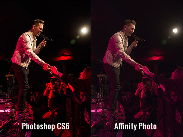
One of the most striking differences that I immediately noticed was the default adjustment that Affinity Photo made to my RAW image when I first imported it. While these defaults could likely be adjusted to taste, I was surprised at how drastically Affinity altered my image when all I did was import it.
Pro: Easy access to basic photo editing tools
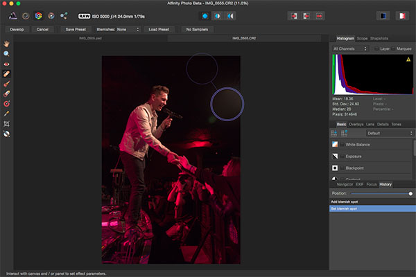
The interface, and ease of use, is where Affinity Photo really shines. Despite being a longtime Photoshop user, I’ll admit that its layout can be overly complicated, presenting too many tools that are beyond the scope of basic photo edits. While Affinity’s interface definitely borrows some features from Photoshop, its basic layout is relatively straightforward and easy to understand without requiring a ton of customization. The top bar below the menu shows all of the basic details of your photo (file format, ISO, shutter speed, aperture, etc.), which is something that seemed rather hidden and hard to find in Photoshop.
Basic editing tools are presented in the right hand panel under the histogram, the tools are nicely labeled, and easy to adjust with sliders. There is also a History tab that, in the same way that Photoshop does, keeps track of every edit, making it easy to track and reverse any changes. Hardcore photo retouchers might find these editing tools to be lacking, but for beginners or photographers in need of basic edits, these tools will get the job done in a straightforward manner.
As a photographer who shoots almost exclusively in RAW, I’ve grown accustomed to the seamless integration of Camera RAW with Photoshop and Lightroom’s smooth handling of RAW image conversion. The way that Affinity handles RAW editing took a bit of troubleshooting, but was straightforward when all was understood.
Initial RAW Editing Tools
When you first open a RAW file into Affinity, there are distinctly fewer editing options and adjustments to choose from. The Basic tab offers easy access to make basic adjustments to white balance, exposure, contrast, shadows and highlights, clarity, vibrance, and black points. What was curiously missing from this panel were saturation and tint control. The Lens tab offers adjustments for lens correction, chromatic aberration reduction, vignettes, and defringing. The Details tab allows for detail refinement, noise reduction, and noise addition. The Tones tab is where you can adjust curves, split toning, and black and white image conversion. In this mode, the left hand panel also has a vertical tool bar reminiscent of Photoshop’s, but when editing RAW files, it is noticeably much sparser containing just 10 tools versus the 20+ tools in Photoshop.
Unlocking the Full Editing Menu
In order to unleash Affinity Photo’s full set of editing tools, it’s essential to click the small Develop button in the upper left hand corner of the RAW image editing window. This will transform Affinity’s interface dramatically to more closely resemble that of Photoshop. If you work exclusively with JPGs, this step will automatically be done for you upon the uploading of the JPG image, but this is an extra step when working with RAW files that to me was not so intuitive.
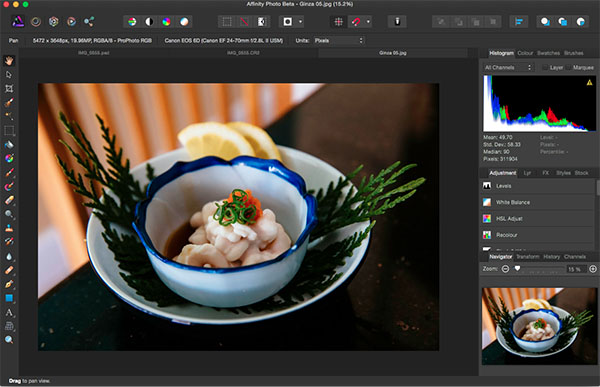
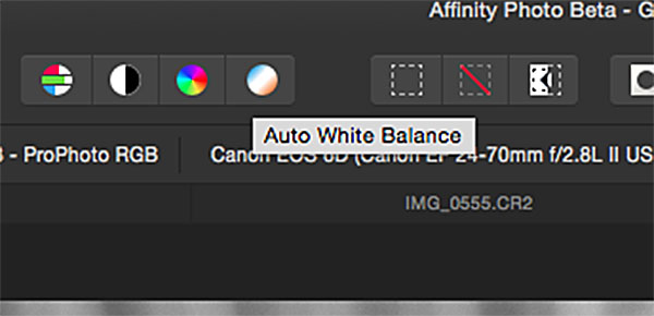
Within the full Affinity Photo interface, you no longer get the image EXIF data in the menu bar, but instead a full row of icons that offer shortcuts to quick edit features such as auto white balance, contrast, and color. There are also several icons on the right that describe different personas such as Liquify, Develop and Macro Persona. A couple of these were not yet available in thw beta version, but clicking on the Liquify Persona offered just about the same editing tools and capabilities that Photoshop’s liquify feature does. For the sake of demonstration, the below image shows off the use of Affinity’s Liquify Twirl Tool, which was intuitive and easy to use.
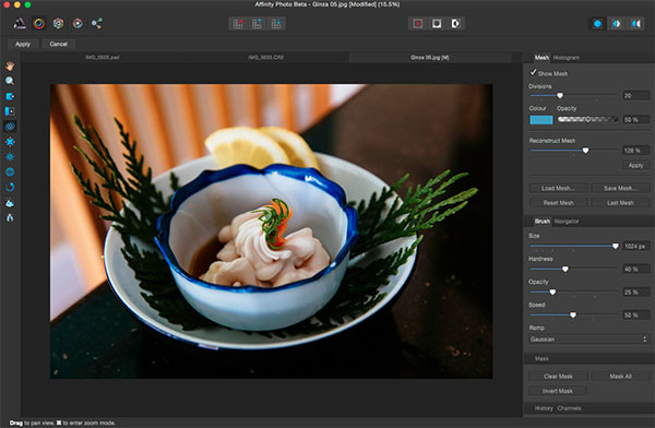
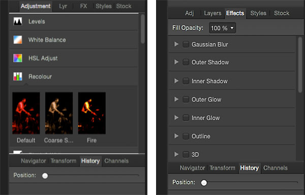
Note that the left hand tool bar is significantly longer offering; paint brushes, clone tools, dodging and burning, text overlays, and much more. The right hand editing tool panel is also laid out differently with tabs including Adjustment, Layers, Effects, and Styles. Want to add a Gaussian blur or 3D effect to your image? Just head over to the Effects tab and check the box next to the desired effect, and it is instantly applied as opposed to hunting around menus or creating an action as you would do in Photoshop.
Closing Thoughts
It’s not often that a platform emerges to go head-on with Adobe, but so far Affinity Photo is setting itself up as a professional-grade app. While there are many high level features for advanced photo editing, there are also lots of basic photo editing tools that are intuitively positioned, making Affinity much more approachable for beginning or amateur photographers.
Whatever the fate of Affinity Photo, the fact that companies like Serif are working on platforms to advance the process of photo editing adds healthy competition to an industry that has long been dominated by big players like Adobe and will hopefully give photographers more options in the future.
Have you tested out Affinity beta yet? If so, what are your thoughts about what works well, and what could be improved?
googletag.cmd.push(function() {
tablet_slots.push( googletag.defineSlot( “/1005424/_dPSv4_tab-all-article-bottom_(300×250)”, [300, 250], “pb-ad-78623” ).addService( googletag.pubads() ) ); } );
googletag.cmd.push(function() {
mobile_slots.push( googletag.defineSlot( “/1005424/_dPSv4_mob-all-article-bottom_(300×250)”, [300, 250], “pb-ad-78158” ).addService( googletag.pubads() ) ); } );
The post Overview of the New Affinity Photo Editing Software by Suzi Pratt appeared first on Digital Photography School.

Digital Photography School


 At the moment, Affinity Photo beta is available as a free online download and is compatible with Apple OSX Lion 10.7.5, and up. Some key features that move Affinity up in the ranks include support for CMYK color, RAW file processing, 16-bit editing, 64-bit Photoshop plug-in compatibility, ICC color management, and LAB color. A few other noteworthy tools include Affinity Photo’s Inpainting feature, which is essentially the equivalent of Adobe content-aware fill, and real-time editing that will apply edits instantly without the need to render a preview.


You must be logged in to post a comment.