RSS
 

Posts Tagged ‘adding’

2 Simple Methods for Adding Color to Your Images Using Photoshop

04 Oct

Most of us have experienced photographing an incredible sunrise or sunset only to get home and realize that the colors in your images are not nearly as good as the colors you witnessed with your own eyes. There can be many reasons to this, such as camera limitations or mistakes you made in the field. However, that’s not what you will learn about in this article. Correcting the colors, or adding color, isn’t something you need to spend hours working on. In fact, it can be done in just a few minutes using Adobe Photoshop and you don’t need to be a Photoshop expert to do it.
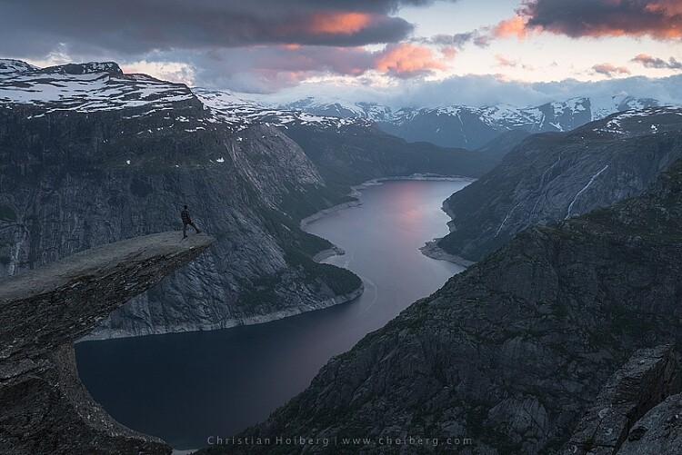
Enhance or adding color in Photoshop

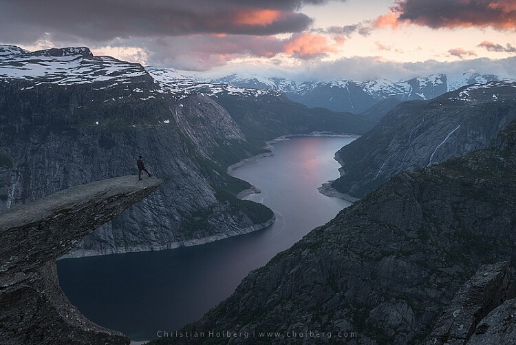
Trolltunga, Norway – We will be adding color to this sky

As we all know there are many ways to get to Rome, there  isn’t only one method of adding colors in Photoshop either. It can, as I mentioned above, be done fairly easy but the more detailed adjustments you wish to make, the harder it will become. In this article, we will be looking at two easy methods to add color in Photoshop.

#1 Adding Color with a Photo Filter

The first method we will look at involves the Photoshop tool called Photo Filter. This is an Adjustment Tool which you can find by clicking the Adjustment Tool icon (the half-filled circle located below the layers palette, see screenshot below). This creates a new layer named Photo Filter 1, which we will be working on.
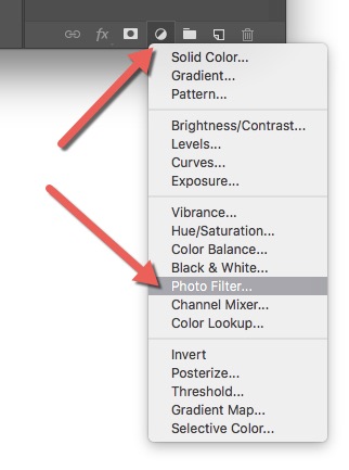
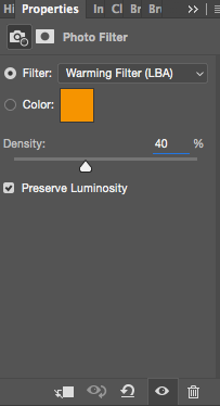
photo-filter-ps adding color in Photoshop

Photofilter adding color in PhotoshopA warming filter is the default setting so, as you might see, the image now has an orange color cast. Personally, I prefer using Warming Filter (LBA) as I find this to have the most natural color that suits my images best (see screenshot on the right). Select this filter by clicking on the Filter dropdown menu. Alternatively, you can select a color manually that might suit your specific image better. If you find the adjustment to be a little too weak you can strengthen its appearance by increasing the Density. I rarely go above 40% Density as the colors then quickly become washed out and results in a look I don’t want.
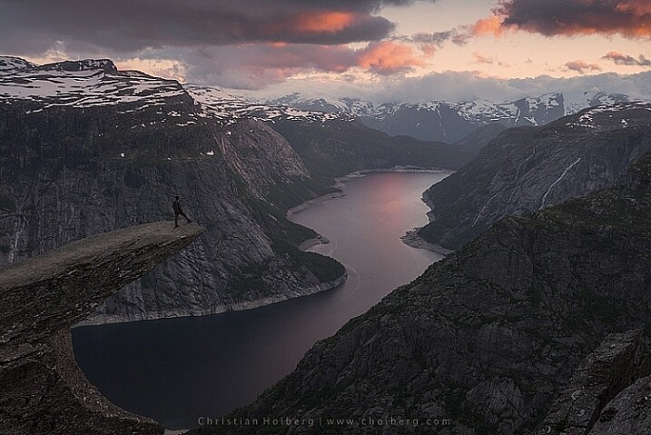
Photo filter applied to the whole image - adding color in Photoshop

Photo Filter applied to the whole image at 40% 
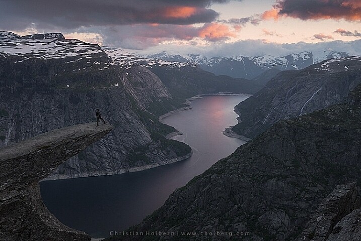
Photo filter - adding color in Photoshop

Photo Filter applied to the whole image at the default 25%

By using this filter we have brought back some of the color in the sky. There’s not a huge difference but we’ve managed to keep a natural look in the image while the sky still looks good. However, there’s one problem. We don’t necessarily want to add the extra color to the landscape itself, we only wanted the sky to be affected.
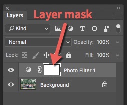
layer-mask-ps - adding color in PhotoshopLeft of the Photo Filter text there’s a white box. This is the layer mask, basically telling Photoshop what area of the image should be affected by that particular layer. White means that it’s visible and black means that it’s concealed. By default the entire mask is white. To remove the adjustment from the landscape itself follow these steps:

  1. Select the Layer Mask by clicking on it (it will show square brackets around the mask when it is selected, see screenshot on the right))
  2. Select a black brush and set Hardness to 0%
  3. Reduce the opacity of the brush to 80%
  4. With the Layer Mask still selected, carefully paint on the areas you do not want affected by the filter. You’ll see the adjustment disappear from those places as you paint.
adding some subtle color to the sky

The Photo Filter layer masked to only affect the sky.

This is the easiest way to manually choose where the adjustment will be visible. Unfortunately, it’s also the least accurate. You might see some haloing along the edges or perhaps the color bleeds onto the horizon at certain places. By zooming in on the image and using a smaller brush you’ll be able to reduce the amount of haloing or bleed. Other methods, such as Luminosity Masking, are more accurate but also demand a better understanding of Adobe Photoshop.

#2 Add contrast with Curves Adjustment Layer
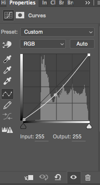
Curves adjustment layerAnother easy method to add colors is by using the Curves Adjustment Layer. Unlike Photo Filter, we will be using Curves to add contrast in the sky. Follow these steps to do a Curves adjustment:

Open a Curves Adjustment Layer by clicking on the Adjustment Layer icon again, and selecting Curves this time.

You want to add some contrast and increase the colors slightly by darkening the sky. Do this by clicking in the middle of the line in your Curves layer and pulling it down gently. Make sure that you don’t go too far as that will lead to unwanted grain or color distortions.

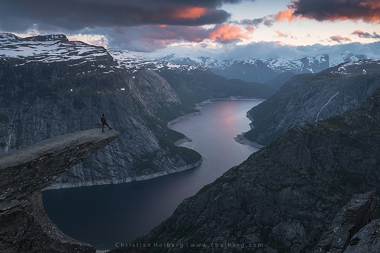
That’s it. To remove the adjustment from the landscape create another Layer Mask and follow the same steps as with the previous method above.
adding color in Photoshop

As you might have noticed these are two subtle adjustments. You won’t get a surreal sky by following these methods. Instead, you’ll maintain a natural look and still bring out some of the color you wanted to capture.

googletag.cmd.push(function() {
tablet_slots.push( googletag.defineSlot( “/1005424/_dPSv4_tab-all-article-bottom_(300×250)”, [300, 250], “pb-ad-78623” ).addService( googletag.pubads() ) ); } );

googletag.cmd.push(function() {
mobile_slots.push( googletag.defineSlot( “/1005424/_dPSv4_mob-all-article-bottom_(300×250)”, [300, 250], “pb-ad-78158” ).addService( googletag.pubads() ) ); } );

The post 2 Simple Methods for Adding Color to Your Images Using Photoshop by Christian Hoiberg appeared first on Digital Photography School.
Digital Photography School

 
Comments Off on 2 Simple Methods for Adding Color to Your Images Using Photoshop

Posted in Photography


9 Tips for Adding a Warm Sun Flare to Your Image

21 Oct

Photography, as an art form, is simply the capture of light on either a sensitive physical medium or, in more recent times, an electronic sensor.

What makes a photograph unique and attractive to the eyes is the distribution of that light. Shadows, highlights, and varying levels of warmth and tone evoke emotion when viewing them, emotionally investing you to the picture you’re viewing.

One of the most dramatic instances of light that can occur in a photo is flare, and more specifically, a sun flare. You’ve no doubt seen spectacular images with beams of light radiating through the photo, giving you a wonderful sense of warmth and brilliance.

21474625629_1dd03156ae_k

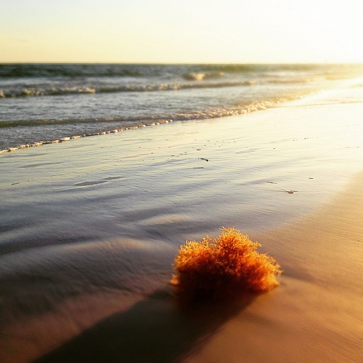
I remember about three years back, a friend asked me to how to produce the warm flares that were visible in many of my photographs. I tried to explain, but realized I really didn’t know the exact combination of properties that worked. I just knew the sunlight coming through a camera lens at the right angle created a beautiful artifact, and that I was able to achieve it pretty consistently in my beach, landscape, and nature shots taken at sunset.

Over time, I learned the details of what it takes to incorporate this effect, and how to use it to my advantage to get a warm, dreamy feel that amps up the viewer’s connection with the photo. This is what I’d like to share with you, as it’s one of the easiest ways to inject emotion into your photography.

In this article, we’ll cover what flare is, what artistic and aesthetic benefits you can derive from it, and finally, how to produce and use it effectively in your photography.

What is sun flare?

Lens flare, as described in its most basic form, is the result of a bright light source entering the lens and producing artifacts, shapes, and effects in the resulting image.

Technically, lens flare and sun flare are different entities, but for the purpose of this article, we’ll treat them the same. We will be talking about the effect created in-camera by having bright sun as a light source in, or near, the edge of the frame.

21629871846_47b2c9c4fa_b

On many occasions this is an unwanted effect. For this reason a lens hood is often used to prevent flare, when bright light shines on the lens opening from outside the frame. Flare often reduces cleanliness and clarity in a scene that requires it, such as with architectural or commercial photography.

But flaring has a beautiful side as well, as you know. Some of us strive for the warmth and haziness that flared light from the sun can provide. Environmental portraiture is an example of an area that utilizes this effect. So how can we create and use flare to our advantage?

21036819798_41e380f648_h

Creating the flare

1. Don’t try this on a cloudy day

The main requirement to create flare is of course, the sun. If you’re shooting on an overcast day and there isn’t any sun poking through, you won’t be able to create a flare.

2. A low angle is best

Although you can create flare at any time during the day, it’s much easier, and much more dramatic, to shoot the sun when its low on the horizon – in other words, at sunrise or sunset, during the golden hours.

This is because you’ll need the sun in the frame, or just outside the frame, and this will usually coincide with your subject positioning.

21469116409_265a1699e2_k

3. Drop the lens hood and pick your lens

If you’re using a lens hood, remove it. Lens hoods are intended to reduce glare and flare from light sources outside the frame, which is exactly opposite of what you’re looking for in this case..

To amplify the chances of getting a good flare, try using a zoom lens, as opposed to a prime. The additional spaces and mechanical parts inside the zoom give the sunlight more room to bounce around and do its thing.

4. Shoot in Manual Mode

This particular discipline is based on the principle that the slightest change in orientation, composition, or aperture can make a pretty big difference in the end result. Shooting manually will allow you to have finer control over these factors and make things much easier for you.

Shooting with Live View can help even more, as you’ll be able to monitor changes in your scene in real time.

5. Settings: Aperture and more

You can use any aperture you wish when creating flare effects, but the look will differ depending on what setting you choose. At smaller apertures (f/11 and smaller), any visible part of the light source will create more of a starburst effect, while a larger aperture (f/8 and larger) will diffuse and disperse the effect, and you’ll end up with a much smoother distribution of the light.

Shutter speed also affects the final result, as more light streams into the lens when using slower speeds; therefore, you’ll have more of a flaring effect.

20950860109_026cca9525_o

6. Focus first

The large amount of light coming into your sensor will affect the autofocus on your camera if you’re using it. So, focus on your subject first by blocking the sun somehow, whether it be your hand, a reflector or a piece of cardboard. Then, once you’ve focused (and lock it or use back button focus), you can shoot normally knowing you are focused correctly for the given distance.

7. Don’t forget to light your subject

If you’re photographing a portrait, don’t forget the negative effect the flare can have on the proper lighting of the face and body. If you find the subject’s face, or other important areas, are washed out too much from the high light levels, use a reflector or other methods of fill light to compensate, and ensure your subject is well illuminated.

Alright, let’s get to shooting!

8. Method one:  In the frame

There are two primary methods of creating the flare effect. The first is by having the sun actually within the frame of the image. Naturally, just having it centered and completely uncovered will result in a washed out photo. You’ll want to have something to partially block the light, so that a flare can be achieved without washing out the subject of your photo. Trees, a distant treeline or building, and your subject can all provide enough cover to produce the desired effect.

16777527017_5540bf7379_b

Take care not to capture too much light. Sometimes the resulting flare can be so pronounced that your image is completely washed out. Shoot several frames, and check the amount of flare you’re getting. If it’s too much, compose the sun a little more out of frame (or more hidden) to reduce the effect.

9. Method two: out of the frame

For an even more pronounced and diffused flare, you can compose your image with the sun partially, or completely out of frame. Usually the best results come from having the sun just outside the camera’s view. Experiment with position to find the correct angle and amount of flare necessary for the shot you’re after.

This method produces more a diffused and smooth flare, especially in the early morning and late evening hours, when the sun is very low on the horizon.

16642785747_fd851ca392_k

That’s it! 

Adding a nice looking sun flare to your image really isn’t tough at all. Following a few rules is all you have to do, and like everything else in our wonderful world of photography, the result is always subjective. Add a little, add a lot, all that matters is that you’re happy with the final image! There’s no wrong way to do it.

So get out there and get your flare on! Of course, we’d love to see some examples of what you can do with this effect, let’s see your best shots!

googletag.cmd.push(function() {
tablet_slots.push( googletag.defineSlot( “/1005424/_dPSv4_tab-all-article-bottom_(300×250)”, [300, 250], “pb-ad-78623” ).addService( googletag.pubads() ) ); } );

googletag.cmd.push(function() {
mobile_slots.push( googletag.defineSlot( “/1005424/_dPSv4_mob-all-article-bottom_(300×250)”, [300, 250], “pb-ad-78158” ).addService( googletag.pubads() ) ); } );

The post 9 Tips for Adding a Warm Sun Flare to Your Image by Tim Gilbreath appeared first on Digital Photography School.

Digital Photography School

 
Comments Off on 9 Tips for Adding a Warm Sun Flare to Your Image

Posted in Photography


JPEG Committee contemplates adding DRM to image format

16 Oct

Change may come soon for the web’s most widely adopted image format. Earlier this week at a meeting in Brussels, the JPEG Committee discussed adding a DRM (Digital Rights Management) security feature to the regular JPEG image format. Read more

Articles: Digital Photography Review (dpreview.com)

 
Comments Off on JPEG Committee contemplates adding DRM to image format

Posted in Uncategorized


Adding it up: Sony a7R II First Impressions Review

24 Sep

The Sony Alpha 7R II has been the topic of much discussion and in our office, much testing. We’ve published a number of articles with results of our tests, picking apart Raw files from its 42MP full-frame BSI CMOS sensor and pushing its 399 on-sensor phase detect AF points to their limits. This first impressions review is the culmination of that work to date, including an in-depth analysis of the camera’s image quality and the effects of shutter shock. Read more

Articles: Digital Photography Review (dpreview.com)

 
Comments Off on Adding it up: Sony a7R II First Impressions Review

Posted in Uncategorized


How to Create Better Photos by Adding a Sense of Motion

10 Sep

Photographing subjects in motion can be kind of tricky because of the very nature of photography as an art form: cameras capture still images, not moving pictures (unless you are Harry Potter and like to read the Daily Prophet).

Of course, one solution is to record a movie with your camera or phone, but even a movie is in itself a series of still images projected quickly, that only give the illusion of motion. Each individual frame is not moving, but put together it appears as though everything you see is changing. Another solution, and one I generally prefer, is to use some knowledge of composition to create a sense of motion in a single photograph. It’s not all that difficult, but these techniques do require a bit of knowledge, a lot of practice, and in the end your photos will be much more dynamic and interesting as a result.

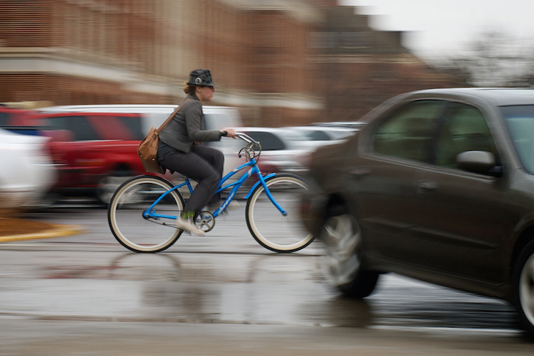
motion-and-composition-bike-car

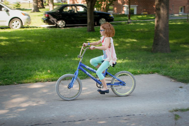
One of the most basic elements of composition is called the Rule of Thirds. It has to do with putting your subjects off-center in order to add more visual impact to your photos. It’s not a hard-and-fast rule, and some people swear by it while others reject it altogether, but understanding how it affects motion photography can go a long way towards giving your pictures an extra boost. To offer an example, take a look at the following image of my niece on her bike.

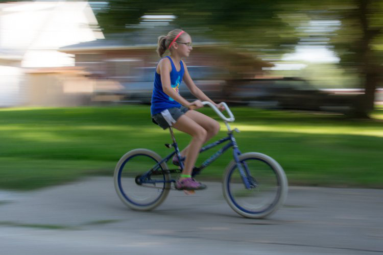
motion-and-composition-bike-center-panning-2

My niece on her bike. There’s clearly a sense of motion, but putting her in the center is not the best use of photographic compositional space.

This image involves a technique called panning, which helps create the illusion of motion by tracking a moving subject with your camera, while the shutter is open. But, take a look at how the girl is framed – she in the center of the image, and you can see her surroundings on all sides. It seems like a good picture at first, but take a look at how a simple compositional change can have a dramatic impact on the sense of motion created by the image.

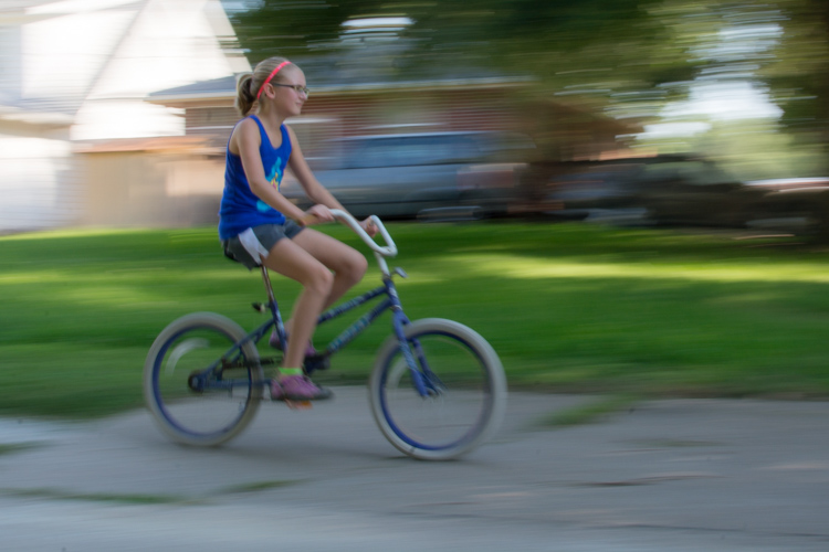
motion-and-composition-bike-center-panning

Putting the subject off-center shows not just that the girl is biking, but the space into which she is traveling.

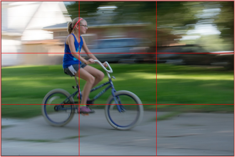
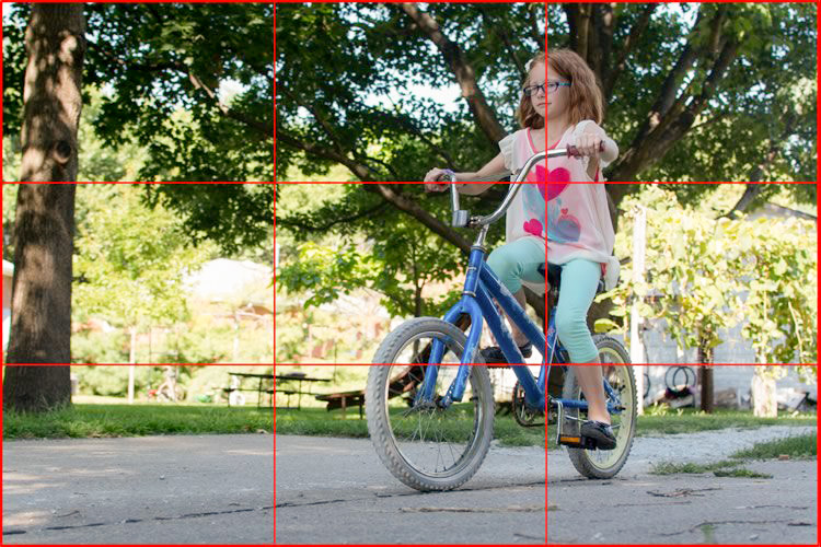
I took this second picture using spot focus on my camera which allowed me to select which focusing point to use, and selected a point on the left side of the frame. Doing this placed my niece right along one of the vertical gridlines, if we look at this image as it relates to the classic Rule of Thirds:

motion-and-composition-bike-left-panning-grid

Both the girl, and her bicycle, line-up with the one-third dividing lines, which helps create a more pleasing and dynamic composition.

Aligning my subject on the left third of the image (and the horizontal center of the bike along the bottom third) has done a couple of things. First, it makes for a more pleasing image due to the off-center placement of my subject. It allows us to see more context overall, since she is on one side and not dominating the entire image. Second, the other goal this placement accomplishes has to do with motion – we see her not only biking, but biking to somewhere. By showing us where she is going, our minds essentially create a greater sense of movement because we can see more context.

This works almost any time you have an object in motion, whether you employ the panning technique or not. Simply placing your subject on one side of the image (often along one of the dividers according to the Rule of Thirds) such that it is moving in the direction of the rest of the image (put more space in front of the subject than behind), will help your photos will seem much more dynamic and interesting. It helps your viewers to get a sense that they were actually there with you at the moment of the picture.

If panning isn’t quite your thing, you can still employ some compositional techniques to create a greater sense of motion. Here’s a picture of my other niece riding her bike that I took from a standing position. I see pictures like this posted online quite a bit, and while they are not bad photos, a change to how they are composed can dramatically alter the visual impact.

motion-and-composition-bike-center-2

My other niece biking, taken from a standing position without much thought put into overall composition.

Again you see that she is in the center of the image (above), and while this picture is perfectly serviceable, there is a lot that can be done to create a greater sense of motion. Here’s another picture of the same scenario, but taken from ground level as she approached me down the alley.

motion-and-composition-bike-right-2

Altering my angle to be low to the ground, and putting the girl on the right-hand side, creates a much more dynamic photo. This was shot with a DSLR but could have easily been taken with any camera or even a mobile phone.

I had to lie on the ground to get this shot, but the results were well worth it. The low angle helps make the shot much more interesting, and the open space on the left side shows us the empty street that she will soon be riding on. This general framing is used all the time in photos of moving objects, and is a favorite of the advertising industry as well: you will often see pictures of sports cars not from the top and side (as in the first of these two bike photos) but from a low angle, and the front wheels turned away from the viewer, much more akin to the second photo. And sure enough, this image also conforms quite well to the good old-fashioned Rule of Thirds.

motion-and-composition-bike-right-grid-2

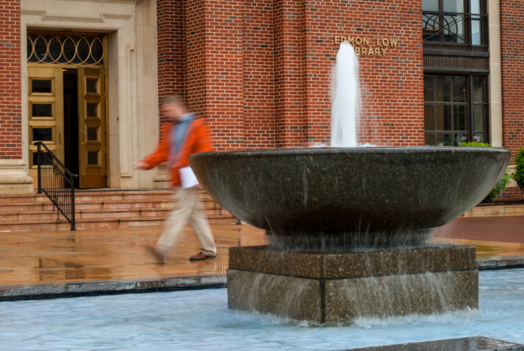
There are other ways to play with composition to create a sense of motion in photos; the Rule of Thirds is just the beginning. This photo of a man walking past a fountain violates the first rule about showing the subject on one side moving towards the rest of the image, but it works because we’re not so much interested in where he is going but what the entire scene is about.

motion-and-composition-fountain

Putting the subject on the left side of this photo creates a different mood and tone than if the man were on the right-hand side.

By using a longer shutter speed, and holding my camera still I was able to capture motion, not only in the man walking, but the water rolling off the fountain. If the position of the man and the fountain were reversed it might look as though he is walking into it. But as it is, the motion of my human subject is one part of the picture as a whole, and the falling water adds another dynamic layer to the image.

The placement of the man creates a bit of tension as well; he is clearly carrying something, and from the words on the wall it’s obvious that he is walking past a library. Is he a student that’s late for class? Is he walking fast to catch up to some friends who are out of the frame? Putting him on the right-hand side would make the image seem a bit more casual and informal. But, intentionally composing this shot so that he is about to walk out of the frame, imparts a different feeling on the viewer that can be very effective when used properly. Also note that both the fountain and the man line up roughly with the traditional Rule of Thirds grid, which helps create a more pleasing composition all around.

I should note that the reliance on the Rule of Thirds can become a crutch, and there are many creative ways to take motion-based images without it. What about you? What are some compositional tricks you have found to help create a sense of motion in your photographs? Do you have any favorite motion images to share? Leave your thoughts in the comments below.

googletag.cmd.push(function() {
tablet_slots.push( googletag.defineSlot( “/1005424/_dPSv4_tab-all-article-bottom_(300×250)”, [300, 250], “pb-ad-78623” ).addService( googletag.pubads() ) ); } );

googletag.cmd.push(function() {
mobile_slots.push( googletag.defineSlot( “/1005424/_dPSv4_mob-all-article-bottom_(300×250)”, [300, 250], “pb-ad-78158” ).addService( googletag.pubads() ) ); } );

The post How to Create Better Photos by Adding a Sense of Motion by Simon Ringsmuth appeared first on Digital Photography School.

Digital Photography School

 
Comments Off on How to Create Better Photos by Adding a Sense of Motion

Posted in Photography


Get Inspired: Try Adding a Little Occultish Mystery to Your Photography

10 Jul

It’s not unusual for photographers, both pro and amateur, to find themselves stuck in a creative rut. Nor is it uncommon for photographers to want to try something new. If you find yourself occupying your own rut, or if you’re just looking for some sort of new inspiration, consider trying some unconventional means. I’m not suggesting you try invoking some ancient Continue Reading

The post Get Inspired: Try Adding a Little Occultish Mystery to Your Photography appeared first on Photodoto.


Photodoto

 
Comments Off on Get Inspired: Try Adding a Little Occultish Mystery to Your Photography

Posted in Photography


Adding an Off-Camera Flash to Create a Winning Image

07 Jul

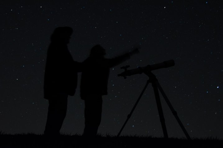
Star_gazers

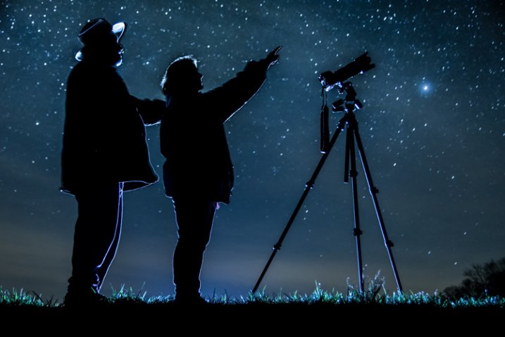
This image, titled “Star Gazers”, won Grand Prizes at the 2015 Shoot the Hills photo competition. Held in the Hocking Hills region near Logan, Ohio, this competition takes place the 3rd weekend every April. 160 photographers from several states participated this year.

I initially came up with the idea for this shot over a year earlier, but my first attempt at the image failed miserably. (see below)

DSC_3387

What mistakes did I make?

If I would have checked the histogram I would have seen that all of the image was extremely under-exposed with all the data pushed up against the left side of the histogram.

If I had checked the histogram I would have noticed that the image was extremely under-exposed with all the data pushed up against the left side of the histogram.

  1. The image was under-exposed, because I failed to check the histogram. In the dark the image looked great on the LCD on the back of the camera!
  2. With the long exposure (30 seconds) there was no way for the subjects in the image to remain still enough to avoid blurring.

The Solutions

  1. The solution for the exposure was simple. First I turned down the brightness of the camera’s LCD screen. Then I used the histogram to determine my exposure.
  2. The length of exposure time was the main problem I had with this first attempt at capturing the image I had planned. It is nearly impossible for a live model to stand still for 30 seconds to prevent blurring. An off-camera flash was added behind the models to create the rim lighting in order to freeze their movement. Adding this flash was the major difference-maker from my earlier attempt of this image.

Other Factors to Consider

Sometimes it takes some trial and error to achieve the results you are looking for in an image. Improvisation may be required when unforeseen issues change shooting conditions. Many factors need to fall together for it to be possible to create an image such as this one. After waiting until 2 a.m. for the clouds to clear, it was finally time to capture the image I had pre-visualized nearly a year earlier.  Because the cloud cover remained near the horizon, it became necessary to change the angle of view to capture the higher, clearer sky. This adjustment also made it necessary to change the focal length from the 18mm I had planned to 50mm. One of the rules of the Shoot the Hills photo competition is that all images must be submitted straight out of the camera, so getting everything right in the camera is a must. Here are some additional factors required to capture such an image:

The Weather

  • Clear starry night – Probably the single most important factor to create this image is a clear starry night.
  • Dark sky – Find a dark sky, away from the lights of the city. There are dark sky maps on the internet.
  • Moonless night (or after the moon has set) – The light from the moon will fade out (overpower) many of the dimmer stars.

The Exposure

Histogram for the final winning. Notice how the histogram stretches back almost into the mid-tones, with a little info clear back into the highlights which is the stars and the rim lighting.

Histogram for the final winning shot. Notice how the histogram stretches back almost into the mid-tones, with a little info clear back into the highlights, which represent the stars and rim lighting.

I wanted to keep the shutter speed at 30 seconds for two reasons. First, that is the longest shutter speed most cameras allow without having to set them to bulb, and manually doing a timed exposure. Secondly, I didn’t want the stars to become extremely blurry. Using the histogram, I determined my exposure with my focal length at 50mm to be;  aperture at f/5 and ISO set to 2000, which I had predetermined was the highest ISO I could use, and still be able to minimize the amount of digital noise. As mentioned earlier, do not rely on the camera’s LED screen to determine exposure. In fact, in the dark the LED screen will look really bright when the image is actually extremely underexposed. To remedy this problem, turn the brightness down on you LED screen, if this setting is available. But always use the histogram to get the best exposure setting. If the histogram is all pushed over to the left side, the image is going to be underexposed.

Remote Triggers

Since I was also one of the subjects in the images, I used one remote to begin the exposure, and another to trigger the flash.

White Balance

After experimenting with several preset white balances I decided to set a custom white balance of 2560 Kelvin, to give the image a cool blue colored sky.

Focusing

Focusing a camera in the dark is one of the most challenging parts of creating a night shot under the stars. Here are some tips to set focus for night images:

  • Pre-focus before it gets dark. This is the easiest way to focus for a night shot, and after the focus is set, turn off the auto-focus so it doesn’t change.
  • Shine a bright flash light on the subject to allow the camera to focus, and as in the method above, after attaining focus, turn off the auto-focus.
  • Use live view to focus manually on a light.
  • Use back button focusing to preset focus

For this image I used back button focusing, and a flash light to set my focus.

The Logistics

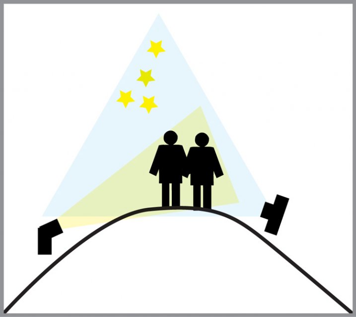
The setup for this shot was at the top of a steep hill which came to a point. With the subjects at the very top, the camera was placed on a tripod below, and aimed upward at the subjects and the starry sky in the background. The off-camera flash was placed on a tripod on the other side of the hill and aimed upward at the subjects. The flash and tripod had to be placed low enough on other side of the hill, so that the actual flash did not show in the image.

layout

Conclusion

Henry Ford once said that “Failure is the opportunity to begin again more intelligently.”  When an image idea fails, take a look at what went wrong and then look for solutions to improve the image, return to the scenario and try it again. From my first unsuccessful attempt to capture star-gazers, the need to freeze the subjects and prevent the blurring, led me to try the off-camera flash technique. The back-lighting and a year’s experience made all the difference between a failed shot and a winner!

googletag.cmd.push(function() {
tablet_slots.push( googletag.defineSlot( “/1005424/_dPSv4_tab-all-article-bottom_(300×250)”, [300, 250], “pb-ad-78623” ).addService( googletag.pubads() ) ); } );

googletag.cmd.push(function() {
mobile_slots.push( googletag.defineSlot( “/1005424/_dPSv4_mob-all-article-bottom_(300×250)”, [300, 250], “pb-ad-78158” ).addService( googletag.pubads() ) ); } );

The post Adding an Off-Camera Flash to Create a Winning Image by Bruce Wunderlich appeared first on Digital Photography School.

Digital Photography School

 
Comments Off on Adding an Off-Camera Flash to Create a Winning Image

Posted in Photography


Create More Unique Travel Photos by Adding a Model

06 Jan

Creative travel photography is becoming increasingly difficult as world travelers have easier access than ever to stellar cameras. In fact, travel photography can at times seem uninspiring when you arrive at a tourist spot and see that everyone around you is taking the exact same shots. There are many ways to reframe your perspective to capture unique angles of a tourist attraction, but there is also another way that seems to be overlooked: turn travel photography into a series of creative portrait sessions with a model.

Sedona creative travel photography

You may have noticed a trend among some of your amateur photographer friends who take an object like a Lego figurine toy and place it in a unique location as a way to maintaining some continuity between travel photography images, or tell a visual story. Using a consistent model is actually a great way to exercise creativity and tell a compelling, unique story, with imagery. While it’s definitely easy to use an inanimate object, why not exercise your portrait skills by adding a human model? This was the way of thinking my photo companion and I assumed during a recent long weekend escape to Sedona, Arizona.

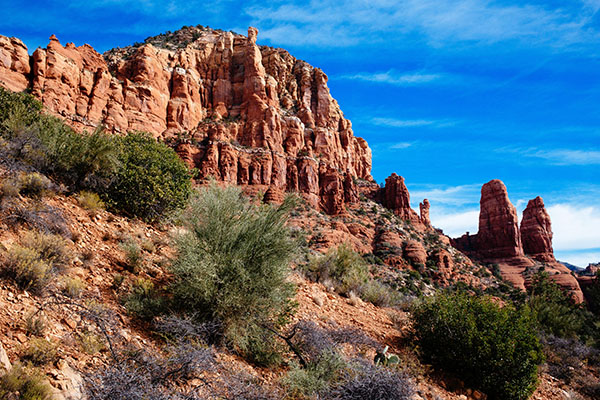
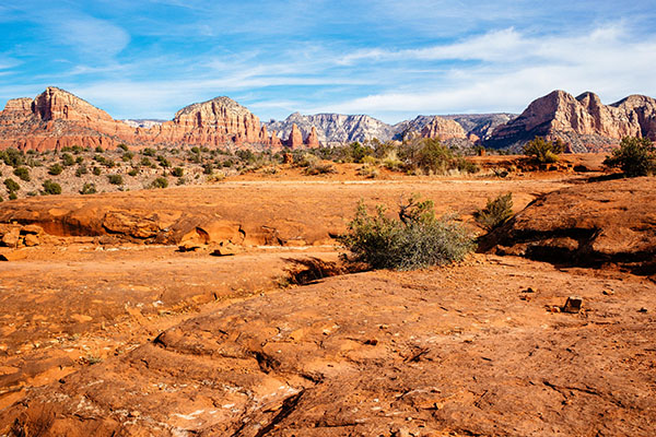
Sedona creative travel photography

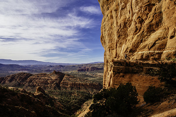
Before: landscape without a model, or the shot that everyone else was getting.

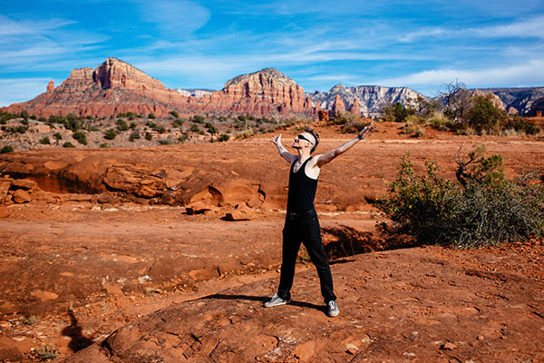
Famous for its natural red rock formations, Sedona is one of those areas that has already been widely photographed from a landscape perspective. In fact, the hotel we stayed at gifted us with a set of six postcards. Each one is a striking landscape photo of a notable attraction in Sedona taken during the perfect time of day, and from a high altitude, likely from a helicopter or high hiking spot. That immediately began to deter our ambitions for capturing stunning images of Sedona, as I’m not inspired by capturing the same images that others have already taken and widely publicized. Immediately, the idea of placing a unique model in the middle of a popular landscape came to mind as a way of crafting one-of-a-kind images.

Sedona creative travel photography

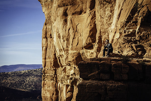
After: landscape with a model.

Background

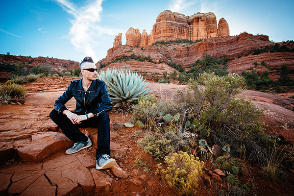
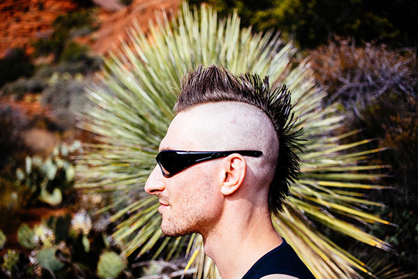
Luckily, my travel companion loves having his photo taken and isn’t afraid of drastically altering his appearance for the sake of a photo shoot. As we began mapping our trip around Sedona, he decided that assuming a character identity similar to that of Mad Max would make a perfect visual theme for our travel photo sessions. The result? He went and shaved his full head of hair into a mohawk and donned an outfit of black pants and black leather jacket, which he wore throughout our entire trip to Sedona. A bit out of place for a hot desert? Indeed, and appropriately so, as a mohawk can be seen as an emblem of nonconformity, in our case, against the typical tourist photos everyone around us was taking. We were met with many stares and raised eyebrows throughout the entire trip, but, we walked away with a unique series of images that not only showcase the beauty of Sedona, but also add some intrigue by inserting a seemingly out of the ordinary character into these landscapes.

Sedona creative travel photography

Executing the Photo Shoots

As mentioned earlier, Sedona is very popular among camera-wielding tourists, making it tough to find clearings for taking portraits. The best method we found was setting up the scene as best as we could and waiting for a quick, often one second, gap when people passed by. The gear was simple: a Canon 6D camera, a 24-70mm f/2.8 lens, and a 70-200mm f/2.8 lens. No external lighting was used, just the sun in all of its glory. As the photographer, it was a fun challenge to figure out the best way to photograph someone with a mohawk. In fact, the only way to capture the full effect of the mohawk is from a profile view, so the real trick was to get creative with the backgrounds, perspectives, and angles to make each portrait unique.

Sedona creative travel photography

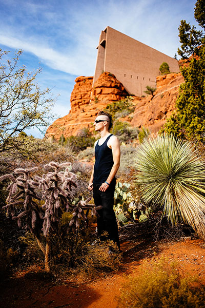
This portrait was taken at the Chapel of the Holy Cross, one of the most visited and easily accessible tourist spots in Sedona. While this would be a pretty common shot of the chapel, inserting a model into the scene makes for a more dynamic image. A wide angle shot like the one above sets the scene, whereas the telephoto shot below takes essentially the same pose and turns it into an entirely new image.

Sedona creative travel photography

Another way to add flair to landscape portraits was to use the 70-200 f/2.8 telephoto zoomed in to 200mm

Sedona creative travel photography

Same principle with these images: in the one above, I started off with a wide shot at the vista of the popular Cathedral Rock Trail, and then zoomed way in with a telephoto lens below.

Sedona creative travel photography

Any other creative landscape portrait artists out there? Show off your images and the stories behind them!

googletag.cmd.push(function() {
tablet_slots.push( googletag.defineSlot( “/1005424/_dPSv4_tab-all-article-bottom_(300×250)”, [300, 250], “pb-ad-78623” ).addService( googletag.pubads() ) ); } );

googletag.cmd.push(function() {
mobile_slots.push( googletag.defineSlot( “/1005424/_dPSv4_mob-all-article-bottom_(300×250)”, [300, 250], “pb-ad-78158” ).addService( googletag.pubads() ) ); } );

The post Create More Unique Travel Photos by Adding a Model by Suzi Pratt appeared first on Digital Photography School.

Digital Photography School

 
Comments Off on Create More Unique Travel Photos by Adding a Model

Posted in Photography


Unbelievable Illusions: Adding a 3rd Dimension to 2D Surface

12 Oct

[ By Delana in Art & Installation & Sound. ]

projection mapping performance piece

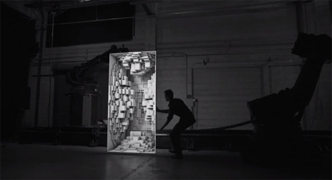
This mesmerizing performance piece from Bot & Dolly blends reality and a technological fantasy world. Using 3D projection mapping, two large white surfaces and two talented robots, the artistic duo created a kind of dance that incorporates high technology and a helping human hand.

The piece is called simply “Box,” and it shows how current technology can be used to manipulate our perceptions of space. The projections create mind-bending optical illusions that look so amazingly real it’s hard to believe there has been no digital trickery involved.

As the making-of video above shows, however, it wasn’t trickery. It was simply amazing technology applied to a graceful and artistic purpose.

Share on Facebook


[ By Delana in Art & Installation & Sound. ]

[ WebUrbanist | Archives | Galleries | Privacy | TOS ]


WebUrbanist

 
Comments Off on Unbelievable Illusions: Adding a 3rd Dimension to 2D Surface

Posted in Creativity


Nikon updates distortion correction data for DSLRs, adding latest lenses

20 Jul

AFS_Nikkor_18_35_ED.png

Nikon has released distortion correction data v1.009, adding support for additional lenses for the D4, D90, D600, D800, D800E, D3100, D3200, D5000, D5100, D5200, D7000 and D7100. The latest update means these cameras can now correct distortion in 107 Nikkor lenses. The latest update includes recent launches such as the Nikon AF-S Nikkor 18-35mm f/3.5-4.5G ED and can be downloaded from Nikon’s global website.

News: Digital Photography Review (dpreview.com)

 
Comments Off on Nikon updates distortion correction data for DSLRs, adding latest lenses

Posted in Uncategorized