In an old dressmaking shop in Paris, a master-tailor has finished stitching a bridal gown. He is eager to show it to the world, but he knows that the job is not yet done. He has a few thoughts passing through his mind, and he has to make sure that the dress is presentable before the bride arrives. He tells himself that these threads dangling from here and there need to be trimmed, the ruffles need to be neatened, and the seams still need to be pressed. The master in him criticizes the dress until the tailor in him fixes the final details.
When it comes to photography, the story is no different. You must lose ownership of your image for a few seconds, and look at your own work with a fine-tooth comb. As beginners, we often rush to upload or print our photos, eager for appreciation and likes from others.
I have also been impatient in this way, though with time, I have now made it a habit to review my image critically at the end of post-processing. Here are some tips I hope that will help you taking your post-processing experience to the next level and pick up on some things that beginners often miss. I use Adobe Lightroom and Photoshop, so I will be talking about both where applicable.
Crooked images
There is nothing more embarrassing than your client telling you that the photo is a bit askew. Once spotted, it is an eyesore that will forever jar when you look at your image. It is not easy to judge tilted images when it comes to mountains and forests, but landscapes are also more forgiving when it comes to a tilt. With seascapes, however, one needs to ensure that the sky meets water on the perfect horizontal for a harmonious and balanced image. Similarly, check the angles of your doorways and buildings, that they are aligned appropriately. Adobe Lightroom has a useful Straighten tool, as well as options in Photoshop.
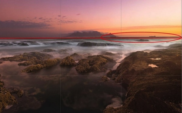
A crooked horizon is not always obvious; verify it using the proper tools.
Spots
Zoom-in and inspect your photo to make sure that there are no spots. Dried water droplets and dust become more visible when you increase the contrast of colors in your post-processing. Adobe Lightroom has a Spot Removal tool, and Adobe Photoshop also provides various ways to remove spots from your image.

Imagine printing a large image with these spots. These are very visible.
Chromatic aberration
Chromatic aberration, or color fringing, often happens around the edges of objects in your images. Why this happens is a technical topic on its own related to your lens, but what you need to know is that modern tools help remove this problem. Adobe Lightroom has a Remove Chromatic Aberration tool that you can use to overcome this issue.
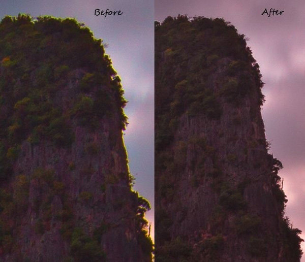
With just one click, I was able to remove the color fringe from the edges.
Barrel distortion
Barrel distortion is associated with wide angle lenses. It causes your image to look more like a sphere. You might get away with it if the elements in your scene are uneven, and not particularly familiar to the eye. However, you need to be aware that the wider your focal length, the more distortion your image will have. Adobe Lightroom allows you to remove barrel distortion using the Lens Corrections feature. In the following image, people standing on each side of the image have elongated faces. I did not, of course, include this in the bridal album!

Unwanted objects
Look for unwanted objects in the scene. Remove shopping bags, cans, tins, ships on the horizon, and even people if they are not desired in the scene. I use Adobe Photoshop’s Content Aware fill tool to achieve the desired results.
Image in black and white
Before and after post-processing, I usually check my images in black and white. By not allowing yourself to be distracted by colours, this is a good way to see if an image is flat. I do this for several reasons. Some images are just meant to be black and white, especially the ones in which the colour adds little by way of interest, and in fact may distract from the subject. You might also want to turn an image into black and white because the sky is overexposed, in this way salvaging, rather than discarding the image altogether. By converting an image to black and white, sometimes unwanted distracting elements in the background of your image can be de-emphasized, with some additional light adjustment (e.g. a person standing behind your main subject in a portrait).
 |
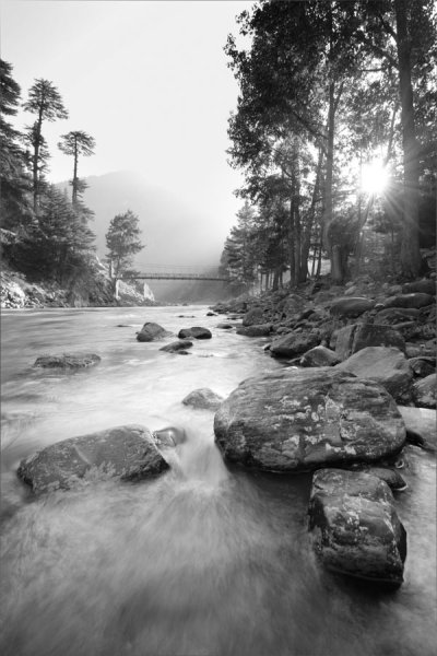 |
Black and White allows you to appreciate the landscape with emphasis on the harmonies and lines rather than on the colours.
 |
 |
In black and white, the background is not as distracting.
Tip: Walk away
Once you have finished editing your image (or a batch of images), step back and give review it full screen. Turning off the room lights and leaning back is a good idea. Without the mouse and the keyboard in my reach, I can think about the image critically. I sometimes even walk away and let the image lie there for some time before returning for a fresh approach.
Whether you are a beginner or a professional, after putting effort into post-processing, you tend to think that you have done enough to make the image ready. You focus on certain areas too much, and your mind forgets to tell you that you need to look in other areas to see if the image is balanced and harmonious. So, take your time and allow the image to fully absorb without patience in the post-processing phase. A lovely image can be converted into a magical one by proper processing.
Though these steps may sound pedantic, a good image needs loving care.
I hope these tips are helpful. Your feedback and comments are welcome.
googletag.cmd.push(function() {
tablet_slots.push( googletag.defineSlot( “/1005424/_dPSv4_tab-all-article-bottom_(300×250)”, [300, 250], “pb-ad-78623” ).addService( googletag.pubads() ) ); } );
googletag.cmd.push(function() {
mobile_slots.push( googletag.defineSlot( “/1005424/_dPSv4_mob-all-article-bottom_(300×250)”, [300, 250], “pb-ad-78158” ).addService( googletag.pubads() ) ); } );
The post Post-Processing Tips for Overcoming Beginners Acts of Omission by Mujahid Urrehman appeared first on Digital Photography School.









You must be logged in to post a comment.