RSS
 

Posts Tagged ‘Achieving’

Tips For Achieving Blurry Backgrounds When You Don’t Have a Fast Lens

03 Dec

The post Tips For Achieving Blurry Backgrounds When You Don’t Have a Fast Lens appeared first on Digital Photography School. It was authored by John McIntire.

Using a shallow depth of field to get blurry backgrounds in your photos is a powerful and popular tool for photographers. Blurring your background in this way makes it easy to obscure details in your scene that don’t add anything to your photographs. This helps to ensure that the focus of your images is your subject, and only your subject.

Using fast lenses with maximum apertures such as f/1.8 or f/2.8 is the easiest way to achieve this blurry background effect.

Getting blurry backgrounds with a fast lens
Using a fast aperture (f/1.8 here) is a surefire way to ensure blurry backgrounds in your images, but what do you do if you don’t have access to a fast lens?
Canon 5D Mark III | Canon EF 85mm f/1.8 | 85mm | 1/1600s | f/1.8 | ISO 100

However, what do you do if you don’t have a fast lens? And what do you do in situations where you are unable to use your lens wide open?

Controlling aperture is only one way to alter the appearance of DOF when trying for blurry backgrounds.
Here, you can see the difference the aperture has on the background. On the left, the aperture is f/8, while on the right, it is f/1.8.

Fortunately, manipulating the aperture settings in-camera is only one way to control how depth of field appears in your images.

This article will show you two ways to help you achieve more background blur when you don’t have access to a fast lens and when you can’t shoot wide open.

1. Get closer to your subject

An easy way to obtain a shallower depth of field for blurry backgrounds is to simply get closer to your subject.

Achieve blurry backgrounds by getting closer to your subject.
Simply moving your position so that you are closer to the subject is a great way to manipulate depth of field. The closer you get, the shallower the depth of field gets.

Depth of field is determined by multiple factors. Aperture is one, but another important factor is how close the camera is to your subject. 

By moving your camera closer to your subject, you will increase the amount of background blur that appears behind your subject. 

(Conversely, if you want more depth of field in your image, move farther away from your subject.) 

Putting it into practice

With techniques like this, it can be a good idea to do a few exercises so you can see exactly what is going on.

To see this technique in action, find yourself a subject and position them in front of a background. Choose a background that’s a little bit busy (like foliage) so you can see the full effect. 

Getting blurry backgrounds without a fast lens
In the leftmost image, I was 12 feet away from the subject. You can see almost all of the details in the background. I slowly moved closer, 2 feet at a time; you should be able to see as the background gets blurrier. The last image was from 4 feet away. (Images are cropped for comparison.)

If you’ve chosen a portrait subject, start from between eight and ten feet away. If you’ve chosen something smaller, decrease that distance as much as you need to have a somewhat reasonable composition.

No matter what lens you have, you should be able to choose an aperture of f/5.6. Dial that in and adjust the other settings until you have a decent exposure. Take a shot. 

Step forward a foot and take another. Then move a foot closer again and take a third shot. Do this until you have reached your minimum focusing distance or you are too close to your subject to frame a photo. 

Then you can review the images in order. Watch for how the depth of field becomes shallower the closer you are to your subject. 

If you use multiple lenses, I encourage you to do this with all of them. 

The reverse

Of course, if what you want is more depth of field (i.e., less blurry backgrounds) in your frame, you can always move further away from your subject. 

In more depth

If you are technically minded and want to learn more about why and how this works, note that depth of field is governed by the inverse square law, just like many other aspects of photography. These other aspects include light intensity (which governs your exposure) and light fall-off (which governs the shape of the light). 

With an in-depth knowledge of the inverse square law and how it works, you would actually be able to calculate exactly where you need to be with a certain focal length and aperture to get an exact result. You will probably never find yourself in a situation where you would need to do this, but it is still possible! 

2. Bring your subject farther from the background

The other main way to achieve a shallower depth of field is to put more distance between your subject and the background.

Getting blurry backgrounds without a fast lens
Another easy way to manipulate depth of field for blurry backgrounds is to move your subject away from the background. Both images above were shot at f/8, but the lefthand image was taken 2 feet away from the background. The righthand image was taken 12 feet from the background.

This works the same way as the previous technique, but in this case, you will be moving your subject rather than the camera. If your subject is close to the background, more background detail will be present. To get more blur, simply move your subject forward. 

Practice

To see this concept in use, position your subject almost touching a background of your choice; this can be a studio background, some trees, or a wall. 

moving your subject away from the background is essential
To practice this, have your subject move away from the background in set increments. Make sure you move the same distance back, as well. Here (from top-left to bottom-right), the subject started 2 feet away from the background and ended 12 feet away from the background.

Start at an aperture of f/5.6 and get a decent exposure with your other settings. Take a shot. Now move your subject a foot away from the background. Note that it’s important that you move the same distance backward. If you don’t, then you will have two factors affecting the depth of field in the frame, and it will be impossible to accurately see what is blurring the background. 

Take another shot. Move yourself and your subject another foot back and shoot again. Repeat as many times as you want. In practice, how far away you move your subject is dependent on how much blur you want to achieve.

Do you want to retain some detail so that your viewers can recognize the background? Or would you rather obliterate any background details altogether, ensuring that your subject is the only thing for your viewers to focus on?

Real-world use

Now that you have put all of this into practice and you have your sequences of images, you should have a good idea of how the depth of field changes with your distance from the subject and the subject’s distance from the background. 

Getting blurry backgrounds is still possible at small apertures.
At the end of the day, you do not need a fast lens to achieve blurry backgrounds in your portraits. You are still able to achieve a shallow depth of field with smaller apertures.
Canon 5D Mark III | Canon EF 70-200mm f/4L | 1/200s | f/8 | ISO 800

Not only will you be able to use this knowledge to help you get a shallower depth of field when you can’t shoot wide open, but it will also help you design any desired photos long before you pick up the camera.

For example, you might want an image where your subject is in focus from front to back, but you want the background to be as obscured as possible. Having gone through these exercises, you should be able to approximate what aperture you need to use, how close to the subject you need to be, and how far away the background needs to be. And you should be able to do it in a fairly short amount of time, too!

Achieving blurry backgrounds: final words

Manipulating depth of field to get blurry backgrounds may be a basic technique, but understanding fundamentals like these helps give you a well-rounded set of camera skills that will serve you well in your photography. 

The post Tips For Achieving Blurry Backgrounds When You Don’t Have a Fast Lens appeared first on Digital Photography School. It was authored by John McIntire.


Digital Photography School

 
Comments Off on Tips For Achieving Blurry Backgrounds When You Don’t Have a Fast Lens

Posted in Photography


A Step-by-Step Guide to Achieving the Perfect Starburst Effect

04 Sep

The post A Step-by-Step Guide to Achieving the Perfect Starburst Effect appeared first on Digital Photography School. It was authored by Simon Ringsmuth.

Adding a starburst effect to your images is a great way to spice things up and really grab the attention of your viewers.

Seeing rays of light slice through your photo is one of the most enjoyable tricks to pull off, especially if you haven’t really done this sort of thing before. While some software programs let you do this on your computer, the real magic comes when you do it by knowing how to use your camera.

starburst on building

Step 1: Find a light source

Creating the starburst effect isn’t difficult. But it does require a bit of training and practice to pull off. You’ll need a few basics to get started:

First, you’ll need a bright source of light, such as the sun. A street lamp or really powerful flashlight will work too, but the sun is nice because it’s always available and doesn’t cost money to use.

If you don’t mind shooting pictures at night, you can get a starburst effect quite easily with a street lamp or other source of light. However, night photos might not look as interesting or visually compelling as shots of the sun.

Ironically, you also need something to block most of the sun. This is because the sun itself is too large and bright to give you good starburst shots; just a sliver of its light is all you need. Buildings and trees work great, but whatever you use can’t be too far away. If the thing blocking the sun is separated from you by too great a distance, you won’t get the starburst effect.

starburst effect on a building roof

The effect isn’t as pronounced in this image, but it’s definitely there. Using a structure to block most of the sun is a great way to help you achieve a good starburst.

Step 2: Choose a small aperture

As far as your camera goes, the one setting that really matters is your aperture.

To get a good starburst, your aperture should be small, such as f/11 or f/16. This means you will need a camera with aperture control, such as a DSLR or mirrorless system. Nearly all mobile phones use wide apertures and very few of them allow you to have any control over the aperture at all.

So if you want to pull off a cool starburst effect in-camera, you’re going to need a dedicated camera and not just a phone.

Step 3: Set up for your starburst shot

The basic setup for a starburst effect photo is also fairly simple and works best when the sun is lower on the horizon during the morning or late afternoon. You can do it at other times of day, but it’s a little more difficult to find objects that obscure the sun when it’s directly overhead.

starburst on a clock

To achieve the starburst effect, position yourself so that the sun is off in the distance and the object obscuring it is not too close and not too far. Then set your aperture to f/11, point your camera in the direction of the light, and take a picture.

Take care to not point your camera directly at the full sun, as it could damage your sensor or your eyes. Just a sliver of the sun and a small aperture is all you need.

Step 4: Experiment with different setups

If the object you use to block most of the sun is too far away, the starburst effect will be much more difficult to achieve. In the shot below, you can just barely see the points of light emanating from where the sun is peeking over the clouds. It’s subtle and can work if it suits your compositional goals for the image, but I don’t find shots like this to be nearly as fun as other starburst images.

A Step-by-Step Guide to Achieving the Perfect Starburst Effect

There’s a lot of creative things you can do when you start experimenting with starbursts. In the picture below, the sun was obscured just a bit too much by the tree branch. The cicada exoskeleton looks fine, but the photo lacks something in the way of a visual spark.

A Step-by-Step Guide to Achieving the Perfect Starburst Effect

I adjusted the position of my camera by mere millimeters so as to get the tiniest bit of the sun poking out below the branch. The result is a much more compelling photo:

cicada with starburst

The addition of a starburst adds a whole new dimension to the photograph and elevates it to a whole new level.

Note: How aperture alters the starburst effect

To see why a small aperture is important, look at the following photos, which were taken just a few seconds apart. The first used a large f/1.8 aperture, and as a result, the sun is a large yellow blob in the sky and not all that interesting. This is similar to the type of picture you could take on a mobile phone since most of those have large apertures ranging from f/1.8 to f/2.8.

Image: I took this photo with an f/1.8 aperture at 50mm.

I took this photo with an f/1.8 aperture at 50mm.

Stopping down to f/11 changes the image dramatically. Not only is the foreground and background in focus, but the sun is now a brilliant star pattern. This is a direct result of the smaller aperture.

fountain with starburst

I took this photo with an f/11 aperture at 50mm.

A similar effect is seen in the two photos below. Taken at different locations, they illustrate the effect quite clearly. The first shows a row of lights fading into the distance, and because I shot it at f/1.8, they appear as blurry orbs. This isn’t a bad thing, as my intent was for the viewer to focus on the light in the foreground.

row of lights without starburst

I took this photo with an f/1.8 aperture at 50mm.

The next image shows a similar row of street lights, but the small aperture I used caused every point of light in the image to appear as a starburst.

streetlights with starburst

I took this photo with an f/13 aperture at 50mm.

Even the green traffic lights far in the distance are starbursts. You can see how this dramatically alters the overall effect of the picture. If I had used a larger aperture, it would be an entirely different image.

Conclusion

My favorite part of shooting starburst photos is how easy it is once you get the hang of it. It’s also rather gratifying to know you can do it just by manipulating your camera.

starburst at night

Have you tried using the starburst effect in your images? What tips or tricks do you have for the DPS community, or for others who might not have done this type of photography before? Leave your thoughts in the comments below!


perfect-starburst-effect-in-photography

The post A Step-by-Step Guide to Achieving the Perfect Starburst Effect appeared first on Digital Photography School. It was authored by Simon Ringsmuth.


Digital Photography School

 
Comments Off on A Step-by-Step Guide to Achieving the Perfect Starburst Effect

Posted in Photography


4 Tips for Achieving Flattering Portraits

19 Jul

The post 4 Tips for Achieving Flattering Portraits appeared first on Digital Photography School. It was authored by Lily Sawyer.

Flattering portraits rarely happen as a default. Some people are photogenic, yes, and look good at every angle. But often, we work hard to get flattering photos that the sitter loves. There is no one-trick as every person’s face, form, and shape are different. We have to tailor our angles to each portrait sitter. However, there are basic fundamental tools we can use that help us achieve flattering portraits.

dps-tips-flattering-photos-lily-sawyer-photo

1. Use the right lens

Having photographed people for a decade now, I have learned that there is no great all-around lens that can do the best job for everything. Sure there are good lenses that achieve good results, but I’d favor specialist lenses for specific purposes.

dps-tips-flattering-photos-lily-sawyer-photo

Let’s take portraits, for example. A basic kit lens that comes with a camera purchase is usually an 18mm – 55mm zoom. It is expected to be good for wide angles and normal-range views. Yes, it’s good for day-to-day standard snaps. But for portraits? A longer zoom, such as the 85mm, 105mm, and 200mm, are a much better choice for stunning portraits. These give a shallow depth of field, great compression to the background and produce flattering portraits. There is no distortion similar to what you would get when using wider lenses for portraits.

You can read more about choosing the best portrait lens on here.

2. Use the right angle for the person

Many women I have photographed do not like having their portrait taken. They are aware of various imperfections on their faces, angles they do not like, and features they are self-conscious about. This is normal and certainly rings true for me. I’m the worst portrait sitter.

dps-tips-flattering-photos-lily-sawyer-photo

In order to achieve portraits that women like, I usually shoot both sides and show them the first few photos I take on the LCD screen of the camera. They choose a preferred side, and we take a few more from that angle. The worst thoughts are usually just in their minds. When they see their photos, even on the back of the camera, they realize it’s not as bad as they thought and there is a better side. They usually relax more from then on.

Generally, I photograph at slightly higher than eye level for most women. This angle hides any unwanted necklines, slims down cheeks and tapers the face down a little for a more flattering portrait.

If I’m photographing from an even higher level than usual, I ask them to look up at me just ever so slightly, and that gives me a confident posture and stance too.

With men, it is usually quite the opposite. Most male portraits get taken within seconds. I find them less self-conscious with a “let’s get on with it, over and done with attitude” in a nice way. I ask them to stand as they usually do. If they slouch, I ask them to straighten their spines a bit, square their shoulders and look straight into the camera. Sometimes I get them to lean slightly against a wall. I generally photograph men at eye-level.

dps-tips-flattering-photos-lily-sawyer-photo

Children, on the other hand, I look best when photographed from waist high. That means I’m always a little lower than them – often sitting on the floor and looking up to them a bit. This means they don’t look too small, and they get a boost of confidence that they are being looked up at and not down to. Children often look down towards whatever they are holding or playing with. By shooting from a lower angle, I get to see their faces clearly too.

3. Use the right type of lighting

Simply put, short lighting is when the shadowed side of the face is closer to the camera. Being in the shadow, this side of the face is darker and therefore usually ‘shorter’ in terms of the span of the light hitting this side of the face. Broad lighting is the opposite when lit and the brighter side of the face is closer to the camera. Because it’s brighter, it appears much broader with more light reaching much of the area of the face.

dps-tips-flattering-photos-lily-sawyer-photo

Short lighting makes the face appear slimmer due to the shadows created on the face. This can also produce strong contrasts although you can soften the dark areas by using a reflector.

Broad lighting helps in making the face appear wider. Because this area is usually brightly lit compared to other areas, stronger contrast between dark and light is usually created.

Use these two lighting types to the advantage of the sitter for more flattering outcomes. You can read a more in-depth explanation of these two types of lighting on here.

4. Crop correctly

Because I always edit my photographs, I feel I can afford to change my composition in post-processing rather than always trying to get everything right in-camera. Don’t get me wrong, I strive to get my compositions right, but I have found I can always tweak it in post to improve it. I shoot fast and can’t always get the horizontals completely straight, so I correct this in post. This means I have to shoot a little wider than the final outcome.

dps-tips-flattering-photos-lily-sawyer-photo

I have no problems with cropping as long as it’s not too aggressive and there are ample pixels left in the image to produce great prints.

There are a few caveats in cropping though. For flattering portraits, never crop or compose your photos so that the edges and tangents are on body joints like elbows, knees, neck, wrist, shoulders and across the belly. These look odd and somewhat disturbing. Always crop in between or partway through the joints, so chest, arms, hips, leg, calves, forehead are acceptable. You can read more about tips on cropping to improve your image on here.

I have photographed many a woman who was very conscious of her body. For example, she was self-conscious of her arms, and yet she turns up in a sleeveless top. In those cases, I zoom in and crop the arms lengthways down so the photo only shows a third of the bare arm.

dps-tips-flattering-photos-lily-sawyer-photo

You can also crop to reposition your image and strengthen your composition as a result. I find using the rule of thirds as a very strong compositional tool and tend to lean towards it a lot. A symmetrical composition is also strong and effective. This is a good article on factors to consider when composing portraits.

I hope you found these four tips for flattering portraits helpful. If you have more tips to contribute, share them on here in the comments below.


achieving-flattering-portraits

The post 4 Tips for Achieving Flattering Portraits appeared first on Digital Photography School. It was authored by Lily Sawyer.


Digital Photography School

 
Comments Off on 4 Tips for Achieving Flattering Portraits

Posted in Photography


Tips for Achieving Minimalism in Photography

30 May

The post Tips for Achieving Minimalism in Photography appeared first on Digital Photography School. It was authored by Karthika Gupta.

Minimalism seems to be a hot topic of discussion these days in almost every facet of life. It has made its way into a lifestyle that is often associated with a particular way of living, of creating and even a certain way of traveling. Even though the interpretation is subjective, the Webster dictionary defines it as a “style or technique that is characterized by extreme sparseness and simplicity.”

Karthika Gupta CulturallyOurs Minimalism in photography Jaipur Fort India

Many of us are drawn to the ‘less is more’ concept, with simple lines, geometric patterns, clear shadows, colors, and isolated subjects. Sometimes these elements occur automatically in our surroundings and at other times requires some manipulation in terms of decluttering and removing elements from the frame.

The key is to train your eye to assess what is required to create a strong story. Here are a few tips and examples to get you started in your quest for minimalist imagery.

Tips for achieving minimalist imagery

1. Composition techniques

One of the key elements of minimalism is the concept of less is more. Keep it simple, light – concise.

However, keeping it simple does not mean keeping it boring.

Contrary to popular belief, a minimalist approach requires a lot of creativity. Well-placed subjects and key elements that help communicate a story are all challenging to get right all the time. These concepts often require much practice until it becomes the way you see.

Start asking yourself these questions even before you bring the camera to your face to take the shot. Take your time in composing and don’t be in a rush to click and move on. Put some thought into it. Sometimes if it is not obvious, look through the viewfinder and see the shot instead of cropping unwanted distractions in post-processing.

Karthika Gupta CulturallyOurs Minimalism in photography Portugal

I did not have room to move back and take a wide-angle shot. So in post, I just added a few layers and made the scene appear further than it actually was, and added negative space.

In situations where it is not possible to remove distracting objects from the frame, use depth of field to isolate your subject from the background by shooting with an aperture as wide (smallest number) as your lens allows. This, in effect, blurs the background, distracting elements and gives a sense of minimalism. You will need a lens that can effectively give that bokeh effect.

2. Colors and textures

Bright colors or even contrasting colors help with the minimalistic approach by adding the right amount of contrast. The key is not to go extreme but to pick one or maybe two colors that work well with each other and use them prominently in the image. Sometimes even adding a little texture in the image can assist in improving the visual appeal like the lines of sand in the image below.

Karthika Gupta CulturallyOurs Minimalism in photography

Initially look at the color wheel and familiarize yourself with contrasting colors. But don’t just focus on that. Trust your eye to catch situations like this one to practice minimalism – even if its on your phone (like this shot).

3. Leading Lines and Patterns

Lines and patterns, if done correctly, can also assist in the minimalistic approach. However, aim to keep it simple. Leading lines and other geometric shapes can make great backdrops for minimalist pictures.

But if there are too many elements in the frame, it can make the image appear chaotic and busy, which is not the minimalistic clean way.

Sometimes all it takes is to find a creative angle to photograph. Experiment with different angles – straight on, high up, or low down until you get a shot that showcases your vision for the image.

Karthika Gupta CulturallyOurs Minimalism in photography Portugal

A typical leading line lead the eye and the camera to this lady drying her rugs (which add a pop of color in an otherwise monotone scene).

4. Negative Space

Learning to use negative space is a huge advantage when embracing the minimalistic movement. Negative space allows the main subject matter to breathe freely. It conveys a sense of lightness in both place and space. Negative space is a great way to isolate your subject so that the viewer can easily interpret the story you are trying to convey.

Remember negative space does not always mean a single subject and nor does it mean always photographing in the rule of thirds. It means allowing less clutter in the frame. Negative space, along with the posing, can add a lot of drama to an otherwise simple portrait.

Karthika Gupta CulturallyOurs Minimalism in photography

Karthika Gupta CulturallyOurs Minimalism in photography Horses in shadow

5. Concise Storytelling

One of the best ways to practice and perfect minimalistic photography is to tell a story. Ask yourself if the elements in the frame help move the story forward or are hindering the story. Sometimes a human element is needed to tell the story, and other times, it is not needed. Symmetry, lines, patterns, and shadows take on the role of telling the story.

Karthika Gupta CulturallyOurs Minimalism in photography Utah

In the above image, the lack of a human subject is overcome by using the yellow median as well as the curve in the road to communicate the feeling of going off the beaten path. There really was not a single car for miles, and we had this magnificent landscape all to ourselves.

Sometimes the story and the environment come together spontaneously, and it’s the photographer’s job to see it and respond quickly. Other times it requires a bit of patience for the right subject to walk through the frame.

The good thing is that a minimalist approach to photography can be applied in nature as well as in an urban environment. You can practice anywhere, so get out there and open yourself to a different way of seeing with your camera – no matter the genre.

6. Post-Processing

Minimalistic photography doesn’t end once you take the shot. You can extend this concept into post-processing as well. The easiest way to approach minimalistic photography in post-processing is to keep the image treatment simple. Avoid highly saturated images, a lot of contrast, and intense color corrections.

With portraits, don’t correct all the skin and tone imperfections. Let the subject’s natural beauty show without too much retouching.

The image below uses grain and emulates a film look. This adds to the minamalism.

Karthika Gupta CulturallyOurs Minimalism in photography Lifestyle Editorial

A simple lifestyle editorial that focused on solitude and idleness was the epitome of minimalism. The post-processing here supported the story with a very light and airy look and feel.

Conclusion

In photography, minimalism is a visual statement where the story of the photograph is simplified, elements reduced, and clean space added. Not only has minimalist photography become its own genre, but photographers specializing in the discipline have come into their own. They have created an attractive space of art and creativity for us all to enjoy. As industry professionals, it behooves us to pay attention to this trend and see how we can apply this in our own body of work.

Feel free to share some of your minimalist images with us in the comments below.


The post Tips for Achieving Minimalism in Photography appeared first on Digital Photography School. It was authored by Karthika Gupta.


Digital Photography School

 
Comments Off on Tips for Achieving Minimalism in Photography

Posted in Photography


3 Quick Tips for Achieving Moody Portraits with Natural Light

04 Mar

The post 3 Quick Tips for Achieving Moody Portraits with Natural Light appeared first on Digital Photography School. It was authored by Lily Sawyer.

If, like me, you are drawn to moody portraits and have been wondering how to take them, read on. Achieving moody portraits with natural light can be quite simple. I hope this takes the mystery our of dark moody portraits in natural light.

3-tips-moody-natural-portraits-dps-lily-sawyer-photo

Before you start, plan your photo shoot first by keeping the following in mind: mood, tones (light or dark), outfits (colors to complement the tones), and the time of day to shoot. This may not make a difference to you, but to me, with my window north-east facing, I know I get decent light between 10am and 2pm, and after that, light availability deteriorates. This is the limitation of shooting with natural light. You are dependent on the amount and quality of the available light.

1. The importance of background

The easiest way to achieve a natural light moody portrait is by using a medium to dark background. The darkness of the background adds depth and the illusion of space and getting drawn into it. In effect, it also gives the illusion of a three-dimensional space. Not only that, but it also helps provide contrast between the background and the face of the subject which you want to emphasize and focus on. You draw the viewer’s eye to the image, and the background effectively provides context and setting.

There are various types of backgrounds: plain solid color, textured, scenery, and patterns such as wallpaper. Choose one that doesn’t clash with your subject (unless clashing is your intention) so that the portrait subject is the star of the show and the background is just that – background.

With a plain background, you can always add texture in post-production and change the tones up if you wish. Below is a side-by-side comparison of the photo without texture (left) and with a warm texture added (right).

3-tips-moody-natural-portraits-dps-lily-sawyer-photo

2. The importance of lighting

Because we are limiting ourselves to available natural light, it is a good idea to work with it. In most spaces, especially in homes, natural light comes from a 45-degree angle streaming from a window unless you have skylights in which case light comes from the top. You would want to cover that skylight and limit yourself to one light source coming from one direction, preferably 45-degree angle from the side. You want to place your subject in such a spot where the light hits them at this angle. Beware of placing the subject too close to the window as this tends to illuminate the face too much.

You want just a small amount of light touching the subject to achieve that ambiance and mood you are after. Before you shoot, look at the shadows on the face and especially under the nose. Position your subject by moving them around adjusting to the light and how the shadows fall on the face.

From a 45-degree angle window lighting where the window is higher than the subject, shadows on the face get cast at a slightly downward angle to the side opposite the light source. This is felt to be a pleasing shadow and is also known as the Rembrandt lighting. I have written an article touching on this with both natural and artificial lights on here.

With Rembrandt lighting, you need a reflector positioned on the opposite side of the light. The aim is to reflect some of the window light back onto the subject’s face, so you get a softer gradation of shadows instead of a very sharp drop from light to dark. If you don’t have a reflector, you can use a white sheet or white piece of cardboard.

Reflectors come in different colors which cast a tint on the face so choose carefully. See here for a side-by-side comparison of what different types of reflectors do.

3. The importance of light diffusion

Diffusion is passing the light source through a translucent material so that the light is spread out instead of coming from a concentrated source. Once spread, it touches the subject more softly thus removing the harshness of otherwise undiffused light.

One can argue that, on a cloudy day, available natural light coming from a window is already diffused by the great big clouds above. I agree with this. However, if you have the option to diffuse, I would still do it. On a sunny day where the light is powerful, I would say diffusion is an absolute must.

In the photo above, the window light is frosted at the bottom and covered in a voile fabric at the top thereby acting as a diffuser. From my experience of shooting for more than a decade, I have learned to see the difference between undiffused and diffused light and the former is definitely softer and better for the skin.

Overall, it’s a factor that contributes to achieving the type of moody portrait I am aiming for in this shoot.

I hope you found this helpful! Do share your moody portraits here and any tips you have too!

The post 3 Quick Tips for Achieving Moody Portraits with Natural Light appeared first on Digital Photography School. It was authored by Lily Sawyer.


Digital Photography School

 
Comments Off on 3 Quick Tips for Achieving Moody Portraits with Natural Light

Posted in Photography


Focus on Autofocus – Achieving Sharp Images Every Time

25 Oct

Focus on Autofocus 1

Focus on autofocus – this article goes out to all my fellow focus-obsessed shooters who strive for consistently tack-sharp images no matter what the scene, subject matter, or lighting situation.

Have you ever walked away from a shoot feeling confident that you nailed every last shot only to discover, upon closer review, that the majority of your captures are slightly or significantly front or rear focused? If so, this article is most definitely for you!

My eyes have been drawn to and compelled by explicitly sharp, detailed, and descriptive imagery since I was a young man pouring over the works of photojournalists such as Gordon Parks, Diane Arbus, Elliot Erwitt, and Eugene Richards to name a few.

These photographers not only captured substantive and spectacular content (moments) but did so with a technical acumen that titillated my visual senses and sent chills down my spine. I wanted to create images just as clean and captivating as those I idolized.

Focus on Autofocus 2

Autofocus in the age of modern digital technology offers quick, responsive subject acquisition and focus, but that technology sometimes yields inconsistent and unreliable results when creating images in chaotic environments or adverse situations—and, surprisingly, sometimes even in ideal situations.

My intention with this article is to discuss autofocus (AF): how it works and the various AF modes and points that are available to help ensure more consistent focus even under the most challenging circumstances.

Autofocus systems are incredibly complex and providing an in-depth explanation of precisely how they work, would take far too long and lead us astray. So here’s a concise breakdown of the two types of passive autofocus modes.

Phase Detection

Focus on Autofocus 3

Phase detection is most common in DSLRs and employs what is known as a beam-splitter. The beam-splitter directs the light (the image) onto two different microsensors, thus creating two separate and identical images. These are aligned (brought into focus) automatically using the camera’s internal software.

If you’ve ever used an older film camera with manual focus lenses, you may recall how the image or scene would appear split in the center of the viewfinder, and focus was achieved by aligning the two misaligned images. Phase detection works this way.

Contrast Detection

Focus on Autofocus 4

Contrast detection is arguably more accurate than phase detection, especially when shooting subjects (portraits) close-up with a wide aperture (i.e., f/1.4–f/2.8). The technology behind it is less cumbersome (lightweight) and less expensive. We see contrast detection AF systems most commonly in smaller and lighter mirrorless cameras.

Phase detection is more robust and more expensive, but it is also more responsive and reliable with subjects that are in motion or moving erratically. The mechanics of contrast detection are much leaner, lightweight and less expensive, but this system is notably slower and less responsive than phase detection.

For this article, I focus (no pun intended) on DSLR systems since they remain—for the time being—the mainstay for fast-action, low-light photography (i.e., photojournalism, sports, wildlife, and wedding photography).

Focus on Autofocus 5

I’ve worked extensively with both Canon and Nikon systems (each has their strengths and weaknesses), but based on my personal experience Nikon prevails when it comes to fast, accurate focus acquisition under adverse low-light situations with subjects in motion.

I shoot mostly using available light, fixed lenses, and wide apertures—typically between f/1.4 and f.2.8. There is no margin for missed shots when it comes to capturing key moments for wedding clients.

I need speed and accuracy and strive for consistency. I need to be able to capture those decisive moments as they unfold, but I also want tack-sharp images. Nothing frustrates me more than capturing great content that is slightly out of focus.

I need my focus to land precisely where I want the viewer’s eye to arrive first. Typically, that focal point is the main subject present in the scene or that subject’s eyes if the image is more portrait-like (rather than a scene with multiple subjects).

The issue of precise and accurate focus becomes even more pronounced and problematic when focusing on subjects close to the lens or when using fast lenses with wide-open apertures. A thorough and comprehensive understanding of your camera’s autofocus modes and AF points prove to be paramount in these cases.

Focus on Autofocus 6

When capturing stationary or slow-moving subjects, I achieve the best results with AF-S. I use the camera’s center focus point, which is considered the most accurate and reliable AF point. I acquire and lock focus with the center AF point then quickly recompose and capture.

Today’s cameras come equipped with many focal points. Depending on which make and model of camera you’re using, you could choose from up to 153 points. AF points typically light up in red or green when the shutter-release button is halfway depressed.

Focusing Modes (for Both Nikon & Canon)

Focus on Autofocus 7

Autofocus Automatic (AF-A) Nikon | AI Focus AF Canon

In Autofocus Automatic (AF-A), the camera analyzes the scene and determines which AF point/s to use. Based on whether or not the subject is moving or stationary, it automatically switches between AF-S and AF-C to achieve focus.

Single Servo AF (AF-S) Nikon | One-shot AF Canon

In Single-Servo AF (AF-S), the selected AF point locks focus on the subject as long as the shutter release button remains partially depressed. Focus lock is typically indicated in the viewfinder by the illumination of a solid circle.

Once focus is acquired and locked, the scene is recomposed without losing focus on the chosen subject/s. This AF mode is ideal for subjects that are stationary.

Continuous Servo AF (AF-C) Nikon | AI Servo AF Canon

In Continuous Servo AF (AF-C) focus, the camera continues to focus (and adjust focus) on the selected AF point up until the moment the shutter is activated. This AF mode is ideal for subjects that are moving.

The AF Area Mode (AF points)

In addition to these focusing modes, Nikon and Canon DSLRs come equipped with numerous AF points and AF area mode options.

Focus on Autofocus 8

Nikon AF Area Modes

Nikon allows you to choose the following AF area mode options:

Single Point – The photographer determines a single AF point manually, and the camera focuses on the subject in the selected AF point, working best with stationary subjects.

Dynamic Area – The photographer determines the AF point manually, as with Single Point AF (above). However, if the subject moves and leaves the selected AF point area, the camera adjusts accordingly based on surrounding AF points and refocuses accordingly. This setting works best with subjects that are moving unpredictably.

Auto – The camera determines which AF point contains the subject and focuses automatically.

3D – The photographer determines the AF point manually. Once the shutter release button is partially depressed, and the camera achieves focus, the photographer recomposes the scene, and the camera automatically shifts to a new AF point to maintain focus for the selected subject.

Canon AF Area Modes

Canon’s AF Area Mode options are very similar to Nikon’s but are predicated more so on groupings of AF points to achieve focus.

AF Point Expansion – This mode allows you to select a primary AF point accompanied by a surrounding 4 or 8 additional AF points for subjects that are moving or don’t offer much contrast for quick focus acquisition.

Zone AF – This provides a cluster of either 9 or 12 moveable AF point groupings to achieve focus on the nearest subject that falls within in the zone you’ve selected.

Auto AF Point Selection – In this mode, all AF points are active and track focus much like Nikon’s 3D AF mode.

If you’re anything like me, options can be exciting but also incredibly overwhelming. When reading camera manuals or highly technical tutorials, I want to ball up in the fetal position and go to my happy place.

So, I urge you to take a deep breath and read on as I speak more prosaically about how to synthesize and integrate this information for the practical application and use in the field.

I’m primarily a portrait and wedding photographer whose obsession with making sharp images has led to a great deal of experimentation throughout my 20-year career. I have worked with every pro DSLR body and lens combination imaginable and what I’m about to tell you isn’t a secret; it’s an affirmation.

Lens Calibration

First, I have achieved my best focus and image sharpness results by using fixed proprietary lenses. Proper lens calibration is also instrumental in achieving optimal results with DSLRs and proprietary lens combinations – both fixed and zooms. Lens calibration is the very first step you must take to achieve consistency and accuracy when it comes to focus.

Nikon offers AF fine-tuning with some of their newer or newly released DSLR pro bodies, and I can’t rave enough about what a valuable tool this is. Canon also allows its shooters to fine-tune and calibrate their pro lenses with their pro bodies, but for right now it remains a manual process.

If you’re interested in learning more about Nikon’s AF fine-tuning, please visit https://fstoppers.com/gear/how-get-most-nikons-auto-af-fine-tune-194063. This video provides a great tutorial that enables you to harness the power of this awesome feature!

Focus on Autofocus 9

Know that no camera body lens combination is ever a perfect match and that all body/lens combinations can benefit from calibrating your lenses. Whether you have a newer Nikon that allows you to calibrate automatically, or you own a Canon system and have to perform lens calibration manually, this is the genesis of consistently tack-sharp imagery.

My experimentation with AF points and AF modes is equally extensive. I have come to find that center point focus, and Single-Servo AF (AF-S) delivers more consistently for stationary or slow-moving objects than any other available combination of AF point and focusing mode.

I prefer to use the AF center point to achieve and lock focus, then recompose my scene for final image capture, rather than using AF points located nearer to the edge of the viewfinder. I haven’t always shot this way but discovered through comparison that this method was quicker and more reliable and that the focus was also far more accurate shot after shot.

Your camera’s AF points and focusing modes rely heavily upon contrasts present in the scene. The AF center point discerns contrast and thus achieves focus faster and more accurately than points closer to the edge of the viewfinder or image. Here contrast, clarity, and brightness get stifled by vignetting and optical aberrations that occur in all lenses—especially toward their edges and corners.

Additionally, the AF center points are cross-type focusing points, which are capable of focusing on lines in two directions, horizontally and vertically.

Focusing on Moving Subjects

Focus on Autofocus 10

When focusing for moving subjects, I have found that using Continuous-Servo AF (AF-C) in combination with Dynamic Area AF mode (Nikon) or Zone AF (Canon) delivers the best, most consistent results even in extreme low-lighting conditions.

Remember, Dynamic and Zone AF modes allow for the selection of AF point groupings ranging from 4-8 point groups to maintain constant focus tracking for subjects in motion.

When I’m a bit further away from subjects that are moving, I find that shooting in Continuous-Servo AF (AF-C) in combination with 3D area AF mode (Nikon) or Auto AF (Canon) produces the most consistent results.

For example, when I’m shooting the bride and groom’s first dance, 3D AF-C is my go-to, as it allows me to tell the camera which subject/s I want in focus and maintain that focus continuously as the subject/s move within the frame or I recompose the scene myself.

More on shooting moving subjects here.

Shooting Portraits

I think the most significant focus challenges come with shooting portraits or close-up details with longer lenses (50mm or greater) at apertures of f/1.2–f/2.8. This is where the pros separate from the amateurs.

Many photographers want to achieve the striking visual effect (bokeh) we see when shooting a subject wide open (f/1.2 – f/2.8) and nailing focus on the eyes. In these instances, there is no margin for error. Sometimes you see just a centimeter of sharpness—and if you miss it, the image is unusable (at least in my opinion). It’s a significant risk with huge rewards.

I’m often asked if there is a trick to nailing eye sharpness in portraits shot at such shallow depths of field. The ‘trick’ is to know how all of your equipment works. Know how each lens works with the body to which it’s paired, and which AF point or focusing mode produces best results when shooting shallow for that particular subject or scene.

Focus on Autofocus 11

For me, the reward is only worth the risk if I possess the technical acumen and confidence to achieve the desired result at least 8 out of 10 times (that’s my standard).

Consider the following: When shooting at 85mm set to f/1.8 with a subject to camera distance of 1 meter, you only have around a 1.3cm depth of field. If you use the center AF point in AF-S to set, lock focus, and recompose before capturing the image, it is highly unlikely your razor thin plane of focus will land where you initially locked focus.

It’s basic trigonometry.

The slight change in camera angle from recomposing (or even breathing), drastically affects (shifts) the plane of focus, resulting in the cheek, nose, ears, or chin (rather than the eyes) being in focus.

So unless you want the subject’s eyes positioned dead-center of the frame in all the portraits you shoot with a shallow aperture, you’ll need a more creative and effective strategy.

In my experience, using Continuous Servo AF (AF-C) and selecting a group of 4 to 6 Dynamic AF points near the eye is the best way to achieve eye sharpness in this precarious scenario.

However, I have found shooting in Continuous Frame or High-Speed mode, and manually making micro adjustments to the focus while the shutter is activated, is the only surefire way you’ll capture at least 1 or 2 frames where eyes are tack-sharp.

Conclusion

Autofocus is a powerful and convenient tool that has helped evolve and elevate photography to heights I would have never imagined 20 years ago.

However, with all things mechanical and humanmade, there exists weakness and limitations. That aside, there are no limitations when we speak of imagination or the creative wills that enable us—and compel us—to push those tools well beyond their limits to achieve optimal and desired results; something only possible when we possess the proper knowledge of how those tools work.

As I stated earlier in this article, Autofocus and AF systems are incredibly complex. It’s a topic of great interest and value to many photographers – from novices to seasoned pros alike.

It’s also a rapidly evolving technology, which means that what we know today may not apply tomorrow. Many variables and factors impact and affect AF accuracy and consistency – it’s a multifarious topic for sure. One article alone could never address all of these facets.

I hope that with this article I’ve been able to break the ice and provide useful information that inspires you to hone your skills further. We as photographers rely upon technology to articulate our vision and voices, so it’s not only crucial but also incumbent upon us to understand the technology – so that we may advance our artistry.

That said, I’m looking forward to writing more articles on this topic and carrying forward this conversation so that we may examine more closely and improve our collective focus.


The post Focus on Autofocus – Achieving Sharp Images Every Time appeared first on Digital Photography School.


Digital Photography School

 
Comments Off on Focus on Autofocus – Achieving Sharp Images Every Time

Posted in Photography


Finding and Achieving Your Style in Lightroom

26 Apr

Photo processed in Lightroom

There are so many options for processing photos in Lightroom that it’s no surprise that some photographers get confused. If you’re finding it difficult to decide what to do with your images (in the post-processing sense) you’re not alone.

The key is to think about what you want to achieve with your processing. That’s not always easy, but you may find it useful to start by thinking about the following aspects. Your answers will help determine the approach you take.

Colour

Do you want a bright, colourful image or a desaturated one? Perhaps you’d even like to work in black and white. If you are working in colour do you want the colour to be accurate, or your photo to be predominantly warm or cool toned? The decisions you make about colour will have a big impact on the direction you take once you get to the Develop module in Lightroom.

Tonal values

Do you want a light image, or a dark one? High contrast or low contrast? Some of this will be determined when you take the photo. For instance, if you decide you want to create a portrait with a dark background, then ideally you would make sure that the background is dark in the first place. But, there are ways of making backgrounds darker that mean you can change the look of a photo quite dramatically in Lightroom if you wish. There’s an example of that later, keep reading.

General feel

Do you want your photo to be conservative or edgy? Modern or maybe nostalgic, vintage or retro? These concepts may feel a little hard to pin down, but again they will help determine the path you take in Lightroom. If you want to create an image with a nostalgic feel, then how does that affect your approach to colour? Or to contrast? How would it be different if you decided to go for a modern look instead?

Portraits

With photos of people, do you want them to look stylized or natural? Are you interesting in capturing character or beauty? Or maybe even both? Do you want your subjects to be sexy or sensual, or asexual? Do you want them to be casual or fashionable? Again, some of these concepts are somewhat airy, but thinking about them will help you work out what approach to take in Lightroom.

Please note that you don’t have to think about all of these aspects. For most most photos, you will probably only have to consider two or three . Here are some examples:

Example 1: Portrait with dark background

The inspiration for this approach came from looking at the work of photographers like Tom Hoops, who use dark backgrounds to great effect in their portraits.

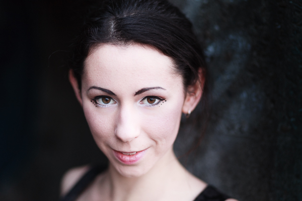
The first example is a portrait I took of a girl standing in the doorway of a concrete bunker. The light is coming from her left.

Photo processed in Lightroom

One side of the photo is already dark, so I decided to reduce the brightness of the other side to match. I used a Graduated Filter to darken the concrete wall, and an Adjustment Brush to make the model’s hair darker. Here’s the result.

Photo processed in Lightroom

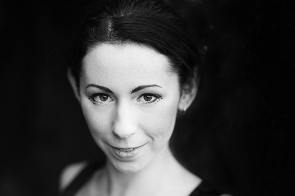
Possible alternative B&W

The logical extension of this thought process is to convert the image to black and white and make the background even darker. I also increased Contrast in the Basic panel and applied Clarity to the model’s eyes with an Adjustment Brush to make them stand out more.

Photo processed in Lightroom

Example 2: Nostalgic colour

I took this close-up photo in a market in Shanghai, China.

Photo processed in Lightroom

There are two thoughts that occur to me here. First, that the two Buddha heads have beautiful textures that I’d like to emphasize. Second, that I’d like to give the image a nostalgic feel.

To achieve the nostalgic look, I used the Temp slider to make the photo warmer, and reduced the saturation of the colours with the Vibrance and Saturation sliders. I increased Clarity and Contrast to bring out the texture, and added a vignette using the Radial Filter. The dark shadows this creates add a sense of mystery.

Photo processed in Lightroom

Possible alternative add a plugin

How about seeing how far I can push the idea of bringing out the texture and reducing colour saturation? Nik Software’s Viveza2 has some excellent tools for this. See the resulting image below.

Photo processed in Lightroom

Example 3: Long exposure landscape

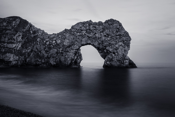
Finally, here’s a landscape that I took one evening using a shutter speed of 30 seconds. The light is flat and dull, and there is a strong blue colour cast.

Photo processed in Lightroom

One option here is to emphasize the late hour and natural blue colour of the light. But I decided to take a different approach and that I wanted to create an image with warm tones. I did this by pushing the Temp slider to the right. Then I increased Contrast to compensate for the flat light and reduced Highlights to bring back some of the subtle detail in the sky. I added Clarity to the rock arch with the Adjustment Brush to emphasize it as the focal point.

Photo processed in Lightroom

Possible alternative dark monochrome

A darker, monochrome version with a blue tone to evoke the atmosphere of the blue hour when the photo was taken. I applied more Clarity to the rock arch, beach and water to enhance the texture and contrast in these areas, then added a vignette with the Radial Filter.

Photo processed in Lightroom

 So as you can see there are many approaches to processing your images in Lightroom. Try different techniques and styles on the same image and you’ll start to learn which ones appeal to you most and are more your “style”. You can also create as many “Virtual Copies” of your image as you want and apply a different style to each for easy comparison. You can even save them as a Lightroom Preset if it’s a look you think you may want to use often.

What is your approach to processing images in Lightroom? If you have any tips for our readers then please leave them in the comments.


Mastering Lightroom ebook bundle

Mastering Lightroom: Book One and Two

My Mastering Lightroom ebooks are a complete guide to using Lightroom’s Library and Develop modules. Written for Lightroom 4 & 5 they take you through every panel in both modules and show you how to import and organise your images, use Collections and creatively edit your photos.


The post Finding and Achieving Your Style in Lightroom by Andrew S. Gibson appeared first on Digital Photography School.


Digital Photography School

 
Comments Off on Finding and Achieving Your Style in Lightroom

Posted in Photography


Achieving a ‘Big’ Look with little Gear | Using What You Have

04 Jun

A Guest post by Judd Green

Bandshoot

There’s always, always an upgrade that I ‘need’ or a new lens I ‘can’t do without’. And I could easily convince myself, and the boss (the wife) I can’t do my next shoot without getting this strobe or lens or wireless system, it would make the shoot awesome! Turns out the gear doesn’t make you awesome, you make you awesome. I have consciously decided to not upgrade any of my gear yet, I’ve made the decision to push my knowledge and the gear that I have to achieve what I want to achieve.

I recently had a band approach me to do some promo shots for them. All they gave me to work with was ‘classy with an edge’ which sounded like fun. Straight away I’m thinking I wanted the ‘look’ of a big production, I organized to do the shoot in a warehouse to give the ‘edge’ and have a set up with a lounge, side table and lamp to add some class. I’ve seen with something like this you’d have strobes and reflectors and assistants running around everywhere. I had my 580exii, a $ 100 strobe I bought off ebay and my mate Dylan.

I did the shoot with my 5d2 (would love to get the mark 3) and a cactus v4 wireless system (would love to get a pocket wizard system) and my 24-70 lens that I have dropped in the past (would love to upgrade that too) and my 580exii and a cheap strobe.

1

We had no ambient light to work with and in order to light every band member up perfectly I had to shoot them one at a time as a composite image so it would be a simple cut and paste job later. One good tip also when doing this style of shoot is to get a ‘clean slate’ shot, a shot with nothing in it but the background, it just makes it easier to cut and paste onto.

2

Don’t let only having little gear stop you from achieving what you want to achieve, but make sure you work it all out before hand, you can never be too prepared when it comes to shoots as to not waste your clients time.

3

Pushing boundaries and my knowledge is what I love about photography, I had an idea and a goal set and then just made it happen. Learn the gear you have and become excellent at it. It’s always nice to get the latest and newest gear, and it often helps and makes things easier, but it’s not the gear that makes you awesome, it’s you.

4

Judd Green is a Photographer from Brisbane Australia. See more of his work at www.juddricphotography.com

Post originally from: Digital Photography Tips.

Check out our more Photography Tips at Photography Tips for Beginners, Portrait Photography Tips and Wedding Photography Tips.

Achieving a ‘Big’ Look with little Gear | Using What You Have


Digital Photography School

 
Comments Off on Achieving a ‘Big’ Look with little Gear | Using What You Have

Posted in Photography