RSS
 

Posts Tagged ‘Acceptable’

Sony a6600 review: Amazing autofocus, acceptable ergonomics

28 Nov

Introduction

$ (document).ready(function() { SampleGalleryStripV2({“galleryId”:”0784641798″,”isMobile”:false}) })

Sample photoSample photoSample photoSample photoSample photo
Silver Award

83%
Overall score

The Sony a6600 is the company’s top-of-the-line APS-C mirrorless camera, with 24MP of resolution and 4K video capture. It looks a lot like Sony’s other a6000-series models at first glance, but this one has the biggest battery and the best build quality of the bunch, even if the images it produces are broadly comparable to the less expensive options.

The a6600 further differentiates itself by offering in-body image stabilization, which is still a rarity among APS-C cameras. This should help with stills shooting in low light, to be sure, but also combines with excellent autofocus tracking to make it the best crop-sensor video shooter Sony currently sells.

Despite its refinements, we still think the a6600 could benefit from some ergonomic updates to make it an easier camera to take control over.

Key features:

  • 24MP APS-C CMOS sensor
  • Advanced, capable subject-tracking autofocus
  • In-body image stabilization
  • 2.36M dot OLED electronic viewfinder
  • 0.9M dot tilting touchscreen
  • Wi-Fi for image transfer, and NFC
  • 4K video capture with log profiles
  • USB charging
  • 810-shot battery life (per CIPA)

The Sony a6600 will be available on November 29th, 2019, at a suggested price of $ 1400/€1600 body-only, and $ 1800/€2000 with an 18-135mm F3.5-5.6 kit lens.


What’s new, how it compares

Check out how the a6600 stacks up against its closest competition here.

Read more

Image quality

The a6600’s familiar sensor produces clean, pleasing images in a wide range of situations.

Read more

Autofocus and performance

With an industry-leading autofocus implementation, the a6600 is a capable sports-and-action shooter, but we have some reservations.

Read more

Video

Oversampling 4K footage from 6K capture, the a6600 churns out really detailed video footage, but rolling shutter remains a problem.

Read more

Conclusion

The a6600 is a supremely capable camera, but it just misses out on earning our top award – find out why.

Read more

Sample galleries

Check out some of our samples from across North America in our a6600 sample galleries.

Read more

Articles: Digital Photography Review (dpreview.com)

 
Comments Off on Sony a6600 review: Amazing autofocus, acceptable ergonomics

Posted in Uncategorized


Center Field – 9 Acceptable Ways For Breaking Rule of Thirds in Photography

22 Nov

When starting, most photographers tend to shoot all subjects center-frame. As they learn more about photography and composition, they learn that centering a subject is not appealing and that they must follow the ‘Rule of Thirds’ to have a good composition. What if I suggest breaking Rule of Thirds?

The Rule of Thirds

The Rule of Thirds is taking a frame and dividing it into three equal sections both horizontally and vertically, creating a rectangular ‘tic-tac-toe’ box. Framing a subject so that it falls on one of the four intersecting points of that box can sometimes make an image more appealing to a viewer engaging with it.

2 - Breaking Rule of Thirds in Photography

Implementing the Rule of Thirds.

While you may not perfectly frame your subject to fall within one of those four points, if your subject falls on one of the four internal lines within the box, in most cases, it still gives a better appeal than a centered image.

When It’s a Good Idea to Center Your Subject

1. Centering as a Compositional Tool

Placing your subject dead-center can work to your benefit if the subject still tends to comply with the Rule of Thirds guideline. Such as, when more than one point of focus falls on more than one line within that ‘Rule of Thirds’ box as shown in the image below.

The sets of pillars fall on one of the two vertical lines in the frame according to the Rule of Thirds even though the entire image is centered.

2. Place Focus on Your Main Subject

Sometimes when there is a busy foreground or background, placing your subject dead-center helps to draw the viewer’s attention to it. While the image below shows much texture, centering the stool brings focus to it.

4- Breaking Rule of Thirds in Photography

Bring better focus to a subject by centering.

3. Emphasize Symmetry

You may sometimes run into a subject that has a symmetrical value to it. The item could include columns at a building’s entrance, a person’s face or something with repetitional characteristics. Centering the subject, in this case, allows the viewer to relax because the order in the image makes sense.

5- Breaking Rule of Thirds in Photography

This nonsymmetrical image is not as appealing as the image below.

In the next image, there is a sense of order due to the equal number of pillars to the right and left of the fountain, producing symmetry.

6 - Breaking Rule of Thirds in Photography

This image represents symmetry.

4. Draw the Viewer’s Eye Inward

One of the most common goals for a photographer is to draw a viewer’s attention into the image instead of out of it. Straight roadways, paths, or sidewalks are great examples that keep your viewer’s attention within the frame – by drawing the eye inward.

The hall and chandeliers are centered taking the eye inward into the photo.

5. Create a Sense of Size and Space

Centering a subject can often showcase its size, especially when surrounded by people, buildings or other objects that serve as a comparison. Such as in the image below.

8 - Breaking Rule of Thirds in Photography

Centering a subject can sometimes emphasize the size of a subject.

Centering a subject can also give a sense of space. A good example is when there is water or cityscape in the foreground of an image and a clear sky in an upper part of the image. See an example below.

9 - Breaking Rule of Thirds in Photography

Centering the Eiffel Tower in this image works to show a sense of space.

6. Square Image Format

A great way to justify centering an image is when you use the square image format. A square has all equal sides in length, so placing a subject dead-center works well. I also like it because, in most cases, it’s an equal distance from the subject to all edges of the sides.

Centering the Eiffel Tower in this image works to show a sense of space.

7. Shooting With Shallow Depth of Field

When you open up your aperture and shoot with shallow depth of field around your subject, it creates a more three-dimensional feel, adding depth to your image. In this case, centering your subject works because it washes out distraction around your subject, as in the image below.

11 - Breaking Rule of Thirds in Photography

Shooting with a shallow depth of field.

8. Overcoming Location Difficulties

Sometimes the location of a fixed subject makes it difficult to capture a stunning shot. During these times try to get creative, as I did in the image of the clock at Grand Central Terminal in New York City below. I could’ve taken that shot from any number of directions or angles. However, for a better shot, I centered it at an angle that included the American flag in the background.

12 - Breaking Rule of Thirds in Photography

Center a subject to overcome location difficulties.

9. Simplicity

You know the saying, ‘less is more?’ While placing a subject off-center adds tension to an image, placing a subject dead center can give a calm and orderly feeling. In addition, placing your subject in a central position is like opening a book to its story. You are making it the most important element in the image. A natural environment, a natural face – it’s an open book. What is your subject’s story that you are introducing to your viewers?

13 - Breaking Rule of Thirds in Photography

Simplicity

Tying It Altogether…

Some ‘rules’ are meant to be broken. The Rule of Thirds is not the only way to guarantee a good composition. As long as you understand why you’re breaking the rules and foregoing guidelines with a specific intention, your images can be as compelling subject-centered as with your subject off-center.

The post Center Field – 9 Acceptable Ways For Breaking Rule of Thirds in Photography appeared first on Digital Photography School.


Digital Photography School

 
Comments Off on Center Field – 9 Acceptable Ways For Breaking Rule of Thirds in Photography

Posted in Photography


When is Altering Your Image Acceptable? A Debate on Post-processing

13 May

Have you ever used Photoshop’s ‘Content Aware Fill’ tool to get rid of some unsightly object in your otherwise perfect image? Have you ever cropped your image in order to give it a more pleasing composition? I know I’ve done both on many an occasion and I feel no guilt or remorse whatsoever.

The Plastic Bag You Didn’t Notice

Here’s an example of a shot I took at Monument Valley in Utah. The foreground was completely covered in litter, so while editing I decided to cut out the more obvious offenders like this plastic bag. Should I have left it in? What is an acceptable level of post-processing and alteration?

Monument Valley Landscape Sunset

Monument Valley trash

I’m curious to know where you feel the line should be drawn? Would you judge me for cloning out that plastic shopping bag? Perhaps I should have walked over and picked it up, either way, it’s gone from my shot and I’m happy with the result.

Truth or beauty, the age-old question?

Landscape photographers like myself are always creating composites of multiple images just to get the tourists and other photographers out of our shots, it’s no big deal. Or is it? Are you one of those rigid purists that believes that the camera should not lie, not even a teensy little white lie? But if you are, doesn’t the camera lie the moment you frame your carefully placed shot and hit the shutter?

I can see both sides of the argument. But, given the choice of performing a ruthless crop and getting a keeper, or leaving my image untouched and forever condemning it to a digital graveyard, I’ll go for the former thank you very much.

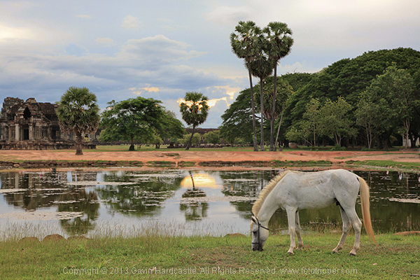
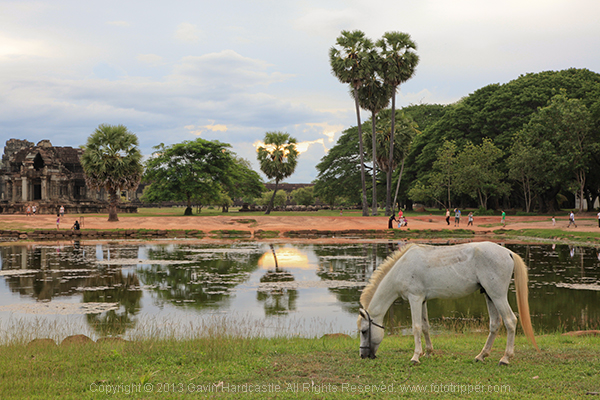
Here’s one of the very first pictures I took with a DLSR from back in 2010. I cut all of the people out of the image because they weren’t adding to the composition in any way. The eagle eyed among you will spot where I got lazy with my ‘people removal’. See the unaltered version below it and tell me if I crossed the line.

Angkor Wat Cambodia Landscape Photography - Gavin Hardcastle

Angkor Wat - Cambodia

Where does it end?

The problem is, where do you draw the line? When do you decide that enough is enough and the image should be left alone? Ultimately it’s down to you as the photographer and your creative vision, but there are instances where photography is used as an accurate historical document. In Photojournalism, we rely on a photographer to tell a story and capture a moment in history, albeit from their own unique perspective and how they choose to frame a shot.

Couldn’t it be argued that a photographer who chooses to omit certain elements, is manipulating the viewer just as clearly as when they chop out an ugly plastic shopping bag in Photoshop?

Consider the real estate photographer who carefully manages to exclude the crack shack next door to the million dollar home, no alteration but still a little white lie.

It’s all so very subjective and the truth is that you’d never know the difference if the photographer didn’t confess.

Oh what’s this below? My wife’s 24-105mm lens creeping in to the lower right of my shot, now there’s a surprise. What do you think are the chances that I’m going to be leaving that in my final edit?

Antelope Canyon Landscape Photography

Where do I draw the line?

As a landscape photographer I strive to keep all of the permanent or natural elements of my images intact. I won’t flinch at removing a discarded water bottle that I hadn’t noticed while shooting. I won’t bat an eyelid at cropping out my wife’s left foot as she reliably walks into the corner of my frame just a split second before I hit the shutter.

I draw the line however, at removing or moving objects that are natural or permanent. If there’s a tree or even a lamp post in a less than ideal spot in my composition I will not alter it. I want the viewer of my image to be able to stand in the exact place I stood when taking the shot and know that everything is in its right place. That doesn’t include the used condoms and the KitKat wrapper.

Tell me, where do you draw the line? Let the debate begin!

Share in the comments below where you stand on this subject. Do you do any post-processing on your images, and if so how far do you take it? How far is too far? Let’s discuss it.

The post When is Altering Your Image Acceptable? A Debate on Post-processing by Gavin Hardcastle appeared first on Digital Photography School.


Digital Photography School

 
Comments Off on When is Altering Your Image Acceptable? A Debate on Post-processing

Posted in Photography