RSS
 

Posts Tagged ‘Companion’

The Olympus TOUGH TG-6 Camera Review – A Perfect Adventure Companion?

12 Nov

The post The Olympus TOUGH TG-6 Camera Review – A Perfect Adventure Companion? appeared first on Digital Photography School. It was authored by Mat Coker.

olympus-tough-tg-6-review

The Olympus Tough TG-6 is the perfect camera for the adventurous soul.

Like a wilderness travel guide, the TG-6 pulls you into the micro world, under the water, and down deeper trails than you would ever take your clunky DSLR down. You can trust the Olympus Tough TG-6 out in the wild because it’s built strong and made for adventure. It’s even tough enough to let your kids use it.

Moreover, it’s really small, so it doesn’t hinder your adventure for even a moment. And it’s so capable it will inspire adventures you hadn’t planned.

This review is about what the Olympus Tough TG-6 will let you do as a photographer and how the pictures look.

TG-6 small size

An evening adventure used to mean hauling a heavy bag filled with gear. I never knew which gear I would need for sure, so I always brought too much. Eventually, I just stopped going on spontaneous adventures because it became too much of a chore. The Olympus Tough TG-6 replaces all that stuff I used to haul around. Gear is no longer the hindrance it used to be.

The technical specs

The reason why so many people are excited about the Olympus Tough TG-6 is the impressive list of technical specs.

  • F2.0 wide-angle lens (the aperture narrows as you zoom)
  • 20 frames per second
  • Underwater modes
  • Microscope mode
  • In-camera focus stacking
  • Scene selection
  • Aperture mode
  • RAW capture
  • 4K video
  • Waterproof
  • Shockproof
  • Dustproof
  • Crushproof
  • Freezeproof

Of course, the reason this list of specs is so exciting is because of what they’ll let you do with this camera as a photographer.

“No photographer is as good as the simplest camera.” – Edward Steichen

When you read camera reviews, you want to know what a camera is capable of and how great the picture quality will be.

Don’t forget that a camera only has to be so good and then the rest is up to you. The world’s greatest camera isn’t much good in the hands of a person that knows nothing about light, moment, or composition. Look for a camera that meets your general needs, then up your game as a photographer.

The most famous photographs were made with cameras that we would consider inferior by today’s standards. A beautiful photograph transcends the technology it was made with.

In the end, it’s not about the technical specs of a camera, but what those technical specs let us do as creative people and photographers.

The TG-6 has an impressive resume. Let’s see what it can help us do.

Adventure photography olympus tg-6

Aperture: f/2.0, Shutter Speed: 1/250 sec, ISO: 3200

When my first child was born I was just becoming the photographer I had always wanted to be. I couldn’t wait to take him on adventures with me as he grew. Ironically, it was a bag filled with too much gear and too many options that held me back from adventures with my kids. The TG-6 is everything I always wanted and fits in my pocket. It practically pushes us out the door and into the world.

“My life is shaped by the urgent need to wander and observe, and my camera is my passport.” – Steve McCurry

What if you could shrink yourself?

It is captivating to suddenly see the world through a magnifying glass or microscope – to see tiny details blown up big. You may not be able to shrink yourself, but you can enter the micro world with the Olympus Tough TG-6.

Microscope mode

With the TG-6, you can get insanely close and discover the mystery and beauty in the fine details of everyday objects. You’ll be exploring the world in a way you haven’t done since science class.

The micro world offers you an infinite number of things to photograph. Look around you right now. There are so many things that you would never photograph on their own, but you can dive in microscopically to a new world and become enamored with the beauty of fine details.

insect macro photography

If you’ve got the courage, the TG-6 will bring you up close and personal with insects.


The Olympus TOUGH TG-6 Camera Review – A Perfect Adventure Companion?


The Olympus TOUGH TG-6 Camera Review – A Perfect Adventure Companion?


macro mode fine detail

The TG-6 can capture incredibly fine detail that the human eye overlooks.


The Olympus TOUGH TG-6 Camera Review – A Perfect Adventure Companion?


Berry macro photography

F/3.6, 1/100 sec, ISO 800

The problem with close-up photography

One of the biggest problems you’re going to run into with close-up photography is a shallow depth of field. You may take a photo of a flower, and nothing more than the edge of a petal is in focus. This is frustrating when you want more of that tiny object to be in focus.

How “focus bracketing” solves the problem

One way to deal with this is to take a series of photos at different focus points (focus bracketing), and later combine them in Photoshop in a process called focus stacking. The end result is an image with more depth of field than is possible in a single photo. If you’re a serious macro photographer, this is an amazing option. But it’s a labor-intensive process and you’re not likely going to do it on a whim while on a nature hike.

But the amazing thing about the Olympus Tough TG-6 is that it can actually do both the focus bracketing and focus stacking for you – all in-camera!

Let the Olympus Tough TG-6 do the Photoshop work for you

The photos below illustrate the frustration of such a shallow depth of field in close-up or macro photography. But they also illustrate the power of the TG-6’s in-camera focus stacking.

Olympus TG-6 focus stacking feature

The photo on the left is a single exposure with a shallow depth of field, while the photo on the right is the result of several photos with varying focus points stacked together into one image.


Focus Stacking with the Olympus TG-6

On the left, only a small portion of the leaf is in focus. But using the focus stacking option on the TG-6, the photo on the right is almost entirely in focus.

Normally, you need a dedicated macro lens if you want to take close-up, macro, or microscopic photos. That means a financial investment and another lens in your bag. But the TG-6 has this capability built-in. The close-up function is worth the cost of the camera.

Get in, the water’s nice!

You’re missing so much fun if you can’t take your camera into, or at least near, the water.

Generally, an underwater housing is expensive and might limit your access to camera settings. Best case scenario, you invest a lot of money to get your camera into the water. But this is a lot to invest and most people won’t do it on a whim. You’ve got to be sure you want to be in the water a lot to make it worth the investment.

With the Olympus Tough TG-6, you don’t need to think twice; just get in!

Having a camera that can get wet means you can get into the splash zone. Don’t photograph puddle-jumping-kids from a distance; get close and get wet!

Get underwater and explore fish from their world.

Don’t stand on the shore with dry feet to photograph the sunset; hit the waves.

The Olympus TOUGH TG-6 Camera Review – A Perfect Adventure Companion?


Olympus TG-6 underwater mode

My kids and I discovered a stream filled with salmon. I knew it was the perfect chance to try out the TG-6 underwater.

A couple of years ago, I stepped into a river with one camera in my hand and one around my neck. I was photographing people back on the shore and kept crouching a little to go for a lower angle. Every time that I crouched down for a great low angle, I was unknowingly dunking the camera around my neck into the water. Goodbye, Fuji x100s.

The irony is that I had an underwater case for my x100s. But it’s so clumsy to use in the case that it hinders my photography.

You no longer need to be nervous around the water with your camera – the TG-6 is completely waterproof and pulls you right in.

A good motivator

If it hasn’t happened yet, the day will come when you lose your drive and inspiration as a photographer.

At first, the thought of packing up all your gear and lugging it around will overwhelm you. Especially because you know you won’t even be happy with the pictures you take.

Then, even just the thought of picking up your camera will depress you.

You lose your drive, your inspiration, and eventually your will as a photographer.

You’ve already learned that new gear is not the answer to this depressing dry period you’re going through. But that’s because most gear is the wrong gear for you.

The TG-6 isn’t just a new camera, it’s a passport to new lands. It’s like slinging on a backpack and heading out to discover the world. It sits there looking at you, hoping you will take it out to play. Photography doesn’t have to feel like a burden anymore.

TG-6 photography inspiration

“It’s a dangerous business, going out your door. You step onto the road, and if you don’t keep your feet, there’s no knowing where you might be swept off to.” ~ Bilbo Baggins

Leave the Olympus TG-6 laying around

When my camera is in the bag, it never gets used. I prefer to leave it out with the lens cap off and the power button left on so that I’m ready to make a photograph at a moment’s notice.

But when I leave my cameras lying around, my wife doesn’t like the clutter (even though she loves the photos that result from the clutter).
Not to mention that leaving expensive cameras around is a hazard with a house full of kids and their rowdy friends.

The TG-6 has become our dedicated “leave it laying around the house” camera. It’s so small that it doesn’t bother my wife. It’s there when we need it. And, it’s so tough we don’t mind the kids using it.

I’m capturing many more moments now that I’ve got a dedicated “everyday life camera.”

Olympus TG-6 capturing candid moments


Window light candid moments with the Olympus TG-6


Black and white photography wit hthe Olympus TG-6

So tough I let the kids use it

One of the things that first attracted me to the Olympus Tough cameras is that I can let my kids use them. The TG-6 is waterproof, shockproof, dustproof, crushproof and freezeproof. Which means it’s also kid-proof.

TG-6 great for kids

I love to look at the photos my kids have taken. It’s inspiring to see what captures their attention enough to take a picture.


Olympus TG-6 dustproof

When my kids ask to use the camera while they explore sand dunes and lakes, I have no problem handing them the TG-6 to use.

Essential modes

After using the Olympus Tough TG-6 for about a month, I’ve figured out my favorite combination of settings for everyday use; P mode.

I want a certain amount of control over ISO, aperture and shutter speed because I understand how they affect my photo. But I don’t want to overthink these settings and miss the beauty of the moment.

In P mode, the camera will choose the shutter speed and aperture for you. All you have to think about is ISO (but you can select auto ISO if you wish).

With a few minor adjustments in P mode, I can make the TG-6 do exactly what I want it to.

In the menu, I set the minimum shutter speed to 1/125th. I want the camera to set the shutter speed for me, but I don’t want it to go any slower than this.

I select auto ISO, but I set the maximum ISO to 1600. I don’t want the ISO to go any higher than that because of the noise issues.

While it’s balancing the settings out, the TG-6 will always favor a lower ISO and only raise it if it needs to. Eventually, if it’s dark enough, it will go below your minimum shutter speed in order to achieve a good exposure.

Here’s the best part; in P mode, you have direct access to exposure compensation with the camera dial. Your camera will hardly ever get the exposure just as you want it. So use the exposure compensation feature to brighten or darken the photo before you take the picture.

There is no full-manual mode on this camera. But if you know what you’re doing, you can still take full control.

TG-6 exposure compensation feature

Processing RAW files

Using Lightroom 6, I am unable to edit the RAW files from the TG-6. However, Olympus provides free editing software called, Olympus Workspace.

Because of this camera’s smaller sensor size (and difficulty capturing extreme dynamic range), I am not putting much hope in the RAW files. RAW + JPG capture is a great option. Get the best exposure you can in order to have the highest quality JPG file, and keep the RAW file in case of an emergency.

Even heroes have a weakness

There are three main weaknesses that I have discovered with the Olympus Tough TG-6.

Lens Flare

I love playing with lens flare and I quickly discovered that is almost impossible to do with the TG-6. This is the strangest lens flare that I have ever seen. It’s discouraging, but I’ll have to learn to make compelling photographers without lens flare.

Oympus TG-6 lens flare

Noise

The Olympus Tough TG-6 produces a lot of noise in high ISO, low light photos.

The following photos are lit with a small-screen TV and/or a lamp.

High ISO

This photo was lit with a lamp. you can see the grainy discoloration in the white blanket. The ISO is 3200.

High ISO noise

This is a close-up of the white blanket in the previous photo.


High ISO noise

This photo is lit with the light from a TV and a small light in the next room over. The ISO was 3200.

High ISO noise

Close up of high ISO noise

You can see the grain and discoloration in his skin.

The following photos are backlit with dim light from a living room window.

Bright light high ISO noise

Again, the ISO was set at 3200. Because the light is brighter, there isn’t as much noise and discoloration. But there is a lack of crispness to the photo.


High ISO and window light

But I was shocked to capture this photo with lots of movement at ISO 3200 because it looks so crisp.

Sharp in bright light

You’ll have to get used to keeping your ISO at 1600 or lower (you’ll need a steady hand for the slow shutter speed that results).

But in bright light, with a low ISO, the TG-6 is nice and sharp.

A sharp photo with low ISO

So the Olympus Tough TG-6 is weak under extreme lighting conditions, but so are many other cameras. For many of us, high ISO with low noise is the last frontier on the technological side of photography.

We can strengthen the TG-6 by post-processing the photo with a program such as Lightroom. Keep your ISO to 1600 or lower when possible, and convert to black and white when suitable.

No control over shutter speed

At first, I thought it was a problem that there was no shutter speed mode on the TG-6. But then I realized that it wasn’t really necessary. You just have to know how to work around it.

If you want a quick shutter speed to freeze the action, use sports mode.

If you want a slow shutter speed to capture motion blur then you need to understand how to force the camera to produce a slow shutter speed.

Suppose you want to capture a silky waterfall photo. Normally, you need control over your shutter speed to make it go slow enough to capture the motion. But with the TG-6 you don’t have control over the shutter speed.

Or, do you?

When you understand ISO and aperture then you do have control over the shutter speed.

Olympus TG-6 slow shutte speed silky waterfall

In order to get silky waterfalls, you need a slow shutter speed. You can force your camera to choose a slow shutter speed by lowering your ISO and closing your aperture.

Choose an ISO of 100. Choose an aperture of f18. This will effectively choke out the light and force the TG-6 to slow down the shutter speed to let more light in. The slow shutter speed will produce a silky waterfall.

So the lack of control over shutter speed isn’t a big problem.

Olympus TOUGH TG-6

The greatest weakness

As photographers, we can find moments so powerful that lens flare isn’t necessary. And, we can look for moments so strong that the viewer will overlook high ISO noise in the photo. Whatever the shortcomings of our cameras, we as photographers always fall shorter. Whatever their weaknesses, our cameras are just fine. We need to increase our skills and know that, even if there was a perfect camera, it could only be used by an imperfect photographer.

The power of the Olympus Tough TG-6 is not merely in its technology. The power is in what that technology allows us to do. This is a camera that will nudge you every time you walk by. It’s like a kid who wants to be played with or a dog that wants to be taken out for a run. Come on, just a quick adventure?

A countless number of moments pass us every day. They become almost infinite in size when we consider their range from wide-angle to microscopic. When you’ve got a camera like the TG-6 in your pocket, it’s not so hard to make those moments hold still.

Have you used the Olympus Tough TG-6 camera? Would a camera like this make you take more photos? Share your thoughts with us in the comments!

The post The Olympus TOUGH TG-6 Camera Review – A Perfect Adventure Companion? appeared first on Digital Photography School. It was authored by Mat Coker.


Digital Photography School

 
Comments Off on The Olympus TOUGH TG-6 Camera Review – A Perfect Adventure Companion?

Posted in Photography


Canon EOS M200 review: Your new pocket-friendly companion

31 Oct

Introduction

Silver Award

79%
Overall score

The Canon EOS M200 is a compact, user-friendly interchangeable lens camera. It has a 24MP sensor, great Dual Pixel autofocus, and in terms of image quality, gives you a lot of bang for your buck. It’s the follow-up to Canon’s previous M100, which we really liked.

Canon hasn’t messed with the formula much in the M200, but is that enough to stand out among ever-stiffer competition? I took the EOS M200 on a quick trip to Oklahoma for a family wedding to find out how it measures up as a travel camera for taking pictures of just about anything.

Key specifications:

  • 24MP APS-C sensor with Dual Pixel autofocus
  • Digic 8 image processor
  • Face and eye detect autofocus
  • 4K/24p video capture (1.7x crop)
  • 3″ tilting touchscreen
  • 6.1fps burst shooting (~4fps with AF)
  • CIPA rated to 315 shots per charge, USB charging
  • Wi-FI and Bluetooth
  • MSRP of $ 599 USD with 15-45mm F3.5-6.3 kit lens
The M200 reliably churns out pleasing images right out of the camera.
Canon EF-M 15-45mm F3.5-6.3 @ 15mm | ISO 100 | 1/60 sec | F3.5

What is it?

The EOS M200 doesn’t come with all of the very latest Canon technology, but it still packs a good sensor with reliable autofocus into a camera body that’s just a bit bigger than a pack of cards. And with a good lens in front of that sensor, you’re getting the same image quality as, say, a Canon EOS 80D DSLR, but in a much smaller package.

This is a camera that your subjects won’t take super seriously, but you can take some seriously good pictures with it. It actually surprises people.

Of course, if you take photos on your smartphone, the M200 represents one more device to bring with you. If you’re mostly doing wide-angle shots of landscapes or cityscapes, or even just selfies, your smartphone is probably good enough. Modern smartphones will even let you blur out backgrounds more than you could with the kit lens that comes with the M200.

In this view, you can see all the external controls on the EOS M200: the power switch and mode dial, shutter button and surrounding dial, as well as the back plate and touch-enabled tilting screen.

But the M200 captures more resolution, meaning more detail in your images, and if you opt for one of the system’s bright prime lenses, you’ll likely get better low light performance. Also, at least for this reviewer, it can simply be more fun to take pictures on a real camera than a phone.

In any case, the combination of small size and good image quality is really appealing to me. This is a camera that your subjects won’t take super seriously, but you can take some seriously good photographs with it. It actually surprises people.

I really enjoy the M200’s unassuming nature. Out-of-camera JPEG.
Canon EF-M 22mm F2 | ISO 6400 | 1/250 sec | F2

For most of the audience that Canon is targeting with the M200, it should succeed as a fairly budget-friendly and accessible companion for generalist photography, the likes of which you’ll see throughout this review.

What’s new

To be honest…not much.

Compared to the older EOS M100 this camera replaces, there’s one fewer button, there’s a newer USB Type-C connector, and the ‘Auto’ setting on the mode dial is painted white instead of green. Yes, there’s so little to talk about that that is what I just talked about.

On the inside, an updated processor brings most of the meaningful updates. The first of which is Eye Detect autofocus: older Canon EOS cameras had reasonably good face detection, but seeing the camera pick up on your subject’s eye, even while shooting in full-auto, gives me greater piece of mind that the focus will be right where I want it.

This out-of-camera image did a good job retaining the bright highlights behind the buildings, but I wanted to see more detail in the shadows. Editing the Raw file in-camera on the M200 only lets me boost overall brightness, so then those highlights clip – back on the older EOS M100, I could boost only the shadows with what Canon calls the ‘Auto Lighting Optimizer.’

The new processor also brings 4K video (though it’s heavily cropped, so difficult to get wide-angle footage with the kit lens), slightly improved battery life, and a new compressed Raw format. Missing is the older method of processing Raw files in-camera, having been replaced by a much more user-friendly but less powerful Creative Assist function.

At its core, the M200 is a very small, snappy camera that won’t weigh you down

For me, I’m torn between appreciating CRaw (which slims file sizes without compromising quality too much) and being annoyed at the elimination of ‘proper’ in-camera Raw processing. But I’ve got to admit, for the target audience, none of this matters much, and could actually be a benefit. The simpler processing interface, which includes adjustments like brightness, contrast, and color tone is approachable for anyone who’s tuned their own Instagram filters.

At its core, what hasn’t changed is that the M200 is a very small, snappy camera that won’t weigh you down. And that is important, both to myself and the target audience.

What works

The same fun factor that I loved in the M100 is here in the M200. It’s easy to carry with you and takes excellent photographs, whether you’re out having a pizza or taking some pictures of family on the dance floor. The menu system is getting a bit crowded (most cameras suffer from this nowadays), but it’s not too hard to find what you’re looking for.

Bricktown, Oklahoma City. Out-of-camera JPEG.
Canon EF-M 15-45mm F3.5-6.3 @ 18mm | ISO 100 | 1/250 sec | F7.1

The Wi-Fi and Bluetooth connection options are pretty polished, too. Establish a Bluetooth connection with the M200, and the camera will maintain that connection even while powered off (and this doesn’t noticeably impact battery life). So as long as you’re within range of the camera, you can launch the app and pretty quickly be off and browsing your images from your phone, even with the camera on a shelf across the room.

The 15-45mm F3.5-6.3 kit lens is, in my experience, solid if not extraordinary. It offers a very useful zoom range while being very compact, but you’ll want to pick up one of Canon’s or Sigma’s EF-M mount prime lenses for lower light shooting or more options for photographic creativity. The Canon EF-M 22mm F2 in particular is a gem, being tiny, affordable and optically great; the tradeoff is that it’s a bit slow to focus. But it should really be the first addition to any Canon EOS M user’s kit.

For this image, I set the camera on Manual to control exposure, then pulled the flash back and bounced it off the ceiling to get some more even lighting on my subject’s hand. I then processed the Raw file in-camera to boost brightness and saturation just a bit.
Canon EF-M 22mm F2 | ISO 6400 | 1/125 sec | F2

Though controls are sparse, the excellent touchscreen interface makes up for this somewhat, and is likely to be appreciated by those moving up from smartphones. And the inclusion of a pop-up flash that you can pull back to bounce at the ceiling is a nice touch and opens up some creative possibilities for users to grow into as they become more comfortable with the camera.

What needs work

For its intended audience of novice users and social media mavens, I think Canon needs to tweak its full auto mode. This mode generally gets you good exposure and autofocus (and you can always tap the screen to choose your subject if the camera doesn’t get it right), but the M200 just hates using fast prime lenses at their widest apertures. This basically means that the M200 produces grainier photos in low light than it should, and doesn’t give you the shallow depth-of-field effect you might be after.
I like this photo, but I’d like it even more if the camera’s Auto mode chose some different settings.
Out-of-camera JPEG.
Canon EF-M 22mm F2 | ISO 6400 | 1/80 sec | F2.8

In taking the above image of a mostly static subject in low light, the camera should have selected F2 and not F2.8. The ISO value would be lower, so there’d be less grain and better detail on my subject. So if you’re eyeing some faster prime lenses for the M200, be aware you may want to switch into a more advanced exposure mode to take full advantage of them.

Other than that, Canon claims that the EOS M200 is now able to charge over USB, but I still haven’t found a charger that will do so: we suspect it needs a ‘Power Delivery’ compatible charger, but Canon hasn’t confirmed this. The autofocus system is generally capable, but it still lags and hunts a bit more than I’d expect it to in low light.

Out-of-camera JPEG.
Canon EF-M 22mm F2 | ISO 6400 | 1/80 sec | F2.8

Burst shooting speeds are, frankly, not impressive when focusing on a moving subject. Lastly, 4K video is nice-to-have, but the crop is limiting and almost begs for another lens, the Canon EF-M 11-22mm, in order to get a decent wide-ish angle of view – especially if you want to vlog. The crop also means that it’s using a smaller portion of the sensor, which will negatively impact image quality, especially in low light.

Conclusion

The Canon EOS M200 is, overall, a good camera. It’s one that I believe, as with its predecessor, is a bit more than the sum of its parts. For those that are more novice photographers, the M200 is a capable and affordable option that’s fun to use and churns out nice photographs without much fuss. Thanks to slower burst speeds and slightly hunty autofocus, it won’t be the best option for capturing fast-moving or unpredictable subjects like animated children: Sony’s pricier a6100 is a better bet there for some family photography.

It won’t be to the liking of every experienced photographer (Canon’s own EOS M6 Mark II is a better bet for that crowd), but I find the M200 to be a nice escape for when I want solid image quality without a larger camera to weigh me down.

If you’re looking for a small, casual camera that won’t intimidate either you or your friends, one with with good wireless connectivity for easy sharing, and you might even be interested in adding an additional lens or two down the line, the EOS M200 is a good bet.

$ (document).ready(function() { SampleGalleryV2({“containerId”:”embeddedSampleGallery_5144667768″,”galleryId”:”5144667768″,”isEmbeddedWidget”:true,”selectedImageIndex”:0,”isMobile”:false}) });

Scoring

Scoring is relative only to the other cameras in the same category. Click here to learn about the changes to our scoring system and what these numbers mean.

Canon EOS M200
Category: Entry Level Interchangeable Lens Camera / DSLR
Build quality
Ergonomics & handling
Features
Metering & focus accuracy
Image quality (raw)
Image quality (jpeg)
Low light / high ISO performance
Viewfinder / screen rating
Performance
Movie / video mode
Connectivity
Value
PoorExcellent
Conclusion
We think the Canon EOS M200 is one of the most approachable cameras for new photographers on the market today. It doesn't have the fastest burst speeds or the greatest video capture, but it has plenty of resolution, produces great images easily and just about fits in your pocket. Lastly, it's reasonably priced, and any additional lenses you might want for it are reasonably priced as well.

Good for
New photographers, those who want to explore photography beyond their smartphones, travelers looking for good image quality in a very small package.

Not so good for
More experienced photographers needing more hands-on control, those who need to frequently photograph fast-moving or unpredictable subjects.
79%
Overall score

RegularScoreCompareWidget({“mainElementId”:”scoringWidget”,”mainProduct”:”canon_eosm200″,”scoringSchema”:{“id”:”SLRs”,”variables”:[{“id”:”BuildQuality”},{“id”:”ErgonomicsAndHandling”},{“id”:”Features”},{“id”:”MeteringAndFocusAccuracy”},{“id”:”QualityRaw”},{“id”:”QualityJpeg”},{“id”:”LowLightHighISO”},{“id”:”ViewfinderScreenRating”},{“id”:”Optics”},{“id”:”Performance”},{“id”:”Movie”},{“id”:”Connectivity”},{“id”:”Value”}],”categories”:[{“id”:”EntryLevel”,”label”:”Entry Level Interchangeable Lens Camera / DSLR”,”shortLabel”:”Entry Level”},{“id”:”MidRange”,”label”:”Mid Range Interchangeable Lens Camera / DSLR”,”shortLabel”:”Mid Level”},{“id”:”EntryLevelFullFrame”,”label”:”Entry Level Full Frame Camera”,”shortLabel”:”Entry Level Full Frame”},{“id”:”MidRangeFullFrame”,”label”:”Mid Range Full Frame Camera”,”shortLabel”:”Mid Range Full Frame”},{“id”:”SemiProfessional”,”label”:”Semi-professional Interchangeable Lens Camera / DSLR”,”shortLabel”:”Semi-professional”},{“id”:”SemiProfessionalFullFrame”,”label”:”Semi-professional Full Frame Camera”,”shortLabel”:”Semi-professional Full Frame”},{“id”:”Professional”,”label”:” Professional Interchangeable Lens Camera / DSLR”,”shortLabel”:”Professional”},{“id”:”LargeSensorCompactEntry”,”label”:”Entry Level Large Sensor Compact Camera”,”shortLabel”:”Entry Level Large Sensor Compact”},{“id”:”LargeSensorCompactEnthusiast”,”label”:”Enthusiast Large Sensor Compact Camera”,”shortLabel”:”Enthusiast Large Sensor Compact”},{“id”:”VideoCamera”,”label”:”Video Camera”,”shortLabel”:”Video Camera”}]},”helpText”:”Choose one or more cameras from the drop-down menu, then roll your mouse over the names to see how their scores compare to the camera on review.”})
Articles: Digital Photography Review (dpreview.com)

 
Comments Off on Canon EOS M200 review: Your new pocket-friendly companion

Posted in Uncategorized


Loupedeck+ Review – the Perfect Editing Companion for Lightroom and Premiere?

02 Oct

The post Loupedeck+ Review – the Perfect Editing Companion for Lightroom and Premiere? appeared first on Digital Photography School. It was authored by Carl Spring.

Loupedeck+ Review - the Perfect Editing Companion for Lightroom and Premiere?

There is something undeniably cool about Hollywood editing studios. I remember seeing one in a magazine as a child and wanting to play with it. Thinking how cool it would be to figure out what all the dials did and edit Hollywood Blockbusters. I never made it in Hollywood, but I can remember my first editing console. Purchased from the high street, it allowed me to link 2 VCR players and have a fade and wipe slider for video. It even had an audio fader that allowed me to (surprisingly) fade audio. At the time it was amazing! I made a lot of skateboard videos using that console.

Obviously we’ve moved to digital everything, but there is something about using knobs and dials to edit that I have always liked. So, when I was given the opportunity to try the Loupedeck+, I jumped at the chance to get hands-on with it. 

What is it?

Simply put, Loupedeck+ is a keyboard-sized photo editing console. The main editing functions are controlled via a series of knobs and buttons.

Loupedeck started life on Indiegogo. The initial Loupedeck was marketed as a photo editing console just for Lightroom. With the Loupedeck+, however, it has become much more than that. The new version has support for several different software platforms too.

This device is still aimed primarily at Adobe users, with support for most of the Creative Suite. There is also support for Apple’s Final Cut and Aurora HDR and is also currently in Beta testing with Capture One Pro, which is my preferred choice of photo editor.
Out of the box

In terms of looks, it is beautifully packaged. However, that doesn’t mean anything if the product itself is not up to scratch. The Loupedeck however, definitely is. Although fully plastic, everything is solid and feels like it will survive long term usage. The only exception to this is the control dial, which does feel a little flimsy compared to the rest of the device.

In terms of the buttons, when making notes, I put down that they are squishy but solid. I still think that’s the best way to describe them. There is also a nice little detail for the cable to connect the Loupedeck. There are grooves that allow you to place it to work with how your computer is setup. It’s not a deal-breaker, but attention to detail like this tends to show the makers care about the end-user. 

dpsloupedeck+-review

The Loupedeck+ is well built apart from the control dial. It just feels a little flimsy. However, in use, it has been flawless so far.

Getting set up 

Once you have unpackaged your Loupedeck, the next stage is setting it up. To do this, you need to install the Loupedeck software. This is a simple download from the Loupedeck website, which then allows you to customize the Loupedeck to your specific editing preferences.

I have left it is standard for now, but I can definitely see me looking into this again to fine-tune it to how I edit.

Once you have the software installed, it is as simple as choosing which software you want to use the Loupedeck with and off you go. Loupedeck has a series of guides for each piece of software that it is compatible with. I recommend having these on hand, especially when using software other than Lightroom. Even with Lightroom though, it is worth having nearby to see what extras you may find yourself reaching for.

The fact that the user guide for Lightroom alone is 31 pages tells you what level of customization is possible.

Image: To get started with Loupedeck+ you need to download the software from the Loupedeck website....

To get started with Loupedeck+ you need to download the software from the Loupedeck website. Once installed, choose your software and away you go.

The learning curve

The learning curve is in two parts; getting used to the Loupedeck from your usual editing routine, and how Loupedeck reduces the learning curve of the software.

To test this, I got my wife to use Loupedeck to work on a wedding we had recently shot. She normally helps make picks, but she has very limited editing experience. She can just about manage to tweak exposure a little, but that’s it.

I put her at the Loupedeck and asked her to try and edit images she thought needed work. After about 2 minutes of me explaining the device, she started. Two more minutes passed before she explained how brilliant it was.

By removing the need to search through the menus (of Capture One in our case), she was able to edit photos easily and without needing constant reminders of the locations of buttons or sliders. It made her experiment more, and within an hour, she felt completely confident using the Loupedeck.

For beginners, this will make the process of learning to edit (especially in Lightroom) so much easier. Everything is at hand, and the layout makes it simpler for beginners to experiment. They can use more of the features of the program without the need to remember the locations in the menus.

For me, as a power user of Capture One, the learning curve was a little steeper. I’ve put this down to Capture One currently being in Beta testing. There are some quirks I needed to get used to when editing, such as using the color balance tool.

There is also the fact that when you use the software every day, you acquire muscle memory from the keyboard shortcuts you use most often. Moving to dials does take a while to get used to.

I do feel that even for Lightroom users (whom this deck was designed for), the change to Loupedeck will mean your editing is slower until you get up to speed. However, I am talking only hours here, not days.

Loupedeck+ and Lightroom

Obviously I wanted to start this test with Lightroom as this is really the program the device is designed for. Now I am not a Lightroom user, so having me use this is more like an inexperienced Lightroom editor versus someone who uses it every day.

I loaded up a selection of images into a catalog and began editing. Using the Loupedeck was completely intuitive. I simply started to edit images without the need to try and remember control locations. It was as easy as twisting the dials with the required name on them. In my experience, the Loupdeck+ and Lightroom work flawlessly together. There is no lag, and the degree of control with each twist feels perfect. Everything is at hand, and if you do find yourself needing something that is not here, you can customize the software until your heart’s content.

It made the process of editing in Lightroom a pleasure and, as a hardcore Capture One user, that is the highest praise I can give it.

dps-loupedeck+-review

It is easy to see that the Loupedeck+ is designed with Lightroom users in mind.

Loupedeck+ and Capture One Pro

Because I’m not a Lightroom user, I went down the road that is Beta testing to put the Loupedeck in my day-to-day editing software. 

Now compared to Lightroom, I found editing in Capture One Pro to be a more clunky affair. The problem is that in its current Beta state, the Loupedeck doesn’t offer the same level of functionality. This is something that Loupedeck are working on and are currently looking for feedback from any Capture One users to help improve the experience.

The basic adjustments work perfectly well in Capture One. To adjust white balance and exposure is just as good as Lightroom. However, there are elements, such as resetting adjustments, that are not there.

The issue here is that the Loupedeck was designed with Lightroom in mind and Capture One works differently. The most obvious example of this is the P1-P8 buttons. In Lightroom, these assign to presets; however, in Capture One, they are simply not set up.

Shooting Fuji, I would love to map this to my film curves, where it would be great to choose the look of my image. However, at present, this is not possible. For more advanced editing, it can be frustrating, and I find myself reaching for the mouse and keyboard more often than I would like.

It’s not perfect by any means, and it does sound a little doom and gloom, but in terms of basic edits, it really did speed up my workflow. I have now edited two weddings with the Loupedeck, and it has definitely saved me some time. Also being super simple for basic adjustments, it really has allowed my wife to do basic edits for things such as exposure.
When editing a wedding, I reach for it straight away. It really is something that after using it, I wouldn’t be without.

The best thing about using Loupedeck+ with Capture One is that I know it can only get better from here. Once there are some more options added, and a few things ironed out from the beta testing, I feel this will be a powerful editing tool.

Loupedeck+ and Photoshop

This is where things start to feel like I was using the Loupedeck for the sake of it. When editing a RAW file, it was great, but after that, I really felt no benefit from using it. When editing in Photoshop, you tend to use your mouse or tablet much more.

You can use it for working with curves, but you need to work with the mouse too, and I found it just too clunky. Other things like zoom in and out, which are mapped to knobs, simply do not work as well as using the middle mouse button.

Unlike using it in Lightroom and Capture One, when working in Photoshop, I found myself using it for the sake of it, rather than reaping any real benefit. I do feel that the Loupedeck+ working with more software is good. However, I feel that, in some cases, it just feels like it is added for marketing over actual functionality. 

Loupedeck+ and Premiere

The ability for Loupedeck to work with Premiere was something that I found myself excited to try. I am by no means a power user, but I know my way around Premiere and edit with it enough to consider myself proficient.

Using Loupedeck with Premiere, though, is where things go a little too far for me. When using it to edit a video, it was just too hard for me to remember what all the functions did. It could be due to my lack of time spent in Premiere, but I think it’s more than that. When photo editing, things like exposure, and contrast are the same no matter which program you use. Video editing, however, uses a completely different language.

It is not that you can’t learn how to use Loupedeck with Premiere. I think once you got used to what each button and dial was mapped to, it would really speed things up. However, as someone who uses the software occasionally, I would find it hard to remember the settings for Premiere.

I think the best way to sum it up is that if you are buying a Loupdeck+ solely for Premiere use, you may face a steep learning curve. For me, to have it as a bonus is nice, even though I can’t really see myself using it.

loupedeck+-review

As you can see from the layout above, Loupedeck is not as intuitive in Premiere.

Conclusion

It’s hard to sum up the Loupedeck+.

Some may see this as a gimmick you will buy, only to put it in the cupboard after a few months to gather dust. But that really isn’t how it is. It’s a well-made, high-quality device that really is a time-saver, especially in basic edits.

I use the Loupedeck+ on every edit now. That must say something. It has sped up my editing (it needs to, I am currently behind on editing a wedding and am writing this article rather than doing that). However, I do still find myself reaching for the keyboard or mouse quite often. I think the best way is to give three different outcomes, depending on what software you use.

If you’re a Capture One user like me, you may find it frustrating. It is almost there, close to being great, but then there are silly little things that are really annoying! However, this is in beta testing, which means things are still ironing out. I am sure this is going to improve moving forward. It’s just a question of whether you are willing to pay for something that doesn’t quite work as you would like it to.

If you’re using this on Premiere or Final Cut, you will need to spend some serious time with the manual. It really is not intuitive in the same way it is for photo editing. If you are willing to put in the time, I am sure it will speed up your workflow. I do question how long it would take to get to this point though.

Lastly, Lightroom. This is still what they designed the Loupedeck for. If you are a Lightroom user, I would definitely suggest getting your hands on a Loupedeck+ – It really does make editing much faster. It worked incredibly well in use, and I enjoyed editing in Lightroom. This really is the highest praise I can give it.

However, where this console really shines is for new users. If you are new to editing, I cannot recommend this enough. I wish something like this had existed when I started editing. It makes the process of understanding how tools work so much more organic. Beginners will get a lot out of using a device like this – It just makes editing more intuitive. My wife managed to edit much better than ever before in minutes.

Moving forward, I will continue to use a Loupedeck+ to edit. Maybe it’s just my old ways. Maybe it means I get to pretend I am in a film studio editing suite. Or maybe, it’s something that I never really thought I would want, but now don’t want to stop using.

In all honesty, I think it’s all three.


loupedeck+-review

The post Loupedeck+ Review – the Perfect Editing Companion for Lightroom and Premiere? appeared first on Digital Photography School. It was authored by Carl Spring.


Digital Photography School

 
Comments Off on Loupedeck+ Review – the Perfect Editing Companion for Lightroom and Premiere?

Posted in Photography


Sony RX100 VI vs Panasonic ZS200 vs Panasonic ZS100: which is the best travel companion?

26 Jun

Intro

Sony’s RX100 may have ushered in the era of the 1″ sensor compact, but it took Panasonic to combine these larger sensors with the long-lens flexibility that defines a travel zoom. This shouldn’t be a surprise, since Panasonic spearheaded that type of camera back in the days when small sensors ruled the Earth.

The RX100 VI, with its 24-200mm equivalent lens, marks Sony’s entry into the travel zoom sphere, pitching it squarely up against Panasonic’s ZS/TZ models: the ZS100 and ZS200. So how do they compare?

Body

The Panasonics, with their longer lenses, are a little larger in every dimension. They have viewfinder eye-pieces extending slightly from their upper left-hand corners. This extra space finds some use, though, with both cameras offering control dials on their top right shoulders, which the Sony lacks. The ZS200 even finds space for a rubber strip down the front of the camera, making it much easier to grip in a stable manner.

The RX100 M6 is still a pretty reasonable size for an 8x travel zoom

The Sony comes closest to counting as pocketable. The RX100 series have added a couple of mm here and there over their lifetime, but although they’ve been creeping up in size compared with enthusiast compacts, the RX100 M6 is still a pretty reasonable size for an 8x travel zoom.

All three cameras have metal bodies but in each case it’s a fairly thin shell, so don’t expect any of them to put up with much rough-and-tumble.

Lenses

The Lumix DC ZS200 has by far the greatest lens range of this trio but, in order to keep the size of the camera down, also has the least bright lens of the three. Its F3.3-6.4 maximum aperture is the most limited in terms of low light performance, and it gives a little less control over depth-of-field at traditional portrait focal lengths.

The ZS100 sits in the middle of the group, with a 25-250mm equivalent lens and F2.8-5.9 maximum aperture, while the Sony opts for the most modest zoom range (~24.5 to 200mm equivalent) but in combination with the brightest aperture range.

The RX100 VI maintains a value of F4 up to and a little beyond 100mm equivalent, meaning it can shoot passable portraits

F2.8-4.5 isn’t much to shout about if you compare it with the short, bright zoom on the RX100 V, but it’s noticeably brighter than those of the Panasonics. The RX100 VI maintains a value of F4 up to and a little beyond 100mm equivalent, meaning it can shoot a passable portrait, as well as a wide range of holiday snaps.

Autofocus

We’ve been pretty impressed with the autofocus performance of the Panasonic ZS / TZ cameras. It’s not pro sports level but it’s pretty good at subject tracking and produces a pretty reasonable hit-rate, even when shooting at 10 fps.

However the RX100 VI is playing at a rather different level. One of the main things you’re paying for in this camera is its fast sensor with on-sensor phase detection. This, along with algorithms Sony developed for its a9 pro sports camera, means hugely impressive autofocus performance. Even at its maximum shooting rate of 24 frames per second, it’s able to track moving subjects very effectively.

Sony’s Eye AF system outperforms the Panasonics by a significant degree, in terms of both speed and accuracy.

Even if you don’t shoot fast-moving subjects or rattle-off 24 fps bursts, the RX100 VI’s autofocus can be very useful. While the Panasonics are able to identify and focus on subjects’ eyes as part of its Face Detection mode, the Sony’s Eye AF system outperforms it by a significant degree, in terms of both speed and accuracy. If you hold down a button to engage Eye AF you can essentially depend on your subject being perfectly focused.

Viewfinders

All three cameras feature viewfinders, which is hugely useful when shooting in bright light, adding to the flexibility of all these cameras. The ZS100 has the smallest, lowest-resolution finder of the three, followed by ZS200, with the RX100 VI offering the highest resolution as well as the largest viewfinder image.

Camera Resolution Magnification
(35mm equiv)
Technology
Panasonic Lumix DMC ZS100 1.17m dot equiv 0.46x Field-sequential LCD
Panasonic Lumix DC ZS200 2.33m dot equiv 0.53 Field-sequential LCD
Sony Cyber-shot DSC RX100 VI 2.36m dots 0.59x OLED

The Sony has the upper hand in this respect, since it has a bright contrasty OLED viewfinder, whereas the Panasonics use field-sequential lower contrast LCDs. These refresh one color after another, rather than showing red, green and blue at the same time. The resulting ‘rainbow effect’ can be off-putting for some users and becomes more visible in low light.

Image Quality

All three cameras perform very well in terms of image quality, compared with older travel zooms or contemporary smartphones, thanks to their large, 1″-type sensors. A 13.2 x 8.8 mm chunk of silicon isn’t much when compared with most interchangeable lens cameras, but it’s enough to offer in the region of a 3EV difference to a smartphone shot at the same F-number (though multi-shot and computational techniques allow some of the latest phones to compete).

Panasonic and Sony have historically ranked somewhat poorly in our estimation when it came to JPEG color, but both have made significant improvements with their recent models. These improvements, combined with some of the most sophisticated noise reduction and sharpening available see us leaning towards the Sony when it comes to JPEG quality.

Lens performance tends to be somewhat variable with the complex, collapsible lenses used in this class of camera

Lens performance tends to be somewhat variable with the complex, collapsible lenses used in this class of camera but we’ve been impressed by what we’ve seen of the Sony lens, so far, whereas we haven’t encountered a ZS200 that could maintain sharpness across its full (extensive) zoom range.

Low light performance is somewhat hindered by the cameras’ relatively slow maximum apertures, which give them less access to light, meaning noisier images than you can get with the likes of the RX100 V or LX10 with their shorter but brighter lenses.

Video

All three cameras offer 4K video at up to 30 frames per second but they achieve it in very different ways. The Sony samples the full width of its sensor then processes and downsizes this higher-res footage to UHD 4K resolution. This allows it to capture more detail than the Panasonics, which use a 3840 x 2160 pixel crop from the center of their sensors.

Using a crop means the Lumixes are effectively using smaller sensors, which means less total light capture and noisier footage, as well as losing any wide-angle capability from their lenses. The Sony also offers a range of advanced video features such as the ability to shoot Log footage.

However, a major drawback for all three cameras is that none of them incorporate ND filters in their lenses, nor do they include filter threads for attaching one. This suggests video was fairly low down on the list of priorities in their design.

A major drawback for all three cameras is that none of them incorporate ND filters in their lenses, nor do they include filter threads for attaching one

Aftermarket options exist that glue a threaded mount onto the front of the lens. However, given how delicate these lenses are, we think you’d have to be pretty committed to shooting video to take this approach (and, ideally, fairly careful each time you apply torque to attach a filter).

The Panasonics limit their 4K recording to 15 minutes, while the RX100 VI claims only 5. In each case, these results are likely to be even shorter when shooting in warm environments, which may further restrict your shooting.

Add to this the lack of mic sockets on all three cameras, and you can pretty much rule them out for serious video work, unless you’re really fond of the booming, rasping interruption of wind noise or are willing to give up the convenience and compactness of the camera by carrying a separate audio recorder.

Controls

All three cameras have comparatively limited direct control. Each has a mode dial from which it’s entirely possible to engage P, A, S or M exposure modes, but none of them appears designed with constant settings changes in mind.

As alluded to earlier, the Panasonics do have an edge here though, thanks to the additional control dial on their top right corners. The function of this dial can be reconfigured, which you may wish to do, depending on how you like to shoot. This ability to customize the dial’s function and its more convenient location make it much more convenient than the small, fiddly dial on the back panel of the Sony, which you need to re-arrange your hand position to reach.

The RX100 VI has the most sophisticated Auto ISO system, whereas the ZS200 doesn’t offer quite so much scope for fine-tuning

The RX100 VI has the most sophisticated Auto ISO system, reducing your need to directly control this, the ZS200 doesn’t offer quite so much scope for fine-tuning and the ZS100 is the least clever, with you just having to hope it’ll make the right choices for you.

All three cameras have free-rotating dials around their lenses. These are great for controlling continuously adjustable settings, such as zoom or manual focus but give no tactile feedback to help indicate when you’re adjusting discrete settings, such as aperture value, ISO or exposure compensation, which can lead to accidental settings changes.

Touchscreen

The RX100 VI is the first of its line to include a touchscreen and, like other recent Sonys, this can be used to position the AF point, both when the rear screen is being used and as a touchpad when the camera is to your eye.

Panasonic was the first brand to use the rear screen as a touchpad, so it probably shouldn’t come as a surprise that its touchscreen implementation is rather more polished. The Lumixes may lack the ability to specify which areas of the screen should/shouldn’t be active in touchpad mode, but they allow the use of the touchscreen for a much wider range of functions.

Panasonic was the first brand to use the rear screen as a touchpad

The menus in the ZS100 and 200, while different, are both touch sensitive. Both cameras also offer a customizable version of their Q.Menus, which are designed with large, easy to press buttons. You can customize the Sony’s comparable ‘Fn’ menu but you can’t interact with it via the touchscreen.

Conclusion

Overall, then, it looks like an easy win for the Sony. It’s the smallest, and has the brightest lens. It may be the shortest zoom of the three, but it includes a range that will be enough for most applications, so this shouldn’t be limiting.

Our impressions so far are that it also has the best lens, the best autofocus and video that’s both cleaner and more detailed. There are also a couple of things the RX100 does that the Panasonics can’t. Its frankly ridiculous continuous shooting performance may be a differentiator for some photographers, and its Eye AF performance alone would make a huge difference for anyone taking portraits.

Where it loses out is in terms of control. The Panasonics have an extra control dial and make much more extensive use of their touchscreens, which makes it easier to take control over them when you’re shooting. They also trounce the Sony in terms of battery life, offering between 25 and 50% longer battery life depending on the model. This may be a deciding factor for anyone traveling.

The Sony certainly promises a lot more but you also have to pay for that.

Then, of course, there’s the price. Even at list prices, the RX100 VI’s $ 1200 price tag makes it 50% more expensive than the ZS200 and 70% more expensive than the ZS100. This price difference on the street is likely to be still larger, given how long the ZS100’s price has had to drop since launch.

The Sony certainly promises a lot more but you also have to pay for that. Whether it’s worth it for you is something we’ll try to establish in our forthcoming review.

Articles: Digital Photography Review (dpreview.com)

 
Comments Off on Sony RX100 VI vs Panasonic ZS200 vs Panasonic ZS100: which is the best travel companion?

Posted in Uncategorized


Microsoft Photos Companion app offers easy photo transfer from smartphones to PC

17 Feb

Microsoft has launched a new app to facilitate easy photo transfer from mobile devices to a Windows 10 PC, without using the cloud. Photos Companion is available for iOS and Android and deposits your mobile images in the Windows Photos app on the desktop or laptop PC using just a WiFi network.

To get started, you have to scan a QR code in the Windows Photos desktop app to pair smartphone and computer. Both devices have to be connected to the same WiFi network, which in turn allows you to send individual images or entire batches across very quickly. It is, in essence, the exact same system as Apple’s AirDrop, but limited to photos and videos.

Pairing isn’t permanent, and will have to be re-established for each sharing operation. Still, that’s easily done and the app looks like an interesting solution for collecting media files from multiple mobile devices on a single PC for working on collaborative projects.

Once on the PC, images and videos can be shared and edited in the Windows Photo app as usual. If Photos Companion sounds like an app that could potentially improve your workflow, you can find more information and app store links on the Microsoft website.

Articles: Digital Photography Review (dpreview.com)

 
Comments Off on Microsoft Photos Companion app offers easy photo transfer from smartphones to PC

Posted in Uncategorized


Robot Home Companion: 12 High-Tech Assistants Making Life Easier

02 Feb

[ By SA Rogers in Gadgets & Geekery & Technology. ]

robot-barista

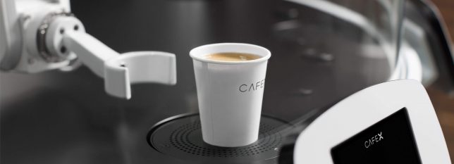
They can’t quite measure up to R2D2, but a new array of consumer robots offer all sorts of practical advantages, including companionship, soothing babies back to sleep, playing with pets, folding laundry and making the perfect latte. All 12 of these robot home companions have passed the concept stage into fully-operational products, and many of them are already up for sale.

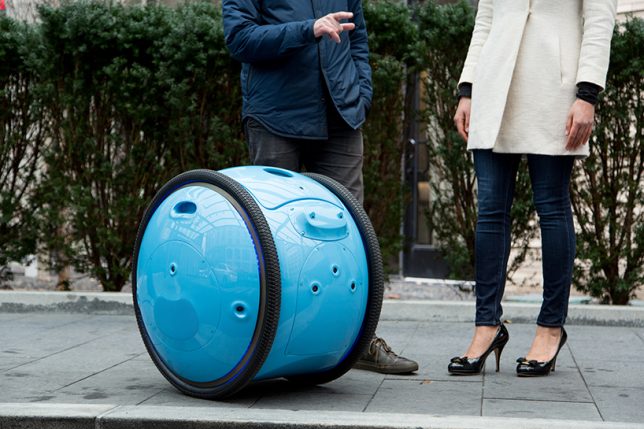
Cargo Carrier: Gita Bot

gita-cargo-robot

gita-cargo-robot-2

gita-3

From the same company who gave us the Vespa scooter comes Gita, a cargo bot that’ll carry your stuff for you, follow you ask you walk, stop when you do, slow down when necessary and even keep up if you start running. You could use it to haul groceries home from the neighborhood market, deliver packages or as a travel aide; a display screen lets you know when the battery is getting low. One thing that’s not clear is how it manages stairs.

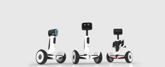
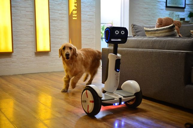
Scooter Bot: Segway Advanced Personal Robot

segway-robot

segway-robot-2

segway-robot-3

Recently renamed ‘Loomo,’ the Segway ‘Advanced Personal Robot’ is a cross between a robot companion and a functional scooter, capable of recognizing individuals and following them until it’s needed. It’s able to stay in balance while carrying loads, and its microphones listen for voice commands. Sensors keep it from bumping into objects and help it map your home and other surroundings so it can navigate itself. It’s currently still in development.

Cute Companion: Kuri Home Robot

kuri-home-robot-1

kuri-home-robot-2

kuri-home-robot-3

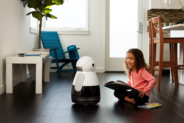
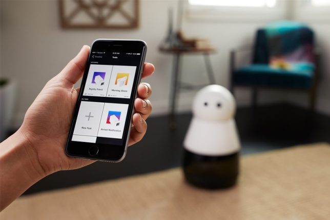
This 20-inch-tall, 14-pound personal companion robot chirps, blinks and ‘smiles’ in response to your attention, and it’s able to recognize specific people, understand context and surroundings, play music, read books, project video, tell you the weather and perform other useful everyday tasks. The Kuri bot responds to verbal commands and can also be controlled and maintained through a smartphone app.

Pet Entertainer: Rolling Bot by LG

lg-rolling-bot

rolling-bot-lg-2

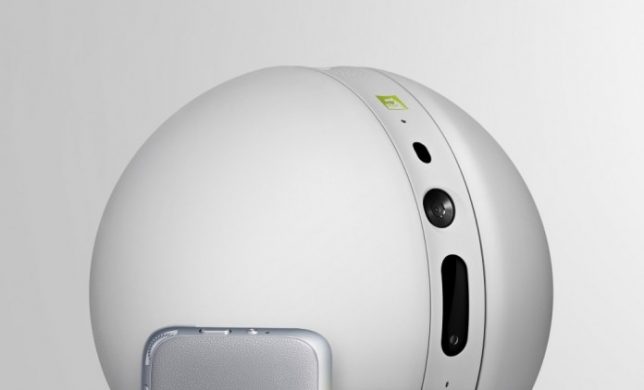
This little bot may not have as much personality as the Kuri, but it’s got some seriously useful functions if you’re the kind of homeowner and/or pet owner who wants to keep a close eye on things while you’re gone. The Rolling Bot by LG is part security system, part pet toy, part smart home gadget with a built-in camera and the capability to roll itself through your home, turning lights on and off, sending you video footage, or entertaining your dogs and cats with dancing and lasers. You can control it through your phone to talk to your pets through it, too.

Next Page – Click Below to Read More:
Robot Home Companion 12 High Tech Assistants Making Life Easier

Share on Facebook


[ By SA Rogers in Gadgets & Geekery & Technology. ]

[ WebUrbanist | Archives | Galleries | Privacy | TOS ]


WebUrbanist

 
Comments Off on Robot Home Companion: 12 High-Tech Assistants Making Life Easier

Posted in Creativity


6 Reasons Why an iPad Makes a Good Photography Companion

08 Sep

I have an iPad Air 2 and I simply love it. It’s my portable digital workhouse. I can pop into most cafés where free wi-fi is the norm. I can enjoy a delicious cup of java, while checking my inbox, or pen a draft for my next article for dPS.

iPad Air 2

iPad Air 2

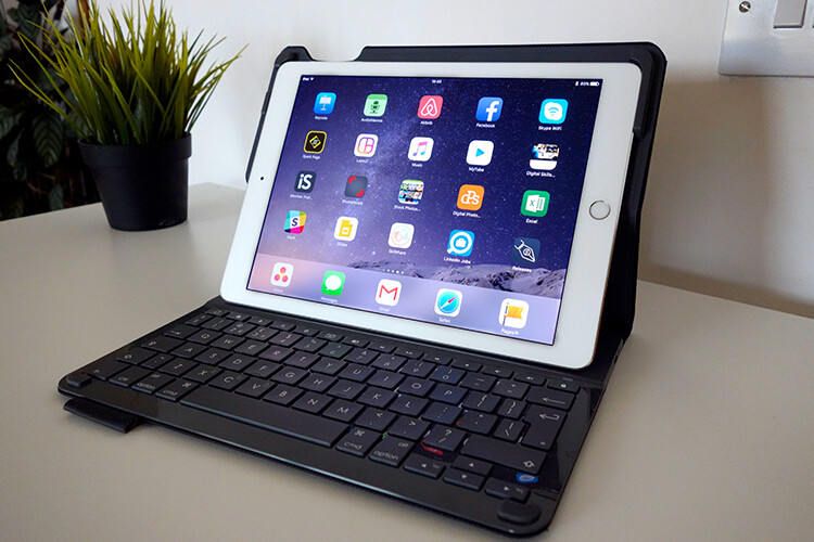
My main reason for purchasing the iPad was that I went back to college recently. I thought about buying a laptop. After a bit of research, I decided an iPad, paired with a keyboard case, essentially turned it into a mini laptop of sorts. Plus it was less expensive and more portable. I’ve completed the course, but the iPad has now become a great companion for my photography.

I was recently in a cafe waiting to meet a client, when an idea started to take shape about the advantages of having an iPad as a photographer. Following on from a previous article I wrote on “Can an iPad be used as a softbox or custom background?“, I realized that I am using my iPad more and more in my photography work than ever before.

ipad-paired-with-keyboard-open

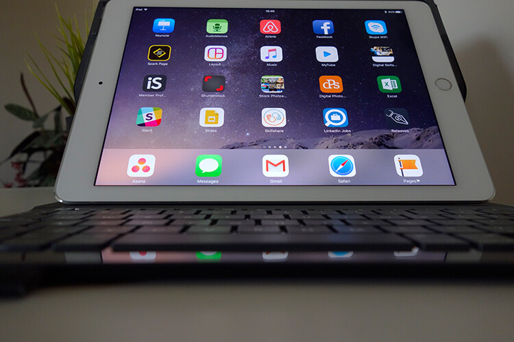
iPad Air 2 paired with a Logitech keyboard

I could go on at length, extolling the many virtues of having an iPad/tablet as a photographer. Instead, I’ll limit my list for now to just six.

Here are my top six reasons an iPad makes a good photography companion

  1. Portability makes it handy to take anywhere
  2. Displaying your work or portfolio makes you look good
  3. Editing and sharing images is easy
  4. Reading and learning
  5. Spoiled for choice with so many Apps
  6. Google Drive

1. Portability of the iPad

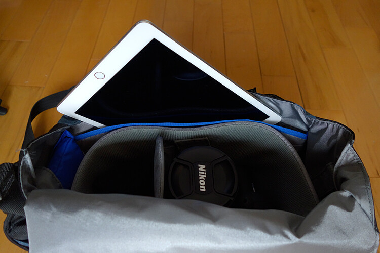
The iPad Air 2 and other tablets are just so light, and even more portable than most laptops. The iPad Air for me is the ultimate Digital Briefcase! The dimensions are 9.4 x 6.6 x 0.24 inches (240 x 169.5 x 6.1 mm). It weighs just 0.96 pounds (436 grams). I feel like James Bond! (sorry Jane Bond)

portability

The iPad fits snugly into my camera bag.

2. To display your work

As a photographer, your work should speak for itself. As a commercial photographer, it’s what gets you your next gig. Now more than ever, there are so many ways to get your work online.

The first option is to have a personal website. But this does mean paying for a domain name and hosting. So what if you don’t want to invest in a website? If you are just starting out in your photography career or you’re a keen hobbyist? Again there are many ways to showcase your portfolio online and in most cases for free. For example there is Behance Display, Flickr, 500px and Morpholio to name just a few.

The retina display on the iPad allows maximum clarity of your photos, and makes it very easy for the viewer to look at the details by easily “zooming in” by pinching the screen. Also, flicking through your images or albums with a swipe of a finger, makes the experience much more tactile and hands-on. Similar to flipping pages of a book.

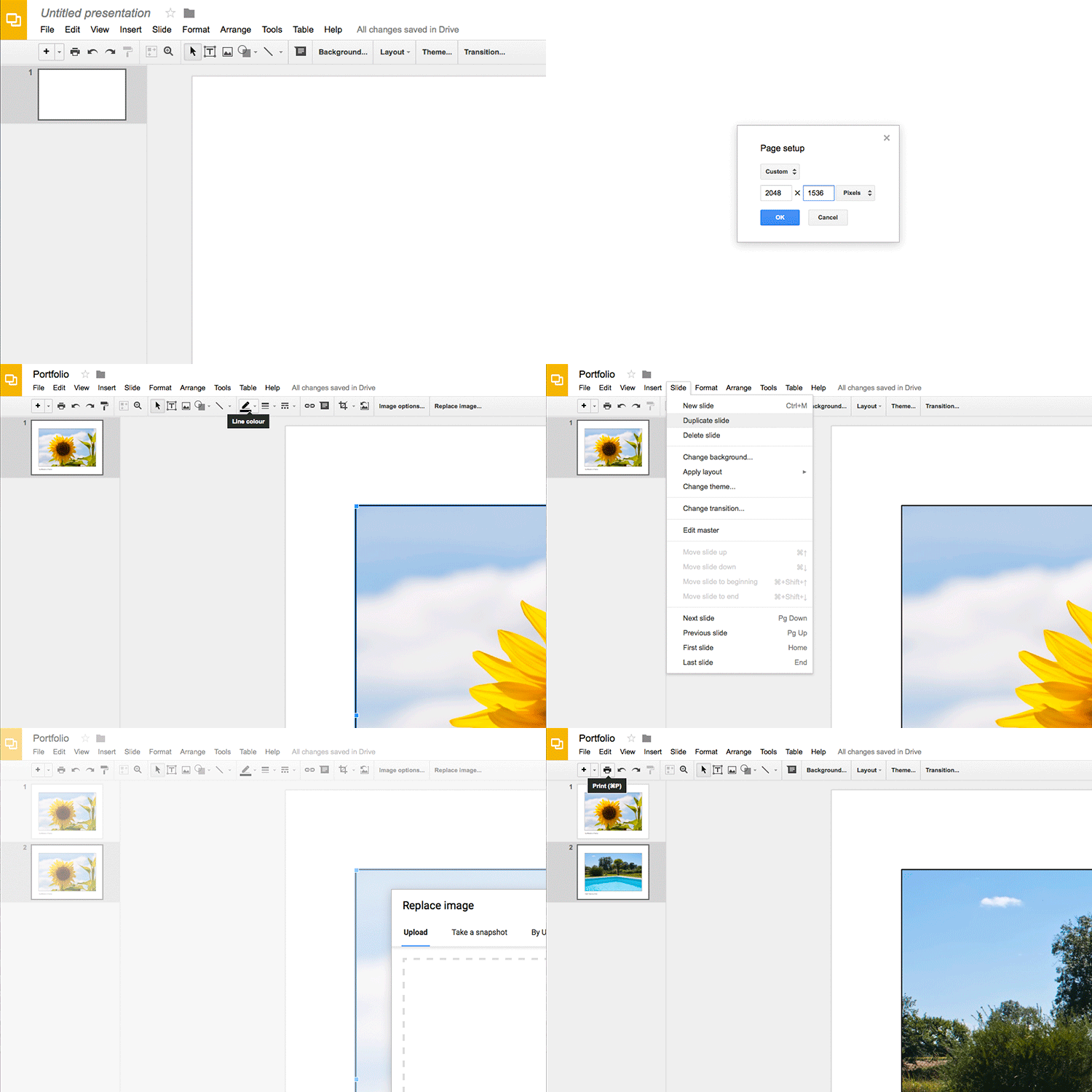
Recently, I met with a client and I needed to bring a digital portfolio with me. I don’t have my full range of work online. I also couldn’t rely on a solid wifi connection. So I put together a portfolio, saved it out as a PDF, and synced it to iBooks on the iPad. A typical page layout program, such as InDesign would be used to put a portfolio together. However, if you just have Photoshop, then here is a great way to create your own portfolio PDF for your iPad from multiple pages.

Creating a PDF portfolio from multiple pages in Photoshop

Open Photoshop and create all your pages the same size, 2048 X 1536 pixels. Place each image and text on a separate page. You can determine how many pages that you want in your portfolio. A general guide is 15-20 pages.

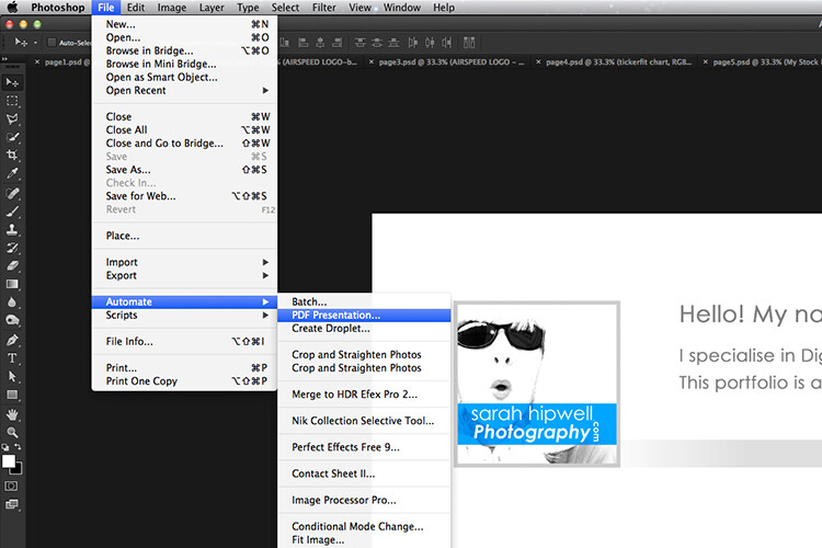
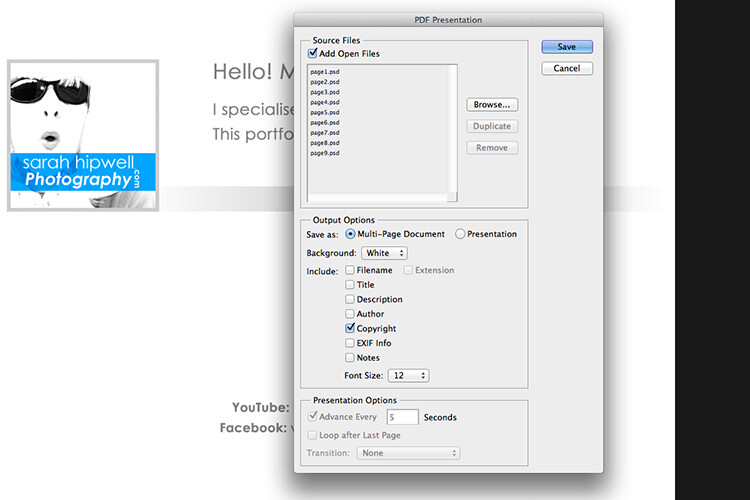
Go up to File>Automate>PDF Presentation. Check this box, “Add Open Files”, and click Save. Name your file and Save it to a location on your computer.

File-Automate-PDF-Presentation

This is handy tip in creating a pdf file from multiple pages or images in Adobe Photoshop.

Make sure to check the Add Open Files box.

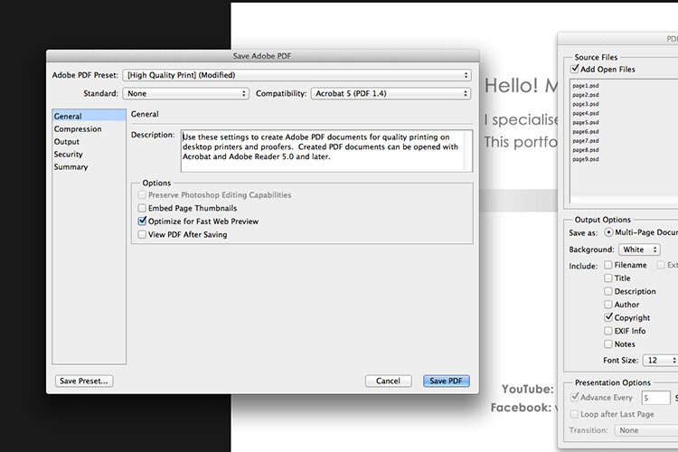
When another dialog box appears, make sure Optimize for Fast Web Preview is checked.

Optimize-for-fast-webpreview

Make sure that the Optimize for Fast Web preview box is ticked.

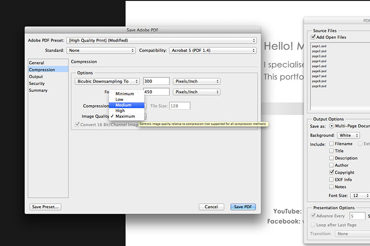
Click on Compression under General (on the left side, see below screenshot). At the top, change the Adobe PDF Preset to High Quality Print, and next to Image Quality, change the setting from Maximum to Medium. Then click on the Save PDF button.

Compression-image-quality-medium

Choose the High Quality Print from the Adobe PDF Preset at the top. Then change Maximum beside Compression to Medium.

Tip: Try and keep the file size below 5mb so as you can email it to potential employers or clients. If you can’t optimize the file size to less than 5mb, then create another portfolio with less pages. PDF files can be viewed on a Mac or PC.

If you don’t have Photoshop, then read on to number six below, and I’ll show you how to create a PDF portfolio using Google Slides.

3. Editing and sharing images is easy

I haven’t done a lot of editing on the iPad. I prefer to do my post-processing at my desktop, where I have the big monitor and stylus. However, I think the iPad Pro could possibly change my mind.

I did try Snapseed. It’s impressive, so intuitive, and free. Other free editing apps are VSCO, Adobe Photoshop Express, and Instagram. What also makes these apps powerful is the ease with which you can share your images online to your social media accounts, or upload them to the cloud.

4. Reading and learning

I’m coming around to reading ebooks and PDFs on my iPad rather than a book. Although, you can’t beat a physical book in your hand. That said, from a practical point of view when travelling, carrying just one book takes up so much room!

I now have my Nikon D750 user manual downloaded on the iPad. This manual alone, although relatively compact in size, still has 507 pages and weighs 310g (11oz).

Tip: If you are using the Safari browser and open a PDF file, you can save it straight to iBooks.

5. Choice of Apps for the iPad

Given the array of apps already in the app store, it’s just not possible to run the gauntlet on them all. Here are a few that popped up on my radar.

  • LightTrac ($ 8.99): LightTrac calculates and plots the angle of Sun and Moon on top of a map, for any location.
  • The Photographer’s Ephemeris ($ 8.99):  TPE  shows you which direction the sun is shining at any given time during the day, no matter what location you choose.
  • Pocket Light Meter (FREE): A light meter that is always in your pocket. It is indispensable for film photography with a manual camera. Measures reflected light, and allows reciprocity calculations.
  • Simple DoF Calculator ($ 1.99): Simple DoF Calculator allows you to calculate the depth of field and hyperfocal distance for any given settings.
  • Take notes to a new level with Evernote (FREE), the productivity app that keeps your projects, ideas, and inspiration handy across all your digital devices.
  • Photography Releases – 500px has a free one. If you shoot Stock photography, a model/property release is a must have.
  • Snapwire also has a free model/property release. I downloaded this app and found it really useful, especially as it stores the photographer’s information. No need to keep filling in this info for every release. Plus it has the templates for all of the major stock sites.

6. Google Drive

What’s not to like about Google Drive? Google Drive is a complete office suite with Google Docs, Sheets, and Slides. Plus you get 15 GB free storage online. In Google Photos, images not exceeding 2048 x 2048 pixels, and videos shorter than 15 minutes ,also do not count towards this limit. It is hard to find fault with this setup when it’s all free!

It is really a Digital Photo Assistant. You can access email, write and publish blog posts, keep track of your schedule and contacts. Share out documents and collaborate with clients online. I also love that you can work with Google docs offline. This has proven as a great time saver if your internet connection is poor, or you simply don’t have access to an internet connection when you need it.

Google Slides is Microsoft’s version of Powerpoint. Here’s an animated gif to illustrate how easy it is to create your PDF portfolio. It’s well worth giving it a go.

animated-gif-slides-portfolio

An animated gif illustrating how easy it is to use Google Slides to create a PDF portfolio for the iPad.

To sum it all up

It was a challenge to keep this list to just six things. I know this could change over the next few months as I continue to use the iPad.

I didn’t mention uploading your photos from your camera directly onto the iPad. You can, but you need the Lightning to SD Card Camera Reader – $ 29.00 or the Lightning to USB Camera Adaptor – $ 29.00.
I only mentioned a mere smidgen of available apps, and most of those were free. This is only a tip of the app-iceberg-store. Some of the paid apps look interesting too.

It’s mind boggling just keeping up with trends. With the recent launch of the iPad Pro. It won’t be long before the iPad has morphed into a real contender, in place of a laptop, for the photographer out in the field.

Do you have an iPad or tablet? What apps do you use? Please share in the comments below.

googletag.cmd.push(function() {
tablet_slots.push( googletag.defineSlot( “/1005424/_dPSv4_tab-all-article-bottom_(300×250)”, [300, 250], “pb-ad-78623” ).addService( googletag.pubads() ) ); } );

googletag.cmd.push(function() {
mobile_slots.push( googletag.defineSlot( “/1005424/_dPSv4_mob-all-article-bottom_(300×250)”, [300, 250], “pb-ad-78158” ).addService( googletag.pubads() ) ); } );

The post 6 Reasons Why an iPad Makes a Good Photography Companion by Sarah Hipwell appeared first on Digital Photography School.


Digital Photography School

 
Comments Off on 6 Reasons Why an iPad Makes a Good Photography Companion

Posted in Photography


Light and Motion launches Sidekick companion light for GoPro on Kickstarter

23 Jan

Light & Motion has introduced a new GoPro companion light called the Sidekick, and is seeking funding for its production on Kickstarter. The Sidekick is designed to attach directly to the GoPro’s existing mount, eliminating the need to carry an external light, though it retains some flexibility via an optional armature for positioning the light. Read more

Articles: Digital Photography Review (dpreview.com)

 
Comments Off on Light and Motion launches Sidekick companion light for GoPro on Kickstarter

Posted in Uncategorized


Rezension: Wacom Cintiq Companion

30 Jun

Mitte Februar war es endlich soweit; bei mir trudelte die neueste Errungenschaft aus dem Hause Wacom zum Testen ein: Das Wacom Cintiq Companion. Ein eigenständiger Tablett-PC mit einem Bildschirm, der gleichzeitig Grafik-Tablett ist. Ich verwandelte mich in diesem Moment zu einem Tech-Nerd und konnte sogar kurz die von tollem Design faszinierten Apple-Jünger verstehen.

Dann aber nahm der pragmatische Teil in mir Überhand und sagte: Ist ja alles schön und gut, aber das Gerät ist ganz schön teuer. Ich werde es drei Monate lang testen, dabei damit Spaß haben und es dann zurückschicken, ohne ein Tränchen zu vergießen, denn einen Laptop und ein Grafik-Tablatt habe ich ja schon, was soll das Gerät hier noch anderes können als diese beiden?

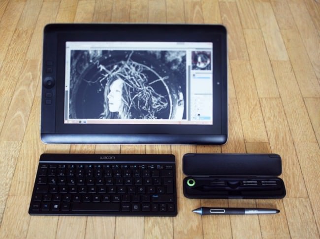
Wacom Cintiq Companion mit Tastatur, Stift und Etui

Eigenschaften

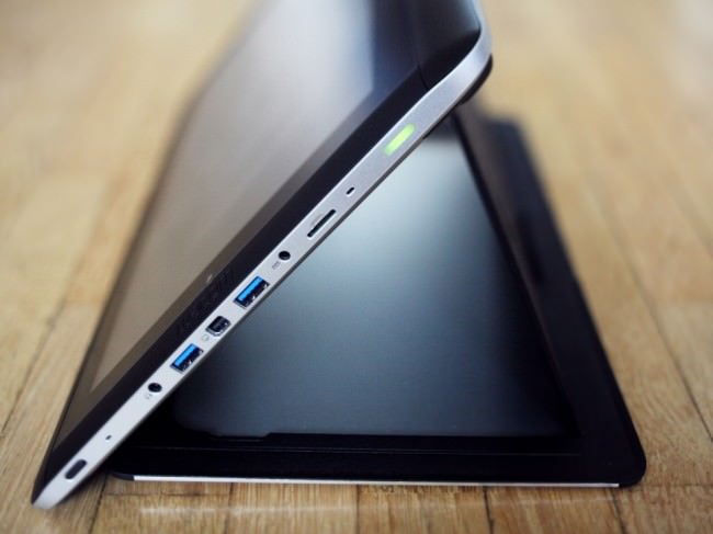
Das Wacom Cintiq Companion ist 37,5 ? 24,8 ? 1,7 cm groß, davon 13,3 ” Bildschirmfläche. Am Rand befinden sich vier belegbare Buttons, der sogenannte „Rocker Ring“ mit vier weiteren Buttons und dem Windows-Start-Button in der Mitte. Es gibt zwei Webcams und neben dem Einschalter und dem Rotation-Lock-Schalter ein paar ausgewählte Anschlüsse sowie einen Kippschalter für die Lautstärke.

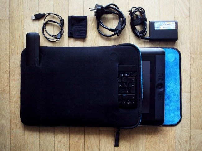
Im Lieferumfang enthalten sind neben dem Netzkabel der Pro Pen mit Etui, neun Wechsel-Spitzen und Farbringen auch eine Tasche, ein Aufsteller mit drei verschiedenen Winkel-Einstellungen und ein Reinigungstuch für die Bildschirmoberfläche. Optional dazu gibt es eine kleine Bluetooth-Tastatur mit USB-Ladekabel, die ich ebenfalls im Test hatte.

Alle weiteren Details der Spezifikationen findet Ihr bei Interesse auf der Produktseite des Wacom Cintiq Companion von Wacom.

Wacom Cintiq Companion seitlich

Wacom Cintiq Companion mit Zubehör

Erfüllte Erwartungen

Die Darstellung ist einfach toll. Der Bildschirm ist knackscharf, hat satte Farben und feinste Abstufungen auch in den Lichtern und Tiefen, genau so wie ich mir das wünsche bzw. von meinem Eizo-Monitor am Desktop-PC gewohnt bin. Ebenfalls wie ich mir das wünsche: Die Farbdarstellung wird nicht seltsam, wenn ich den Betrachtungswinkel zur Oberfläche verändere.

Der Pro Pen liegt mit seiner umlaufenden Gummierung angenehm in der Hand, seine zwei Tasten sind für mich so erreichbar, wie ich es gewohnt bin und wenn man damit über die Bildschirm-Oberfläche fährt, fluppt es einfach. Die Druckstufen, die Positions- und Neigungserkennung des Stifts sind präzise und fein. Manchmal sogar fast zu fein, wenn man die Details seiner (wackligen) Linienführung unbarmherzig abgebildet sieht.

Menschen wie mir sagt es nicht viel, wenn im Datenblatt steht, dass ein Intel® Core™ i7 Prozessor und 8 GB DDR3 RAM verbaut sind. Fakt ist: Windows läuft flüssig. Wenn ich in Photoshop eine ganze Horde Ebenen à 21 MP übereinander gestapelt habe, bleibt das so und die Wartezeit auf Photomerge, das aus einem Dutzend Fotos (auch à 21 MP) ein ganzes baut, reicht nicht zum Kaffeekochen. So soll es sein, um wohl noch ein paar Jahre damit arbeiten zu können, ohne technisch ins Hintertreffen zu geraten.

© Aileen Wessely; Modell: Luna Leung

Wacom gibt die Laufzeit mit fünf Stunden an. Natürlich je nachdem, was man gerade macht, wie viele Programme noch so laufen und ob die Bildschirmhelligkeit voll aufgedreht ist – kennt man ja. In meinem Bildbearbeitungs- und Collage-Endspurt mit Belastungstest für Photoshop durch über 40 Ebenen für das Titelbild (knapp 30 MP) waren es viereinhalb Stunden. Passt.

Auch angenehm: Beim Hochfahren hört man, dass das Companion anspringt und wenn man es herunterfährt, hört man, dass die Lüftung sich abschaltet, aber im Betrieb ist das Gerät so geräuscharm, dass ich es nicht wahrnehme. Der Bildschirm wird auch im längeren Betrieb (das Maximum am Stück bei mir: ca. 20 Stunden) nicht heiß. Klar, wenn draußen 30 °C im Schatten sind, hätte ich lieber eine gekühlte Oberfläche, aber die zumindest erwärmte Oberfläche war gut auszuhalten.

Das gesamte Design des Geräts mit seinem Zubehör ist einfach angenehm. Minimalistisch, ohne beliebig zu sein und komplett in schönem Schwarz mit ein paar silbernen, grauen, metallischen bzw. blauen Highlights. Die Verarbeitung ist erstklassig, mir sind keine Grate, Passungenauigkeiten oder ähnliches aufgefallen. Dadurch wirken auch Plastik-Teile nicht billig, dazu trägt auch die Oberflächenstruktur und teilweise Gummierung bei.

Ein Mädchen in langem schwarzen Kleid mit Holzkrone und Stab steht vor einem großen Baum in einem Wald, über ihr Lichtreflexionen.

Collage aus sechs Ebenen.

Ein Mädchen in langem schwarzem Kleid steht mit einem Stab in einem überdimensionalen Vogelnest.

Brenizer-Erweiterung aus elf Fotos.

Die Begeisterung liegt im Detail

Was mich am stärksten mitgerissen hat: Es macht einen unfassbaren Unterschied, ob ich einen Stift über ein Grafik-Tablett bewege und mit den Augen auf einen angeschlossenen Monitor schaue, auf den die Bewegungen übertragen werden oder ob ich den Stift auf genau dem Bildschirm bewege, auf den auch meine Augen gerichtet sind. Das hätte ich niemals gedacht und hat meine (durch jahrelanges digitales Malen mit Maus und Stift trainierte) Digitalkreativität einen großen Satz nach vorn katapultiert.

Das Companion lässt sich nicht nur mit dem Stift bedienen, sondern auch mit Touch-Klicks und -Gesten steuern. Großartig finde ich, dass sich diese Touch-Funktion mit einem Klick auf einen Knopf am Rand des Geräts einfach an- und abschalten lässt. Ich habe ziemlich schnell einen Workflow mit sich abwechselndem Einsatz von Stift und Touch entwickelt.

Das Gerät erkennt automatisch die aktuelle Neigung und dreht die Anzeige hochkant oder quer in alle vier Richtungen. Mit einem Schalter lässt sich die aktuelle Orientierung einrasten, sodass sie nicht ungewollt umspringt, wenn man sich mit dem Companion in einer seltsamen Haltung befindet. Man kenn das ja von Smartphones: Wie oft hab ich meines schon zurecht-geschüttelt!

Die erste Übung nach dem Einschalten: Detailstudie in Paint.

Die erste Übung nach dem Einschalten: Detailstudie in Paint.

Am Anfang dachte ich, dass ich sicher schnell einen favorisierten Winkel finden würde, in dem ich den Aufsteller für das Tablett benutze. Aber weit gefehlt: Gerade, wenn ich länger dran arbeite, ist es schön, nach einer Weile die Körperhaltung verändern zu können und in zwei Sekunden einen anderen Winkel passend dazu eingestellt zu haben.

Mittels eines einfachen Kalibrierungsdialogs (auf vier Fadenkreuze in den Ecken tippen) sind Stift und Tablett auch blitzschnell auf den aktuellen Betrachtungswinkel eingestellt und es kann weitergehen.

Der Aufsteller lässt sich natürlich entsprechend der Rotation in zwei Richtungen anbringen und auch komplett flach an das Gerät anklipsen, wenn er nicht benötigt wird. So kann er auch nicht so leicht verloren gehen, weil er nicht getrennt herum liegt, sondern immer dran ist. Auch in der Tasche ist er damit natürlich platzsparend im Hauptfach mitverstaut.

© Aileen Wessely© Aileen Wessely

Überrascht hat mich auch die kleine Tastatur. Man braucht allein schon für den Einrichtungsvorgang von Windows auf jeden Fall eine, ich möchte aber nicht ständig mit der Kabel-Tastatur für meinen Desktop-PC hin und her wechseln. Außerdem ist die natürlich vergleichsweise riesig und für unterwegs nicht zu gebrauchen.

Da ich blind tippe, hätte ich eigentlich erwartet, auf dem etwas verkleinerten Wacom-Tastaturlayout zielsicher die Tasten zu verfehlen, aber dem war nicht der Fall. Das Design ist gerade so stark verkleinert, dass es noch passt. Die Tasten sind gerade so flach, dass meine Finger sich noch gut darauf orientieren können.

In den bisherigen vier Monaten der Benutzung habe ich die Tastatur nur zwei Mal aufladen müssen (via USB-Kabel, Betrieb immer kabellos via Bluetooth). Damit hält Wacom das, was sie versprechen: Aufladen nur ca. alle zwei Monate nötig. Und ich hatte schon befürchtet, dass es sich rächt, sie ab und zu eingeschaltet herumliegen zu lassen, wenn ich sie nicht brauche. Quatsch.

Neu waren für mich im Vergleich zu meinem bisherigen Billig-Tablett die Stift-Funktionen Radierer und Neigungserkennung. Letztere bietet einem zum Beispiel für die Pinsel in Photoshop ganz neue Möglichkeiten und der Radierer ist eine echte Zeitersparnis beim Zeichnen oder digitalen Collagieren.

Kleines Experiment: Animation aus einer Handvoll Fotos.

Gewöhnungssachen

Windows 8 nervt. Punkt. Dafür kann Wacom aber nichts und wenn ich zurückdenke, habe ich den Satz „Windows [Versionsnummer einsetzen] nervt.“ über jede Version von Windows gesagt, anfangen bei 95. Und trotzdem habe ich mich an jede Version gewöhnt, obwohl ich beim Suchen nach verschobenen Einstellungen stundenlang geflucht habe. Ich werde darüber hinweg kommen.

Der Pro Pen klappert. Ich weiß nicht genau, welche Teile es sind, ich schätze mal der Radierer-Einsatz und die Stiftspitze, die beide beweglich gelagert sind, um die fein abgestufte Druckerkennung zu gewährleisten. Am Anfang hat mich das irritiert, da ich von meinem Billig-Stift absolute Geräuschlosigkeit gewohnt war, aber jetzt fällt es mir nicht mehr so auf.

Das Tablett ist mit 1,8 kg kein Leichtgewicht. Zugegeben, dieser Punkt könnte für viele ein Killer-Argument sein, die erwarten, dass man sich das Companion fröhlich pfeifend unter den Arm klemmt und beschwingt loszieht. Ich hab’s versucht und war nach schon nach einigen Minuten unglücklich, das Companion immer wieder von einer Seite auf die andere verlagernd.

Wenn diese sonst wunderbare Tasche für das Gerät einen Gurt hätte, wäre das alles kein Problem, dann ließe sich das Paket einfach umhängen und wäre gut transportabel. Ich werde also irgendwann meine Tasche in guter alter DIY-Manier mit einem Gurt ausstatten, um das Problem zu umgehen. Solange transportiere ich das Companion in meinem Rucksack, wo es – wie mein ähnlich schwerer Laptop – bei Weitem nicht so ins Gewicht fällt.

Mit zwei USB-Ports kann man leben, aber zumindest drei wären viel angenehmer gewesen. Ob ich das Companion als einzigen PC oder ergänzend zu anderen Geräten (wie ich) verwende: Ich möchte ein oder zwei Festplatten für Backups anschließen und auch mal einen Scanner oder Kartenleser. Dann sind die zwei Slots schnell voll und man muss anfangen, herumzustecken. Auch eine Mikrofon-Buchse wäre eine super Sache gewesen, um das Companion als Allrounder einzusetzen.

© Aileen Wessely

Abzüge bei der B-Note

Was mir wirklich, wirklich fehlt, ist ein Standfuß für den Stift, in den ich ihn abstellen kann, wenn ich ihn kurz oder länger nicht brauche, weil ich das Gerät per Touch bediene oder einen längeren Text tippe (bei kurzen kann man ihn sich ja gut zwischen die Finger klemmen). Die Bewegung, den Stift aus einer stehenden statt liegenden Position aufzunehmen, ist einfach angenehmer und er läuft so weniger Gefahr, auf meinem Schreibtisch unter irgendetwas begraben zu werden.

Der eigentliche Bildschirm des Companion ist von mehreren Rand-Elementen umgeben, auf dem an einer Seite zum Beispiel auch die Tasten und auf der anderen der Helligkeitssensor untergebracht sind. Zwischen Rand und Bildschirm-Oberfläche ist eine dünne Rille, in der sich garantiert Krümel, Schmutz und sowas ansammeln werden. Ich freue mich nicht darauf, das in ein paar Monaten säubern zu müssen.

Egal, wie herum ich das Wacom einsetze (als Rechtshänder meistens quer mit den Tasten links): Ich schaffe es beim Arbeiten, gerade beim freien Zeichnen, immer wieder, mit einem Arm den Helligkeitssensor zu verdecken. Dann dunkelt sich der Bildschirm ab und es dauert ein paar Sekunden bis zur nächsten Messung.

Klar, wir haben 2014 und es ist eine Zeit, die idealerweise papier- und kabelarm funktioniert. Leider sieht die Realität anders aus, sodass nicht die ganze Welt mit wunderbarem WLAN-Empfang eingedeckt ist. Eine LAN-Buchse gehört immer noch zu den Dingen, die ich an PCs egal welcher Form nicht missen möchte. Beim Companion fehlt sie mir und ich habe viele Stunden den Akku meines Handys und die Internet-Option meines Mobilvertrags strapaziert.

© Aileen Wessely, Modell: Sina© Aileen Wessely, Projekt: T(r)anzparenz

In der Praxis

Was ich mit dem Companion gemacht habe: Internetkram, also auf den Webseiten surfen, auf denen ich mich eben so rumtreibe, dort Fotos und Videos geschaut, gern auch lange Texte gelesen. Artikel für kwerfeldein recherchiert und geschrieben. Office- und E-Mail-Kram. Vor allem aber ganz viel Bildbearbeitung vom Schnappschuss, der nur eine schnelle Farb-Korrektur braucht, über normale Portraits und Dokumentationen bis zu aufwändigen Collagen oder Kompositionen mit der Brenizer-Methode.

Außerdem habe ich mit Freude gezeichnet. Das erste, was ich nach der Einrichtung getan habe, war, mich einige Zeit in die Studie eines Papierknäuls aus meinem Mülleimer zu vertiefen. Mit pixeligen Strichen in Paint, weil noch nichts anderes installiert war. Und weil ich denke, dass man am Einsatz rudimentärster Software hier gut sehen kann, wie großartig die Hardware ist.

Dazu hat mir das Companion den Anstoß gegeben, mit der Arbeit an einem Musikvideo anzufangen, von dem ich schon rede, seit meine Freunde von Computerfreak den Song „Unbekanntes Pferd“ Ende November gecovert haben. Das Video ist eine gezeichnete Schwarzweiß-Animation, die bei 9 Bildern pro Sekunde auf Foto-Material basiert. Da es noch nicht fertig ist, hier als Vorschau die Anfangssequenz:

Ich habe sicherlich nicht alle Funktionen des Companion getestet. Es hat zum Beispiel auch zwei eingebaute Webcams, von denen ich nur eine genau einmal für einen Schnappschuss eingesetzt habe. Ich bin einfach kein Webcam-Benutzer. Ebensowenig nutze ich zwei Bildschirme, sodass ich keinen Monitor als Erweiterung angeschlossen habe. (Bin aber zuversichtlich, dass Windows 8 das ebenso gut hinbekommt wie seine jüngeren Vorgänger.)

Da ich trotz aller Begeisterung doch einige Kritikpunkte am Companion aufgeführt habe, mag man sich zurecht fragen, warum ich es am Ende behalten – also: gekauft – habe. Der Hauptgrund ist vor allem: Die sehr viel reibungslosere digitale Integration des Workflows, den ich von einem Stift auf Papier gewohnt bin, inspiriert mich ungemein.

Ich habe Projekte in Angriff genommen und begonnen, meinen Stil viel stärker in eine Richtung zu erweitern, die in der diffusen Gegend meines Herzens und meiner Vorstellungen liegt, die dem näher kommt, was ich statt – relativ austauschbaren – Portraits von schönen Menschen in schönem Gebüsch eigentlich machen möchte. Bisher erschien mir der Weg dorthin zu steinig, weil die Umsetzung der Vorstellung in meinem Kopf nicht so unmittelbar möglich war.

Eine Frau mit Gestrüpp auf dem Kopf schaut durch ein Steinfenster, um ihren Kopf haben sich sechs Papiervögel versammelt.

„the bird catcher“ | Modell: Miss Souls. Bei über 40 Ebenen brauchen Operationen wie Hineinzoomen in Photoshop eine Sekunde, aber auch dann geht’s noch flüssig weiter.

Inklusive Tastatur und Mehrwertsteuer hat das Companion einen Preis von 1.849,80 €, den man zurecht als stolz bezeichnen kann. Allerdings hat meine Kamera vor einigen Jahren ungefähr das Gleiche gekostet und ich schätze es so ein, dass ich beide Geräte in einem ähnlichen Umfang nutzen werde und sie mir beide unschätzbare kreative Möglichkeiten bieten. Wenn die 5D mir das Geld wert war, ist es das Companion also auch.

Für wen lohnt sich also die Investition in eine Mischung aus Grafik-Tablett und Tablet-PC mit Super-Monitor? Meiner Meinung nach vor allem für diejenigen, die in der Nachbearbeitung ihrer Fotos nicht nur ein bisschen an den Kurven zupfen, sondern die Grenzen der Fotografie überschreiten wollen. Die sich nicht die Frage stellen, ob das, was sie da gerade tun, eigentlich noch Fotografie ist, sondern die einfach ihre Kunst machen und die Hürden der Ideen auf dem Weg vom Hirn zum Pixel minimieren wollen.


kwerfeldein – Fotografie Magazin | Fotocommunity

 
Comments Off on Rezension: Wacom Cintiq Companion

Posted in Equipment