RSS
 

Posts Tagged ‘Understanding’

Understanding Natural Light Part 2: Color of Light

04 Nov

Light has different Properties, and by understanding those differences and using them in your favor, you can become a better image maker.

Gold1

Golden light of late day, mixed with cool light in the shadows.

Chapter Two: Understanding color in natural light

In this chapter, we will:

  • Explore how color can affect the viewer’s emotional response.
  • Understand how the color of natural light changes throughout the day.
  • Learn how to mix light colors to create depth.
  • Practice using exercises.

Please note that as a portrait photographer, I will be discussing portraits and using them as examples. However, this knowledge applies to any type of photography.

Color as a visual storytelling element

What we perceive as color is actually our brain’s interpretation of light reflected off objects and transmitted to the brain via our optic nerves. Under the field of color psychology, a range of studies have shown that colors can deeply affect how we experience the world around us, from the taste of the food we eat, to how we respond to new brand packaging on supermarket shelves. Colors affect how we feel, and this is precisely why understanding color is so important to you as a photographer.

There are many ways you can control or change the colors in your images, such as by editing, with the use of filters, or adjusting the White Balance. But as we are here to discuss natural light, so let us delve deeper into understanding how to create an emotional response by using the right color of natural light.

Mix2

Because color is an amorphous concept (we all see colors slightly differently), there is a standard way to define color tone; this is called color temperature. We will not discuss the technical definition of color temperature for two reasons: first, it will make you very sleepy and second, it will not make your photos better. The important thing to know about color temperature is that it is a standard that is measured in degrees of Kelvin (now you understand what the “K” symbol means in your White Balance menu). Color temperatures below 4000K are considered warm (red and yellow) and color temperatures above 4000K are considered cool (blue).

Plan your shooting time

In the previous article, Understanding Natural Light Part 1: Quality of Light, you learned to forget the concept of good or bad lighting, and think in terms of suitable or less suitable. It is your responsibility to shoot under the most suitable light for the visual story you wish to create, and this concept applies to the color of light as well. Now, let’s get familiar with how the color of the light changes throughout the day.

Blue Light (about 11000K)

Blue light

  • When: Before sunrise and after sunset.
  • Common emotional effect: Glum and mysterious, with a sense of coldness.
  • Take it to the next level: If you are in an urban environment, try mixing the natural blue light with the artificial orange light from street lamps to create an amazing color combination and depth (which will be later explained).
  • Please note: Due to the low level of light during this time of day, pay close attention to your shutter speed to avoid blurry images.

Golden Light (about 3500K)

  • When: It depends on your location on earth, but golden light is usually around sunrise and sunset.
  • Common emotional effect: Praised by photographers as the golden or magic hours, with soft, pastel-like warm colors of red and yellow. Portraits and landscape images will seem almost magical.
  • Take it to the next level: By standing higher than your subject, shooting from an angle of 45 degrees, you can achive a wonderful catch light (a spark of light in the eyes of the subject) due to the reflection of the sky in the subject’s eyes. (see image below)
  • Please note: As with any type of magic, you need to be swift and efficient. Plan your daily schedule carefully. For example, if you want to shoot during the golden light of sunrise, you must get up early. Very early.

Gold2

Midday Light (between 5000-6500K)

  • When: It depends on your location on earth, but usually from one hour after sunrise until one hour before sunset.
  • Common emotional effect: This light seems neutral in color to the eye, even though it’s considered a cold color in terms of Kelvin degrees. The contrasts caused by midday light will amplify objects’ colors. So, vibrant objects will seem even more vibrant and vice versa.
  • Please note: You can enjoy the amplifying benefits of midday light without the harshness if you place your subject indoors near a window.

Mid day

Cloudy Day (about 7000K)

  • When: When the sky is heavily overcast.
  • Common emotional effect: Similar to that of blue light with a glum, winter-like feeling, but stronger and brighter, allowing you to work with faster shutter speeds.
  • Please note: The biggest benefit of working on a cloudy day is the continuity of color tone throughout the day. This means there’s less pressure on you to work as fast as possible, as you would need to do at other times of the day, like the golden hours.

Clouds1

Mixing colors

You can achieve very satisfying results by mixing cold with warm color tones. For example, by placing warmer colors in the foreground and colder colors in the background, you can add volume and depth to make an interesting image.

You can do this by either working during the border of two periods of the day, or by mixing natural and artificial light.

Working during the border of two time frames

For example, if you choose to shoot at dusk, which I heard National Geographic photographer William Albert Allard refer to as the “The time between dogs and wolves”, you can combine the warm colors of the golden light, with the cold colors of the blue light. Here is an examples:

Mix1

Mixing natural and artificial light

If you choose to mix light sources, the sky’s the limit. In this image: on one side (camera left), this lady was illuminated with the warm orange light of the shop’s light bulbs and on the other, with the blue cold light of a cloudy day (camera right).

Mix3

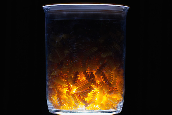
Or in this image where I mixed the warm natural light of fire with the blue artificial light from the projector in the background.

Mix4

Exercise #1: Study other photographer’s work

Search the web and gather 20 images from your favorite photographer. Analyze his or her color choices:

  • Are there themes or common colors choices?
  • What is the light source: natural or artificial?
  • Are there specific time frames when this photographer works (golden hour, midday, etc.)?

Exercise #2: Shoot with the wrong White Balance

To make it short, White Balance is how you help your digital camera create a more accurate representation of the colors in your image. By telling your camera the lighting conditions (cloudy, sunny, flash, etc.) you help the camera adjust to neutralize the color balance in the image.

For this exercise, I will ask you to go to the White Balance menu in your camera and shoot with the wrong setting. For example, if it’s a sunny day, choose the Cloudy setting, which will make your photo look much warmer. Or shoot in the Tungsten or Incandescent setting to make it really cool.

F11A9441

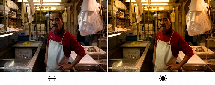
I took this image in Tokyo’s Fish Market, under the white light of Fluorescent. On the left image, I went for the Fluorescent white balance preset, which is indeed more faithful to the original lighting situation in the market. But, on the right image, I selected the “wrong” white balance ( daylight preset), which made the image much warmer, in color and feel. Which one is better in your opinion?

If you are shooting in the RAW image format as opposed to JPEG, the White Balance setting is not that relevant, as you can easily change it in post-processing. This is one of the characteristics of RAW files. But this exercise allows you to understand how, by intentionally changing the image’s color tone, you can create different and interesting emotional effects using color.

The author would like to thank Nicholas Orloff for his assistance in writing this article.

googletag.cmd.push(function() {
tablet_slots.push( googletag.defineSlot( “/1005424/_dPSv4_tab-all-article-bottom_(300×250)”, [300, 250], “pb-ad-78623” ).addService( googletag.pubads() ) ); } );

googletag.cmd.push(function() {
mobile_slots.push( googletag.defineSlot( “/1005424/_dPSv4_mob-all-article-bottom_(300×250)”, [300, 250], “pb-ad-78158” ).addService( googletag.pubads() ) ); } );

The post Understanding Natural Light Part 2: Color of Light by Oded Wagenstein appeared first on Digital Photography School.


Digital Photography School

 
Comments Off on Understanding Natural Light Part 2: Color of Light

Posted in Photography


Understanding Natural Light Part 1: Quality of Light

14 Oct

Light has different qualities, and by understanding those differences and using them in your favor, you can become a better image maker. From my point of view, the best place to start improving your ability to work with light is by learning its most basic form, which is natural light.

quality of light - soft light portrait

Therefore, this article is the first of a series that will focus on understanding how to work with natural light. We will:

  • Explore the difference between harsh (hard) and soft lighting and each of their pros and cons.
  • Understand how to use color to serve the visual story we want to portray.
  • Learn how the direction and intensity of light affects the final image.

Even if you are a studio photographer, who wishes to work exclusively with strobes and flash, this article is crucial for you. If you manage to understand how to work with natural light, this knowledge can be later applied to any genre or style of photography. As a portrait photographer, in my explanation and examples, I will focus on working with natural light in portraits. However, as mentioned, once you understand the concept, this can be applied to any genre or subject.

George Eastman, the American entrepreneur that founded Kodak (and who probably knew a thing or two about photography), said, “Embrace light. Admire it. Love it. However, above all, know light. Know it for all you are worth, and you will know the key to photography.”

What do you think that Mr. Eastman meant by “know light. Know it for all you are worth.”? From my point of view, he meant that as photographers, light is our raw material. It is like letters to the writer and notes to the musician, and as photographers, we must understand how this raw material works and behaves under different conditions.

quality of light - soft light

Quality of light – Understanding hard and soft light

In this first chapter we will:

  • Understand the differences between soft and hard (or harsh) light.
  • Explore the concept of “Good Light” versus “Bad Light.”
  • Learn about common challenges faced when working with natural light, and how to overcome them.
  • Suggest exercises that you can use to practice the explained concepts and techniques.

Soft lighting

Soft light is characterized by low levels of light, lack of shadows, a small and gentle difference between dark and bright areas.

soft lighting

Soft lighting situation is characterized by the lack of shadows and (as you can see in this image), cold hues during cloudy weather, which fit the greens and blues in this situation.

When does it happen? Depends on the weather and your location on the globe (it won’t happen at the North Pole, during winter), but you will usually encounter a soft lighting situation, at the edges of the day (also referred to the Golden Hours), just after sunrise and just before sunset (how much time before and after, is again dependent on your location). Besides the edges of the day, you can find soft lighting conditions under a cloudy or overcast sky.

Challenges: Soft light is not suitable for every portrait, it all depends on what you wish to evoke (in terms of emotion and mood) in your image, as I will describe later. Another issue is the level of light, which may be too low. So, it is very important that you pay attention to your shutter speed and increase it manually, to avoid blurriness.

Hard/harsh lighting

Hard light is characterized by strong levels of light, long and deep shadows, a big difference between dark and bright areas (high dynamic range). Because of contrast, harsh light will strengthen the current situation in the field, in terms of color. Saturated and rich colors will seem even more intense, and dull colors will seem even more so.

hard or harsh lighting

In harsh light, there is a huge contrast between the dark and bright areas in the image and details might get too bright or too dark – but this is perfectly fine!

When do you have hard light? It also depends on the weather and location, but usually, you can encounter harsh lighting situations during the day, about two hours after sunrise, until one hour before sunset (middle of the day).

Challenges: the main problem with the harsh lighting is the huge difference between the dark and bright areas (also known as contrast). Contrary to our sophisticated eyes, the camera is (still) not able to cope with this difference. So, the result will be the loss of details in your image, as they become too bright or too dark. For example, you might get a great exposure on your subject while losing detail in the background or vice versa.

Some photographers mistakenly think that this condition (the loss of details) is due to an error they made in operating their camera. So, the first step to the solution is to understand the problem. If you are shooting under harsh light, that lost of details is something that you cannot change (unless you use flash or post-process the image), because it is due to the contrast between the dark and the bright areas. So, changing the aperture, shutter or ISO, won’t help correct it.

“The artist vocation is to send light into the human heart.” – Robert Schumann

Forget about “good” lighting

Due to the challenges I have mentioned, most photographers avoid shooting under harsh lighting condition. They prefer to work under soft lighting, which is usually referred to as more pleasing to the eyes. However, it is not always the right choice for your portrait.

hard lighting

That day in the streets of Havana was extremely hot. So, I used the harsh light to evoke that sense.

The thing to remember is that you want to match the light to the visual story you want the portrait to tell. As we just learned, each lighting condition has its own qualities and characteristics. While the soft light from a setting sun might be best for a romantic couple’s photoshoot, it may be less suitable for a portrait of a hardworking man outdoors. Let’s stop using the concepts of good and bad lighting, and start thinking in terms of more suitable, or less suitable lighting.

Planning

To work under the most suitable lighting conditions, you should plan for it instead of just wishing for it. Check the weather forecast, as well as the sunrise and sunset times. For example, if you need soft lighting for your project, you should know exactly where to be, and what to do around sunrise and sunset every day. Do not waste even a minute on sleeping when there is suitable light out there.

1. Matching the time of day to desired mood – You should choose the most suitable time to go out and work, according to your desired results.

2. Matching the visual story to the given lighting conditions – I often choose the visual story, according to the available light given to me on location.

soft light

Flexibility

Sometimes even with careful planning, the weather changes and therefore, so does the natural lighting condition. That’s what happened to me when I was working on an assignment in southern Thailand. In a place known for pristine beaches and postcard-like islands, the mighty monsoon decided to make an appearance and show everyone who’s boss. At first I was afraid that I wouldn’t be able to provide the images that I had in mind to my editor.

However, I know one thing for sure: you cannot fight the light. So I changed my plans and headed to the small village of the Chao Leh (Sea Gypsies) community. This visit (which ultimately became a seven-year project), allowed me to discover a different, much less touristy side, of that area. I discovered a story about a struggling community of sea drifters, that never fully recovered from the tsunami of 2004.

soft light be flexible

The Chao Leh (Sea Gypsies) community in southern Thailand. The stormy weather, with its soft, low, blue-colored light gave the images a sense of “cold winter,” which was a perfect match to the feeling I wanted to evoke in that story.

A few days later, the clouds gave way to the sun and I was back to my original shooting list. When I sent the images back to my editor, she was thrilled with the new direction and decided to run a full story about this community.

“What makes photography a strange invention is that its primary raw materials are light and time.” – John Berger

In conclusion, do not limit yourself to working exclusively under soft light, as both harsh and soft light summon great challenges and opportunities. As a visual storyteller, aim to always try and match the story you are trying to tell, to the light you are using, to bring that visual story to your viewers. The key element is planning, with a bit of flexibility, and some room for serendipity.

Practice working with quality of light

Exercise #1 – using over exposure compensation while working with a harsh light condition.
  • Time: A sunny afternoon.
  • Location: Any outdoor location – from your backyard to the local park.
  • Step one: Place your favorite model (it can be a friend, a family member, your partner, or a beloved dog) under the midday sun.
  • Step two: Take a moment to understand how the light illuminates your subject’s face. Do you notice the high contrast between dark and bright areas (lit forehead versus dark eyes)?
  • Step three: Work in Aperture Priority mode (A in Nikon and AV in Canon), and use exposure compensation (overexpose), until you manage to bring more light to your subject’s eyes. Don’t panic, as you will probably burn out (lose details) the background, and parts of the subject’s face. It is okay. This exercise is about being able to stop reviewing your images through the histogram tool and highlight alerts, and start thinking in terms of story, and if that story is working or not.
hard light portrait

Harsh light helped me to create a sense of “roughness” in this portrait, which I felt that support the visual story I wanted to tell.

Exercise #2 – switch to black and white while working under soft light conditions.
  • Time: A cloudy day or the edges of the day.
  • Location: Any outdoor location – from your backyard to the local park.
  • Step one: Approach a stranger and ask his or her permission for a portrait. Perhaps you can send the final image by email as a token of appreciation.
  • Step two: Switch to Monochrome mode, which is black and white photography (under Picture Style in Canon and Picture Control in Nikon).
  • Step three: Take a close-up portrait (torso and face only). Note how the light gradually illuminates the subject’s face, creating soft pockets of shadows that evoke a sense of depth.

black and white in soft light

The author would like to thank Nicholas Orloff for his assistance in writing this article.

googletag.cmd.push(function() {
tablet_slots.push( googletag.defineSlot( “/1005424/_dPSv4_tab-all-article-bottom_(300×250)”, [300, 250], “pb-ad-78623” ).addService( googletag.pubads() ) ); } );

googletag.cmd.push(function() {
mobile_slots.push( googletag.defineSlot( “/1005424/_dPSv4_mob-all-article-bottom_(300×250)”, [300, 250], “pb-ad-78158” ).addService( googletag.pubads() ) ); } );

The post Understanding Natural Light Part 1: Quality of Light by Oded Wagenstein appeared first on Digital Photography School.


Digital Photography School

 
Comments Off on Understanding Natural Light Part 1: Quality of Light

Posted in Photography


Understanding Black and White Filters in Lightroom

13 Aug

Shooting in black and white can be an amazingly creative way to explore new areas of photography, and help you see not only your pictures, but the world around you in a whole new light. However, unless you are shooting with black and white film or with a dedicated black and white camera like the Leica M Monochrom, all your pictures will initially be shot in color and later transformed into black and white through software tricks or filters.

Lightroom has an impressive array of presets that allow you to apply black and white effects to your color pictures, but in order to select the right filter for your particular pictures it’s important to understand how these presets work behind the scenes, and what they are really doing to your photos.

black-and-white-filters-hispanic-student-association

Back in the days of film photography, black and white film was composed of a single layer of silver crystals that were sensitive to light and affected the film in different ways depending on the wavelength, or color, of the incoming light. Green light (like reflected off of plants and trees) had a different effect on the film than red light (reflected off apples) or blue light (reflected off the sky).

When color film was invented it contained not one, but three layers of silver halide crystals, each of which produced different colors when exposed to light–similar to how the photosensitive pixels work on modern digital cameras. The problem with this method was that sometimes a photographer would need his or her film to be extra sensitive to different wavelengths of light, depending on the particular scene being photographed. One popular solution was to use colored filters that screwed onto the front of the camera lens, which still left the resulting image monochrome but changed its properties in significant ways.

A collection of color filters that can be quite useful in black and white photography.

A collection of color filters from Amazon that can be quite useful in black and white photography.

These filters operate by absorbing light on different parts of the spectrum while letting other colors pass through much more easily: green filters absorb more of most colors except green, blue blocks most colors except blue, and so on. This means that portions of the spectrum similar to the color of the filter will be lighter since more of that color of light makes it through the filter and essentially over-exposing those portions of the film. Conversely, portions on the opposite side of the color wheel from a given filter color will be darker since less of that light is allowed to pass through. For example, this diagram illustrates the basic principle behind a red color filter:

black-and-white-color-filters-diagram

The fact that more red is allowed to enter through the camera lens means the camera’s light meter would then adjust itself accordingly: you’re essentially exposing for the reds, which means that a properly exposed black and white image with a red filter would have pleasing reds with very dark cyans, blues, and greens.

black-and-white-color-filters-diagram-stars

By taking this basic idea and applying it to modern digital photography you can start to see how different black and white post-processing solutions work. In Lightroom you can mimic the effects of a color filter when converting an image to black and white. It’s not quite the same as actually using a physical filter on your lens and shooting using black and white film, but it’s a decent approximation that gets the job done for most circumstances. The trick is knowing which filter to use in a given situation.

This shot of kids’ feet would be nice in black and white, but in order to choose the right style it’s important to know how each type of color filter will affect the results. A green filter will make the leaves lighter while darkening the skin colors, since they are somewhat opposite on the color wheel. A blue filter will lighten the bluish hue of the rocks and the darker areas in the leaves but darken the skin colors, though perhaps a bit too much.

black-and-white-filters-feet-original

Here’s what the same image looks like with five different Lightroom black and white filter presets applied:

black-and-white-filters-all

In the end I chose a yellow filter to create the final image because it exposes the legs and feet a bit more while underexposing the blue and purple hues in the rocks:

black-and-white-filters-feet-yellow-filter

Of course Lightroom is not actually putting a color filter over your picture, but using digital tricks to approximate the same effect. It does this by altering the values of various parameters in the Develop module when a given preset is applied. After selecting a Black and White Filter preset you can see how various color values change by choosing the B&W panel in the Develop module. Note how the sliders change for various selected Presets, such as the Yellow and Blue in the example below.

black-and-white-lightroom-presets

Lightroom is not applying different colors to a black and white image, but deciding how much of each color value to over or under-saturate in order to mimic the effect of putting the same type of physical filter on your camera. While it’s not quite the same as shooting in pure black and white, one of the nice advantages is how Lightroom allows you to essentially create custom black and white filters by adjusting the slider values yourself. You can tweak any of the existing Presets, not just the Black and White ones, by increasing or decreasing various sliders, and even save your adjustments as new Presets that you can apply instantly to any image.

As one more extreme example, here’s an image of some bocce balls with different filters applied.

black-and-white-lightroom-balls-original

The original color image, properly exposed.

Applying a red filter preset in Lightroom produces an image where the reds are properly exposed and a bit lighter, but the blue shirts are dramatically darker since red and blue are rather opposite on the color spectrum.

black-and-white-lightroom-balls-red-filter

The same image with a Red black and white filter preset applied.

Now look what happens when a blue filter preset is applied. Just like a real physical filter on the front of the camera lens, the blues are lighter while all opposing colors are incredibly dark because very little of that light was allowed to pass through–or at least that’s the effect that Lightroom attempts to mimic.

black-and-white-lightroom-balls-blue-filter

A Blue filter preset now changes the image dramatically.

So how do you get a properly exposed image, with a well balanced amount of black and white across the frame? In real life you would use a green filter since this would block roughly equal amounts of both reds and blues, and the effect works quite well in Lightroom as well.

black-and-white-lightroom-balls-green-filter

Using a green filter preset results in a well balanced image.

As you can see, getting a proper black and white conversion in Lightroom is not always as simple as just clicking a button. It helps to know not only what options are available, but why they function the way they do.

What about you? What are your favorite black and white tips and tricks in Lightroom? There is much more I have not covered in this article, and if you have anything you’d like to share leave your thoughts in the comments below.

Editor’s Note: This is the second article in a week full of features on black and white photography. Look for 5 Simple Ways to Create Expressive Photos in Black and White earlier today and more daily over the next week.

googletag.cmd.push(function() {
tablet_slots.push( googletag.defineSlot( “/1005424/_dPSv4_tab-all-article-bottom_(300×250)”, [300, 250], “pb-ad-78623” ).addService( googletag.pubads() ) ); } );

googletag.cmd.push(function() {
mobile_slots.push( googletag.defineSlot( “/1005424/_dPSv4_mob-all-article-bottom_(300×250)”, [300, 250], “pb-ad-78158” ).addService( googletag.pubads() ) ); } );

The post Understanding Black and White Filters in Lightroom by Simon Ringsmuth appeared first on Digital Photography School.


Digital Photography School

 
Comments Off on Understanding Black and White Filters in Lightroom

Posted in Photography


Your Guide to Understanding Program Mode on Your Camera

03 Jun

Almost every DSLR or Mirrorless camera has a mode dial with a variety of letters and icons on it, some of which might seem cryptic or confusing. Usually you’ll find a green icon for Full Auto mode (usually a green A or rectangle), Full Manual mode (M), as well as Aperture Priority (A or Av) and Shutter Priority (S or Tv). Your camera might also feature scene modes such as portrait, night, or macro, and even some user-configurable modes indicated with a U1 or U2 (or C1/C2, etc.).

Somewhere on that dial is a letter that’s often left neglected, and unused by many people, even though it can be quite powerful – Program Auto (P). In my experience most people don’t use it because they don’t understand it. Is it Auto? Is it Manual? What can it do that the other modes can’t? The answer is a bit strange at first, but once you wrap your head around what the humble little P mode can do, you might find yourself using it much more than you thought.

DSC_2475

The camera mode dial operates on somewhat of a continuum. On one end you have Full Manual mode, which gives you complete control over the three elements of exposure: shutter speed, lens aperture, and ISO sensitivity. On the other end you have Full Auto mode which gives you almost no control over exposure except whether the flash turns on or not (and on some cameras, not even that much). On most cameras Full Auto will not even let you choose basic parameters like white balance and focus mode, which is fine if you just want to shoot some pictures and not worry about all the technical aspects of photography.

The other modes exist in the middle of the spectrum and give you some degree of control, while your camera handles the rest. For instance, in Aperture Priority you control the aperture and ISO, and let your camera figure out what shutter speed to use for a good overall exposure. In Shutter Priority things are reversed; you control the shutter speed and ISO, while your camera figures out what aperture to use.

program-auto-diagram

Program mode exists on the same continuum somewhere between Aperture/Shutter Priority and Full Automatic. When you initially put your camera in P mode you might notice that things look similar to Full Auto; your camera sets the aperture and shutter speed in order to get a proper exposure. One benefit you might not immediately realize is that you can set the ISO which will then remain unchanged by the camera. This is quite useful in situations where you want to intentionally use a lower ISO, such as outdoors or in bright light, or a high ISO when things are a bit darker and you prefer to not activate the flash. If nothing else, think of the Program Auto mode as an ISO Priority mode; you set the ISO and your camera figures out the shutter speed and the aperture. If that’s all you want to do, you’re set. Change the ISO (or not) and worry only about composing and framing your shots, then let your camera figure out the rest.

DSC_2624

Program Auto gave me a well-exposed picture but the result was not what I was hoping for. I wanted a smoother look for the fountain…

fountain-motion-blur

…so I quickly adjusted my shutter speed to 1/20 using the dial on my camera. Program mode kept a nice exposure while giving me the motion blur I was looking for.

If you’re willing to dig a little deeper you will find many more useful features to unlock in Program mode – far more than just giving you the ability to control the ISO. It’s kind of like the familiar Auto mode on steroids. There are many options available to you in Program that you won’t get in Full Auto, and many of these can help you get the shot you want, instead of the shot your camera thinks you want. However, as you start changing settings your camera will do its best to maintain a proper exposure. In this way Program is like the late-night infomercial version of Auto; it handles all the nitty-gritty complicated stuff for you…but wait, there’s more!

For example: if you are using Program mode while taking pictures at an indoor birthday party you can set a high ISO so you don’t need to use the flash, and your camera will choose a combination of aperture and shutter speed to get a properly-exposed photo. You can then rotate the command dial (on some cameras it might be pressing a button) to change these values if you decide you want a wider aperture or slower shutter. Essentially your camera says “Here’s what I think will be good,” and then you take over and say “Thanks bro, I’ll take it from here” as you shift the values of your shutter and aperture using the dial on your camera.

I shot this using Program Auto mode which was a great way to tweak my exposure settings on the fly with very little time to waste.

I shot this using Program Auto mode which was a great way to tweak my exposure settings on the fly with very little time to waste.

Or you might be outdoors doing some nature photography but aren’t quite sure what settings to use. So, you put your camera in Program and set the ISO to 100 in order to get as little noise as possible. Soon you might notice that your camera has selected a small aperture, and you’d like to get a bit of background blur so you quickly rotate the dial on your camera until your aperture is much wider. Your camera then automatically adjusts the shutter speed accordingly, in order to maintain a good exposure.

You can also set parameters within Program like white balance, metering mode (full/center/spot), select which focus point to use, and even tell your camera to use the flash or not. Contrast this to the Full Auto mode and you start to see the usefulness of the humble little P marker on your camera’s mode dial. At this point you might be wondering why you would want to use Program Auto instead of Aperture or Shutter Priority because those will also allow you to set the ISO, aperture, and shutter speed. Program Auto sort of functions like the best of all worlds: you can change various options if you want to, or you can just leave everything alone and let your camera figure it all out.

DSC_2641

Shooting in Program mode gave me a good overall exposure but I was not happy with the results…

microphone-spot-meter

…so I switched to spot metering, re-took the shot, and got what I wanted. Program allows for this flexibility, whereas Full Auto does not.

I must admit that even though Program mode can be quite useful I spend most of my time in Shutter or Aperture Priority along with Manual. For me Program is great to have in a pinch, but I generally prefer to make more of the decisions when shooting, instead of having my camera do the heavy lifting.

Still, it’s good to be aware of what it is, and what it can do, in case you find yourself in a situation where you don’t want to give up all control to your camera but also don’t want to do everything yourself. What’s your preferred method of shooting, and what do you like (or dislike) about using the Program Auto mode? Leave your thoughts in the comment section below.

googletag.cmd.push(function() {
tablet_slots.push( googletag.defineSlot( “/1005424/_dPSv4_tab-all-article-bottom_(300×250)”, [300, 250], “pb-ad-78623” ).addService( googletag.pubads() ) ); } );

googletag.cmd.push(function() {
mobile_slots.push( googletag.defineSlot( “/1005424/_dPSv4_mob-all-article-bottom_(300×250)”, [300, 250], “pb-ad-78158” ).addService( googletag.pubads() ) ); } );

The post Your Guide to Understanding Program Mode on Your Camera by Simon Ringsmuth appeared first on Digital Photography School.


Digital Photography School

 
Comments Off on Your Guide to Understanding Program Mode on Your Camera

Posted in Photography


The Future of Photography Websites – Understanding and Adapting to Trends Continued

31 May

In an earlier article (The Future of Photography Websites – Understanding and Adapting to Trends) on this topic, you can read about a couple of major trends in the web-design industry (as they relate to photo websites). Here’s a quick review:

  • The huge number of new websites being built and ways to rise above the noise including: Choosing a photography niche (specializing); Differentiating yourself as a photographer; Using quality platforms and website templates; Simplifying and prioritizing elements on your site; Understanding and focusing on your target audience.
  • New website performance standards and their effect on browsing habits: Why and how to make your website faster; Editing down your content and creating a smooth browsing experience; Having clear website navigation.

Now we’re going to continue exploring many other important aspects you should take into consideration when building your photography website (whether it’s an online portfolio, a stock website, or centred around a photo blog). All combined, these notes should give you a more clear picture of how to build your photography website and steer towards a more successful photo business.

3. Mobile devices are omnipresent and powerful

This is fairly obvious to see in the world around us, but what implications does it have on photography websites?

a. The old adage: stop using flash on your site

No need for me to dwell on this, but it’s hard to write an article on photography websites without mentioning Flash, and with good reason. I hope you’re in the position to skip this paragraph, but if you’re still using Flash, continue reading and consider making some changes soon.

Besides the well-known SEO limitations, Flash websites are slower, not compatible with Apple devices, harder to update, and can be almost entirely replaced today using modern HTML5, CSS3 and Javascript components (and surely surpassed in many aspects).

b. Make your website mobile-friendly (responsive)

Many photographers are reporting that almost half of their website traffic comes from mobile users (smartphones and tablets), and we can expect this number to rise further.

So you can no longer afford not to have a mobile-friendly website. Google confirmed this by announcing they will now penalize non mobile-friendly sites. While this is just one of the many factors Google uses to rank websites, it’s a strong signal to take note of this issue.

This is especially important for photography websites where users interact with the site more (using slideshows, doing searches, buying images etc.) Slideshows and static images (along with the entire layout, of course) should automatically resize and adapt to any screen size.

Example 7a responsive

To emphasize the importance of a mobile-friendly browsing experience, Google provides a free testing tool for your site and rewards responsive websites in mobile search results:

Example 7b mobile friendly badge

c. Once again, make your website fast

You can read about website performance in the first article, however, it’s worth mentioning here again. The load times of a website are even more important to mobile users (with mobile networks being somewhat slower and less reliable than home broadband connections).

4. Content-consumption rates are increasing (a lot)

Not only are more users coming online (and using more devices than ever before), but they’re also consuming a lot more content. This should come as no surprise, and it’s worth considering for its web-design implications. Since users want more content, here are some ways to help them out:

a. Make your site easily shareable

That means leveraging social media buttons on your website (even when you don’t have your own profiles on those specific social media sites), making it easy for people to recommend your images and pages.

Example 8 social shares

Don’t neglect tweaking your site to display pretty permalinks: a page URL like this www.johndoe.com/?p=789 is much uglier than something like www.johndoe.com/gallery/great-description-here/. Besides the SEO implications, pretty permalinks are also important for people sharing your content: if a URL is more inviting, it will naturally get more shares and visits.

b. Keep the content fresh

Example 9 yannickdixon blog

While everybody knows that blogs should frequently be updated, you need to refresh the rest of your website once in a while too.

  • Make sure your contact information is up to date.
  • Have some featured galleries on the homepage? Change or rotate them from time to time.
  • Have a slideshow? Rearrange some of its images, or add new ones. Returning visitors will notice that.
  • Recently worked on a project or received an award? Make sure it’s there on your site.
  • Consider keeping a Recently Updated gallery or section on your site’s homepage, depending on your layout.
  • Schedule and do such a site review regularly.

You’re not making a good impression if your site is becoming stale after months of inactivity, and let’s not even talk about Google (who values fresh content as much as users do).

c. Consider offering an email newsletter

Email marketing is becoming huge these days. While everybody hates inbox clutter, getting unique and valuable content via email is always good. This is especially important if you have a photography blog. Sure, people can come to your site to check for new content (or subscribe to an RSS feed), but sending them content directly via email can be very effective.

Example 10 kenkaminesky newsletter

The people who subscribe to your mailing list are already targeted; they’re interested in your content to start with,
and want to see more of it. You can look into tools like MailChimp (free for up to 2000 subscribers) and follow their best practices for creating, and managing your mailing list.

5. People are searching more, not just exploring

Remember we mentioned impatience. With things happening so fast online, people expect to be able to search for content if they can’t find what they’re looking for in a few clicks. It comes down (again) to how you organize your site structure (and having clear site navigation), but it’s also about providing metadata and search options where appropriate:

a. Don’t ignore text content

Okay, you have a photography site, so it’s supposed to be image-heavy and visually impressive. The homepage is sometimes a good place to do that, but throughout the site, you need to also have quality text content to provide context.

Example 11 rosafrei metadata

We’re not even attacking this point from an SEO perspective. It’s important to your users that you describe every piece of content you have:

  • What are these images about? (IPTC captions and keywords displayed on the page).
  • What is this entire gallery about? (Gallery descriptions).
  • What is this page about? (On-page intro paragraphs, SEO titles and meta descriptions to help users when seeing search results).
  • What is this blog post about? (Text inside blog posts too, not just one image per post).
  • What is this entire site about? (Titles and descriptions once again, text on the About page, text on other pages describing your work/services).

b. Allow (and track) image searches on your site

Once again, this comes down to properly captioning and keywording your images, along with having an easy-to-find search functionality. This entire process is time-consuming, for sure, but you’ll reap the benefits in the long run. How you add all this searchable image IPTC metadata is also important and shouldn’t be taken lightly. Nobody will do a search on your site for “DSC0023”, so you need to provide real value to users that need to search, by describing your images for:

  • Abstract meanings.
  • Scientific names where appropriate.
  • Actual persons/locations/objects depicted in them< ./li>
  • More creative captions describing your process, experience, gear, etc.

Example 12 analytics site search

You can obviously write unlimited keywords for your images (sometimes overdoing it with all the possible synonyms), but it’s usually recommended to go for 10-20 keywords per image depending on the type of photography you do.

Once images are on your site and people are searching for them, be sure to also track those searches in Google Analytics to learn more about popular search queries (informing you about content demands). There are exceptions to this: simple portfolio websites (with just a small selection of best-of images) don’t really need a search functionality. For larger stock archives or anybody selling prints/licenses though, it’s a must.

If you have a popular blog on your site, a blog search option also comes in handy. Just make sure it doesn’t get into a fight for attention with the image search box – they need to be clearly separated. Choose whichever is most important to make prominent (like having an image search box in the header throughout the site, and a discreet blog search option in the blog sidebar only).

6. Search engines are looking at user satisfaction as a huge ranking factor

There’s obviously a huge buzz around SEO and how to rank higher for certain keywords. Google is always one step ahead, continually changing their algorithms to prevent any dishonest or spammy tactics. How do they do that? They constantly figure out how people make browsing choices, and turn those into ranking factors.

When writing SEO titles and meta descriptions, think about how they would look in search results, how to best encourage users to give you their clicks. Don’t just stuff them with keywords for Google’s sake.

Example 13 mariankraus

For every main page on your website, ask yourself:

  • What do people come to this page for?
  • Can users quickly find the information they’re after?
  • What would you want to see on this page if you came here for the first time?
  • Where should visitors go to after viewing this page?
  • What elements on the page are probably not useful to people?

This change in mindset is the one thing that can set you apart and differentiate your photo website. Sure, there are many SEO-specific actions you need to take care of, but you should always go above and beyond in providing value to people. Do that, and it will be impossible not to rank well in search engines.

7. Social media websites come and go

You probably can no longer build a successful business without some sort of social media presence. But you would be taking too many risks to only setup camp there, without building your own website. Social media companies can always get sold or shut down (acquisitions, natural life cycles, new competitors etc.), so you don’t really own your profiles there.

Whereas a website is an asset you can control, that you have copyright over. You’re interested in buying instead of just renting online real-estate. Social media sites are excellent marketing hubs, and they’ll always be there to drive business forward in one shape or another. But building your strong personal website should be the core of your focus.

With this in mind, it’s obviously important to leverage all the social media tools you have (by placing profile links and sharing buttons on your site). Use them as much as you want, just don’t rely solely on them, it’s more important to build your own online presence.

8. Web platforms and tools are maturing, and eCommerce is exploding

A lot of photographers these days are looking for hybrid solutions instead of having multiple separate sites. They want a place where they can blog, and showcase and sell their photos if they want. So it makes sense that some platforms are starting to offer that, and the days of having separate portfolio and blog sites are coming to an end.

Current established companies (like PhotoShelter or SmugMug) are getting strong competition from WordPress plugins like NextGen Gallery (with its Pro version) or WooCommerce (with its new Photography extension).

Example 14 scenicnh products

If you want to start selling prints/products, now is a good time. Since online sales keep growing, it’s natural to see many photographers shift (at least partially) from services to products, basically trying to build a passive income from their photography business. They do that through books, prints, courses, workshops, etc.

9. Design aesthetics are changing

Change is the only constant. I won’t recommend you use any particular flat design elements, any colors or layouts because those are just like fashion trends. They come and go.

What is here to stay is simplicity. I can’t imagine a time when having a cluttered header area (with 10-12 menu items, six social media links, a search box and a subscribe box, all crowded together) will be in fashion. A clean website is not about using big fonts or a lot of white. It’s about prioritizing your business goals and the elements on your site.

Applying this mindset to the number of galleries you feature on your homepage or the products and services you offer is important. When visitors have fewer and more clear choices to make, they have a better browsing experience and are more likely to trust your website and keep coming back for more.
Example 15 sebastienmerion

Conclusion

Along with part one of this article, this was an overview of the important web-design trends you should be aware of as a photographer.

Constant improvement is the only way to be successful with an online photography business. You know this to be true for your photo technique and composition skills (since you’re reading this on dPS, after all). The mindset can be applied to your online presence as well; it’s a continuous effort to get better and adapt to the industry.

Success does not depend on cool slideshows and flat designs. Sure, you have to make your photography website beautiful, and, therefore comply with the latest web design fashion trends sometimes, but not at the expense of helpfulness and clarity.

googletag.cmd.push(function() {
tablet_slots.push( googletag.defineSlot( “/1005424/_dPSv4_tab-all-article-bottom_(300×250)”, [300, 250], “pb-ad-78623” ).addService( googletag.pubads() ) ); } );

googletag.cmd.push(function() {
mobile_slots.push( googletag.defineSlot( “/1005424/_dPSv4_mob-all-article-bottom_(300×250)”, [300, 250], “pb-ad-78158” ).addService( googletag.pubads() ) ); } );

The post The Future of Photography Websites – Understanding and Adapting to Trends Continued by Alex Vita appeared first on Digital Photography School.


Digital Photography School

 
Comments Off on The Future of Photography Websites – Understanding and Adapting to Trends Continued

Posted in Photography


Understanding Light for Better Portrait Photography

29 May

A solid understanding of light can make you stand out from an average photographer. In fact, in portrait photography, light is even more important than the subject and location. This is because without the proper use of light, you can ruin the shot, even with the best looking subject, at the most awesome location in the world!

In this article, I’m going to break down the understanding of Light for you into six simple terms. Once you understand and apply these concepts, you will immediately notice the improvement of quality in your portrait photographs.

The six principles of light are: intensity, dynamic range, direction, diffusion, White Balance and reflection.

1) Intensity of Light

Intensity of light resized

Intensity is the brightness level of light and it brightens up your subject. For both natural light and studio light, you can modify the light source to change the intensity. I’ll cover the basics of light modifiers later, but the most important fact about intensity is that the distance between the light source and your subject has a massive impact on the intensity of light.

This is also known as the Inverse Square Law.

It is an equation that dictates the intensity of light produce at a given distance. It states that the intensity of light changes in inverse proportion (one over that number) to the square of the distance from the source. Meaning:

  • At one foot it is 1 over the square of one or 1/1 or 100%
  • At two feet it is 1 over the square of 2 (2×2) or ¼ or 25%.

In plain English, that means if you double the distance from one to two feet, the light intensity will decrease by 75%. On the other hand, if you bring the light source closer from two feet to one foot the intensity of light is going to increase by four times.

With the knowledge of inverse square law, you will be able to determine the placement of your subject for better portrait photography.

2) Dynamic Range

Dynamic range and stops have a very close relationship. Dynamic range is the difference between the lightest and darkest tones of an image, and a stop is the measurement of this range. Since a stop measures light in representation of numbers, what’s the relationship between the two?

The difference of one stop of light means the light is twice (or half) as intense. Human eyes can detect roughly 10-14 stops of light, while a DSLR camera can only detect around 8-10. With that said, your camera sees a lot less than your eyes. Dynamic range issues occur when this range goes beyond what the camera can record in details. These areas come out as pure white or pure black in the photograph.

Generally, most people tend to avoid pure white and black in portrait photography unless it is for artistic reasons. Otherwise, it may look like as if you exposed the picture incorrectly.

Dynamic range resized

3) Direction of Light

The position of your light source is very important because it determines how light hits your subject. It has a great affect on the quality of your photograph and a few small inches of light misplacement could bring your shot down to a snapshot.

A common question people always ask is, “Why do I need to worry about the direction of light when the subject is properly exposed?” Everyone has different opinions, but my point of view is that this is how you create mood, define shadows, and shows depth to your subject.

The biggest thing to avoid in portraits is flat images (which is created by lighting your subject directly from your camera angle). Reach into your wallet now and grab your driver’s license. That is an example of a flat image. The picture is either too bright or too dark; there is no shadow on your face (or a very harsh one) because the flash was pointed straight at you; and the worst thing is you probably look 10 years older! Without saying any further, I am almost certain that it is one of the worst pictures of yourself.

So what are some ways to light your subjects? Below are two of the most common ways:

Split Lighting – This direction of light divides the face equally in half so one side is in shadow while the other is toward the light. You can simply place the light source 90 degree to the left or right of your subject. If you are using natural light, just ask your subject to turn to such an angle. It creates a very deep dramatic shadow that casts strong moods for your subject. It is great for artistic type portrait shots.

James Willamor

By James Willamor

Loop Lighting – Perhaps the most common lighting method for portraits. Simply place the light source about 45 degrees to your subject. The shadow it casts is going to show nice depth; this method is great for single portraits. Make sure you place the light just slightly above eye level to make the best of this lighting style.

Dragos Jianu

By Dragos Jianu

There is no right or wrong direction of light in portrait photography. They are more personal preference, mixed with different style and purpose. The main thing is that you make your subject look good in front of the camera.

4) Diffusion of Light

Diffusion relates to hardness and softness of light. It also determines the intensity of the shadow. As a general rule, the bigger the light source and the closer it is to the subject, the softer the light.

When photographers talk about hard light, it means there is a rapid falloff between bright and dark areas in the photograph creating harsh, sharp-edged shadows. As such, the photograph doesn’t look as appealing to the viewer.
An example of hard light would be taking picture under a bright sunny day or when you overexpose studio light photographing your subject. Generally, hard light is not something you should be looking for in portrait photography unless for artistic reasons.

Diffusion of light resized

As you might have guessed, opposite hard light, there is soft light. This kind of light has mild falloff between bright and dark areas in a photograph. The light is evenly spread and it looks like it wraps around the subject.
An example of soft light would be taking pictures under an overcast day or using studio light with modifiers. The portrait looks more pleasing to the viewer and the photograph does not show much contrast.

5) White balance

White balance is the color temperature of your camera’s setting. Matching the right color temperature in the environment you are shooting is very important. This is how you remove an unrealistic colorcast, so that your photograph represents true color that you see in real life.

Depending on your camera model, you should have a different white balance presets to choose from: Tungsten, Fluorescent, Daylight, Flash, Indoor, Cloudy, Shade, Custom (PRE), and Kelvin (K).

As the photographer you need to make sure white appears white and not yellow/orange on the hot end, and blue/green on the cold end on the Kelvin scale.

If you shoot RAW, you can modify the white balance during post-processing of your images. This can also be changed easily in Adobe Lightroom or Photoshop. By the way, this is one of the reasons why it is important to shoot RAW instead of JPEG.

6) Reflection of light

Light has one very distinct behaviour; it travels in straight lines. Which means no matter whether you are using natural light or studio light, it is only going to travel in one direction until it reaches a surface.

Once the light reaches a surface it reflects off at the same angle it hits. The amount of light being reflected is going to be determined by the color and texture of the surface.

So why is reflection of light important for portrait photography?

Once you understand light behaviour you can then modify it to control how much light you want for your subject. For example, if you want soft light and you have no other equipment, you can bounce light off a wall. As mentioned before the larger the light source the softer the light, you can now control both the direction and intensity of light for your portrait photographs by doing so.

Reflection of light resized

Another common way to modify light is using a softbox such as a brolly box (umbrella softbox). This is a type of softbox where the external flash is placed inside of it. When the flash fires, light bounces all around inside the box until it exits out the white diffuser on the front. If you have an assistant to hold the brolly box you now have a portable light source producing soft light everywhere you go. This is a must-have for portrait photography.

I hope by breaking down the understanding of light into six categories they are going to be able to level up your skills as a portrait photographer. Be sure to practice as much as you can, but most importantly, enjoy this process and have fun in photography.

googletag.cmd.push(function() {
tablet_slots.push( googletag.defineSlot( “/1005424/_dPSv4_tab-all-article-bottom_(300×250)”, [300, 250], “pb-ad-78623” ).addService( googletag.pubads() ) ); } );

googletag.cmd.push(function() {
mobile_slots.push( googletag.defineSlot( “/1005424/_dPSv4_mob-all-article-bottom_(300×250)”, [300, 250], “pb-ad-78158” ).addService( googletag.pubads() ) ); } );

The post Understanding Light for Better Portrait Photography by Gary Lun appeared first on Digital Photography School.


Digital Photography School

 
Comments Off on Understanding Light for Better Portrait Photography

Posted in Photography


Seeing in Depth of Field: A Simple Understanding of Aperture

18 May

Photography can be simply defined as: painting with light.

When you are painting with light, you are creating a story in a split second. That’s what photography is all about. Technically, your camera is measuring the light in the scene, and you are telling it how much of that light you want to use to create a properly exposed image. This becomes your story.

There are three main settings used to control that light; Shutter Speed, ISO and my favorite, Aperture. Each of these settings has its own individual way of measuring light. When all three are balanced correctly, you create a proper exposure.

1 Aperture Range 3265

Though each of these three settings measures light, they also have unique characteristics that create artistic qualities in your photographs. By understanding them, you have control over the full story you want to tell.

Shutter speed captures movement or freezes it. ISO helps control how sensitive your camera is to the available light in a scene. Finally, the aperture creates depth of field. This is where the real story comes from; it is with aperture that you control what is in focus, and what is out of focus.

As a photographer, how do you decide what you want your viewer to focus on? How do you create a story? That’s what aperture is all about, and that’s why I love it.

WHERE IS IT AND WHAT DOES IT DO?

Aperture is located in your lens, not in the camera body. The lens opening expands and contracts to control light. By selecting a specific aperture size, you are telling the lens how much light you want to hit, and register on, the sensor.

It is very similar to how the human eye works. Your pupils expand and contract based on the available light in the scene. Like when you first walk into a dark movie theater. At first you can’t see, then your eyes adjust. Your pupils expand, allowing your eyes to see as much light as possible in the dark room.

Again, when you go outside on a sunny day, at first it’s too bright to see. Your pupils adjust by contracting, letting in less light. Your lens aperture works the same way. Changing aperture settings is like your pupils dilating or contracting.

The size of a lens aperture is measured in what we call f-stops (fractional stops). Just like all settings on a camera, there is a general range.

2 aperture range2

The numbers aren’t necessarily important to memorize. What’s important is to see the range in the settings. Here is the trick; the smaller the f-stop number (like f/1.8), the larger the aperture opening. This means more light will enter through your lens at once, and vice versa. The larger the f-stop number (e.g. f/22), the smaller the aperture opening, and less light will enter your lens.

Think of these f-stops as fractions. Just replace the F with the number one. 1/4 of a pie is much more than 1/16 of a pie.

A quick note: Not all lenses are built the same. Different lenses have different apertures. Some lenses have a wider range and some have less. Standard lens will range from F3.5–F22. Specialty lenses go as low as F1.2 or more. See: What the Numbers on your Lens Mean for more on this.

SEEING IN DEPTH OF FIELD

Here is where it gets fun. While measuring light, when the lens expands and contracts, it also measures depth of field. Again, your eyes do the same thing!

As you look at the screen to read this, these words are mostly in focus to your eyes. In your peripherals, you can see other things, but they aren’t in focus.

Notice, your hands on the keyboard, they are in the foreground, and perhaps a bookshelf is in background. You can see them but they are not in focus. You are seeing in depth of field.

A great photograph does just that. It captures a foreground, a mid-ground and background. By setting your aperture you are controlling which of these areas is in focus. It is all based on your intention, your story.

DEFINING DEPTH OF FIELD

With your camera’s focal point (that little square in the middle of your viewfinder), you focus on a particular part of the scene. This point becomes the sharpest part of your image. There is an area in front of that point in focus, and an area behind it in focus as well. The distance from front to back that is acceptable focus is considered your depth of field. You decide what is acceptable by choosing a specific aperture size.

3-Uluwatu-Monkey-8427

This is a story about a monkey on a cliff. The bushes in the foreground and the temple on the cliff in the background are out of focus. They are out of the depth of field. This brings your attention to the focal point; the monkey in the middle (no pun intended).

Remember, the lower the f-stop number, the bigger the opening, the more light comes through the lens. This means less of your scene is in focus and you have a shallow depth of field. The opposite is also true. The larger the f-stop number, the smaller the opening, the less light comes through the lens. In this case, more of your scene is in focus and you have a greater depth of field.

Simply put, the larger the f-stop number, the more will be in focus. The smaller the f-stop number, the less well be in focus.

A DEEPER LOOK AT DEPTH OF FIELD

As you lock your camera’s focal point on a specific spot, that spot creates a focal plane. Everything that is the same distance away from the lens is on the same focal plane, and will be in focus.

4 focal plane explained

At a shallow depth of field (low number), the focal plane is very thin. As your depth of field becomes greater (high number), the focal plane becomes deeper.

Here is the same scene photographed with different aperture settings. Notice that the depth of field changes how much of the image is in focus.

5 aperture example

At f/2.2 only the sunglasses are in focus. At f/5.6 the hat is also in focus. By using f/8.0 you can start to make out the trees in the background. Finally, at f/22 everything in the image is in focus.

Which one tells the best story? You as the photographer, get to decide.

PRACTICE TIPS AND TRICKS

Now that you’ve got a good grasp on the basics, it’s time to play! Here are some great tips to start your practice.

Set your camera to Aperture Priority mode. You will have full control of the aperture, without having to worry about proper exposure. This way you can just focus on depth of field. It’s a great way to fully understand what your lens is doing as you change your aperture settings.

Pick a subject or scene, and stick with it. Photograph your scene from many different angles. Choose different parts of the scene to focus on using the full range of aperture settings.

Use these guidelines to capturing depth of field in different scenarios:

6 Aperture Range 9748

When shooting single subjects, like a portrait of a child, it is best to use a lower f-stop like f/1.2-f/2.8. Creating a shallower depth of field brings attention to the subject’s face, which is always most important in a portrait.

7 Aperture Range 2145

When shooting a small group of people (2-5), choose an aperture of f/4-f/8. This, being a slightly deeper depth of field, guarantees that everyone in the group will be in focus.

8 Aperture Range 6150

Any time you have a wide-open scene, for instance a landscape, and you want all of that landscape in focus, choose a setting above f/10.

These are just guidelines. Photography is a form of art. Be creative, and remember, it’s all about telling a story.

What story do you want to tell? Share your images here and show how you’ve used depth of field to create a great story.

All Images in this article are © 2015 Danielle Werner and DEW Imagery & Design

Bio

Danielle Werner is a free-spirited photographer, designer and retoucher, on an endless journey around the world. She is also a passionate writer and educator who teaches photography workshops wherever she goes. Read Danielle’s inspirational travel stories at LiveWonderful.com, and check out more of her adventure and lifestyle photography at DEW Imagery & Design. You can also connect with her via:

https://twitter.com/ImageryDEW

https://www.facebook.com/livewonderfulblog

googletag.cmd.push(function() {
tablet_slots.push( googletag.defineSlot( “/1005424/_dPSv4_tab-all-article-bottom_(300×250)”, [300, 250], “pb-ad-78623” ).addService( googletag.pubads() ) ); } );

googletag.cmd.push(function() {
mobile_slots.push( googletag.defineSlot( “/1005424/_dPSv4_mob-all-article-bottom_(300×250)”, [300, 250], “pb-ad-78158” ).addService( googletag.pubads() ) ); } );

The post Seeing in Depth of Field: A Simple Understanding of Aperture by Danielle Werner appeared first on Digital Photography School.


Digital Photography School

 
Comments Off on Seeing in Depth of Field: A Simple Understanding of Aperture

Posted in Photography


The Future of Photography Websites – Understanding and Adapting to Trends

03 May

Right off the bat, this is not an article about what background colors to use, what plugins to install, or other shallow web design fashion trends. Focusing blindly on bells and whistles (flat design, parallax scrolling, full-width page layouts) won’t actually make your photo website better. Sure, it might make it pretty, but it won’t necessarily be effective.

Getting the bigger picture and understanding the WHY behind web design trends will make you better equipped to build a successful photography business.

Having worked on over two hundred photography websites in the past few years, I’ve developed an eye for all the details that make up a great photo website and have recognized some important mindset shifts. My aim with this article is to give you a good overview of where the web design industry is heading (as it relates to photography websites), and how you can stay ahead of the curve.

Focusing on trends that truly matter allows you to then provide real value to your audience.

Change is inevitable

Web design trends are just a result of an ever-changing landscape. That’s why building your photography website should not be considered a one-time effort. It’s your responsibility to keep an eye on the industry and adapt as you go along.

So, what is driving all the web design changes in the photography industry, and what can you do about it?

#1 – The sheer number of online users

The web design world is rapidly evolving in order to manage the Internet boom:

There were more than 3 billion (with a “b”) Internet users in 2014, representing 43% of the world’s population.

So if you think the Internet has grown in recent years, we have yet to reach the tipping point. Not to mention how fast and easy it is to create a new basic photo website these days, instead of just being a content consumer. Everybody is getting online, which is the obvious cause of many web design changes.

Let’s explore some strategies to differentiate your photo website and rise above the surface:

a) Choose a niche

When the market becomes over-saturated, you’re somewhat forced to specialize in a smaller niche and become an expert in it. Your target audience will be smaller, but you’ll also be a better fit for their needs.

Example 1 wildscenics

Niching down can usually be done through:

  • The type of photography you specialize in (instead of being a jack-of-all-trades).
  • The physical area you cover (only accepting clients from a certain city).
  • How you promote yourself online (blogging, publications, events etc.)

This also has a great impact on how you structure your website. Having a clear target audience in mind, allows you to craft your message and tailor your site’s landing pages better.

If a first-time visitor comes to your site and is greeted with 10+ galleries from completely separate photography domains, (s)he might start exploring some of them, but will surely be a little confused and ask “What is this photographer actually good at?”.

b) Differentiate yourself and show your personality

Besides having great images (which should be a constant focus in your career), your website is an important way to showcase your personality. Just like you’re trying to craft a unique style in your photos, you should also infuse your style into the way you build your website.

How do you do that?

Your words have a lot of power. What you write (and the tone you write in) can make a lot of difference:

  • Using your sense of humor in blog posts and your About page (within reason).
  • Having a good self-portrait (did you nail the right facial expression?).
  • Describe your work/services in a friendly manner.
  • Write about your experiences in your own words, as if you’re talking to a friend using natural language. Forget about SEO for now.

Example 2 patitucciphoto

Furthermore, it’s obviously not enough to use a great website template, thousands of other photographers might use the same one. The branding and design of your website are also important differentiators:

  • Defining who/what your audience is (to inform what site structure, colors and fonts to use).
  • Choosing whether to brand the site under your personal name or a business name.
  • The general mood created by the site (minimalist, strict and professional, very joyful, retro, dark and intriguing etc.)

To dive deeper into how you can infuse personality into your website, look no further than this excellent article from Smashing Magazine: The Personality Layer.

c) Use quality platforms and themes/templates

Using free blogging platforms like blogger.com or wordpress.com (not to be confused with the self-hosted software from wordpress.org), you get what you pay for. I don’t want to sound harsh, because they’re useful to many people, but they’re targeted at beginners, so you also let out that impression when using them.

Using the right platform (like wordpress.org for your blog and/or PhotoShelter, Smugmug, or Zenfolio for your portfolio or archive, to give a few examples) allows you to build your site under your own terms, with SEO advantages and more design flexibility. But then you also have to pay attention to the theme or template you’re using on these platforms. Choosing a weak one (and not even customizing it in any way) makes your site very similar to many other ones out there.

Even if you’re not in the position to hire a professional web designer or developer, or you’re just starting out, it’s important to do a little research first and choose a strong theme as the foundation for your site.

Example 3 ginamilicia

Website of our own Gina Milica – dPS writer and ebook author

If using WordPress, one of the best places to look for quality themes is ThemeForest (this link automatically filters for the term “photography” in the WordPress category, sorted by bestsellers and does not use any referral code).

Once you have a theme, it’s worth browsing the theme demo, reading its documentation, and getting acquainted with all the various layouts and options it has – they’re building blocks from which you can build your own WordPress-based website.

d) Learn to prioritize and simplify your website

You can tell a lot about a photographer’s personality from his website layout. Cluttered headers and overwhelming navigation can leave users confused and make them abandon the site (or at least browse to less important pages).
By letting go of clutter and focusing on quality over quantity, you can provide a better browsing experience for your users:

  • Provide simpler (and fewer) navigation options. Try to keep menu items around five to seven choice at most.
  • Any new piece of content should replace an older one, instead of just being crammed in there with all the existing content.
  • Leave the header area distraction free (that means: no big blocks of text, client logos or obtrusive subscribe boxes). Just your logo (linking to the homepage), main navigation items and maybe a couple of social media links.
  • Forget about only placing content above the fold (in the first few hundred pixels from the top). People scroll a lot these days (if the content is worth it). So leave some breathing room (whitespace) between elements – it adds legibility and creates a more modern and elegant look.
  • Choose one or two accent colors for the site and go with them, consistently, throughout the site.
  • Question the purpose of every element on your site: Is it distracting people from the main content? Would it be better placed somewhere else? Do you enjoy seeing/using similar elements on other websites?

Notice I did not mention minimalism in particular, or using the now-popular flat design elements. Prioritizing your content and focusing on a clean design are key ingredients to being more successful with your site.

e) Focus on your audience

Your photo website should obviously showcase your work and let your personality shine, but it shouldn’t be built around what YOU like (as the website owner). Instead, you should embark on the long process of defining your target audience and figuring out their likes and needs:

  • Read industry blogs (What shifts are there in the industry? What tools are popular these days?).
  • Get inspiration from other successful sites in your niche (How are other photographers writing to their audience?)
  • Continually get feedback from your readers/clients (Can you see some patterns in the contact messages you get from readers? Can you ask a few clients why they chose you?)
  • Understand the process a client goes through to find a photographer like you, and draw conclusions to inform your website copy and marketing efforts (Where do my target clients go looking for photographers? What are their most common questions and concerns?).
  • Think about what visitors on a page are most likely looking for, and make sure that’s front and center (Does a reader come to your About page to vaguely see if you’re passionate about photography, or in fact to quickly view your experience and location?)

Answering questions like this should, in time, create a strong new mindset for building a site that’s useful and appealing to your audience. What a great place to mention this quote from marketing expert Seth Godin:

“The only reason to build a website is to change someone. If you can’t tell me the change and you can’t tell me the someone, then you’re wasting your time.” – Seth Godin

Example 4 jasonmyers

2. High-speed internet is becoming the norm

The spread of broadband connections and mobile networks are changing the way we browse websites. No longer are people expecting to wait too long for a page to load, or to sit and read very long texts (except maybe for long-form articles like this one).

High-speed connections bring many benefits, but also impatience and superficiality (users not staying long enough on a site to dive deeper into a topic). This has a few important affects on the way you should build your online presence:

a) Make your website fast, people expect that

Google expects that too. Photography websites usually have a problem with site speed, due to the nature of the image-heavy pages which require more bandwidth and are slower to load. While using a quality hosting provider is obviously important, the three main performance factors are:

  • The quality of your theme or template (see notes above on this topic).
  • The content you add to the site – unless you’re selling prints or licenses, you should only upload lower-resolution images (at the size displayed by the template, usually no more than 800-1000 pixels on the longest side, maybe larger for home pages or slideshows). With some exceptions, JPG files at a 60-70% quality level is a good compromise (in order to keep file sizes low while maintaining acceptable image quality).
  • Page caching – using performance plugins like W3 Total Cache (and integrating with a CDN (Content Delivery Network) or enabling similar caching features on your platform) can greatly improve your site’s load speed.

Quality content comes first, but a big chunk of users leave your site if it takes too long to load. As technologies advance, this performance expectation will only get stronger.

Example 5 fineearthphotography

b) Make your pages easy to skim through

Make no mistake – with faster websites, users’ patience is also stretched thin. In this era of distractions and (false) multi-tasking, rarely do people sit for long periods of time on a single page. Even if they’re fond of your work, the social media feed in the other browser tab pulls them away from your site and back to their notifications. It is, therefore, important to create a smooth browsing experience:

  • Be brief – when writing blog posts or your biography text, try to stick to what matters and get to the point. Quality over quantity, again.
  • Showcase only your best images – having tens or hundreds of images in a slideshow will only dilute the visual impact, and you can’t really expect people to sit through all of it. Especially annoying are very similar variations of certain images. Unless it’s for a client project, show visitors a different thing, not the same subject shot from three different angles.
  • If you have many galleries, try grouping them into collections/categories. A user is more likely to choose from five categories and dive deeper into sub-galleries, instead of choosing from 30 galleries right from the start. It’s the jam experiment all over again.
  • Properly format your text – you can increase legibility by breaking texts into paragraphs with spacing, highlighting important sentences/words and using headlines and sub-headlines. Notice how this article is quite long, yet (hopefully) easy to skim through with all the sub-headlines and bullet points.

c) Have a clear site navigation, people want to quickly jump from one thing to another

Since people are so distracted these days, you might be thinking of grabbing their attention and making them stay on your site longer. But this can be done in both good and bad ways. You can either use annoying pop-ups and write bombastic words to trick them into staying, or you can instead create a clean and simple website that’s a joy to use.

When you visit a website and can quickly find what you’re looking for, you’re a happy reader and more likely to go there again. Don’t you also feel the same way when shopping in a neatly organized store? Whereas on websites where you’re wasting time searching or navigating, your frustration level might prevent you from ever going there again.

What are the main ways to create a great website experience, you ask?

  • Once again, simplify your navigation – I’m not saying to just have three or four menu items, because that might actually create even more work for the reader to dig out your other pages. Just try to place your important site areas in the navigation, and remove the rest. You can always link to your other less-important pages in other places.
  • Position the navigation consistently – people expect to find the menu in the same spot throughout the site. This is especially important for people with multiple/separate websites. When a visitor reaches your blog, can (s)he see the same menu items and in the same position? Or do they have to learn a new layout again? It’s not difficult, but it’s a hindrance.
  • Provide clear calls-to-action – when users reach the end of the page, where should they go next? Depending on the page, you can let them explore the main menu on their own, or you can guide their actions by having buttons linking to where you want them to browse next (or subscribe to something, or leave you a contact message).

Example 6 paleyphoto

Conclusion

The web design industry is evolving. It’s heading towards clarity and simplification, forced by the expanding number of websites out there.

There are many other aspects to take into consideration (the rise of mobile devices, higher content consumption rates, new browsing habits, SEO and social media implications, and many more), but they’re the topic of a future article here on dPS.

If you closely read all the points above, you’ll spot the common thread; helping your readers and always asking yourself how to make things better for them.

Focusing more on the quality of your work and on providing an honest and friendly browsing experience to your readers can go a long way.

googletag.cmd.push(function() {
tablet_slots.push( googletag.defineSlot( “/1005424/_dPSv4_tab-all-article-bottom_(300×250)”, [300, 250], “pb-ad-78623” ).addService( googletag.pubads() ) ); } );

googletag.cmd.push(function() {
mobile_slots.push( googletag.defineSlot( “/1005424/_dPSv4_mob-all-article-bottom_(300×250)”, [300, 250], “pb-ad-78158” ).addService( googletag.pubads() ) ); } );

The post The Future of Photography Websites – Understanding and Adapting to Trends by Alex Vita appeared first on Digital Photography School.


Digital Photography School

 
Comments Off on The Future of Photography Websites – Understanding and Adapting to Trends

Posted in Photography


Understanding the Difference Between Photoshop and Lightroom

20 Mar

One of the most common questions I hear from people just starting out in photography is, “What program should I use to edit my photos?”. There are many free options such as iPhoto, Picasa, GIMP, and other commercial programs such as AfterShot Pro and Pixelmator but the most popular programs are Photoshop and Lightroom.

That question is usually followed by another, which seems quite logical, “What’s the difference between Photoshop and Lightroom?”. While the two programs do share many similarities, and are both widely used by the photographic community, they each serve a unique purpose and are quite different in some very major ways. Understanding what makes them similar, as well as different, can help you make an informed choice when selecting the right software for your needs.

PhotoshopLightroomQuestionMark

If you’re not sure what the difference is between Photoshop and Lightroom, you’re not alone.

Similarities

At the core level both programs do essentially the same thing, edit images. How they go about handling that task, as well as how you actually use each program, is quite different – but if you are simply looking for software that will allow you to alter, tweak, and enhance your photographs, either one will suffice. Both are capable of handling multiple file types such as: JPEG, PNG, TIFF, and a perennial favorite of many photographers, RAW. In fact both Photoshop and Lightroom use the Adobe Camera Raw (ACR) processing engine to handle RAW files. So, you can expect similar controls and editing options in both programs when doing things like adjusting saturation, working with curves, and correcting for lens distortions.

Both Photoshop and Lightroom are powerful additions to any photographer's digital toolbox, but understanding what makes each one unique can help you choose one that suits your needs.

Both Photoshop and Lightroom are powerful additions to any photographer’s digital toolbox, but understanding what makes each one unique can help you choose the one that suits your needs best.

Both programs also feature an extensive set of editing and manipulation tools allowing you to do everything from; basic edits like cropping and adjusting exposure, to advanced alterations such as working with brushes, tone curves, and graduated filters. You will find a variety of built-in effects in both programs that will allow you to instantly apply edits such as black and white, sepia, and other artistic styles. The two programs are quite powerful image editors. I know some photographers who use Lightroom exclusively and never touch Photoshop, as well as plenty of others who spend all day in Photoshop and never open Lightroom. However, in order to understand which one is best for you it might help to see how they are also quite different from each other.

Difference #1: File Handling

One of the most significant ways in which Lightroom is different from Photoshop is that it does not actually edit photos, nor does it move your images around to different locations on your computer. Instead all the changes you implement are kept in a separate file called the Catalog, which is sort of like a recipe book of instructions for how each photo should be processed. When you apply some type of edit, like a radial filter or adjustment brush, Lightroom is essentially keeping a log of the alterations in a database, while leaving the original image intact. It’s a technique called nondestructive editing, which stands in stark contrast to how Photoshop operates.

For example, several months ago I sent my father this photo I took of him, which I had subsequently edited in Lightroom.

simon-dad-edited

Since the original file was left unchanged I can go back and re-edit the photo any time I want. The edits in Lightroom are a set of instructions for how to process the file, similar to how a recipe is a set of instructions for making food like a cake or casserole. After you finish making changes to an image in Lightroom the photo must be exported at which point it can be printed, shared, or posted online. Because the original photo remains on your computer fully intact and untouched you can go back to Lightroom at any point in the future and re-edit the photo however you want.

Another benefit of this approach is that the catalog itself is quite small, often taking up only a few hundred megabytes on your hard drive even if you have several thousand images in Lightroom.

LightroomEditingWorkflow

A basic diagram of the Lightroom workflow: editing instructions are stored in the Catalog file and no changes are made to your original images.

Photoshop, on the other hand, operates quite differently. When you edit a picture such as a JPG, PNG, or RAW file in Photoshop you are always working on the original file itself, unless you save a copy as a Photoshop PSD file that is usually several dozen megabytes in size. This PSD file contains all the changes made to a photo, and in order to share a given image it must then be saved to a final format such as JPG, PNG, etc. In essence, if you want to perform nondestructive edits in Photoshop you will end up with three separate files: the original camera RAW file, a PSD, and the final copy saved into a shareable format from the PSD. The process works something like this:

PhotoshopEditingWorkflow

A basic diagram of the Photoshop workflow: If you want to edit an image later it must be saved as a separate PSD file.

FileDifferencesThe two processes look somewhat similar on the surface with one major difference; in Lightroom all your changes for every photo are saved in one single, relatively small, catalog file. In Photoshop all your changes are saved in unique files for every single picture you edit. This means much more space on your hard drive will be taken up as you work with multiple files in Photoshop, and you will end up with multiple versions of each image as well. So why would you want choose to use Photoshop instead of Lightroom? In a word, power.

Difference #2: Editing Tools

Lightroom is kind of like an all-terrain-vehicle you might see on some farms. It’s fast, nimble, and can be used for a variety of tasks like hauling small objects and towing little trailers. But it simply cannot match the sheer power of a massive farm truck when it comes to getting big, serious jobs done like transporting massive bales of hay, pulling a horse trailer, or ploughing through mud and snow.

Nearly a decade ago Adobe realized that not everyone needed the capability of Photoshop, particularly photographers who were returning from events with hundreds of images to edit quickly. What this new generation of digital photographers demanded was the essential editing tools of Photoshop in one easy-to-use package which resulted in Lightroom.

PhotoshopLayers

Photoshop uses layers, which can be intimidating for beginners but offers incredible versatility that Lightroom simply can’t match.

Photoshop contains a dizzying array of filters, brushes, and other tools that allow you to perform all manner of edits and changes to your images. But more than that, Photoshop operates by letting you create different layers on which your edits actually take place. For example, the image on the right shows the various layers I used to edit the image of the statue, and each layer can be edited independently of the others. This might look like a lot, but it is not uncommon for a digital artist to use dozens of layers when editing an image. Lightroom, by contrast, works in a much more linear fashion with no layers, fewer editing tools and less overall flexibility. Both programs contain a history panel that lets you step back in time to any of your edits, but working with layers gives you infinitely more control over exactly how you edit your image.

Case in point, let’s say you want to add a vignette to a portrait. In Lightroom it’s as simple as clicking the “Vignette” option and changing a few basic parameters like the amount, how big the untouched middle portion should be, and how gradually the vignette should fade from the center. It’s a quick no-fuss solution that is incredibly useful for all sorts of photography situations, and if you want a bit more control you can click on the Radial Filter for a few more options.

SereteanStatueFinal

After image


SereteanStatueOriginal

Before


To do the same thing in Photoshop would require adding a special layer to your photo called an Adjustment Layer such as  Levels. Then you’d adjust the levels to darken the image in the highlights and overall, and apply a mask to the layer to only darken the outer edges. You could also change the opacity of the layer (lightening the effect) or the Blend Mode,  or you could apply a Dodge and Burn layer – and that’s just the beginning. While all these additional steps might seem hopelessly convoluted, the more you learn how to use the tools Photoshop has to offer the greater degree of control you will have over the editing process.

LightroomVignette

In Lightroom adding a vignette is as simple as clicking a button. In Photoshop it’s much more complicated but you get much more control as well.

With all of its options and features (including support for text, 3D graphics, and even video) Photoshop is ideal for almost any image-editing situation. Lightroom essentially distills Photoshop down to the tools that Photographers use most, which is one reason it is so appealing to many shutterbugs.

Difference #3: Workflow

Features and file options aside, the trump card that Lightroom has over its big brother involves its end-to-end workflow solution for photographers. Since it is designed specifically to address the needs of photography enthusiasts and professionals, it handles everything from importing photos from your memory card, to organizing, editing, sharing, and finally printing them. Lightroom has support for keywords and virtual folders to help you keep track of your images, and you can even use it to create a slideshow or photo book. Many photographers, even professionals, will go weeks or months without ever opening Photoshop, because Lightroom takes care of everything they need.

LightroomLibraryModule

Lightroom’s Library module lets you quickly sort, organize, and manage all your photos.

On the other end of the spectrum is Photoshop which doesn’t transfer files, won’t organize your images, and certainly can’t make slide shows or photo books. But again, it’s all about the tradeoffs you are willing to accept. Nothing else can even come close to Photoshop in terms of sheer editing power. However, you can use Adobe Bridge to handle some workflow-based tasks like importing photos and organizing the digital media on your computer, which when paired with Photoshop, does offer a more comprehensive Lightroom-esque workflow experience. It’s not quite as streamlined as working in Lightroom alone, but it does provide a welcome degree of automation as opposed to manually organizing all your PSDs, JPGs, and other photos by hand.

Sometimes the best solution involves both programs. I used Lightroom to import this photo from my camera and do some basic edits, and then used Photoshop to add some more extensive tweaks.

Sometimes the best solution involves both programs. I used Lightroom to import this photo from my camera and do some basic edits and then used Photoshop to add some more extensive tweaks.

Which one is right for you?

By now you probably realize that this is a question only you can answer, and until recently it meant spending $ 150 on Lightroom or several times that amount on Photoshop. Thankfully, Adobe has made the decision much easier with its release of Creative Cloud and you can now get both programs for $ 10/month. If you don’t like the idea of subscribing to software, you can still buy Lightroom by itself, and Adobe has stated they will continue to sell the standalone version for all future versions as well.

This article could be much, much longer and in many ways it seems like I have just scratched the surface, but I hope you have a better understanding of what makes these programs similar and different.

What about you? What differences do you think are worth noting between both programs, and what purpose does each serve for you? Leave your input in the comments section below.

googletag.cmd.push(function() {
tablet_slots.push( googletag.defineSlot( “/1005424/_dPSv4_tab-all-article-bottom_(300×250)”, [300, 250], “pb-ad-78623” ).addService( googletag.pubads() ) ); googletag.pubads().enableSingleRequest();
googletag.pubads().disableInitialLoad();
googletag.pubads().collapseEmptyDivs( true );
googletag.enableServices();
} );

googletag.cmd.push( function() { googletag.display( ‘pb-ad-78623’ ); } );

googletag.cmd.push(function() {
mobile_slots.push( googletag.defineSlot( “/1005424/_dPSv4_mob-all-article-bottom_(300×250)”, [300, 250], “pb-ad-78158” ).addService( googletag.pubads() ) ); googletag.pubads().enableSingleRequest();
googletag.pubads().disableInitialLoad();
googletag.pubads().collapseEmptyDivs( true );
googletag.enableServices();
} );

googletag.cmd.push( function() { googletag.display( ‘pb-ad-78158’ ); } );

The post Understanding the Difference Between Photoshop and Lightroom by Simon Ringsmuth appeared first on Digital Photography School.


Digital Photography School

 
Comments Off on Understanding the Difference Between Photoshop and Lightroom

Posted in Photography


Understanding the Radial Filter in Lightroom

15 Feb

One of the most useful features in Lightroom is one that tends to get overlooked, or at least under-utilized. The Radial Filter, introduced in Lightroom 5, is an incredibly powerful image adjustment tool that can be used to enhance your photos in many ways. From creating vignettes, to enhancing colors, to adjusting the exposure, and white balance, this humble little icon sitting on the right-hand side of the Develop module can unlock a variety of creative possibilities and bring new life to not only your photos, but your photography as a whole.

bike-handle-before

Before you start using the Radial Filter, it’s important to understand just what it does. Similar to the Adjustment Brush and Graduated Filter, you can use the Radial Filter to add one or more specific adjustments to a select area of a photograph, and edit your changes dynamically after they have been implemented. But while the Graduated Filter adds a gradual adjustment in a linear fashion, the Radial Filter adds a similar adjustment in a circular pattern. For example, here’s a picture of a bicycle handle before adding a radial filter (see above image).

It’s a decent image, but I’d really like to draw the viewer’s eye directly to the yellow handle by adding a Radial Filter. In this image below the filter has been applied a bit too extreme, but I wanted to give you a clear idea of what exactly this tool does.

bike-handle-after

By adding a Radial Filter adjustment and decreasing the exposure, I created a vignette effect to highlight the bicycle handle.

Notice how the effect is centered on the hand grip and gradually fades from light to dark. Various parameters can be adjusted as well, such as the degree to which the filter darkens or lightens the image, how gradually it fades, and even whether to use a custom color for the filter itself. Radial Filter adjustments, like most edits done in post-processing, are better if the effect is subtle and understated. As you can see in the following example, the filter can be rotated to better match your creative vision for the shot.

bike-handle-radial-filter-rotated-closeup

In this image the effect is subtle, but you can see how such flexibility would come in handy in other situations as well. By matching the rotation and size of the radial filter to the bicycle handle, I was able to create the exact type of adjustment that the picture needed.

One of the best things about the Radial Filter, though, is that it is not limited to just making things brighter or darker. Lightroom gives you over a dozen parameters to adjust such as White Balance, Tint, Saturation, and even whether to invert the filter so the effects are applied on the inside of the circle, instead of on the outside.

radial-filter-panel

There are several built-in presets as well, so if you’re not quite sure where to start you can pick one of them and use it. You can also create your own presets for repeating a particular effect in the future.radial-filter-panel-presets

Finally, the flexibility of the Radial Filter can hardly be overstated. You are free to edit your adjustments at any time, and once you apply a filter to your image you can go back and change it as much as you like. You can use multiple filters on a single image too, giving you complete creative control over your photos.

For an example of how the filters can be used to adjust color and not just create a vignette, here’s a photo of a girl holding a teddy bear without any radial filter adjustments.

girl-before-filter

The original image, without any adjustments applied.

I was fairly pleased with the original, but wanted to isolate her face and focus the viewer’s attention on her, so I used two Radial Filters: one to increase the saturation and shadows on her face, and another one to de-saturate the entire rest of the photo.

I intentionally went a bit overboard with the changes here, and as with most adjustments a more balanced and subtle approach is probably best, but I wanted to give a clear illustration of how this works so you can start to see the usefulness of the Radial Filter in your own work.

girl-after-filter

Adding two different Radial Filters had a dramatic impact on the image as a whole.

At this point you might be wondering why you would use the Radial Filter, when some of these adjustments can be implemented using the Adjustment Brush tool. The key to remember is that the Radial Filter is graduated, meaning its effects are implemented in terms of increasing value–less at the edge, and more at the center. You can also control how gradual the filter actually works each time you use it, which is a bit different than the brush tool. While the latter does have a feather parameter to give you some control over how gradually a brush adjustment is implemented, it’s not well suited for adjustments that need to change in value over a wide area of the photo. That’s where the Radial Filter really shines.

Regardless of how you choose to implement it, the Radial Filter can be a powerful addition to your photo editing workflow and if you have never looked into it I would encourage you to do so.

What are your favorite uses for the Radial Filter? Do you have any other tips to share? Post them in the comments below!

googletag.cmd.push(function() {
tablet_slots.push( googletag.defineSlot( “/1005424/_dPSv4_tab-all-article-bottom_(300×250)”, [300, 250], “pb-ad-78623” ).addService( googletag.pubads() ) ); } );

googletag.cmd.push(function() {
mobile_slots.push( googletag.defineSlot( “/1005424/_dPSv4_mob-all-article-bottom_(300×250)”, [300, 250], “pb-ad-78158” ).addService( googletag.pubads() ) ); } );

The post Understanding the Radial Filter in Lightroom by Simon Ringsmuth appeared first on Digital Photography School.


Digital Photography School

 
Comments Off on Understanding the Radial Filter in Lightroom

Posted in Photography