[ By Steve in Art & Street Art & Graffiti. ]

Most oil storage tank farms are big, bland and boring, classic examples of form following function with the occasional company logo affixed to break up the visual monotony. Most but not all: there are a few artistically painted and decorated oil tanks that stand out from the rest due to their pleasing paint jobs rendered on a very large scale. Here are a dozen of the best.
Portland’s Maine Attraction
 (images via: Portland Phoenix, PR Maine, Mainebiz and Mayo Street Arts)
When the Maine Center for Creativity launched the Art All Around public art project in the spring of 2010, they decided to think big and there are few canvasses bigger than the blank outer walls of oil storage tanks. Venezuela-born and London-based artist Jaime Gili was commissioned to kick off the project by decorating oil tanks at the Sprague Energy tank farm near the Portland International Jetport.
 (image via: Boating Local)
When the plan was conceived, the question of how many tanks to paint was dependent on how much funding could be raised. “We know we’re going to do one,” stated Jean Maginnis, the Portland-based center’s founder and executive director. “We hope to do as many as three more.” In the event, a full 16 tanks ended up getting an extreme yet appealing makeover!
Store My Beer, Y’all
 (image via: JJFlash229)
On a slightly smaller scale are these oil storage tanks painted to look like jumbo Budweiser and Bud Light cans located on SR 37 between Mcconnelsville and Crooksville, Ohio. At least they’re supposed to be oil tanks… what else could they hold?
Oh The Huge Manatees!
 (images via: Roger4336 and The Sparky Chronicle)
Arriving and departing cruise ship passengers get the best view of the amazing manatees mural painted on a Citgo fuel storage tank adjacent to the Port of Tampa’s Garrison Channel. You can’t say it doesn’t brighten up the otherwise dreary gray overtone of this mainly industrial area.
 (image via: Fifth World Art)
Dolphins and sea turtles accompany the manatees on this beautiful mural. Hopefully the tank never ruptures… considering its precarious location, the local dolphins, sea turtles and manatees would be rather less appreciative of the artwork depicting them.
Philadelphia On A Half-Tank
 (images via: Paul Santoleri, LesMarCyd and LibbyRosof)
Old and busted: Venus on the half-shell. New hotness: Philadelphia on the Half-Tank! In 1999, the City of Philadelphia Mural Arts Program asked artist Paul Santoleri to express his vision of the city on an otherwise unremarkable oil tank located at Penrose Avenue and Platt Bridge. Santoleri’s whimsical look at a busy, lively Philadelphia occupies one side of the tank easily visible to anyone driving from the airport to downtown.
The REALLY Great Pumpkin
 (images via: SkyscraperPage)
If you thought painting oil storage tanks was a recent trend, think again. The enormous jack-o’-lantern above was a regular fixture of Los Angeles’ Wilmington neighborhood from the early 1950s. Though it seems wasteful to paint an entire oil tank for just one day, things aren’t quite as they seem: the tank belonged to Union Oil whose main corporate color was orange.
 (image via: eBay/237)
An 80,000-barrel oil storage tank certainly stands out in the middle of a tank farm, especially when it’s done up pumpkin-style and illuminated with spotlights. Union Oil wasn’t shy about plugging their community spirit either, as the 1962 advertising poster depicting the tank above perfectly illustrates.
 (images via: USC Libraries, Yesteryear Remembered and Foxtongue)
Now owned by ConocoPhillips, the tank is ideally viewed from the 110 Harbor Freeway near Wilmington. Stop by for trick-or-treat on the 31st and you’ll actually get some treats.
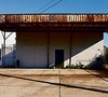
Rust Never Sleeps
 (image via: Kevin Raber)
Why paint oil storage tanks? They’re made of metal and spend their lifetimes outside, season in and season out without any other covering beside their paint jobs, that’s why. Getting artistic is the tank owner’s prerogative but the alternative is downright ugly – unless it’s creatively photographed, of course.
Whale Meat Again
 (images via: Bimikyusin)
This fish oil tank painted up to look like a can of whale meat must have been quite a site to see… unless you’re a member of Greenpeace, that is. The 10.8m (35.4ft) tall and 8.5m (27.9ft) diameter tank was originally built in 1975 by Kinoya Ishinomaki Suisan, a seafood canning company from northeastern Japan. It received its garish paint job in 2006 when the company was looking for a way to promote its canned whale meat.
 (images via: House Of Japan and Fuyuto)
The devastating Great East Japan Earthquake and tsunami of March 11th, 2011 hit the town of Ishinomaki hard and the oil storage tank even harder: it was toppled and swept 300 meters (985ft) from its original location. These images are the only records remaining of the tank; it was dismantled out of consideration for the feelings of local survivors of the disaster.
Grand Old Flag City
 (images via: Trustypics)
Tanks for visiting Flag City, USA, otherwise known as Findlay, Ohio. This former 19th-century oil boomtown (yes, oil, in northwestern Ohio) still displays vestiges of its petroleum infrastructure with this patriotically painted oil storage tank sitting alongside Interstate 75 showing off Findlay’s fame for flags and fuel to best advantage.
Boston Gas’s Rainbow Swash
 (images via: J. H. Kostro & Associates, KatieHodge/Get It Scrapped! and Elizabeth Thomsen)
In 1971, Sister Mary Corita Kent was asked by the Boston Gas Company to paint one of the 150-foot (46 m) tall LNG storage tanks located on the Dorchester waterfront. The so-called “Rainbow Swash” tank was torn down in 1992 but by that time it had become a well-known, much loved Boston Landmark and Kent’s design was re-painted on an identical tank standing beside the old one.
 (images via: Me_Ram and Aesthetic Grounds)
Although Kent, who passed away in 1986, was an acclaimed artist at the time the tank was painted (she also designed the USPS’s “LOVE” stamp), she was also an avowed anti-war activist. More than a few people stated they could see a profile of North Vietnamese leader Ho Chi Minh in the tank’s blue stripe though Kent never admitted any intention to do so. Interestingly, the blue slash’s “nose” was rounded slightly when new owner National Grid re-painted the tank in order to reduce any perceived similarity.
Slam Dunk!
 (images via: Silly America and Roadside America)
You can’t say America’s oil and gas refiners aren’t good sports, not when one of their spherical oil tanks has been painted in an athletics motif for 40 years! The tank located at the Marathon Oil refinery alongside Interstate 75 in south Detroit started off as a giant baseball to celebrate the success of the MLB Detroit Tigers. In 2004 it changed its look to honor the NBA Detroit Pistons on one side and the WNBA Detroit Shock on the other.
Oil Hail The King
 (images via: Philadelphia Citypaper and Google Maps)
Petty’s Island is located in the middle of Delaware River between between Pennsylvania and New Jersey, though it’s officially part of the latter. The 400-acre island also happens to be owned by the Citgo Petroleum Corporation, a subsidiary of Petróleos de Venezuela S.A., which happens to be owned by Hugo Chavez. What could possibly go wrong?
 (image via: Back To Philaplace)
In April of 2009, Chavez blew a chance to be even more of a thorn in the American government’s side when he generously donated Petty’s Island to New Jersey provided it be used only “for environmental developments.” Amidst the wrangling between developers and environmentalists, New York-based guerilla artist Duke Riley scaled one of the Citgo fuel storage tanks and painted a mural of little-known legend Ralston Laird, who moved to the island in 1851 as a paid land manager. in his nearly 60 years on the island, Laird raised 10 children, proclaimed himself its King, and seems to have achieved fame as sort of an east coast Emperor Norton. As for Riley’s tank-top mural, it’s visible from space and made it onto Google Maps.
Send In The Tanks
 (images via: Richard Messenger)
These two oil storage tanks displaying the visages of Syria’s late leader Hafez Assad and his two sons stand silently in the desert about 100km (60 miles) from the Iraqi border. How long they stand there is anyone’s guess, being that current president of Syria Bashar Al-Assad can be said to have a target on his back. These tanks present a pair of targets that would be very hard for anyone to miss.

 (image via: Saatchi Online)
One can debate the pros and cons of artistically painting oil storage tanks without any resolution being achieved – as always, art is subjective and what’s beheld to be beautiful is purely in the eye of the beholder. As such, even functional tank painting has the power to please when photographically interpreted by someone skilled with a lens and light meter. Tanks… you’re welcome.


[ By Steve in Art & Street Art & Graffiti. ]
[ WebUrbanist | Archives | Galleries | Privacy | TOS ]

WebUrbanist


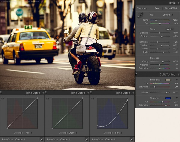

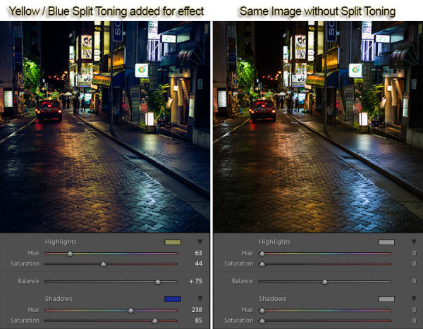
 To conclude this 3-part series on creative color processing in Lightroom 4, here’s an image that combines all three of the techniques that I discussed in the series: white balance, split toning, and tone curve.
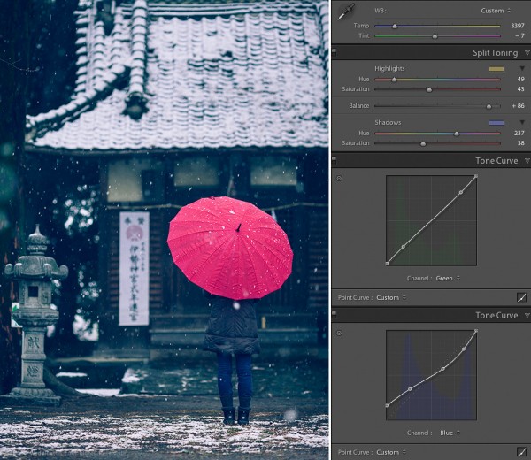


You must be logged in to post a comment.