RSS
 

Archive for July, 2013

Great summer photo projects

19 Jul

maddieonthings.jpg

A good summer photo project doesn’t necessarily require a lot of expensive equipment, just a camera, an idea and and the persistence to see it through. Chances are you’ve already got everything you need to kick off a photo series of your own. At DPReview we’re always looking for new and interesting photos on the web and lately we’ve noticed a lot of inspired projects. Some are more fairly laborious, while others take a simple idea and run with it. Check out these projects and why not get started on your own?

News: Digital Photography Review (dpreview.com)

 
Comments Off on Great summer photo projects

Posted in Uncategorized


3D-Printed Prosthesis: Custom Casts & Artificial Limb Covers

18 Jul

[ By WebUrbanist in Gadgets & Geekery & Technology. ]

custom 3d printed cast

Customization has long been a limiting factor in certain aspects of medical practice, particularly those centering around damaged or lost limbs  creating different person-specific needs. 3D printing technologies, perfect for one-off, fit-to-purpose projects, may just promise ideal solution(s).

custom cast design process

Jake Evill dubs his project, Cortex, an exoskeleton rather than a cast. First, an x-ray of the injured limb is performed. Next, a scan of the exterior of that same limb is made. Finally, based on both of the above, a suitably stiff-but-flexible 3D print is made. The result is customized to the needs of the user for both recovery and comfort.

custom efficient cast design

The resulting design addresses issues of aesthetics, but more importantly deals with waste, healing, safety, durability and other everyday needs. Unlike its cumbersome traditional counterparts, it is readily washable, comfortable and compact enough to fit under clothing that would otherwise require modification.

custom style prosthesis cover

Bespoke Innovations, meanwhile, addresses the needs of those with artificial limbs through what they call Fairings. Their process likewise involves scanning the limb, but in this case of the non-organic variety, then creating a custom cover to fit the functional and stylistic needs and wants of the wearer.

custom artificial limb covers

From the company: “Fairings infuse the individual’s lifestyle and taste into the design from the start. But to make this an even more personal part of the prosthetic leg, Fairings can be enhanced with patterns, graphics, and materials—including leather, ballistic nylon fabric, chrome plating, and even tattoos. By creating a unique custom form that presents the individual, Bespoke Innovations hopes to change the way the world thinks of prostheses.”

Share on Facebook


[ By WebUrbanist in Gadgets & Geekery & Technology. ]

[ WebUrbanist | Archives | Galleries | Privacy | TOS ]


WebUrbanist

 
Comments Off on 3D-Printed Prosthesis: Custom Casts & Artificial Limb Covers

Posted in Creativity


Make Rad Abstract Photos From Milk and Food Coloring

18 Jul

Extra photos for bloggers: 1, 2, 3

Picasso had his paint brush, Michelangelo had his marble, Escher had his sketchbook, and now you have a milk carton?

Strange as it may sound, you can make twisted tie-dye swirls and churning volcanos of color by simply mixing milk, soap, and a little food coloring.

This is the stuff of dreams if you are one of those photographic Jackson Pollocks who gets their jollies from abstract snaps.

Plus, you don’t need any fancy gear and all it costs is lunch money.

Poke your head in the pantry, swing by the fridge, check under the sink, and in minutes you’ll be making your own Moona Lisa.

Make a Modern Milksterpiece

p.s. We’re hiring for an amazing opening at Photojojo. We’re looking to re-invent what/how/where we publish online, and we’re seeking one amazing somebody to lead the charge. Learn more and apply for our Editorial & Community Lead.

Why It’s Cool:

Your fifth grade baking soda volcano may not have turned out so well, but take our word for it this experiment is an easy and fun way to make abstract art!

You never know what creations will come out of this churning rainbow wonderland and it’s good times for everyone from kids to Great Aunt Edna.

And although it’s quick and easy to clean up, it won’t be short on the wow factor.

Milk swirls in Action from Photojojo loves you on Vimeo.

The Ingredients:

  • Whole or 2% milk
  • Dinner Plate
  • Food coloring (red, blue, green, yellow)
  • Dish-washing soap (Dawn seems to work well)
  • Q-tips

STEP 1: Pour the Milk

beforeSet your dinner plate somewhere level and safe from getting knocked over, and then pour in a layer of milk.

A thin coat will do, you don’t need to go overboard.

STEP 2: Add a Dash of Color

beforeGrab your droppers of food coloring and add a few drops of each color to the center of your plate of milk.

The food coloring will allow you to see the reaction that happens in the next step so feel free to experiment with the placement of your dye drops for different effects.

STEP 3: Get Soapy

beforeApply a good dollop of dish soap to one end of a clean Q-tip.

Twirl the soap around a bit to make sure the whole cotton swab is coated.

STEP 4: Dip Your Q-Tip

beforeDab your soapy swab into your milk and dye mixture and watch the colorful explosion!

You can keep dipping your Q-tip and reapplying soap to create new shapes, colors, and textures.

STEP 5: Capture the Color

beforeGrab a phone, compact, or DSLR and start snapping.

We found that increasing the saturation, contrast, and sharpening, helps to get pictures that really pop.

If you are using a phone, you can do this after the fact with an app like Photoshop Express or Pixlr.

Try using a macro lens with your phone or DSLR for super close ups.

Also, using a fast shutter speed will help prevent the moving colors from blurring.

You can experiment with new color combinations, try using a different type of milk, drop colors around at random, use two or three Q-tips at once, or anything else you can think of to spice up your pics.

Taking It Further

  • Setup your milk and dye in a glass dish and shine a bright light through the bottom for an illuminating effect.
  • See what other experiments you can turn into works of art like steel wool lightpaninting, create photos using plants, or develope film with coffee!
  • Try photographing your food coloring dropped into water for some fantasticly abstract results.

Many thanks to Casetofoane for use of their song ’90′ in our video!

Related posts:

  1. How to Create Coloring Book Pages Using Your Very Own Photos! Extra photos for bloggers: 1, 2 Imagine a world where…
  2. Coloring Pages from Your Photos in 3 Easy Steps So we were walking around Toys R Us the other…
  3. Photo Food Tags: A Thanksgiving DIY Project Extra photos for bloggers: 1, 2, 3 Thanksgiving at your…


Photojojo

 
Comments Off on Make Rad Abstract Photos From Milk and Food Coloring

Posted in Equipment


Panasonic Lumix DMC-LF1 Review

18 Jul

Panasonic Lumix DMC-LF1 Review.jpg

Over the years I’ve owned a number of digicams just like this one and each has been damned useful. Pop in the pocket. Pull it out. Shoot. And enjoy.

However, in the last 2-3 years they have become really fearsome beasts with tech specs that ring with power.

Not only can these more recent arrivals shoot big, big stills but some have enormous zoom ranges and all can shoot Full HD video.

So who needs a DSLR or a MILC?

This little number from Panasonic is a good example of shooting power but with a certain finesse.
Panasonic Lumix DMC-LF1 BACK.jpg

Panasonic Lumix DMC-LF1 TOP.jpg

Panasonic Lumix DMC-LF1 Features

The lens in particular screams quality: an f2 Leica DC Vario-Summicron 7.1x zoom that equates to a 35 SLR optic of 28-200mm range. The only downer is that you cannot enjoy the full f2 all the way through the zoom range; it soon shrinks to f5.9. But it does mean you can enjoy limited focus effects at the f2 aperture.

Bokeh.JPG

This shot was made at full wide on the zoom and at f2. Notice the limited depth of field.

However, it would be easy to miss the standout feature of this diminutive picture maker: beside the large 7.6cm LCD screen at the camera’s rear, there is also an electronic screen tucked away on the camera’s left top corner (as viewed from the rear). This will win many hearts!

The LF1 offers Wi-Fi connectivity so that users can connect the camera to their smart phone or tablet with one touch to share an image. You can also use a smart phone or tablet as a remote shutter with a monitor.

The CMOS captures a maximum image size of 4000×3000 pixels, enough to make a 34x25cm print.

Video can be shot in either AVCHD or MEG4 formats at Full HD 1920×1080 pixel quality. You can shoot stills mid video recording at a reduced size. If you shoot in AVCHD the maximum recording time is 29 minutes and 59 seconds.
Menu.jpg

Scene modes.jpg

Creative Control.jpg

The control layout is very straightforward:

Top deck has the viewfinder mentioned earlier, with dioptric adjustment; then there’s the mode dial with positions for intelligent auto, PASM, two custom modes, panorama shooting, scene modes (16 in all) and creative control with 11 settings, including retro, old days, high and low key etc.

Pano 6.JPG

Panoramas can be shot laterally and vertically left to right, right to left, up or down and stitched in-camera. With the creative panorama function you can apply filter effects of retro, expressive, high or low key etc. The camera does not shoot horizontally panned panos with the camera held vertically, unlike some other cameras … notably Sony’s.

Next to the mode dial is the shutter button set within the lever for zooming; the power switch is at the extreme right end.

Rear: at the extreme left is the button to switch from rear screen to turret viewfinder; next is the WiFi button.

Beneath it is the video record button, shielded from accidental triggering by a protective slice of leatherette; adjacent is the Function and replay buttons.

Lower is the four way control dial with positions for macro shooting, exposure compensation, flash options and continuous/self timer. The menu button is central.

Lower still is a button for display options and one for trash.

Overall, a good layout but one that is badly let down by all the identifying text being too small, printed in off-white and almost impossible to read in dim light. Why not white text?

Composition Guide.jpg

Tap the Function button and you gain access to a rather novel aid: a Composition Guide that makes it easy to shoot a photo with good composition, by choosing from a range of on screen examples: Rule of Thirds Offset, Diagonal Lines, Tunnel etc. A big help for those beset with poor visual acumen. It’s unlikely to prevent cut off heads or feet … but at least your shots will be visually balanced!

Distortion

No distortion evident at either the wide or tele ends of the zoom.

Start Up

In two seconds from startup you can shoot the first shot; follow-ons nearly as fast as you can hit the button.

Panasonic Lumix DMC-LF1 ISO Tests

Panasonic Lumix DMC-LF1 ISO 80.JPG

Panasonic Lumix DMC-LF1 ISO 400.JPG

Panasonic Lumix DMC-LF1 ISO 800.JPG

Panasonic Lumix DMC-LF1 ISO 1600.JPG

Panasonic Lumix DMC-LF1 ISO 3200.JPG

Panasonic Lumix DMC-LF1 ISO 6400.JPG

Panasonic Lumix DMC-LF1 ISO 12800.JPG

Only at ISO 3200 did noise become apparent. At ISO 6400 overall quality declined while noise increased and odd artefacts appeared. Useable? Maybe.

At ISO 12800 the shot was unusable.
Marina.JPG

(insert Marina)

Panasonic Lumix DMC-LF1 Review Verdict

Quality: average.
Why you’d buy it: small, sufficient zoom range for most purposes; shoot RAW files.
Why you wouldn’t: LCD screen is not vari-angle.

A great little number for easy, high quality photography. Available in silver or black.

Panasonic Lumix DMC-LF1 Specifications

Image Sensor: 12.1 million effective pixels.
Metering: Multi zone, centre-weighted, spot.
Lens: Leica DC Vario-Summicron f2.0-5.9/6.0-42.8mm (28-200mm as 35 SLR equivalent).
Exposure Modes: Auto, Program AE, shutter and aperture priority, manual.
Sensor Size: 15mm CMOS.
Shutter Speed (stills): 60 to 1/4000 second.
Continuous Shooting: 10 fps.
Memory: SD/SDHC/SDXC plus 87MB internal memory.
Image Sizes (pixels): Stills: 4000×3000 to 640×360.
Movies: 1920×1080, 1280×720, 1440×1080 and 640×480.
Viewfinder: 7.6cm LCD screen (920,000 pixels).
File Formats: JPEG, RAW, JPEG+RAW, MPO (3D), AVCHD, MPEG4.
Colour Space: sRGB, Adobe RGB.
ISO Sensitivity: Auto, 80 to 12800 (with boost).
Interface: USB 2.0, HDMI mini, WiFi.
Power: Rechargeable lithium ion battery, DC input.
Dimensions: 103x62x28 WHDmm.
Weight: 192 g (inc battery).
Price: Get a price on the Panasonic Lumix DMC-LF1 12 MP Digital Camera (White) or Panasonic Lumix DMC-LF (Black).

Post originally from: Digital Photography Tips.

Check out our more Photography Tips at Photography Tips for Beginners, Portrait Photography Tips and Wedding Photography Tips.

Panasonic Lumix DMC-LF1 Review


Digital Photography School

 
Comments Off on Panasonic Lumix DMC-LF1 Review

Posted in Photography


Panasonic launches Lumix DMC-XS3 slimline zoom compact

18 Jul

XS3_news.png

Panasonic has announced the Lumix DMC-XS3, a budget zoom compact camera that’s just 14mm thick. It sports an optically-stabilised wideangle 5x zoom lens (24-120mm equivalent), a 14.1MP 1/2.3″ High Sensitivity MOS sensor, and can record Full HD video in MP4 format. It includes a range of Creative Filters which can be applied either during or after shooting, and can also be used when shooting panoramas. The XS3 appears to be a Europe-only release, and will be available in September at a price of £119.

News: Digital Photography Review (dpreview.com)

 
Comments Off on Panasonic launches Lumix DMC-XS3 slimline zoom compact

Posted in Uncategorized


Wo Heimat ist

18 Jul

„Zuhause ist, wo das Herz ist.“ So könnte man die Fotos aus „The Home Series“ in einem Satz zusammenfassen und diesen Artikel enden lassen. Ich möchte Euch aber gern mehr über diese wundervolle Serie der amerikanischen Fotografin Alexis Mire erzählen.

Für Alexis ist „Zuhause“ mehr als nur ein Ort. Es ist eine Idee. Dort, wo man sich am meisten nach sich selbst fühlt, dort, wo man glücklich ist.

Ich fühle mich Zuhause in der Wohnung meines Freundes, aber auch im Haus meines Vaters, wo ich aufwuchs, am Rande des Ozeans und im Wald, mit meiner Kamera als Begleitung. Zuhause sind die Menschen, die ich liebe und die Erinnerungen, die wir teilen.

The Home Series © Alexis Mire

Die Idee für Alexis’ Serie wurde durch eine frühe Fotoserie von Eleanor Hardwick inspiriert. Diese fotografierte ein Modell in einem kleinen Zelt an verschiedensten Orten. Alexis gefiehl der Gedanke, das Zuhause immer mit sich zu nehmen und sie wollte ihren eigenen tragbaren Raum schaffen.

Sie rahmte ein großes Stück Plexiglas ein und fotografierte sich selbst hinter dem Glas an verschiedenen, für sie wichtigen Orten. Der Rahmen steht dabei für den kleinen Raum um sie herum, den sie Zuhause nennen würde. Ein Raum, der jedem Sturm und Wellengang standhält.

Das Glas stellt eine Barriere zwischen mir und der Welt dar, aber erlaubt dennoch einen Einblick in meinen Raum. Es repräsentiert Sicherheit mit einer Dosis von Freiheit. Meine Heimat hält mich geschützt, gibt mir Ruhe, lässt mich andere lieben und vermissen. Ich fotografierte meine Rahmen an verschiedenen Orten, um zu zeigen, dass ich meine Heimat mit mir nehme, wohin ich auch gehe, in guten und schlechten Zeiten. Für mich ist Heimat überall und jederzeit, weil mein Zuhause tief in mir begraben liegt.

The Home Series © Alexis Mire

Ich mag die Gedanken hinter Alexis’ Serie sehr, vielleicht weil ich mich darin wiederfinde. Zieht man oft um, bricht auch einmal abrupt auf und lässt sich treiben, wohin der Wind einen führt, dann wird die Frage nach der Heimat groß. An Heimat denkt man erst, wenn man sie zum ersten Mal verlassen hat. Und dann sucht man, sucht vielleicht auch an dem Ort, den man damit verband und findet sie am Ende doch nur in sich selbst.

Der Begriff Heimat ist gerade in unserer jetzigen Zeit ein schwieriger Begriff. Man muss für den Job flexibel sein, kaum einer bleibt an seinem Geburtsort. Es gibt verschiedene Heimaten in verschiedenen Ländern. Woher kommen die Eltern, woher komme ich und wohin gehöre ich am Ende? Die Frage nach der Heimat wird so zu einer Identitätsfrage.

The Home Series © Alexis Mire

Alexis Mires Antwort auf diese anscheinend so schwierige Frage finde ich beruhigend, wie ihre Bilder. „Heimat ist dort, wo man sich nach sich selbst fühlt. Heimat ist, wo man glücklich ist.“


kwerfeldein – Fotografie Magazin

 
Comments Off on Wo Heimat ist

Posted in Equipment


4 Fun Tricks to Enhance Your Photos With Lightroom’s Graduated Filter Tool

18 Jul

A few weeks ago I shared some key tips on how to get a lot out of Lightroom by using only a handful of sliders and while this is a great place to start eventually you’ll want to get a bit more creative with the software. Today I’m going to show you four different things that you can accomplish by using Lightroom’s Graduated Filter tool.

4 Creative Ways to Use Lightroom’s Graduated Filter

Split White Balance – This technique can be a powerful one when trying to get some interesting colors out of the sky, but retaining the natural colors of the earth. In the photo below I’ve added some pinks and purples to the sky, but was able to retain the natural green color of the grass.

whitebalanceb&a  

How I Did It – The graduated filter was dropped in from the top and rests just above the horizon line. I then made adjustments to the temperature and tint sliders until I was happy with the colors. Note: if there are objects that fall within your graduated filter’s effected zone you can correct it by using the adjustment brush and adjusting the tint & temp sliders locally for that specific area.

Direct the Light – By applying multiple filters to your photo you can create spot light like effects, leading lines and even your own very customizable vignette effect like seen below.

directing eyes

How I Did It – Here I’ve dropped in four different filters which all work together to create the final effect. There are two that are pulled in from the sides of the frame to drop the exposure of the edges. Then I dropped one in from the top and placed it almost at the bottom of the frame I use this one to increase the exposure of the overall photo excluding the very bottom of the frame. However, once this one was applied the top of the frame was over exposed so I then apply one more filter, again dropped in from the top, but placed towards the middle of the frame. This time I drop the exposure to cancel the effect of the previous filter and thus create the vignette effect. Yikes that was a mouthful!

Soften Your Borders – Sometimes you might want to soften the borders of your photo to draw in more attention to the center of the frame.

soft borders

How I Did It – This is a fairly simple process of dropping two filters in one from each side of the photo and then reducing the sharpness and clarity on both of them to -100. This effectively blurs out the sides of the frame and draws your attention to the middle.

Create a B&W to Color Transition – A very cool effect can be the black and white to color transition. It’s  not something that’s going to be used on every photograph you produce, but when you do use it it will often get people to look twice.

Black & White Color

How I Did It – The black and white to color transition is done by using one single graduated filter and dropping the saturation to -100. It’s up to you where you want it placed and how dramatic you’d like the transition to be – a narrow filter makes for a more dramatic transition.

For Those Who Prefer Video

If you’re anything like me it is so much easier to learn this kind of thing when things are in motion and therefore I’ve included a video which walks you through everything I talked about above, plus a few other Lightroom goodies as well. Enjoy!

Post originally from: Digital Photography Tips.

Check out our more Photography Tips at Photography Tips for Beginners, Portrait Photography Tips and Wedding Photography Tips.

4 Fun Tricks to Enhance Your Photos With Lightroom’s Graduated Filter Tool


Digital Photography School

 
Comments Off on 4 Fun Tricks to Enhance Your Photos With Lightroom’s Graduated Filter Tool

Posted in Photography


Composing Dynamic Landscape Images

18 Jul

A Guest Post by Todd Sisson from www.sisson.co.nz.

As a landscape photographer I am constantly seeking that next X-factor shot – an image that leaps from the screen or page and demands the viewer’s attention – preferably attention of the favourable variety.

If you spend an hour or two on a photosharing site like Flickr viewing landscape images in un- curated groups you will note that a very small percentage of the total image population stands out from the crowd.

However, if you view a carefully curated collection of top-shelf landscape images you will probably start to notice some themes appearing. Certain visual cues and devices appear across multiple images – there will often be subtle commonalities between these attention hogging photos.

In many instances these images will possess the qualities of what I consider a dynamic landscape image.

What is a Dynamic Landscape Image?

Summer Storm, Queenstown New Zealand. An example of a dynamic landscape image. To maximise the number of dynamic elements in this image I locked this composition off in the field and shot multiple images. The best of about five wave-action frames were then blended together to form the final image.

There is no dictionary entry that defines a Dynamic Landscape Image* – heck, there’s not even a Wikipedia entry – so it is a somewhat personal interpretation.

To my mind, a dynamic landscape image is one that in some way conveys the energy and scale of the natural world. Dynamic images also often seek to breach the confines of their 2D medium by inferring a sense of depth – many truly dynamic image have an almost 3D quality about them.

*As far as I am aware, the term Dynamic Landscape was first popularised by the late Galen Rowell – one of the most influential American landscape photographers of his generation. Rowell used the term to demarcate his work from the somewhat literal colour landscape photography that dominated the early 1970′s. Although he was certainly not the only photographer employing these principles in his work, he appears to have been an excellent self-promoter and the term is somewhat synonymous with his name.

Dynamic Composition

Composition is the backbone of all great photos – dynamic or otherwise – but it is essential in the creation of a truly strong landscape image.

I feel that the goal of a successful composition is to draw the eye into image and hold it there for as long as possible – which is seemingly, a maximum 15 milliseconds these days*. The following image is an example of an image that I feel achieves this objective.

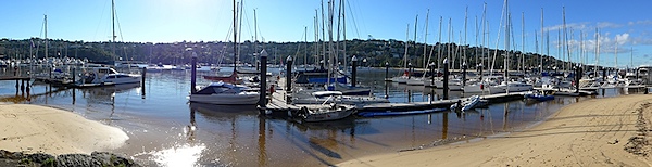
Sunrise Over The Moeraki Boulders, Otago New Zealand. Seascapes lend themselves to the creation of dynamic landscape images.

This image combines all of the elements that I feel comprise a Dynamic Landscape Image:

  • Leading or converging lines
  • Interesting perspective
  • Visually interesting foreground elements
  • Visually interesting mid-ground & background elements
  • Vivid colour or incredible light
  • Vision-locking tonal control
  • Suggestion of movement

It is important to note that not all dynamic landscape images possess all of these factors. In fact, it is depressingly rare to have it all come together in one moment. It must also be stated that what follows is not a recipe for creating great images. Photography can only be practised as an art when personal interpretation is injected into the process – only use this information as a guideline for evolving your own images.

So let’s have a very quick look at each of these Dynamic Landscape factors.

Leading Lines & Converging Lines

One of the simplest ways to draw a viewer’s attention into an image is to use converging or leading lines. Converging lines have been used by painters for centuries to create the illusion of depth within a 2 dimensional medium.

This is why photos of wharves, roads, and rivers make such successful photographic subjects. Although many consider such subjects to be cliches, I strongly council my workshop students to shoot them heavily to build an awareness of the power of a line in an image.

Leading lines not only draw attention into the image, they can also help to hold the eye within the confines of the image.

Check out the crudely overlaid wharf image below combines the strong converging lines of the wharf with secondary supporting lines in the water, hills and clouds.

Look for these lines whenever you are shooting – they are almost everywhere.

The Wharf at Frankton, Queenstown New Zealand. Shoot ‘cliched’ subjects like wharves and roads until it hurts a little. The pain is just your visual muscles growing stronger. Shooting man-made lines will teach you to look for more subtle lines in nature.

Although the wharf is the primary leading line device in this image there are a number of leading lines present in the water, hills and clouds. The darker reflected lines in the water help hold the eye in the central region of the frame.

Interesting Perspective

As a photographer you are an artist not a forensic documentarian. You get paid the mega-bucks and live the champagne lifestyle to show your audience something a little different – that is your raison d’être.

Hence I rarely find myself shooting at my natural standing position. For some reason, compositions seem to get more dynamic the closer you are to the ground/mud/ snow/ice-encrusted cow turd – it’s just the way it is.

This is especially apparent when using an ultra-wide lens. Subject matter becomes incredibly diminutive and interesting leading lines really lose their visual power when viewed from 5 or 6 feet high – so try getting uncomfortably close and low.

Aim high also. Look for ways to gain elevation to find that privileged viewpoint – I find that this often works really well when shooting telephoto lengths for some reason. Try scrambling up banks, standing on cars and sitting on your wife’s/husband’s shoulders (sans tripod) in an effort to find an interesting perspective.

Paddock Bay, Lake Wanaka New Zealand. Getting uncomfortably low in this instance dramatically altered the perceived form of the rock on the lower right of the frame. B y moving about I was able to create the satisfying impression of the rock 'interlocking' with the reflection. Note the strong leading line formed here also.

Foreground Elements

I believe that a dynamic image almost always possesses a strong foreground element, or elements, that complement the greater scene.

Take a sunset/sunrise for example. Sure, spectacular light makes for great images, but personally photos that contain nothing but vast expanses of super-saucy red clouds do little to engage me as a viewer.

The best dynamic images typically have a strong point of interest in the lower half, or foreground. This is your visual entree into an image. If your foreground element happens to include leading lines you are quite possibly onto the much vaunted money-shot.

Lupin(e)s, Fiordland New Zealand. Yeah, this is cheating – foreground elements don’t come much easier than this. That aside, keen observers will note the subtle converging lines formed out of the lupin pattern. This was accentuated by deliberately placing a bloom in each corner and leaving a little empty space at the bottom of the frame. Sunstars make an exceptional background element (segues niftily to my next point)

Visually interesting Background Elements

I often compose back to front. Firstly I will find the subject of my image, say a spectacular sunset playing out on mountains, and then I will run around like a deranged prison escapee in search of a foreground element to complement the background.

It is very much a balancing act – defining who or what element gets to play the lead role in your composition. Ideally the background is where the eye should gravitate to and the foreground should pick up a gong for best supporting actor.

Milford Sound, Fiordland New Zealand. The star of this image is the dramatic light playing out in the clouds over the eye- catching form of Mitre Peak – the foreground & mid ground elements are critical supporting parts of the whole composition but don't hog the lime-light.

Unusually, I didn’t scramble to find a foreground element for this image – I staggered. Four minutes earlier I had been happily sleeping in the back of my truck – my alarm went off and I saw this – panic ensued….

Vivid Colour or Incredible Light

By now it should be obvious that I have some un-checked colour-dependancy issues. I love colour*, especially natural light shows. However, I feel that vivid colour needs to be kept in balance and be a part of the overall composition. Too often I see images that rely solely upon dollops of super- saturated colour.

For a dynamic landscape image to work, balance must prevail. Hence I attempt to avoid filling the frame with too much colour (yes, there is such a thing – see below).

*I am even partial to the American version – colour.

Sunrise from Mt Taranaki / Egmont, New Zealand. In this image the main act was the rapidly dissipating beams of sunrise goodness and the rich colour in the clouds. Lens choice and composition mean that the sunrise colour is just one component of the image. I often like to keep dark forms in my images (anathema to the HDR readers amongst you) as a counterpoint to the extreme lightness of a sunset/sunrise. I find the dark hills here quite mysterious in contrast to the sunstar and clouds.

Too much colour. This was one of the most intense sunrises that I have ever witnessed. I should have just sat and enjoyed it – this is just too much colour for my tastes – it looks un-realistic. This shot has actually been partially de-saturated in an effort to tame the colour.

Vision-locking Tonal Control

I am tempted to trademark this term – it sounds like a mind-control experiment deployed by shady branches of the US intelligence community.

Basically all I am referring to is the phenomenon of vignetting.

The eye is drawn towards lightness within an image, particularly near the centre of frame. Furthermore, the eye is restrained by darkness at the edges of the frame.

When employed deftly, the viewer’s eye is gently drawn into the image by lightness and held there by the darker edges of the image.

Look at all of the images above and you will see this technique in use. Often this happens in- camera just by virtue of the composition and through use of ND grad filters. However, I will often darken the top edge of an image in post and even add a subtle vignette as the last thing I do. Weird Cloud formation & Road to Nowhere. Alexandra New Zealand. In order to achieve vision-lock here I painted in a brighter layer near the central portion of the image. A little vignetting was added to further enhance the effect.

Suggested Motion

Suggested motion, by way of blur or frozen motion is not always an achievable, or desirable, element to utilise within an image – but it can add another layer of dynamism to a composition.

Don’t just get locked into shooting long exposures either – frozen, or partially-frozen motion can convey movement just as well as a long exposure in some circumstances (see the first image, Summer Storm, for an example of this).

Moeraki Boulder, Otago New Zealand. Long Exposure motion blur creates a dynamic tension between the static boulder and the relentless sea. Note the other dynamic ingredients added to this image – interesting perspective, use of colour, vision-lock, foreground/background interest.

Can Dynamic Landscape Images be B&W?

Absolutely. There are many thousands of truly incredible B&W dynamic landscape images. No style renders texture and contrast better than B&W – at it’s best it is magnificent.

In order to compensate for their ‘lost’ colour Black & Whiters will often apply industrial grade quantities of Vision Locking Tonal Control (that’s why vignette sliders to go -100) and rely heavily upon strong graphical elements such as leading lines (you will find a lot of B&W photos of wharves and sewerage pipes heading out to sea).

I would show you an example of this, but I am mono-challenged. If you want to see B&W Dynamic landscapes at their best check out the work of Mitch Dobrowner & Hengki Koentjoro.

So Are All Good Landscape Images ‘Dynamic’?

Not at all. Stunning images can be made by avoiding almost all of the techniques that I have just espoused in this essay. Dynamic Landscape composition is just one style of landscape photography.

In fact, many of my favourite images by others are beautifully composed static, flat compositions. These ‘static’ images respectfully comply with the two dimensional constraints of the photographic medium and rely upon a separate set of visual devices in order to ‘succeed’.

If they will have me back here at DPS, these static landscapes will be the topic of my next blog post.

Todd & Sarah Sisson are full-time landscape photographers based in Central Otago New Zealand.

Their work can be found as fine art prints & canvas prints at www.sisson.co.nz Todd also offers private and group photographic tuition. They can be found on facebook, Google Plus and twitter.

Post originally from: Digital Photography Tips.

Check out our more Photography Tips at Photography Tips for Beginners, Portrait Photography Tips and Wedding Photography Tips.

Composing Dynamic Landscape Images


Digital Photography School

 
Comments Off on Composing Dynamic Landscape Images

Posted in Photography


City Evolution: Watch Urban Growth in 3D Visualizations

18 Jul

[ By Steph in Architecture & Cities & Urbanism. ]

City Growth Maps Main

Watch Manhattan multiply and San Francisco soar into the sky in a series of growth animation videos that show the expansion of cities over more than a century. Created by Calgary-based real estate company Cube Cities, the videos utilize developer-reported data of building construction dates to show buildings pop upon top of city maps.

City Growth Maps NYC 1

City Growth Maps NYC 2

3D mapping technology from Google Earth provides the base of the videos, and animations show construction as it occurs through each decade. The videos highlight the busiest decades for growth, which is most visible in New York City during the 1920s, San Francisco during the ’60s and Toronto during the ’70s.

Next Page:
City Evolution Watch Urban Growth In 3d Visualizations

Share on Facebook


[ By Steph in Architecture & Cities & Urbanism. ]

[ WebUrbanist | Archives | Galleries | Privacy | TOS ]


WebUrbanist

 
Comments Off on City Evolution: Watch Urban Growth in 3D Visualizations

Posted in Creativity


Panasonic announces Lumix DMC-FZ70 with 60x optical zoom

18 Jul

FZ70_front.png

Panasonic has announced the Lumix DMC-FZ70, a 16MP compact superzoom with a 60x optical zoom that more than doubles the zoom reach of its 24x FZ60 predecessor. Spanning the equivalent of 20-1200mm, the FZ70’s zoom lens has a maximum aperture range of F2.8-5.9 and is claimed to be both the longest and widest in its class. The FZ70 effectively replaces the FZ60, but the constant-F2.8 Lumix DMC-FZ200 remains in the lineup.

News: Digital Photography Review (dpreview.com)

 
Comments Off on Panasonic announces Lumix DMC-FZ70 with 60x optical zoom

Posted in Uncategorized