RSS
 

Posts Tagged ‘White’

Create In-Camera White Balance Experiments

18 Jan

Extra photos for bloggers: 1, 2, 3

Did you know that white balance is the quickest way to turn your camera into an InstaLomoCrosstography machine?

This tutorial is a fun, simple way to play with color a la Instagram or Lomography without any apps or chemicals!

All you need to do is take the correct white balance and set it to the “wrong” white balance to get sweet shifts in tones and colors.

We put together a guide on exactly what kind of color shifts you’ll get with each setting. No Android-based technology here. You can do it all with the settings your camera already has!

Create Sweet White Balance Experiments

p.s. We’re giving away an iPhone Lens Dial (our primo iPhoneography gizmo) today! Here’s how to enter.

Why it’s cool:

ingred-smDid you know that your brain has magic color changing abilities? Well, sort of.

Your brain can’t change it’s own color (bummer!), but it does an awesome job at making sure the color white always looks that way. In other words, our brains are stuck in Auto White Balance.

Our cameras are a bit different. To them, white isn’t always white, but is influenced by the source of the light, whether it’s a buzzy fluorescent light in the ceiling or a cozy tungsten bulb under a lampshade.

This technique involves forcing your camera’s white balance to the incorrect setting for the scene so that the colors are purposely skewed. Sometimes it looks a little weird, and sometimes it looks awesome; it’s all about experimenting, with no computer or fancy editing programs required!

For an awesome explanation on how to achieve correct white balance and color temperatures, follow this tutorial by our friends over at SLR Lounge!

Ingredients:

paint-sm

  • A camera that allows access to white balance settings
  • A willingness to experiment!

STEP 1: Locating White Balance Settings

paint-smFirst things first, we need to locate where the White Balance settings are on the camera.

Here’s where ours is located. Look for the letters “WB” or the for “White Balance” if it’s under a set of menus.

Step 2: Crack The Code: Figure Out The Symbols

paint-sm White Balance settings are most often denoted by a set of symbols that represent the light source. They either warm things up, or cool them down!

  • AWB or A: Auto, correct White Balance
  • Sun: Sunshine or Daylight. Neutral.
  • House Casting a Shadow: Shade. The warmest.
  • Cloud: Cloudy. Very warm.
  • Light Bulb: Tungsten Light Bulbs. Very cool, very blue.
  • Glowing Rectangle: Fluorescent Light Bulbs. Cool blue and purple
  • Lightning Bolt: Flash. Warm.
  • Square Floating Over Triangles: Custom
  • K: Specific Kelvin Temperature

Step 3: Time to Play

paint-smNow that you now where the settings are located and what each symbol means, it’s time to start experimenting!

Remember, the AWB or Auto setting will let your camera determine the correct White Balance for the scene; we want to set the “wrong” White Balance to get cool colors!

Featured below are examples of how you can use this technique!

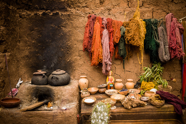
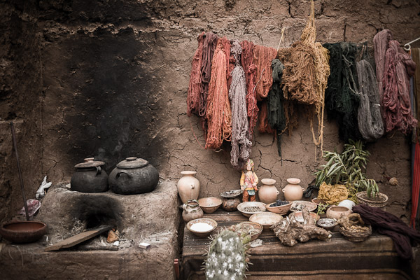
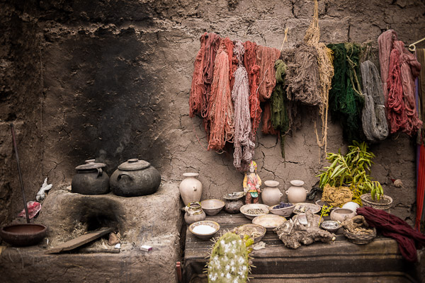
Outside: Cloudy Day Meets Fluorescent and Shade

paint-smIn this example, the natural light was from an overcast day (lame!).
In this instance, Cloudy would be the correct setting. Compare that to the Shade and Fluorescent settings.

The Shade setting is much warmer, which gives a stronger orange and yellow hue. The Fluorescent setting adds some neat purple and blue hues.

Outside: Cloudy Day Meets Fluorescent and Tungsten

paint-sm
This time we paired up another overcast day (round 2!) with Fluorescent and Tungsten.

We have to admit, the Fluorescent setting is one of our favs for getting sweet colors

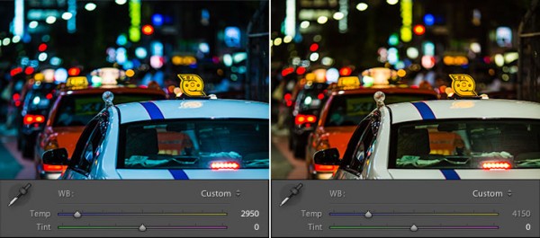
Inside: Fluorescent meets K10,000 and K2,500

paint-sm This time we’re inside under a mix of Fluorescent and Daylight.

We got even more experimental this time and tried to dial in our own Kelvin temperatures for the white balance! 2,500 Kelvin shifts the photo towards blue, and 10,000 Kelvin shifts the photo towards a warm orange.

Real Life Use

paint-smUsing the “wrong” White Balance goes against the grain for most photography teachings, so we want to share an awesome photographer that uses this technique to achieve great results.

His name is Ryan Waite, and he creates some really sweet portraits! He shared a few tips with us on how to use White Balance to get cool effects. These are a little more advanced and will likely require some editing software to accomplish.

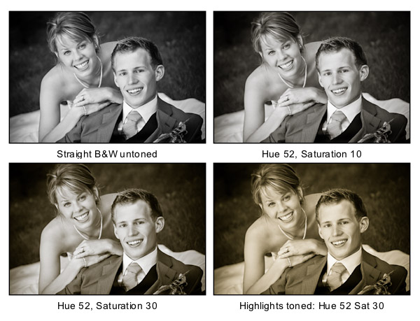
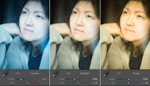
  • Shift the White Balance to “bring out different tones in the skin and create emphasis on certain areas of the face in unique ways.” This can influence the reds and blues in skin tone, or change the highlights and shadows. (seen above!)
  • Push the White Balance so that it’s “excessively warm and then lower the saturation for an aged, vintage feel.” A sepia-esque look without the monotone.
  • In post-production, “you have easy access to the color temperature and the tint. The temperature is great for creating warm and cool effects, but tint can specifically bring out the purples and greens in a photo.” Boost the magenta tint in afternoon sun to get beautiful yellows and purples, or boost greens for trees and plants to make them pop!

Extra Tips

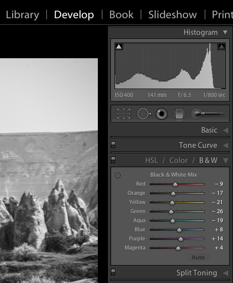
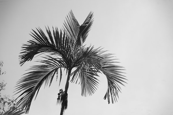
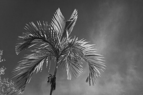
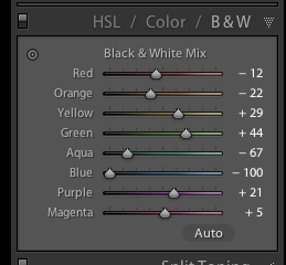
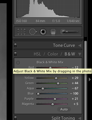
  • Try it for Black and White photos: the colors from the original can make a huge difference before you convert! Try warming up the white balance and shifting the tint all the way green.
  • Go full analog: grab some film balanced for a particular light source and shoot it in another.
  • Use Live View to see the results in real time!

Related posts:

  1. DIY Photo Magic: How to Turn Black and White Photos into Full Color Images! Extra photos for bloggers: 1, 2, 3 We love the…
  2. Black and White Conversion: The Best Ways to Turn Color Digital Photos Into Beautiful B&W ~Have a cool photo product or site? Reach 270,000 photo…
  3. How to Create Coloring Book Pages Using Your Very Own Photos! Extra photos for bloggers: 1, 2 Imagine a world where…


Photojojo

 
Comments Off on Create In-Camera White Balance Experiments

Posted in Equipment


Stunning Portraits: Manipulating White Balance

17 Jan

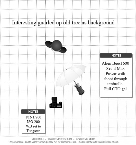
I am always looking for more interesting and unique ways to take interesting and beautiful portraits. It is a personal challenge for me to push my own creative envelope as much as possible so that I am constantly broadening my own bold and colorful style. There are so many ways to take a portrait the possibilities are almost endless and the range of emotional and psychological expressions that can be achieved are truly spectacular. Portraits can be editorial, lifestyle, fashion, glamour or extremely creative in style and the true wonderment of any portrait is the amazingly, maddening ability of the human face to portray expression in so many captivating ways. So let’s look at a more creative way to take a portrait that I think gives the final photo a simply stunning look.
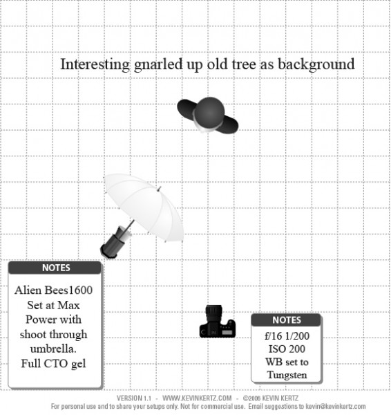
Before we get into the details of shooting, I think a little review of white balance is in order as this technique involves a basic understanding of the topic. Every light that we take photographs in, whether it be an incandescent light bulb indoors or the bright shining sun outdoors, is made of of a different spectrum of colors. Now when we look at objects under these light sources with our own eyes, we take it for granted that our vision compensates for all the different color casts of these lights amazingly well and we get a pretty standard representation of all colors in the scene. Basically, when we look at something that is supposed to be white in varying light conditions, our brain interprets the situation and our eye sees it as white. The camera works a little bit different.

The camera sees color in a much different way and has a less sophisticated way to interpret colors under different lighting situations. This is where the white balance setting helps us out. Many photographers that I know tend to keep there cameras white balance on the automatic setting. With the automatic white balance setting, your camera searches for a white reference point in the scene you are shooting. Then all of the other colors are set to this reference point. Therefore, your camera tries to make an educated guess to ensure the colors are represented correctly in your photo. The problem is that sometimes the camera is wrong and we have to bypass the automatic settings and go to that very scary place of setting the white balance in a more manual way, either by using the preset settings that the camera contains or even, heaven forbid, we might have to use some sort of white balancing device to help set our colors. There is a wealth of knowledge on this subject and I encourage you to pursue this topic at your leisure. You can also click on the following links for a decent explanation and breakdown of white balance (DPS-Intro to White Balance and White Balance in Digital Photography). The take home message is simply that we have to be conscious of how our camera views color and understand that we might have to give it some help by changing our camera’s white balance setting.

Now that we have introduced the concept of white balance let’s turn the tables on this subject and manipulate it to create some drama and eloquence in a portrait. The lighting setups for these portraits can be seen in the following diagrams:

Essentially, both diagrams are the same with the only difference being the placement of the light with the shoot through umbrella. I switched it from one side to the other just to see what sort of difference it made and concluded that both light placements worked just fine.

The overall concept for the shot was to contrast the old, decayed tree with the young beautiful model (Brittney) and to highlight each with some warm and cool tones for effect. So where does one start with getting the camera settings and flash setup properly?

First, lets talk about the manipulation of the white balance. I used an Alien Bees 1600 flash unit set at full power, covered with a full CTO (color temperature orange) gel, and modified with a shoot through umbrella. The CTO gel is commonly used to balance the color of light from the flash to that of a tungsten light bulb. Thus, when one is shooting flash in an indoor setting, the color of the flash matches the color of the light bulbs in the room and a camera white balance setting switched to tungsten will create a wonderfully balanced color palette in the photo. When used outdoors, a CTO gelled flash, combined with a white balance setting to tungsten, will balance the colors for anything upon which the flash falls. However, this tungsten white balance setting will also cause the sky and anything not receiving light from the flash to take on a majestic deep blue color cast that can be captivating. Compositionally, this simple white balance manipulation creates a mix of cool blue tones with warm orange tones that works fantastically well and makes the image pop.

Now, if you find yourself a little anxious about using flash outdoors you should go ahead and relax cause you can definitely pull off this shot. Before you start shooting with any flash at all, the very first thing you want to do is meter the scene and reduce your exposure about 2 stops so that the background is underexposed. Doing this in full daylight requires a few considerations and I recommend shooting either in the morning or the evening so that the sun is not too high in the sky, otherwise you will have a hard time getting your flash to overpower the sun. Camera settings are pretty easy to figure out. First, the white balance needs to be set to tungsten to get the desired effect. You are shooting in daylight and want the background underexposed so low ISO is a must which in my case was 200. The shutter speed cannot be too fast as it can only be that of your flashes sync speed which in my case was 1/200 seconds. What does this mean exactly? If you set your shutter speed faster than your flash can fire, the shutter will open and close before any light from the flash can be seen by the camera and you will never capture your flash in the image. So the only real variable was the aperture in this case which in order to get 2 stops underexposed for the background had to be at f/16. Basically, the environment for the shoot had already dictated my camera settings.

Since my camera settings were already determined, the only thing I needed to do was to turn on my CTO covered flash and adjust the power until I could see the effect in the image. Since I am shooting in daylight and trying to overpower the sun I knew I would need a lot of power from my flash and actually had brought a second flash unit just in case I needed more power then one flash head had to offer. I started with one flash about 5 feet from the subject at full power and took a few sample shots and it was just a little shy on power. I moved the flash as close to the subject as I could without it being in the frame (about 2.5 feet) and took a few more shots and it looked great. A few outfit changes and a serendipitous bit of sun flare from behind the tree and I had the makings for a stunning set of portraits. I hope this post encourages you to not only push your creative boundaries, but also to take a small step further into the excitingly surprising realm of flash photography.

Post originally from: Digital Photography Tips.

Check out our more Photography Tips at Photography Tips for Beginners, Portrait Photography Tips and Wedding Photography Tips.

Stunning Portraits: Manipulating White Balance


Digital Photography School

 
Comments Off on Stunning Portraits: Manipulating White Balance

Posted in Photography


3 Tips for Better Black and White Conversion using Lightroom

16 Jan

Ever wondered how the professional photographers get those dreamy black and white or sepia toned images? Wonder why yours come out looking dull and flat looking?  I’m going to give you 3 tips to help you do better black and white conversions using Adobe Lightroom, and solve that problem!

Today’s cameras are pretty smart, and many of them offer a black and white setting or shooting mode. I recommend using those to start, especially if you’ve never done any black and white (B&W) or if you are not currently doing any post processing or image editing on your files. BUT, if you have some experience with b/w photography, and you are processing your images, I recommend doing the conversion yourself as you have more control over the look of the final image.  I’m going to show you a few ways of converting them into B&W using Lightroom.

Note:  for the most part these tips will work in Photoshop as well, using the Adobe Camera Raw features and sliders.

First a quick note about my background. Back when I took my photography degree (dare I say, in 1987-88, and date myself) I spent the entire first year shooting black & white only, using a 4×5 view camera no less. I processed my own film and made my own prints. I spent a lot of time in a black & white darkroom, so I’m pretty well versed in how it works and how to control it to my advantage.

To grab some info from those film days, it’s important to note and understand that your camera sees light and colours differently than does the human eye. Black and white film sees blue tones much lighter than our eyes, for example.  Coloured filters were used to shift how the B&W film “saw” and rendered the scene.  Using a red filter would lighten anything red in the image and darken blue tones.  So if you were a landscape photographer you’d often use a red filter to darken the sky and make it less washed out.   A green filter would lighten green and blue tones and darken red and orange.  So photographers used the appropriate filter to capture the scene as they envisioned it.

In Lightroom and ACR (Adobe Camera Raw) in Photoshop you have the same tools at your disposal!  So without the use of filters, you can adjust how the scene is rendered in B&W.  That brings me to the first tip.

Tip #1 – use the B&W mix to do your conversions

In Lightroom’s Develop module (and ACR) there are a few ways that you can convert your images into B&W.  You can just pull the saturation slider all the way to left to -100. You can also do similar with the Vibrance slider, but it may not give you a 100% B&W image, depending on the image. Both of those options will give you a black & white result. However, they give you no control over how the colours render into the various shades of grey. A better choice, in my opinion, is to use the B&W mix, located on the third panel down on the right in Develop – see below.

Black and white mix panel in Lightroom Develop module

Let’s take a look at an example using the same image.

Original colour image

B&W conversion done using the Saturation slider at -100

B&W conversion done using the B&W mix in LR

In the images above, notice how the blue sky went really light using the desaturate method?  This is often the case when you have a lot of blue sky in an image, as I explained above.  Using the B&W mix and pulling a few of the sliders I was able to get very different tones.  This is what my sliders in the B&W Mix panel look like on the third image:

Notice the blue slider is pulled all the way to the left to -100.  That is what is darkening my sky.  Also worth noting is the green and yellow sliders are moved in the opposite or plus direction.  This lightens both yellows and greens (most grass and trees are often a mix of green and yellow, sometimes more yellow than green).  I have not done any selective adjustments to darken the sky here, just the sliders you see to the right!  How very different this image is from the desaturated one, and so simple to do using this method!

Also on this panel notice there is an “Auto” button.  Clicking it will allow Lightroom to apply a predetermined B&W mix for you.  You can also set up in your Lightroom preferences to apply that for you when B&W mix is selected, then you can just fine tune from there.  Otherwise all the sliders will start at “0″.

Another little known trick for using these sliders is the funny looking little double circle thing on the top left.  As you move the mouse over it, you will see this:

Adjust Black & White Mix by dragging in photo. So what on earth does that mean, you may wonder?!  If you click on the little circle your mouse pointer will now have little up and down arrows, as well as your cursor showing the same icon as you hover over the image. Click anywhere on the image, hold and drag, and it will adjust ONLY the colours that you’ve clicked on.   Drag up to move the sliders to the right (+) and drag down to move them to the left (-). How cool is that?!

This is very helpful if you do not know which sliders to adjust.  Just select the area of your image you’d like to adjust the tones on and drag away!

Tip #2 – don’t just stop there, add some punch

Sometimes even using the B&W mix sliders the resulting image still looks a bit flat and dull looking.  Take it up a notch by adding some punch to your image.  I do the following to most of my B&W images:

  • increase the clarity:  if it’s a scenic I’ll push it quite far like +60 or higher, if it’s a person I keep it under +30 or they start to look a bit crunchy and overly wrinkled (especially if the photo is of your mom or your spouse, they tend not to be too happy about that)
  • lower the black slider, until it looks good.  Highly scientific, yes! Here’s a little trick for you as well using the Blacks slider:  if you click and hold the Opt/Alt button while you slide it, you will get to see exactly where your blacks are clipping (meaning going off the chart on the histogram and having no detail). You can use that information to make sure you have just enough blacks, but make sure you keep all the detail in important areas.
  • increase the contrast either using the Contrast slider or Curves

Occasionally after making these contrast adjustments it will affect the overall image and you may want to go back and rework the B&W sliders a bit too.  It’s a dance, play them back and forth until you get a mix you like.   Here’s the final version of the image above, with contrast and punch adjustments applied.

Notice how much more snap it has, while still maintaining that nice rich, dark sky!

Secret to making great B&W images that the pros won’t tell you . . .

Black!  That’s it.  Make sure you actually have some black, and some white in your image.  Check the histogram and use my little tip on seeing the clipped bits. Add contrast or increase the blacks, whites, or both to get a full range of tones.  No matter what the subject is in the photograph, having enough contrast to have pure white, and pure black is key to having a stunning B&W image.  Otherwise you’re just left with a bunch of grey mud.

Tip #3 – creating selective coloured images

There are a couple ways to make selectively coloured images, and also to create that faded look that is really popular. Once again you can use the Vibrance and Saturation sliders in the Basic panel, however they will affect colours in the entire image the same.  You can also use the Adjustment Brush and paint in a lower saturation onto parts of your image where you want to fade out the colour.  I use that method quite often, even on full colour images, to do tone control on items in the background that are distracting.

Lastly you can use the sliders in the HSL panel.  By sliding selected colours to the left you can desaturate only those colours.  You can also use the little Click and Drag tool we used earlier to do the B&W Mix to click on your image and pick the areas to fade.   Here’s an example using each of these methods.  None is right or wrong, just give you a different look and some have more control than others.  Choose the one that works for you on in individual image basis.

Original colour image

Vibrance slider set to -75

Saturation slider set to -75

Adjustment brush used to paint in saturation at -75 to the whole image except for the wool

HSL sliders used to desaturate by separate colours

*Bonus Tip – making a nice duotone or sepia toned image

A little extra bonus tip for you.  Adobe has made it super easy to create a really nice duotone (just means two tones, go figure!) image, which includes Sepia.  Just go to the Split Toning panel after you’ve done your B&W conversion, it’s the fourth one down.

You will see sliders for both Highlights, and Shadows.  My personal tip on how to keep a nice clean sepia or toned image is to use ONLY the Shadows sliders and do not touch Highlights.  That will leave you with clean, crisp white highlights even after you’ve applied the toning.

How to create the duotone

First start by choosing the Hue slider (for Shadows).  If you want a nice brown colour, start with it around 40-45. Each image tones slightly differently, so start there and adjust to your taste and style.  You may notice that nothing happened, right?  That is because you need to increase the Saturation slider before the tone will show up.  The more you increase saturation, the deeper and more vibrant the colour tone will become.  Again, there is no right or wrong, it’s all about preference.  For a subtle, dark, chocolate brown try 10-20.  For a deeper colour go higher with saturation (NOTE: make sure the “balance” slider is set to zero)

If you want a different tone just move the Hue slider.  You can create some really neat affects this way including Blue Tone or a true Duotone.

Example using a portrait

For this final example I’ll show all the steps we’ve just covered using a portrait.  This is applicable to any people photos, you don’t need to make portraits to use this information.

Original colour image


Notice the last image where I’ve added in colour to the Highlights and how it completely changes the look of the image. The whites have a yellow tint now instead of a nice clean look. I personally prefer the third one but there are times I do use this option. Do what feels right for your image, you’ll know what to do.

A "duo" tone using different colours for the Highlights and Shadows. Shadow settings: Hue 232, Sat 70 – Highlight settings: Hue 52, Sat 37. I did move Balance to -27 to skew the colours more towards the Shadows as well.

What next?

As always I encourage experimentation.  If you have another way that you like better, that’s awesome!  Please share it with us if you will.  Another way to do some really quick B&W inside Lightroom is to find some good presets. There are literally tens of thousands of Lightroom Develop presets available for free on the internet.  Try a Google search for:   Free lightroom b&w presets.  Then just pick the ones you like and install them.

Now get out there and go make some images and let’s see what you can do in Black & White!


Post originally from: Digital Photography Tips.

Check out our more Photography Tips at Photography Tips for Beginners, Portrait Photography Tips and Wedding Photography Tips.

3 Tips for Better Black and White Conversion using Lightroom


Digital Photography School

 
Comments Off on 3 Tips for Better Black and White Conversion using Lightroom

Posted in Photography


Canon EOS – Black & White Photography with Craig Golding

07 Jan

Professional Photographer, Craig Golding, talks about Black & White Photography (or Monochrome Photography) as well as his EOS Photo5 2010 brief and gives great tips for creative photography. Join in, find the inspiration for your photography and share at www.canon.com.au/worldofeos


How I Shot & Edited – The White Infinity Setup

03 Jan

The Classic White Infinity Backdrop

In my last post about studio photography (the killer clamshell) I covered a simple two light setup for achieving a gorgeous soft beauty look.  This time I thought it might be fun to cover something a bit more general purpose and for this there cannot be anything better than the ever classic white infinity setup.

The All Can Do Lighting Setup

There is a reason why pretty much every major fashion or lifestyle magazine makes good use of a white backdrop and that reason is simplicity.  Not only is this lighting arrangement incredibly easy to achieve but it also delivers sharp, detailed portraits with a beautifully clean and uniform background and most importantly no visible seams or edges.  Aesthetics aside its also great for beginners to try as if done correctly provides a large and consistent zone in which to place your subject, allowing you to concentrate less on the position of your lights and more on placing and posing your model.

Families, pets, models, products the white infinity background is probably one of the most versatile setups going and to help you get started here is my approach to nailing this fantastic lighting arrangement:

Disclaimer

Ok, confession time.  The images and steps below are 100% genuine and therefore its going to be pretty obvious that I screwed up my exposure during this shoot.  Before you hit the big red ‘X’ at the top of your browser .. I can explain.  I basically had about 10 minutes to set everything up and 30 mins to take the shots before my studio rental was over.  Because I was in a rush I failed to spot that a large portion of the floor area was under exposed (by about a stop).  I promise I don’t do this all the time and if you don’t believe me check please feel free to check out the studio section of my portfolio site.  Hopefully by showing you my mistakes you will avoid them in the future.

Equipment

This lighting setup requires three lights and is best achieved using studio strobes as opposed to speed lights given the extra power needed to blow out the background.  As I have said before, hiring a studio is a cheap and very effective way to get access to this kind of equipment, making this shot all the easier to achieve.  If you do decide to do this at home however I would definitely recommend spending a little bit of money on a decent quality background paper, you can use a fabric backdrop but in my experience this will absorb much more light making the exposure more difficult than a non fabric setup.  Its also important that you have a background which is long enough to span both the back wall and floor of your shooting space.

For this setup you will need:

  • Two lights for the background, preferably with some form of diffuser to spread and soften the light.
  • A main light with as large a diffuser as you can possibly get, an octobox is ideal however any softbox or umbrella will also work.
  • If possible a light meter is also a great tool for this setup and will help speed up the setup although it isn’t essential.

The Lighting Setup

The important thing to achieve is a background that is both evenly exposed and completely blown out (i.e. solid white).  The ideal result is to have a background that is twice as bright as your subject, the trick here being the ratio of light as opposed to absolute values.

Typically I will set the exposure for my subject using an aperture of around f8.  Therefore if we want to achieve a background which is twice as bright we need to expose the background at an aperture which is one stop smaller than that used for the subject.

Just in case this doesn’t make complete sense, changing the aperture by one stop will either halve or double the available light.  Therefore if when we meter the background we use an aperture which is one stop smaller than the subject, when we open this back up again to take the final shots the background will now be twice as bright as the subject.

Here is how I go about getting this all set:

  1. Assuming a subject aperture of f8, set your camera to manual and dial in an aperture of f11 and a shutter speed of around 1/125 of a second with your lowest ISO.
  2. Aim the two background lights at the backdrop, positioning them to provide as even a spread of light as possible and either fire the stobes or take a test shot.  Take care to only expose the background, try to avoid any of the light spilling forward onto where the subject will be.
  3. If you have a light meter you can now use this to adjust the power of the background lights until you get an even exposure of f11 across the entire backing.  If you don’t have a light meter set the exposure by taking a test shot of the background, varying the power until the entire backdrop is solid white and evenly exposed.  If your camera has it you can use the highlight clipping warning combined with the histogram to double-check your results.   Remember to check the floor as well as the background, don’t make the same mistake as I did.
  4. Now its time to set the subject exposure, before doing so adjust your camera settings to f8 keeping everything else the same.
  5. Now turn off the background lights and place your subject in position.  Again if you have a light meter you can use this to confirm the right flash power to achieve an f8 exposure.  If you don’t have a light meter set your subject exposure by varying the flash power on your main light until you achieve an exposure that looks right.
  6. Now turn all your lights back on and you are all set.

Two background lights and a main subject light.

The Post Processing

Obviously you can post process your final images however you like but just in case you are looking for a few pointers here is a brief overview of my workflow and more importantly how I overcame my exposure malfunction.

Starting Point – Notice the horrible 'yellow' area of underexposed floor.

Step 1: White Balance & Crop – Basic adjustments to get the colour right and to straighten up the slight slant on the composition.


Step 2 – Minor exposure adjustment (slight exposure and fill light) to get the subject lighting right.

Step 3 – Contrast corrections using via a minor curves adjustment (slight 'S') and added detail via Clarity.

Step 4 – Now its time to fix the badly exposed floor. This was done using a gradient filter from the bottom up to increase the exposure on the area on the floor. Minor imperfections were cloned out using a spot healing brush.

Step 5 – All done, final image completed. Much better than the start as I am sure you will agree. All in all this took less than 2 minutes and would have been much less if I had got the exposure correct from the start.

Summary

The white infinity backdrop is a fantastically versatile and satisfying lighting setup and one which I would definitely recommend to anyone wanting to try something different to a single light arrangement.   Hopefully the tips here will help you to have a go at this classic lighting look, unfortunately though finding the super model is down to you!

Post originally from: Digital Photography Tips.

Check out our more Photography Tips at Photography Tips for Beginners, Portrait Photography Tips and Wedding Photography Tips.

How I Shot & Edited – The White Infinity Setup


Digital Photography School

 
Comments Off on How I Shot & Edited – The White Infinity Setup

Posted in Photography


Hollywood lighting secrets classic black & white photo videography lighting

02 Jan

Create that old time hollywood lighting effect. www.elitevideo.com has made it simple and easy with instructional videos for lighting called Digital Lighting Magic. This segment is just one of many from the 3 DVD set. Check out more at www.elitevideo.com
Video Rating: 4 / 5


D300s Custom White Balance with 18% Gray Card

16 Dec

D300s Custom White Balance with 18% Gray Card

 
Comments Off on D300s Custom White Balance with 18% Gray Card

Posted in Nikon Videos


Creative Color Processing (Part 1/3 – White Balance)

12 Dec

It is often said that photography is a visual language. Through our photographs we tell stories, share experiences, and communicate emotions. Aside from journalism, where faithful captures are important for ethics reasons, photography is often about creatively interpreting a scene, rather than simply recording what is in front of the lens.

Tokyo street scene with creative color

Tokyo street scene with creative color

Tokyo street scene with 'normal' color

Tokyo street scene with ‘normal’ color

Creative use of color can be a powerful tool for controlling the mood in your photographs. In a series of three posts I will discuss three Lightroom controls that can be used to control color and mood in your photos:

1. White Balance
2. Split Toning
3. Tone Curve

In this first article in the series I will discuss white balance, the simplest of the three tools.

Note: I shoot Raw and import my photos into Lightroom, converting to DNG on the way into Lr. Shooting Raw gives me much more flexibility to make creative color decisions in post processing. The screenshots from are from Lightroom 4, but with the exception of the Tone Curve technique that I will cover in Part 3 of the series, these techniques can be used in previous versions of Lightroom.

White Balance

White balance allows you to control the overall color temperature of your image, and adjust for different light sources like tungsten, daylight, flash, etc. If you’ve never heard of white balance take a look at this post.

White Balance Example

Example of different white balance settings

Most of the time you’ll read that white balance is there to help you get accurate color in your photos. This article is not about accurate color. For the next few minutes, forget about accurate color and let’s just look at how white balance can be used to change the mood in a photo. I like to think of white balance as just another tool for controlling color image my images. Thinking of white balance this way is liberating and encourages experimentation.

Tokyo Taxi White Balance Example

Tokyo Taxi White Balance Example

Notice how a cool white white balance creates a totally different mood than a warm white balance for the same scene? Which of the above images do you prefer? When you feel like getting creative with your images, try shifting the white balance either cooler or warmer for creative effect.

I hope this article has encouraged you to think creatively about white balance, and to experiment with shifting white balance for creative effect. I love hearing your feedback, please comment below or feel free to connect with me through Facebook or Google+.

In Part 2 of the Creative Color series I will discuss Spit Toning, and demonstrate how white balance and split toning used together for even more creative control over color.

Post originally from: Digital Photography Tips.

Check out our more Photography Tips at Photography Tips for Beginners, Portrait Photography Tips and Wedding Photography Tips.

Creative Color Processing (Part 1/3 – White Balance)


Digital Photography School

 
Comments Off on Creative Color Processing (Part 1/3 – White Balance)

Posted in Photography


Skyrim White Phial Duplication Glitch

10 Dec

I show you how to duplicate the White Phile, a quest item that is found in Skyrim. I recorded on my Xbox 360 using an Easycap D60 with S-video. It is all one cut, no after video changes were made, except the overlay of the commentary.
Video Rating: 4 / 5

 
Comments Off on Skyrim White Phial Duplication Glitch

Posted in Nikon Videos


Black and White Photography 5 by Richard Armstrong.

04 Dec

black and white photography including some street photography,macro photography and a handful of colour images..

Phase One IQ digital camera back – www.phaseone.com Watch fashion photographer Stefan Kapfer on location with the Phase One IQ180.

 
Comments Off on Black and White Photography 5 by Richard Armstrong.

Posted in Photography Videos