RSS
 

Posts Tagged ‘White’

Architectural Photography Using Layer Masking to Correct Contrast and White Balance

17 Dec
Dps 2

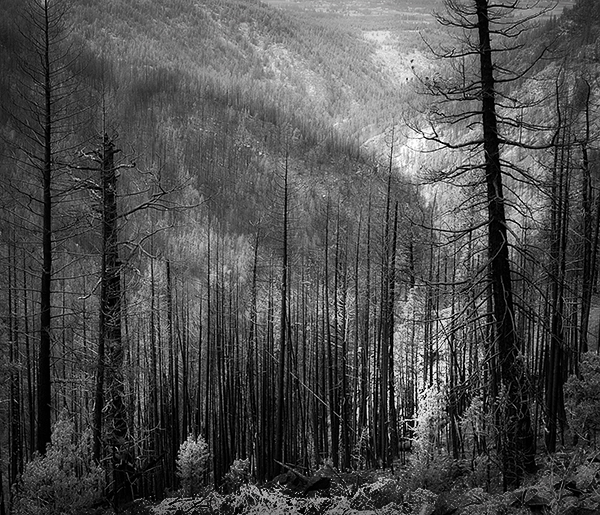
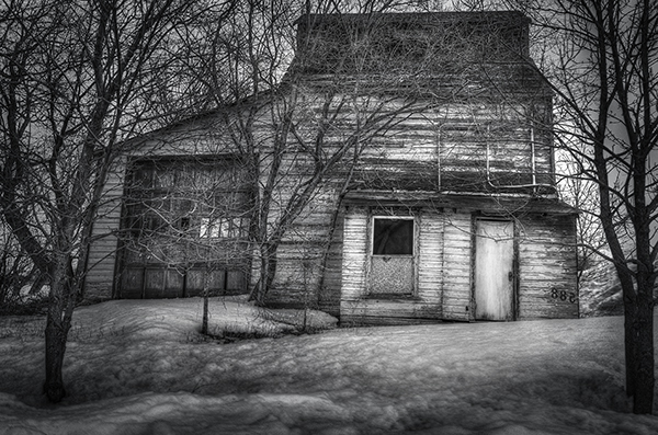
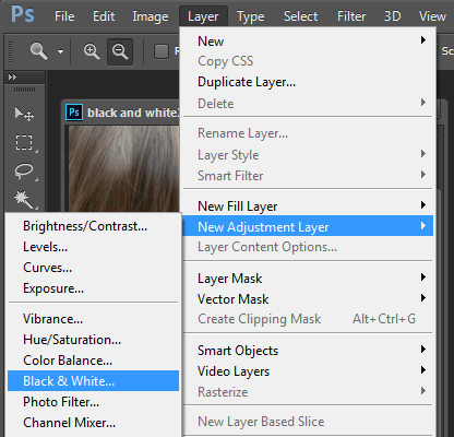
A challenging nighttime scene was overcome with multiple exposures and layer masking.

Blending indoors and outdoors in architectural photography can often create a compelling image. Unfortunately, however, it is often fraught with exposure and white balance issues. These issues are compounded at night, when artificial lights inside buildings coupled with the darkness of the night sky create an especially contrasty image with an unattractive colorcast created by the different light sources. Luckily, with multiple exposures and layer masking in Photoshop, you can create a photo that looks a lot like what you saw with your own eyes.

This method is a little different than HDR, which involves taking three or more photos at different exposures, then using automated software to combine them into one image that captures the range of light in the scene. Here, you’ll be taking three or more photos and blending them manually, since HDR software often creates unpleasant artifacts and odd color blending when used in the type of situations presented in this tutorial. You can always try HDR software first, and if the colors don’t seem to bleed, you can skip down to the later part of the tutorial for dealing with the colorcasts.

Dps 1

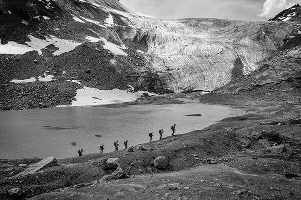
An image that required three exposures and had a color cast from the lamps.

Shoot three or more exposures on a tripod

You need to shoot as many photos as it takes to capture the dynamic range (the range from light to dark) in the scene. It is really important to shoot in RAW, to get as much mileage out of each photo as possible. A tripod is also necessary, since you’ll probably be taking these at night, and also because you won’t be using HDR software which aligns the images. You can use auto exposure bracketing to capture three images, but at night, exposures on the high end can often exceed 30 seconds, the longest shutter speed most cameras will let you shoot manually. It’s probably easiest to use manual mode, set your ISO to 100 or 200, stop down your aperture to f/7.1 or f/8 (if it’s really dark out, you can open it up wider), and then take a series of shots at increasingly slower shutter speeds until you’ve captured the range of light in the scene. If you need to go past 30 seconds, go into bulb mode (consult your camera’s manual for how to find it), and use a remote trigger release, holding the shutter open as long as you want. Don’t worry about white balance yet.

Dps 3

Processing one of the RAW files in Lightroom. Here you can see where just processing one RAW file wouldn’t be sufficient.

Process each exposure in Lightroom or Camera Raw, then open as layers in Photoshop

First, you are going to process the photos for exposure only, ignoring white balance. If you don’t have Lightroom, you can do this in Adobe Camera Raw. Since you have multiple exposures, you don’t need to go crazy trying to recover lost highlights (overblown bright spots) and shadows (dark parts that look black), but you want to recover them a little bit to give you more leverage later on in the process. There’s no magical formula for processing here. I usually apply lens profile correction, remove chromatic aberration, and do a little noise reduction before bringing down the highlights a little bit and bringing up the shadows and whites a little bit. Once you’re done processing each exposure, select them all, right click, and select “open as layers in Photoshop. Now you’ve got an image with three or more layers all ready to go, but we’re no quite ready to do the layer masking yet.

Dps 4

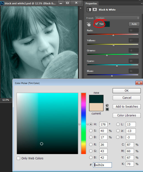
Go back and reprocess for white balance

White balance is a setting that keeps the whites in the image white, removing any colorcasts. Different light sources have different white balance settings though, so if you have a photo with two or more different light sources (such as the night sky and an artificial light), no matter how you adjust your settings, you’ll always have a color cast somewhere on your photo. What you’re going to do here is reprocess each photo so that you’ve corrected any colorcasts. If you’re lucky, you’ll have no more than two light sources in the photo. Unfortunately, though, there can often be more.

It’s important to note that you only have to correct for colorcasts that are in properly exposed parts of each photo. For instance, in one of your overexposed photos, don’t worry about the white balance for the overblown highlights. You’ll be discarding that part of the photo later. For one of your underexposed photos, don’t worry about correcting for the shadows, since you’ll also be discarding that. Start with your most properly exposed photo, and correct for any colorcast you see (for instance, the lights inside a building have a yellow cast).

All you have to do to correct the white balance is slide those two sliders (one goes from blue to yellow, and the other goes from green to magenta) until the part of the photo with the colorcast looks normal. When you’re done, open that photo in Photoshop, and make it a layer in the other image you have open. Do this by hitting Ctrl-A on Windows, or Command-A on a Mac to select the photo you just opened, then Ctrl-C or Command-C to copy it. Then click on the image with the three layers, and hit Ctrl-V or Command-V to paste it in as a layer. Repeat the processing until you have corrected all colorcasts in the photo. Then, move on to the other exposures, and correct any color casts there (remember, only the properly exposed parts need to be corrected).

Dps 5

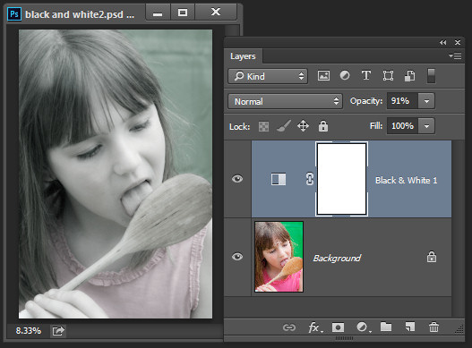
Mask in one layer at a time

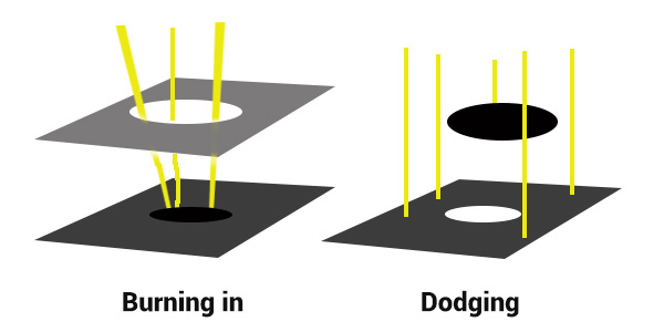
Once you’ve finally got every exposure and every colorcast accounted for as separate layers, you’re going to mask them in one by one. I start by making all but the bottom two layers invisible and masking in one layer at a time (by the way, the order of the layers does not matter, but having the most properly exposed image on the bottom will probably make things easier). Do this by clicking the little eye to the left of each layer except the bottom two. Then, with the layer one up from the bottom selected, click the layer mask icon (it’s a rectangle with a dot in the middle, found at the bottom of the layer panel). Make sure the paintbrush icon is selected as well (this can usually be found on the left hand side). You may need to adjust your brush size as you go through.

When painting with black on the layer mask, you will cover up the parts of the layer you don’t want appearing (the improperly exposed or color cast parts of the image are what you want to cover up). When you want to go back and reveal parts because you’ve made a mistake, paint with white on the layer mask. Click X on your keyboard to toggle back and forth between black and white.

When you’ve masked out all the parts of the layer you don’t want shown, select the layer on top of that and make it visible (click the space where the eye used to be). Then create another mask and start masking that layer. Keep revealing layers and masking them in until you’re done. In some cases, one part of the photo may be properly exposed in more than one image. In this case, keep the one that looks better to you. Once you’ve finished this process, save the photo as you would normally. If you think you might come back to this photo later and edit it, make sure to save a copy as a PSD.

Dps 6

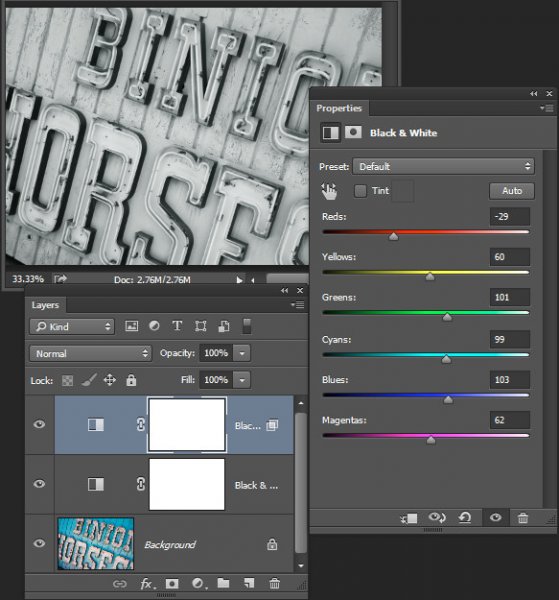
Sometimes you get lucky, and the part of the image that’s colorcast has a very strong hue to it. If you have a colorcast that’s almost all one color, you can automate the masking process a bit for that layer. In the top pane, go to Select –> color range, then click somewhere in the colorcast. Look at the preview. You want the part of the image that’s your colorcast to be almost completely white, and the rest to look almost completely black. Adjust the fuzziness slider until this is the case, and then click ok. You actually want to select the inverse of that, so go to Select –> inverse. Now click the layer mask icon, and you’ll have a mask that hopefully masks out the colorcast. If it doesn’t look right, undo it and try it again with a different fuzziness setting. This is not a perfect fix. You will still need to do some fine-tuning, but it really helps move things along quicker.

Dps 7

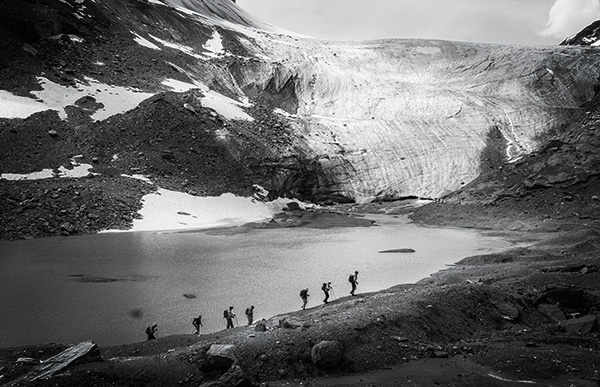
A simple “select color range” layer mask got rid of most of the colorcast in this photo.

Conclusion

This is just one method of conquering the challenges brought on by nighttime architectural photography. As you start working with photos of this nature, you may find a different method that you prefer. Luckily, many photos only require some of the steps detailed in this tutorial. Sometimes you only need one exposure, but you need to process for colorcasts. Other times, the white balance is even, but you need to mask for exposure. It takes practice to master these intricate masking techniques, so don’t give up if you’re unhappy with your results at first. Start with simpler photos with fewer colorcasts and exposures needed before diving into a really complex one. In time you’ll be creating photos that look as natural as they appeared when you saw them in person.

Dps 8

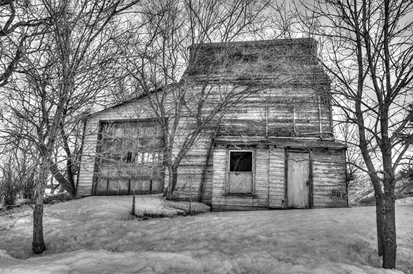
A single exposure that required layer masking to correct colorcasts.

Have you got any tips for doing architectural photography or using layer masking? Please share in the comments below.

googletag.cmd.push(function() {
tablet_slots.push( googletag.defineSlot( “/1005424/_dPSv4_tab-all-article-bottom_(300×250)”, [300, 250], “pb-ad-78623” ).addService( googletag.pubads() ) ); } );

googletag.cmd.push(function() {
mobile_slots.push( googletag.defineSlot( “/1005424/_dPSv4_mob-all-article-bottom_(300×250)”, [300, 250], “pb-ad-78158” ).addService( googletag.pubads() ) ); } );

The post Architectural Photography Using Layer Masking to Correct Contrast and White Balance by Samantha Decker appeared first on Digital Photography School.


Digital Photography School

 
Comments Off on Architectural Photography Using Layer Masking to Correct Contrast and White Balance

Posted in Photography


Setting Your White Balance with a Gray Card – a Tip from Phil Steele

15 Dec

Setting your white balance can be done two ways: in camera when you’re shooting or later in post-processing. In this short video tutorial Phil Steele shows you how to do both methods.

Part one is using a gray card to set a custom white balance. Read more about that topic with: Get your White Balance Right in Seconds Using Grey Card.

Part two is how to adjust the white balance using a gray card in Lightroom. Read more here: Adjusting White Balance in Lightroom.

Phil also mentioned where to buy gray cards, you can find several options on Amazon:

If you liked this tip, you can find out more about Phil’s Lightroom course or his brand new Event Photography course here.

googletag.cmd.push(function() {
tablet_slots.push( googletag.defineSlot( “/1005424/_dPSv4_tab-all-article-bottom_(300×250)”, [300, 250], “pb-ad-78623” ).addService( googletag.pubads() ) ); } );

googletag.cmd.push(function() {
mobile_slots.push( googletag.defineSlot( “/1005424/_dPSv4_mob-all-article-bottom_(300×250)”, [300, 250], “pb-ad-78158” ).addService( googletag.pubads() ) ); } );

The post Setting Your White Balance with a Gray Card – a Tip from Phil Steele by Darlene Hildebrandt appeared first on Digital Photography School.


Digital Photography School

 
Comments Off on Setting Your White Balance with a Gray Card – a Tip from Phil Steele

Posted in Photography


Dodging and Burning to Create More Effective Black and White Images

16 Oct

With the huge assortment of software and plugins you have at your disposal these days, the photo processing technique of burning and dodging is practically ancient. It was (and still is) one of the most common ways of enhancing film images in the darkroom, and everyone from Ansel Adams to Imogen Cunningham used it.

myra2

They used it because it is powerful and simple and still is to this day. With all the complicated plugins and post-processing procedures you have at your disposal, you won’t get any better bang for the buck than creative dodging and burning.

This tutorial with show you  how I do dodging and burning in Photoshop, for black and white images. I’ll save another article for you about using the technique for your color images. First, though, let’s make sure we all know what dodging and burning is.

WHAT IS DODGING AND BURNING?

Originally, dodging and burning was used in the traditional darkroom, to retouch film to enhance highlights, and deepen shadows on photographic prints. Photographers used simple darkroom tools to either allow more light from the developer machine to reach certain parts of the light sensitive photographic paper. This was known as “burning in” which made these parts of the photo darker. The photographer could also dodge the light – hold it back from the paper – allowing that part of the photo to remain less developed or lighter than the non-dodged area.

Using this method, photographers or retouch artists could control with great accuracy the developing process to ensure that their prints displayed the full range of tonal values needed to make the photograph pop.

Darkroom Burning and Dodging digram

Darkroom burning and dodging: allowing more light to pass, or holding light back.

WHY YOU SHOULD DODGE AND BURN YOUR DIGITAL PHOTOS

So what has an ancient darkroom technique got to do with your photography? Plenty! Dodging and burning can add a whole new level of depth to your images. With Photoshop it’s simple.

Here are some compelling reasons to incorporate dodging and burning into your digital photography post-processing workflow:

  • To create more dimensionality, make things pop out at your viewers, and make others recede into the shadows.
  • To draw your viewer into your image. Our eyes are programmed to follow the light, and the lightest, brightest parts of your photo are where you want to direct viewers. Some creative dodging and burning will help get their eyes where you want them to go.
  • To isolate the subject.
  • To minimize distracting backgrounds.
  • To turn the lights on, in a photo – if you need some creative lighting after your shot, dodging and burning can help.
  • To make things more dramatic and moody – enhance the shadows to darken things down.
  • Add a vignette to keep the viewer’s eye in the image.
Dodging & Burning adds dimension.

Dodging and burning add dimension.

The three dimensionality of the circle on the right was created purely by dodging and burning a copy of the one on the left. As well, it is super easy with the technique you’re about to learn. As with most things in Photoshop there are many ways to accomplish the same goal, and each have their advantages and drawbacks. I prefer this way because it gives you a huge amount of control and flexibility. It’s drop dead simple, and non-destructive.

Let’s look at  before and after shots so you can see  the difference between nothing, and selective dodging and burning.

Before Dodging and Burning

Before dodging and burning, the image is flat and has no center of interest.

Final Image, with Burning and Dodging applied - exaggerated for effect.

Final image, with dodging and burning applied – we are drawn by light to the door.

The second image has more drama, more of a moody feel. The snow has texture and dimension, and the small door and window are the clear center of interest. Nothing was changed in this photo other than adding tonality by dodging and burning. The look has been exaggerated so you can see the changes, normally dodging and burning is more subtle than this example. Although you can get quite dramatic results if that’s the mood you’re going for.

USE THE BEST TOOLS FOR THE JOB

toolsYou may have noticed in Photoshop’s Toolbar, a couple of tools called Dodge and Burn. Forget about them. I don’t use  these for my dodging and burning. I like to have more control when I work on my images. So instead of the pre-made tools I create my own using layers and the brush tool. It becomes artistic like creating a painting, and you have more freedom to be flexible.

Using layers give you the flexibility to change opacity, and to group your different layers into folders. You can then selectively turn on layers to see how your work is progressing.

HOW TO DO DODGING AND BURNING

Dodging – adding more light:

  • Create a new layer. Switch the blending mode to Color Dodge, and rename this layer Dodge. You may end up having many dodge layers, so name it something more descriptive, door dodge or tree dodge.
  • Select a pale gray color from the toolbox palette, initially this color will be light, for example #bcbcbc, or 188,188,188 on the RGB scale. This color determines the main intensity of the dodge, or how bright it will be.
  • Select a soft brush at a size suitable for the area you want to bring out or emphasize.
  • Initially set the Opacity and Flow of the brush to about 20% each.
  • Brush on the new layer and instantly see the light colors start to POP. If there’s too much, you can either reduce the opacity of the layer, or reduce the opacity and flow of the brush itself.

step1

Once you have an intensity you like, brush dodge segments of the image – the door for example. If you move to another part of the image use a new layer for that area or element. You do this because you may want to adjust the intensity by changing the opacity of the layer, or the brush, or even change the color to a lighter or darker shade of gray.

Finally create a Layer Group – click the little folder icon in your layers palette. Move all your Dodge layers into one Group. Name the group Dodge. This allows you to instantly turn off all the “lights” to see before and after. Did you go overboard too much, should you do more, or is it just right? Being able to turn all the dodging off with one click will help you decide.

Where and what to dodge:

You want the lightest parts of your image to lead the viewer’s eye to your subject. Can you create a pathway of sorts with a dodged or brighter leading line, a bright path that the eye can easily follow? Alternately you can also make leading lines darker by burning. Leading lines don’t always have to be bright.

Dodge (and burn) places with texture, to add that three dimensionality, to make the texture really stand out. Try dodging the subject a bit, just a subtle brushing with a gentle opacity to add some brighter tones relative to the rest of the image. Does it pop out a little more now?

You’ve finished dodging for now, next let’s go over to the dark side!

Burning – creating darkness:

Next you’ll do the exact same process for burning. I suggest starting with the exact same color and opacity settings too. Simply create a new layer and set the blending mode of Color Burn, and name the layer Burn.

Once again, if you need more drama, you can change the color of the brush, or change the opacity and flow of the brush or the layer. You can add more layers if needed, duplicate a layer to instantly double the amount of darkness.

This method is quick and intuitive, and if I feel that you’ve gone too far, you can turn off a few layers to hide their visibility in the image. I suggest you make a Layer group for the Burn layers as well.

You can even create another Layer group called D&B (for dodge and burn) and put the the other groups inside. Just ctrl+click to select them and drag them over top of the D&B layer. Now you’ll be able to see the total before and after view with one click. Off and on – good or not? More work needed or done?

SEEING THE BIG PICTURE

Once you’ve brushed in the areas that you want and think you have all the burning and dodging done, you can burn a vignette around the edges of your image to keep the viewer’s eye from leaving. It’s like framing your photo with a bit of darkness, so the eye stays on the brightness.

All  you need to do here is create (yes) another layer and use the elliptical marquee tool, with a feathering setting of at least 50 pixels. On the new layer drag out the circle so it touches the edge of your frame. To add darkening to just the edge of the image to create the vignette, go to the top menu in Photoshop and click on Select>Inverse. This will now let you fill the area OUTSIDE the selection.

In the Tools Box, select the same grey color you used for the initial burning of your image as your foreground color, then hit Alt>Backspace on your keyboard to fill that selection with color.  Set the layer blending mode to Color Burn. You may have to decrease the opacity of this layer a bit depending on the tones in your image.  This vignette should be pretty subtle, it’s not meant to be a frame, just a very slight darkening to keep your centre of interest a few tones brighter, to keep the viewers’ eye in your frame.

marquee

Initial selection

Selection inverted

Selection inverted

Vignette added

Vignette added

_2DS2932VV

FInal image

I’ve made a short screen capture video showing my technique for dodging and burning you can watch below if you prefer to follow along:

Once you give this method a try, you’ll see how easy it it and how you can achieve dramatic effects with a few quick steps. You have full control of the look and style of your image, and you can revert your steps at anytime to adjust if needed.

If you have alternate methods for dodging and burning let me know why you like them, and also what challenges they create for you. If you’d have any dodged and burned images you’d like to share, please do post them here. Inspire us!

The post Dodging and Burning to Create More Effective Black and White Images by Alex Morrison appeared first on Digital Photography School.


Digital Photography School

 
Comments Off on Dodging and Burning to Create More Effective Black and White Images

Posted in Photography


How to do Great Black and White Conversions Using Photoshop

08 Oct

Black-and-white-in-photoshop-1

Some photos that you take you’ll want to convert to black and white. Photoshop has some tools that you can use to convert your photos to black and white and I’ll show you what these are and the best way to do the conversion.

Why you should shoot in color and convert to black and white

If your camera saves photos as jpeg images, even if it can capture in black and white, it’s advisable to avoid this setting and instead shoot in color and convert later. The reason is that when you capture in jpeg and have the camera set to black and white, all the color information is discarded when the image is saved and you can never get it back. So you will only ever have a black and white image. On the other hand if you capture in color you will have the choice to convert the photo to black and white, but you will also have a color image in case you decide it looks better that way.

Black and white conversions in Photoshop

You have a couple of choices when converting to black and white in Photoshop. You can desaturate the image by choosing Image > Adjustments > Desaturate. This removes the color from the image but you have no control over how it is converted.

Black-and-white-in-photoshop-2

A better way to convert an image is to use a black and white adjustment layer. So choose Layer > New Adjustment Layer > Black & White and click Ok to create the new adjustment layer.

Black-and-white-in-photoshop-3

When the Properties dialog appears you will see sliders for red, yellow, green, cyan, blue and magenta. You can use these to control how the colors in the photo are converted. Drag a color slider to the left to darken areas in the image which are that tone and drag to the right to lighten them.

Black-and-white-in-photoshop-4

In some cases you may see little or no change when you drag a slider – this will happen if there is little or none of that color in the image.

The sliders allow you to create a custom black and white conversion for your photo and you can also adjust how similar value colors are converted. In this image the girl’s pink shirt and the green background convert to a similar shade of grey – but adjusting the green slider to the left darkens the background and creates a more pleasing black and white image.

Black-and-white-in-photoshop-5

In addition to adjusting the sliders you can also use the targeted adjustment tool by clicking its icon in the Properties panel (circled in red below). You can then click on a specific area of the image and then drag to the left or to the right to adjust the color under the eyedropper. Drag to the left to darken the color, and to the right to lighten it. You should be aware, that this will, of course, adjust every occurrence of that color in the image, not just the area of color underneath your cursor.

Black-and-white-in-photoshop-6

As you adjust the sliders take care to avoid dragging adjacent sliders in completely opposite directions. You are adjusting colors which are likely to be found in close proximity to each other in opposite directions – making one color light and the other dark. The risk is that you will create areas of mottled darks and lights in the image which won’t be aesthetically pleasing as in this image below:

Black-and-white-in-photoshop-7

Instead, adjust adjacent sliders so their values are closer to each other for a smoother and more pleasing result as in this next image:

Black-and-white-in-photoshop-8

There are also presets options available from the Properties dialog that you can use as a quick start converting your image to black and white. Click a preset in the list to apply it. If you find one you like you can use it as is, or continue to adjust the sliders to fine tune the result.

Black-and-white-in-photoshop-9

Although you can apply this black and white conversion directly to the image using Image > Adjustments > Black and White, I suggest you use the adjustment layer method instead. The reason for this is that, when you use an adjustment layer you can double click the adjustment layer thumbnail to fine tuning the result at any time.

If you apply the adjustment as an adjustment layer you can blend it into the image below by reducing its opacity. Here I reduced the opacity of the black and white adjustment to reveal some of the original color image to give an almost hand tinted look to this image.

Black-and-white-in-photoshop-10

You can also, as I will explain below, add multiple black and white adjustment layers and use the built in masks to control how each adjustment layer affects the image.

Tinting a black and white image

The Black and White Adjustment Layer Properties dialog also gives you the option of tinting the black and white image. To do this click the Tint button and click the color selector which allows you to choose a color to tint the image. Choosing a bright color will result in a brighter and more colorful tint and choosing a darker color will give a more subtle tone to the image.

Black-and-white-in-photoshop-11

Multiple black and white adjustments

Occasionally you may want to treat two areas of similar color in a photo in different ways. For example you may have an image that has a blue sky as well as other elements which are also blue. If you adjust the image using a single black and white adjustment layer all the blues in the image will be converted to a similar grey value and this may not be the effect that you want.

When you need to adjust two areas of similar color in an image in different ways you can apply two separate black and white adjustment layers. To do this, add the first black and white adjustment layer and use it to adjust the image the way you want it to look for one area of color. In this example I’ve adjusted the top of the image.

Black-and-white-in-photoshop-12

Then add a second black and white adjustment layer to the image. At this point you may notice that making changes using the second adjustment layer has no effect on the image at all. This is to be expected – a black and white adjustment layer won’t have any effect when applied over the top of what is basically a black and white image. You can change this behavior by selecting the new adjustment layer and choose Layer > Layer Style > Blending Options. From the Knockout dropdown list select Deep and then click Ok.

Black-and-white-in-photoshop-13

Now you can use the new black and white adjustment layer to fine tune the image. In this case I used it to adjust the image so the bottom part looked the way I wanted it.

Black-and-white-in-photoshop-14

To finish the image you can blend the two adjustments using the masks on one or both adjustment layers.

For this example I targeted the mask on the topmost adjustment layer and filled it with a black to white linear gradient using the Gradient tool. I dragged down at an angle across the middle of the image so the gradient would follow the angle of the sign. The result is that the top most black and white adjustment layer no longer has any effect on the topmost part of the image (the mask is black in that area).

Black-and-white-in-photoshop-15

This process has allowed me to convert two areas of the photo, both of which contain a similar blue color to different tones of gray, one light and one dark.

If you prefer to watch a video showing these adjustments see below for the same steps:

This second video shows how to craft custom black and white images in Photoshop:

For tips on using Lightroom for your black and white conversions try these:

  • Tips for Shooting and Processing Better Black and White Photographs
  • How to Convert Photos to Black and White in Lightroom
  • Create Better Black and White Photos Using Local Adjustments in Lightroom 5
  • 3 Tips for Better Black and White Conversion using Lightroom

Do you have any other tips for black and white conversion using Photoshop?

The post How to do Great Black and White Conversions Using Photoshop by Helen Bradley appeared first on Digital Photography School.


Digital Photography School

 
Comments Off on How to do Great Black and White Conversions Using Photoshop

Posted in Photography


Paint Me White Again: Tunnel Type Graffiti Taunts Authorities

28 Sep

[ By WebUrbanist in Art & Street Art & Graffiti. ]

paint me white again

Well known for stenciling big block-lettered phrases on walls around his native Newscastle, this piece is unusually blunt (as well as hilarious), amounting to a multi-part conversation between the artist and the city.

street art blank wall

street art painted over

Even better than the original ‘COME ON AND PAINT ME WHITE AGAIN’ dare is the later response after the municipality indeed whitewashed the first work: ‘BOOORING’, using his same signature typography in black paint.

joke around the corner

mobster street art checklist

mobstr newcastle reblog this

While not all of his work is quite so meta-minded as this series, this sequence remains a great illustration of how graffiti is generally temporary as well as contextual, and can have elements of humor and self-reflection beyond simple tagging. Some of his works are best seen in video form rather than via photographs, hence a few fun short films below.

A self-described minimalist, Mobstr explains the origins of his nom de plume, which are none too surprising: “It is a play on the term mobster which is someone who deals in organised crime. Most of my work is illegal however a lot of organisation goes into it. So as a joke I use the idea of it being organised (art) crime.” Also, he had a lobster named mobster.

Share on Facebook


[ By WebUrbanist in Art & Street Art & Graffiti. ]

[ WebUrbanist | Archives | Galleries | Privacy | TOS ]


WebUrbanist

 
Comments Off on Paint Me White Again: Tunnel Type Graffiti Taunts Authorities

Posted in Creativity


Canon UK introduces limited edition Stella McCartney bag with white EOS 100D

27 Sep

In a collaboration with fashion designer Stella McCartney, Canon UK is to offer a run of 1000 EOS 100D kits that come packaged in a tote bag created specifically for the white bodied version of the camera. Called Linda, after the designer’s photographer mother Linda McCartney, the bag adheres to its namesake’s vegetarian ethics by using ‘cruelty-free’ Eco Alter Nappa leather alternative material finished with a natural vegetable oil coating. Read more

Articles: Digital Photography Review (dpreview.com)

 
Comments Off on Canon UK introduces limited edition Stella McCartney bag with white EOS 100D

Posted in Uncategorized


The Winner of $1000 from our Essential Guide to Black and White Photography eBook Competition is….

23 Sep

NewImageRecently we launched our Essential Guide to Black and White Photography. As part of the launch we put everyone who purchased a copy into the draw to win $ 1000 in camera gear.

The winner of this competition is…. Yves Wepadjuie!

Congratulations Yves – we’ve just emailed you with details of how we’ll get you your prize and can’t wait to see what you buy!

Thanks everyone else for picking up a copy of the Essential Guide to Black and White Photography – the eBook has received some amazing feedback and we appreciate you supporting dPS with your purchase – the sale of our eBooks is how we are able to keep producing 14 free tutorials each week here on the blog!

Our Next eBook is Just Around the Corner

For those looking forward to our next eBook – you don’t have to wait too long! We’ve got another exciting one for you very soon from our best selling author – Gina Milicia!

The post The Winner of $ 1000 from our Essential Guide to Black and White Photography eBook Competition is…. by Darren Rowse appeared first on Digital Photography School.


Digital Photography School

 
Comments Off on The Winner of $1000 from our Essential Guide to Black and White Photography eBook Competition is….

Posted in Photography


Macphun’s Tonality Pro Versus Lightroom 5 for Black and White Conversion

13 Sep

Tonality Pro vs. Lightroom

MacPhun Software recently released Tonality Pro (use this link to get 20% off, for dPS readers only), a powerful black and white converter for Mac. In this article I’m going to compare it to Lightroom so you can see how the conversion process differs between the two programs.

Windows users please don’t stop reading now – I’ll look at some other black and white plug-ins at the end of the article, all of which are cross-platform.

To start, here’s the colour photo that I’m going to convert to black and white.

Tonality Pro vs. Lightroom

Here’s the black and white version I created in Lightroom.

Tonality Pro vs. Lightroom

It’s a fairly straightforward conversion. I increased Clarity and Contrast, and added a vignette using the Radial Filter. I didn’t touch the Black and White Mix panel, and I didn’t add Split Toning.

All these tools will be familiar to Lightroom users. So, how does Tonality Pro differ? Let’s take a look.

Tonality Pro uses presets

Tonality Pro’s presets give you a variety of ready made black and white conversions. Of course, not all of them will be suitable for your photo, but with over 150 to choose from, you are bound to find at least a few that do good things for your images. If you don’t like using presets, just skip them and go straight to the other panels to do your work.

Tonality Pro’s presets are similar to Lightroom’s Develop Presets. The main difference is that Tonality Pro comes supplied with a full set, while Lightroom only has a limited range of built-in monochrome presets. If you want a decent set of black and white presets for Lightroom, you will have to buy them.

Tonality Pro’s presets have two features that make them a very powerful and versatile feature.

The first is a slider that lets you adjust the strength of the preset. This is useful because the number one problem with presets of any sort is that they can be too strong. A subtle touch is better when it comes to post-processing and many presets are far from subtle. The opacity slider in Tonality Pro helps you deal with that. Let’s say you apply the Impressive preset to your photo. Here’s how it looks.

Tonality Pro vs. Lightroom

Too strong? It’s easy to reduce the strength of the effect until it looks just right.

Tonality Pro vs. Lightroom

The second feature (I’m really excited about this) is that Tonality Pro has layers. With layers, you can apply a preset on a new layer, then create a mask using Brush mode so that the preset is only applied to part of your image.

Take a moment to think about what that means. For example, you could apply one preset to the subject (in this case the girl in the photo) on one layer, and another to the background on another layer. It’s got the potential to be very powerful, and it’s something that I haven’t seen in any other plug-in.

Here’s how it works. In these examples I’ve applied the Impressive preset to the model’s face, and the Grunge 1 preset to the background using layers. I used the opacity sliders to keep the effect subtle. These three images show the result.

Tonality Pro vs. Lightroom

Next I added a frame.

Tonality Pro vs. Lightroom

Finally I added some Structure to the eyes, and increased Adaptive Exposure a little to compensate for the way Structure tends to make things darker as well as add detail. You can achieve a similar effect in Lightroom with Clarity, but you will be interested to know that you can adjust Structure in Tonality Pro as well as Clarity (Structure is better than Clarity for bringing out detail).

Tonality Pro vs. Lightroom

Here’s the final comparison of the two versions of the photo.

Tonality Pro vs. Lightroom

As you can see, apart from the border, most of the differences are subtle. But the way I got there, the editing process itself, was very different.

Now I’m going to show you another application of Tonality Pro that you definitely can’t do in Lightroom. Here’s the original colour photo.

Tonality Pro vs. Lightroom

Here’s the initial black and white conversion:

Tonality Pro vs. Lightroom

This is the same photo processed in Tonality Pro with a red colour filter applied to darken the sky and add drama to the distant mountains.

Tonality Pro vs. Lightroom

Here I’ve added another layer and applied the El Captain preset, reduced the opacity of the layer to 20 (to keep the effect subtle), and used a mask to apply the preset to the foreground only, not the mountains or sky.

Tonality Pro vs. Lightroom

All this took just a couple of minutes to carry out.

The verdict

This is a simple demonstration but hopefully it’s given you a taste for what Tonality Pro can do, and how it compares to Lightroom.

I’ve only scratched the surface in this article, Tonality Pro has lots more interesting features. Another dPS writer,  Phillip VanNostrand has done a full review here, it covers the software in more depth, so check that out also. In the meantime, if you want to test out Tonality Pro for yourself, or learn more about the program, then you can do so at MacPhun’s website (get 20% off for dPS readers using this link).

How Tonality Pro compares to other plug-ins

Tonality Pro isn’t the only black and white plug-in out there, and you may be interested to know how it compares to some of the others. Don’t forget they all have different features and strengths, and the best one for you depends on what you want to do with your black and white images. You can download trials of all the plug-ins to help you make your mind up. Here’s a brief guide:

Silver Efex Pro 2

Until Tonality Pro came along this was the single best black and white conversion plug-in you could buy. To be honest, I haven’t used Tonality Pro enough yet to say whether it is better than Silver Efex Pro 2. But, there’s no doubt that the layers feature in Tonality Pro means that it is a versatile program that gives Silver Efex Pro 2 a good run for its money.

Silver Efex Pro 2 is more expensive (more than double the price) but it does come as part of the Nik Collection, so you do get the benefit of the other programs within it (Viveza, Color Efex Pro and so on). Silver Efex Pro 2 also has a powerful history function that Tonality Pro lacks.

Alien Skin Exposure 6

One of my favourite plug-ins, Exposure 6 is designed to give your digital photos an analog look. You can use it for both black and white and color photos, and in my opinion it’s stronger on the colour side than monochrome. But it’s still a powerful black and white converter.

It’s more expensive than Tonality Pro, but you get the advantage of being able to use it to process colour photos too. It can be used as stand-alone program as well as a plug-in (as can Tonality Pro).

Topaz Black & White Effects 2

Black & White Effects 2 is a nifty black and white plug-in. Its main benefit is an extensive range of creative presets, including several sets that imitate old processes such as cyanotype, albumen and van dyke brown. It’s also good for emphasizing detail and texture.

Perfect Black & White

onOne Software’s Perfect Photo Suite includes the Perfect Black & White module. Like Silver Efex Pro 2, you get the benefit of the other modules in the suite. But unlike Silver Efex Pro 2, all the modules work together and you can switch seamlessly from one to the other.

One of my favourite modules is Perfect Mask. I use it to blend two versions of landscape photos, one processed for the sky and the other for the foreground. Combined with Perfect Black & White it helps you create powerful and dramatic black and white landscapes. It also works as a stand-alone program.

Discussion time

In my review of MacPhun’s Intensify Pro one reader gave an opinion that photographers who use plug-ins instead of Photoshop are lazy. It’s an interesting topic for discussion, so please let us know what you think in the comments. Do you use plug-ins to process your photos? If you do, which are your favourites and why? Or do you agree with the view that plug-ins are for lazy photographers?


Mastering Lightroom: Book Three – Black & White

Masterlng Lightroom: Book Three – Black & White by Andrew S Gibson
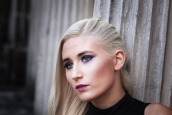
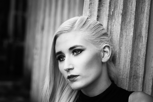
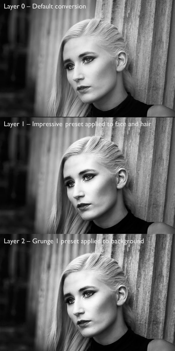
My ebook Mastering Lightroom: Book Three – Black & White goes into the topic of black and white in depth. It explains everything you need to know to make dramatic and beautiful monochrome conversions in Lightroom, including how to use the most popular black and white plug-ins. Click the link to visit my website and learn more.

The post Macphun’s Tonality Pro Versus Lightroom 5 for Black and White Conversion by Andrew S. Gibson appeared first on Digital Photography School.


Digital Photography School

 
Comments Off on Macphun’s Tonality Pro Versus Lightroom 5 for Black and White Conversion

Posted in Photography


Product Review: Macphun Tonality Black and White Photo Editor

10 Sep

Macphun Software announces new program

Macphun Software, a photography app developer with over 20 million users worldwide just recently released their latest photo editing software program, called Tonality. This is a program dedicated entirely to editing your photos in black and white, and it is so much fun to use!

You may already be using a Macphun program – they have produced a whole suite of useful consumer photography editing tools, such as Intensify Pro, Snapheal Pro, and Focus Pro. This latest addition to their software collection is really a powerful one, for professionals and hobbyists alike.

I played around with the software a bit and there are quite a few things I liked about it, and just a couple of things that I found non-intuitive. Read on to discover more about this program.

Macphun Tonality

From my recent trip to Mongolia

Overview of Macphun Tonality

Macphun Tonality
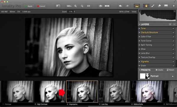
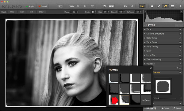
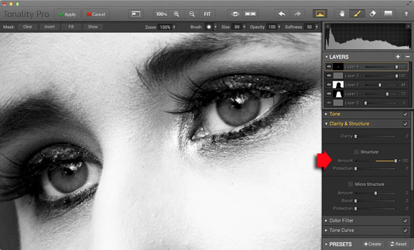
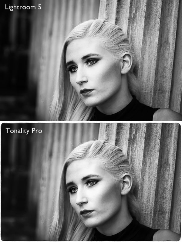
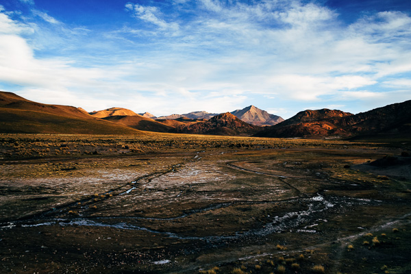
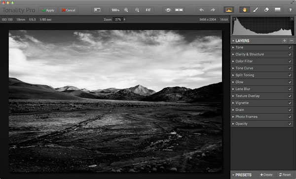
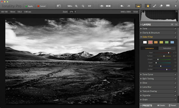
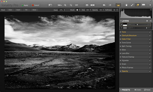
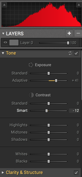
Tonality is easy to pick up right away if you are familiar with Lightroom or Photoshop RAW editing tools. The designers intentionally created an editing panel on the right hand side of your viewing window that looks almost exactly like Lightroom’s editing panel. It includes familiar tools like Exposure, Tone Curve, Split Toning, and Vignetting.

There are some other effects here that are not so familiar, and do interesting things when you play with the sliders. Clarity & Structure is a section unto itself that provides the user with highly controlled clarity effects. In the Exposure section there is an ingenious slider titled Adaptive which allows you to adjust the exposure while preserving the highlights, something Lightroom should have had in place a long time ago. There is a section called Glow which does exactly what you think it would do; add glow to your images, like a balloon lit from the inside casting a nice glow over everything. You can add Grain, adjust the overall Opacity of the changes you are creating, and there are options for Texture Overlay and Frames, which are pretty fun with black and white images.

Macphun Tonality

Layers

One thing that is really fantastic is that ability to edit with layers. This is something that I found (and still find), rather non-intuitive, but allows for huge possibilities in editing, especially with textured layers.  When you add on a new layer and insert a texture via the Texture Overlay panel, you can brush through via masking and only texturize parts of the image, like the background in this image:

Macphun Tonality

Editing with the Textures Overlay panel. I added a metal texture in one layer and a paper texture in another layer, and painted through on the girl’s face using the layer mask so the texture didn’t affect the smoothness of her skin.

Here I added a metal texture in one layer and a paper texture in another layer and painted through on the face using the layer mask so the texture didn’t affect the smoothness of the girl’s skin.

The non-intuitive part for me is in actually using the layers and brushes to mask out parts of the image. If you have grown up on Adobe Photoshop then you might not find this familiar at all. It’s not impossible, it just requires a different way of thinking about how layers work and how the masking works. It will simply slow down your workflow slightly, but as with anything new, there is always a learning curve.

Some thoughts

When I first saw the software I thought to myself; “I can edit in black and white just fine with Lightroom. Why would I need another program to do such a simple thing?”. But just as Photomatix is brilliantly designed to do just one thing (tone-map HDR images), Tonality is designed to do just one thing perfectly: create black and white images like you could never do in Lightroom or Photoshop. I took a couple of black and white images from Lightroom that I was satisfied with, and tried them out in Tonality. Just using the presets alone as a jumping board for editing in Tonality shows an astounding difference in quality, sharpness, and texture.

See these two images side-by-side and notice what Tonality can do to really make a photo pop:

Digital Photography School Review

Edited in Lightroom for a simple black and white look

Macphun Tonality

Edited in Tonality for some movie poster “pop”

Perhaps some won’t like that HDR look, but I happen to love it. It makes an otherwise bland black and white photo cause me to pause and take a second look. Which is what we are always trying to accomplish with our photos, aren’t we?

Macphun Tonality Pro features:

  • Professional image quality with proprietary 16-bit RAW processing engine
  • Advanced algorithms and a streamlined user experience for superior results
  • Scores of inspiring professional presets provide a wide range of one-click image styles
  • Built-in organic-style overlay textures, plus user-loadable textures, for incredible creativity
  • Unique adaptive exposure and smart contrast tools for advanced tone control
  • Multiple effect layers, each with separate opacity controls, blending modes and preservation of color data offer true advancements in creative toolsetsTonalityPro
  • Adjustable, pressure-sensitive brushes and masking tools for precise selective edits
  • Advanced clarity and structure detail controls yield dramatic results
  • Proprietary grain engine with over 20 emulated film types
  • Selective color using color channel sliders for unique stylistic expressions
  • Glow, lens blur, vignette, photo frame and opacity controls for finishing touches
  • Easy image sharing to popular social networks, and via email, instant messaging, AirDrop and SmugMug
  • Macphun Print Lab services, powered by MILK
  • Runs as either a standalone app or, in the Pro version, as a plug-in to popular image editing software like Adobe® Photoshop®, Adobe Photoshop Lightroom®, Adobe Photoshop Elements® or Apple® Aperture®.

Find Tonality Pro and Tonality here on the Macphun website, starting at $ 19.99, and for dPS readers they’ve given us 20% off so use this link to get that special price.

Summary:

In summary, I give this software product 5 stars. I can actually see myself using this in the future, and I think it will be a welcome addition to my limited number of tools that I use for editing photos. It’s fun, super easy, and I can use it to edit a lot of my future travel photos. Like these:

Macphun TonalityPro

Macphun TonalityPro

Macphun TonalityPro

You can also add in some coloring for sepia tints or different metallic effects

The post Product Review: Macphun Tonality Black and White Photo Editor by Phillip VanNostrand appeared first on Digital Photography School.


Digital Photography School

 
Comments Off on Product Review: Macphun Tonality Black and White Photo Editor

Posted in Photography


Black and White Portraits a Set of Images to Admire

06 Sep

Last week we looked at a collection of stunning black and white landscape photos. This week it’s all about portraits in the same modality.

Photograph So close together by Magda Constantin on 500px

So close together by Magda Constantin on 500px

For me there is something special about a portrait done in black and white, something about it that allows the photographer to exposure the subject’s very soul itself. The simplistic nature of being monochromatic means the focus is on light, shape, tone and emotion more so than with color, in my opinion anyway.

Black and white portraits transport me to a time of the master photographers like Karsh, Hurrell and Newman. If you don’t know those names – I suggest you google them with the word “portrait” and learn from them, as they were truly some of the best in portrait photography, possibly ever.

Without further ado, enjoy this set of black and white portraits, and if you want to learn more about black and white grab a copy of the newest dPS ebook The Essential Guide to Black and White Photography at early bird pricing only until September 13th.

Photograph K. by pkfruen  on 500px

K. by pkfruen on 500px

Photograph Fête de la musique by Jean-Paul Verjus on 500px

Fête de la musique by Jean-Paul Verjus on 500px

Photograph Sister love by Cathy Martineau on 500px

Sister love by Cathy Martineau on 500px

Photograph Rain by pkfruen  on 500px

Rain by pkfruen on 500px

Photograph Soul-division by Anthony De Faria on 500px

Soul-division by Anthony De Faria on 500px

Photograph David Hayman, King Lear by Tommy Ga-Ken Wan on 500px

David Hayman, King Lear by Tommy Ga-Ken Wan on 500px

Photograph FIlm Noir: Chris Botti by Brian Smith on 500px

FIlm Noir: Chris Botti by Brian Smith on 500px

Photograph second wind ,,, by Mete Ba?koçak on 500px

second wind ,,, by Mete Ba?koçak on 500px

Photograph my life... by Leila Raymond on 500px

my life… by Leila Raymond on 500px

Photograph Untitled by Lee Jeffries on 500px

Untitled by Lee Jeffries on 500px

Photograph shootout by David Mar Quinto on 500px

shootout by David Mar Quinto on 500px

Photograph Mans Best Friend by Drew Hopper on 500px

Mans Best Friend by Drew Hopper on 500px

Photograph Serge. by DrakSpirit on 500px

Serge. by DrakSpirit on 500px

Photograph Symmetry of Hate by Daniele Di Egidio on 500px

Symmetry of Hate by Daniele Di Egidio on 500px

Photograph Close-up portrait of a street by Mikhail Levit on 500px

Close-up portrait of a street by Mikhail Levit on 500px

Photograph A portrait of friend in a kitchen setting by Mikhail Levit on 500px

A portrait of friend in a kitchen setting by Mikhail Levit on 500px

Photograph Smoking Hot by Darcy Evans on 500px

Smoking Hot by Darcy Evans on 500px

Photograph Jill by Renee Robyn on 500px

Jill by Renee Robyn on 500px

Photograph Eye & Face by Andi Halil on 500px

Eye & Face by Andi Halil on 500px

Photograph The breath by Claudio L'Estremo Montegriffo on 500px

The breath by Claudio L'Estremo Montegriffo on 500px

Photograph mr thomas by Hegel Jorge on 500px

mr thomas by Hegel Jorge on 500px

Photograph When the soul cries(The true story of a tough life) by Silvia S. on 500px

When the soul cries(The true story of a tough life) by Silvia S. on 500px

Photograph Danka B&W by Gabor Jonas on 500px

Danka B&W by Gabor Jonas on 500px

Photograph Sometimes there are no words... just the moment by J.J. Taylor on 500px

Sometimes there are no words… just the moment by J.J. Taylor on 500px

Photograph thoughts by Danilo Veccia on 500px

thoughts by Danilo Veccia on 500px

Photograph Elusive by Federico  Ratano on 500px

Elusive by Federico Ratano on 500px

Photograph girl's eyes by marylexa on 500px

girl's eyes by marylexa on 500px

Photograph vamos bien by Angelo Tassitano on 500px

vamos bien by Angelo Tassitano on 500px

Photograph Master Monk by Anthony Pond on 500px

Master Monk by Anthony Pond on 500px

Photograph In the Brick Shed by Anthony Pond on 500px

In the Brick Shed by Anthony Pond on 500px

Photograph Three Prayers by Anthony Pond on 500px

Three Prayers by Anthony Pond on 500px

The post Black and White Portraits a Set of Images to Admire by Darlene Hildebrandt appeared first on Digital Photography School.


Digital Photography School

 
Comments Off on Black and White Portraits a Set of Images to Admire

Posted in Photography