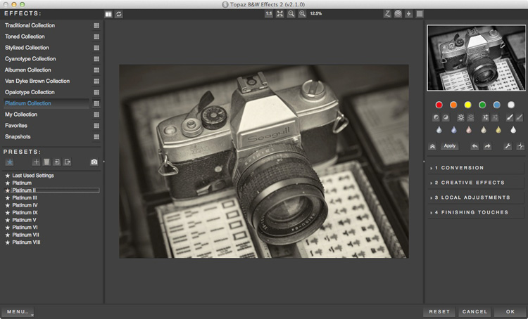
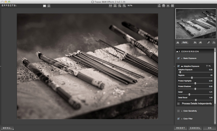
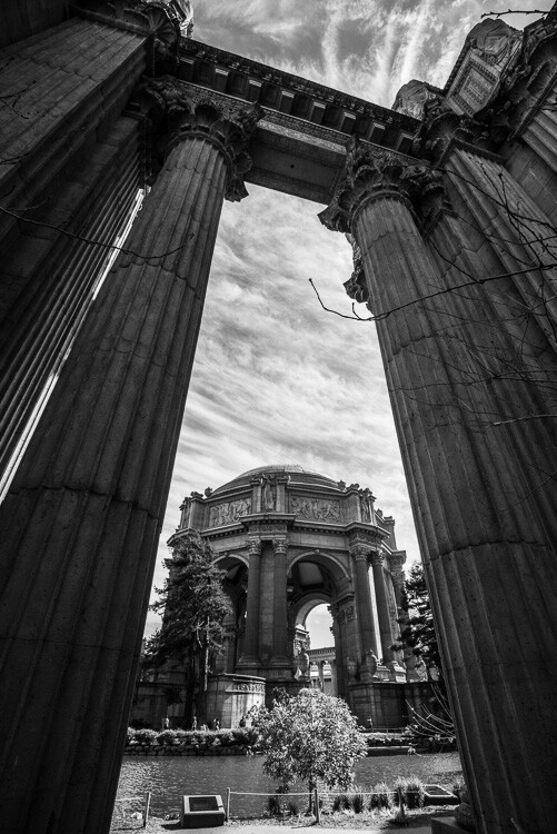
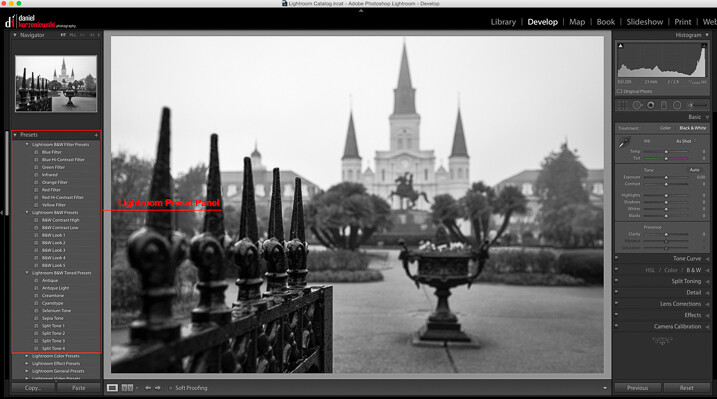
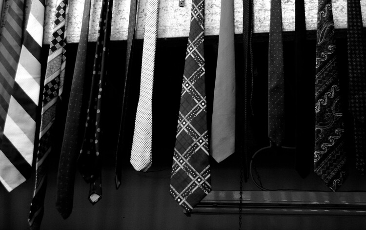
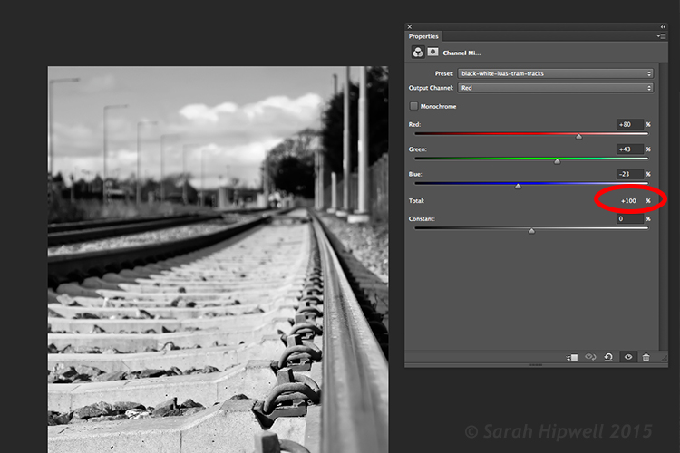
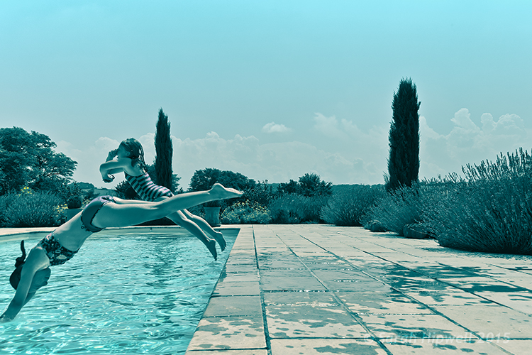
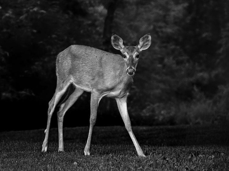
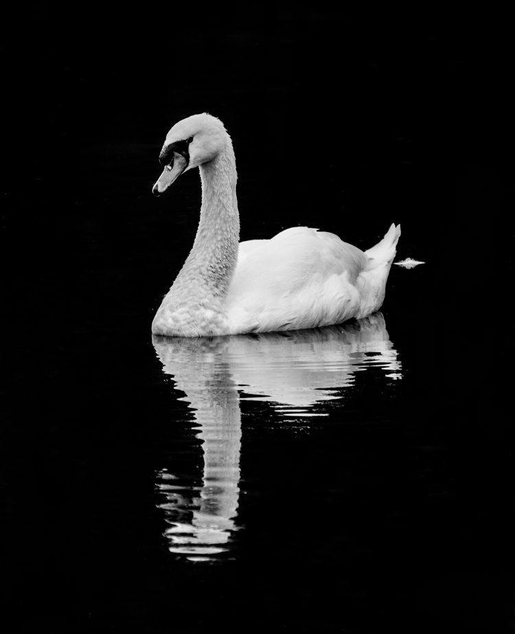
Photo converted to black and white in Topaz B&W Effects 2.
While Lightroom and Photoshop are sophisticated, advanced Raw converters and image editing programs, there are still many things that they don’t do as well as third party applications. One of these is converting photos to black and white. But, there are so many plug-ins available that it can be difficult to know which one to buy. This guide will help you decide.
Why buy plug-ins?
A common theme with black and white plug-ins is that they contain many more ways to emphasize texture than Lightroom and Photoshop. This is important with black and white, as texture is an important part of the composition. In Lightroom and ACR (Adobe Camera Raw) you can use the Clarity slider to emphasize texture, but it’s a blunt instrument compared to the options available in these plug-ins.
Another feature of most of these plug-ins is that they come with an extensive set of presets that you can use as a starting point for your black and white conversion. Just browsing through the presets and seeing what you can do to your photos will inspire you.
Some presets imitate old printing processes such as cyanotypes and wet plate photography. Others emulate black and white films, some of which are no longer available.
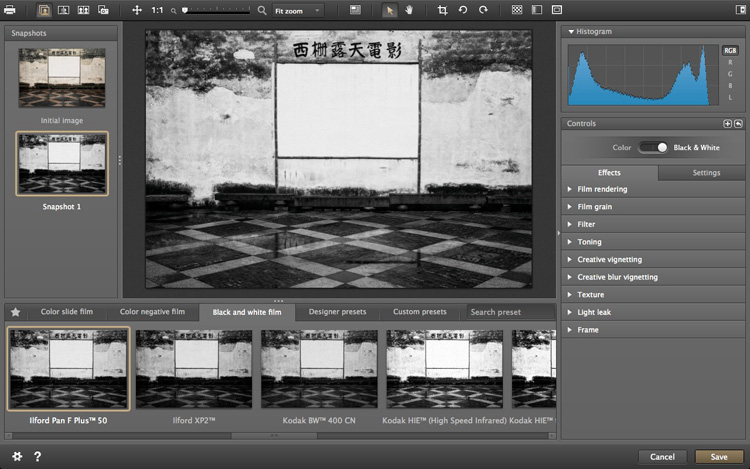
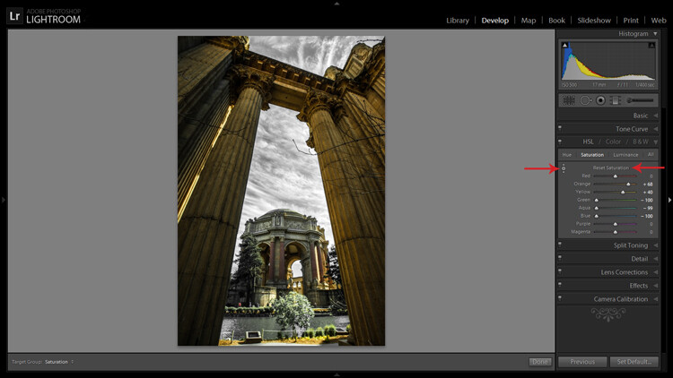
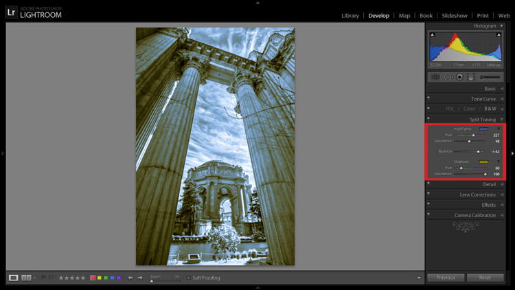
Silver Efex Pro 2
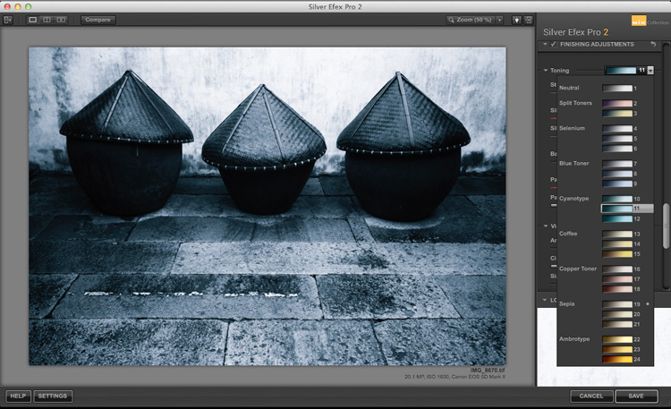
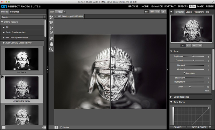
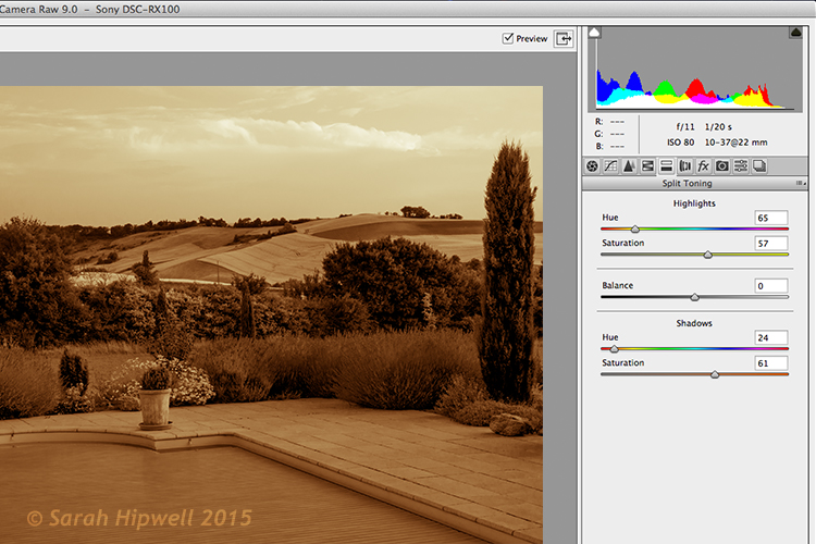
Split toning in Silver Efex Pro 2.
Silver Efex Pro 2 is made by Nik software and regarded by many photographers as the ultimate black and white conversion plug-in. You can buy Silver Efex Pro 2 along with the other applications in the Nik Software range in a bundle for $ 149. While you can’t buy Silver Efex Pro 2 as a stand-alone application, it also means that you get the rest of Nik software range included with it.
Who is Silver Efex Pro 2 for?
Silver Efex Pro 2 is for the professional, or advanced hobbyist photographer, who wants to take black and white processing to the ultimate level. If you are serious about black and white photography, you will love this plug-in.
Reasons for buying Silver Efex Pro 2:
- It has more options than Lightroom or Photoshop. There are more ways of adjusting tonal values, toning images, and adding borders. The Structure, Fine Structure, Dynamic Brightness and Soft Contrast sliders in Silver Efex Pro 2 provide a lot of ways to enhance texture, an important element of many black and white images.
- It has a good workflow. The History in Silver Efex Pro 2 makes it easy to see where you’ve been and where you are going with your black and white conversion.
- It comes with a number of good presets that help you obtain good black and white conversions right away.
- It mimics black and white film grain. If you are interested in creating images that look like they were taken with film, Silver Efex Pro 2 lets you imitate the grain structure of 18 commonly used black and white films.
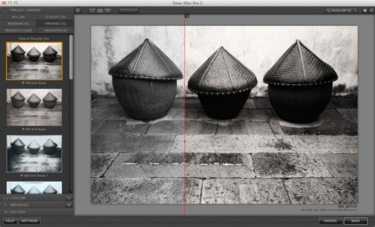
- It has the standard Before and After view. It also has a Split View that I rather like. You can move the red dividing line to see more of one version or the other (see below). You can also zoom-in to view the differences in fine detail.
Exposure
Exposure by Alien Skin Software is a plug-in designed to give your digital photos an analog look. It comes with hundreds of black and white and colour presets that imitate the look of film and antique processes. Alien Skin Software are not merely imitating though – a lot of research has gone into replicating the grain structures of all the film types featured in their software. Where the film wasn’t available, they used photo archives.
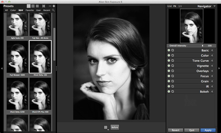
Just like Silver Efex Pro 2, the presets are a starting point, and tools are provided to make adjustments, including an Intensity slider that lets you fade the effects created by the plug-in. You can create and save your own presets for future use.
Who is Exposure for?
Exposure is for photographers who want to mix the look of analog photography, with the speed and convenience of digital. If you yearn to make your photos look like they were shot with film rather than a digital camera, then this is a good plug-in to use.
Exposure is used by a lot of photographers to create effects that you can’t create in Lightroom, or would take a long time in Photoshop. While it seems mainly pitched at portrait, fashion and wedding photographers, you can apply the filters to virtually any type of photo. It’s a lot of fun to use.
Reasons for buying Exposure:
- It lets you emulate the look of black and white film. There are over 20 film presets (plus variations) that let you apply an analog look to your digital photos.
- Exposure is for colour as well as black and white. While this isn’t a concern if you are only interested in the plug-in for black and white conversions, there are some beautiful colour presets and film emulations to use.
- It lets you add creative borders, light leak effects and scratches to your photos.
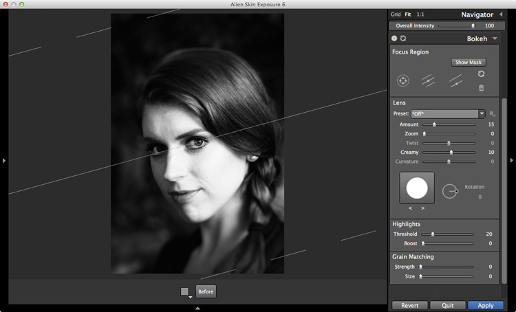
- Exposure lets you add sophisticated lens blur effects to your images, emulating the look created by using specialist lenses such as tilt-shifts and Lensbaby optics (see bel0w).
- It has an easy to use batch processing tool that makes processing multiple images very quick and easy.
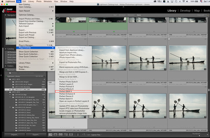
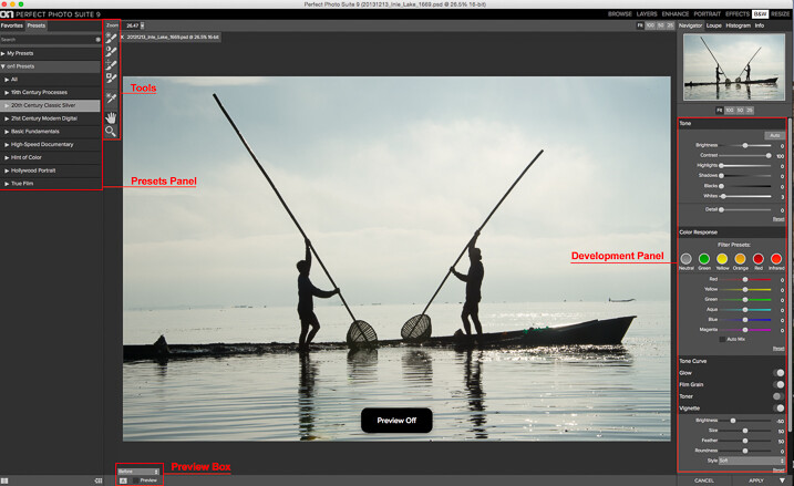
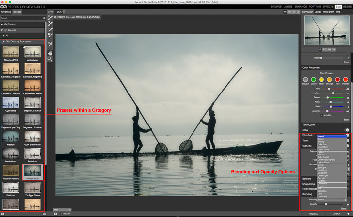
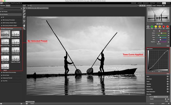
Perfect Black & White
Perfect Black & White comes as part of OnOne Software’s Perfect Photo Suite. There are six modules within the suite, giving you the use of the additional ones if you buy it.
Another benefit of Perfect Photo Suite is that it comes with built-in layers. When you convert a photo to black and white it is placed on a layer with an Opacity slider that lets you merge it with the original colour image. While this feature is of limited use for black and white conversions, it may come in handy with the other programs included in the suite.
Who is Perfect Black & White for?
This software is ideal for the photographer who wants to experiment with black and white photography and take advantage of the other programs that come with the suite. You will only appreciate the power and potential of this software by using it and experimenting with all the tools.
Reasons for buying Perfect Black & White:
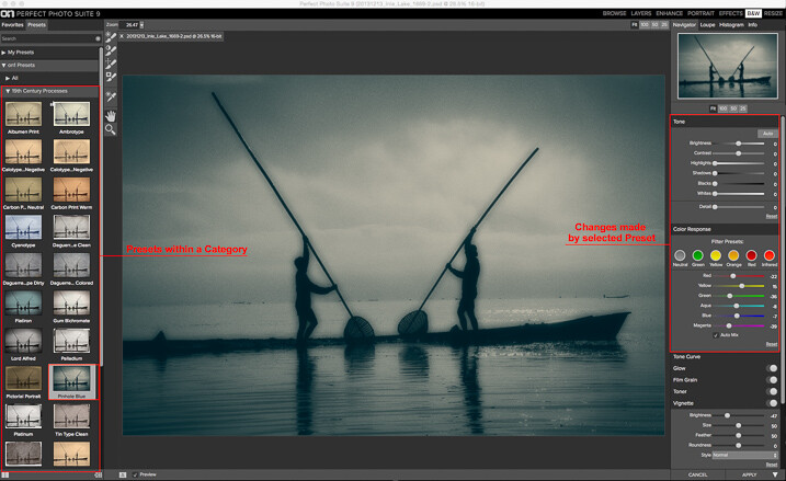
- It has presets that emulate old photographic processes such as 19th century processes such as the Albumen Print and Ambrotype (see below).
- There is a good selection of creative borders that you can add to your images.
- The Sharpening options in it are more advanced than those in Lightroom and Photoshop. There are three types of sharpening to choose from: High Pass, Progressive and Unsharp Mask. High Pass is the most aggressive, while the others let you apply Sharpening in a more subtle fashion.
- It works in conjunction with the other modules in Perfect Photo Suite. For example, you can use Perfect Portrait to retouch portraits before (or after) converting them to black and white. Or Perfect Resize to enlarge your photo files to a suitable size for making large prints. Or add textures to your photos using layers.
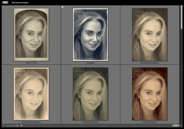
Some of the antique process presets available in Perfect Black & White.
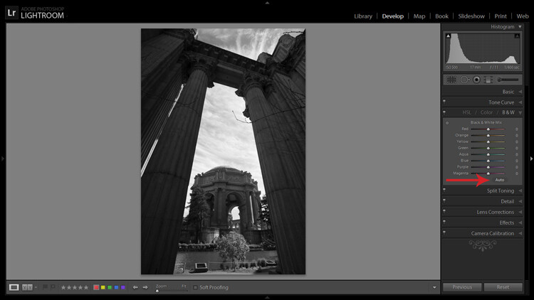
B&W Effects 2
B&W Effects 2 is a Lightroom plug-in made by Topaz Labs. The main strength of this plug-in is its strong collection of presets, many of which imitate old processes. There are over 200 to choose from, and many of them have an interesting look which you don’t get from the presets in the other plug-ins mentioned here.
Who is B&W Effects 2 for?
B&W Effects 2 is for photographers who want to take advantage of its extensive preset range as a basis for creative black and white conversions. The Snapshots feature gives you a history function that most of the other plug-ins lack, albeit one that you have to activate yourself by taking Snapshots at important points in the processing stage. B&W Effects 2 is also good at increasing detail in mid-tone areas and bringing out texture, an important part of a good black and white conversion.
Reasons for buying B&W Effects 2:
- Lots of presets for emulating old printing processes. Have you ever wanted to try out cyanotype, albumen, van dyke brown, opalotype or platinum printing? The cost and impracticality associated with these processes puts them out of reach of all but dedicated enthusiasts. But B&W Effects 2 has all these and more.
- It uses Adaptive Exposure technology to add mid-tone contrast in a way that can’t be replicated in Lightroom or Photoshop. It works by analyzing the image, breaking it into regions and applying the adjustment to each region individually. The best way to appreciate what this tool can do is to try it out for yourself.
- The Detail and Detail Boost sliders bring out details and texture, completing the work done by the Adaptive Exposure sliders. You’ll be amazed by how much detail and texture you can bring out with these sliders.
DxO FilmPack
All the plug-ins we’ve looked at so far include some sort of film simulation, but DxO have taken it a step further with their FilmPack plug-in. According to their website, DxO FilmPack lets you, “Perfectly reproduce the quality, style, colours, and grain of the most famous analog films.”
Like Exposure, DxO FilmPack works in both colour and black and white.
Who is DxO FilmPack for?
DxO FilmPack is for photographers who want to process their digital images so that they look as if they were taken on film. But it goes further than that, and offers a variety of creative effects that you will find useful in creating emotive monochrome images.
Reasons for buying DxO FilmPack:
- Lots of film emulation presets, based on an analysis of the films themselves.
- Features shared by most of the plug-ins listed here – the ability to add borders and textures, toning, light leaks effects and creative blur.
Tonality Pro
MacPhun is a company that makes plug-ins for Apple Mac computers (sorry Windows users!). Tonality Pro is a relatively recent addition to its stable of software and even though it will only be of interest to some of our readers I’ve included it here because it is a very good piece of software.
MacPhun’s aim with Tonality Pro was to create the best black and white plug-in available. I’ll leave it up to others to decided whether they have achieved that, but there’s no doubt it’s a powerful application with lots of useful tools for converting your photos to monochrome.
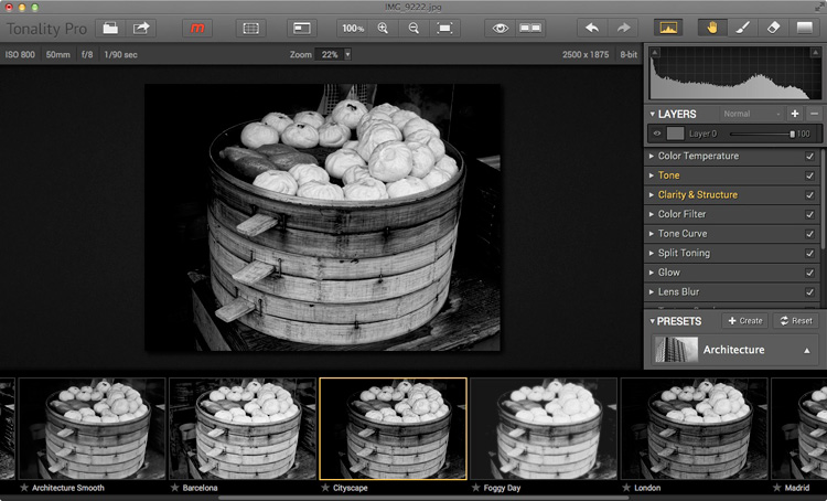
Reasons for buying Tonality Pro:
- Tonality Pro has over 150 presets. There is also an Opacity slider that lets you control the strength of the preset, so you can make the effect as strong or subtle as you wish.
- Tonality Pro has layers. None of the other presets mentioned here do, except for Perfect Black & White (and then not within the plug-in itself). Layers mean that you can apply an effect to your photo, then use brush mode to create a mask so the effect is applied selectively. Layers add a level of creative potential that allows you to use the plug-in’s tools with nearly unlimited freedom.
- The clarity and structure tools help you emphasize texture and bring out detail in a way which simply isn’t possible in Lightroom or Photoshop.
Your turn
For me, one of the best things about plug-ins is that they give you a chance to play. They open up new ways of processing that you may not have considered before. Above all they are fun, give you chance to get creative, and find new ways of expressing yourself.
So, here’s a challenge. Download the trial version of one of these plug-ins. Then have a play with some of your favourite images and see what you can do with them. Does the new software give you some creative options that you had never considered before? Let us know how you get on in the comments.
Mastering Lightroom: Book Three – Black & White
 My ebook Mastering Lightroom: Book Three – Black & White goes into the topic of black and white in depth. It explains everything you need to know to make dramatic and beautiful monochrome conversions in Lightroom, including how to use the most popular black and white plug-ins. Click the link to visit my website and learn more.
googletag.cmd.push(function() {
tablet_slots.push( googletag.defineSlot( “/1005424/_dPSv4_tab-all-article-bottom_(300×250)”, [300, 250], “pb-ad-78623” ).addService( googletag.pubads() ) ); } );
googletag.cmd.push(function() {
mobile_slots.push( googletag.defineSlot( “/1005424/_dPSv4_mob-all-article-bottom_(300×250)”, [300, 250], “pb-ad-78158” ).addService( googletag.pubads() ) ); } );
The post How to Choose a Black and White Plug-In by Andrew S. Gibson appeared first on Digital Photography School.


 Mastering Composition


 Introducing split toning


You must be logged in to post a comment.