RSS
 

Posts Tagged ‘Using’

Single Image Star Trails – a Powerful Technique to Create Star Trails in Minutes Using Phototoshop

11 Jun

10258929_1466264890276738_7906982947618430010_o

If you are reading this, you must be among those who have a special place in their hearts for stars, galaxies and the wonders of the universe. With recent advancements in camera technology, many photographers have captured the beauty of the night sky in spectacular ways. The truth is that every photographer is fascinated by the glittering stars, and captivating night skies, that have the power to instantly teleport us to a world beyond our wildest imaginations. From a photographic perspective, star trails can add another dimension to an otherwise average shot and that is likely the primary reason for many photographers desire to learn how to capture star trails. If you are struggling to find out and learn about this rewarding effect, get your camera and computer ready. But before that, let me introduce you to star trails.

10373061_1472036406366253_4127720884282225109_oWhat are Star Trails?

Star trails is a photographic effect that gives an illusion of motion to the stars along a circular or an elliptical path. Technically, stars do not move when we observe them. They are quite stationary very much like our Sun. In reality, the circular motion of the stars we see in star trail images is a result of rotation of the Earth along its axis. For better understanding, please refer to the ‘equatorial grid’ figure under “Understanding Star Trails” section below.

How are Star Trails captured?

Traditionally, star trails are captured by taking multiple shots of the sky in succession over a period of many hours. Modern DSLR cameras also allow you to take a single exposure of an extended length of 30 minutes or more but many photographers prefer to take multiple shots at 30 seconds each and stack them together. Doing it this way eliminates any chances of shaky exposures that can occur due to wind or bumping into the setup while the shutter is open. If you are attempting to make almost a full circle star trails, then the number of shots required to create it can go in hundreds. Later, all those shots are stacked together in Photoshop or a free software such as StarStax to create a single image that shows the circular paths of the stars.

Photographers have been using this method for years with great results. But if you do not have the option to return to the same location again, then the conventional method would feel limited, as it requires you to stay in one spot for hours, thereby limiting your options to take multiple shots and capture a variety of angles on location in one night.

Understanding Star Trails

Equatorial grid

Equatorial grid from observer’s point of view

Imagine that ‘YOU’ are inside a giant sphere (see above diagram). Now, depending on the direction you look at, the effect of the star trails will be as follows:

Facing North: Star trails effect will appear to be circular with some stretching of the circular lines at the far edges of the frame.

Facing East: The trails will appear to be straight in the middle moving diagonally in an upward direction from bottom center to top center. They will also appear to be converging at both top left and bottom right at the far sides of your frame. See image below:

East West Trails Umm ul Aish Kuwait

Umm-ul-Aish, Kuwait – image shows the upward motion of East star trails

Facing West: In this direction, the trails will appear to be the exact opposite of what you see when looking towards the South. Moving downwards and to the right from top to bottom in a diagonal line, they will also appear to be converging at both bottom left and top right at the far edges of your frame.

Facing South: If you are facing South head-on, the star trails will appear to be moving from left to right in an upward curve.

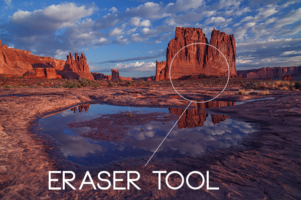
One-shot Star Trails – the Technique

I have been developing a new method to create star trails in Photoshop. Unlike the ‘Star Trails’ Photoshop action that you might already be familiar with, this technique is much more than that. It eliminates all limitations associated with the traditional method of capturing star trails. Unlike the conventional method, this technique only requires a single shot, that’s right, only ONE shot of the night sky to create realistic star trails. Since this technique is a result of a joint effort between me and my friend Mobeen Mazhar, who is a great landscape photographer from Pakistan, we have named it the “HM technique” or “HM star trails”.

When implemented correctly, this technique will open endless possibilities for you in your star trail adventures and is sure to spark new hope among photographers for all levels of expertise. Now, let’s take a look at different types of star trails and how you can use this new technique to create them in Photoshop with just one shot.

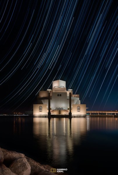
Creating North Star Trails

North Star Trails Nanga Parbat

Nanga Parbat-Trashing, Pakistan – North Star trails created with HM technique

This is the most common and simplest type of star trails. Traditionally, it can be achieved by pointing your camera towards North with the focus set to infinity and then taking consecutive long exposure shots (30 seconds) at high ISO settings. Since the North Star remains almost stationary, the final effect is circular with the stars seeming to revolve around a pivot point, which is the North Star. Then at the time of post-processing, all shots are stacked using Photoshop or StarStaX.

The downside to this approach is that it can take as many as 700 shots over a period of five to eight hours to get a full circle trail. Now watch the video below to learn to create North Star trails within minutes using just a single shot of the night sky.

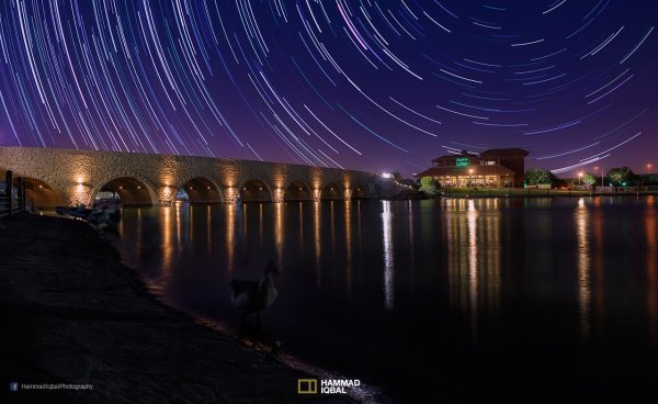
Creating Meteor Shower Trails

Meteor shower AspirePark

Aspire Park, Doha – meteor shower trails created with HM technique

Meteor shower trails is by no means an official name. This is fundamentally a beautiful variation of the North Star trails. Instead of a long continuous streak of light, the trails seem to disappear at the origin which gives it depth and dimension. There is also another variation of the meteor shower trails in which the tip of the trail is thicker, brighter and looks like a blob or droplet.

The underlying technique of the meteor shower trails is the same as shooting the North Star trails. The only difference is in post-processing. The meteor or comet effect is achieved by using the ‘Comet mode’ in StarStaX as shown below.

‘Comet Mode’ feature in StarStax

But regardless, the traditional method still requires that you spend hours on a single spot to take hundreds of consecutive shots. Now watch the video below to see how you can create amazing meteor shower trails in minutes, and once again, all you need is a single shot of the night sky.

Creating Vortex Star Trails

Vortex Aspire Park Doha

Aspire park, Doha – Vortex star trails created with HM technique

This is by far my favorite kind of star trails and is quite complex to achieve. Unlike the previous two types of trails, vortex star trails require special equipment which can be costly and may prevent most photographers from trying it. The vortex effect is achieved by zooming in or out on the lens during the long exposure. It may sound simple at first but the trick is to avoid vibrations as you zoom during the 30-second long exposure. Hence it makes it extremely difficult, if not impossible, to do it with bare hands without shaking the whole setup.

But if you have plenty of free cash to burn, you can get the tools which would include a geared ring that goes on the zoom ring of your lens, a motor and a wireless remote for controlling the motor. The setup is basically what DSLR filmmakers use for focus racking, that is a motorized follow focus system as shown below. The system is very useful if you shoot professional video with your DSLR but for photographers, the cost might not be justifiable.

Electronic follow focus

Wireless electronic follow focus kit v2 by Jag35

Do not worry because the following video will show you how to create vortex star trails in Photoshop. No cash required.

Conclusion

With the help of this powerful new technique, you will be able to maneuver on location, shift your focus towards making a variety of compositions, save countless hours, battery power and thousands of shutter actuations on your DSLR. Would you have thought that a single shot could give you such incredible flexibility in your star trail photography?

Tip: Just make a note of the direction your camera is facing to help you create star trails in relation to the reference direction.

I am sure that this tutorial will add a new skill to your photography arsenal. If you have any questions, post them in the comments below. Thank you.

Technique developed by Hammad Iqbal and Mobeen Mazhar

Mobeen Mazhar is a passionate traveler and has spent more than a decade exploring Pakistan and its natural beauty. Photography gives him a mode to express his love for nature and a medium to document his travel experiences. He is a landscape specialist, regular travelogue writer and travel expert for Pakistan. You can find his photographic work at Facebook, 500px and Flickr.

The post Single Image Star Trails – a Powerful Technique to Create Star Trails in Minutes Using Phototoshop by Hammad Iqbal appeared first on Digital Photography School.


Digital Photography School

 
Comments Off on Single Image Star Trails – a Powerful Technique to Create Star Trails in Minutes Using Phototoshop

Posted in Photography


Top 10 Photo Shoot Tips Using UV Paints

10 Jun

Hong Linh Photography UV Paint Shoot inspired by African Tribes featured on Fashion Photography Blog (FashionPhotographyBlog.com)Last time FashionPhotographyBlog.com spoke to Linh Le from Hong Linh Photography she had informed us that she had finished a photo shoot over a weekend that involved UV paints. The results resulted in a beauty shoot inspired by African tribes. From the feedback that we received about that post, we asked Linh if she could tell us more about the technical aspects of putting a shoot together for our readers. Linh shares with us her top tips for photographers who are thinking about taking on a shoot with UV paints and the key things to look out for.

1) Control all lights, including the ambient light! Linh revealed that failure to do so can have unflattering results, as she explained “My rehearsal shoot was a complete disaster! I set everything up in my living room and it was quite late at night, so there was no light coming through the window blinds, doors etc. My plan was to use our dim light as the ambient light. But the results were just horrible. The skin looked extremely uneven and red. It was really frustrating; I tried all sorts of settings. But that was not the problem; the problem was the lighting, the colour temperature of the lights. They were too yellow. So, I changed the LED fairy lights, which I used as back light, to a different set and because the shoot was during the day, I was able to use the daylight coming through the thin curtains and the results were completely different.”

Hong Linh Photography UV Paint Shoot inspired by African Tribes featured on Fashion Photography Blog (FashionPhotographyBlog.com)

2) Use a tripod, Linh recommends, in order to get sharp images, it is essential to use a tripod here.

3) Use a fast shutter setting and a low ISO, the settings Linh used were 1/8 sec, f2 and ISO 200.

4) To help your camera focus in such low light, Linh also recommends that it is also helpful to use a torch.

5) Test the colors first – Linh advises that “Some of the colours such as gold and silver glow less than others, so make sure you test them out first and mix them if necessary.”

6) You don’t need to go all out on expenses. You can pretty much get all you need cheaply in one site as the photographer revealed that “Getting all the supplies for the UV shoot was easier than I expected. I ordered the colours and two UV light tubes on Amazon, which were about £60 altogether.”

7) Use low wattage for subtle effects as Linh explained “As I did not want the glowing effect to be too extreme, I only used 20W UV lights, so this will depend on your personal style and taste.”

8) Using fabric as backdrops has its advantages. You can play with the effects of different backgrounds simply by changing the color or pattern of fabrics. Linh shared that “For the background, I bought curtain fabric which was dark but had interesting patterns on them which I wanted to be visible on the image.”

9) To get some back light in order to separate the model from the background, you can use fairy lights as the photographer has done on her shoot.

10) When asked if she can give us one last secret, Linh shared that getting the balance of lighting right is essential, “I think the secret lies in finding the perfect balance between the UV light and the ambient light, which is a matter of trial and error.”

There you have it, according to Linh Le, that’s basically all you need to set up a shoot with UV paints. Of course, shoot requirements may vary, depending on the result you want to achieve.
According to the photographer, the biggest challenge with doing UV shoots is to find the best lighting setup and camera settings and finding the right balance for your shoot can only be figured out through experimentation.

I hope this anyone who is thinking of doing a UV shoot and don’t know where to start. We’d love to see and hear about your results! Once again, we’d like to thank Linh Le from Hong Linh Photography for sharing her top tips for doing a shoot using UV paints. Do you have another tip? Post them in the comment section below.

Hong Linh Photography UV Paint Shoot inspired by African Tribes featured on Fashion Photography Blog (FashionPhotographyBlog.com)

To find out more information and see all the images from Linh Le’s UV shoot as well as other shoots, you can check the blog on her website www.honglinhphotography.com

You can contact her via e-mail: mhlinh.le@gmail.com

message Linh on her website: www.honglinhphotography.com
or Facebook page (Hong Linh Photography).

Photo Credits:
Photographer: Hong Linh Photography
Make Up Artist: Sophie Le
Models: Wendy Ng & Ana Santos


Fashion Photography Blog

 
Comments Off on Top 10 Photo Shoot Tips Using UV Paints

Posted in Uncategorized


3 Easy Steps Using Photoshop to Making your Images POP

06 Jun

Image Post Processing Techniques

Having taught in-depth image post-processing workshops for Photoshop users, I’ve found that three of the simplest techniques are the ones that people love the most. These are quick and easy tricks that work for most image processing situations.

If you’ve got your exposure, aperture, focus and white balance all correct during shooting, you’ve got all that you need for a great image, but with these three easy steps using Photoshop we’ll add some serious POP to the colour, contrast and sharpness of your images.

I’m going to assume that you’ve already corrected your image in Adobe Camera Raw to fix any blown out highlights and shadow detail. This can sometimes leave you with a low contrast image that lacks lustre. HDR users will often find that a full HDR image lacks some punch once it has all the dynamic range fixed for highlights and shadows. Here’s how to add some pizazz to images.

I’ll start with a RAW file from last year’s trip to Moab, Utah.

Unprocessed RAW file

I was more than happy to get this shot of Courthouse Towers in Moab, Utah but the RAW file was total Blandsville.

Step 1 – Make Those Colours POP

Open the image in Adobe Photoshop. With the image on the background layer of Photoshop, right click on the layer (in the layer window) and choose ‘Duplicate Layer’ (see screenshot below left).

Duplicate Layer Multiply Layer

Now click on the newly duplicated layer and change the blend mode to ‘Multiply’ (see screenshot above right).

Multiply Blend Mode

Right away you’ll notice that all of the colours are more striking and the contrast is extreme. It’s also way too dark so we’ll fix that next.

Next go to Image > Adjustments > Shadows/Highlights and drag the shadows slider all the way to right then hit OK (see screenshot below left).

Photoshop Shadows / Highlights Photoshop Layer Opacity

By doing this, you’ll reduce the darker parts of the image ONLY in the duplicated layer. It’s still a little too dark, so in the layers window reduce the opacity of the duplicated layer until it’s at about 58% (see screenshot above right). This percentage will be different for all of your images so use your judgement and don’t overdo it. Usually I find that a setting of 28% works best in most cases.

Step 2 – Selectively Boost Colours and Brighten

I think that some of the colors need a little encouragement. For this example you want to boost the blue sky so combine the two layers that you’ve been working on so that you can make changes to that. You can do this ‘none destructively’ by pressing ctrl+alt+shift+e which will now combine the two layers you have selected, and create a new layer from those. The original layers are still intact underneath this new one.

Next, go to Image > Adjustments > Color Balance > and bring up the RGB sliders. As I mentioned earlier, you’re going to be boosting the blues in my sky so click on ‘mid-tones’ and then pull the blue slider up to about +42.

Photoshop Color Balance

Boosted Blue Midtones

Ooooh, now that sky is looking vibrant but I’m not too sure about boosting the blues in the land area. Let’s fix that by erasing the land in this blue layer so that the layer underneath is revealed, where the blue mid-tones have not been boosted. You can also do this with ‘layer masks’ but this method is much easier to understand.

Do this with the eraser tool and select a brush size that fits inside the land area of the image. In the layer with the boosted blue mid-tones, erase a large area of land at first and then choose a smaller brush size for tighter control. To do this, simply click inside the layer you want to erase. The settings below show a brush size of 1053 pixels and a hardness of 0% which gives a soft, feathered edge.

Photoshop Easer Tool

Erase Bruash Tool

Click in the area you’d like to erase to reveal the layer beneath. In this case the layer beneath won’t have the boosted blue mid-tones that you want only in the sky.

Now you’ve managed to selectively boost the blue colour in the sky without ruining other parts of the image that didn’t need that blue boost. Here is an image of how the ‘sky’ layer looks after the land has been erased out, and below you can see how it looks in the layers panel.

Erased Land

This is what’s left of the ‘boosted blues’ layer. The layers under it are temporarily switched off so that you can see the isolated sky.

Photoshop Layers Palette

Layers panel showing the partially erased boosted blue sky layer

Notice that the opacity of the sky layer has been reduced to 49% so the effect is more subtle when laid over the top of the lower two layers. Again, you’ll need to use your own judgement for your own images as they won’t all be the same. Maybe you have red clouds and would like to boost the red highlights? You can do this procedure multiple times with multiple layers to tweak the colours selectively. There are more accurate ways to do this but if you’re new to Photoshop, this is the easiest method to understand and has hardly any learning curve.

Lastly, all this tweaking has made the image a little too dark so a boost the overall brightness by 36 has been done.

Photoshop Brightness

Step 3 – Let’s Resize and Get Sharp

Sharpening is often something that I leave to the end of my image processing, depending on the medium I’m using to display the image. I’ll use different sharpening settings for a high resolution print than I will for the web, so it’s always a good idea to save an ‘unsharpened’ version of your processed image for safe keeping.

Assuming that you wish to display your images online, here are some fairly universal sharpening settings that I use for sharing my images online. Before we sharpen, let’s flatten and resize our image for the web. You can decide how large your image should display on screens but for the purposes of this tutorial let’s go with 1200 pixels wide.

Go to Layer > Flatten Image so that you’re now just dealing with one complete layer that has all of the changes. Next go to Image > Image Size and tell Photoshop that you’d like your image to have a resolution of 72 dpi which is standard for web images. Next, specify the width by entering 1200 pixels in the ‘width’ window. The height should auto adjust if you have ‘constrain proportions’ checked by default (the little chain icon).

Photoshop Image Resize

Next open the Filter > Sharpen> Unsharp Mask tool.

Use some fairly safe sharpen settings for web so that you don’t over it. It’s worth noting that ‘sharpening’ deserves an article as a separate topic but for now these basic settings should get you going. Try: Amount > 128%, Radius > 1.7 pixels and Threshold > 58 Levels.

Photoshop Unsharp Mask

The Final Result

POP! There you go, three easy steps an you’ve now got an image with plenty of punch. There are many different ways to achieve the same results, but for this tutorial, I wanted to give you an easy to understand process to introduce you to some of Photoshops most powerful tools. Try these three simple techniques for your image post-processing and let me know it works out for you.

After Processing

IMPORTANT NOTE: Backup your files before editing or saving your edits.

The post 3 Easy Steps Using Photoshop to Making your Images POP by Gavin Hardcastle appeared first on Digital Photography School.


Digital Photography School

 
Comments Off on 3 Easy Steps Using Photoshop to Making your Images POP

Posted in Photography


4 Steps to Photoshop Artistry Using Fine Art Grunge Techniques

02 Jun
PhotoshopGrunge600x600

Image by Sebastian Michaels

Sebastian Michaels has the course Photoshop Artistry: Fine Art Grunge Composition which is current on sale for 67% off at SnapnDeals.com for a limited time only. Grab it now before the deal is over.

One question. Do you sharpen just about all your images? If so … you should stop. As photographers we tend to want our images to be perfect: perfect exposure, perfect white balance, perfect sharpness. But aren’t you a little tired of being so perfect all the time? Let me clue you in. Art doesn’t always have to be so darn pretty. What if instead you let yourself RELAX a bit, lighten up, and have some fun? What if you let yourself get a little messy? Maybe not full-blown grunge. But how about “fine art grunge”?

Start here: a little more blur, a little more noise, an unexpected angle or crop, perhaps some striking effect of light combined with a subject you never would normally have thought to consider.

BellyDance

Photo credit: Catherine King (course student)

Sometimes we forget that at our core we are ARTISTS. Owning a Canon 5D Mark III rig and enough lighting gear to stage a Pink Floyd reunion tour doesn’t change that. Just because we spend so much time trying to capture the perfect shot doesn’t mean that we can’t switch it up now and then and treat our images (even our mistakes, even our botched shots) as nothing more than the starting point in more elaborate artistic compositions.

Here’s a mental trick to get you started. Think of some of your favorite shots. But instead of imagining your photos all printed pretty and perfect, imagine them layered-in and composited with other images and rendered as a painted canvas.

Think paint on canvas. Not that you need to simply run a paint filter on your photos. That’s not going to cut it here. Think instead of paint on a canvas in the sense of a wild-eyed painter with oil paint in his hair, brushes sticking out of his pockets and one clenched between his teeth – attacking a canvas in a frenzy of creativity and passion. When was the last time you approached your photography with that kind of intensity? When was the last time you let yourself step outside of your serious photographer role and actually felt like an ARTIST creating a great canvas?

EnjoyYourLife

Photo credit: Li Li Wee (course student)

That kind of artistry is in you. Let’s look at how you might begin tapping into it.

STEP ONE: Take More Chances With Your Photography

I mentioned a little of this earlier. You might already have some shots that you would otherwise delete out of hand just because they are blurred or the contrast is screwy. Give those a second look. Maybe there’s something artistic you could do with them. Maybe you could crop them in a creative way.

When you are shooting, try some angles you normally wouldn’t even attempt. For that matter, try shooting some subjects outside of your usual comfort zone. Take a walk down a dark alley (or a woodland trail) and see what you come out with.

Maybe enlist some models you normally wouldn’t have chosen, or stockpile some odd objects and lug them out to quirky locations. In other words: experiment more. Get out of your comfort zone and try something new. Take some chances for your art.

STEP TWO: Throw In Some Blend Modes (and Maybe Some Textures)

It’s surprising how much more interesting an image can become simply by slapping a Curves layer on it (or even simply duplicating the background layer) and assigning that layer a Blend Mode. Give it a try and see.

BlendModes1

BlendModes2

Your best bet is almost always with Multiply or Screen blend modes, or alternately with Overlay, Hard Light, or Soft Light. I recommend memorizing the keyboard short cuts for those so you can toggle through them quickly and pick the best. You might also want to lower the opacity of the layer (or you might want to duplicate that layer with Cmd/Ctrl+J, doubling up the effect, or giving that duplicate layer a different Blend Mode of its own).

You might also want to stick a Layer Mask on there and paint in precisely where you want that effect to show. Every image is different, and layer Blend Modes can create rich results.

I recommend also trying out some textures combined with Blend Modes and Layer Masks. A texture or overlay might be as simple as a photo of a grungy patch of concrete, or it might be a scanned watercolor wash. It could also be an intricately layered piece in and of itself, comprised of scanned swatches of paint, scratched up paper with coffee stains on it, colorized with a Hue/Saturation layer and given a dark vignette. When you decide to explore photo-artistry, you begin collecting a lot of these kinds of textures and overlays.

Texture

But whatever you use, you drop it in over the image and give it a Blend Mode; again, you might tweak the opacity or employ a Layer Mask. Already your image is likely looking more dramatic and artistic. It’s probably a bit “grungy” at this point, and that’s okay. Embrace it. You might already find yourself astonished; discovering something in the image you never quite knew was there until this moment.

STEP THREE: Get More Dramatic With Your Lighting or Experiment With Some Filters

You never know where an image is going to take you. All you can do is try a few things and see if one of them looks especially cool. One approach you may want to try is to slap another Curves layer on top of the image (or Brightness/Contrast if you’re working with Elements) and deliberately darken the entire image. Go back in with the Brush Tool to paint over the Layer Mask at a low opacity and, in essence, paint in the lighting where you want it. Be sure to use a soft-edged round brush at only about 20% opacity, layering your strokes while using black and white and toggling between the two by pressing the “x” key.

Here you are painting in where you want light. But you can do something very similar with any of the effects in the Filter Gallery. Here’s how:

  1. Go to the top layer of your layer stack and execute what has come to be known as “The Move”: Cmd-Option-Shift-E on a Mac (or Ctrl-Alt-Shift-E on a PC) to “merge everything visible” onto its own new layer.
  2. Select the new layer you just created and press Cmd/Ctrl+J to duplicate it.
  3. Run a filter from the Filter Gallery on that layer. Go ahead and try out one or more of the painting filters, but experiment with the others as well, and how they interact. LayerMaskShortcuts
  4. After you apply the filter to your duplicate layer, stick a Layer Mask on it and again use a black or white soft-edge brush at low opacity to paint the effect in or out as you like. Try masking out the effect a bit in the areas of greatest focus, leaving everything on the edges more enhanced. Experiment and see where the image takes you.

STEP FOUR: Go Ahead and Add an Edge Effect and a Signature

Now that you have an interesting artistic image, it’s nice to give it some kind of artsy edge treatment. There are half a dozen ways to do this (you can even pick up OnOne Software specifically built for the task of creating edge effects), but we can leave the pure Photoshop methods for the next tutorial.

You might even want to stick a more artistic signature on the corner of the piece, because you’re likely excited at this point, since you are now looking at a work fit for canvas.

Cat

Photo credit: Irene Hofmann (course student)

You took some chances and it paid off. Next time maybe you’ll get even grungier, because by now you’re seeing that “grunge” is just another way of saying “artistic.” Above all else, whatever your tools, and whatever your approach, you are first and foremost, an artist.

For walk through of this process and a better idea of what the course is like, check out this video:

// < ![CDATA[ _evpInit('dHV0b3JpYWwxMjgweDY5MndlYi0xLm1wNA==[evp-f593aa84764ec0c7dba0fa770e9114bc]'); // ]]>

Sebastian Michaels has the course Photoshop Artistry: Fine Art Grunge Composition which is current on sale for 67% off at SnapnDeals.com for a limited time only. Grab it now before the deal is over.

The post 4 Steps to Photoshop Artistry Using Fine Art Grunge Techniques by Sebastian Michaels appeared first on Digital Photography School.


Digital Photography School

 
Comments Off on 4 Steps to Photoshop Artistry Using Fine Art Grunge Techniques

Posted in Photography


Using Focus Creatively with Food Photography

30 May

There are ways to use selective focus, or shallow depth of field, to completely control how you look at an image. Selective focus is using a large aperture, like f/4.5 or wider, to show only a small part of your image in focus. You can control where you want your viewer to look in your image by using this technique.

Eliminate Distracting Elements

If you have a potentially busy scene or environment, you can use selective focus to calm things down a bit and get your viewer to look where you want.

Selected Focus Olives

The left image was shot at f/16 while the right image was shot at f/5.6

When you compare the two images above pay attention to what you are looking at first, and how your eye moves around the images. There’s a lot going on in the image on the left. You really don’t know where to look at first. In the image on the right your eye goes right to the olive oil in the front, which is exactly where I wanted you to look. I wanted to make sure you didn’t get distracted by the text on the jar on the left side, so I focused on the garnish in the olive oil and blurred everything else out. I wanted the first read to be the olive oil, then all other items become secondary. Your eyes naturally look at what is in focus in an image.

Which Element is the Hero?

You can use focus in some shots to clearly show which element the image is about – this element is your hero element. In food photography we call this the hero food.

Who Is Your Hero

In each shot the focus is shifted to change which jar of pickles is the hero jar, the one I want you to look at.

Here are some pickles that I made. You can use selective focus to tell the viewer where they should be looking. If this image was for a recipe of dill pickles, then you would use the image on the left. If this image was for a recipe on golden pickled beets, then you’d use the image on the right.

Pick Your Focus Point

Pick Your Focus

The image on the left was shot at f/8 while the image on the right was shot at f/4.5

I focused on the dill pickle laying on top of the cut pickles. In the left image you really can’t tell where my focus point is so your eye goes all over the place. In the image on the right, it’s a little more obvious. My hero food is the cut dill pickles.

All the images including pickles were styled by my good friend and prop stylist, Amy Paliwoda. We work on a lot of jobs together. Amy is always talking about using props to tell your story. It’s my job as the photographer to make sure I use the proper aperture to have the props help with the story, not cause distractions. With everything in focus, a simple prop can take away from your story. Once you pick your focus, take several shots at different apertures to see which one works the best to tell your story.

When One Aperture Isn’t Enough

Now I’m going to show you a technique I use a lot. I take two images at different apertures, with different depth of fields and then I composite them together in Photoshop by using layer masks. I use this technique when I want the background to be more out of focus, yet keep the food or product in focus.

I have to mention that I ALWAYS shoot with my camera on a tripod. This type of compositing would be very difficult with files that were handheld.

Two Images for Composite

The image on the left was shot at f/8 and the image on the right was shot at f/4.5

For this image I really like how the jars look at f/8, but I prefer the background shot at f/4.5, so I’m going to put the two together in Photoshop by creating a layer mask and put the best background, on top of the preferred foreground.

Making a Layer Mask

There are many ways to do the same thing in Photoshop. My favorite way to do a composite of multiple images is to use layer masks.

In the final composite I will be putting the background of one image onto another image, and also making a duplicate of one light bulb and pasting it onto the background.

I first open both files that are to be put together in Photoshop.

Next, I copy the image with the desired background and then paste the entire image into the file with the jars that I like. Now I have one file with two layers.

Two Layers

Now I need to make the top layer into a layer mask:

  1. Go to the top menu
  2. Click on “Layer”
  3. Scroll down to “Layer Mask”
  4. Scroll over to “Reveal All”

Converting Layer Mask2

Now, look in your layers palette. Your image should look similar to what you see below – the two files, with the top one having a white box next to the image. That is the layer mask.

New Layer Mask

You can see the new layer masked circled in red.

To start working inside the layer mask, you have to use the brush tool. Then make sure your color palette is set to black on top of white for masking through the image. If you mask too far in one area, you can correct it by reversing the color palette to white on top of black and then go back over the area.

In this image I am using a soft edge brush (brush set to a hardness of “0″) for masking through the foreground of the top layer so that only the red background with the lights are left. The image below is how my layer looks mask work completed.

Background Layer Mask

This only took me a few minutes to create in Photoshop.

Now for the final composite below. I also added some text, then copied and pasted an additional light bulb in Photoshop to balance things out in the background.

The additional light bulb was also turned into a layer mask so that I could blend the edges of the image I pasted on top of the file.

Final Composite

Final Layers

Here is what all the layers look like. Layer “2″ is the extra light bulb. If this was a file with a lot of layers, I would name each layer so that I knew what they were. In this case it’s easy to figure out, so I didn’t do that. You can see in the mask of layer “1″ that the bottom half of the frame is black. This is the part of the image that I masked.

So, next time when shooting on a tripod, experiment a little and take your shot with multiple apertures to bracket your depth of field, and maybe you’d like to composite a couple of files together.

The post Using Focus Creatively with Food Photography by Christina Peters appeared first on Digital Photography School.


Digital Photography School

 
Comments Off on Using Focus Creatively with Food Photography

Posted in Photography


Create Art with your Photos Using Topaz Simplify

27 May

Simplified-after-1

Topaz Simplify is designed in a way that allows you to transform your photography into something that resembles painted or drawn art. There are a ton of different styles of art packed into Simplify, from line and ink, to oil and watercolor painting; so it should provide some great creative opportunities for you. Today I’m only going to do a basic walk through on a couple of different photographs in order to introduce the product to you.

TopazSimplfiy-Beforeandafter

Before getting started I do want to mention that while I’ll be using Topaz Simplify as a Lightroom plugin today, it also works with Photoshop, Aperture, iPhoto and others so you don’t have to have Lightroom to use it. Find out all the info and get the free trial of Topaz Simplify here.

Topaz Simplify Basic Walkthrough

As you can see from the original RAW file below this photograph is in some serious need of help. It’s basically just an underexposed shot of the sun setting through the forest, without much of a focal point or anything interesting going on. Now I don’t want you to think that Simplify will solve all your terrible miss-fired shots, in most cases it won’t. But here I think it does a remarkable job at making lemonade out of lemons.

Do Lightroom basic adjustments first

TopazSimplify-Original

Original RAW file in Lightroom

Before we can use Simplify however, we do need to get the photograph into some sort of usable shape. For this photograph I’ve got to really rely on Lightroom’s power of saving an underexposed image which it handles without too much of a problem.

After some adjustments in Lightroom 5 using a combination of sliders in the basic tab, you can see that the photograph is at least now in a condition that Simplify will be able o handle.

TopazSimplify-LightroomCleanupCrop

After some basic Lightroom adjustments

To use Topaz Simplify in Lightroom you’ll also need the free Fusion Express plugin (download it here) which is what launches all of the Topaz products. Once both programs are installed launch Topaz Simplify by right clicking on your photo. Navigate to EDIT IN > FUSION EXPRESS 2.

TopazSimplify-LaunchSequence

You can see this in more detail in the video below

Next, a dialog box will open up asking you to select how you’d like the photograph to be brought into Topaz Simplify there are three options here – I always choose ‘create a copy with Lightroom adjustments’ as the other two work off the original file in Lightroom. Note: if this is an area of confusion for you, you’ll be able to see this process in more detail in the video below.

TopazSimplify-AdjustmentForest

Topaz Simplify preset and adjustment options

Next try the ready-made presets that come with Simply

Once you’ve launched Topaz Simplify you’ll be brought into a new editor screen with a bunch of prepackaged collections filled with different presets.

On the left-hand side, as you can see from the screen shot above, the Line and Ink collection is currently selected. There are a handful of other collections, each one containing a different set of presets, all of which are great when you’re just getting started with Topaz Simplify. I highly recommend just playing around with them to find out which ones suite your own creativity best, before getting to involved with the rest of the program. Here are a couple more variations on the photograph above that I achieved with just a few mouse clicks using presets.

TopazSimplify-Forest2

A couple more Topaz Simplify variations.

Customize and play

However, once you have gotten used to the presets and found the ones you like, you also have a lot of control to make the images your own through various adjustment options.

The right-hand panel offers the ability to control things like the overall intensity of the Simplify effect, the ability to determine which edges are drawn in harder or removed entirel,y and the ability to modify how much overall detail is pulled out from the scene.

You also have access to some options for basic image adjustments should you need to do some minor contrast, brightness or saturation modifications (though I’d suggest waiting on these until you get back into Lightroom).

Finally – one of the best parts of Simplify – is that Topaz decided to include bunch of great local adjustment options allowing you to burn, dodge, smooth and/or brush out the effects of Simplify in specific areas of your photograph.

Simplified-after-2

For a look at Topaz Simplify in action watch the video below where I run our second photograph from the two before and after images above through Simplify.

Topaz Simplify Basic Video Walkthrough

What do you think? Have you simplified a photo?

So after this basic walk through I’d love to hear your thoughts on the software. If you do go ahead and use it, or have done so in the past, how about a sharing one of your favorite before and after image sets in the comments below – I’m curious to see what you’re able to come up with.

The post Create Art with your Photos Using Topaz Simplify by John Davenport appeared first on Digital Photography School.


Digital Photography School

 
Comments Off on Create Art with your Photos Using Topaz Simplify

Posted in Photography


Find the Perfect Photography Location Using Google Maps

25 May

No matter if you’re planning your next photo road trip or you’re scouring the city streets looking for the perfect viewpoint, Google Maps and Google Earth are the most valuable tools to add to your arsenal for finding the perfect photography location.

Planning to Shoot

I usually travel for work, or with family, so I don’t have the luxury of as much time as I might want to search for the perfect vantage point in person. Nor to scout an area to compare locations that I want to dedicate to the one sunset that I’ll have time to shoot. Google Maps to the rescue!

While planning a trip from home, you have much more time to explore the area in a virtual capacity instead of being out there with boots on the ground. Nothing can compare with actually being there, but the tools available to you are getting better every day and the ability to nearly frame your shot is a realistic time saver. Time to turn the volume on your pre-visualization up to 11.

If I’m planning a trip or have an idea for a shot, I’ll start with Google Maps and zero in on the area that I want to shoot. You probably already do this, too, but let’s just take it a step further. Click the icon in the lower left corner labeled “Earth” to start the Google Earth browser plugin. This has replaced the satellite or aerial view for much of the world’s map, but instead of only offering a flat, two dimensional view of the map directly overhead, you can now tilt the map and see an approximation of topography, texture, and elevation.

Default Earth View

Normal mouse controls on the map let you pan in all directions, and zoom in or out with the mouse wheel. In order to adjust to a view that will help you get a better idea of the terrain, hold down the shift key, click and drag upward. That will rotate your point of view (POV) so that you now have an aerial view looking toward the horizon instead of straight down. Dragging left or right while holding shift will rotate your point of view instead of panning.

Rotated Earth View

But, you don’t have to be tied down to your desk to do this. Just two weeks ago, I was out with a friend exploring San Francisco and searching for a specific vantage point of the 101/280 freeway interchange. We knew the general area that we wanted to shoot from, but with so many streets winding around, using Google Earth on my mobile phone helped to eliminate some of the trial and error of driving around without a clue how to find what we wanted.

101 280 Framing the Shot Mobile

101 280 Framing the Shot

Desktop interface Google Earth view looking south

Joe Ercoli Land of Confusion 600

Finished image from location scouted using Google Maps/Earth

The example images from this article show the area that we shot in, including a screenshot taken from the mobile interface, and the completed image. Of course the view that you can get from the map interface is never as good as what you’ll see in person, but it’s an excellent way to help you hit the ground running when you get on-site with your camera in hand.

NOTE: The camera is facing South in the final composition, not North as in the initial Google Earth Point of View.

Have you used Google Maps to find any cool locations? What other tips or tricks have you tried? Please share in the comments below.

The post Find the Perfect Photography Location Using Google Maps by Joe Ercoli appeared first on Digital Photography School.


Digital Photography School

 
Comments Off on Find the Perfect Photography Location Using Google Maps

Posted in Photography


Mastering Color in Lightroom using the HSL Tab

24 May

Mastering colour in Lightroom

Color in Camera

Mastering color in Lightroom occurs in two steps. The first is when you take the photo. Successful color photography requires an awareness of the colors in the scene and how they work together. If you read about the topic of color composition you will come across a lot of advice, including articles about the emotional values of color. It’s all good background knowledge, but if there’s one tip I can give that will help you compose better color images right away it is to simplify. Color is powerful, and if there are too many colors in the photo they will either clash or weaken each other. Simplify the use of color to make your images stronger. This works because the colors you choose to leave in have more impact when there are fewer other hues in the frame to distract from them.

Here’s an example below. In the photo on the left the use of color is not as good as it could be. There are too many conflicting hues. The red stripes on the flag compete with the orange flowers on the porch, and the blue and violet paintwork. It is more of a snapshot than a carefully composed image.

In comparison the photo on the right is dominated by red and yellow, and the colors are much stronger.

Mastering colour in Lightroom

An easy way to simplify color is to use a telephoto lens to simplify the composition. Another is to  use a wide aperture to blur the background. Click the links to read my articles on those topics.

You can go into the topic of color in more depth by reading Mitchell Kanashkevich’s ebook Captivating Color.

Color in Lightroom

The next step, after you have taken your photo, is to get the best out of it in Lightroom. Today I’m going to focus on the first two tabs in the HSL / Color / B&W panel, and show you how to use them. If you’re a Photoshop user, you will find the same sliders in Adobe Camera Raw.

The HSL and Color tabs are essentially the same, but with the sliders arranged in a different order. In the Color tab, the sliders are grouped in eight colors.

Mastering colour in Lightroom

Mastering colour in Lightroom

Click on one of the colored squares at the top to show the sliders from a single color group.

The HSL tab groups the same eight color sliders into three categories: Hue, Saturation and Luminance. It is the tab I prefer to use as I find it easier to adjust by property (ie. hue, saturation or luminance) rather than color. It also has a Targeted Adjustment Tool (I will show you how to use that further on in the article), which the Color tab doesn’t.

Mastering colour in Lightroom

H=Hue, S=Saturation, L=Luminance

Now it’s time to take a look at the sliders under the HSL and Color tabs to see what they do. You can carry out most of these adjustments within either tab, but the examples I show you will all use the HSL tab.

Hue adjustment sliders

Hue is another word for color. The Hue sliders let you replace colors in your photo with neighbouring hues from the color wheel. Let’s take a look at the earlier photo again to see how it works. The image is dominated by the color red. This diagram shows you approximately where those red hues occur on the color wheel.

Mastering colour in Lightroom

When you move the Red slider under the Hue setting to +100 Lightroom replaces red with orange tones, located nearby on the color wheel.

Mastering colour in Lightroom

When you move the Red slider to -100 Lightroom replaces red with purple tones, located in the other direction on the color wheel.

Mastering colour in Lightroom

It is possible to make dramatic differences to the colors in your images using just the Hue sliders. Here, the right hand version of the image was created by setting Red to +100 and Blue to -100. Lightroom replaced the red and blue tones in the photo with other colors.

Mastering colour in Lightroom

Before left – after Hues adjusted on the right.

The Targeted Adjustment Tool

The Targeted Adjustment Tool gives you an alternative way to do the same thing. It is more precise than the sliders because most of the hues within your photos will fall somewhere between the color sliders in the HSL tab. The Targeted Adjustment Tool lets you target those colors exactly.

Start by clicking on the Targeted Adjustment Tool icon. Use the mouse to lay the crosshair over the hue you want to adjust. Click and hold the left mouse button down while you move the mouse upwards to replace the hues underneath the crosshair with neighbouring colors from the color wheel in one direction, and down to replace them with colors from the other direction.

When you do this, Lightroom moves colored sliders in whatever combination is required to adjust the color you have targeted. In the following example I used the Targeted Adjustment Tool to target the red colors in the wall. Lightroom moved both the Red and Orange sliders, indicating that the targeted color was comprised almost equally of those colors.

Mastering colour in Lightroom

You can use the Targeted Adjustment Tool to target colors with precision exactly the same way when you adjust Saturation and Luminance.

Saturation adjustment sliders

The term saturation refers to the strength of a color. If you increase Saturation, the color becomes stronger. Decrease it and it becomes weaker. Note: My article Color Composition: Using Subtle Color goes into the topic of using subtle colors in more detail.

One way to emphasize color in Lightroom is to desaturate surrounding colors. Here’s an example. The starting point is an image of an old car I took in Alaska. The composition is simple –  the red paintwork on the car contrasts against the blue wooden shingles on the house behind it and the patches of greenery.

Mastering colour in Lightroom

First I used the Targeted Adjustment Tool to reduce the saturation of the green patches. Lightroom reduced Saturation in the Yellow and Green sliders accordingly.

Mastering colour in Lightroom

This simplifies the color composition even more, leaving red and blue as the dominant hues.

Mastering colour in Lightroom

Then I used the Targeted Adjustment Tool again to reduce the saturation of the blue paint. Lightroom reduced Saturation in the Aqua and Blue sliders.

Mastering colour in Lightroom

This is the result. I’ve placed the original and the final versions together so you can see the difference.

Mastering colour in Lightroom

Here’s another technique you can use. I set every Saturation slider except Red to zero. This desaturated most of the colors, turning the entire image black and white with the exception of the red paintwork on the car. I added a slight vignette using the Post-Crop Vignetting tool and increased Contrast and Clarity in the Basic panel to arrive at this black and white conversion.

Mastering colour in Lightroom

Luminance adjustment sliders

Luminance is the brightness of a color. You can make colors brighter to make them stand out more, or darker to subdue them. Depending on how bright the color was to start with, reducing luminance may also increase saturation, and increasing it may reduce saturation.

Here’s a example showing the difference when I used the Targeted Adjustment Tool to reduce the luminance of the blue paintwork.

Mastering colour in Lightroom

Lightroom reduced luminance in the Blue and Purple sliders when I made this adjustment.

Mastering colour in Lightroom

Note that with some images the colors may go a little weird when you adjust luminance too much. Watch out for this and ease back on the luminance sliders if this happens to you.

Your turn

Now it’s your turn. How do use you use the HSL and Color tabs when processing your photos in Lightroom or Adobe Camera Raw? Have you come up with any interesting techniques you can share with our readers? Let us know in the comments.


Mastering Lightroom: Books One, Two and Three

Mastering Lightroom ebook bundle
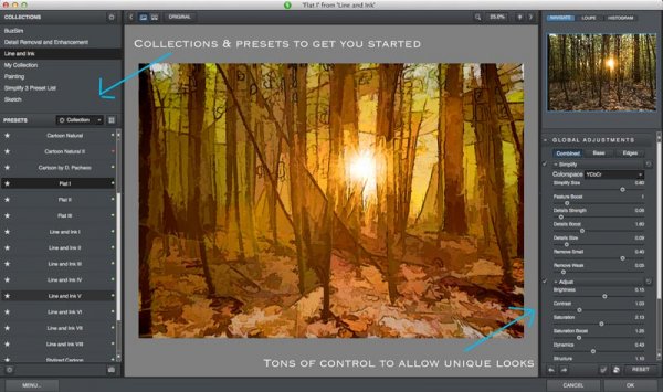
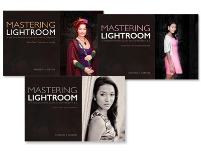
My Mastering Lightroom ebooks are a complete guide to using Lightroom’s Library and Develop modules. Written for Lightroom 4 & 5 books One and Two take you through every panel in both modules and show you how to import and organise your images, use Collections and creatively edit your photos. Book Three shows you how to create stunning black and white images in Lightroom.

The post Mastering Color in Lightroom using the HSL Tab by Andrew S. Gibson appeared first on Digital Photography School.


Digital Photography School

 
Comments Off on Mastering Color in Lightroom using the HSL Tab

Posted in Photography


Using Balance in Your Landscape Photography Composition

19 May

How to use Balance in your landscape photography

If you want to take your landscape photography to the next level, it’s time to start thinking about how you balance your subjects. The most powerful compositional tools that you have at your disposal are your knees, and your feet.

Simply stepping to the side a couple of feet can change your landscape compositions drastically. Take things one step further (weak pun intended) and bend those old knees to get a lower point of view. Now things might start to look more interesting.

The reason why I say this is because horizontal and vertical movement will allow you to achieve the ideal balance of subjects in your landscape images. If you’ve got a camera with one of those flippable LCD screens, you’ll be able to get right down on the ground or way up high on your tripod. Nice.

So what do I mean by ‘balance’?

Composition basics - using balance in your landscape photography

Something Wicked

I’m referring to how you balance subjects in your image on the horizontal and vertical planes. Simply plonking your interesting subject slap bang in the centre of your image might work, but there are times when you might get a better composition by placing it to one side of your image, and counter balancing that with something on the opposing side.

With my image above ‘ Something Wicked’, I wanted the moody storm clouds to be the main subject but it was essential to capture it bearing down on the mesa. By devoting the lower third of the frame to the mesa and the upper two thirds to the menacing clouds above, I balanced the subjects to my liking.

Subjects can’t move but you can

There may be times when you actually use interesting space to counterbalance your main subject, don’t assume that your spaces have to be filled with obvious subjects. I like to invite my viewers to think about what’s in that space, drawing their eye to what at first appears to be nothing, but upon closer inspection reveals something interesting.

Balancing subjects in images that feature reflections is really important. Perhaps you want to give more emphasis to the reflected elements? Movement from left to right, or up and down, can really place those elements exactly where they need to be. Moving one foot to the left might eliminate a pleasing mountain ridge in the distance. Dropping down a few inches might bring it back.

How to balance reflections in landscape photography - Gavin Hardcastle

With my image of Mono Lake above, I found that if I got too low to the ground, I lost some of the mass in the reflected clouds. The ideal vertical position was at an agonizing semi crouch that had my quads screaming. If I’d moved a little more to my right I would have lost the foreground tufa mound that you see in the lower left corner, which adds depth to the image.

I’ve done this so many times that I no longer think about doing it, something just clicks and I know the shot is in the bag. When you’re starting out however, this might require a bit of conscious thought, so here are two tips I always teach to my workshop students.

Do the Squat

After you’ve taken a shot with your camera at normal height on the tripod, squat down for a few seconds and survey the scene from a lower perspective. Make it a habit and I can virtually guarantee* that you’ll see a better shot around 50% of the time.

Do the Cobra

Rather than shuffling left to right, I often like to crack out my Cobra impersonation and move my head from side to side while trying to maintain the same height. By doing this I can see how my foreground subjects move around the subjects in the distance. If you see some bloke with a tripod on a cliff edge who looks like he’s doing some type of shamanic dance, that’s me setting up a shot.

This sounds really obvious, but I notice a lot of photographers don’t bother with these two basic moves. There’s more to composition than your standard tripod setup.

Composition tips for landscape photography

My shot of Los Arcos Park in Cabo San Lucas (Mexico) is a prime example of how ‘doing the Cobra’ helped me to visualize the ideal composition for having El Capitan (the central sea stack) positioned so that it fits just right in that gap. If I’d moved just 12 inches left or right I would have lost that pleasing ‘equidistant’ position. If I’d moved lower (the Squat), that foreground rock would have obscured the footsteps in the sand that lead your eye towards El Capitan.

Go Handheld

Yes, yes, I realize I’m a one man tripod enforcement unit but I’ll often start a shoot without the tripod so that I’ve got the freedom of movement to find the best compositions. Once I’ve discovered that ideal balance of subjects along the vertical and horizontal planes, I’ll grab the tripod and take the shot. This will save you a lot of fiddling around with the tripod, especially if you’re rocking one of those flimsy box store tripods that belong in the recycling bin.

Try it out

Go out and try the ‘Squat and Cobra’, then post your comments here to let me know your results. Being conscious of how you balance your subjects will give you better landscape images, and with practice, will become automatic.

** Guarantee is virtual and only worth the paper on which it is written.

For more articles on composition try these:

  • Composition, Balance and Visual Mass
  • A New Photographer’s Guide to Composition
  • Perspective in Photography – Don’t just stand there move your feet!

The post Using Balance in Your Landscape Photography Composition by Gavin Hardcastle appeared first on Digital Photography School.


Digital Photography School

 
Comments Off on Using Balance in Your Landscape Photography Composition

Posted in Photography


Unique Flower Photography Using Multiple Exposures

12 May

Most of the new cameras from both Nikon and Canon now have the capability to create multiple exposures. The technique is rather simple to set up, but the results can be both unlimited and unpredictable. So try using this feature to create some unique floral images.

DSC_3968

Set-up

  1. Select Multiple Exposure from your camera’s menu. The default option on this setting is, of course, OFF. Select the ON option. Some cameras will give you the option here for ON (series) which will keep the option on until you turn it off or ON (single photo) which will capture only one multiple exposure image.
  2. Scroll down to select the number of shots you desire, select either two or three. (Some cameras will allow you to select up to 10).
  3. The third setting is Auto Gain. When set to ON, your camera will automatically adjust exposure gain for the addition of each image. In the OFF position you must manually adjust for the exposure of each layered image. (All the sample images here were created with the Auto Gain ON.)
  4. Confirm that you have Multiple Exposure set to ON and hit OK.
  5. You’re now ready to shoot, so set up your exposure and focus like you would do with any floral image.
  menu1 menu2 menu3

Taking multiple exposure images does take some practice to perfect, and you will have a lot of throwaways. As you take each exposure, your camera will show you a preview of the image just exposed, and you have 30 seconds to shoot the next image or the camera will finish the process without any additional exposures. After the last exposure of the series, you will see the final image.

Type of Multiple Exposure Images to Try

The resulting photos you can accomplish with this technique are limited only by your own creativity. The following paragraphs describe how to shoot three types of images:

  • The Twist
  • The Fill
  • The Shoot Through

The Twist

In this method, set the number of shots to three. The key to this method is to keep the center of the flower in the same location on all three images. Using your spot focus point as a reference point to help keep the images aligned, take the first image. Keep the center of the flower in the same location of the view finder and turn the camera to the left or right and take a second exposure. Then, again keeping the center of the flower in the same location, turn the camera again and take the third image. The degree of your turn can vary depending on the size of the subject flower. Remember to refocus before each of the three exposures.

DSC_0009


DSC_0060

DSC_4035

The Fill

In this method you will fill the frame with flowers by shooting however many multiple exposures you choose and placing flowers in different locations within the frame with each exposure.

DSC_4059

The Shoot Through

Set your number of exposures to two. Your first exposure should be a normal exposure of the floral subject. Without changing the focus setting, move your camera closer to the flower to fill the frame with an out-of-focus image, which will give you a soft shoot-through effect.

DSC_3958

DSC_4045

Other Tips

  • Some Nikon models will automatically turn off Multiple Exposure after each image, so you will need to go back into the menu and turn it back on after each image is completed.
  • Simple backgrounds work best.
  • Most successful images are shot handheld. Using a tripod to create these images makes it difficult to move freely.
  • LiveView will be disabled on your camera during multiple exposures.
  • Remember, after your first exposure is taken, if no operations are performed within the next 30 seconds, the camera will automatically end the Multiple Exposure mode.

Creating Multiples in Photoshop

If your camera doesn’t have the Multiple Exposure options, you can still create these same effects in Photoshop.

  1. Take all your images as describe above as single frames. Open the first image in Photoshop.
  2. Open the second image and copy and paste it onto the first image as a second layer. Change the layer blending modes to multiply. You can experiment with different blending modes to get some wild effects. You can also change the opacity of each layer to get the effect to your liking.
  3. Repeat Step 2 for every image in the series.

photoshop

Shooting multiples is a lot of experimenting, but when you get a good image, you will know it! This method can also be used for many other kinds of images. For example, try shooting a silhouette and filling it with another image. . . the possibilities are endless!

The post Unique Flower Photography Using Multiple Exposures by Bruce Wunderlich appeared first on Digital Photography School.


Digital Photography School

 
Comments Off on Unique Flower Photography Using Multiple Exposures

Posted in Photography