
Why do flash images look harsh?
Recently, a number of dPS readers have asked the question on Facebook, “How do I use a flash and not have my images look so harsh?”.
Let us first understand the difference in using natural or ambient light and using a flash. With natural light you have little control over intensity, direction, or color. With a flash, you have a lot more control if you can grasp the fundamentals of light and exposure. Using a flash you can control the direction, intensity, color and distribution of the light.
A good understanding of how your flash affects the way the subject is lit, and how it will appear in the final image is important.
Understanding light
The properties of light include: quality of light, quantity of light, and also color of light, but we will exclude that from this article.
Brightness: is a relative expression of the intensity of energy output of a visible light source.
Contrast: is the difference in light between parts of an image.
Shadows and highlights: consider that the absence of light is shadow, so shadows are parts of your subject that are not lit, and highlights are the parts that are lit.
The quality of light: here we use the terms “hard” and “soft” to define the quality of light. Hard light is found on a bright, sunny day. It creates very bright and very dark areas in the same scene. Another good example of hard light is an on-camera flash. When it is used as the only light source it results in a brightly lit subject and a very dark background. Soft light on the other hand can be defined as smooth, diffuse and evenly distributed. This type of light creates few shadows. Cloudy days and shaded areas are examples of this quality of light.
Size of the light: small light sources produce hard light while large light sources produce soft light.
Distance: the farther the light source is from the subject, the harder the light it will produce.
Example: although the sun is very large, its relative size to us is small and it produces a hard light. However, on a cloudy day the light becomes a relatively large light source and the sun is no longer a hard light. Not only do the clouds make the light source relatively larger, they take that bright light source and diffuse it. As a result there is no direct light falling on anything in the scene you are photographing.
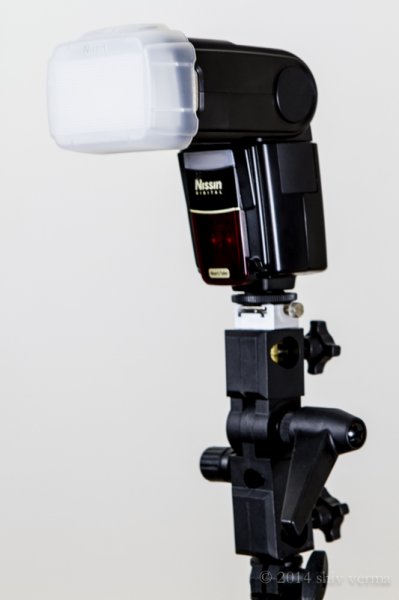
Nissin Flash with Diffuser
You can conclude that on a cloudless day, the light source is small, it is distant, it is bright and therefore is hard light. This light will create sharp shadows that define high contrast. On a cloudy day the relative size of the light source is large, it is much closer (the cloudy sky), less bright, and diffused. This light will create soft shadows and thereby lower contrast.
Photographing different types of subjects require different types of light. In response to the question asked, lets consider people photography. Your portraits will be far more pleasing when they are photographed with less contrast using a soft light. Yet in some cases, like for dramatic portraits of actors, high contrast looks great. High contrast using hard light is good when you want to show texture of the skin in older people. Contrast will exaggerate texture and facial features as the shadows are well defined. Less contrast, or the use of soft light (diffuse light), will deemphasize the texture and give skin a smoother appearance. This is what you are looking for, particularly with the female portrait.
When you use a flash, on or off camera, you are using a relatively small, hard, directional light source. This is a problem, since you end up with high contrast and a harsh appearance to your portrait. To solve this problem you have to make the light softer by making it larger. Remember, soft light is a large, light source, so the key to making your light softer is to make it larger.
Modifying light from the flash
On-camera flash
Here are some ways to make the on-camera flash into a soft light source. We will start with the simplest without using additional products, and move on to the more complex options using modifiers.
Bounce the flash: Bouncing is one way to make the light source larger but the light will also lose intensity. By bouncing the light off of walls and ceilings, the light falling on your subject will originate from a much larger area as compared to a directly aimed flash. Outdoors this may not be possible so you may have to find other means to bounce the flash. You can use large white foam core boards, umbrellas or you can buy a reflector. Reflectors come in various sizes and can have multiple surfaces that bounce or reflect the light. These can be twisted and folded into very compact and portable bags. If all you have is a white business card or an index card on hand, use an elastic band and affix the card to the top of your flash. This will serve as a small bounce and help provide catch lights in the subject’s eyes.
Tips:
- Since bouncing the light reduces light intensity you will need to adjust your flash for higher output.
- Bouncing off colored walls or ceilings will impart the same color cast on your subject
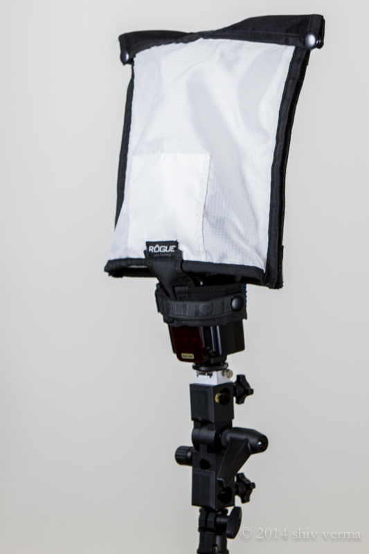
Rogue FlashBender Large
Use a Diffuser: The simplest diffuser is a piece of tissue paper taped in front of the flash lens. Plastic diffusers that either fit over the flash head or are fastened using Velcro or elastic bands, are the next step up. Stofen makes these diffusers in various sizes to fit most flash heads. A number of products that will bounce and diffuse light are available – Rogue Flash Bender products are a good example. A number of manufacturers make small portable soft boxes designed for use with a flash.
Diffusers work well for indoor flash photography but are not that useful when outdoors. In addition, just as when using bounced light, diffusers also require higher power to achieve the same exposure.
There is one other problem that needs solving – flat lighting. The on-camera flash sits near the axis of your lens, so when you use a diffuser the light will still be coming from the same angle and you portraits will have little dimensionality. The images will appear flat. It gets worse if there is no diffuser. You will get red-eye or the deer in the headlights look.
Off- camera flash
The position and direction of the light source has a great impact on the appearance of your subject. We covered contrast and how contrast is defined, but the visibility of this contrast (visibility of shadows and highlights) depends on the position of the light source, be it diffused or not.
Any subjects, no matter how much texture and dimension it may have, when lit and photographed from the same angle will look flat as shown in the diagram below left. In order to show dimension and texture, the flash direction and the angle of the camera lens must not be coincidental, as shown below right.
The maximum dimension theoretically would be when the light source and the camera are at 90 degrees. However, this is a bit extreme. See the diagram below.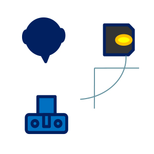
If the flash is mounted on-camera the camera will see and capture the side of the subject that is blasted with head-on light. As a result there are few if any shadows and you get the appearance of a harshly lit subject.
It may not always be possible to use the flash off-camera. Even small extensions using flash brackets to either side or above will help. A flash mounted on a light stand and controlled via wireless trigger is ideal. Flash heads mounted in small softboxes (see below) or with a Rogue Flash Bender style product will defuse the light well.
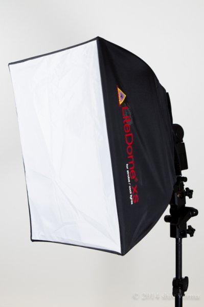
Photoflex LiteDome XS
If you are in a studio like environment or even at home you can increase the relative size of your flash by directing it through a translucent (white not clear) shower curtain. You can build a PVC pipe frame and drape a shower curtain over it, or buy ripstop nylon and use it as diffusion material.
Finally, remember that the closer the light source is to your subject, the softer the light. The edge of the light source is softer than the center. Keep these tips in your arsenal. Armed with the information in this article you will hopefully make better portraits when using a flash and have a better understanding of controlling the light from your speedlight.
The following two portraits were shot in a casual setting with a white foam core board serving as a fill from the left side of the camera. For the first image a diffuser that comes with the flash head was used. As you can see that despite the use of a diffuser the light source is still small and relatively harsh. The second portrait was shot using the light dome. Notice how much softer the light is on the subject. Both images are straight from the camera – no post-processing was done.
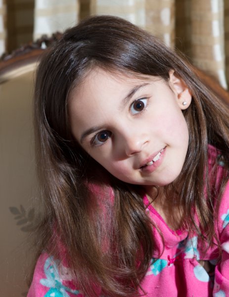
Single flash on-camera using a manufacturer supplied diffuser

Same flash mounted in a Photoflex LiteDome XS Softbox
The post How to Soften the Light When Using Flash by Shiv Verma appeared first on Digital Photography School.

Digital Photography School


You must be logged in to post a comment.