RSS
 

Posts Tagged ‘Using’

How to Save Images Using Export in Lightroom

26 Nov

Reader feedback tells me that some people are confused by Lightroom’s Export process. I think the confusion is caused by not completely understanding how Lightroom works, especially when processing Raw files. So let’s start by recapping the process that a single Raw file goes through when you import it into Lightroom.

How to export photos from Lightroom

1. Lightroom adds the Raw files to the Catalog

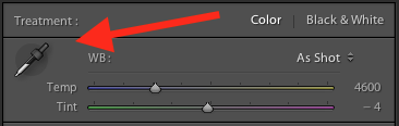
The Catalog is a database containing information about all the photo files you have imported into Lightroom (for further clarification on this process read my article How to Import Photos into Lightroom). Lightroom keeps track of the location (where it is saved on your hard drive) and metadata of each imported Raw file.

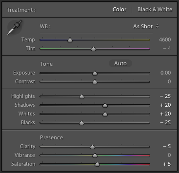
2. Open the Raw file in the Develop module and process the photo

The key thing to understand here that Lightroom keeps track of every single edit you make in the Develop module by storing them as a series of text commands in the Catalog. This means that (a) the Raw file itself remains unchanged and most importantly that (b) at this stage even though you can see it on your computer screen, you haven’t yet converted the Raw file into another format that other programs can use. This is where the Export function comes in.

JPEG and TIFF files

By the way, it’s a similar process if you are processing a JPEG or TIFF file. Lightroom saves the edits you make in the Lightroom Catalog, and doesn’t change the original file in any way. This only happens at the export stage, where you create a new version of the file that incorporates the changes. This is important to note, because it is different from the way Photoshop and Photoshop Elements work.

Exporting image files

All this means is that if you want to view or use your photos in a program other than Lightroom, you need to export them first and save them in a format that other programs understand.

There’s just one exception to this. If you go to Catalog Settings > Metadata and tick the Automatically write changes into XMP box, Lightroom will save the Develop settings in a .xmp file in the same folder as the original file. These files can be opened successfully using Adobe Camera Raw in Photoshop.

Note: Export in Lightroom simply means: Save As! Just like in MS Word or any other program. 
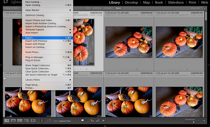
The Export process

Now that you understand why you have to export photos, let’s see how to do it.

Start by selecting the photo, or photos, to be exported. It is easiest to do this in Grid View. Then go to File > Export to start the export process and bring up the Export window. This is what it looks like.

How to export photos from Lightroom

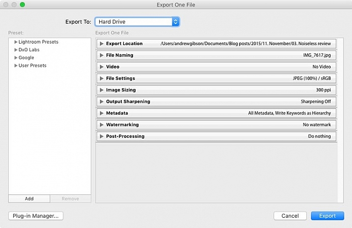
The Export to menu at the top defaults to Hard Drive. You can also choose to export the photos as email attachments, burn them to a CD/DVD or export them to a plug-in. For this article I am going to work on the basis that you have selected Hard Drive. The settings change slightly if you choose one of the other options.
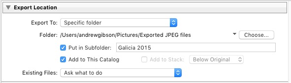
Export Location

This is where you tell Lightroom where to save the exported files. Select “Ask what to do” or “Choose a new name” for the exported file from the Existing Files menu, to avoid accidentally overwriting existing files with the same name. Tick the Add to This Catalog box if you want to add the exported images to the Lightroom Catalog. This saves time that would otherwise be spent re-importing the new images.
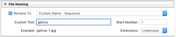
How to export photos from Lightroom

File Naming

When exporting you can opt to keep the original file names, or create new ones. What you choose to do here depends partially on whether you created new file names at import, or kept the original names made by your camera. The most obvious use here is creating a naming format for images to be sent to clients. If you are exporting photos to send to a stock library, for example, the stock library will have its own file naming requirements that you need to stick to. You have the option of selecting one of Lightroom’s naming presets, or you can create your own by choosing Edit from the Rename To menu.

How to export photos from Lightroom

Video

Only applies if you are exporting video.

File Settings

This is where you select the format, quality, and colour space of exported files. It is important to get these settings correct, otherwise you risk creating files that are unsuitable for the intended purpose. There are five Image Format options to choose from:

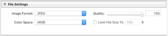
JPEG: This format is for creating small files for sending to other people or uploading to websites.

For web use: Set Quality to between 60 and 80 and Color Space to sRGB. You may also wish to tick the Limit File Size box to ensure that files are below a certain size. If you are exporting photos to use on a web page, restricting file sizes to less than 150kb will help the page load faster in a browser. You also need to set the pixel size of the exported files under the Image Sizing heading.

For full size images: Set Quality to 100 and Color Space to sRGB. You should only select a Color Space other than sRGB if you instructions to do so (for example, you are sending the files to a magazine publisher who wants them in the AdobeRGB (1998) colour space).

How to export photos from Lightroom

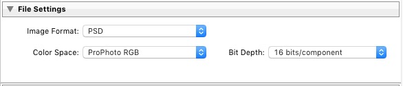
PSD: This is for creating PSD files to work on in Photoshop. For maximum quality set Color Space to ProPhoto RGB and Bit Depth to 16 bits/component. This gives Photoshop all the available information for that image, and the highest quality possible.

How to export photos from Lightroom

TIFF: These files are large, 16 bit files similar to PSD files. For maximum quality set Compression to None, Color Space to ProPhoto RGB and Bit Depth to 16 bits/component. The assumption here is that you are creating the file to work on in Photoshop or another plug-in.

How to export photos from Lightroom

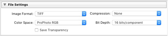
Note that the reason I recommend using ProPhoto RGB for both TIFF and PSD files is because I’m making the assumption that when you’re finished editing the photo you will then convert it to either sRGB or AdobeRGB (1998) afterwards. If you’re not sure what colour spaces are or how they work then my article Everything You Need to Know About Lightroom and Colour Space will help.

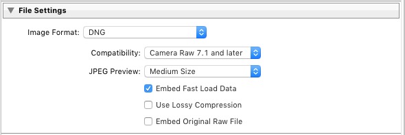
DNG: Use this setting to convert native Raw files to the DNG (Digital Negative) format. Tick the Embed Fast Load Data box to create DNG files that load faster in Lightroom.

How to export photos from Lightroom

Original: Retains the original photo file format. If the original is a Raw file, Lightroom exports the unmodified original, with a sidecar .XMP file containing the changes made in Lightroom.
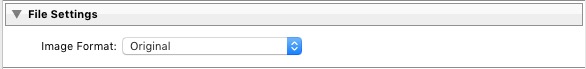
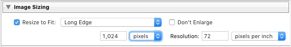
How to export photos from Lightroom

Image Sizing

This option lets you alter the size of the image and set the resolution. Use this to upscale the photo for printing, or to create a smaller file for uploading to a website. If you simply want to export a full size version of your photo, you won’t need to alter any settings here.
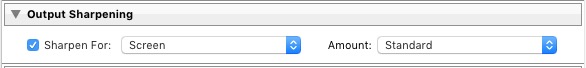
How to export photos from Lightroom

Output Sharpening

Lets you add sharpening for display (Screen) or printing (Matte Paper and Glossy Paper). Select from three levels: Low, Standard and High. There is no need to sharpen if you are exporting photos to edit in another program such as Photoshop.
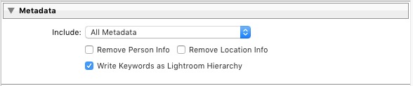
How to export photos from Lightroom

Metadata

Here you choose whether to include all metadata in the exported image, or just some of it. You may want to leave out Person Info (keywords that include people’s names) for privacy reasons, and Location Info for security or privacy reasons (for example, if you post a photo of your home online).
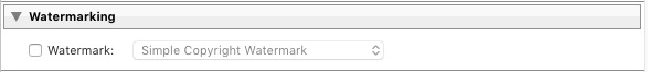
How to export photos from Lightroom

Watermark

Tick the Watermark box to add a watermark to your images. Select Edit Watermarks from the menu to create your own watermark. The main purpose of this is to add a copyright logo to photos that are going to be published online.
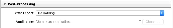
How to export photos from Lightroom

Post-Processing

Tell Lightroom what to do after exporting the images. Do Nothing is the most appropriate setting most of the time, but you may find the other options useful from time to time.
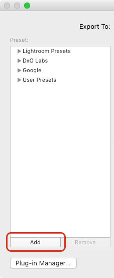
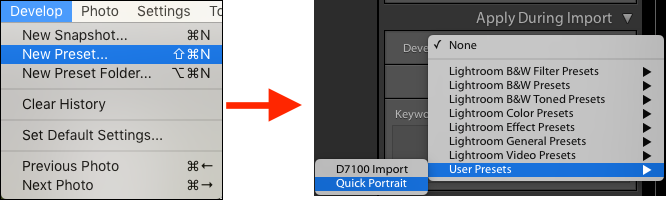
How to export photos from Lightroom

Export Presets

If you find yourself using the same export settings a lot, you can save them as a User Preset. Click the Add button in the bottom left corner of the Export window to do so. You’ll be prompted to enter a name for the Preset, and to select the folder to save it in (the default is User Presets).

How to export photos from Lightroom

As you can see, the export process in Lightroom is quite simple. If you have any questions about it, or indeed any questions about Lightroom, please let us know in the comments.


The Mastering Lightroom CollectionMastering Lightroom ebooks

My Mastering Lightroom ebooks will help you get the most out of Lightroom. They cover every aspect of the software from the Library module through to creating beautiful images in the Develop module. Click the link to learn more or buy.

googletag.cmd.push(function() {
tablet_slots.push( googletag.defineSlot( “/1005424/_dPSv4_tab-all-article-bottom_(300×250)”, [300, 250], “pb-ad-78623” ).addService( googletag.pubads() ) ); } );

googletag.cmd.push(function() {
mobile_slots.push( googletag.defineSlot( “/1005424/_dPSv4_mob-all-article-bottom_(300×250)”, [300, 250], “pb-ad-78158” ).addService( googletag.pubads() ) ); } );

The post How to Save Images Using Export in Lightroom by Andrew S. Gibson appeared first on Digital Photography School.


Digital Photography School

 
Comments Off on How to Save Images Using Export in Lightroom

Posted in Photography


Using Emotions to Take Storytelling Images

25 Nov

A forgotten woman and her daughter – tips for storytelling

If you travel to remote places you will be sure to get extraordinary photos. Be brave, take a risk, and allow the warm winds of far off places take you on a journey you won’t forget. I’m always looking for opportunities that allow me to visit people and places that are off the usual tourist trail. I travel with an open mind and heart, and am often rewarded by meeting extraordinary people in the most unlikely places.

51K1433

My interest is photographing landscapes and portraits. I especially look for people that are indigenous to the countries and the remote areas I visit. Their faces and traditional dress tell the stories of their ancestors, and I want to capture these people before they are no longer able to live as their forebears.

Traveling along the rough, dusty roads on the border between India and Pakistan you are immediately reminded of just how volatile these two countries still are. You take a great risk to visit these regions where many armed soldiers are seen in camps, at river crossings, and in long convoys of trucks as they continually patrol, ready to defend their respective countries.

Have patience and wait for opportunities

If you are able to travel in this area during October you will be rewarded with the magnificent autumn colors on display throughout the countryside. My intention was to capture these colors in all their glory, and photograph the natural beauty of the landscape. However, I arrived a little too early. I had a choice: I could stay and wait another week or two, or I could return home. I decided to stay and take the opportunity to have some time to relax, and see what other stories might present themselves.

It was the last day of my visit and I decided to take a walk, as I often do, to see if I could find a story by keeping an open mind, and a keen eye while I strolled.

51K1389

I knew that in the next few days, this area would be totally cut off for six months during winter. I was feeling a bit low as I hadn’t taken any photos that I felt were of any substance. As I walked I noticed a lady sitting in the window of a very humble wooden house. She looked very sad and I felt drawn to go and speak to her.

Note: To shoot in this region you need permissions and local guide, which I had. My first image of the story has shows me shooting from outside of her house. Next to me were people of that village and my local interpreter. She was watching me shoot from above. My objective was to talk to her and cheer her up. 

Image 1

51K1366

Allow the story to unfold and follow your instincts

As soon as I entered the house I thought why not test my new camera in this low light. Once inside, I’m sure you would get the same shock I did. In one corner was a small fire for cooking. The rest of the room was dirty and in complete disarray. Upon seeing me enter, she looked quite stunned, and started to use sign language – I realized she couldn’t speak or hear. I also had a feeling she was mentally challenged, so I thought I would give up the idea of taking some portraits of her. She was trying to talk and constantly moving her body.

Image 2

I smiled and sat opposite her trying to show her my camera. I wanted to explain that I was a photographer so she wouldn’t be scared of me. Normally most of the strangers in this area are suspected militants, or a threat. As I tried to communicate with her, she continuously tried to sign violence and killing, which she must have experienced since birth. In sign language I tried asking her if I could photograph her, unfortunately it was my first try with sign language and she did not understand. Something inside me pushed me to take a few shots and leave. Somehow I managed to take some photos despite feeling low after spending time with her.

Image 4

L1000775

Then her mother walked inside the house and told me the story of her daughter. She was deaf, and mentally challenged since childhood. They were living a very difficult life and there was nobody else in family. I listened and took one shot as she broke down. All I could do was put my hand in my pocket and give her whatever cash I had.

Image 5

Look for the emotion parts of the story

When I left the house I felt heavy hearted. I looked back and saw the daughter smile as she was looking out from her window, and I smiled back at her. I clicked the picture as a memory and it turned out to be the best photo I had taken on this visit. If you keep an open mind and follow your instincts you may well find a story such as this.

Image 6

As I drove back her powerful smile did not leave my mind. I kept thinking about her, she had left an impression.

Review

Look at your images after you take them as I did. It’s only then that you will realize how powerful they are.

Her smile started growing on me and I thought that perhaps I had made a small difference to her life. Her smile was so genuine. Even before arriving back home I decided to write about, and share her story. This story provoked my thoughts, altered my ego, and forced me to approach everyone with her story, whether they are my admirers or critics. I wanted to let the world know of her existence and those like her, as you will when you take those rare and unique photos and experience what I did. There are many such people on this earth for whom life is a day-to-day existence and there are only fleeting moments of happiness.

Take a risk and go for it

So… be brave, take a risk, and allow the warm winds of far off places take you on a journey you won’t forget. Trust me you won’t regret it!

Do you have any images that you took that inspire you and tell a story? Please share them in the comments below.

googletag.cmd.push(function() {
tablet_slots.push( googletag.defineSlot( “/1005424/_dPSv4_tab-all-article-bottom_(300×250)”, [300, 250], “pb-ad-78623” ).addService( googletag.pubads() ) ); } );

googletag.cmd.push(function() {
mobile_slots.push( googletag.defineSlot( “/1005424/_dPSv4_mob-all-article-bottom_(300×250)”, [300, 250], “pb-ad-78158” ).addService( googletag.pubads() ) ); } );

The post Using Emotions to Take Storytelling Images by Aarief appeared first on Digital Photography School.


Digital Photography School

 
Comments Off on Using Emotions to Take Storytelling Images

Posted in Photography


How to Create 5 Different Looks Using Lightroom

24 Nov

Most often you may strive to capture photos which most closely reflect the scene the way it looks to your eye.
On the other hand, with having powerful editing software at your fingertips and an insatiable creative streak, sometimes you may find yourself experimenting with altering your images to create different “looks”.

setting moods in lightroom

Lightroom gives you ample opportunity to experiment with creative effects.

Some photographers find the idea of strong post-processing edits to be an unfair alteration of reality, but let’s face it, it can be loads of fun to play around with photos in Lightroom (LR) or Photoshop (PS) and the results can be stunning – even if they don’t accurately reflect the shooting conditions.

It’s important to keep in mind that edits don’t have to be super-strong or over the top, and just a few fairly minor changes can work wonders to create a mood that fits the photo. Naturally, what works and what doesn’t is subjective. That being said, it’s likely you wouldn’t want to use a soft, bright effect on a portrait of prison inmate, or a dark gritty effect on photos of a newborn.

The extent to which you are able to apply these effects will be largely influenced by the original file type. If you are working with JPEG, you are going to run into problems with color rendition, saturation, noise and other issues. If you plan on processing your photos with editing software, I recommend shooting RAW files 100 percent of the time.

#1 Add Warmth

setting a warm mood in lightroom

The warming effect works best to boost an already warm photo, but can also be created.

When trying to create a certain mood in a photo, it makes it easier if some of the characteristics of that mood are already present, and you can just accentuate them. This is especially true if you want to create a warm feeling in a photo.

The first slider you’re going to want to visit for this is color temperature. Increasing the color temperature is going to give the entire image a warmer tint, which can be exaggerated by increasing vibrancy.

Another way to boost the warmth is in the HSL/Color/B&W panel. HSL stands for hue, saturation and luminance which can be adjusted for eight different colors. You will work with the first three – Red, Orange and Yellow. I prefer to start with the Luminance tab, and find that decreasing luminance, and then sometimes increasing saturation slightly, works pretty well with many images.

Although you don’t have access to the HSL panel, don’t forget the power of the graduated filter to increase the warming effect in skies – particularly in sunset photos.

#2 Dark and Gritty

dark and gritty mood

The dark and gritty mood adds a brooding look and highlights detail, while taking the focus off of colors.

To achieve various levels of this effect, I work with various combinations of the following:

  • Increasing Clarity, sometimes more than 100 per cent by using graduated filters or the adjustment brush
  • Increasing Contrast, and decreasing Highlights and Whites
  • Further tweaking contrast with the Tone Curve sliders
  • Decreasing Saturation and Vibrance, or converting to black and white
  • Adding grain in the Effects panel

#3 Light and Airy

light and airy look

Light and airy is a good look for soft portraits, where super sharpness isn’t desired.

For this look, the idea is to make the image soft without any harsh shadows. Here are some steps to take that will start to produce this mood:

  • Lower Contrast
  • Increase Highlights and Whites sliders
  • Decrease Shadows and Clarity

Also note that a light hand with the sharpening slider should be used here to maintain the softness. If you add sharpening, try using a high value for masking to lessen the global affect.

#4 Silhouette

silhouette look

Silhouettes help to simplify your photo.

You certainly can’t create this effect in just any photo – nor should you. Look for elements in the image that would be enhanced by a reduction in detail. Do the areas of the image that are going to be reduced to black contain details that are important to telling the story?

Here are some adjustments that will get you moving in the right direction:

  • Increase Contrast
  • Decrease Shadows and Blacks sliders
  • You can decrease the darks and shadows sliders in the Tone Curve panel if needed

Depending on your image, you likely want to avoid the clarity slider as this will bring back shadow details that you’re trying to get rid of.

#5 Bright and Clear

bright and clear look

The bright and clear look makes your photos pop with lots of detail.

Along similar lines to the light and airy effect, you are looking to boost lightness while maintaining contrast and retaining detail and color. Here are some of the edits I start with while aiming for this look:

  • Boost Contrast
  • Increase Shadows
  • Increase Whites – you usually have to decrease highlights a bit as well to avoid clipping
  • Visit the Tone Curves panel if you need to work on the contrast more

The trick here is that after making these adjustments, the colors can get a bit washed out. A visit to the HSL panel, some tweaking of the luminance and saturation of the dominant colors in your image, will help you dial it in.

Conclusion

In case this hasn’t crossed your mind already, creating presets of these settings can save you oodles of time later on. Of course, all of the adjustments I’ve outlined above may not work on your original image (depending on exposure, contrast, saturation, subject matter, etc.), and the same goes for any presets which typically only serve as a starting point.

What tricks do you have up your sleeve for creating different moods in post-processing?

googletag.cmd.push(function() {
tablet_slots.push( googletag.defineSlot( “/1005424/_dPSv4_tab-all-article-bottom_(300×250)”, [300, 250], “pb-ad-78623” ).addService( googletag.pubads() ) ); } );

googletag.cmd.push(function() {
mobile_slots.push( googletag.defineSlot( “/1005424/_dPSv4_mob-all-article-bottom_(300×250)”, [300, 250], “pb-ad-78158” ).addService( googletag.pubads() ) ); } );

The post How to Create 5 Different Looks Using Lightroom by Jeremie Schatz appeared first on Digital Photography School.


Digital Photography School

 
Comments Off on How to Create 5 Different Looks Using Lightroom

Posted in Photography


Photographer’s Guide to Using Graphic Tablets for Lightroom Editing

24 Nov

There are several gadgets we can use to improve our performance in Adobe Lightroom, if our intent is to post-produce images quickly and neatly with professional results. However, there is no better tool for a talented photographer than a good graphic tablet. Read on to learn how a graphic tablet can be used with Adobe Lightroom and how it can Continue Reading

The post Photographer’s Guide to Using Graphic Tablets for Lightroom Editing appeared first on Photodoto.


Photodoto

 
Comments Off on Photographer’s Guide to Using Graphic Tablets for Lightroom Editing

Posted in Photography


Photoshop Tip: Using the High Pass Filter to Sharpen Images

22 Nov

If you’ve used Photoshop, you are likely aware by now that there are many ways to accomplish the same tasks. One of the more important ones that should be done to almost every digital image is sharpening. This is necessary because most digital camera sensors make use of an anti-aliasing filter, which very slightly blurs the image, to reduce the chances of moire occurring in the image. This slight blurring, generally only one pixel in size, causes a slight loss of detail in an image. To correct for the slight blurring, tools such as Unsharp Mask are used. For a good tutorial on Unsharp Mask, check out How To Sharpen Photos: An Introduction.

High Pass Sharpening

This shot of sunflowers benefited from the High Pass filter by sharpening the fine detail in the center of the flower.

Another easy way to sharpen your images is with a filter that’s not even found in the Sharpen menu under Filters in Photoshop. It’s relegated to the Other category at the bottom of the Filters menu, and is called High Pass. The High Pass filter is a bit easier to use than Unsharp Mask, in that it only has one slider to worry about, and the technique for using it allows for some experimentation even after it’s applied, so you can get your image looking exactly as you want.

Note: I am using the latest version of Photoshop, version 2015.0.1 in Creative Cloud.

Step 1: Edit your image, then flatten it

Before you use the High Pass filter, you’ll first want to process the image to your liking. Generally speaking, sharpening should be the final step in image editing, because it is directly dependent on image size. You will sharpen an image sized to 5×7″ differently than one sized to 13×19″. Once your image is edited, flatten all layers by going to the Layer menu and selecting Flatten Image. Then adjust your image size as needed if you’re going to print or to display online.

Step 2: Duplicate Layer

Now that your image is flattened, duplicate that layer by pressing <CTRL + J> (in Windows) or <CMD + J> (on a Mac). You’ll then want to zoom in to view the image at 100% by pressing <CTRL + 1> (in Windows) or <CMD + 1> (on a Mac), or just double clicking the magnifying glass in the toolbox. You’ll want to be at 100% so you can see the detail of the image clearly.

Step 3: The High Pass Filter

High Pass Filter Selection

In the Filter menu, select Other, then High Pass.

Go to the Filter menu and select Other, and then High Pass. You will see the entire image turn a flat grey color. Not to worry, as this will allow you to see what the filter is doing.

Step 4: Adjust the amount of sharpening

high pass filter sharpening

Once the High Pass filter dialog box pops up, use the slider to adjust the radius.

Once you run the filter, you’ll see a dialog box open up, showing a preview along with a radius slider. In addition, the image behind the dialog box will have turned grey, with some edge lines showing.  This allows you to see exactly what is being sharpened. The High Pass filter only sharpens edges, so anything that’s not an edge becomes flat grey. The amount of sharpening you do will largely be image dependent, as well as size dependent.

For this image of the sunflowers, I was making a large print, using the full resolution of the image. When doing so, I’ve found my radius amount will usually fall somewhere between 0.5 and 5 pixels. You need to be careful here, as too much sharpening will introduce unwanted artifacts and noise into the image. I use the preview as my guide. I want to see thin black lines over the grey areas, with little to no white. Once you see any white, it means you’ve begun to get a halo, which you want to avoid. The final effect will be a subtle sharpening, not a drastic pop. For this image, I used a radius of 0.9. You can see above that there are only black lines around the edges of the flower, with very little halo. Click OK when ready.


Step 5: Adjust Layer Blending Mode

High Pass filter layer blending mode
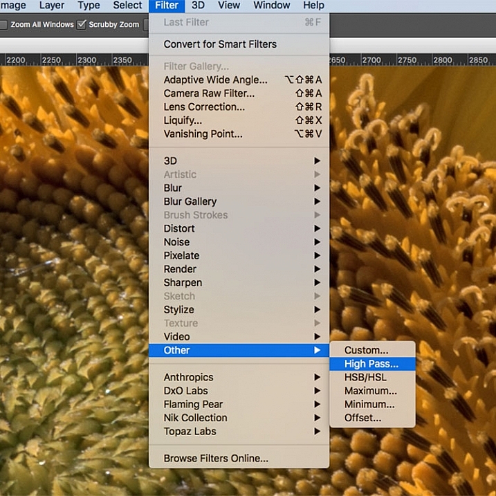
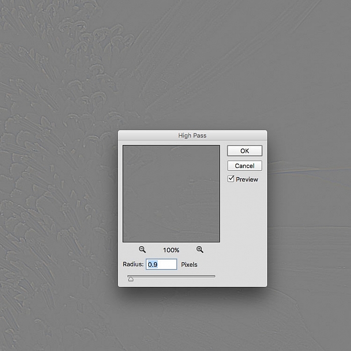
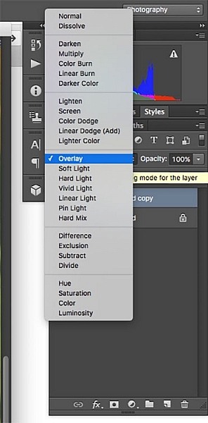
Once you’ve applied the High Pass filter, it’s time to get rid of that flat grey image and bring your photo back to life. Go to your Layers palette and select the Blending Mode drop-down menu and set it to Overlay. Your image will regain its color, and you can toggle the sharpened layer off and on, to compare the image with and without sharpening.
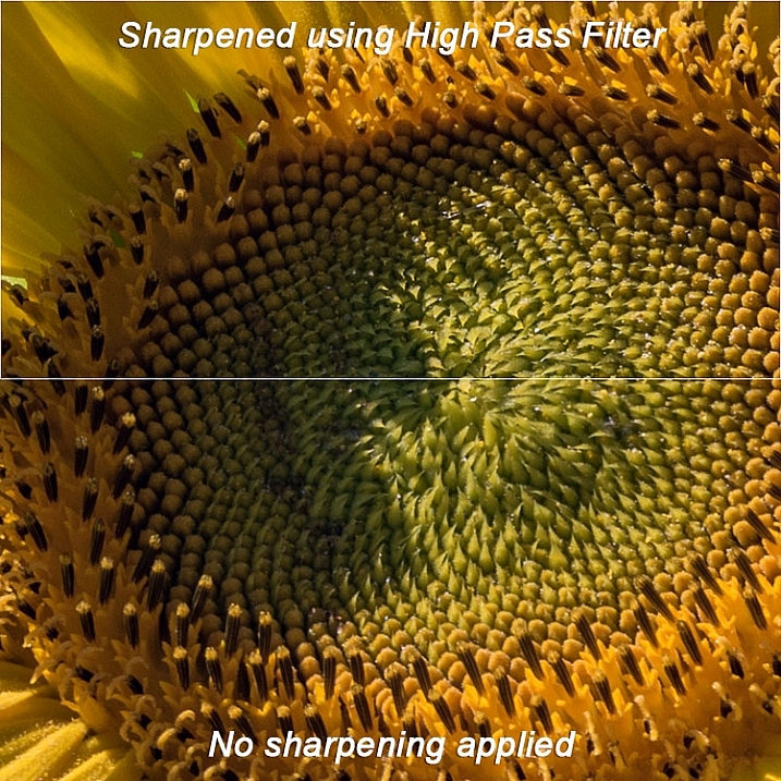
You can also experiment with different blend modes, including Soft Light, Hard Light, Vivid Light, Linear Light, and Pin Light. In addition, you can use the Layer Opacity setting to reduce the effect a bit, if you decide the sharpening is a bit too strong. The beauty of this technique is that it’s completely adjustable (non-destructive) after you’ve applied the filter, and because you’ve worked on a separate layer, you can easily undo the sharpening and start over again if needed. Also, again because you’re working on a separate layer, if there are certain areas in the image where you want the sharpening to be applied, you can use Layer Masks to hide or show it.

Final results

High pass filter comparison

In this comparison image, the top half has been sharpened using the High Pass filter, while the bottom half has not been sharpened.

The High Pass filters allows a lot of flexibility in sharpening photos and is simple to use. It’s a great way to give your images a sharper, crisper look before uploading or printing. Give it a try and let me know what you think!

googletag.cmd.push(function() {
tablet_slots.push( googletag.defineSlot( “/1005424/_dPSv4_tab-all-article-bottom_(300×250)”, [300, 250], “pb-ad-78623” ).addService( googletag.pubads() ) ); } );

googletag.cmd.push(function() {
mobile_slots.push( googletag.defineSlot( “/1005424/_dPSv4_mob-all-article-bottom_(300×250)”, [300, 250], “pb-ad-78158” ).addService( googletag.pubads() ) ); } );

The post Photoshop Tip: Using the High Pass Filter to Sharpen Images by Rick Berk appeared first on Digital Photography School.


Digital Photography School

 
Comments Off on Photoshop Tip: Using the High Pass Filter to Sharpen Images

Posted in Photography


Manfrotto launches D1 backpack for photographers using drones

21 Nov

Accessories manufacturer Manfrotto has introduced a new series of backpacks designed for photographers who fly drones. The Aviator D1 Drone Backpack holds a medium sized quadcopter such as the DJI Phantom 3 along with all the accessories that go with it, as well as a DSLR, a laptop and a tripod. Read more

Articles: Digital Photography Review (dpreview.com)

 
Comments Off on Manfrotto launches D1 backpack for photographers using drones

Posted in Uncategorized


Using Framing for More Effective Compositions

12 Nov

From my experience, it’s true – photographers tend to see the world in a different way. If not from the beginning, eventually, and maybe subconsciously, your eye is trained to notice details differently. Perhaps it’s the way light falls off of, or wraps around an object, or when pleasing geometrical compositions fall into place. In extreme cases, you may even start to catch glimpses of your camera’s viewfinder layout when you blink (you might want to seek help for this).

Framing of a hidden Chinese garden.

Some opportunities to use framing in photographs are less subtle than others. Of all the images I shot in this Chinese garden, this one stood out, as it not only shows the hidden nature of the garden, but makes a perfect frame.

Often, an important step in the “Seeing like a Photographer” evolution is to begin recognizing, and implementing, framing elements into your images.

Although in photo lingo we talk about framing often, it is one of the strongest tools you have at your disposal to create strong compositions. Let’s be clear that when we talk about framing your photo, we may be referring to the actual border of the image itself – but in this article we are discussing other objects used to intentionally create some sort of border around the subject of the image.

However, clever framing is just one part of an equation that fits into an overarching photographic formula. In certain circumstances, the frame itself may be so ridiculously amazing and awe inspiring that it carries the image all by itself. In practice, you are likely to use framing in order to draw attention to, and strengthen, the subject of the photo.

Framing a photo of a pier

Framing can help highlight your subject, directing the viewer’s gaze where you want it.

Framing can be used to various degrees; while some framing elements may be subtle in one image, they can be quite obvious in others. This can be a product of your personal creativity or style, or simply a result of making do with what you have, as there aren’t always framing options for every photo you shoot.

Using framing to boost your photo’s appeal is generally a good tactic, and is a great approach to creating original images of over-photographed scenes or landmarks.

Framed shot of the space needle

A keen eye for framing can yield original images of well-photographed landmarks like the Space Needle in Seattle.

As a photographer you will become familiar with the feeling of walking up to a familiar scene, turning on your camera and raising the viewfinder to your eye, only to not push the shutter button. You’ve realized that you’ve seen the picture you were about take a million times, and you want your own unique shot.

For example, as I wander around a new city seeing the sights, I am always looking for environmental elements that I can use to add a sense of place, or implement as an element of a frame. Once you make a conscious effort to use framing techniques in your photography, you start to see all sorts architectural and natural elements that you can use.

Architectural element used for framing an image

After developing an eye for framing your subject, many opportunities will reveal themselves.

What can you use to frame your image? Some of the more common elements include foliage such as trees, branches, and leaves. Windows and mirrors in houses and cars are other popular framing options.

Framing a food photo with the chef's body

Framing elements come in many shapes and sizes – creative perspectives can pay off.

I like to look for interesting architectural features, or even use people as framing borders. Sometimes you may not necessarily even have a subject in mind for an image but see a good framing opportunity, so you then look for a compelling subject or wait for a person to pass through the scene inside the frame.

You can also use lighting as a powerful framing tool. As we are always working with various lighting in photography, what is included or excluded from the lighter areas of the image can help isolate the subject.

Although it’s best practice to develop an eye for framing while out shooting, other options may often present themselves while editing your photos. Cropping can be very useful for honing in on, or aligning, the framed area of the photo just right. Other tools such as the Graduated Filter or Radial Filter in Lightroom, can be used to lighter or darken specific areas of your image, to boost the intensity of your framing.

Have you made good use of framing techniques? Share your successes and images with everyone in the comments below.

This is the first in a week of articles about composition. Look for another tomorrow and over the next few days! 

googletag.cmd.push(function() {
tablet_slots.push( googletag.defineSlot( “/1005424/_dPSv4_tab-all-article-bottom_(300×250)”, [300, 250], “pb-ad-78623” ).addService( googletag.pubads() ) ); } );

googletag.cmd.push(function() {
mobile_slots.push( googletag.defineSlot( “/1005424/_dPSv4_mob-all-article-bottom_(300×250)”, [300, 250], “pb-ad-78158” ).addService( googletag.pubads() ) ); } );

The post Using Framing for More Effective Compositions by Jeremie Schatz appeared first on Digital Photography School.


Digital Photography School

 
Comments Off on Using Framing for More Effective Compositions

Posted in Photography


How to do Basic Processing on a Portrait in 5 Minutes Using Lightroom

11 Nov

There’s a Triangle of Service that you may have seen before which goes something like this: You have three options available (cheap, quick, quality) but can only choose two. I first saw this on a sign in an automotive shop years ago, but it applies in almost any professional setting where goods and services are produced for consumption, and is especially true in photography.

As a photographer you don’t have unlimited time, but you and your clients expect quality results, and doing so is not always cheap or easy. Fortunately Lightroom makes it simple to do a basic portrait processing job in only a few minutes, which you can then copy and paste to other similar photos, to make your work even faster.

five-minute-lightroom-portrait-processing-headshot

Before I get too deep into this article I want to make clear that the following steps are a process that works for me, but your unique solution might be a bit different. The important lesson is to find a workflow that is easy to replicate and repeat, so you don’t spent all your time doing the same types of edits over and over.

As you work with any editing program – whether it’s Lightroom, Photoshop, Capture One, or even a free tool like Photos or Picasa – it’s a good idea to find an editing style that matches your photography style. I know the look I’m going for when I edit a portrait or headshot, which might be entirely different from what you prefer. Knowing how to achieve my particular style has taken me a while, but now I find that my editing is a lot quicker, because I start each photo with a particular set of steps:

  1. White Balance
  2. Tone
  3. Sharpening
  4. Vignette

These steps are quick, usually get me 90% of the way towards a finished image, and will often result in a finished portrait with no additional editing required. Let’s look at each step one by one:

five-minute-lightroom-portrait-processing-step1-import

This original is decent but it needs some tweaks before it’s good enough to give to my client.

Step 1: White Balance

One advantage of shooting in the RAW format is that you can calibrate the White Balance of your images afterwards, whereas shooting in JPG leaves you much less leeway to edit not just White Balance, but most other aspects of the photo as well. Of course, one drawback of shooting in RAW is that calibrating the White Balance can take a lot of time, but much of this can be mitigated by using Lightroom’s eyedropper tool (targeted adjustment tool) instead of fiddling with the sliders on your own.

five-minute-lightroom-portrait-processing-white-balance

To quickly adjust the White Balance, click the eyedropper icon, then find a part of your image that is neutral in color – think slightly gray instead of pure white. The eyedropper tool might not get you the perfect overall color, but it will quickly get you close to your target, after which you can adjust the Temperature and Tint sliders to your liking.

Another tip to speed things up is to click directly on the Temperature and Tint numbers and use the up/down arrows to adjust their values, or hold down the [shift] key while doing so to make larger incremental changes.

Step 2: Tone

After you get your initial White Balance set, it’s time to make some initial adjustments using the rest of the Basic panel in the Develop module. To get my particular look, I almost always start off with the following values. You can change each one quickly by highlighting the numbers, entering new values, and pressing [Tab] to move to the next set of numbers instantly.

five-minute-lightroom-portrait-processing-basic-panel

Exposure 0, Contrast 0. I don’t change these values until I make the following adjustments you see below. Because they are global, and affect the entire image, that is not usually what I want to do right away. If the image is still too light or dark after doing the rest of the basic adjustments, I’ll increase or decrease exposure accordingly, but rarely do I need to adjust contrast and you’ll see why in the steps below.

Highlights -25. This helps even out the bright portions of the portrait so any spots that are a little bright are brought down a bit.

Shadows +20. This is a way of brightening just the dark parts of the portrait to bring out a little more color and definition.

Whites +20, Blacks -25. I use these sliders instead of adjusting the contrast because it gives me more granular control over the look and feel of my portraits. I’m essentially making the whites and blacks more pure, which helps give the portrait a richer look overall. Some people skip this step and make adjustments to the Tone Curve, but it’s all a matter of personal preference, though I usually find the white/black adjustments to be quicker.

Clarity -5. Most people bump up the clarity slider which essentially affects edge contrast mostly in the midtones, but I like a slightly more subdued look so I usually start by lowering it a few notches.

Vibrance 0 (zero). This slider mostly affects colors outside the normal range of human skin, so it can be useful if you shoot outdoors and want to make the nature colors pop. I leave it at zero as a general rule, and then adjust later as necessary.

Saturation +5. I usually like a bit more color to start things off, so I start with a small value increase here, and then go up or down as necessary.

I always start with these adjustments, and then tweak as necessary. The whole process only takes a minute and almost always results in an image that is dramatically improved over the initial import.

five-minute-lightroom-portrait-processing-step2-color

This image is already more vibrant than the initial picture even though most of the adjustments were very basic.

Step 3: Sharpen

After the color and tonal adjustments are finished, I almost always apply some degree of sharpening to the image. With portraits, it’s essential that the eyes be in focus and sharp, so the next thing after Basic adjustments, is to use the Detail panel to get the sharpening you want.

five-minute-lightroom-portrait-processing-step3-sharpen

Click the targeting symbol in the top-left corner and then click on your subject’s eye to get a zoomed in view, then adjust your sharpening accordingly. I usually start with a value of 50 and then tweak additional parameters like Radius or Detail if I need to, but this basic adjustment is quick and usually gets me right near where I want.

I also apply a mask to the sharpening so it doesn’t apply to areas like faces. This helps keep the eyes sharp without adding unwanted texture to people’s skin. If you hold down the ALT key while you click the Masking slider you will see something like this (below). The white areas are where sharpening will be applied, the black areas will not. Use this to decide how far you want to take the masking on your portrait.

five-minute-lightroom-portrait-processing-step3-sharpen-mask

Step 4: Vignette

This one is a bit controversial – some people like vignettes, and some think they are an abomination unto modern photography, but as I said in the beginning this is all about finding a style and workflow that works for you. I usually add a slight vignette to my portraits, but if that’s not your thing then you can skip this step altogether. It’s not part of everyone’s five-minute workflow but it fits neatly in with mine, which is why I’m including it here. I only use a little bit of highlight priority, dark vignette, and try to keep the effect subtle.

five-minute-lightroom-portrait-processing-step3-vignette

That’s it – finished

Doing these four steps won’t always lead you to a finished portrait, but as the title of this article implies, you can usually get to a very nicely-edited portrait in under five minutes with these simple steps. You might have additional adjustments like adjustment brushes, spot removal, or red-eye corrections to do afterwards, but this will get most of the essentials out of the way.

five-minute-lightroom-portrait-processing-step1-import

Before

five-minute-lightroom-portrait-processing-step3-vignette

After – subtle but you can see the differences

Save your settings as a Preset

One final way to speed things up even more is to create a preset based on your workflow, which you can then apply to all photos on import.

five-minute-lightroom-portrait-processing-new-preset

If you take this angle, be sure to err on the side of caution and be a bit more conservative with your edits when creating the preset. You probably won’t want want to apply the same dramatic alterations to every single photo, but if you do find yourself reusing the same workflow over and over it might be worth your time to do an import preset.

Alternatively, you can create a preset and apply it at will after import by right-clicking on any photo in the Develop module, and choosing your preset from the “Develop Presets” shortcut (or find it in the Develop Presets panel on the left side panel of Lightroom).

What quick portrait processing tips work for you? Are there any specific actions you have found that save you a great deal of time? Share your thoughts in the comments below, and any example images of what your finished portraits look like are always welcome.

googletag.cmd.push(function() {
tablet_slots.push( googletag.defineSlot( “/1005424/_dPSv4_tab-all-article-bottom_(300×250)”, [300, 250], “pb-ad-78623” ).addService( googletag.pubads() ) ); } );

googletag.cmd.push(function() {
mobile_slots.push( googletag.defineSlot( “/1005424/_dPSv4_mob-all-article-bottom_(300×250)”, [300, 250], “pb-ad-78158” ).addService( googletag.pubads() ) ); } );

The post How to do Basic Processing on a Portrait in 5 Minutes Using Lightroom by Simon Ringsmuth appeared first on Digital Photography School.


Digital Photography School

 
Comments Off on How to do Basic Processing on a Portrait in 5 Minutes Using Lightroom

Posted in Photography


How to Create a Surreal Look in Photoshop Using Hue Adjustment

03 Nov

When you start learning photoshop it is scary to see all those different tools you can choose from. It is often said there are seven ways to achieve the same results, using different tools in photoshop. So, it means you have to find the one that suits you perfect, in order to give to your pictures the look that you want.

In this article I want to show you how you can change colors in your pictures using Photoshop. This is a very easy method that you can use, either you are a beginner or you are a more advanced user.

You could add a surreal twist to your images, or remove colors you do not feel like comfortable working with (I am sure we can all relate to this, because as artists we have our favorite and least favorite colors- the ones we struggle to work with!). You can use this technique for anything from changing the color of a dress or any other prop, to changing the forest tones to enhance the autumn feeling, or creating it if you want to create an autumn picture even though it is still spring.

This is the before and after color change:

Picture01 before after

Create a color adjustment with Hue/Saturation

You can get to the Curves dialog in two ways:

  1. Image adjustment: By choosing Image > Adjustments > Hue/Saturation or Click the Hue/Saturation icon in the Adjustments panel.
  2. As an adjustment layer: Layer > New Adjustment Layer > Hue/Saturation, or in your layers panel use the shortcut: New adjustment layer> Hue/Saturation.

Picture02 new adjustment layer shortcut

I strongly recommend working with layers. It allows you to come back to the adjustment and to erase it, or modify it, as many times as needed. Especially when you make big changes, you may want to be able to have full control. Layers can be scary at the beginning, but trust me, they will become your best friend once you overcome this fear.

Creating a new layer you will have the following Hue/Saturation dialog box:

Picture03 HueSaturation dialog box

Select the color you want to change.

The more different you want your original color to be, the more important this selection is so that the color change does not affect areas do not want to shift. Removing a general color cast is usually a very light change. But, a total different color requires you to be more careful when selecting, and sometimes require several color adjustments.

When your object has a very clear color – as to say all red, one red tone – it is easy. When your object has different color shades it is tricky but not impossible.

In this case we are changing the color of ivy leaves, with different tones of green, blue, and even yellow.

First step: Make the color selection:

You can choose Master to adjust all colors at once, or one of the other preset color ranges listed for the color you want to adjust (reds, yellows, greens, cyans, etc.).

Picture04 Master or preset color

Or you can also choose the Targeted Adjustment Tool (the little white hand) – this is the easy way to select color if the area/object you want to change is a mix of several color tones.

Picture06 On image adjustment tool

Click on the Targeted Adjustment Tool and put your cursor on your image, the eyedropper tool appears. Drag it on your image, and click on the color tone you want to select.

Picture05 color values

Four color values appear in degrees in your properties panel. If you click again, you change the selected colors.

Second step: Refine your selection

To check your selection, grab the saturation slider and move it to the right to increase saturation. The idea here is to see what you have selected, and make sure you have the right colors, therefore helping you adjust the selection. For example, when editing a portrait, you want to make sure it doesn’t affect the skin tones of your subject. If editing a forest you want to make sure you have selected the leaves, but not the tree trunks (or anything in the background).

Picture07 increase saturation to check selected colors

As you can see there is still a lot of blue of the leaves, that is not included in the selection. To add those blue tones you will drag the adjustment sliders to expend your selected colors, and change the color value (appearing in degrees in your properties panel).

There are four sliders. The ones in the middle allow you to expend or shorten the selected color ranges. The two sliders on both sides are to adjust the range of color and fall-off. Play with those sliders until you find a good selection. Don’t worry if it’s not perfect, you can still make a second hue/saturation adjustment layer, or mask this layer.

Third step: Change the color

In your properties window, drag the hue slider to the left or right depending on the new color tone you want to give to your selection. Then you can play with adding or removing saturation by dragging that slider either way.

Picture01 after

Learning to use hue/saturation will give you more creative options when editing your images in Photoshop. Share any images that you’ve changed the color on, or any other methods you use for doing this technique.

googletag.cmd.push(function() {
tablet_slots.push( googletag.defineSlot( “/1005424/_dPSv4_tab-all-article-bottom_(300×250)”, [300, 250], “pb-ad-78623” ).addService( googletag.pubads() ) ); } );

googletag.cmd.push(function() {
mobile_slots.push( googletag.defineSlot( “/1005424/_dPSv4_mob-all-article-bottom_(300×250)”, [300, 250], “pb-ad-78158” ).addService( googletag.pubads() ) ); } );

The post How to Create a Surreal Look in Photoshop Using Hue Adjustment by Amélie Berton appeared first on Digital Photography School.


Digital Photography School

 
Comments Off on How to Create a Surreal Look in Photoshop Using Hue Adjustment

Posted in Photography


3 Tips for Waterfall Photography Beyond Just Using a Long Exposure

30 Oct

JacksonFalls-3

Of course, shutter speed plays an essential role in creating silky smooth waterfall photographs, but does it get a little too much attention in tutorial articles? I think so.

In this article you’ll learn about three other key elements to creating a successful silky smooth waterfall photograph, and when you put it all together, all you’ll need to do next is find a waterfall to photograph.

JacksonFalls-5

ISO 100 | 62mm | f/16 | 1/3

Composing waterfall photographs

Like many landscape photographs, composition plays a huge role in whether or not the final photograph you capture is more than just a snapshot. Even if you nail the shutter speed, have perfect lighting, and just the right amount of depth of field, a poorly composed image will still fall flat.

In the video below I take you through the thought process behind a waterfall photography session I went on last year. I try to drive home the point that getting the best composition of a scene involves more than just moving the camera, but also includes thinking about why the choices you make matter to the photograph itself.

When composing a waterfall scene you’ll have to take into account not just the waterfall itself, but the direction of water flow, the rocks and debris that make up the foreground, the trees in the background, and everything in-between. Next time you’re photographing a waterfall, try just moving the camera around, get high, get low, pay attention to what you see through the viewfinder, and take as many different photographs as you have time for.

Importance of light in waterfall photography

As with most photographs, light is key in setting a tone or mode of the scene, however with waterfalls it can arguably be even more important.

Not only does light determine the mood of the scene you’re photographing, but it may downright determine whether or not you can get a slow enough shutter speed on your camera for the silky smooth water that you want to create. On top of that, you’ve got to absolutely watch out for photographing on a sunny day or this might happen – look at all those hot spots!

trapfallssun-2

ISO 100 | 11mm | f/11 | 0.5 sec

There’s no amount of highlight recovery or post production magic that will bring this image back, and give it a more refined tone. The light simply makes the photograph feel harsh, and while the snapshot showcases the falls, it does little to make the photograph interesting.

Due to the nature of waterfalls often being off the beaten path, and being dangerous to get to, it can be difficult to photograph at sunrise or sunset if you’re not a seasoned hiker. Therefore, as a second best option, I’d highly recommend planning your waterfall adventures for cloudy day. At the very least this will reduce the occurrence of hot spots on the water, and at best it will give you a few extra stops of shutter speed to work with if you need it.

dianesbaths-2

ISO 100 | 11mm | f/14 | 0.4 secs

Don’t forget about water flow

When it comes to creating the silky smooth waterfall effect, the amount of water actually flowing through the waterfall plays an important role in the end result. A powerful current has more movement to it than a small stream, and as a result this high flow waterfall may not require an exposure as long to achieve the desired result.

Take a look at the following two photographs, they are from the same waterfall one year apart. the first image is during a drought resulting in a waterfall that had almost no water flowing over it, while the second image was taken after Hurricane Irene came through the area dropping more than 10 inches (25cm) of rain in some locations. As you can see, the two images offer quite a different view of this waterfall.

Trap-Falls

ISO 100 | 11mm | f/11 | 5 seconds

Trap-Falls-2011

ISO 100 | 11mm | f/11 | 0.5 secs

In most cases it’s probably better to photograph smaller waterfalls with a light flow of water when you’re looking to create the silky smooth waterfall effect, as it tends to work best with those. Often, high flow waterfalls, will simply overpower the look that you’re trying to achieve, and as a result are often better photographed at a faster shutter speed in order to freeze the motion, and showcase their power.

Overall, waterfall photography is a lot of fun, the experience of hiking to the waterfall is often just as rewarding as the photographs themselves, so be sure to enjoy the entire experience.

googletag.cmd.push(function() {
tablet_slots.push( googletag.defineSlot( “/1005424/_dPSv4_tab-all-article-bottom_(300×250)”, [300, 250], “pb-ad-78623” ).addService( googletag.pubads() ) ); } );

googletag.cmd.push(function() {
mobile_slots.push( googletag.defineSlot( “/1005424/_dPSv4_mob-all-article-bottom_(300×250)”, [300, 250], “pb-ad-78158” ).addService( googletag.pubads() ) ); } );

The post 3 Tips for Waterfall Photography Beyond Just Using a Long Exposure by John Davenport appeared first on Digital Photography School.


Digital Photography School

 
Comments Off on 3 Tips for Waterfall Photography Beyond Just Using a Long Exposure

Posted in Photography