RSS
 

Posts Tagged ‘Using’

How to do a Head Swap using Photoshop

26 Oct

When looking through your pictures, have you ever had that sinking feeling of seeing everyone in a single image perfectly happy and smiling except for one person who was sneezing, sniffling, or looking at a squirrel? I can recall several times when I have returned from photo shoots being all optimistic about the experience, but realized as I combed through my images, that while I had several good shots where most people were perfectly posed, I didn’t have any shots where everyone looked just right.

It can be intensely frustrating, especially if you know you did everything in your power to get just the right shot. Fortunately Photoshop can help. With a few simple steps, you can learn how to load up a couple of images and perform a face or head-swapping maneuver with surgical precision, that would make Nicolas Cage blush (as in from the movie: Face Off). If it’s done correctly, no one will ever be able to tell that the final image has been altered.

Face-swapping can be incredibly useful when dealing with squirmy kids. This impromptu photo at a birthday party is actually a composite of three separate pictures.

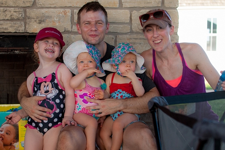
Heade-swapping can be incredibly useful when dealing with squirmy kids. This impromptu photo at a birthday party is actually a composite of three separate pictures.

When going through my pictures, I always start with Lightroom to cull the images down to the best ones, and do initial edits, such as exposure and color adjustments. If I come across a situation where I need to take a face from one photo, and put it in another, I open both pictures in Photoshop (which is a simple matter of right-clicking and choosing: Open as Layers in Photoshop). For example, the following picture turned out fine except for the boy who was distracted by something off to the side.

This family picture I took on July 4 is fine, but the boy's expression is not the greatest.

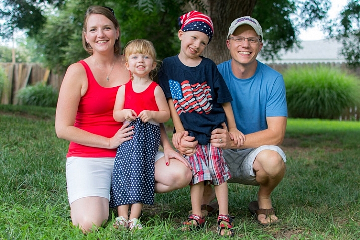
This family picture I took on July 4th is fine, but the boy’s expression is not the greatest.

Fortunately I had another picture that looked great, but in this one the mother was blinking. No worries though – Photoshop was there to save the day!

He has a much better expression in this photo, but his mother was blinking.

The little guy has a much better expression in this photo, but his mother was blinking. Photoshop to the rescue!

When working with edits like this it’s a good idea to use as high-resolution of pictures as possible, so you have the maximum amount of data to work with. Do not export your images from Lightroom as low-res JPG files, and then import them into Photoshop. Instead use full-size originals, though I do like to make sure the exposures are as closely matched in each picture first. Edit your white balance, color adjustments, and other parameters such that both images are as close as possible before going into Photoshop, or your composite will look painfully obvious. (Some photographers take the exact opposite approach and do all the Photoshop work first, and then do color adjustments and cropping in Lightroom. Either way works, but I prefer the former method.)

If you’re unfamiliar with Photoshop, and it seems a bit overwhelming at first, don’t think about all the buttons, menus and options available to you just yet. This face compositing really only requires two sections: the Layers panel in the bottom right corner, and the Brush tool on the left side.

photoshop-face-swap-workspace

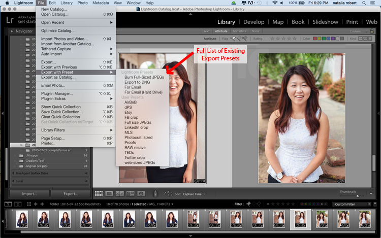
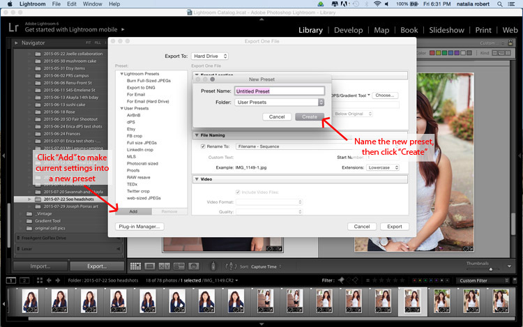
Open both images as layers in Photoshop

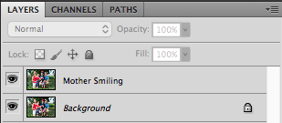
Select both images in Lightroom and right click, then choose: Open as Layers in Photoshop. Once your images are open in Photoshop, rename one or both so you can tell which is the one to use most people, and which is to copy the new head from.

photoshop-face-swap-edit-as-layers


You now have two layers in one image: the background (in this case, the one where everyone but the mother is smiling) and the layer you just copied over (in this case, the one where only the mother is smiling).

photoshop-face-swap-multiple-layers

Make a layer with just the new head to be added

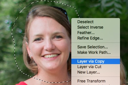
From here there’s a couple different ways to go about combining them, but when doing a simple head swap the method I prefer is to get rid of everything in the second layer except the face I want to put into the first image. To do this, use the Lasso tool to draw an active selection around the face, and create a new layer which consists of just the face itself. I like to use New Layer via Copy just in case I want to go back to the original for something, but it’s up to you. Make sure to leave plenty of padding around the face so you have enough room to blend it in as you make your adjustments.

photoshop-face-swap-new-layer-via-copy

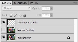
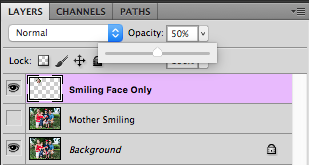
You now have three layers in the side panel: the original background, the new one you copied over, and the face itself. Since you only need the face, you can click the eye icon just to the left of the layer you copied over, which leaves it intact but invisible (hidden layer).

photoshop-face-swap-three-layers-hide-one

Compositing or blending them together

Now comes the fun part – compositing the face! I like this step because I get to be a little creative, and play around with exactly how I want the final image to look. The first thing you’ll notice is the face you are working with is probably going to be out of place, unless your camera was on a tripod, and everyone was perfectly still.

photoshop-face-swap-initial-composite

To get the face into the proper position, select it in the Layers panel and change its opacity to about 50%. That way you can see both faces at the same time, which will help you as you start lining them up. (Note: alternatively you can change the face layer’s blend mode to Difference. That will show it sort of inverted (negative) and it makes it easy to position them or align the layers. Then just change it back to normal when done.)

photoshop-face-swap-opacity

With the face layer still selected, choose “Transform” from the “Edit” menu, or press command-T on a Mac (control-T on Windows). Use your mouse to drag the face into the proper position, and press the arrow keys on your computer to fine-tune your movements on a per-pixel basis. You can also use the Transform command to rotate the face in case the person has turned his or head slightly. To do this, put your mouse cursor just outside the border near one of the corners, where it will change to a rounded arrow which means you can now click and drag to rotate.

photoshop-face-swap-line-up-facial-features

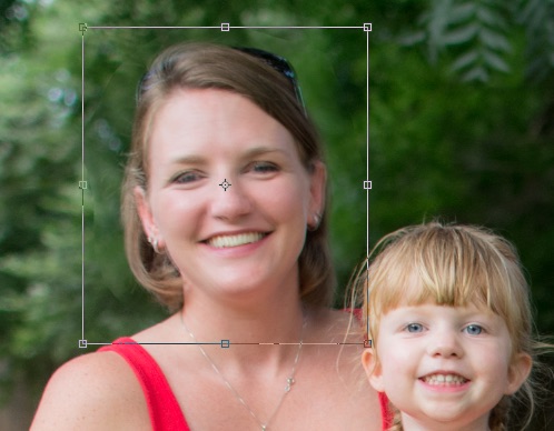
Once you that have the second face lined up properly over the first one, press the [Enter] key to lock it in place, then bring the layer opacity of the face back up to 100%. Don’t worry if you didn’t get things just right: you can always made additional Transformations later by selecting the layer and choosing “Transform” just like before.

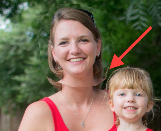
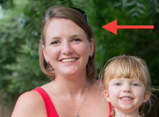
At this point things are looking pretty good, but right away you will notice a harsh border around the face where your selection box was. This needs to be eliminated so you only have the facial features you want, and not the person’s hair or any background elements that might have changed between the shots.

photoshop-face-swap-harsh-border

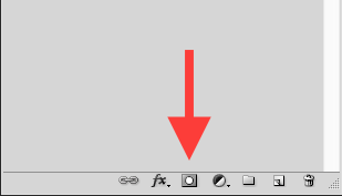
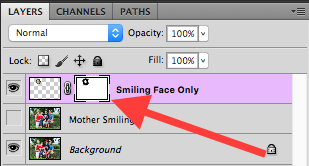
At this point you might be thinking “No problem! I’ll just use the eraser tool to get rid of the parts I don’t need,” but that’s a rookie mistake you will soon regret. The eraser tool is permanent, so instead we’ll use what’s called a layer mask to get rid of any parts we don’t want. It works similar to the eraser tool, but is fully adjustable and even altogether reversible (it’s called non-destructive editing) so that any edits you make can easily be undone at any point. With the face layer selected, click the “Add Layer Mask” button at the bottom of the Layers panel.

photoshop-face-swap-new-layer-mask

Now you can use the brush tool to paint out (using black) any areas of the face layer you do not want, or paint them back (paint with white) in if you do decide to keep them. This layer mask method is far more flexible than using the eraser tool, and it allows you to use varying levels of opacity as well. You can partially erase something, while retaining just enough to allow for a smooth transition, instead of a harsh line. Select the brush tool and choose a brush with soft edges. Play around with your flow rate and opacity settings too. I don’t like to go all the way to 100% opacity right away, so I usually start with 50%-70% to leave some wiggle room. Remember, you can always change your adjustments later.

photoshop-face-swap-brush-selection

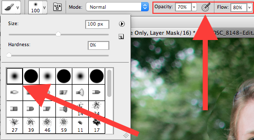
Now you can start blurring the line between the background photo and the face you are compositing onto it. Use the brush tool to gradually erase around the edges of the face, and if you find yourself wanting to brush anything back in just press the X key to reverse the process (X switches your foreground and background colors, in this case black and white) as you apply the brush. Notice that you’re not actually painting on the image of the face, but on a mask that has been applied to the layer. You are basically telling Photoshop which parts of the face layer you want to see, and which parts you want to erase (hide) or mask out. In the Layers panel you will see this mask show up to the right of the original layer as a mostly white box with some dark spots that indicate where you have painted with the brush.

photoshop-face-swap-edit-layer-mask

Using brushes on the layer mask is the most part of this whole process as I get to see my edits in realtime, and get as detailed as I want with brushing in the smiling face.
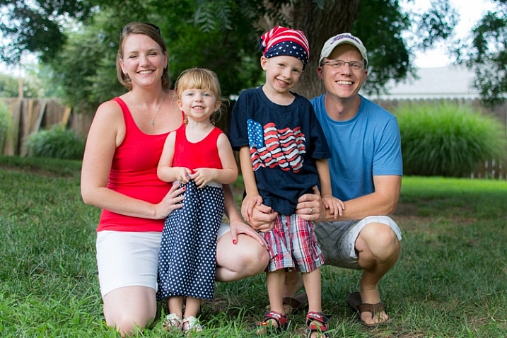
photoshop-face-swap-final-image

The final image

You can use this technique to composite as much as you want, including background elements, multiple faces, or even individual features such as eyes or teeth. Learning this simple head swapping technique is not only handy for creating the perfect group portrait, but can also be your gateway into a much broader world of Photoshop editing in general.

What are your favorite tips for doing simple edits in Photoshop? Do you have any other techniques that have worked for you over the years? Leave your thoughts in the comments below.

googletag.cmd.push(function() {
tablet_slots.push( googletag.defineSlot( “/1005424/_dPSv4_tab-all-article-bottom_(300×250)”, [300, 250], “pb-ad-78623” ).addService( googletag.pubads() ) ); } );

googletag.cmd.push(function() {
mobile_slots.push( googletag.defineSlot( “/1005424/_dPSv4_mob-all-article-bottom_(300×250)”, [300, 250], “pb-ad-78158” ).addService( googletag.pubads() ) ); } );

The post How to do a Head Swap using Photoshop by Simon Ringsmuth appeared first on Digital Photography School.


Digital Photography School

 
Comments Off on How to do a Head Swap using Photoshop

Posted in Photography


5 Tips for Using the Blend If Feature in Photoshop

18 Oct

In this video Blake Rudis, from EverydayHDR, shows five really useful tips for using the Blend If feature, which is available in Photoshop when working with layers.

The five methods for using Blend If:

  1. Adding sharpness to your image
  2. Removing noise
  3. Adding saturation
  4. Vignetting
  5. Adding a texture to your photo

Get the downloads he mentions in the video here:

Using the Blend If sliders allow you to really control where you want the affects to apply, without complicated masking and brushing in and out details. Give it a try, it may save you a ton of time editing!

googletag.cmd.push(function() {
tablet_slots.push( googletag.defineSlot( “/1005424/_dPSv4_tab-all-article-bottom_(300×250)”, [300, 250], “pb-ad-78623” ).addService( googletag.pubads() ) ); } );

googletag.cmd.push(function() {
mobile_slots.push( googletag.defineSlot( “/1005424/_dPSv4_mob-all-article-bottom_(300×250)”, [300, 250], “pb-ad-78158” ).addService( googletag.pubads() ) ); } );

The post 5 Tips for Using the Blend If Feature in Photoshop by Darlene Hildebrandt appeared first on Digital Photography School.


Digital Photography School

 
Comments Off on 5 Tips for Using the Blend If Feature in Photoshop

Posted in Photography


Using Your Photography to Create Social Change

05 Oct

There are images that immediately come to mind if someone mentions them. For instance, the image of the man being shot in the head during the Vietnam War, or the girl running naked down the road (also in Vietnam) after being burned by a napalm bomb. I don’t want to use the word iconic, but they are well-known, and very emotive images. The Vietnam War was like no other, and these images helped to show the devastation.

An image of an event, or a place, can create a lot more connection than written words or stories; humans are visual and we relate to visual cues. But images don’t have to be about war to generate a response from people.

In late-1970s Australia, the government wanted to dam part of a river in Tasmania. It was something that upset many people. It would mean that many parts of stunning rainforests in the area would be drowned and lost forever. When I think back to that time, there is a beautiful image of the place that immediately comes to mind. It is an image of the river by photographer Peter Dombrovskis, and its catchphrase was that it would be submerged by the dam.

peter-dombrovski-franklin-river

Rock Island Bend, Franklin River, South West Tasmania, by Peter Dombrovskis, National Library of Australia, an6631500 (Bib ID#2899361)

Here I am 30 years later, and this image is still strong in my mind; it says, “This image stopped the Franklin Dam”. Images can very powerful. Who wouldn’t want to have an image that changed the world – well, at least helped save a small part of it? With so many images in existence now, it may be hard to imagine that any could have the same impact. With the world of digital perhaps we are in image overload.

It doesn’t mean you can’t try. There is no reason why you can’t highlight a cause that you are passionate about, using your photography.

In the area around where I live, there is a large green belt that follows the Yarra River, which is the main source of water for the City of Melbourne. It is wonderful that the land has been preserved and not given up to development. Parts of the area were still being farmed until very recently, around 2o years ago.

Cole-social-change-photography0374

Morning Light over Banyule Flats. The area has been allowed to return to its natural state as it would have appeared over 250 years ago.

Part of the area is a swamp (wetland) and was here before European Settlement. Once the land was claimed, the swamp was drained and the water course moved so it didn’t fill anymore. Fences were put up, and cattle grazed there for over 150 years.

Cole-social-change-photography0376

Early Autumn Mists on the Water.

Eventually, the land was sold to the local council, and they have helped the area recover over the last 20 years by revegetation, and putting the water course back, so the swamp would fill again. It did – and it has become a place rich with native birds and plants. The fence posts are still there, but the trees that grew while it was dry have since died from being waterlogged.

The area is ecologically and communally important and is in constant use – but there is a problem. Banyule Flats is situated right in the middle of where they want to connect two freeways. This is an area that I love and want to help protect, so I started thinking about how I could use my photography to help stop the freeway.

Cole-social-change-photography0375

Winter Sun Casting Long Shadows.

My first thought was to start putting photos up on my blog. If I could get people from around the world to build a connection with Banyule Flats, perhaps I could get a whole lot more people to fight for its survival.

About 12 months ago my local council, Banyule City Council, was offering Environment Grants and I wondered if I could get one to do a book on the area using my photography. I rang the coordinator for the grants and spoke to her about my idea for the book. She seemed to really love it, and gave me ideas of what to put in the proposal. I had to join the Warringal Conservation Society to be eligible for it, but that was never a problem, and I have loved being a member.

The grant was approved, and I will use the photos I have been taking for two years now. It is time to put the book together and work out what is the best way to present the images. We can’t just put them all together with no story because, it has to be interesting.  It has to be done in a way that people find not only beautiful, but helps build a connection to the area so they won’t want to see it destroyed.

This is an opportunity to use photography to bring about social change. If you can help people build a relationship or feel something for a cause, then that gives you a lot more people who want to fight for it with you. Your case becomes stronger, and there’s power in numbers.

Cole-social-change-photography0377

Cattle Egret Surveying the Water Below. One of many birds that inhabit the area.

One thing that is happening with the book on Banyule Flats is that we are inviting the Wurundjeri Elders and people to be involved. They are the traditional owners of this land, and having their input will help highlight the area, give the book a unique look, and help showcase part of their culture. Of course, I will not take advantage of them and will make sure that proper credit is given, and they will get a share in the royalties as well.

If we can make the book show off the area, we hope that more local people will get involved in the fight for the Flats, and we can then introduce the area to a much wider, potentially worldwide, community.

The book is going to be visual, have lots of photos throughout showing the area through the seasons, and contain big landscapes, as well as macro images of the flora that grow there. The photos have to be powerful to get our message accross: there will be no freeway through Banyule.

Cole-social-change-photography0378

Bottle Brush. One of the indigenous plants at Banyule Flats.

Images are very strong. If I just tell you about the area then you are not going to want to protect it, but if I show you what it looks like then you start to feel a connection. Beauty has to be seen, and that is where photography becomes very powerful.

Think back to causes you have felt very passionate about. Do you think of them in words, or in images?

Cole-social-change-photography0373

Sunrise Around the Back of Banyule Flats.

When I think about the Vietnam War, images come to my mind, like the two I already mentioned. The Franklin Dam project was one of the first major campaigns that I have a really good memory of.  The image of the Franklin River gave people an understanding of what they were going to lose if the dam went ahead.

If you have a cause that you want to assist or save, use your photography to help. Get the best photos that you can, and show people what you want them to see. The stronger your photography is, the better the effect it will have. You want to create images that people will remember. In the years to come when people talk about Banyule Flats and how we stopped the freeway, I want them to think of my images in the book.

googletag.cmd.push(function() {
tablet_slots.push( googletag.defineSlot( “/1005424/_dPSv4_tab-all-article-bottom_(300×250)”, [300, 250], “pb-ad-78623” ).addService( googletag.pubads() ) ); } );

googletag.cmd.push(function() {
mobile_slots.push( googletag.defineSlot( “/1005424/_dPSv4_mob-all-article-bottom_(300×250)”, [300, 250], “pb-ad-78158” ).addService( googletag.pubads() ) ); } );

The post Using Your Photography to Create Social Change by Leanne Cole appeared first on Digital Photography School.


Digital Photography School

 
Comments Off on Using Your Photography to Create Social Change

Posted in Photography


Add Contrast to Your Images by Using Complementary Colors

02 Oct

When looking at something as cognitive human beings, we naturally get a response. These responses could be emotional, physical, intellectual, etc. There is a whole range of how we respond. This range of reactions is essential for the photographer, no matter if you are shooting wedding photos professionally, landscapes for a hobby, or street photos as a traveler. Just as there is a range of photographic intentions there are ranges of how we interpret what we see. So, how do you see, and what makes you more likely to push the shutter button here and not there?

001 Red and green

From a market in Korea this green sea veggie and the red baskets they are placed in show how saturation can be achieved through color contrast

One reason is color! Colors can be striking, bold, subtle and muted, or they could be vibrant, luscious, and soft. The descriptions of colors goes on and on, as does the names of colors. Pick up an elementary school crayon box and what you’ll notice that what used to have eight colors when I was young, doubled to 16 and now there are even boxes with 152 different colours (I did look back into Crayola history and found they were sold in metal tins of 48 crayons). So again, we could make this as complicated as possible, but I can’t keep track of all those color names, can you? Nor do I want to. I just want better images.

To keep it straight forward and simple we will look at the traditional color wheel. Color wheels for printing and or mixing colors (e.g., oil painting), are not the same, so our focus is simply on what looks good to us, not the pigment mixing of paints, for painters and printers. If you look at the traditional color wheel, the complementary colors are the ones opposite of each other. When these colors are both present, called contrast, then it is pleasing to the eye.

Why, because the different colors excite different cones (or color receptors) in our eye which in turn sends signals to our brain giving us a feeling. As mentioned above colors are described in a variety of ways, as too are feelings. Sometimes complementary colors are more soothing, and sometimes they are more powerful. That often depends on the context and perspective that the colors are in (the surrounding colors), along with their tone (dark or light). Simply put, complementary colors vibrate themselves and give us feeling.

002 Yellow and purple

The contrast of the yellow to the purple direct the eye towards the center of the water lily along with selective focus. Combine color with other techniques to help guide the viewer. From Changchun China International statue park.

One reason that complementary colors tug our hearts in one direction or another is because the complementary color is actually a blend of the other two primary colors. Thus, each primary color has one complementary color which is a mix of the other two primary colors. The traditional complementary colors are red and green, yellow and purple, and blue and orange. Red is a primary color and its complement is green (i.e. a mix of yellow and blue—the other two primary colors). Thus when using complementary colors you are actually stimulating all of your color receptors but in a slightly deceiving way. If we look at the complement of yellow, it is purple. What are the two primary colors that create purple? You got it, red and blue.

003 Blue and orange

The blue background of the volcano after sunset in Guatemala really highlights the orange lava bursting out. A much different feeling would be created if the picture had been taken at golden hour, rather than blue hour.

If we look at many Dutch master painters they were very skilled in the art of light and dark. Using lighter areas to attract your attention to certain areas of the photo, and using darker tones to push areas back into the shadows. If we move forward in the impressionist era, Monet definitely shows his use of complementary colors in his painting Impression, Sunrise (Impression, Soleil levant) in 1872, of the orange sun with the blue seascape. In the post-impressionist era, Van-Gogh’s Starry Night in 1889 of the yellow stars, and the purple night sky is maybe one of the most famous examples of the use of complementary colors.

So back to photography, what does this all mean? Well for one, print out a color wheel and put it in your camera bag. You can never look at color enough. Even back in ancient Greece, Aristotle pondered color and how it seemed to change based on the light around it. Moreover, if you look in the shadow of a primary color you will see hints of its complement. Color is one of the most subjective forms of visual art, and thus, it is very much open for interpretation and experimentation. Like most concepts in photography it is best to know the “rules” then to learn how to break them.

004 No blue

No blue: by subtracting one of the primary colors you can still achieve vibrant and dynamic results.

005 No Red

No Red: Because there is no red, the other colors seem to create more contrast.

006 No Yellow

No Yellow: In a very colorful scene, eliminating one primary color brings continuity to the photo.

Go out and see the world, armed with a little more understanding of what and how we perceive the world around us. Don’t be afraid of color in the natural world. But don’t expect to get it right by just ramping up the saturation slider in post-processing. Colors are vibrating wave forms all around us. Placing complementary colors next to each other gives your photo a little bit more energy.

Looking for the right colors might help you broaden your portfolio and prevent you from over-valuing leading lines or the rule of thirds. It might also help add punch to your textures, rather than sliding that saturation bar all the way up. Complementary colors naturally create contrast so you don’t need to try to create it in post-production. Let complementary colors complement your other strengths as a photographer.

007 color circle from 1708

Traditional Color wheel from the early 1700’s.

Please help continue the tradition by sharing your thoughts and photos below.

googletag.cmd.push(function() {
tablet_slots.push( googletag.defineSlot( “/1005424/_dPSv4_tab-all-article-bottom_(300×250)”, [300, 250], “pb-ad-78623” ).addService( googletag.pubads() ) ); } );

googletag.cmd.push(function() {
mobile_slots.push( googletag.defineSlot( “/1005424/_dPSv4_mob-all-article-bottom_(300×250)”, [300, 250], “pb-ad-78158” ).addService( googletag.pubads() ) ); } );

The post Add Contrast to Your Images by Using Complementary Colors by Branson Quenzer appeared first on Digital Photography School.


Digital Photography School

 
Comments Off on Add Contrast to Your Images by Using Complementary Colors

Posted in Photography


Using the Histogram to Take Better Pictures

20 Sep

You might have seen some articles here on Digital Photography School about using the histogram when editing pictures in Lightroom and Photoshop, but it can also be a very handy tool when you are out shooting images as well. Most cameras have the ability to show you the histogram when you review your photos on the rear LCD screen, and some even allow you to see a real-time histogram in Live View. While this might seem a bit intimidating at first, learning to use the histogram when out shooting pictures can have a dramatic impact on your photography and help you understand how to get the right exposure for the photos you are taking.

histogram-sorority-bid-day

Sorority Bid Day brought to you by the magical properties of the histogram.

In a nutshell, the histogram shows how much data is recorded for various Red, Green, and Blue color values in a picture. While you can usually see data for all three colors separated into discrete graphs, the one I find most useful for general shooting is the histogram that combines all three RGB values into one visual representation. A histogram shows how much data has been recorded across the tonal range of a photograph from very dark to very light. A spike in the graph means a lot more data has been recorded for those particular values of darkness or lightness, and a dip means that not much data has been saved. In general, a properly-exposed picture should have a histogram that looks something like this:

histogram-example

An example of a hypothetical histogram for a properly exposed photo.

A histogram similar to this example would mean that most of the color data is concentrated in the middle: the greatest quantity of pixels is neither too dark nor too light. Most photos will have some darker pixels and some brighter pixels, but in general all the information captured by a camera’s image sensor should fall somewhere between the darkest of darks (i.e. very black) and the lightest of lights (i.e. very white). A histogram that is skewed to the right would indicate a picture that is a bit overexposed because most of the color data is on the lighter side, while a histogram with the curve on the left shows a picture that is underexposed. This is good information to have when using post-processing software because it shows you not only where the color data exists for a given picture, but also where any data has been clipped: that is, it does not exist and, therefore, cannot be edited. It’s also good information to have out in the field, such as in the following example:

histogram-quidditch-overexposed

Most cameras allow you to overlay the histogram on top of a given photo during playback, or as you shoot the photo when using Live View.

I could tell right away that this picture of some college students playing Quidditch was a little overexposed, but looking at the histogram data right on my camera gave me additional information that helped me adjust my shooting on the spot. The large curve on the right-hand side tells me that most of the color information is concentrated on the lighter side, which is actually a good thing because more data is actually collected in the highlight portions of the image which can then be brought down later in a program like Lightroom. (This is a technique called expose to the right, which is a fantastic way to get a little more out of your photography if you are willing to put in a bit of time editing pictures on your computer.)

The problem with this image, as you can see in the above histogram, is that the graph literally goes off the chart on the right-hand side. This means that some of the highlights have been clipped: there is no longer any data that can be recovered, and no matter what I do in Photoshop or Lightroom there are some portions of my image that show up as pure white and can’t be edited. An example histogram from a photo that is clipped on both the darkest and lightest areas would look like this:

histogram-example

After taking the first photo and realizing that some of the data would be lost due to clipping, I was able to adjust my exposure settings and get a much better image:

histogram-quidditch-properly-exposed

Quidditch isn’t only played at Hogwarts.

The histogram for this picture was also concentrated a bit more to the right-hand side, but right after I shot it I was able to see that no data had been lost due to clipping. This didn’t help much in the immediate moment, but it meant that I had plenty of information to work with later when editing the picture in Lightroom. As another example, here’s a picture of a unique building on the Oklahoma State University campus:

histogram-example-building-exterior

The Noble Research Center on the campus of Oklahoma State University.

When I looked at the back of my camera it seemed as though the photo was pretty good. The sky was a bit bright, but I thought everything would be just fine overall. This is similar to many situations I have been in when I thought I could tell simply by looking at the photo on my camera’s LCD screen if it was exposed properly, but a quick check of the histogram can yield much more information. Even though the above image seemed decent at first, the camera histogram told another story:

histogram-example-noble-center-D7100

The histogram for the above photo indicated severe clipping on the highlights, meaning some parts of the photo were so bright that I wouldn’t be able to fix it in Lightroom.

Had I not looked at the histogram I would have never seen that a good chunk of the sky was clipped which meant there was no color data at all for the brightest portions of the photo. This would be a serious problem for my post-processing when I bring my pictures into Lightroom and adjust various parameters to get the image to look like I want. After looking at the histogram I re-adjusted my exposure settings and took another photo which had an improved balance of color data across the spectrum:

histogram-example-noble-center-D7100-proper

The same composition, but with different exposure settings that resulted in a better exposure with no clipped data.

One curious aspect of this image is that while the sky is now properly exposed, the glass panels on the building appear to be too dark. Looking at the histogram you can see that while there is certainly a lot of data on the darker portions of the image (hence the spike on the left-hand side of the graph), no data has been lost due to clipping. This means I had a lot of flexibility to improve the image in Lightroom, which resulted in the following finished photograph:

histogram-example-building-exterior-proper

One nice thing about most mirrorless cameras, as well as some DSLRs when shooting in Live View, is their ability to give you a real-time indication of any areas of the image that will be over – or under – exposed. This is normally referred to as a zebra pattern and it essentially overlays a series of stripes over any portion of your image where data is going to be clipped. And remember, as I stated earlier, many cameras today have the ability to show you a live histogram that updates in real-time so you can see not only where the color data on your image is concentrated across the light/dark spectrum, but also alert you to any clipping that will happen when you take the photo.

These are just a few examples of how the histogram can be useful when you’re out shooting photos, not just when you’re editing them on your computer. How do you use the histogram, and what other tips and tricks do you have to share about using it to enhance your photography? Leave your thoughts in the comments below.

googletag.cmd.push(function() {
tablet_slots.push( googletag.defineSlot( “/1005424/_dPSv4_tab-all-article-bottom_(300×250)”, [300, 250], “pb-ad-78623” ).addService( googletag.pubads() ) ); } );

googletag.cmd.push(function() {
mobile_slots.push( googletag.defineSlot( “/1005424/_dPSv4_mob-all-article-bottom_(300×250)”, [300, 250], “pb-ad-78158” ).addService( googletag.pubads() ) ); } );

The post Using the Histogram to Take Better Pictures by Simon Ringsmuth appeared first on Digital Photography School.


Digital Photography School

 
Comments Off on Using the Histogram to Take Better Pictures

Posted in Photography


PhotoshopUser TV: Using Styles and 3D Model Import – Episode 422

16 Sep

This week on PUTV, Pete has a tip on using styles and Corey talks about importing a 3D model and using it for your project in Photoshop.

This Week’s Sponsors:

Wacom | mpix | B&H Photo | Kelby Training | NAPP | onOne Software | Peachpit | Squarespace | Expo Imaging | Intel | Athentech

Photoshop User TV Episode 422 is now playing!

Download Episode 422
(In order to download this file directly to your computer, right-click (Control-click on Mac) on the Download link and choose the Save As option.)

Photoshop User TV

 
Comments Off on PhotoshopUser TV: Using Styles and 3D Model Import – Episode 422

Posted in Photography


How to Process a Landscape Photo in 5 Minutes Using Photoshop

07 Sep

2-for-1 special

As part of Landscape Photography Week here on dPS, we’re offering TWO for the price of ONE on our best-selling Living & Loving Landscape Photography ebooks!

Click here to take advantage of this offer.


In this ultra fast video tutorial photographer Joshua Cripps walks your through how to process a landscape photo using Photoshop in under five minutes. He talks really fast and works quickly so if you miss anything just watch the video again (he even says that at the end) or pause it so you can follow along.

How did you make out with your own landscape image, could you do it in five minutes? If it takes you a little longer that’s just fine, especially if you’re just learning Photoshop.

Note: everything he does in the video can also be done in Lightroom using the basic sliders, adjustment brush, and graduated filter.


Here on dPS this is landscape week – here is list of what we’ve covered so far. Watch for a new article (or two) on landscape photography daily for the next couple days.

  • 6 Tips for Better Low-Light Landscape Photography
  • Landscape Photography and the Human Element
  • 5 Ways a Telephoto Lens Can Improve Your Landscape Photography
  • Landscape Photography from the Side of the Road
  • 32 Majestic Landscape Photos to Inspire Your Wanderlust
  • Weekly Photography Challenge – Landscape
  • Landscape Photography – Shooting the Same Location Through the Seasons

googletag.cmd.push(function() {
tablet_slots.push( googletag.defineSlot( “/1005424/_dPSv4_tab-all-article-bottom_(300×250)”, [300, 250], “pb-ad-78623” ).addService( googletag.pubads() ) ); } );

googletag.cmd.push(function() {
mobile_slots.push( googletag.defineSlot( “/1005424/_dPSv4_mob-all-article-bottom_(300×250)”, [300, 250], “pb-ad-78158” ).addService( googletag.pubads() ) ); } );

The post How to Process a Landscape Photo in 5 Minutes Using Photoshop by Darlene Hildebrandt appeared first on Digital Photography School.


Digital Photography School

 
Comments Off on How to Process a Landscape Photo in 5 Minutes Using Photoshop

Posted in Photography


Advertise Your Business by Using Custom Print Balloons

06 Sep

Where is the best place to put printed advertisement? You can print your advertisement on classifieds, hoping that newspaper readers will take a look at it and pay special attention to it. However, your expectation will soon vanish because your advertisement is just a tiny spot in the middle of the ocean of thousands of […]
Digital Photography Information Center

 
Comments Off on Advertise Your Business by Using Custom Print Balloons

Posted in Equipment


Quick Lightroom Tip Using the Graduated Filter

29 Aug

This video tip is courtesy of Anthony Morganti and shows us what you can do using the Graduated Filter tool in Lightroom. What if you’ve maxed out your basic adjustments and want to go farther? This little tip might do the trick for you, check it out:

Learn more about using the Graduated Filter in LR here.

A very cool tip, had you thought of that or done this before? Do you have any other Lightroom tips and tricks? Please share in the comments below.

googletag.cmd.push(function() {
tablet_slots.push( googletag.defineSlot( “/1005424/_dPSv4_tab-all-article-bottom_(300×250)”, [300, 250], “pb-ad-78623” ).addService( googletag.pubads() ) ); } );

googletag.cmd.push(function() {
mobile_slots.push( googletag.defineSlot( “/1005424/_dPSv4_mob-all-article-bottom_(300×250)”, [300, 250], “pb-ad-78158” ).addService( googletag.pubads() ) ); } );

The post Quick Lightroom Tip Using the Graduated Filter by Darlene Hildebrandt appeared first on Digital Photography School.


Digital Photography School

 
Comments Off on Quick Lightroom Tip Using the Graduated Filter

Posted in Photography


The What, Why, and How of Using Lightroom Export Presets

21 Aug

ExportPresets-Header

You’re probably quite familiar with Lightroom presets for editing photos, called Develop Presets. When was the last time you created your own Export Presets, though? These presets can help you speed up your workflow even more, by allowing you to save different export settings, for different needs. Let’s look at what they are, how they can help you in your workflow, and how to create your very own.

What are export presets?

Export presets are simply ones that tell Lightroom the parameters to follow when it exports your image files. Just like develop presets, they save you from applying the same settings repeatedly, only these are for exporting rather than editing.

To see the current presets you have loaded, go to the Library Module, select a sample photo, and click Export. A window will pop up with all your exporting options, including things like destination folder, image name, image size, and watermarking options. The left side of this box will have a list of what export presets are available for you. Alternatively, you can see the list of presets if you go to File -> Export with Preset and you’ll see the list pop up. That view, however, doesn’t show you the details of each preset.

ExportPresets-Locate

Why use export presets?

This is all great, but how are they helpful to you? Let’s work through your general workflow and see how these presets can be beneficial. You import your fresh photos into Lightroom, then go into the Develop module to work your editing magic. Once you’re ready to finalize and export the final product, you click back into the Library module to export. You have loads of options for how you could export this photo, all depending on its intended use.

Will the photo be used for social media? Then the size and resolution will be lower, and most likely you’ll want to add a watermark. Is this photo going to be printed and enlarged? Then you’ll want to make sure to give a large size and higher resolution to allow for enlargements. Is this photo going to be part of a set? Perhaps you want all the final photos to be labeled cohesively (for example: JonesFamilySession-1.jpg). Export presets allow you to set up parameters for each of these situations, saving you from having to remember settings and change them with each export. You can select multiple photos, click Export, and select the export preset that will then be applied to all photos in that export session.

How to use export presets

Great! Export presets are awesome! Let’s talk about how you can create some for yourself. While in the Library module, click Export to get the exporting window to pop-up. Begin at the top with Export Location and choose all the settings to put the images where you want them for your current need. If you’re exporting to send someone proofs from a session, for example, you’ll want to pay attention the resolution, watermarking, and file naming so that they are ready to show to your client. Don’t be shy about clicking on pull-down menus or playing with various numbers – you can always click Cancel and start over.

You can also always delete a preset if it was not properly set up. Now that you have the options all set how you want them, look to the left column where it has the list of existing presets. In the bottom of this column there is an Add button. Click that and a new small window will pop-up for you to input the name. Here is where you will name this preset, so be sure to make it something simple and clear for your future use. You can name it anything as long as it doesn’t have the exact same name of another existing preset. For example, your preset for client proofs may simply be called Proofs.

You can see that I have created a preset for images shown on Digital Photography School to fit the website requirements! Go through this process for each preset you want to create.

ExportPresets-DialogueBox

ExportPresets-New

When you are ready to use one of these presets, select the photos to export, click Export, select the preset you want to use, and then click Export to complete! Note that you can modify these presets as you use them. For example, say I want to export a file with the same parameters as the Proofs preset, but I don’t want to watermark this one. I simply go to export, click on Proofs, then scroll down and modify the setting for the watermark. If this is a one-time use and I do not want to save this as a new preset, then I simply go ahead and click Export. If I decide I want this to be a new modified preset for me, then I would click Add after making my modifications, and name it something different (like: Proofs-clean).

What happens if you make a mistake and save an export preset you no longer want? In the Library module, click to Export. When the window pops up, click once on the export preset you want to delete. When that preset is highlighted, the Remove button next to Add will become available. Click Remove and it’s gone! Note that there is no confirmation window that pops up for deleting the preset, so be sure that you do want to remove it completely before you do this.

Do you have other exporting tips for speeding up your workflow and making life a bit easier? Please share in the comments below!

googletag.cmd.push(function() {
tablet_slots.push( googletag.defineSlot( “/1005424/_dPSv4_tab-all-article-bottom_(300×250)”, [300, 250], “pb-ad-78623” ).addService( googletag.pubads() ) ); } );

googletag.cmd.push(function() {
mobile_slots.push( googletag.defineSlot( “/1005424/_dPSv4_mob-all-article-bottom_(300×250)”, [300, 250], “pb-ad-78158” ).addService( googletag.pubads() ) ); } );

The post The What, Why, and How of Using Lightroom Export Presets by Natalia Robert appeared first on Digital Photography School.


Digital Photography School

 
Comments Off on The What, Why, and How of Using Lightroom Export Presets

Posted in Photography