RSS
 

Posts Tagged ‘Using’

How to Sharpen Your Photos using Lightroom and Nik Efex

02 Nov

Do you want to take razor sharp photos? One of the best methods for creating tack sharp images is what I call The 20/20 Technique. It’s a process that combines the editing power of Adobe Lightroom and Nik Efex to sharpen your images.

sharpen, photos, tips, photography, Lightroom, Nik Efex

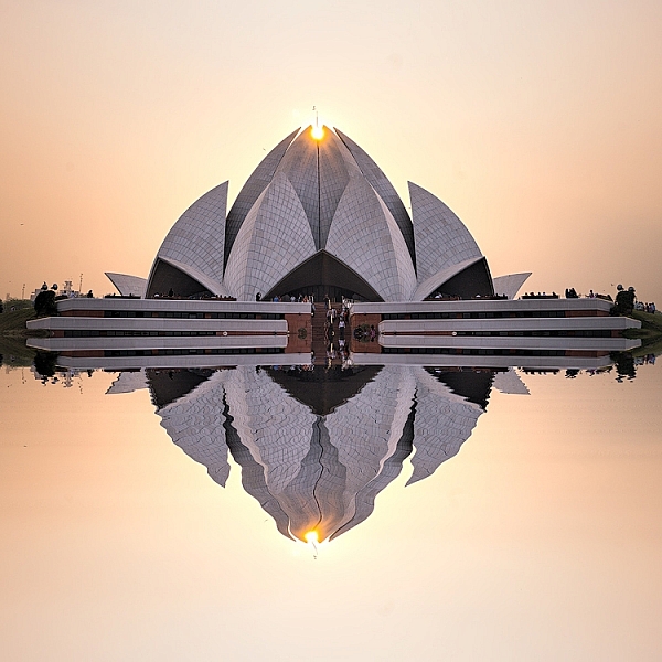
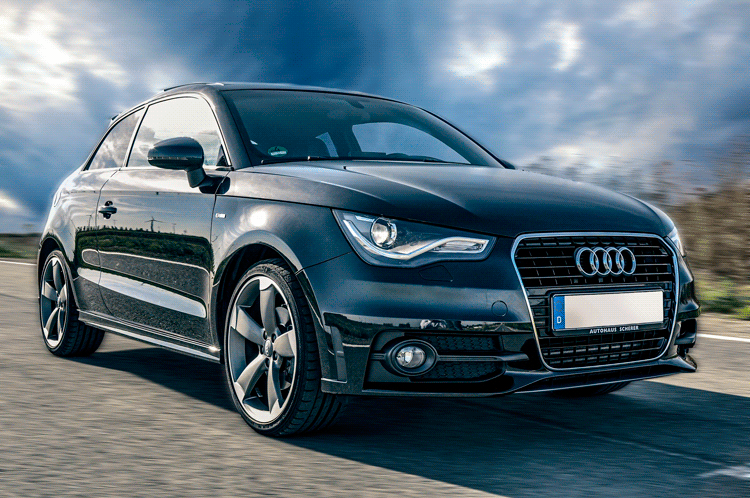
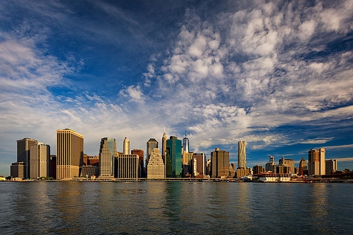
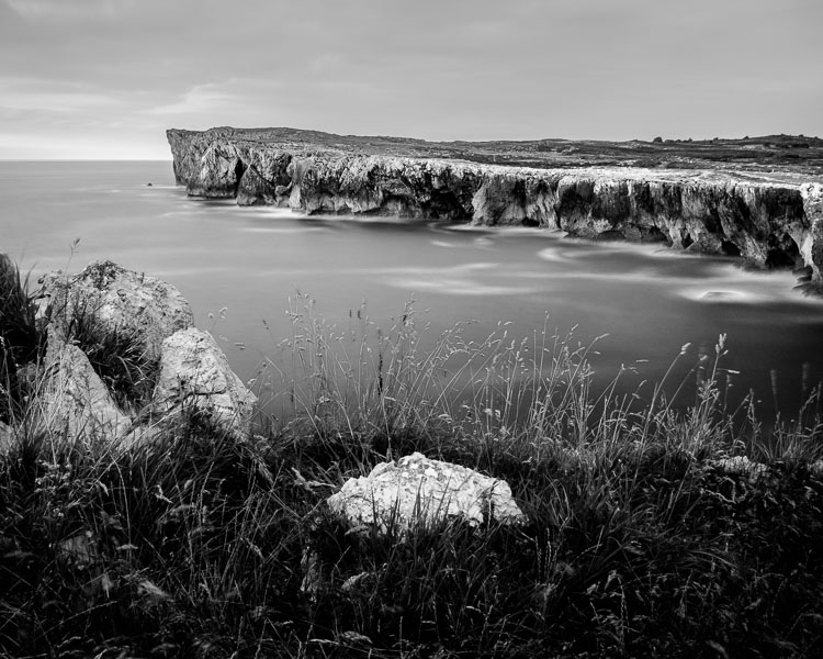
Lotus Temple, Delhi: Bringing out sharpness in architectural photos can really make them pop. © Pete DeMarco

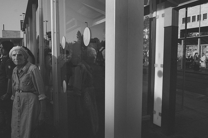
Is sharpness overrated?

The godfather of street photography, Henri Cartier-Bresson, once quipped, “Sharpness is a bourgeois concept.” It’s true that sharpness does not turn a bad photo into a good one. In fact, some of the greatest photographs of our time aren’t that sharp. A picture that evokes emotion will always win over an image that is technically great but lacks feeling.

In the digital age, however, sharpness is another tool in the photographer’s kit that can transform an image from good to great. Have you ever seen a photo so clear that it makes you feel as if you could reach through the screen? It’s almost as if it’s not even a photograph at all but a window into another world.

sharpen, sharper photos, tips, photography, Lightroom, Nik Efex

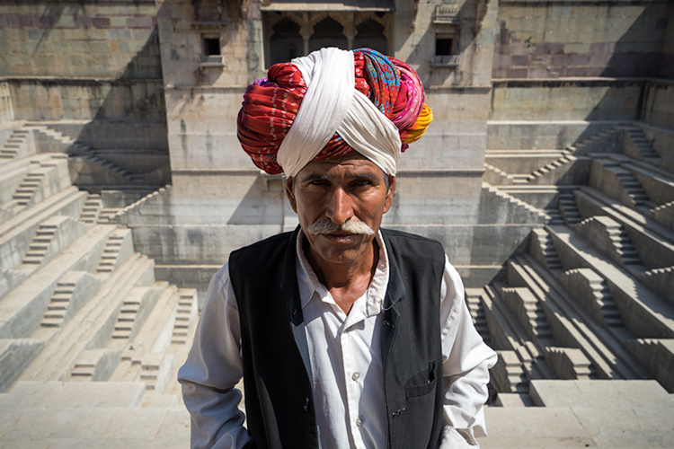
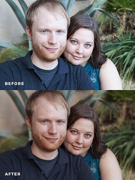
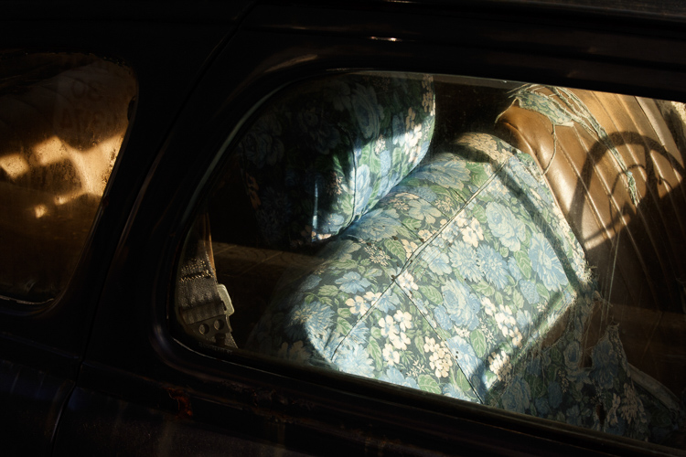
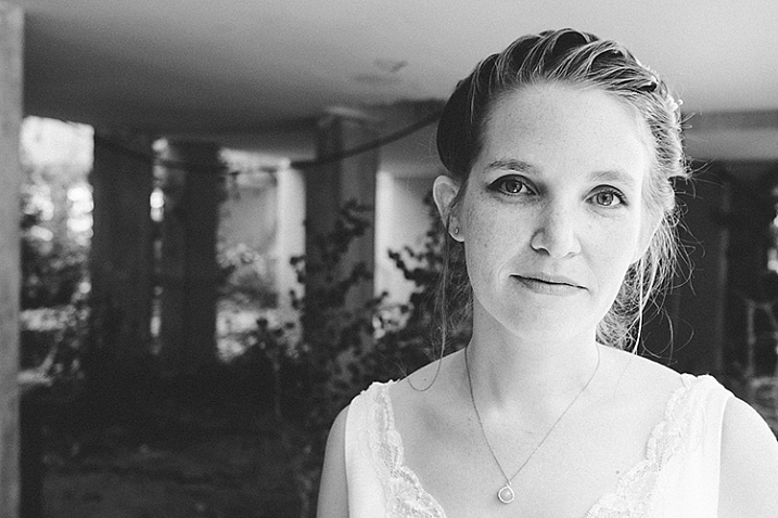
Bundi, India: Be careful not to sharpen people too much. © Pete DeMarco

Popular advice about getting sharp images usually centers around buying expensive lenses or having the proper settings in camera, as is explained in this article; How to Take Sharp Images. Although those two factors have a major impact on the overall sharpness of the image, today’s top photographers take an additional step. They enhance the sharpness in post-processing.

Sharpen Using The 20/20 Technique

In the modern digital darkroom, there are a number of ways you can add a superior amount of sharpness to your images. I’m going to explain one of the most simple and effective methods you can use to get incredible results. Here is my 20/20 Technique workflow:

sharpen, photos, tips, photography, Lightroom, Nik Efex

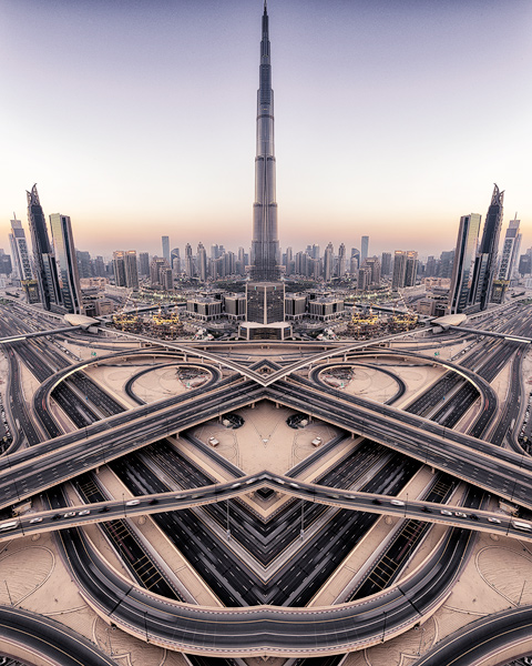
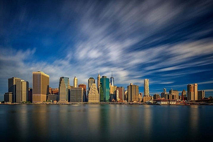
Burj Khalifa Reflection, Dubai: Nik Efex is a powerful photo editing suite you can download for free. © Pete DeMarco

Step 1. Open your image in LR

Import your image into Adobe Lightroom (or the editing software of your choice). Open the Develop Module and go to the Detail Panel, then to Sharpening. Increase the sliders up to somewhere between 40 – 50. This is just a general number to start. You’ll have to decide what works best for your image (make sure to view it full size or 1:1). Then finish editing your photo (correcting the white balance, exposure, etc.).

Step 2. Open the image in Nik Efex

For the next step, you will need a piece of software called NIK Efex. You can download NIK Efex for free here. Look for the blue download button in the top-right corner.

NIK Software is a company that develops image editing tools for others like Adobe and Google. In fact, Google bought the company in 2012. Then they copied the best editing algorithms from NIK Efex and created the photo editing app Snapseed. Sadly, NIK Efex has not been updated since then. Most assume it will die a slow death, especially after Google announced the software is now free.

sharpen, photos, tips, photography, Lightroom, Nik Efex

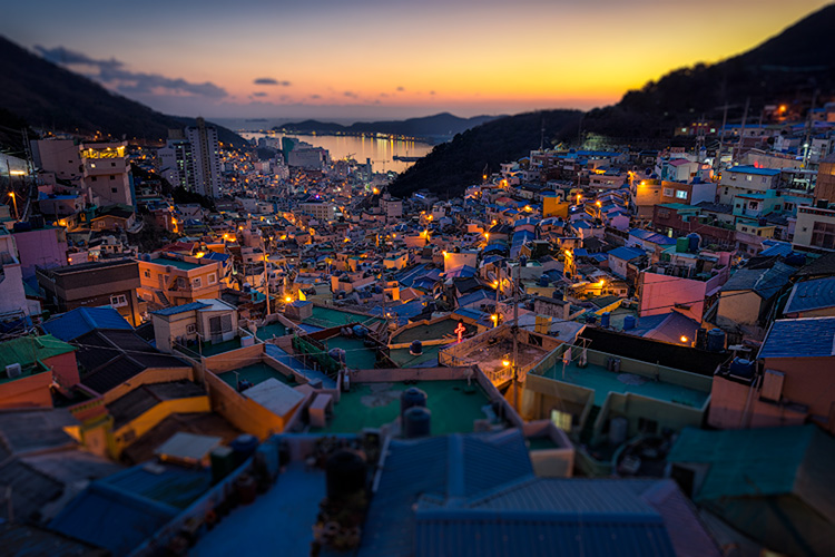
Busan, South Korea: Adding a slight tilt-shift blur effect to the edges of your photo can accentuate the sharpened areas. © Pete DeMarco

Anyways, once you install Nik Efex, right click on your photo in the Lightroom Develop Module > Edit in Nik Output Sharpener, and choose; Edit a copy with Lightroom Adjustments. Your photo will then open in a new Nik Output Sharpener window.

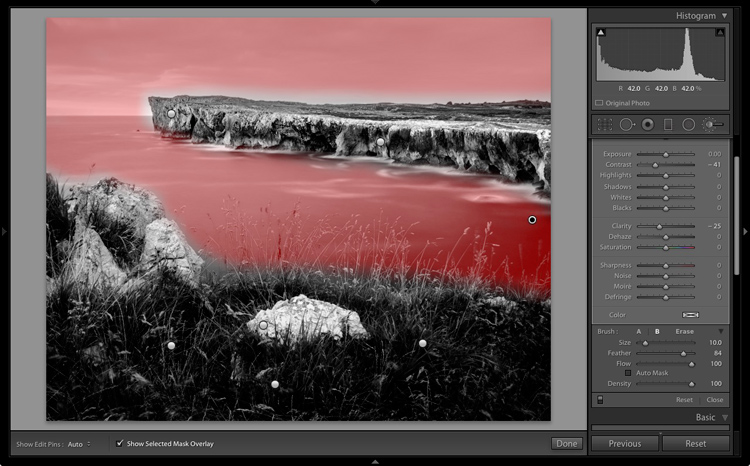
Step 3. Adjust using the Nik filters

From the Nik Output Sharpener window, move the sliders until you get the look and sharpness you are after. For me, I usually leave the “Adaptive Sharpening” at 50%. Then I increase the “Local Contrast” and “Focus” sliders up to around 15-20%.

Google, Nik Efex, sharpen, photograph, output

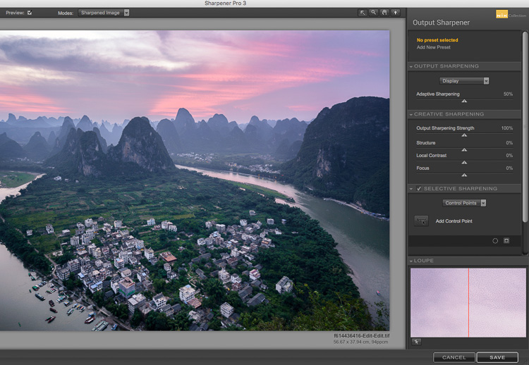
The Nik Efex Output Sharpener interface.

Step 4. Save and head back to Lightroom

Click on “Save” and the final version of your image will import as a new file back in Lightroom. That’s it!

Here is a video from Nik showing how to use this filter:

Words of warning

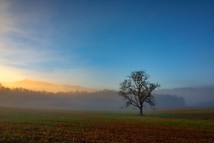
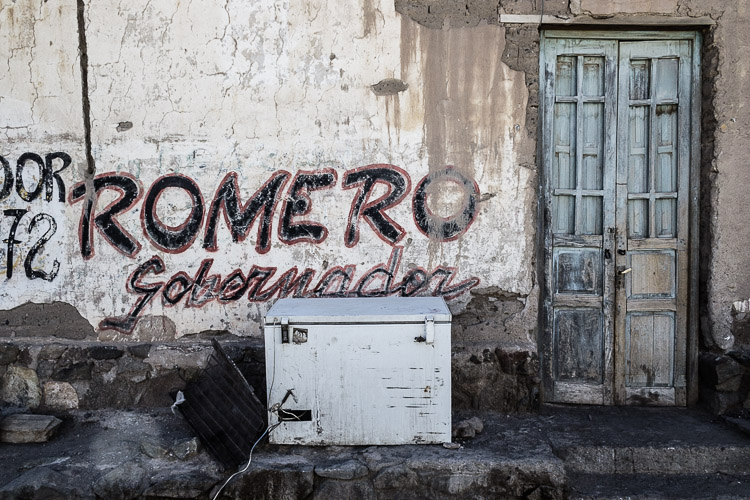
Don’t sharpen too much. Know when to pump it up or turn it down. For instance, clouds are soft so you usually don’t want to apply a lot of sharpening to them. Nature scenes usually call for less sharpening. With architecture, some extra sharpening really makes it pop (try adding a little “Structure” sharpening to those). Sharpening people can be hit or miss. It all depends on what you’re trying to achieve.

sharp, photos, tips, photography, Lightroom, Nik Efex

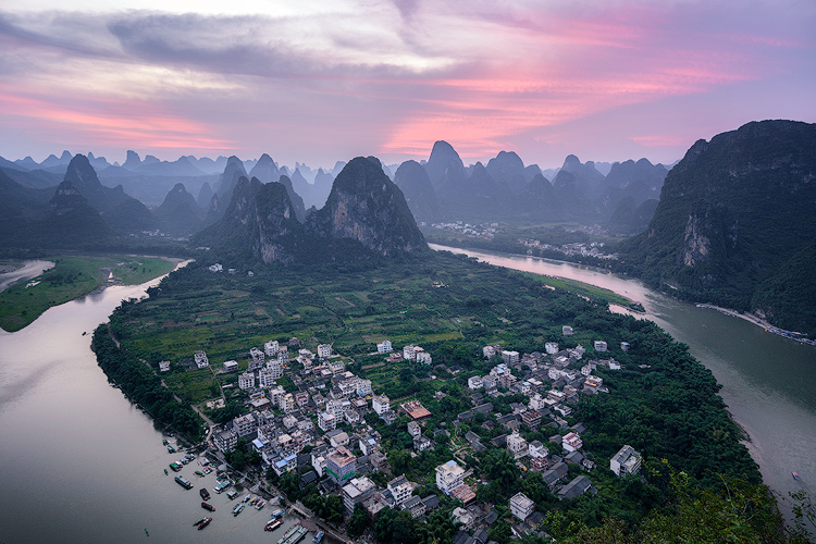
Xingping, China: Selectively sharpening parts of your image, like the houses in the foreground of this photo, helps to lead the viewer’s eye. © Pete DeMarco

Watch out for noise. The more digital sharpening you apply, the greater the noise in your photo. Just zoom in on your photo to see it more clearly. You can apply some Noise Reduction in Lightroom if need be. I don’t like to use it much though because it softens the image. Some noise really doesn’t matter anyways, especially if you are sharing your photo as a smaller size online.

Make sure you’re using a good monitor. If you are viewing or editing your photos on an old monitor, it’s possible that you will not see much difference in sharpness. You can get the best results on a retina display or by printing your photos.

sharpen, photos, tips, photography, Lightroom, Nik Efex

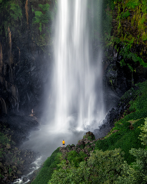
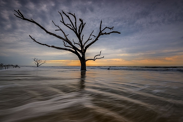
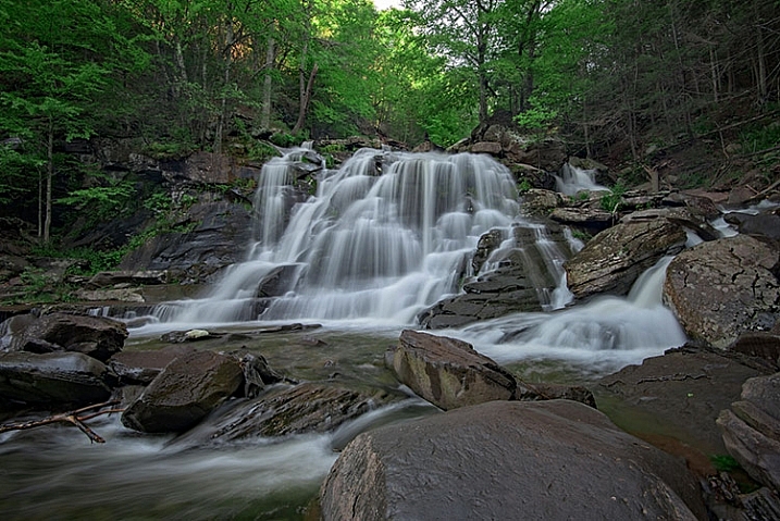
Sipisopiso Waterfall, Indonesia: Transform your images by combining the 20/20 Technique with split toning. © Pete DeMarco

Share your work

Try the 20/20 Technique and share your photo in the comments below. I’d love to see what you do with it. And if you enjoyed this article, you might also like my previous article: How To Use Split Toning to Make Your Photos Stand Out.

googletag.cmd.push(function() {
tablet_slots.push( googletag.defineSlot( “/1005424/_dPSv4_tab-all-article-bottom_(300×250)”, [300, 250], “pb-ad-78623” ).addService( googletag.pubads() ) ); } );

googletag.cmd.push(function() {
mobile_slots.push( googletag.defineSlot( “/1005424/_dPSv4_mob-all-article-bottom_(300×250)”, [300, 250], “pb-ad-78158” ).addService( googletag.pubads() ) ); } );

The post How to Sharpen Your Photos using Lightroom and Nik Efex by Pete DeMarco appeared first on Digital Photography School.


Digital Photography School

 
Comments Off on How to Sharpen Your Photos using Lightroom and Nik Efex

Posted in Photography


How to Add a Sun Flare to Your Images Using Photoshop

29 Oct

If you read my previous article where I give you some tips for doing more spectacular sunset photography, you’ll understand that I love taking photos during the magic hour. For my portraits, I also book my sessions during that time because the light is very soft and flattering. There is one thing I particularly like to do when I process my images and that’s adding a sun flare to my portraits and landscapes. I love to use Photoshop to recreating a scene that would have ideally been there in real life.

How to Create a Sun Flare in Photoshop

I added sun flares to this portrait to add depth.

It’s difficult to not underestimate the effect of a sun flare but it really does make a big difference, especially if you like cinematic results to your images. They’re a great way to add color and depth to your images.

Analyze your image first

The process of adding sun flares is actually quite easy, it only takes two steps and a few minutes. The most difficult thing however is to get a realistic result. You need to analyze your image before doing anything. Start by looking at the position of the sun, how the shadows and highlights are wrapping around your subject.

In the image below, I added a sun flare on the left, but before doing that I noticed that the highlights were hitting the Taj Mahal from the left and the shadows were in the right side of the monument. If I were to position the sun flare on the right side of the image, the results wouldn’t be realistic because the highlights and the shadows wouldn’t correspond to the direction of the light of my sun flare. Try to consider the position, direction and intensity of the light.

How to Create a Sun Flare in Photoshop - Taj Mahal

This is another example of a GoPro image I took. I added a sun flare on the right side of the image because the sun was positioned there in real life. We’re not trying to create another sun, we’re just enhancing it with more colors and more intensity.

How to Create a Sun Flare in Photoshop

In this portrait, I added a sun flare to the left of the model. The result looks realistic because you can see the orange flair spreading and lightning the hair of the model but her face isn’t affected.

How to Create a Sun Flare in Photoshop

How to create and add a sun flare in Photoshop

It’s actually quite easy to add a sun flare in Photoshop. Start by opening your file in Photoshop and creating a new empty layer. The next step is to analyze where you want to place your sun flare and how strong do you want the effect to be. In this case, I want to place my sun flare in the top right of the image and make it pretty big. The sun was actually setting in that position but I am not completely satisfied with how it looks. I want to make the flare more vivid and more intense.

How to Create a Sun Flare in Photoshop

Select the Brush Tool and pick a color

The next step is to select the Brush Tool with an opacity and flow of 100%. Make sure to select a soft brush with a hardness of 0%. I usually like to pick my own color of the sun flare, the color code I use is #fd9424, but there are different ways to pick a color for the sun flare.

You can use the Eye Dropper Tool and select a color from the image by pressing I on your keyboard or by selecting it in the tool box on the left (the chosen color will automatically be set in your palette). Or after you have created the flare, you can create a hue/saturation adjustment layer only affecting that layer and just playing around until you find a color you like.

How to Create a Sun Flare in Photoshop

Adding your flare

To create the sun flare, the first step is to simply create one brush stroke (you just have to press once). Make sure your brush is quite big. So far your image should look something like this:

How to Create a Sun Flare in Photoshop

The next step is to go to blending modes for your current layer (the layer with the brush stroke). The default blending mode is normal, you need to change it to Screen. The screen blending mode by definition will invert both layers, multiply them, and invert the result. Your sun flare is going to get brighter and blend in with the sky after you do that.

How to Create a Sun Flare in Photoshop

Transform

The next step is to select your layer with the sun flare and press CTRL/CMD+T to transform (resize) it. A little box will appear, you want to drag the corners to make it bigger. How big you want to make it depends on your image and your desired effect. The sun flare will affect the whole image if you make it too big and will brighten up the shadows.

Using a brush tool on a new layer is really helpful because you have full control. You can change the position, color, brightness, or saturation of your flare whenever you want by creating new adjustment layers that only affect that layer.

If you think that your effect if too strong, you can reduce the opacity of the layer, if it is not strong enough, you can duplicate the layer. Always remember that the effect should be subtle otherwise if will look quite unrealistic. We are just trying to create a scene taking in consideration how light works.

How to Create a Sun Flare in Photoshop

 whenever you want

Your turn

Now you try you hand at adding a sun flare to one of your images using Photoshop. Please share your images and any questions in the comments below.

googletag.cmd.push(function() {
tablet_slots.push( googletag.defineSlot( “/1005424/_dPSv4_tab-all-article-bottom_(300×250)”, [300, 250], “pb-ad-78623” ).addService( googletag.pubads() ) ); } );

googletag.cmd.push(function() {
mobile_slots.push( googletag.defineSlot( “/1005424/_dPSv4_mob-all-article-bottom_(300×250)”, [300, 250], “pb-ad-78158” ).addService( googletag.pubads() ) ); } );

The post How to Add a Sun Flare to Your Images Using Photoshop by Yacine Bessekhouad appeared first on Digital Photography School.


Digital Photography School

 
Comments Off on How to Add a Sun Flare to Your Images Using Photoshop

Posted in Photography


How to Correct Skin Tones Using Lightroom’s Color Curves

27 Oct

Lightroom gives you a million and one ways to complete most photo edits. Having options is important. No two photos are alike, so no two edits are alike either. In this article, I’ll show you how to correct skin tones using Lightroom’s color curves.

There are times when the best way to edit color in general, and skin tones in particular, is to use Lightroom’s Color Curves. After reading this tutorial, you’ll be able to; measure RGB skin tone numbers to give you a general idea of which edits your photo needs, and correct the color issues using Lightroom’s Color Curves

skin-tones-Lightroom-curves-13.jpg

Finding the color numbers

The image below is a photo that came out of the camera with a pretty good white balance and skin tone. Do you see the numbers under the histogram? Those are Red, Green and Blue (RGB) numbers.

Skin tones Lightroom curves 01

You can display the RGB numbers for your photos too. In Lightroom’s Develop module, hover your cursor over the area you want to measure. Look under the histogram for the corresponding RGB measurements.

These measurements tell us that the pixels next to the arrow in the screen shot had the following measurements:

  • Red: 73.1%
  • Green: 67.1%
  • Blue: 60.5%

RGB numbers are usually measured on a scale of 0-255, unless you are working in Lightroom. In Lightroom, you generally see them on a percent scale. 0% is the darkest value for any color, it’s so dark that there is no visible detail in that area. 100% is the brightest, and is so bright that no detail is visible.

Analyzing the color numbers

When analyzing RGB numbers for skin tone, look for the following indicators:

  • Red should be higher than Green. Green should be higher than Blue. This pattern is universal to all skin tones, regardless of age or ethnicity.
  • Each color should have at least a 2% difference, usually more, between it and the next number. Do you know how to identify a pure gray? That is a pixel that measures exactly the same in its Red, Green and Blue numbers. So skin whose RGB numbers are very close to each other is going to look gray. Not very appealing, right?
  • If any colors measure 94% or above, you probably have overexposure to deal with.
  • If any colors measure 6% or below, you probably have underexposure to deal with.

The RGB numbers in the photo above are consistent with expectations. This means that the skin is within “proper range” of a well-exposed photo with good white balance.

What do to with bad numbers?

What happens, however, if your photo doesn’t look so good straight out of camera?

Skin tones Lightroom curves 02

In this photo, the measurement point was just next to the arrow on her forehead. The numbers read: Red 93.8%, Green 92.5%, and Blue: 93.6%.

Anytime you see a photo with skin tones that measure like this, your eyes are going to tell you that something is off before the numbers do. The benefit of using the numbers is that they give you the direction to which your edits for the image need to go.

The numbers in this photo cause concern because:

  • Anything higher than 94% or so in Lightroom is bright enough that your image, if you print it, might not render good detail in those areas. That means that these areas are too bright.
  • Blue is higher than Green. Red should always be the highest and Blue the lowest otherwise the skin tone will appear cold.
  • The RGB numbers are too close together – they are approaching gray. This skin in this photo is lifeless as a result.

Correcting the skin tones

To fix this image, you would start by tweaking exposure. Proper exposure is a huge component of proper skin color. In fact, it’s often impossible to assess skin tone issues correctly without correcting exposure first.

A little-known bit of Lightroom awesomeness is that it’s easy to correct exposure while keeping an eye on the RGB numbers. In the Develop module, double click in the numeric entry field for Exposure so that the number is highlighted. Next, hover your cursor over the area of skin you are measuring without clicking. Use the up or down arrows on your keyboard to change exposure until a more appropriate measurement for the Red value appears under the histogram.

Skin tones Lightroom curves 03

Adjust Highlights (or Shadows, Whites, or Blacks) in the same way. Activate the numeric input field for editing then hover the cursor over the arrow you want to measure. Use the arrow keys on your keyboard to increase or decrease the adjustment.

Exposure for this photo is better with the adjustments you see above, but color is still off. When the RGB numbers are as close together as you see here, it’s often better to use Color Curves than the White Balance sliders to fix the issue.

Using Color Curves instead of White Balance Sliders

Color Curves has two major advantages over the white balance (WB) sliders.

You might have noticed already that Lightroom measures three colors (red, green and blue) for each pixel. However, the White Balance sliders don’t allow for editing the most important component of skin color – red. But, you can edit Red tones using Lightroom’s Color Curves.

The other big benefit of using Color Curves is that you can adjust colors in limited parts of the tonal range. For instance, if you reduce yellow in an image using the Temperature slider in the White Balance section, you are reducing yellow globally (everywhere in the image equally). Using Color Curves, however, you could reduce yellow only in the shadows, without taking away the yellow that properly belongs in the mid tones and highlights of an image.

To find Color Curves in Lightroom, scroll down to the Tone Curve section. By default, it shows you the parametric curve, which looks like this:

Skin tones Lightroom curves 04

Click on the small button in the lower right corner of the Curves panel to access the Point Curve. (It’s circled in the screen shot above.)

Now you are looking at the Point Curve interface:

Skin tones Lightroom curves 05

Using the Channel drop down menu, select the color you’d like to adjust.

Skin tones Lightroom curves 06

Which color channel to edit?

At this point, you may be wondering about adjusting colors other than red, green, and blue. For instance, what if your photo has too much yellow or orange? Think about it like this.

Each of the three colors measured in Lightroom has an opposite:

  • Red is the opposite of cyan
  • Green is the opposite of magenta
  • Blue is the opposite of yellow

Reducing any one of those colors using Color Curves, increases that color’s opposite. In other words, reducing blue is the same as increasing yellow.

Looking at the Curves panel, do you see the histogram behind the straight line? When you click and drag the straight line to create a curve, this tells Lightroom to adjust the pixels corresponding to that part of the histogram.

Say, for instance, that you wanted to add blue to the mid tones of an image. You would select the Blue channel and click the line in the middle of the histogram, where the midtones live. Dragging the line up would add blue to the bright parts of your photo’s tonal range.

Dragging up increases the color the channel is named after – blue, in this case. If it increases blue, that means that it’s also decreasing blue’s opposite, yellow.

Skin tones Lightroom curves 07

Dragging down decreases the color the channel is named after.

skin-tones-lightroom-curves-08b

Using the Targeted Adjustment Tool for Curves

That’s the way it works in general. But you can get much more precise color control by using Lightroom’s Targeted Adjustment Tool. Click on the button at the top left corner of your Curves panel to activate it (circled below).

Skin tones Lightroom curves 08

Hover this tool over the spot you’re using to measure the skin tone in your photo, but don’t click! Use the up and down arrows on your keyboard while keeping an eye on the RGB numbers beneath your histogram until the both the appearance of the photo and the RGB numbers improve.

Moving the blue curve down, as in the screenshot below, provides better separation between the Green and Blue measurements. It also gives the photo the warmth it’s lacking.

Skin tones Lightroom curves 09

If the image still lacks vibrance, as this one does, move to the Red curve and increase the Red channel. Adding a touch of red is the best way to counteract gray skin.

Skin tones Lightroom curves 10

Next, decreasing green (to add magenta) makes the skin color, as well as the corresponding RGB numbers, look just about right.

Skin tones Lightroom curves 11

Tweaking things

However, the warmth of the plants behind them is overpowering the subjects. To downplay it, return to the Blue channel.

Using the Targeted Adjustment Tool, add Blue to the the shadows by hovering over a dark area of the photo and hitting the up arrow on your keyboard.

Skin tones Lightroom curves 12

Compare the original and edited photos here:

Before

Before

After

After

Editing your own images with Color Curves and RGB numbers

Keep the following tips in mind when editing your own images.

#1 – First, a big caveat to anyone who has heard that using RGB numbers to edit will solve all skin tone problems! There are as many proper RGB measurements as there are people in the world. As you study RGB numbers, let trends in the numbers and generalities guide your edits, but don’t try for an exact numeric match.

#2 – Measure skin tones in the middle range of brightness. Look for mid-tones rather than bright highlights or deep shadows. Also avoid measuring on cheeks, the end of the nose, or other areas that are usually redder than others.

#3 – In general, when I’m editing photos, I look for tones in these ranges:

  • Red is highest > Green is middle > Blue is lowest – always.
  • The Red channel is usually between 70% and 90%. Very light skin can be as high as 94%. Very dark skin can go as low as 40-50%.
  • The Blue channel is usually between 30% and 80%.
  • It’s not possible to generalize how many percentage points difference should be between Red and Green, or Green and Blue. However, skin that has warmer tones will have less Blue in proportion to Red and Green.

#4 – Small movements of your tone curve impact your image dramatically. Don’t go overboard!

Conclusion

Studying the patterns in the RGB numbers of your photos is a great way to develop your editing eye. Everyone has photos that aren’t quite right. Analyzing the relationship between the numbers and the appearance of the photo will help you get to the point where you can eyeball a photo’s needs without referring to the RGB numbers at all.

Any questions? We could talk about this topic all day. Comment below and tell me what you think.

googletag.cmd.push(function() {
tablet_slots.push( googletag.defineSlot( “/1005424/_dPSv4_tab-all-article-bottom_(300×250)”, [300, 250], “pb-ad-78623” ).addService( googletag.pubads() ) ); } );

googletag.cmd.push(function() {
mobile_slots.push( googletag.defineSlot( “/1005424/_dPSv4_mob-all-article-bottom_(300×250)”, [300, 250], “pb-ad-78158” ).addService( googletag.pubads() ) ); } );

The post How to Correct Skin Tones Using Lightroom’s Color Curves by Erin Peloquin appeared first on Digital Photography School.


Digital Photography School

 
Comments Off on How to Correct Skin Tones Using Lightroom’s Color Curves

Posted in Photography


3 Tips for Creating Double Exposures In-Camera Using Flash

20 Oct

Have you ever wondered how double exposures are done in digital cameras? I have. Back in film days, we knew that to double expose a frame, all you needed to do is rewind it back to the frame you have just exposed, thereby taking two separate shots using one frame of the film. Nowadays with digital SLRs, there is no film to re-expose and no rewind mechanism to go back to a previous photo so you can re-shoot on top of it. However, double exposure and multiple exposures can be done in post-production quite easily. But this little tutorial will focus on how to take double exposure in-camera using a digital camera.

double-exposures-in-camera-tutorial

Equipment needed for double exposures

What you will need:

  • A tripod.
  • Your camera.
  • Remote trigger, receiver or transceiver.
  • Flash guns (speedlights) or strobes (one or two).
  • Some light modifiers (optional) such as umbrellas, softboxes, or octaboxes.
  • A backdrop or wall.

For my experiment below, I used two strobes mounted on stands and modified by gridded octaboxes. I used Paul Buff’s Cybersyncs for the wireless remote transceiver system. I also had three backdrops: one black, one beige and one patterned. See the image below for my studio setup and an iPhone picture of behind the scenes.

double-exposure-tutorial-in-camera

The camera and flash settings

The strobes were kept on a constant setting and I chose the lowest power. My ISO was also on the lowest setting (ISO 100) for most of the shots except for the f/16 ones where I cranked it up a little. The aperture varied between f/8 – f/16, depending on the look I was after and the length of my exposure. Shutter speed also varied between one second to a few seconds, to bulb. In other words, experiment until you get the look right.

How to take the double exposure

This is the trick. While the camera is exposing the image so that the shutter is open, keep triggering the flash. For these shots, I triggered the flash 2-4 times depending on the length of the exposure and how fast I could press the trigger button. The flash freezes the action so the more time the flash fires the more frozen actions you get on your image.

This leads us nicely to the first tip.

#1 Exaggerated movement is key

double-exposures-in-camera-tutorial

If your subject makes very small and minor movements, the likelihood is the images will sit on top of each other. This may result in one final image that looks like a blurry mess as in the photo above rather than many separate frozen images on a single photo as shown in the photo below. It is better to tell your subject to move distinctly away from the first position so the movements are separate. The camera still captures the trail of movement as a blur. But when you trigger the flash, that particular moment is rendered sharp and still.

double-exposures-in-camera-tutorial

I asked my kids to walk across the frame, counting each step and on a certain count to turn their heads. I would trigger the flash when they moved sideways or turned their heads. At other times I asked one of the children to only join the frame on the third flash so that there is only one of her that registers. I also got them to walk towards me (see photo at top of article). It was at that stage that I changed my aperture to the smallest my lens allowed, in this case, f/16 so that I could still get the head sharp at various depths of field.

double-exposures-in-camera-tutorial

In the photo below, I got my kids to shake their heads as fast and as many times as they could. I wanted the focus here to be the movement rather than their frozen faces. Don’t be afraid to experiment. The beauty of digital is that unlike film, you have an infinite number of frames at your disposal so can afford to make many mistakes until you get what you are looking for.

double-exposures-in-camera-tutorial

#2 A dark background is better

Compare the image above with the light background to the other images with the black background. The difference in the final image is vast. I prefer the dark background where my intention was to freeze several portraits and the lighter background where my focus was on capturing the trail of movements. Overall I shot and preferred more of the images with a dark background as the delineation between actions and the clarity of subjects are easier to see. Contrast between the skin and other lighter parts of the image was also easier to achieve compared to images shot with the beige background. In the photo below, I edited quite aggressively to get the contrast I wanted. I also added grain to simulate a film look.

double-exposures-in-camera-tutorial

#3 Experiment with materials and textures

Bring in other materials such as aluminum foil. This one here is an emergency blanket. Two of my kids stood on either side, held and waved the blanket up and down in front of the middle child so the slow shutter captured some of the movement of the foil. The kids also carried  a torch (flash light) and did some light painting. The problem I found with both photos was the blurry look of their faces. Because they did not do big movements with their bodies, hence the frozen photos captured by each flash just got stacked up in roughly the same spot. Other things you can use are glow sticks, flashing lights, moving lights, iPhone and iPad screens – pretty much anything that reflects or emits light.

double-exposures-in-camera-tutorial

double-exposures-in-camera-tutorial

Don’t be afraid to experiment with backgrounds too. In the photos below, I changed the background to a zebra striped black and white rug just because I wanted to see what would happen. I used the same movement techniques as above and the same camera and light settings but the results were very different and unique. The last image below was a happy accident. My third child popped her head up on the third flash, but she came closer to the camera than I had intended so the flash didn’t quite illuminate her face enough. However, I thought this looked really effective as it provided the gray tone of the image as well as a solid form in the middle thereby making the overall image more dynamic and interesting.

double-exposures-in-camera-tutorial

double-exposures-in-camera-tutorial

double-exposures-in-camera-tutorial

I hope you enjoyed this little tutorial on in-camera double exposures using flash. If you have more ideas, do share them here in the comments below!

googletag.cmd.push(function() {
tablet_slots.push( googletag.defineSlot( “/1005424/_dPSv4_tab-all-article-bottom_(300×250)”, [300, 250], “pb-ad-78623” ).addService( googletag.pubads() ) ); } );

googletag.cmd.push(function() {
mobile_slots.push( googletag.defineSlot( “/1005424/_dPSv4_mob-all-article-bottom_(300×250)”, [300, 250], “pb-ad-78158” ).addService( googletag.pubads() ) ); } );

The post 3 Tips for Creating Double Exposures In-Camera Using Flash by Lily Sawyer appeared first on Digital Photography School.


Digital Photography School

 
Comments Off on 3 Tips for Creating Double Exposures In-Camera Using Flash

Posted in Photography


Tips for Using the Blur Filters in Photoshop

09 Oct

For most photographers before they even press that shutter button, they have already pictured the type of shot in their heads. What exactly do I mean by that?

Well for example, a sports photographer may use a panning technique to shoot a moving sports car so that the background is out of focus to convey a dynamic shot of motion. Or maybe you are a portrait photographer and you want your subject set against a wonderful bokeh in the background.

Field Blur in Photoshop

Shallow DOF on the photo to the left. A Field Blur filter using Photoshop was added to create a greater depth of field look to the photo on the right.

In-camera blur versus done in Photoshop

All these techniques can be done in-camera. But sometimes due to time, technical constraints, or other factors, getting that desired shot in-camera isn’t always possible.

In this article, I will take a look at the Blur filters in Photoshop and demonstrate how useful these effects can be when applied in post-production. Whether you want to create a motion blur effect or simply blur part of the image to create a shallow-depth-of-field look.

When Photoshop CS6 was released Adobe added three new filters: Field Blur, Iris Blur, and Tilt-Shift. This brought the tally up to 14 different types of Blur effects in Photoshop. These new blur features were impressive.

Blur filters in Photoshop

First, let’s take a look at few and where you access them in Photoshop. I’m using Photoshop CS6. Go up to the Menu Bar > Filter and select Blur. I’m not going to describe all of them. Instead, I will concentrate on the few that I use the most but feel free to experiment with the others.

different-blur-filters

Where the different Blur filters are located in Adobe Photoshop.

Some of the filters I’ve never used let alone tried, such as Blur and Blur More. Here are some blur filters which include my personal favorites:

  • Gaussian Blur
  • Field Blur
  • Radial Blur
  • Motion Blur
  • Average Blur
  • Lens Blur

If you take a look at the following images, you can see the subtle, and not so subtle differences, each blur filter has on the same image, which are white lines on a black background.

white-lines-and-shape-blur

Normal whites lines on a black background – no blur effect. A Shape Blur filter was applied to the same image on the left.

gaussian-and-radial-blur

Gaussian Blur was applied to the image on the left and Radial Blur was applied to the image on the right.

lens-and-motion-blur

A Lens Blur was applied to the image on the left and a Motion Blur was applied to the image on the right.

Gaussian Blur

I use Gaussian Blur the most out of all of the blur filters. It is my general workhorse for blurring parts of an image and for softening the edges of a layer mask. It can also reduce noise in an image.

Field Blur

Field Blur works great when you want to focus on an area of your photo, such as the foreground or background. You apply a pin on the part of the image where you want the focus left as it is. Then reduce the Radius to 0px, which can be done either by using the slider in the top right part of the menu or by dragging the white bar around the pin until blurring disappears. Place another pin or pins on the image where you want to blur the focus. The default setting is 15px Radius.

sunflowers

Sunflowers in France – one is smiling while the others are wilting due to the intense heat.

sunflowers-pins-field-focus

Applying the pins on the image where I want the focus to remain, and others where I want it blurry.

sunflowers-field-focus

I applied the Field Blur to blur out the poor wilting sunflowers so that the focus was on the smiling sunflower.

Note: If you have version Photoshop CS6 13.1 or Photoshop CC, you can apply these blur filters to Smart Objects. That’s a big plus.

What I found particularly impressive when either of these three blur tools are accessed is the separate panel for creating Bokeh. Read this dPS article if you want to know how to create a Bokeh effect in Photoshop.

Radial Blur

Pick up any magazine or newspaper where you see photos of cars being advertised. If you look closely, you will see some images of cars where the motion effects were applied in post-production. Reflections, the wheels of the car, and the background are the usual tell-tale areas.

animated-car

An animated Gif to illustrate the Radial and Motion Blur effects applied to the wheels and parts of the car and the background.

Let’s take for example, the wheels of a car. A Radial Blur could be used here to create the effect of the wheels spinning around.

2-radial-blurs-to-front-wheel

Radial Blur applied twice to the front rim part of the wheel.

In the example above, I first selected the wheel rim and part of the tire using the pen tool (See Note below). The pen tool saves the selection and I can edit it later if needed. This selection was placed on its own layer and converted it to a Smart Object. I applied two Radial blurs. For the first method, I used Spin; Quality Best with a 8px blur. I then applied another Radial blur using the Zoom method; Quality Best at 6px blur.

Motion Blur

For the background and other parts of the car, I used the Motion Blur effect. I duplicated the image and converted it to a Smart Object. The car was isolated with the pen tool and I applied a layer mask so that when the motion blur is applied, it affects the background only and not the car. You will notice a little ghosting around the rear of the car.

car-with-radial-and-motion-blur-effects-applied

Radial Blur was applied to the wheels. Motion Blur was applied to the side panel, rear side window, and to the background.

Ideally, you would also cut out the car from the duplicated image and clone the area back in with the surrounding sky, trees, and road.

Disclaimer: I’m in no way inferring here in this article that to convey motion to a static shot of a car that all you need to do is apply Radial and Motion blur effects. Far from it. I fully appreciate that more techniques are involved, along with time, skill, and effort, to pull off a professional retouching job.

Note: I feel the Spin Blur Filter in Photoshop CC is definitely a much improved version of the Radial Blur. You add a pin over the part of your image. Click and drag the ellipse’s borders to resize it, or you can also click and drag the handles to reshape and rotate it. It’s much faster and intuitive to use. You have more control and it works on Smart Objects. The effect is also more realistic in my opinion.

Average Blur

This is a filter I don’t use that often but I wanted to demonstrate how to use it to remove color casts on your photos.

With your image already opened, duplicate the layer. Go up to Filter > Blur > Average. It will turn the image to a solid color by producing an average of all colors in the image. Add a Levels Adjustment layer. Click on the middle eyedropper tool and click anywhere on the solid color layer. This samples a gray point in your image. Turn off the visibility of this layer and you will see the difference, the color cast has been removed. It’s not perfect though, and you may find that further editing is required.

Average-blur-blue-drums

How to apply the Average Blur in Photoshop.

click-on-gray-eyedropper-tool

A solid average colour is calculated, which is blue. Add a Level Adjustment Layer and click on the middle eyedropper tool.

the-blue-color-changes-to-grey

By selecting the gray eyedropper tool and clicking on the image, the blue colour changes to grey.

color-cast-removed

The colour cast has been removed.

Lens Blur

The Lens Blur filter is probably my favorite of all of them if I had to choose one. It does a fantastic job of replicating the shallow DOF (Depth-of-Field) look normally achieved in-camera. While Field Blur also does a great job of this, I still prefer the Lens Blur method as you can import a depth map. That is an alpha channel which stores the selection as an editable grayscale mask in the Channels panel.

An example

In this image of the rhino taken at Dublin Zoo, I was too far away and I didn’t have a telephoto lens with me to get a nice shallow depth of field to blur out the background.

rhino-at-Dublin-Zoo

A rhino taken at Dublin Zoo.

So in Photoshop, I selected the rhino using the Quick Selection and Refine Edge tools. I saved this selection and named it. The selection or mask is now permanently stored as an alpha channel. To access it, I opened up the Channels panel and selected the alpha channel called rhino. By holding down on the Cmd/Ctrl key and pressing the letter I, it inverts the mask. The rhino is now black. Remember black conceals, white reveals on masks. Next, I clicked on the RGB layer to go back to the Layers panel.

I now need a layer mask for the foreground as I only want the background to appear blurred. Follow these steps to do the same:

Create a new layer and click on the Gradient Tool. Go up to the Gradient Editor and make sure you choose the preset Foreground to Background. Start near the bottom of the image while holding down the Shift key and drag upwards. It may take a few tries but you want a nice transition from black to white, similar to the image below.

Gradient-Toll-Editor-set-to-Foreground-Background

Open up the Gradient Editor and set the preset to Foreground-Background.

Open up your Channels panel again and duplicate any of the red, green, or blue channels and name this gradient. You now have two separate channel layers; one with the rhino and the other with the gradient for the foreground.

duplicate-channel

Duplicating the gradient channel to create one alpha channel.

Bear with me for the next few steps!

In order to create just one alpha channel to load as a depth map for the Lens Blur filter, we need to copy the rhino selection onto the gradient layer. So duplicate the gradient channel by right clicking on the layer or dragging the layer to the bottom of the Layers panel to the icon “Create new channel”. Name it rhino mask in this instance.

Hold down the Cmd/Ctrl key and click on the rhino layer. You will see the marching ants around the rhino and the border. Go up to the Menu Bar > Select > Inverse. Now the marching ants are just around the shape of the rhino. Go back up to the Menu Bar > Edit > Fill with Black. Click on the RGB layer and go back to the Layers panel.

fill-with-black-rhino

After inverting the selection of the rhino, you can now fill it with Black.

alpha-channel-for-rhino-photo

Now we have the rhino mask and the foreground mask on the one channel ready for the Lens Blur filter as a depth map.

Now we are ready to load this channel as a depth map into the Lens Blur filter. Duplicate the layer, or if you have a new version of Photoshop convert it to a Smart Object.

A separate dialog box appears and the image will initially be blurry. Go to where it says Source and click on None. A drop down menu appears and you can select the channel you have just created, in this case “rhino mask”. Adjust the radius value and click the Ok button.

loading-alpha-channel-in-the-lens-blur-filter

Selecting the channel rhino mask in the Lens Blur filter

Lens-Blur-applied-using-alpha-channel

The depth map has been applied and a shallow depth of field has been created.

Conclusion

I hope this article was helpful and your eyes aren’t too blurry from reading it.

Do you use Blur filters in Photoshop? What are your favorite ones? Please share your comments below.

googletag.cmd.push(function() {
tablet_slots.push( googletag.defineSlot( “/1005424/_dPSv4_tab-all-article-bottom_(300×250)”, [300, 250], “pb-ad-78623” ).addService( googletag.pubads() ) ); } );

googletag.cmd.push(function() {
mobile_slots.push( googletag.defineSlot( “/1005424/_dPSv4_mob-all-article-bottom_(300×250)”, [300, 250], “pb-ad-78158” ).addService( googletag.pubads() ) ); } );

The post Tips for Using the Blur Filters in Photoshop by Sarah Hipwell appeared first on Digital Photography School.


Digital Photography School

 
Comments Off on Tips for Using the Blur Filters in Photoshop

Posted in Photography


Six Tips For Using Filters to Improve Your Landscape Photos

05 Oct

One of the secrets to good landscape photography is the way in which you capture various elements of the scene. Sure, you can let your camera do the heavy lifting and figure out the exposure. But a landscape photo doesn’t have to be a literal interpretation of what you see, or of what your camera sees when left to its own devices. While post-processing can help make adjustments to an image so that it’s less literal than what you saw, making certain adjustments at the time of capture is more important, giving you something special to work with when the time comes to edit the image in post. Using filters such as polarizers, neutral density, and graduated neutral density filters can help you capture the scene in more creative ways. These tips for using filters can help you start making these adjustments and creating more dynamic images.

Filter Tips

The following tips can help you start making these adjustments and creating more dynamic images.

1 – Use a polarizer to improve the sky

Using filters - a polarizer to reduce haze in an image.

A polarizer cut through the morning mist to reveal blue sky in this shot of Great Smoky Mountains National Park.

I believe every photographer should have a polarizing filter in their camera bag because of how useful they can be. Polarizers work by filtering out light that is reflected directly toward the camera at specific angles. When photographing a landscape with a blue sky, haze can occasionally cause the sky to be less vibrant. Using a polarizer, you can minimize the haze and reveal the true blue of the sky. This will work best when aiming the camera at a 90° angle from the sun; in other words, with the sun to your side.

By rotating the polarizing filter while composing your shot, you can see the effect the filter will have. Be sure you don’t go too far. It is possible to over polarize the scene, creating a darker blue splotch in the sky that will make the use of the filter obvious and the image appear unnatural. This is especially possible with ultra-wide angle lenses that take in a huge expanse of the sky. In the image above, a polarizer was used to reduce the amount of morning mist in the valley and show the blue sky behind the mist.

2 – Use a polarizer to reveal what’s underneath the water

Using filters - a polarizer cut down on reflections on the water's surface.

A polarizer can reduce reflections on the surface of the water to allow you see what’s beneath the surface, and add visual interest to a scene.

Often when photographing a stream or lake, the light may reflect off the water’s surface to such a degree that it’s impossible to see what’s below. However, there may be times when there is something of interest underneath the surface, such as rocks, fish, or logs from fallen trees. Using a polarizer, you can reveal as much or as little of what’s beneath the surface by eliminating the reflecting light.

It doesn’t have to be all or nothing either. You can nuance the effect by rotating the filter just a little bit, to retain some reflecting light while still seeing beneath the surface. In the image above, on the left, no polarizer was used and the reflected light prevents you from seeing below the water’s surface. On the right, a polarizer was used to reduce the reflected light on the water’s surface, allowing you to see the rocks beneath the surface.

3 – Use a polarizer to reduce reflections on wet rocks

using filters - Photographing wet rocks

In this image, light reflects off of the wet rocks by the waterfall.

using filters - A polarizer can reduce the reflected light from wet rocks.

In this image, a polarizer was used to reduce the reflected light from the wet rocks.

When photographing a waterfall, where there are generally a lot of wet rocks, light can reflect off of them, making them appear shiny. On occasion, that reflected light may be so strong that it detracts from the image. Using a polarizer can reduce the reflected light and reveal more detail in the rocks, adding interest to the image.

As with the water reflections discussed above, you can nuance the effect by rotating the filter to get the right balance of reflected light and detail underneath. In the images above, you can see how the highlights on the rocks can be reduced if desired by using a polarizing filter. Again, by rotating the filter as you look through the viewfinder, or on the live view screen, you can watch the effect happen and adjust it to your liking.

4 – Use Graduated Neutral Density Filters to darken the sky

Using filters - graduated neutral density filters for a better sky.

The difference when using a graduated neutral density filter can be very apparent, as seen in the comparison of these two images.

When photographing the landscape, especially at sunrise or sunset, there is often a high amount of contrast between the sky and the foreground. That forces you to make exposure choices to determine what will be exposed properly. While digital cameras are much improved with regards to dynamic range in recent years, nature can still push your camera to its limits in terms of how much can be captured in a single image.

Graduated neutral density filters can help to reduce the dynamic range of an image, by darkening the brighter areas, like the sky, so that it falls within the range of what the camera can capture. Use Live View on your camera to see the positioning of the filter over the lens, especially when using a hard-edged ND graduated filter. Watch the way the foreground exposure changes in relation to the sky, as it is possible to overdo a good thing. If the sky gets too dark in relation to the foreground, try a less dense filter, for instance, a 2-stop ND grad rather than a 3-stop grad. Above, the image on the left was taken without the use of a graduated neutral density filter. On the right, a 3-stop,

Above, the image on the left was taken without the use of a graduated neutral density filter. On the right, a 3-stop, soft-edged graduated neutral density filter was used to darken the sky. Notice it also has the effect of brightening the foreground in relation to the sky, bringing out more detail in the darker area in the bottom left.

5 – Control the motion of water

Using filters - an ND filter to control the motion of water.

A neutral density filter can be used to help capture the motion of water in a scene.

Because of its nature, moving water is often the most dynamic part of an image. You can create a different mood simply by changing the way you capture water. Longer exposures tend to be more calm and peaceful, while shorter exposures can capture the violence of a crashing wave, or the power of a river going over the falls.

Since shutter speed controls the effect of motion, by using neutral density filters you can evoke both moods by limiting the amount of light that enters your lens. Thus, you can adjust the shutter speed to give you the effect of motion that you want. You may not need a filter for faster shutter speeds, but if it’s a bright day and you want to slow things down, you’ll need a neutral density filter to do that.

Using a 3-stop ND filter is usually fine for waterfalls to slow them down just enough to get a nice creamy look to the falls, but when capturing waves on the ocean, it may not be enough to get the effect you need. Sometimes four or even five stops of neutral density is needed to get the exposure you need to slow it down to capture water the way you want. Adding a 10-stop neutral density filter will allow you to slow down your shutter speed to a minute or more, eliminating waves completely, creating a calm scene that feels quiet and peaceful as opposed to the crashing waves pounding the rocks or beach.

In the image above, a 3-stop neutral density filter was used to slow down the exposure just enough to allow the water’s motion to be captured as it crashed on the rocks. In the image below, a 10-stop neutral density filter was used to slow down the exposure further, to a full 2-minutes, creating smooth water and a calmer looking scene.

Using filters - a 10-stop ND filter to smooth water during a long exposure.

Using a 10-stop ND filter, you can make water appear calm by using a long exposure. This is a two-minute exposure.

6 – Create motion in clouds

Using filters - Clouds appear as normal when no ND filter is used.

When no neutral density filter is used, clouds are captured as we see them.

Using filters - a 10-stop ND filter to achieve a slower shutter speed of 60 seconds, I was able to capture the motion of the clouds as they passed over New York City.

Using a 10-stop ND filter to achieve a slower shutter speed of 60 seconds, I was able to capture the motion of the clouds as they passed over New York City.

As a landscape photographer, clouds are often the focus of an image or at least a strong component in the composition. Clouds add depth and drama to a good landscape, creating background interest. But you can also manipulate the clouds to your creative advantage as well, capturing their movement and blurring them to create a sense of flight and speed in your scene. By using a strong neutral density filter, such as Lee’s Big Stopper 10-stop ND filter or Vü Filter’s 10-stop offering, you can slow down your shutter speed to allow the motion of the clouds to be captured.

The proper shutter speed to capture cloud movement will vary, depending on how fast the clouds are moving. The longer the exposure, the more movement you will capture. An exposure of 30 seconds to one minute for fast moving clouds, such as in the image above, will result in a motion blur where the clouds still resemble clouds. An exposure of two or three minutes will result in the clouds becoming streaks of color across the sky, unrecognizable as clouds anymore.

Conclusion

One of the complaints I hear about using filters is that it takes too much time to put them on the lens, or it slows you down. I prefer to think of it as being deliberate about the shot I am trying to capture, and making sure that my camera captures exactly what I want.

Do you use filters? What’s your favorite technique using on-camera filters? Please share in the comments below.

googletag.cmd.push(function() {
tablet_slots.push( googletag.defineSlot( “/1005424/_dPSv4_tab-all-article-bottom_(300×250)”, [300, 250], “pb-ad-78623” ).addService( googletag.pubads() ) ); } );

googletag.cmd.push(function() {
mobile_slots.push( googletag.defineSlot( “/1005424/_dPSv4_mob-all-article-bottom_(300×250)”, [300, 250], “pb-ad-78158” ).addService( googletag.pubads() ) ); } );

The post Six Tips For Using Filters to Improve Your Landscape Photos by Rick Berk appeared first on Digital Photography School.


Digital Photography School

 
Comments Off on Six Tips For Using Filters to Improve Your Landscape Photos

Posted in Photography


2 Simple Methods for Adding Color to Your Images Using Photoshop

04 Oct

Most of us have experienced photographing an incredible sunrise or sunset only to get home and realize that the colors in your images are not nearly as good as the colors you witnessed with your own eyes. There can be many reasons to this, such as camera limitations or mistakes you made in the field. However, that’s not what you will learn about in this article. Correcting the colors, or adding color, isn’t something you need to spend hours working on. In fact, it can be done in just a few minutes using Adobe Photoshop and you don’t need to be a Photoshop expert to do it.

Enhance or adding color in Photoshop

Trolltunga, Norway – We will be adding color to this sky

As we all know there are many ways to get to Rome, there  isn’t only one method of adding colors in Photoshop either. It can, as I mentioned above, be done fairly easy but the more detailed adjustments you wish to make, the harder it will become. In this article, we will be looking at two easy methods to add color in Photoshop.

#1 Adding Color with a Photo Filter

The first method we will look at involves the Photoshop tool called Photo Filter. This is an Adjustment Tool which you can find by clicking the Adjustment Tool icon (the half-filled circle located below the layers palette, see screenshot below). This creates a new layer named Photo Filter 1, which we will be working on.

photo-filter-ps adding color in Photoshop

Photofilter adding color in Photoshop
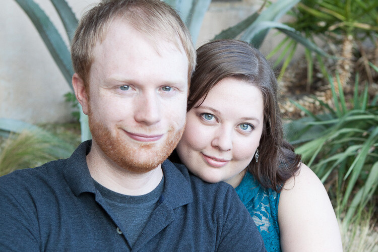
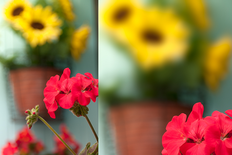
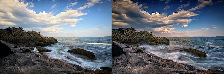
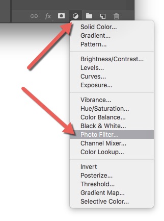
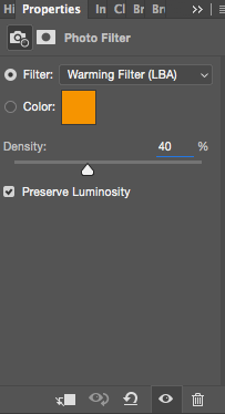
A warming filter is the default setting so, as you might see, the image now has an orange color cast. Personally, I prefer using Warming Filter (LBA) as I find this to have the most natural color that suits my images best (see screenshot on the right). Select this filter by clicking on the Filter dropdown menu. Alternatively, you can select a color manually that might suit your specific image better. If you find the adjustment to be a little too weak you can strengthen its appearance by increasing the Density. I rarely go above 40% Density as the colors then quickly become washed out and results in a look I don’t want.
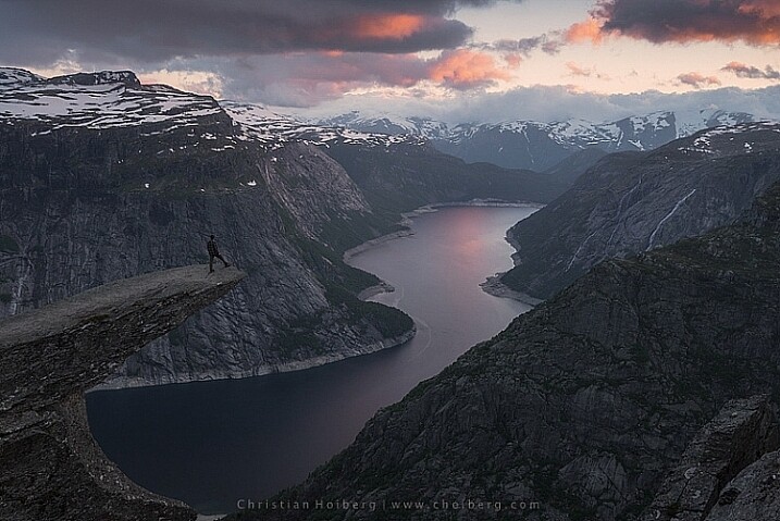
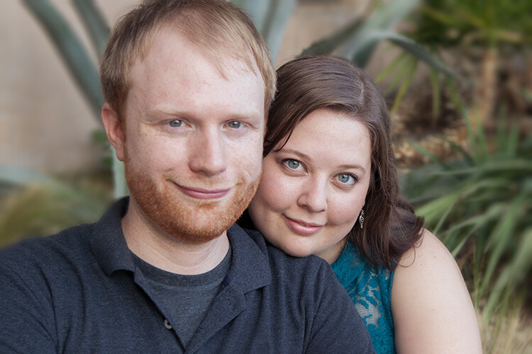
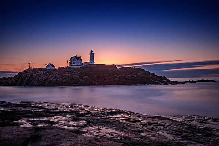
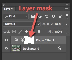
Photo filter applied to the whole image - adding color in Photoshop

Photo Filter applied to the whole image at 40% 

Photo filter - adding color in Photoshop

Photo Filter applied to the whole image at the default 25%

By using this filter we have brought back some of the color in the sky. There’s not a huge difference but we’ve managed to keep a natural look in the image while the sky still looks good. However, there’s one problem. We don’t necessarily want to add the extra color to the landscape itself, we only wanted the sky to be affected.

layer-mask-ps - adding color in PhotoshopLeft of the Photo Filter text there’s a white box. This is the layer mask, basically telling Photoshop what area of the image should be affected by that particular layer. White means that it’s visible and black means that it’s concealed. By default the entire mask is white. To remove the adjustment from the landscape itself follow these steps:

  1. Select the Layer Mask by clicking on it (it will show square brackets around the mask when it is selected, see screenshot on the right))
  2. Select a black brush and set Hardness to 0%
  3. Reduce the opacity of the brush to 80%
  4. With the Layer Mask still selected, carefully paint on the areas you do not want affected by the filter. You’ll see the adjustment disappear from those places as you paint.
adding some subtle color to the sky

The Photo Filter layer masked to only affect the sky.

This is the easiest way to manually choose where the adjustment will be visible. Unfortunately, it’s also the least accurate. You might see some haloing along the edges or perhaps the color bleeds onto the horizon at certain places. By zooming in on the image and using a smaller brush you’ll be able to reduce the amount of haloing or bleed. Other methods, such as Luminosity Masking, are more accurate but also demand a better understanding of Adobe Photoshop.

#2 Add contrast with Curves Adjustment Layer

Curves adjustment layer
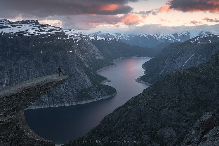
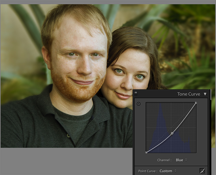
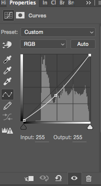
Another easy method to add colors is by using the Curves Adjustment Layer. Unlike Photo Filter, we will be using Curves to add contrast in the sky. Follow these steps to do a Curves adjustment:
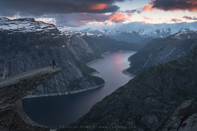
Open a Curves Adjustment Layer by clicking on the Adjustment Layer icon again, and selecting Curves this time.

You want to add some contrast and increase the colors slightly by darkening the sky. Do this by clicking in the middle of the line in your Curves layer and pulling it down gently. Make sure that you don’t go too far as that will lead to unwanted grain or color distortions.

That’s it. To remove the adjustment from the landscape create another Layer Mask and follow the same steps as with the previous method above.

adding color in Photoshop

As you might have noticed these are two subtle adjustments. You won’t get a surreal sky by following these methods. Instead, you’ll maintain a natural look and still bring out some of the color you wanted to capture.

googletag.cmd.push(function() {
tablet_slots.push( googletag.defineSlot( “/1005424/_dPSv4_tab-all-article-bottom_(300×250)”, [300, 250], “pb-ad-78623” ).addService( googletag.pubads() ) ); } );

googletag.cmd.push(function() {
mobile_slots.push( googletag.defineSlot( “/1005424/_dPSv4_mob-all-article-bottom_(300×250)”, [300, 250], “pb-ad-78158” ).addService( googletag.pubads() ) ); } );

The post 2 Simple Methods for Adding Color to Your Images Using Photoshop by Christian Hoiberg appeared first on Digital Photography School.


Digital Photography School

 
Comments Off on 2 Simple Methods for Adding Color to Your Images Using Photoshop

Posted in Photography


5 Tips for Using a Kit Lens for Travel Photography

03 Oct

There are many good reasons not to use a kit lens for travel photography. If a kit lens is the only lens you own and you have a photography trip planned, you may be thinking about buying a better quality mid-range zoom or even a prime lens to replace or accompany it.

Kit lens in travel photography

But before you do so, I want to tell you a story.

Why a kit lens isn’t so bad after all

10 years ago I bought my first digital SLR, a Canon EOS Digital Rebel XT. I had switched systems from Pentax so I didn’t have any lenses to use with it. The camera came with an 18-55mm kit lens, and undecided about what other lenses I needed, I took it with me on an extended trip to South America.

I soon realized that the quality of the lens was not as good as it could be (I nearly used the word horrible). It wasn’t sharp and there was lots of chromatic aberration and purple fringing in my photos. Canon have since discontinued that early kit lens and replaced it with another, better one.

But that lens and camera combination gave me a tremendous amount of freedom. It was light enough enough to carry with me everywhere. I never had to change lenses, which helped keep the sensor reasonably free of dust. I had a wide-angle lens at 18mm, a short telephoto at 55mm, and all the focal lengths in-between.

It was during this trip that I had time to think about my future and what I wanted to do with it. I decided that I wanted to write about photography for a living.

Five months later I sold my first feature to Practical Photography magazine, illustrated with photos taken in South America with the Digital Rebel XT and that same kit lens. Yes, the lens may have been horrible, and I’d never want to go back to that camera and lens combination, but the photos I took with it were good enough to be published in a major photography magazine.

Kit lens in travel photography

What lessons can we learn from this? Here are some of the key lessons.

1. Your equipment matters, but not in the way you think

The key thing is that the equipment you chose to take with you is light enough for you to take just about everywhere, so that you don’t miss any photo opportunities that present themselves. That’s one of the reasons that mirrorless cameras and high end compacts have become popular with travellers.

Relating this back to lenses, one of the benefits of prime lenses is that they tend to be smaller and lighter than better quality mid-range zooms.

Kit lens in travel photography

2. Location and timing are more important than gear

Travel photography is about getting yourself to interesting places, when the light is beautiful, so that you can take photos that evoke the mood and atmosphere. If you don’t do this, it doesn’t really matter what camera and lens you have. Your photos won’t be as interesting as those from people who do take the trouble to do these things.

Kit lens in travel photography

The photo above was taken during a 4-day jeep trip in south-west Bolivia. It’s a remote location at 4200 meters above sea level in the Andes that I never would have seen without going on that trip. It doesn’t matter what camera and lens you have, you’ll never take photos like this if you don’t make the effort to get to places like this one.

3. You need to interact with the locals

You get more out of the journey on a personal level when you talk to local people. The ability to confidently communicate gives you the chance to learn about their lives and the way of life of people from a different place or country.

It also opens up the number of photographic opportunities that come your way. Perhaps the people you talk to would like to have their photos taken, if you ask. Or you can ask people what local sights they can recommend for you to visit with your camera. You will learn about local temples, markets, festivals and other interesting cultural events or places that make good subjects.

Kit lens in travel photography

I came across this scene in Punta Arenas, Chile (above) and was struck by the contrast between the expensive looking racing car and the houses. These two guys were happy for me to take a photo. The confidence to talk to people in this type of situation, and ask for permission to take a photo, is just as important as your gear.

4. Money is always a factor

Travel can be expensive, and it may be wiser spending money on experiences than gear. You don’t want to be in the situation of having spent so much on lenses that you don’t have enough money left to do all the things you would like on your journey.

Kit lens in travel photography

5. Kit lenses are not perfect

I think it’s wise to acknowledge at this point that there are many reasons why you might want to buy a better lens than your kit lens. You might need a prime lens with a wide aperture for shooting in low light or experimenting with shallow depth-of-field. Or you may need a shorter focal length or a longer one. A weatherproof lens so you can shoot with confidence in the rain might also be handy.

These are all valid reasons for buying a better lens. Most photographers who start out with a kit lens end up buying better ones eventually. My photos were published in spite of me using a kit lens, not because of it.

But if a kit lens is all you have, there is no need to worry. You will have plenty of opportunities to buy better lenses in the future. For now, just get out there and seize the moment. Enjoy your trip, have a wonderful experience and make as many beautiful images as you can.

Kit lens in travel photography


Mastering Lenses

If you want to know more about buying and using lenses then please check out my ebook Mastering Lenses: A Photographer’s Guide to Creating Beautiful Photos With Any Lens.

googletag.cmd.push(function() {
tablet_slots.push( googletag.defineSlot( “/1005424/_dPSv4_tab-all-article-bottom_(300×250)”, [300, 250], “pb-ad-78623” ).addService( googletag.pubads() ) ); } );

googletag.cmd.push(function() {
mobile_slots.push( googletag.defineSlot( “/1005424/_dPSv4_mob-all-article-bottom_(300×250)”, [300, 250], “pb-ad-78158” ).addService( googletag.pubads() ) ); } );

The post 5 Tips for Using a Kit Lens for Travel Photography by Andrew S. Gibson appeared first on Digital Photography School.


Digital Photography School

 
Comments Off on 5 Tips for Using a Kit Lens for Travel Photography

Posted in Photography


How to Process a Black and White Landscape Photo Using Lightroom

20 Sep

The process of converting a color landscape photo into a black and white image using Lightroom goes beyond changing the treatment to black and white. That’s just the start. From there you have to tweak and refine, using all tools that Lightroom gives you, to craft an image that matches the vision you carry in your mind.

Black & white landscape in Lightroom

A good way of showing you how this works is to take you step by step through the process that I use when converting a landscape photo to black and white in Lightroom. You’ll see the techniques that I use. and more importantly, the reasoning behind them. This should give you the insight you need to use these tools on your own images.

1. Make sure you have a good image for black and white

The first step is to make sure that you are working with a photo that suits a black and white treatment. Good black and white photos have strong composition that make use of texture, line and tonal contrast.

It’s a good idea to convert only your best landscape photos to black and white. It will take you some time to convert a photo, so why waste it on anything less than your best work?

2. Prepare the color photo

First, open your photo in Lightroom’s Develop module. Then, I do two things before converting a color landscape photo to black and white.

  1. Use the Spot Removal tool to get rid of any dust spots.
  2. Set White Balance to Auto so that the color balance of the photo is more or less neutral. Photos with strong color casts are harder to successfully convert to black and white.

If you are converting a photo that you have already processed in color it’s a good idea to make a Virtual Copy and work on that. This way you don’t lose the work you have done on the original color version.

Black & white landscape in Lightroom

Here’s the color photo that I am going to convert to black and white.

3. Analyze your photo

This takes practice and becomes easier the more you convert photos to black and white. The idea is to make some big picture decisions about what you want to achieve with your conversion. With my photo I can see that:

  • The sky is too bright, and I would like to make it darker.
  • The distant cliffs have beautiful texture that I would like to bring out
  • So do the grass and stones in the foreground.
  • The sea and sky are smooth, creating a visual contrast against the heavily textured parts of the photo.
  • There is good tonal contrast between the grass and stones in the foreground.

This analysis helps me set some goals for the conversion.

4. Convert the image to black and white

There are three ways to convert the photo to black and white using Lightroom. They all do the same thing, so it doesn’t matter which of these methods you use:

  1. Set Treatment to Black & White in the Basic Panel.
  2. Use the keyboard shortcut; V .
  3. Click on B&W in the HSL/Color/B&W panel.

The conversion is likely to look quite flat. That’s okay – it’s easy to add some contrast.

Black & white landscape in Lightroom

Now go to the B&W tab in the HSL / Color / B&W panel. It will look like one of the these two examples below depending on your Preference settings in Lightroom:

Black & white landscape in Lightroom

If you go to the Presets tab in Preferences (see below) you’ll see a tick box titled Apply auto mix when first converting to black and white. If this is unchecked, all the sliders will be zeroed, as in the screenshot on the left (above). If it is ticked, Lightroom takes a guess at what settings to use to make a good conversion and you’ll see something like the screenshot on the right (above).

Black & white landscape in Lightroom

My preference is to leave the box unticked.

When I convert the image to black and white I go to the HSL / Color / B&W panel and click the Auto button at the bottom of the B&W tab. If I like the result, I leave it there. If I don’t, I use the undo command (Ctrl-Z on a PC, Cmd-Z on a Mac) to undo it.

In this case, I liked the result of pressing the Auto button, so I left the settings as they were. I rarely do any work more than this in the HSL / Color / B&W panel.

Black & white landscape in Lightroom

5. Basic panel adjustments

Now it’s time to make some global adjustments in the Basic panel. Global adjustments are those that apply to the entire image.

The image is flat so the first step is to increase contrast.

Going back to the analysis I did earlier, I can see that I want to emphasize the textures in the photo. Clarity is the ideal tool for this. Increasing Clarity also increases contrast. You should adjust both Clarity and Contrast sliders to get the best overall effect, without overdoing it. You can also use the Highlights and Shadows sliders to adjust the brightness of the lightest and darkest tones in the image individually.

In the end I set Contrast to +40, Clarity to +60, Shadows to -13 and Highlights to -49. Remember that every image is different, and that these settings only apply to this one.

Black & white landscape in Lightroom

6. Make local adjustments.

Now it’s time to make some local adjustments. Local adjustments are those that just affect part of the image. Lightroom gives you three tools to do this – the Radial filter, the Graduated filter and the Adjustment Brush.

I want to make the sky darker in this photo, so I will do that with a Graduated filter. This screenshot shows the location of the Graduated filter (the area affected by the local adjustment is shown in red).

Black & white landscape in Lightroom

I used the brush to erase part of the Graduated filter so that the sea and cliffs weren’t affected.

Black & white landscape in Lightroom

I set Exposure to -0.70, Contrast to -100 and Highlights to -100. Again, the settings required depend on your photo.

My aim here was to make the clouds darker and reduce the contrast so that they appeared smoother. The contrast in this image is in the cliffs, the sea and the foreground, not the sky. Less contrast in the sky means that it won’t compete with those areas for attention.

Black & white landscape in Lightroom

The next local adjustment is on the cliffs in the background. I used the Adjustment Brush for this. Here’s the area affected by the local adjustment (shown in red again).

Black & white landscape in Lightroom

I set Clarity to +86 and Shadows to +16.

Black & white landscape in Lightroom

You may remember that in my analysis I decided that I wanted to make the foreground darker to emphasize the tonal contrast between the grass and the rocks. I’m going to use the Adjustment Brush for this as well.

First, I added an Adjustment Brush to make the grass darker. Here’s the area affected (shown in red).

Black & white landscape in Lightroom

I set Highlights to -64, Shadows to -48.

Black & white landscape in Lightroom

That left a light patch in the bottom left corner, and a dark patch under the stone in the center. I used the Adjustment Brush two more times, to make the light patch darker and the dark bit lighter, creating a more even tone across the bottom of the image.

Then I used the Adjustment Brush on the stones, with a Clarity adjustment to bring out the texture. Below is the result of all those adjustments.

Black & white landscape in Lightroom

Next I used the Adjustment Brush again and selected the sea and the sky.

Black & white landscape in Lightroom

Then I set Contrast to -41 and Clarity to -25. The idea was to remove some of the contrast and texture from these areas, to emphasize the smoothness and lack of texture and set up a stronger visual contrast against the heavily textured cliffs and foreground.

Black & white landscape in Lightroom

That’s it. The final image could certainly be refined a little further, but it’s important to pick a point at which to stop so that you don’t spend too much time on the conversion. Where this point is depends on how much of a perfectionist you are, and how much time you are willing to devote to a single image.

Here’s the initial black and white conversion and the final result together so you can see the difference more clearly.

Black & white landscape in Lightroom

Original color image.

Black & white landscape in Lightroom

First version of black and white conversion.

Black & white landscape in Lightroom

Final image.

There are lots of ways you can convert landscape photos to black and white in Lightroom. I’ve only touched on the topic here, so if you have anything to add please let us know in the comments.


Mastering Lightroom

If you want to know more about processing black & white photo in Lightroom then please check out my ebook Mastering Lightroom: Book Three – Black & White.

googletag.cmd.push(function() {
tablet_slots.push( googletag.defineSlot( “/1005424/_dPSv4_tab-all-article-bottom_(300×250)”, [300, 250], “pb-ad-78623” ).addService( googletag.pubads() ) ); } );

googletag.cmd.push(function() {
mobile_slots.push( googletag.defineSlot( “/1005424/_dPSv4_mob-all-article-bottom_(300×250)”, [300, 250], “pb-ad-78158” ).addService( googletag.pubads() ) ); } );

The post How to Process a Black and White Landscape Photo Using Lightroom by Andrew S. Gibson appeared first on Digital Photography School.


Digital Photography School

 
Comments Off on How to Process a Black and White Landscape Photo Using Lightroom

Posted in Photography


How Using a Manual Focus Lens Can Make You a Better Photographer

19 Sep

Back in the days of all manual, focusing your lens was a  skill that every photographer had master. Focusing used to be that thing that made your camera an extension of your hand, therefore a direct extension of your photographer’s eye. That whole agenda came to an end in the early 1990s with the arrival of autofocus systems that were able to actually focus faster than us humans.

That is another key frame along the medium’s timeline. Where new technology started a chain reaction that changed the face of photography forever. Until the appearance of mirrorless cameras that is.

Manual Focus Ouria Tadmor

A photographer looking to purchase a new lens for their mirrorless camera in 2016 might find that there are many manual focus lenses made nowadays alongside the autofocus ones. That means one thing: the market has said the word, manual focus is not dead.

Feed your spirit with the following thoughts to learn how manual focusing can make you a better photographer.

Doing versus supervising

And old carpenter once said, “If you want something done right the first time, do it yourself.” That was always reiterated when a new machine came to the industry to perform a task better, faster, and more efficient than a trained man could ever do.

Instead of being a skilled craftsman, now all you need to know is how to make sure that the machine is doing its job, that’s the truth about an autofocus camera. It is one thing for your brain to rotate the focusing ring with your left hand and stop rotating at the correct focus, and a whole different thing to wait for the green light or beep confirming focus has been achieved. 

Manual Focus Ouria Tadmor

Sometimes you might choose to use only one central focusing point, lock it on your subject and then recompose your frame. That way you are still doing some of the work yourself, but you do it by pressing a button rather turning a ring with your left hand.

Pressing a button (or half-pressing the shutter, in most cases) is a very different connection between your hand and the machine than turning a ring with your left hand. Allowing your hand to learn the feel of the lens. Letting your hand know when and where to turn the dial and where to stop. It takes a greater effort of your brain, but only until your muscles learn it and bypass the need to think about the action. Then it frees your brain to think about the picture. In autofocus mode, your brain always has to check on the machine, make sure that focus is where you want it. That takes brain power every time. Brain power that could have been used to be more creative.

The need for speed

Manual Focus Ouria Tadmor

It’s true, the autofocus machine is indeed faster at turning the lens to the right distance than any human hand will ever be. But then it needs to wait for the brain to approve it before the shutter is pressed all the way and the photo is taken. So it is actually you that slows down the machine.

There are ways to overcome the speed limit of manual focus. For example, one way is to pre-focus on the distance your subject will be positioned at the moment of exposure. This is a technique that was very popular among sports photographers in the days before predictive dynamic autofocus. It required a fair amount of planning and knowing the nature of your subject. A property that let to visualization of the final image even in sports photography.

Another way, more popular among street photographers is called Zone Focus. You approximate the distance of your subject and make sure that they are within the depth of field by setting the focus and aperture correctly. It is a fast and simple technique that will force you to plan your frames. Thus forcing you to be more sensitive to your surroundings than a photographer who responds to a moment by half-pressing the shutter and then pressing it all the way. A street photographer trained in zone focusing does not have to pay attention to focus at all because they adjust their focus and aperture with every change in the scene without even thinking about it.

Manual Focus Ouria Tadmor

Move slow, think fast

When photographing a portrait with a fast telephoto lens you want to have the subject’s nearest eye in focus. There are many ways to achieve that with autofocus cameras. Some of the modern mirrorless cameras will lock on the near eye and stay focused on it for you as long as it’s there.

What a manual focus lens does for you is exactly the opposite. It is almost impossible to keep the near eye in focus with a portrait lens at a wide open aperture. The shallow depth of field means you will have to pay attention to your subject’s smallest moves such as breathing. By doing so it will focus your attention on the subject and you will start noticing facial features that would have been left behind at the photographing speed of autofocus lenses.

Manual_Focus_OT

Zen and manual focus

Use manual focus to put control of your photography back in your hands. It will slow you down and make you think more. For many of the greatest photographers throughout history, the process was as important as the final picture. When you let yourself indulge the process your photographs will benefit.

It is a totally different experience to manual focus using a lens that was created for autofocus than one that was made to be focused by a human. Invest in yourself and buy a vintage affordable lens that fits on your camera then go out shoot with only that lens. This way you will be able to feel what it is like to really do manual focus photography.

googletag.cmd.push(function() {
tablet_slots.push( googletag.defineSlot( “/1005424/_dPSv4_tab-all-article-bottom_(300×250)”, [300, 250], “pb-ad-78623” ).addService( googletag.pubads() ) ); } );

googletag.cmd.push(function() {
mobile_slots.push( googletag.defineSlot( “/1005424/_dPSv4_mob-all-article-bottom_(300×250)”, [300, 250], “pb-ad-78158” ).addService( googletag.pubads() ) ); } );

The post How Using a Manual Focus Lens Can Make You a Better Photographer by Ouria Tadmor appeared first on Digital Photography School.


Digital Photography School

 
Comments Off on How Using a Manual Focus Lens Can Make You a Better Photographer

Posted in Photography