RSS
 

Posts Tagged ‘Using’

3 Ways to Make a Sky Selection Using Photoshop

14 Sep

There are many reasons why you would like to select the sky in your image using Photoshop. Maybe you would like to replace it, to add details, change the contrast, etc. Selections give you a precise contour of your subject and facilitate local adjustments, without altering the other elements in your images.

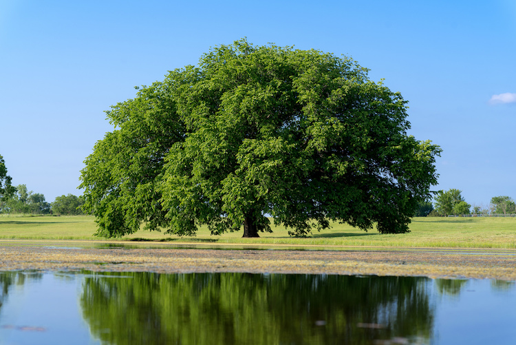
In landscape and architectural photography, the sky is a really important element. It has to be an exciting part of the image. Boring skies translate into boring images, and amazing skies can also translate into solid images because it will make the viewer forget about the foreground or middle ground if they are not that beautiful.

Three different methods for selecting the sky

Depending on the image and the subject, making precise selections of the sky can be quite difficult. That is why is this tutorial, I will show you three different ways to select the sky in three different situations

Select sky image1

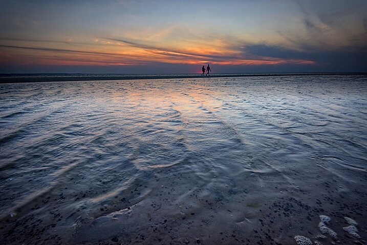
I replaced the sky in this image, and I love the results.

I personally love to play around with my skies and most of the time it is a fake one. Sometimes I am able to be at one location just for a day and if I get a solid image with no clouds, I will not hesitate to replace it.

Do not hesitate to try crazy things with your images, photo manipulation is really fun

Select sky image2

I wanted to get some crazy result, so I added an image of the Milky Way behind the Eiffel Tower.

Be careful to use royalty free images with no copyrights, there are so many websites where you can pick images of skies without having any problems afterward.

Method #1 – Using the quick mask tool

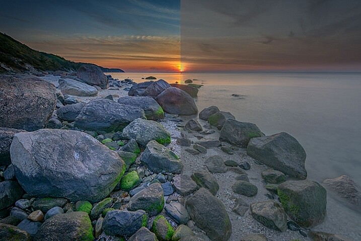
This is the easiest of the three ways, and the most used. We will be working on an image with a blown out sky and a subject with easy contours.

Select sky image3

The sky in this image will be easy to select because of the simple contours of the monument.

The first thing you need to do is open your image in Photoshop and duplicate the layer to avoid any destructive editing. You can always go back to the original layer if you make any mistakes. Do this all the time, it will save you a lot of time and hassle if you make a mistake.

Start by selecting the Quick Selection Tool on the tool’s panel, make sure to increase the size to facilitate the selection.

Select sky image4

Then simply click on the sky starting at one end. In this case, I started from the bottom left and dragged all the way to the other end (bottom right). With these kinds of images, the selection will work 90% of the time on the first try and it should be pretty accurate. Do not forget to select the other parts of the sky, pay attention to your image and look where there is some sky left that is unselected.

Select sky image5

Select sky image6

Once you have your selection, you want to click on refine edge to make it more precise (Refine Edge is located on top of the Photoshop window). You will have multiple viewing options, a good one to use is On Black.

Select sky image7

On the edge detection section, click on Smart Radius, then play around with cursor until you find the right radius. This will vary from image to image.

Select sky image8

When you are satisfied with your selection, press on OK and you will go back to your image with your selection. Make sure you are still using the quick mask tool. To save your selection, simply right click and pick save selection. You just need to name it and press OK to confirm. Your selection will be saved and you can use it whenever you want by clicking on select on the top of the Photoshop window then choosing load selection at the bottom

Select sky image9

Method #2 – Using Color Range

This selection is also quite easy to do, but it is very precise. We will basically select the sky while sampling a color. So logically your sky has to be uniform, these types of selections work really well during the blue hour or on clear days, with a vivid blue sky.

Select sky image10

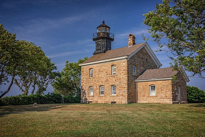
We will be working on this image, the sky is completely blue and easy to select. It would be much more difficult to do this selection with the quick mask (Quick Selection) tool because the image is quite dark and the contours of the building are quite difficult to separate from the sky.

Start the same way as the first image by duplicating the layer. You then want to go to select on the top of your window and select color range.

Select sky image11

A small window will pop up, and the only thing you need to do is click on the sky in the main layer (not the pop up window) with the eye dropper tool (it will be set automatically as your cursor). Once you have selected your color, you will see a mask being created on the small color range window. Remember that white reveals and black conceals, so whatever is white is being selected: That will be your selection.

Play around with the fuzziness cursor on top of your selection in the color range window to decide how much you want of the sampled color to be selected.

Select sky image12

Select sky image13

Once you are satisfied with your color range selection, press OK. Redo the same thing as the first image with the refine edge tool, then finish off by saving your image.

Select sky image14

Select sky image15

This is the final result with the sky replaced.

Method #3 – Using a Levels Layer to Create a Luminosity Mask

This kind of selection is a bit more difficult to do. Use it when you don’t have only one color in the sky or subject has complex contours that will be difficult to separate from the sky.

This is quite advanced but it’s very easy once you understand how it works. It always works, and if it doesn’t do 100% of the job it will at least do about 90% of the work need. The rest can be completed with a brush and adjusting your mask after you are done with the first selection.

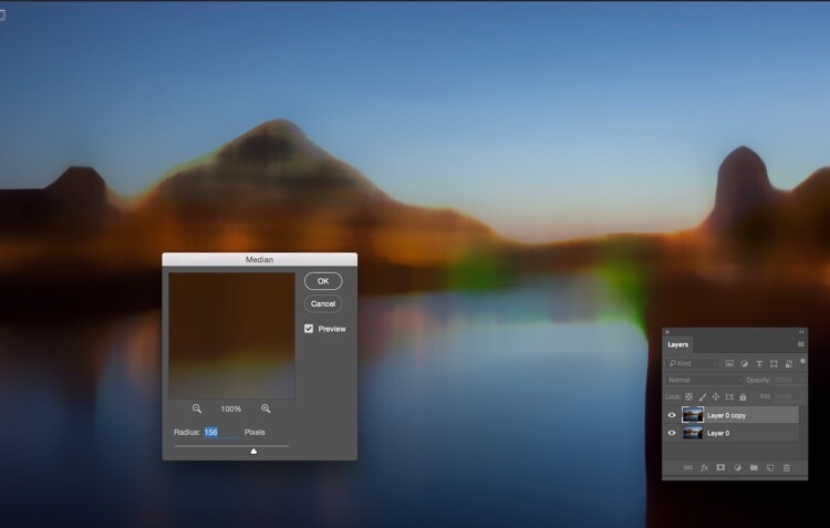
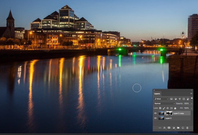
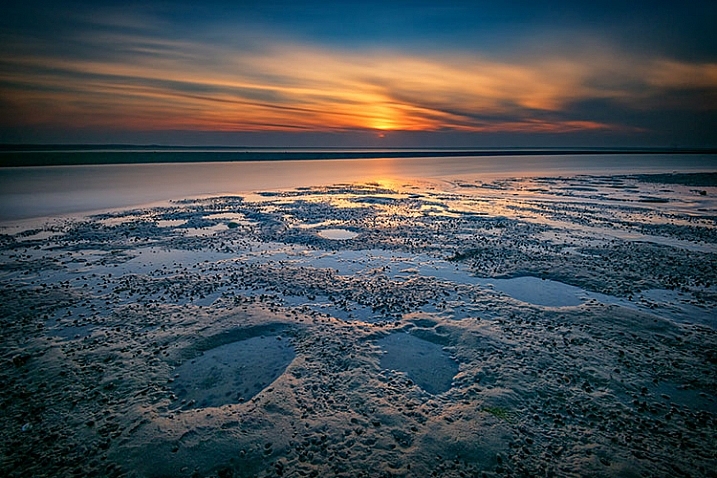
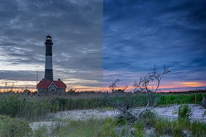
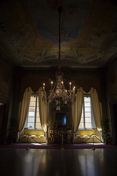
We will be working with this image and as you can see, the sky is quite dark just like the buildings so it will be difficult to use the quick mask tool. The colors in the sky are mixed between blue, orange and white (yes these are blown out highlights).

Select sky image16

What we are going to do is quite simple. We’re going to create a luminosity mask selecting only the highlights, in other words, the brightest pixels of the images. The highlights correspond to the sky so that’s exactly what we want.

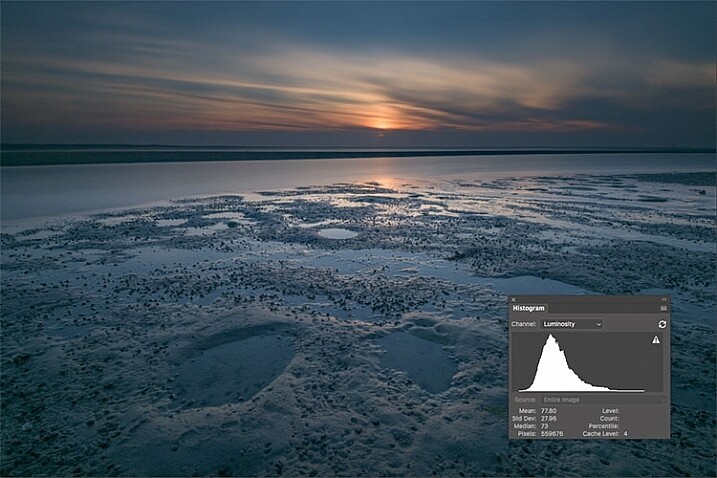
To make the selection easier we’re going to convert the image to black and white so we have an easier visual. We’re basically going to crush our whites and blacks to have a nice separation between the shadows and the highlights. We’ll be doing this using the levels layer adjustment, we are also going to remove all the mid tones from our image. Don’t forget to duplicate the layer first.

Select sky image17

Select sky image18

After converting your image to black and white and creating a levels layer, you’re going to play around with the three sliders to have a white sky and everything else black. White reveals and black conceals so your selection will be in white.

The three cursors should all meet at one point, you have to play around and see which selection works best for your image. You’re basically creating a luminosity mask.

Select sky image19

Select sky image20

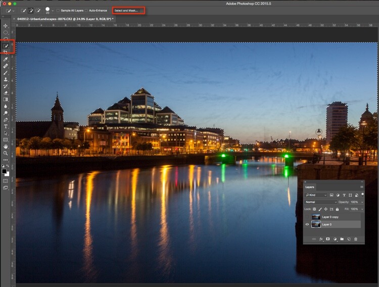
After finding the sweet spot, you just need to close your levels layer and go to channels. Pick any channel, click on it, and type Command/CTRL + A to create the selection from the levels layer you just created.

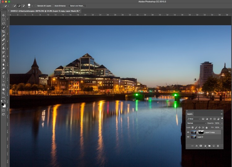
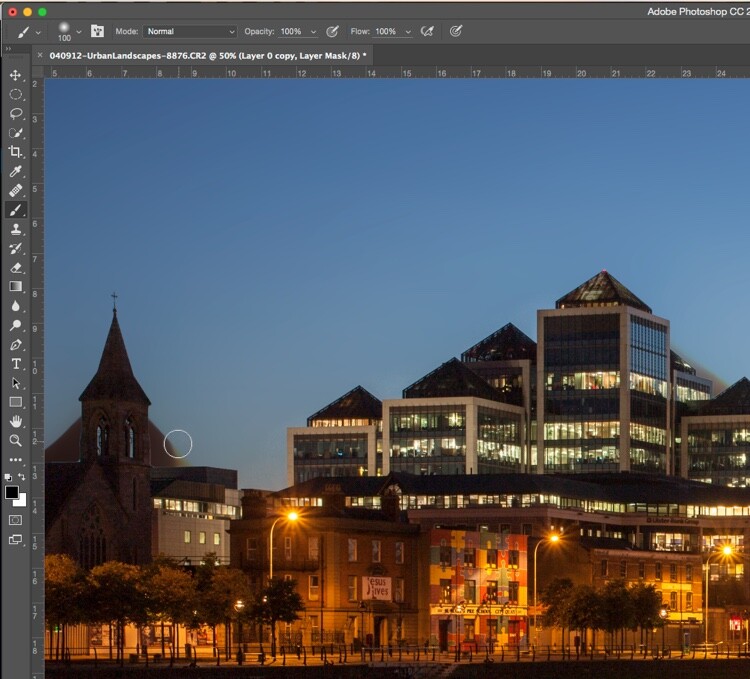
Once you have done that you can delete the levels and black and white layers to go back to your original image. Your selection is still going to be there. After that it is pretty much the same thing, click on refine edge on top of the Photoshop window and play around with your radius until you get the perfect selection.

Select sky image21

Select sky image22

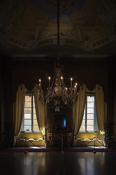
This is the final image after some adjustments, I used the sky selection to add colors without affecting the rest of the image.

Select sky image23

Whether you want to just edit or completely replace the sky is up to you. But, I hope that gives you some techniques that you can apply to your landscape and cityscape photography to perk up the sky.

Do you have any other methods you use for making a sky selection?

googletag.cmd.push(function() {
tablet_slots.push( googletag.defineSlot( “/1005424/_dPSv4_tab-all-article-bottom_(300×250)”, [300, 250], “pb-ad-78623” ).addService( googletag.pubads() ) ); } );

googletag.cmd.push(function() {
mobile_slots.push( googletag.defineSlot( “/1005424/_dPSv4_mob-all-article-bottom_(300×250)”, [300, 250], “pb-ad-78158” ).addService( googletag.pubads() ) ); } );

The post 3 Ways to Make a Sky Selection Using Photoshop by Yacine Bessekhouad appeared first on Digital Photography School.


Digital Photography School

 
Comments Off on 3 Ways to Make a Sky Selection Using Photoshop

Posted in Photography


How to Quickly Remove Dirt Spots Using Median in Photoshop

07 Sep

You’ve rolled out your white background for your shoot; whether it’s vinyl or paper. It’s a bit dirty from shoes, but you’re under pressure to get the shoot done, so you carry on regardless. When the shoot is over and the photos are back on the computer, that’s when you see how bad it really was. The scuff marks, the footprints, the stray hairs, these are going take ages to clone out. You’re sorry now that you didn’t clean it up, or cut off some paper. Sigh. Better just getting going on the processing.

But wait! There’s a better way.

It doesn’t have to all be cloned out. There’s an easy way, using one of Photoshop’s lesser known tools called Median. Median is a form of blurring, where groups of pixels get changed to the middle value of the pixels. Higher values are reduced, lower values are increased, averaging out the values.

Steps for cleaning up your white background

So your floor has specs of dust, hair, and just general footprint dirt on it.

cleaning-a-white-background-1.jpg

Step one – duplicate layer

Duplicate your background layer by dragging it on to the New Layer icon at the bottom of the Layers panel.

Cleaning a white background 2

Alternatively, use the shortcut Command/Control + J. If you’ve got a set of layers, then use the shortcut Shift + Cmd/Cntrl + Option + E to stamp them into a new layer.

Step two – Median

Go to Filter>Noise>Median.

cleaning-a-white-background-3.jpg

Move the Radius slider until the dirt disappears. I’ve used 10 here.

Cleaning a white background 4

Step three – apply a layer mask

If you’re not familiar with Layer Masks, you can use the Erase brush to bring remove the areas you don’t want blurred, but I recommend using Layer Masks.Cleaning a white background 6

A white Layer Mask reveals everything on the layer, while a black mask conceals the contents of the layer. You want a black mask for this layer, so hold down the Option key on Mac (Alt for PC), and click the New Layer Mask icon at the bottom of the Layers Panel. A black mask appears on the layer and the Median filter is concealed.

Next, select the Brush Tool (or use the shortcut B), then hit D for Default colours. Then use the shortcut key X to swap foreground and background until the foreground (i.e. the top swatch in the tools panel) is white. With a soft brush, paint over the dirt to reveal the Median filter’s affect. Don’t go too close to the edges of your subject. If you make a mistake, press X to swap the brush to black, and paint it back to hide that area again. This is the beauty of Layer Masks, you can reveal or conceal over and over again without having to undo (this is called non-destructive editing).

cleaning-a-white-background-5.jpg

This trick isn’t limited to backgrounds. You can be use it on any areas of continuous tone, for a quick result. I’ve had to use it on skies, where I’d accidentally used a dirty sensor cleaning brush and left marks on the sensor. Here’s how you could fix such an issue using Median.

Fixing a dirty sky with Median

As with the background cleaning technique, start by duplicating the background layer. You can see the issue quite clearly in the sky (below), and in the smooth parts of the river.

cleaning-a-sky-1

Next, apply Filter>Noise>Median. The issue will need a far higher Radius than the background required.

cleaning-a-sky-2

Select only the sky area

Next, hide the Median layer by clicking on the eye on the layer, then select the layer underneath. From the tools panel, choose the Quick Selection tool or press W. From there, drag the cursor along the sky, close to the buildings. Because of the hard edges against the sky, the selection is made easily.

cleaning-a-sky-3

Next click “Select and Mask” (outlined in red above). You’ll see the sky clearly, and the rest of the image faded. Brush the cursor over the tips of the buildings, street lamps and other things that need to be protected from the blurring effects of the Median filter. Press return (enter) to create a selection with marching ants visible.

Turn the visibility back on for the Median layer. Press the Layer Mask icon in the Layers panel to create a mask.

cleaning-a-sky-4

You will see areas where the Median filter has blurred edges, so you’ll need to brush the mask with a black brush to hide these. You don’t need to be precise, using a large soft brush along the edge of the buildings will make it a quick job.

cleaning-a-sky-5

Remove the Median where it has blurred the edges of the city buildings.

The final part is to go along the water with a white brush, set to 50% Opacity, to hide the dirt in the water.

cleaning-a-sky-6

The final image looks far better than the original.

cleaning-a-sky-7

Much quicker than manually cloning the dirt out, right?

Have you tried this method, how did it go? Do you have another fast way of removing dirt? Please share your thoughts in the comments section below.

googletag.cmd.push(function() {
tablet_slots.push( googletag.defineSlot( “/1005424/_dPSv4_tab-all-article-bottom_(300×250)”, [300, 250], “pb-ad-78623” ).addService( googletag.pubads() ) ); } );

googletag.cmd.push(function() {
mobile_slots.push( googletag.defineSlot( “/1005424/_dPSv4_mob-all-article-bottom_(300×250)”, [300, 250], “pb-ad-78158” ).addService( googletag.pubads() ) ); } );

The post How to Quickly Remove Dirt Spots Using Median in Photoshop by Sean McCormack appeared first on Digital Photography School.


Digital Photography School

 
Comments Off on How to Quickly Remove Dirt Spots Using Median in Photoshop

Posted in Photography


4 Tips for Using for Live View to Get Sharper and More Creative Images

02 Sep

Live View versus optical viewfinder on your DSLR, pros and cons?

Pascal

By Pascal

If you shoot with a DSLR you probably use the same method for taking pictures that most people do, holding the camera up to your eye and looking through the viewfinder before snapping the shutter button.

This tried-and-true method has several benefits, including letting you see precisely what you are going to take a picture of before you click the button. Also, allowing you to track fast-moving subjects without any lag time, and even stabilizing the camera due to the fact that it’s being held up against your face instead of away from your body.

Getting this shot using the optical viewfinder wouldn't have been impossible, but it would have been much more difficult.

Getting this shot using the optical viewfinder wouldn’t have been impossible, but it would have been much more difficult.

However, the Live View function that is built into most DSLR cameras has a few tricks up its sleeve that can greatly benefit you as well. While not useful in ever single photographic situation, Live View certainly is worth a second look if you are the type of person who normally casts it aside in favor of the traditional viewfinder.

#1 Make sure your subject is perfectly focused

When you look through the optical viewfinder on your camera, you will see an array of rectangles or dots which each represent points on which your camera can focus. This is a result of your camera’s phase detect focusing system which is present in nearly every DSLR. While it usually works just fine, there are situations in which it can present a bit of a problem.

For one, the subject on which you are focusing can sometimes be outside the boundary of your focusing points, which makes it quite difficult to get it tack sharp even with something like the focus-and-recompose technique. Also, even with using the built-in focusing points it’s not always a guarantee that your subject will be completely in focus, especially if it is very far away like when shooting landscapes or scenic vistas.

Live View helped me get this flower focused just how I wanted, and instead of laying in the mud I used the flip-out screen to help me compose the picture.

Live View helped me get this flower focused just how I wanted, and instead of laying in the mud I used the flip-out screen to help me compose the picture.

Zoom-in on Live View

Live View is the magic bullet in these situations, as you can use it not just to frame your shot, but to zoom in close on a specific area to make sure it is focused. Think of this as though you were holding a magnifying glass up to your camera’s viewfinder when focusing on your subject, and using that as the basis for judging whether it is tack sharp or just a bit fuzzy. This obviously works best if your camera is firmly attached to a tripod, but even if you just set it on a solid surface such as a shelf, rock, post, or other object, you should be fine.

Live View can be a good way to make sure your subjects are tack sharp and perfectly focused.

Live View can be a good way to make sure your subjects are tack sharp and perfectly focused.

Each camera handles the zoom-in function a bit differently, but for most DSLRs there will be an option in one of the menus to enable a button on your camera to zoom in during Live View, and even set the percentage of zoom which tells you how much it will magnify the image. If your subject is not moving, and neither is your camera, this technique is one of the best possible ways to make sure everything is tack sharp precisely how you want it to be (using manual focus in this instance can be helpful also).

#2 See previews of camera effects in realtime

One fun trick that many DSLR manufacturers have added to their cameras is the ability to do various types of effects like selective coloring, miniature, and black-and-white, among many others. Think of them as though you are adding Instagram filters, but in realtime, as you are taking your pictures instead of on your phone afterwards.

Using Live View as you activate various scene modes is a fun way to experiment with different types of creative image effects. It also has the added bonus of allowing you to play around and see how the options affect your photography before you even click the shutter.

A common camera effect is "miniature," which mimics a tilt-shift lens. It's fun to play around with these built-in effects using Live View which shows you a preview of what the final image will look like as you compose it.

A common camera effect is “miniature,” which mimics a tilt-shift lens. It’s fun to play around with these built-in effects using Live View, which shows you a preview of what the final image will look like as you compose it.

Some photographers frown on this type of creative expression, and prefer to leave these effects and scene modes to Photoshop, where things can be endlessly controlled, changed, and tweaked to perfection (often ad nauseam). But, my own personal stance is, if you’re making pictures you enjoy by using simple in-camera effects, then why not keep doing it?

Some of the built-in modes are a little cheesier than others, and you usually can’t shoot in RAW format. But using Live View to preview the different sorts of photography effects you can explore, is a great way to try something new and add a little spark back to your creative juices at the same time.

#3 Depth of Field preview

This one piggybacks pretty well off of the previous item, but I wanted to list it separately because it is so useful on its own. When you change the aperture and focal length of your lens, you are also changing the depth of field, or area that is in focus. It’s a difficult concept to understand since it involves several different variables, including how close you are to your subject and how far away is the background.

This confusion can be compounded by the fact that your optical viewfinder doesn’t really show you what to expect when you click the shutter button. Some DSLR cameras have a Depth of Field Preview button that allows you to close down the aperture and see what it will look like when you take a photo (it also gets dark if you use a small aperture), but another way to do this is by using Live View.

It really helped to see a preview of the depth of field by using Live View when composing this image.

It really helped to see a preview of the depth of field by using Live View when composing this image.

How it works

When you look through the viewfinder on a DSLR camera you are seeing through the lens while it is opened to its widest possible value. But, when you click over into Live View the aperture blades close down to the value you’ve specified, or that which the camera thinks is appropriate, depending on the shooting mode you are using.

This makes it possible to see precisely what the picture will look like when you press the shutter button. So, if you focus on an object while in Live View, you will see a more accurate representation of the depth of field than looking through the viewfinder. This is incredibly useful when shooting macro photos, because it’s difficult to understand just what is in focus and what is not unless you can see it yourself using Live View.

Depth of field can be extraordinarily thin when shooting macro pictures, and using Live View to see a preview of the final result is a good way to get the photo to show up just how you want.

Depth of field can be extraordinarily thin when shooting macro pictures, and using Live View to see a preview of the final result is a good way to get the photo to show up just how you want.

#4 Tap to focus

One final trick that Live View offers, is the ability to actually use it for the act of focusing itself. As more cameras start implementing touch screens, manufacturers like Canon have started allowing users to tap on the screen itself to actually focus the camera, much in the same way you do on your mobile phone.

While this feature is not available on all DSLR cameras, and though some with touch screens don’t have focusing enabled, if you do have a camera that allows you to tap-to-focus you might find it incredibly useful and well-worth your time. This won’t do you any good if you are shooting sports, action, or wedding photos, since the touch-based focusing isn’t as quick. But if you are out shooting casually it’s something you might really enjoy trying.

It even has some advantages over traditional viewfinder-based focusing if you are shooting at extreme angles, such as very low to the ground. More and more cameras are offering flip-out screens so you can swivel it, instead of crouching down, and then tap it to lock focus.

If you have a touchscreen, using Live View can be a great way to make sure your subject is focused exactly how you want by simply tapping the area you want to be in focus.

If you have a touchscreen, using Live View can be a great way to make sure your subject is focused exactly how you want by simply tapping the area you want to be in focus.

Summary

These are just a few of the options available to you if you use Live View on a DSLR. If you are more of a traditional shooter who prefers the optical viewfinder I hope you at least give Live View a chance. It’s not going to be the best option in every situation, but you may find it to be more compelling and useful than you realize.

If you do like shooting in Live View and have your own tips to share, please leave your thoughts in the comments below!

googletag.cmd.push(function() {
tablet_slots.push( googletag.defineSlot( “/1005424/_dPSv4_tab-all-article-bottom_(300×250)”, [300, 250], “pb-ad-78623” ).addService( googletag.pubads() ) ); } );

googletag.cmd.push(function() {
mobile_slots.push( googletag.defineSlot( “/1005424/_dPSv4_mob-all-article-bottom_(300×250)”, [300, 250], “pb-ad-78158” ).addService( googletag.pubads() ) ); } );

The post 4 Tips for Using for Live View to Get Sharper and More Creative Images by Simon Ringsmuth appeared first on Digital Photography School.


Digital Photography School

 
Comments Off on 4 Tips for Using for Live View to Get Sharper and More Creative Images

Posted in Photography


How to Tell a Story with Portraits by Using Creative Composition

21 Aug

In this article, we will explore new ways of using composition and creative framing to tell a story in your portraits. We’ll do so by understanding the marvellous ways our brain (as viewers) construct a sense of story.

The common principle of the techniques I will describe here, is that they are all based on our mind’s ability to fill in missing gaps of information. A skill that helps us survive in a world of uncertainty.

F11A2018

Two things to note about creativity before we start

Skill, is not just a talent: Just like working on the flexibility of a muscle, I believe we can work on our creativity, with the “muscle” being our vision.

Being creative for the purpose of being creative: Creative compositions should be a vehicle for a purpose – an emotion or a story you want to evoke in the image. If you choose to add creativity to your images, just to be more creative, it will be an empty gimmick.

Half close up portrait – a full story

By showing only half of a close-up portrait, you stimulate the viewer’s mind and almost force it to delve into the image. We do so by activating their mind’s need to fill in gaps of missing information. This ability is rooted in us since ancient times, from which we evolved to understand that the two blurry spots between the trees, could be the hidden face of a tiger.

F11A6628

Good to know:

For best results, you can practice framing this kind of composition by using the crop tool in your editing software. Once you become comfortable with this technique (and framing); it will be easier to achieve a “half close-up portrait” in the field, without the need to crop it in the post-processing stage.

This kind of framing is like an exclamation mark, which one cannot ignore. Therefore, use it only on the most interesting faces, and not on every portrait.

F11A8534

Environmental portrait – a person in context

For me, this the most challenging and rewarding portrait framing style, the environmental portrait. This shows not only the person, which is the hero of your image, but also his or her environment: home, work place, country, etc. By doing so, you use the mind’s ability to conclude and understand a situation by connecting pieces of information.

14 the sleep

Good to know:

The biggest challenge in this type of composition is the balance between the main figure (hero) and environment. Keep in mind that the main figure must be dominant, and not overtaken by the background. Use light, color, and sharpness to make your subject significant.

Using a wide lens (below 50mm) is recommended for the environmental portrait framing, as it will allow you to capture the environment of your hero, even in small spaces.

F11A4931

Detail portrait – telling the story with small details

Like with the half portrait technique, in the detail framing we use the brain’s ability to fill in the gaps, by showing only a small fraction of the entire story. For a good detail shot, choose some with a connection to your subject. It can be a connection of similarity or difference. For example: take a close-up shot of his or her hands, shoes, the reading books on the shelf, the subject’s regular chair or smoking pipe, you name it! As long as this object, represent something which is bigger than the object itself.

12970960 1147522381976706 3379301587067512747 o

Good to know:

A good place to start is by examining your subject from head To toe. Looking for anything that other people might miss in that person. Did you spot anything special? Like a unique piece jewelry, a tattoo, or just a hole in their shoe.

Some of my best ideas came from my subjects. Ask your subject to show you an object to which he or she feel a strong connection. You do not even need to have any human presence in the detail shot, as long as the object represents or tell us something about its owner.

IMG 4005

Kuleshov effect – creating a meaning by interaction

In this technique, based on the groundbreaking experiment by the Soviet filmmaker Lev Kuleshov, we will use the brain’s ability to derive meaning from the interaction. Kuleshov demonstrated that the audience constructs the story not only by the content, but also by the order in which the images appear, and the connection between them.

In the experiment, Kuleshov used two different shots, which he put in sequence one after the other. The first shot, a close-up shot of the face of silent film actor Ivan Ilyich Mozzhukhin, remained the same throughout the experiment, while the second shot was replaced with every round of projection; a plate of soup, a dead young girl, a woman on a divan (sofa).

The audience praised the actor’s ability to express different feelings such as sadness and even hunger, using only his facial expressions, without knowing that they watched the same shot over and over, and the only thing that was changed was the second image.

Page 18

To use this effect in your work, just place two images side by side and try to evoke a connection between them. In the example, I combined between the portrait of Net, which I did with the half close-up composition, with an image of a swirling sea. Where does it take you?

Good to know:

You will be amazed by the power of creative composition. Challenge your audience. Don’t be afraid to create a connection which is too complicated to understand.

A good creative exercise which you can do is by collaborating with a different photographer. You will provide the first image, he or she will provide the second. In there you will have a connection, not only between the two side-by-side images but by two different points of view.

The author would like to thank Nicholas Orloff for his assistant in writing this article.

googletag.cmd.push(function() {
tablet_slots.push( googletag.defineSlot( “/1005424/_dPSv4_tab-all-article-bottom_(300×250)”, [300, 250], “pb-ad-78623” ).addService( googletag.pubads() ) ); } );

googletag.cmd.push(function() {
mobile_slots.push( googletag.defineSlot( “/1005424/_dPSv4_mob-all-article-bottom_(300×250)”, [300, 250], “pb-ad-78158” ).addService( googletag.pubads() ) ); } );

The post How to Tell a Story with Portraits by Using Creative Composition by Oded Wagenstein appeared first on Digital Photography School.


Digital Photography School

 
Comments Off on How to Tell a Story with Portraits by Using Creative Composition

Posted in Photography


Tips for Abstract Macro Photography – Using Texture and Light

21 Aug

Macro photography opens up a whole new world to those who are willing to get up close. There is no shortage of subject matter to photograph, but in this article we’ll look at the abstract world of texture and light.

Rusted paintwork of a Dodge Campervan

Rusted paintwork of a Dodge Campervan

The beauty about these subjects is that they can be shot anywhere; in your backyard, on your street, or in any part of your city. Textures are everywhere. They are really easy to find, and working with the light properly will help you to highlight the grittiness and tactile effect of textures. Ideally, a macro lens would be perfect to use for this type of photography, but a good 50mm or 85mm can work too. A macro lens gives you the bonus of being able to focus really close, normal lenses may not be able to get as close as you want.

My view is that even if you don’t have a macro lens, give this a try anyway, a new tiny world of wonder awaits you!

What is Abstract Macro Photography?

Abstract photography, in general, is about representing a subject in a non-literal way. The focus of abstract photography is more about colour, shape, and texture, as opposed to the literal representation of the subject. Abstract macro photography, takes this to the next level by enabling you to get even closer to your subject, and therefore also able to be more abstract in a sense. In this article, we are concerned with texture and showing that in our images.

The same guidelines around composition apply, you can use the rule of thirds, curves, and lines, to draw the viewer into your image. The difference is that the subject may not be immediately recognizable, your centre of interest might be a colour, or the curve of a flower. So for abstract macro photography, you will need to think a little differently.

Cracked paint on a car bumper

Cracked paint on a car bumper

What will I need to do abstract macro photography?

A macro lens will work best. A 50mm or 85mm lens will work pretty well too, you may not be able to get as close to your subject though, so be aware of that (or you can try close-up filters). You will need a tripod too, or some sort of support for your camera, as shooting macro images handheld is really difficult and can be frustrating.

What can I photograph?

Textures are all around you. Think of the rusted lamppost at the corner of your street, the peeling paint on the wall of the shed, or even the cracked paint on the bumper of a car. They are everywhere.

You need to spend time looking at all the surfaces around you, then take some test shots to see if they work. The key thing to be aware of when shooting textures is how the light is affecting the scene. Macro photography is like a micro landscape image. It has a foreground, middle-ground and background. There are colours, shapes, and of course textures in the image.

When you look at the texture, take some time to study where the light is coming from, and how it is affecting the image. Try a few different angles to see what works best in the scene. Using side light (i.e. light some from the left or the right) will accentuate the texture in your image. Side light will give your image a three dimensional quality, so try and get some directional light on your scene if possible.

Reflections from a security gate

Reflections from a security gate

Find your texture, and use this as a workflow

  • Work on building your composition – is there a particular part of the texture you want to emphasize, try and get some side light if possible?
  • Use manual focus to bring even a small part of your image into sharp focus, this sharp area will be the natural focal point for your viewer.
  • As an abstract image, you don’t need a subject as such, but the texture and the colours will be the reason for the image, so make sure the subject matter is interesting.
  • Check the histogram to make sure that you are exposing your scene correctly.
  • Capture the shot.
  • Try shooting the same subject from different angles, and maybe even with a different centre of interest.
  • Take as many images as possible, from different angles, with different focal points.

The beauty about this type of photography is that you have an infinite number of subjects. It is really easy to get going once you start looking around you, at what there is to photograph.

The beauty of cracked window putty

The beauty of cracked window putty

Have you tried abstract macro photography before? If not give it a go and share some of your images in the comments below. See if we can guess what you photographed.

googletag.cmd.push(function() {
tablet_slots.push( googletag.defineSlot( “/1005424/_dPSv4_tab-all-article-bottom_(300×250)”, [300, 250], “pb-ad-78623” ).addService( googletag.pubads() ) ); } );

googletag.cmd.push(function() {
mobile_slots.push( googletag.defineSlot( “/1005424/_dPSv4_mob-all-article-bottom_(300×250)”, [300, 250], “pb-ad-78158” ).addService( googletag.pubads() ) ); } );

The post Tips for Abstract Macro Photography – Using Texture and Light by Barry J Brady appeared first on Digital Photography School.


Digital Photography School

 
Comments Off on Tips for Abstract Macro Photography – Using Texture and Light

Posted in Photography


How to Bump Your Photography up a Level by Using Film Style Limitations

19 Aug

Get 50% off Tom’s ebook Ang’s World – A Life in Photography eBook, now only until July 26 at Snapndeals.

One of the most important skills in photography is pre-visualization. The idea is that before you capture an image in the camera, you have a clear idea in your mind of what it’s going to look like. You preview the image before you shoot it. Colour or black-and-white in rendering? Rich in tones or pale and soft? Misty-blurry in feel or so tack-sharp you might cut your eyes on it? What – exactly – will your image look like?

One of the early objections to digital photography was that it wasn’t really photography because there was no negative; no sense of what kind of picture you’re making. In fact, with digital, there’s not much at all, apart from data in the form of a very, very long row of zeroes and ones. You know what kind of image you have only when you use that data to drive a screen (on camera or at computer) or a printer. And before you get there, you have to process the image. If you feel feel isolated from the process of creating the image, it’s no wonder.

01 DSC3714
The most basic in-camera processing setting is your exposure. For this nature shot in my back-garden (above), I over-exposed by two stops. This pales out the colours, fills the shadows nicely to get the effect I envisaged, all suffused with light.

If you feel a bit disjointed from your images or from your camera, one way back is to try some old-school photography. If you feel your photography is getting a bit jaded, you can re-discover its joys by committing to a treatment or filter effect at the time you take the photograph.

You simply think, feel and shoot as if you’re using film.

I love this way of working. There are two simple steps. You choose an in-camera processing or filter effect (which, of course, produces JPEG files), and you do not use the screen to review your images (it’s good practice anyway). So, let’s set to the Toy Camera option – this vignettes the image heavily (darkens the corners), under-exposes, and adds strong saturation. And off we go:

02 DSC43152013
This indoor scene on our dining table (above) is rich in a surreal way, because the strong colours in the centre and heavy vignetting forces the viewer’s attention to the centre. The very shallow depth of field – from using a f/2 aperture – also helps make the space tensioned.

One reason some photographers have returned to work with film, is that the process of envisioning how the image will look before clicking the shutter, creates a sense of connection with the subject. You feel more involved with the process, and that’s an important part of the fun of photography.

03 DSC6410 2014

This portrait is a rich-toned black-and-white: it takes a shocking amount of processing in-camera, but comes out with deep, sharp tones that is surprisingly flattering. It works well in mixed hard and soft lighting.

There’s another advantage to camera processing – if you work this way, you often don’t need to touch the image before being able to use it. When I photograph for my books, I produce thousands of images, and have to submit as many as 1,500 images to the art department. You won’t find me messing about with the images more than I need to, I have a book to write! So images that pop straight out of the can into the book are what I aim for, like this one.

04 DSC9708 2

This late evening scene in Auckland, New Zealand comes straight out of the camera as rendered by the Toy Camera effect. I did try out some adjustments, but quickly decided it was best left as shot.

04A DSC14092014

Garden furniture left in the rain came out glowing with the Toy Camera filter, which often brings out a mood that is slightly world-forsaken. I like using the filter with the lens wide open, to leave as much as possible softly blurred.

So the question is; do you know what your image will look like before you capture it? If commitment scares you, one approach is to at least think ahead to the post-processing that you’ll do. Instead of blundering around trying one effect or adjustment after another, you will go straight to the effects that you want. Saves a LOT of time.

Or you can do as I’m showing here, and bravely go for it. More jeopardy equals more fun! And that’s exactly what you’d have done with film. You load the camera with film – say slow black-and-white for fine grain, or fast colour for low-light work. 24 or 36 exposures, and you’re stuck with it until the last frame reels off, come rain or shine, action or still-life. Many photographers have found fun in photography again by embracing the risks of film-like limitations.

05 IMG 1367

I’ve used the Hipstamatic app on my iPhone since the beginning, as I enjoy the commitment to the image coming out according to the film and lens combination you pick. This is one of my favourite combinations – the Libatique lens – and the Dream Canvas film.

Just like learning to work with a fixed focal length, what looks like an imposition and inhibiting feature, can actually free you artistically. For example, knowing that I’ve chosen a filter that gives a particular soft focus but richly coloured look, means that everyday scenes become mysterious washes of colour and tone. Without that effect, I might not have thought of making this shot.

06 IMG 1446

This is a Hipstamatic shot using D-Type Plate film with the Jane lens, processed for increased saturation.

A mundane scene like the mess on a chopping board just looks ordinary in colour. But in black-and-white, with a bit of fake Tintype effects, and the image moves into another arena.

Committing to a treatment challenges you, and changes the way you look at things. Some photographers say they can see compositions only in black-and-white. If you set your camera to shoot black-and-white, you will find that you photograph different things from your usual subjects. You’ll probably shoot them in a different way too. If you’re feeling especially brave, you can set your camera to apply an art filter. I like using the Illustration filter, which pumps up colours and draws a line on sharp edges. It works neatly with nature.

07A__DSC2691A
A moderate wide-angle view of a nature reserve. (Looks pretty but actually it’s over-run with invasive foreign species.) In the soft light, I thought the image would come out flat and lacking in contrast. So I decided to add some filter fizz.

07B DSC02690 2014

With the illustration filter applied, all the important features have been brought out; the trees, the slope of the hill, the bright lilies, and lily leaves. This image came straight out of the camera, with no post-processing at all.

You don’t have to be so drastic though. One useful in-camera effect available in several models, is built-in HDR (High Dynamic Range). In fact, what the effect does should be called tone-mapping. It makes three or more rapid-fire shots of the subject, at different exposure values. Then, in camera, it combines them so that the image is predominantly filled with mid-tones. Now if you try this on a moving subject, you get weird double-fringed effects. More in-camera fun!

08 DSC27672014
Three separate exposures of trees waving in the wind, even when shot at a high rate of fire, will create blurred or fringed images. Then tone-mapping them – processing to bring out mid-tones – gives a half-photographic, half-graphic effect. (Post-processed to reduce brightness and increase saturation.)

All this works, because pre-visualization makes you see in a different way. What happen is that the camera actually reprograms the way you see. That makes a lot of sense, if you think about learning new skills. Let’s take martial arts, for example. Before you start classes, you just see people punching, kicking. Once you learn more about it, you start to get your eye in – you see when someone’s leaning too far forward, or that there’s no power in a strike. It’s exactly the same moves as before, but your now-tutored eyes see more; they see differently.

In photography, you may start to see relationships, not objects. You pick out shapes and aren’t distracted by textures. Or you may see small details which before you’d overlook. In short, committing to one look for your images can invigorate your seeing, which will inspire your photography to greater, new levels.

09 IMG 4425 2015
An extravagant flower display at a hotel reception looks charming when given a look of aged film, complete with old-world border given by Hipstamatic Libatique lens with Ina’s 1969 film options.

Get 50% off Tom’s ebook Ang’s World – A Life in Photography eBook, now only until July 26 at Snapndeals.

googletag.cmd.push(function() {
tablet_slots.push( googletag.defineSlot( “/1005424/_dPSv4_tab-all-article-bottom_(300×250)”, [300, 250], “pb-ad-78623” ).addService( googletag.pubads() ) ); } );

googletag.cmd.push(function() {
mobile_slots.push( googletag.defineSlot( “/1005424/_dPSv4_mob-all-article-bottom_(300×250)”, [300, 250], “pb-ad-78158” ).addService( googletag.pubads() ) ); } );

The post How to Bump Your Photography up a Level by Using Film Style Limitations by Tom Ang appeared first on Digital Photography School.


Digital Photography School

 
Comments Off on How to Bump Your Photography up a Level by Using Film Style Limitations

Posted in Photography


How to Shoot Real Estate Photography Using Natural Light

14 Aug

There’s something about the way sunlight illuminates a room. The light pours over surfaces, metal fixtures gleam, wood detail shines, and the edges of furniture upholstery glows. Natural shadows produced by different objects convey a sense of depth. A naturally-lit image gives you a feel for what it would be like to see the space in person.

1 dining

The following will give you a basic understanding of equipment needs, how to manage contrast and mixed lighting in a room, and HDR shooting techniques to get you started doing real estate photography using natural light.

Equipment

Shooting with natural light has the benefit of a short equipment list. A camera, tripod, and wide angle lens is all you need.

  • Camera: A DSLR with auto-bracketing will increase your shooting speed and ease.
  • Tripod: Your tripod should be sturdy enough that your camera will stay put if you need to manually adjust camera settings, while shooting a series of bracketed images.
  • Wide Angle Lens (with lens hood): For cropped sensor cameras, the Tokina 11-16mm is a fantastic choice for real estate photography. The Canon 10-22mm is also a great option. You’ll be able to handle just about any real estate shooting situation with either of these aspherical lenses. For full frame cameras you’ll want a lens in the 16-35mm range. A lens hood is necessary to prevent lens flare.
  • Not required, but definitely a bonus: Circular Polarizer. In addition to deepening blue skies, a circular polarizer can be very helpful in reducing glare on windows, foliage and pool surfaces.

Sunlight on the exterior

A sunny day is the best canvas for your exterior shots. Try to schedule your shoot during a time of day when the sun will be shining on the front of the house. Ask your client (or check Google Maps) to see which direction the house faces. You want capture the front exterior in its best light, as it’s almost always used as the featured image for the property’s listing.

2 exterior sun darlene

If it’s not possible to shoot the exterior in sunlight, don’t fret. Shooting HDR (explained later on) will help perk up a shady exterior.

851 Cabrillo Ave 05 Exterior print

4036 Baldwin Lane 01 ExteriorFront

Camera position within a room

There’s usually one ideal spot in a room, to position your camera to showcase the best angle. A room’s best angle usually shows:

  1. As much of the room as possible.
  2. The most aesthetically pleasing furniture and/or architectural elements.

For the natural light photographer, finding that spot depends on two things: available space, and window brightness.

Most importantly, you need to pick a space you can physically occupy. For smaller houses and rooms, quite often your only choice is the doorway, as it is likely to be the only spot where you can fit behind the tripod, and still squeeze enough of the room into your shot. Capturing three walls in your shot will give the viewer a better idea of the size and space of the room.

Rooms large enough to offer more than one shooting location often have windows lacking shades or blinds. Pick a spot in which extremely bright windows are angled more than 45 degrees away from center of your lens’ field of view. Doing so will help you avoid a high-contrast shooting situations and potential lens flare, which will in turn reduce your time spent in post-production.

4 side light

The shooting location for this image placed the bright window at a 90-degree angle to the lens, minimizing contrast, as well as producing a pleasantly side-lit scene. An out of frame kitchen window, provided supplemental light from the right.

5 low contrast window

This room’s patio doors looked directly onto a foliage-covered hillside, resulting in a reduced contrast between interior and exterior, and less work required in post-production.

Working with windows

The windows in smaller rooms, such as bedrooms and bathrooms (in which your shooting position is limited) usually have blinds or shades. If the windows are bright, consider closing them at least partially, to reduce contrast between the interior and exterior – especially if the view outside is not an additional selling point for the house. This cuts down on the overall contrast of the scene, while still illuminating the room. It also prevents direct light from hitting your lens, minimizing flare and ghosting.

6 bed shades

Blinds are angled at 45 degree to cut down on scene contrast.

7 living partial

Blinds on the brightest window are partially closed, whereas the patio door blinds were left open.

Shooting HDR

Natural light can create beautiful images, but they do require some extra work in post-production. Rarely can a single exposure handle the range of contrast produced by an interior space with windows. HDR techniques will help remedy shadowy corners and bright windows, properly exposing all parts of the space.

8 bed no hdr

From a single exposure.

9 bed hdr

HDR composite created with nice bracketed images.

To create an HDR image, you’ll need to shoot a series of bracketed images. Tiny rooms without any windows, such as washrooms and closets, usually require three images bracketed by 1-1.5 stops. In most rooms 5-7 images will do the trick. High-contrast spaces containing bright interior lighting and/or windows, may require nine bracketed images. For rooms with exterior views, sometimes HDR programs have difficulty rendering the contrast, no matter how many bracketed images you shoot, and the composite starts to look unnatural.

In general, it’s difficult to achieve a natural look within an image that contains a room with a view. For finer control over this interior/exterior blending process, consider shooting an image to expose for the view out the window, then using Photoshop to mask the view into the HDR composite image of the room.

10 view hdr

HDR composite image.

11 view hdr+extra image
HDR composite with an additional image exposed for the view masked into the windows with Photoshop (above). Even though the change is subtle, the potentially distracting overexposed window scene is now closer to proper levels, making it easier for the viewer’s eye to move from the interior to exterior, and back again.

Mixed lighting inside

One of the difficulties of working with natural light, is dealing with mixed lighting situations. If enough light is coming in through the windows, you can choose to leave interior lights off, resulting in a single daylight color temperature throughout the image. Leaving interior lights off works especially well when window light is sufficiently illuminating the room, the light fixtures themselves aren’t in the frame, and the palette of the room is mostly white.

12 bath sunlight only

Lights off in this bathroom resulted in a fresh and clean look.

13 bed sunlight only

The window light was so abundant in this bedroom that turning the interior lights on could have arguably made the scene look unnatural.

14 living sunlight only

The interior lights were kept off to avoid mixing tungsten with daylight for this shot. Turning them on wouldn’t have added much illumination, as the sunlight was quite bright on its own.

If the room isn’t bathed in sunlight, or contains light fixtures like pendants or chandeliers that should be on display, make sure to turn them on. You’ll end up with multiple color casts that will require correction later, but there’s a point at which simplifying the lighting just to speed up post-production, starts to undermine the ambiance of the room.

15 living mixed

Mixed lighting in the living room above, and the bedroom below, required a significant amount of color correction in production, but resulted in more inviting and warmer looking spaces.

16 bedroom mixed

You can reduce your color correcting time by masking in the lights, the same way you would the view outside a window. Shoot the room with the lights off, then with the lights on. Create two HDR composites of each lighting situation, then mask in the illuminated lights. This works well with fixtures that don’t provide much illumination but should be seen turned on.

17 dining chandelier off

HDR composite with chandelier off.

18 dining chandelier on

HDR composite with the illuminated chandelier masked in with Photoshop.

Conclusion

Shooting real estate with only sunlight and interior lighting lends a beautiful, natural aesthetic to your images. When setting out, remember:

  • A wide angle lens is a must-have, along with camera and tripod.
  • Shoot the exterior bathed in sunlight, if possible.
  • Avoid shooting directly into extremely bright windows.
  • Adjust shades and blinds to control contrast within a room.
  • Decide how to deal with mixed lighting, and shoot different variations to give yourself plenty of options in post-production later.

Please post your questions and share your real estate photos in the comments below.

googletag.cmd.push(function() {
tablet_slots.push( googletag.defineSlot( “/1005424/_dPSv4_tab-all-article-bottom_(300×250)”, [300, 250], “pb-ad-78623” ).addService( googletag.pubads() ) ); } );

googletag.cmd.push(function() {
mobile_slots.push( googletag.defineSlot( “/1005424/_dPSv4_mob-all-article-bottom_(300×250)”, [300, 250], “pb-ad-78158” ).addService( googletag.pubads() ) ); } );

The post How to Shoot Real Estate Photography Using Natural Light by Lauren Schroeder appeared first on Digital Photography School.


Digital Photography School

 
Comments Off on How to Shoot Real Estate Photography Using Natural Light

Posted in Photography


Using a Flat Picture Style for Better Finished Images

13 Aug

During my career in photography, I’ve continued to evolve, both my shooting and editing styles, to achieve the results I wanted. Several years ago, while working with film editors on a cinema project, I came across a concept that I decided to apply to my own photography, and I have to say, it has improved my final images a great deal. Let me explain about using flat picture styles.

Finished-Image

When Hollywood studios film a movie using a digital cinema camera, many times the camera will be set to record what is known as Log Gamma. This is similar to the picture styles that we DSLR and camera users have come to know and love. But while picture styles or picture controls are for the most part intended to provide a finished look, Log Gamma does just the opposite. A video file shot using Log Gamma will be very flat, with little contrast and color saturation. The purpose of shooting video this way, is so that it retains as much information as possible about the range of tones in the image, so the colorists who work on the video later can bring out that detail, and create a visual look to the film. This process is called color grading.

As I began to understand what the colorists were doing, I adjusted my workflow to allow me to take advantage of the same concepts. I find that by using a flat, low contrast, low saturation picture style, when I process the RAW file I can bring out better detail and contrast, and avoid clipping in the highlights and shadows.

Choosing a Flat Picture Style

Before Image With Histogram

A flat or neutral picture style will give you an image with the least contrast, maintaining better highlight and shadow detail. This allows you to bring out those details in processing. The histogram on your camera, and later in Photoshop or Lightroom, allows you to see where your highlight and shadow tones fall, to avoid clipping.

I had been shooting RAW for some time, but have left the Picture Style set to Standard or Landscape, for the most part. Once I saw this technique, I decided to change my picture style on my camera to Neutral (for Canon cameras) or Flat (on newer Nikons).

Canon Picture Style

Canon Picture Style

The reason is that the histogram shown on the back of the camera, as well as the image preview, reflect the selected picture style. The result is that if the picture style selected is a more contrasty one, such as Landscape, the histogram will reflect that, and may indicate clipping of highlights or shadows, especially in a contrasty scene.

Clipped Histogram

This histogram shows clipped highlights, meaning detail is lost in the brightest areas of the image.

On my Nikon D810, I use the Flat picture control, because it is the best choice for capturing the full range of tones in the scene, and those tones are reflected on the histogram on the back of the camera when I review the shots. This is important because I need an accurate indication of where the highlights and shadows in a scene fall in my histogram.

Nikon 810 Flat Picture Control

Nikon 810 Flat Picture Control

Nikon picture control

Nikon picture control – if you do not have Flat, choose Neutral or Faithful

The histogram on your camera is a graphed indication of where the pixels in your image fall in relation to highlights and shadows. The left edge represents blacks, the mid-left represents shadows, the middle is midtones, the mid-right is highlights, and the far right is whites. While not all cameras have a Flat picture control or style, most have a Neutral or Faithful picture style or control, that works similarly. Also, most cameras give you the ability to edit the picture styles, so you can turn down the contrast if you like, ensuring that you capture more highlight and shadow detail, and reducing the chances of clipping highlights or shadows.

When you clip highlights, objects in the scene that are clipped will show as pure white with no detail. When shadows are clipped, objects in those areas will show as pure black in the scene, also with no detail. When viewing the histogram, if the squiggly lines that make up the graph are pushed up against either the left or the right side, that is called clipping. When that happens, you are losing detail in the shadows if it’s pushed against the left, and in the highlights if the graph is pushed against the right. By reducing the contrast in the picture style, you’ll reduce the chances of losing detail in the scene.

Shooting RAW, and knowing I’ll be making adjustments in post, it doesn’t really matter what picture style I use, because I can change that when processing the RAW file. But it’s essential to be able to see an accurate histogram on my camera, to ensure I’ve captured as much tonal range as possible.

Processing the RAW File

Image photographed using flat picture control

This image was shot using the Flat picture control, and then the highlight and shadow sliders in Adobe Camera RAW were adjusted to further reduce contrast.

Once I begin processing the RAW file, I’ll do even more, if necessary, to flatten the image and compress the range of tones within the histogram. This includes using the Highlights and Shadows sliders in Adobe Camera RAW to bring out details on both ends of the histogram.  You can watch the histogram change in Adobe Camera Raw or Lightroom as you do so, to be sure you don’t go too far. If the highlights begin to look muddy, you’ve gone too far. By the same token, if the shadows start to look washed out, that’s probably too far as well. You want to maintain detail in each, but not lose the depth of tone completely. It’s important to note that this adjustment will vary for different images, depending on where the highlights and shadows fall in the images.

In addition to adjusting the highlights, shadows, and contrast here, I will use the Dehaze slider, Lens Correction, and Spot Removal brush in Adobe Camera RAW. If you prefer, you can use the Vibrance, Saturation, and Adjustment Brush to complete the image in Adobe Camera RAW or Lightroom, but my preference is to work in Photoshop. There I can use a Layers workflow along with masking and Adjustment Layers and with various plugins, to achieve my final image.

Building Up Color and Contrast

Using Adjustment Layers

Using Adjustment Layers in Photoshop, I built up the color saturation and contrast to achieve the final image.

Once I have the image at the desired level of flatness, I then go about building up color saturation and contrast, or in Hollywood terms, color grading my image. After bringing the image into Photoshop, there are a number of ways you can go about this. The first is to use adjustment layers so that you can continually adjust each layer as desired, until you flatten the image for your final output. In addition, if you’re making an adjustment that you only want to apply in certain areas, you can use layer masks to hide or reveal it as desired.

Many of these adjustments will be to personal taste. I personally prefer my images to have punchy color and contrast. So a set of adjustment layers I might use would be Vibrance, Exposure, Hue/Saturation, Curves, and Exposure.  The flexibility of using adjustment layers allows me to direct adjustments where I need them, rather than being forced to make them globally.

Image processed with Nik Color Efex Pro

This is the same image, but I used Nik Color Efex Pro to achieve the final image instead of adjustment layers.

If adjustment layers aren’t your thing, perhaps using a plugin such as Google’s Nik Efex Pro. It’s now available at no cost, and is a software package I highly recommend. I’ve created several presets in Color Efex Pro, and will also use Viveza and its control points to further adjust my image. For landscapes, in Color Efex I have created a preset using Brilliance/Warmth, Pro Contrast, Skylight Filter, Detail Extractor, and Vignette:Lens, that I find to be pleasing for a majority of my landscape images. Depending on the image, I will tweak these settings to meet my vision.

Summing Up

Before and After

On the left is the image with its tones flattened and desaturated, using a Flat picture control and adjusting highlights and shadows as needed. On the right is the image fully processed building contrast and color saturation.

By starting with a flattened file, you give yourself room in the range of tones to build contrast and saturation, without clipping highlights, shadows, or any of the color channels. While shooting with a more finished picture style may look more pleasing on the camera’s LCD screen, or upon import into Lightroom or Photoshop, the contrast has already been adjusted to give it a pleasing look. Any adjustments to Saturation or color may result in a file that at the very least looks overcooked, and at worst, shows evidence of clipping highlights, shadows, or color channels.

An image showing before and after color grading.

On the right is the image with the flat picture style, while the left has been “color graded” in Photoshop.

Building-contrast-2

googletag.cmd.push(function() {
tablet_slots.push( googletag.defineSlot( “/1005424/_dPSv4_tab-all-article-bottom_(300×250)”, [300, 250], “pb-ad-78623” ).addService( googletag.pubads() ) ); } );

googletag.cmd.push(function() {
mobile_slots.push( googletag.defineSlot( “/1005424/_dPSv4_mob-all-article-bottom_(300×250)”, [300, 250], “pb-ad-78158” ).addService( googletag.pubads() ) ); } );

The post Using a Flat Picture Style for Better Finished Images by Rick Berk appeared first on Digital Photography School.


Digital Photography School

 
Comments Off on Using a Flat Picture Style for Better Finished Images

Posted in Photography


Using Lightroom’s Transform and Crop Tools to Improve Composition

30 Jul

Everybody loves to get it right in camera. But if you don’t, you have plenty of tools to help you make it right. Lightroom is one of the best available, and the easiest to use. In this article I’ll show you how you can use Lightroom’s Transform and Crop Tools to improve your composition.

The Transform Tab

First, let’s talk about the Transform tab, in the Develop module. Transform is relatively new to Lightroom. It’s an improved version, split-off of the Lens Correction tab. Essentially, Transform helps you straighten crooked or skewed images.

IMAGE 1

Here, in the first example above – a lovely seascape – there is a crooked horizon. Before opening the Transform tab, press the R key to activate the Crop Tool. Now press the O key (letter not number) to toggle the Grid overlay. With the Crop Tool still activated, click on the Transform tab in Lightroom and choose Level.

IMAGE 2

The Level option is perfect for images like this, when there are no strong vertical lines that need correction. It simply straightens the horizon so it no longer slopes crookedly. With the Grid overlay turned on, it’s easy to verify that the horizon is now straight. Here’s the image after the crop is applied.

IMAGE 3

In this next example (below) – an interior image of an old Italian mansion – the windows are falling over backwards.

IMAGE 4

Here the Vertical option in the Transform tab does a great job of straightening the perspective. The windows align perfectly with the horizontal and vertical lines of the Grid overlay.

IMAGE 5

But as you can see, straightening the image has created a few problems. The image was so crooked (perspective distortion) that now there is a lot of white space to crop out. The good news is that when fixing these issues, composition can be improved too.

Composing with the Crop Tool in Lightroom

The white space can be eliminated, and the composition strengthened, by creatively using the Crop Tool in Lightroom. The next step is to adjust the composition with the Crop Tool by moving it around the image.

IMAGE 6

In this image, to eliminate all of the white space and direct the viewer’s focus to the chandelier and windows, grab the Crop Tool at the top centre point, and draw down. This eliminates both the unnecessary ceiling, and the white spaces on either side of the image.

Now that the image is starting to look better, scroll through the Crop Tool overlays and review the newly cropped image to see which ones work. By reviewing your images with different Crop Tool overlays, you can strengthen your intuitive sense of strong composition.

To review each of the overlays, press the O (oh not zero)) key. You’ll toggle through the following:

  • Rule of Thirds (below left)
  • Diagonal (below right)
  • Golden Triangle
  • Golden Ratio (similar to the Rule of Thirds overlay)
  • Golden Spiral
  • Aspect Ratios
  • Grid
IMAGE 7 IMAGE 8

In the example images above, both the Rule of Thirds and the Diagonal overlays clearly show that the composition is strong.

Before

Before

IMAGE-9.jpg

Final image.


Here’s the final image (before correction is above left, after is on the right). Now let’s take a quick peek at one more image, and one more feature in Lightroom.

Flipping the Golden Spiral and Golden Triangle Overlays

You’ve probably toggled through the overlays and disregarded both the Golden Triangle and the Golden Spiral because they just never work. Unlike most of the overlays, neither the Golden Spiral nor the Golden Triangle is symmetrical. That means that you need to flip the overlays around a few times to find the orientation that aligns with your image. By pressing the Shift key and the O key at the same time, you can change the orientation of both the Golden Spiral and the Golden Triangle. Changing the orientation makes those overlays a lot more useful.

Here, in this image of a wild stallion (below), before flipping the Golden Triangle orientation, this overlay doesn’t work at all. Looking at it you might question whether or not the image had a strong enough composition to start with.

IMAGE 11

By pressing Shift plus the O key, and flipping the overlay orientation, the stallion fits neatly into his own triangle. His legs and nose are also no longer bisected by one of the diagonals. In addition, he’s positioned towards the back of the triangle. The top diagonal edge of the triangle that contains the stallion shows us that he is moving forward into the composition, towards the viewer, which is naturally pleasing to the eye. The other triangles neatly organize the foliage surrounding the stallion. Even the beam of sunlight highlighting the stallion falls within the main triangle, further confirming that this image is well composed.

IMAGE 12

With a little practice, some judicious use of the Transform tab and Crop Tool, you’ll master composition in no time. How do you use these tools to help you? Please share in the comments below.

googletag.cmd.push(function() {
tablet_slots.push( googletag.defineSlot( “/1005424/_dPSv4_tab-all-article-bottom_(300×250)”, [300, 250], “pb-ad-78623” ).addService( googletag.pubads() ) ); } );

googletag.cmd.push(function() {
mobile_slots.push( googletag.defineSlot( “/1005424/_dPSv4_mob-all-article-bottom_(300×250)”, [300, 250], “pb-ad-78158” ).addService( googletag.pubads() ) ); } );

The post Using Lightroom’s Transform and Crop Tools to Improve Composition by Lara Joy Brynildssen appeared first on Digital Photography School.


Digital Photography School

 
Comments Off on Using Lightroom’s Transform and Crop Tools to Improve Composition

Posted in Photography


Stylized Techniques for Editing Portraits Using Lightroom

25 Jul

This is the promised follow-up to my article on Creating Compelling Wide-Angle Portraits Using One Off-Camera Flash. While part one discussed equipment, composition, lighting and posing, this article focuses exclusively on post-processing.

1 Romanian Woman

Let me start by stating the obvious. Everyone has their own unique preferences regarding post-processing. Just read the comments below a posted image that is somewhat heavy on processing and you will see the variety of opinions out there. Personally, I like creating portraits that look somewhat surreal. I achieve some of this look by lens choice and composition and the rest in Adobe Lightroom and Photoshop.

2 Malawian Guy

Rather than go through my entire workflow, I’ll focus on five steps in Lightroom that form the foundation for my portrait processing. If you also like portraits that look a bit surreal, my hope is that you will learn a technique or two here that you find helpful.

This article assumes that you already have some familiarity with the menus and tools in Adobe Lightroom or Bridge.

3 Chinese Guy Hat

Let’s look at the work I did in Lightroom for the above portrait, shot in rural China. First, here is the image right out of camera.

4 Out Of Camera

Step 1. Move the contrast to the mid-tones

One of the first steps was to reduce the overall contrast in the image using the Highlights, Shadows, Whites and Blacks sliders. The image is fairly contrasty, but weighted more towards dark tones. I moved the Highlights and Whites sliders left (only a minor adjustment to Whites) to reduce some of the highlights (bright areas) in the background. I then moved the Shadows and Blacks sliders right (only a minor adjustment to Blacks) to make sure detail can be seen throughout the image, even in the gentleman’s hat.

These initial adjustments gave the image a flat (non-contrasty) look as a starting point. This was intentional, as I planned on building contrast back into the image.

Notice in the image below that the light area in the background is somewhat less distracting, and that there is more visible detail in the background shadows.

5 Global Luminosity

While I removed some contrast at the outer ends of the spectrum, I then added contrast into the midtones by pushing up the Clarity slider. This varies by image, but in this case I moved it to +60 in Lightroom, in order to accentuate facial features. The Clarity slider focuses on the mid-tones while mostly leaving the luminosity of the brighter and darker areas of the image as is. Here are the results:

6 Clarity

Step 2. Reduce saturation globally

For my portraits, I always make an initial global reduction (applies to the entire image) to Saturation and Vibrance. In this case, I reduced Saturation to -10, and Vibrance to -5. The shirt is still too blue in my opinion, but I’ll target that in the next step.

7 Reduce Saturation

Step 3. Make local adjustments using the Adjustment Brush

Using the Adjustment Brush, I made changes to luminosity, saturation and sharpness in targeted parts of the image:

Adjustments to Luminosity – Your eyes usually gravitate towards the brightest areas of an image. So, I used the Adjustment Brush to draw more attention to the subject, especially his face, and less attention to other areas.

I started by brushing over brighter areas that were competing with his face, and darkening them slightly using the local Exposure and Highlights sliders. I also brushed over some darker areas that were missing detail, and pulled the local Shadows slider up slightly. Lastly, I added some overall brightness to the face and a little more to the eyes.

Adjustments to Saturation – I used the Adjustment Brush and local Saturation slider to further desaturate the man’s t-shirt. In this case, I also darkened it, while de-saturating.

Adjustments to Sharpness – I added a bit of additional sharpness to the eyes, eyebrows, and hair using the Adjustment Brush with the local Sharpness slider.

After these local adjustments, here is the image at its next stage:

8 Local Adjustments

Step 4. Create a vignette using the Gradient Tool

In photography, when someone speaks of a vignette, they are usually referring to the darkening of the outer areas of the image, relative to the center of the image. The standard vignette darkens the outer edges equally, usually in an oval shape. However, using several gradients allows you to control the direction, size and strength of the vignette on each side independently.

I clicked on Lightroom’s Gradient Tool, then clicked and dragged from outside the image towards the center, overlapping the subject slightly. Then, I pulled the local Exposure slider down, until I created a subtle edge vignette. I then added a gradient from the opposite side, and a very subtle one from the bottom. Conversely, if the edge of your image is darker than you’d like, you can also increase exposure with the gradient.

Here is the image after adding a subtle gradient vignette:

9 Vignette

Step 5. Create a virtual copy of the RAW file for the background

To add more dimension to this image, I used a different processing treatment between subject and background. I created a virtual copy of the file in Lightroom (Photo > Create Virtual Copy, or use the keyboard shortcut CMD/TRL+’) and named it “Background”. If you use Adobe Bridge, you can create a copy of the RAW file instead. Then, for this second copy, I simply pulled the Clarity slider back to zero, and backed off on the global Sharpness slider as well. No other changes were made.

I then opened both of these file copies into Photoshop as layers, with the sharper rendition as the top layer. With the top layer active, I made a careful selection of the subject and created a mask so that the less sharp bottom layer becomes visible in the background areas. This adds a bit more dimension and helps keep your focus on the subject, as seen below.

10 Imported Photoshop

Background edits applied in Photoshop

4-Out-Of-Camera.jpg

Original out of camera for comparison

Note: If you do not have Photoshop, you can also use the Adjustment Brush inside Lightroom to paint in less Clarity and Sharpness to the background areas.

Although it is beyond the scope of this article, I continued on with processing in Photoshop, including additional adjustments to luminosity and contrast.

3-Chinese-Guy-Hat.jpg

I hope this short overview of my five steps in Lightroom has been helpful and that there was a technique or two that will help you in your workflow.

googletag.cmd.push(function() {
tablet_slots.push( googletag.defineSlot( “/1005424/_dPSv4_tab-all-article-bottom_(300×250)”, [300, 250], “pb-ad-78623” ).addService( googletag.pubads() ) ); } );

googletag.cmd.push(function() {
mobile_slots.push( googletag.defineSlot( “/1005424/_dPSv4_mob-all-article-bottom_(300×250)”, [300, 250], “pb-ad-78158” ).addService( googletag.pubads() ) ); } );

The post Stylized Techniques for Editing Portraits Using Lightroom by Ken Koskela appeared first on Digital Photography School.


Digital Photography School

 
Comments Off on Stylized Techniques for Editing Portraits Using Lightroom

Posted in Photography